I’ve been unhappy with my watercolour palette lately, and so I’ve been experimenting with new colours instead of some of the old ones. I usually swap out one colour at a time, try out the new colour for a while, and then either keep it or swap it out for something else. This time I’m doing my usual swap procedure, and also building a completely new palette on the side. The idea is to speed up the new colour discovery process, as there are 5-6 colours that I want to replace in my current palette, and that’s a lot.
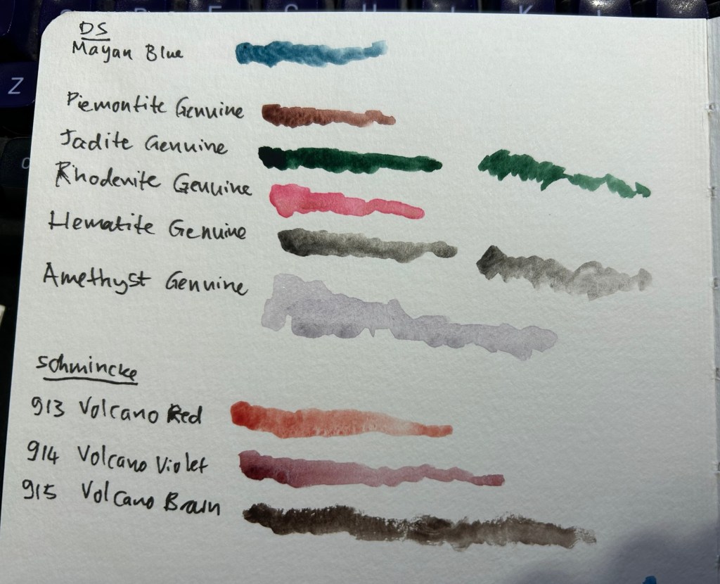
The first colour to leave was Daniel Smith Cerulean Blue Chromium. I have too many similar blues and it’s slowing me down having to decide between them every time I need a blue. In its place I swapped Daniel Smith Rhodenite Genuine, which is a bright pink.
Samples of some of the colours I considered swapping in. Amethyst Genuine was a genuine disappointment – I don’t think I’ve seen such a bland, pale, washed out purple anywhere.
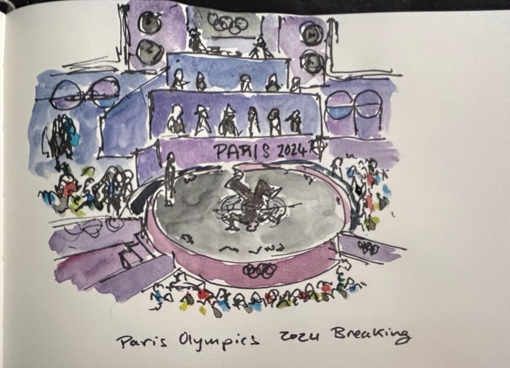
I then sketched one of the scenes from the 2024 Paris Olympics Breaking final, which I was going to see in person before I had to cancel my trip. Luckily my brother was there and sent me photos and videos, which I had fun sketching from. There was a lot of purple in this scene, so I had fun mixing Rhodenite with blues and purples on my palette.
Quick Paris Olympics Breaking sketch
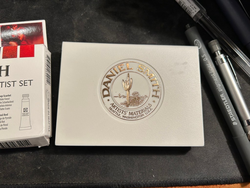
The new palette is something I’m building in a Daniel Smith plastic paintbox. It’s not a box that I’d regularly use (it doesn’t have enough mixing space for me), but it’s useful for the testing I want to do.
This box came as part of a set of two, one of which had paints in it.
I then set up a legend in my sketchbook:
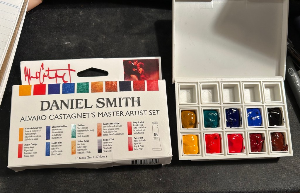
Next I broke ou the Alvaro Catagnet Daniel Smith Master Artist set and filled the pans with paint. I’ll give them 2-3 days to completely dry out before finishing the legend and trying them out. I would never have built a palette which is so heavily skewed towards reds, but this is part of the experiment – after a heavily blue skewed palette it’s time to try something new.
I can’t wait to give these new paints a try. I’ve worked with the Schmincke versions of Yellow Ochre (I no longer use it because of its opacity), Viridian (way to artificial a green for my tastes), Ultramarine Blue and Cobalt Blue, but it will be interesting to see Daniel Smith’s take on these colours.
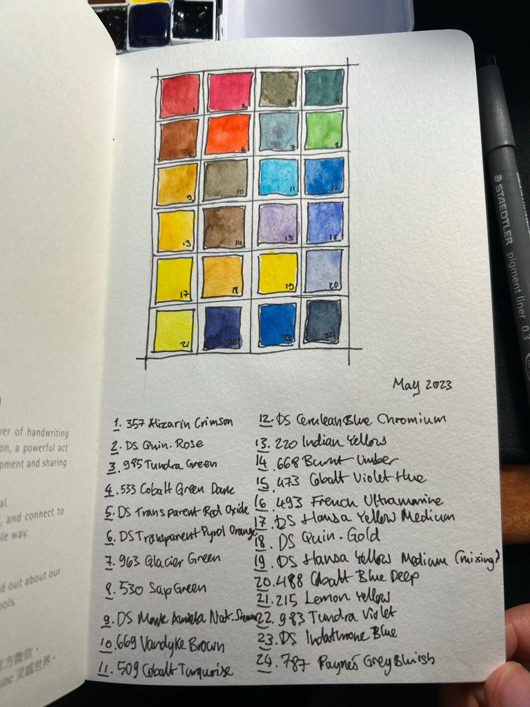
So after writing this post about the physical side of building a new watercolour paint box, here is my updated palette. I’m using a new Moleskine Portrait Watercolour Sketchbook as my sketchbook of choice for the watercolour part of Liz Steel’s teacup course (that starts today), and so I used the first page to create an index for my current palette.
My watercolour palette for May 2023
Every watercolourist’s palette is unique and full of choices that reflect their subject matter preference, the place they live in, and various personal idiosyncrasies. Please don’t copy anyones palette as-is (including mine), but rather understand the artist’s choices and tailor your palette choices to your own needs. To this end, I will explain some of the choices behind my paletter.
There are 24 half-pans in my palette, and 23 unique colours. Daniel Smith Hansa Yellow Medium now appears twice in my palette, once for mixing and once for using as an unmixed mid warm yellow. Yellow paints get dirty if you even look at them, and they are difficult to clean after a dab of this or that paint made its way to them. Of the three yellows in my palette I use DS Hansa Yellow Medium the most for mixing, which is why I opted to have a second half-pan of it this time (it’s a new change that I’m trying out).
Of the 23 paints, 15 are Schmincke Horadam and the rest are Daniel Smith. I’m pointing this out so that you feel comfortable mixing between paint manufacturers on your palette. This can be done so long as you are using the same grade of paint in each maker (artist grade, for example).
There are some classic examples of watercolour palette building in this palette and some that are a bit off. There are warm and cold sets of yellow (Hansa Yellow Medium, Lemon Yellow), red (Quin. Rose and Alizarin Crimson) and blue (French Ultramarine and Cobalt Blue deep), and there’s a rather standard set of earth tones (Pyrol Oxide, Monte Amiata Natural Sienna, Van Dyke Brown and Burnt Umber) but there’s some weird stuff too. I’ll be focusing mostly on the weird stuff.
There are three greens in my palette. I sketch mostly landscapes and having premixed greens saves a LOT of time. Of the three greens I use Sap Green the most, either by itself or lightening it with yellow or darkening it with blue. It also has a brightness and vivacity that you cannot obtain by mixing your own green. The two other greens are opaque (which means they don’t mix well), and cover two very common and difficult to mix green shades. Schmincke Tundra green is part of their super-granulating series, and has some pink undertones to it. It also covers a wide variety of olive coloured local plants. The Cobalt Green Dark is a brand new addition to the palette, replacing Schmincke’s forest green. This paint works as an “artificial” green, for things like benches and fences that were painted green, and a greyish-green for the many greyish-green local plants.
Then there are some “magic” paints. Schmincke Glacier Green is on the palette as a cool “glass” and sea blue, and it’s super-granulating and dual pigmented. You can see the pigment party going on with it in my swatch of this colour. Liz Steel has influenced me to add an orange and a turquoise to the palette. They bring joy to the painting, the turquoise is useful as “glass” and “windows” when I want something brighter than the Glacier Green and the orange paint is much brighter and more alive than any mixed orange that I could ever hope to create. It’s useful to add a splash of colour to a painting, to help focus the eye in a certain area. The two Daniel Smith blues on my paletter are also Liz Steel inspired, and at least one of them may be on its way out due to low use.
Paynes Grey Bluish is one of my most heavily used pigments, as part of sky and sea scenes, denim jeans, as a shadow colour, for asphalt and to darken other mixes. A must have for me.
The two violets on the palette are also personal choices, though the Tundra Violet will likely be replaced with something else in the near future. Purples are very difficult to mix without getting muddy not registering as purple, which is why the Cobalt Violet Hue paint on my palette. The super-granulating Tundra Violet is much less useful, and may find its way out my palette.
I hope this gave you some insight as how to think about the pigment choices that you make for your palette. Again – create your own palette and don’t just force yourself to use a copy of someone else’s
My hands have been killing me with the worst neuropathy since my treatments began, so I’ve been trying to limit my typing to what I need to do for work. That is why this post took so long to write, and why my posting schedule may be a little off until things improve with my neuropathy.
2021 was a hell of a year for me. It started with me doingLiz Steel‘s excellent Sketchbook Design course. I also took some fantastic and very illuminating tea seminars with Juyan Webster from the Chinese Tea Company. If you have any interest in tea and you get a chance to have a tea seminar with her, I highly recommend it.
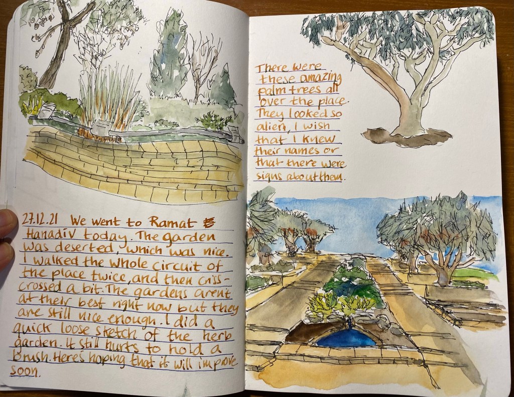
Early on in the year is also when a close family member got diagnosed with thyroid cancer, and that’s also when my journalling went on the fritz. This was the notebook I was using at the time, a Moleskine Pokemon Charmander limited edition and I abandoned it 2/3rds of the way through.
Abandoned Moleskine.
Covid was raging, I was working from home, at a new job, and I spent the first quarter of the year trying to fit my drawing and running into the new quarantine rules that kept getting both stricter and more confusing with each iteration. I happily got vaccinated as soon as I could, and I’m still very grateful to the amazing scientists and doctors who came up with vaccines in such a short time frame. I managed to participate in the OneWeek100People challenge, which is very demanding but also a lot of fun. If you can spare the time I recommend giving it a try.
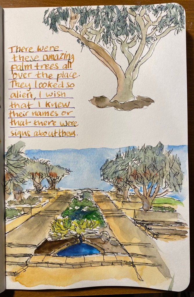
In the beginning of April I started having shortness of breath (dyspnea) while running. It got worse with time and soon I couldn’t run at all, and then I couldn’t walk very fast or far, climb stairs, etc. After a long and laborious road to get a diagnosis, in the beginning of June I learned that I had cancer, and in the beginning of July I got a diagnosis and started ABVD chemotherapy to treat Hodgkin’s Lymphoma. A few things helped me get through that incredibly difficult time. First and foremost, my phenomenal family (mother, father and brother) that rallied around me and took care of me from the moment of the first diagnosis and to this day. I can’t imagine going through this process without them. Almost as important were my friends, who visited me in the hospital and cheered me up, and kept in touch and cheered me on during the treatments. Finally it was journaling and reading. I started this Moleskine “I am New York” on the day I was first admitted to hospital, and writing in it gave me perspective and kept me sane.
Journal of a bad year.
And books? Books have always been my comfort and escape. I saw a few things on Disney+ while I was hospitalized, but books helped distract me from a lot the most unpleasant and painful parts of this journey. I was happy to discover that one of my favourite Moleskine limited edition series, the denim ones, was back in stock, and so once I finished the “I am New York” journal I moved into this Moleskine “Skinny. Flared. Bookcut.” one. It’s such a well conceptualized and executed design, it was a joy to use. This was when I decided to regularly use fountain pens to journal with, and just use only one side of the page. I have more than enough notebooks to support that decision.
This notebook took me through the second part of chemo to the end of it.
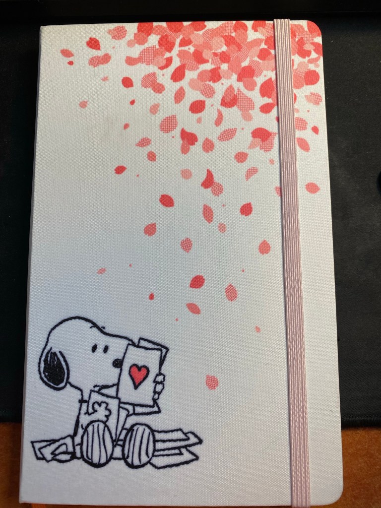
And now, and the beginning of 2022 I started a new journal, a Moleskine Peanuts Sakura. Pretty, right? Let’s hope I get to fill it with good news and positive thoughts.
A new Moleskine for a new and better year.
Some favourites from the past year:
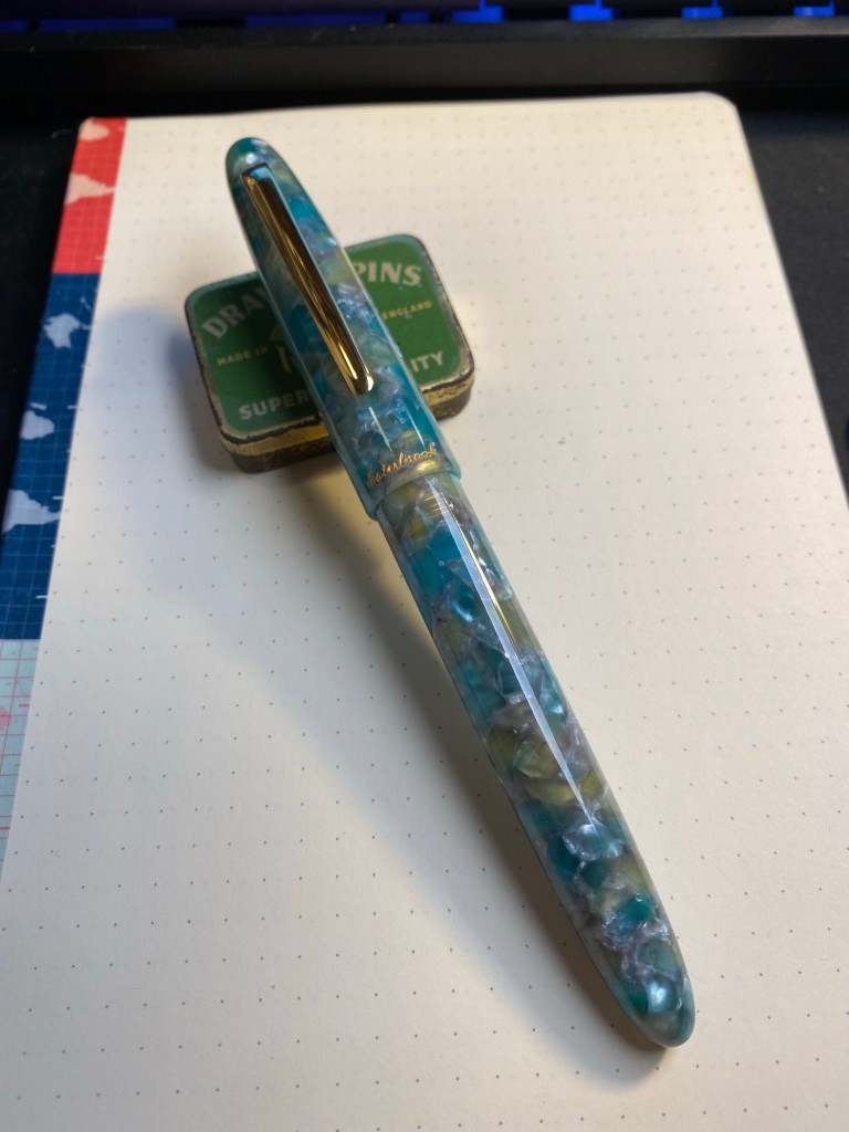
My favourite pen was the Esterbrook Estie Sea Glass. Quite a surprise for me, but it hasn’t been out of rotation since I got it.
Esterbrook Estie Sea Glass – fantastic and beautiful pen.
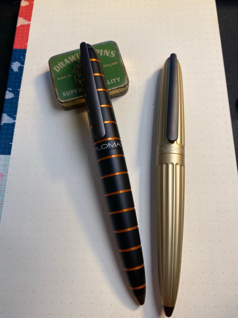
Another pen purchase that came in at a close second was the Diplomat Elox Rings and the Diplomat Aero (basically the same pen with a slightly different body design). These are wonderful workhorses, and a joy to use.
Diplomat Elox Rings on the left and Diplomat Aero in Champagne on the right.
I didn’t read as much this year as last year, but I did read a few really great books. Here’s a list of a few standouts among them:
The Good War, by Studs Terkel. WWII as I’ve never experienced it before – as seen and told by the “regular people” who lived through it.
Cloud Atlas, by David Mitchell. Not an easy read by far, but a breathtaking work of fiction nonetheless. Worth the effort.
The Brief Wondrous Life of Oscar Wao, by Junot Diaz. A surprisingly moving tale of a character that you won’t expect to fall in love with, and yet you will.
Wolf Hall, Bring Up the Bodies, by Hillary Mantel. Why should I care about Thomas Cromwell? How can you not care about Thomas Cromwell after reading these books? An era and place come to life, in a world filled with complex and compelling characters.
Nomadland, by Jessica Bruder. Watch the movie AND read the book. Both are excellent, and both offer a chance to look into a part of modern living that we were hitherto oblivious of.
Project Hail Mary, Andy Weir. Just a fun and interesting sci-fi novel. If you enjoyed the Martian, you’ll enjoy this.
Underland, by Robert Macfarlane. What happens in the deep dark places beneath our feet? A lyrical work of non-fiction.
The Song of Achilles, by Madeline Miller. The love story between Achilles and Patroclus told with great gentleness and heart.
Klara and the Sun, by Kazuo Ishiguro. An understated and masterful work of science fiction that explores themes of humanity, identity, friendship and love, among other things.
Harlem Shuffle, by Colson Whitehead. How can you write a heist novel that isn’t a heist novel but rather a story of a person, a time and place? Whitehead’s writing is exceptional, and Harlem Shuffle is just another proof of that.
The Expanse books 1-4, James S.A. Corey. I haven’t read book 5 and onwards yet, but I did read the first four books of The Expanse this year. They aren’t perfect (Holden is a bit much), but they are very good at world-building, with interesting and unique plots and complex and believable characters (apart from Holden, who is a bit much). The books are each written in a different style, and they improve with time.
In terms of art supplies, 2021 was the year of the super-granulating watercolours from Schmincke, and also when I added Daniel Smith watercolours to my palette. Schmincke just announced that the super-granulating colours will be permanently added to their offerings, and that they are issuing three more permanent sets into this series (Desert, Shire and Vulcano), and another limited edition set, Haze.
I’ll be talking about planning for 2022 on one of my next posts. In the meanwhile, have a great new year, and don’t forget to take time and breath.
I’ve been trying to draw better foliage, which made me want to investigate the various greens I can mix from my current palette. So for the first time I dedicated time and a few sketchbook pages to experiment with green watercolour mixes. I thought that the process would be tedious and boring, but it ended up being very interesting. Mixes that looked like mud on the palette came to life on the page. I discovered a whole host of green hues that I had no idea that I had access to. And once again I fell in love with Schmincke’s Glacier Green.
Note: DS stands for Daniel Smith and Sch for Schmincke. The paper is Stillman and Birn Alpha.