It’s nice to have new pens and inks in rotation. I’m enjoying Diamine’s Writer’s Blood more than I expected, Diamine Autumn Oak is fantastic with a Waterman superflex nib, and Pilot Iroshizuku Tsuki-yo is becoming one of my favourite inks.
Liz Steel and Marc Taro Holmes are hosting the OneWeek100People challenge again this year, and I intend to participate again. The challenge starts on the 3rd of March and officially lasts 5 days. I normally sketch from photos, but this time I want to see if I can do the entire challenge from observation only. It may take me more than 5 days, but I’m OK with that. Are you planning on joining the challenge?
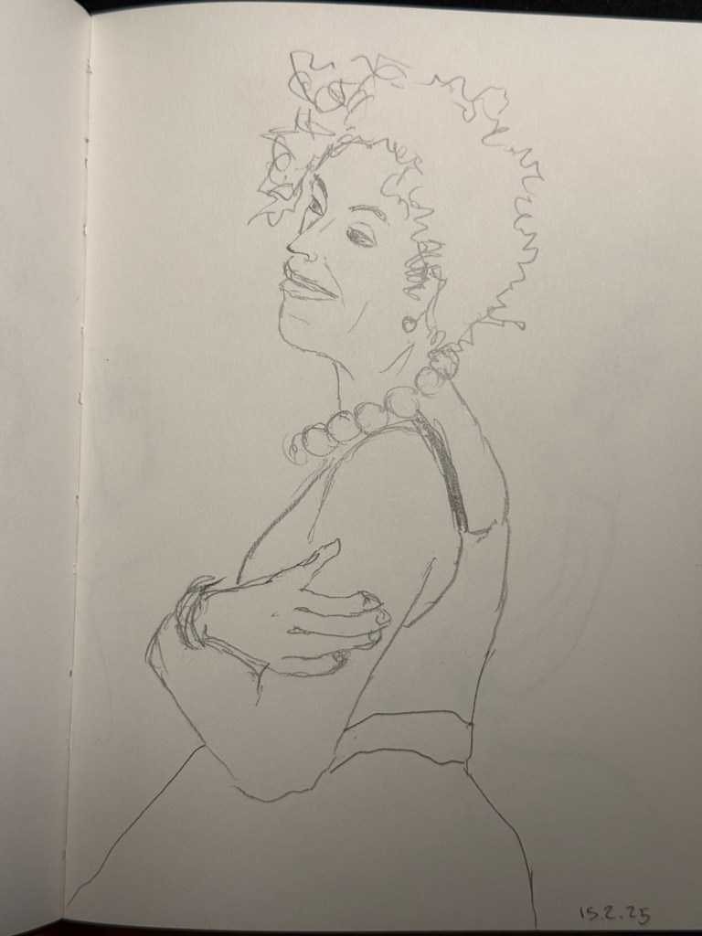
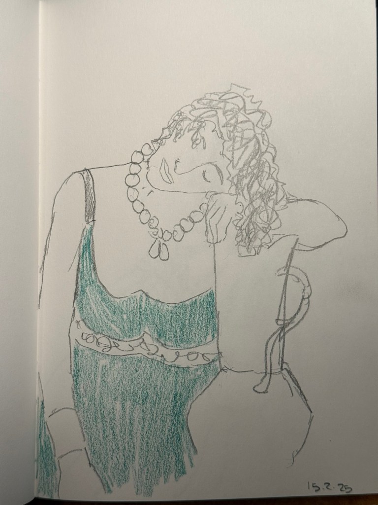
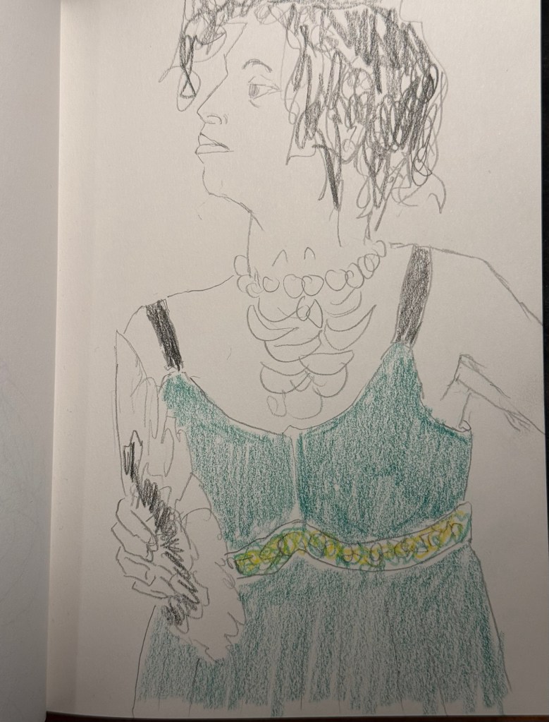
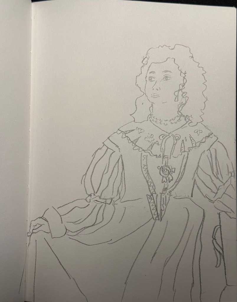
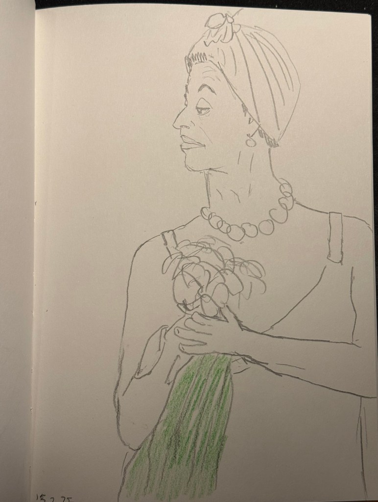
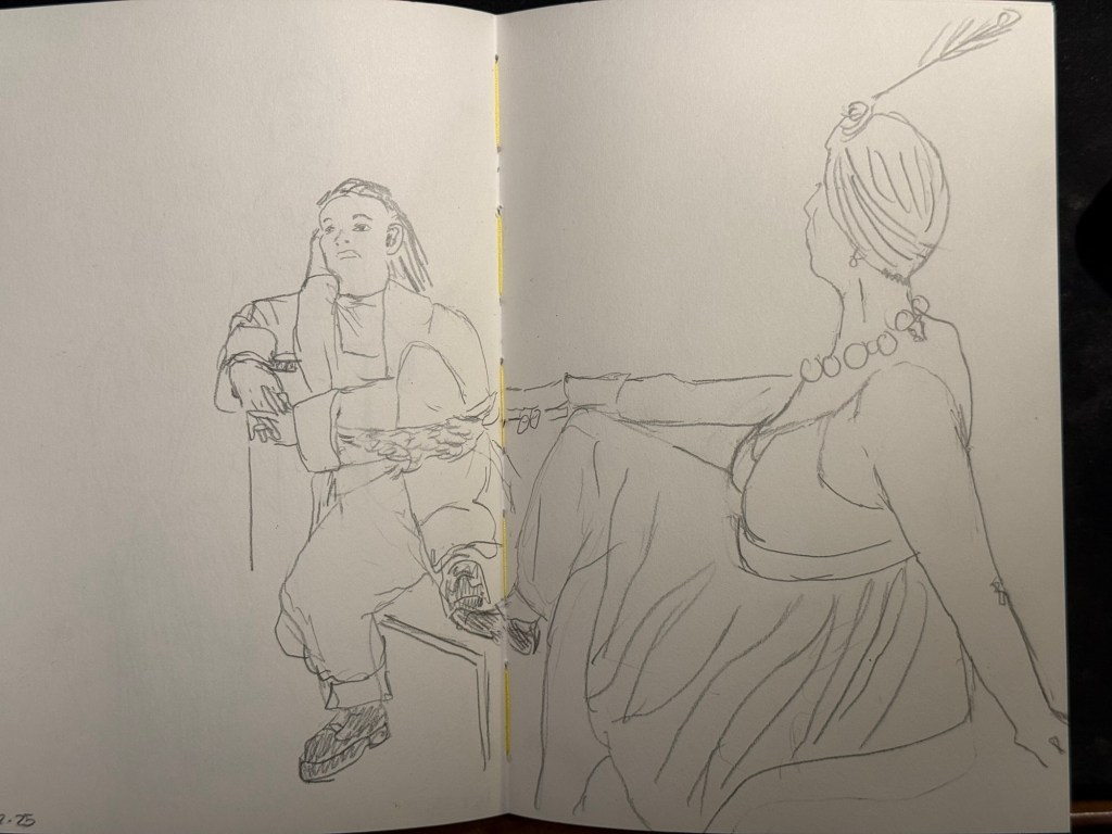
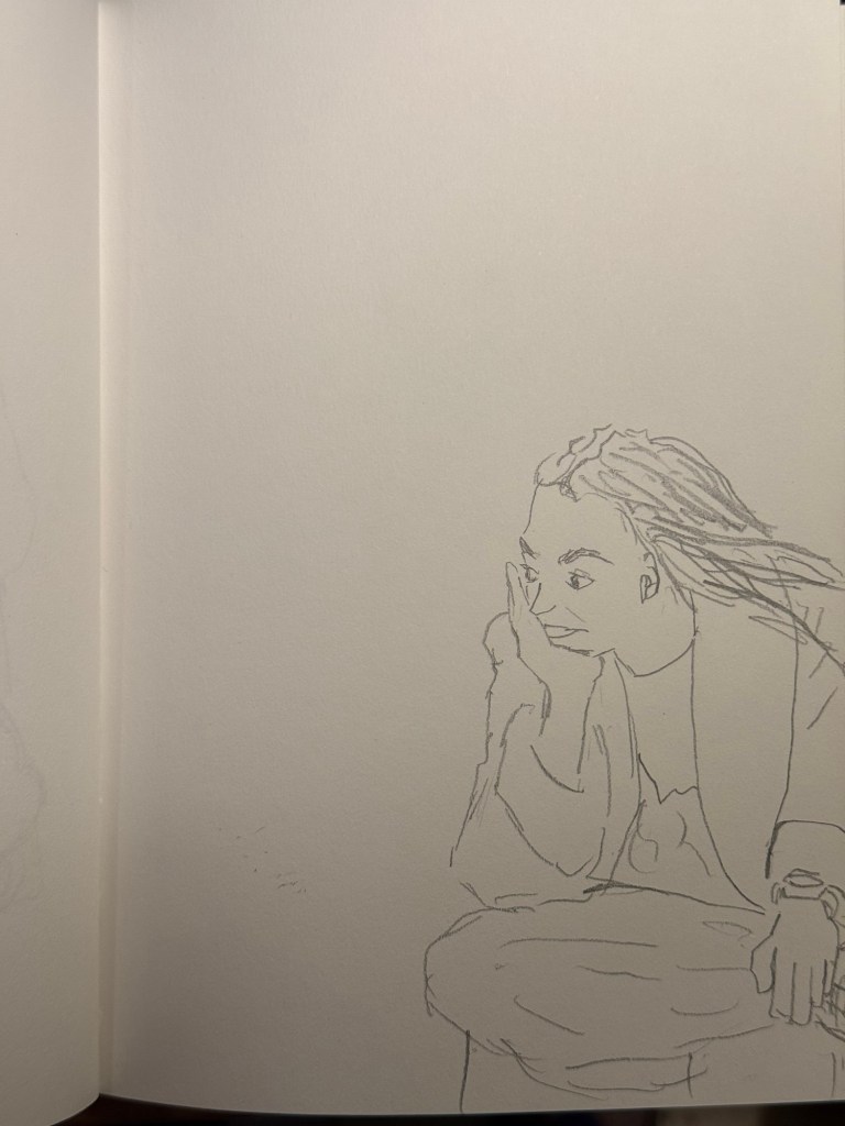
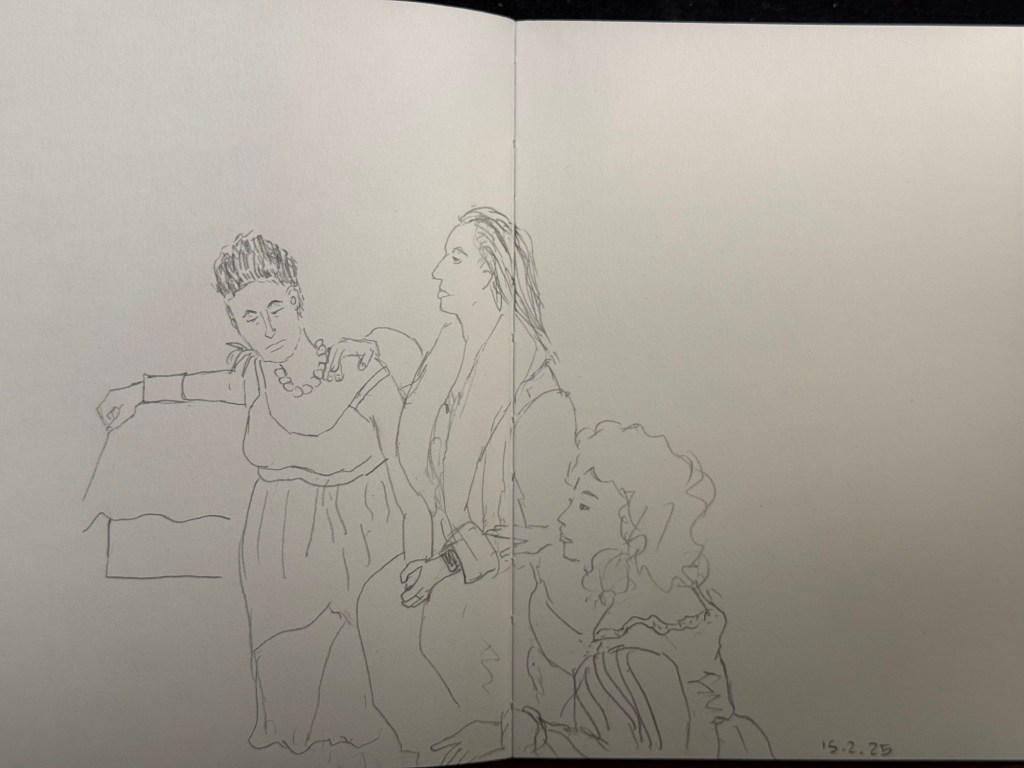
I went to the local art museum again this week, to sketch models in the museum. This was the last time this event was run, and the place was packed with sketchers. I didn’t have the best of locations, but I made the most of it. I sketched with Faber Castell 9000 2B and 3B pencils mostly, and added a touch of colour with Faber Castell Polychromos. The ink sketches were done with a Staedtler Pigment Liner 0.5. The sketchbook I used was once again the French Pascale Éditions. The models did fewer 20 minute poses and more 10 minute ones, which meant scrambling a lot. I wanted to visit the museum after the event, but I was so tired from 3 hours of non-stop sketching that I just went home.
Harman Photo just came out with a brand new colour film, Harman Red. It’s a red-scale film, and I’m curious enough to try and buy a roll or two and test them out. I love the wild, wild results I got with Harman Phoenix and the Harman Red is basically Phoenix pushed even more into red-scale.
Here are the sketches from today, and I hope that you have a great week!
10 minute pose.10 minute pose.10 minute pose.10 minute pose – the hardest pose to draw because of the angle of the head. Had a false start on this one, so had only about 8 minutes for this. 10 minute pose – Staedtler 0.5 pigment liner10 minute pose10 minute pose10 minute poseThe three models. The pose started with just the two top models, and then the third one joined, and it was a 10 minute pose.A challenging composition, 20 minute pose10 minute pose. I like the composition on this one – I placed her on the side of the page to give her room for thought. Final pose, 20 minutes
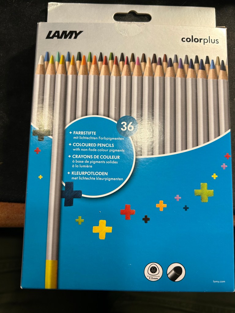
I rarely write reviews that trash products— because I tend not to waste my time and money on products that could potentially be bad. However, I was stuck in Tampa’s airport on a very long connection due to inclement weather and so I browsed their bookstore and found this:
Lamy ColorPlus 36 coloured pencils
Well it says Lamy on the box, so it can’t be bad, right? And it was just $15 for 36 pencils…
This is where the red flags should have popped up, but they didn’t. I bought the pencils.
When I got home and opened the box, my heart sank. The leads were broken on almost all of the pencils. Now the box was in my trolley, well protected from dropping or crushing, so there was really no reason for this amount of damage. I checked the back of the box:
“Highly resistant to breakage” it is not.
The pencils are triangular shaped, which is supposed to make them ergonomic. It makes them more unpleasant to sharpen, as there’s a steep “bump” whenever you turn the pencil to another side.
Triangular pencils
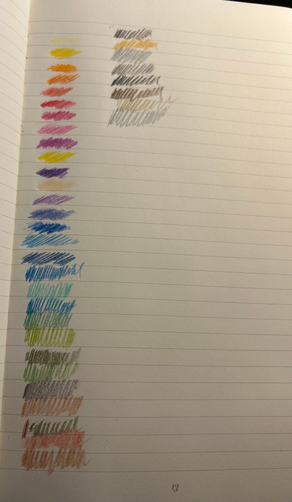
The colour selection is weird — there are a lot of various shades of brown, but no ochre. The browns themselves are nothing like the colours that you’d expect from their labelling. I use the term “labelling” loosely here, because there’s no colour labelling on the pencils, just a dip of colour that is vaguely similar to the actual pencil colour produced.
Pencil samples
The 36 shades chosen are wild – way to many similar brown, not enough greens, too many purples and blues, and of course utterly useless white and the bewildering gold and silver which are neither gold nor silver. Obviously the pencils crumbled while creating these samples so there are some duplicates here.
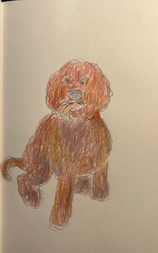
The pencils are very waxy, which means after 2-3 layers maximum the paper will be clogged and subsequent layers won’t be registered. The pencils also crumble easily —- even with very light pressure applied. Creating this sketch with them was nightmarish, as the leads kept crumbling, and I couldn’t get the shades that I wanted to the layering that I was trying to achieve.
Quick dog sketch
I honestly don’t understand why this product exists. It’s too expensive and not robust enough for children’s use, it’s definitely not artist grade (poor pigment, layering and no labelling), and even student grade pencils are properly labelled these days. In any case, save your money to buy better pencils. You deserve them.
Over the past 24 hours things have gotten very depressing and very scary here. To distract myself a little bit, I decided to start working on a new project: Going Shopping in My Stationery/Art Supply Stash. I have a lot of stuff. I don’t use enough of the stuff that I have, to the point where I don’t even remember what I have. As I’ve significantly cut down on buying new stationery and art supplies, I’ve decided this would be a good time to go “shopping” for new things to use in whatever it is that I already have.
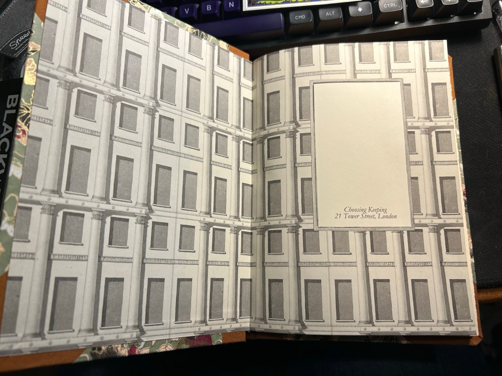
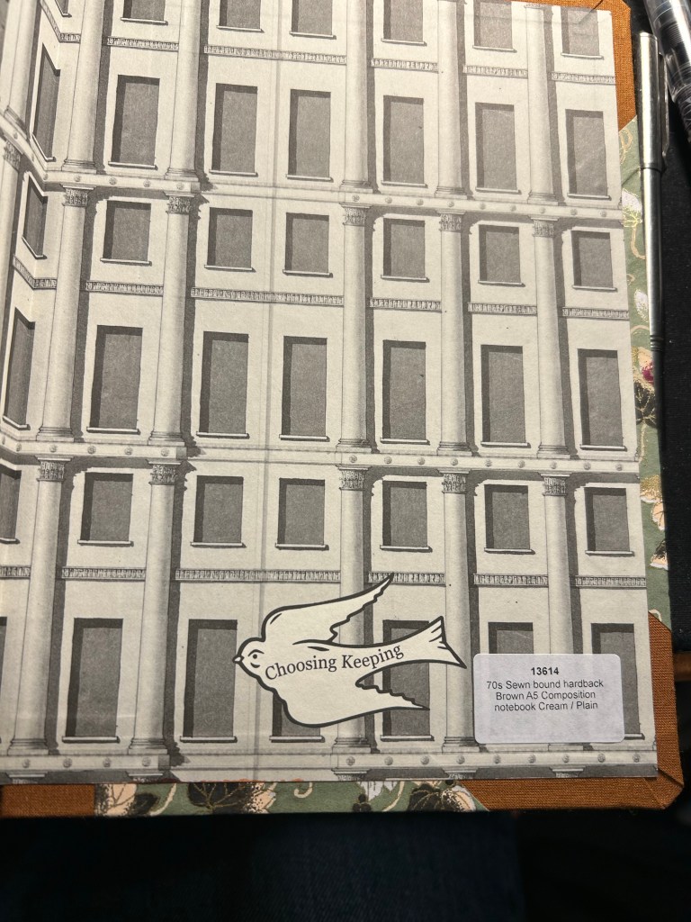
I bought this fancy looking A5 composition notebook from Choosing Keeping in London this April, after eyeing their gorgeous notebooks the last time that I was there.
Such a great looking notebook. Yes, the cover has gold foil on it.
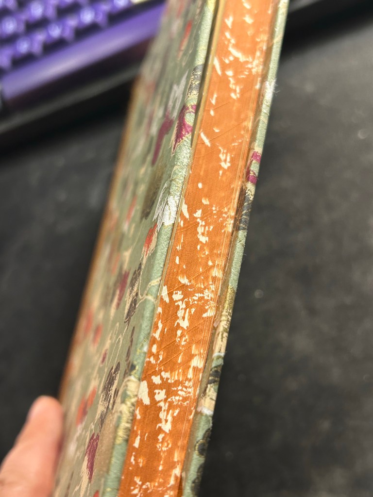
The endpaper is also very good looking:
Front endpaperBack end paper with the Choosing Keeping bird sticker, and details on the notebook.
The paper is cream and unruled, and the edges of the paper are mottled brown. It is one of the best looking notebooks that I have:
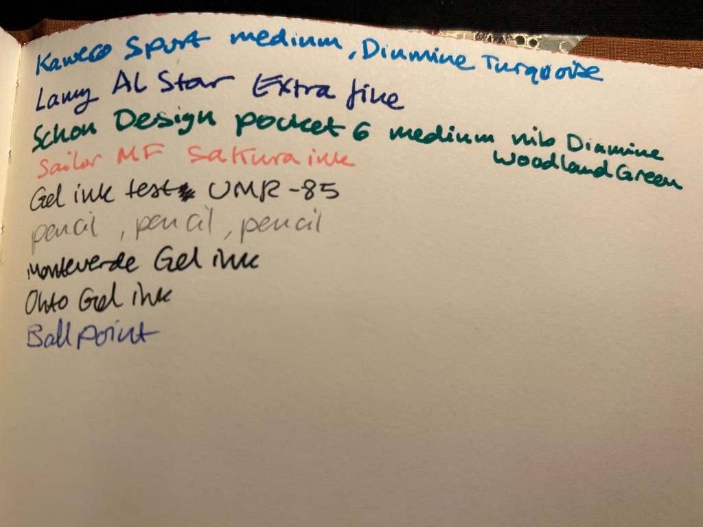
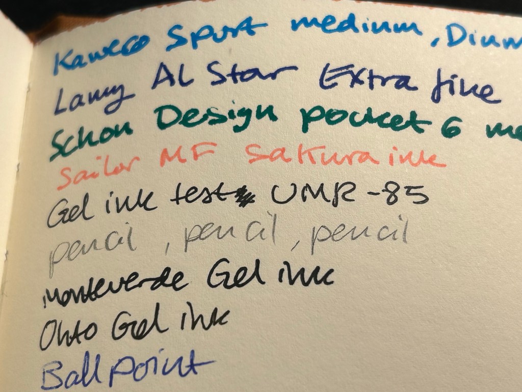
I was planning on using it as a journal, but the paper was an utter disappointment. It is not fountain pen friendly, which really surprised me — the ink spreads and feathers and bleeds through. I could have used a gel ink pen with this notebook, but it somehow seemed incongruous with how fancy and special (and expensive) the notebook is.
Ink test page
So I shelved it and I haven’t touched it in months, until today. My eye caught it as I was looking for a notebook to sketch in, and I remembered that the paper had some tooth and texture to it.
Closeup on the paper and the ink results.
It’s a soft, velvety kind of paper, which made me thing that it might work with pencil quite well. I also had some pencils I wanted to try out, so it seemed like a good opportunity to not let a fancy notebook go to waste.
Massive bleed-through
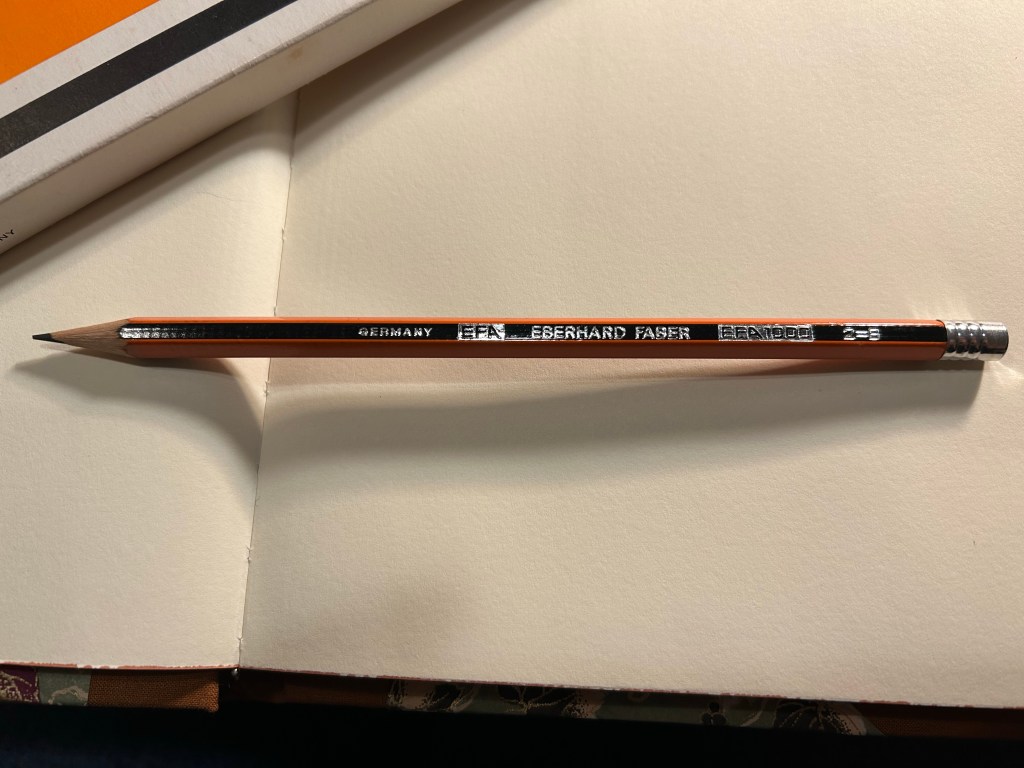
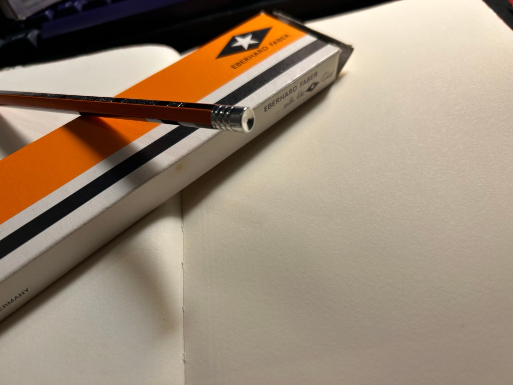
Enter the pencil that I wanted to try out most: the Eberhard Faber EFA 1000 vintage pencil in 2=B grade. I know, it’s weird. I don’t get it either. 2 is supposed to be HB. I bought a box of these beauties at during my last visit at Present and Correct, and I’ve been wanting to use them since. They’re made in Germany, the lead is a B grade (slightly softer and darker than HB), very smooth and it retains its point surprisingly long for a soft pencil.
Eberhard Faber… with the Star. I love everything about the design of this pencil and this box.
The pencil comes pre-sharpened, and has an orange and black body that looks a bit like the Staedtler Noris, but in orange instead of yellow. It has “Germany”, “EFA”, “Eberhard Faber”, “EFA 1000” and “2=B” embossed on it silver foil. The fonts used look very futuristic and modern, which makes me think that this is a ‘70’s pencil.
Very fetching design
The biggest issue with vintage pencils is the eraser, which is always dried up and completely unusable. For this reason I prefer vintage pencils that don’t have erasers, or better yet, those that have endcaps. Well the EFA 1000 gets lots of bonus points for not only having an endcap, but having a really good looking one. It’s also silver in colour, and it features three rings and a concave top.
The endcap
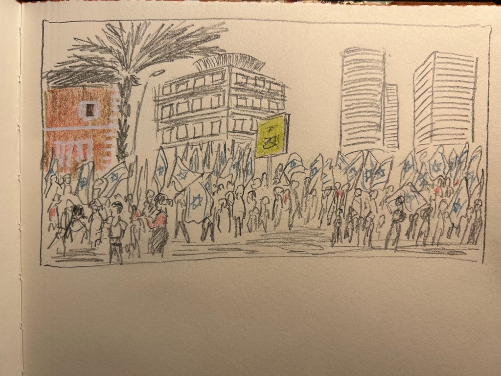
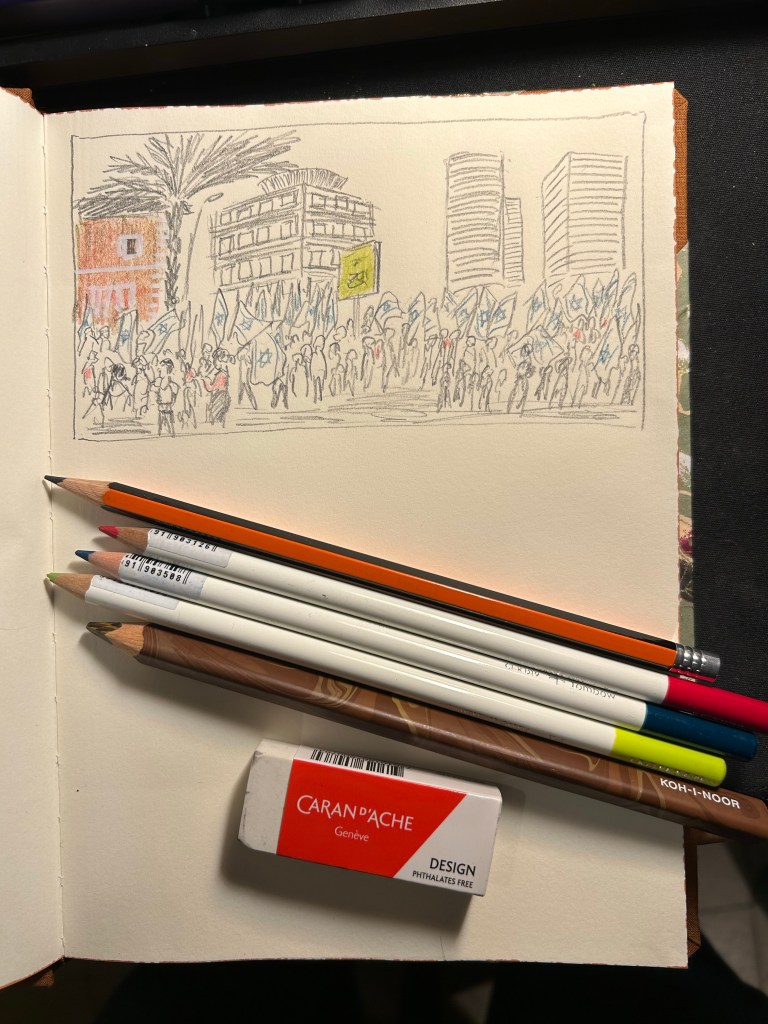
I then sat down to create this quick sketch of the latest round of pro-democracy protests. The pencil was a joy to use, and it worked very well on the paper. I was very happy with the feel of them both, and with the sketch results:
I added some colour with three Tombow Irojiten coloured pencils and a Koh-I-Noor brown Magic Pencil. The Tombow Itojiten was an utter disppointment. The green pencil crumbled twice, the others were mediocre at best. The Koh-I-Noor was a lot of fun, but brown works best with other coloured pencils layered on top, to give it some life.
Tools used here. Eberhard Faber EFA 1000, Tombow Irojiten, Koh-I-Noor Magic Pencil, Caran d’Ache Design eraser
All in all this first attempt at shopping from my own stationery stash was a success. The EFA 1000 is staying on my desk, I learned things about the Tombow Irojiten (I’m glad I only have three Itojiten pencils and not a box of them), and I got to use a notebook that I’d thought would just gather dust. This is definitely something I will try to do again.
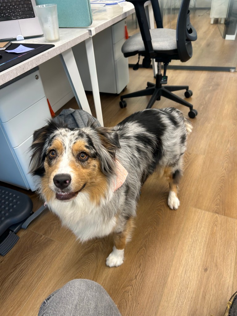
Trying out a new sketching setup so I decided to sketch Belle. She’s a young Australian Shepherd that belongs to a colleague and regularly comes to the office.
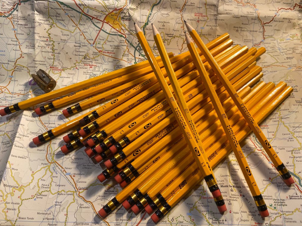
Today is national pencil day, which is just an excuse to showcase my latest vintage pencil finds from visiting a very old local stationery shop. Oftentimes shops like these still have new old stock of vintage pencils, and in my case I’m usually looking for local Jerusalem Pencils, but I often find other interesting things along the way.
Eberhard Faber Mongol pencils.
In this case I got a very large haul of Eberhard Faber Mongol #2 pencils, which I think are really good looking in terms of typography and ferrule design. Most of them are unsharpened, which is a bonus treat, although as usual with vintage pencils time has rendered their erasers unusable.
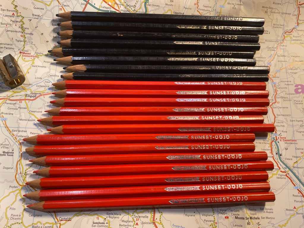
The real find for me were some very old Jerusalem Pencils (based on the logo), in this case coloured pencils (black and red). These are very waxy with relatively little pigment, but I don’t intend to draw with them anyway, and it just tickles me that didn’t translate “sunset” to “שקיעה” (or sunset in Hebrew) but rather chose to transliterate it, to give the pencil a more cosmopolitan feel.
Jerusalem Pencils Sunset coloured pencils.
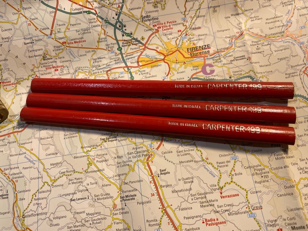
Carpenter pencils are something I rarely find in stationery stores but do sometimes find in flea markets. In this case I lucked on three perfect Jerusalem Pencils Carpenter 199 pencils.
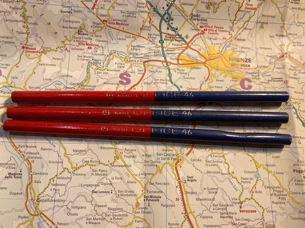
Even rarer for me are these Jerusalem Pencils Office 46 red and blue dual pencils. One of them is badly warped and another is slightly warped, but they still have their handsome imprint with an art deco-y font.
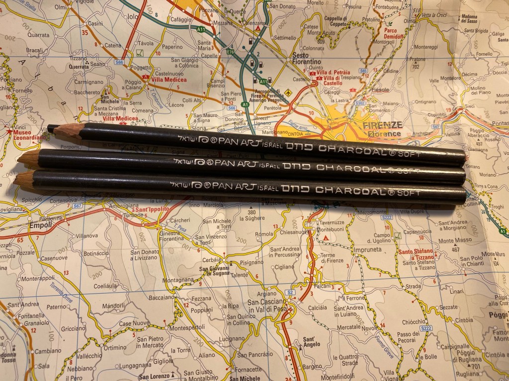
These are more modern, as they have the Pan Art imprint, which means that they were likely made after Jerusalem Pencils was forced to rebrand itself after its bankruptcy. They’re charcoal pencils, and it will be interesting to give them a spin. I love the font selection here as there’s a lovely flow to it.
Pan Art Charcoal Soft pencils.
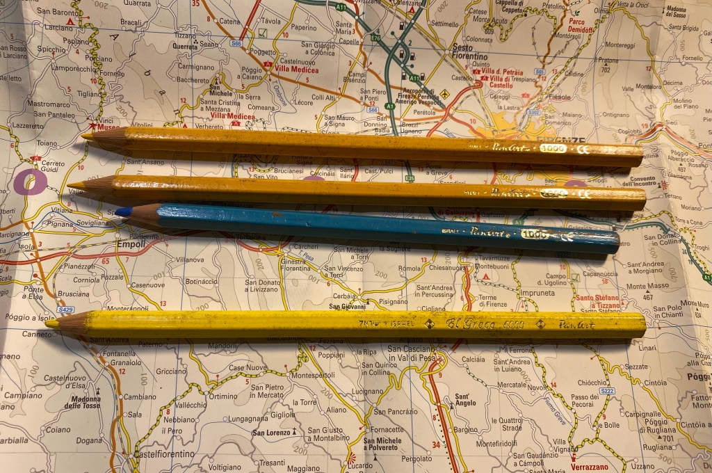
These are the last Jerusalem Pencils of the bunch, Pan Art coloured pencils from the 1000 and the Al Greco 6000 line. These are quite modern but I still haven’t seen them too often so I added them to the pencil pile.
Pan Art 1000 and Al Greco 6000 coloured pencils.
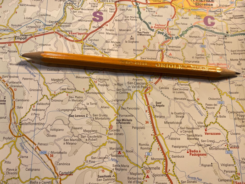
Here’s a pencil that I’m pretty sure was made by Jerusalem Pencils, but there’s no telling it if was under that name or Pan Art. It was sharpened at both ends so you can just make out that it’s an HB pencil, and enough of the imprint is left to know that it was made in Israel and is called Oriole.
Oriole pencil.
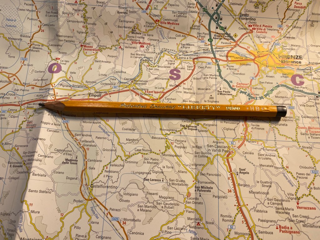
And here we enter the realms of the unknown pencil brand, where I just bought pencils for their imprint and style, such as this Patented Drawing “Liberty” pencil:
Patented Drawing “Liberty” pencil.
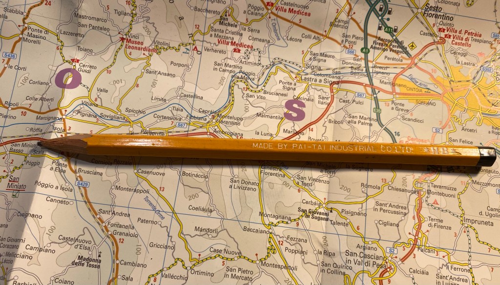
Which was made by the Pai-Tai Industrial Co LTD.
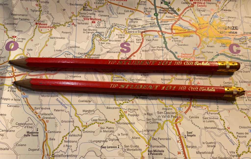
These Student 101 pencils from a Croatian company called TOZ Penkala (thank you to a penaddict slack user for helping me with this):
TOZ Penkala Student 101
These L&C Hardtmuth Studio 941 7 and 18 pencils that just have the best imprint font and logo:
L&C Hardtmuth Studio 941 7 and 18 pencils.
These Marco 4100 coloured pencils which I bought for the Comic Sans “Superb Writer” imprint, it made me laugh.
Marco 4100 coloured pencils.
And these random pencils all bought for their imprints: Springer, Factis “Eraser Pencil” 3012, and Warm Heart Color Pencils.
Of all of these I’ll probably only be using the Mongols, but I find having the others fun, and I may be able to swap a few of them for some other vintage pencils that I can enjoy.
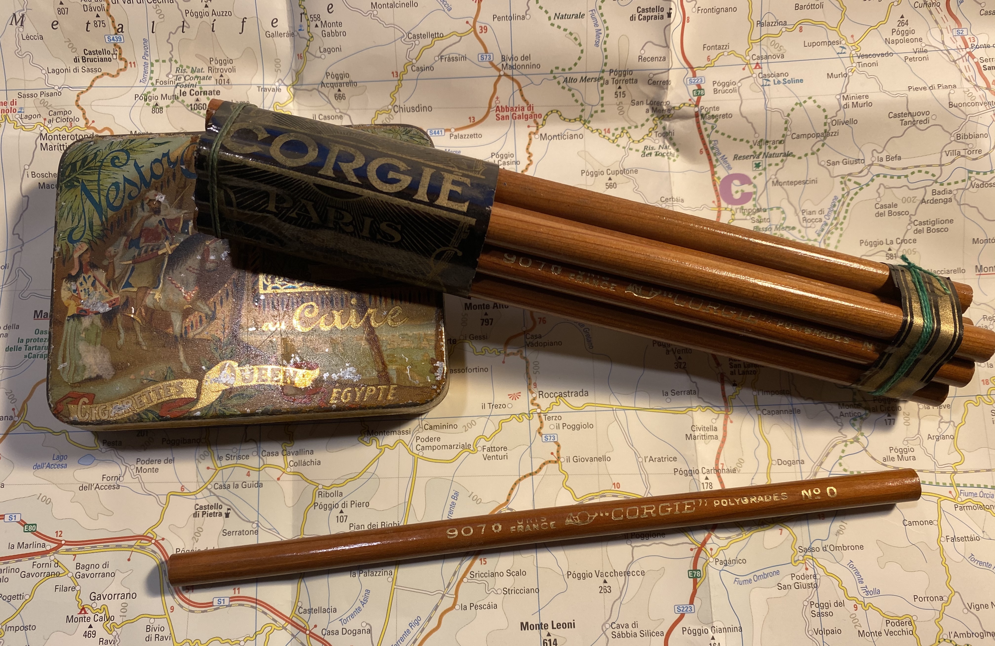
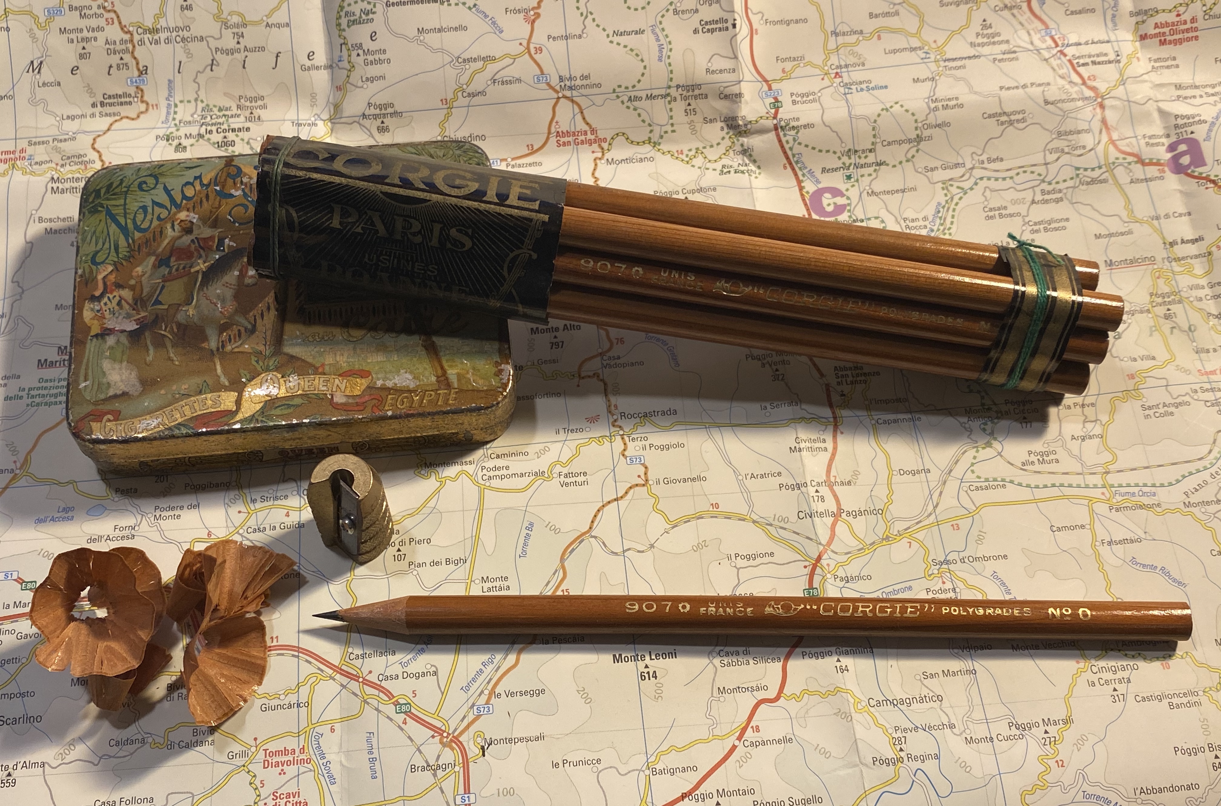
It’s National Pencil Day and I decided to celebrate. Last year I picked up some vintage pencils in a stall in Spitalfields market in London, and they’ve been languishing unloved in their box ever since. The truth is I felt that they were too pretty to sharpen and use, which is both understandable (I mean look at them!) and silly. Pencils are meant to be sharpened, period.
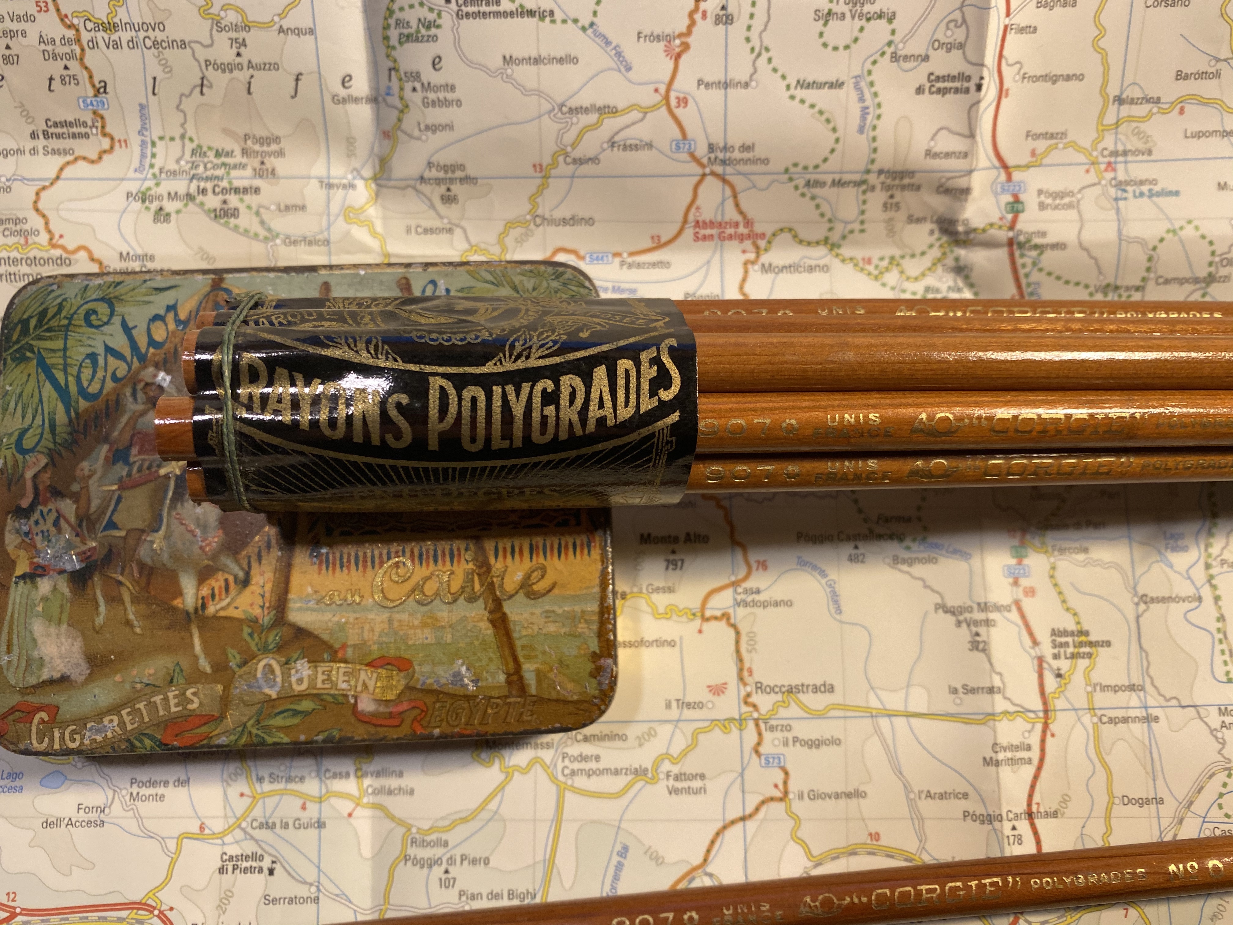
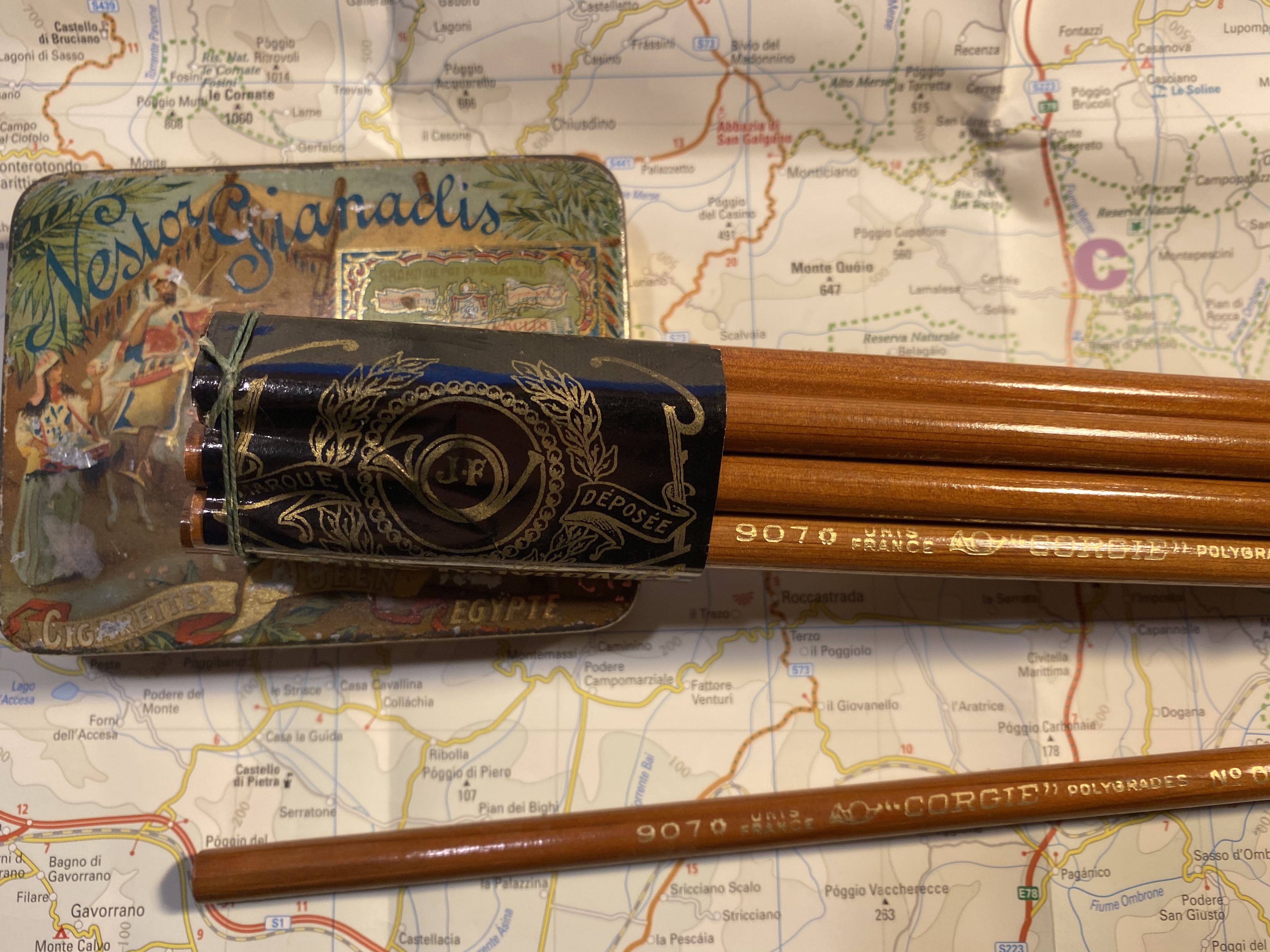
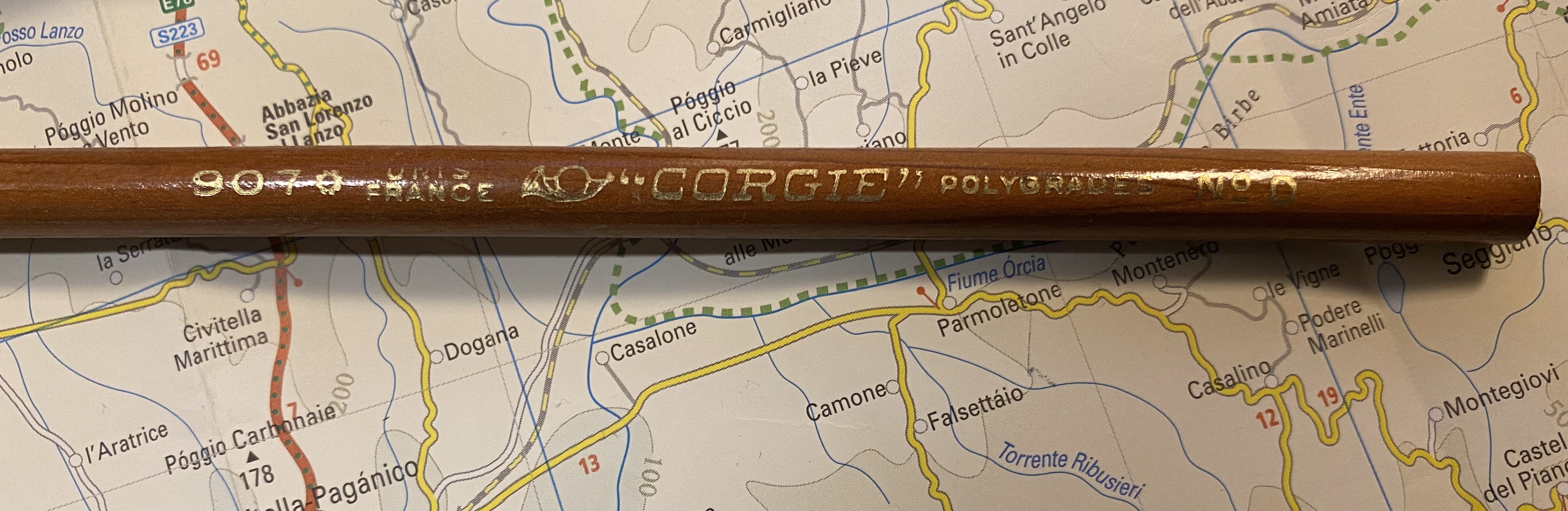
So I broke out the “Corgie” (à Paris) 907 pencils, which are natural pencils coated with a thick layer of lacquer that makes them both shiny and satisfying to hold. The French appear to be more restrained in their choice of imprint fonts, but they go all wild when it comes to the wrappers around the pencils. Behold, creativity let loose:
Stunning, right?
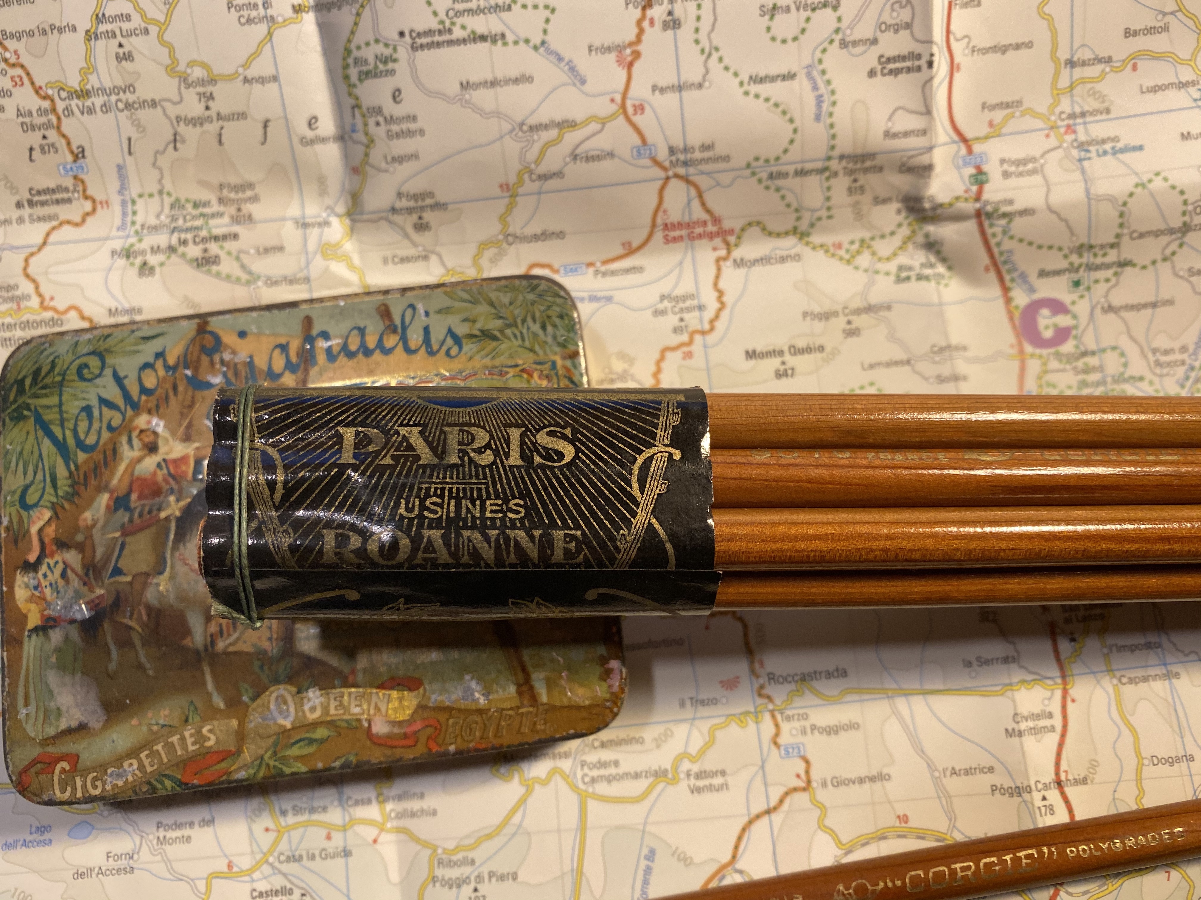
Here’s the imprint (it’s hard to photograph, as the lacquer gets in the way. There are basically two fonts in use, and a very charming bugle logo. The Corgié à Paris factory was active from 1923 to around 1986 (thanks Brand Name Pencils) and if I’d have to venture a guess I think that these are from the ’60s, but it’s really hard to tell.
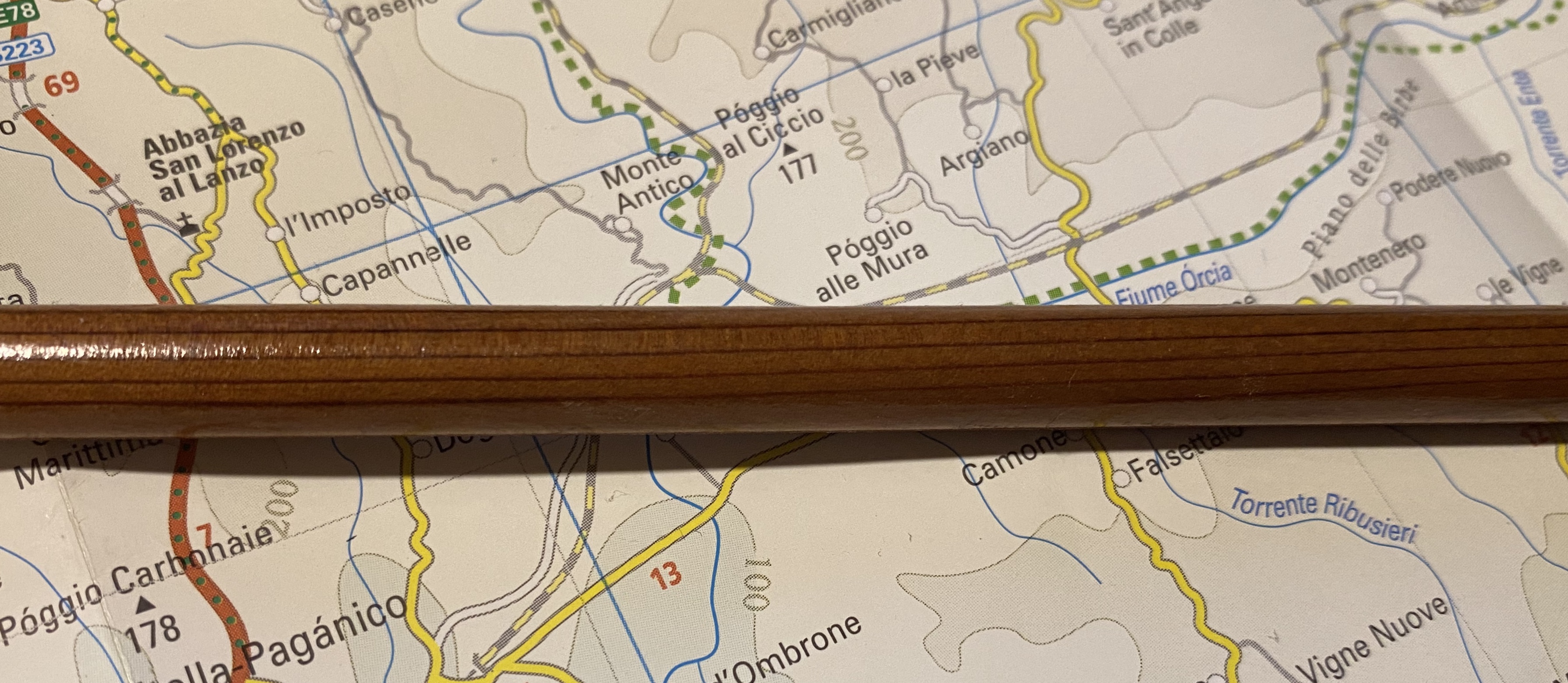
The grain on these pencils is fantastic. Just look at that:
Unlike some vintage pencils whose wood has dried out and become brittle with time, the Corgie 907s sharpen like a charm. They’re not very nice smelling (they just smell old), but there’s nothing to complain too much about.
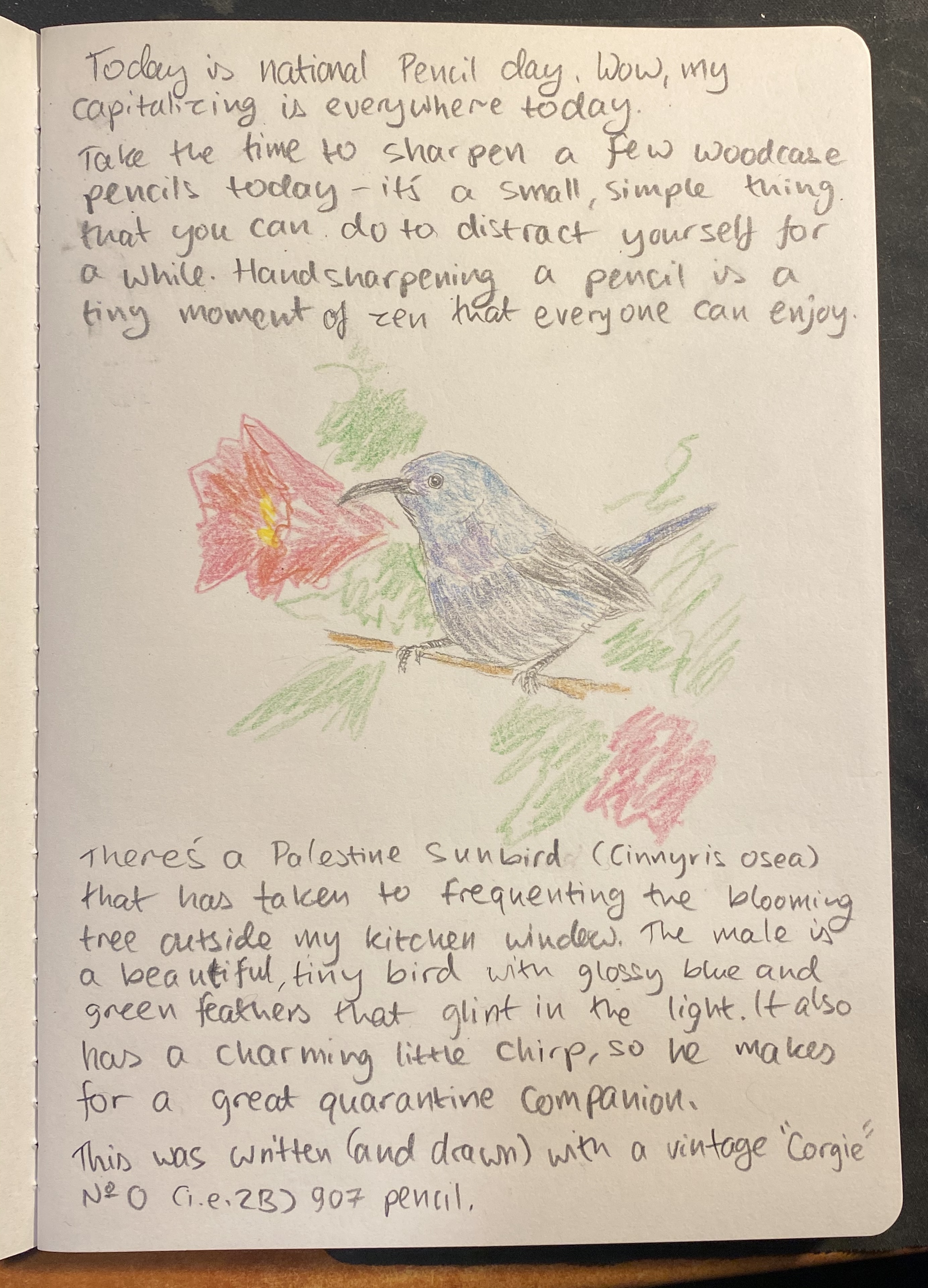
These are No. 0 pencils, which makes them about 2B-4B, depending on the manufacturer. They’re soft and dark, and a joy to draw with, although they don’t hold a tip for very long. The graphite does smudge, but it doesn’t crumble, and there’s a good amount of feedback while using them. Here they are with some Faber-Castell Albrecht Dürer watercolour pencils in use:
I had to sharpen the pencil three times to get through this A5 page. Not great for writing, great for expressive drawing.
Go sharpen a pencil, and have some fun drawing or writing a little something for yourself.
Leuchtturm1917 sketchbook, Kuretake Zig Mangaka pens, Deleter Neopiko-Line-3 pens, Caran d’Ache Pablo coloured pencils, Faber Castell Albrecht Dürer coloured pencils.
A lucky find in the Jaffa flea market, three pencils and one coloured pencil made by Jerusalem Pencils, likely in the 70s or maybe the 80s, for the IDF.