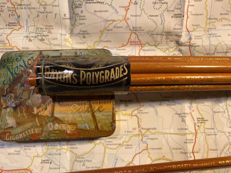
PenBBS 500 Summer and Sailor Sky High

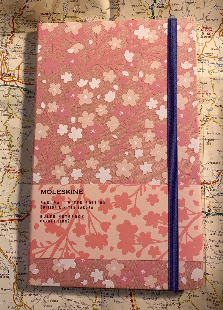
After a long wait my PenBBS 500 Summer finally arrived earlier last month. The PenBBS 500 is a piston filler with a new and rather elaborate filling mechanism for the shockingly low price of $29.99. At that price it can’t be very good, right?

This pen is about the size and thickness of a Pelikan M800, but it’s much heavier than the M800.

While the PenBBS 500 is far from a perfect pen, it is much better than the price tag would have you believe. It’s a heavy pen, made with beautiful acrylic that is both partly translucent and chatoyant, with swirls in pearlescent white, turquoise and royal blue.

There is a lot of branding on this pen, which accounts for some of the choices to slap a lot of chrome on it. You can see the piston spring through the pen body. The “summer” acrylic is beautiful.

The hardware isn’t to my tasting, as there’s too much of it, and it ends up cheapening the pen’s look. The finial has a nice art deco look to it, but when it comes to its functional design it could use some improvement. To fill the pen you twist the small circle in the centre of the finial until it pops out and you can access the spring/piston mechanism to fill the pen. It’s not very convenient to twist open on the one hand, and on the other hand if you’re not careful you can accidentally twist it open while carrying it.

The pen body is stepped down towards the end, maybe so you can cap it? But who caps fountain pens, and why on earth would you want to do that with such a heavy cap?

I like the clip design, but the cap band and the top of the cap hardware are much too pronounce for my taste, and they add a weight to the pen. The pen itself is top heavy, but not the point where it’s uncomfortable or awkward to write with.

I’m not a fan of that big glob of chrome at the end. 

As the ink colour partially shows through this pen, I decided to use Sailor Sky High in it. I’ve had a bottle laying around since the days when Sailor discontinued it and I rushed out to buy some. That was a silly move, but in those days I didn’t know any better. There’s always going to be another ink, people. No point in chasing the discontinued ones only to have the reissued in a few years, or to discover that another brand as the same hue for a fraction of the price.

Sailor’s inks are fun to draw with, particularly with a water brush, as they are utterly non-waterproof, and yet remain true to colour when wet. As I’m staying at home I drew my “nasturtiums,” which I just learned were called Tropaeolums and come from South America originally. They are very easy to grow from seed and offer a lot of interest even when not in flower.

This PenBBS 500 Summer has a fine nib, which skews slightly wider than Japanese fine nibs, and closer to European ones. Sailor Sky High shades enough for it to show with this nib size, and on Tomoe River paper the shading is more pronounced and a red sheen appears.

Sailor Sky High on Canson paper.

On Tomoe River paper wherever the ink pools, there’s a red sheen, but if you write fast enough, you won’t see it, and the ink will skew lighter:

Sailor Sky High on Tomoe River paper.

The red sheen slightly appears on Rhodia and Canson paper, but not as much as on Tomoe River paper.

So, would I recommend the PenBBS 500 as a first piston filler for a newcomer to fountain pens? Probably not. It’s too finicky for that. But at such a low price and with such a good, workhorse nib this is the perfect pen for artists and users that want to experiment with various finicky or troublesome inks. Like the TWSBI GO, this is a pen that’s fun to use and your heart won’t break if you accidentally ruin it.

Moleskine Limited Edition Sakura

In early 2019 I found out that Moleskine had come out with a Sakura Limited Edition that they were selling originally only in Japan. This is not the dark pink/light pink limited edition Sakura that is available as part of their 2020 spring catalog, but a smaller run of notebooks that came out before that. The edition garnered enough interest that it started appearing outside of Japan in Moleskine stores near the end of 2019. After searching for this notebook online with no success, I was surprised to find it in a Moleskine store on Oxford street, London. I try not to buy notebooks abroad, because they can very quickly weigh down your luggage, but I couldn’t pass these by. There were two versions of Limited Edition Sakura in large format, and two pocket ones. I showed some restraint and “only” bought the large ones.

I just finished one journalling notebook and I was casting for the next one to use, when I decided to go for this Sakura one. It was difficult to acquire and expensive, so there was a risk that it would stay in its wrapper forever, but I decided that if anything would cheer me up as I journal through these difficult times it’s this notebook.

img_4260
Front cover with wrapper. Notice how the wrapper design matches the fabric print.

The Moleskine Sakura is a cloth covered notebook, with an utterly unique design. There’s an imprint of cherry blossoms over the slightly shimmering pink fabric, and the imprint looks like it’s floating over the fabric cover. The result is a stunning and tactile notebook that looks extremely luxurious. It’s almost too pretty to use.

Back cover. 

The fabric is clearly synthetic, and it has some shimmer to it because of that. The imprint on top has part of the fabric’s texture, and I’d venture to say that it was screen printed, but I’m not a screen printing expert so I could very well be wrong. It’s hard to capture how the covers look in person, but it’s as if there’s an invisible layer between the floral print and the fabric cover. The flowers appear to be floating in the air.

The print. Nobody does fabric covered notebooks as well as Moleskine does.

Inside the covers the endpapers feature the same print but in monochrome pink and white.

Here are the back endpapers, and Moleskine again gets full points for prints matching perfectly on the back pocket and the back cover.

img_4264

The back pocket edges are in purple fabric, much like the elastic closure and the bookmark.

The bookmark features a slightly lighter purple than the elastic closure and back pocket.

Like most limited edition Moleskines the Sakura comes with a sticker sheet. This one is of cherry blossoms in white and various shades of pink. It’s a beautiful sheet of stickers, and the washi-like design of the bottom half of the sheet is a very nice touch.

Like all the Moleskines in recent years the paper wrapper features a “side-B” that you can reuse. This one is meant to be a bookmark, and design on it was so fetching, I actually cut it out and faced it with card-stock to make a bookmark that I’m now using.

My completed bookmark:

The Moleskine Sakura is one of the most stunning designs Moleskine has produced in recent years. I’m glad that they’re making a version of this design more widely available, and I really hope to see them utilizing this printing technique for other designs in the future.

Journaling: The Last Page

A handwritten journal is an artifact in a way that an app can never be. It’s tactile, endlessly flexible, there to be used and customized in every way possible. Tear out pages, glue stuff in, doodle, scribble, sketch and write whatever you wish however you wish. There’s no autocorrect, nothing editing or censuring your words. Analogue journalling is about freedom, flow and pure creativity.

This is my last day journaling in this journal, and tomorrow I’ll write up the last page and start a new one for the thoughts of that day.

Every time I finish a journal, I use the last two pages to summarize what that journal contains and means to me. Analogue journals are fantastic, but they do make searching for old entries a bit of a chore. Luckily I don’t find myself looking for an old entry that often, and if I do the last two pages help me narrow it down to the specific journal, and the dates and titles to the specific entry.

I also like taking the last few pages as a chance to reflect on the time the journal covers and how things have changed (and I have changed) as the time has gone by. There’s usually about three months in each journal, sometimes more, so that’s a good chuck of time to look back on: short enough to make it simple to summarize and contextualize, and yet long enough to have some impact and meaning. This journal contains two trips abroad, my decision to move into a new career path, and a pandemic that wrecked havoc on everyone I know (including me, of course). That’s quite a lot, even for a journal that covers a relatively long span of time (almost 6 months).

It’s also full of bits and pieces that I stuck in, to make the page come to life. So here’s part of the Diamine Inkvent packaging that I glued in after I opened the last window and before I tossed out the box:

I just ripped out a panel that I liked. This journal is for me, not Instagram, and it can be as messy as I need it to be.

Cool clothing tags also sometimes make it in, especially if it’s from a piece of clothing that I really like:

This tag came of one of my favourite sweatshirts.

I got a lot of Star Wars themedvinyl stickers as a gift near the end of last year and a lot of them ended in my journal:

Even the silliest of things can be used to brighten up a page:

See that bleedthrough? It’s fountain pen bleedthrough. I don’t give a damn. If I wanted to write with a Sharpie in here, I’d write with a Sharpie. Use what makes you feel good.

There are little drawings and illustrations everywhere:

Messy, messy handwriting. 

And bits and pieces of washi tape that were leftover from other projects:

The point is, tomorrow I finish another journal, a small analogue memory artifact that is entirely mine. I created it for me and me only, and it was worth every minute I put into it.

If there’s one habit that you can pick up during your time at home these days, pick journaling. You’ll end up getting quite a treasure in the end, and I’d be truly surprised if you won’t enjoy the process.

Vintage Beauty: Corgie 907 and National Pencil Day

It’s National Pencil Day and I decided to celebrate. Last year I picked up some vintage pencils in a stall in Spitalfields market in London, and they’ve been languishing unloved in their box ever since. The truth is I felt that they were too pretty to sharpen and use, which is both understandable (I mean look at them!) and silly. Pencils are meant to be sharpened, period.

So I broke out the “Corgie” (à Paris) 907 pencils, which are natural pencils coated with a thick layer of lacquer that makes them both shiny and satisfying to hold. The French appear to be more restrained in their choice of imprint fonts, but they go all wild when it comes to the wrappers around the pencils. Behold, creativity let loose:

Stunning, right?

Here’s the imprint (it’s hard to photograph, as the lacquer gets in the way. There are basically two fonts in use, and a very charming bugle logo. The Corgié à Paris factory was active from 1923 to around 1986 (thanks Brand Name Pencils) and if I’d have to venture a guess I think that these are from the ’60s, but it’s really hard to tell.

The grain on these pencils is fantastic. Just look at that:

Unlike some vintage pencils whose wood has dried out and become brittle with time, the Corgie 907s sharpen like a charm. They’re not very nice smelling (they just smell old), but there’s nothing to complain too much about.

These are No. 0 pencils, which makes them about 2B-4B, depending on the manufacturer. They’re soft and dark, and a joy to draw with, although they don’t hold a tip for very long. The graphite does smudge, but it doesn’t crumble, and there’s a good amount of feedback while using them. Here they are with some Faber-Castell Albrecht Dürer watercolour pencils in use:

I had to sharpen the pencil three times to get through this A5 page. Not great for writing, great for expressive drawing. 

Go sharpen a pencil, and have some fun drawing or writing a little something for yourself.

Happy National Pencil Day!

Jerusalem Pencils “Park Avenue” Copy Pencil

Vintage copy pencils are magic (albeit oftentimes poisonous magic). You take an ordinary looking and behaving pencil and dip it in water and purple, turquoise or blue ink comes out. The Sanford NoBlot is probably the most well known pencil in this category but there were dozens of others made by various pencil companies. The Israeli pencil manufacturer “Jerusalem Pencils” had a copy pencil by the worldly and sophisticated name of “Park Avenue” (very Israel in the ’70s and 80’s). Of the local vintage pencils available in Israel it’s not the easiest pencil to find, although it’s also not the hardest.

Not the prettiest pencil, but not too shabby.

When dry the Park Avenue writes like an F grade pencil, with a bit of a purplish hue. It’s not as hard and light as an H grade pencil, yet it is lighter and harder than an HB. It erases well when dry, and doesn’t smudge.

When wet the pencil lines turn purple, and so much more bold. You can either dip the pencil tip in water, write dry on wet, or for more gentle effects use a wet brush over the dry lines. Just don’t be tempted to lick the pencil tip or chew on it, as there’s a good chance that the lead is poisonous.

The Park Avenue is a deep royal blue pencil with a yellow imprint on it. Apart from the Jerusalem Pencils logo and the 999, I counted four different fonts printed on the barrel of what was meant to be a utilitarian office workhorse. This is in line with many vintage pencils, and this over-design, pride and attention to detail is why I like them so much.

The imprint is worn off but you can still see all the fonts.

Retro 51 System and Uni-ball Jetstream SXR-600 Review

The Retro 51 System is what piqued my interest in Retro’s Tornado rollerballs again. It is such a handsome, well designed pen.  There are surprisingly few black Retro 51 limited/open numbered editions, which is in some ways not surprising. The company’s aesthetic leans towards the colourful or the metallic, not so much the “dark/stealth/tactical” side of the pen world.

A handsome, handsome pen.

I haven’t reviewed the Retro 51 System so far because it was such a huge hit when it came out, there were half a dozen reviews of it practically from day one. What did I have to add to the conversation? Plus, there was some confusion after the first 300 pens ran out and Mike Dudek put up another 300 pens for sale: people thought it was a very small limited edition, while it was always sold as a numbered, open edition. I didn’t want to take part in the drama, and I think that this pen is iconic enough to warrant discussion outside the hardcore Retro 51 collectors’ circles. Dudek and Retro 51 took a concept that could have been a “Smithsonian gift shop pen” idea, and turned it into a little work of art.

Pluto is on there, and you can see some of the “dark matter” streaks that Dudek designed into the pen.

The Retro 51 System isn’t cheesy, though it certainly could have been. Retro do design cheesy pens at times (its part of their design aesthetic), and the solar system has been over-productized for the past 50 years. Yet there’s something about the care put into creating this pen, from the choice to put Pluto on the map but to the side, to the choice to leave the texture to the “dark matter” stripes and let the planet designs speak for themselves, that makes it a utilitarian work of art. This pen was clearly designed be people who love everything about space and the solar system, and also everything about pens. It doesn’t glow in the dark, because it doesn’t need to. It has a classic, classy look that will also wear well with time.

One of the favourite things about this pen is the finial/top disc: it’s clear orange, a representation of the sun. It glows bright against the black background of this pen’s hardware, and really makes the pen pop – to whoever is writing with it.

Around the time I got this pen the Uni-ball Jetstream SXR-600 (Parker style) refill started appearing on the market. I was looking for a replacement to the Schmidt refill, and I had yet to meet my favourite Ohto Flash Dry refill, so a Uni-ball refill that made Brad Dowdy happy seemed like a good one to try. The Uni-ball SXR Jetstream SXR-600 in 0.5 is a Jetstream hybrid gel-ballpoint refill, one that lays very thin, neat, relatively dark lines. It’s probably the best ballpoint refill that you can get these days, and it is waterproof, fade proof and resistant to all kinds of fraud. It is not, however, fully a gel ink refill, nor does it remotely feel one, despite what the marketing says. It’s a best-in-class ballpoint refill, which most people will want to buy in 0.7 I think, as the 0.5 refill lays down a really fine line. If you’re looking for a replacement refill for Retro 51s, something that’s less messy and lays down a clean, fine line, the Uni-ball Jetream SXR-600 is probably the pen for you.

Vintage Beauty: Eberhard Faber Colorbrite

Continuing the theme of “vintage pencils are awesome” today I’m using the Eberhard Faber Colorbrite red violet 2154 (which proudly notes that it’s both “woodclinched” and made in the USA). I counted 5 different fonts on this pencil, not including the 2154.

The fonts are my favourite thing on this pencil, although the end cap is elegant too and the colour is really unique and vibrant.

Go have fun with some pencils and listen to the birds for a while. They sing some hope into these dark times.

Pelikan Ocean Swirl, Sailor Peacock and Last Run Outside

I’m using my pens to cheer me up a little, as we get ready for even more serious movement restrictions, and as the political and economical situation here go haywire. This was written using a Pelikan M805 Ocean Swirl with a fine nib and Sailor Peacock ink. The lighting situation at my desk doesn’t do this ink justice – it’s beautiful.

I managed to squeeze in a 4k run this morning. As I avoided people, I couldn’t run further than that, but I’m glad that I did. The weather is perfect for runs right now, and I really miss my running, but today’s run looks to be the last I’ll be able to go on for a while. I usually run along the waterfront, but so does everyone else, so I ran in parallel streets. This is a temporary goodbye to the sea, and I hope that it’s not a long one:

Stay healthy and safe, and look for the little things and little moments to keep you happy.

Vintage beauty: Eagle Chemi-Sealed Verithin

This isn’t a review. It’s just to say that coloured pencils and vintage drafting coloured pencils in particular can be used to “spice up” your everyday notes. Also, vintage pencils are often stunningly beautiful, especially the Eagle ones.

Look at that beauty! The “dragee” box is also vintage, as are the market credit coins, so much more elegant than today’s cards and digital payments (if more unwieldy).

Here’s a writing sample and a quick update for today:

“Also ideal for marking blue prints” indeed. Who doesn’t need one of those?