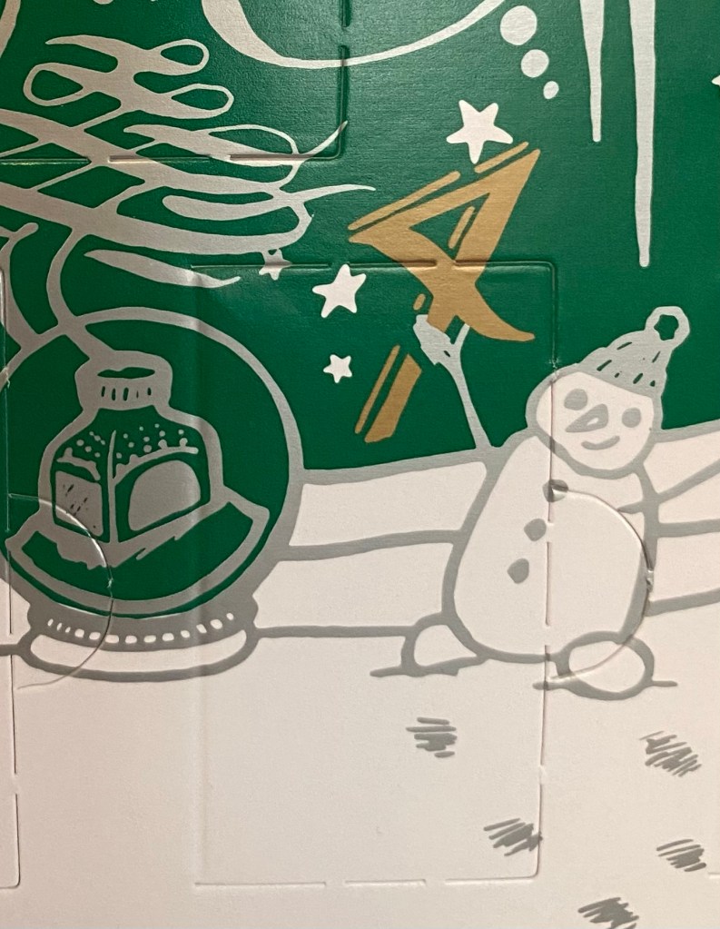
It’s Day 4 of the Diamine Inkvent calendar. What’s behind today’s door?
Day 4’s door
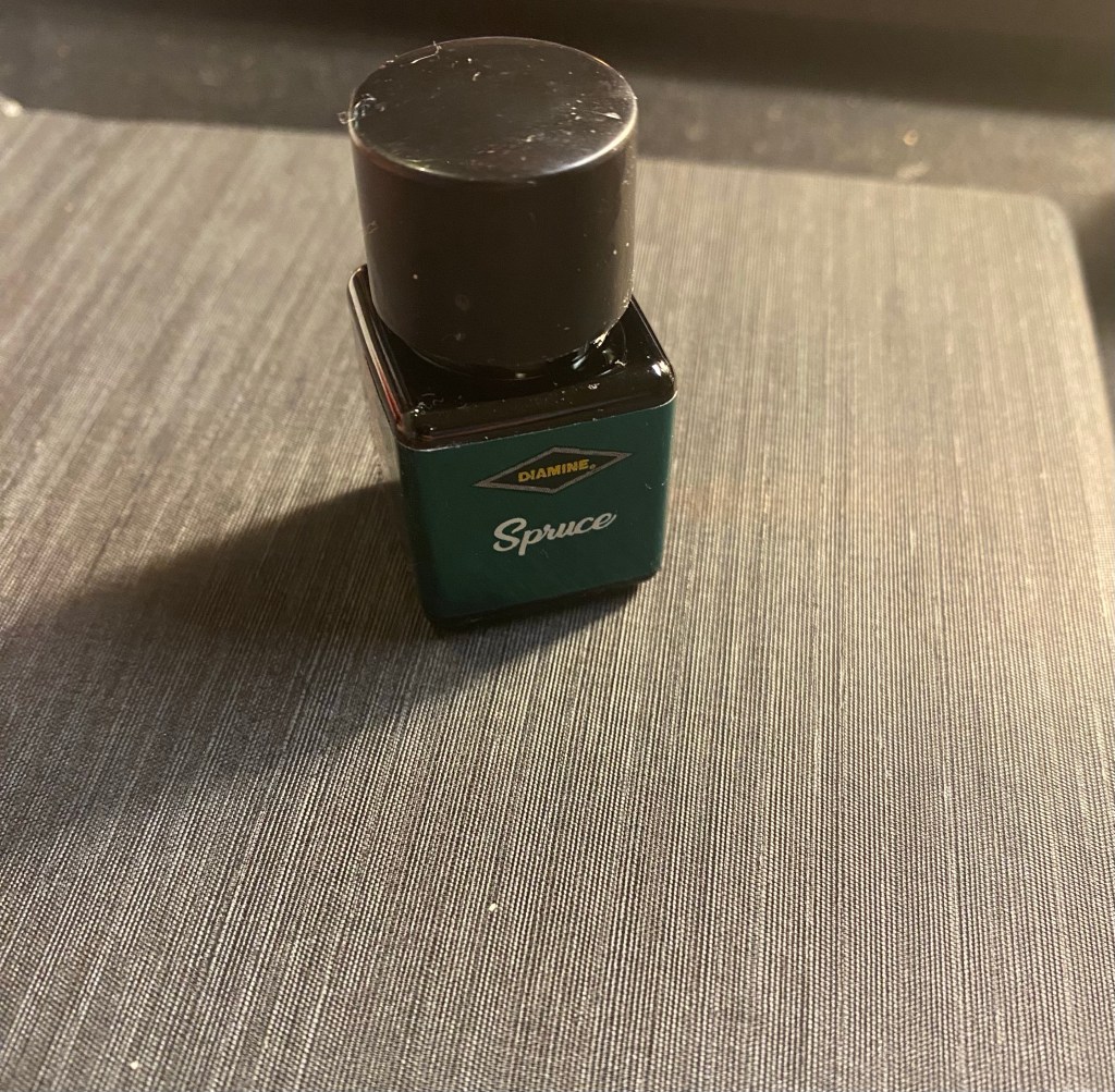
It’s Diamine Spruce – a saturated dark green that’s (unfortunately) scented.
Diamine Spruce bottle.
The ink is a dark viridian green with a red sheen and relatively little shading, as it is so saturated. It also showed a troubling tendency to stain pens, perhaps because it is so saturated or perhaps because of the pigments involved. It’s not a super sheening ink, which means that drying times are long but acceptable, but it will feather on even normally fountain pen friendly paper.
Diamine Spruce swab on a Col-o-Ring
Diamine Spruce is a very Christmas appropriate ink, and I’d have no issue with it if it wasn’t scented. Diamine doesn’t normally make scented inks and I don’t like scented inks, which means that this is not only the first scented Diamine ink that I own, it’s the first scented ink that I own. Did Diamine even make scented inks before this Inkvent calendar? I don’t like scented inks enough to even check.
Diamine Spruce on Tomoe river 52g paper
I filled a Lamy Safari with a medium nib with Diamine Spruce, and the air freshener smell it gives off is so unpleasant that I’ll probably dump the ink in the converter right after writing this review. It’s not an overpowering scent, but it is present, and I don’t like it. It reminds me of hospital toilets and car air-fresheners, and not in a good way. Definitely not an ink that I would ever buy or use.
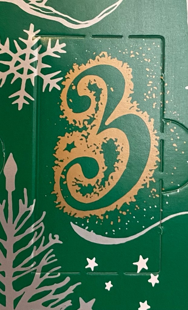
What does day 3 of the 2022 Inkvent calendar bring?
Door 3
Something new and exciting: a chameleon ink:
Diamine Solar Storm
Day 3’s ink is Diamine Solar Storm, a dark purple chameleon ink. What is a chameleon ink, you may ask? I did too. When I saw the label on the bottle I thought that there must be some new ink trend that started when I was abroad and I missed it. Was that the new name for the hue shifting inks that Sailor popularised?
Solar Storm swab on a Col-o-Ring
No it was not. A quick internet search revealed that chameleon inks were a new kind of shimmer ink from Diamine, first offered in the Inkvent 2022 calendar. What is special about them is that the mica in them is very fine, and so the shimmer shifts colour as you tilt the page and view your writing from different angles.
Diamine Solar Storm on tomoe river 52g (original paper)
Very cool and impossible to photograph (you’ll perhaps get a feel for the effect in a video review). There are angles where you can barely see the shimmer, and others where it is dazzling, angles where it’s golden green and others where it’s silvery. The ink itself is a wonderfully dark, dusky and rich bluish-purple with a good amount of shading. Even without the chameleon effect it would have been lovely.
Diamine Solar Storm compared with Diamine Stargazer from 2021’s Inkvent
Comparing Solar Storm with last year’s Stargazer, there’s something more subtle about the chameleon effect that makes it more appealing to me than the shimmering and sheening Stargazer. It may be the newness bias, and it may be that I’ve grown tired of blue inks with lots of red sheen, but if chameleon inks are the next big thing, I’m not against them. Solar Storm is a fantastic ink, with a very peculiar name choice for a Christmas themed calendar. However, if it will clean out well out of my Pilot Metropolitan cursive medium fountain pen, then it is definitely going on the shopping list for a full bottle.
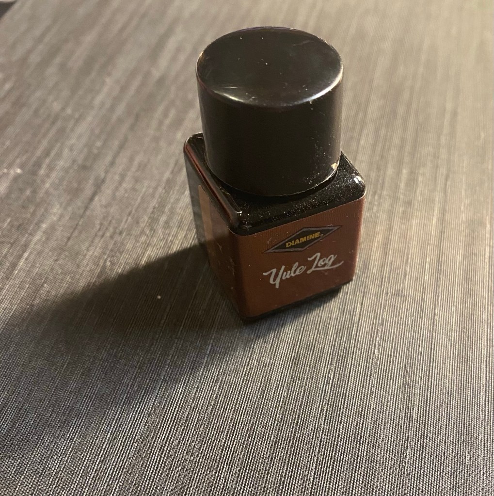
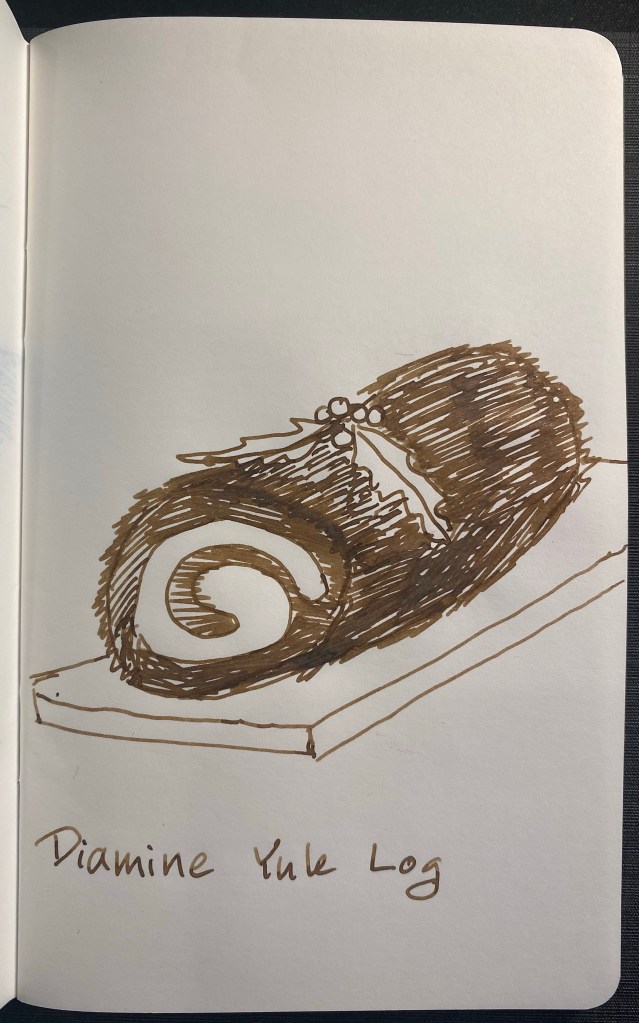
Day 2’s ink is Diamine Yule Log, a brown shimmer ink. There’s a lot of coppery shimmer in this ink, and a good amount of shading. I filled a Lamy Studio fine nibbed fountain pen with this ink, and all the writing samples here are done with that:
Diamine Yule Log on Col-o-Ring
Yule Log is a sketcher’s ink in terms of hue: if it didn’t have shimmer to it, I could see myself sketching landscapes with it. You can see how close it is in shade and shading to De Atramentis Urban Sienna, which is an excellent sketching ink. Yule Log tends a bit more to yellow and Urban Sienna tends a bit more to red, but they both look like classic inks for pen and ink sketching.
The coppery shimmer does add interest to Diamine Yule Log and it makes it more celebratory without being so much shimmer that you lose the character of the ink. It still shades beautifully, and has a warm richness to it even without the sparkles:
Yule Log sketch on Tomoe River paper 52g
I love that this ink is part of the Inkvent calendar, but I’m not so sure where it lives once Inkvent is over. Yule Log is dark enough to use in serious settings, but then it’s a shimmer ink, so maybe not something you want your colleagues to see you write meeting notes with. It isn’t festive enough to be your ink of choice for Christmas cards, and I’m not sure it has a place over any other ink for any other purpose. I’m sure that it’s going to be someone’s favourite ink somewhere, it’s just that I don’t think many people will be rushing off to buy a full bottle of it.
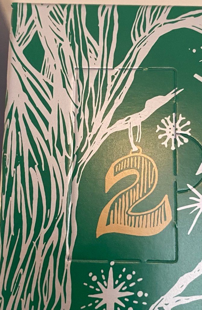
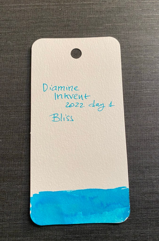
It’s day 1 of Inkvent 2022, and it’s time to see what’s behind the first door (the illustration on the calendar is exactly the same as in previous years, just on a green background, instead of a blue or red one):
Door 1
It’s Diamine Bliss!
Diamine Bliss bottle
I filled a Pilot Metropolitan fine nibbed pen with it, and created this Col-O-Ring swab:
A nice and bright turquoise with some shading.
It’s definitely a cheerful and calming colour, and it has distinct summery vibes to it. To test it out I created a quick sketch of the beach and the Mediterranean on a Tomoe River 52g notebook (the original Tomoe River paper).
A blissful view.
I then wrote this quick review of The Expanse series using it. As you can see, despite this ink being labelled as “standard” it shades very well, even in a fine nibbed pen. It also remains readable throughout, which isn’t a given in turquoise inks. This was written on Tomoe River paper 68g (original tomoe river paper).
I highly recommend reading The Expanse. Yes, all nine novels. It’s worth it.
I like turquoise inks, and so I have a few swabs of them at hand (and one or two laying around that I haven’t swabbed yet). Diamine Bliss is very close to Sailor Bungubox June Bride Something Blue, and not far from Diamine Subzero (minus the shimmer). Not a particularly rare shade of ink, but a nice one nonetheless.
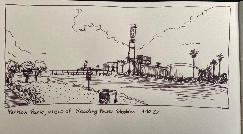
It’s Inktober again, and after a few days of hemming and hawing I decided to join it this year. Once again I’m not following the very Halloween themed prompts, but instead just sketching with fountain pens (for the most part) and ink. I’m sketching directly on paper (no pencil underdrawing), and I’m using an A4 Midori Cotton notebook for these sketches.
Yarkon Park, view of Reading power station.
This is a 10 minute sketch, done with a Karas Kustoms Vertex Velys Ignem fountain pen with a fine nib, filled with Kyo No Oto Sakuranezumi ink.
Vertex Velys Ignem.
This is my first Karas Kustoms fountain pen, and I really enjoy using it (I’ll be posting a full review once I’ve had more time with it). I used the nib on both sides (flipping it over for extra fine dots and lines), and it is smooth and well performing.
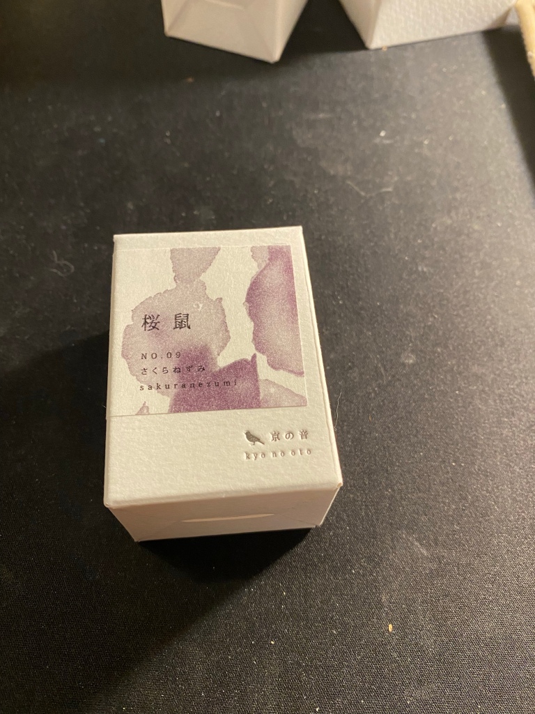
Kyo No Oto Sakuranezumi box.
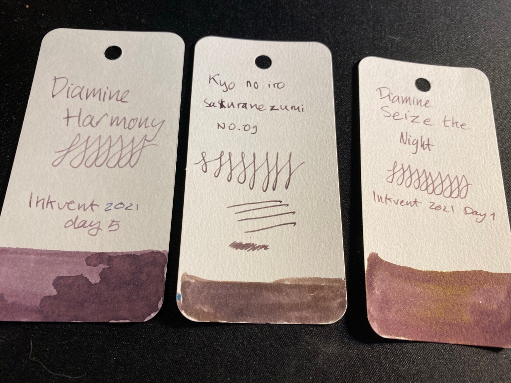
For some reason I got the ink brand name mixed up in my head and I’ve been calling it kyo no iro. Embarrassing. In any case, I bought this ink on an ink shopping spree in Choosing Keeping in London during my latest trip there. It’s a dusky purple/mauve colour that reminded me of Diamine Harmony (and costs significantly more).
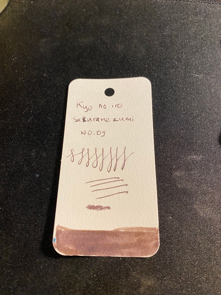
Ink sample on Col-o-ring tab.
Sakuranezumi is a purple with yellowish undertones that is darker than Diamine Harmony or Diamine Seize the Night, and shades significantly less than the other two. In a fine pen it is dark enough to be acceptable in office use, and I enjoy its dusky mystique. If you do wet the ink, the yellow undertones really become prominent, so take that into account if you plan to use it for ink washes, etc.
If you are looking for a mauve ink and you want something subdued and dark, Sakuranezumi would work for you. I personally find Diamine’s offerings to be more interesting, plus they are easier to obtain and significantly cheaper. Harmony shades more, and if you are looking for yellow undertones, then Seize the Night has the sheen for you.
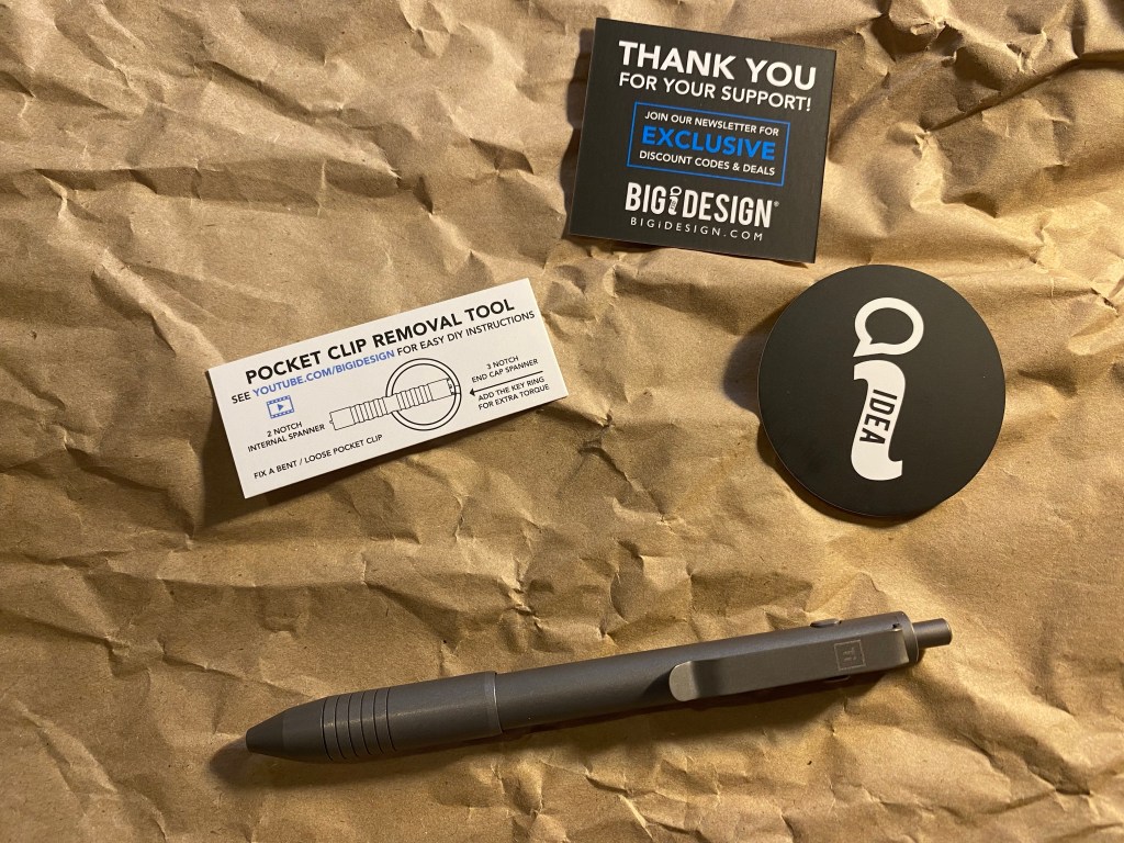
BigIDesign is one of my favourite machined pen manufacturers, and I have practically every machined pen they make (apart from the PHX, which I don’t like visually). I’ve backed many of their kickstarters, including their newest one which ends in a few days, and I know that they deliver on what they promise, on time. That’s no mean feat, and it’s that consistency, not just the quality and design of their pens, that keep me coming back to them.
I have a lot of BigIDesign’s pens, and there are a few more on the way.
While I reviewed many of their pens in the past, I thought that I’d do a quick overview post, for those just getting into machined pens or into BigIDesign’s pens and wondering where to start.
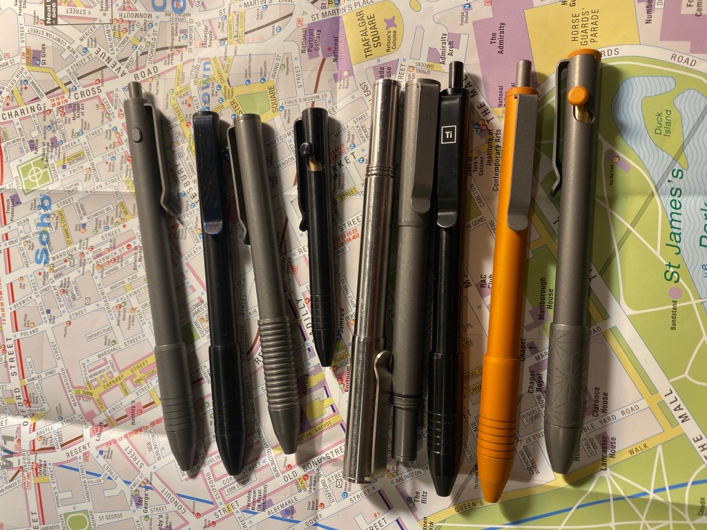
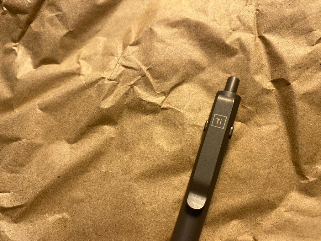
Almost the entire standard pen lineup. I don’t own the PHX, and the Ti Mini pen is in one of my travel backpacks and I don’t remember which one.
BigIDesign create machined metal pens, and the first thing to know is that they have two sites. If you’re based in the USA go here, and if you’re from anywhere else in the world go here. They are one of a very few companies that offer free international shipping on their pens, and that’s no small thing. Their service in general is top notch, and the pens come in functional, well thought out packaging that is gift appropriate without being incongruously fancy. These pens are workhorses, not status markers.
BigIDesign pens all accept more than one kind of refill, and most of them accept a very long list of refills. When in doubt, consult the pen’s product page for a link to a spreadsheet with the full refill compatibility list.
The pens are made of stainless steel, titanium alloy, brass, copper or zirconium. Certain special edition pens (like the orange one/orange highlighted one) are Cerakote finished. These are handsome pens, but if you’re looking for durability, these aren’t for you. The finish chips off and mars when bashed around. The bolt pens come with optional damascus clips and bolts.
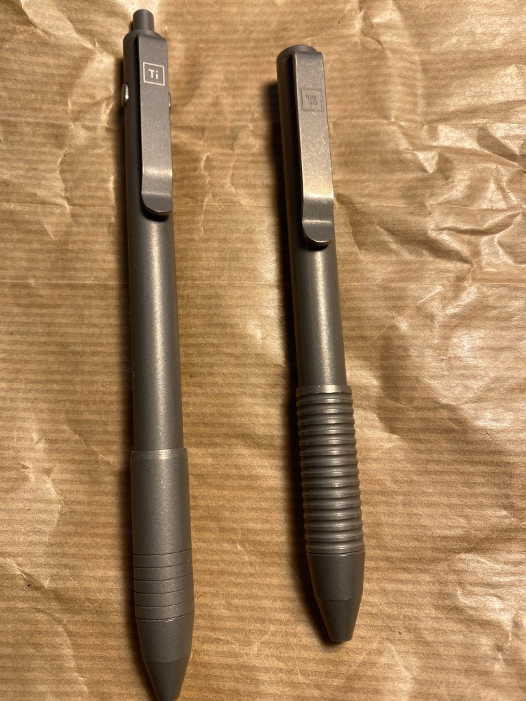
The titanium pens come in three finishes, which you can all see in the photo above: machined raw, stonewashed, and midnight black. Of the three finishes, the stonewashed weathers the best, and machined raw shows scratches the most. I happen to like that look on my Ti Arto, but of the three finishes, stonewashed is my favourite (also in terms of grip and feel), which is why I have the most of it.
I don’t like listicles, so I’m not going to rank these pens. I will just note what they’re best at, and who I think should get them:
Ti Arto – accepts the most refills by far. If you like experimenting with refills, and enjoy using capped pens, this is the pen for you. It was my first BigIDesign pen, and remains my favourite because of its versatility and the fact that while it’s built like a tank, it doesn’t look like one. This isn’t a pen for people who like fidgeting with their pen, or just want to jot down a quick word or two, because it is capped.
Ti Arto EDC – the same as the Ti Arto but smaller, and accepts less refills, this is a great option for a pocket or purse pen. The cap means that even misbehaved refills won’t leak onto your belongings or clothes. It is large enough to be used unposted, unless you have really large hands.
Ti Pocket Pro – the number one choice for those looking for a pocketable, EDC, workhorse pen. Uses a twist mechanism, built like a tank, and with very good support for a variety of refills, this is the pen that I take on trips and to the hospital with me. The Pocket Pro and the Ti Artos are very easy to clean/disinfect.
Ti Click EDC- if you want a click pen, go for the side click. This pen looks good, but has a mushy click mechanism that will probably only appeal to those who like quiet click pens. The Ti Dual Side Click is better than this pen in every way.
Dual Side Click – the latest arrival to the BigIDesign family (minus the slim bolt, that isn’t shipping yet), this is one of the best pens that BigIDesign offers. The click mechanism is satisfying and fun to fidget with, the design is sleek and functional, and it supports a wide variety of refills.
Bolt Action – good looking, with a very solid bolt mechanism that’s also a fun fidget toy. If you like bolt action pens, this is a good one to have, and it supports a good amount of refills, but take into account that the Ti Dual Side Click and most of the rest of BigIDesign’s pens support more.
Ti Mini/Mini Bolt Action/Mini Click – skip these unless you really, really want a tiny, compact pen. The issue is less with the pens, and more with the refill options at these sizes.
Big I Design is one of those pen manufacturing companies that use Kickstarter as a sort of pre-order system. I’ve backed several of their kickstarters and they always deliver on time, exactly what they promised to deliver. Their campaigns are for products that they already designed and know exactly how to manufacture, and I know that backing their work is a low risk endeavour. They know how to make pens, they know how to make pens that I enjoy using, their pens are solid and super versatile workhorses, and there aren’t too many options to get sidetracked by. It’s usually one new pen body in three different finishes, with maybe an add-on option or two.
So when they came out with a new pen on Kickstarter, the Dual Side Click, of course I backed it.
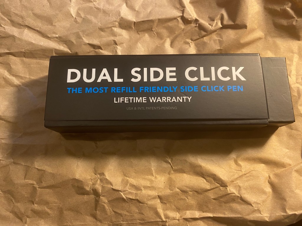
The Dual Side Click box.
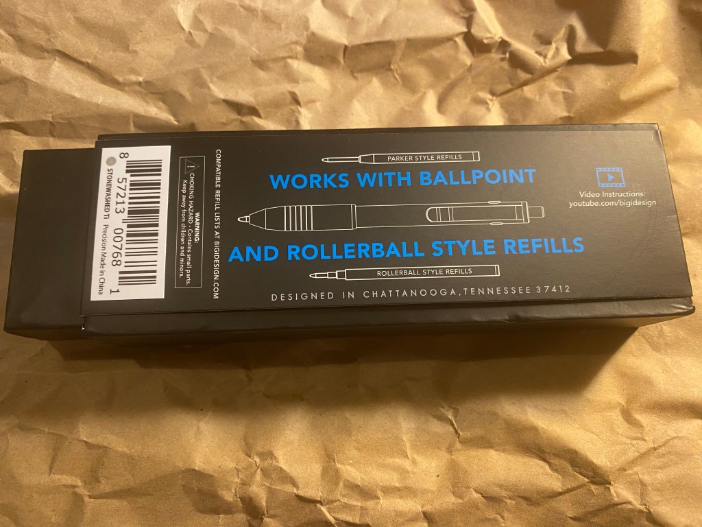
Like all of Big I Design’s pens, the Dual Side Click is designed to accept a large variety of refills – ballpoint, gel ink and rollerball. If there’s a particular pen refill that you like or you’d like to try, it’s likely one that is compatible with the Dual Side Click. Here’s the full list of refills for your delectation. I will note that likely because of the click mechanism, the Dual Side Click (and the EDCClick) don’t support as many refills as their Ti Arto and Ti Arto EDC counterparts (which support every refill on the market, I think, including the Uni-ball Signo DX UMR-1 refills). They do, however, support more refills than the Ti Pocket Pro, and an impressive amount of refills.
The back of the Dual Side Click box. Says what it does on the tin.
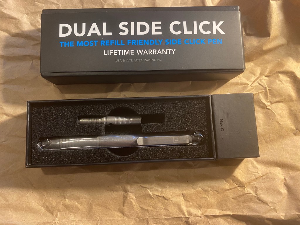
I got the stonewashed titanium Dual Side Click, which is by far my favourite Big I Design pen finish. I like the new packaging that they use, as its functional, well made and impressive enough to work as gift packaging, while not being so fancy that you’ll feel bad tossing it into the recycling.
Functional, well designed box. The little compartment on the right holds spare parts and the ring used with the clip tool, and it magnetically closes.
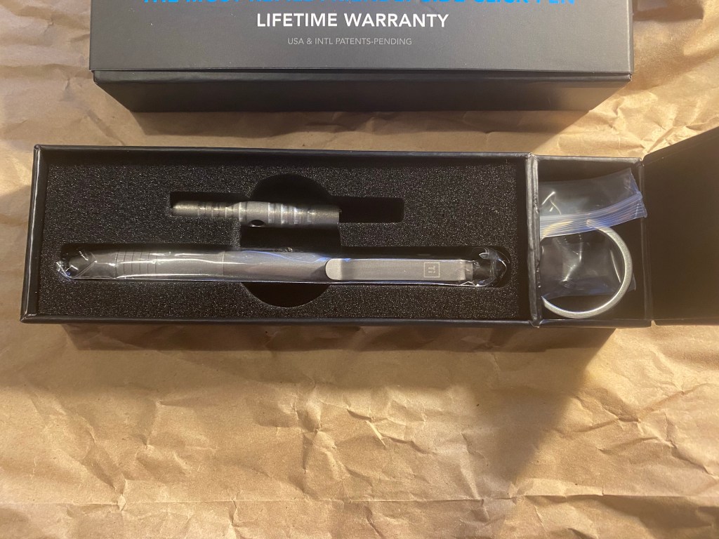
The box comes with a tool that will allow you to remove or adjust the clip (which is the little ridged rod and the ring you see below), and spare parts – o-rings and springs. That’s a wonderful touch, as is the magnetic closure on the ring and spare parts compartment.
Everything you need, right in the box.
You also get a Big I Design sticker, some info cards and of course, the pen. The stonewashed titanium finish is silky to the touch, and gives the pen an understated look. The grip section is wide, with a few engraved rings to added grip. It’s the same grip section as on the Ti Click pen, and is great for longer writing sections. The Ti logo is, as usual, elegant and understated. It’s not a “I’m an expensive pen!” kind of design, nor is is a “I’m a tactical pen!” kind of design. It’s a functional, pragmatic, solid, and enjoyable to use kind of design.
Info, sticker and pen.
The stonewashed finish will age well with time and use – like an old pair of jeans. You can see the new Dual Side Click next to the Ti Pocket Pro, which I have used since late 2017. The original finish on both pens was the same, but the various nicks and scratches on the Pocket Pro have added to its looks, and it has a little more lustre now.
Dual Click on the left, Pocket Pro on the right.
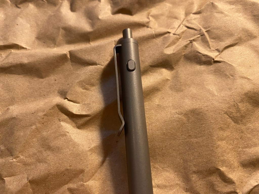
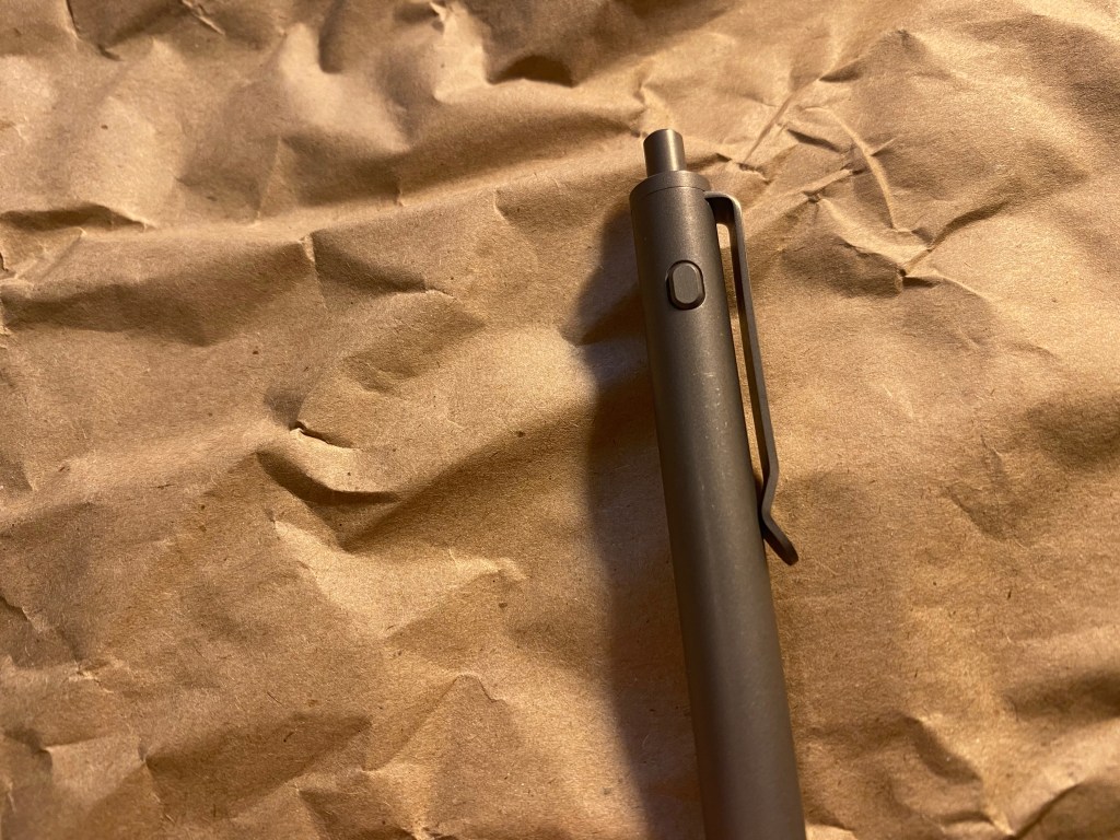
The star of the Dual Side Click is, of course, the dual side click mechanism. The pen is engaged by clicking on the click mechanism on top, just like any other click pen, and then the refill is retracted by clicking on one of the side clicks. The side clicks look like flat lozenges that protrude a bit on each side.
Side click mechanism.
When the click mechanism is engaged the side click buttons protrude a bit more, but they’re still unobtrusive and aren’t likely to snag on anything.
Other click mechanism.
You can press on either the left or the right side mechanism to retract the pen refill, and both the click mechanism and the side mechanism engage and disengage with satisfying clicks. Unlike the Ti Click pen, this Dual Side Click’s mechanisms aren’t mushy.
A closer look on the click mechanisms.
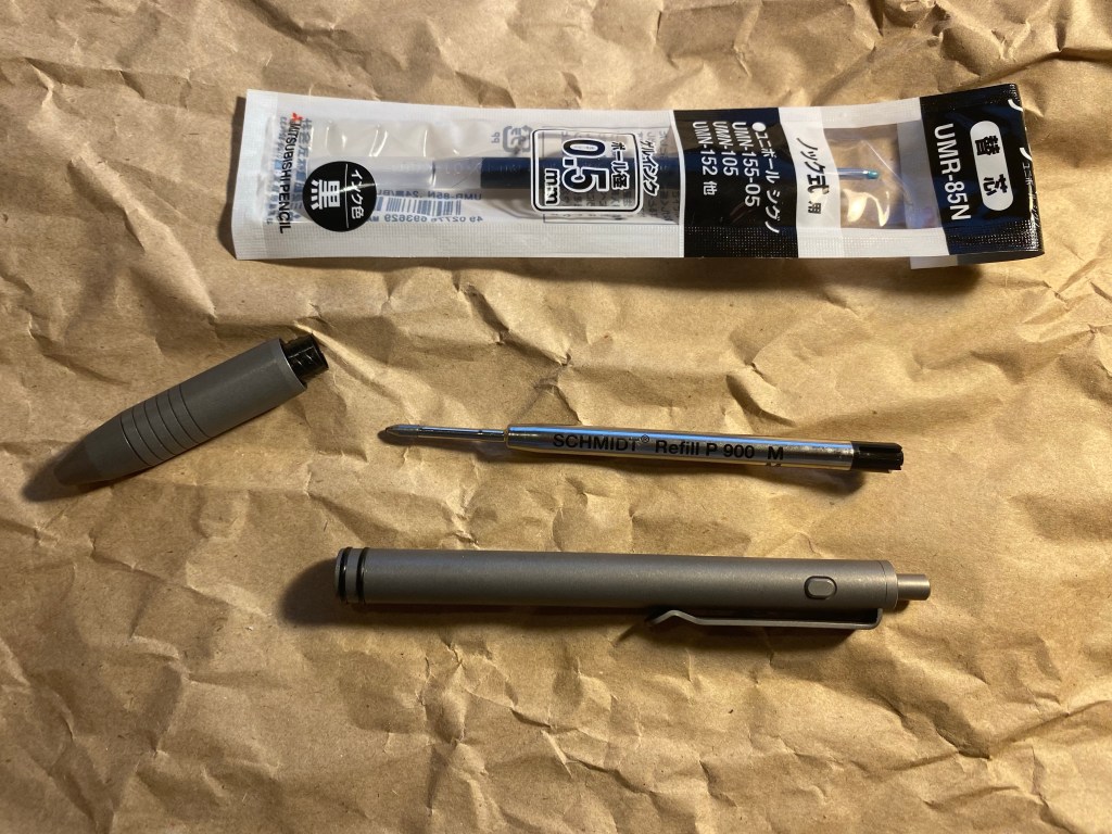
The Dual Side Click ships with a Schmidt P 900 medium refill, which is one of my least favourite pen refills. That doesn’t matter much as I immediately swapped it for my favourite refill, the Uni-ball Signo UMR-85N.
Refill swap.
As the whole point of the Dual Side Click is the pen body and not the refill (which most users will swap out), I created a video of the click mechanism in action:
This is a very satisfying pen to use. And fidget with during dull meetings.
If your favourite refill is among those that is supported by the Dual Side Click, then I highly recommend it. It’s one of the best pens that Big I Design have ever created, and that’s saying something. The titanium body is solid, weighty without being overly heavy, and comfortable to hold and use. The click mechanism is excellent, and it’s fairly priced, especially when you factor in the refill choice flexibility and the free worldwide shipping (and the lifetime warranty, which I’ve never had to use for any Big I Design pen).
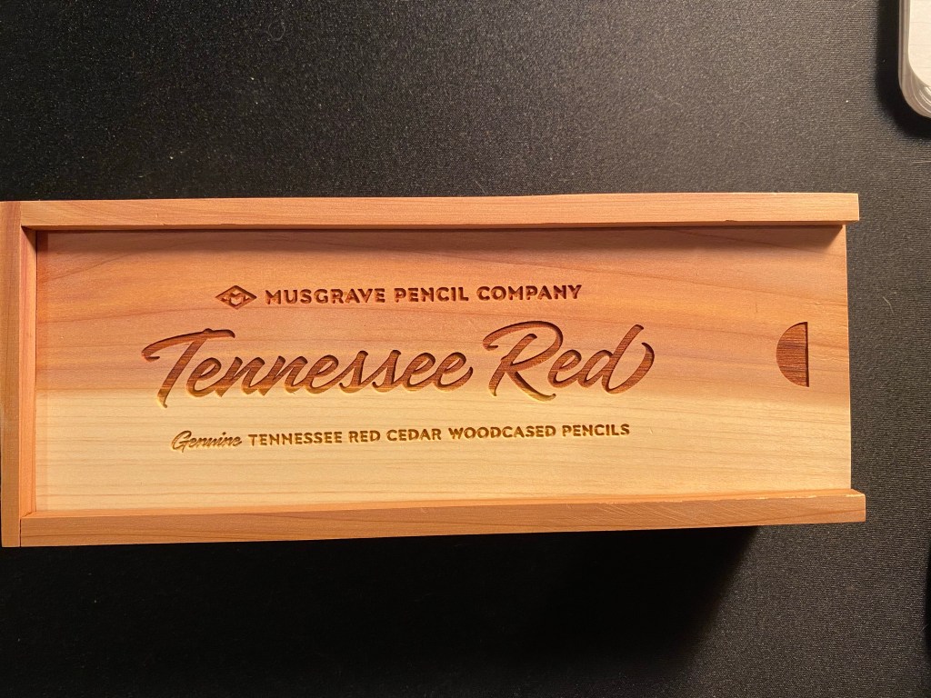
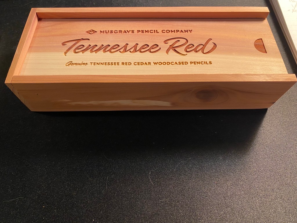
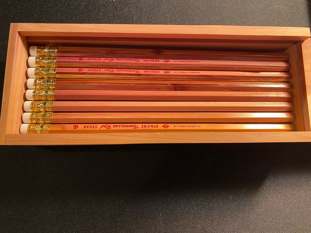
This is the Musgrave Tennessee Red pencil presentation box:
Gorgeous, isn’t it? Just look at that reddish and golden timber. It glows:
The pencils inside are equally beautiful. They’re made of Eastern Red Cedar, in the USA, and this is the 24 pencil presentation box. I have two of these, as well as a paper box that has 12 pencils. I’ve had them for a few months, but I haven’t had the nerve to sharpen them until earlier this week. They were just too good looking to sharpen.
24 Tennessee Red pencils in a cedar presentation box.
Now this isn’t to say that these pencils are perfect. Musgrave points out on their site that these pencils can have modest visible wear due to the soft nature of the wood, and the core may be slightly off centre. A rummage through the pencils that I have proves that these warnings are justified. But it still is a gorgeous pencil:
Just look at it.
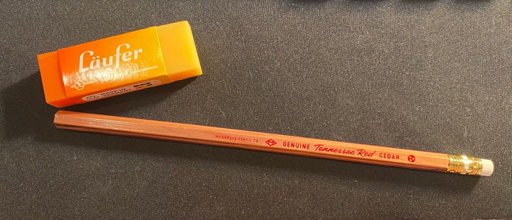
The pencil is lacquered which does protect the wood somewhat, and a lot of thought and care went into designing the imprint on the barrel (text, colour, font, symbols) – and a lot of restraint too. The imprint, ferrule, and eraser don’t call attention to themselves. This is a pencil that’s all about its beautiful, sweet smelling wood.
See how the imprint and everything else fade out of sight? An beautiful and understated pencil.
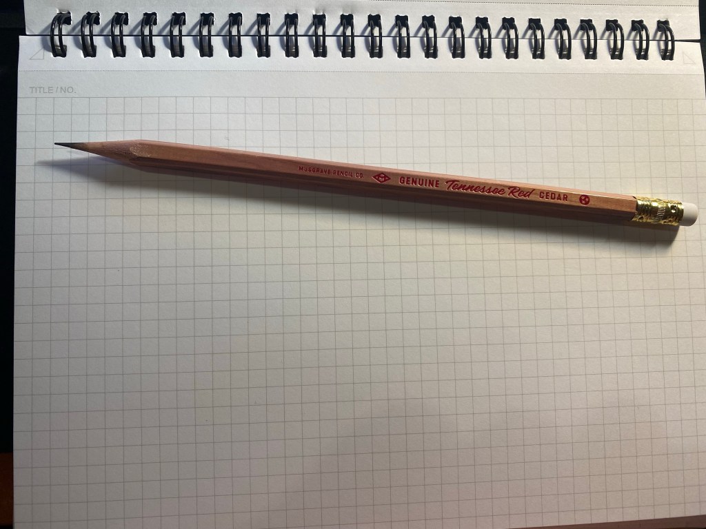
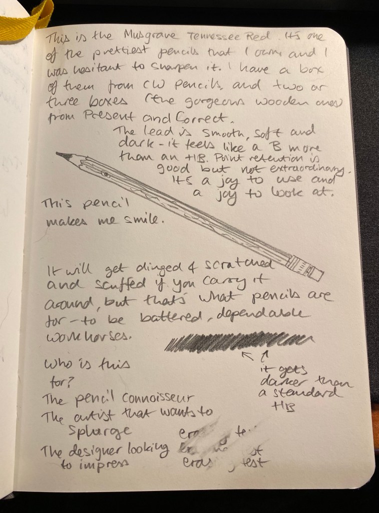
The Tennessee Red is a joy to sharpen. The cedar smell is intoxicating, and if the pencil wasn’t such a good one I may have just sharpened it all away. But it comes with a smooth, dark lead that feels and behaves like a B grade despite being a #2 (or HB) pencil. It’ll be a delight to sketch with this beauty. You can see it in action below, on a Baron Fig Confidant.
These aren’t cheap or widely available, and if you are outside the US they are even less cheap and more hard to come by. They are, however, worth the price and worth making an effort to find, and not because they are the best pencils in the world, but because it is clear that someone made an effort to make a modern American pencil that doesn’t shame its Eagle and Eberhard Faber vintage counterparts. It’s a beautiful, sweet smelling, wonderful woodcased pencil that is a joy to use and would make any stationery lover smile. And who can’t use a reason to smile these days?
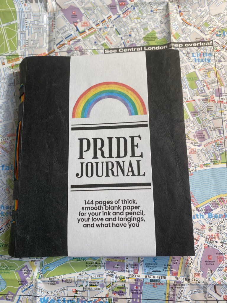
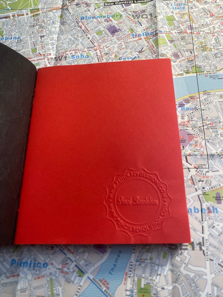
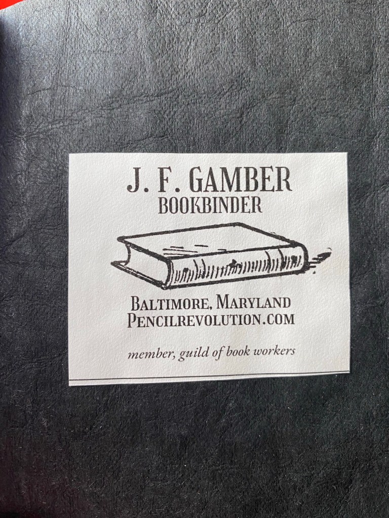
In my sizeable collection of notebooks and sketchbooks I have maybe one or two handmade ones. I tend to not buy handmade notebooks because the paper quality is oftentimes sacrificed in favour of cool covers or bindings. However, when I saw the Peekaboo Pride notebook on Pencil Revolution’s Etsy store, I couldn’t help but give it a try. The binding looked amazing, and I trust Johnny Gamber when he says that the paper inside is good.
I love this cover band. It made me smile.
The notebook is small, 10cm x 12.5cm, and beautifully made. Every little detail is well designed, starting from the band that the notebook came wrapped in. You see the care and character in every part of this little notebook, which is precisely why you’d want to buy a handmade notebook in the first place.
Back of the band.
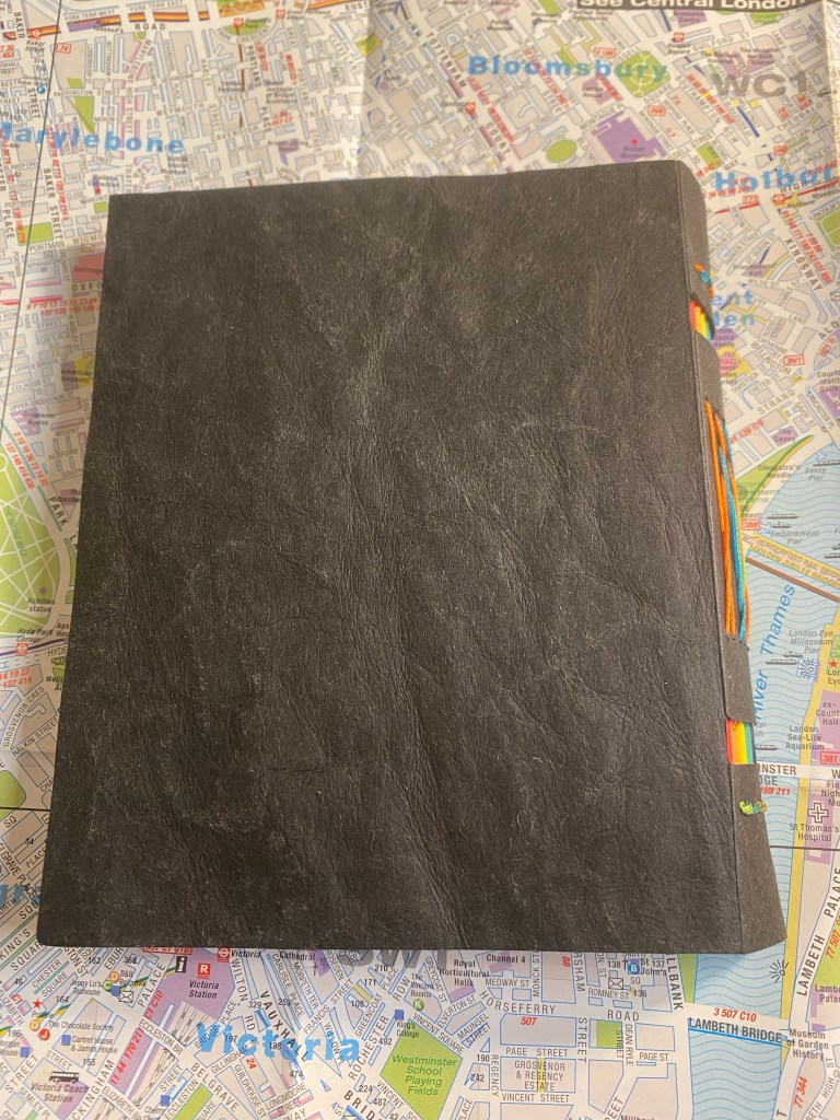
The cover is made of “Kraft-Tex” which is a textured, durable, flexible, card-stock like paper. It’s ripe for customisation if you enjoy customising your notebooks.
The cover.
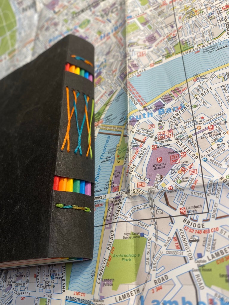
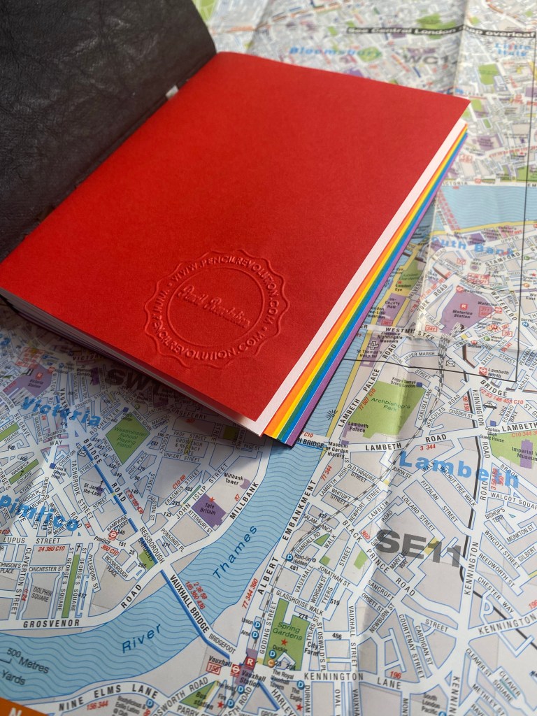
The spine is where the notebook really shines, and it’s what gives the notebook it’s “peekaboo” name. The notebook is made of six signatures the colour of the pride flag, and the cutouts in the spine allows you to see their colours. The threads used for binding are also pride coloured, and the result is stunning:
Peekaboo spine with pride signatures and threads showing.
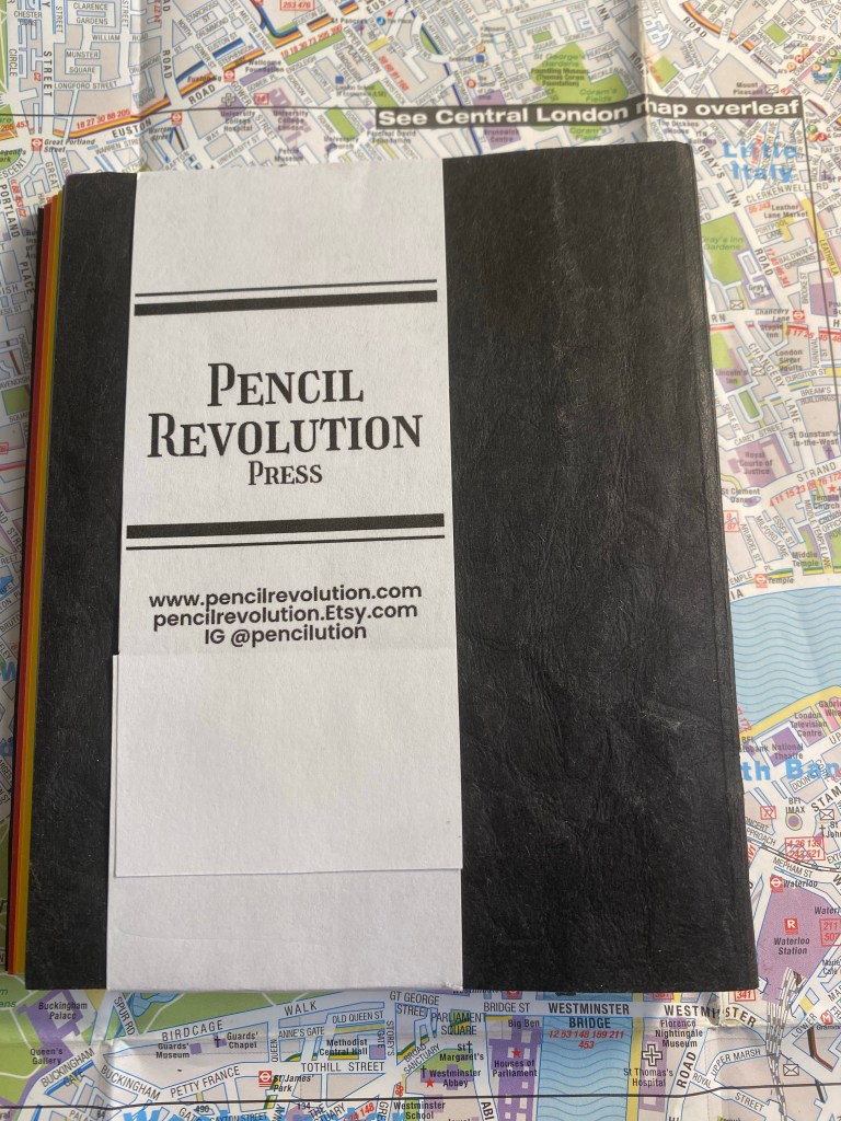
The cover of the first signature has a Pencil Evolution stamp embossed on it. That, together with a label inside the inside of the back cover is the only branding on the notebook. Very subtle and tasteful.
Pencil Revolution stamp.
I just love the back label. There’s such pride of craftsmanship here:
Back label.
Here’s a look at the colourful signatures from inside. Everything about this little notebook is perfect, and makes me smile:
Pride colours on show.
And inside each signature you get glimpses of the multicoloured thread used to bind this notebook.
You can see the thread change colour on the top.
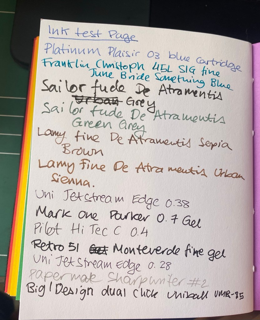
I was worried that the paper wouldn’t be fountain pen friendly, but I had nothing to worry about. The Neenah’s Astrobrights paper is very fountain pen friendly, despite not being coated paper. That means that inks dry quickly on the page, and it means that you can use this little notebook for pen and ink wash sketches.
Testing various inks and pens.
There’s no bleed through, even with the Sailor Fude nibs that lay down a lot of ink, and there’s very little show through.
Very well behaved paper.
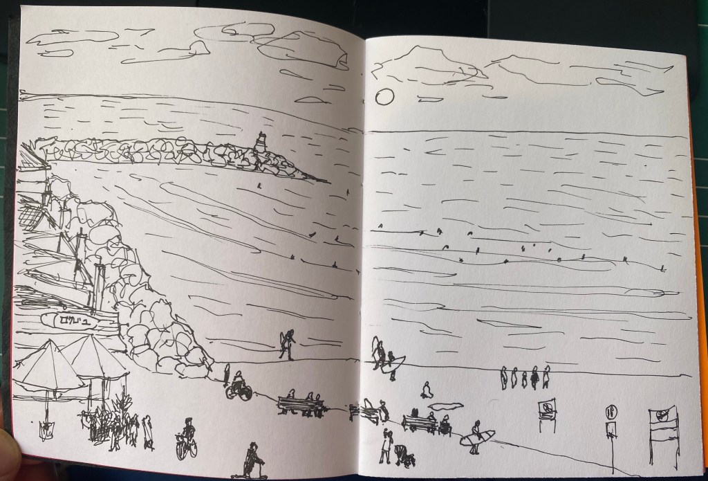
The paper was so well behaved that I decided to see how well it would take to an ink and wash sketch. Here’s the basic sketch, done with a Staedtler 0.1 pigment liner.
Initial sketch.
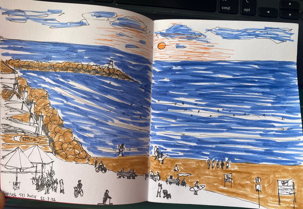
Then I laid down ink washes, and the paper behaved beautifully. It didn’t deteriorate, the colours popped on it, and it was fun to use.
Sketch of the Tel Aviv beach on the paper.
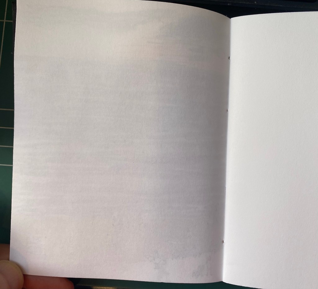
Here’s the other side of the paper. It’s amazing that there’s no bleed through and very little show through. This paper behaves better than my Stillman and Birn Alpha with ink washes.
Back side of the sketch.
The Peekaboo Pride notebook is phenomenally well made, with excellent paper, and it’s just a joy to use. I’m close to finishing my pocket Stillman and Birn Alpha, and this little notebook will be the next sketchbook in line to replace it. I won’t be using it for watercolour (no paper this thin has a chance of handling watercolour washes), but it’s great for pen and ink sketches, and for ink washes.
I somehow managed to not review my favourite pigment/fine liner, despite it being one of the sketching tools that I use the most. While I know that the pigment liner from Sakura is more popular is stationery blogger circles, and Copic is thought to be the elite offering (it sure is in terms of price), Staedler’s pigment liners have been my go to pigment liners since I was a teenager, and they have always been the ones I compare all others to.
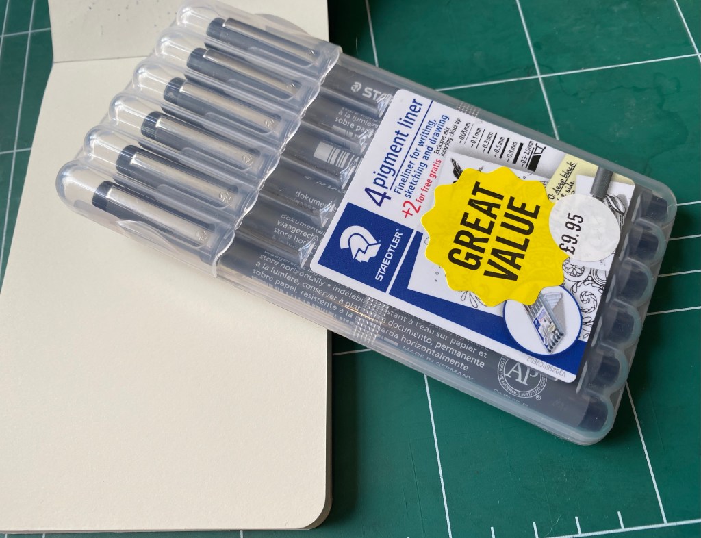
Pigment liner set bought at Cass Art in London
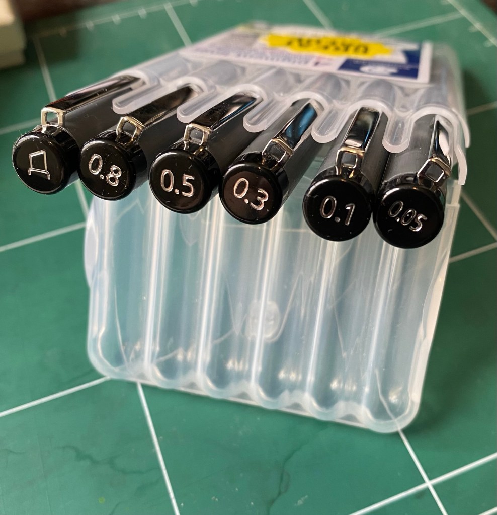
All pigment liners are expensive to purchase here, and Staedler is no different, which means that I always stock up on them when I go to Cass Art in London. This 6 pen set is always on sale, and you get a useful selection of pen widths. However, if you are just starting out, don’t buy a set – buy a 0.3 and a 0.5 and if you want to splurge add the 0.1 and the 0.8.
The full set: Calligraphy, 0.8, 0.5, 0.3, 0.1, 0.05
Whether you use Staedler pigment liners or ones from another brand (Sakura, Faber Castell, Copic, Uni-ball, etc), the 0.3 or 0.5 will likely be your base, bread and butter pen. I generally use the 0.3, unless I’m feeling shaky, I’m in a hurry and want to churn out sketches/illustrations, or I want to go for a dramatic effect, in which case I go for the 0.5 or the 0.8. The 0.1 is a pen that I use for the opposite effect – when I plan to use watercolour or an ink wash and I want the colour or wash to take precedent. The 0.05 is a pen that I used to use when I was younger and drew comics (it’s excellent for fine details), but I hardly ever reach for it now, unless it’s to work in small format with a colour wash of some sort following. It’s a fragile pen, so if you tend to lean on your pens, this one is not for you. How can you tell if you put a lot of pressure on your pens? Write a page with a gel ink pen and check the back of the page. Does it feel like braille lettering? Does your wrist hurt? Then you’re putting to much pressure to use this pen without ruining the tip, and you may have issues with the 0.1 tip as well. I used to write like that and it took some practice for me to be able to use these ultra fine tipped pens.
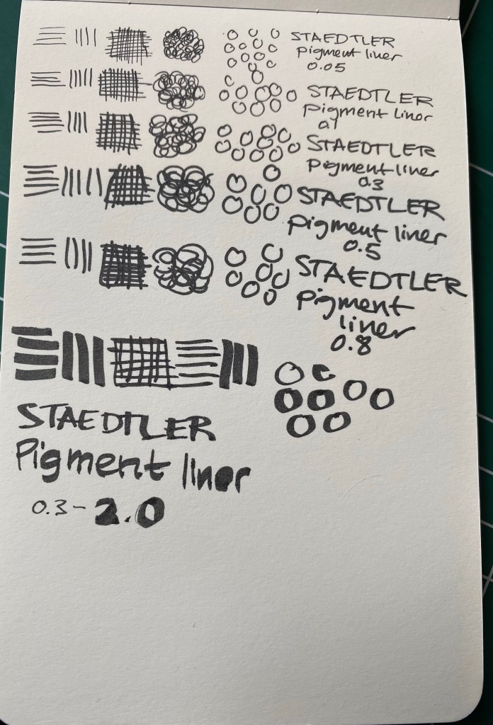
Line samples on a Moleskine pocket sketchpad.
So, why do I love the Staedtler pigment liner so much?
It puts down a consistent, black line. This seems obvious, but I’ve tried more than one pigment liner that puts down a dark grey or washed out black line and it’s always disappointing.
It’s a rock solid pen that won’t dry out, and has a robust tip. I’ve had terrible luck with Faber Castel and other makers where a capped (mind you, capped) pigment liner stopped writing reliably after a month or two. This has never happened with my Staedler’s, and I’ve had some for years.
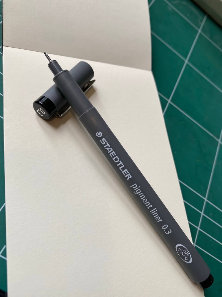
The pen body. This is what makes the Staedler’s the best of the best in my personal opinion.
The Staedtler pigment liner’s pen body.
So, what makes the Staedler pen body so great? It’s a whole lot of small things that just add up. It’s light weight but doesn’t feel flimsy, and it has a matte finish with a subtle lined texture all around, so its easy to grip. It’s also a bit wider than many of its competitors, and unlike many of them, it has the pen width clearly marked on both the pen body and the pen cap. It also doesn’t have any sharp edges, which you’d think would be an obvious in pen design, but sadly isn’t. Finally, it caps and posts and uncaps with a solid click, and without having to apply a lot of pressure. You know the pen is capped and the pen is uncapped when you need it. And if you so care to uncap it with one hand, you can.
Here’s the 0.1 Staedtler in action. There’s a photo of the sketch I made after applying an ink wash (Sennelier Burn Sienna India Ink diluted in water and applied with a brush pen), and one of the same sketch after I applied blue watercolour.
Staedtler 0.1 pigment liner, and ink wash.Staedtler pigment liner 0.1, ink wash and watercolour.
During a private tour of Nazareth last year (a present from my wonderful family in between chemo treatments), I met the guide’s young boy. His father told me that he wanted to be a clothing designer when he grew up, so I broke out my sketching kit and gave him every Staedler pigment liner that I had on me. His eyes lit up once his father explained what these pens were. If you have a budding artist, designer, sketcher, doodler in your life and you’re wondering which gift to give them, two or three Staedler pigment liners will always be welcome.