Moleskine Denim Antwerp Blue Review

Following the success of the excellent Moleskine Denim limited editions, Moleskine has added two Denim notebooks to their regular lineup. Yay! The first of these is the Moleskine Denim Antwerp Blue, which is a sort of classic mid wash, blue jeans coloured cover.

The notebook cover is wrapped in denim, and it looks and feels exactly like a well worn pair of jeans. The band is black, unlike the white in the limited editions, and there’s no white print on the cover. I think that the Denim limited editions are more striking and better looking because of these white highlights, but that Molskine made a deliberate choice here to keep these notebooks more muted and office friendly.

The front endpage, with the “In case of loss” covered up because I’ve been using this notebook and so my details are there.

The back endcover with the famous pocket. 

The back cover is where Molskine allowed itself to have a little fun. Their logo is printed on a grey fabric band that looks and feels like the kind of labels that you have inside jeans (the ones with the washing instructions on them).

The band is orange, and that adds a welcome pop of colour to the notebook. This notebook uses 70 gsm paper like most of Moleskine’s lineup and there is some show through with gel ink pens and ballpoints. If you are a very heavy handed writer, you can really put a dent into this paper, so take that into account.

Moleskine does not claim that this paper is fountain pen friendly, and it clearly aims it for standard pens (gel ink pens and ballpoints) plus pencils, but their recent standard lineup has featured more fountain pen friendly paper. The Moleskine Denim is no different from the new dot-grid notebooks in my experience in that there is no more of the strange spidering or the over absorbency of the paper that left certain inks looking weird, but there is show through and with wetter nibs also bleed through.

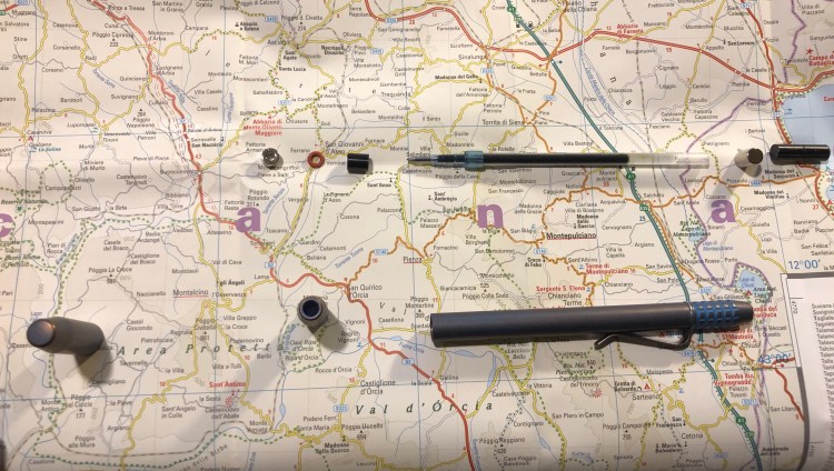
Here’s an example of some pens in use in order from top to bottom:

  • Tombow Object rollerball (uses an ink cartridge very similar to a fountain pen).
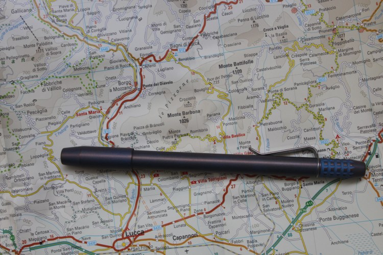
  • TWSBI ECO 1.1 stub with J Herbin Caroube de Chypre.
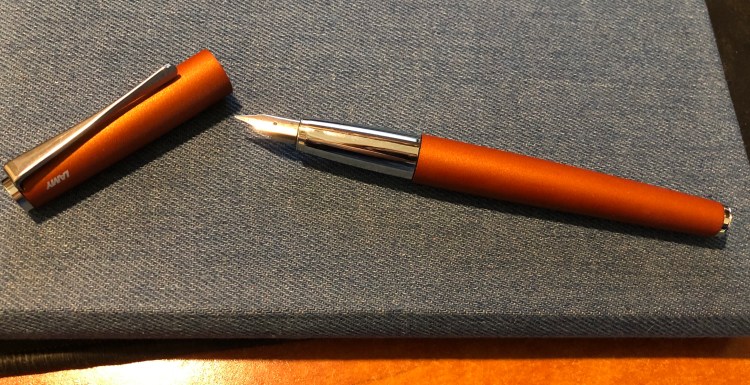
  • Lamy Studio Terracotta fine with Diamine Terracotta.
  • Baron Fig Squire rollerball (it uses a Schmidt P8127 rollerball refill that spreads and bleeds on most paper).
  • Uni-ball Signo RT 0.5 gel ink pen.

I didn’t test a ballpoint or a pencil because they all work well, and the gel ink is there as a benchmark.

There’s a B-side to the band that comes with the notebook, and this one is a ruler.

This is one of my absolute favourite notebooks in recent years. The cover texture is fantastic — much softer and thicker than the one that Baron Fig uses, and it gets worn like a pair of jeans the more you use it (i.e. it gets even softer, and the colour fades a bit in the edges). It’s subtle and serious looking enough to fly under the radar in office use, and it is just fun to use. The fact that I can use most of my fountain pens in it is just a little bonus.

Moleskine Wonder Woman Red Review

It’s Diana time again! I reviewed the blue Moleskine Wonder Woman limited edition here, and now it’s the red notebook’s turn.

This is the notebook with the band still on it. Take a look at that yellow and red Wonder Woman logo on the band — would it not be nice to have a bit of that yellow on the actual cover print? Say on the logo and the yellow parts of Wonder Woman’s outfit? I think that it would make the cover pop more.


The back cover, with the band still on. That quote is pretty great.


Diana in all her glory. I really wish that Moleskine would have been more playful with it, maybe done a screen print like design or an action shot, like they did with the excellent Batman Moleskine limited editions.


The back cover, sans paper band. Kudos to Moleskine for keeping their branding subtle.

The front and back endpages are exactly the same as the blue Wonder Woman limited edition, and a little meh in my opinion.

Wonder Woman doing what Wonder Woman does… but with no foe in sight. Why? Batman got a great punch scene in the Batman Moleskine limited editions.

This edition comes with stickers, exactly like the blue edition.

And the B-side of the band shows the various tools that Wonder Woman uses, exactly like the blue cover edition.

I’m not sure which of these editions I like more, the Lasso of Truth edition (the blue one) or this one, but I am sure that this edition is not all it could be. If you’re a Wonder Woman fan you’ll likely love it, but I don’t see this edition appealing to a wider audience. It’s closer to the weird Marvel Avengers editions than to the great Batman and Superman editions.

Moleskine Basquiat Limited Edition Notebook Review

It is rare that I start using a notebook the moment I unwrap it, but the Basquiat Moleskine limited edition had that effect on me even though I originally didn’t plan to buy it.

The colour of the cover is what drew me to this notebook. It’s a purplish blue that contrasts beautifully with the orange elastic closure. I didn’t even pause to take a picture of notebook when it was still wrapped. That periwinkle cover makes Basquiat’s handwriting and art just pop. You can see the character in each line and it really does inspire you to grab a pen and write and draw and doodle.

The back cover (a little smudged from my enthusiastic use, but nothing that a wet-wipe can’t remove) is understated, with just the Basquiat signature. I think that I’d prefer the Moleskine logo to just be debossed in, like they did in several other recent editions, but it’s not a dealbreaker for me that it’s boldly there.

The front endpage echoes the front cover, with the addition of a pretty fitting Basquiat quote. I had already filled in the “In case of loss” details, so I hid them.

Look at that back endpaper. Is it not well designed? I like that they let the piece “breath”.

Unlike most Moleskine limited editions that come in lined paper, this notebook comes with blank pages. I like the choice, as it frees you to do whatever you want with the notebook: drawings and words will feel equally welcome here. Also, there’s an orange ribbon bookmark. What’s not to love about that?

The stickers are a bit of a disappointment in my opinion in terms of colour choice. I would have liked it better if they kept to the orange and periwinkle colour theme. As it is, they clash a bit with the rest of the notebook.

The B-Side of the paper band gives a little background on Basquiat, who he was and how he worked. It’s a nice little add on.

There are times when a notebook just makes you want to start using it, start writing and scribbling in it, start creating. The Basquiat Moleskine did that for me, and it is a fantastic addition to the Moleskine limited edition lineup for the year, and definitely a notebook that I recommend that you try.


Field Notes Rooster 2019 Limited Edition Notebook Review

Field Notes is a major sponsor of the Morning News’ Tournament of Books, and every year they celebrate the tournament by creating a specially themed notebook for the occasion. The notebooks are sold as singles and 100% of the proceeds from them are donated to the 826 National, which provides free educational programs to under-resourced youth. This year, the Rooster Book looks like this:

The party is all in the back, with this year’s ToB Rooster logo:

I really feel like colouring it in crazy psychedelic colours.

The notebook is lined, and the craft front cover is pretty standard for a Field Notes:

Again the back is where it’s at, with a list of this year’s Tournament of Books contenders.

You can check off the books that you’ve read, and I admit it was pretty fun checking almost all of them off.

This is a cool little edition that helps out two wonderful causes. The only thing I would change about it is its publication date. If Field Notes would have issued it at the time the list of contenders was announced then you could really use this notebook to follow along with the tournament. But I bought a few notebooks as a memento of my plan to read all the books in the tournament this year, and excellent for that.


Moleskine Pokémon Pikachu Limited Edition Notebook Review

Pikachu! I choose you!

This is the final large format Moleskine Pokémon limited edition notebook that I haven’t reviewed, and I think that it’s the one that Pokémon fans will most gravitate towards. Why? Because it’s Pikachu, and because it is so well designed.

Like the Charmander edition cover, the Pikachu notebook front cover shows Pikachu dreaming of when he’ll be all grown up and kicking ass as Raichu. It’s a lovely, cute design.

I would have liked the elastic closure to be yellow, but it works in black too, and I guess that black is more pragmatic in that it doesn’t show dirt that much.

Pikachu is super skipping happy on the front endpapers, and the background of banana coloured Pikachus works really well. You can’t have enough Pikachus after all, as any Pokémon GO player will tell you.

The back endpaper has the same background, and Pikachu resting from jumping around and fighting I guess. They probably posed him like this so you can see his stripes and tails, but I would have preferred him an an action pose with lightning maybe. Then again, it’s cute, and Pikachu is all about the cute. For those wondering, the background print is aligned on the back pocket of the notebook, and the webbing on the side of the back pocket is black.

The pages are lined (I love Moleskine’s lined notebook line width, as it’s perfect for my handwriting size) and the ribbon bookmark is black, which works, but I would have liked a yellow one instead.

As in the Pokéball edition and the Charmander edition you get cardboard bookmarks instead of stickers as the little add-on in the notebook’s back pocket. These are really well designed and I’m going to hazard a guess that Moleskine would have preferred to make stickers for these editions, but they were limited by their contract with Nintendo. Nintendo sells a lot of Pokémon branded merchandise, and there’s probably a contract somewhere that gives some sticker company rights for the Pokémon brand.

I accidentally tore the paper sleeve, and so the b-side on this one is pretty much ruined, but like the Charmander edition it’s Pikachu in all his evolutions: Pichu, Pikachu and Raichu.

Should you get this for the Pokémon fan in your life? Yes you should. All three notebooks in this series (and the pocket notebooks which I will not review) are excellent. This would be a great way to get someone to consider journalling, or keeping notes on a trip or during an interesting or difficult time in their life. These are now pretty heavily discounted all over the place, so they’re also kind of a nice little treat to buy for yourself.

Pika! Pika!

Field Notes: Out and In (Campfire and Fire Spotter)

Out: Campfire Night. I loved using this notebook despite my initial apprehensions about the orange grid and the photo covers (my favourite Field Notes Colours edition is “Balsam Fir”). The covers wear really well, and the orange grid isn’t as distracting as I thought it would be. I’ll still use this one for a while, until I finish reading the Tournament of Books books, as it has my logs in it.

In: Fire Spotter. I’ve started this notebook before, filled in two pages and abandoned it (I’m not a fan of dot grid). Decided to start using up the Field Notes notebooks that I started using and haven’t finished because it’s just a shame not to. Firespotter is a great edition if you like dot grid, and I love the debossing on the back cover.

Lamy Studio Terracotta Fountain Pen Review

I’ve been eyeing the Lamy Studio for years now, but until now I haven’t purchased one because I found the available colours kind of boring and drab. Then they came out with the Terracotta limited edition, and I decided to give it a go.

The Lamy Studio Terracotta is a full metal bodied pen, and so it has some heft to it, although it’s nothing close to the weight of a Karas Kustoms Ink. Even if you have a small hand, the weight of this pen shouldn’t be an issue.

The colour of the pen is vibrant, and the matt finish on the pen practically glows in the light.

This fountain pen is famous for its propeller-like clip design, and it’s nice and functional but not something you notice after a little while. The Lamy 2000 and the Lamy Safari have much more striking designs.

The Lamy Studio uses the same nib units that the Lamy Safari uses, and the same converters too. The pen arrives in a beautiful, super sized box that makes for great gift packaging, complete with an ink cartridge and a converter.

The main issue with this pen is its grip. As you can see from the photos, it’s a shiny, slippery metal grip. That’s a problem, especially if you tend to sweat, or if you use hand cream. It’s not that the pen slipped when I wrote with it, but as my fingers had no real purchase on the grip, the pen felt insecure in my hand. Like it was going to fly out of my grip at any moment. That doesn’t make for an enjoyable writing experience.

As I was taking photos to try and get the colour of this pen, it rolled away (uncapped) and fell to the floor. The nib got slightly dinged, but I straightened it pretty easily. Even if it would have been badly damaged it would have been no big deal as I have plenty of Lamy Safari nibs to choose from to replace this one. That’s a big plus for this pen, since if you’ve invested in a few Safari or AL-Star or Vista Lamy fountain pens, you can swap the nibs around very easily.

I filled the Lamy Studio Terracotta with the Diamine Terracotta 150th Anniversary ink, and they go fabulously together. The Diamine Terracotta (and the Diamine Safari) are my favourites of the Diamine 150th anniversary inks, as it’s such a unique colour, with some nice shading, but it isn’t super saturated. This means that it can be used safely with vintage fountain pens, and that it can add a little va-va-voom to your office work without drawing too much attention to itself. It almost looks like a boring brown, but it very much isn’t. I love that in an ink.

A close up on the shading, that goes from a lighter reddish brown to a darker reddish brown on the ends of downstrokes even in a fine nib pen.

So, what’s the verdict? If the Lamy Studio had a different grip then it would be a five star pen. As it is, I don’t recommend it. The Diamine Terracotta though is an ink worth having, especially if you’re just starting out with exploring brown ink, or if you want an interesting ink to use in vintage fountain pens.

Mark One and Ohto Flash Dry Review

After waiting for over two months, my Mark One (purchased post Kickstarter) finally arrived. The pen, by Studio Neat, is made of aluminium and features a ceramic finish and a custom click mechanism. It also comes with a Schmidt P8126 rollerball refill (the same kind that Retro51 uses in their pens), which is absolutely horrible, so I switched it with an OhtoFlash Dry 0.5 gel ink refill instead.


The pen comes in a cork box that is very pretty, but not really functional. If you have tons of spare room on your desk you can reuse it as a pen tray for the Mark One, but as I don’t the box will just go to recycling. I would have preferred a simpler box, of the kind that TWSBI or Lamy uses, but this is a great box if you plan to give someone the Mark One as a gift.

The Mark One box is held closed by a piece of cardboard that doubles as an instruction sheet for the pen. That’s a nice idea, and the sheet is well designed and clear.

The box without the sheet doesn’t have a sealing mechanism (it’s just two pieces of cork), so it’s not really built to be a pen case, just a pen tray.

I chose the white and copper Mark One, which is very popular based on the waiting times on the Studio Neat website.

The pen is very comfortable to hold and use for long periods of time. It looks heavy but is super light, and the ceramic finish makes it very grippy. The wide barrel helps ensure that you don’t slip into “death grip” mode even if you have a tendency to.

The click mechanism is excellent and very solid and satisfying to use. It’s also very far from silent. The pen tip doesn’t rattle, and the pen looks as gorgeous as the pictures make it appear.

The Ohto Flash Dry 0.5 gel ink refill (PG-105NP)  is a needle point, parker refill that dries in a flash. It’s very dark and produces a line that is slightly wider than the Uniball 0.5 gel ink refills, but it somehow doesn’t smudge. Even on Moleskine, Rhodia and Tomoe River paper the OHTO Flash Dry dries almost instantaneously. It’s a left hand writer’s dream, and an excellent gel ink refill in and of itself. I have no idea why this refill hasn’t gotten more reviews, since there are so few parker style gel ink refills to begin with, not to mention good ones or ones that dry in a second or less. Maybe it’s because I don’t think it’s the kind of refill that’s widely available. It is, however, totally worth the price and effort.

Here’s a sample from my journal (which is a Moleskine). New Moleskines don’t have the spidering problem that they used to have, and there is no spreading or smudging with this pen/ink combo. The show through is a more significant than with a Uniball UMR-85 refill (the Signo 207), but the line is also wider and a good deal darker.

Here’s a writing sample on a Field Notes, where the first line (“Mark One”) was written with the original refill, and the rest with the Ohto Flash Dry.

Here’s the refill, which is available at JetPens and CultPens (I am not an affiliate of either):

I highly recommend the Mark One, as it’s a beautiful pen that’s just a joy to use. I would recommend switching the Schmidt refill out for the Ohto Flash Dry 0.5, or just using the Flash Dry in any parker compatible pen that you’ve got. It’s one of the best refills out there, especially if you’re left handed or tend to smudge your writing.

Ti2 Techliner Review

Ever since I first saw a review of the Ti2 Techliner on The Pen Addict I have wanted this pen. At the time it was on Kickstarter, and I wasn’t comfortable with paying that much for a pen that I wasn’t sure that I would get.

Later on it was for sale on the Ti2design website, but that site looked dodgy enough for me to hesitate giving them my money. This is an expensive pen, especially considering that it’s not a fountain pen, and I was unsure if I wanted to spend the money on it. It didn’t help that Ti2design noted that it was no longer using the Uniball Signo 207 refills (which are my absolute favourites), but have switched to Uniball Jetstream refills (which I’m not a fan of). As the FAQ at the Ti2design site said, the two were not interchangeable, due to different nose cone designs on the refill, each requiring a different combination of magnets, spacers and o-rings.

That turned out to be wrong, but more about that later.

When JetPens got the Ti2 Techliners, I decided to take the risk and buy the fallout titanium edition, hoping that I could hack a Uniball Signo 207 refill into it. It arrived super fast in the ugliest, cheapest looking packaging I have ever seen. It was just a plastic tube with a bit of paper stuck on it, not even in a clean and professional way. I don’t care about packaging, but if I would have bought this as a gift for someone I would be hugely embarrassed if it arrived like that. It’s a $92 pen — they couldn’t even splurge for a nicely designed cardboard tube? The TWSBI GO costs a third and comes with much, much nicer packaging.

IMG_3525

The pen itself is gorgeous in my opinion. It’s obviously got a design that not everyone will like, but you can see that every detail has been considered and designed. The fallout finish is stunning, with a blue hue over the tumbled titanium finish giving it a purplish glow, especially at the raised edges of the pen (the top of the cap, the grip knurls, etc.).

IMG_3527

The cap closes magnetically, which is very satisfying, and it posts magnetically too. Those magnets close with a satisfying click (what a great fidget toy), and they are STRONG. That means that the pen will attract various metal knickknacks lying around, and you need to be careful where you place it.

I photographed it both in natural light and warm light, just to try and bring out the colour a bit more, but neither photo does it justice.

The knurling on the grip is pretty comfortable to use, but if you have a death grip and you use it for long periods of time, it will start digging into your fingers. This is also a long pen, both capped and uncapped, at 14.1 cm uncapped, 14.7 capped and 15.5 posted. It is well balanced though, so even with my tiny hands it didn’t feel unwieldy.

The knurling is tumbled so that it won’t cut into your hands, and it looks great with the fallout finish. It’s one of the most comfortable machined pen grips that I’ve used so far, and the only reason that it may encourage a bit of “death grip” is that the pen is long and it may feel like you need to. You don’t.

You can see the purply-copper finish a bit here, on the capped end, and see the clip too. JetPens only sells the Ti2 Techliner with the clip, but if you go to Ti2design’s site they’ll sell you one without one. The clip looks nice and does a decent job.

The uncapped end of the pen also has knurling on it, and looks cool.

I like the truncated nose cone design, and it shows off the magnet that holds the refill in place and allows the cap to snap on. There may be those that don’t like it, but I really think that it works on this pen, especially since it’s repeated on the end of the pen.

The end of the pen is also truncated, and you can see the magnet that allows posting here too.

This brings us to the insides of the pen and some things worth knowing before you buy this pen. The pen comes with two magnets, two spacers and an o-ring, and a Uniball Jetstream SXR 0.7 ballpoint refill. That’s a great refill if you like ballpoint pens, but otherwise and unlike what the Ti2design FAQ says, you can totally use other refills in this pen. Jetpens has a list of compatible refills here, and the Uniball UMR gel refills (the Signo 207 refills) totally fit. You could have 0.38 mm gel refill in this pen!

Before unscrewing the pen and changing the refill, do take a moment to:

  1. Go to the Ti2 Techliner FAQ page, just to understand which parts go where. The magnets are directional, so if you put them back the wrong way in your pen won’t cap or post. Just take it apart again and flip the magnets. You can’t get the front and back end magnets or spacers confused, as the front ones have a hole in them for the refill, and the back ones are solid.
  2. PUT THE CAP FAR, FAR AWAY BEFORE STARTING!!!! The cap has a magnet inside it, and if you’re not careful you front magnet (which is tiny and light) will get sucked into it, and you’ll need a pair of tweezers and some effort to get it out. Save yourself the hassle and put the cap away first before you disassemble the pen.

I love the Ti2 Techliner and I’m happy with my purchase. Do I recommend it? If you like the aesthetic and aren’t shocked by the price, then yes. I wouldn’t give it as a gift (not until the packaging is sorted out), and I’d recommend the Ti Arto over it because it’s much more versatile, but in my opinion this is still a very well designed, beautiful pen.

Just beware of the magnets…

Moleskine Wonder Woman Blue Notebook Review

It’s the Moleskine of Truth! No, it’s actually just the Moleskine Wonder Woman Blue limited edition notebook. This is a brand new edition for Spring 2019, and there’s a red one too (expect a review later on).

The notebook with the wrapper on makes you think that there will be a red element on the cover, but the print on it is only in black and yellow on the blue background.

There’s a quote on the back of the notebook (there’s a different one on the red notebook), and it’s lovely. Go, Diana!

Now we come to the biggest issue I had with this notebook: it has some printing quality control issues. If you look closely you can see that on the yellow lasso print there are tiny bits of paper stuck to the cover. It feels as if there was a sticker there and someone removed it with bits left behind. They aren’t sticky and they are very easily removed with a wet wipe, but that’s not something I enjoy dealing with when unwrapping a brand new notebook. It’s only on the yellow parts of the print, so it is probably a leftover of the printing process, but it shouldn’t have slipped through.

The front cover unwrapped:

I understand the design aesthetic here, but I don’t agree with it. It would have been nicer if it was black, yellow and red and it would have been even nicer if Diana (Wonder Woman) was in full colour. As it is, the lasso is more attention grabbing and vivid than she is, and it’s not the main point. This isn’t the “Lasso of Truth” limited edition notebook, is it?

Here’s the unwrapped back cover, which is a little plain compared to what Moleskine have done for Batman in past limited editions.

The front end paper plays with the lasso of truth design element, and again, I really wish that Diana was more represented in this edition. Maybe her doing her thing, or even a comic book page. She deserves the same excellent design that Moleskine made for Batman and Star Wars.

This is better! The back end page is where it is. You see Wonder woman using her lasso which… is mysteriously cut out mid back-pocket. What? Why? If only they hadn’t done that, or at least if it would have vanished into the pocket. It just looks weird here. I get that it disappears into the page so that it looks like she’s shutting the notebook’s cover, very clever and comic book-like, but take a step back and just look at the page layout. It’s… not good.

Inside are lined pages and a blue ribbon. The paper is the newer kind, so there’s no weird spidering, it’s good for gel ink pens, ballpoint, pencil, and certain fountain pens and inks (Noodler’s Black works with every fountain pen, all else needs testing, but generally speaking fine and extra fine nibs and inks that aren’t overly saturated or wet will work fine. The paper is thin, so there will be show through).

This edition comes with some nice stickers, and it would have been great if they would have been part of the cover or end paper design, but I’m not complaining, you’re complaining!

The best thing about this edition is the B-side of the wrapper, which explains what Wonder Woman’s stuff does. Of course the Lasso of Truth is there, it’s the Lasso of Truth edition, didn’t we already go over that?

The Wonder Woman fan in your life is probably going to love this edition, even though Moleksine can and does do better. It’s fun, it’s unusually colourful (most Moleskine limited editions feature black covers. They’re like Ford that way), and it will probably be on deeply discounted sale soon, so stock up then for gifting or as an everyday notebook.