Moleskine Lord of the Rings Moria Limited Edition Review

A few years ago Moleskine came out with a series of rather plain Lord of the Rings limited edition notebooks. This year they’ve had a redo, and this time they’ve decided to invest a little more in the cover designs. The result is a series of notebooks that really does the LotR justice.

The Moleskine Lord of the Rings Moria limited edition is a proof that even if you choose grey as your colour scheme, you don’t have to create a dull product (I’m looking at you Blackwing volume 10).
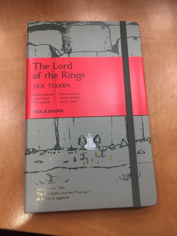
Notice how even the font on the paper band has been changed to fit the LotR design sensibility.
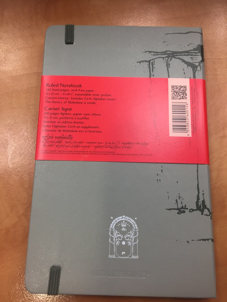
Every little detail counts, including the choice of colour for the paper band (it just pops), and the Tolkien symbol on the spine.
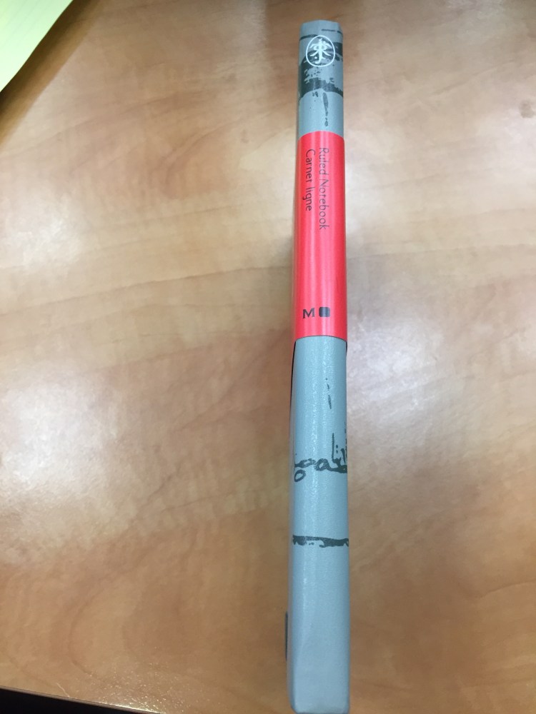
I’ve decided to use this notebook as my next journal. You can check out just how many things I pack into my journals by comparing the two notebooks’ thickness. They’ve got the same page count (192).
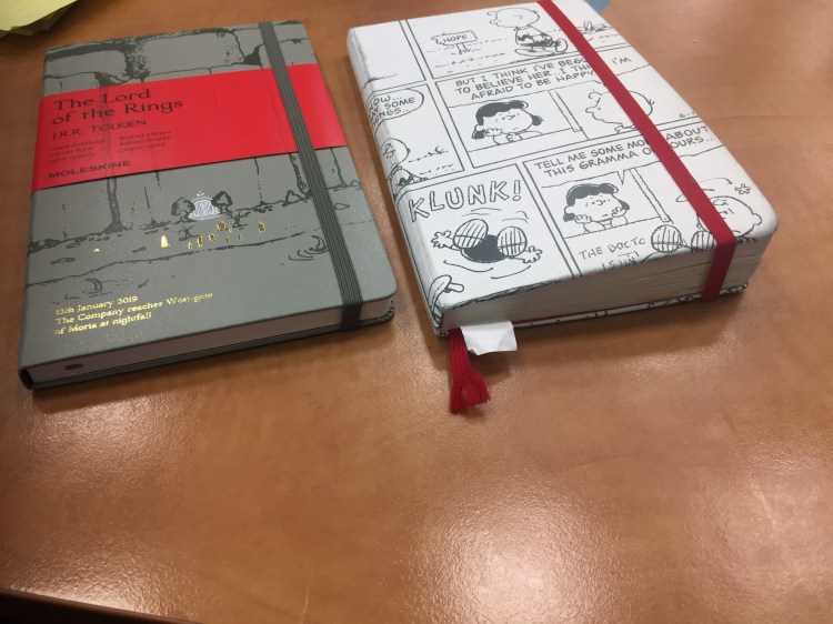
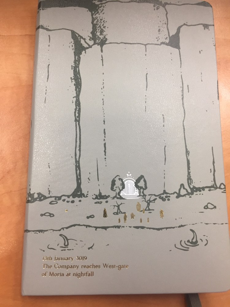
The front cover features a drawing of the entrance to Moria, in dark grey on a light grey background. The drawing continues on the spine and the back. You can see members of the fellowship (in gold foil) standing in front of Moria’s gates, the monster about to attack from the lake, and the carving of the two trees and the entrance runes. A description of the scene is given in gold foil, also in the LotR font.
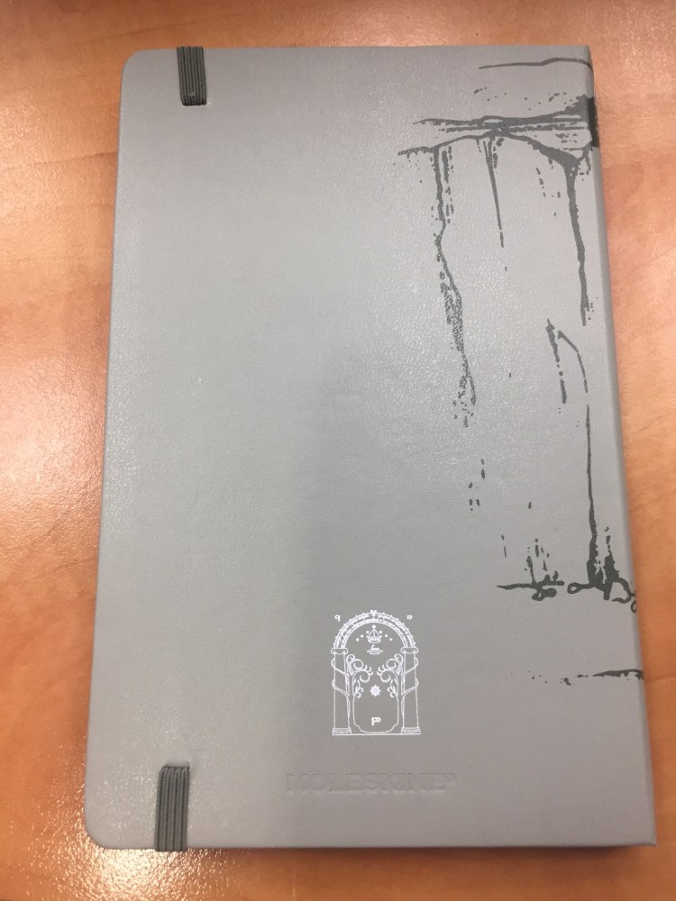
The back cover. You can see the gate rune to Moria in detail, and the Moleskine logo hardly at all. It’s just debossed into the cover. The elastic band matches the dark grey of the drawing.
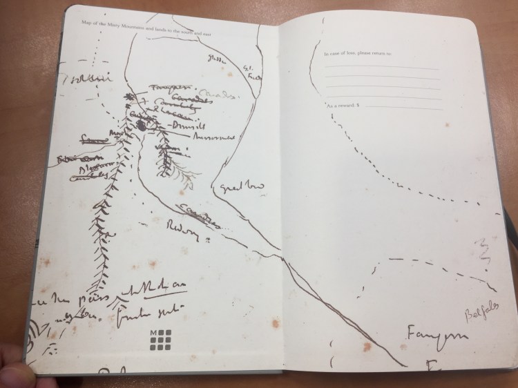
Inside the front and back cover is some of Moleskine’s finest work in terms of endpaper design. The front features a sketch of the Misty Mountains and lands to the south and the east, and also the “In case of loss“. You can see Tolkien debating which name to use for various places.
The back includes a contour map of the Misty Mountains around Mirrormere. Again, the drawing is perfectly aligned with the back pocket (it might not seem so in the photo, but trust me, it is), a small but not trivial design feature.

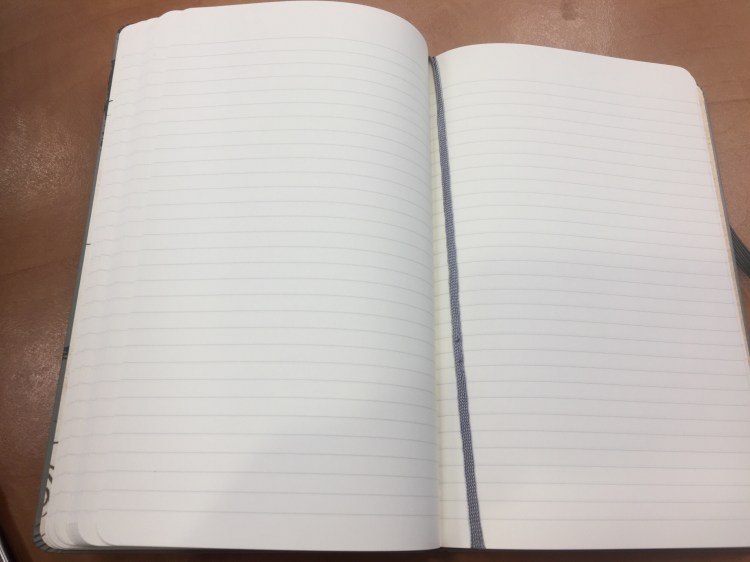
This is a lined notebook, with a light grey ribbon. The paper works well with pencil, ballpoint, gel ink pen, fineliners and Noodler’s Bulletproof black.
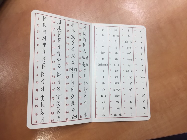
The add on to this edition is also unique: an insert with the Cirth alphabet that Tolkien invented.

Inside the insert:
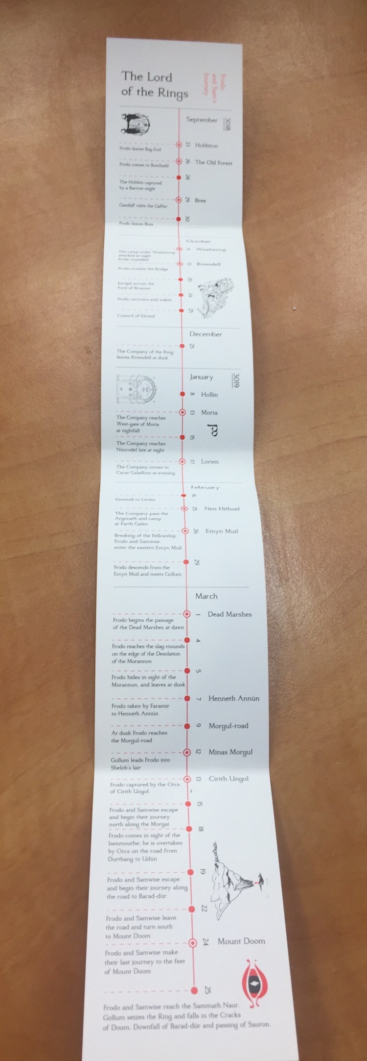
The B-side of the paper band includes a timeline for the Lord of the Rings trilogy, focusing on Frodo and Sam’s journey.
If you love the Lord of the Rings this edition is a no brainer —  I highly recommend it. Even for non-fans this is a very well designed, grey/red/black and white edition that proves that you can create beautiful things even with a limited palette.
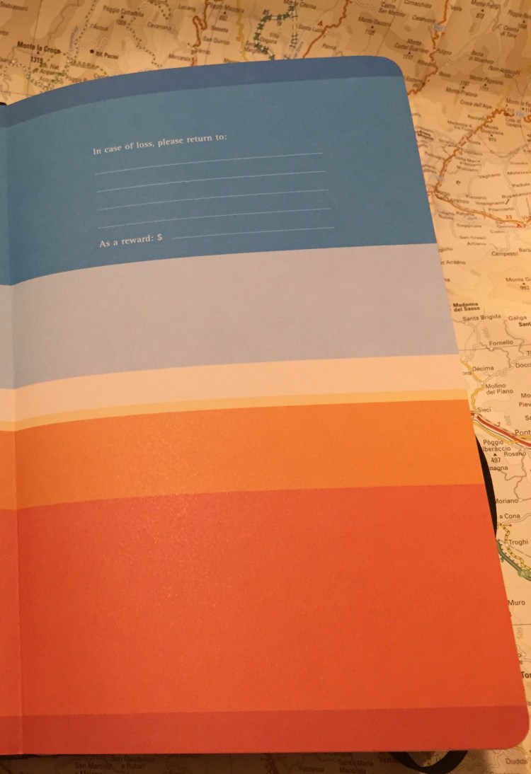


In Case of Loss

One of the most iconic things about Moleskines is the “In case of loss, please return to” on the front endpaper. You are supposed to write your name and address on the supplied four lines, together with an enticing, but not too enticing reward. According to Adrienne Raphael this feature of the Moleskine sees little use. If you’re Casey or Van Neistat you label every notebook cover with Whiteout, offering a cash reward.

img_0125-1.jpg

I just write my name and email, and with “let’s talk” in the reward line. I started filling the “In case of loss” at first because at the time I could barely afford to buy a Moleksine and they were really difficult to obtain, so I wanted a chance to get them back if I ever misplaced them. Over the years filling these lines has become a habit, a ritual that makes the notebook mine instead of just another notebook. I never thought that I would come in use.

Until last year.

I used my Moleskine to journal during a night flight from London to Tel Aviv. In the rush out of the plane I didn’t notice that I forgot my notebook in my seat pocket, together with my beloved Ti Arto. I got home at around 3 AM after a sleepless night, and crashed to sleep. When I woke up a few hours later and realized that I lost my journal you could hear my howl around the block. I beat myself up and then contacted the airline (the brilliant British Airways), as well as the Ben Gurion and Heathrow lost and found, in the faint hope that someone found my notebook and didn’t toss it out with the garbage.

A few hours later, while I was still mourning my loss, I got an email.

The Customer Service Manager on my flight had found my notebook, saw my email address on the “In case of loss” page, and had emailed me. There are good people in the world, and one of them was the manager on my BA flight.

Two weeks later my journal arrived through the mail, and I nearly cried when I saw it.

You see, when I first filled that from page this wasn’t a special notebook. I had bought it on sale, it wasn’t a favourite limited edition of mine, and I had just randomly selected it from the shelf when I filled my previous Moleskine.

But then I wrote in it.

By the time I lost it the notebook contained memories of my dog, which died two months before, notes from my London trip, ideas for a short story, and a lot of snippets of everyday life. It had become meaningful, irreplaceable.

So when you crack open a new notebook, any new notebook, take a moment to jot down your name and email at least. You may plan on only using it for grocery lists right now, but you never know what the future holds.

Moleskine Bruce Chatwin Songlines Anniversary Limited Edition

In 1987 Bruce Chatwin published “The Songlines”, his classic travel narrative about Australia. In the book he describes his favourite notebooks, moleskines, which he purchased at various Parisian bookstores:

In France, these notebooks are known as carnets moleskines: ‘moleskine’ in this case, being its black oilcloth binding. Each time I went to Paris, I would buy a fresh supply from a papeterie in the Rue de l’Ancienne Comédie. The pages were squared and the end-papers held in place with an elastic band. I had numbered them in series. I wrote my name and address on the front page, offering a reward to the finder. To lose a passport was the least of one’s worries: to lose a notebook was a catastrophe.

In 1995 Maria Sebregondi read this account and decided to try and revive those moleskine notebooks as a brand. She approached a small Italian design company, Modo & Modo, and in 1997 the Moleskine (capital M) came to life.

In 2017 Moleskine came out with a collaboration with Vintage Books that celebrated the 20th anniversary of Moleskine and the 30th anniversary of “The Songlines”. The result is stunning, and perhaps a bit thought provoking.

Moleskine created a version of “The Songlines” that looks like a hardback Moleskine, including the elastic band and the back pocket, and contains the full text of the book, an excerpt from Chatwin’s biography about his trip to Australia, an explanation of what they owe this text and how they see their future, and several blank pages for notes. To this edition they attached a plain, large softcover Moleksine. Not a limited edition Moleskine, just a regular plain softcover Moleskine. We’ll get to that decision later.

The paper band on this edition is phenomenal. There’s no B-side (this came out before Moleskine started to play with the B-side of their paper bands), but it’s extra wide and extra long and embossed so I kept it in the back pocket, as it’s so pretty.

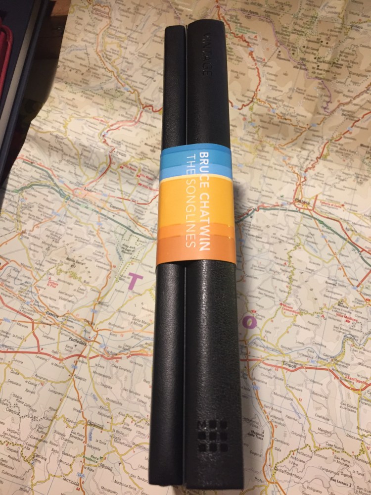
As you can see, “The Songlines” book is considerably thicker than the softcover Moleskine that it comes with. The text is 293 pages long, and together with the biography excerpt it comes to 320 pages long. Then add the blank notes pages and you get a considerably larger “notebook”. It’s still very well bound, with the pages opening flat and the standard Moleksine paper. I wonder if the size of the book made them realize that they can create a Moleskine Expanded. In any case, it’s a really fun book to hold.

On the back cover the paper band explains the history of Moleskine with “The Songlines” and what this edition celebrates.

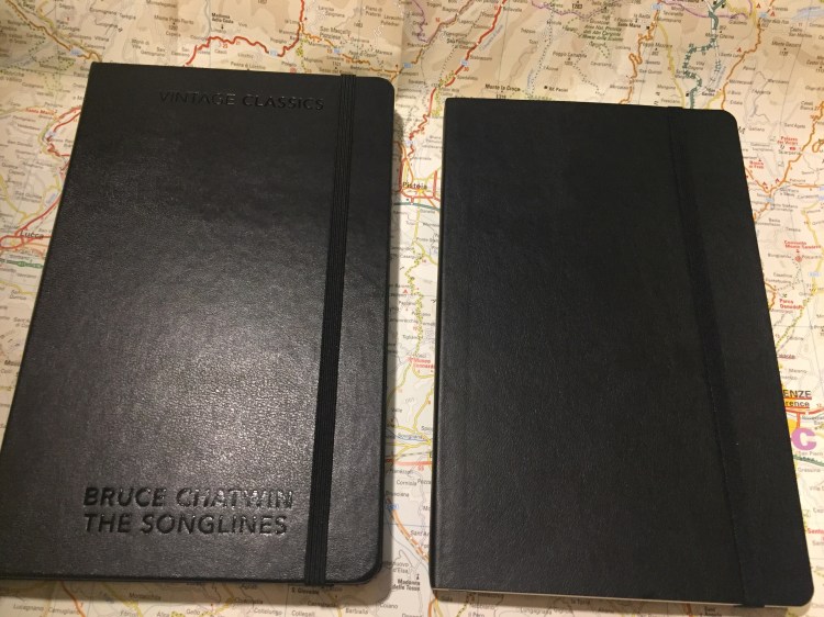
When you remove the paper band you get two simple looking Moleskines, one embossed with Chatwin’s name, the title of the book and the publisher’s name. The second is a regular plain softcover Moleskine, and in between the two is a cardboard separator with “Enjoy your travel writing” written on it.

Here are the book and the notebook side by side.

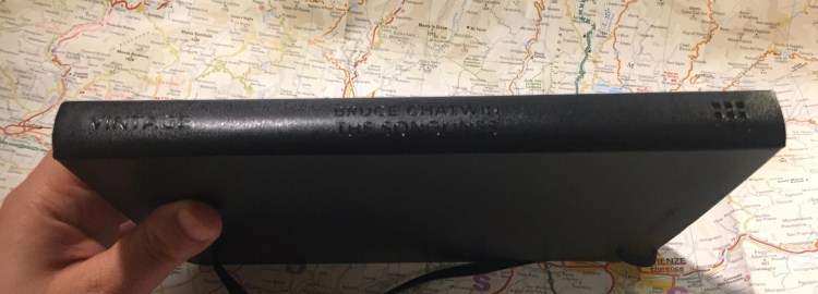
The spine of the book, with the Vintage books and Moleskine logo.

The beautiful, beautiful endpapers of “The Songlines” book.

The title page:

At the end of “The Songlines” there’s an explanation of what Moleskine’s history with this book is.

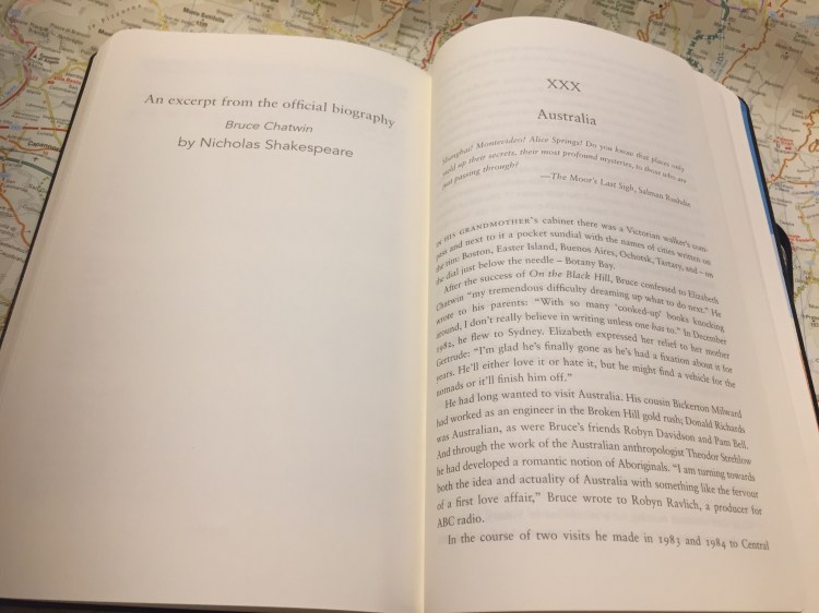
The excerpt from Nicholas Shakespeare’s “Bruce Chatwin” biography:

The notes pages:

And the back end-papers:

This brings me to the peculiar and somewhat thought provoking move of including a plain large softcover Moleskine with this well designed and produced book. To be honest, I was disappointed at first. Why wasn’t this a limited edition with the same colourful end-papers? Why was it a softcover and not a hardcover Moleskine, like the original 1997 notebook?

After giving it some thought and reading “The Songlines” I think I can guess why. This edition is about the book, not so much about lionizing Moleskine as a brand. It’s a tip of the hat to the man to whom which the company owes so much. The notebooks he describes don’t seem to be half as well designed as Moleskines (no rounded pages, no back pocket, no ribbon marker), and they appear to be softcover plain or ruled notebooks. Moleskine brought out their equivalent, and I kind of like the gesture. There’s another, much less quoted moleskine scene in “The Songlines” that I think that this applies to:

‘Nice notebook,’ he said.

‘I used to get them in Paris,’ I said. ‘But now they don’t make them any more.’

‘Paris? he repeated, raising an eyebrow as if he’d never heard anything so pretentious.

Sometimes keeping it simple and being aware and respectful of your inspiration is all that’s required.

Tournament of Books: The Mars Room

The Mars Room” was the book that I most dreaded reading once the final list of the Tournament of Books 2019 contest was published. The story of a stripper sentenced to three life sentences in a California prison for killing her stalker didn’t seem like the kind of reading that I’d enjoy. In some ways I was right — this wasn’t a fun read. What I hadn’t anticipated was being moved and touched by a story not so dissimilar from those that I’ve recently read and heard about in the news or in “This American Life”.

“The Mars Room” is about as far from light reading as you can get. It’s gut-wrenching. It’s violent. It’s relentless. It’s excellent.
We are living in a time where at least in parts of America there seems to be a growing awareness of the failings and injustices of their criminal justice system. There are a lot of non-fiction pieces coming out now that are bringing to light the toll mass incarceration, the “war on drugs” and prison privatization have taken on communities. So why read a work of fiction, no matter how well researched, when you can read an article or a book, listen to podcasts or watch documentaries on the American criminal justice system and the people at its mercy?
Because Kushner lets you into Romy’s mind, into her fellow inmates minds, into her victim’s mind. You see the people working in the system and incarcerated in the system as intimately as you possibly can – their mistakes, the tragedy of their lives, their big and small moments, their cruelties and their kindnesses. They aren’t opaque any more, they aren’t invisible. You get to see not only the systems of poverty, injustice, racism and abuse that started them on their respective journeys to prison, but you get to see them, to experience them as full human beings. That’s what makes it so terrible, and such a great work of fiction to read.

Moleskine Basquiat Limited Edition Notebook Review

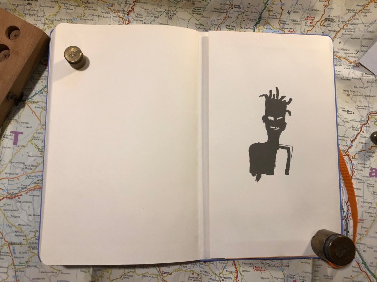
It is rare that I start using a notebook the moment I unwrap it, but the Basquiat Moleskine limited edition had that effect on me even though I originally didn’t plan to buy it.

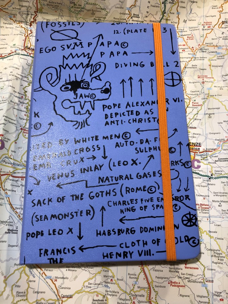
The colour of the cover is what drew me to this notebook. It’s a purplish blue that contrasts beautifully with the orange elastic closure. I didn’t even pause to take a picture of notebook when it was still wrapped. That periwinkle cover makes Basquiat’s handwriting and art just pop. You can see the character in each line and it really does inspire you to grab a pen and write and draw and doodle.

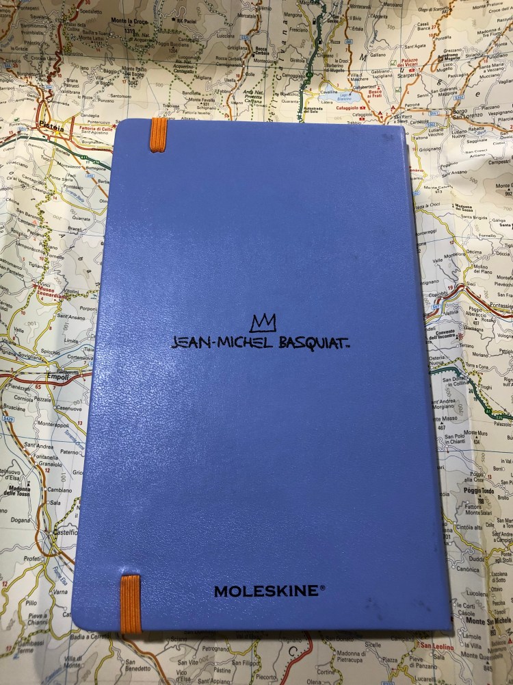
The back cover (a little smudged from my enthusiastic use, but nothing that a wet-wipe can’t remove) is understated, with just the Basquiat signature. I think that I’d prefer the Moleskine logo to just be debossed in, like they did in several other recent editions, but it’s not a dealbreaker for me that it’s boldly there.

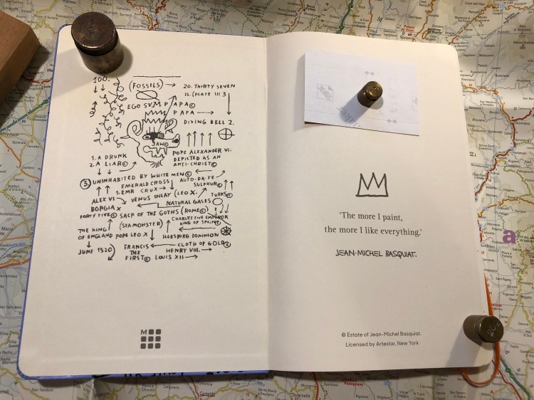
The front endpage echoes the front cover, with the addition of a pretty fitting Basquiat quote. I had already filled in the “In case of loss” details, so I hid them.

Look at that back endpaper. Is it not well designed? I like that they let the piece “breath”.

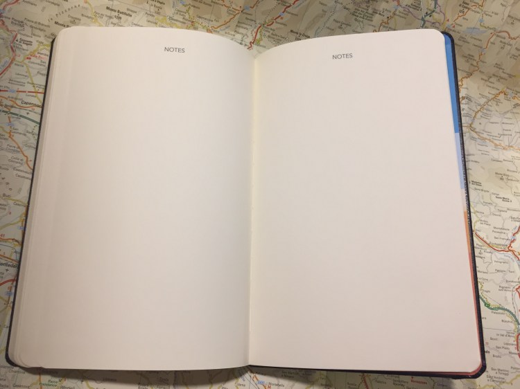
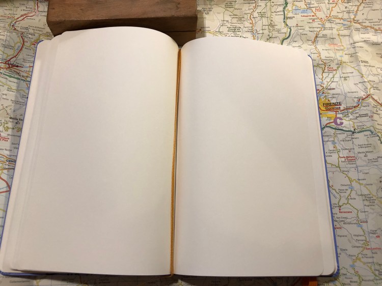
Unlike most Moleskine limited editions that come in lined paper, this notebook comes with blank pages. I like the choice, as it frees you to do whatever you want with the notebook: drawings and words will feel equally welcome here. Also, there’s an orange ribbon bookmark. What’s not to love about that?

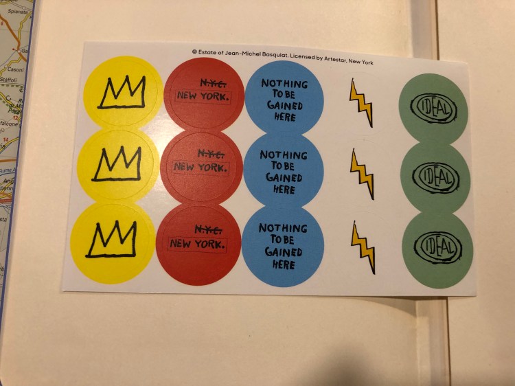
The stickers are a bit of a disappointment in my opinion in terms of colour choice. I would have liked it better if they kept to the orange and periwinkle colour theme. As it is, they clash a bit with the rest of the notebook.

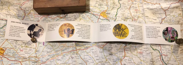
The B-Side of the paper band gives a little background on Basquiat, who he was and how he worked. It’s a nice little add on.

There are times when a notebook just makes you want to start using it, start writing and scribbling in it, start creating. The Basquiat Moleskine did that for me, and it is a fantastic addition to the Moleskine limited edition lineup for the year, and definitely a notebook that I recommend that you try.


Tournament of Books: The Golden State

I finished reading the eleventh Tournament of Books 2019 book, Lydia Kiesling’s “The Golden State“, which is running against Jesse Ball’s “Census” in the fourth round of the competition.

You would be forgiven if you read the premise of “The Golden State” book and thought that you are about to read an “Eat, Pray, Love” kind of book. This is nothing of the sort. Kiesling has written an intensely realistic and touching piece about loneliness, particularly female loneliness.
The heroine of “The Golden State”, Daphne, is a young, neurotic mother to a precocious 2 year old, left alone due to the machinations of the US Immigration system. The daily grind at her unfulfilling job finally makes her snap, and she decides to take her toddler and run back to Altavista, where her late grandparents lived. The narrative follows her through the 10 days of her escape. So far the “Eat, Pray, Love”.
Daphne is a victim of a society that does nothing to help young mothers (except pile guilt and anxiety on them in the form of study after study), especially young mothers who marry outside the tribe. She is caged in a pointless job that is full of daily humiliation, but the money is “good” (not good enough for SF) and the health insurance… She has no friends, no family, nothing of interest in her life except her daughter, who she can’t afford to spend time with. Her husband and his loving family is in Turkey, and apart from skype calls, she has very little chance of seeing them any time soon. No wonder she snaps.
Altavista is no paradise, and isn’t portrayed as such. It’s a semi-deserted place full of angry white people, only a handful of which remember Daphne and her grandparents. She has unknowingly fled to the only place where she could be more lonely than she was back home. So when an old lady who visited Turkey one time befriends her, she can’t help but reach out.
This novel would not work in any place but today’s US. It’s a novel of time, place and character more than plot. Every breathless rush to change diapers or calm a screaming toddler becomes momentous once you realize just how alone Daphne is, just how alone the society she lives in wants her to be.
The novel is interesting, fresh, sharp and well written, and it beautifully breaks down large political ideas to small, everyday encounters.

This book is running against “Census” in the fourth round of the Tournament of Books, and though they have very little in common apart from being stories about single parents and their children out on a trip, it was not hard for me to pick “The Golden State” as a winner. It’s a better book in terms of writing accomplishment, and it has much more heart than “Census”. I highly recommend skipping “Census” entirely, and reading “The Golden State”. It’s a very good piece of contemporary fiction.

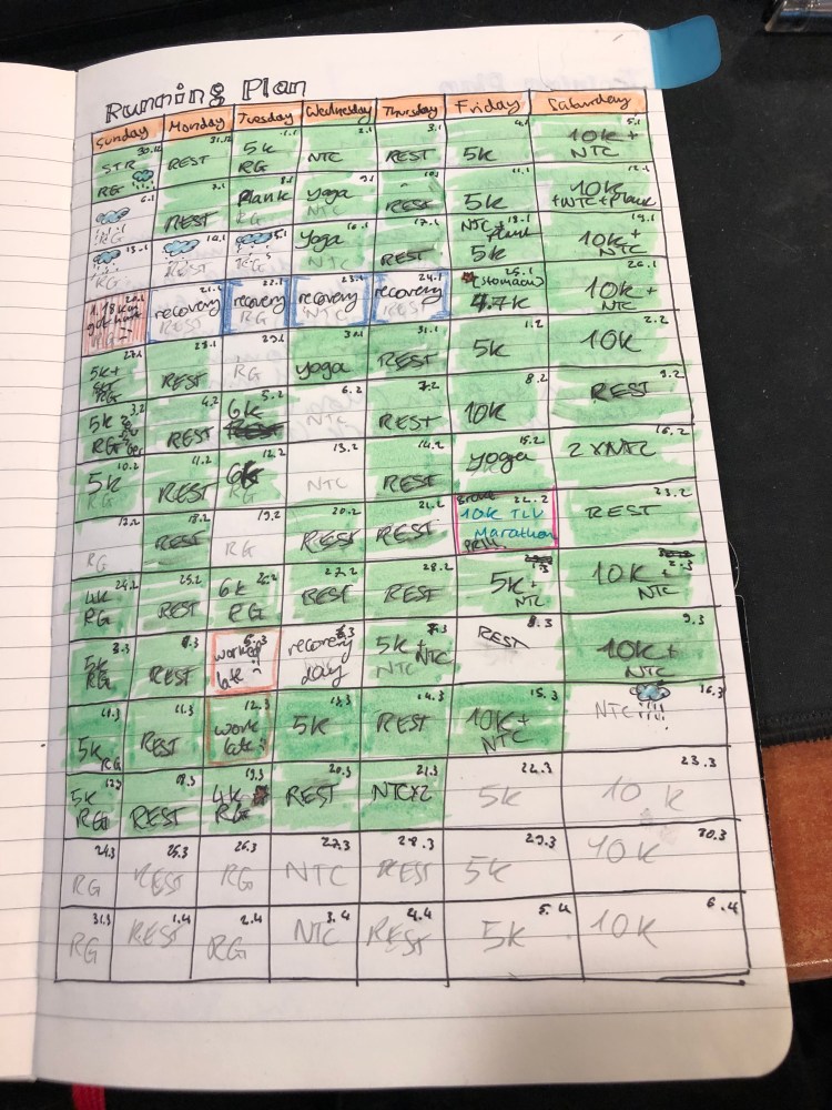
How I Use My Notebooks: Running Planner

The thing that you learn very quickly about running is that no matter which Couch to 5k plan you started with, if you want to have any hope of persisting with your running you are going to have to tailor make your own running plan.

I make a fresh plan every three months or so, and I always create it in my current Moleskine journal. In the spirit of showcasing notebooks in use, that are not created for Instagram, this is my latest running plan:

Things are penciled in with an H pencil, and I ink them in with gel ink pens as they happen. Green highlighted blocks show me where things went according to plan, and other blocks represent where things had to change due to injuries or circumstances.

I’ve been running for 8 years now, and I have around 6 years of running plans in all my previous notebooks, each one looking pretty much the same: messy and functional.

How I use my notebooks: Tournament of Books tracking

Most stationery blog posts focus on reviewing products and less on how people actually use all the paper, pens and inks that they buy. I thought I’d try to write a bit more about how I use my stuff, and not just on how cool is all the stuff I have.

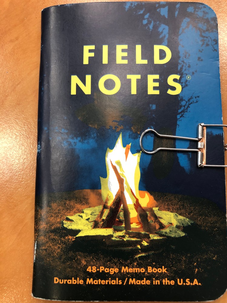
This is my latest Field Notes, the Campfire Night. I use a binder clip to keep it closed as it bashes around in my backpack. Without the clip the pages get crumpled and torn after a few days of use. The clip used to be nice and copper coloured but now is just nice and worn silver.

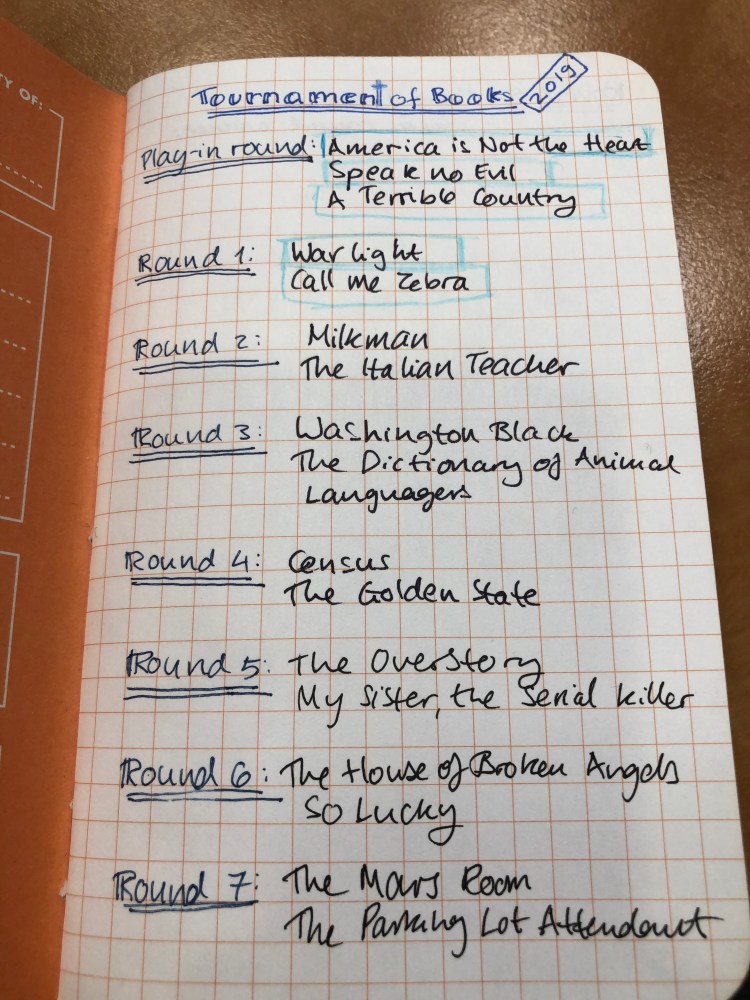
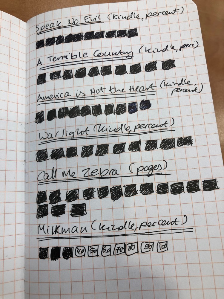
Apart from my day to day to do lists, this notebook currently hosts my Tournament of Books trackers. There’s a list of books that are participating in the contest, divided per round. Those that I’ve read are marked off with blue pencil. This is for my personal use, so you’ll not see any Instagram level calligraphy here. I wasn’t planning to photograph this and blog about it when I created these.

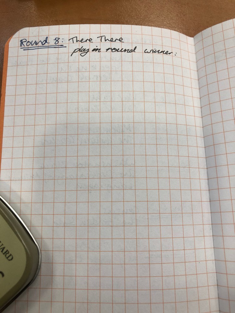
This is where I’m logging who I think should win each round. When the tournament starts I’m going to log who actually won each round on the opposite page.

Since doing this challenge means reading 18 books in a very short period, I’m tracking my reading progress in this notebook as well as in my reading journal, just to make sure that I’m on track (I won’t finish reading these in time, as I’ve started too late, but my goal is to finish reading them all by mid April).

That’s it.

A few journaling tips

Notebooks are meant to be used, and I use many of mine for journaling. Here are a few journaling tips that I’ve found useful over the years:

  • Don’t constrain yourself to pre-dated or restrictive formats, just pick a not too fancy lined or blank notebook (or dot grid or squared). The notebook just needs to be nice enough and special enough for you to want to crack it open and write in it, but not too nice to be intimidating.
  • Start with a title and a date. The title is a neat way to get yourself writing, and to help you search through previous entries later on.
  • Even lined notebooks can be doodled in.

  • Stick bits and pieces of things into your notebook to make it come to life. Business cards are great for this (restaurants usually make their cards extra interesting and colourful), as are ticket stubs, clothing tags, labels, etc. Write a little something about what you put in, or just let the graphics speak for themselves.
  • If you just feel like writing a line or a paragraph, then do it and don’t beat yourself up about it.
  • If you’re having an extra busy day that you want to remember but don’t have time to fully log, bullet points are your friend. You can always go back and flesh them out later if you feel like it.
  • Write 2-3 things as topics for each day to avoid describing your breakfast and what you did at work. Just document a few things that made the day memorable, special, interesting, fun, unique, or even just a thing or two that are on your mind right now and you want to hash out.
  • Did you see a TV show or movie you liked? Read a good book or went to a good restaurant? Write about it as a way to relive and capture your good experience.
  • Be kind to yourself and others. Put cringeworthy things elsewhere, or you won’t want to open that notebook again. I work through pain and loss in my journaling sometimes, but never anger. Obviously your milage may vary on this one, just be careful not to make yourself be afraid to open a pandora box that you created with your own writing.

Moleskine Spring 2019 Catalog

Chronicle Books has uploaded Moleskine’s Spring 2019 catalog and it is interesting.

Here’s a break down of what’s new and changed this season, as well as my take on some of their decisions. Some of these notebooks are already available, others will become available over the next few months. Pour yourself a cup of coffee, open the catalog, and dive in:

Classic Notebooks

  • Of the seasonal colours, I’m pretty sure Reef Blue and Daisy Pink will do well. It’s nice to see Scarlet Red, Sapphire Blue and Myrtle Green join their regular lineups. In the past black was pretty much their only offering, with an occasional red thrown in, but it looks like regular colour options are here to stay.
  • I’m curious about their new “medium” size, between the pocket and the large. There’s no sizing info in the catalog for this option and it appears to be available only in the hardcover notebooks. My guess is that it will be in the “Two-Go” size, which I think is a pretty useful size (11.5×18 cm or 4 1/2×7”).
  • Sad to see that they still haven’t brought back the reporter notebooks in squared paper, and how little love in general squared paper gets from Moleskine.
  • Great to see the new dotted (dot grid) options. These ought to be popular, and Moleskine didn’t dip their toe in with just pocket and large black hardcover notebooks, but is offering them in all their core colours and in what will likely be their best selling seasonal colour, Reef Blue. As is stands, dotted paper is getting more love than squared paper, which is not surprising. Squared paper is niche outside the stationery blogger/podcaster world.
  • Classic notebooks expanded” is a new offering from Moleskine — a large hardcover or softcover notebook that has almost twice as many pages as a regular large Moleskine, with two ribbons instead of one. This may seem a bit unwieldy, but I use a large Moleskine daily planner as a meeting notebook and because of its size it’s still pretty convenient to use. If you plan on using your notebook a lot (as a daily journal for a year perhaps?) this may be a good option to check out.

Non-Standard Cover Material Notebooks

  • Leather notebooks – these aren’t available everywhere (Barnes and Noble have them), and I haven’t tried them, but they’re still on offering, with or without a box. I’d recommend that you spend your money elsewhere, unless you’re really looking for a corporate executive gift to put the company logo on.
  • Two-Go notebooks are still on offer, with four colour options (added last year) and in an excellent size, with thicker than usual paper and a surprisingly useful albeit non-standard blank-and-ruled format. If you haven’t given these a try I highly recommend them. They can handle fountain pens pretty well.
  • Blend notebooks, with their tactile, super fun and durable fabric covers now come in four new colours that promise to blend better in office settings than their current (and still produced) camouflage Blend offering. Black, Green, Blue and Beige are offered in a woven, slightly distressed look with contrasting elastic closure, as usual only in large size and with ruled pages. Definitely worth trying out if you haven’t had a chance to give their fabric covers a spin.
  • Denim notebooks, which first came out as a super popular and a very well designed limited edition offering, are now part of the regular lineup, sort of. The limited edition notebooks are still more attractive in my opinion, with their white contrasting branding label on the back and their white print on the front, but these notebooks, in Antwerp Blue and Prussian Blue (pocket and large, ruled only) are a great way to get some of that denim feel in your life without trying to get a hold of overpriced LE notebooks on the secondary market. Of the fabric covered notebooks that Moleskine (and Baron Fig) offer these feel the best, and I recommend these over the Blend notebooks for that reason.

I’m not a planner person, so I’m not going to go over Moleskine’s extensive planner collection.

Limited Edition Notebooks

  • This is where Moleskine excels beyond all current competition, and in my opinion they’re starting this year stronger than they finished last year.
  • Fall-Winter 2018 limited edition notebooks, Looney Tunes, Super Mario, 007, Astro Boy and Harry Potter are still available, though the very attractive Harry Potter notebooks (especially The Marauders’ Map edition) are starting to be harder to find.
  • Spring-Summer 2019 limited edition notebooks are Lord of the Rings, Basquiat, Wonder Woman, Bob Dylan and Gundam. Each is designed to appeal to a different demographic, and I think that they really nailed it this time.
  • This is not the first time that Moleskine is tackling the Lord of the Rings in a limited edition, but this edition is much, much more attractive and well designed than their previous rather lackluster attempt years ago. The covers, endpapers and special insert all seem spectacular, and this is one edition that I’ve already preordered and plan to review. The “geek” edition, this notebook is designed to appeal to the same people that bought the Harry Potter and Alice editions
  • Basquiat limited edition notebooks are for the hipstery crowd that liked the Kieth Haring limited editions, Dr Seuss editions and probably also enjoyed the Monopoly limited edition, but in an ironic way. These are extra expensive but they’ll probably be popular, considering Basquiat’s success on Uniqlo t-shirts. They’re offered in plain and ruled paper, though I wish Moleskine would have stepped up and offered a sketchbook Basquiat edition. In terms of the boxed set, this one comes with a pen (the regular editions come with stickers), so it’s probably a better deal than the slightly lackluster LotR boxed edition (comes with nothing, will sell like hotcakes, because LotR).
  • Wonder Woman is the comic book edition, and as usual it is the most colourful one, and where Molskine allowed themselves more creative freedom. Bold red and blue action packed covers that really celebrate the character in drawings and text, what more could you want? Ruled only, comes with stickers.
  • Bob Dylan limited edition notebooks are aimed at music lovers, as the Beatles, Rolling Stones and Blue Note editions were before them. These are really reminiscent of the Blue Note limited editions, and like other music themed limited editions, are pretty tame, design-wise. If you’re a Dylan lover, you’ll likely love this edition, and it will make for a great gift, especially around father’s day. Is it surprising then that these come out in April? Ruled only, comes with some pretty dull stickers. The numbered boxed edition is the best designed of the bunch in my opinion. These too are relatively expensive limited editions, though of course expect a difference between RRP and what you actually pay online and anywhere but the official Moleskine stores.
  • Gundam is the anime edition, and as usual is more subdued than the comic book edition, but still pretty colourful. Ruled only, comes with stickers.

Journals

  • I’ve no idea why Moleskine calls their Cahier and Volant offerings “journals” and not notebooks, but I guess you have to differentiate them somehow.
  • Cahiers, formerly available only in Kraft Brown and Black have been expanded to include Cranberry Red (a darker shade of red than the Scarlet Red, likely because of printing limitations) and Myrtle Green, but that’s not that new. What’s new is the three new seasonal colours, Brisk Blue (a darker shade of Reef Blue), Kinetic Pink, and Tender Yellow. I’d stay away from the yellow, as it will turn dirty and blah in about a day’s use, but the other colours are solid and fun. Kraft Brown is the most fun to decorate and make your own (with black in second place), but the other colours seem pretty vibrant for cardboard covers.
  • It is worth saying that of all of Moleskine’s offerings, the Cahiers got the most paper love in recent years, which is a very good thing as the old paper used in these notebooks was garbage. Not acid-free and super thin, it turned yellow and brittle with age very, very quickly. Now the Cahiers use the same paper as the regular notebooks, and they even got some dotted paper love.
  • Subject Cahiers, a new offering that is geared for academic note-taking (Cornell Notes anyone?), and is offered only in large and extra-large. If I was still working on my degree this would be something that I would probably look into using.
  • Volants have become more colourful as time has passed, with Moleskine moving them from a light and dark shade of the same colour to complimentary colours instead. They also got stickers to boost, but still only come in plain and ruled paper. They are the only notebook left that Moleskine offer in extra small, which is both not surprising and a bit of a shame.

There’s nothing new in the Pro Collection and I don’t use any of these business focused notebooks (I like to build my own meeting notes formats), and so I won’t go over these.

Art Notebooks

  • Moleskine’s art collection has gone through a significant overhaul in recent years, all for the better. The sketchbook paper is less pronouncedly ivory coloured, and the paper has less coating on it, which means that it can now take things like light washes, fountain pens, rollerballs, etc without them beading up on it.
  • The sketchbook also got some love in the form of new colours (Red and Sapphire Blue), which is always nice.
  • The recently added sketch album (which is a landscape formatted notebook with cahier covers) is now available in Kraft Brown, which is awesome, because they’re so fun to customize.
  • There’s also a sketch pad, which has less pages and I completely don’t understand. It appears to be a more expensive way to get a sketch album with less pages. Huh?
  • The ever popular (and justly so) Watercolour Album got recently expanded into a Watercolour Notebook (standard format, as opposed to the landscape album format). Now the Watercolour Notebook has been expanded to include the pocket, A4 and A3 size. This is a must buy for me, and will probably be pretty popular amongst urban sketchers.
  • The Music Notebook got a surprising new addition, a Music Cahier in extra large. Moleskine is one of the few stationery companies to offer this layout, and good for them for expanding it.
  • The Japanese Album and Storyboard notebooks are niche products and so unsurprisingly, got no love.

Themed Notebooks

  • Not much is new in this area. There are no new Passion Journals, no new City Notebooks and not much new with the Voyageur.
  • What is new is a Travel Kit, that contains the Ocean Blue Voyageur, a pen and a luggage tag. The Voyageur appears to be more popular than the Travel Journal, so I wonder how long before the Travel Journal is phased out.

As for the rest (the non notebook stuff), here my interest wanes, and this post has been long enough as it is. The catalog is 151 pages long, and full of eye candy, so even if you aren’t a Moleskine fan, take a look.