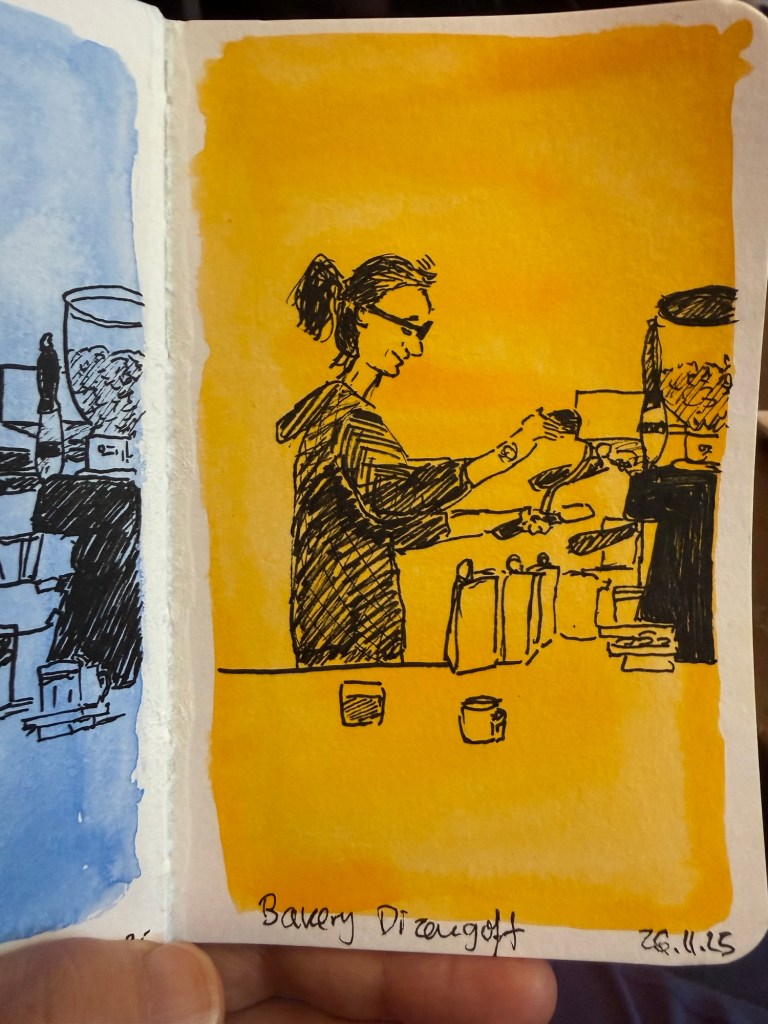
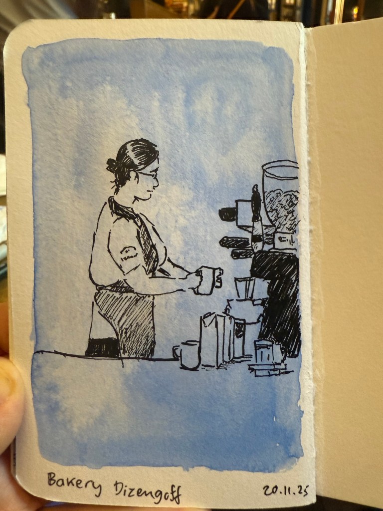
Quick Cafe Sketches
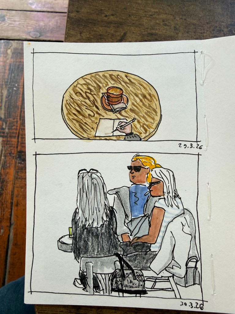
Quick cafe sketches done between the rocket alerts.
A blog about writing, sketching, running and other things
Quick cafe sketches done between the rocket alerts.
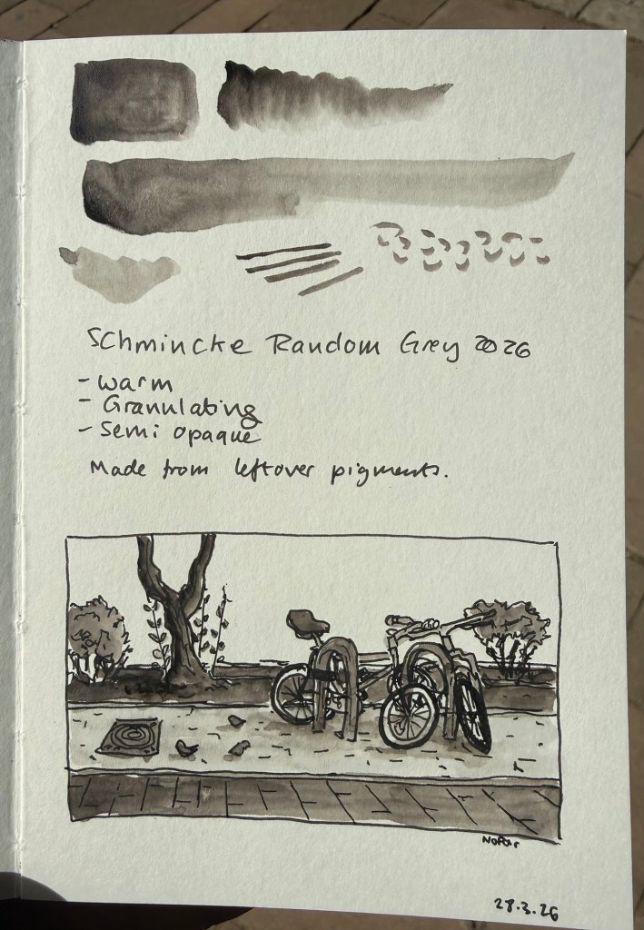
Once a year Schmincke, the German art supply company (makers of the best watercolours in the world) produce a limited edition colour out of the leftover pigments they have. The pigments come from their pastel production- which uses almost 100% pigment.
In 2024 the made an acrylic Random Grey. In 2023 the Random Grey was a pastel.
This year’s Random Grey is a watercolour. It’s a warm grey, granulating, and semi opaque. While I normally prefer cool or neutral grey’s, this colour looked interesting enough for me to give it a try.
The paint comes in a 15ml tube and though it’s a series 1 pigment it cost double the price of Schmincke’s usual series 1 watercolours (note: professional watercolours are usually priced differently by the kind of pigment they use. Blues tend to be more expensive than earth tones, for example. Schmincke’s series 1 are the cheapest and series 4 the most expensive). I’m not surprised as it’s a limited edition, but if you’re just looking for a warm grey Random Grey isn’t the most cost effective option.
I filled three half pans with Random Grey (one for me and two to gift) and there was plenty more to go around, so if you’re interested in this watercolour but are price conscious you can try finding other artists in your area that would be willing to split the tube. Schmincke’s watercolours are superb and it’s very easy to fill a pan or half pan with paint, let it set for a day or two and then use it.
The shade really surprised me. Yes, it’s a warm grey, but it’s not too far away from a neutral grey to become unusable for all but certain lighting conditions. It does not have that yellowish brown tinge that makes warm grey’s so… atmospheric. I enjoyed using this pigment, its granulation and layering possibilities enough to add it (at least temporarily) to my watercolour palette.
Is this a bit of a gimmick? Yes. Is it also a fun and interesting grey to have around? Also yes. I look forward to mixing and combining it with some pinks and reds and seeing what comes out.
Note: I sketched this on Pith paper, which is not watercolour paper. On watercolour paper Random Grey’s granulating properties will be even more pronounced.
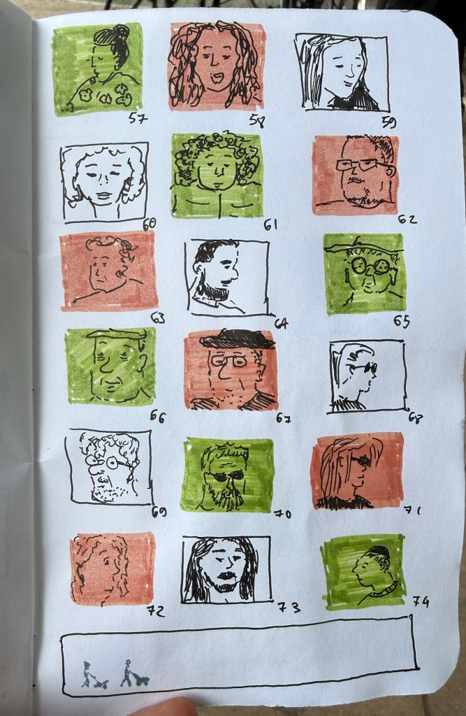
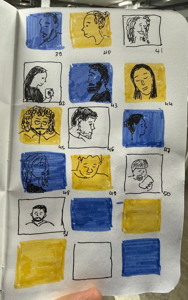
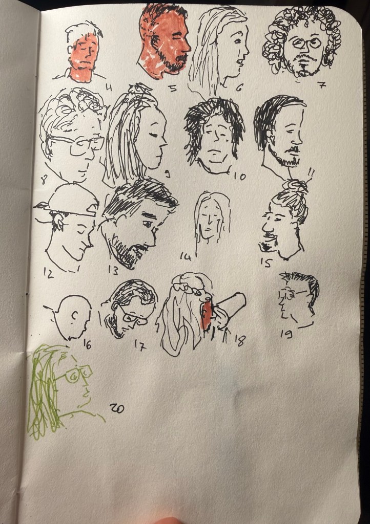
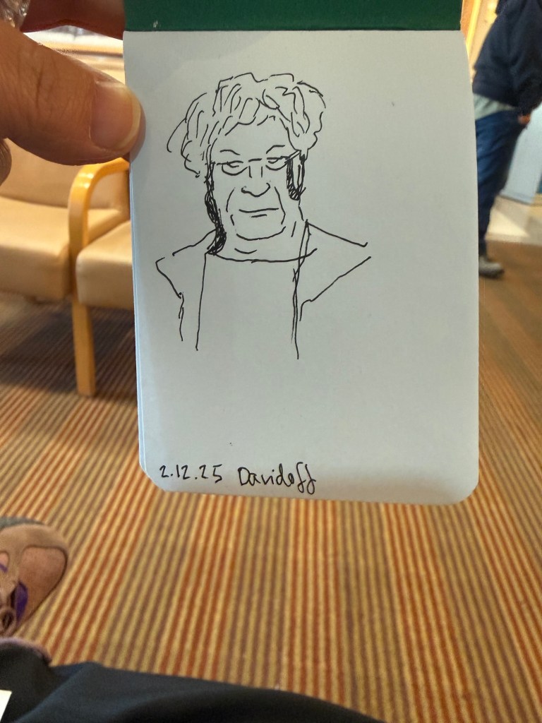
Last day of the challenge and I got all 100 (well, 101) people done. Today includes people in the streets near my house as well as people in the shelter.
Field Notes sketchbook and Faber Castell Pitt pens.
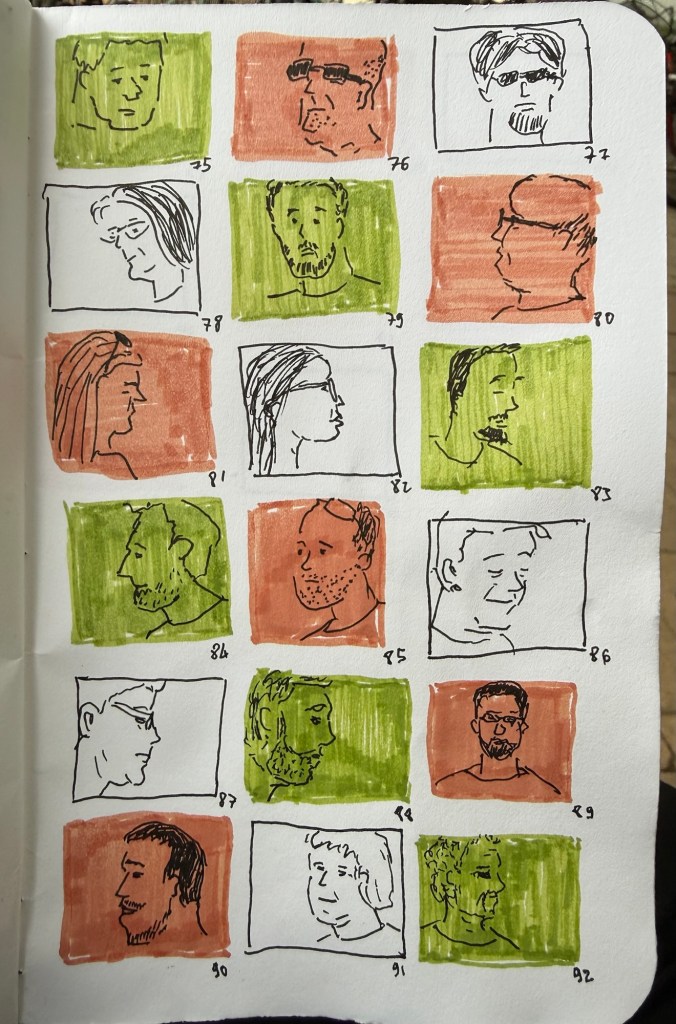
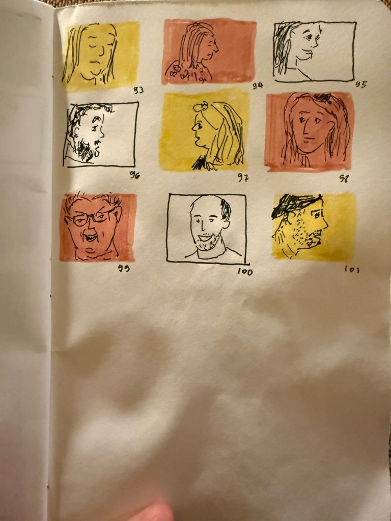
As usual this was a fun and challenging challenge to do, and I hope to get to do it again next year.
Still lagging behind a bit since I’m still sick, but these are today’s batch. Hopefully tomorrow will be better.
Field Notes sketchbook and Faber Castell Pitt pens
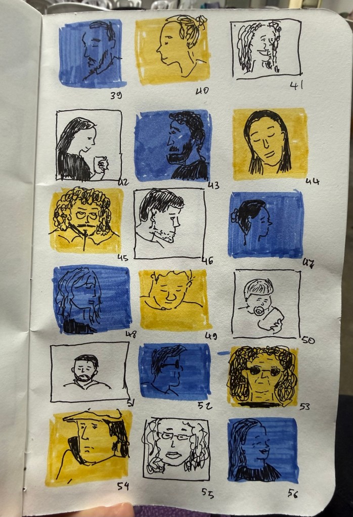
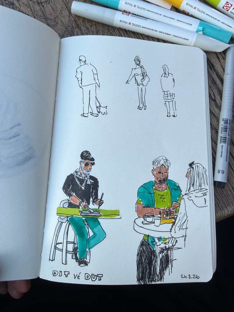
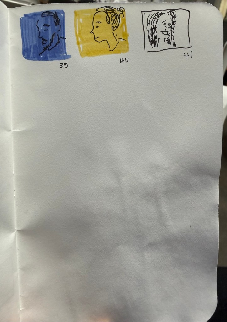
We had a rocket attack every three hours last night so I was very tired today. Got only 10 sketches out of the 20, although I may be able to get some more tonight.
Field Notes sketchbook, Faber Castell Pitt pens.
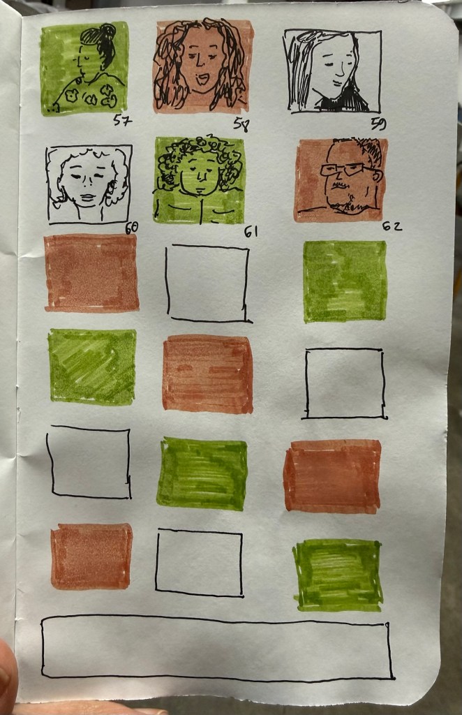
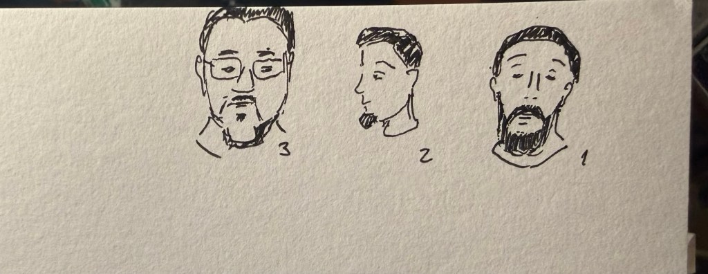
Shelter sketches today as well, on a battered Field Notes sketchbook using Faber Castell Pitt pens. I have a cold, so it was a struggle to get these done today.
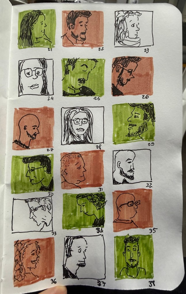
It’s time for the yearly one week 100 people challenge. This year I’ll be doing most of it out of a bomb shelter.
The first three sketches were done at a morning zoom meeting on a Stillman and Birn Alpha.
The rest were done in the bomb shelter throughout the day, on a a Field Notes sketchbook that has seen some water damage.
Sketched with a Faber Castell Pitt 0.3 pen and brush pens.
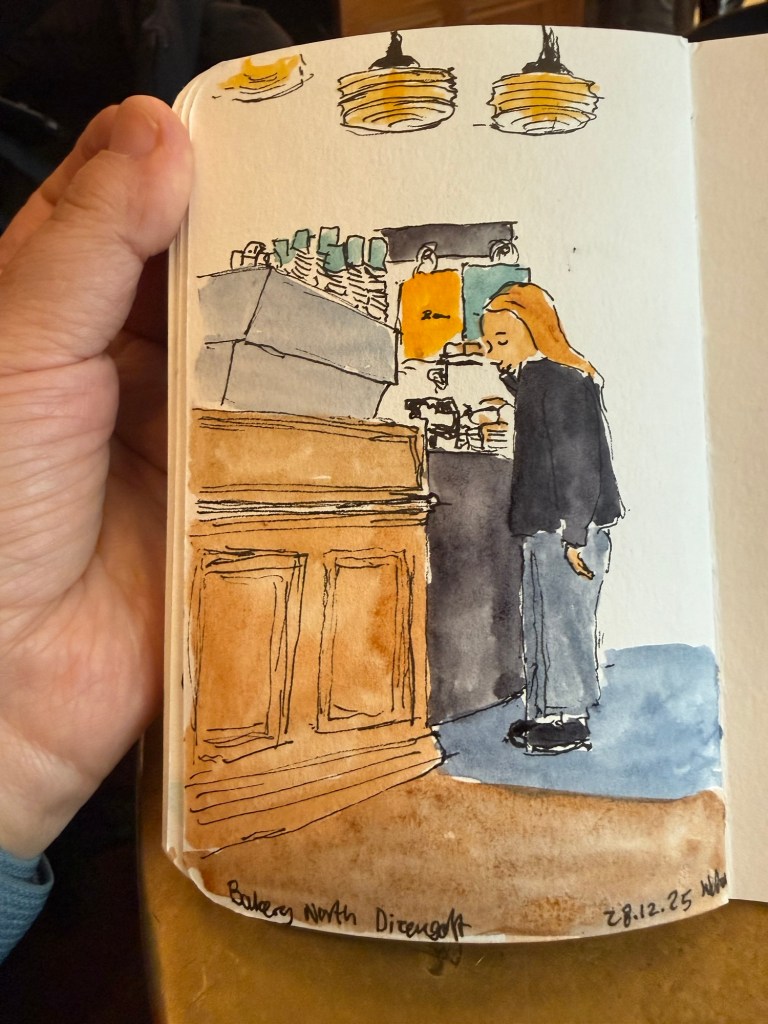
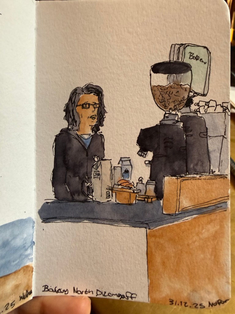
Have a happy new year! Here’s hoping that 2026 will be much better than 2025 was.
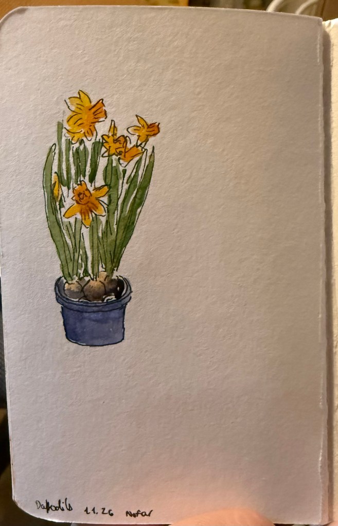
Here are a few recent sketches (mostly) from my Stillman and Birn pocket beta notebook.
Have a creative new year!
On Friday we went to an Urban Sketchers outing in Jaffa. It was celebrating local designers, and there were street performances as well as open studios and an arts and crafts market. The weather was hot and sunny, and the place was pretty packed with people and full of interesting old buildings. The main trouble I had was focusing on what to draw, as there were so many subjects.
I took a new sketchbook, a Pith Oroblanco in A4 size, and an A5 portrait Etchr Labs 100% cotton watercolour sketchbook. I don’t normally work in such a large format, but I decided to challenge myself to use the Oroblanco as much as possible. The 170gsm paper is identical to the one in the smaller Pith Kabosu, and so is great for mixed media and light washes. The Etchr Labs sketchbook is the best watercolour sketchbook that I’ve ever used – the paper works wonderfully with washes, and is very forgiving for mistakes and reworking.
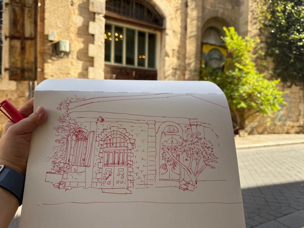
I started out 30 minutes before the official start time, and sketched a local building. I liked the combination of the beautiful old stone building together with the graffiti and the semi wild trees and shrubs. Inspired by Liz Steel’s Patreon sketching community (I just joined it) and December’s theme of “Red” I selected to sketch this building with Diamine Inkvent 2025 Day 3’s Carousel – a red ink – and to highlight the rust colour in the shutters and door. I had enough time to finish the line sketch before going to say hello to Marina, our local chapter head and the organizer of this sketchwalk (a wonderful person and artist). I took reference photos just in case, and then returned and quickly finished the sketch:
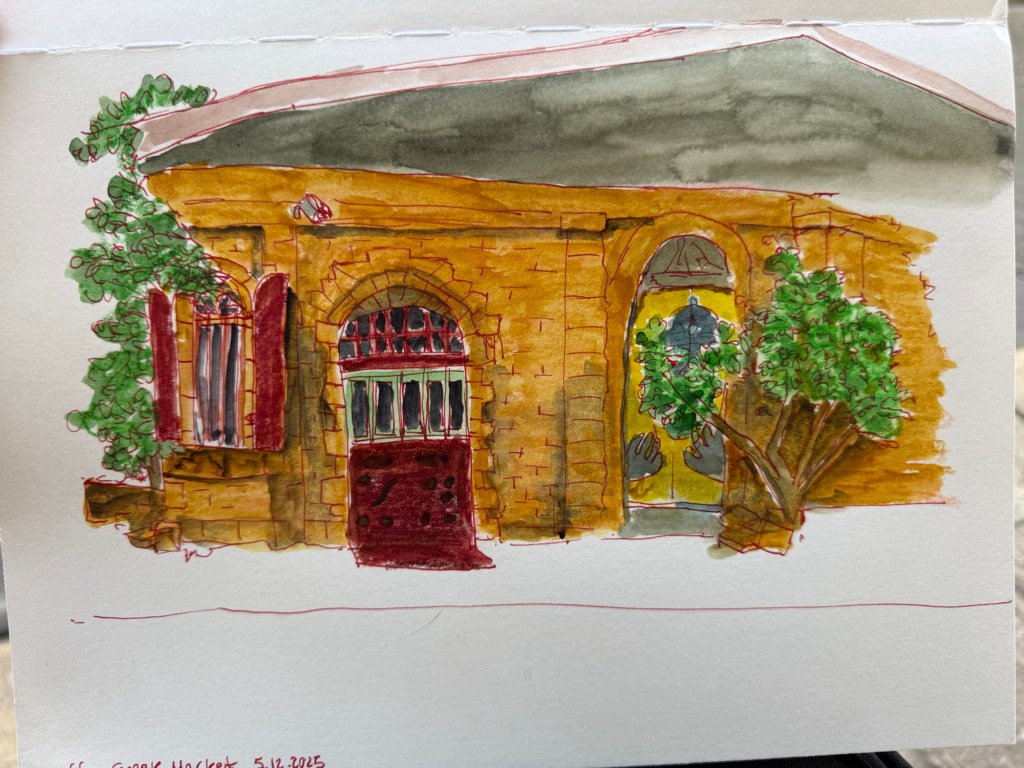
To avoid having to lay down a large wash I used Caran d’Ache Neocolor II to lay in most of the base colour – except for the roof bit (where you can see why laying down a large wash on this paper was problematic).
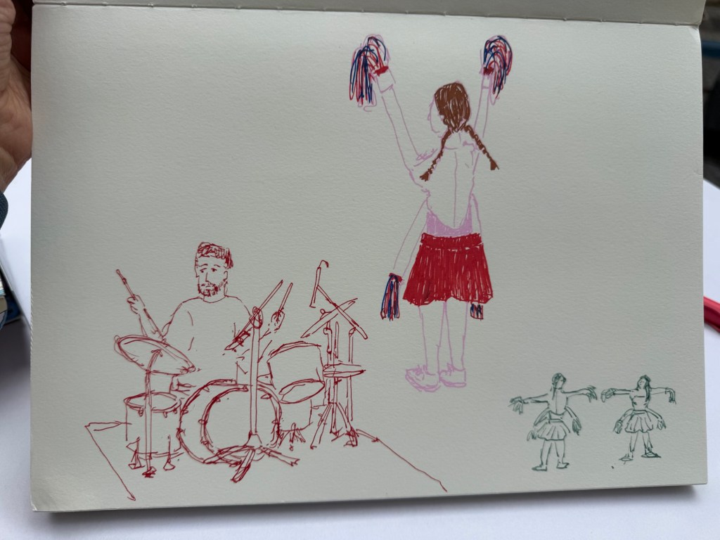
I then went in search for the music performance that was supposed to take place in an adjacent street. I managed to sketch the drummer as he was doing a sound check, but then he left and two girls in peculiar 4 armed cheerleader outfits came out and did a sort of otherworldly dance-march. They kept moving but I did manage to capture them. I used Diamine Carousel in a Lamy Safari medium nib for the drummer, and Posca markers for the cheerleader. The tiny cheerleader thumbnail was sketched with a TWSBI Eco 1.1 fountain pen and De Atramentis Document Ink Green Grey.
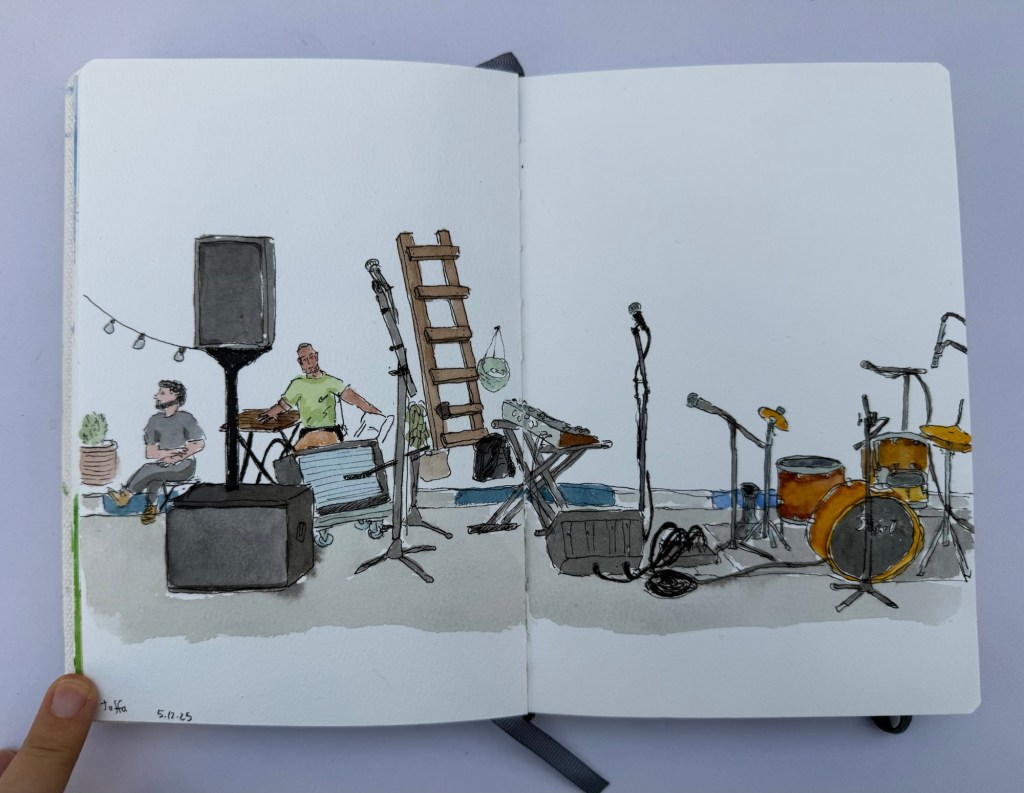
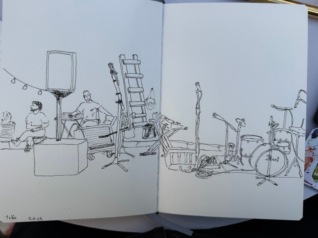
I then settled in to prepare to sketch the musicians when they returned. There was a Flamenco dancer in a nearby stage, but the place was too crowded for me to get a good viewing angle of her dancing so I spent the time creating a detailed fountain pen and watercolour sketch of the location where the musicians were supposed to play in. I was hoping to add them in once they started, but their show was delayed and i had to get back to the throwdown. I did get a sketch of their instruments and some local viewers, but I rushed in the end and didn’t get a chance to get proper shadows in. Oh well.
The line work was done with a Platinum Preppy 0.3 filled with De Atramentis Document Ink Black on an Etchr sketchbook:
There was a lady there that was clearly on her first every Sketchwalk, and my heart went to her. Seeing her struggle made me realize that there are so many things that are obvious to me as a seasoned “sketchwalker” that aren’t obvious to people going out with an Urban Sketchers chapter for the first time. Here are a few useful tips:
If you go on Urban Sketcher Sketchwalks and have tips for newcomers, I would love it if you could reply with them.
A hectic week but an interesting one.
I went to see a local production of Singer, a play by Peter Flannery. It was phenomenal but it kept me up at night, which meant that the following morning I headed straight to my local cafe. I sketched the barista but something didn’t work in terms of getting her face right – she turned out sadder than she is. Sketching tired is rough.
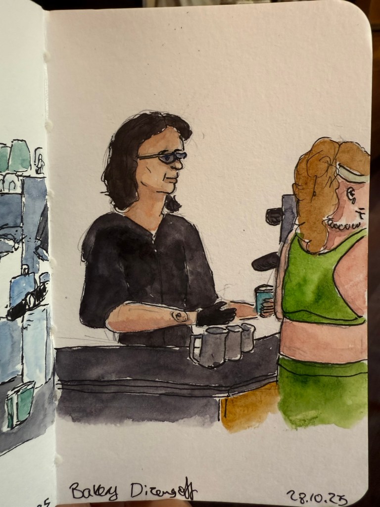
Here’s the rather messy pencil and pen sketch. I can tell just by the line quality that I was very, very tired.

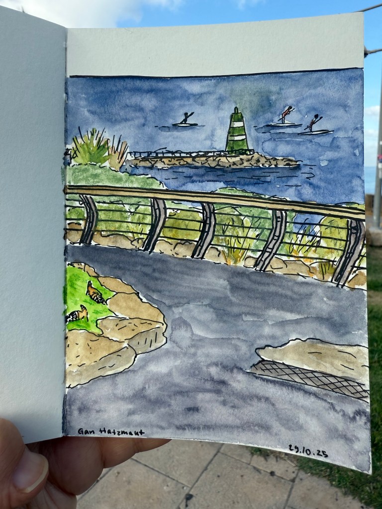
A day later I went to sketch at the nearby park and you can see the difference in the line quality in this sketch:
Initial sketch:

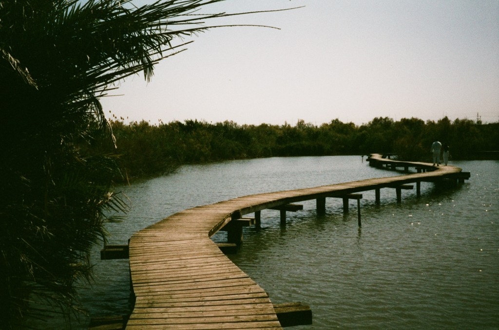
Later that week the film photographs that I’d had developed were returned to me. Here are a few of my favourites:
I love the atmosphere that the film gives this simple photo:

All of these photos are unedited. I’ll likely clean them up later on.
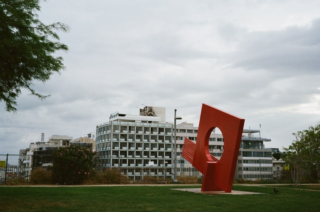
There was a fire on the roof of a nearby hotel. I took this photo a day after the fire, and you can see the damage:
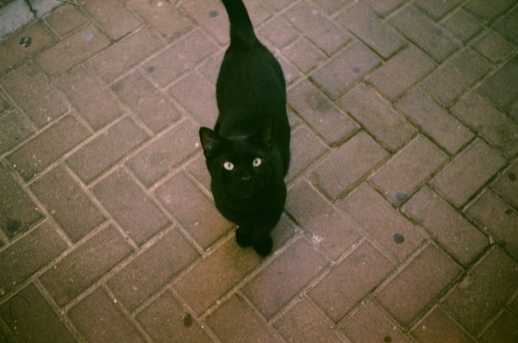
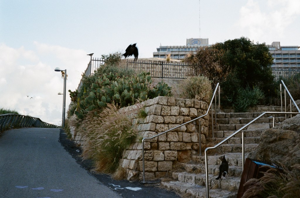
Cat failing to hunt a crow:
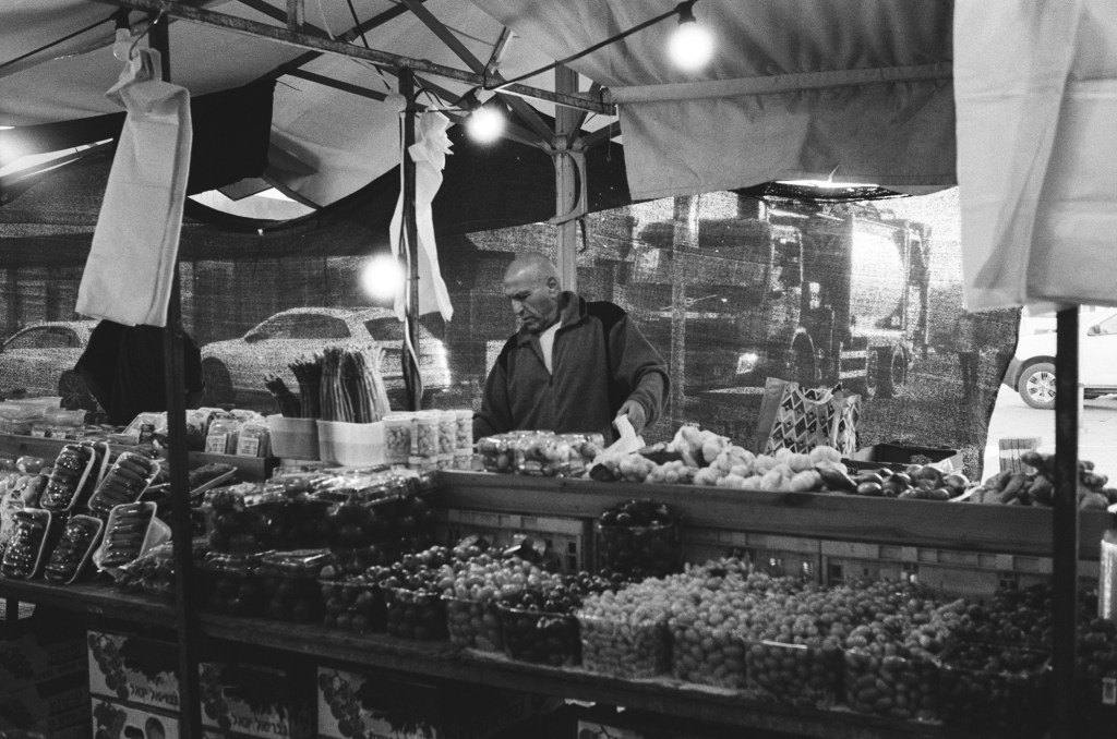
A stall at the local farmer’s market:
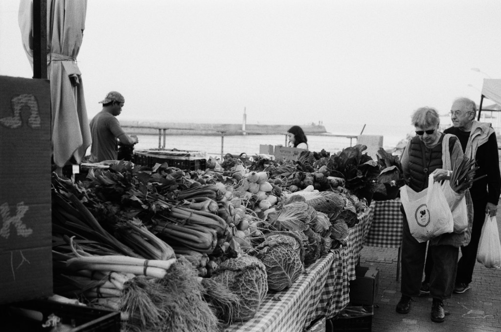
A stall at the local farmer’s market. You can see the see in the background.
I was supposed to run at a 10k night race on Wednesday, but I wasn’t feeling too good and I was apprehensive about dealing with the crowds so I ran the distance by myself a few hours before the official race start. It was a good decision as I was really struggling during the first 3k – but I did manage to finish, and finish strong.
I finished reading “Helmet for My Pillow” by Robert Leckie (a powerful narrative, but not as punchy as “With the Old Breed”), read “Death of a Nurse” by M.C. Beaton as a palate cleanser, and I’ve now started “The Shattering Peace”, John Scalzi’s long awaited sequel to his Old Man’s War series.
I’ve been overwhelmed with the responses to my Pelikan Hubs post. Thank you all for your kindness and for the thought and effort you put into your comments. I read them all, I just wasn’t able to respond to all of them this week.
Speaking of the Hubs, all of my pre-hubs inked pens have been written dry, which means that I currently have a 100% Pelikan rotation, plus some Platinum Preppy’s that I use for sketching.
Have a great week!
