Field Notes Out and In

Out: Three Missions, Apollo.
In: Campfire, Night.
I love how these photo covers Field Notes wear and tear.
A blog about writing, sketching, running and other things
Out: Three Missions, Apollo.
In: Campfire, Night.
I love how these photo covers Field Notes wear and tear.
Started out extra early today, so ran most of my run in the dark.

Two geese and a coot:
Mom and dad duck bringing their babies to the water’s edge:
Duck and egret ignoring each other on the exposed riverbed: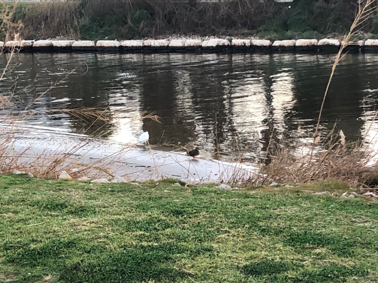
10k done, and my Egyptian goose friend approves:

Back in the (not so good) old days, Tomoe River Paper was an exotic kind of paper available only in bulk order from Japan, or through various indie creators that advertised mostly on the Fountain Pen Network. The magical paper that made all your inks shine (not literally, this was in the pre-sparkle days of ink, when shading is all we dared dream of in an ink) was very hard to obtain, and very expensive.
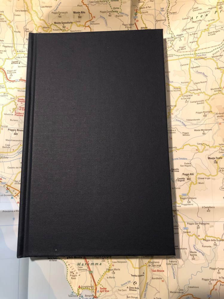
It was at that time, in 2013, when I was looking for reasonable priced Tomoe River Paper notebooks that could be shipped to Tel Aviv, that I ran into Paper For Fountain Pens, through the Fountain Pen Network. Since I just received my latest three-pack of notebooks from Jay at PaperForFountainPens.com, I decided that now would be as good a time as any for a review.
The notebooks that I ordered are the larger, 374 pages (187 sheets), ones, which are available only around this time of year. The regular notebooks have 320 pages, but are otherwise identical. Jay uses 52 gsm Tomoe River Paper for the notebooks, which are 4 3/4 x 8 3/8 inch page size; 5 1/4 x 8 1/2 inch cover size.
The notebooks used to be shipped with a paper cover, now they arrived vacuum packed as well, to protect them from the elements, and in a heavy duty box that prevents them from getting damaged by the postal services of the world.


Tomoe River Paper is much easier to find now and these notebooks aren’t cheap, as you are paying for the binding. The covers are very durable, made from a material that (with the binding) makes the whole notebook look and feel like a vintage hardcover book. It has that solid, over-engineered feel to it, and is very pleasant to use and hold.
The notebook isn’t inconveniently thick, even with the larger page count.

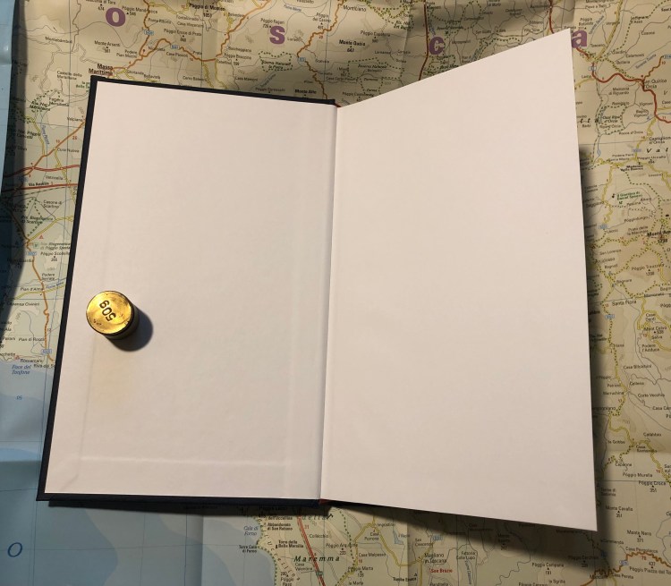
There are no frills to this notebook, just blank end papers, no elastic closure or bookmark, nothing but the paper and the covers. The pages lie flat, and the binding is extremely durable (I page a lot, a lot in my Paper for Fountain Pens notebook and not a page has wavered in my years of using it).
I’ve used the slimmer version of this notebook as a research notebook for my novel and it has held up well through years of use. I do, however, only keep it on my desk. Travelling with such fragile paper in a notebook with no elastic closure is a recipe for disaster, so if you do intent to use one of these beauties as your everyday carry notebook or journal, I highly recommend placing it in some kind of protective cover that you can zip up.

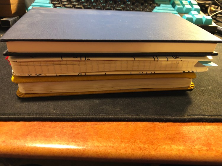
This notebook is slightly thicker than the Baron Fig Confidant and Moleskine large notebook, is about as wide as the Moleskine, but a tad taller.
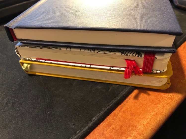
You can see the difference in sizes with the notebooks stacked up. The Paper for Fountain Pens notebooks have thicker and heavier covers than the Moleskine and Baron Fig ones, but the lightweight paper in them keeps them from being overly heavy to carry around.
All in all I recommend these notebooks, with one caveat: they may intimidate you to a point where you won’t use them. There’s something about their book-like format that makes you feel that you can only write the next Booker prize winning novel in them. Notebooks should be used and not stacked and stared at, so if this one will scare you off, pick a more humble notebook instead. Otherwise, buy a three-pack of these — it’ll come out cheaper (particularly with shipping), and there’s an excellent chance that they’ll become your new favourite.
Each year for the past 15 years The Morning News has run the Tournament of Books — a March Madness like competition for books published during the previous year. It’s fun and light-hearted and super interesting because unlike other literary prizes, you get to see the judges’ thought process as they decided which book progresses and which doesn’t.
I first learned about it a few years ago through Field Notes, who sponsors the competition and issues a special, limited edition notebook to accompany it. At first I just bought the notebook, because I was a budding Field Nut and that’s what Field Nuts did. A year later I read and enjoyed some of the books that were in the competition, and I started to really look forward to reading the judges’ debates on each round.
Which brings us to this year, which is the year that I’ve decided to finally challenge myself to read every book on the Tournament of Books 2019 shortlist. That’s 18 books total, and as the tournament starts in March, there’s very little chance that I’ll be able to finish reading all of the books in time for their round. That just means that I’ll be following along a little later than usual, but I don’t think that it matters much.
What’s challenging isn’t just the sheer volume of books, but also their topics. There are no “light read” books on this list. There are books about death, prison, war, bigotry, racism and all the other “wonderful” sides of humanity. It would be a tough challenge on a regular year, but as I’m struggling with death and sickness in my family, this will be extra tough.
So why am I doing this? To challenge myself. To make myself a better, more empathetic human being, and hopefully a better writer. And because I can.
Speak No Evil is part of the Tournament of Books 2019 play-in round, which means that it is up against two other books before it can make its way into the initial rounds of the competition. As this is the first book I’ve read in the ToB and it was excellent, I can’t imagine what the rest of the field looks like.
I have never read a book so full of heart, life and joy, that was also tragic. “Speak No Evil” is a timeless tale that is deeply imbedded in our time and is well aware of it. To say that it deals with Issues (capital I) like Homosexuality, Race, Bullying, Policing, Gender and (above and beyond) Friendship would do this gem of a novel injustice. It’s first and foremost a very good book, with beautifully and richly crafted characters moving around in a plot that is inevitable but far from dull or expected. Every person is propelled forward by their past and their character, but is also somehow aware that he or she are actors in the story of their life. An astounding achievement, and a must read.
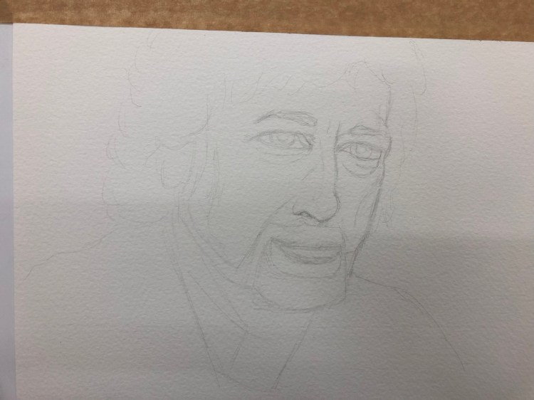
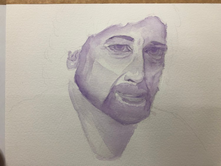
I decided to work on a monochrome Neil Gaiman watercolour portrait, and I remembered to take progress photos for a change.
The initial sketch was done with a Faber Castell 9000 2H on Bockingford 300gsm watercolour paper.
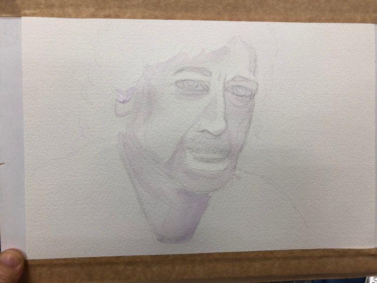
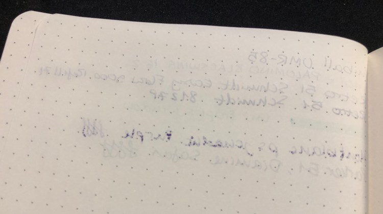
Then I did some light initial shading (I use Schmincke watercolours):
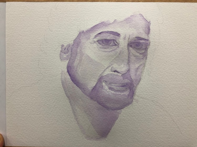
This is with most of the work done:
Final pass, differentiating more between light and dark:
On Sunday’s running group meet I tripped on a bit of uneven sidewalk in an unlit section of the park. I blocked my fall with my hands and knees, saving my head but tearing my tights and the skin off my knees. So I’ve been on a running hiatus until Friday, giving my knees time to heal. This meant that this week’s 10k was slow, as I was both out of shape and wary of the sidewalk, but at least I got it done.
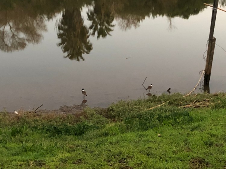
Spur-winged lapwings waded along the riverbank:
The cormorants, wintering near the river, have a thing for this eucalyptus:

Two Egyptian geese perched on the river edge:

Rowing on the river:

A little egret fishing:

I also saw a moorhen and a pied kingfisher, but didn’t get the chance to photograph them.
Another 10k in the books:

Chronicle Books has uploaded Moleskine’s Spring 2019 catalog and it is interesting.
Here’s a break down of what’s new and changed this season, as well as my take on some of their decisions. Some of these notebooks are already available, others will become available over the next few months. Pour yourself a cup of coffee, open the catalog, and dive in:
I’m not a planner person, so I’m not going to go over Moleskine’s extensive planner collection.
There’s nothing new in the Pro Collection and I don’t use any of these business focused notebooks (I like to build my own meeting notes formats), and so I won’t go over these.
As for the rest (the non notebook stuff), here my interest wanes, and this post has been long enough as it is. The catalog is 151 pages long, and full of eye candy, so even if you aren’t a Moleskine fan, take a look.
I planned to review the Sharpie brush pen, after spending the best part of a week with it, but as it turns out, I forgot it at the office. I’ve been using the Pentel Fude Touch Brush Sign Pen instead, so here’s a review of this boring little brush pen instead.
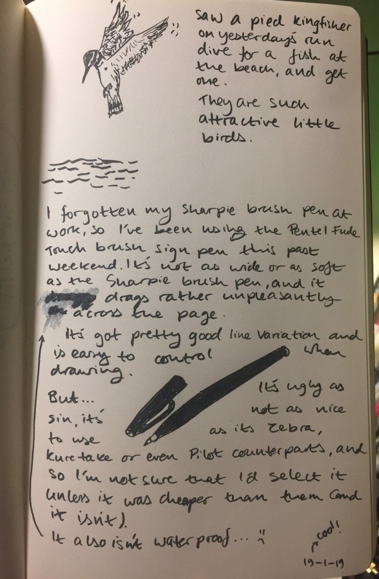
Today’s journal comic/review, drawn on a Moleskine Star Wars crawl text blank notebook. This paper is smooth, although not Rhodia smooth, but the pen still really dragged on it. It was worse on any sort of paper with even the slightest tooth, making it super not fun to use.
The brush pen tip is pretty firm, which means that you get a medium amount of line variation, but that it’s very easy to control. If you’re starting out in the wild world of brush pens, either for drawing or lettering, this tip grade is probably the best for you.
The black ink is black, and not greyish or brownish, and completely not waterproof, which can be a good thing (if you want to “stretch” it or use it for shading, as wet it produces a good 50% cool grey), or a terrible thing (if you want to combine it with watercolours).
The pen body itself looks and feels cheap and plasticy, which isn’t too unusual in the disposable brush pen market. Why do all these companies have a thing for a dark pen body with pronounced gold lettered marketing splashed all over it? Pentel’s also put sparkles in its, body, just for some extra garish fun.
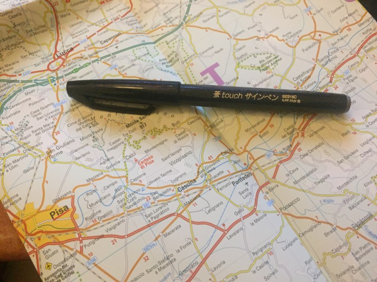
The pen is torpedo shaped with facets along the body that somewhat help keep the pen from rolling. It’s borderline too thin to use for long periods of time without cramping, but otherwise it’s comfortable to hold and use.
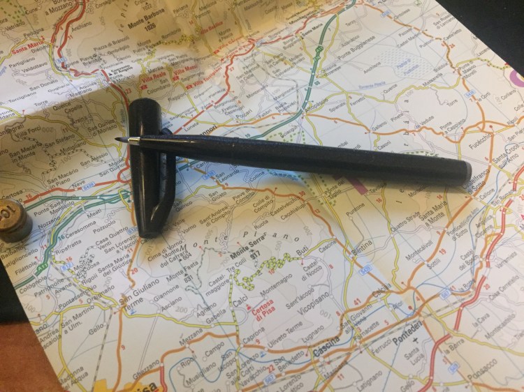
The Pentel Fude Brush Sign Pen would be a good beginners’ brush pen if there wasn’t so much competition at the same price. As it is, buy a Zebra brush pen, which allows for greater line variation, or a Kuretake brush pen, which is also waterproof, or add a little more and get the experience of two brush pens in one with the Pilot Futayaku. As it is, this Pentel pen lacks enough line variation to make it fun and interesting to use, and it isn’t cheap enough to justify buying it over the competition.
So it appears that Moleskine has finally hopped on the dot grid bandwagon, releasing several of their classic collection notebooks in dot grid, even going as far as creating dot grid versions of some of their seasonal colours (gasp!). Next thing you know they’ll be releasing limited edition notebooks in squared and dot grid paper, and then where will we be? (Don’t worry, it’s not going to happen).
The classic Moleskine collection consists of their hardcover and softcover notebooks, in pocket, large and extra large. Currently the dot grid is offered in black covers, both in hardcover and softcover, and in underwater blue (such a pretty seasonal colour) and beige in softcover. However, it apparently was enough of a success for them to issue the dot grid option in all their classic collection core colours (black, red, blue sapphire, and myrtle green), and in seasonal reef blue (both hardcover and softcover). These colours will start being available in February-March, so it may be worth waiting a little while before purchasing (although some of the hardcover core colour options already seem available).
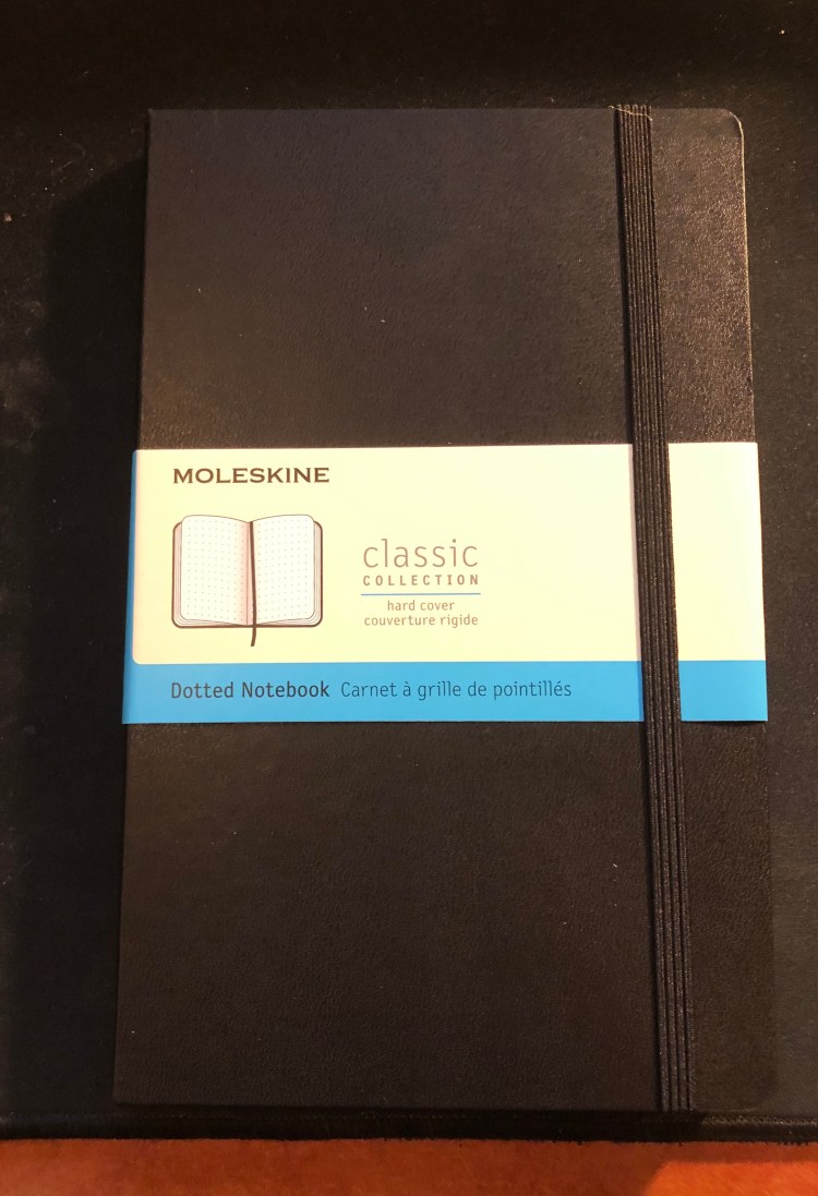
Now to the review. I got the classic large black hardcover notebook, as it’s probably Moleskine’s best selling notebook, and what people have in mind when they say “Molekine”.
First thing’s first, Moleksine have listened to customer feedback and significantly strengthened their notebooks’ elastic bands. They’re a little thicker and wider, and there’s little chance that they’ll turn into the floppy mess that some of their earlier elastic closures turned into after a few months of use.
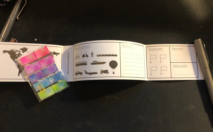
The sleeve also has a B-Side, this one is pretty travel oriented, and I love it because maps!

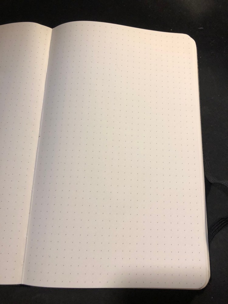
Which brings us to the paper. The dot grid pattern is medium grey, dark enough to be visible, light enough to not be too distracting. It also is very precisely aligned on all pages, if those kind of things bother you.
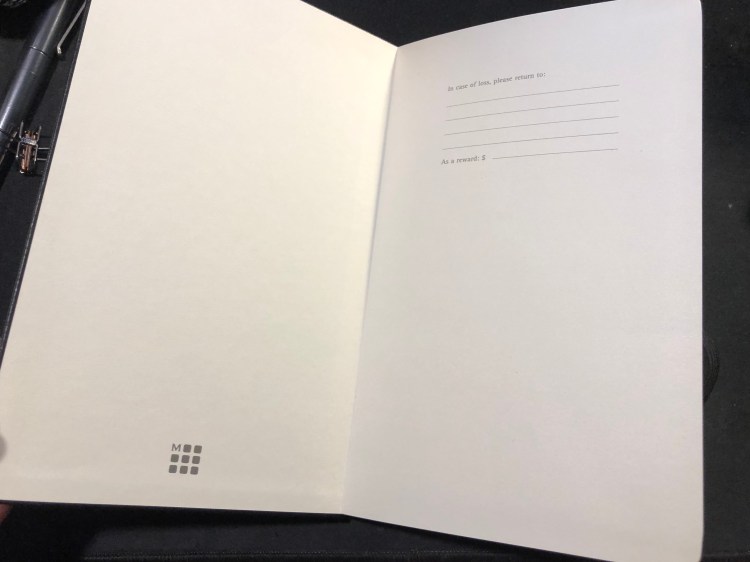
The “In case of loss” endpaper, with the Moleskine logo, a relatively recent addition.
How does the paper perform? Better than you’d expect. Gel, ballpoint and pencil work well with the paper, but even fountain pen inks, including pretty saturated messes like the Montblanc psychedelic purple work pretty well. There’s no more weird spidering, as there used to be and the spreading is minimal (better than Baron Fig, well above average). If you don’t insist on super saturated inks, you’ll be able to enjoy using fountain pens in this notebook.
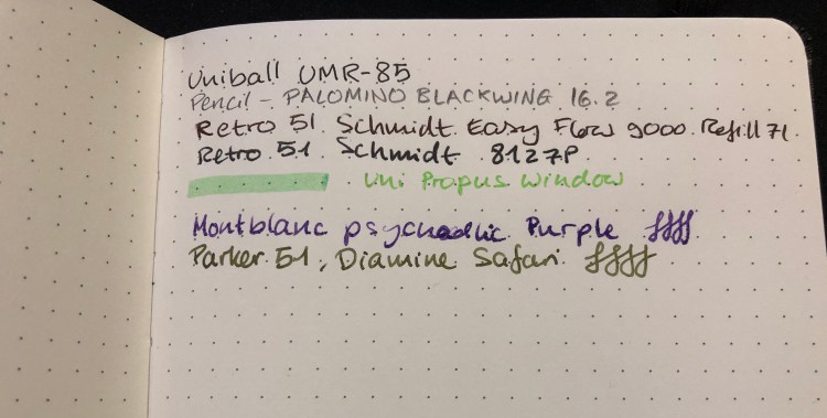
A closeup of my writing samples. Montblanc purple has behaved this way on Rhodia paper too, so I blame the ink, not the notebook:
Show through is better than tomoe river paper, but not as good as Rhodia (I’ve had mixed results with Baron Fig, so I’m not using them for comparison here). Again, the only real problem was with the Montblanc ink, which is a problematic ink in general, so I’m not using it for comparison. I’d find this notebook to be usable on both sides of the page, but again, that comes down to preference.
Moleskine seems to be making an effort not only to come up with innovative limited editions, but also to give their regular line-up a bit of a refresh (with new added colours) and boost (with new dotted paper, better quality paper, and a fix for their elastic closure problems). That’s a move in the right direction, and one that I plan to enjoy.
I still need to figure out what’s going on with that Montblanc ink, though…
