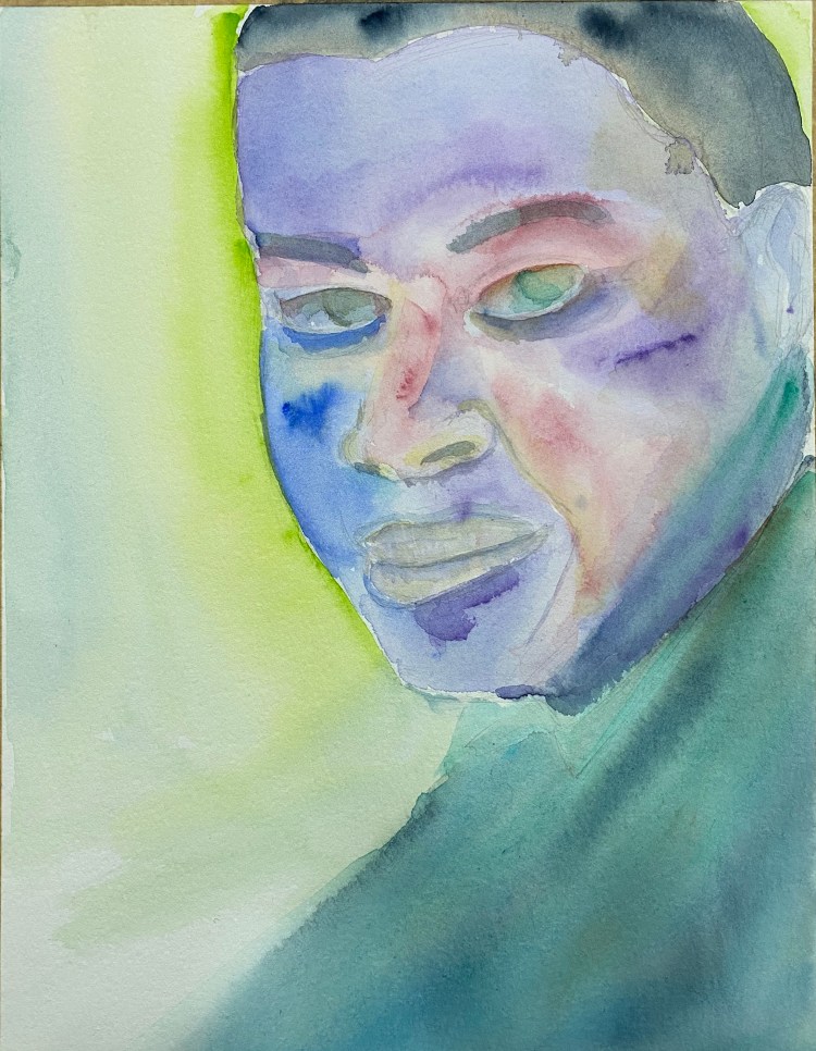
Portrait of an Urban Sketcher
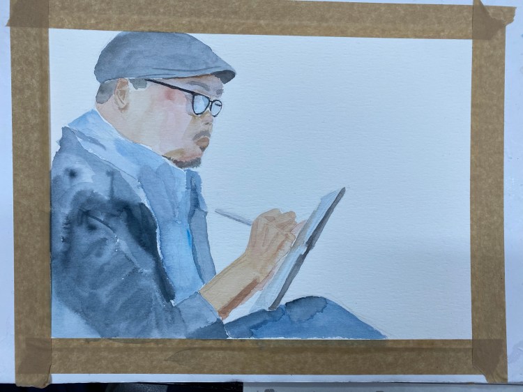
Decided to work on a more conventional piece, and so I drew a watercolour portrait of Urban Sketcher Rob Sketcherman at work.
A blog about writing, sketching, running and other things
Decided to work on a more conventional piece, and so I drew a watercolour portrait of Urban Sketcher Rob Sketcherman at work.
I just finished my first Field Notes of the year. In: Mr. Rainier National Park (Field Notes National Parks), Out: Field Notes Joshua Tree National Park (Field Notes National Parks).

This has become one of my favourite Field Notes editions, right up there with Two Rivers and Balsam Fir. It also wears surprisingly well. This notebook has been bashing around in my bag for the past three months and you can barely tell:

The dent on the side is from where I clip it shut.

The Mt. Rainier is the last of the National Parks C pack (which also included the Grand Canyon) and the cover just brings a smile on my face. What a great edition.
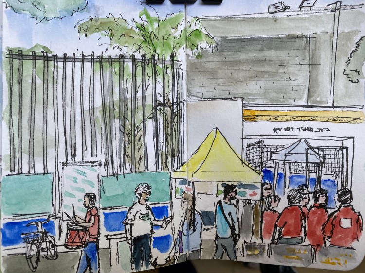
A sketch on location of my polling station in Tel Aviv (don’t be creepy) on election day.
While I was sketching an elderly volunteer came for a chinwag in the shade, and then stayed and chatted for a good long while. I guess he was lonely. And later two girls came around selling cookies and lemonade for charity, so I bought a cookie and talked to them while they watched me draw and tried to sell their wares.
Schminke watercolours, Staedtler pigment liners, Stillman & Birn pocket Alpha.
It’s been a while since I’ve written one of these, mostly because I’ve cut down on the number of photo stops during my long runs. But this morning’s dramatic cloud cover inspired me to take a few photos, and so here we are 🙂

These clouds passed over me as they made their way inland with a strong breeze, and though they look foreboding and there was rain inland, I was lucky and I didn’t get rained on during my run. It was cool to see the sky darken and then brighten back up again when they passed.
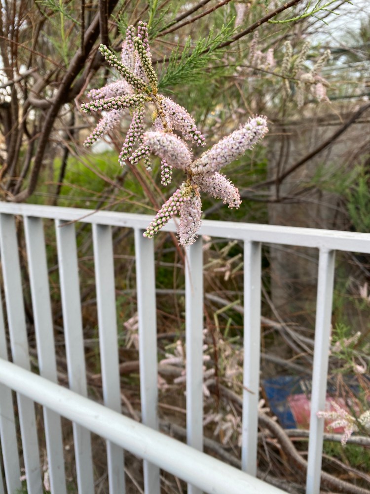
This is a Tamarisk of some kind, but I haven’t been able to nail the exact species yet.

Mama Mallard was taking the ducklings out for a stroll, which was nice to see. They kept running circles around her, with the wild energy of youth.

There was a congregation of Black-headed gulls chilling in the water. The tide and wind was pretty strong but they managed to maintain their position, which was impressive.
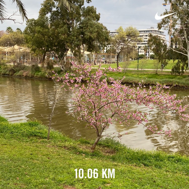
10K done, in perfect running weather. I don’t get a lot of those, so I try to cherish them when I do.
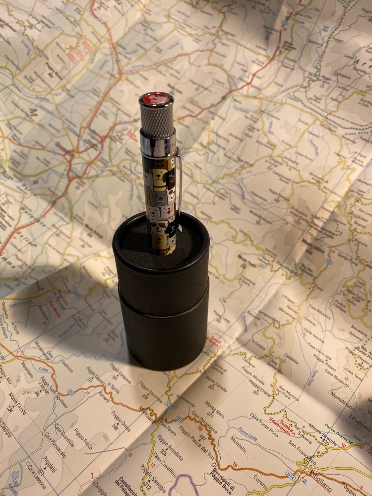
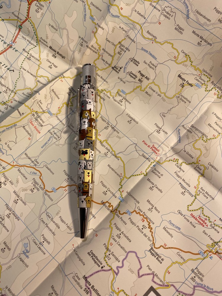
The last Retro 51 of the three that bought once I heard that they were retiring arrived: the Cat Rescue 3. I gave it a try as part of my Retro 51 Challenge, and so far I’m utterly enamoured with it.
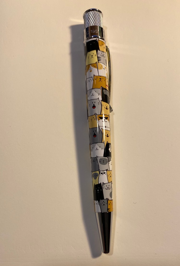
The Cat Rescue 3 shares a similar design and illustration style as the Dog Rescue 3. The illustrations on both pens are wonderful: adorable, full of humour and love for their subject.

Beyond cool cats in sunglasses (that go well with pirate dogs with eyepatches) the Cat Rescue 3 pen also has a hidden drawing of a mouse (the dog one had a hidden squirrel). That just makes this pen 1000% more likeable in my eyes.
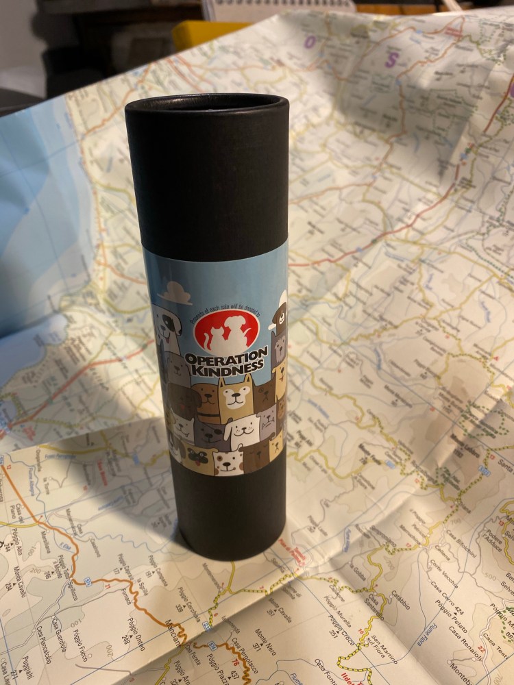
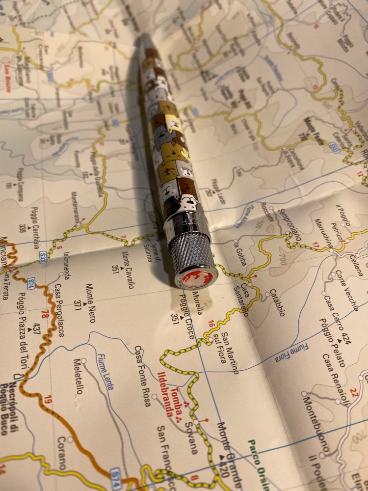
The tube the Cat and Dog rescue is similar, as both donate 5% of proceeding to the same animal shelter, Operation Kindness. Unfortunately the cardboard tube mine came it was utterly crushed by the mail service, so I won’t be photographing its ruins.
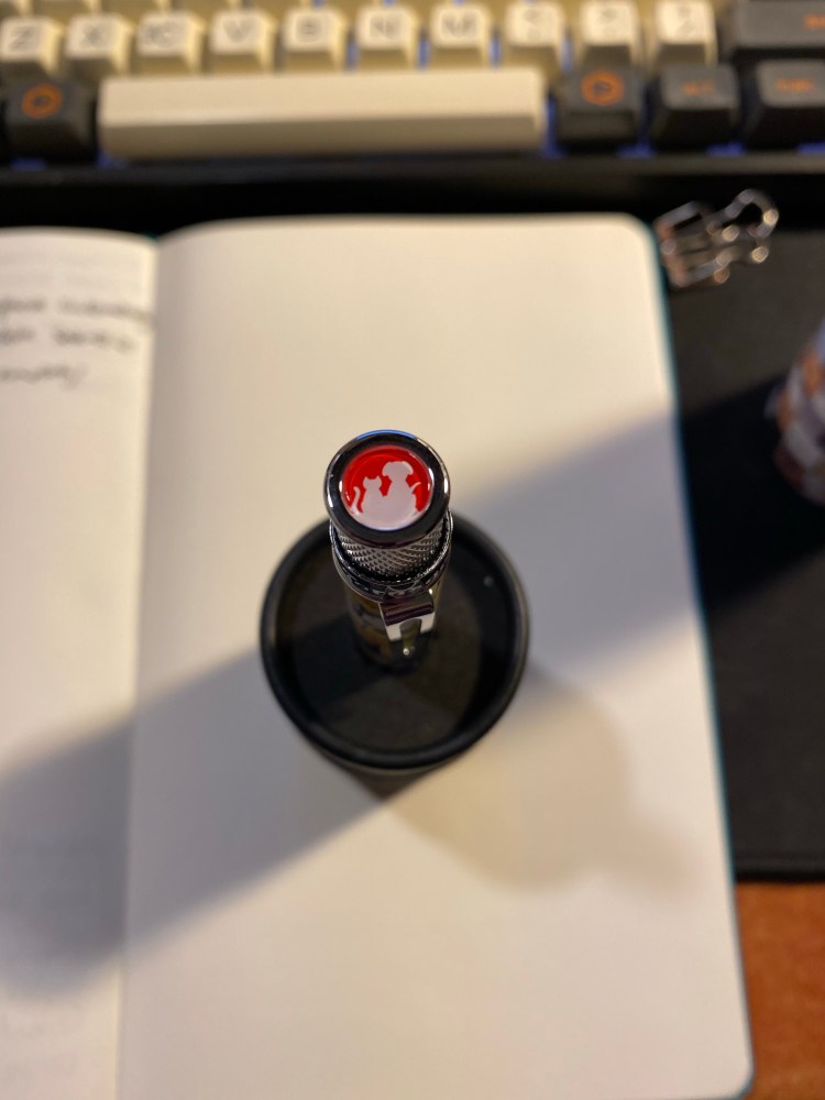
The finial/top disc features the Operation Kindness logo, and I’m not bothering with a writing sample because there are only so many times you can read about me raving how great the Ohto FlashDry gel refill is.
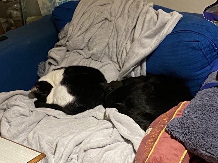
As a bonus, here are a picture of my cats (brother and sister, both rescues) to make you smile. If you can donate or help your local shelter in any way, please do.
Decided to really play with this one.
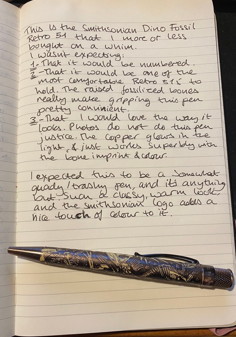
My Retro 51 Dino Fossil arrived in the mail, and I’ve been using it throughout the weekend. It was a completeimpulse buy, and I kind of regretted it once I bought it and before I got it. I thought that I’d never use a pen with bones on it, fossilized dinosaur bones or not.
It turns out I was wrong.
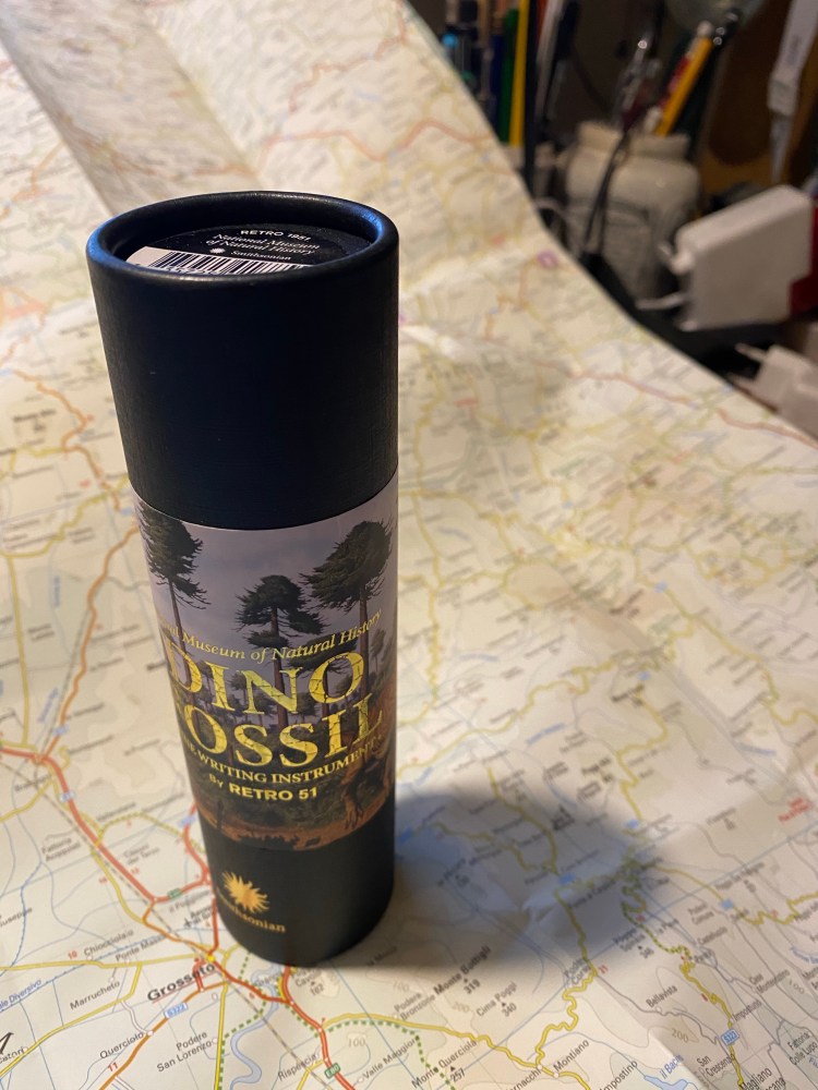
I don’t care much for packaging, but this packaging was cool. The gold embossing really adds a classy touch to it, and the Smithsonian logo pops on the background of the black tube.
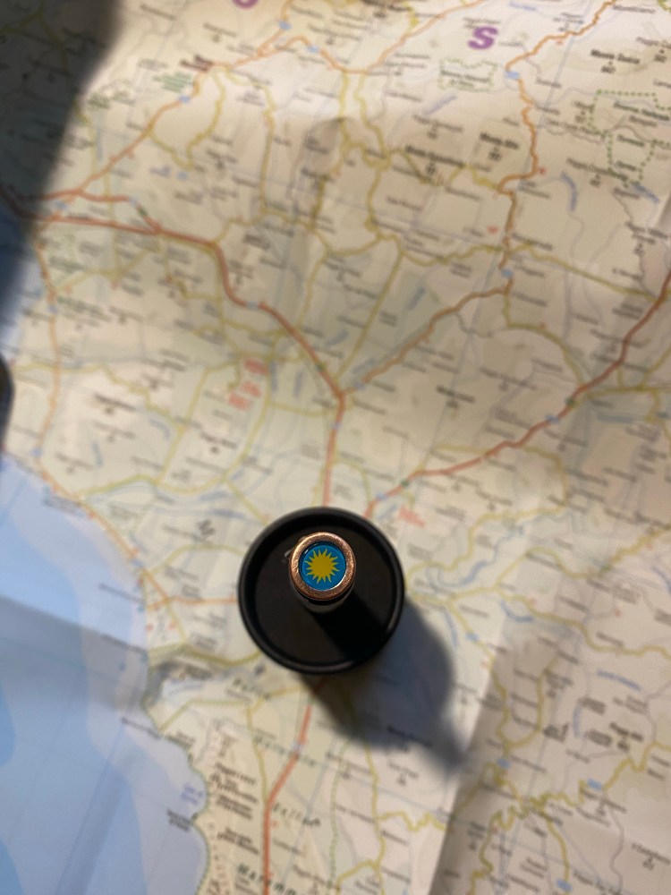
That same logo also appears, in full colour, on the finial/top disk of the pen, and it adds a welcome bit of colour to it.
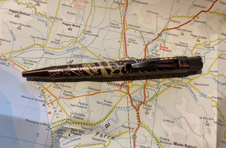
The pen is copper, much like the Retro 51 vintage metalsmith Lincoln, but there’s a lot of added texture to that copper. There’s brushed copper on the pen hardware, a dark matte copper on the pen body, and embossed dinosaur fossils that are partially painted.
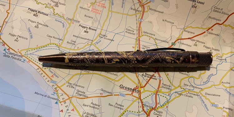
The result could have been busy, but ends up working phenomenally well, while at same time making it almost impossible to properly photograph. The copper glows with warmth that makes the pen come to life.
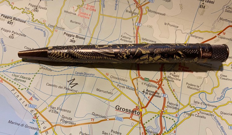
It somehow doesn’t look tacky in person, but rather classy and somehow understated. The pen’s copper body draws more attention to itself that the bones do, because of their muted off-white colour.
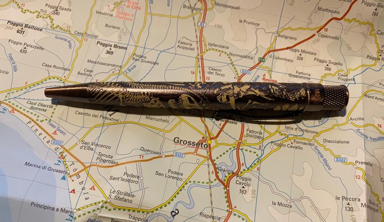
The other thing that surprised me is that the Dino Fossil is numbered. I wasn’t expecting that, and the seller I got it from didn’t mention it, but just in case you care, on the band below the twist mechanism there’s a number, and “Smithsonian” where there usually is “Tornado” etched in. The number also appears on the cardboard tube the pen comes in.
The dinosaur fossil embossing makes this pen really easy to grip, and pretty enjoyable to write with. As usual I swapped out the Schmidt refill it comes with, replacing it with an Ohto FlashDry 0.5 gel refill.
The Retro 51 Dino Fossil was a pleasant surprise: a pen that I thought I bought for gifting, and turns out to be one of my favourite Retro 51s to date. I’m likely going to say goodbye to my Lincoln before this, and I recommend it if you have even the slightest affinity to dinosaurs, natural history, archeology, the Smithsonian or beautiful copper pens.
I bought three new Retro 51 pens once I heard that they were retiring: Dog Rescue 3, Cat Rescue 3, and the Smithsonian Dino Fossil. I was planning on giving them a try as part of my Retro 51 Challenge, and if it turned out that I didn’t enjoy them, gifting them (or at worst, reselling them).
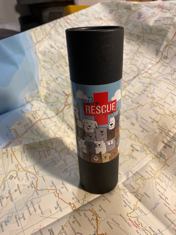
The Dog Rescue 3 arrived a few days ago, inside one of the cutest tubes that Retro 51 has designed.
5% of proceeds from this pen goes to Operation Kindness, which is nice, but probably won’t move the needle much. I donate yearly to a local animal shelter, and if you’re buying stuff just to donate, it’s better to not buy the stuff and just donate. This is a great looking pen though, so if you like it, by all means buy it, feel a little good about the donation, and then go and donate to Operation Kindness or a local shelter directly.
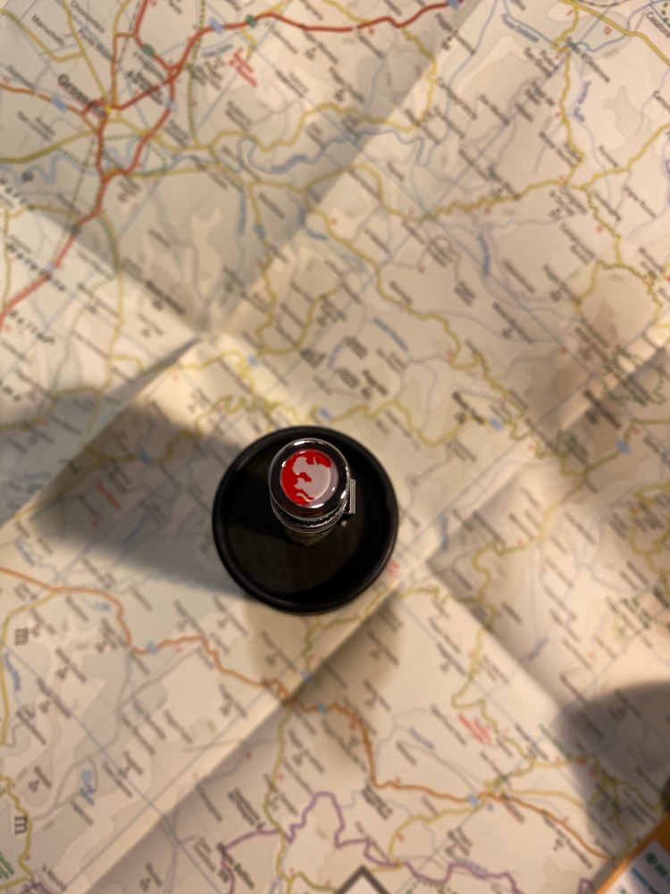
The operation kindness on the finial/top disc is a great touch.
The red on the finial is echoed in the dog illustrations on the body, which works really well. The illustrations/cartoons themselves are the best part of the this pen. You can totally see different dog personalities here, not just different breeds:
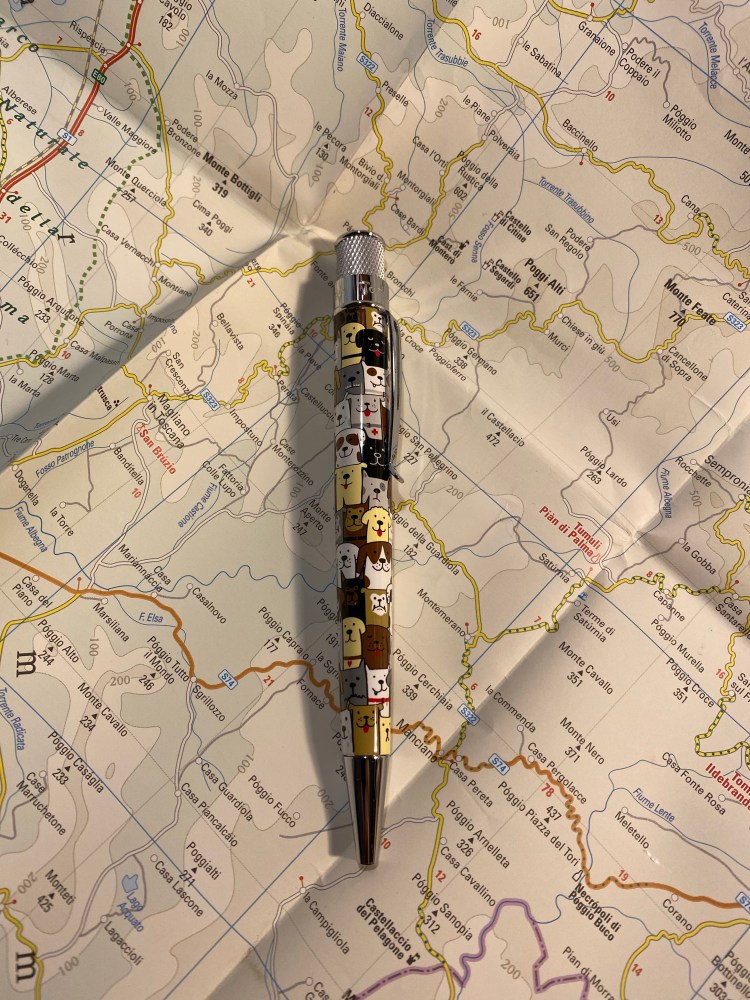
There’s even an eye-patch dog – can you spot him?
The hardware on this pen is shiny silver, and though it works, it isn’t one of the highlights of this pen. I suspect that the Dino Fossil’s one will be more interesting.
I replaced the standard Retro 51 refill with an Ohto FlashDry 0.5 one and it’s a joy to write with now.

The Retro 51 Dog Rescue 3 is a delightful pen that brings a smile on my face every time I pick it up. It would make for a great gift for a dog lover or a Retro 51 aficionado.

María Gainza’s “Optic Nerve” is a pleasant piece of what I now know to be termed “autofiction,” which is to say that it’s “fiction” based on the author’s life. It’s a nice way to while a way a few short hours, especially if you enjoy art history (or to be honest, art gossip). “Optic Nerve” is readable, inoffensive, largely forgettable, like most trivia-based works of its kind. There’s nothing to hate here, but there’s also not much to really love: the book remains on surface level with itself and its reader.
There are interesting and complex “characters” here, but the narrator is too self involved to get to know them, or too busy keeping herself at opaque for us to see them well. They are marks on the paper, nothing more, nothing less. You know nothing more about them, the artists or the narrator than you did at the book’s start. It’s a little disappointing, since it’s clear that Gainza knows how to write and is well aware of the dangers of judging an artist by the anecdotes we know of their lives.
I read this as part of the Tournament of Books 2020, where it’s up against Caleb Crain’s “Overthrow” in the 5th round of the tournament.

Ocean Vuong’s “On Earth We’re Briefly Gorgeous” is more of a memoir in poetry than it is a novel. Even as you read it it’s clear that this book is so autobiographical that practically only the language use in it is fiction. It’s a sharp, painful and beautiful memoir, and I’m glad that it exists, but it’s just not a novel, so it’s impossible to judge as one. The characterization is brilliant, but it’s clear that these characters are very real, and their complex relationships and behaviours are recorded from life. There’s no plot except the protagonist’s life, Vuong’s life. The writing is wonderful, although it’s not an easy read. It’s poetry from start to finish, and it expects the reader to work for their reading.
There are more and more “fictionalized non-fiction” books that are being published as fiction, and some of them are excellent. It’s just makes the task of judging them against “fiction fiction” much harder.
So a recommended read (it does require a strong stomach. There are some very disturbing images and scenes that appear again and again in the narrative), but one that also calls into question the definition of fiction.
I read this as part of the Tournament of Books 2020, where it’s up against “Nothing to See Here” in round four of the contest. It’s so hard to compare these two books, even though they both deal with childhood trauma, loss and being impoverished outsiders in a world that values wealth and conformity. “Nothing to See Here” is entirely a work of fiction, while “On Earth We’re Briefly Gorgeous” is so very clearly not. Vuong’s work is more culturally significant, but I enjoyed “Nothing to See Here” so much more, and it’s such a risky and clever piece. I wouldn’t argue with anyone picking “On Earth We’re Briefly Gorgeous” as the winner of this round, but my pick is Kevin Wilson’s “Nothing to See Here”.
