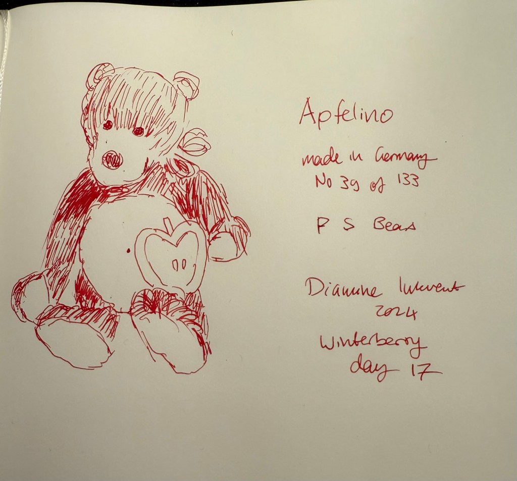
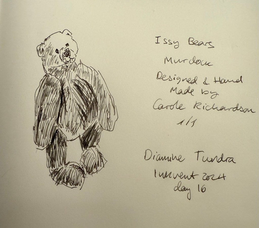
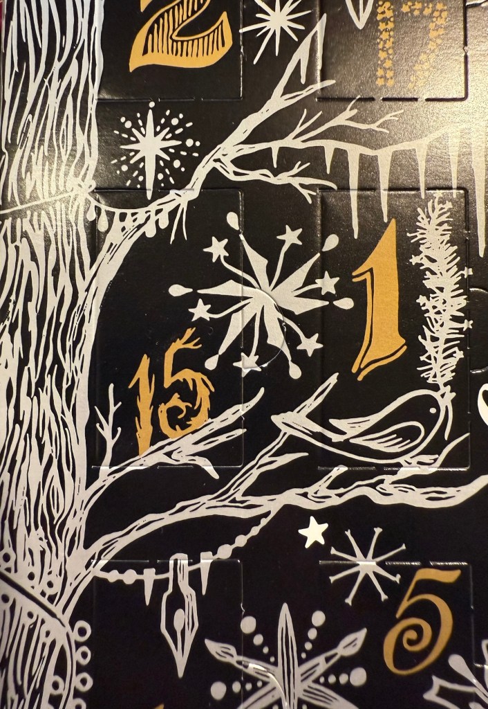
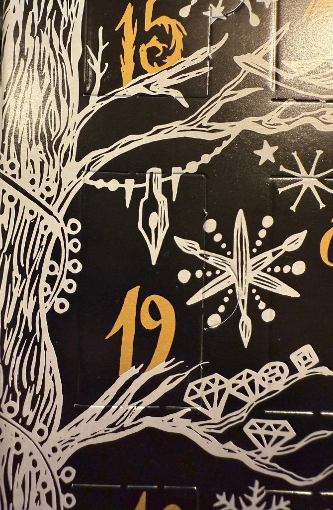
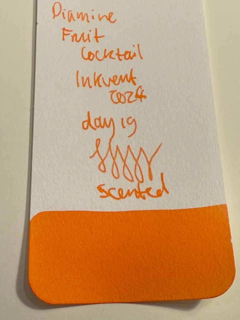
Diamine Inkvent 2024 Day 19
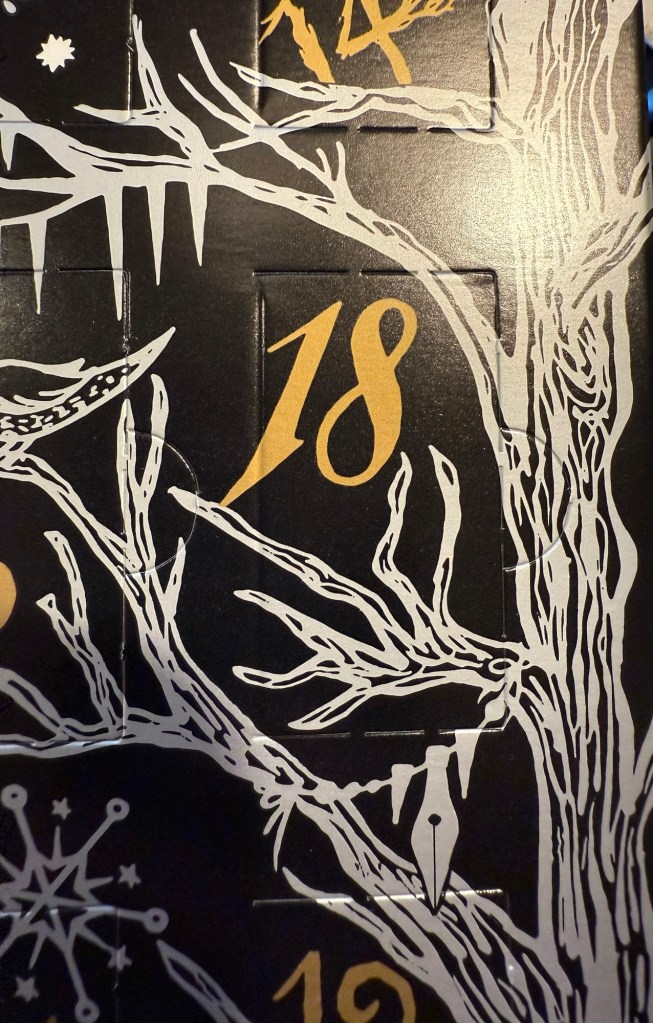
This is the Diamine Inkvent 2024 Day 19 door:
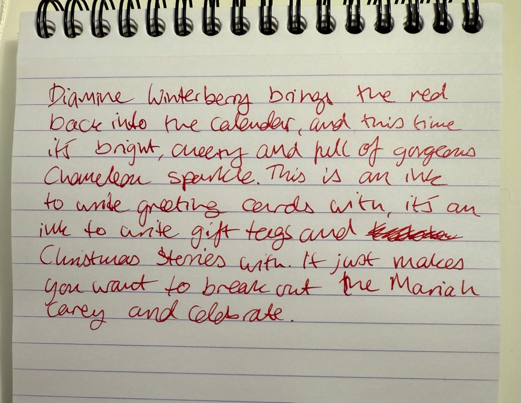
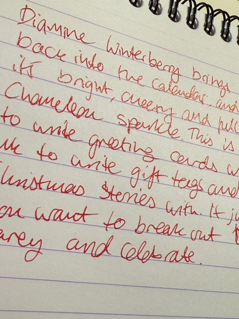
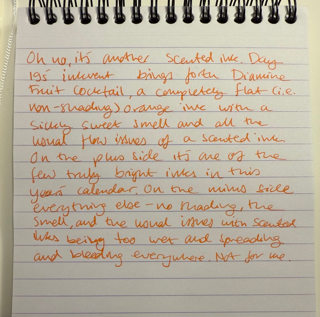
Day 19’s is Diamine Fruit Cocktail, an almost neon orange ink with zero shading properties and… scent. Yes, this is another scented ink, again with a sickly sweet artificial smell and an overly wet and weird ink flow due to the addition of said stink (I hate scented inks, can you tell?). I used a Diplomat Aero fountain pen with a fine nib to test this ink.
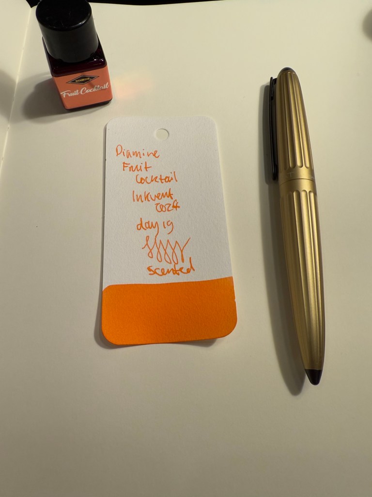
It is absolutely uncanny just how flat this ink is, especially considering how light and unsaturated it is. I would have expected such a “thin” light ink to have at least a little shading, but as you can see from the Col-O-Ring swab close up, Diamine Fruit Cocktail doesn’t shade at all:
It’s weird writing with this ink because you learn to expect certain things from fountain pen inks, and this ink doesn’t behave at all like you’d expect. It’s scented, so it does have the usual flow issues that scented inks have, but it’s much less pronounced with this ink: in fact, it’s almost negligible. There’s also an expectation of some amount of shading in an ink that isn’t a dark, super saturated ink, and that doesn’t happen here at all: it’s like writing with a gel ink pen. And you don’t expect this kind of neon-ish colour in a fountain pen ink, because it’s normally accompanied by some amount of colour variation or shading.
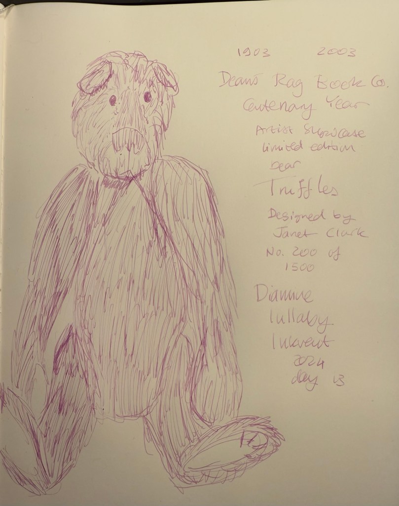
I was tired when I sketched this bear, so the proportions are a bit off. It was wild sketching with a fountain pen and getting the sort of results that I expect from a gel ink pen. Also, I really didn’t appreciate the addition of the sickly sweet smell to this ink.
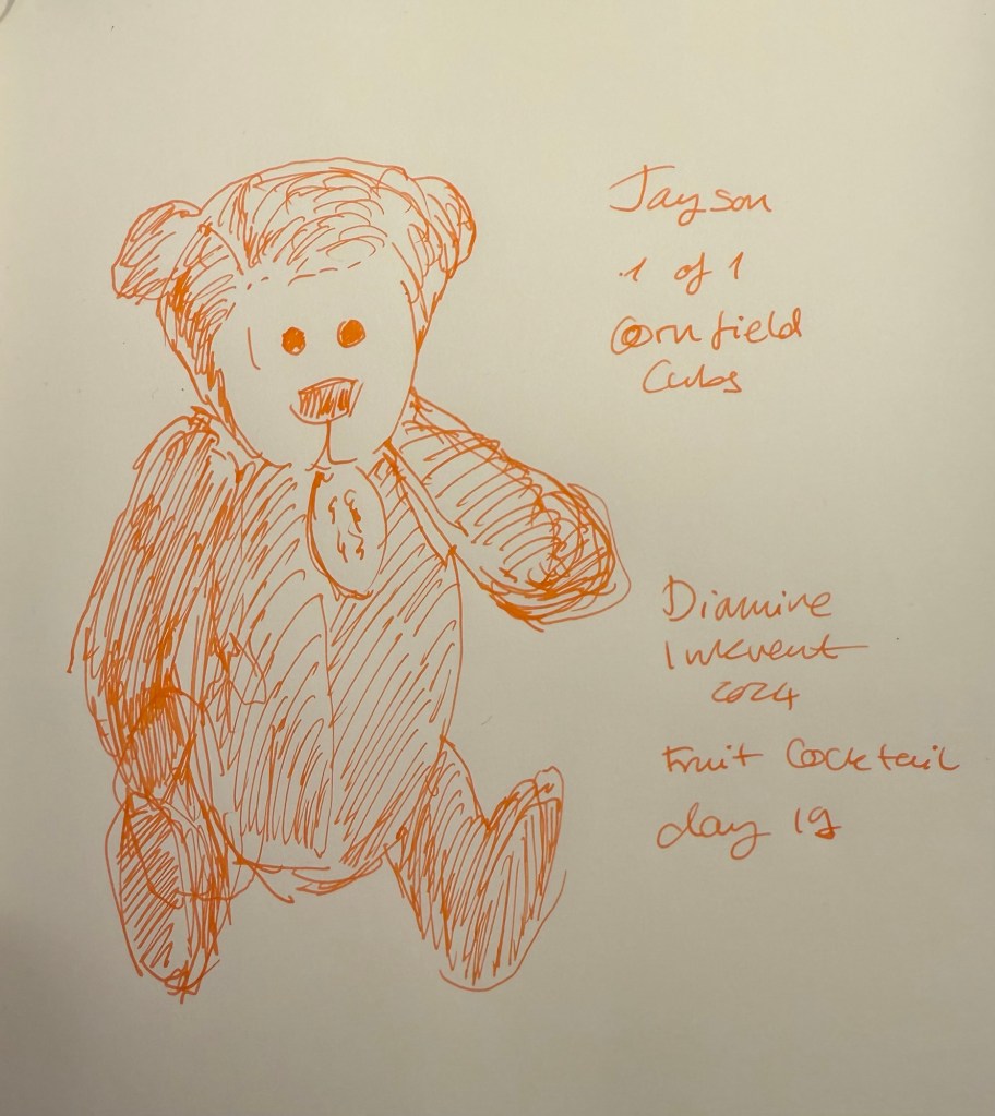
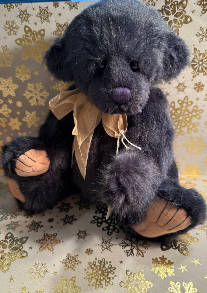
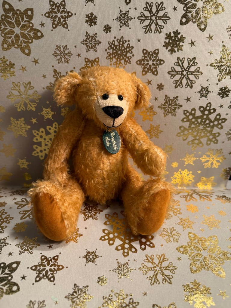
Today’s bear is Jayson, a one of a kind hand made bear from Cornfield Cubs, a small maker. I bought him in York because he’s got an usual look to him.
Putting aside the fact that Diamine Fruit Cocktail is a scented ink and I don’t like scented inks, I really don’t like this ink. There’s something about an ink that has none of the properties of a fountain pen ink that I find really off-putting. If I wanted flat colours I would use a gel ink or a felt tip pen. The whole point of using fountain pens, for me, is that they’re their own thing, and that includes the way that fountain pen inks look and behave. It doesn’t matter that I don’t really like Fruit Cocktail’s colour nor do I think that it’s thematically tied to the holiday season, what makes me dislike it most of all is that it doesn’t do what fountain pen inks do. If Fruit Cocktail had some interesting shading going on, I could almost ignore the smell and flow issues and rejoice in there being a bright and cheerful ink in what is shaping up to be a pretty dark Inkvent calendar this year.
What do you think? Do you see yourself using Diamine Fruit Cocktail? Does it bother you that this ink doesn’t shade or sheen or have any sort of interest beyond its scent?