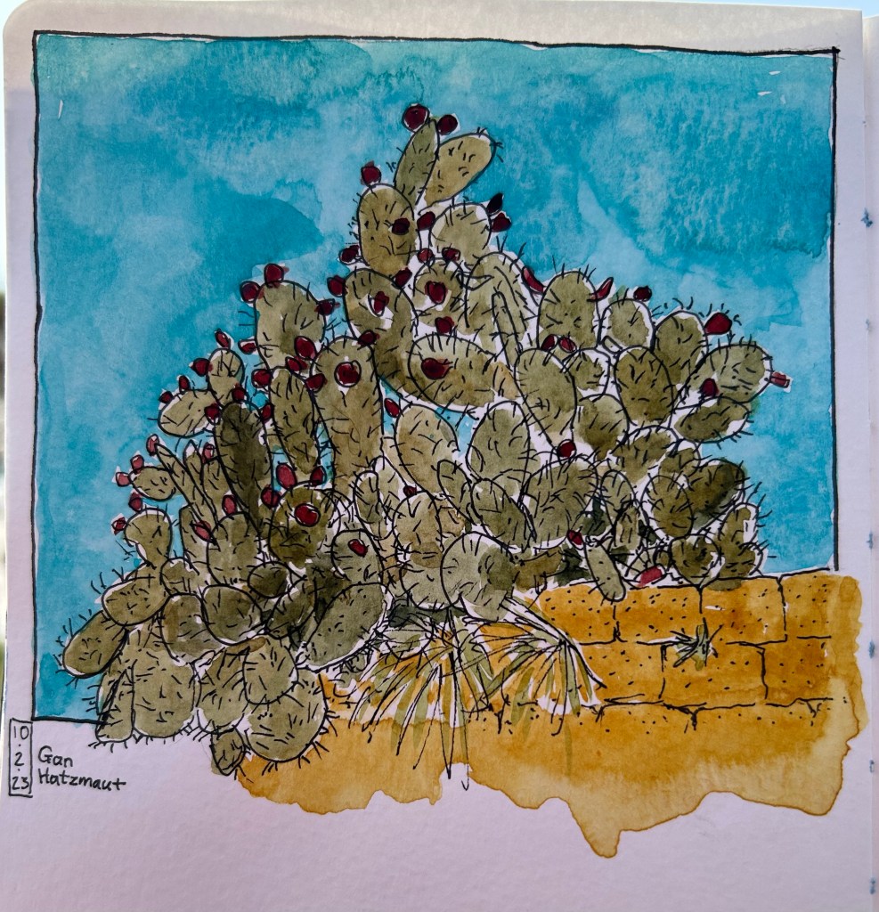
Yellow, Green, Blue, Black

Quick watercolour I drew yesterday. Schmincke cobalt blue is super granulating.
Process photos:

A blog about writing, sketching, running and other things
Quick watercolour I drew yesterday. Schmincke cobalt blue is super granulating.
Process photos:
I’ve had a cold this week, which is to show just how well masks and isolation work as it’s the first cold I’ve had in years. I haven’t missed it.
After a rainy week and then a sick week, my running has been suffering and the first race of the year is in two week’s time! I went back to running today, and planned to ease in with a 3k run that ended up being a 5.5k fast run because I was enjoying myself so much. It’s cold outside, but it isn’t raining, and that makes it perfect running weather.
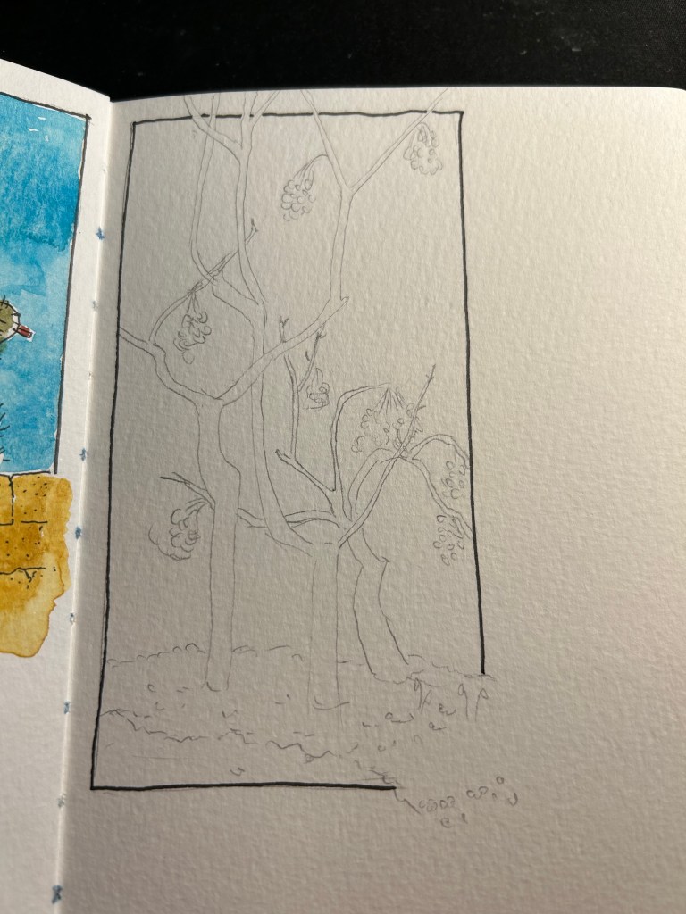
After three days of being cooped inside, I went outside to draw yesterday, and I tried a new kind of composition, which I kind of like:
I finished reading “A Gentleman in Moscow,” and thoroughly enjoyed it. I’m focusing on finishing “Erebus” by Michael Palin next before working my way through my kindle backlog and the stack of physical books that I want to read this year.
I’ve written my Lamy Studio Terracotta limited edition filled with Diamine Yule Log dry, and I’m now using a Lamy Safari Charcoal with Diamine Deck the Halls and a Lamy AL Star Charged Green with Diamine Alpine mostly, as they’re the next in line, with a couple of Kaweco sports, to be written dry. I’ve currently got 26(!) pens inked up, and it looks like I’ll be dumping out ink from a few of them, for the sake of my sanity. We’ll see how things go next week.
I’ve been my fountain pens mostly for journalling, on a Stalogy 365 notebook that I’ve started using. Every time my journalling gets into a rut, I switch notebook formats and that generally works to get me journalling again. The Stalogy is smaller than the Moleskine’s that I generally prefer to journal in, but it has fountain pen friendly paper, which is giving me the chance to use my pens. This is not to say that I don’t use fountain pens with my Moleskines (I do. I don’t care that they show through and sometimes bleed, as I have more than enough of them to use just one side of the paper), but that it’s nice to better see the properties of the inks that I use. Drying times aren’t great, and the cover is floppy, which means that I probably won’t be using this format long term. For now it works, as I’ve been journalling regularly, and I can use the Stalogy without looking at the various hour and date notations on the page. They are very feint, and I’ve turned the notebook upside down, so they are completely irrelevant to me.
I’ve been doing a lot of NTC workouts lately, and they’re tough but a lot of fun. If you’re looking for a way to work out more, using the NTC app is a great option. They have a large variety of workouts, workouts that are as long or as short as you need them to be, and workouts that are built for small places and little or no equipment (mostly you’ll just need a mat). It’s all completely free of charge, and has been that way for years. I’ve been using them for over a decade, and the quality and variety has just gone up with time. Even 5-10 minutes of exercise a day is better than nothing, and this is an easy and fun way to get into training.
Have a great and healthy week!
This post has been languishing in my drafts since mid September 2022. The photos were taken using my old iPhone 11, and the lighting came out very yellow and vintage-y. I was considering photographing everything again, but then I decided that this somehow works with this Moleskine’s theme.
It’s been a while since I’ve reviewed a Moleskine, but I’ve decided to get back to regular Moleskine reviews since I’ve got so many of them, and I still think that they are masters of design, and make the best quality covers and bindings than anything else in the notebook market. And 90% of Moleskine’s limited editions are their covers.
Back in the heady days of 2015, Moleskine came out with one of their best collaborative limited editions: The Moleskine Blue Note notebooks.

Blue Note are a jazz icon, a record label established in 1939 and instrumental in the development of modern jazz and in album cover graphic design. This collaboration could not be more tailor made for a brand that emphasized graphic design as much as Moleksine do.
The front cover looks like a Blue Note album cover, because it is a Blue Note album cover: midnight blue by Kenny Burrell. It’s a classic Blue Note album with a classic Blue Note design, and it’s no wonder that this is one of the albums that was chosen for this collaboration. The other albums in this series (Art Blakey’s “A Night in Tunisia”, Freddie Hubbard’s “Hub Tones”, Dexter Gordon’s “Go!” and Thelonius Monk’s “Genius of Modern Music Volume 2”) are equally iconic in both sound and album design, although “Midnight Blue” is the most muted of the bunch. As usual in Moleskine limited editions, there were two large notebooks and two pocket notebook designs in this series. I can’t help wishing for more of these, because I think that it’s such a perfect fit between the brands, and because Blue Note album covers are so fantastically well designed.

The inside cover design is the same for all the notebooks in this edition (again, this is something that Moleskine does for all its limited editions), and they feature photos of many of the legendary artists that recorded Blue Note albums (how many do you recognize?). There’s also a note about the album and the famous Blue Note logo on the bottom right side of the page, and Moleskine’s on the left. I’ll note here that Moleskine gave Blue Note’s logo far more prominence on the cover than what it gives its own logo (which is simply debossed on the back).

On the back endpapers there’s a history of the Blue Note label, the famous back pocket, and again Moleksine’s phenomenal printing and assembling capabilities that make the pocket printing completely aligned with the endpaper printing. Pattern matching is hard, and it always surprises me that they get theirs perfect every time.

The sleeves on this edition are excellent. Moleskine in Jazz indeed:

There are four stickers that come with each of the notebooks in this edition, one for each one of the albums in it, and they are perfect. The look exactly like a Blue Note disc, and the details on them are magnificent. Someone really enjoyed their job here, and it tells.

Almost all of Moleskine’s limited editions feature lined paper, but the Blue Note edition was a welcome change: this notebook has blank paper! I’ve been using it, in combination with another notebook, for journalling, and it’s great! As is the case with Moleskine paper, it’s largely for gel ink, ballpoint, pencil and fineliner use, although some combinations of fine nibbed fountain pens and inks work on this paper, and blank paper tends to be the most fountain pen friendly of the bunch.

If I could have any say in the matter, I would have loved to see more Moleskine and Blue Note collaborations, and I would have loved to see more blank paper limited edition notebooks. Most Moleskine users still prefer lined paper, which is why almost all of their limited editions have lined paper. But as Moleskine limited editions lately seem to skew to either book themed (Petit Price, Wizard of Oz, Lord of the Rings, Alice in Wonderland), pop-culture themed (Star Wars, various Manga and video game editions, Coke-Cola, Smiley) or designer based, I doubt that we’ll get to see more of these kinds of collaborations.
This book languished on my kindle for a long time, and is one of the ones that I was most looking forward to read as part of my “getting through my kindle backlog” challenge.
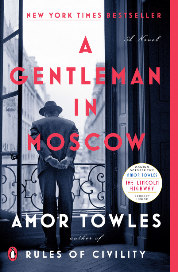
It is a first and foremost a charming book, much like the charming gentleman at its heart. It will make you smile more than once or twice, even as it discusses one of the most brutal periods and places in Western History: Russia under the Red Terror and during Stalin’s reign. Towles plays a tricky game here, much like a clever juggler, as he never lets you experience the era’s cruelty at first hand, yet he at the same time never lets you forget it. Even as the count thinks of poetry and the best of human kind, there are asides that remind you what was going on at the same time in the gulags and the collectives, in Ukraine (even then suffering under Russia’s boot), and in the daily lives of Moscovites in bread lines.
If you are looking for realism, this is not the book for you. “A Gentleman in Moscow” has the air of a fairytale to it, an insistence on seeing the good in people, in noticing their nuances and making room for them, in forgiving them for their foibles. It’s an optimistic book and I think we could do we a few more of those in the world.
This is not to say that “A Gentleman in Moscow” lacks sophistication and polish – on the contrary, it may have a little too much of them. Here is my main criticism of this book: it doesn’t trust its reader enough. It isn’t willing to let them pull out their own chair, pour out their own wine. Every point must be made clear, with charm and grace, but with little room for interpretation. The points where you are left to your own thoughts are few and far between, and you are to arrive to them after getting a thorough nudge in the right direction.
All in all though, “A Gentleman in Moscow” is a delightfully charming, accomplished book, with enough sophistication to its narrative to be satisfying without being opaque. It’s an enjoyable book to read, a book that I would gladly recommend, and it reminds me a bit in its overall theme and outlook of “Mrs ‘Arris Goes to Paris” by Paul Gallico (and that’s a compliment, in case you were wondering).
It was obvious that I’d discuss daily planners after I addressed weekly planners, right?
This format, in combination with some of the planning tactics that I’ll talk about in later posts, has been the one that I used the most over the years. Daily planners usually have a page per day, oftentimes with hourly notations on the side. Less commonly they have a page for planning and across from it a page for notes. Sometimes the page is divided into sections for various meeting notes, todos, etc. Daily planners tend to be the thickest of planners, unless they split the year somehow, or only cover part of it (academic year planners, for example).

I’ve used the daily format the most because it allows for the most room to think and plan in, and the main reason I plan on paper is for the space it allows me to sit with a pen in hand and a blank (lined/squared) page and plan the direction, location and movement of my tasks like a general ordering troops around in the army. Push this one until tomorrow or early next week, this one gets a little marker for lower priority, and this one for higher, etc. The marking methods that I use have changed a bit over the years, but the format that I prefer largely hasn’t. I can oftentimes plan two days on a page, but it makes things feel cramped. I’m giving that format a try now (two days per page), and I’m likely going to revert back to my beloved page per day format soon. Ideas need space to breath, and when tasks get cramped I tend to miss a few of them. They just run on into each other in a condensed wall of text.
Like with weekly planners, daily planners have obvious inherent downsides. They’re thick and heavy. Unless you’re making them yourself (which is what I’ve been doing for years), you’ll be made to feel bad with every day you skip in them. They also don’t allow to easily see the bigger picture: having all the space that the weekly planners lack, they pay for that with the inability of letting you get a feel for your week in a glance. You remain mired in the day to day, and need to purposefully remember to look ahead to see what’s coming tomorrow, the day after, next week.
This is the reason that for years I’ve kept two notebooks that I turned into planners, a daily one (which was much more heavily used) and a weekly one (which I referenced once or twice a week). This combination worked the best for me until I got sick and it crumbled. Perhaps it will work for me again.
“‘You Just Need to Lose Weight’: And 19 Other Myths About Fat People” by Aubrey Gordon is a short reference book that discusses 20 common myths and misconceptions about fatness in an attempt to equip the reader with facts, talking points and things to consider when addressing anti-fat bias (aka fatphobia).

As a long time listener and supporter of “Maintenance Phase“, Gordon’s excellent wellness and weight loss debunking podcast with Michael Hobbes (of “You’re Wrong About” fame) very little in this book was new to me. It was a distillation of many of the ideas and topics discussed in the podcast, formed into a book that is specifically meant to be a teaching aid of sorts. It is also much more of a “call to action” book than Gordon’s previous book, “What We Don’t Talk About When We Talk About Fat”.
If you haven’t listened to “Maintenance Phase” I highly recommend it. You can either start with the first episode here, or jump in with one of their best episodes, on Goop. If you are looking to get into Gordon’s writing, I recommend reading “What We Don’t Talk About When We Talk About Fat”. It’s much more of a reading book than a reference book. Once you’ve read that, there’s a good chance that you’ll want to keep a copy of “You Just Need to Lose Weight” around, if only to squelch tiresome Karens who tell people that “you just need to lose weight, it’s for your own good, I’m just concerned about your health”.
On a more personal note, just to highlight why I find this topic personally important (beyond me wanting to be a better, more accepting person in a better, and more accepting world):
My mother was misdiagnosed by a whole phalanx of very good doctors because all they could see is a fat person standing before them. They ignored her blood work, they ignored her biopsy, they ignored her medical history and our family’s rich and varied history with blood cancers. She nearly died because of their insistence that her problem was that she is fat. Well, she is fat, but her problem was that she had two types of blood cancer and one of them was going for her liver. The only two doctors that actually gave her a proper diagnosis were a resident that didn’t even see my mother (she just looked at the actual tests and you know, read them), and a liver doctor who is himself fat.
Bias kills. Learning about it is a moral duty, regardless of whether the bias is tied to race, gender, gender expression, size, age, disability, social class or anything else. It literally kills.
Field Notes Heavy Duty started out as a limited edition product and I believe is now part of their lineup (these posts are quick and dirty ones, so google things if you’re interested. The point of this exercise is to write these without pausing to search for things). I didn’t use them at all at first, but lately they have become my scratchpad of choice. I have a pair currently in use, and I throw whatever I need to remember into them, plus little things that I need to work out, notes that I take during phone calls, etc. Things then get processed from there, or just torn off and chucked away. Aaron Draplin would approve.
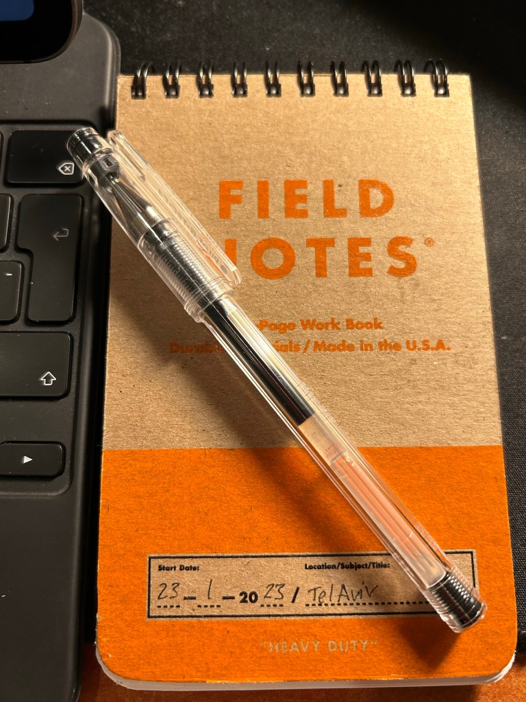
These take pretty much any kind of pen that you can throw at them and are decent enough even with fountain pens.
Pro tip: feel free to ignore the ruling and use them landscape style. This goes for any portrait oriented writing pad.
It’s been a busy past two weeks.
I ran my first tabletop roleplaying convention game for a group of strangers and it went great. It was an evening convention for “oldies” – players over 30 years old – run entirely by volunteers, and the vibe was wonderful. There was tea and biscuits, as befitting people our age, and about 8 tables running games in two rounds. I ran a Dungeon World game on the first round to three delightful and creative people, and we all had a great time. The game itself ran for three hours, including an half-hour general intro and intro to the system. It took me something like six hours to write the adventure from scratch, create the pre-made characters and write an intro to the system and to the game. I also did a test run of the game before the convention, and it helped me tweak the game and make it much better.
I got to experience a great story and have a really fun time with a group of funny and nice people, and I got to get someone who hasn’t played since he was a teenager back into the hobby. I will probably be running another convention game in the future, maybe even later this year.

I’ve also launched the first D&D campaign I’ve written in years. It’s set in a new campaign setting that I’ve created (also something I have done in well over a decade) and it’s the most complex kind of campaign with the most players that I have ever run. Set in a university like setting that is functioning at the brink of an all out war, the students are called to fill in for the ever dwindling university staff while still trying to study for their degrees. The game is set in short adventures running two or three sessions, with a changing cast of characters, and is built for busy people who can’t commit for a years long campaign. Some of the play is done via a telegram group, and there’s a growing campaign site in obsidian portal, which works to keep the play alive from session to session. The logistics of it is monstrous, but so far people appear to be having fun and I’m enjoying myself, so all is well in the world.
I’ve finished January having read four books (two Agatha Christies, “You Just Need to Lose Weight” by Aubrey Gordon, and “Miss Pettigrew Lives for a Day” by Winifred Watson). I’ll be posting reviews of the latter two books later on this week probably. Meanwhile, I’ve started reading the deliciously delightful “A Gentleman in Moscow” by Amor Towles after having eyed it for a long time. I’ve decided to read all of the 20-something e-books that I have languishing in my Kindle instead of going for this year’s Tournament of Books.
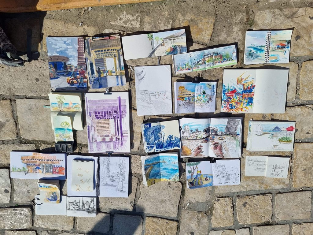
I went on my first Urban Sketchers sketchwalk in a good long while, and while my hands aren’t what they used to be and I took time to warm up as I hadn’t drawn for a while, I still got a few good sketches out of the three hours we had, and I enjoyed myself. You can read more about it here.
It’s finally decided to winter here, so I’ve been forced to run on a treadmill and I’ve gotten back to doing NTC training sessions. NTC have added whiteboard workouts, which are a challenge (to say the least), and treadmill running is still heinous, but at least I get to do some speedwork (also heinous) while I’m doing it, thus killing two birds with the proverbial stone.
There have been a lot of good Lego deals here lately, so I really need to start building some of the sets that I have before I’ll drown in boxes (and then think about what to do with them once I’ve finished building them, of course). There’s something meditative about building Legos. I started to get back to them once I was in my month in and out of hospital waiting for my cancer diagnosis to be finalized, and the Legos today aren’t those that I had as a child. They are much more sophisticated, interesting, and creative than those that we had as children, and I can lose myself in a set just like I can lose myself in a good book.

As for the fountain pen countdown, I’m down to 28 inked pens now, likely down to 27 by the end of today.
Have a great week!
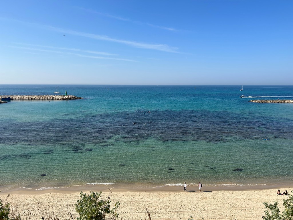
Last Friday there was an Urban Sketchers Tel Aviv sketchwalk to Atarim Square, which is right near the beach. The weather was scorching hot for this season, and I hadn’t planned for it (no hat, no sunscreen) so I worked as quickly as possible on this first sketch and then looked for subjects that I could sketch from the shade.

There were a lot of boats out and the sea was unbelievably blue and clear. You can see the rocks that make this beach not a bathing beach.
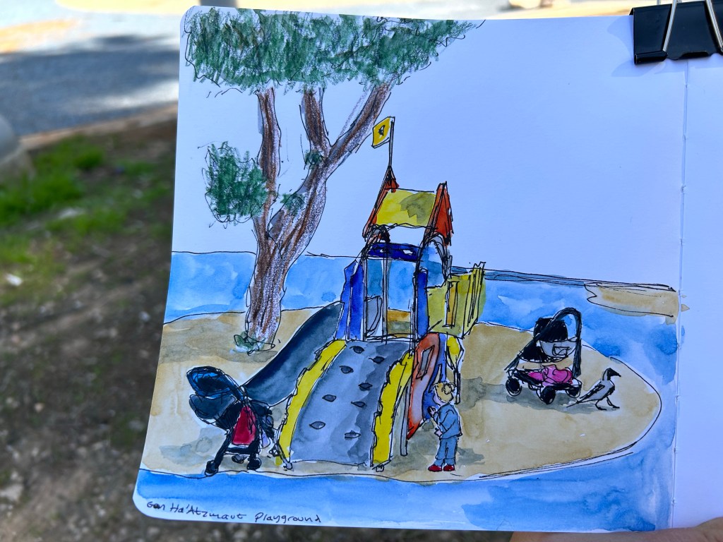
It was noon, which meant that there were very few places in the shade. I found one next to a playground and made a quick sketch of part of the scene there, making sure to obscure the little girl’s face. There was a huge crow prancing around quite fearlessly.
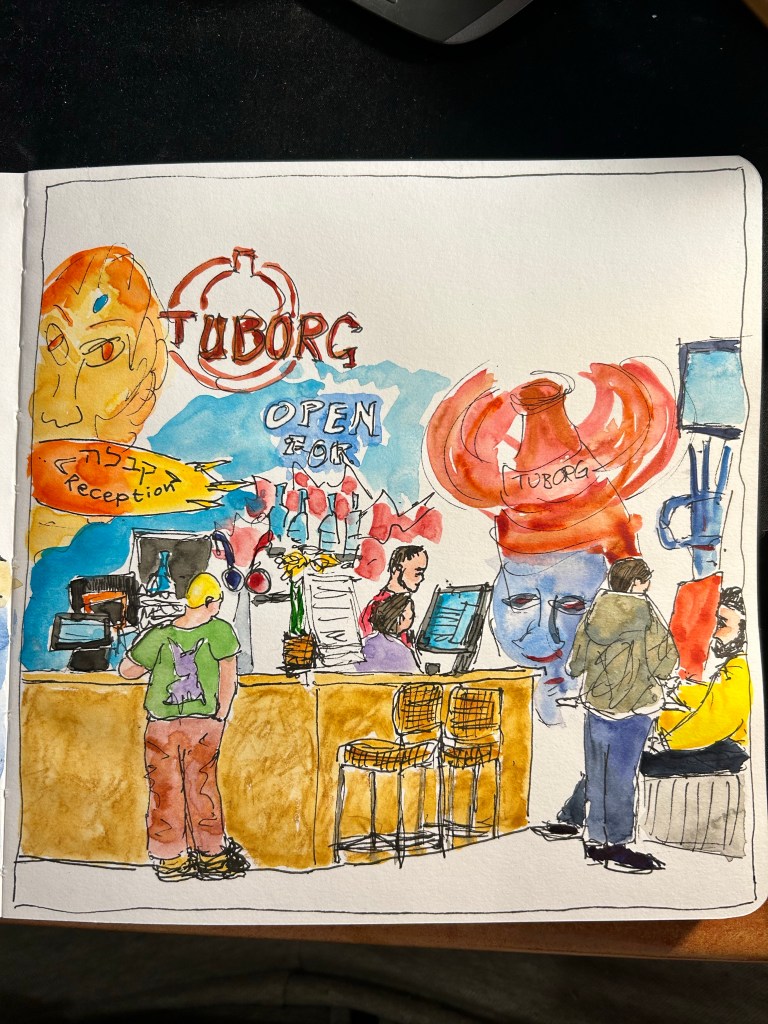
I spent a lot of time looking for places to sketch in the shade, so I ended up having to sketch this scene very quickly (less than 15 minutes), take some reference photos and add the watercolour later. It’s the local bar and reception for the nearby hostel.

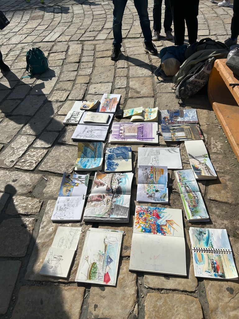
What I love about going to Urban Sketcher outings is seeing how everyone finds something different that catches their interest and is worth sketching in the same small area. Seeing all the different sketching styles is also a lot of fun.
Here’s the finished sketch of the bar/reception area from above. They have some wild graffiti on their walls, so this was really fun to paint.
As part of my struggles with planning, I’ve been reviewing the various planning systems I’ve used over the years and how they have changed. One of the most persistent of these has been the Weekly Planner.
Weekly planners generally take the form of a week on two pages, with the left page used for the actual weekly planner part and the right page used for notes. I’ve used Moleskine pocket weekly planners, I’ve used tiny weekly planners from Word Notebooks for two years (2016 and 2017), and I’ve used a large squared Moleskine notebook that I turned into a weekly planner myself. The format appeals to me, which is why I’ve had some form of a weekly planner with me for well over a decade.

The pluses of the weekly format seem obvious: you can get an overview of your week at a glance without too much clutter. You can easily tell when you can block out time for things, and what is your general availability for the week. You can tell if it’s a “heavy” week or a “light” one and plan your projects accordingly, and you can schedule pre-work and prep for upcoming events. It’s the ultimate planner’s planning format.
The minuses are that you don’t have enough space to plan out the individual days, which usually necessitates a secondary planning system, and that if you live in a country that starts the week on Sunday and not on Monday (like I happen to), your choices in this category are few and hard to come by.
Yet if this format is so compelling, why did I stop keeping a dedicated weekly planner late last year?
The answer is that I wasn’t referencing it enough to justify lugging another notebook around. It was great to get a sense of the week to come as I was planning for it on Friday or Saturday, but once I finished the planning, I would reference it again maybe once or twice a week. That was just not good enough.
My solution for now is to use one of the “Stay on Target” notepads from The Well Appointed Desk‘s Etsy store to create a small weekly plan on one piece of paper that I can see at all times (I keep the pad propped up at my desk). It just has one or two major events for each day tops, and it helps me keep track of my long term goals on a weekly basis (running, blogging, sketching, reading, gym and NTC sessions, meditation sessions, vitamins and fountain pens written dry). Here’s a censored example of next week’s plan:

Like the rest of my planning, it’s messy, not Instagram ready and not festooned with calligraphy, but it’s mine and it’s useful. My handwriting these cold days is beyond appalling, but as I can barely feel my hands even as I laboriously type this out, it’s the best that I can do under the circumstances, and I understand what I’m writing so that’s good enough.
And that is the main takeaway from this entire series (there are a few more posts to come): find what works for you, and don’t create a system that makes you work for it.
