April-May’s Currently Inked Fountain Pens

In the middle of April I inked up a bunch of new fountain pens, and at the end of the month I added two new fountain pens to this rotation. At the rate I’m writing with them I assume that this pen rotation will be with me until around the end of May, when I’ll be putting more “summery” inks into use.

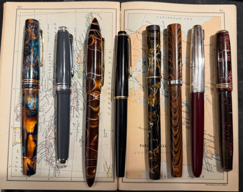
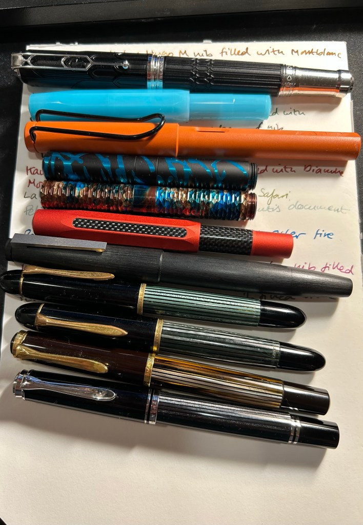
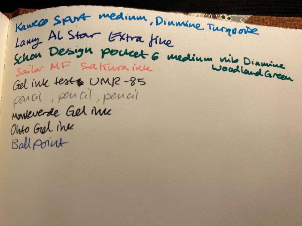
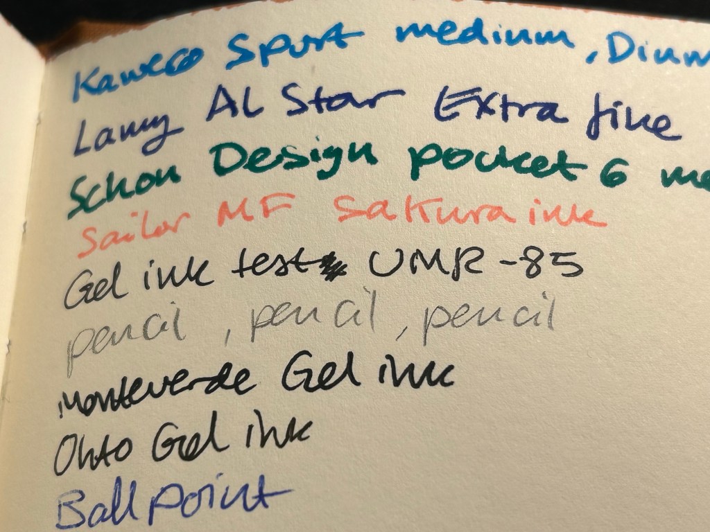
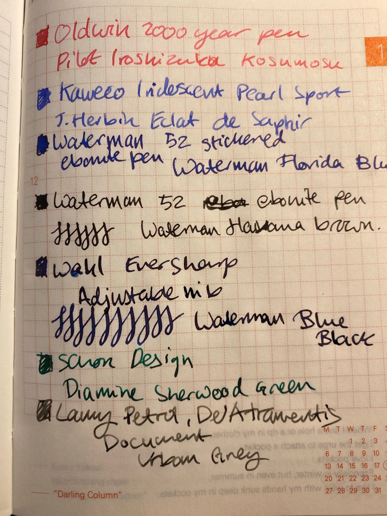
This is a rather eclectic group of pens and inks, but I was mostly looking for inks that I haven’t used for a long time or I haven’t used at all. Here they all are (I was in a rush when I created the writing samples so they’re messy, but life isn’t Instagram, so messy it is):

Messy Writing Sample #1
Messy Writing Sample #2

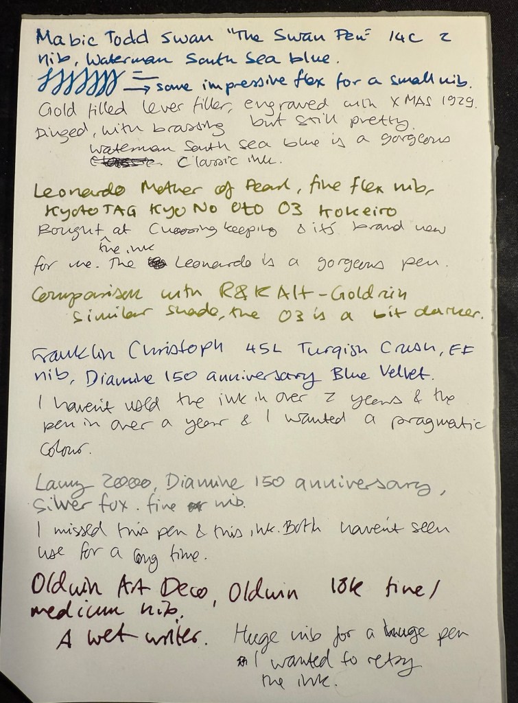
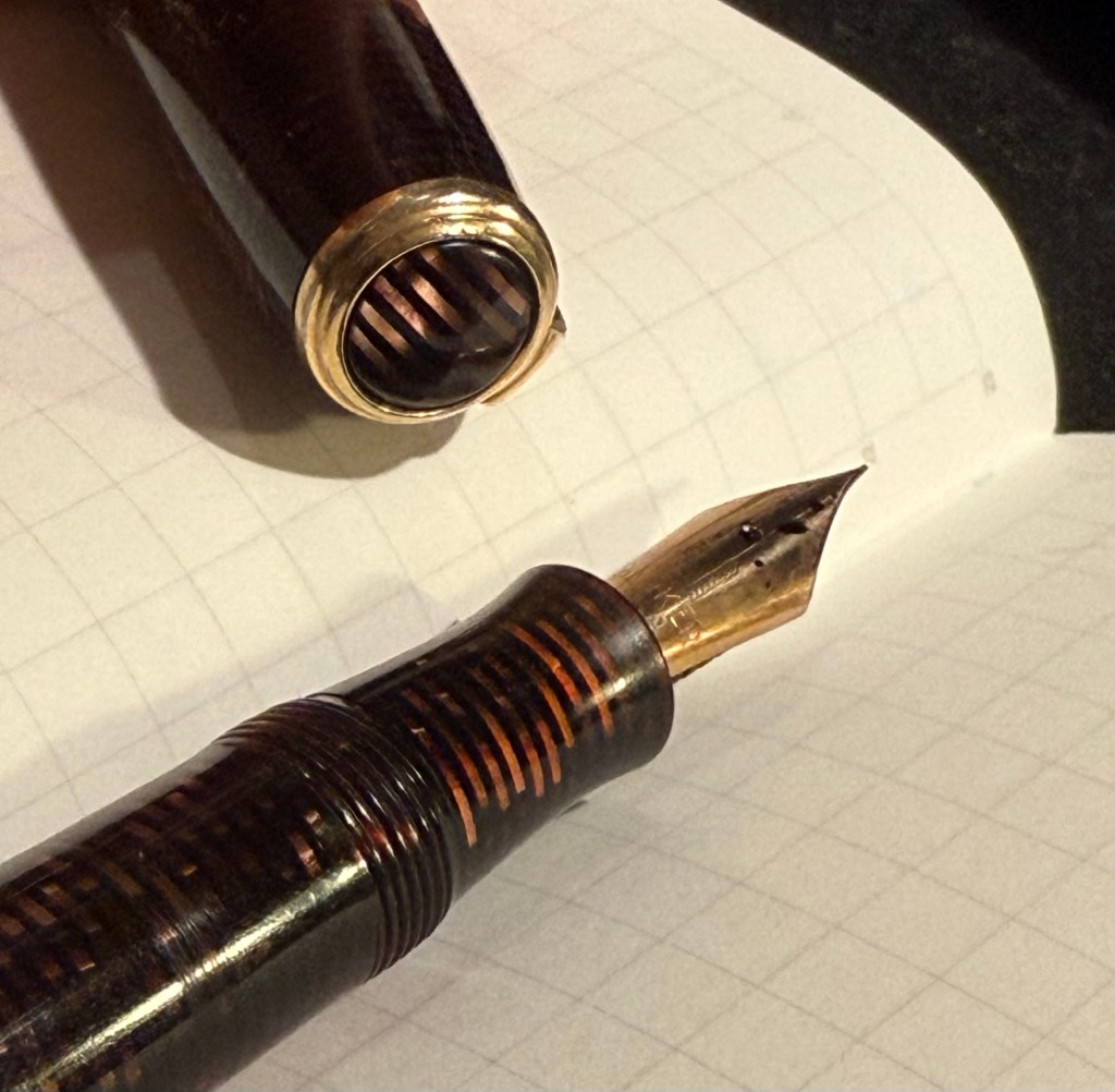
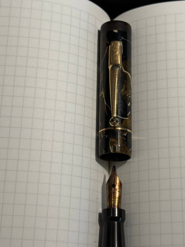
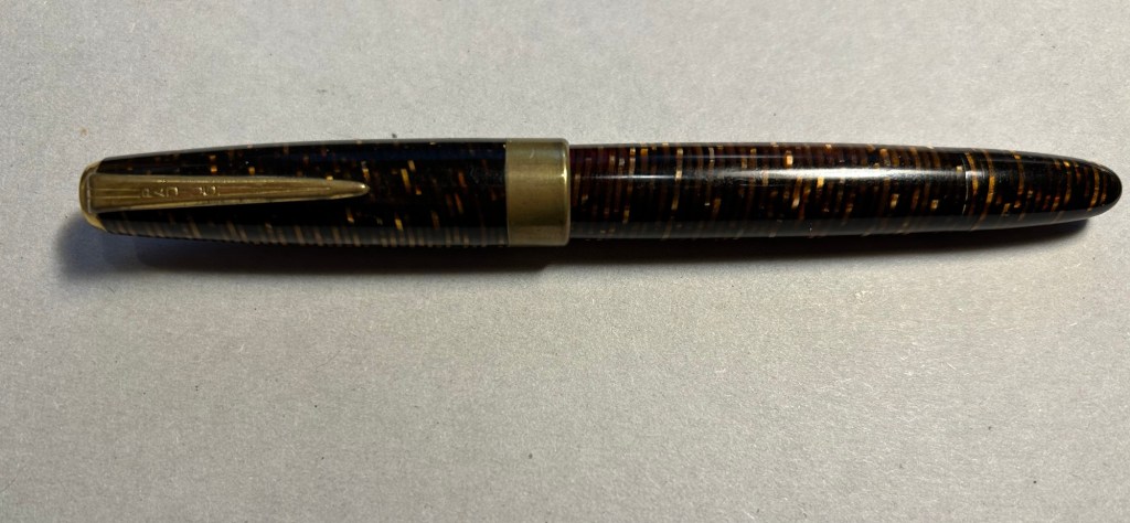
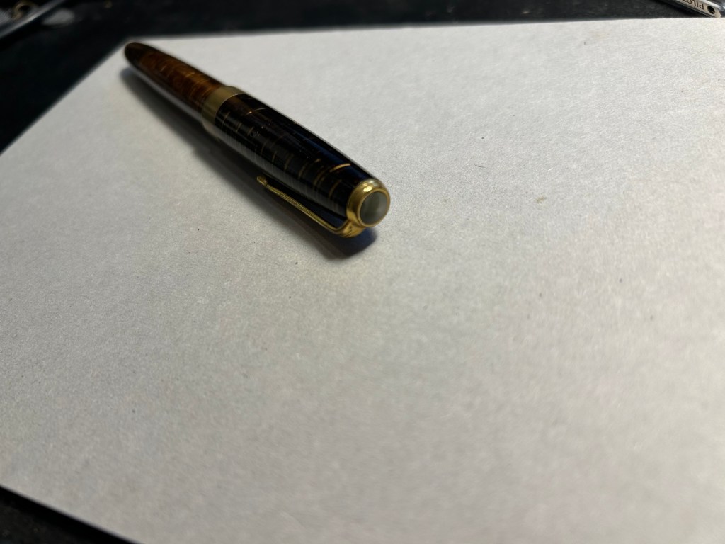
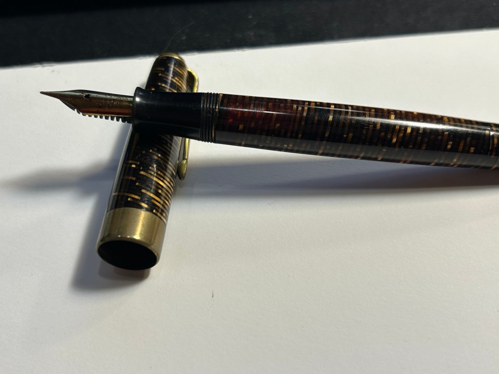
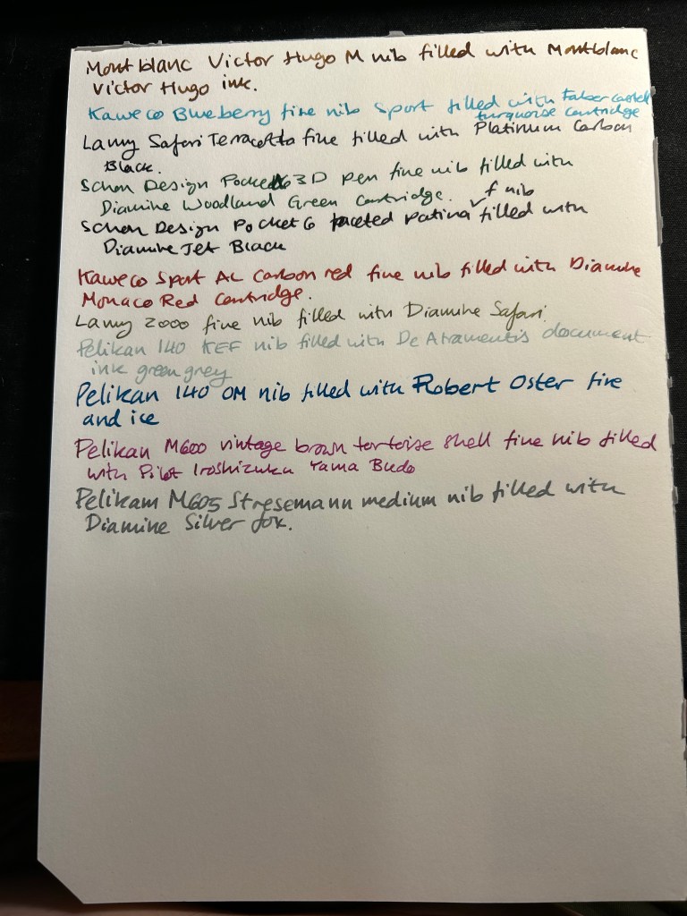
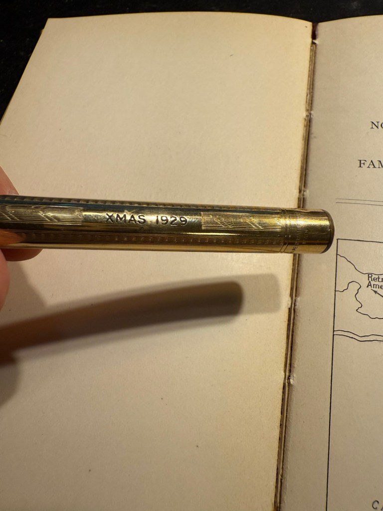
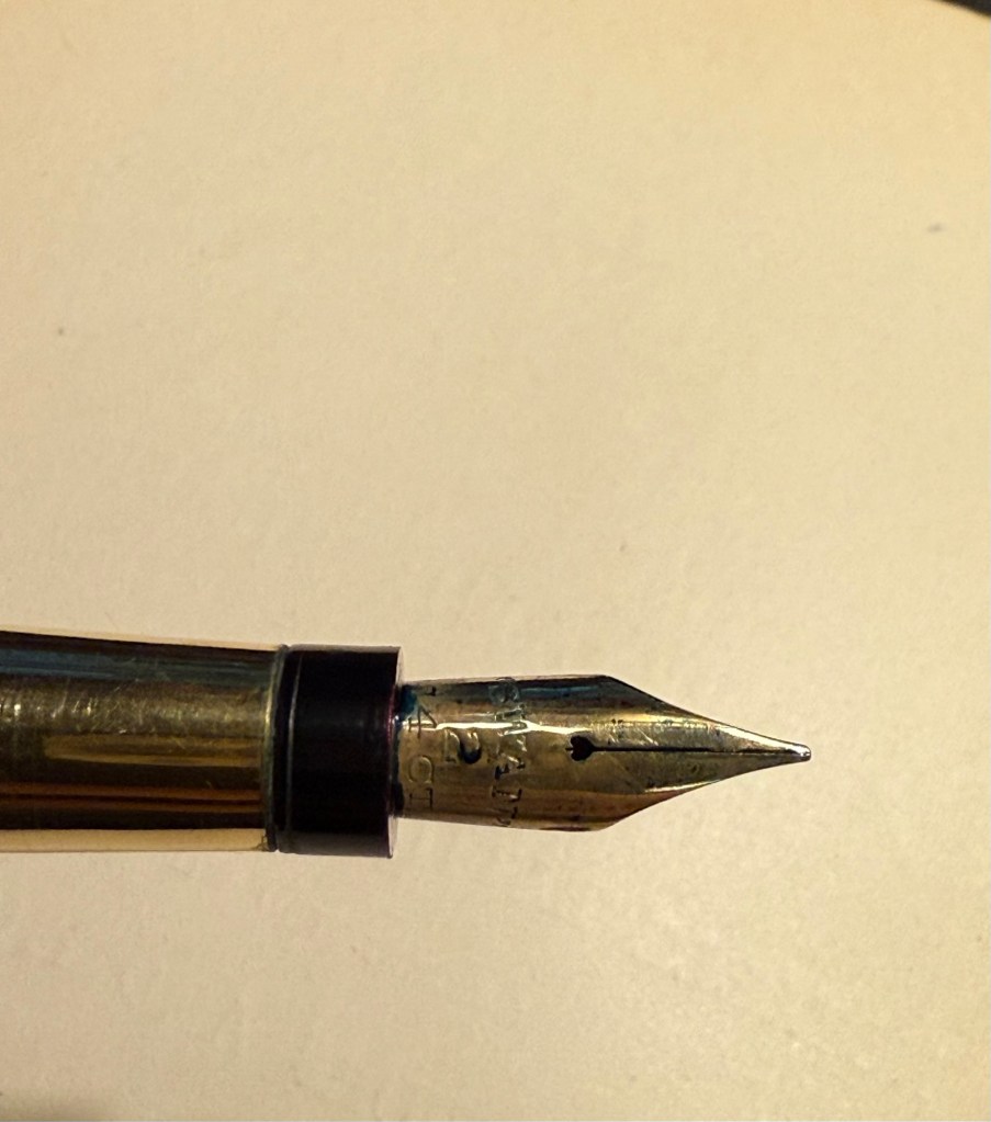
Mabie Todd Swan “The Swan Pen” 2 nib with Waterman South Sea Blue – a vintage gold plated lever filler pen, this is one of two vintage gold plated pens that I bought in Paris in Mora Stylos years ago. I don’t usually like the bling of gold plated pens, but I was drawn by the fantastic, very wet, flexible swan gold nib, and by the engraving on the pen body.

The Swan Pen

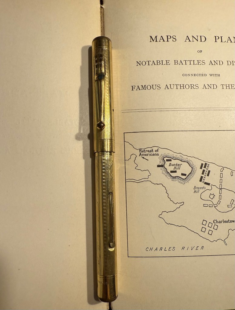
Normally engravings lower the value of a vintage fountain pen, but this one added value for me – I find it endlessly intriguing. This was clearly a Christmas gift, in 1929, and it was likely a lady’s pen, given its size and general level of decoration. I can stare at this pen and spin dozens of stories from that engraving, and this is one of the main reasons I prefer vintage pens. This one is “use grade” – the engraving, the dings on the body, the brassing on the clip, and the multitude of microscratches on it make it so – but I don’t care. It’s a treasure of a pen with a fantastic nib that I got at a very good price and gives me much joy. What else does one need?

Closeup of the inscription XMAS 1929

I chose a Waterman ink for it because they’re the best inks for vintage fountain pens – very gentle, very easy to clean out of a pen, non-staining, and on the dry side (though not as dry as Pelikan 4001 inks) which works well with this very generous nib.

Swan 2 nib with heart shaped breather hole

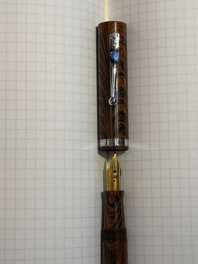
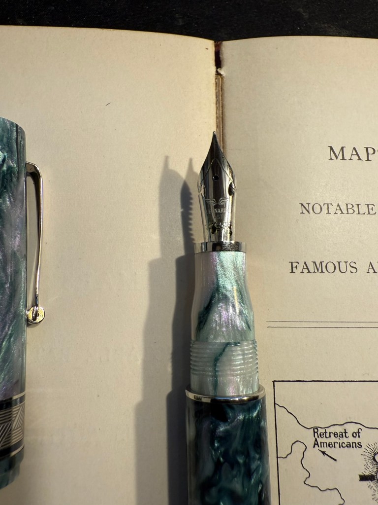
Leonardo Mother of Pearl fine elastic nib with Kyoto TAG Kyo No Oto 03 Kokeiro ink – I wanted a Leonardo pen in rotation (I love them) and I wanted to try this new ink, and compare it to the Rohrer and Klingner Alt-Goldrün ink that I still had going at the time from March’s rotation. The inks are practically identical, with Alt-Goldrün being perhaps a shade lighter than the 03.

Leonardo Momento Mother of Pearl fountain pen

The Leondardo’s elastic or “flex” nib has cutouts in the nib shoulders to provide it a bit of give. It’s a nice nib that offers some line variation, but is nowhere near what you can get in vintage flex or super-flex nibs (particularly Swan and Waterman).

Closeup of the elastic nib with the cutouts in nib shoulders

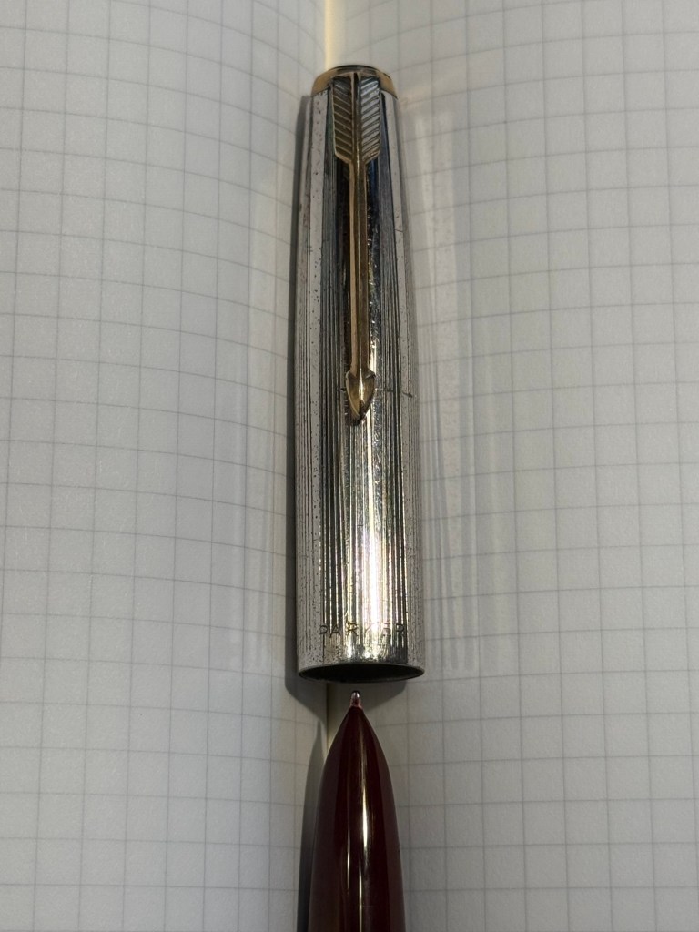
Lamy 2000 fine nib with Diamine 150 anniversary Silver Fox ink – this is one of two Lamy 2000s that I have, and I really like this pens as workhorses. Silver Fox was part of the original collection of 150 anniversary inks that Diamine issued and it’s a nice mid grey that is very readable.

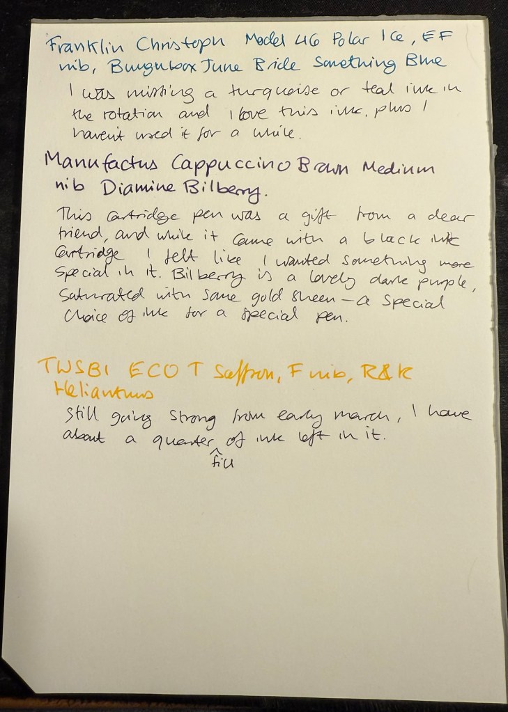
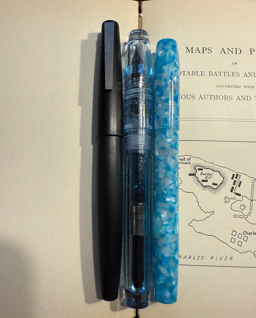
Franklin Christoph Model 46 Polar Ice extra fine nib with Bungunox June Bride Something Blue – I filled this pen about a week after the others since I wanted a teal ink that wasn’t in as wet a nib as the Swan. I got this ink as a gift from the Pen Addict Membership back in 2016.

Franklin Christoph Model 45L Turqish Crush extra fine nib with Diamine 150 anniversary Blue Velvet – another original 150 anniversary ink (Diamine later issued a second and perhaps also a third line of inks in this series, I don’t remember). This one is a nice royal blue, and another ink that I had used in years.

From left to right: Lamy 2000, Franklin Christoph Model 46 Polar Ice, Franklin Christoph Model 45L Turqish Crush

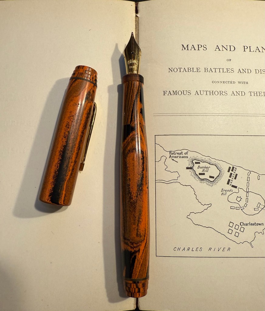
Oldwin Art Deco red and black striped ebonite, 18k medium nib with Diamine Writer’s Blood – as I’m writing this I have written this pen dry, mostly because it has a very wet and hungry nib and a standard sized converter. I bought this Oldwin from Mr Mora at Mora Stylos in Paris, and it’s a huge and surprisingly light pen.

Oldwin Art Deco red and black ebonite

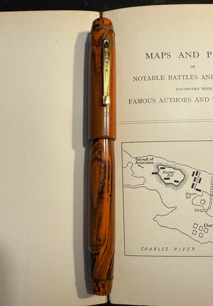
The nib is also a very large nib (size 8 and not size 6), and the pen is surprisingly not smelly for an ebonite pen. The feel of the material is fantastic – ebonite is such a warm material – and I like it enough to consider refilling it instead of cleaning it out. Diamine Writer’s Blood has been in rotation recently, but it’s a new ink to me and I’m still trying to figure it out. Having it in this pen made me appreciate it more, as it really showed off its unique colour properties and shading plus sheen.

Oldwin nib

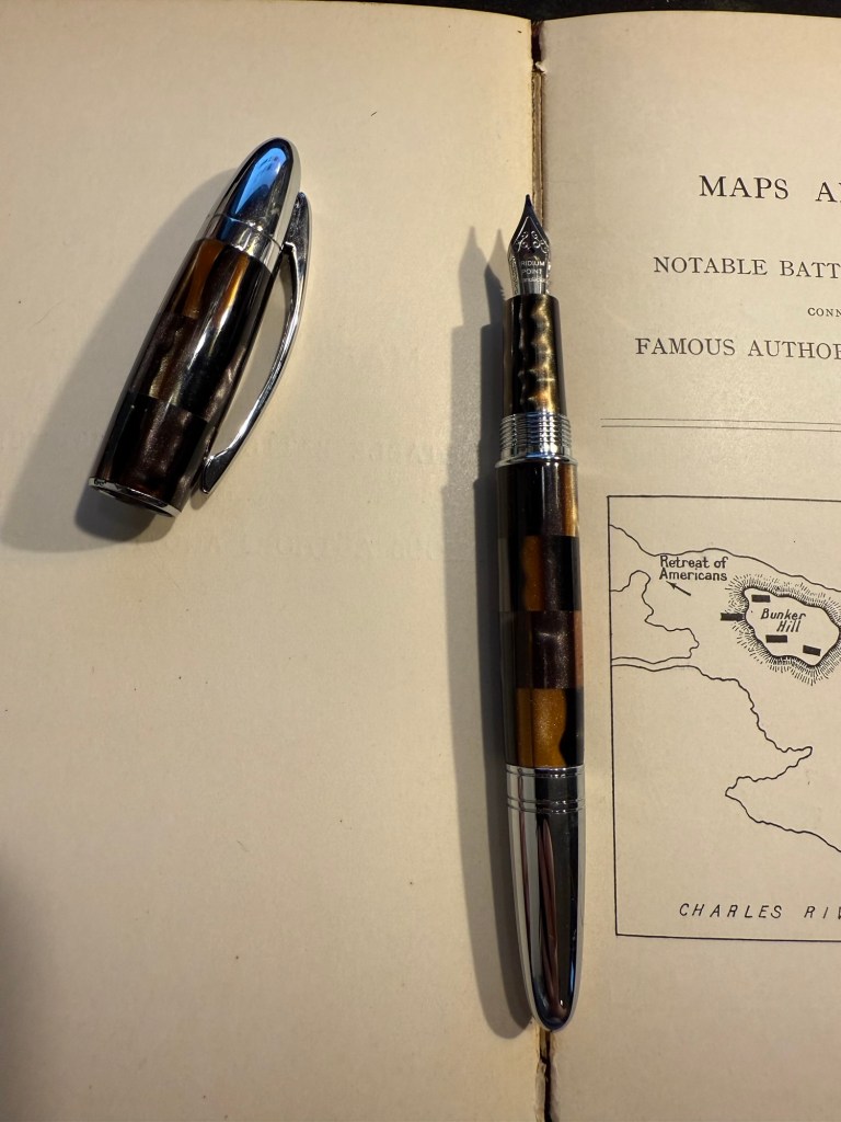
Manufactus Cappuccino Brown medium nib with Diamine Bilberry cartridge – this was a gift that I received from a dear friend who was just back from Italy and bought this (and a wonderful leather bound personalized journal) in the Manufactus store in Rome. The photo doesn’t do justice to the richness of the resin on this pen.

Manufactus Cappuccino Brown

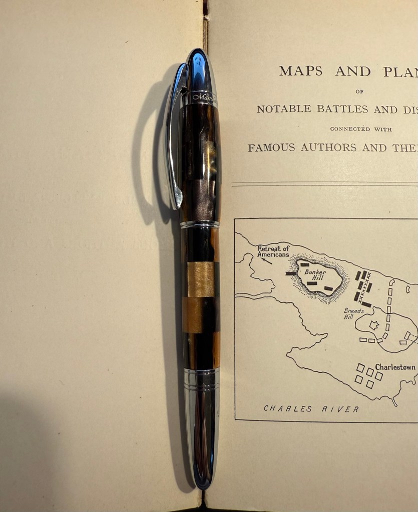
The Manufactus has some heft to it, due to the metal body and trim, and while it states that it’s a medium nib, it runs closer to a fine nib in terms of line width. Diamine Bilberry is an interesting ink that I had in cartridge form, and I wanted a more unique ink than the standard black cartridge that came with this pen. Bilberry is saturated enough to pass as black at a cursory glance, but it’s a gorgeous rich purple with gold sheen that works well in this pen.

Manufactus Cappuccino Brown nib

Apart from these pens I still have about a quarter fill of ink in my TWSBI ECO T Saffron fine nib with Rohrer and Klingner Helianthus going from March’s ink rotation.

Which of these pens interest you the most?

February 2025 Currently Inked Pens

I have finally written dry all of my Inkvent 2024 fountain pens, which means that after two months I get to write with a whole new set of fountain pens and inks. I normally don’t spend too much time selecting which pen and which inks I’ll use next, but this time I decided to use some criteria for the next pens in my rotation:

  • They need to include at least 50% vintage pens. I don’t use vintage pens with Inkvent inks, and vintage pens make up most of my pen collection.
  • All the pens need to be pens that I haven’t used in a long time (at least a year). It was time to mix things up.
  • The inks needed to be inks that are new to me, or that I haven’t used in years, and all of them need to be inks that I haven’t swabbed before. This was not only to mix things up, but to get me to use and swab more inks in my collection, instead of going again and again to a few select favourites.

Here’s February’s fountain pen lineup:

The pens from left to right: Leonardo Momento Zero Bohemian Twilight, Sailor Pro Gear Slim Graphite Lighthouse, Edison Nouveau Premiere Cappuccino, Montblanc 32, Mabie Todd Swan L2 Leverless pen, Waterman 52, Parker 51, Parker Vacumatic Standard double striped jewel.

And here are ink swabs of the inks that I’ll be using:

Ink swabs on Col-o-Ring cards

The Vintage Pens

  • Parker Vacumatic 1st generation Laminated Burgundy Pearl Double Jewel (striped jewels, striped section) – I adore Parker Vacumatics and this is a “use the good china” pen. The grip section is also laminated (and not plain black), the body is transparent, and the nib is a sharp extra fine gold nib with a bit of character to it. It’s filled with a brand new ink for me, Diamine Writer’s Blood. I never use red inks, but this got raving reviews and seemed dark enough for me to try. I bought the ink in Oxford last year, and the pen years ago from the late Henry Simpole (Henry the Pen Man) in London. I don’t think I inked up this pen since I bought it, as it was too precious, and I still won’t let it leave the house, but I am looking forward to actually using it.
Parker Vacumatic first generation burgundy laminated grip section
Closeup on the striped jewel and the grip section of the Parker Vacumatic
  • Parker 51 Burgundy aerometric with a silver cap and gold filled arrow clip. I love Parker 51s, they are my absolute favourite fountain pens. I believe this cap is on the rare side, though it’s far from pristine or attractive (it’s blackened in specks, and there are a few scratches and micro scratches on it). The nib is a generous fine, bordering on medium, and like all other 51s that I’ve used, it’s magic. I haven’t used this pen since I bought it, so it’s time to give it a whirl. It’s filled with Pilot Iroshizuku Yama Budo, which is a lovely, sheening burgundy ink, one of the more popular inks in the Iroshizuku lineup. In hindsight coupling this ink with this pen wasn’t the best choice, as the 51 has generous nibs and Iroshizuku inks are on the wet side. It just means that I’ll have to steer clear of cheap paper with this combination.
Parker 51 cap and nib closeup
  • Waterman Ideal 52 Red Ripple fountain pen with a super flex extra fine nib – my word but this pen has the most glorious nib. The pen itself is elegant and pristine, and because of its age it doesn’t have the ebonite stink to it. The nib is why I bought this pen, and it effortlessly moves between extra fine and broad or double broad lines, with the feed easily keeping up with tines. Like all Waterman nibs that I’ve tried, there is some feedback, so if you like butter on hot pan nibs this one isn’t for you. This is the kind of nib that you can only get in a vintage pen, and it puts modern flex pens to shame. It’s only minus is that this is a lever filler, and I hate cleaning out lever fillers, which is why I rarely use them. This pen is filled with Diamine Autumn Oak, which I haven’t used yet (in bottle form at least – I have cartridges of it). I wanted a brighter ink in this lineup, so Autumn Oak was a perfect choice.
Waterman 52 cap and nib closeup. You know the nib is going to be fabulously flexy once you see that heart shaped breather hole and the slight bend down in the nib.
Writing sample on Midori MD Paper. Notes written with a Platinum Preppy.
  • Mabie Todd Swan L2 Leverless L205/62? Not sure – Swan did a poor job labeling their pens, and I didn’t write down notes when I bought it. This is a lovely pen that I bought from Henry Simpole years ago because of the phenomenal Swan nib. It’s an oblique flexible nib with Swan’s gimmicky “Leverless” filling system (which is a lever system in disguise, but such were the ’30s – you needed a gimmick to sell pen). I haven’t used it at all since I bought it because I don’t remember the experience of cleaning it out very fondly – imagine all the bother of cleaning out a Lamy 2000, but with a piston that has just one twist of travel. I used Pilot Iroshizuku Asa Gao with this fountain pen, and it’s a gorgeous ink with a good amount of sheen with this nib. I love this shade of royal blue, and I haven’t used this ink in a while. Take a look at the Swan above – it’s almost 100 years old and works perfectly.
Closeup on the nib and cap of the Swan Leverless pen
Writing sample on Midori MD Paper. Notes written with a Platinum Preppy.
  • Montblanc 32 (1967) OM 585 nib – heavens, you can get a gold nibbed, piston filling original Montblanc with an Oblique Medium nib for less than a steel nibbed Pelian M2xx costs? Yes, you can. I love the design of this pen (you can read about it more here) and the nib is great… provided you write in the exact angle it expects. The Swan’s nib is generous in terms of the writing angles it accepts, and the Monblanc 32 is demanding: you will use the nib at the precise angle it is designed for, or it will not work at all! I only wish that the Montblanc Around the World in 80 Days ink was so exact. From the description and the illustration on the box I was expecting a brownish gold ink, maybe with a hint of green. In reality I got a dark, cold grey ink, with a hint of blue to it. No brown, no gold, nothing at all to do with the elephant illustration on the box. I had to double check just to make sure that I hadn’t landed on a bad bottle by chance.
Montblanc 32 semi hooded nib
Writing sample on Midori MD Paper. Notes written with a Platinum Preppy.
Writing sample on original Tomoe River Paper

Modern Fountain Pens

  • Sailor Pro Gear Slim Graphite Lighthouse H-EF nib – I haven’t used this pen in over a year, and I wanted a pen with a very fine nib, so that I can use it for note taking. It’s inked up with Sailor Black, a new ink for me and one that’s supposed to be water resistant. I’m using this combination for my certification study notes, and I may also try it out with some watercolours in a sketch, just to see if I can use Sailor Black ink as part of my sketching kit.
  • Edison Nouveau Premiere Cappuccino fine nib – I bought this pen in early 2012, before they did a run of seasonal limited editions of this pen design. I haven’t used in years, and the same goes for the ink in it: Lamy Petrol. This is a limited edition ink, one that Lamy issued with the Lamy Safari Petrol, and it’s a wonderful blue-black with red sheen.
  • Leonardo Momento Zero Bohemian Twilight fine nib – this pen has “only” been a year out of rotation, and it’s one of my favourite Leonardos. The colour of the resin is gorgeous, and it works very well with the Pilot Iroshizuku Tsuki-yo ink that it’s filled with. Tsuki-you is a bluish-teal with red sheen and a wet flow, and it suits the Leonardo’s fine nib.
Modern pens writing sample on Midori MD paper.

August’s Currently Inked Fountain Pens

August is going to be a month of pens and inks that I haven’t used in a good long while. While I still have a small amount of ink in four of my July pens (the Kanelea, the TWSBI ECO-T Saffron, the Big I Design Fountain EDC and the Schon Design Faceted Pocket 6), they will all be written dry by the end of next week at the latest. It was time for a new lineup, and this is this month’s assortment:

Writing sample of August’s pens

The TWSBI ECO-T is one of my favourite TWSBI designs, and so I have a few of them. The TWSBI ECO-T Mint Blue hasn’t been in use for about two years, so I decided to pull it out and use the Sailor Studio 162 with it, just for colour matching reasons. The 162 is an ink that I’ve used a few months ago but I really like it, so I felt like giving it another month in rotation.

The Lamy Safari Pink Cliff is a recent purchase that I made in Paris last April. I’ve only now inked it up as I wasn’t sure what ink to use with it — until all the discussion about the new (and not as great) Lamy Dark Lilac ink made me want to use the original Lamy Dark Lilac ink. I purchased a bottle of Dark Lilac and the Dark Lilac Safari back when they first came out, but I haven’t used the ink very much. It’s wet and very saturated and so it works best with only a handful of paper options that I have. Still, it’s a very attractive ink.

Visconti Homo Sapiens — this is the original Homo Sapiens, the one that created quite a splash when it came out. At the time it was my most expensive fountain pens, and it’s still one of my most precious pens. I bought it at Mora Stylos in Paris and had it customized with the special initial badges on the finial. I got Pilot Iroshizuku Shin Kai as a gift with my purchase, and though I love this ink I haven’t used it in a while simply because I misplaced it behind another rarely used ink.

The pens from top to bottom- TWSBI ECO T Mint Blue, Lamy Safari Pink Cliff, Visconti Homo Sapiens, Parker 51 Flighter, Sailor Pro Gear Slim Manyo Cherry Blossom, Leonardo Momento Zero Grande 2,0 Galattica Universe

Vintage Parker 51 pens are my absolute favourites, to the point where I have a hard time seeing one in the wild and not buying it. This Parker 51 Flighter hasn’t been in use in years, but in the spirit of “use the good china” I’ve inked it up. Pilot Iroshizuku Fuyu Syogun used to be my favourite grey ink — and then Diamine came out with a series of excellent grey inks and Sailor came out with the 123. I haven’t used it in years, so I dusted off the bottle and decided to give it another try.

The Sailor Pro Gear Slim Many Cherry Blossom has been in rotation relatively recently, but the ink inside it, the Sailor Shikiori Sakura Mori, is one I haven’t used in years. I don’t have or use many pink inks, but I decided I needed something to brighten up this lineup, and the Sakura Mori ink is relatively readable. It also perfectly matches this pen, which is a nice bonus.

Leonardo Momento Zero Grande 2.0 Galattica Universe is also a relatively recently purchased pen that has been in rotation not too long ago. I just love the Momento Zero so much that I decided I wanted to ink one up, and so I chose the Pilot Iroshizuku Syo Ro to ink it up with. I haven’t used this inks in years, and I love teal inks so it was about time.

What have you got inked up for this month? Anything new? Old favourites or long forgotten pens or inks?

One week 100 people day 2

I almost didn’t post today as I wasn’t up to sketching and I got only three sketches in, none of them great. But I like it when creators show their failures so I’m doing it myself today: my lack of shoulder mobility coupled with a lack of sleep and the difficulty of the subject made for a bad sketching day.

Parker 51 with Montblanc The Beatles Psychedelic Purple on a Stillman and Birn Alpha. Sketched 6-8 were done today. As usual the goal for me is to get to 100 even if it takes more than a week.

Celebrate your failures.

Vintage Radius Comet Fountain Pen Review

In April 2010 back when I was relatively new to collecting vintage fountain pens, I purchased a vintage Radius Comet on the Fountain Pen Network. The body was brown laminated celluloid, just like Parker striped Vacumatics, and you could see the ink levels through the stripes, just like with a Parker Vacumatic, and it had a jewel on the cap, just like a Parker Vacumatic. It was, however, a piston filler, unlike the Parker Vacumatic, and it had a superflex gold nib, also unlike a Parker Vacumatic. So even though I had never heard of the brand before and there was very little information about them to be found, I took the risk and bought the pen. It cost €120 shipped.

Radius Comet

The pen was obviously user-grade, as there was brassing and tarnishing on the hardware, a lot of micro-scratches on the body, and some ambering in parts of the celluloid. It’s still a good looking pen, though.

The stripes had darkened with time, but some still have their original glow

The design of the clip and the jewel on the end of the cap was clearly influenced by the ultra popular Parker Vacumatic.

The jewel on top, a clear copy of the Parker design.

Even though the celluloid has darkened and ambered with time, you can still clearly see the ink levels through the stripes. As a piston filler it has an impressive ink capacity, which works well with the flex nib, as it can lay down a good amount of ink when fully flexed.

You can see the ink levels through the stripes.

It works perfectly – the filling system is and always was a joy to use, and the nib… Well, the literally don’t make nibs like this any more:

The nib

When you apply no pressure it’s a wonderfully smooth fine nib, but when fully flexed it goes up to broad/double broad territory. The feed keeps up with the ink flow with ease, and I’ve never had a hard start with it, ever.

Writing sample on Midori MD paper with Diamine Amaranth

Leonardo has revived the brand in recent years, and now you can buy a brand new Radius with a cartridge/converter system, resin body and (obviously non-flexible) steel nib for around €150, not including shipping. No modern pen manufacturer is capable of creating a pen like the vintage Radius or any of its contemporaries, neither in body material, nibs or filling systems at the price that they were once made. It’s a question of both volume and lost knowledge and tooling, which means that the vintage and new Radius pens have very little to do with each other beyond having the same brand name.

Buying vintage is always a risk in a way buying modern pens isn’t, but the value for money still cannot be beaten. I might buy a modern Radius at some point in the future (I like their designs and I’m curious about the pens), but I have no doubt that in terms of looks, nib and filling system it won’t be able to hold a candle to its well-worn and well-loved vintage namesake.

Currently Inked: September 2023

I’ve recently switched out most of my fountain pens and inks for a new batch, so here’s a quick overview of them (from top to bottom):

Currently inked writing sample

Montblanc Victor Hugo medium nib filled with Montblanc Victor Hugo ink. I bought this at Mora Stylos just before they closed, mainly because the design is based on the Notre Dame de Paris, which I adore. It’s a weird design and quite a hefty pen, but I enjoyed the nib, despite it being a medium. The ink, also limited edition (but knowing Montblanc is likely a relabeled existing ink) is a nice, warm brown with a good amount of shading. As I post this I’ve written this pen dry.

Kaweco Sport Frosted Blueberry fine nib filled with a Graf von Faber-Castell turquoise cartridge. This is the only fountain pen that I took with me on my recent trip to the US, and I used it on the plane (not during takeoff and landing).

Lamy Safari Terracotta fine nib filled with Platinum Carbon ink. I wanted a waterproof ink for my sketches, and I haven’t used Platinum Carbon for ages. The Safari Terracotta is the perfect coloured pen for this season.

Schon Design Pocket Six 3D Teal x Matte Black pen with a fine nib filled with a Diamine Woodland Green cartridge. This pen is already been written dry by the time I’ll post this.

Schon Design Pocket Six Faceted Patina fine nib filled with a Diamine Jet Black cartridge. Schon Design pens made me enjoy pocket fountain pens, and Diamine Jet Black is proving to be a solid, dark black ink (not greyish or brownish).

Kaweco Sport AL Carbon Red fine nib filled with a Diamine Monaco Red cartridge. The perfect pen and ink match. I don’t normally use red inks, but Monaco Red skews towards the raspberry side of things, and is very pleasant.

Lamy 2000 fine nib filled with Diamine Safari. Before I filled a flock of Pelikans, this was supposed to be my workhorse pen. Diamine Safari is great for sneaking unusually coloured inks into serious office settings without drawing attention to yourself.

Pelikan 140 KEF nib filled with De Atramentis green grey document ink. Another sketching combo, perfect for watercolours when I want my line work to melt into the background. KEF stands for Kugelspitze Extra Fine – or Ball-tip extra fine. It’s a very forgiving and rather firm gold extra fine nib. I inked this up on the Friday of the Pelikan hubs even though I didn’t go to a hub. The 140 is a piston filler from the 1950s with a gold nib that was dirt cheap and is an utter workhorse. It’s user grade due to the brassing, but brassing adds character.

Pelikan 140 OM nib filled with Robert Oster Fire and Ice – Pelikan stopped making OM nibs in 2014 because they’re scratchy and unpleasant to write with if you don’t hold them at the right angle. But at the right angle this nib is phenomenal, and it works great with inks that shade and sheen – and Robert Oster Fire and Ice is definitely one of those. You can see a visible sheen at the edges of each letter, and it makes them all glow. I inked this to celebrate the Pelikan hubs.

Pelikan M600 brown tortoise shell fine nib inked with Pilot Iroshizuku Yama-Budo. This is a vintage M600 from the 1980s, with West Germany printed on the band. It’s a lovely workhorse, like all Pelikan Souveräns, and the Yama Bodu ink manages to shade even with the Pelikan fine nib. Also inked for the Pelikan hubs.

Pelikan M605 Stresemann medium nib filled with Diamine Silver Fox. I haven’t had a grey ink in rotation for a while, and Silver Fox is an interesting and dark grey with plenty of shading, particularly with a juicy Pelikan medium nib. Also inked for the Pelikan hubs.

Currently inked pens

A.W. Faber-Castell Vintage Pencil Tin

While most of my fountain pen collection consists of vintage fountain pens, I understand that for many people purchasing vintage fountain pens is too risky. You might get a pen that needs repair, you might misjudge the value of the pen and overpay considerably, you might be buying a fake. As even the cheapest of vintage pens isn’t just a few bucks, making a mistake here could end up being very expensive.

Yet there’s a joy in vintage items, in seeing the craftsmanship, design and care put into them, in learning their history and placing them on a timeline, and in the knowledge that you saved something from the landfill. If you want to experience some of that joy with less of the risk of buying vintage fountain pens, vintage pencils are your friend. Flea markets are full of vintage pencils, pencil tins, pencil sharpeners, leadholders, etc that are usually very cheap to buy, and hold little to no risk.

When I was in Spitalfields market, buying vintage books, I saw this tin propped up against a bookshelf in the stall I was purchasing my Arthur Ransome books from. This is how it looked:

Grimy but not full of rust or beaten up A.W. Faber Castell pencil tin.

It’s an A.W. Faber Castell pencil tin, and after just a few minutes with some wet wipes it already started to look better:

A bit cleaned up.

The tin and the pencils inside cost me only a few pounds, and truth be told I would probably have purchased the tin even if it was empty. The design and typography are absolutely delightful:

Castel 9000 2H. I can imagine having a stack of these in different lead grades on a shelf.

The over packaging continues inside – you wouldn’t want your pencils rattling around in the tin, would you?

Paper insert to protect the pencils inside.

Faber Castell’s factory in Stein proudly represented on the outer tin and here too:

A.W Faber-Casterll, Stein Bei Nürnberg

Inside were about half of the original Faber-Castell 9000 2H pencils, and half pink advertising pencils for a thread company that I think no longer exists.

It’s like opening a box of chocolates – you never know what you get

Faber-Castel 9000 are excellent artist pencils, and the vintage ones are just as great as the current ones in production, only they’re usually cheaper and have much better typography and logos on them. Look at this little masterpiece:

Vintage pencils always have a ton of stuff stamped on them. You needed the INFO, right?

The pink pencils were round advertising pencils, for a German thread making company that seems to no longer exist. They are solid HB pencils, and have an 80s sort of vibe to them.

Advertising pencils.

The great joy of vintage pencils is that they of course write just as they used to when they were originally made. If they have erasers they’re going to be unusable (these pencils don’t), and sometimes the wood is a bit brittle and dried out so a bit more care needs to be taken whilst sharpening them (these pencils are in excellent condition), but otherwise time affects pencils very little.

Writing samples

So next time you’re at a flea or antique market, rummage around its hidden corners for some cool old pencils to try out. You never know what you’ll find — I picked up some Sanford Noblots from a giant jar of pencils that way.

P.S. If you’re wondering, 2H pencils are perfect for watercolour under-sketches, as so long as you keep your pressure light, they disappear beneath the paint.

Going Shopping in My Stationery Stash: Choosing Keeping Notebook, Eberhard Faber EFA 1000, Tombow Irojiten and Koh-I-Noor Magic Pencil

Over the past 24 hours things have gotten very depressing and very scary here. To distract myself a little bit, I decided to start working on a new project: Going Shopping in My Stationery/Art Supply Stash. I have a lot of stuff. I don’t use enough of the stuff that I have, to the point where I don’t even remember what I have. As I’ve significantly cut down on buying new stationery and art supplies, I’ve decided this would be a good time to go “shopping” for new things to use in whatever it is that I already have.

I bought this fancy looking A5 composition notebook from Choosing Keeping in London this April, after eyeing their gorgeous notebooks the last time that I was there.

Such a great looking notebook. Yes, the cover has gold foil on it.

The endpaper is also very good looking:

Front endpaper
Back end paper with the Choosing Keeping bird sticker, and details on the notebook.

The paper is cream and unruled, and the edges of the paper are mottled brown. It is one of the best looking notebooks that I have:

I was planning on using it as a journal, but the paper was an utter disappointment. It is not fountain pen friendly, which really surprised me — the ink spreads and feathers and bleeds through. I could have used a gel ink pen with this notebook, but it somehow seemed incongruous with how fancy and special (and expensive) the notebook is.

Ink test page

So I shelved it and I haven’t touched it in months, until today. My eye caught it as I was looking for a notebook to sketch in, and I remembered that the paper had some tooth and texture to it.

Closeup on the paper and the ink results.

It’s a soft, velvety kind of paper, which made me thing that it might work with pencil quite well. I also had some pencils I wanted to try out, so it seemed like a good opportunity to not let a fancy notebook go to waste.

Massive bleed-through

Enter the pencil that I wanted to try out most: the Eberhard Faber EFA 1000 vintage pencil in 2=B grade. I know, it’s weird. I don’t get it either. 2 is supposed to be HB.
I bought a box of these beauties at during my last visit at Present and Correct, and I’ve been wanting to use them since. They’re made in Germany, the lead is a B grade (slightly softer and darker than HB), very smooth and it retains its point surprisingly long for a soft pencil.

Eberhard Faber… with the Star. I love everything about the design of this pencil and this box.

The pencil comes pre-sharpened, and has an orange and black body that looks a bit like the Staedtler Noris, but in orange instead of yellow. It has “Germany”, “EFA”, “Eberhard Faber”, “EFA 1000” and “2=B” embossed on it silver foil. The fonts used look very futuristic and modern, which makes me think that this is a ‘70’s pencil.

Very fetching design

The biggest issue with vintage pencils is the eraser, which is always dried up and completely unusable. For this reason I prefer vintage pencils that don’t have erasers, or better yet, those that have endcaps. Well the EFA 1000 gets lots of bonus points for not only having an endcap, but having a really good looking one. It’s also silver in colour, and it features three rings and a concave top.

The endcap

I then sat down to create this quick sketch of the latest round of pro-democracy protests. The pencil was a joy to use, and it worked very well on the paper. I was very happy with the feel of them both, and with the sketch results:

Choosing Keeping A5 Composition Notebook and Eberhard Faber EFA 1000 pencil

I added some colour with three Tombow Irojiten coloured pencils and a Koh-I-Noor brown Magic Pencil. The Tombow Itojiten was an utter disppointment. The green pencil crumbled twice, the others were mediocre at best. The Koh-I-Noor was a lot of fun, but brown works best with other coloured pencils layered on top, to give it some life.

Tools used here. Eberhard Faber EFA 1000, Tombow Irojiten, Koh-I-Noor Magic Pencil, Caran d’Ache Design eraser

All in all this first attempt at shopping from my own stationery stash was a success. The EFA 1000 is staying on my desk, I learned things about the Tombow Irojiten (I’m glad I only have three Itojiten pencils and not a box of them), and I got to use a notebook that I’d thought would just gather dust. This is definitely something I will try to do again.

Parker Vacumatic Shadow Wave and How I Look at Vintage Pens

Our local fountain pen brick and mortar shop is closing down at the end of the month, and it’s a crying shame. There’s been a steady stream of collectors visiting the store to say goodbye and stock up on supplies, and on Thursday I joined them. I bought a few bottles of ink, a few fridge magnets with reproductions of old fountain pen adverts (most of them for Parker, of course), and there was a single tray of vintage pens.

“None of them work, I’m afraid,” the proprietor’s daughter said.

But I saw a Parker Vacumatic Shadow Wave among the lot, and I have a very hard time leaving Parker Vacumatics and 51s behind. I picked it up and took a quick glance. It was clearly a user grade pen, but I didn’t care – it was a speedline Vacumatic, which meant that it was fairly easy to fix. I asked her if they could perhaps be mistaken, and was there a chance that the pen worked. She brought out a cup of water and tried it out. It didn’t seem to hold any water, and she showed it to her dad, the proprietor and a well known pen repairman. “Oh, I can fix it, no problem. It just needs a filler swap”.

So today, in the midst of a rainstorm, I went to pick it up after its repair. It’s still a user grade pen, because it’s full of little nicks and scratches, and it has a well worn name engraved into it. But that’s part of what I love about vintage pens, and it’s something that I just can’t get with modern ones. I got a gold nibbed pen with a unique filling system and lovely material (that allows you to see the ink levels through it), in a classic design, for less than $130. And I got a bit of history, as this little workhorse has been around since the first quarter of 1938, and it’s still doing its job. Finally, there’s the mystery of it: puzzling out the model and the date code, maybe trying to find out about its previous owner (in this case, a Mary Thompson. It’s part of why I have no problem with engraved vintage pens), imagining what it’s been through over the decades. This pen is almost 85 years old. It’s a Junior Debutante, so it isn’t surprising that it belonged to a lady. It was likely a gift, and one wonders for what occasion and who the gift giver was. It was at the cusp of a world war that would change a lot of things for women. Was Mary Thompson starting out at her first job? Had she graduated from college? Did the pen pass to her children? How did end up in a pen shop in Tel Aviv 85 years later?

Yes, there’s a risk when buying vintage pens. There is also always a story, and a chance of a greatly rewarding experience, not to mention the possibility of getting a pen with a nib that writes like this (it’s a fine italic nib with nice amount of spring to it):

Weekly Update: Flowers and Races

This week was busy and filled with milestones. On Sunday I celebrated my 40th birthday. That’s not something that I was sure that I’d get to celebrate: in June and July last year I thought that I was dealing with a much more aggressive form of lymphoma, and I was unsure if I’d live to 40. Being where I am right now in terms of health and life in general makes me feel lucky and blessed.

On Wednesday I participated in my first race since 2019 (I missed a race in early 2020 due to Covid concerns, and then all the local races were cancelled until late 2021, when I was dealing with cancer). I was worried about the crowds triggering my post trauma, and the start of the race was challenging, but then the crowds cleared up and I had a great time.

I sketched a bit this week, working with watercolour pencils and watercolours. I’m still experimenting a lot, and still trying to work out how to sketch plants and foliage. Here’s a very quick sketch from a local garden, done with ballpoint, Faber Castell Albrecht Durer watercolour pencils and watercolours (Schmincke Horadam and Daniel Smith) on a Stillman and Birn pocket sketchbook. I didn’t feel like sketching so I just did a quick study of some rocks and plants, experimenting with textures.

Quick experimental rock and plant sketch.

I’ve inked up all of the fountain pens that I bought on my latest trip. That’s an Oldwin 2000 Years of History pen in silver (gorgeous, with a fantastic nib, but very heavy as it’s large and has a silver body), two Waterman 52s, with lovely flexible nibs. One of the pens is still stickered, and yet in the spirit of use the good china, I inked it. There’s also a Wahl Eversharp in the Kashmir colourway. I think that it’s an Equiposed that somehow got an adjustable nib on it, but I bought it for the phenomenal nib, not the pen body as much. All four pens were bought at Mora Stylos in Paris, and I am very happy with them.

I also popped a J. Herbin Eclat de Saphir cartridge into the Kaweco Collection Sport Iridescent Pearl pen that I bought in Present and Correct in London. It was very difficult not to buy up that entire shop, especially since I visited it twice.

The other two pens were inked up before my trip and are probably going to be written dry this week or the next: a Lamy Safari Petrol with a fine nib that I use for sketching as it has De Atramentis Urban Grey document ink in it and that’s waterproof, and a Schon Design Pocket 6 in 3D Teal that has a Diamine Sherwood Green cartridge in it.

From top to bottom: Oldwin 2000 Years of History, two Waterman 52s (the bottom one is stickered), Lamy Safari Petrol, Kaweco Collection Sport Iridescent Pearl, Schon Design Pocket 6 3D Teal, Wahl Eversharp Equiposed.

The Oldwin is inked with Pilot Iroshizuku Kosumosu, a new ink that I got as a gift from the lovely Mr. Mora. I don’t have many pink inks so it will be nice to give this ink a try.
I still am having terrible luck with J. Herbin inks. Their regular lineup is so watery and desaturated, it’s always been a bit of a let down, especially when compared to the vibrant colours on their labels.
All the vintage pens are filled with Waterman ink, as it’s safe on vintage pens and very easy to clean out. There’s Florida Blue (now called Serenity Blue), Havana Brown (now called Absolute Brown) and my desert island ink, Waterman Blue Black (now called Mysterious Blue).

Ink samples of the all the pens on original Tomoe River Paper.

In terms of reading, I finished reading Ben Aaronovitch’s “Amongst Our Weapons” and it was a really fun read. His previous novel in the “Rivers of London” series, “False Value” got me a little worried that he’d lost his touch (it wasn’t bad, it just wasn’t nearly as good as his previous seven books), but “Amongst Out Weapons” is a return to form.
I’ve also finished reading Agatha Christie’s “A Murder is Announced” and boy does she know how to write. The characters, setting, period come to life, and you can sense an intelligent and keenly observing mind at work.
I’m now back with the Tournament of Books, this time with “Our Country Friends” by Gary Shteyngart. If I find this book tiresome, I may yet give up on the Tournament of Books list as I’ve got more than enough good books that I can’t wait to dig into.

Next week is very busy, so I’m not sure if I’ll have time for any long posts. In the meanwhile, please remember to take a break from social media and enjoy your life: call a friend, take a walk, listen to a family member, be kind to someone, volunteer in some way. And if you are on social media, please be kind.