Weekly Update: Open House at the Municipal Nursery
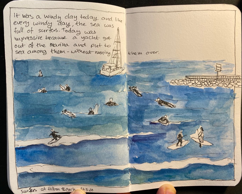
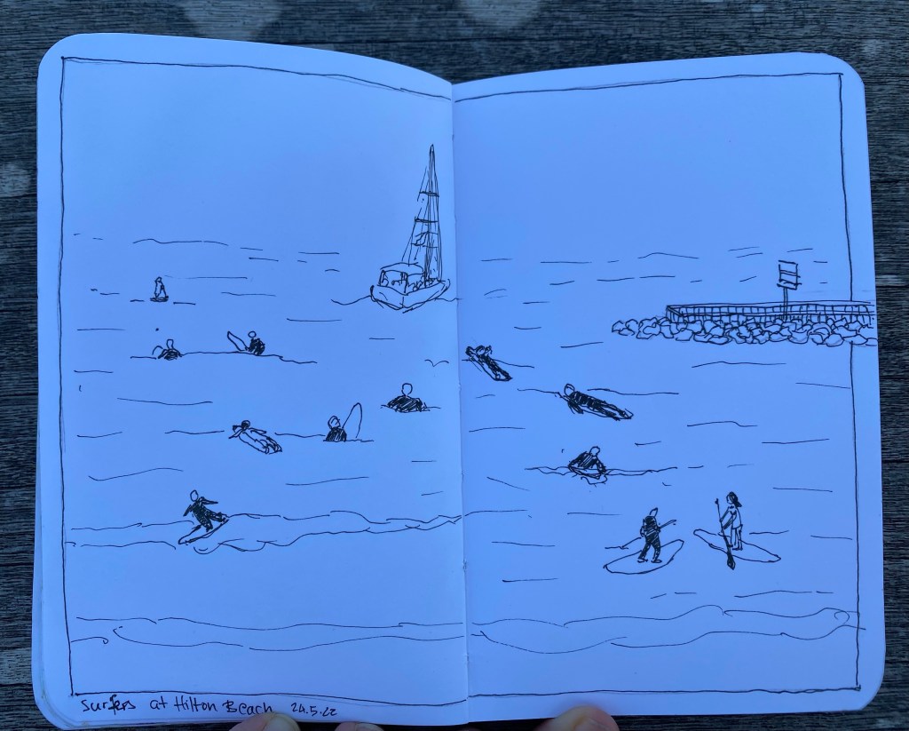
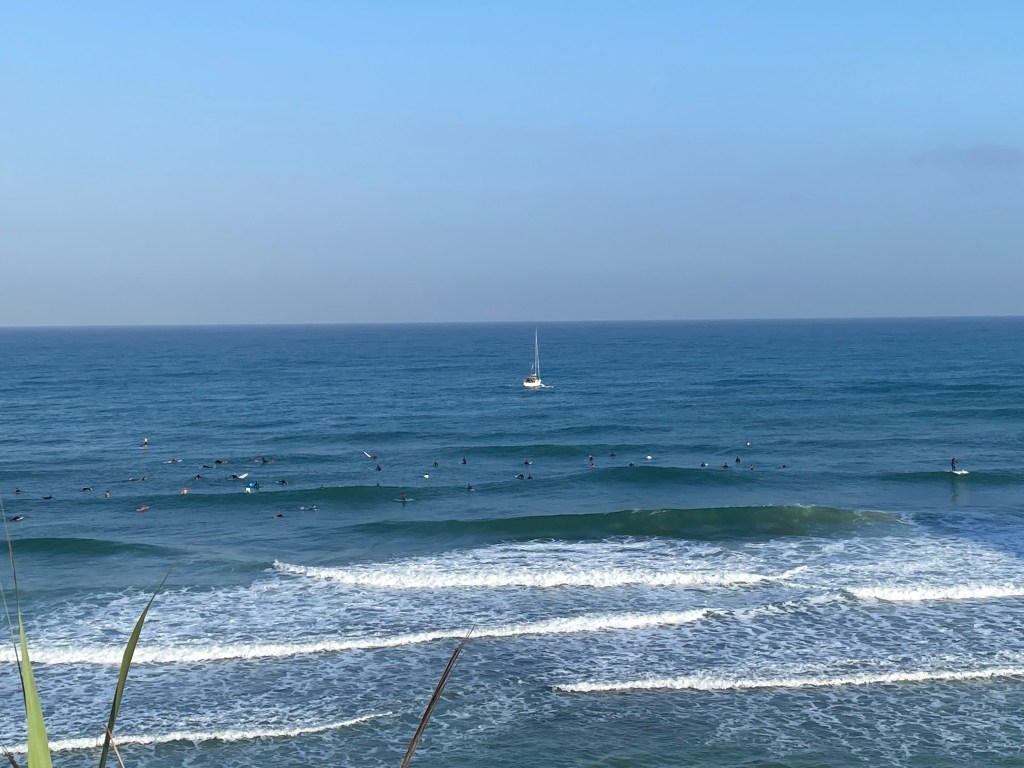
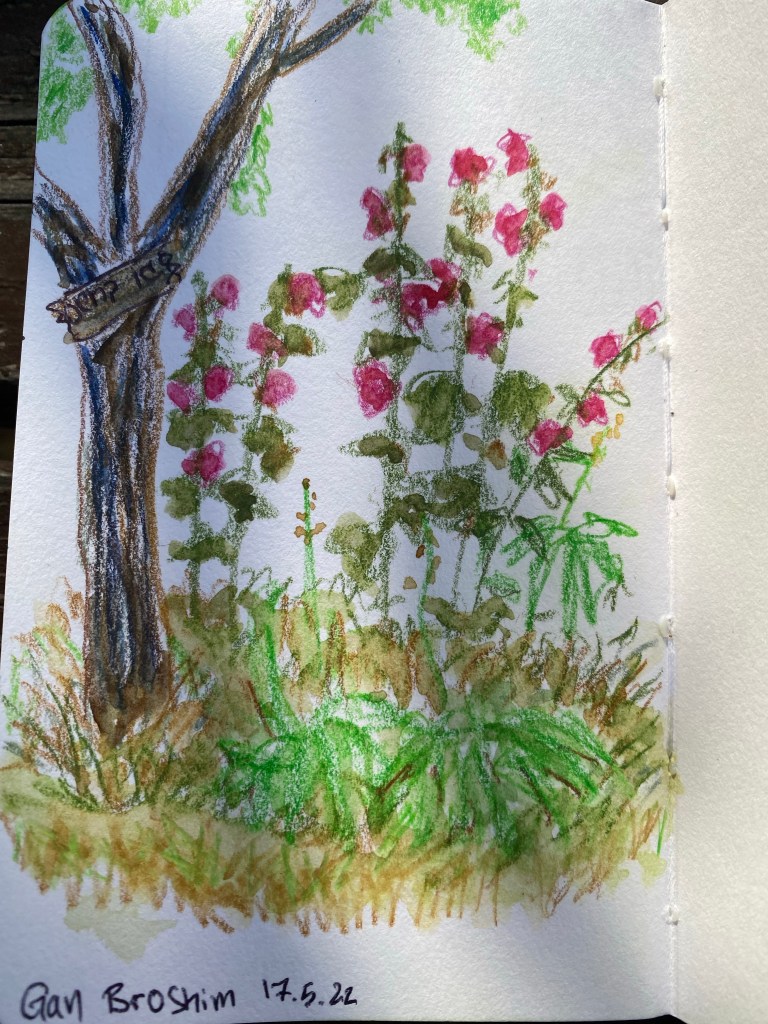
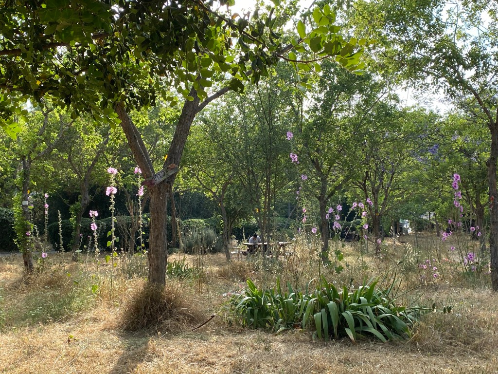
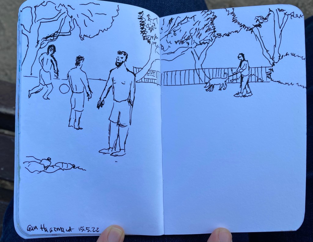
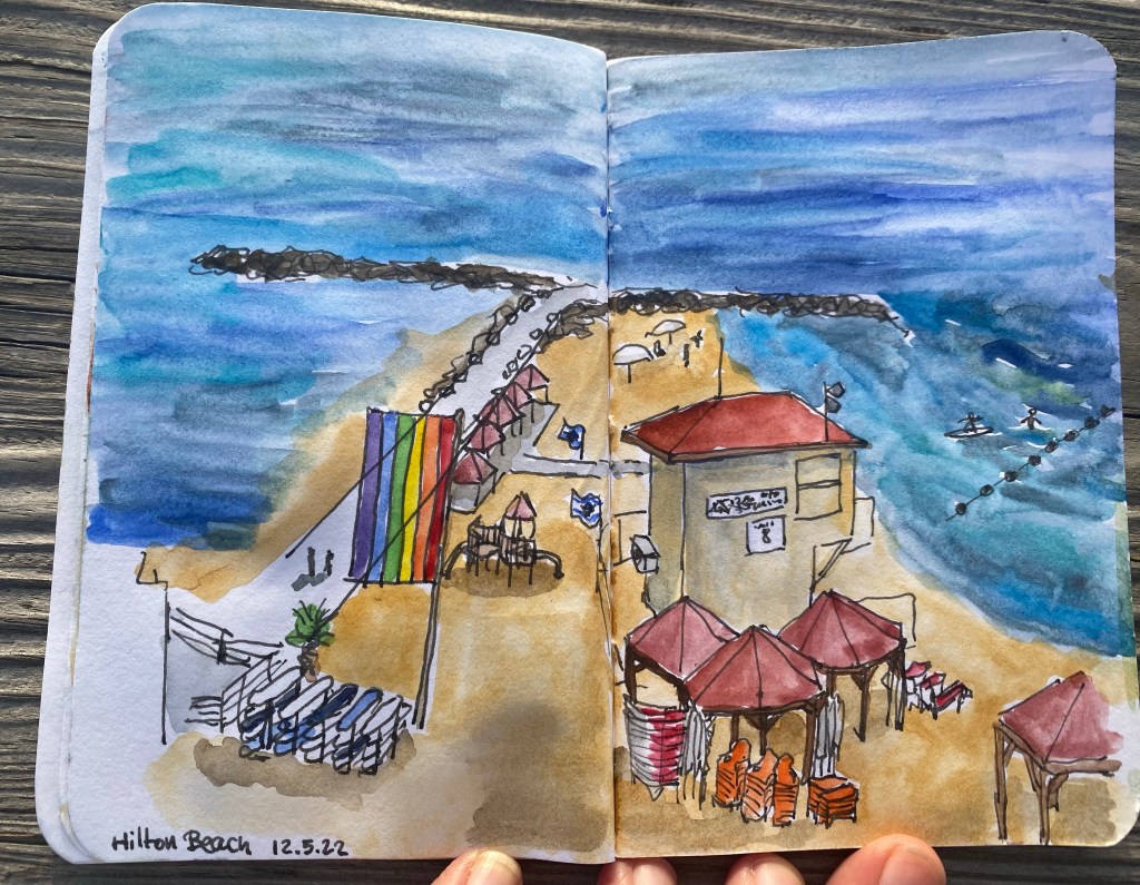
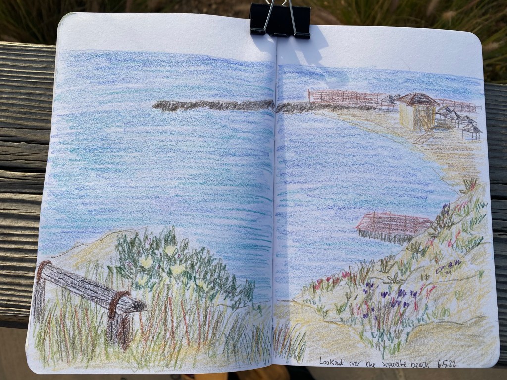
The past two weeks were a bit hectic, with various social gatherings (I’m not used to meeting people after being isolated for so long due to Covid and chemo) and getting ready to leave my old job and start my new one. The weather is still pretty good, and I’ve been relishing it: running, walking, and sketching a lot. As I’ve gotten used to writing and sketching with this level of neuropathy, I’m trying to take advantage of the pre-summer-heatwave weather to get as much outdoor on location sketching done as possible. I also have a backlog of London and Paris sketches to go through, complete where necessary and post.
I’m back at the gym (I had to freeze my membership during treatments), and enjoying getting back to lifting weights. And I went to see a movie for the first time in more than two years. “Dr. Strange and the Multiverse of Madness” was pretty good, but it had a few too many horror elements for my liking. Another first after a very long time was an evening out at an escape room with my friends. It was a lot of fun, and something that I really missed.
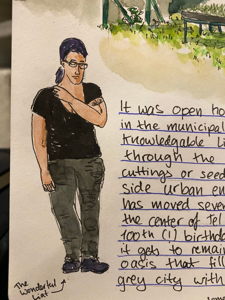
Yesterday I went an Open House Tel Aviv event at the municipal plant nursery. I learned that the nursery serves a wide variety of organizations and gardens all over the city, that urban environments, and particularly seaside urban environments are rough on plants, that the nursery is one of the few of its kind in Israel, and it has been around for 100 years. We saw plants grown from cuttings, talked about plants that can survive the salt and sand and harsh sunlight of beachfront gardens, as well as plants that can thrive in the shade. We saw plants that are pollinator friendly, and talked about local plants vs. imported and invasive plants in the city. It was fascinating, and I could have spent the entire day there. The nursery isn’t normally open to the public, so visiting it and getting such a wonderful insight into it was a real treat.
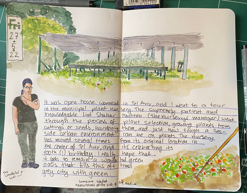
Here’s a closeup of Liat, who manages the nursery and was our fantastic tour guide for the day.
I’m 3/4ths done with “Our Country Friends” by Gary Shteyngart and I’m probably going to give up on the Tournament of Books reading list once I’m done. I have so many good books that I want to read, that I don’t feel like chancing another tiresome one. What will come next is Ali Smith’s “Companion Piece”, and then “The Mirror and the Light”. There are a few classics that I want to catch up on, and some very good sci fi that’s waiting for me, so as much as I’ve discovered some fantastic books through “The Tournament of Books”, I think that this is where our ways will part, at least for a while. Oh, and Agatha Christie is an excellent writer, and very addictive. I may return to her books in the near future.
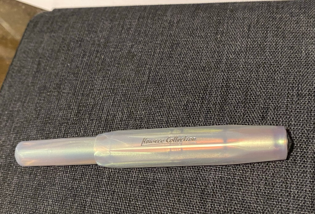
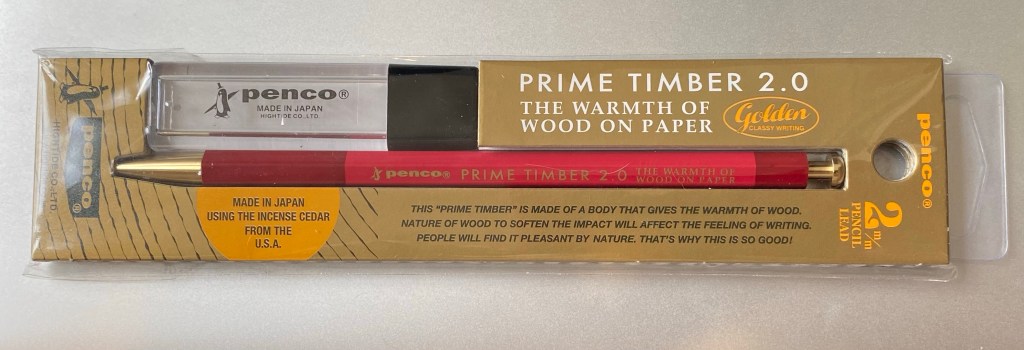
I’m exploring various ways to manage my projects, and so far I’m unhappy with all of them. When I was in London I picked up this Penco leadholder and some leads (I have another one in shades of green that part of a sketching kit that I don’t want to break up), and I’m giving the good old PigPogPDA another try while I work things out. This is always my “palate cleanser” system, something that I use while I tweak other, more complex systems into relative perfection. I’ll be using this leadholder and a Moleskine plain pocket reporter.
I’ve enrolled to Liz Steel’s Watercolour course. It’s starting a runt through on the 8th of June, and as I’ve had such a long sketching break while my hands were bad, I thought that it would be a good way to refresh my skills and pick up a few tips and techniques along the way. I like Liz’s loose, non standard watercolour style, and her courses are excellent.
Next week on Tuesday is my last day in my old job, and the week after that I start my new job. Exciting times 🙂