Happy New Year!
Happy New Year! May 2022 be better than 2021 in every possible way.

A blog about writing, sketching, running and other things
Happy New Year! May 2022 be better than 2021 in every possible way.
I had a strange Yom Kippur this year, as is to be expected. I decided to commemorate it in my sketchbook, this time using Faber Castel Albrecht Durer watercolour pencils in addition to my usual Schmincke and Daniel Smith watercolour mixture.

Drawn on a Stillman and Birn Alpha. Ink is Iroshizuku Ina Ho (lines), Robert Oster Fire and Ice (heading and text) and Sailor 123 (2021).
I am a big fan of Field Notes, so when I saw that they came out with a sketchbook in collaboration with musician Maggie Rogers, I had to give it spin. The Maggie Rogers Field Notes are in the “Dime Novel” size, and are bound with and contain Strathmore paper. That is a promising start: an uncommon sketchbook size, with artist quality paper inside.
The Maggie x Field Notes edition comes with two sketchbooks in each pack, one with a red tinted spine and one with a blue tinted spine. On the cover of each is a Joshua Meier photo that was featured on Maggie Rogers’s first two albums: Blood Ballet is on the red tinted one on the left, and The Echo is on the blue tinted one on the right.
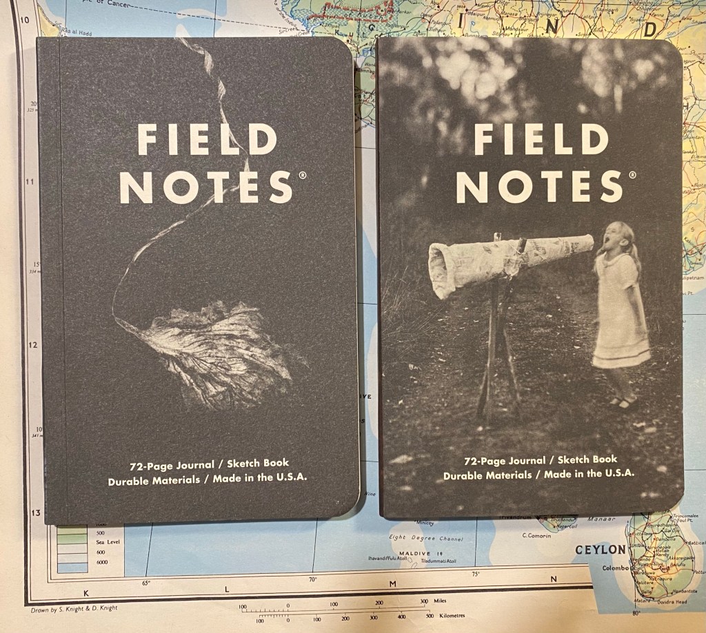
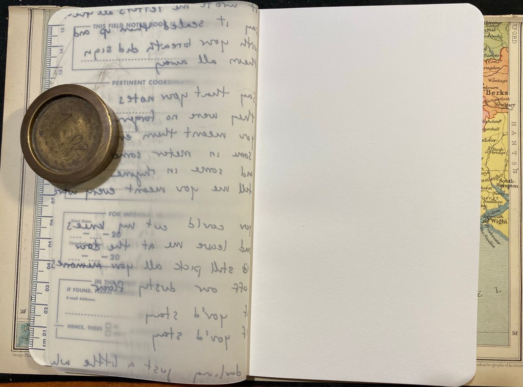
Beyond the normal “Pertinent Coordinates” design on the front cover, there is a vellum fly-sheet in each sketchbook featuring Maggie Rogers’s original hand-written lyrics. It’s a nice touch that really adds to this edition’s design.
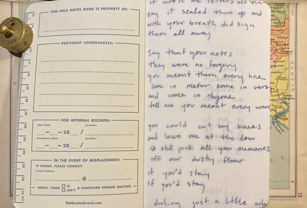
I also like the decision to print these on vellum and not on Strathmore paper that is in the rest of the sketchbook. It gives the words an airy feeling that doesn’t weigh too heavily on the user. You don’t feel the need to compete with them, so to speak.
The inside of the back cover features Field Notes’ usual spiel and some information about Maggie Rogers and this collaboration. As usual, it also lists all of the technical details of this sketchbook, which I love. It would have been nice to get the Strathmore paper weight in a more standard gsm notation.

The red, Blood Ballet edition of the notebook is the same as the blue one, just with a red brown tint to it.


So, to business. How does the Maggie Rogers Field Notes perform as a sketchbook? For that I tested it with some Uni Pin fineliners and brush pen, a Fixpencil with 2B lead, and finally with light watercolour use. Unsurprisingly, considering the paper inside is light weighted Strathmore, it’s a good sketchbook to have in your bag or coat pocket. It’s versatile and not too precious to make you feel bad about “ruining” pages.
The first sketch that I made was done with a grey Uni-Pin 0.5 fineliner. The paper isn’t entirely smooth, but I no problem using the fineliner on it. The ink doesn’t spread or feather, but it does show through and even bleed through to the other side. I won’t be using both sides of the paper here.

You can see the show through and even a spot or two of bleed through here. I really don’t recommend drawing on both sides of the page here.

The next drawing was done with a Uni Pin brush pen. The paper isn’t glass smooth, and that actually makes it more fun to draw on. There was no spread and less bleed-through than with the fineliner somehow. I still wouldn’t use the other side of the page, because it will show through.

The paper shines with pencil, and I had a lot of fun sketching this palm using a Fixpencil with a 2B lead. If pencil is your medium of choice, you are going to love this little sketchbook.

As for watercolour, you can use the Maggie Rogers Field Notes sketchbook for light washes in a pinch, but it’s clearly not made for this. Washes come out patchy and grainy, and while the paper holds and doesn’t buckle too much if you are vey careful and only use a small amount of water on it, I really wouldn’t use it for watercolour.
The reverse side of the paper shows just how much it buckled under the strain of even a small amount of water (pun intended).
I think that the Maggie Rogers Field Notes is a nice sketchbook to try out quick ideas and vignettes in. It’s a nice sketchbook that’s not too nice, the vellum fly-sheet actually reduces the pressure of the first blank page, and so long as you don’t insist on using watercolour with it, it’s versatile and will do as your main pocket sketchbook in a pinch. Its main weaknesses (the thinness of its paper and the binding that doesn’t allow the pages to open flat so you can’t use a whole spread) actually work together to make this a sketchbook that encourages you to burn through it. It’s not precious. It’s not too nice. It’s a workman-like sketchbook, which works perfectly with the Field Notes brand.
I really like how the two watercolours on this page “melt” together, and in general this is one of my favourite sketchbook spreads created as part of the Sketchbook Design course.
This is the first time that I’ve used my new watercolour palette and I’m still figuring stuff out. I’m also using an 8’’x10’’ Stillman and Birn Alpha which is a large format that I’m still getting used to and isn’t the best for smooth washes. I’m embracing the patchiness here and letting the paint do its thing. More importantly, despite temptation I’m not making any adjustments to the new palette now, as I need more time with it.
Also, the Sailor Fude 55 degrees fountain pen is magic. I used one here with Noodler’s Lexington Grey.

A drawing of a decrepit, old building in central Tel Aviv. Painted only using the new Schmincke super-granulating watercolours (Galaxy, Glacier, Deep Sea, Forest and Tundra). The only exception is the yellow, which doesn’t exist in this range.
My review of these colours will probably be up this weekend.
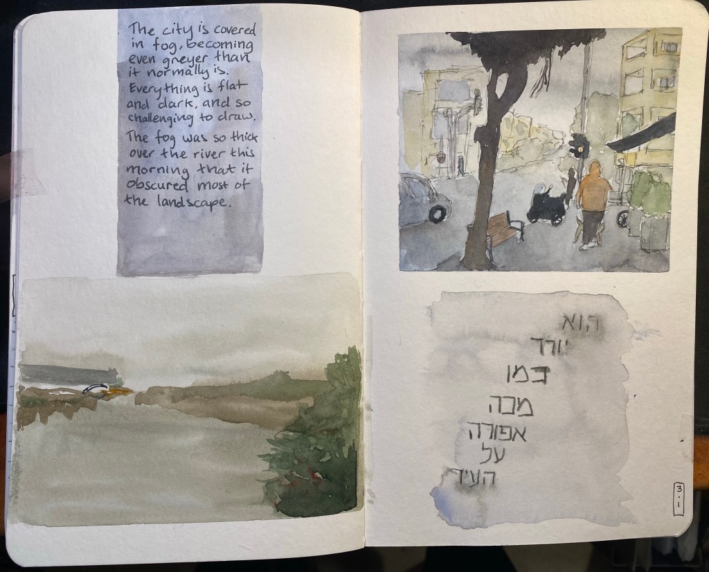
In early January we had a bout of very foggy days and I took photos of various city scenes in the lockdown and the fog thinking that I’d later draw them. I thought that drawing fog in watercolour would be pretty straightforward, because what is easier than just drawing wet on wet and letting the watercolour do its thing? But after looking more closely at the photos I realized that fog isn’t just grey sky melting into the landscape, it’s also a muting of colours, a flattening of the landscape, the lack of shadow. In the end I drew two small landscapes, one urban and one of the park, and although they were challenging I enjoyed drawing them enough to want to have the same experience with the text. The grey writing in Hebrew in the bottom right corner is a line out of a well known rock song that embodies a lot of the spirit of Tel Aviv. It was written using Diamine Silver Fox on a semi-wet background, to facilitate ink spread.
These drawing also showcase a shift I have made in my palette and my mixing over the past few weeks. Once things settle down I’ll probably post about my new palette.
I’ve had a rough two weeks, with my mom going through surgery to remove tumours during a Covid lockdown and other stuff crumbling at the same time. Starting to get back to my my routine again, which means posting here, working on a review and working on another short story.
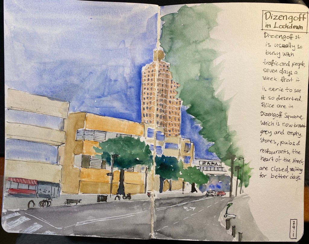
This page shows a deserted Dizengoff street, which I haven’t seen since the first lockdown, last spring.
Hoping for better days ahead.
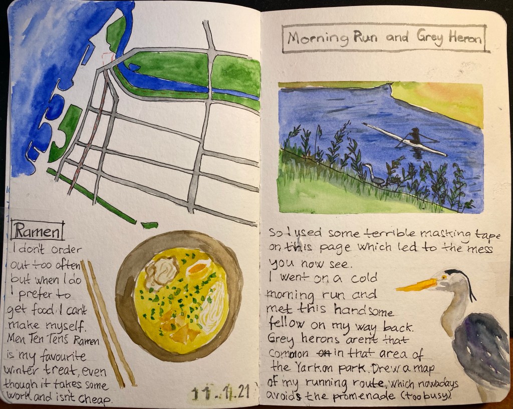
I don’t often get to see grey herons during my runs, so I decided to make a hero of this sketchbook page. Drew a map for the first time in my sketchbook and it was hard and took longer than I expected.Drawing the ramen bowl was also challenging, but I really like the results. I like this spread even though at the beginning I thought that I’d have to trash it, because some terrible masking tape that I used tore into the right page quite badly. Glad that I stuck with it.
This page was created as part of Liz Steel‘s Sketchbook Design course and explores using maps in your sketchbook.
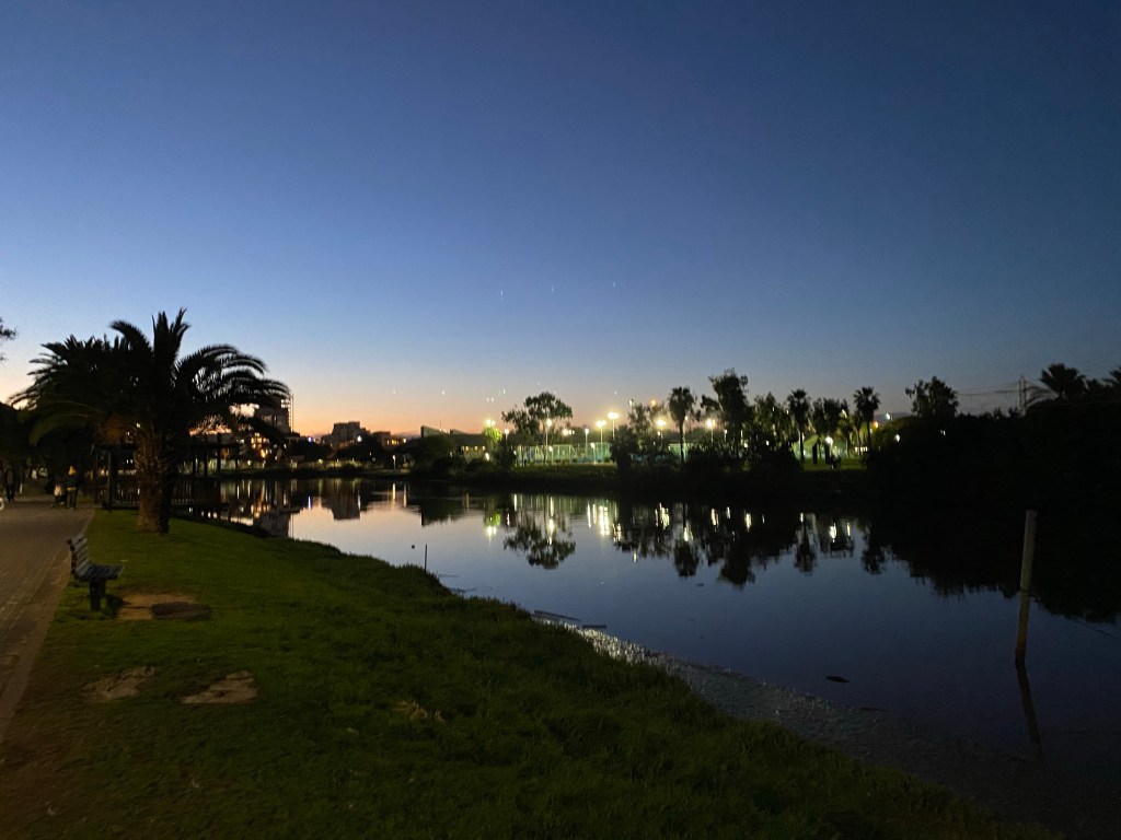
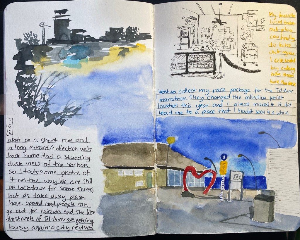
Twilight over the Yarkon river. Taken during tonight’s chilly 5k run.
