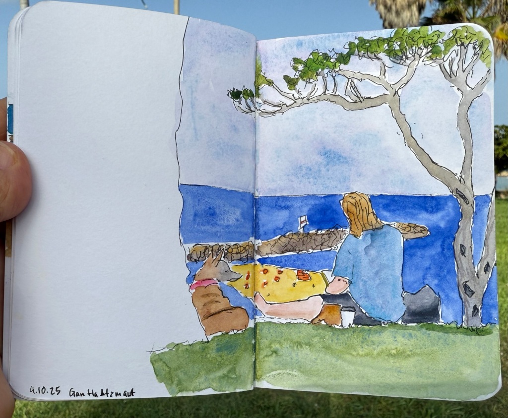
I recently returned from a pretty long trip to Paris and London with my family. I ended up sketching a lot more than I normally do during trips, largely thanks to things that I learned during the Urban Sketchers Symposium in Poznan (more on that in a later post). Here is part 1 of some highlights from my trip.
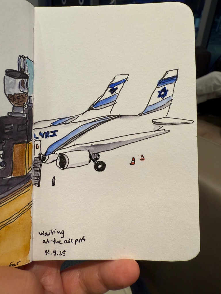
Quick sketch in a Stillman & Birn pocket beta while I was waiting for my flight
Centre Pompidou, my favourite museum in the world, was closing down until 2030 (!) so I went to pay it a last visit. Already parts of the colourful outside facade have been repainted white, and I’ve never seen the area around the museum so deserted.
The iconic Pompidou facade
The library was the only area still accessible, and it had been turned into a giant project playground for German photographer Wolfgang Tillmans to work with. It was something that only Pompidou could do, and it was breathtaking, thought provoking, fun, interesting, and unique. I wish I could have spent hours there, but at this point in my trip I became badly ill and for the entire Paris leg of the trip I was struggling.
The Pompidou library transformed.
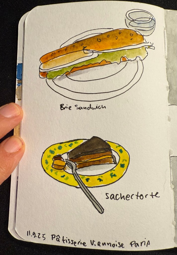
I ended up largely not eating in Paris, but this was my first meal there – in the fantastic Patisserie Viennoise in the Latin Quarter.
Stillman and Birn pocket alpha watercolour sketch
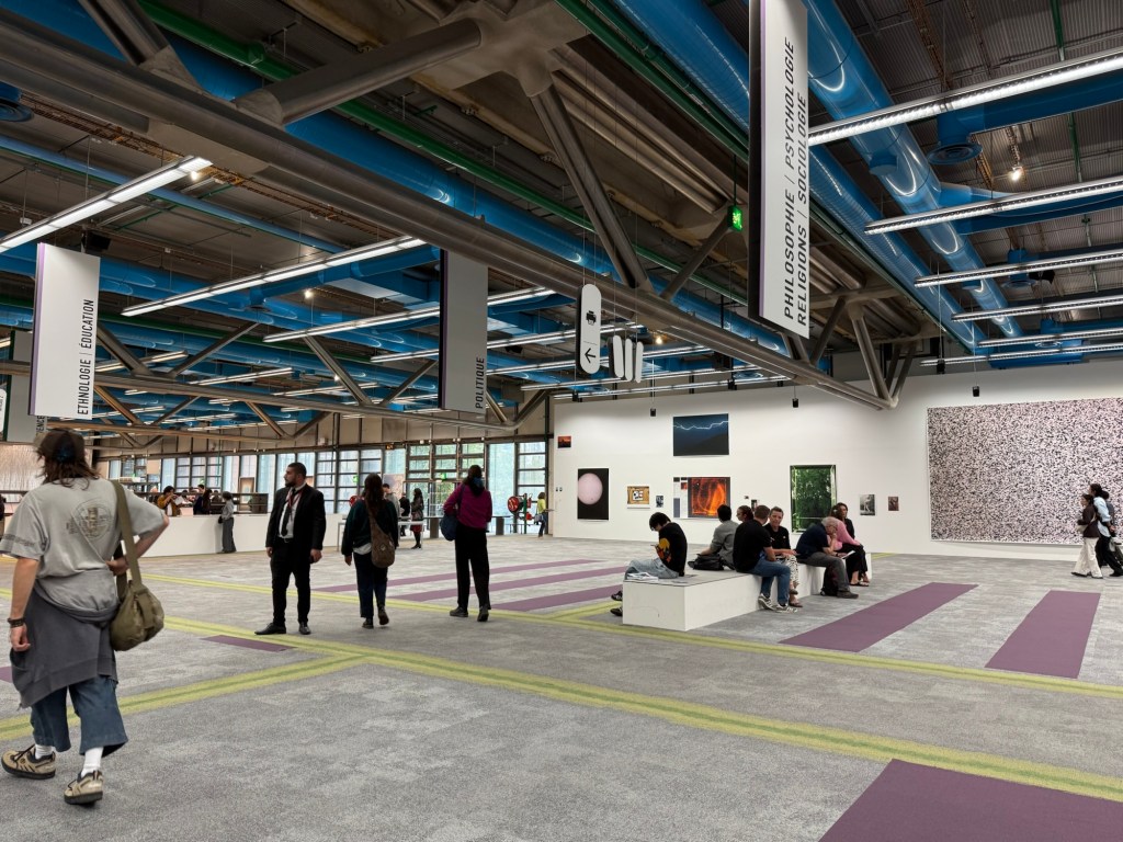
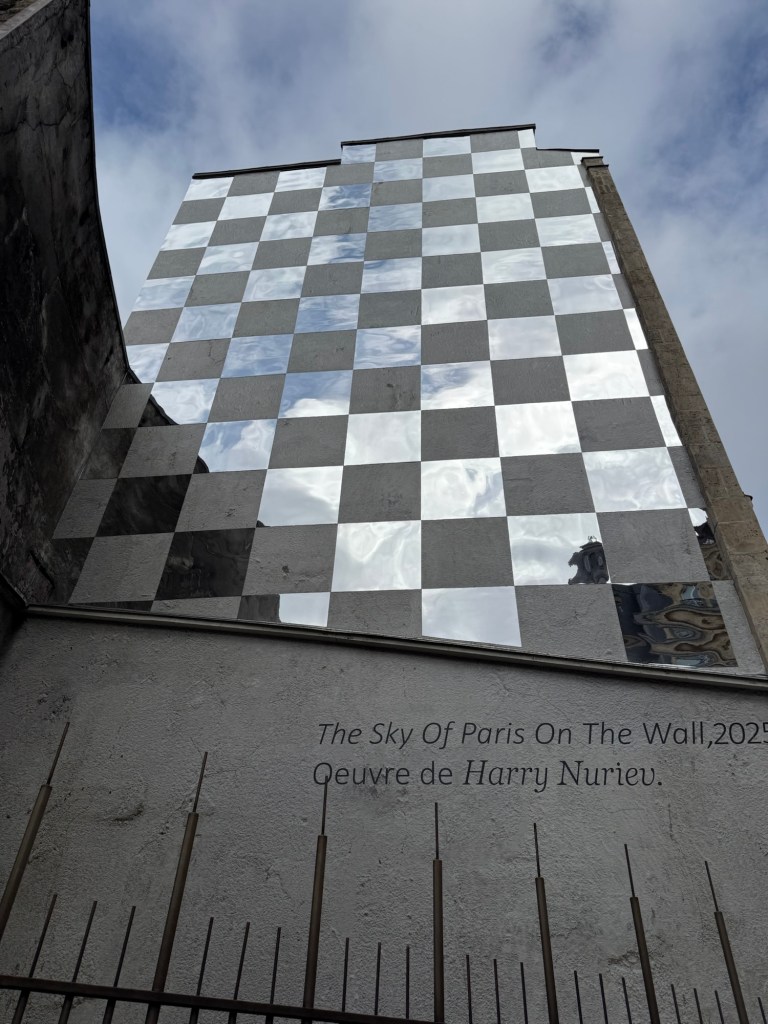
We also went to a new museum, the Bourse de Commerce and I saw this great artwork on the way there:
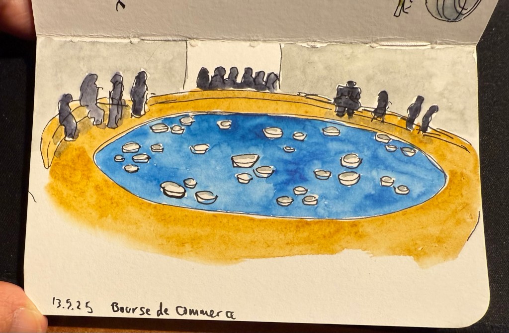
The museum was in between putting up exhibitions, so while a large part of it was closed we managed to view some great and moving art pieces with relatively few crowds and at a discounted price. I did a VERY quick sketch while I was there:
Stillman and Birn pocket alpha watercolour sketch
This is the artwork that I was sketching.
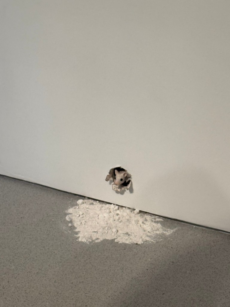
And this little fellow is also part of the art exhibits there:
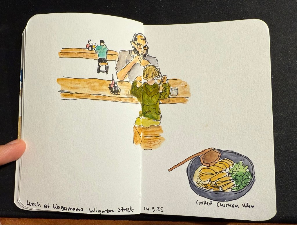
We then took the Eurostar to London. This is where I switched sketchbooks – this sketch of a boy and his father having lunch at a table across from me at Wagamama is the last sketch I created in my Stillman and Birn pocket beta. The beta has decent watercolour paper but it’s not half as good as the paper in my Etchr labs watercolour sketchbook, and the glued in pages make it a struggle to create full page spread sketches, as you can see here:
Last trip sketch in the Stillman and Birn pocket beta.
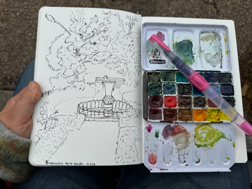
I created my first sketch in an Etchr lab cold pressed watercolour notebook while in the Greenwich Park herb garden and the paper is astonishingly good. Here’s the ink sketch (my tree sketches have gotten so much better thanks to a workshop I took in Poznan):
Etchr lab watercolour sketchbook sketch
And here is the watercolour:
The paper not only makes the colours pop, it actually allowed me ample time and space to work with the washes, adding layers of well blended colours that gave depth and life to the scene. Never have I ever seen the importance of good quality watercolour paper demonstrated so well. I have about half a dozen sketches of this garden throughout the years and this is by far the best one.
That’s it for part 1, I’ll try and upload part 2 later this week.
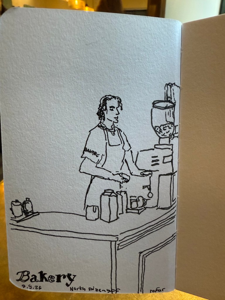
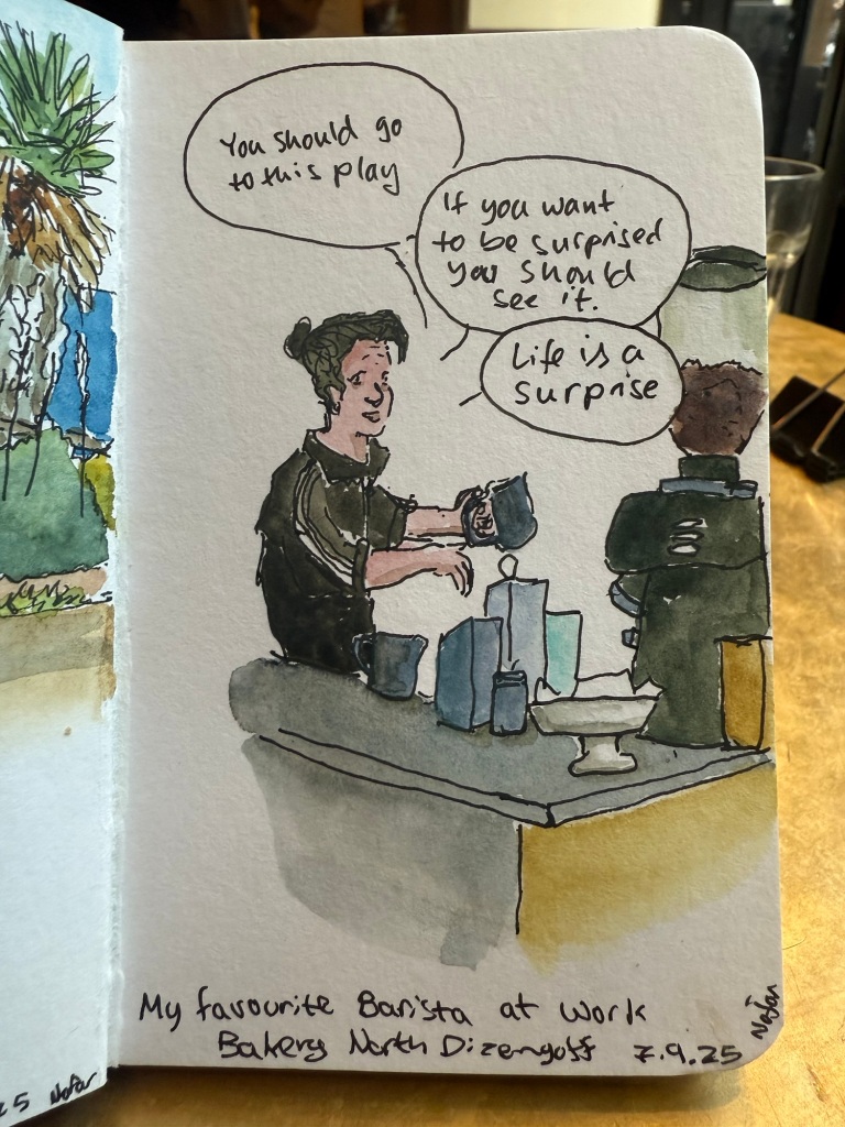
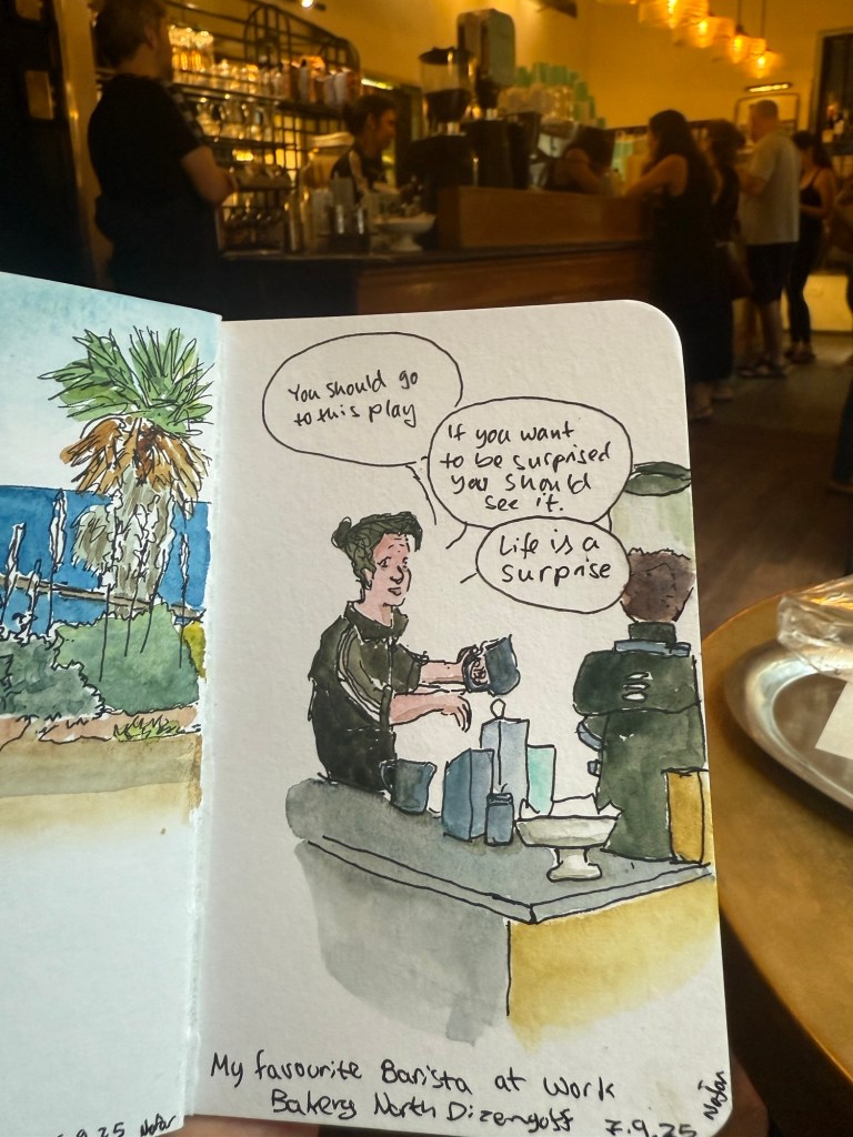
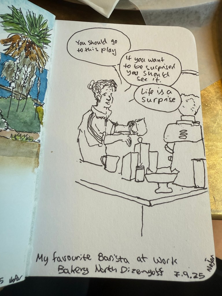
Went on a 5k run and then went to my favourite cafe and did a quick sketch of the barista. Had more time this morning than last time so this sketch is more detailed.
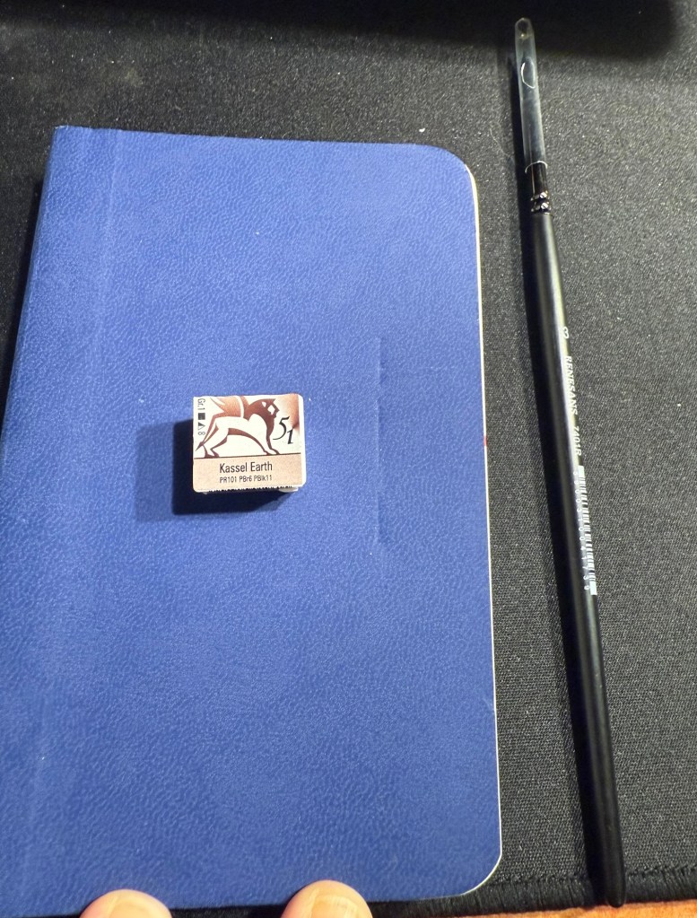
As part of the Urban Sketcher’s 2025 Symposium in Poznan I got a very generous goodie bag filled with art supplies from the Symposium sponsors. One of those sponsors was Renesans, a Polish art supply manufacturer, and they gave us a half pan of Kassel Earth extra fine watercolour and a number 3 synthetic watercolour brush.
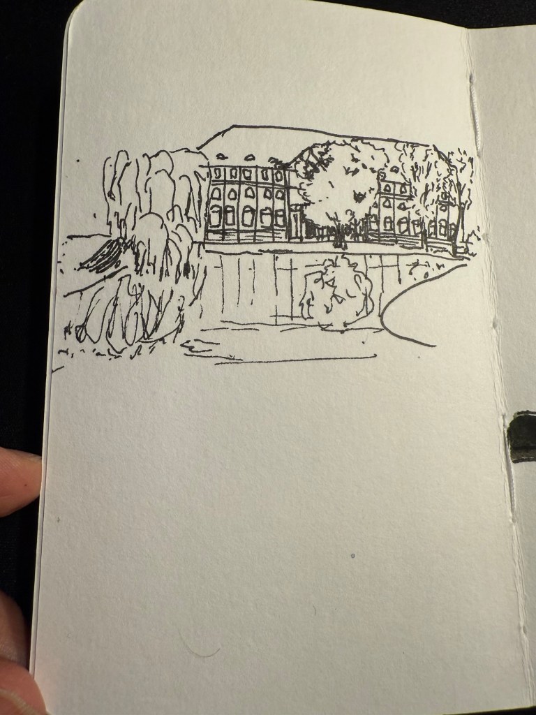
Today I decided to try them out. I used a Stillman and Birn pocket beta, a Staedtler 0.8 pigment liner and only the Kassel Earth watercolour and the Renesans brush. This is the result:
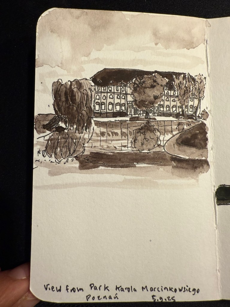
It’s a sketch of a beautiful building across from a pond in a park in Poznan. I drew it from a photo that I took during my morning run through the park. I was planning on returning to the park during the Symposium but I ended up not having time.
This is the sketch:
I used some of what I learned in the symposium to create more realistic trees.
I rarely sketch in monochrome so this sketch was a challenge. It’s about seeing the grades and shades in a scene, and not the colours, and that’s a hard exercise.
This is the paint and brush on the sketchbook:
And this is a swab of the paint. It’s a classic Van Dyke brown, artist grade quality. The brush was surprisingly good, especially for a synthetic brush. It retained quite a lot of water, and it has a good, sharp point.
Though the paint pan has bubbles in it, which isn’t great, I am happy with the quality of the paint and I would consider using Renesans watercolours in the future. The brush is excellent and I am adding it to my rotation. What a wonderful gift to get!
So I was sick, which made sketching impossible for a few days. I’m still sick but I’m slightly better, so I sat down and powered through the rest of the missing sketches.
As I mentioned last time 61-68 were draw from life, the rest from earthsworld. This site is so much better for reference photos than the flickr gallery I used in previous years that it affected both my speed and my sketching quality. Also, I had a lot more fun sketching these portraits this year. The Leonardo Momento Zero Bohemian Twilight fine nibbed fountain pen was the perfect sketching companion, and Diamine fireside snug performed well on the Stillman and Birn Alpha paper. The larger landscape format also helped make these a joy. Here are the previous days’ sketches: day 1, day 2, day 3, day 4, day 5, day 6, day 7.
This sketching challenge is always great to do, as it really pushes me outside my comfort zone. If you haven’t yet, I highly recommend giving it a try.
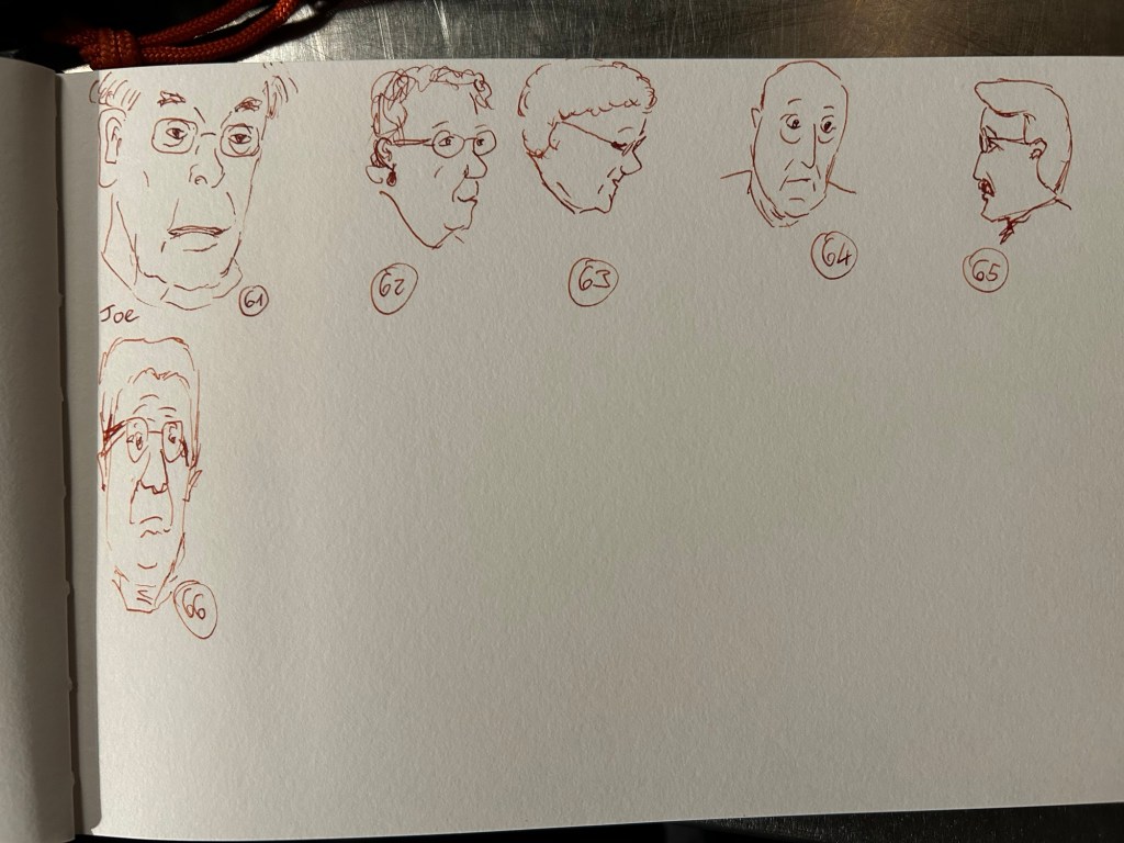
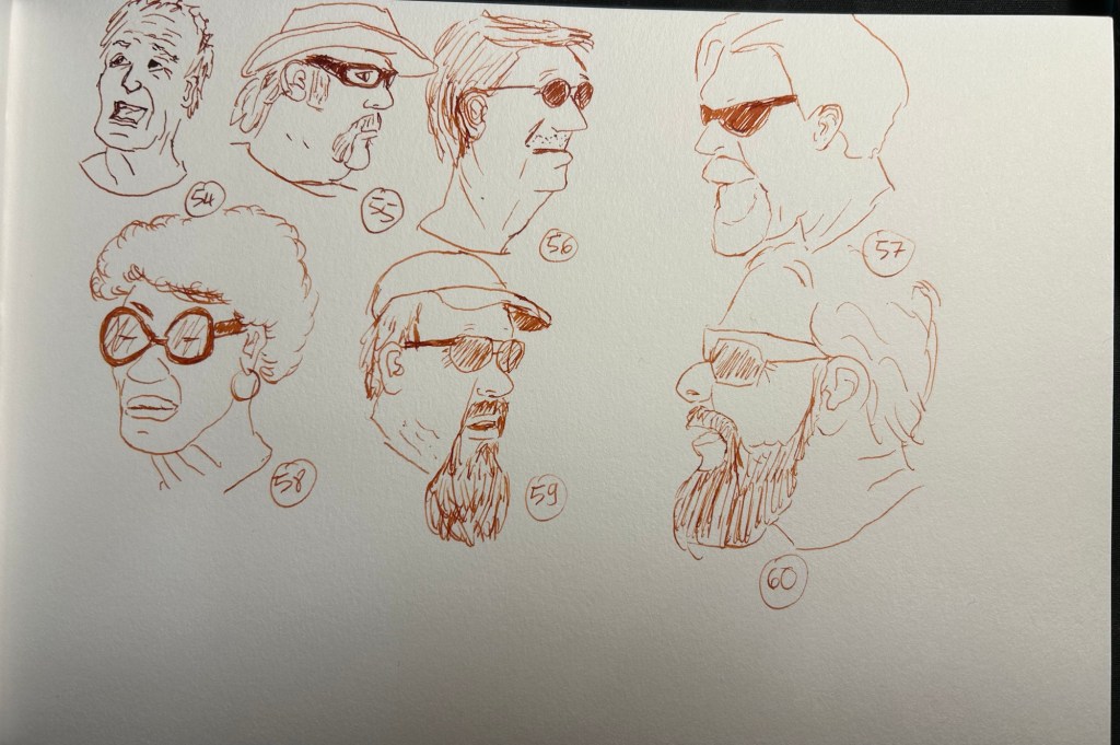
A long tiring day with two vet visits meant that I had precious little time to sketch. Got up to 60, and sort of them came out surprisingly well.
As expected, with my injury and the way this week is shaping up I likely will finish my sketches only on Tuesday or Wednesday, but I like the results so I’m not in a rush.
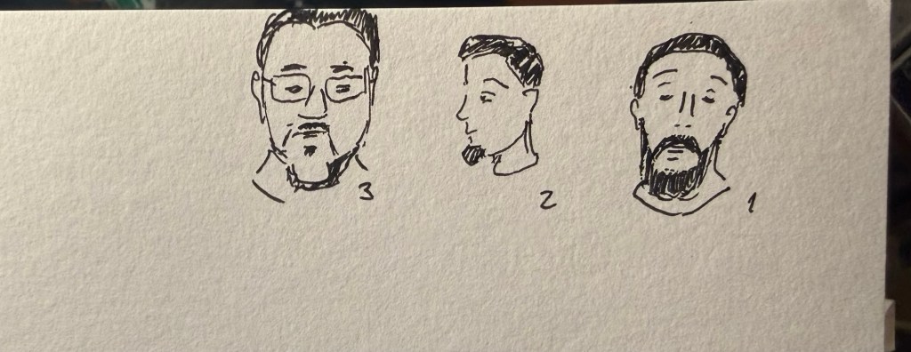
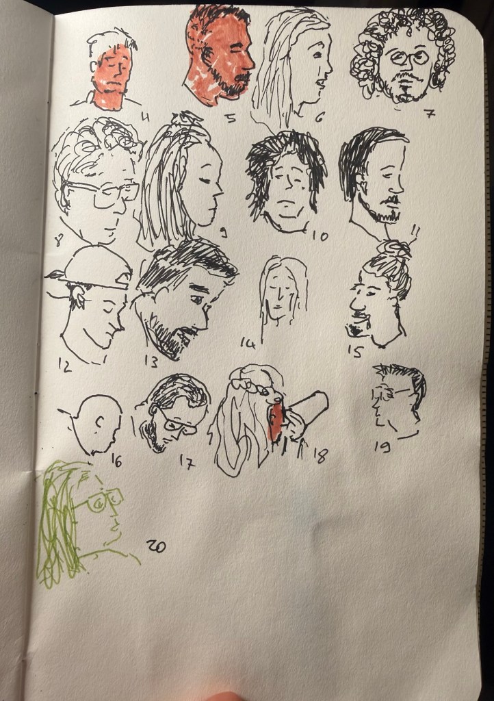
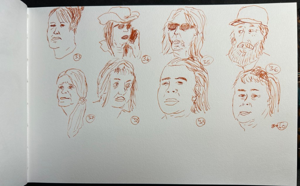
The result is sketches 12 to 40 (yes, I got that many done in a single sitting). The fact that I have much better reference photos made such a huge difference, as I didn’t have to waste time digging through urban landscape photos in search for half decent portraits. Also, the Earthworld photographs feature People with a capital P – frumpy, old, ugly, real and incredibly beautiful to sketch. The great Leonardo Momento Zero Bohemia Twilight fountain pen with its fine nib and Diamine Fireside Snug also added to the fun – I love this pen and ink combo so much I’m likely going to use it for the rest of the 60 sketches.
Number 12 was added to this pageI love 14, 17, 18, 20 and 21I picked up speed with these as I warmed upNumber 36 and 37 really came out well, I think
So, now which one is your favourite? I have too many to choose from.