Weekly Update – Baristas and Cats and Plays, Oh My

Long time no update so this one contains multitudes.

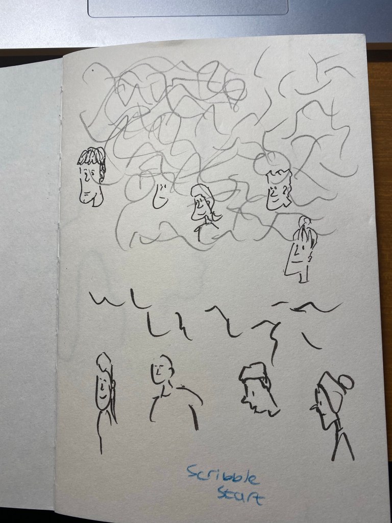
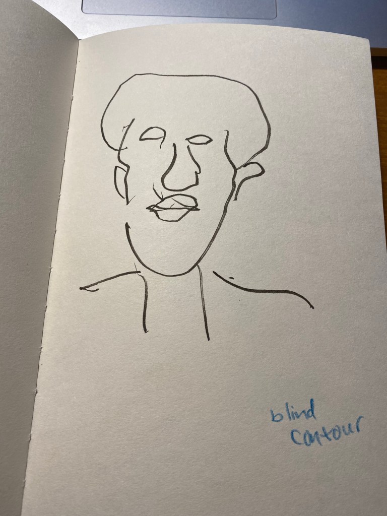
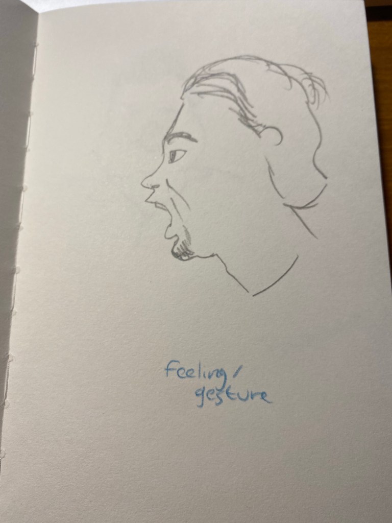
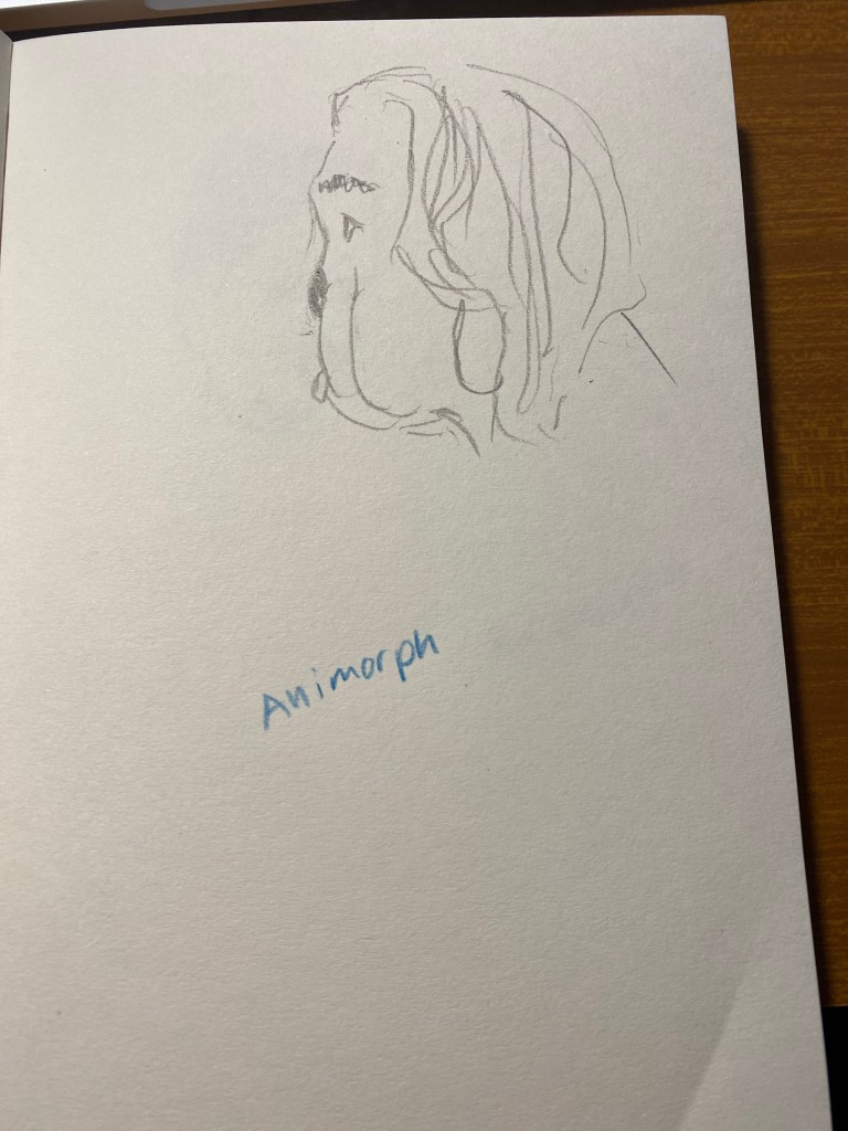
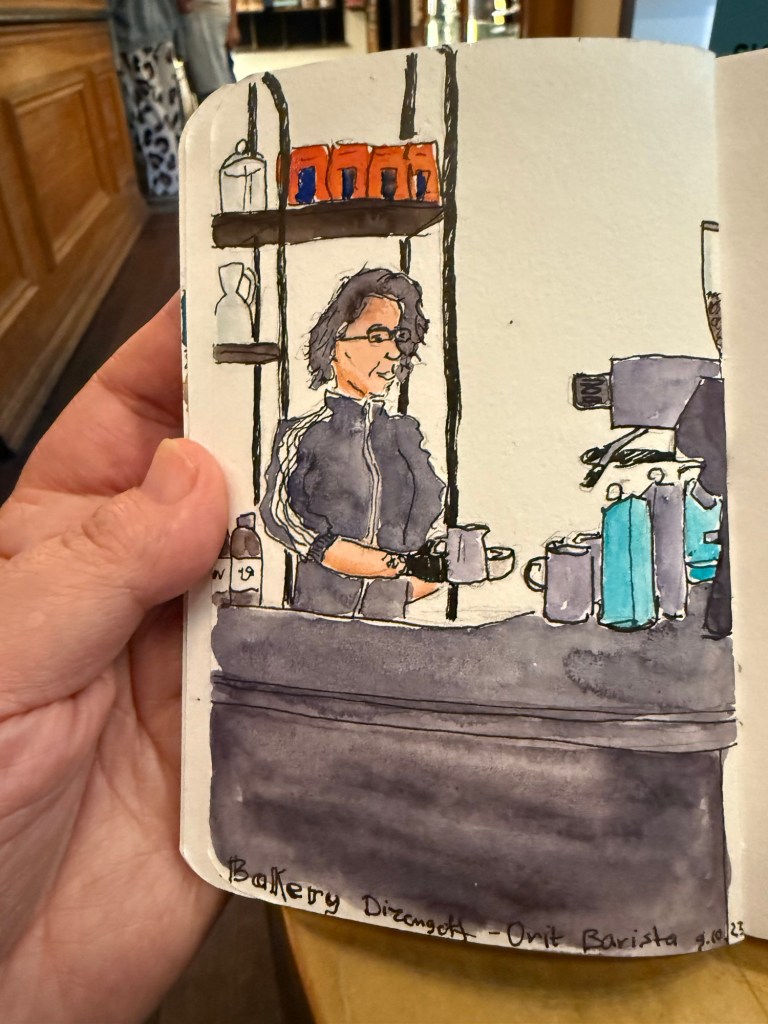
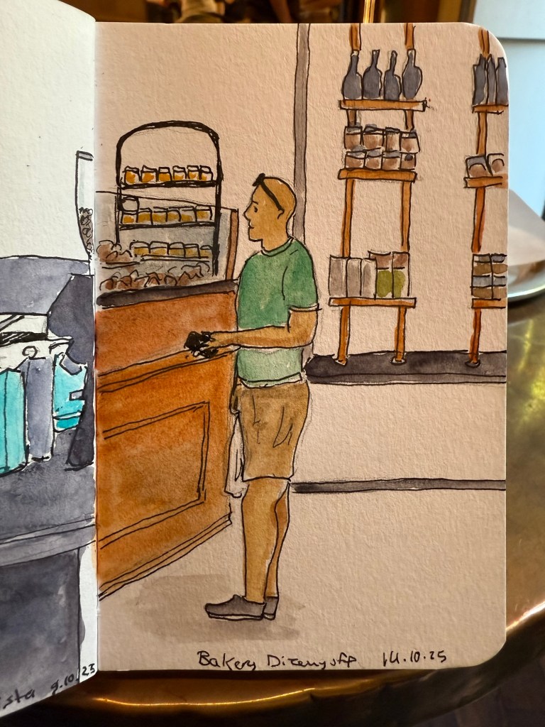
I have started taking a small sketching kit with me on my long runs. I take my Pith Kabosu, Aquarius Urban Sketchers watercolour palette, a fineliner of some sort, a waterbrush and a Pentel P209 mechanical pencil. I finish my runs at my local cafe and sketch there over a sandwich and coffee.

My favourite barista at work

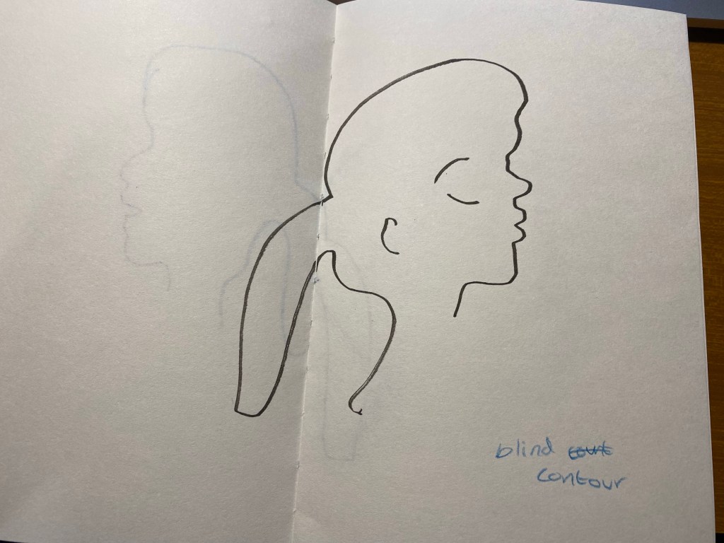
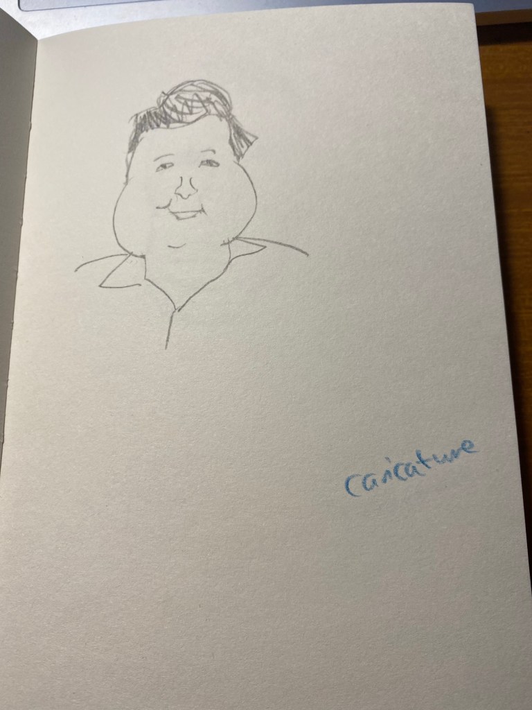
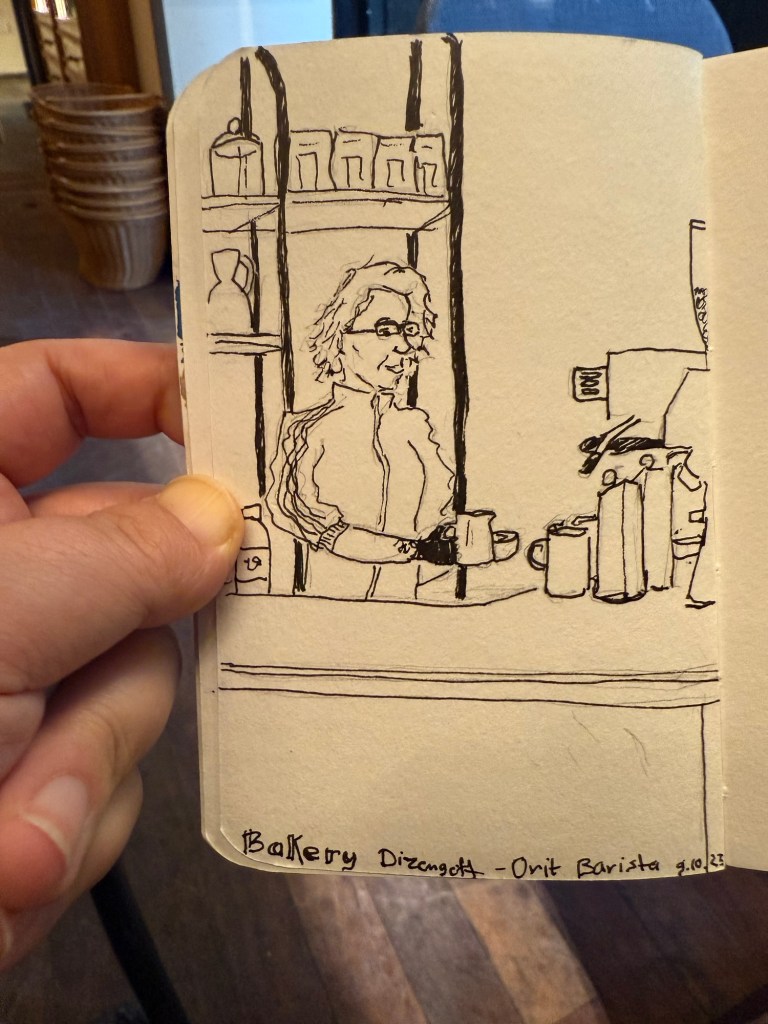
Here’s the preliminary sketch, done in pencil and a 0.5 fineliner:

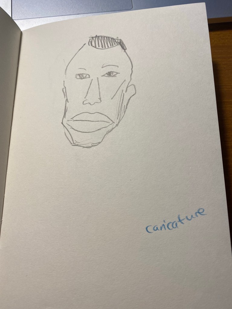
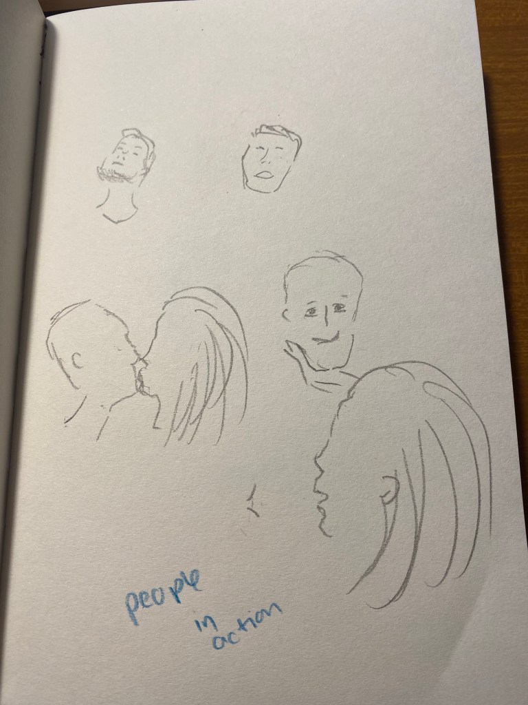
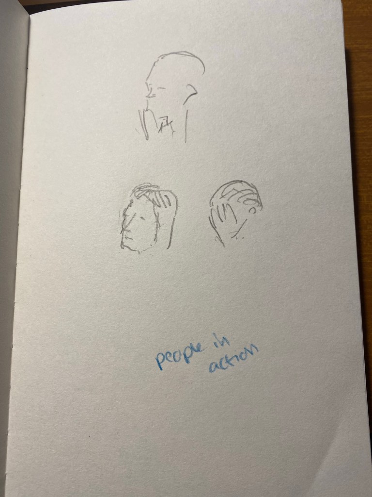
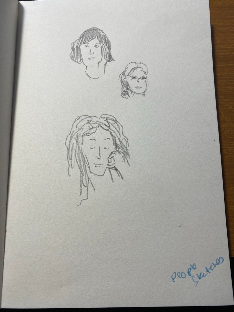
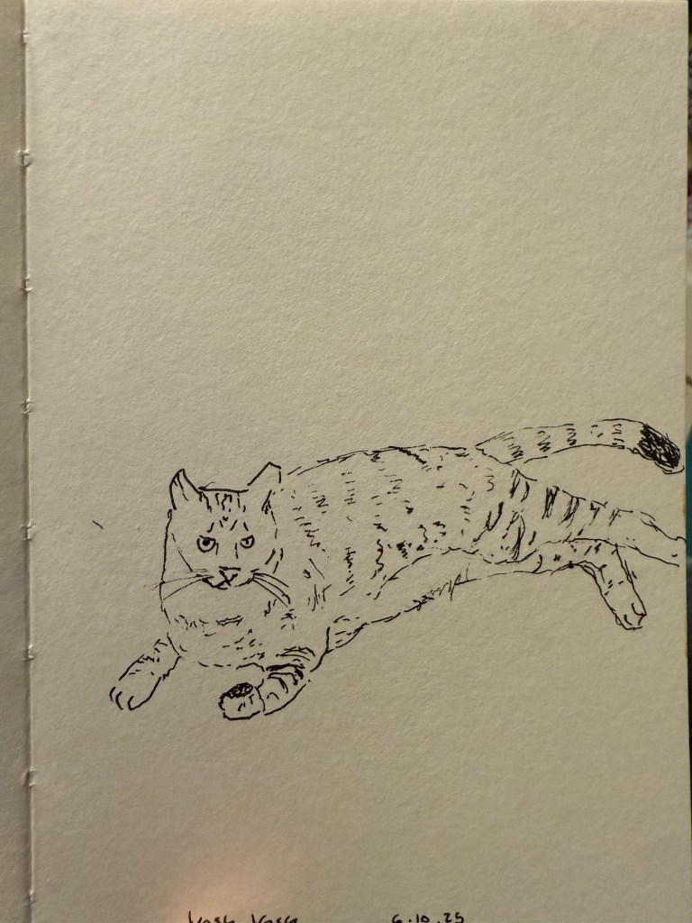
I am really enjoying my Pith sketchbook, and I’ve been taking it with me almost every day and sketching a lot more. My brother’s cat:

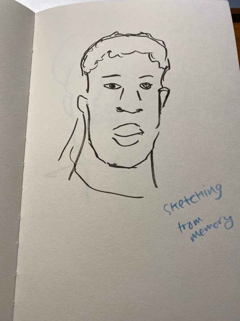
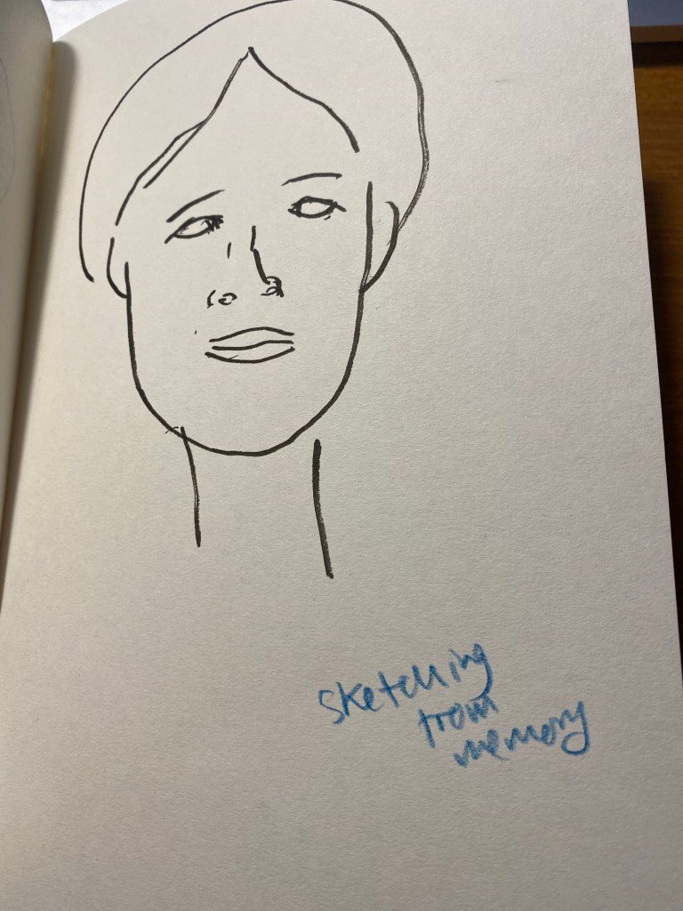
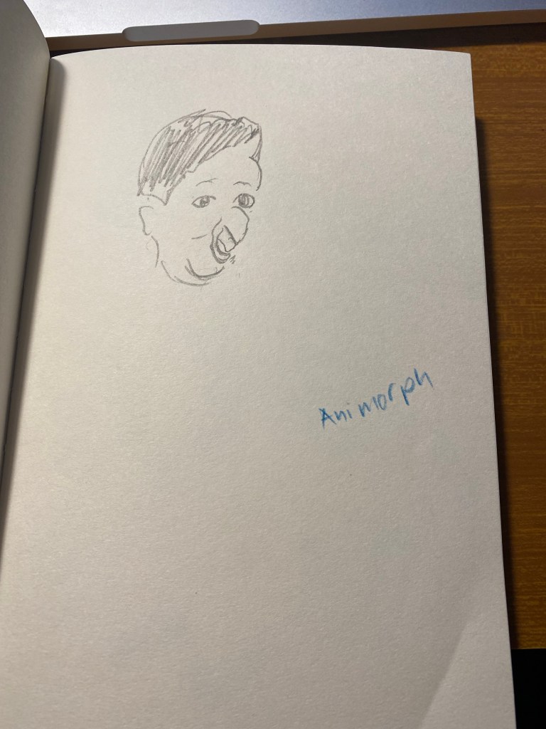
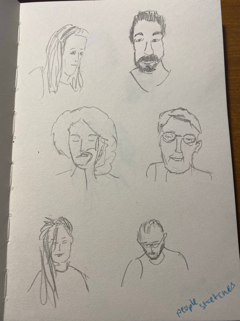
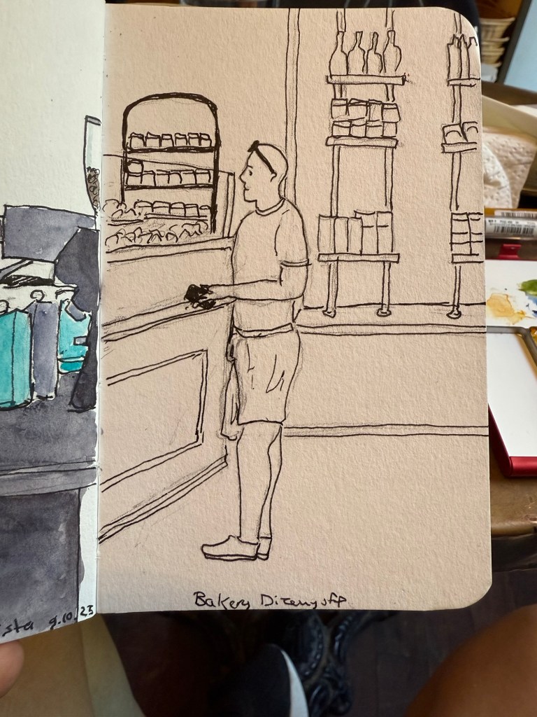
Another sketch at the cafe, this time of a customer:

While I’ve been sketching a lot more since the Urban Sketcher’s Poznan symposium, my journaling has taken a big hit. This oftentimes happens to me after traveling, as I rarely have time for regular journaling during a trip, and I often replace writing with sketching when traveling. The issue is that this time I’ve been struggling to return to the habit, mostly because I’ve picked up a few bad habits during the last two months of travel and chaos.

As many in the Urban Sketchers community use Instagram I started using the app before the symposium (I didn’t have it installed on my phone beforehand), and I got into the unfortunate habit of using it. Earlier this week I deleted it and logged out of YouTube on my phone, as I’ve been wasting time on there too. It’s been a relief – I’m not posting my sketches there, but I realized that I don’t really have an audience there – I’m just unpaid labour for billionaires. It’s bad enough that AI bots are scraping my site for content, but I don’t see a reason why I should allow my brain to be addicted to the slot machine tactics of an ecosystem that relies on me spending as much time as possible there to make its money.

My planning also took a hit due to travel, but I’ve gradually gotten things on track. My Q4 planning was about two weeks late, but as these were holiday weeks it wasn’t a big deal. I’ve also scaled down my plans to better accommodate holidays and travel.

Lest you think that I only go to plays when I’m abroad, I did catch two plays during the past two weeks. One was a wonderful community theatre staging of “Twisted”, performed during the local “comicon” – a sci-fi, fantasy and roleplaying game convention that happens once a year.

Twisted cast.

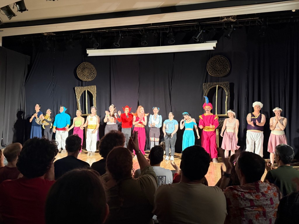
Twisted is a StarKid musical that is a funny, profanity full take of Aladdin from Jafar’s point of view. One of the striking things about it is that it highlights the actual problem points with the original plot.

Speaking of that convention, I also got to give a lecture, run a tabletop RPG (a Dungeon World adventure that I wrote and ran), help master a LARP and meet a lot of cool friends. Oh, and sell a good amount of books that I no longer needed. Yay to more room on my overcrowded shelves!

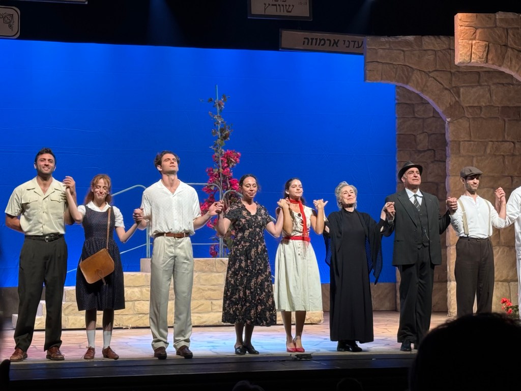
This week I got to see a play at the local theatre, “The Beauty Queen of Jerusalem”. The play is based on a bestseller by the same name, and there has already been a TV series on the saga of the Ermoza family. While the actors were good, I thought that the play lacked depth, likely because the story needed more time to unfold.

The cast of The Beauty Queen of Jerusalem

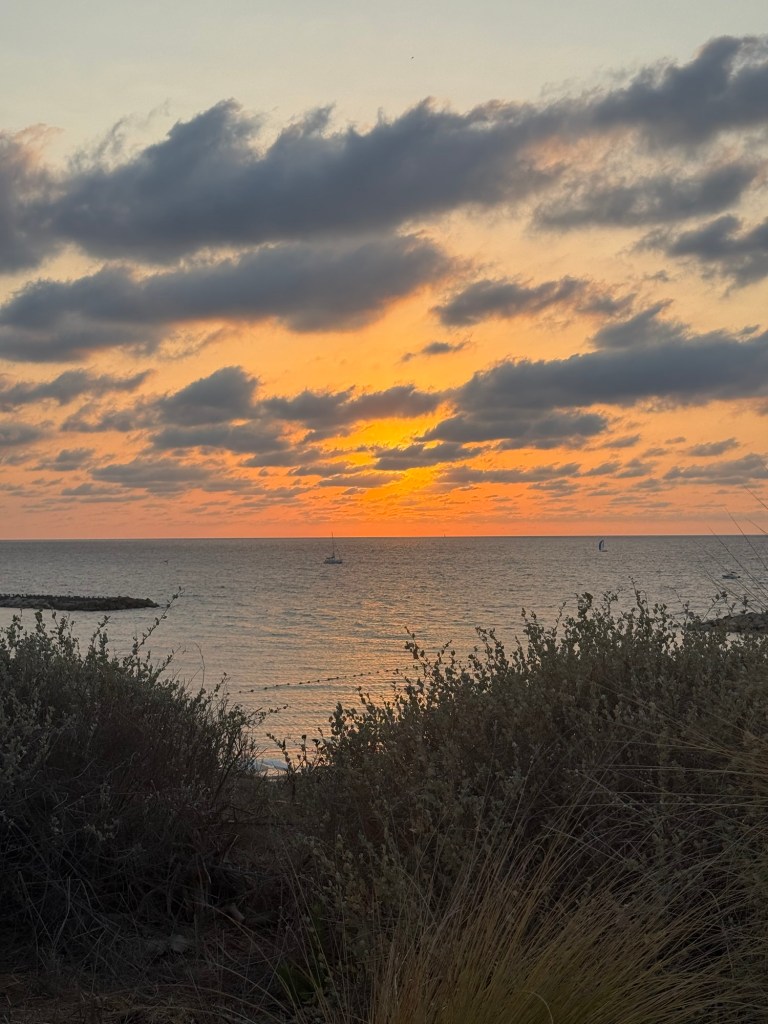
This morning I went on a walk before my usual swim. This sketch was made using a combination of Aquarius watercolours, Caran d’Ache neocolor II crayons, a Tombow brush pen and a 0.5 fineliner, all on a Pith Kabosu sketchbook.

We’ve been having some stunning sunsets lately. Have a great and peaceful week!

Weekly Update: 10K Race, Field Notes Sketchbook and Poetry Anthology

Another busy week at work coupled with a packed weekend means that this update will be bullet-point style:

  • I ran my first race of the year, a 10K in what turned out to be surprisingly warm weather. I’ve been using the Nike Running Club App’s 10k race plan, for both this race and the one I ran in Disney World last October and it’s proven to be fantastic. I wish I could say the same about the app, which has lately had annoying audio issues that have made it downright unusable at times.
  • In preparation for next week’s One Week 100 People challenge I’ve been using a Field Notes Sketchbook, and I’ve grown to appreciate its portability. It’s not suited for wet media, but for pen, ink and pencil it works well. All the sketch photos here were done on a Field Notes Sketchbook, and I’ll be reviewing it sometime in the future.
  • I’m down to only five inked fountain pens, and I’ll likely write one or two of them dry next week. I’ll be updating my pen rotation sometime late next week, possibly looking to add some more spring-time ink colours to the darker inks I currently have in use.
  • I’ve finished reading Legends and Lattes by Travis Baldree, bringing my February book count to three. The book was just the sort of cozy, light read that I needed at the time, and I enjoyed it enough to immediately buy the sequel (which is actually a prequel) Bookshops and Bonedust.
  • I spent an annoyingly long time downloading all of my kindle books to my laptop before Amazon locked that option out. I’ve also moved to using Kobo to buy eBooks. I will admit that it’s not as convenient as buying ebooks from Amazon, but I’m angry enough at them for the change to put in the extra effort required. I bought Bookshops and Bonedust on Kobo and then used the Amazon “Send to Kindle” website to transfer my purchase (it was easy because Travis Baldree, bless him, demanded that the book be DRM free). I also bought another book (a bit on that in the next bullet) that had DRM applied, so I had to do some Calibre work to strip it of DRM before sending it to my Kindle. Next time the whole process should take only a minute or two extra beyond the usual Kindle book purchasing process, and again, for me it’s worth it.
  • After listening to Oxford poetry professor Tara Stubbs’s wonderful Demystifying Poetry podcast (Apple Podcasts, Spotify) I bought my first poetry book in years, the anthology “Staying Alive”. Even if you’re not a poetry lover, give the podcast a listen. It’s well worth your time.

Have a great week!

Sketching Now Travel Sketching: Eiffel Tower and Big Ben

So the first week of actual lessons in Liz Steel’s Sketching Now Travel Sketching course started and already there’s been a slight change of materials.

As this week will be entirely focused on line drawings, I’m switching to a non-watercolour sketchbook. For the first part of this week’s exercise, which includes working from reference photos, I’m using the Midori MD Cotton notebook in A4. It’s neither a proper sketchbook nor the A5 size format that Liz recommended, but as she also requested to upload as few photos as possible to this week’s gallery (and no more than 6) and as we have quite a bit of work to do, I decided to at least use a large notebook so I can fit more than one or two sketches on a page and thus avoid the need to stitch photos.

Eiffel Tower

We have several scenes we need to sketch as quickly as possible, starting with just 7 lines to define the scene. The 7 lines idea worked quite well with the Eiffel Tower but broke down completely for me once we got into a complex building like the Big Ben. That’s when I decided to just work with shapes and let the architecture details on the building help me determine its length and proportions.

Big Ben

Generic rules like “start with just 7 lines” are nice ideas on paper, but they oftentimes break down when we’re faced with reality. I think that the 7 lines idea would actually slow me down when sketching on location (it slowed me considerably while I was at home, and it failed completely with the Big Ben), but the basics of contour, shapes, perspective, proportion hints work no matter what.

I will try the 7 lines for the rest of the week, to see if it’s just a matter of practice, but I suspect that it isn’t.

Sketch/Doodle Session

There is a local group of illustrators and animators that have set up a delightful new tradition during the pandemic: they meet up every Tuesday morning on Zoom for a sketch/doodle session, where they do quick, loose sketches and doodles just to warm up and experiment. Once a month the morning Tuesday meeting is replaced by a night Monday meeting with a guest artist leading the session with various prompts. Tonight my Urban Sketchers chapter head lead the session, and through her I joined the fun.

As I’m neither an illustrator or an animator, I’m posting everything here as quickly as possible before I see the other artists’ amazing work and lose my nerve.

We started with the suggestion to just doodle while we waited for people to join. I was using a new sketchbook that was very cheap, laid flat and had thick textured paper (good for pencil). I used a Caran d’Ache Fixpencil with a 2B lead, and a Tombow brush pen throughout this one hour session.

Doodling before we started. Testing out the paper. Warming up.

We started with a few blind contours, which I haven’t done for years, and so I kept catching myself automatically glancing down at the page. Definitely something I need to practice to get used to drawing these again. We were using Shutterstock films as our models, so that subject was moving around, some of them quite a lot. The idea was to get used to sketching people in motion, grasping as quickly as possible what captured their character.

Not so blind contour.

This looks good if you don’t know what the original looked like. I do, however, like the boldness and flow and expressivity of the lines here. Something to recapture in the future.

Blind contour.

Then we did an exercise where we had 10 seconds to look at a moving person and try to remember what made them them, and then draw a portrait of them from memory. As Marina suggested, it’s easier if you describe the person to yourself in a few sentences.

Portrait from memory.

The second subject drawn as a blind contour:

Blind contour.

And from memory:

Portrait from memory in a minute.

We only had a minute for each portrait, and that was too little for me. It’s a good challenge to practice in the future (working under such short time limits with such complex, moving subjects).

The next exercise was to capture the subjects feelings. Again, a 2 minute time limit would have been more in my wheelhouse.

Can you guess what he’s feeling?

The second subject for this exercise went through every emotion in the book so I couldn’t settle on one.

Feeling? Gesture?

The third was just fun though:

What is he feeling?

Then we did a caricature exercise, where we tried to draw people as not overly stylized caricatures. We has a minute for each, and I was starting to warm up at this point:

The next exercise was a strange one – to draw a person as if he was morphing into an animal and we caught them in the middle of the morph.

Bulldog man.

This was fun and very creative:

Parrot man.

The next one was to draw people in action, in one minute. To capture as many gestures as possible. I guess that the animators had a field day with this one, but I really struggled.

Finally we had 15 minutes to draw each other. I had a lot of fun with this, and the earlier exercises really did help me warm up and loosen up and work faster.

These exercises are definitely something that I’ll try to warm up before drawing portraits, and they’re also just a lot of fun to do. If you have a minute, a pencil and a blank page I recommend that you give them a go.

Mexican Feast

This is the first time I’ve used colour blocks to design a page in this way, with vertical drawings and horizontal text. This page was created as a contained composition for Liz Steel’s Sketchbook Design course (highly recommended, especially if you have a basic handle on drawing and sketching already). I normally would have just done an overlapped jumble of all the things that we cooked that evening, to convey a bit of the chaos of cooking so much in just an hour and a half, but I forced myself to think of a way of creating some of that night’s feeling using a contained composition. The vibrant turquoise was what brought this page to life for me: a joyful colour that connects me with what I learned about Mexico during that evening, and the happiness of cooking my way through a small part of the wonderful Mexican cuisine.

BTW – I just noticed that Jenny Mason from The Finer Point also took the Sketchbook Design course. I love the vibrant spreads that she’s created. Go check them out.

Build a Plant Holder

Sketchbook spread with two wooden X shaped plant holders, a screwdriver and some tiny paint pots. There's a sticker with the Molet logo on the right.

Tel Aviv Municipality has come up with a great way to support local businesses during the lockdown. Once a day at 11:00 they open the option for around 30-40 people to purchase a box from a local business. The box costs 50 NIS, and comes with a zoom session with the store owner, where you learn about their business and make something together. There was a beer box, a sushi box, a stationery box, a magic shop box, a cocktail box, a pickles box, and more. The boxes proved to be more popular than city hall envisioned, so after a few days they limited it to one box per resident. Luckily I managed to get three boxes before the limit took place, and this was the first one. We learned how to make two plant holders out of reclaimed pallet wood from a lovely design studio in Jaffa called Molet. They create kits and give workshops using wood pallets and the results are charming and fun. My dad had a workshop with them before the pandemic and really enjoyed it, and I’ll try and get the people at work to go to a workshop there once we can.

This sketchbook page was created as part of Liz Steel‘s Sketchbook Design course and explores using collage and colour blocks as design elements.

TIMEX x DDC

I tried to get my hands on the Timex X DDC Scout watch designed by Aaron Draplin for three times before I managed to snag one. They are sold out so quickly that if you want one you really need to set an alarm and be quick with your keyboard and mouse. Then our local post office tried to do a vanishing act with my package, but finally, a month after I ordered it, I got my hands on this orange and black beauty. I only use analogue watches, usually Swatch watches (in recent years it was System 51 Swatch mechanical watches), but I’ve never owned such a heavy watch. It took me a day to get used to it, and since then it has been my constant companion. It is a beast of a MACHINE but an eye catching one, and I couldn’t be happier with my purchase. I highly recommend getting one, if you have any interest in watches.

This page was created as part of Liz Steel‘s Sketchbook Design course and is all about the white space.

Oranges, Bananas and maison kayser

A sketch of an orange, a banana, a narcissus flowering, Maison Kayser and a Viennoise au Chocolat
Bananas, orange, narcissus and Viennoise – an eclectic page

This page, created for Liz Steel‘s Sketchbook Design course, is about secondary sketches and borders, and has a little hidden colour block in it. The original spread was a little lacklustre and disjointed. The Viennoise in the corner looked particularly sad. Adding a secondary sketch of the Maison Kayser bakery (where I bought it), with a touch of blue and bluish grey to the background really brought it to life.

The bananas and orange got a shadow which serves more as a grey colour block, making their warm colours more prominent. Adding borders in Noodler’s Lexington Grey (to the bananas and orange watercolour) and Noodler’s Black (to the narcissus) was the final touch that pulled this page together.

I’m enjoying the course very much, even though the past two weeks have been personally hectic. I’ve been working on a short story to submit to a competition (got it done in time and accepted), and some bad news regarding the health of a family member have meant less sketching time than I would have liked. Hopefully the coming weeks will be better.

By the way, the local branch of Maison Kayser, in Tel Aviv’s port (I haven’t visited the Rothschild one yet), is excellent. Their vanilla chocolate chip danish, sandwiches, and baguettes are sublime, and it’s a fun place to visit. They had the misfortune of opening after the pandemic started, but they seem to be managing well, so I think we’ll be seeing them around for a good while yet.

Drawn on a Stillman & Birn Beta, with Lamy fountain pens, Noodler’s ink and Schminke watercolours.

comfort pasta

Comfort Pasta Sketchbook Page

I think that there’s nothing better than plain pasta or pasta with a little cheese if you’re not feeling your best: it’s perhaps the ultimate comfort food.
I created this page as part of my Sketchbook Design course with Liz Steel, and this one is all about exploring how to use text as part of my page design. Gave Rohrer & Kilngner Helianthus ink a spin, which is also something that I decided to experiment with. Like many yellow/orange inks it tends to crystallize on the nib and feed, so I’m “sacrificing” a Pelikan Pelikano for the effort. Pelikanos are great beginners pens that don’t get much love in the community probably because they are less ubiqutous than Lamy Safaris and their standard nib offering is a Pelikan medium which is very wide. If you’re an artist I recommend purchasing one (with a converter), as they have less tendency to dry out (with permanent inks) than Lamy Safaris and they indestructible workhorses that have very smooth (and wide) nibs.

Drawing made with Schmincke watercolours on a Stillman & Birn Beta which I’m still on the fence about. It’s better than the Alpha for watercolour washes, but it’s still not great, and it’s not great for pen and ink or fineliners. Also the glue connecting the sections isn’t the best, as it needs forcing apart once you hit a new section, and oftentimes leaves an unseemly tear in the middle. The sketchbooks are good, I just wish that the sections were sewn together and that the paper would lean into being watercolour paper more – so that they would be perfect. However, changes like these would mean a price increase, which would make them unappealing, since a large part of the Stillman & Birn softcover sketchbook appeal is their price. In the end it’s a nice sketchbook that I don’t feel too precious about, which is the main point, and is why I’ll continue using it.

Stormy Sea and Gonfu Tea

Today’s sketchbook page, as part of Liz Steel’s SketchingNow Sketchbook Design course.

Stillman and Birn Beta sketchbook, Schminke watercolours, Lamy fountain pens (Fine, Medium, 1.1 stub), vintage Eagle 4h pencil.