Once a year Schmincke, the German art supply company (makers of the best watercolours in the world) produce a limited edition colour out of the leftover pigments they have. The pigments come from their pastel production- which uses almost 100% pigment.
In 2024 the made an acrylic Random Grey. In 2023 the Random Grey was a pastel.
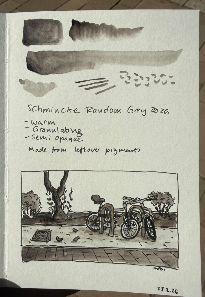
This year’s Random Grey is a watercolour. It’s a warm grey, granulating, and semi opaque. While I normally prefer cool or neutral grey’s, this colour looked interesting enough for me to give it a try.
The paint comes in a 15ml tube and though it’s a series 1 pigment it cost double the price of Schmincke’s usual series 1 watercolours (note: professional watercolours are usually priced differently by the kind of pigment they use. Blues tend to be more expensive than earth tones, for example. Schmincke’s series 1 are the cheapest and series 4 the most expensive). I’m not surprised as it’s a limited edition, but if you’re just looking for a warm grey Random Grey isn’t the most cost effective option.
Sample sketch and swab
I filled three half pans with Random Grey (one for me and two to gift) and there was plenty more to go around, so if you’re interested in this watercolour but are price conscious you can try finding other artists in your area that would be willing to split the tube. Schmincke’s watercolours are superb and it’s very easy to fill a pan or half pan with paint, let it set for a day or two and then use it.
The shade really surprised me. Yes, it’s a warm grey, but it’s not too far away from a neutral grey to become unusable for all but certain lighting conditions. It does not have that yellowish brown tinge that makes warm grey’s so… atmospheric. I enjoyed using this pigment, its granulation and layering possibilities enough to add it (at least temporarily) to my watercolour palette.
Is this a bit of a gimmick? Yes. Is it also a fun and interesting grey to have around? Also yes. I look forward to mixing and combining it with some pinks and reds and seeing what comes out.
Note: I sketched this on Pith paper, which is not watercolour paper. On watercolour paper Random Grey’s granulating properties will be even more pronounced.
I’ve been unhappy with my watercolour palette lately, and so I’ve been experimenting with new colours instead of some of the old ones. I usually swap out one colour at a time, try out the new colour for a while, and then either keep it or swap it out for something else. This time I’m doing my usual swap procedure, and also building a completely new palette on the side. The idea is to speed up the new colour discovery process, as there are 5-6 colours that I want to replace in my current palette, and that’s a lot.
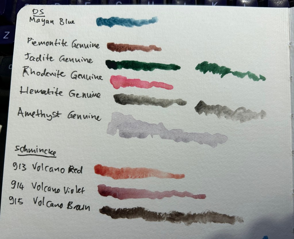
The first colour to leave was Daniel Smith Cerulean Blue Chromium. I have too many similar blues and it’s slowing me down having to decide between them every time I need a blue. In its place I swapped Daniel Smith Rhodenite Genuine, which is a bright pink.
Samples of some of the colours I considered swapping in. Amethyst Genuine was a genuine disappointment – I don’t think I’ve seen such a bland, pale, washed out purple anywhere.
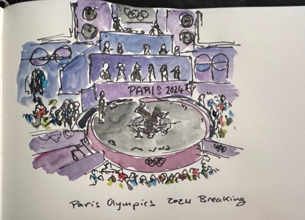
I then sketched one of the scenes from the 2024 Paris Olympics Breaking final, which I was going to see in person before I had to cancel my trip. Luckily my brother was there and sent me photos and videos, which I had fun sketching from. There was a lot of purple in this scene, so I had fun mixing Rhodenite with blues and purples on my palette.
Quick Paris Olympics Breaking sketch
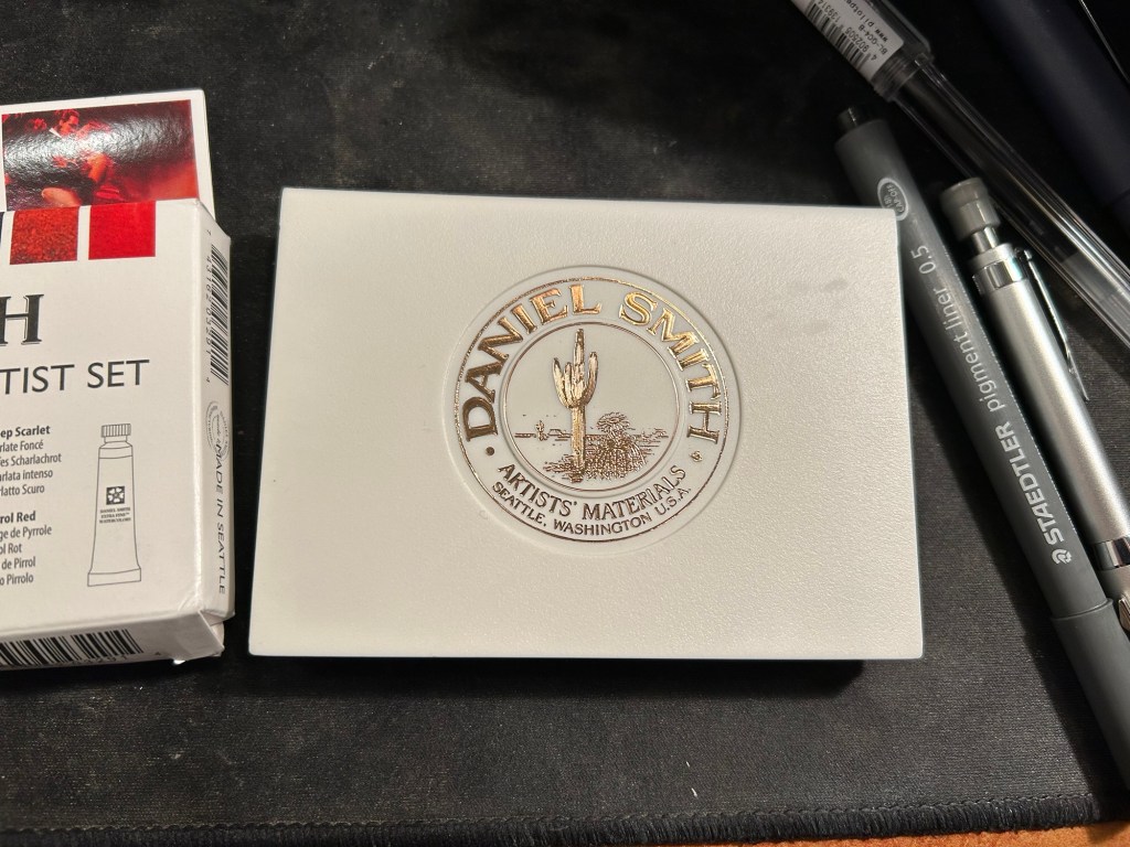
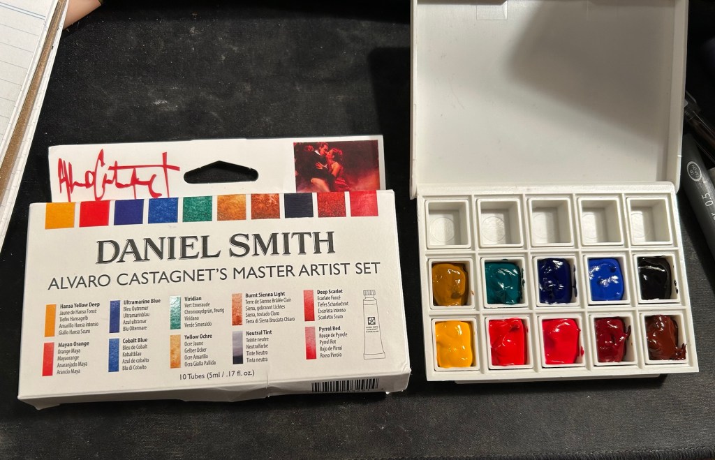
The new palette is something I’m building in a Daniel Smith plastic paintbox. It’s not a box that I’d regularly use (it doesn’t have enough mixing space for me), but it’s useful for the testing I want to do.
This box came as part of a set of two, one of which had paints in it.
I then set up a legend in my sketchbook:
Next I broke ou the Alvaro Catagnet Daniel Smith Master Artist set and filled the pans with paint. I’ll give them 2-3 days to completely dry out before finishing the legend and trying them out. I would never have built a palette which is so heavily skewed towards reds, but this is part of the experiment – after a heavily blue skewed palette it’s time to try something new.
I can’t wait to give these new paints a try. I’ve worked with the Schmincke versions of Yellow Ochre (I no longer use it because of its opacity), Viridian (way to artificial a green for my tastes), Ultramarine Blue and Cobalt Blue, but it will be interesting to see Daniel Smith’s take on these colours.
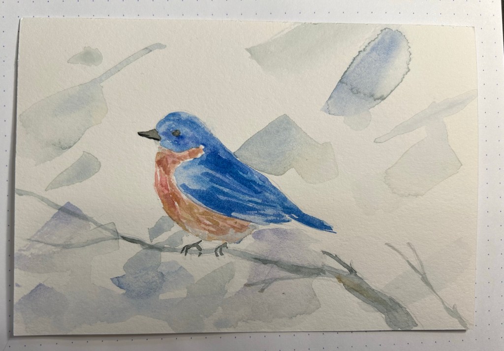
I’m coming on my two year anniversary from the end of my chemo (it’s at the end of next month, so basically on Christmas Eve), and I have a check up with my hemato-oncologist in two days. I sketched this to give her with a box of pralines, a small token of my gratitude for the past two and a half years:
Bluebird watercolour
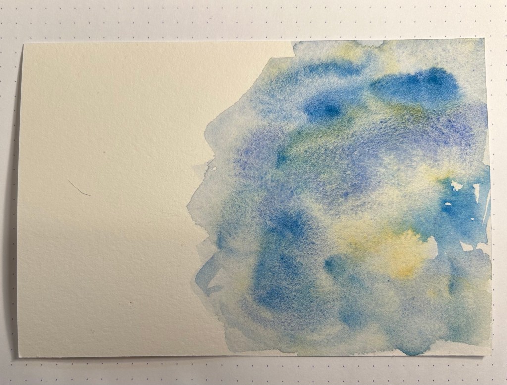
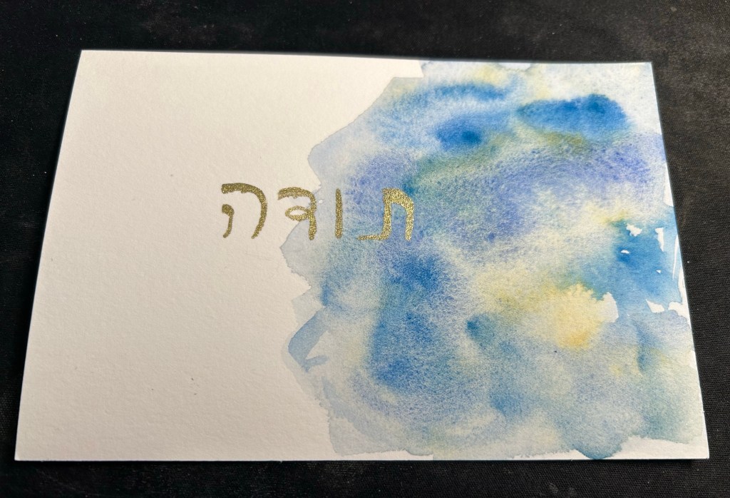
It’s a new kind of paper so it came out a bit more blotchy than I’d like, which made me want to play with it a bit more. I wanted to make another quick card for one of my mom’s doctors, who’s retiring, so I had some pigment fun:
If you don’t like granulating watercolours then you’d hate this paper.
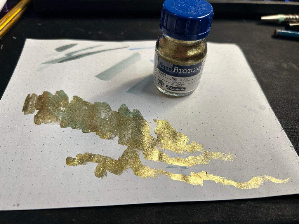
I then used Schmincke’s Aqua Bronze rich gold to add some writing to it. Aqua Bronze is basically a small jar full of glitter powder that you mix with a little bit of water (a very, very small bit of water) on your palette and it turns into metallic watercolour. Unlike other metallic watercolours Aqua Bronze has good coverage and opacity, and it really pops off the page. It’s the very last thing you add to your drawing, after everything else has completely (and I mean completely) dried up. You need very little of the powder and even less water, a cheap plastic palette and a cheap synthetic brush and you’re all set.
Aqua Bronze in action
There are several different kinds of metallic hues, and they all work the same. Do remember that you want to use a cheap brush and a palette you don’t care about because this is glitter. You also don’t want to clean the brush in your regular water pot, or to use the same water for another drawing later on. Aqua Bronze sticks to everything, and you can’t ensure that it was completely cleaned out of your tools, so don’t use your best brush or your usual palette for this.
You mix up the powder with a tiny bit of water and a bit of patience (it takes less water and more time than you think) and then apply it to your dry drawing. The paint stays in place but if you brush your fingers on it, they will come out with a fine dusting of glitter. Here’s how it turned out:
If you want even more opacity, you’re going to have to use a paint marker. In this case I wanted the yellow in the abstract blue rose to be reflected in the thank you written in gold so I wanted the soft edges of the Aqua Bronze.
If you’re thinking about creating watercolour holiday cards and want to add a little bling to them, Aqua Bronze could be an option. I’d select one colour as the jars aren’t cheap, and I’d finish the sketches and then add the glitter highlights in one batch.
If you use watercolours you usually find yourself in one of two camps: those who want as much control of their painting as possible and so hate granulating watercolours, and those who love the magic of granulating pigments, and the unexpected effects they create. For the first few years that I was using watercolours I hated the “cauliflower” and “graininess” of granulating watercolours and so I actively avoided those pigments. Nowadays I have several granulating watercolours on my palette (and two super granulating ones) and I enjoy the watercolour magic and pigment parties that they create.
A few years ago Schmincke started issuing “super granulation” watercolours, which are watercolours with extra pronounced granulation effects and two different pigments in the same paint – something that created a dual colour effect and added tons of texture to any painting they were used in.
I reviewed the first of those paints here, and since then Schmincke have come out with three more series of super granulation paints: Shire, Desert and Volcano. Of the three the Volcano interested me the most as it seemed to fill in a gap that the very blue and green leaning previous sets were missing: warm, red hues. As Schmincke watercolours aren’t cheap, and the full volcano set came out to more than I was willing to pay for just to experiment with, I purchased a trio box of 5ml tubes to try out.
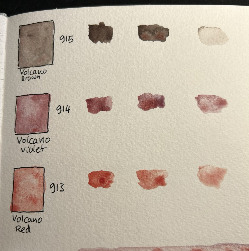
The test page
The trio I got contained 913 Volcano Red, 914 Volcano Violet and 915 Volcano Brown. The one that I was most interested in was the volcano red. The one that I ended liking the most is the one that I had the least expectation for: volcano brown.
Trio Super Granulation Volcano
I filled three half pans with paint and let them dry out for 24 hours (Schmincke watercolours are much easier to pan fill than Daniel Smith as they come out of the tube better and they dry quicker). I then did a colour swab for each, and a paint test with three paint consistencies (honey, milk, tea as Marc Taro Holmes calls them): the first with very little water, the second with more pigment than water and the third with very little pigment. In the case of the volcano brown I overdid the water in the tea swab, so it’s much lighter than the rest.
Volcano red is semi-transparent and semi-staining, volcano violet is semi-opaque and semi-staining, and volcano brown is semi-opaque and staining. The opacity-transparency spectrum in watercolours is important if you mix watercolours, as the more opaque a paint is the less well it mixes and the more chance you’ll get a “muddy” mixture out it. It is also important for layering, as opaque paints will not layer as well as transparent ones. For this reason I use opaque and semi-opaque paints sparingly, and usually only during the final stages of my painting.
Staining is a measure of how easy it is to “lift” the paint off the page with water or by dabbing it off, should you need to. The more staining the paint, the harder it is to lift without leaving a stain behind (this also depends on the paper you use, of course).
Looking at the paints, the volcano brown shows dual brown and red pigments, the volcano violet shows red and purple pigments, and the red shows red and maybe orange pigments, but it’s hard to tell. The volcano brown is the most dramatic and interesting of the three, though the volcano red is by far the most granulating of them.
Paint swabs and honey, milk, tea tests.
I tried to create a sketch using only these paints (on 100% cotton watercolour paper) and boy do they show their super granulating properties. while the volcano red by itself isn’t impressive, it does layer spectacularly well on the other two paints, and the volcano brown adds a lot of interest and drama to the painting. Of the three I’m likely to add the volcano brown into the rotation, and perhaps, for certain effects, the volcano red. The violet would come in handy if I was working on portraits maybe, but otherwise it reminds me of potter pink: a pigment that is too washed out to be of any regular use in my palette, and not worth the space when it comes to keeping it around for mixing purposes.
Volcano sketch
If you’re just building your watercolour palette, these paints are not for you. However, if you have an established palette and a certain style of painting that favours texture and layering, I’d recommend giving at least some of the Schmincke super granulation watercolours a try. They are bound to result in something interesting and unexpected.