July’s Currently Inked Fountain Pens

This month features a few new inks, and a lot of old favourites that I haven’t used for a while.

Big Idea Design’s Fountain EDC is far from perfect, and yet I’ve inked it up again. It’s the ultem and the ease of capping an uncapping it – it makes it a great EDC fountain pen even though it still has infuriating flow issues. This, however, is the last time I’m inking it for a while (after filling it three times in a row) as I have lost patience with getting it to work properly when I’m journalling. The Schneider Cognac is a new ink for me, a cartridge packet that I bought in London for a pretty steep discount. The colour is a nice orange brown with a good amount of shading and good flow.

Kanilea Pen Co Haleakala Silhouette is gorgeous and overpriced pen that I haven’t used in a while. Sailor studio 123 ink was also in my previous rotation, but I now have two bottles of this most gorgeous of grey inks, so I feel like I should give it more use.

Omas Bibliotheque Nationale is a pen that I bought about a decade ago at Mora Stylos in Paris. The nib is extraordinary, and I decided that I wanted to use it again. It lays a thick, juicy line of ink that works well with Diamine Earl Grey. Diamine Earl Grey is not only a great grey ink at a fraction of Sailor Studio 123’s cost, it also doesn’t bleed through to the other side of the paper in even the Omas’s generous ink. So I get a dark grey with plenty of shading and character, but I can also journal on the other side of the page.

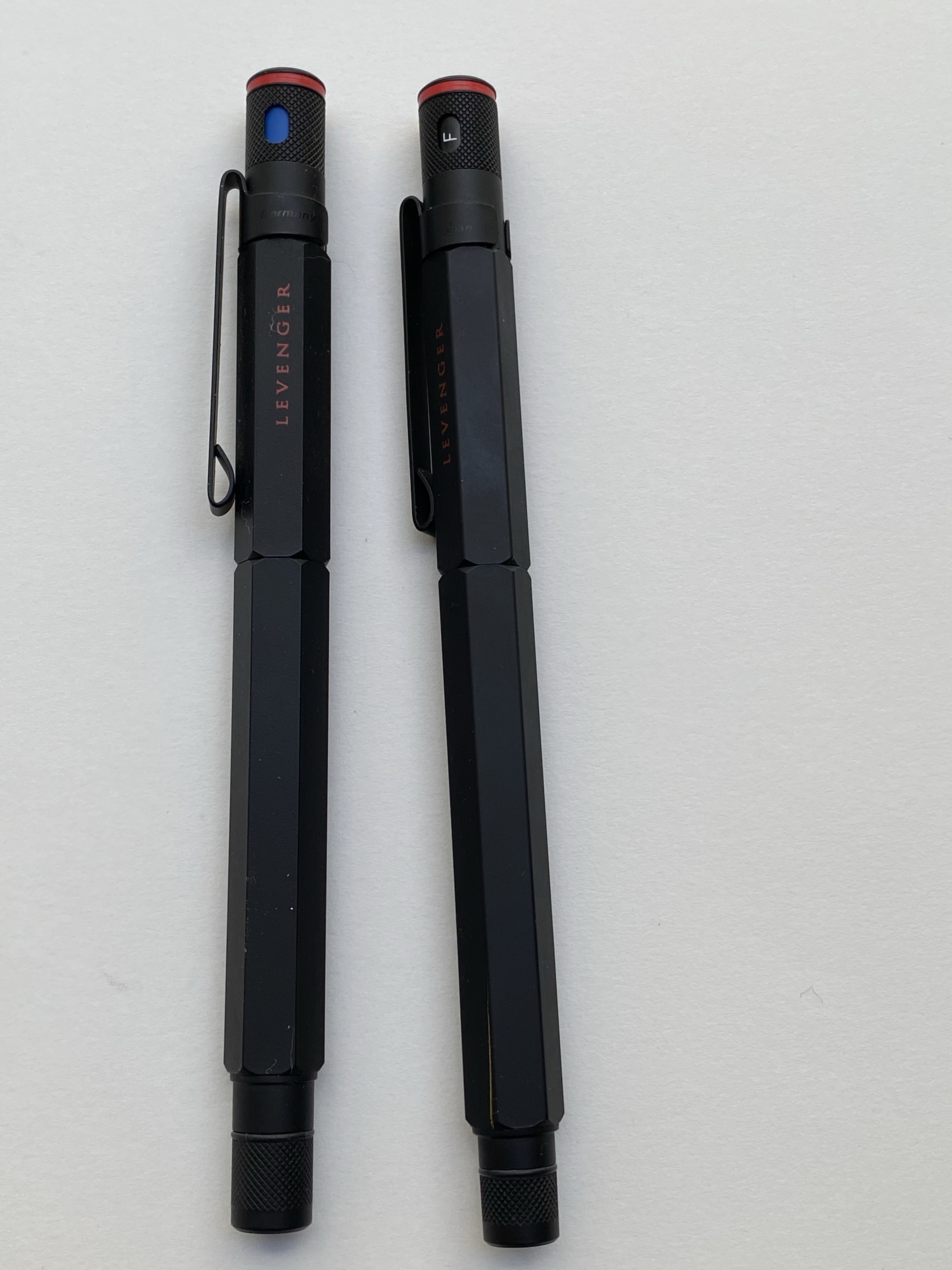
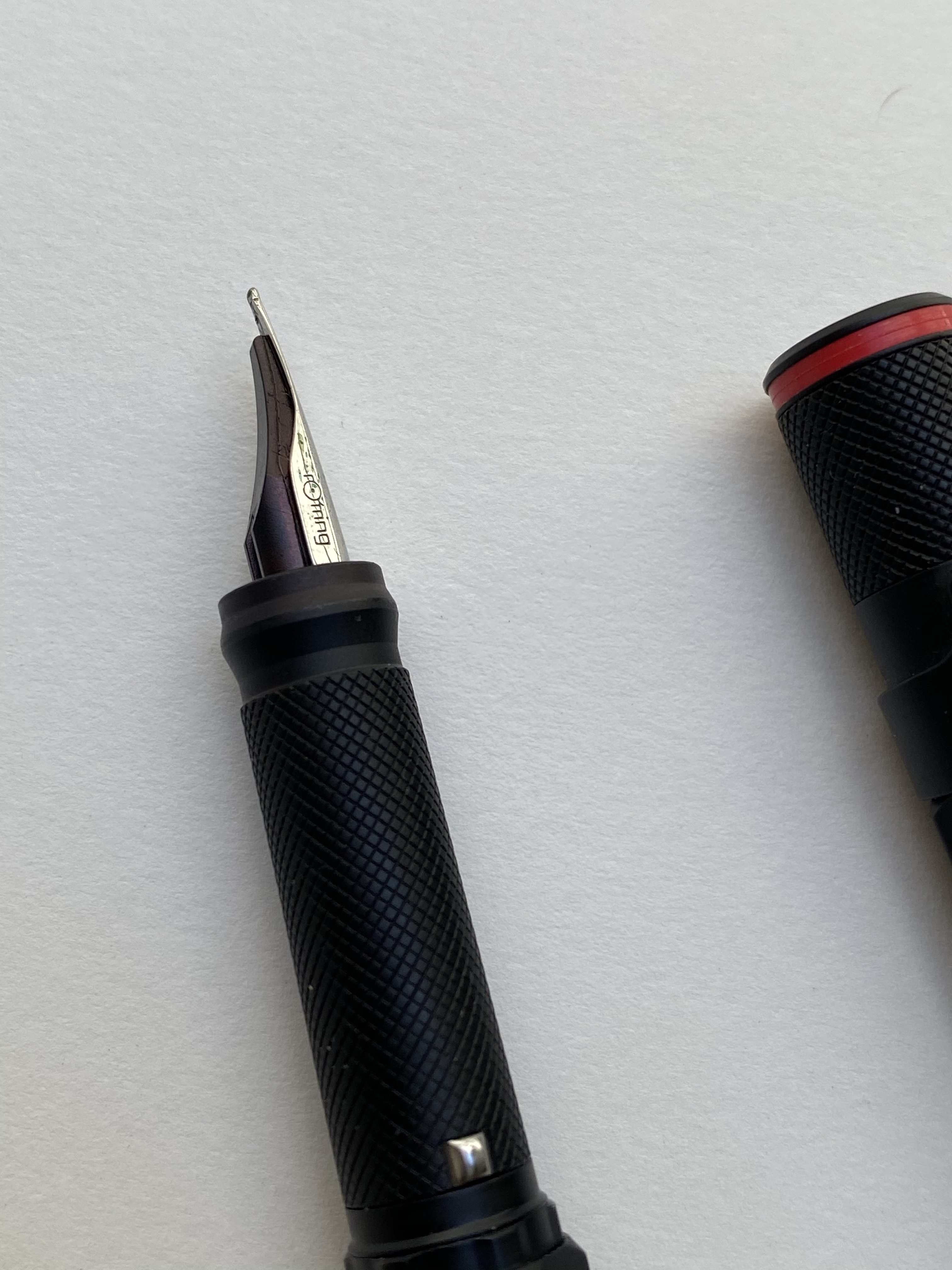
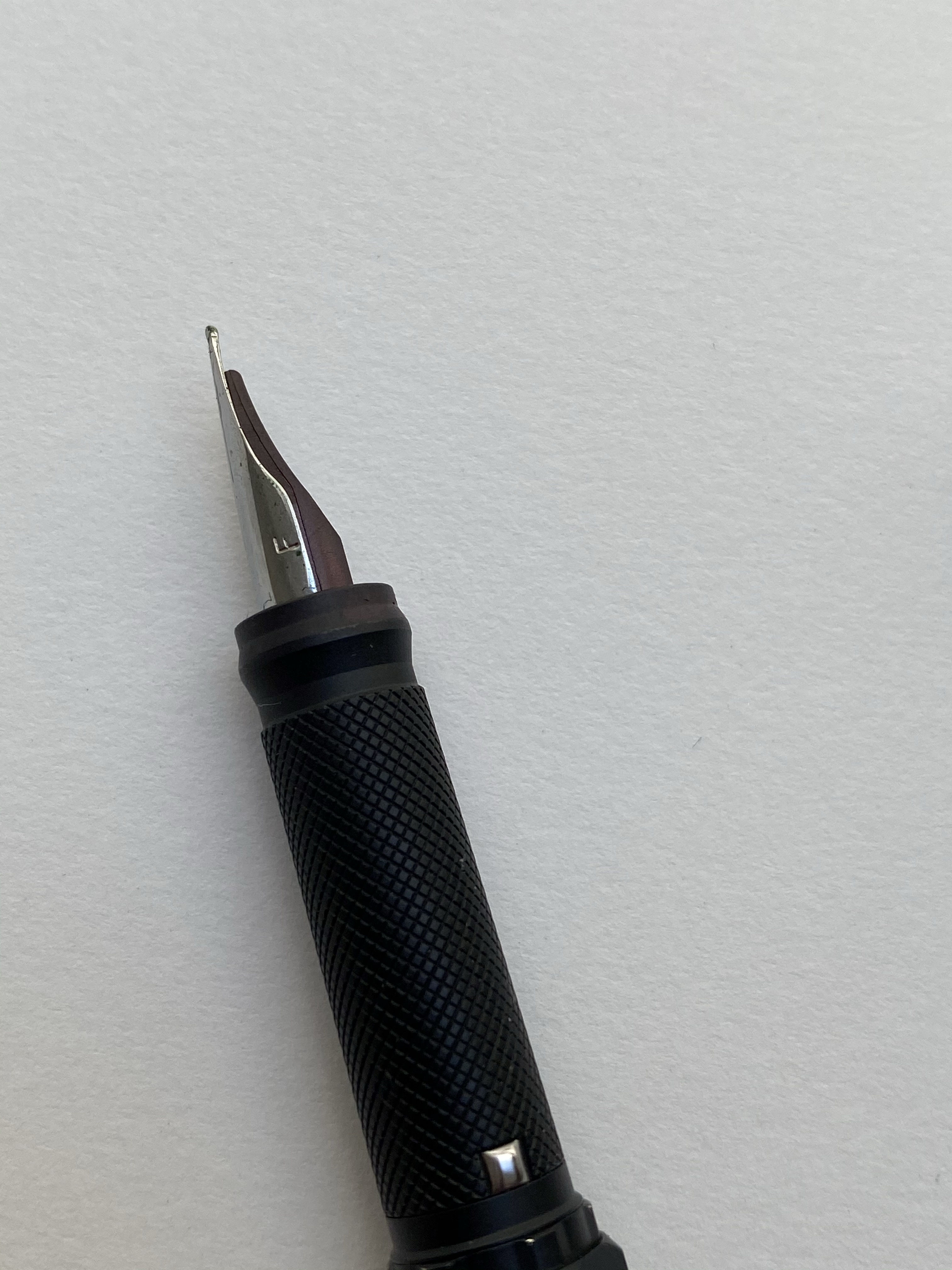
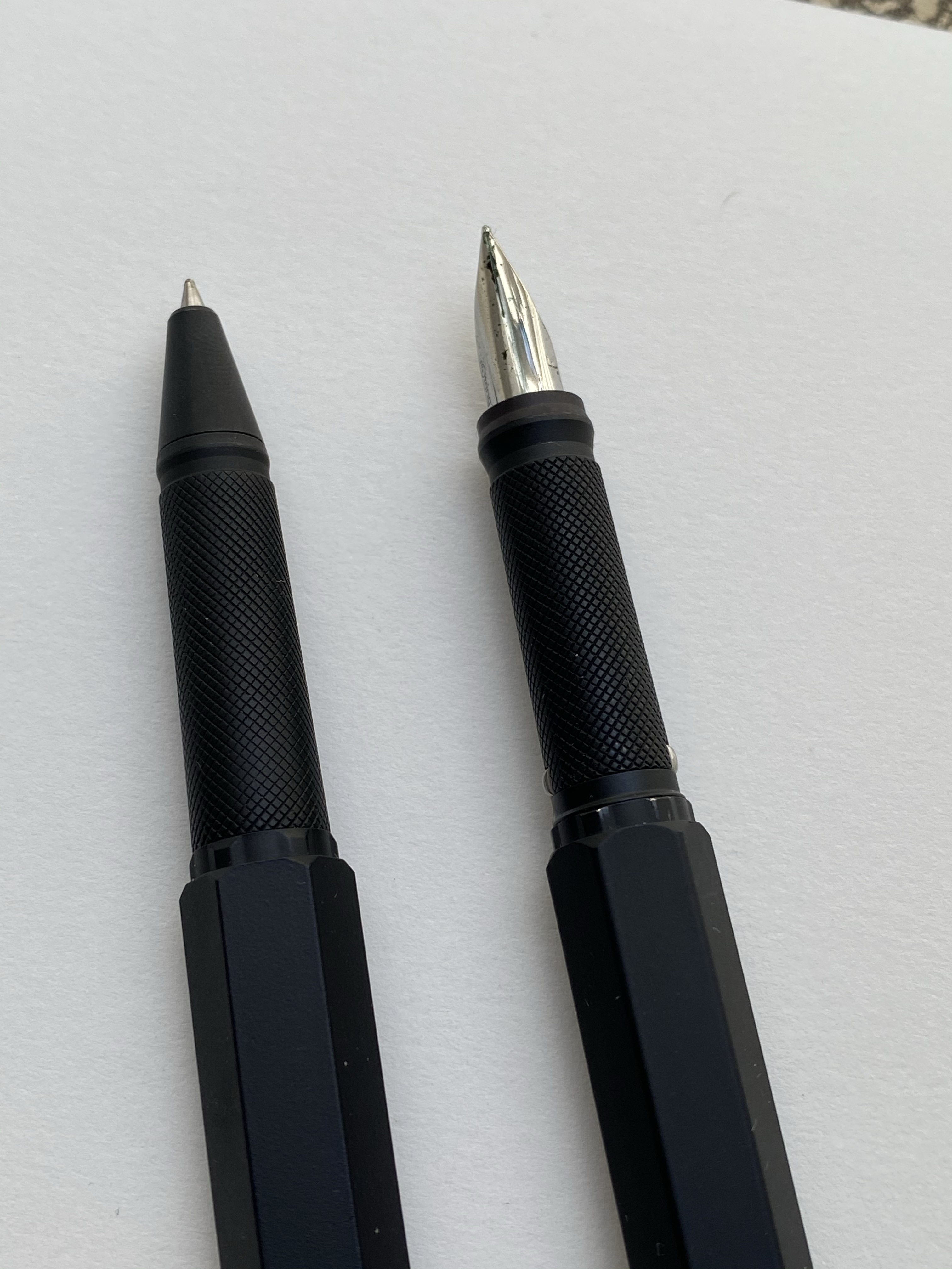
Rotring Levenger 600 is a wonderful pen that Rotring needs to make more of, and Sailor Jentle Sky High is a discontinued ink that Sailor likely makes under a different name and a higher price now. I like the colour, even though it’s a blue and blue inks tend to be boring, and the Rotring works well in use for my office notes.

Writing sample part 1

Sailor Pro Gear Slim Graphite Lighthouse is one of the last Sailor pens that I bought, and it’s one of my favourites. The H-EF nib is extremely fine, and not for everyone. Sailor Jentle Epinard is a great discontinued dark green ink from Sailor, and they likely make something similar under a different name and higher price (or you can find a parallel Diamine ink for much cheaper). The Sailor Jentle ink’s discontinuation was when I bought this and the other Jentle inks in use here, and I kind of regret my shopping rush. There’s no point in buying discontinued ink, as you’ll likely easily find something else similar to that (something that doesn’t use the Jentle ink’s terrible flat bottle design), or something better.

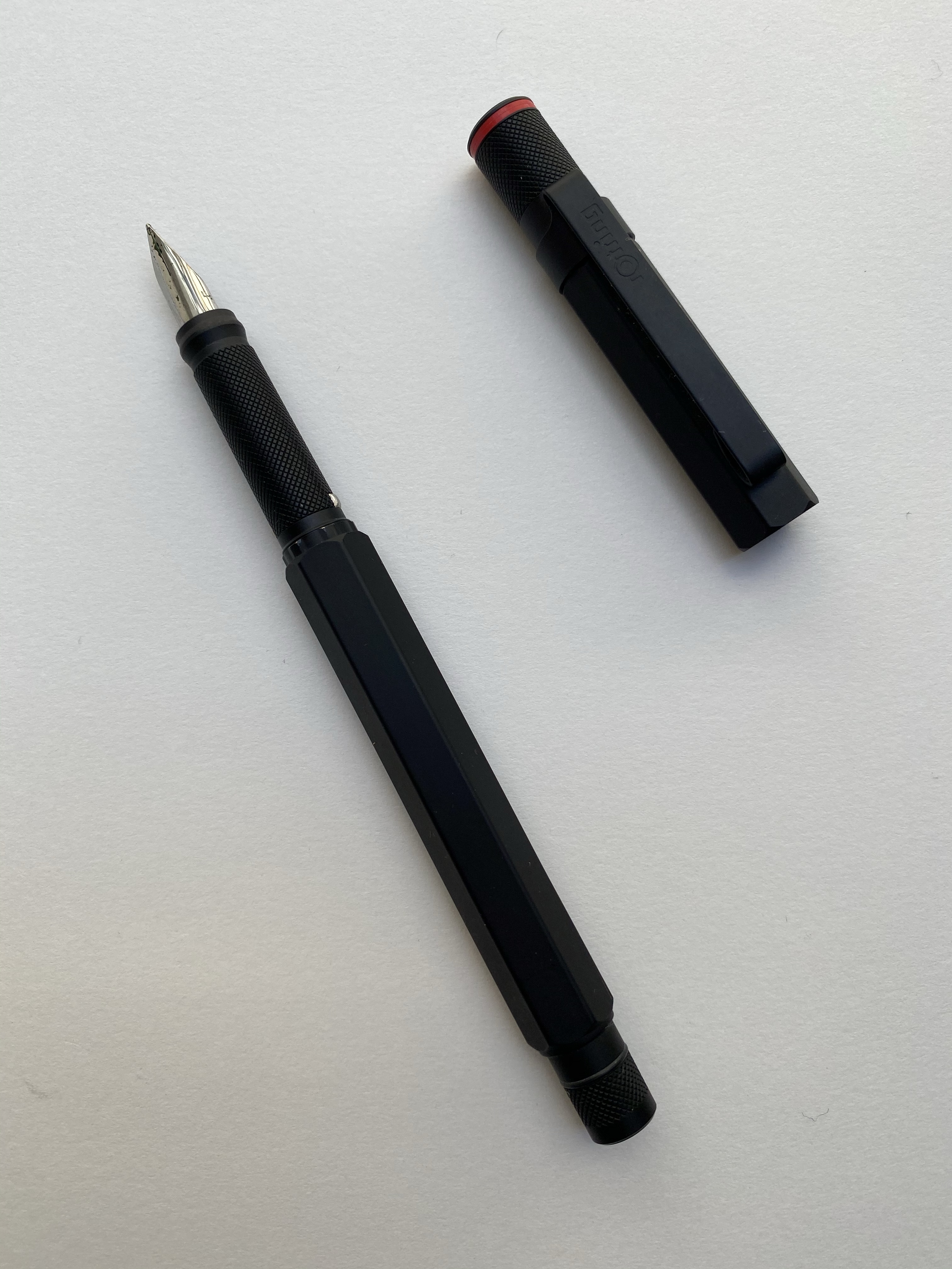
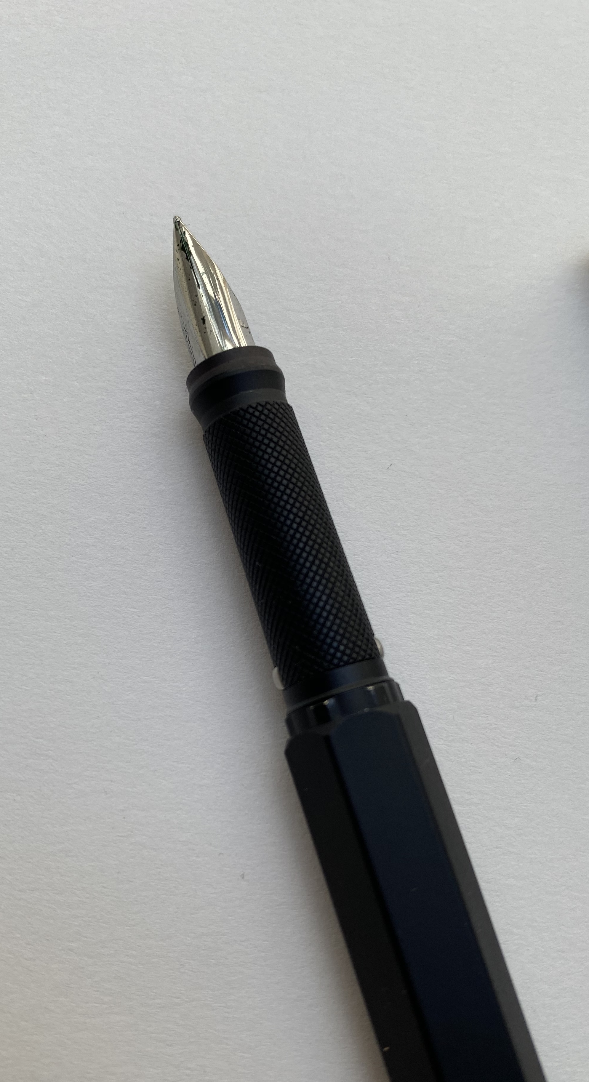
Schon Design faceted pocket six patina is a great pocket pen, and the Schneider Bermuda Blue is a great teal ink. The shading on this ink is excellent, and if I get a chance to buy another box of cartridges when this one is empty, I will.

The TWSBI ECO T isn’t as interesting to me as the ink inside it. I’ve been wanting to try out Diamine Ancient Copper for a long time, and when I was in Oxford I managed to get a bottle. It does not disappoint – great flow, great shading, great rich burnt sienna colour.

Writing sample part 2

I haven’t used the Platinum 3776 in a while, and I almost forgot what a great workhorse of a pen it is. Sailor Jentle Ultramarine, a very bluish purple, long discontinued, is kind of on the boring side.

Here are the pens from top to bottom:

Big Idea Design Fountain EDC

Kanilea Pen Co Haleakala Silhouette

Omas Bibliotheque Nationale LE from 1999

Rotring Levenger 600

Sailor Pro Gear Slim Graphite Lighthouse

Schon Design Faceted Pocket Six Patina

TWSBI ECO T Saffron

Platinum 3776 Demonstrator

The pens

What have you got inked up this month?

New Reading Journal

Yesterday I finished my fifth reading journal, and so I thought that it would be a good opportunity to write a post about how I set up my reading journal.

I use my reading journal to keep track of what I read and to encourage me to read more. This is the journal that I’ve just finished, a Moleskine Two-Go:

Moleskine Two-Go. The perfect size and format for my needs.

I used to use a Field Notes Arts and Sciences notebook for my reading journal, but once I got back to reading more it made sense to move to a larger journal. For the past three years I’ve used the Moleskine Two-Go, and I fill one book journal a year (70 books are logged in each notebook).

Start and end date for this reading journal.

This is the setup in my old reading journal. Three pages of index:

First index page. Red checkmarks for books that I’ve read.

The Moleskine Two-Go comes with pages that are blank on one side and lined on another, which is perfect for my use case, except for the second index page, which I need to rule myself:

Ruled second index page.

I missed a line on the second index page, so the index numbering came out a little wonky. It’s only for me, so I don’t mind.

Off by one error in my index.

Here’s a sample of a complete page. I talked more about my thoughts behind the design in a previous post, but you can get the gist by looking at this sample. I like drawing something that captures the book for me on the opposite page, which is why I love the Moleskine Two-Go format.

I remember really not liking this book, and this is a reminder of why.

At the very last page of the journal I keep a log of how many books I read that month. It’s ten books so far for December, but the month isn’t done yet so that line isn’t filled.

Number of books per month tracker.

Here is my new reading journal, a Moleskine Two-Go, this time in green (my previous ones were in light grey, dark grey and navy):

Front cover.

I love the texture of the fabric colours on this, and the shade of green is interesting. The two contrasting bookmarks and the endpapers are grey.

Back cover

The first page, marking when I started the notebook and which journal number it is. This notebook doesn’t leave my desk yet I still write my name and email in case I misplace it somehow.

Front page

Next comes the index page. Since this is my third Two-Go reading journal I already know to number the pages until 139 (I number odd pages only, since my reviews are on odd pages), which comes out to 70 books.

Index page.

I rule the second page, because I tried just winging it on the first year and it didn’t come out great.

Spoke pen for the win.

On the last page I create my books per month tracker:

Zebra mildliner highligher smears gel ink, but I still like it.

I number all the pages of the index, but only the first 25 pages of the actual book journal. I will continue numbering pages in batches as I add books to the journal. The great advantage of using a completely unstructured book here is that I can do whatever I want with it, including starting the numbering after the index pages and not on the first notebook page.

These are the pen and pencils that I’ll be using in this journal. The Rotring 600 is a ballpoint, and the only ballpoint that I regularly use. The Caran d’Ache Bicolor has been my companion in these notebooks for several years. I use it to highlight things, and sometimes in my book scene sketches. I used the Blackwing 611 in my previous reading journal, and this time I’ll be using the Blackwing 4.

Caran d’Ache Bicolor, Blackwing 4, Rotring 600 ballpoint.

The first non fiction book in this journal:

The Good War

The first fiction book in this journal:

Cloud Atlas. ToB means Tournament of Books.

That’s my new reading journal all set up and ready to go. I hope that this inspires you to keep a reading journal of your own, one that will encourage you to read more and help evoke the memories of reading a specific book.

Rotring 600 Levenger Fountain Pen and Rollerball Review

I haven’t bought a fountain pen on eBay in years, but when I decided to celebrate completing a six month intensive DevOps course, I headed out to eBay in search for the Rotring 600 Levenger rollerball. Yes, you read that correctly, I was looking for the Rotring 600 rollerball, not the fountain pen. I love the design of the Rotring 600 Levenger pens, but I thought that there was zero chance that I’ll manage to snag a good quality fountain pen, not to mention a fountain pen and rollerball set, so I decided to focus on the cheaper to obtain rollerball. As it turned out, I landed on an estate sale Rotring 600 set, and managed to get a Rotring 600 Levenger fountain pen and rollerball in great condition for a pretty good price.

The Rotring 600 Levenger pens aren’t flashy. They both have metal hexagon bodies with knurled ends and the classic Rotring red rings on the cap ends. The cap ends and the grip and the pen finial and round, and the pen body and cap are hexagonal, and somehow the transition between these two shapes is perfect and seamless. Industrial design at its best.

The fountain pen cap snaps into place with the help of the two silver protrusions on the knurled grip section. These protrusions don’t get in the way while writing, no matter how weird your pen grip is, and the section itself is very comfortable to hold. The knurling isn’t as dense as on the Rotring 600 mechanical pencil, and it is smoothed over so it doesn’t dig into your fingers. It provides a secure grip, while giving the pen the traditional Rotring look.

Because of the silver protrusions the pen cap snaps very securely into place. The fountain pen came with no converter, just unbranded short international cartridges, but it was easy enough to take the converter off my Super5 pen and use it here. The nib grade is indicated on the pen cap, which is what you’d expect on a drafting pencil. I like that oh so Rotring touch.

The Rotring 600 fountain pen comes with a steel nib that’s shaped a lot like a Lamy Safari nib. It’s stamped with Rotring’s logo on one side, and the nib grade on the other.

The nib is smooth and a lot of fun to write with, but it’s on the wider (European) side of fine. A 0.7 mm width line. Check out that grip section design:

The rollerball has a blue indicator, presumably for the colour of the ink refill inside. By the time I got it the refill had dried out, and so I replaced it with my favourite refill, the Uni-ball UMR-85N gel ink refill. This is the reason I bought the set and I couldn’t be happier with my purchase. Just look at it:

That’s so sleek and so clever, and I have no idea why they stopped producing them. Side by side you can see that the knurling on the fountain pen is slightly more pronounced. You can hardly feel the difference when in use, but I thought that it’s worth pointing out.

And here is that glorious nib in use, with a quick sketch of the Albert Memorial in London. The ink is Sailor Jentle Ink Epinard, which is a fun ink to sketch with an a green ink dark enough that you can sneak it into office use (not that anyone would notice or care right now).

It’s been a tough time, and a long and challenging six months course, but I couldn’t be happier with my “reward” for finishing it. If you run across a Rotring 600 rollerball or fountain pen at a reasonable price, by all means, buy them. The design on these pens is the kind that belongs in museums it’s so good, and they are a lot of fun to use too.

Rotring, if you’re listening, bring these back!

Rotring 800 Drafting Pencil Review

After I reviewed the Waterman Phileas I noticed that I have hardly reviewed the writing/drawing tools that I use most. So I making it a point to start to rectify that, at least a little bit. 

The Rotring 800 is Rotring’s high end drafting pencil, and it costs significantly more than its popular counterpart, the Rotring 600. It’s also my preferred drafting pencil, and the one pencil that’s a constant in my drawing kit. While I own the Rotring 600, and I agree that it’s a very good drafting pencil, I’ve abandoned it entirely for it’s more big brother, the Rotring 800. 

This is a handsome, elegant drafting pencil.

The Rotring 600 and 800 are both full metal (brass) bodied drafting pencils. This means that they were built for drafting (architectural plans) and sketching, not so much for writing. You can use a drafting pencil for writing, but they’re not built for that (that’s what mechanical pencils are for). Drafting pencils are metal bodied with a knurled grip, a lead grade indicator, and a sleeve that both protects the lead and allows you to more easily use it with rulers and templates, and to get a better view of what you’re drawing.

Herein we get to the problem: both the Rotring 600 and the Rotring 800 are almost perfect drafting pencils. Each one has a significant flaw, which means that you have to decide when purchasing what are you willing to live without.

Retractable tip

I think that the Rotring 800 is a slightly more good looking drafting pencil than the Rotring 600, and it weighs more than the 800. That’s nice, but that’s not “$20 more” nice. The reason to buy the Rotring 800 is the retractable tip. That’s it. The Rotring 600’s non-retractable, sharp-yet-delicate tip makes carrying it around an issue. It can bend and it can do damage – piercing through case fabric, clothes, and I wouldn’t carry it in my pocket (ouch!).

Retractable tip extended. The tip allows for precision work, and prevents the lead from breaking.

I carry my Rotring 800 in a Nock Co Sinclair, together with the rest of my sketching kit, and I really needed the retractable tip. For that I had to pay extra, and I also had to give up on a crucial drafting pencil feature that the Rotring 600 has and the Rotring 800 doesn’t have: the lead grade indicator. This is a basic feature of drafting pencils, and I have no idea why Rotring didn’t add it here. It doesn’t bother me too much as I don’t switch lead grades that often, but it’s still a baffling choice on Rotring’s part.

I love the texture on the pen grip and the pen itself: it’s beautiful and functional at the same time. This is a pencil that will not budge from your hands as you’re working with it. Also, the added weight of the retractable mechanism means that it’s perfectly balanced and you need to apply zero pressure on the lead.

There’s an eraser beneath this cap. I wouldn’t use it. 

The Rotring 800 is a handsome, heavy and expensive drafting pencil. If you’re just getting to know drafting pencils the Pentel Graph Gear 1000 is what I’d recommend (it’s cheaper, lighter, has a great design, more tip sizes, and a lead indicator), as it really works as an excellent mechanical pencil as well as a drafting pencil. The Rotring is what I use because it aggravates my RSI least (YMMV),the added weight lets me work faster and yet retain control over my line, and I really needed the retractable tip (I ruined a Rotring 600’s tip). If you’re wondering whether to purchase a Rotring 800 (or 600) I highly recommend testing it out first, especially if you have small hands or have a “non-standard” way of holding a pencil, since you may find its weight uncomfortable.