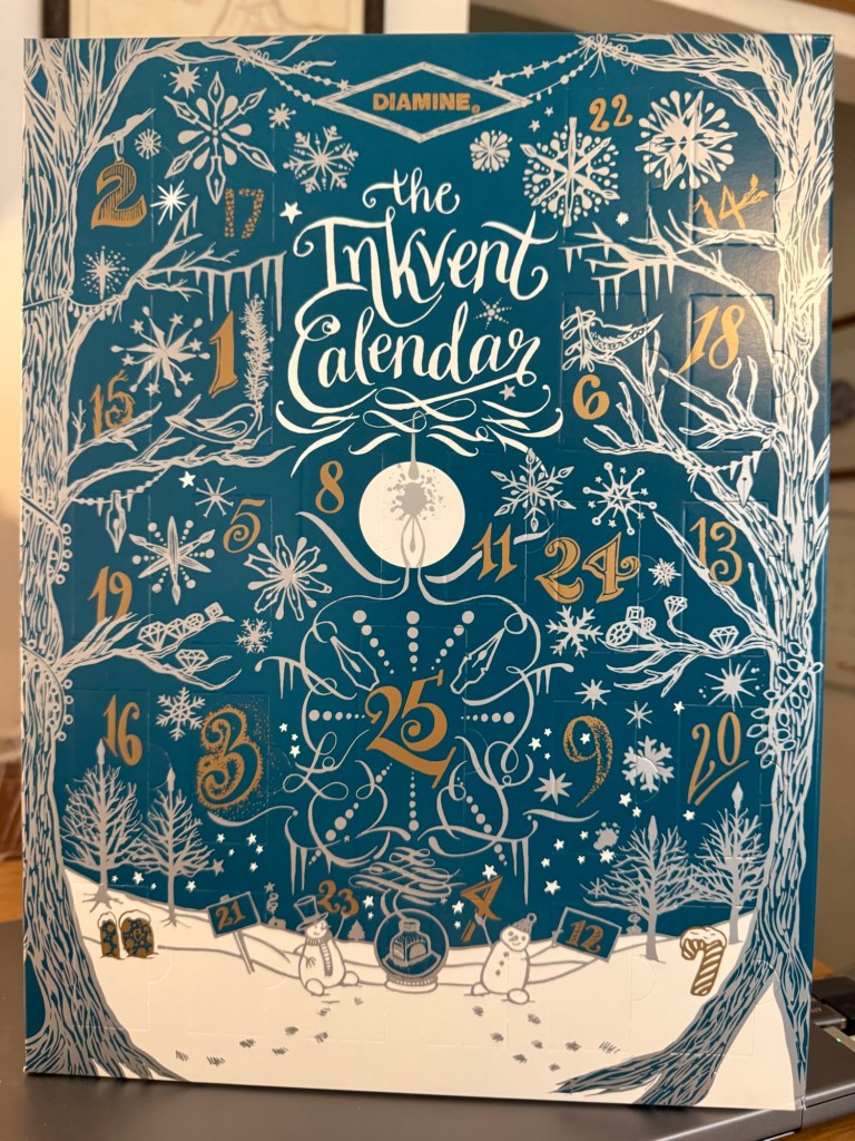
As the year comes to a close, it’s time for this year’s Diamine Inkvent. This year’s calendar is the Teal Edition – one of my favourite colours. I am guessing that it will include some version of Diamine’s new Forever pigmented inks. It will likely also include shimmer, chameleon, sheening and super sheening inks, scented inks (alas) and likely also a few surprises. I have done as much as possible to not read about the inks in it in advance – the surprise is most of the fun.
My Diamine Teal Edition Inkvent calendar.
I have been reviewing the Diamine Inkvent calendar since it was first issued, and it’s been a huge undertaking, and a fun one. You can find my review of the 2019 Blue edition starting here, the 2021 Red edition starting here, the 2022 Green edition starting here, the 2023 Purple edition starting here, and the 2024 Black edition starting here.
This year I’ve decided to streamline things a bit. I’m very busy, and my calendar arrived very, very late due to shipping issues so I haven’t really had a head start creating the review posts, and they take a LOT of time and effort. To cut down on the overhead I will not be photographing the individual doors or bottles – they aren’t really interesting. I will be creating a writing sample and a teddy bear sketch for each ink – using teddy bears from my collection as models. This year, however, the sketch and the writing sample will be done in a single notebook – the Apica Premium C.D Notebook. It has very fountain pen friendly paper that does a good job of showing off individual ink properties.
Apica Premium C.D. Notebook
Like in previous years, I will be using my trusty Col-o-ring to swatch and sample each ink. I will also be actually filling fountain pens instead of just using dip pens to test the inks. I think that it’s provides more insight into how an ink behaves in a pen, particularly in terms of flow. Unlike in previous years I have a brand new ultrasonic cleaner, so hopefully the pen cleanup won’t be too bad…
Col-o-ring (no 2025 inks are swabbed here yet)
Have a great Inkvent to all who celebrate! I can’t wait to dig into this year’s calendar and see what Diamine came up with.
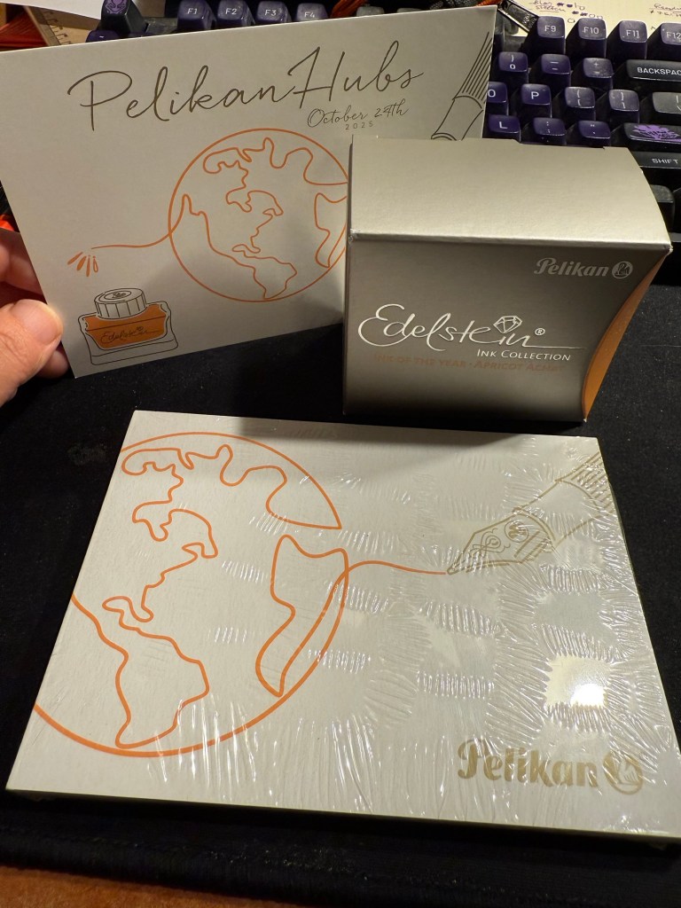
Yesterday was the 2025 Pelikan Hubs event. Pelikan is so wonderful to organize these events, so generous and thoughtful with their gifts, and I love the company and their pens so much that I’m really heartbroken that this isn’t just a glowingly happy post.
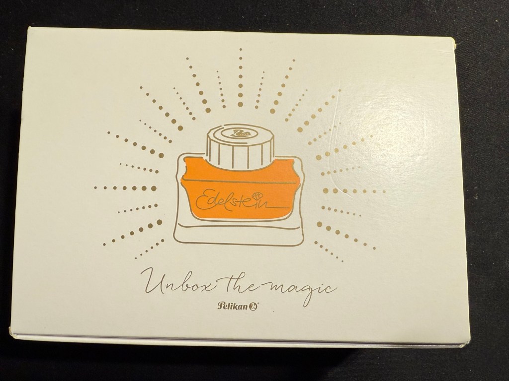
This isn’t Pelikan’s fault. Their organization was as usual, impeccable. Their gift was tremendous – a beautiful box, with the Edelstein’s ink of the year Apricot Achat, a postcard and a notepad. Everything was so well designed it was breathtaking to open the box and see it all laid out perfectly.
The box
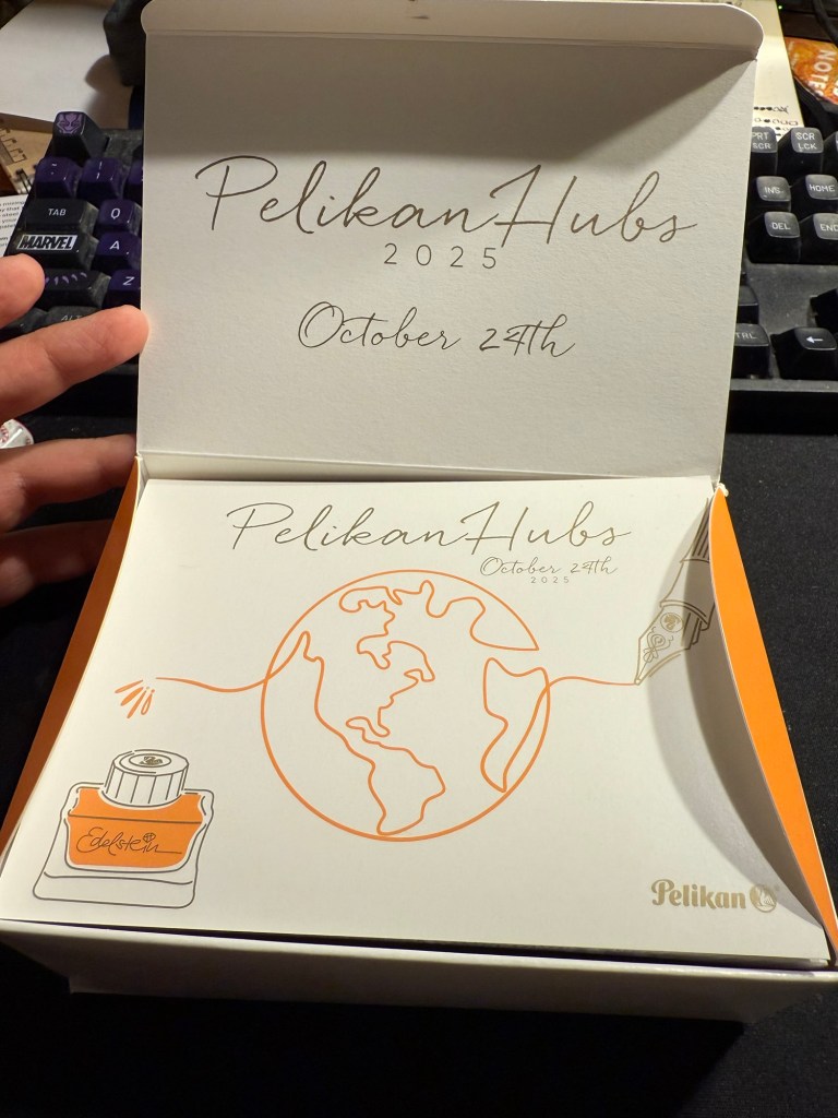
Here’s the open box and the postcard:
The open box and the postcard
Here’s the notepad. You can see the design on the cover better in the next photo, but the paper is smooth, thick and perfectly fountain pen friendly.
Small notepad
I love the design of the cover of the box, the postcard and the cover of the notepad. It’s playful but elegant, and it works well together and ties in well with the typography and the design of the Edelstein box. That’s a 10/10 for design and quality.
Everything that was in the box: postcard, Edelstein Apricot Achat ink, and notepad
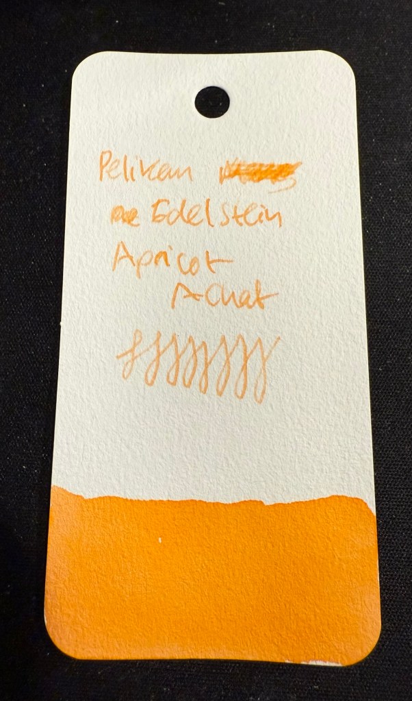
The that we received is the Edelstein Apricot Achat, which is the ink of the year 2025. The bottle is gorgeous, and the ink is non-shimmer this year, so it should be easy to clean out of pens.
Edelstein Apricot Achat
The ink itself is indeed an apricot ink, with a hint of shading. It’s bright but light – a tad too light for me if I’m honest. I think that this exact ink just slightly more saturated would have been the perfect orange for people who like their orange right in the middle of the orange spectrum – not too yellow or too red.
Swab on Col-o-Ring
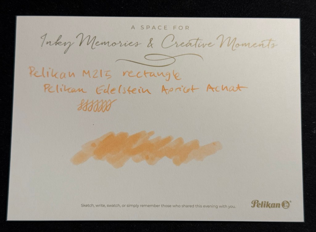
I filled a Pelikan M215 Rechteck (rectangle) with this ink, but I chose poorly, forgetting that it has an EF nib. Pelikan EF are on the wide side, but this ink would fare better in a medium or even a broad nib. I will still enjoy it as it works well with the other inks I currently have in rotation, but if you are looking to use this ink I’d suggest wide and generous nibs for it.
Writing sample on Kokuyo paper.
I tried it on the Postcard. The paper isn’t coated but is still rather sleek:
The postcard with an ink swab and writing sample
So thank you very much Pelikan for organizing this worldwide event and for your wonderful gift! I am actually considering buying the matching M200 because I like the look of the ink.
Now for the sad and ugly part:
Pen collection has a misogyny problem. I have experienced it during the previous Pelikan Hubs, I have experienced it when I tried to buy pens in brick and mortar shops, in flea markets, from pen makers. I experienced it during this year’s Pelikan Hubs and I’m tired of it, and kind of tired of all the talk about how wonderful and welcoming the pen community is. It’s wonderful and welcoming if you’re a guy, and time and again I have seen it close ranks and snarl if you’re a gal.
Just during yesterday’s event, where I stayed on for less than an hour (and even that was just to be at the edge of the group photo), I was told several times that:
Women don’t collect pens.
Only men collect pens.
I am not a real pen collector.
I can’t possibly be a pen collector.
I can’t possibly have enrolled to the Pelikan hub.
I am there as someone’s plus one.
Women don’t understand pen collecting.
I am a rare bird, the exception to the rule.
They had facts to back it up, they said. Their closed pen collectors group only had three women in it. That proved the point. I eye-rolled so hard. I had met and talked to one of the other female collectors at last year’s event and I fully understand why she didn’t brave this treatment to collect her gift this year. It’s because nobody wants to go out of their way to spend their precious free time with a bunch of *holes.
There are women collectors, they have every right to enjoy this hobby, and if you’re a guy and you don’t see women in your group, it’s not because they don’t collect pens. It’s because you’ve created a group that women don’t want to join.
Do better.
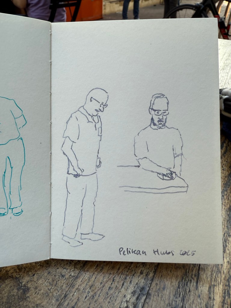
End of rant – and to end on a more positive note, I did manage to do a few 2-3 minute sketches while I was waiting for the group photo:
Sketched with Pelikan M805 Ocean Swirl F nib and Montblanc Maya Blue on a Pith Kabosu SketchbookSketched with Pelikan M605 Stresemann M nib and Sailor Ink Studio 123 on a Pith Kabosu Sketchbook
Thank you again Pelikan for the wonderful event. I intend to return next year even if the menfolk find my presence abhorrent. There were a few nice fellows that were willing to talk to me, and I will not let the trolls dissuade me from participating in a hobby that I have been enjoying for close to 20 years.
In September I traveled to Paris and London.See part 1 of my travelogue here, part 2 here and part 3 here.
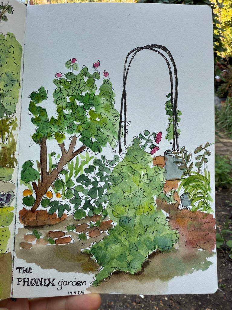
Another visit to the Phoenix garden resulted in this sketch in my Etchr lab sketchbook. I love the paper so much – even a super quick sketch pops on it.
Phoenix garden sketch
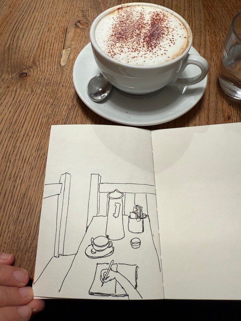
I had a coffee at the Monmouth Coffee Company. I love their coffee, but the place was both packed and super hot and stuffy so I made this quick sketch in my Pith Kabosu sketchbook and didn’t bother to add watercolour to it. It’s the first time I tried a POV sketch, and you can see the weird way I oftentimes hold my pen. I got to talk to a super nice young South Korean woman, as I shared the table with her and a young Japanese father and his 4 year old son.
POV sketch of the Monmouth Coffee Company table
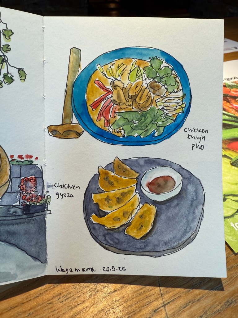
Lunch was at Wagamama again. I tried their pho for first time (it’s new on the menu) and really liked it.
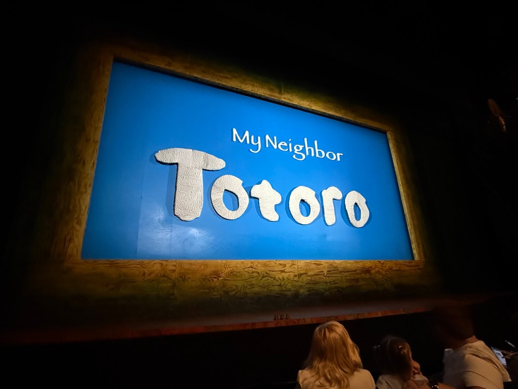
In the evening we went to see My Neighbour Totoro. It’s a lovely play, very well considered and beautifully acted and puppeteered.
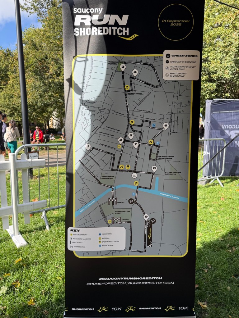
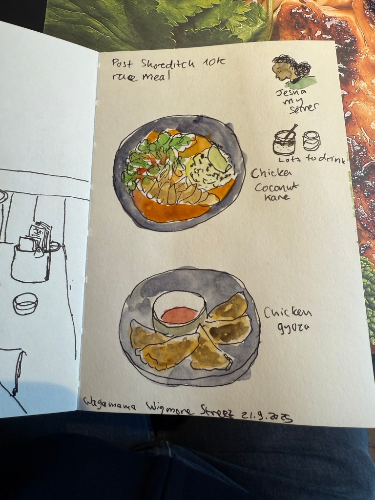
On Sunday my family went to Greenwich and I went to the Saucony Run Shoreditch 10k race. It was bright and cold, perfect running weather, and the route was pretty flat – but chock full of speed bumps, which really hampered the race flow and caused a few nasty spills.
Here’s the route:
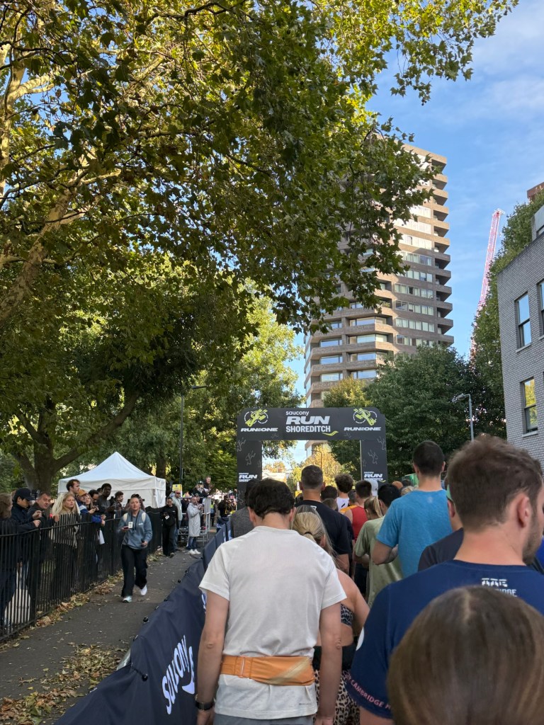
And the starting line:
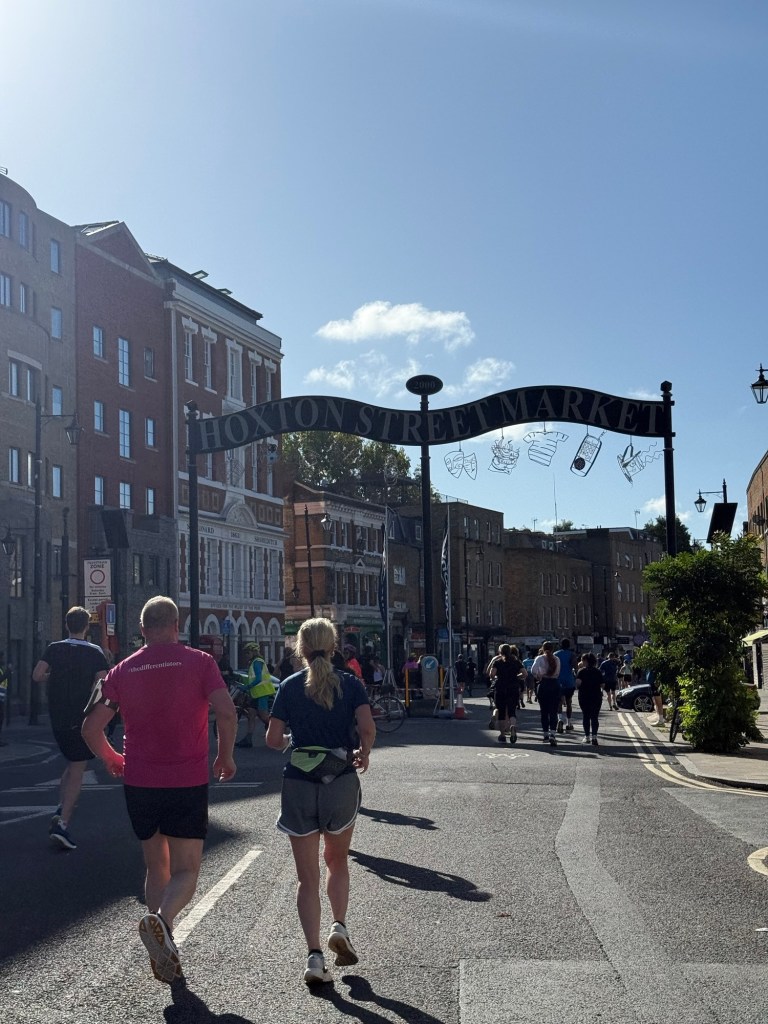
And some of the entertainment on the way:
We ran a lot of loops, mostly through pretty dull residential streets. Only in the final kilometre or so did we get to see a bit of Shoreditch high street etc.
Overall the race was fairly well organized, and not overly crowded (about 6,000 runners), but I didn’t enjoy the route mostly due to the speed bumps. They seem to have taken the worst out of the local runners, as people pushed, jostled and shoved to avoid running over them (I just started running over them from around the 3rd kilometre or so).
Here’s the medal:
After the race I went for a celebratory meal at Wagamama. I hadn’t had breakfast and I was parched so I had a ton to drink and tried one of their new curries. Jesna, my server, was really curious about the sketches and we got to talk a bit.
Another Wagamama meal.
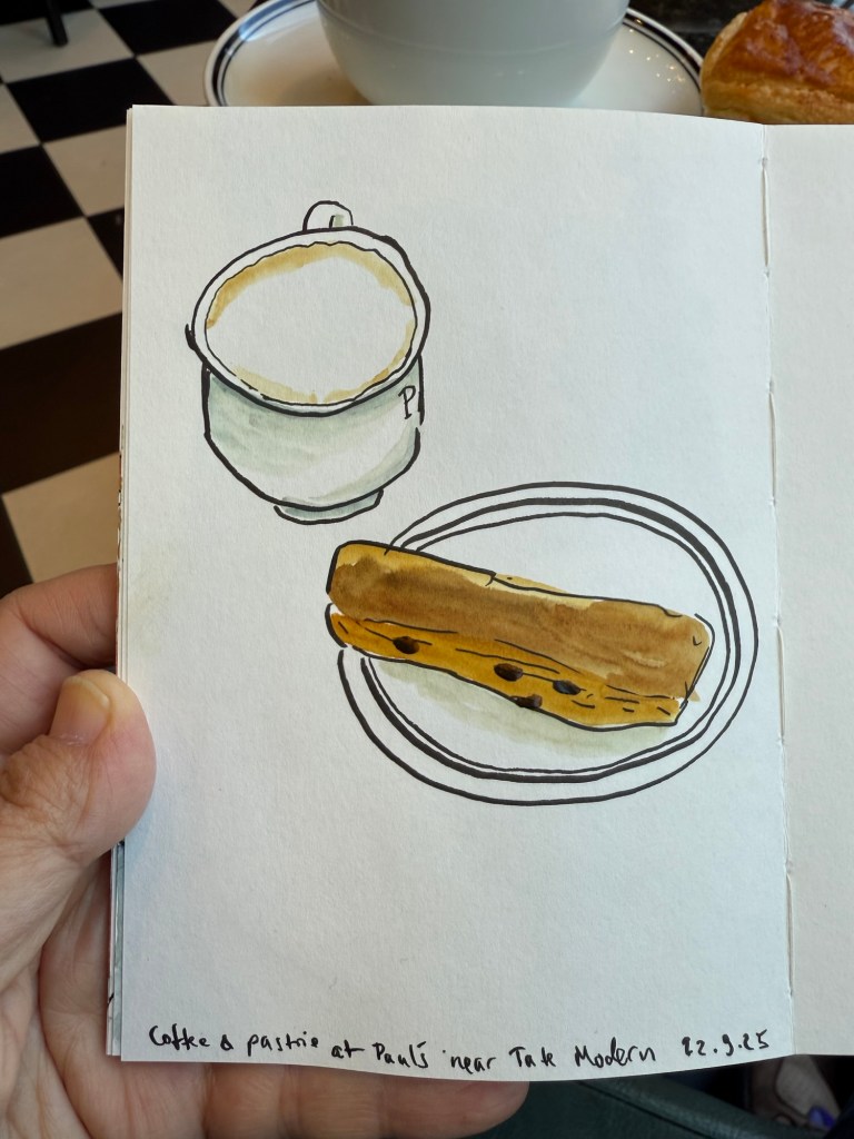
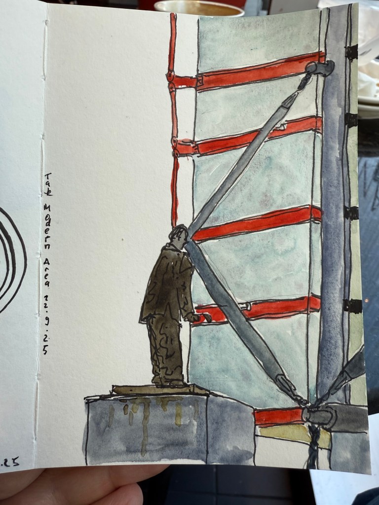
On Monday my dad and I went to Tate Modern to see a Picasso and the Theatre exhibition. We arrived early so we sat at Paul’s and sketched.
Coffee and pastry at Paul’s
I also sketched the statue and part of the modern building across the street.
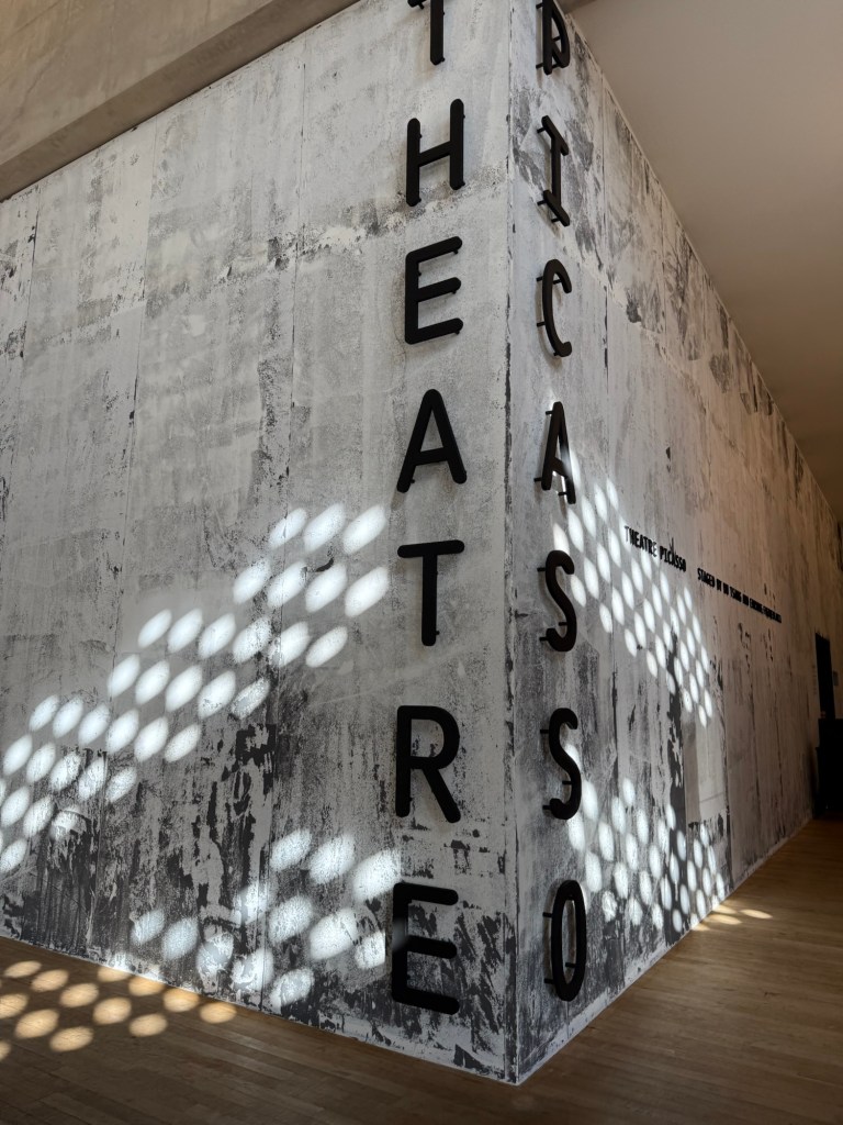
The “Theatre Picasso” exhibition was hands down one of the biggest disappointments of the trip. Never have I felt my intelligence or interest in art more insulted than in this exhibition, and I left after about 20 minutes.
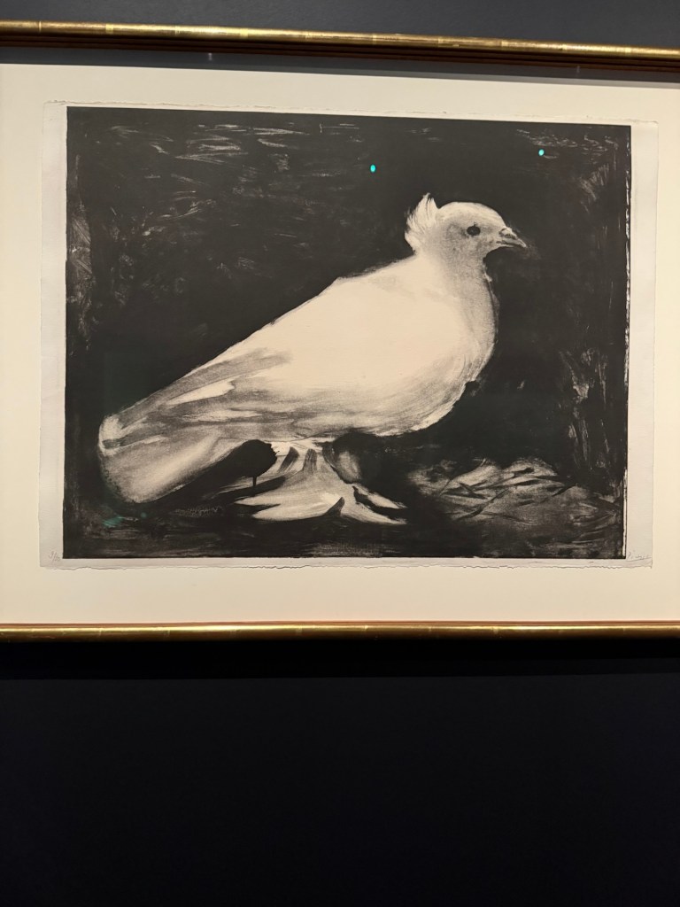
Here’s a Picasso dove to relax for a bit:
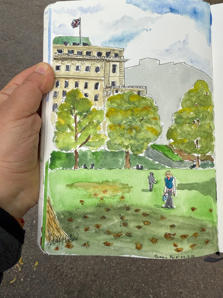
I was in a bad mood when I left and I didn’t know what to do with myself so I made my way to Green Park and sat and sketched there for a while:
Pencil and pen
The final sketch:
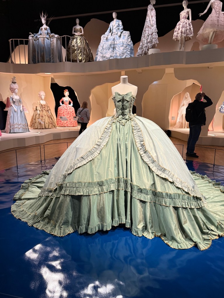
Thankfully the best exhibition was still ahead of me – Marie Antoinette Style at Victoria and Alberts. The thought, curation, staging, flow, items – everything about this exhibition was perfection. You saw Marie Antoinette as a style icon, as a woman trapped in a role, as a doomed queen, as a harried and slandered victim, and as a larger than life figure. Her foibles, her eye for fashion, her courage, her very flawed life and her terrible death made her immortal in a way she likely could never have imagined.
Marie Antoinette Style
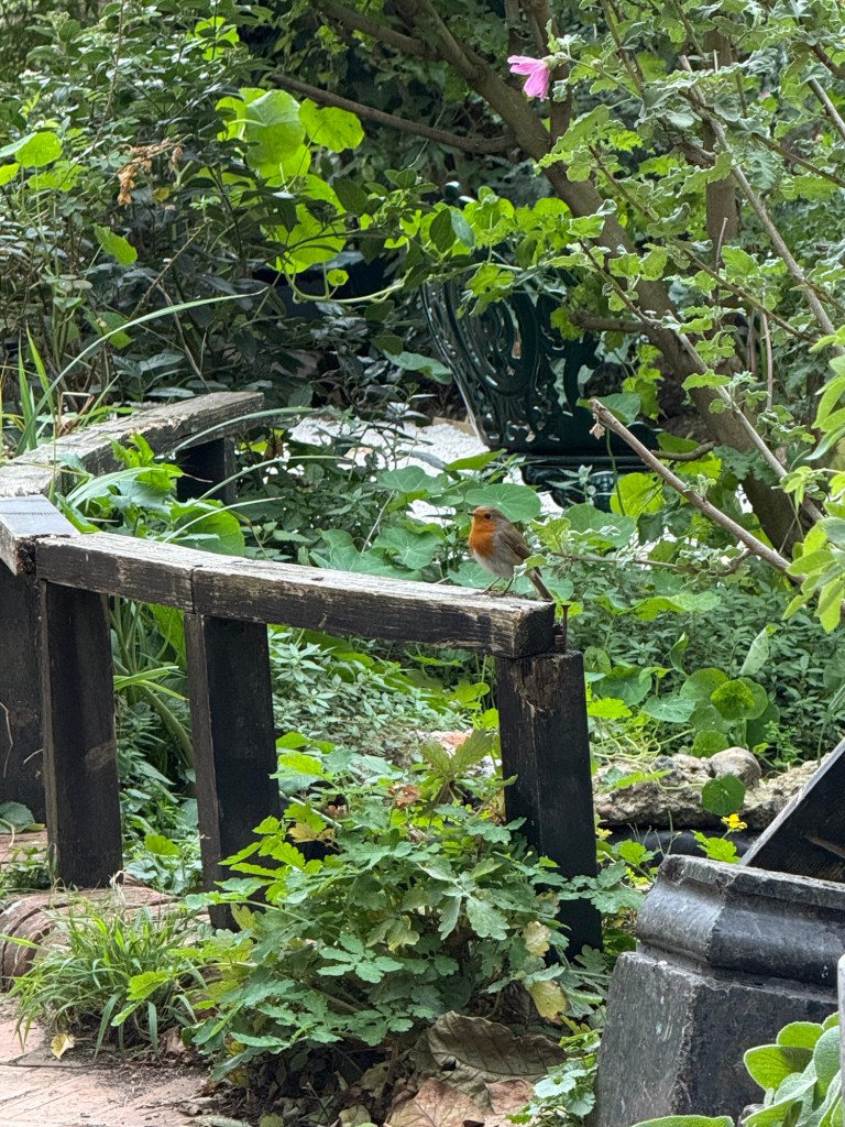
We don’t have robins here, so it was nice to get to see a few of them at Hyde park during my morning runs and at the Phoenix garden.
Robin
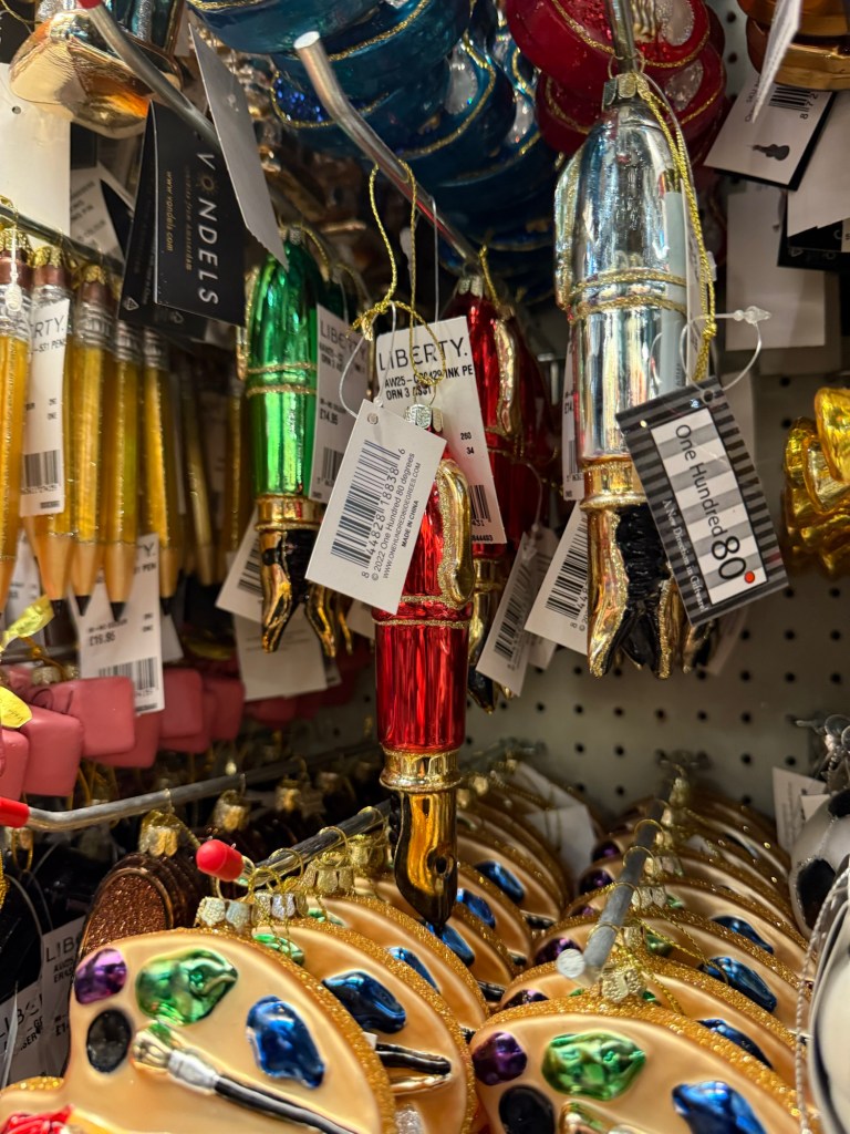
There were surprisingly few Halloween decorations out but the Christmas shops were on full blast in all the big stores. Of course I had to buy this red fountain pen ornament from Liberty:
Pencils, pink pearl erasers, fountain pens and palette ornaments at Liberty London.
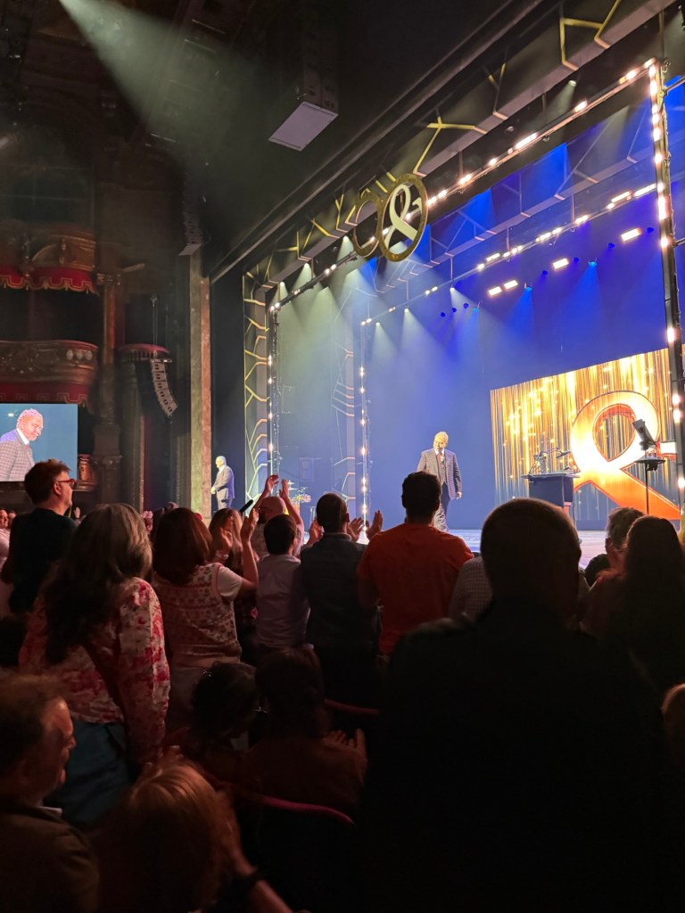
We then got to see Penn and Teller’s 50th anniversary show (and first West End tour). They were funny, surprising, and wonderful, and it was an overall delightful and very memorable evening. I even got a signed poster of their show!
Penn and Teller
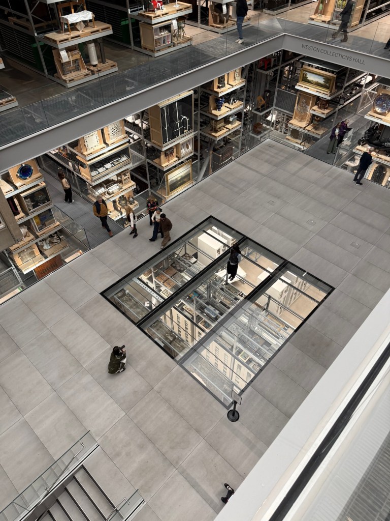
On one of the last days of the trip I went to see the new Victoria and Albert East Storehouse museum. It’s a unique experience, and it’s worth the visit – but I recommend planning to go there well ahead of time and ordering items to interact with. It’s not a standard museum by any stretch of the imagination – it’s more of a museum about museums and how they handle their collections.
While I found many of the explanations to be overly politicized, it nevertheless is a place that I’d return to – provided I manage to book a “meeting” with an item (Order and Object at the study centre). It’s also interesting to see what other people ordered and how they interact with their chosen objects.
Victoria and Albert East Storehouse
I had lunch at the nearby Wagamama for the last time, and sketched my lunch for the last time:
Final lunch and sketch
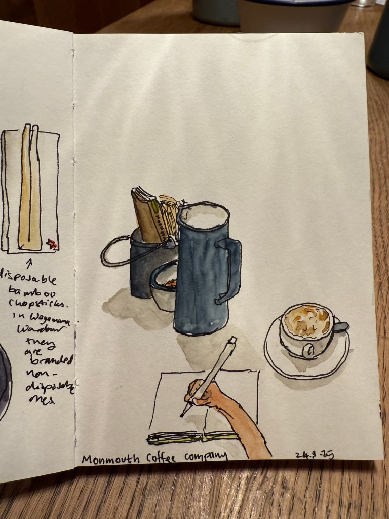
And then went for my last coffee at Monmouth Coffee Company:
Another POV sketch
In the evening we went to see “The Importance of Being Earnest”. Stephen Fry was excellent as Lady Bracknell, but I didn’t like the director’s interpretation of the play (Algernon is gay, Jack is gay, Cecily is gay, Gwendolen is gay), and the two main actors weren’t very good. For the life of me I don’t understand the director’s need to try and outsmart Oscar Wilde. Wilde’s work is polished to a mirror finish – there really is no need to be clever with it. It packs enough punch as it is.
Stephen Fry and the cast of The Importance of Being Earnest
On the last day of the trip I went to the Phoenix garden for a last sketch:
Pen sketch
I got to talk to a lady that works in the garden, and it was nice showing her all of my various sketches of the place.
Final watercolour
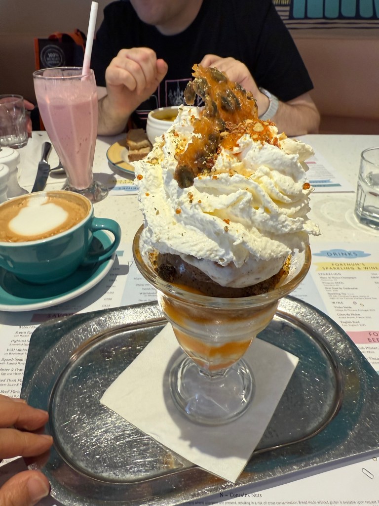
And we went to The Parlour at Fortnum and Mason for celebratory Sundaes before the flight.
Tres Leches sundae – Coffee, Bickfield Milk and Fior de Leche & Chocolate Biscuit Ice Cream and Pumpkin Seed Praline
Overall it was a great trip even though I was sick during its first leg. I’ve never sketched so much during a trip before, largely thanks to some recently acquired sketchbooks and watercolour palettes, and some skills I learned during USK Poznan. I got a ton of watercolours, pens, pencils, inks and art supplies that I can’t wait to try out, and I got a nice stack of books to peruse over the coming months. Hopefully this was fun to read, and perhaps you got some inspiration for your next trip to Paris or London.
In September I traveled to Paris and London.See part 1 of my travelogue here and part 2 here.
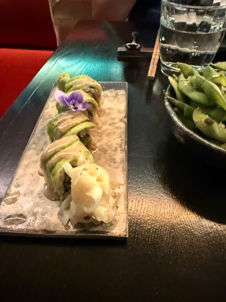
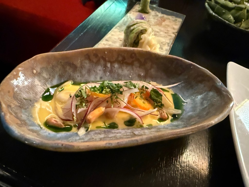
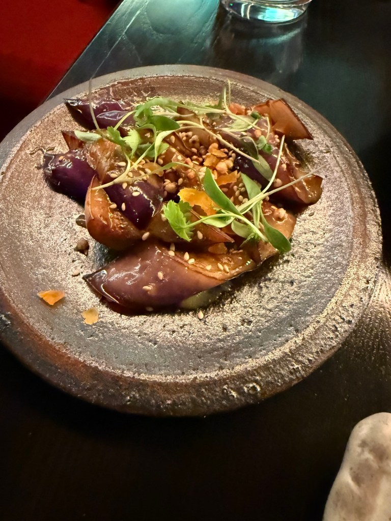
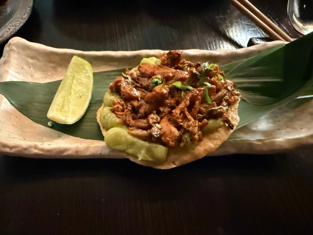
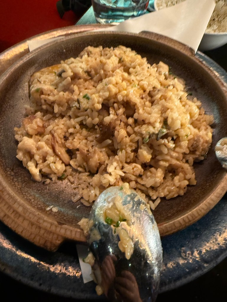
I met up with a dear friend for a pre-theatre tasting meal at Chotto-Matte, a trendy restaurant that combines Mexican and Japanese cuisines. I am not a foodie, and I will now confess that this was the first time that I’ve had sushi (I hate the smell and taste of fish and seaweed and everything that comes from the sea and so I’ve avoided it), and I really enjoyed it. It was the best meal that I had in London, and the company, the weird design and the very attentive service added to it.
I had the vegetarian pre-theatre menu, which meant that mine had no fish, seafood, meat or chicken in it. It was phenomenal.
On the right is the Edamame, which we shared and was good, and in the centre is Truffled Avocado Roll – Cucumber, sesame seeds, yuzu truffle soy. It was light and refreshing.Lychee Ceviche – Leche de tigre, chive oil, sweet potato, Peruvian corn, coriander. One of the biggest surprises of the meal. Delicious, zingy and the textures were phenomenal. Yasai Miso Crispy Sushi – Picante miso vegetables, takuan, shiso cress. Sticky but very good.Nasu Miso – Aubergine miso, apricot, puffed soba, sesame seeds. Aubergine like I’ve never tasted it before. Again, a lot of great textures here and a ton of deep flavours.King Oyster Mushroom Tostada – Pulled mushroom, smoked aji panca chilli, guacamole, lime, coriander. I’m not normally a mushroom fan, but this was smoky, “meaty” and satisfying. Truffled Mushroom Rice – Sweet corn & queso fresco dip, jalapeño, coriander, corn tostadas. This was a rice heavy meal, and at this point I could eat no longer. I had about three spoonfuls and no more. It was a good dish, but it lacked the depth of flavour and the uniqueness of the rest of the dishes.Milk Soft Serve Ice Cream with toasted almonds, chocolate sauce. It’s ice cream, it was good, but we had to rush to the theatre so we didn’t get to finish it. It wasn’t a particularly interesting desert though.
This is definitely a place that I’d return to for a special occasion.
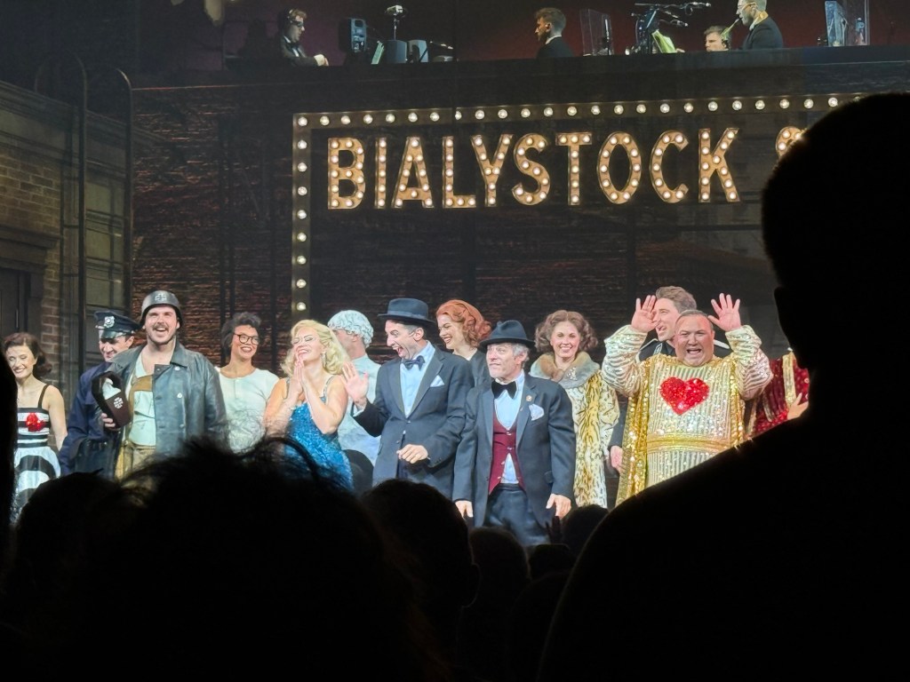
We then went to see the classic musical, “The Producers”, and it was excellent. The cast was brilliant, and it’s a very good musical with some great (if disturbing) songs. Mel Brooks is a comedy genius, and this musical still packs a punch.
The Producers
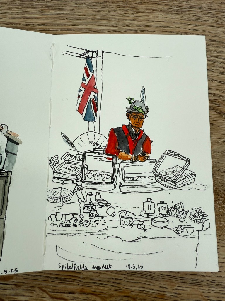
We also went to Spitalfields market, which meant that I could sketch this guy:
Sketch of a statue of a goat in Spitalfields market.
This was my very first sketch in the new Pith Kabosu sketchbook that I purchased at Cass Art. I debated whether to buy this sketchbook or not, as it had smooth, 200gsm paper and it opened flat, but I wasn’t sure it would work with watercolours. The great sellers at Cass Art told me it would, as they use it themselves, and they were right. It’s now my “daily driver” having replaced the Stillman and Birn pocket beta. The beta has thicker and more textured paper but the Pith Kabosu is slightly larger, has a more durable cover, and opens flat much better than the Stillman and Birn does. I later returned and purchased two more of these sketchbooks, they were so good.
I later sketched this seller in his stall, after purchasing an old set of folding rulers from his stall. I decided to paint him and the flag but left the rest of the stall as line drawings.
Spitalfields market
The Pith Kabosu is also cheaper than the Stillman and Birn and as it has smoother paper, works better for ink sketches and dry medium (pencils of various kinds, for example). It means that I’m more inclined to bring it out and make quick sketches in it, even if I don’t get to adding watercolour to them.
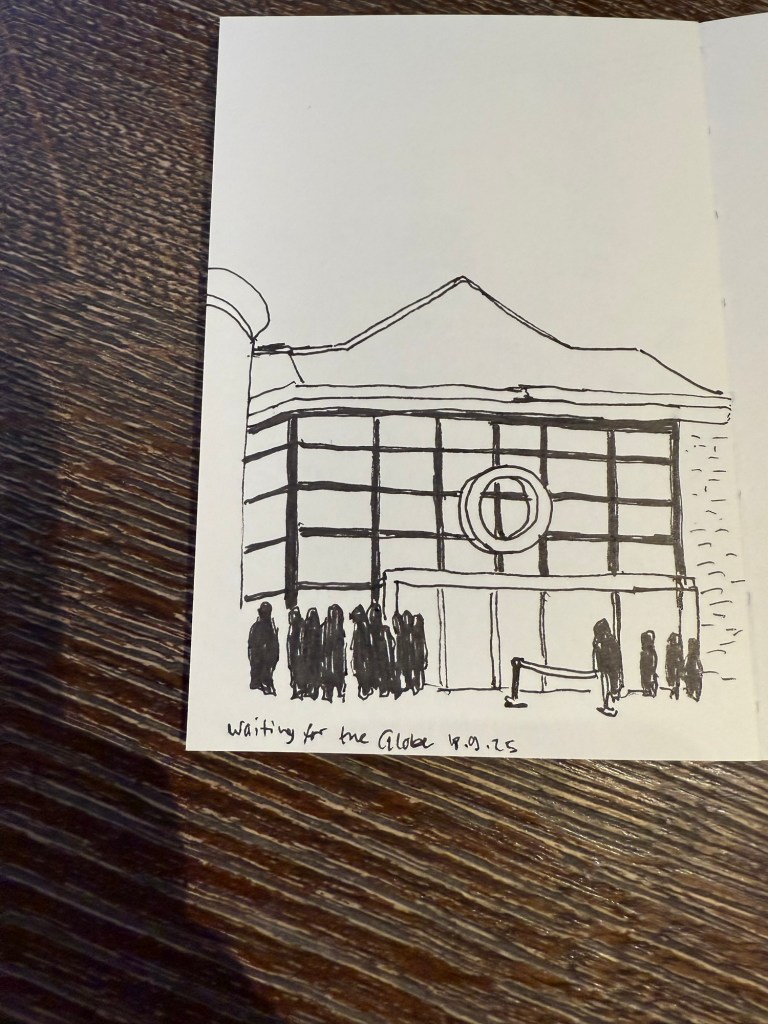
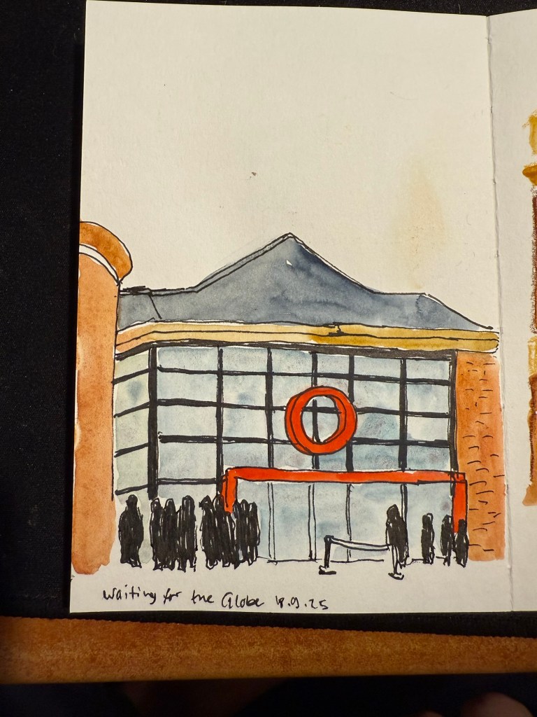
We then went to the second play at The Globe – Shakespeare’s Twelfth Night. We arrived early so I sat in the Starbucks across the entrance and sketched the place:
I originally didn’t have time to add colour to this. I just bashed out this 5 minute sketch and then added watercolour later, from reference photos.
I later added colour to the sketch. In hindsight I would have gone for a looser sketch, but I was still unsure what this paper could and couldn’t do. The answer is – practically everything. Only very heavy washes make the page buckle.
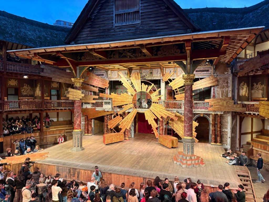
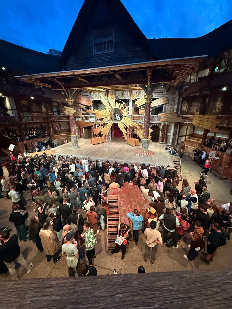
This was a regular Shakespeare play, and so there was some set design. this is the stage:
And in the yard where the groundlings are you can see another bit of the stage that isn’t normally there, but was used to represent the beach and other locales in the play.
I enjoyed the play a lot, and would recommend seeing plays at the Globe if you can tolerate the extremely uncomfortable seats (yes, even with the cushions).
We went to the Cartier exhibition at the Victoria and Albert museum. The exhibition is sold out, and it’s well considered, but we found it a bit dull compared to the Marie Antoinette exhibition at the same museum.
This is the Patiala necklace that was part of the exhibition. It was made by Jacques Cartier for the Maharaja of Nawanagar in 1928. He also made the Maharaja of Nawanagar’s necklace, later named the Jeanne Toussaint in the “Ocean’s 8” movie (it was a recreation made by Cartier for the movie).
My favourite parts were the film where they showed how a Cartier leopard is made, and the famous mystery clocks. There was a whole room dedicated to them, and it was fabulous.
Next post will be the last in the series. You can read it here.
In September I traveled to Paris and London.See part 1 of my travelogue here.
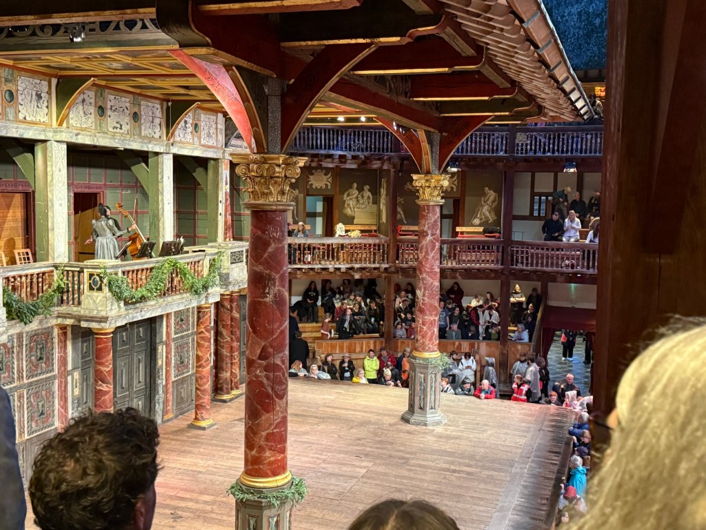
I went to see two plays in The Globe theatre in London. The first was a one night only performance of Midsummer Night’s Dream that was a reenactment of how the actors in Shakespeare’s time would have performed a play. The actors didn’t rehearse the play beforehand, and they didn’t have the full text of the play to work with, just their lines and their cues and staging directions. They practiced the dances alone, and they had no idea what their fellow actors would do during the performance. Now this is Midsummer Night’s Dream so all the actors and everyone in the audience knew exactly how the story unfolds, but the lack of rehearsals made this a very live performance.
The Globe stage before the show
The play was sold out in minutes and I’m glad that I managed to get tickets at all. It was an amazing experience. As this was a one night performance the stage was the bare Globe stage – nowhere to hide as the audience surrounds the actors practically from all sides. There was a lady on stage in period costume, sitting with the full text and helping actors in the very few times that they fumbled. The energy was beyond description. It was the most electric staging of Shakespeare that I have ever seen. Everybody was “on” all the time because they weren’t entirely sure what would come next.
It was a raw performance – I later saw another, standard Shakespeare play there and it was much more polished because it was clearly rehearsed and performed several times before we saw it. Yet that was what made this performance so special – the actors’ reaction to their fellow actors was genuine and unvarnished. They were having fun, improvising, owning the text in a way they normally never do. The highlight was the play within the play at the end – seeing the actors laugh to the point where they had trouble saying their lines because Bottom was so very, very hilariously over the top was amazing.
The musicians at the Globe.
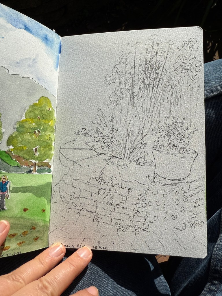
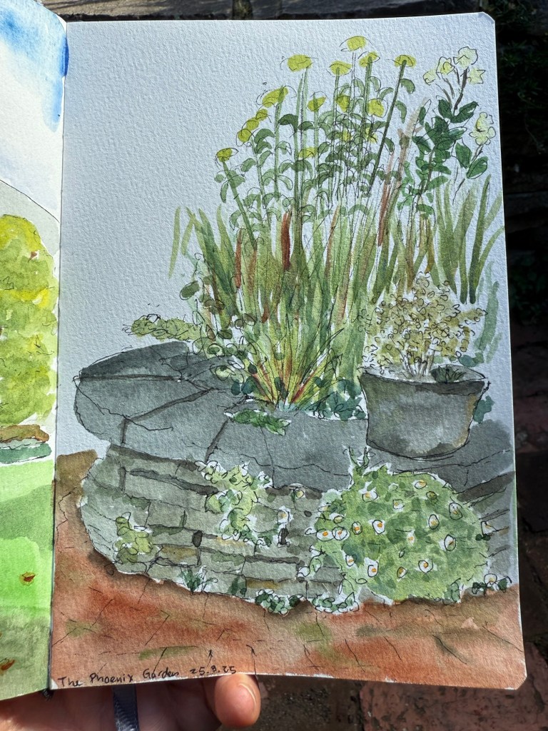
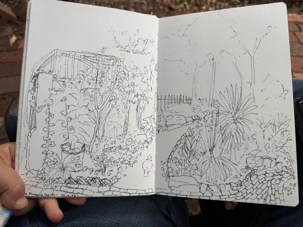
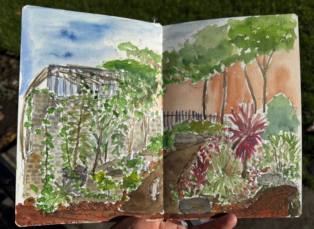
One of my favourite places in London is the Phoenix community garden. I spent a lot of time there, and sketched it several times. This was my first and longest sketch of the garden, done on the wonderful Etchr Lab cold pressed watercolour sketchbook:
Fineliner sketch – no pencil underdrawing.Final sketch.
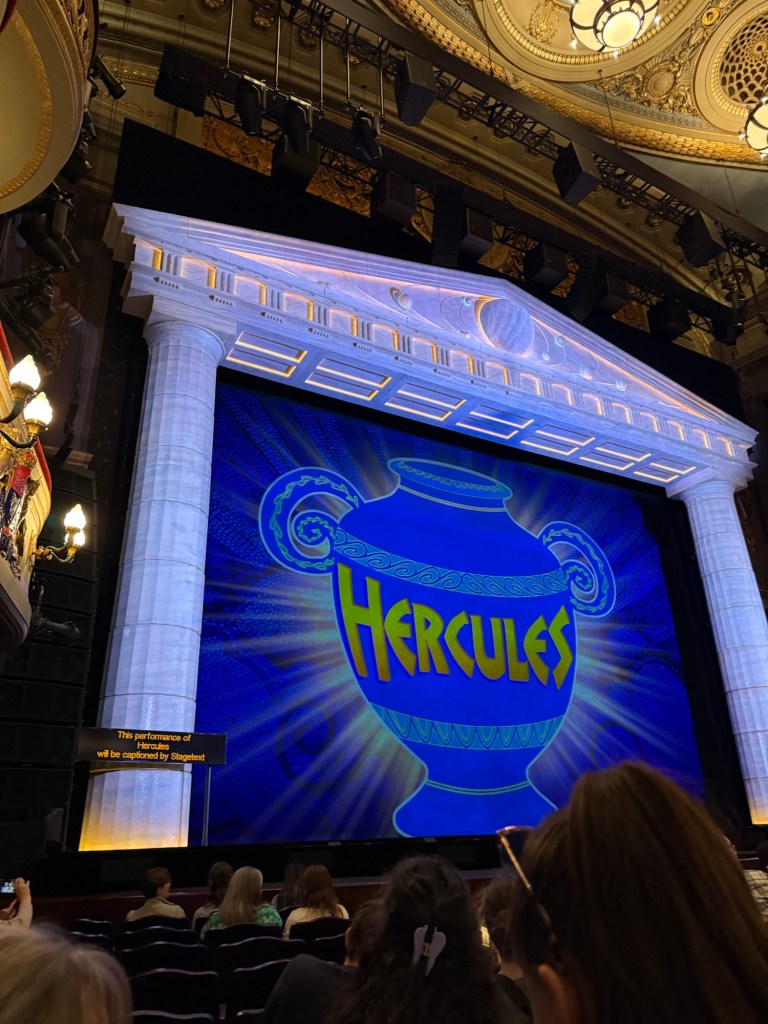
We went to see Disney’s Hercules – a new musical in West End. I wasn’t expecting much as I’m not a fan of the movie, but the musical was one of the best that we saw in the London. The production is stunning, the music is great, the actors were talented – particularly Megara – and the only minus is that Hades was a bit over the top even by the movie standards. They would do better to cut down on the amount of his jokes because they lose their impact otherwise. The Disney merch machine was out in full force that night, and I was one of only a handful that didn’t leave with something from their store.
Hercules the Musical
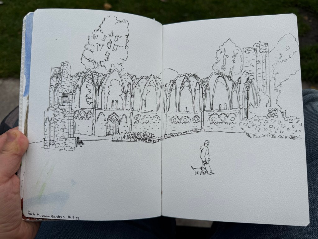
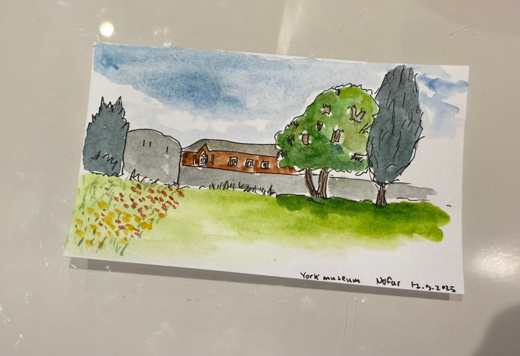
We spent a day in York, and I started it with a sketch of the York Museum grounds, also in my Etchr Labs watercolour sketchbook:
Fineliner sketchComplete watercolour.
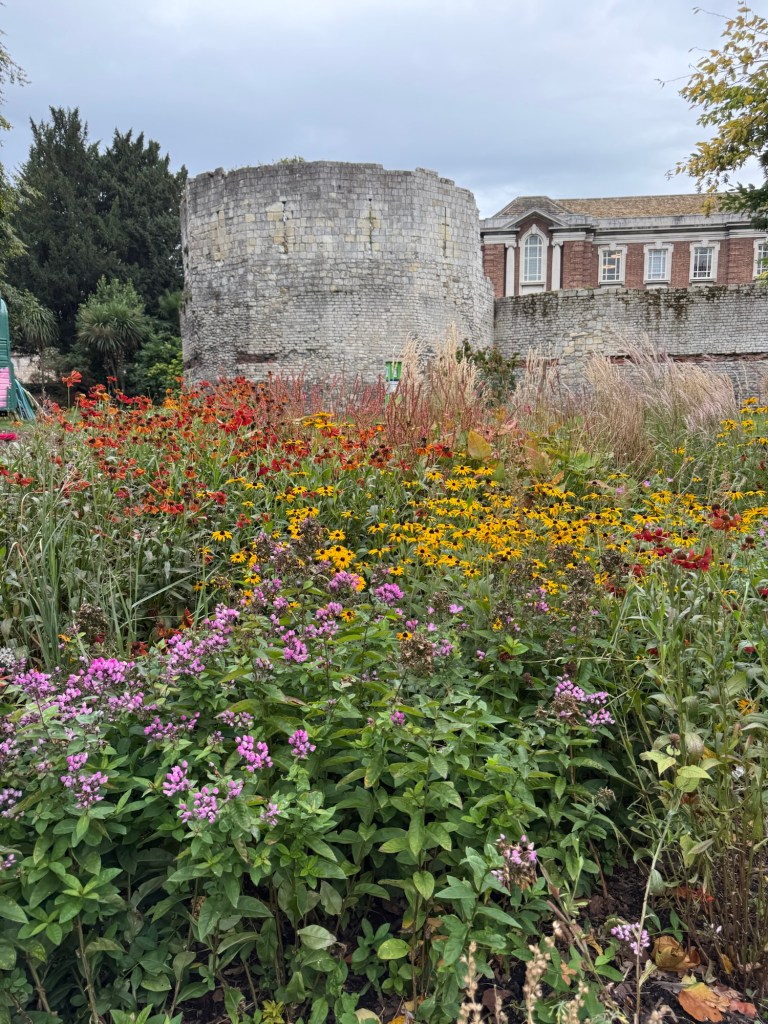
York is full of wonderful bits of history that are just layered freely on each other:
York museum
I did a very quick sketch of this scene later on, on an Exacompta Bristol card:
Quick sketch on Brisol card
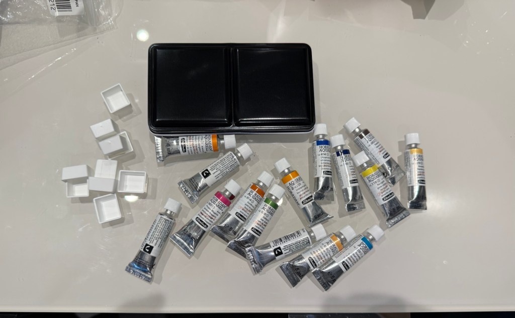
I also bought a decent amount of watercolour paints – enough to build out two new palettes that I want to try.
This post is getting long and photo heavy, so I will be completing this trip journal in two additional posts.
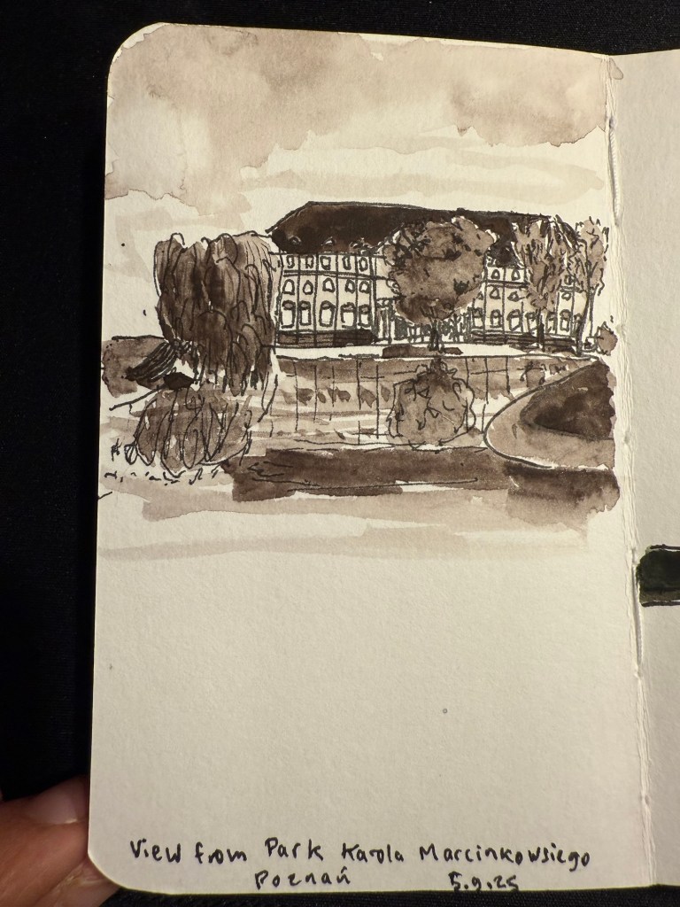
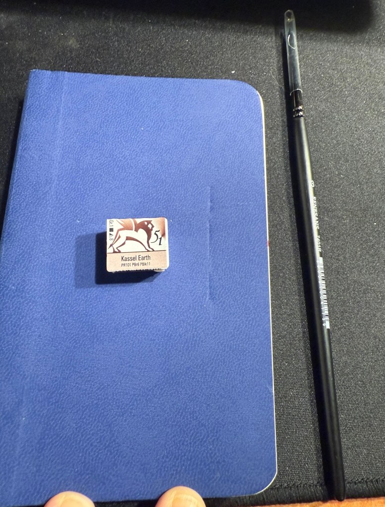
As part of the Urban Sketcher’s 2025 Symposium in Poznan I got a very generous goodie bag filled with art supplies from the Symposium sponsors. One of those sponsors was Renesans, a Polish art supply manufacturer, and they gave us a half pan of Kassel Earth extra fine watercolour and a number 3 synthetic watercolour brush.
Today I decided to try them out. I used a Stillman and Birn pocket beta, a Staedtler 0.8 pigment liner and only the Kassel Earth watercolour and the Renesans brush. This is the result:
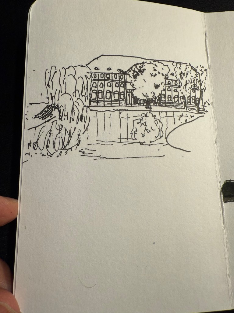
It’s a sketch of a beautiful building across from a pond in a park in Poznan. I drew it from a photo that I took during my morning run through the park. I was planning on returning to the park during the Symposium but I ended up not having time.
This is the sketch:
I used some of what I learned in the symposium to create more realistic trees.
I rarely sketch in monochrome so this sketch was a challenge. It’s about seeing the grades and shades in a scene, and not the colours, and that’s a hard exercise.
This is the paint and brush on the sketchbook:
And this is a swab of the paint. It’s a classic Van Dyke brown, artist grade quality. The brush was surprisingly good, especially for a synthetic brush. It retained quite a lot of water, and it has a good, sharp point.
Though the paint pan has bubbles in it, which isn’t great, I am happy with the quality of the paint and I would consider using Renesans watercolours in the future. The brush is excellent and I am adding it to my rotation. What a wonderful gift to get!
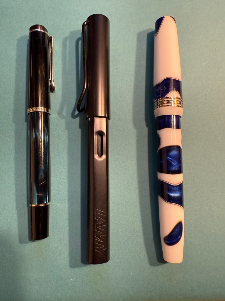
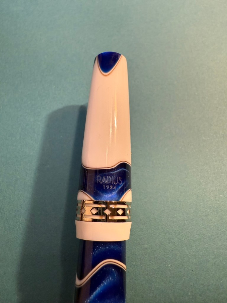
I just received a package from Fontoplumo and I immediately added the pen and inks it contained into rotation. While I already have a good amount of pens inked up, I really wanted to give the Radius 1934 Settimo Cielo Blu a try as soon as I got it. Not only is it a gorgeous looking pen, but I was also curious to see how it compares both the the vintage Radius fountain pen that I own and to my Leonardo fountain pens, as they are also the makers of the Radius.
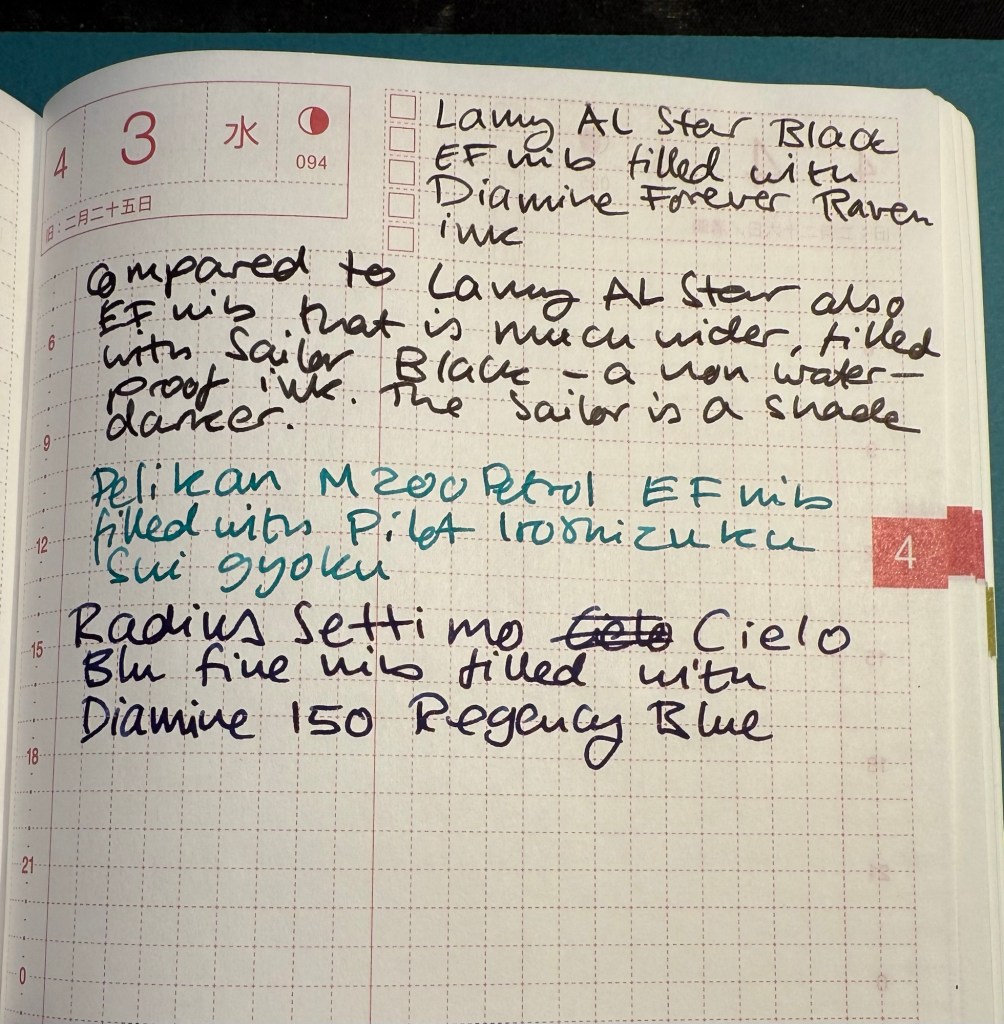
Apart from the Radius the package contained two inks that I was interested in using as soon as possible, so I inked up a Pelikan M200 Petrol with Pilot Iroshizuku Sui gyoku and a Lamy AL Star with Diamine Forever Raven. The Radius got inked up withe Diamine 150 years Anniversary Regency Blue, a rich royal blue with moderate red sheen that fits the blue swirls on the pen body.
From left to right: Pelikan M200 Petrol, Lamy AL Star Black, Radius Settimo Celio Blu
Comparing the Diamine Forever Raven to Sailor Black reveals that the Sailor is slightly darker than the Raven, but both are dark enough to count as proper black inks (and not dark grey or brown). They both have a bit of shading, but the Raven interests me as a waterproof ink, so I’ll be testing it with some watercolour sketches later on.
Writing sample
The Pilot Iroshizuku Sui gyoku isn’t what I expected. I was hoping for a more prominently green ink, but Sui gyoku is more of a turquoise than a green. I like turquoise inks so that won’t be a problem, but it means that I’m still on the lookout for an interesting, bright, readable green. The shading on this ink is delightful.
Diamine 150 Anniversary Regency Blue is a rich royal blue with some red sheen. It’s very saturated, especially in the Radius nib.
Gorgeous blue swirls on the Radius
The Radius interested me not so much as a revival of the old Italian brand since the original Radius was a minor pen manufacturer, and I wasn’t blown away by the vintage Radius that I own. It seemed to me that the old Radius brand was busy making local copies of what Parker was doing at the time, which is understandable. However, Radius as a sub-brand of Leonardo is interesting since Leonardo have been hiking their prices lately but the Radius remains more affordable and offers resins and pen bodies that are just as attractive as what Leonardo has to offer.
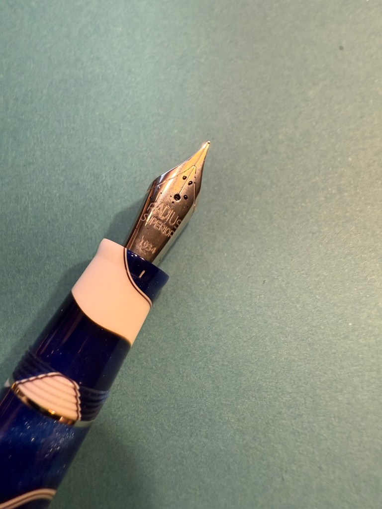
Radius imprint on the nib
I love both the blue, white and brown swirly resin of this pen and the art deco-ish band. It’s a big wide pen, like the Leonardo pens and Viscontis, but light and comfortable to use.
Radius branding and band
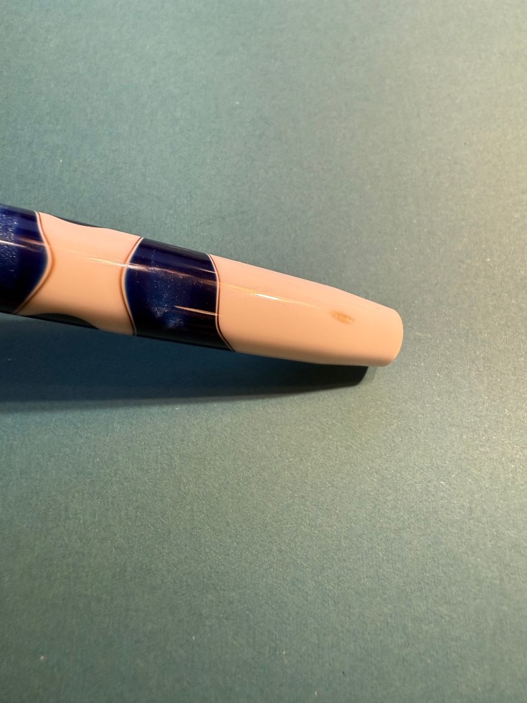
One tiny minus with my pen is that as the bottom part of the body tapers down, a smudge of brown resin was left, making it look like there’s permanent dirt on the pen body. Not ideal, but it’s something I can live with.
The smudge
Here’s a writing sample of all three inks on Col-O-Ring cards.
Ink samples
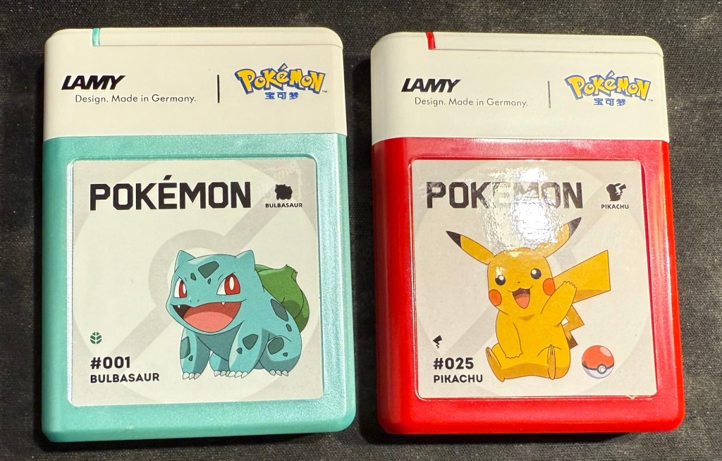
And as a silly little treat I also bought two cartridge boxes of Lamy Pokemon ink cartridges. They are filled with regular black Lamy ink cartridges, which I knew, but is still disappointing – a teal and a red would have been better.
It’s been a while, mostly because life has been hectic, not because I don’t have things to write about. Here’s to trying to get more posts in, even if they aren’t perfect or particularly long.
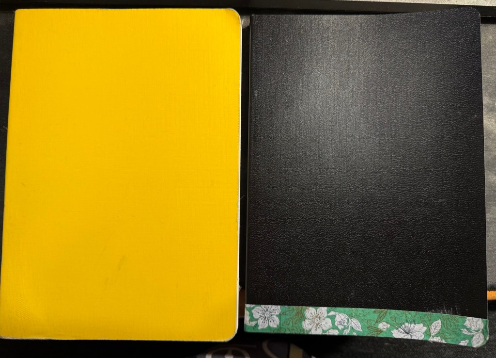
I’ve just finished another journal (the yellow one on the left in the photo below) and have set up my new one. Both are Stalogy 365 B6 notebooks, and both have a similar initial setup:
1.I flip the notebooks upside down so that the header with the dates is on the bottom and out of the way, as I don’t use it.
2. I use the front endpaper to write an “in case of loss” message (my name, email, phone number and a request for the finder to do the right thing).
New journal on the right, old journal on the left.
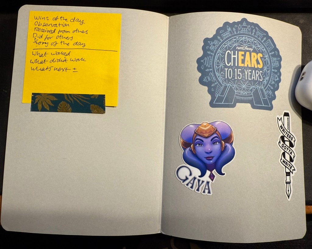
3. I use the back endpaper as a sort of “dashboard”. One side gets stickers on it, the other gets a post it with some journaling and review prompts.
Endpaper view of the new journal.
My new journal’s cover was damaged in transit, so I covered the worst of the damage with washi tape. It adds some character to the black cover, and if it gets too grimy or peels off I can always replace it.
My old journal lasted me for 5 months, which is about what these notebooks last for. My Moleskine journals lasted for 3-4 months because they had fewer paged and I used them for scrapbooking as well.
In other news “Writing at Large” is 10 years old. I never thought that I’d be publishing it for so long, but I’m glad that I started it way back in July of 2015, and I hope to keep it going for many years more. I’ve been through a lot over the past decade, and this site reflects a tiny part of that. If I can recommend something it’s to invest your time in your own site and your own work instead of on social media. If you persist, it pays dividends.
Reading
Finished The Day of the Jackal by Fredrick Forsyth and found it fascinating. I’m planning on reviewing it here.
Started on We Solve Murders by Richard Osman and I’m working on some Ulysses posts.
Health and Fitness
It’s getting hard to run outside, harder than it ever was, in this heat and humidity. Global warming is making treadmill runs more attractive. I’ve started using the NRC app‘s guided treadmill runs and they are pretty good and making treadmill running more bearable.
A mixture of some pens left over from last month, coupled with a slew of new pens in mostly long unused inks characterizes this month’s lineup.
The paper is Hobonichi Techo 2024 this time (I bought it on Black Friday, to compare with the original Tomoe River Paper in my 2014 Hobonichi). The paper in it is almost as good as the original Tomoe River Paper for showing off ink properties.
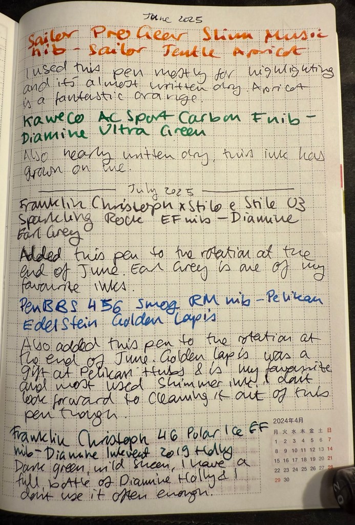
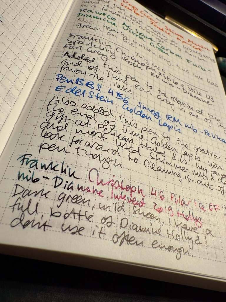
From June’s rotation I only have:
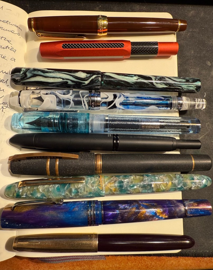
The mauve Sailor Pro Gear Slim with a music nib and delightful yet discontinued Sailor Jentle Apricot. A readable reddish orange ink with generous shading.
Kaweco AC Sport Carbon fine nib with Diamine Ultra Green. It’s almost written dry but has seen less use than I planned since I’m not in love with the ink colour. It is growing on me though.
Writing sample on Hobonichi 2024 paper
In the end of June I added two new pens into the rotation:
Franklin Christoph x Stilo x Stile 03 Sparkling Rock EF nib with Diamine Earl Grey. Earl Grey is still one of my favourite inks and if you want a readable, interesting grey I highly recommend it.
PenBBS 456 Smog with a RM nib and Pelikan Edelstein Golden Lapis ink. I have no idea what possessed me to fill a vacuum filler with this ink, but I’ll pay for that later. Golden Lapis was a gift from the Pelikan Hubs and has turned out to be my favourite shimmer ink.
Closeup on the sheen on Diamine Holly
The proper July inked pens are:
Franklin Christoph 46 Polar Ice EF nib with Diamine Inkvent 2019 Holly. I reviewed this ink here and I liked it enough to purchase a full bottle of it, though I have rarely used it since. Holly is a dark blue green with a wild red sheen and is saturated enough to pass as a serious businesslike black at a cursory glance, so you can sneak it into office use 🙂
Pilot VP Matte Black M nib with Pilot Iroshizuku Chiku-rin ink. I used to use my VPs a lot more, especially to take notes in meetings, but now I rarely use them because they have a tiny ink capacity and are a bit of a pain to clean out. They do have beautiful nibs, and I wanted a cheerful green ink so the pairing works well.
Visconti Homo Sapiens Lava black EF with Sailor Shikiori Yama Dori – this is the original Homo Sapiens pen, before Visconti did dozens of versions of it, when it took the pen world by storm. I bought mine at Mora Stylos, and they customized the finial with my initials. Yama Dori is a peacock blue with red sheen, and is a wonderful ink in Sailor’s annoying flat Jentle ink bottles.It was almost impossible to fill this pen due to the bottle shape.
Writing sample on Hobnonichi 2024 paper
Esterbrook Estie Sea Glass Journal nib with Diamine Aurora Borealis. I love the Journal nib, and it really shows off the gorgeous teal of Aurora Borealis. There’s some shading with this ink and a hint of red sheen. This ink is one of the few I own in both bottle and cartridge format.
Leonardo Momento Zero Grande 2.0 Galattica Universe F nib filled with Montblanc The Beatles Psychedelic Purple. A wild pen and a wild ink that have wildly jumped in price over the past year or two. I have a handful of Montblanc inks, but I’ve been priced out of the brand now. Leonardo makes great pens, but I no longer feel the need to buy every limited edition they come out with. The Beatles purple is a wonderful PURPLE – bright, not muddy and perfectly midway between red and blue.
Last but very far from least Parker 51 Plum F nib with Sailor Jentle Peche. A rare 51 and a long discontinued ink coupled together to make sure that I use the good china. Parker 51 pens are my favourites, and this one is a gold capped aerometric with a fantastic nib.
The pens in order of appearance here, from top to bottom.
A smorgasbord of stuff for your delectation to celebrate my birthday. You can read part 1 here and part 2 here. Only one more part after this one…
23. Lightening Book Review #3: The Vinyl Detective – Noise Floor by Andrew Cartmel. This is the the 7th Vinyl Detective book and possibly the weakest so far. Set in the world of 1980s electronic music it’s not about finding a rare vinyl record this time, but rather finding an aging electronic musician. There’s the usual hipster/foodie/audiophile vibes but the plot is air thin, you will immediately know whodunnit in the whodunnit, and there’s a desperate attempt to give this Scooby-Do style adventure an “edginess” using aging threesomes and references to John Fowler’s The Magus. There is the usual boring insistence on describing every turn in every journey the protagonists take, and the characters are even more cartoony than usual. The only truly enjoyable scene is the village fête in the end, and even that is highly unbelievable. Feel free to skip this one, unless you’re looking for a cozy, featherlight read between other books and there’s nothing better lined up.
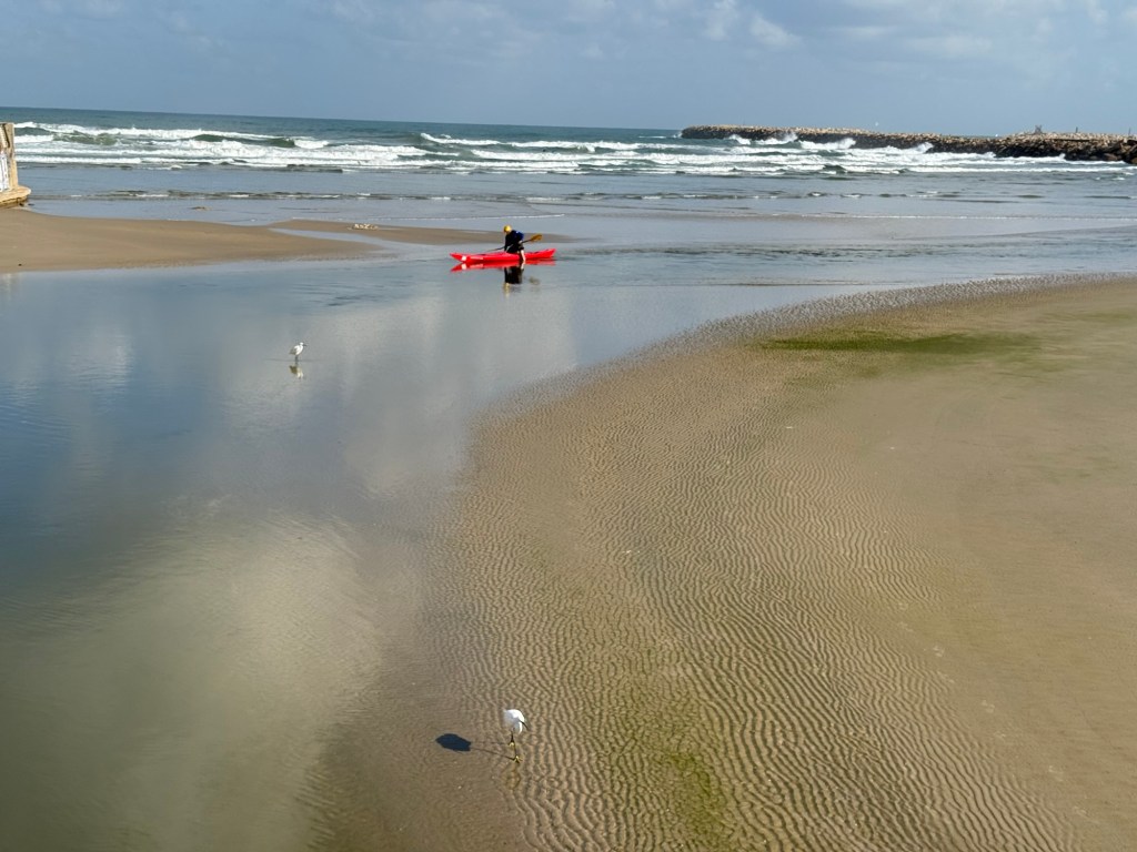
Scene from today’s run
24. Lightening Book Review #4:The Vinyl Detective – Underscore, by Andrew Cartmel. This is why I still read this series – a cozy and highly imaginative adventure with a likeable cast, in a charming and vivid setting. The crime is stylized, the new characters are vivacious and it reminds me of my favourite book in the series, Victory Disc (book #3). Take a trip back to London in the 60s, with a dash of family drama, a hint of Italian passion thrown in, and of course a sprinkling of good music.
25. Lightening Book Review #5:The Thursday Murder Club, by Richard Osman. While we’re on the topic of cozy mysteries, this one was a treat. Unexpected plot full of twists and turns, a memorable and original cast of characters, a unique setting, humour and heartache, and a it dared to touch on actual issues with substance (aging, sickness and death, religious oppression, capitalism and corruption, and the limitations of the law and its enforcers). A very enjoyable read and not just because Elizabeth is now one of my favourite fictional characters.
26. My Apple Watch Ultra 2 has been acting up lately – it’s almost 2 years old and it’s been losing battery power and struggling to keep track of my laps in the pool. So far a full charge and a restart before every swim have helped, but it’s annoying. A watch at this price level should be able to last for 3 years at least, and yet we’ve somehow been trained to expect to upgrade our watches every year or two at the most, if only because they lose their ability to keep a charge after the first year or so. Originally my watch lasted almost 3 days between charges (and I’m a very active person). Now I have to charge it once a day. I’ve been contemplating moving to a Garmin for my workouts and switching back to an analog watch, but I use some of the Apple Watch capabilities to keep track of my health post treatments, so we’ll see.
27. I have ordered the Moleskine Limited Edition Peanuts notebooks (the yellow lined large hardcover and two sets of the extra large cahier notebooks). There’s something about this collection that I find irresistible, and so they will be part of my birthday gifts this year.
28. There’s something tragic about an unfilled and unfulfilled notebook and I have too many of those lying around. I’m considering what to do with them, especially with those that I’ve started using and have abandoned after a few pages. Let me know in the comments if you have any ideas.
29. Tomorrow I start reading Ulysses having just finished The Obstacle is the Way, the last book that I planned to read in May.
30. Lightening Book Review #6:The Obstacle is the Way by Ryan Holiday. I read the 10th anniversary edition of this book, which has a new introduction and a few additions to it. This is a very digestible intro to stoicism, competently written and researched by a man with a marketing background, but it had the same affect on me that Seth Godin’s books have: it glanced on my brain and left no mark. It was hard to concentrate on this book not because it was challenging but because it was not: it was like eating easily digestible, flavourless popcorn with sprinklings of anecdotal salt at the beginning of each tiny chapter. You are left hungry and unsatisfied at the end, not sure what exactly you consumed. Philosophy should make you sit up and pay attention, think, stretch your mind and sweat a bit. It was divorced from its gravitas, substance and challenge in this book, and that’s a pity.
31. There’s no greater joy than crumpling yesterday’s to do list and tossing it out.