Retro 51 Dino Fossil Review

My Retro 51 Dino Fossil arrived in the mail, and I’ve been using it throughout the weekend. It was a completeimpulse buy, and I kind of regretted it once I bought it and before I got it. I thought that I’d never use a pen with bones on it, fossilized dinosaur bones or not.

It turns out I was wrong.

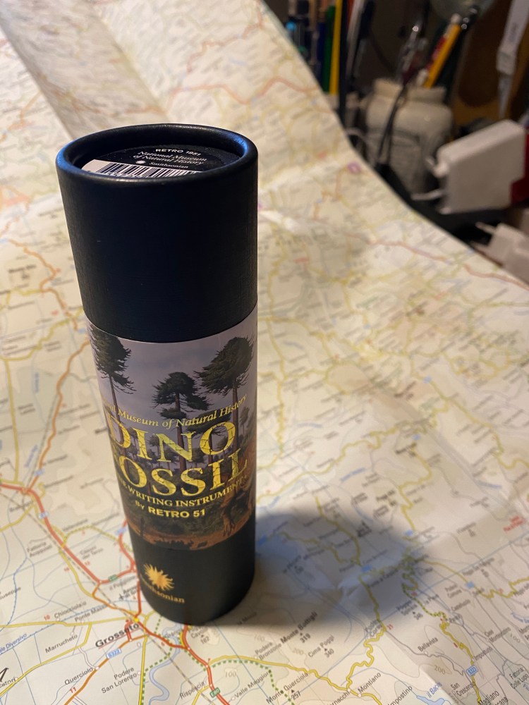
I don’t care much for packaging, but this packaging was cool. The gold embossing really adds a classy touch to it, and the Smithsonian logo pops on the background of the black tube.

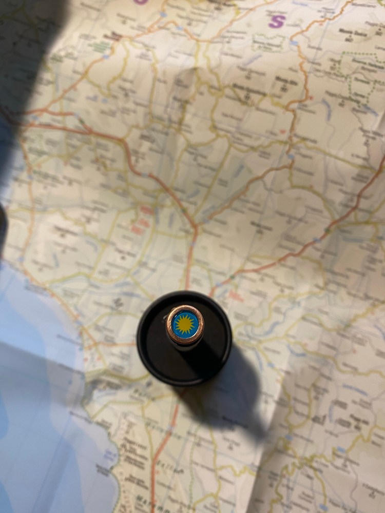
That same logo also appears, in full colour, on the finial/top disk of the pen, and it adds a welcome bit of colour to it.

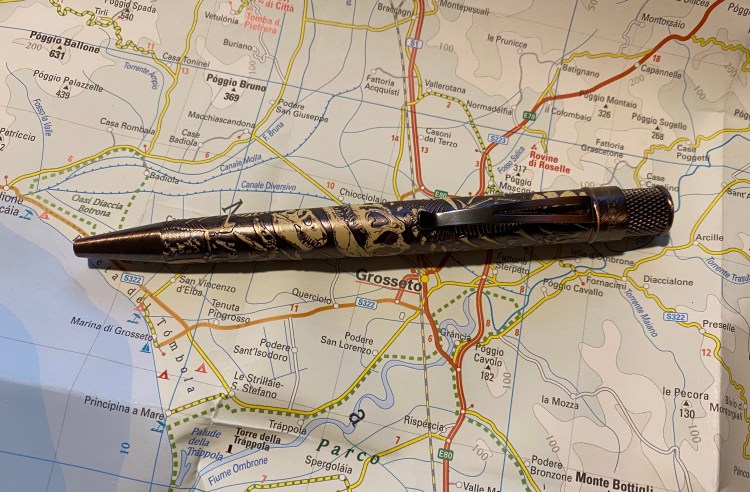
The pen is copper, much like the Retro 51 vintage metalsmith Lincoln, but there’s a lot of added texture to that copper. There’s brushed copper on the pen hardware, a dark matte copper on the pen body, and embossed dinosaur fossils that are partially painted.

The result could have been busy, but ends up working phenomenally well, while at same time making it almost impossible to properly photograph. The copper glows with warmth that makes the pen come to life.

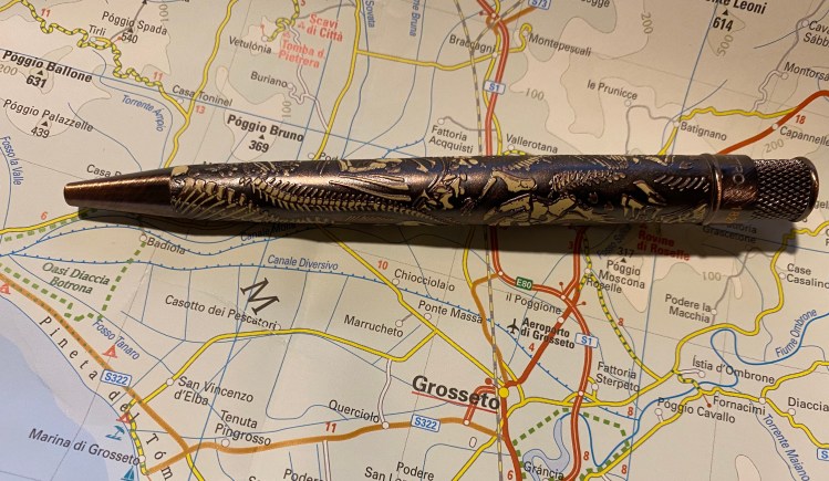
It somehow doesn’t look tacky in person, but rather classy and somehow understated. The pen’s copper body draws more attention to itself that the bones do, because of their muted off-white colour.

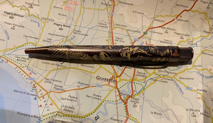
The other thing that surprised me is that the Dino Fossil is numbered. I wasn’t expecting that, and the seller I got it from didn’t mention it, but just in case you care, on the band below the twist mechanism there’s a number, and “Smithsonian” where there usually is “Tornado” etched in. The number also appears on the cardboard tube the pen comes in.

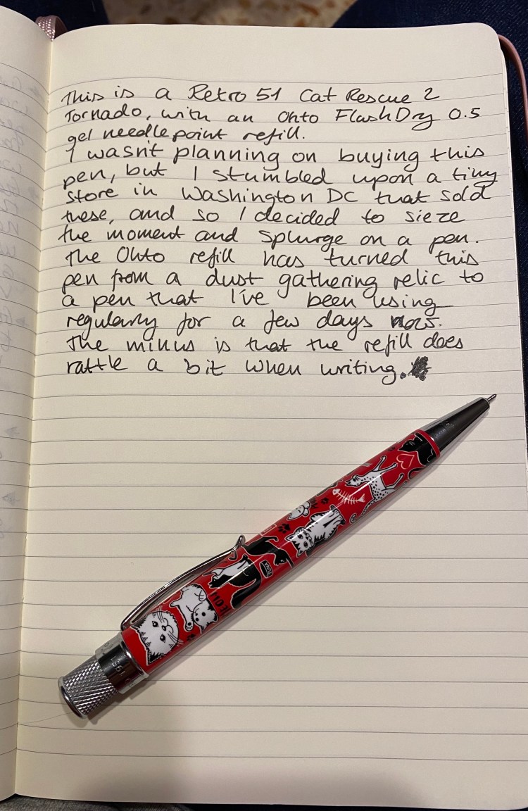
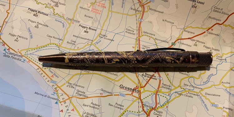
The dinosaur fossil embossing makes this pen really easy to grip, and pretty enjoyable to write with. As usual I swapped out the Schmidt refill it comes with, replacing it with an Ohto FlashDry 0.5 gel refill.

The Retro 51 Dino Fossil was a pleasant surprise: a pen that I thought I bought for gifting, and turns out to be one of my favourite Retro 51s to date. I’m likely going to say goodbye to my Lincoln before this, and I recommend it if you have even the slightest affinity to dinosaurs, natural history, archeology, the Smithsonian or beautiful copper pens.

Retro 51 Dog Rescue 3 Review

I bought three new Retro 51 pens once I heard that they were retiring: Dog Rescue 3, Cat Rescue 3, and the Smithsonian Dino Fossil. I was planning on giving them a try as part of my Retro 51 Challenge, and if it turned out that I didn’t enjoy them, gifting them (or at worst, reselling them).

The Dog Rescue 3 arrived a few days ago, inside one of the cutest tubes that Retro 51 has designed.

5% of proceeds from this pen goes to Operation Kindness, which is nice, but probably won’t move the needle much. I donate yearly to a local animal shelter, and if you’re buying stuff just to donate, it’s better to not buy the stuff and just donate. This is a great looking pen though, so if you like it, by all means buy it, feel a little good about the donation, and then go and donate to Operation Kindness or a local shelter directly.

The operation kindness on the finial/top disc is a great touch.

The red on the finial is echoed in the dog illustrations on the body, which works really well. The illustrations/cartoons themselves are the best part of the this pen. You can totally see different dog personalities here, not just different breeds:

There’s even an eye-patch dog – can you spot him?

The hardware on this pen is shiny silver, and though it works, it isn’t one of the highlights of this pen. I suspect that the Dino Fossil’s one will be more interesting.

I replaced the standard Retro 51 refill with an Ohto FlashDry 0.5 one and it’s a joy to write with now.

The Retro 51 Dog Rescue 3 is a delightful pen that brings a smile on my face every time I pick it up. It would make for a great gift for a dog lover or a Retro 51 aficionado.

Tournament of Books 2020: Optic Nerve

43793635. sy475

María Gainza’s “Optic Nerve” is a pleasant piece of what I now know to be termed “autofiction,” which is to say that it’s “fiction” based on the author’s life. It’s a nice way to while a way a few short hours, especially if you enjoy art history (or to be honest, art gossip). “Optic Nerve” is readable, inoffensive, largely forgettable, like most trivia-based works of its kind. There’s nothing to hate here, but there’s also not much to really love: the book remains on surface level with itself and its reader.
There are interesting and complex “characters” here, but the narrator is too self involved to get to know them, or too busy keeping herself at opaque for us to see them well. They are marks on the paper, nothing more, nothing less. You know nothing more about them, the artists or the narrator than you did at the book’s start. It’s a little disappointing, since it’s clear that Gainza knows how to write and is well aware of the dangers of judging an artist by the anecdotes we know of their lives.

I read this as part of the Tournament of Books 2020, where it’s up against Caleb Crain’s “Overthrow” in the 5th round of the tournament.

Tournament of Books 2020: On Earth We’re Briefly Gorgeous

42111754. sy475

Ocean Vuong’s “On Earth We’re Briefly Gorgeous” is more of a memoir in poetry than it is a novel. Even as you read it it’s clear that this book is so autobiographical that practically only the language use in it is fiction. It’s a sharp, painful and beautiful memoir, and I’m glad that it exists, but it’s just not a novel, so it’s impossible to judge as one. The characterization is brilliant, but it’s clear that these characters are very real, and their complex relationships and behaviours are recorded from life. There’s no plot except the protagonist’s life, Vuong’s life. The writing is wonderful, although it’s not an easy read. It’s poetry from start to finish, and it expects the reader to work for their reading.
There are more and more “fictionalized non-fiction” books that are being published as fiction, and some of them are excellent. It’s just makes the task of judging them against “fiction fiction” much harder.
So a recommended read (it does require a strong stomach. There are some very disturbing images and scenes that appear again and again in the narrative), but one that also calls into question the definition of fiction.

I read this as part of the Tournament of Books 2020, where it’s up against “Nothing to See Here” in round four of the contest. It’s so hard to compare these two books, even though they both deal with childhood trauma, loss and being impoverished outsiders in a world that values wealth and conformity. “Nothing to See Here” is entirely a work of fiction, while “On Earth We’re Briefly Gorgeous” is so very clearly not. Vuong’s work is more culturally significant, but I enjoyed “Nothing to See Here” so much more, and it’s such a risky and clever piece. I wouldn’t argue with anyone picking “On Earth We’re Briefly Gorgeous” as the winner of this round, but my pick is Kevin Wilson’s “Nothing to See Here”.

Retro 51 Cat Rescue 2

An utterly non-Instagram ready journal entry about this pen, including my terrible handwriting. 

In November 2017 I went to a business convention in Washington DC, and while there I stumbled upon a tiny stationery store that had some Retro 51’s for sale. I liked the red colour of this pen, and some (not all) of the cat illustrations on it, and so I bought it. It was an utterly unreasonable impulse buy, because at the time I already knew that the Schmidt refill rendered my Retros virtually unusable for me, and I was years from finding a suitable replacement refill. The pen gathered dust in a pen cup on my desk for the past two years, until this week.

The finial/top disc is one of Retro 51’s best designs.

As part of my decision to use my Retro 51s more, I replaced the (dried out) Schmidt refill in this pen with an Ohto FlashDry gel ink one, and I’ve been using it pretty regularly for the past few days. It’s a bright and cheerful pen that writes like a dream now, even though in a quiet room you can definitely hear the tip rattle a bit as you write.

There’s no texture to this pen, the rescue cats are just printing on it, and I wish Lucy Kinsley had drawn them. So I’m not yet sure if this pen stays with me or I’m going to gift it to a cat loving friend, but for now I’m enjoying giving it a spin.

Retro 51 Vintage Metalsmith Jefferson

I bought this pen in November 2014 from Jetpens after eyeing it for a while. I thought it looked so cool, and I still do. There’s just something about the finish that makes it a little unpleasant for me to hold.

The Moleskine gel refill was great. It’s a shame that they’ve stopped producing it.

Tournament of Books 2020: Nothing to See Here

44527740. sy475

Kevin Wilson’s “Nothing to See Here” is a sharp, fresh, unputdownable gem of a novel. A heartwarming story about finding your tribe and embracing your weirdness in a world that’s all about conformity. Larger than life gorgeous characters that aren’t caricatures, a page-turning plot that still leaves them room to breath and grow, and an interesting take on family, love, opportunity and class.
Plus, it’s a funny, fun and original read.
I highly recommend it, and I definitely will reread this book again.

I read “Nothing to See Here” as part of the 2020 Tournament of Books, where it’s up against “On Earth We’re Briefly Gorgeous” in round 4 of the competition.

Tournament of Books 2020: Mary Toft; or, The Rabbit Queen

46675302. sx318

A very surprising book. I was expecting a grotesque horror story, and I got nothing of the sort.
In “Mary Toft; or, The Rabbit Queen” Dexter Palmer takes a historical event and greatly expounds upon it to create a clever and subtle work of fiction which is at times breathtaking in its endeavours. This is a bildungsroman, it’s a tale of mastery and apprenticeship, it’s a love story, and most of all its a story about truth, fiction, and the complexity and variety of what lies between the two, and what defines them. The 18th century was the Age of Enlightenment, yet, Palmer says, look how dark and fragile that enlightenment was, and look and tremble at how dark and fragile our current age is. For the tale of Mary Toft in the 18th century is also the tale of flat-earthers, anti-vaccers, “Fake News” current West civilization, and it’s also the same tale of women who’s voices aren’t heard, who are abused, ignored, deemed “cow-like” and only good enough for breeding, who cry in pain in a room full of doctors that not once ask her how she’s feeling.
So why 4 stars and not 5? Because there’s a tremendously cruel and grotesque bit in the London part of the novel that I understand why Palmer brought in, yet I still wish he hadn’t. After a line or two I skipped the part, and my reading wasn’t spoiled for it. So: 1. Once the bull shows up in the arena, skip to the end of the chapter. 2. If I could skip the horror and not miss a bit, then Palmer could have done without it.
A very interesting, clever and subtle tale, worth reading and contemplating upon.
I read this novel as part of the 2020 Tournament of Books, which is fortunate, because otherwise I wouldn’t have even heard about it. It’s going up against Sally Rooney’s “Normal People”.

Visconti Homo Sapiens Bronze Age Review (or Falling in Love with Fountain Pens Again)

In late 2014 I visited the wonderful Mora Stylos in Paris, France. I was there to buy a pen. A specific pen. One that had made a buzz in the pen world the moment it came out. The Visconti Homo Sapiens:

There are dozens of Visconti Homo Sapiens reviews out there, and so I wasn’t planning on reviewing this pen. Yes, it’s beautiful. Yes, it has a satisfying heft to it, the material feels amazing to the touch, the nib has some delightful springiness to it, and did I mention that it’s a hulking large, beautiful pen?

It’s also a very, very expensive one. It was the most expensive pen I had purchased until then, and since then only three other pens in my collection have come close to it in price (my Nakaya, my Henry Simpole Silver Overlay Conway Stewart, and my Oldwin).

I remember spending a lot of time in that store, holding the pen (it’s large and I have tiny hands), trying out the nib (I bought an Extra Fine. Today I would have gone for something broader), debating the price of pen.

Look at that patina!

In the end I liked the aesthetics, the nib, the unique filling mechanism, and the story around the pen enough to buy it. As I bought it from Mora Stylos, it was customized with my initials on the finial. This made the pen even more special and precious to me.

The finial can be customized by dealers, using a special magnetic mechanism.

I got home and I couldn’t get enough out of just looking at this pen, this piece of art that looked like it belonged in a museum.

Just look at the nib and the clever closing mechanism.

Who would want to sully this with ink, right? I could accidentally drop it or something.

A closer look at the scrolling on the nib and the patina on the band.

But I forced myself to fill it and try using it, if only at my desk at home. I loved writing with it. It’s truly a joyous pen to write with, especially if you have a light touch. The nib is something else, comparable to my Nakaya in terms of feel.

But then I had to clean it out. And that was an absolute nightmare that took ages and  ages. The filling mechanism was great to use, but terrible to fully flush out. Who has the time for that, especially for a pen that I daren’t carry with me at all times?

So over the past 5 years I’ve used my Visconti Homo Sapiens a grand total of three (!) times. It stands to reason I should sell it and let someone else enjoy it. Yet I can’t bring myself to do that. Why?

You see, I’ve grown lazy in my fountain pen use over the years, and this pen was one of the turning points. Fountain pens require effort. They have always had. That’s why people moved to ballpoints the moment they were a semi viable substitution. Fountain pens can be messy. They need filling and cleaning, and care during use and storage and while cleaning them out. You don’t use them for convenience, you use them because they bring you joy.

I’ve lost touch of that, just as I’ve lost touch with the joy of playing around with various inks. My pen usage has fallen into a rut of mostly easy to clean inexpensive cartridge-converters or TWSBI pens filled with easy to clean inks.

Diamine Denim, which I haven’t used in more than two years and used to be one of my favourite inks. Still is.

It has taken me a while to realize that. As I was building my goals for 2020 the realization that I’ve stopped actually enjoying my pens and ink dawned on me, and I’ve decided to see if I can’t change that.

So I filled my gorgeous Visconti Homo Sapiens, and I actually carried it with me in my bag (the skies haven’t fallen yet and the pen is OK), and I’m thoroughly enjoying using it. And I dusted off my beloved Diamine Denim, one of my favourite blue-black inks and previously one of my favourite inks that has seen absolutely no use over the past two years, and I’m giving it a spin. It’s as richly delightful as it ever was. There’s no sparkle or sheen to it, and not much shading to speak of, and yet I still love it. Diamine Denim is just a very good blue-black ink period.

So, who knows what the future holds, but I hope that this pen that does so much to evoke humanity’s past will get me interested again in my fountain pen future.

Tournament of Books 2020: Lost Children Archive

40624441

Valeria Luiselli’s “Lost Children Archive” could have been a great novel. All the ingredients are there. And I mean ALL of the ingredients are there. There’s a solid and enticing plot. There are potentially interesting an unique characters. There’s an obviously intelligent and accomplished author behind the scenes. There’s a hauntingly beautiful (and at times chilling) setting.
And it all falls flat.
Like an artist that doesn’t know when to stop painting, or a baker that doesn’t know when to stop embellishing, or a designer that has to add “just one more frill”, “Lost Children Archive” is extremely overworked. The result is at times barely readable, and at all times airless, stodgy, bloated. There are too many references layered onto a plot that would have been excellent if it had only been given a chance to flow freely. The characters, potentially excellent, become so iconic they are no longer relatable, realistic, living human beings.
This is such a tremendous shame, because all the ingredients are there, and with a little bit of tweaking and pruning this could have been a powerful novel about migrant children, families falling apart, genocide, memory, loss. As it is, it’s reads like an overly worked “New Yorker” piece – so cerebral it’s lost all its heart and momentum.
I read this as part of the Tournament of Books 2020contest, where it’s up against the phenomenal “Girl, Woman, Other,” and I will be stunned if Evaristo’s book will not trounce it. Read this only for the potential.