Parker Quink Blue Black Ink Review

Parker Quink Blue Black is far from a new ink on the market: it’s been produced and in use for decades. So why bother to write a review about it now?now

Because Covid-19 happened, and it’s turned shipping and shopping into a challenge, and so I have found myself seriously contemplating a “desert island” kind of question:

If the only ink you can buy is ink commonly found in brick and mortar shops, which ink should you buy?

The obvious answer for me is anything Waterman, but specifically Waterman Blue Black, now renamed to “Waterman Mysterious Blue”. But Parker Quink Blue Black is just as readily available, and just as cheaply priced (more or less), and also a workhorse, utilitarian ink that packs a few surprises. So why is it not my go to ink? I’ll get to that near the end, I promise.

Two swabs of the same ink: how are they so different?

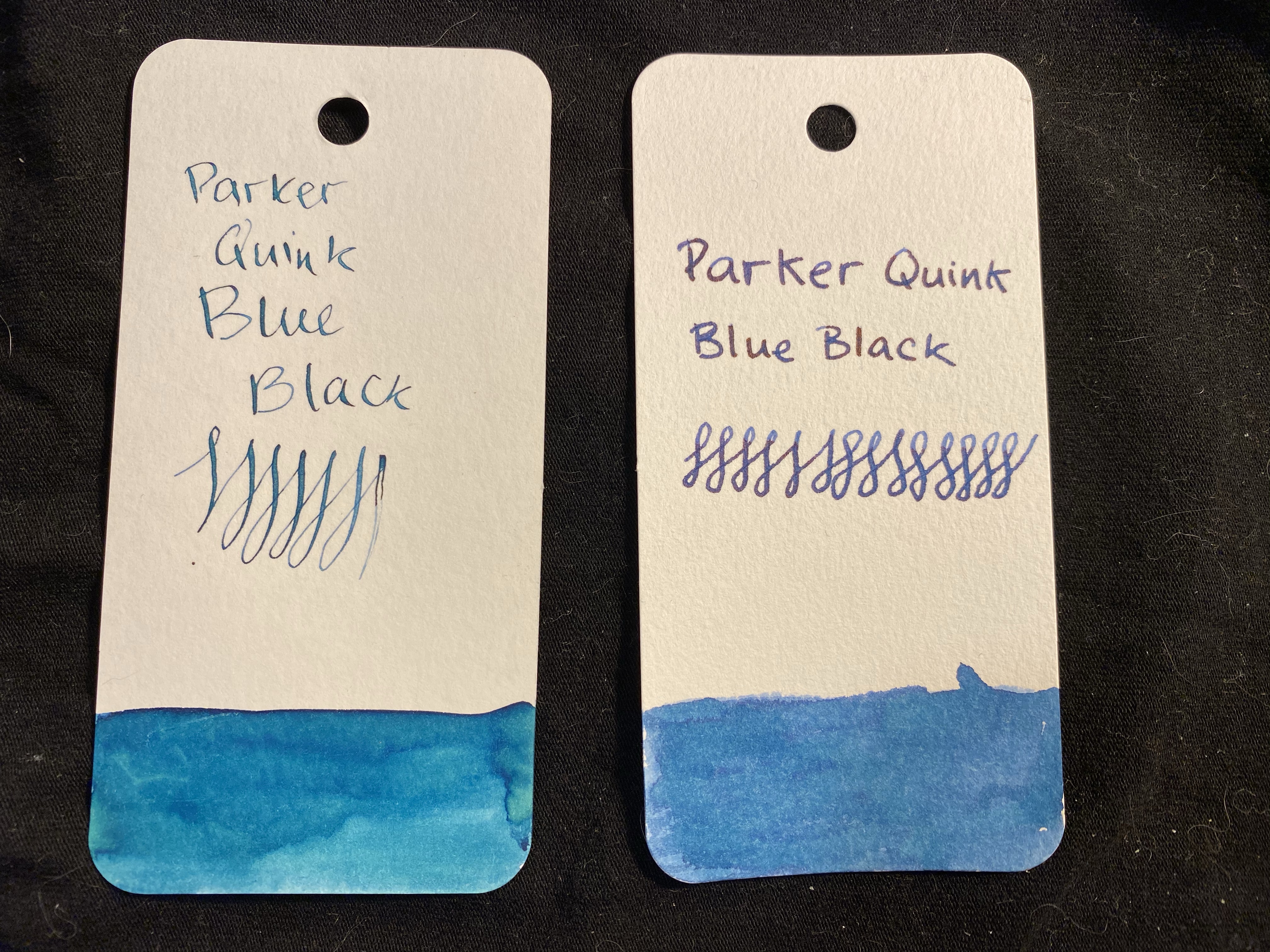
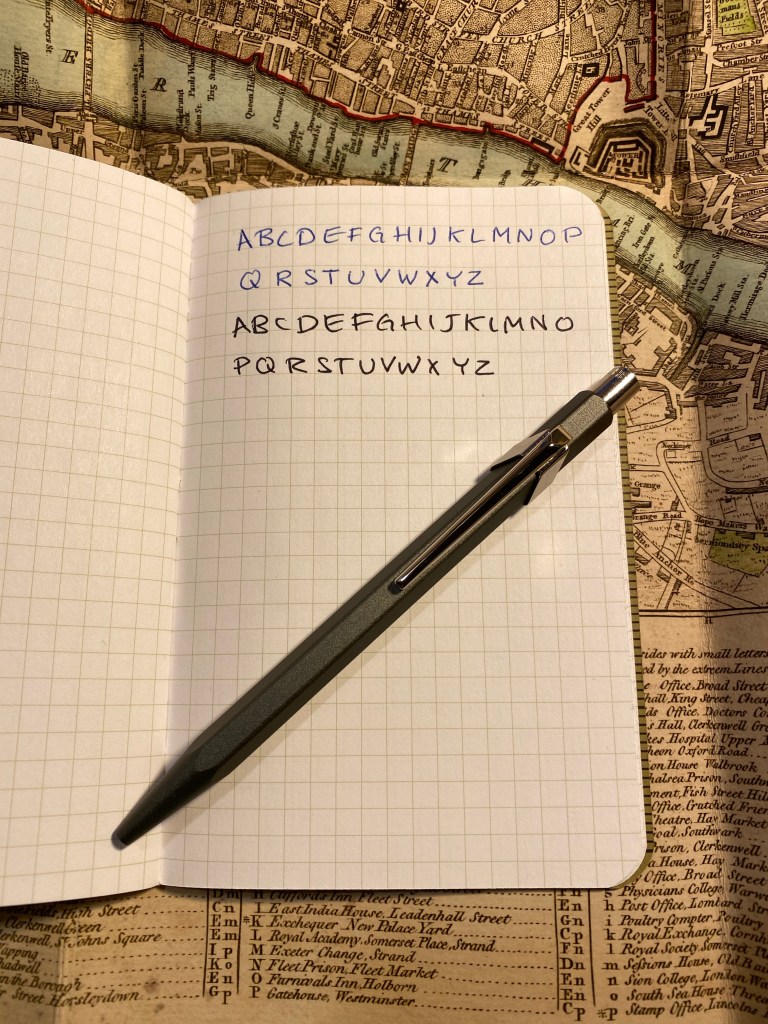
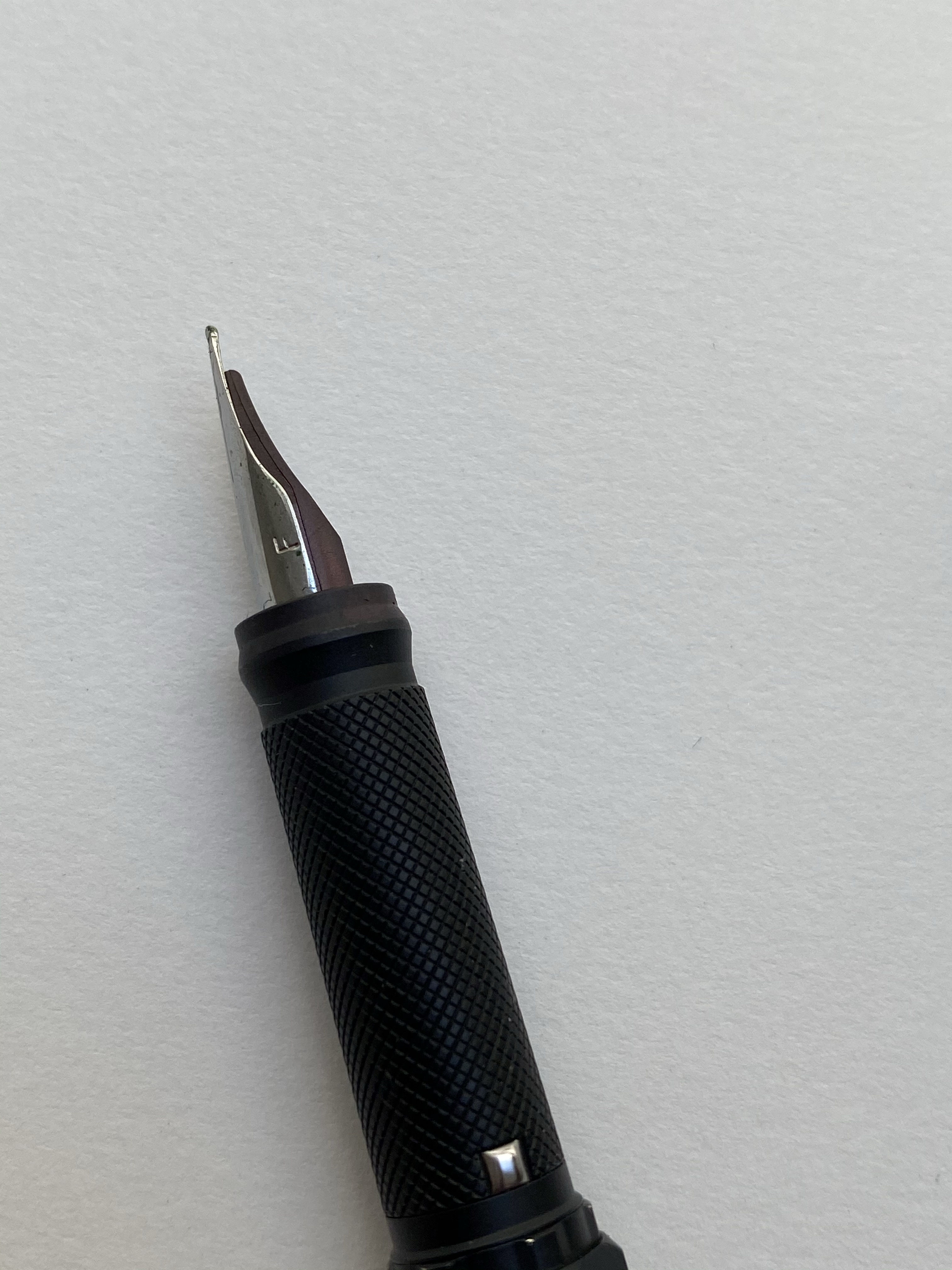
I took two swabs and writing samples of the Parker Quink Blue Black, mainly because I thought that the first swab didn’t show off the correct colour of the ink. The left hand writing sample was done with a dip pen, and the swab was done with a brush. The right side was done with Henry Simpole’s Jasmin pen and a Conway Stewart medium nib, with the swab being done with a q-tip. The right hand sample is truer to the colour of the ink, although you can get a more teal/turquoise colour out of the ink in certain nibs (as is true with Waterman Mysterious Blue). This changeability is part of the charm of blue-black inks.

It’s also worth noting that Parker Quink Blue Black both shades and has a red sheen, so it’s far from a bog standard, boring ink. Here’s an ink that can be fun at the same time as it makes you look serious.

Comparison swabs.

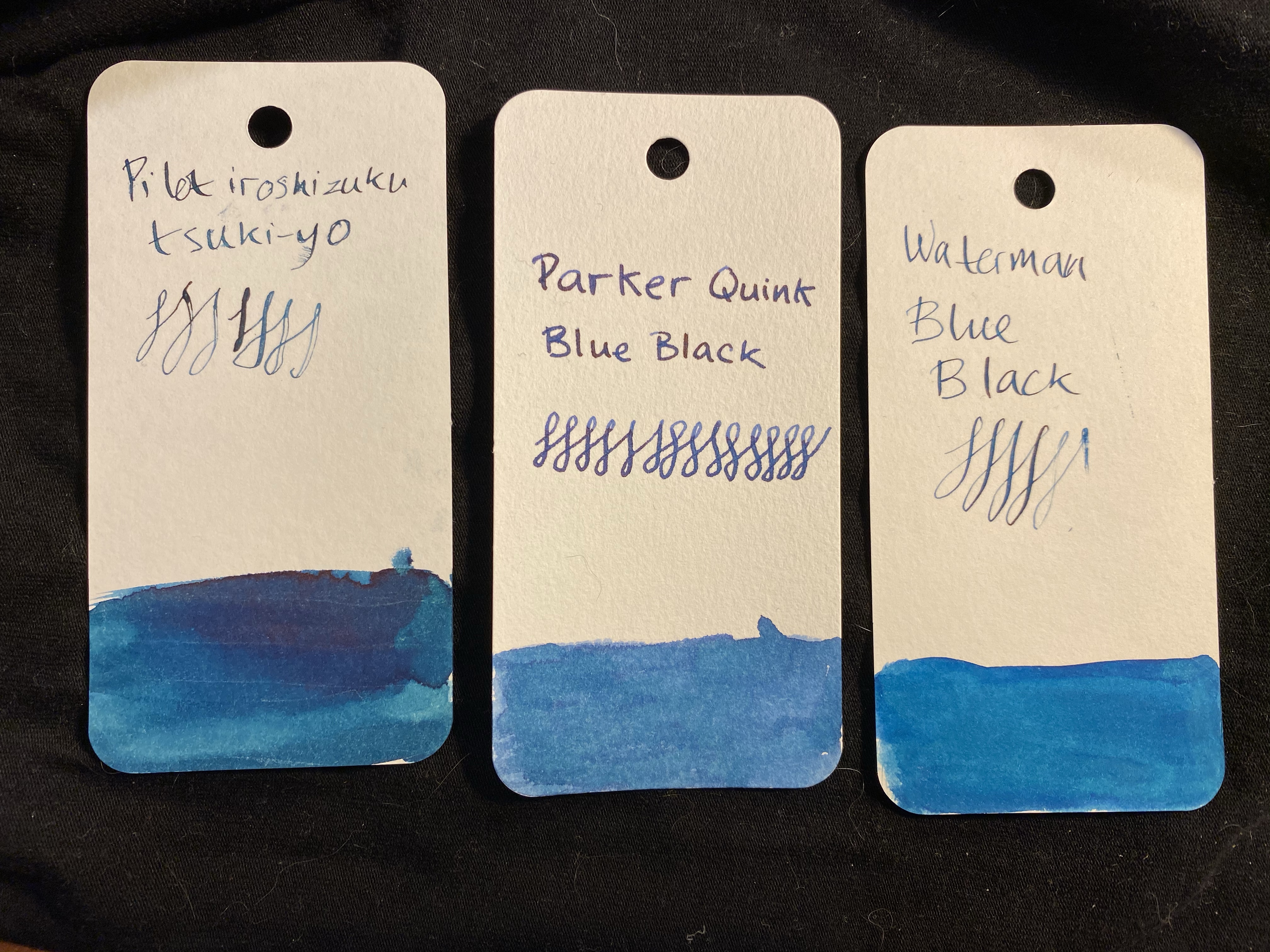
Waterman Mysterious Blue leans a bit more into the teal/turquoise side of things, but it doesn’t sheen as much as Parker Quink Blue Black. Here’s the ink on Paperblanks paper (I snagged a fountain pen friendly Paperblanks a few years back and have been using it to test inks ever since):

You can see the shading particularly in my swirls.

There’s a red sheen even on the Paperblanks paper, in every spot where the ink pooled (so the bottom half of these letters for instance):

If you can’t see the red sheen, look at the sample below.

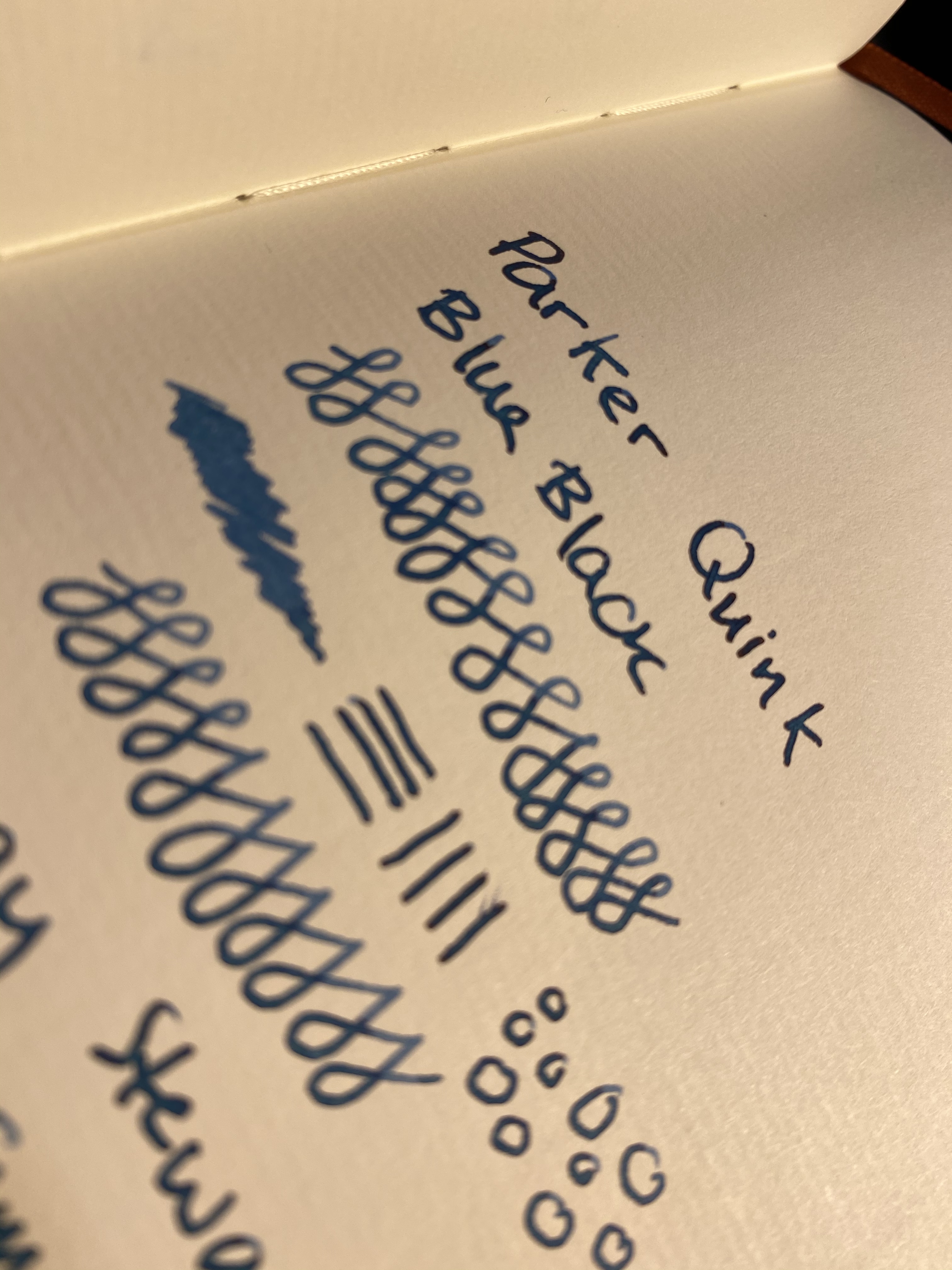
And here it is on Tomoe River paper, showing off shading and sheen. The photo came out a shade lighter than in reality, but that was the only way that I could show some of that sheen off.

Parker Quink Blue Black is neither waterproof or water resistant, just like Waterman Mysterious Blue. Yet it takes a bit more time and effort to clean the Parker ink out of pens than the Waterman’s (my gold standard for easy cleaning ink). It’s vintage pen safe, and an excellent staple ink, available practically everywhere that sells stationery or art supplies. In times where shipping prices have skyrocketed and many places no longer offer shipping to all destinations, it’s good to know that there are still good, cheap and widely available ink options out there.

Stay safe and stay as much as possible at home.

Ti Mini Review

Look what arrived in the mail today! It’s the Big Idea Design Ti Mini, fresh from their latest Kickstarter. I generally love all Big Idea Design pens (except the for the click, which I still enjoy, though it’s not my favourite), but I still hesitated before backing this one. The form factor is so “extreme” that I wasn’t sure that I’d like it or find use for it. A small pocket pen (i.e. a pen that’s small even for a pocket pen), the Ti Mini is a titanium machined pen that uses D1 refills and is basically built for the watch/change pocket of your jeans. It’s the emergency pen you pull out when you need to scribble something on a note, something that you can carry around without even remembering it’s there until you need it.

The post was enthusiastic so the package got a bit smashed in transit.

The packaging is standard Big Idea Design: utilitarian, full of useful information, well thought out and designed and with a bit of an Apple vibe to it.

Smashed package, but you get the gist
That is just a great tagline
Designed by Big Idea Design, Made in China. Remind you of something?

There’s a bit of marketing material when you open the box, but I’m just going to pause and say that I’ve paid a lot more for machined pens that weren’t half as well packed as this, and the reason that my pen survived the rough-handling that my package received is because someone took the time to consider good packaging. And I’m not even someone who usually appreciates packaging (unless it’s particularly good or downright insultingly bad).

Not a scratch on the pen even though the box was smashed in.
Nice logo sticker to go with the pen.

The Ti Mini comes with two spare o-rings and six D1 refills: three gel ink refills (one in the pen, two others in the refill bag), and three ballpoint refills. All refills are Big Idea Design branded, and all of them are medium refills. You have everything you’ll need to write with this pen for months if not for years, right out of the box.

The Ti Mini in DLC Black

The pen has the classic look of any Big Idea Design pen, with an addition of a titanium bead at the end of a lanyard, to make it easy to pull out of your jeans’ change pocket. It’s an extremely well designed pen, built perfectly for its purpose.

The Ti Mini isn’t built for long form writing, but for a few lines and a scribble when you’re on the go it’s perfect. The gel ink refills that came with my pen seem to be duds, which is a shame, and the only strike agains this pen purchase. It’s not too bad though, because if there’s a pen that calls for a ballpoint refill, it’s this one.

Changing refills is a breeze: unscrew the top, and then unscrew the refill, replacing it with another D1 refill by simply screwing the refill in and then screwing the top back on.

If you’re looking for an “emergency” EDC pen, something that’s always there and ready for when you really need it, the Ti Mini is perfect for the job. It also makes for a great gift pen, even though now is not the time when people travel around much (stay at home!). Just be careful not to forget about it and leave it in you jeans when you wash them. The pen will survive, I’m not so sure about the washing machine…

Caran d’Ache Nespresso India Green

When Caran d’Ache came out with this year’s limited edition Nespresso capsule 849 pen I breathed out a sigh of relief. I’m not a fan of their India capsules, and their olive green colour doesn’t speak to me, so I thought that it would be an easy pen to skip. Their previous collaboration, the Darkhan, was an excellent pen overall, especially as a gift purchase to the Nespresso or pen lover in your life, and I also loved the capsules and loved their colour.

Well Cult Pens celebrated their 15th anniversary, and I needed some refills, and somehow or other the India 849 found itself in my basket. I thought I would gift it away, but once it arrived I knew that this pen is staying with me.

As with the previous edition, the packaging on this pen is genius. It shows off the pen and what it is beautifully, and it’s so well made and well considered. On the front there’s the “This was a Nespresso capsule” label, and a sketch of the pen that fits perfectly with the way the pen is presented in the box (that’s not left to chance. The box is designed so the pen will stay put in semi profile and show off the subtle “Caran d’Ache” logo underneath the clip).

Limited Edition, Caran d’Ache 849, Series No 02.

On the back there’s a short explanation about what makes this pen special:

Inside the pen is securely slotted in its superbly designed cardboard housing, and here you can catch the first glimpse of why I decided to keep this pen: its colour.

This is a beautiful pen that doesn’t photograph well. Its colour is wild, if subtle could be wild. It’s a cool grey with a slightly green hue. I’ve never had a pen like it, and the result is very, very cool.

Unlike most 849’s and just like the Darkhan edition, this pen has writing on it beyond the hidden Caran d’Ache and the “Swiss Made”:

Made with recycled Nespresso capsules.
849 Caran d’Ache and Swiss Made, standard imprints on 849 pens.

The 849 is a ballpoint and has an excellent out of the box Goliath Caran d’Ache refill. I’m not a fan of ballpoints, so I switched my refill out with the 0.7 Parker gel refill in black, and now I can’t put this pen down. This pen weighs more than the featherweight 849, and it has a textured finish. The result is the 849 pen, only better.

The writing on the top of the page is with the original Goliath refill, and below it the writing is with the Parker gel refill.

I highly recommend this pen to anyone who is even slightly interested in the Caran d’Ache 849, as it’s a significant improvement over an already great pen design. It makes for a great gift, and a great pen to carry around with you (just make sure nobody tries to nick it from you). I hope that Caran d’Ache and Nespresso continue this collaboration, and I can’t wait to see which capsule colour they select next.

Kaweco AL Sport Blue Stonewashed Review

I’m not a fan of pocket pens, mostly because women’s pants usually don’t have room for them. Couple that with my fear of forgetting a pen in my pocket and then putting the pants through the wash, and you can see why I have so few of them. However, in 2014 Kaweco came out with the AL Sport Stonewashed and I just couldn’t resist.

This is such a cool look for a pocket pen.

The Kawecon AL Sport Stonewashed is the classic Kaweco Sport pen, in aluminum, stonewashed to give it a worn denim look (especially in the blue version of this pen). The pen really has been worn down, so each pen is unique, and the chips and dings have been smoothed over so it still feels great to write with.

You can see the finish best on the various edges of the pen, and they just work so well with the Kaweco Sport design. This is a pen that’s meant to bash around in your pocket or bag, and the stonewashed finish just highlights that.

Caran d’Ache 849 Tropical on top, Kaweco AL Sport Stonewashed on the bottom.

The AL Sport is ridiculously small when uncapped to the point where it’s unusable, but this is a pen that never was designed to be used uncapped.

Capped it becomes a standard length pen with a pretty wide barrel, which makes it surprisingly comfortable to write with even on longer writing sessions.

The only flaw in this pen is the way that the refill tip clicks when you lift it off the page. There’s some play at the tip end, so while it won’t affect your writing style, you will hear it when you write. This is the case with the original refill and the Parker 0.7 gel refill that I replaced it with.

If you can live with that minor annoyance, then the Kaweco AL Sport Stonewashed is a marvellous pen to buy. As someone who uses mechanical keyboards, I like objects that add sound effects to my writing progress, so the little clicks this pen makes only make it more charming to me.

Vengeful Fortress Part 3: Rohrer and Klingner Lotte SketchINK Mini Review

Welcome back to Vengeful Fortress, a fantasy roleplaying game that I’m drawing in ink and watercolour (no pencil underdrawing, to save time) as I’m running it for my group of players. We’re now in Part 3, and here are Part 1and Part 2 (which also include a review of the sketchbook I’m using, the Stillman and Birn Epsilon).

As you can see, things are starting to heat up. I’m using a TWSBI Diamond 540 fountain pen with a fine nib, filled with Rohrer and Klingner SketchINK Lotte. SketchINK Lotte is a black pigmented and waterproof fountain pen ink. It’s not a saturated ink, and you can see the grey shading quite clearly here in the lettering and the line work. R&K SketchINK Lotte is also a hard starter, so while it does flow well enough when you get it primed up with a few preliminary scribbles, if you put the pen down for even a few minutes, you’re going to have to prime it again. It is, however, waterproof and relatively fast drying, which makes it worth my time using it. In case you’re wondering if “hard starting” is just an issue with this pen or this nib, I have tried R&K SketchINK Emma and Lotte in a Lamy Safari and a Super5 pen and they are hard starters in all cases. It seems to be a property of the ink, perhaps because it dries to relatively quickly, or because of the particular waterproof formula R&K are using here.

So know that you can trust the Rohrer and Klingner SketchINKs with your watercolours, and know that they’re great for when you’re in a rush and don’t want to wait for the ink to dry, but also have a bit of scrap paper for the first few seconds before you use them .

Vengeful Fortress Part 2: More Thoughts on Stillman and Birn Epsilon

You can find part 1 here. You can see that there is a slight bit of show through with the Stillman and Birn Epsilon, but at only 150 gsm that’s to be expected.

The show through is most pronounced in the area between the goblin’s sword and the text above him.

I decided to play a bit more with ink colours and wider nibs here, so that’s a Sailor medium stub nib and Diamine Inkvent Blue Edition Candy Cane ink for spells and effects:

There’s no show through for the ink, and though it may not seem that way, there was no spreading. Also, if you like granulating watercolour effects, the Stillman and Birn Epsilon paper seems to be a champ for that.

Vengeful Fortress: A Stillman and Birn Epsilon Sketchbook Review Adventure Part 1

A while ago a local art supply shop started stocking a wider variety of Stillman and Birn sketchbooks. I currently use the Stillman and Birn pocket Alpha as my daily sketchbook, but I decided to give the pocket Epsilon a try. The Epsilon features smooth, white 150 gsm pages which should work for pen, ink, dry media and light washes.

This sketchbook is in landscape format, which is what I normally prefer. I was planning to use it once I’ve finished with my current Alpha, but weeks stretched to months and meanwhile this sketchbook has been languishing away, unused.

So when I saw Liz Steel going on a virtual sketch tour in Italy, I was inspired to grab this notebook and fill it with a sketch tour of my own. I initially planned to sketch out my cancelled London trip, and I may yet do that, but something inspired me to take this idea to a completely new direction.

I’m going to sketch out a freeform fantasy roleplaying adventure for my regular D&D group, and use that as a way to test out this sketchbook, and to make good use of my fountain pens.

So without further ado: Vengeful Forest, a fantasy freeform adventure.

Sketch and writing done with TWSBI 540 Diamond F nib and Rohrer and Klingner Lotte SketchINK.

Blue lines done with PenBBS 500 Fine and Sailor Sky High ink.

Frying pan Rapunzel dressed in purple is probably copyrighted by Disney, but one of my players thought it would be funny to make my life interesting, so here she is.

I tried to give each character a distinct enough colour scheme so you’ll be able to recognize them from a distance. Each player had one sentence to describe their character.

The watercolours are Schminke and I used a Windsor and Newton Series 7 number 2 brush and a Rosemary and Co 772 brush

I’ll continue posting as the adventure progresses, but so far this has been a lot of fun, and the players seem to be enjoying it too. The Stillman and Birn Epsilon has been an absolute champ: it takes light washes beautifully, with very little buckling, allowing me to use both sides of each page. It also works well with fountain pens, especially fine nibbed ones, which are commonly used for sketching. The white paper makes everything pop, and even though 150 gsm isn’t much when it comes to watercolour, it did allow for some layering and reworking without turning into a messy paper pulp. This is a sketchbook that I’m definitely going to purchase again.

Rotring 600 Levenger Fountain Pen and Rollerball Review

I haven’t bought a fountain pen on eBay in years, but when I decided to celebrate completing a six month intensive DevOps course, I headed out to eBay in search for the Rotring 600 Levenger rollerball. Yes, you read that correctly, I was looking for the Rotring 600 rollerball, not the fountain pen. I love the design of the Rotring 600 Levenger pens, but I thought that there was zero chance that I’ll manage to snag a good quality fountain pen, not to mention a fountain pen and rollerball set, so I decided to focus on the cheaper to obtain rollerball. As it turned out, I landed on an estate sale Rotring 600 set, and managed to get a Rotring 600 Levenger fountain pen and rollerball in great condition for a pretty good price.

The Rotring 600 Levenger pens aren’t flashy. They both have metal hexagon bodies with knurled ends and the classic Rotring red rings on the cap ends. The cap ends and the grip and the pen finial and round, and the pen body and cap are hexagonal, and somehow the transition between these two shapes is perfect and seamless. Industrial design at its best.

The fountain pen cap snaps into place with the help of the two silver protrusions on the knurled grip section. These protrusions don’t get in the way while writing, no matter how weird your pen grip is, and the section itself is very comfortable to hold. The knurling isn’t as dense as on the Rotring 600 mechanical pencil, and it is smoothed over so it doesn’t dig into your fingers. It provides a secure grip, while giving the pen the traditional Rotring look.

Because of the silver protrusions the pen cap snaps very securely into place. The fountain pen came with no converter, just unbranded short international cartridges, but it was easy enough to take the converter off my Super5 pen and use it here. The nib grade is indicated on the pen cap, which is what you’d expect on a drafting pencil. I like that oh so Rotring touch.

The Rotring 600 fountain pen comes with a steel nib that’s shaped a lot like a Lamy Safari nib. It’s stamped with Rotring’s logo on one side, and the nib grade on the other.

The nib is smooth and a lot of fun to write with, but it’s on the wider (European) side of fine. A 0.7 mm width line. Check out that grip section design:

The rollerball has a blue indicator, presumably for the colour of the ink refill inside. By the time I got it the refill had dried out, and so I replaced it with my favourite refill, the Uni-ball UMR-85N gel ink refill. This is the reason I bought the set and I couldn’t be happier with my purchase. Just look at it:

That’s so sleek and so clever, and I have no idea why they stopped producing them. Side by side you can see that the knurling on the fountain pen is slightly more pronounced. You can hardly feel the difference when in use, but I thought that it’s worth pointing out.

And here is that glorious nib in use, with a quick sketch of the Albert Memorial in London. The ink is Sailor Jentle Ink Epinard, which is a fun ink to sketch with an a green ink dark enough that you can sneak it into office use (not that anyone would notice or care right now).

It’s been a tough time, and a long and challenging six months course, but I couldn’t be happier with my “reward” for finishing it. If you run across a Rotring 600 rollerball or fountain pen at a reasonable price, by all means, buy them. The design on these pens is the kind that belongs in museums it’s so good, and they are a lot of fun to use too.

Rotring, if you’re listening, bring these back!

Retro 51 Blue Acrylic Tornado

The Retro 51 Blue Acrylic is the last Retro 51 that I have yet to review as part of my Retro 51 challenge (minus the Retro 51 Flower and Retro 51 Coffee which are quarantined in my office). I bought this pen years ago in the Latin Quarter in Paris, in a little store on Boulevard Saint-Michel. The store had a few Retro 51 tornados in their dusty window display, and after some hemming and hawing I went in and asked about the pens. The proprietor had no idea what I wanted to buy from, but after some pointing he brought out his Retro 51 tray. The moment I saw this pen, I knew that I had to have it:

Is it not pretty?

The Retro 51 Blue Acrylic features chatoyant acrylic swirls in blue and navy, and it’s somewhat transparent, which means that you can see glints of the metal refill tube below the material. Like the Pelikan M800 Ocean Swirl there’s a dark side to the material, and a light side.

The dark side of the pen.

The hardware is chrome, and so very bright. This works well with the overall colour scheme. The acrylic body does pick up lint in a way that Retro 51’s metal-bodied pens do not.  I’m not sure this would make for a good pocket carry pen because of that.

Between light and dark.

Weight wise it doesn’t feel significantly lighter than Retro 51’s metal-bodied pens. If that’s you’re draw to this pen, then you’ll be disappointed. But how can you be disappointed in a pen that looks like this?

Look at that!

The finial features a dark navy blue, almost black, disc. I kind of wish that Retro 51 had made the finial out of the swirly acrylic material, but I guess that would have hiked up the price significantly.

The finial/top disc.

I changed out the refill for my favourite Ohto FlashDry refill, mostly because the old refill dried out. I used to use the semi-dried out old Schmidt refill for sketching, as it was pretty perfect for that.

The above drawing was drawn with the Retro 51 Blue Acrylic and the Ohto FlashDry 0.5 gel ink refill, plus some Faber-Castell PITT brush pens. My parents’ cats have ideas about my dad’s laptop that don’t coincide with his.

If you stumble upon one of these Retro 51 Acrylic Tornado pens, snap them up. They’re gorgeous, and life is too short to carry an ugly pen.

Retro 51 Pen Addict

The quarantine distracted me from reviewing the two final Retro 51 pens that I have on hand (the Coffee and Flower edition are regrettable locked away at work), and the first of these two is the original Retro 51 Pen Addict limited edition tornado.

The Pen Addict Retro 51 was the first pen that Brad Dowdy had made for his shop, and it embodies both the Pen Addict aesthetic and the Retro 51 motto: “Life is too short to carry an ugly pen”.

The ding near the tip is my fault. There’s no chip off the pen and you hardly notice it, but it’s still there.

This is not an ugly pen. Orange isn’t my favourite colour, but it totally works on this pen, both because of the specific metallic orange hue used here, and because of the dark hardware. The Pen Addict Retro 51 just glows:


img_4661

It also is a numbered edition (I have number 77) and has one of the best Retro 51 top discs/finials: the Pen Addict logo.

The Pen Addict logo finial.

This is one of the few Retro 51s that I own that still have the Schmidt refill installed. I’m not a fan of this refill, but there are times when I’m looking for big, bold lines and it just fits the spot. This is the first time I used it for drawing:

My brother’s cat has opinions.


The Retro 51 Pen Addict original limited edition is still a great, classic Retro 51 tornado design. It’s no longer offered for sale on the Pen Addict shop, but if you find it reasonably priced on the secondary market, it’s totally worth buying.