Lamy ColorPlus Coloured Pencils Review
I rarely write reviews that trash products— because I tend not to waste my time and money on products that could potentially be bad. However, I was stuck in Tampa’s airport on a very long connection due to inclement weather and so I browsed their bookstore and found this:
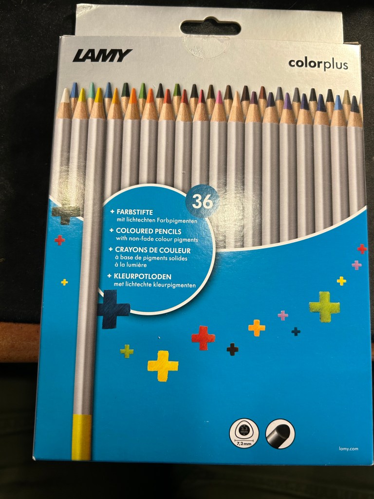
Well it says Lamy on the box, so it can’t be bad, right? And it was just $15 for 36 pencils…
This is where the red flags should have popped up, but they didn’t. I bought the pencils.
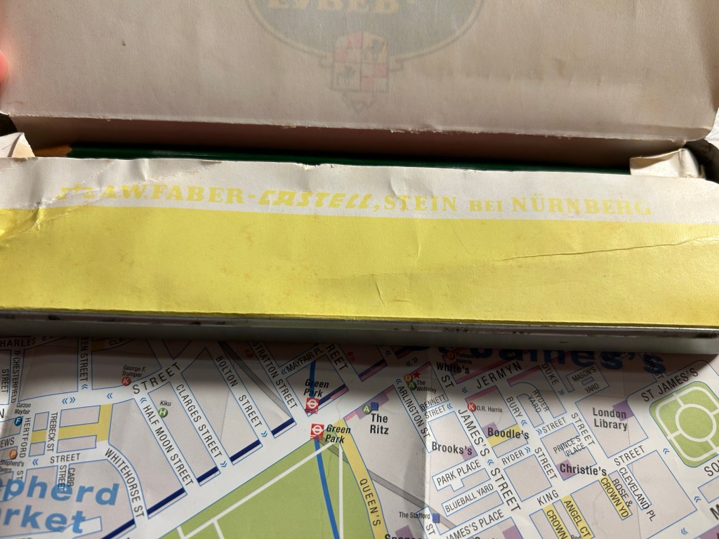
When I got home and opened the box, my heart sank. The leads were broken on almost all of the pencils. Now the box was in my trolley, well protected from dropping or crushing, so there was really no reason for this amount of damage. I checked the back of the box:

“Highly resistant to breakage” it is not.
The pencils are triangular shaped, which is supposed to make them ergonomic. It makes them more unpleasant to sharpen, as there’s a steep “bump” whenever you turn the pencil to another side.

The colour selection is weird — there are a lot of various shades of brown, but no ochre. The browns themselves are nothing like the colours that you’d expect from their labelling. I use the term “labelling” loosely here, because there’s no colour labelling on the pencils, just a dip of colour that is vaguely similar to the actual pencil colour produced.
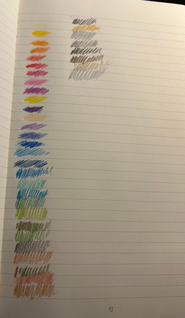
The 36 shades chosen are wild – way to many similar brown, not enough greens, too many purples and blues, and of course utterly useless white and the bewildering gold and silver which are neither gold nor silver. Obviously the pencils crumbled while creating these samples so there are some duplicates here.
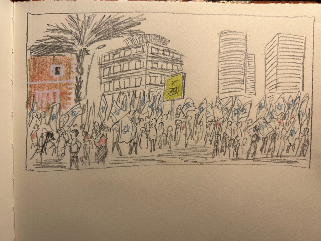
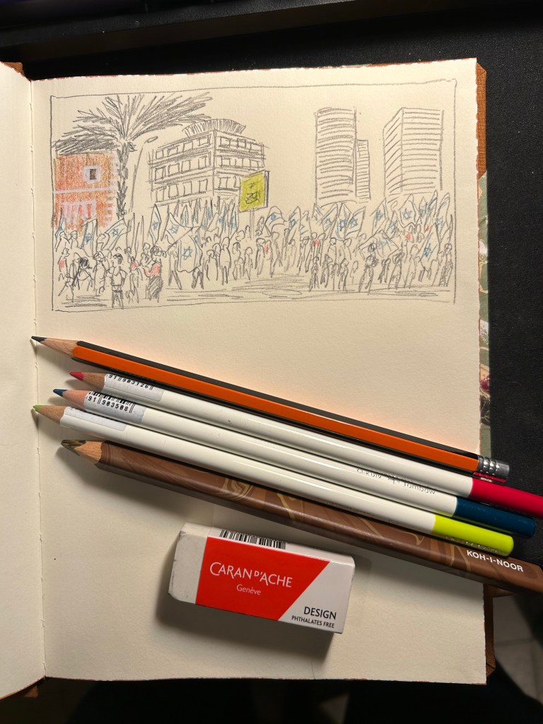
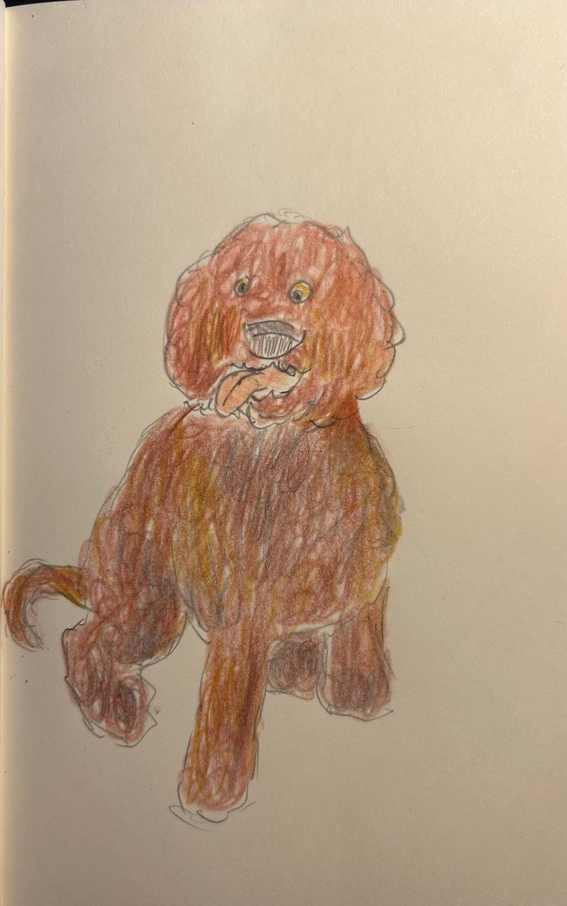
The pencils are very waxy, which means after 2-3 layers maximum the paper will be clogged and subsequent layers won’t be registered. The pencils also crumble easily —- even with very light pressure applied. Creating this sketch with them was nightmarish, as the leads kept crumbling, and I couldn’t get the shades that I wanted to the layering that I was trying to achieve.
I honestly don’t understand why this product exists. It’s too expensive and not robust enough for children’s use, it’s definitely not artist grade (poor pigment, layering and no labelling), and even student grade pencils are properly labelled these days. In any case, save your money to buy better pencils. You deserve them.