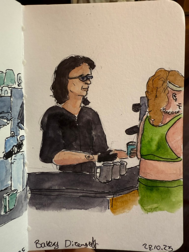
I went to see a local production of Singer, a play by Peter Flannery. It was phenomenal but it kept me up at night, which meant that the following morning I headed straight to my local cafe. I sketched the barista but something didn’t work in terms of getting her face right – she turned out sadder than she is. Sketching tired is rough.
Sketch on Stillman and Birn pocket Beta
Here’s the rather messy pencil and pen sketch. I can tell just by the line quality that I was very, very tired.
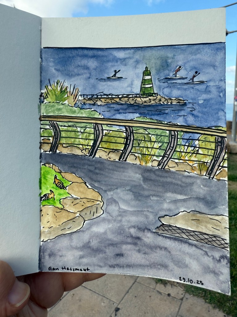
A day later I went to sketch at the nearby park and you can see the difference in the line quality in this sketch:
Sketch on a Pith Kabosu sketchbook
Initial sketch:
Later that week the film photographs that I’d had developed were returned to me. Here are a few of my favourites:
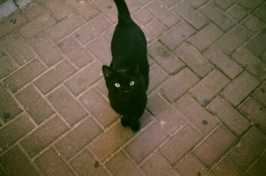
The local community cat that I feed twice a day coming to say hi
I love the atmosphere that the film gives this simple photo:
Ramat Hanadiv rose garden
All of these photos are unedited. I’ll likely clean them up later on.
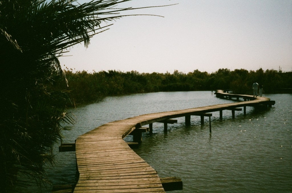
Bridge over water at a nature reserve near Haifa
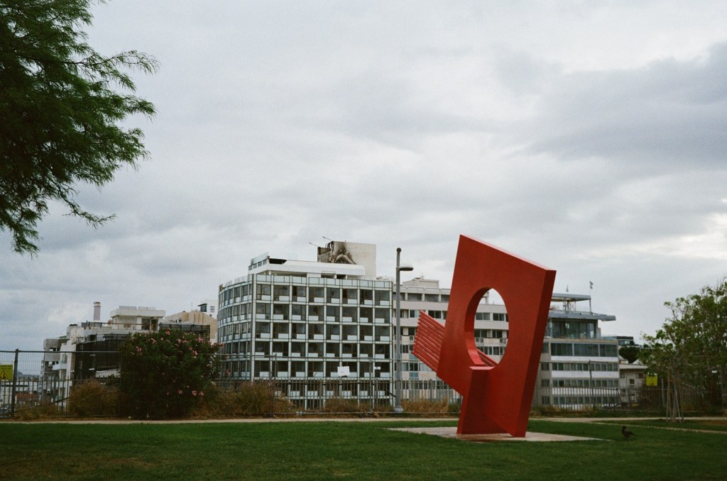
There was a fire on the roof of a nearby hotel. I took this photo a day after the fire, and you can see the damage:
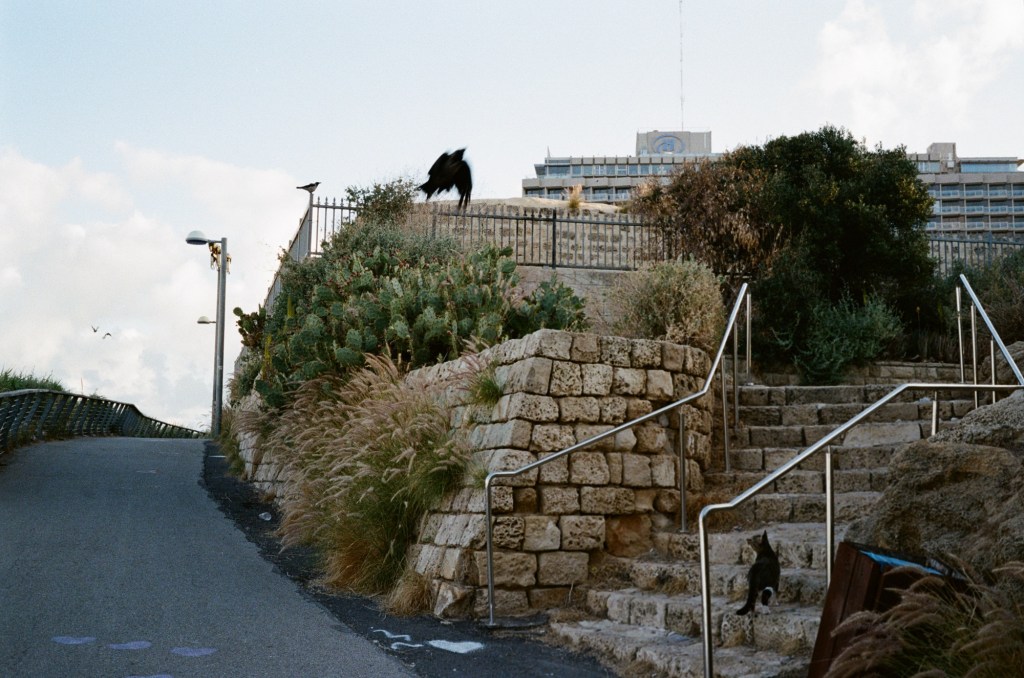
Cat failing to hunt a crow:
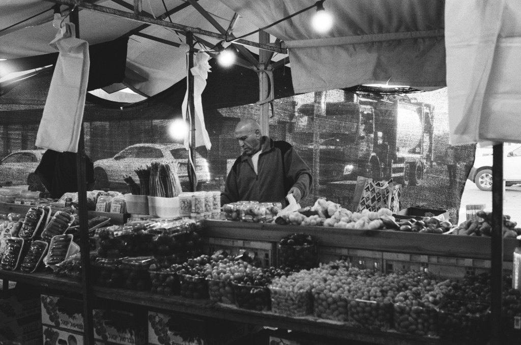
A stall at the local farmer’s market:
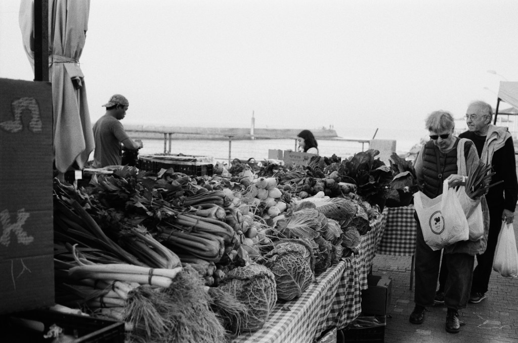
A stall at the local farmer’s market. You can see the see in the background.
I was supposed to run at a 10k night race on Wednesday, but I wasn’t feeling too good and I was apprehensive about dealing with the crowds so I ran the distance by myself a few hours before the official race start. It was a good decision as I was really struggling during the first 3k – but I did manage to finish, and finish strong.
I finished reading “Helmet for My Pillow” by Robert Leckie (a powerful narrative, but not as punchy as “With the Old Breed”), read “Death of a Nurse” by M.C. Beaton as a palate cleanser, and I’ve now started “The Shattering Peace”, John Scalzi’s long awaited sequel to his Old Man’s War series.
I’ve been overwhelmed with the responses to my Pelikan Hubs post. Thank you all for your kindness and for the thought and effort you put into your comments. I read them all, I just wasn’t able to respond to all of them this week.
Speaking of the Hubs, all of my pre-hubs inked pens have been written dry, which means that I currently have a 100% Pelikan rotation, plus some Platinum Preppy’s that I use for sketching.
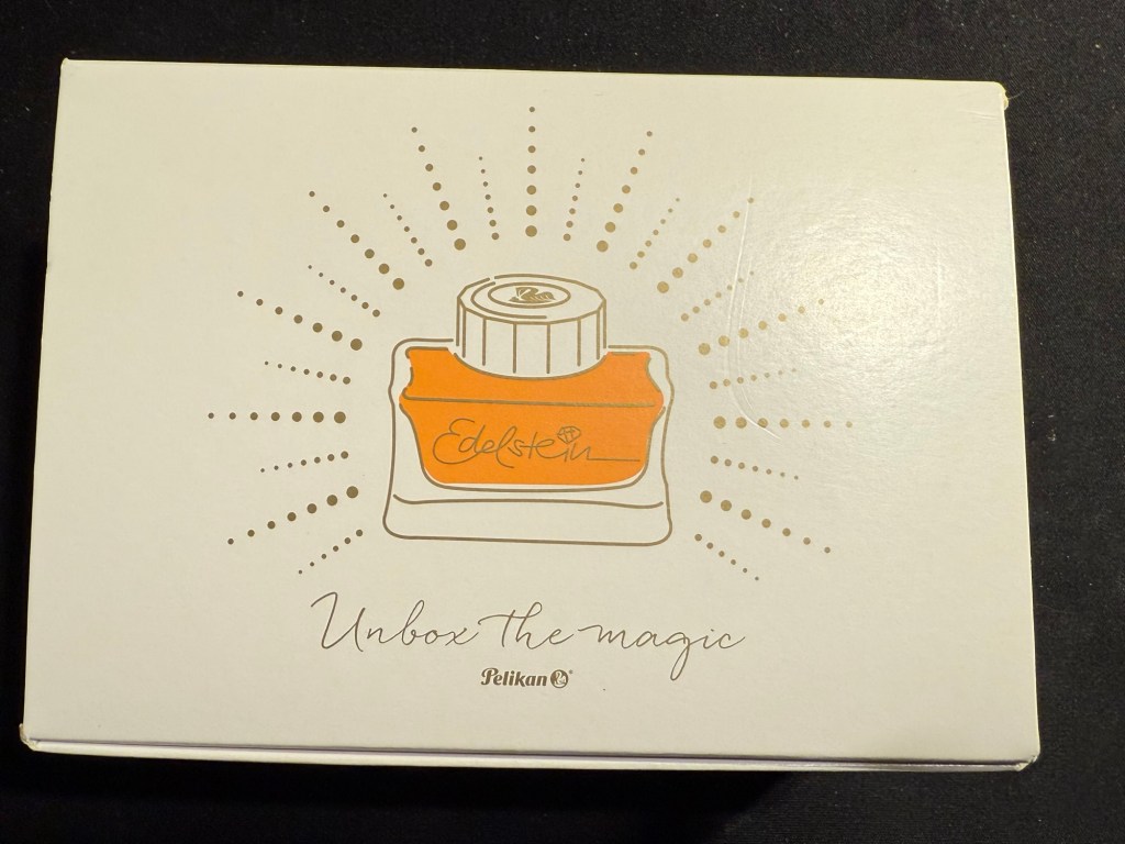
Yesterday was the 2025 Pelikan Hubs event. Pelikan is so wonderful to organize these events, so generous and thoughtful with their gifts, and I love the company and their pens so much that I’m really heartbroken that this isn’t just a glowingly happy post.
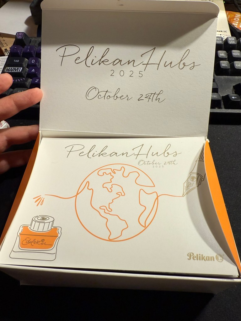
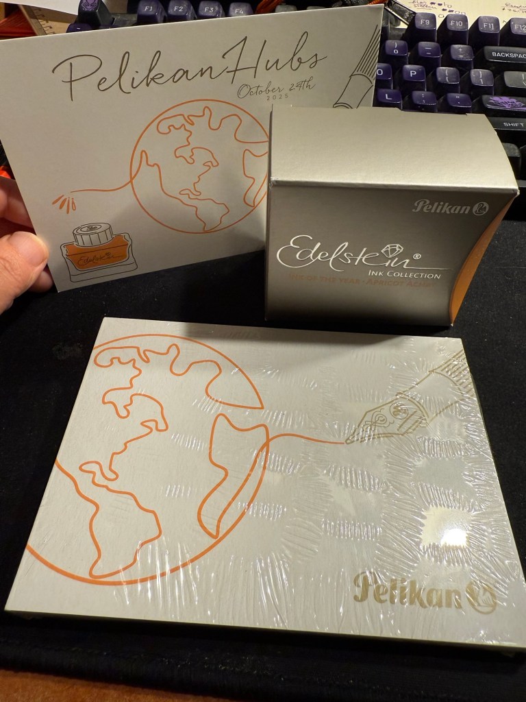
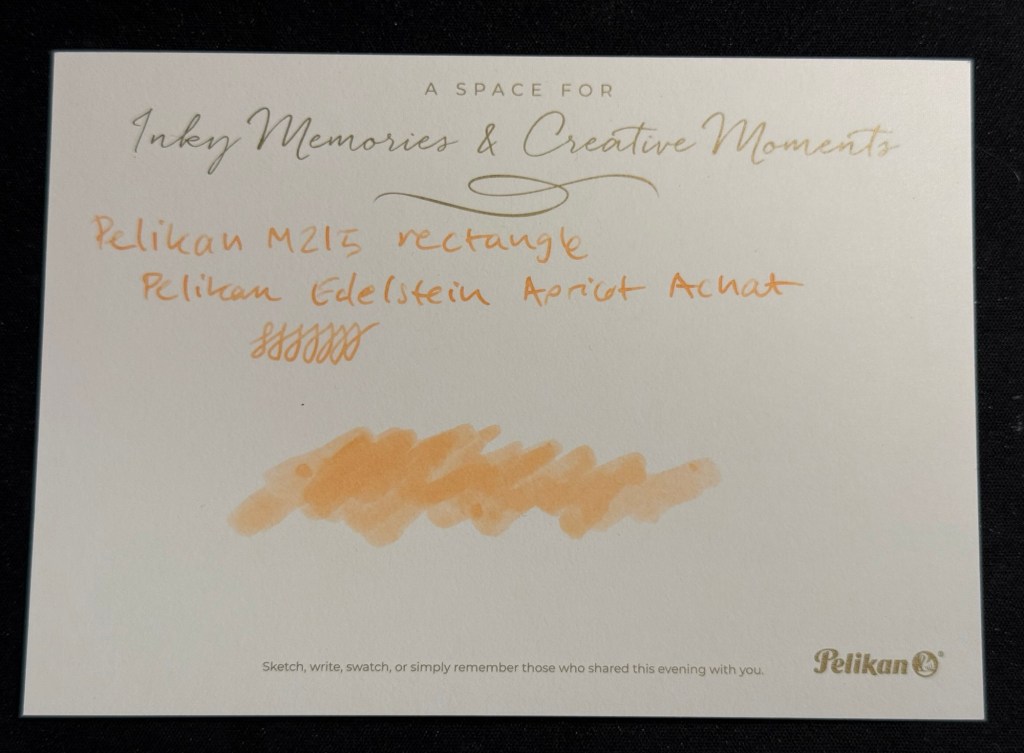
This isn’t Pelikan’s fault. Their organization was as usual, impeccable. Their gift was tremendous – a beautiful box, with the Edelstein’s ink of the year Apricot Achat, a postcard and a notepad. Everything was so well designed it was breathtaking to open the box and see it all laid out perfectly.
The box
Here’s the open box and the postcard:
The open box and the postcard
Here’s the notepad. You can see the design on the cover better in the next photo, but the paper is smooth, thick and perfectly fountain pen friendly.
Small notepad
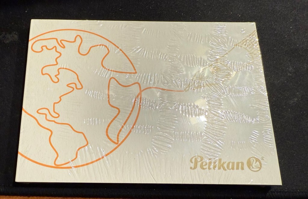
I love the design of the cover of the box, the postcard and the cover of the notepad. It’s playful but elegant, and it works well together and ties in well with the typography and the design of the Edelstein box. That’s a 10/10 for design and quality.
Everything that was in the box: postcard, Edelstein Apricot Achat ink, and notepad
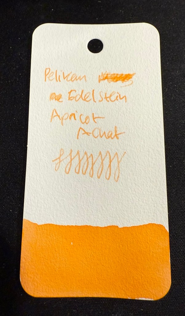
The that we received is the Edelstein Apricot Achat, which is the ink of the year 2025. The bottle is gorgeous, and the ink is non-shimmer this year, so it should be easy to clean out of pens.
Edelstein Apricot Achat
The ink itself is indeed an apricot ink, with a hint of shading. It’s bright but light – a tad too light for me if I’m honest. I think that this exact ink just slightly more saturated would have been the perfect orange for people who like their orange right in the middle of the orange spectrum – not too yellow or too red.
Swab on Col-o-Ring
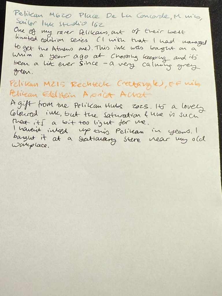
I filled a Pelikan M215 Rechteck (rectangle) with this ink, but I chose poorly, forgetting that it has an EF nib. Pelikan EF are on the wide side, but this ink would fare better in a medium or even a broad nib. I will still enjoy it as it works well with the other inks I currently have in rotation, but if you are looking to use this ink I’d suggest wide and generous nibs for it.
Writing sample on Kokuyo paper.
I tried it on the Postcard. The paper isn’t coated but is still rather sleek:
The postcard with an ink swab and writing sample
So thank you very much Pelikan for organizing this worldwide event and for your wonderful gift! I am actually considering buying the matching M200 because I like the look of the ink.
Now for the sad and ugly part:
Pen collection has a misogyny problem. I have experienced it during the previous Pelikan Hubs, I have experienced it when I tried to buy pens in brick and mortar shops, in flea markets, from pen makers. I experienced it during this year’s Pelikan Hubs and I’m tired of it, and kind of tired of all the talk about how wonderful and welcoming the pen community is. It’s wonderful and welcoming if you’re a guy, and time and again I have seen it close ranks and snarl if you’re a gal.
Just during yesterday’s event, where I stayed on for less than an hour (and even that was just to be at the edge of the group photo), I was told several times that:
Women don’t collect pens.
Only men collect pens.
I am not a real pen collector.
I can’t possibly be a pen collector.
I can’t possibly have enrolled to the Pelikan hub.
I am there as someone’s plus one.
Women don’t understand pen collecting.
I am a rare bird, the exception to the rule.
They had facts to back it up, they said. Their closed pen collectors group only had three women in it. That proved the point. I eye-rolled so hard. I had met and talked to one of the other female collectors at last year’s event and I fully understand why she didn’t brave this treatment to collect her gift this year. It’s because nobody wants to go out of their way to spend their precious free time with a bunch of *holes.
There are women collectors, they have every right to enjoy this hobby, and if you’re a guy and you don’t see women in your group, it’s not because they don’t collect pens. It’s because you’ve created a group that women don’t want to join.
Do better.
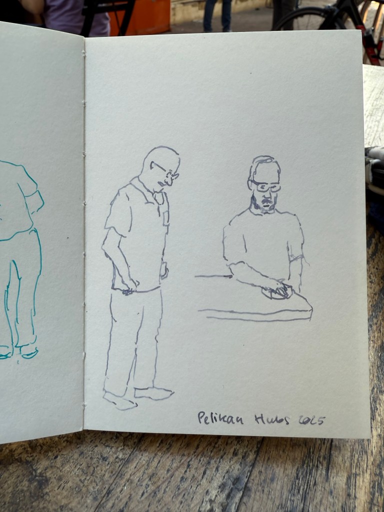
End of rant – and to end on a more positive note, I did manage to do a few 2-3 minute sketches while I was waiting for the group photo:
Sketched with Pelikan M805 Ocean Swirl F nib and Montblanc Maya Blue on a Pith Kabosu SketchbookSketched with Pelikan M605 Stresemann M nib and Sailor Ink Studio 123 on a Pith Kabosu Sketchbook
Thank you again Pelikan for the wonderful event. I intend to return next year even if the menfolk find my presence abhorrent. There were a few nice fellows that were willing to talk to me, and I will not let the trolls dissuade me from participating in a hobby that I have been enjoying for close to 20 years.
Tomorrow is the Pelikan Hubs 2025 event, and to prepare I have inked up a whole flock of Pelikan fountain pens.
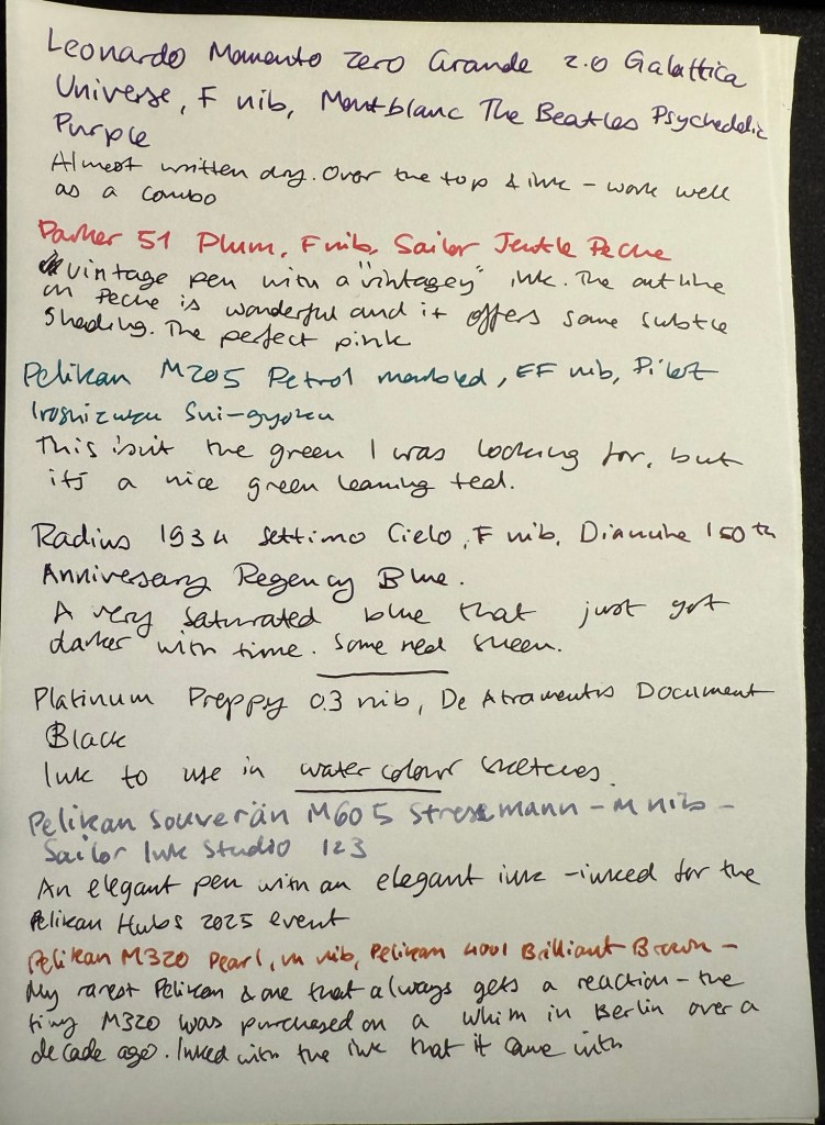
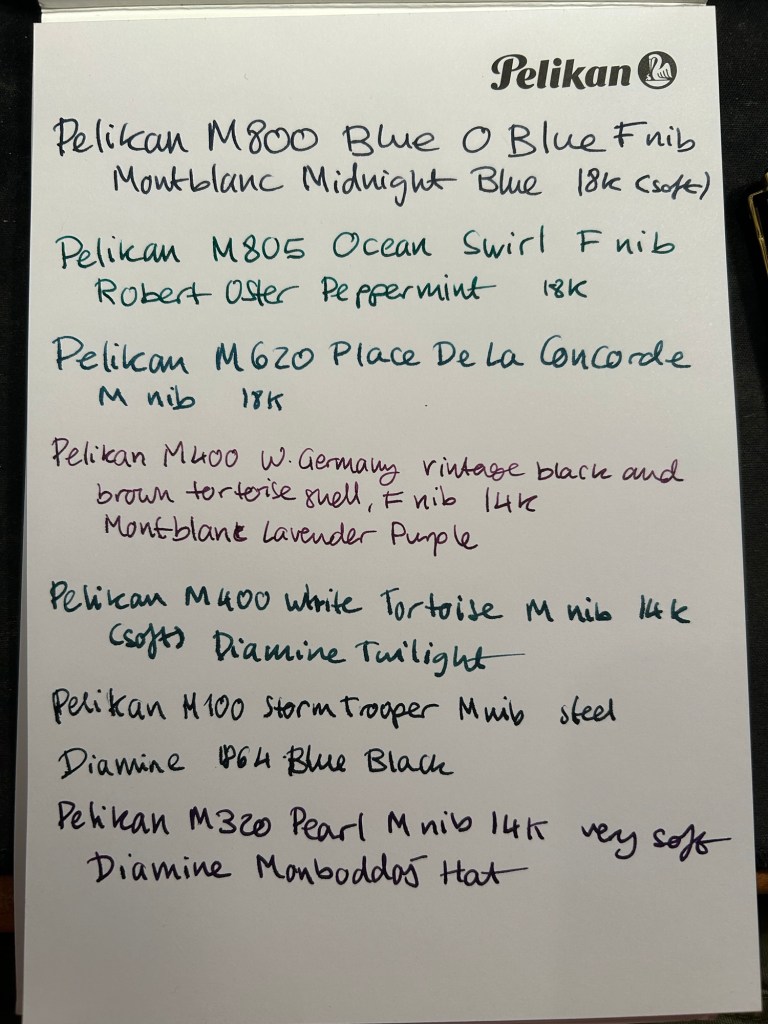
Here’s my current lineup of fountain pens and ink:
Currently inked part 1
The top four have been inked way back in the beginning of August, but because of my travel schedule I’ve yet to write all of them dry. You can read about the Radius 1934 and the Pelikan M205 here as well.
Leonardo Momento Zero Grande 2.0 Galattica Universe – F nib – Montblanc The Beatles Psychedelic Purple – great pen and ink combination. I wrote this pen dry just after writing the sample above.
Parker 51 Plum – F nib – Sailor Jentle Peche – all vintage Parker 51 fountain pens are fabulous and this one is no different. The plum colour is very rare, but I decided to “use the good China”. The ink is a long discontinued Sailor Jentle Peche, a beautiful pink with great shading and outlining. Sailor used to make fantastic inks at great prices – in terrible bottles. It was a struggle to fill this pen, even with their internal ink reservoir dingus.
Pelikan M205 Petrol Marbled – EF nib – Pilot Iroshizuku Sui-gyoku – I was hoping that Sui-gyoku would be the green ink that I was looking for, but it’s more of a teal than a green. The Pelikan M2xx series is a solid workhorse kind of pen, and I highly recommend it.
Radius 1934 Settimo Cielo – F nib – Diamine 150th Anniversary Regency Blue – the ink has grown darker with time, to the point where it’s almost black. This isn’t surprising as it was a very saturated dark blue ink to begin with, and it’s had some time in the pen. I will likely write this pen dry today or tomorrow. The new Radius pens by Leonardo feel very much like Leonardo Momento Zeroes but with a slightly different design. That’s not a bad thing – they are gorgeous pens, and for now they’re slightly cheaper than the Momento Zeroes.
Last week I inked up a new Platinum Preppy 03 nib with De Atramentis Document Ink Black as part of a post that I am working on. It’s the first time I’ve used a Preppy with a converter and not the Platinum cartridge it comes with – and it works well.
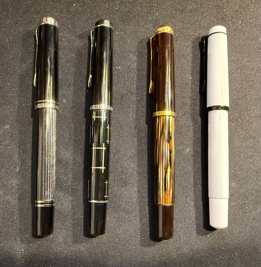
Pelikan Flock – currently inked part 2
I inked these pens today for the Pelikan Hubs event tomorrow:
Pelikan M605 Stresemann – M nib – Sailor Ink Studio 123 – a classic and elegant pen and ink combination. The Sailor 123 is really that good, and the generous medium nib shows off its dual shading properties.
Pelikan M320 Pearl – M nib – Pelikan 4001 Brilliant Brown – my rarest Pelikan, always a crowd pleaser at the hubs. This tiny pen came with a tiny brilliant brown bottle and so far I’ve filled it only with that. I bought it about a decade ago in Berlin on a whim, and I’m so glad that I did.
Pelikan M800 Blue O Blue – F nib – KWZ Exclusive for epiora.pl Błękit Warty Poznania – this pen was a very expensive birthday gift and my first M800 Pelikan. I bought it at a local pen store that no longer exists. The ink is even more special – it’s my first KWZ ink, gifted to me from the store that it was exclusively made for. I had purchase my M600 Glauco Cambon there just before they were closing for the day on the last day of the USK Symposium in Poznan. The name means Poznan Warta Blue – and it’s tied to the unique blue of the city and the Warta river. It’s a gorgeous blue and it reminds of Poznan, the store, the lovely seller and the nice symposium volunteers that saw me in the store and helped me out with my purchase.
Pelikan M400 White Tortoise – M nib – Sailor Ink Studio 767 – This is the green I was looking for! I purchased this ink last month at Choosing Keeping in London, and it’s the perfect bright and cheerful green that I was looking for, with some great shading to boot. The Pelikan Tortoise pens are gorgeous, and this one is a particularly nice one.
Pelikan M805 Ocean Swirl – F nib – Montblanc Maya Blue – I have been priced out of Montblanc inks (there’s only so much I’m willing to pay for ink) but this ink was heavily discounted at the Montblanc boutique in Heathrow. It’s a lovely bright turquoise with great shading, and it works well coupled with this pen.
Pelikan M600 Art Collection Glauco Cambon – F nib – Pilot Iroshizuku Ajisai – this is the pen that I purchased at Epiora in Poznan, and while I saw it online and loved the concept, I never thought that I’d buy it because of the price. Seeing it in person changed my mind because no photos can do this pen justice – the pattern on it glows! It’s beyond vibrant, and the pen body itself feels different than other Pelikans – heavier and cooler to the touch. The ink is also a Choosing Keeping purchase, and I love the colour very much.
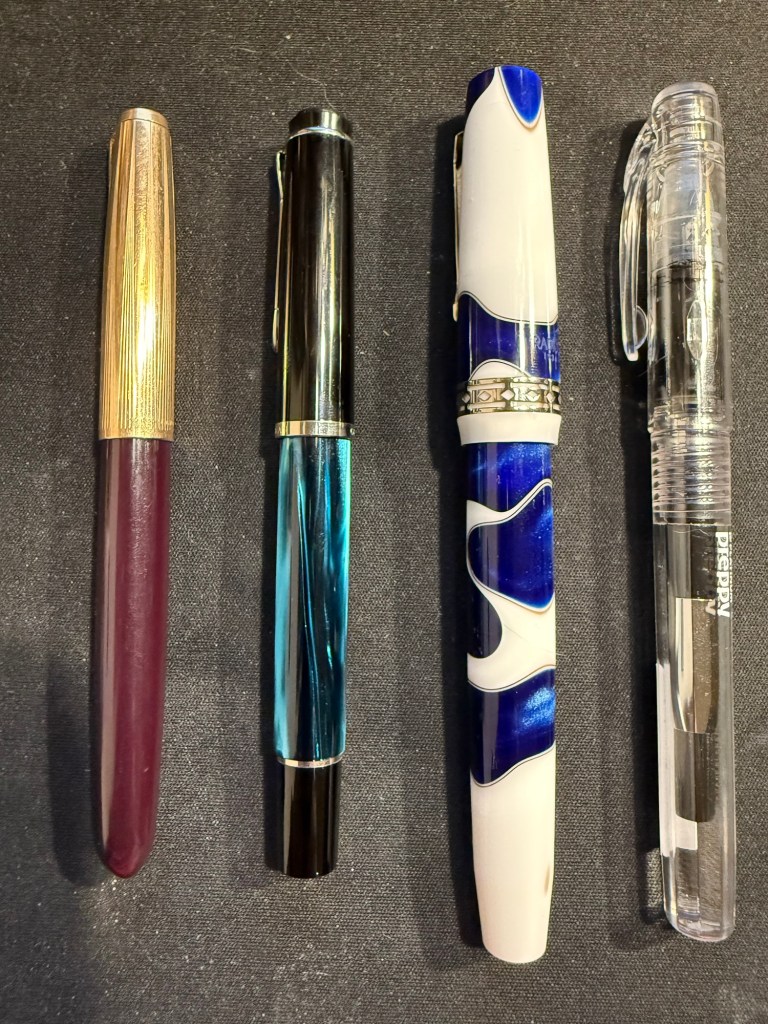
Currently inked part 3
Pelikan M620 Place De La Concorde – M nib – Sailor Ink Studio 162 – this is one of my rarer Pelikans, one that I bought a year or two after the series had been complete and no longer for sale. If ever there was a series of pens that I wish that I owned it was the Pelikan M620 City series, and for years I searched for an Athens pen before giving up – it was just too expensive.
The Pelikans left to right – Place de la Concorde, Glauco Cambon, Ocean Swirl, White Tortoise, Blue O Blue, Pearl
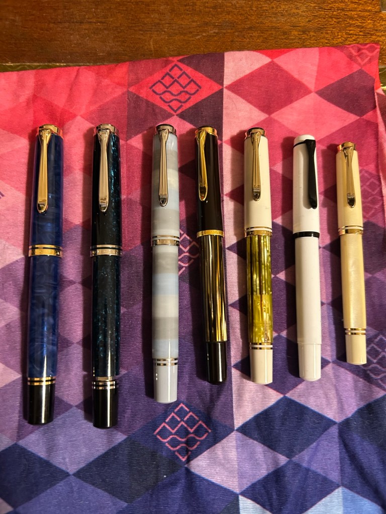
Apart from my inked Pelikans, I’m also taking three uninked Pelikans with me – one to fill with the ink that we’ll be getting, and the others just to share.
Pelikan Flock – left to right – Stresemann, M215 Rectangle (uninked), vintage M400 Tortoise (uninked), Stormtrooper (uninked)Left to right: Parker 61 Plum, M205 Petrol Marbled, Radius 1934 Settimo Cielo, Platinum Preppy
Are you going to a Pelikan Hub? If so, what pens did you bring with you?
We just had the 2024 Pelikan Hubs event and I wanted to talk about which Pelikan fountain pens I brought with me to the event, and to note a few things that may be useful for those looking to get into Pelikan fountain pens.
This was my flock:
From left to right they are:
Pelikan M800 Blue O Blue – one of the most expensive pens in my collection, and one that I (partially) got as a gift for my birthday. This pen has an 18 Karat fine nib that is soft and springy. Note: Some of Pelikan’s gold nibs are softer than others, so it’s worth testing the pen out before you buy it, especially if you’re not used to Pelikan nibs. This pen has a semi transparent blue swirly body and a typical Pelikan wide and juicy nib.
Pelikan M805 Ocean Swirl – gorgeous, gorgeous pen that draws attention every time I use it. The depth and shade of the material is something else, and the palladium trim and rhodium plated 18k nib work very well with the turquoise and black shades of this pen’s body. This pen also has a fine 18k nib but this one is much firmer than the one in the Blue O Blue.
Pelikan M620 Place De La Concorde – so, so glad I got this pen though it was expensive for me at the time. This was part of Pelikan’s city series and the only Pelikan I have in the M600 size, which is just a shade longer than the M400. There’s marbling in this pen’s stripes, as is befitting its name, and the 18K M nib is wide and juicy and of a standard Pelikan nib firmness.
Pelikan M400 W. Germany vintage black and brown tortoise shell – I brought this pen so that people could compare the old tortoise shell design to its modern counterpart. There’s just one band on the cap, the bottom and top finials are more rounded and there’s the old Pelikan logo engraved (not screen printed) onto the finial. The nib design is also completely different, though it still feels like a standard fine 14k Pelikan nib (wide and on the firm side).
Pelikan M400 white tortoise shell – this is the modern counterpart of the previous pen, and it has a 14k medium nib that is on the soft side. Both the black and white tortoise shell pens have semi transparent pen bodies so you can easily see the pen level through them.
Pelikan M100 storm trooper – on the rarer side of Pelikans, this steel nibbed fountain pen has a medium nib that feels just as good as Pelikan’s gold nibs. While I understand why Pelikan didn’t want to continue making M100 still nibbed fountain pens, I kind of wish they would have. These could have been slightly higher end alternatives to Lamy’s Al Stars and Safaris – a step down from the M200.
Pelikan M320 Pearl – the rarest Pelikan in my flock, and always a crowd pleaser. This fountain pen is tiny, and came as part of a set with Pelikan brown ink and a nice presentation box. I bought it more than 10 years ago in Berlin, and nobody was interested in them because of the pen’s size. It’s a piston filler, a fantastically well made pen and it has a very soft 14k medium nib.
Here’s a writing sample for all these pens:
Writing sample on a Pelikan Hub 2022 notepad
Did you go to a Pelikan Hub this year? If so, which pens did you bring with you?
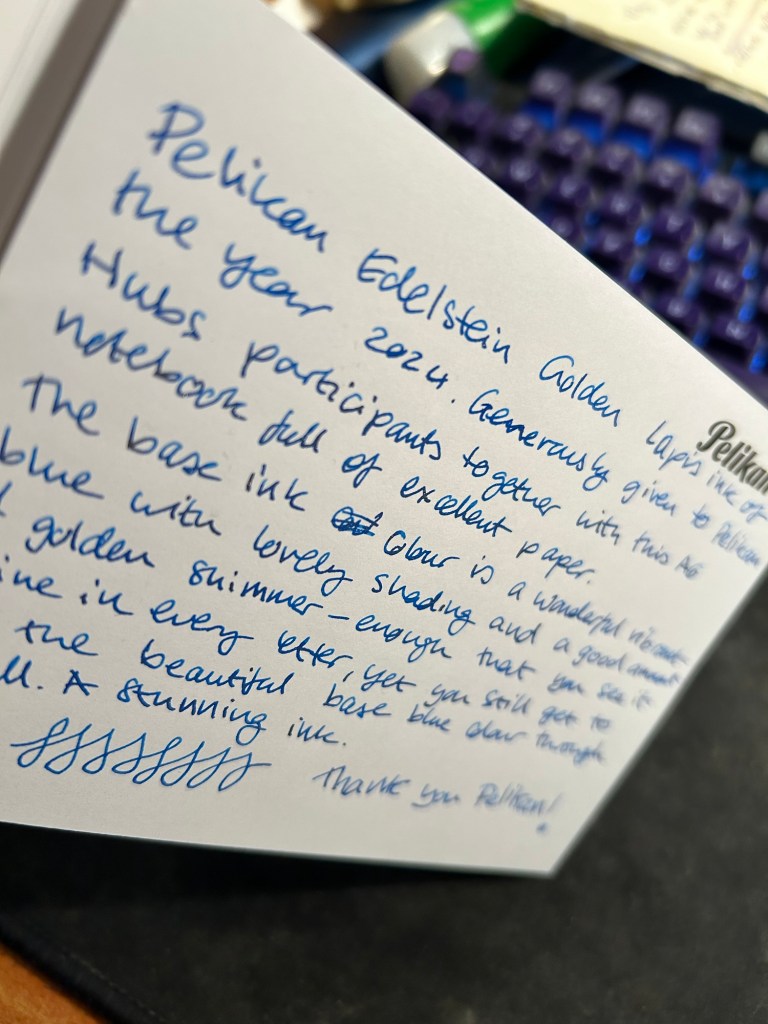
Yesterday Pelikan celebrated their annual Pelikan Hubs event, and we had a local Pelikan Hub. Since 2014 the German pen company has invited its fans to gather in groups all around the world and for one evening celebrate their love of Pelikan fountain pens and ink. The events are well organized, with a local volunteer in each country organizing the Hub location and orchestrating the event. And every year Pelikan gives Hub participants a generous gift for their participation.
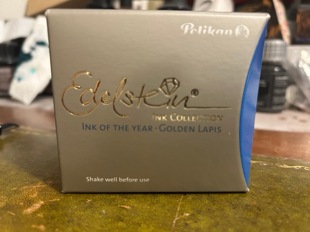
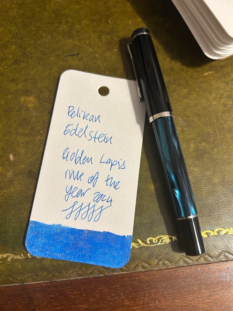
This year was no different, and Pelikan Hub participants got a full sized bottle of Pelikan’s premium ink collection, Edelstein, in the Ink of the Year 2024 colour: Golden Lapis.
Pelikan Edelstein Ink of the Year Golden Lapis
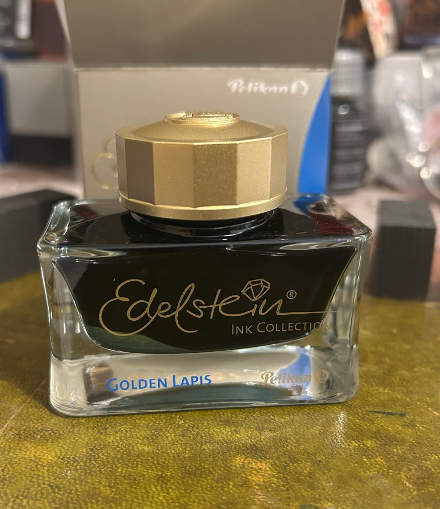
As is customary with luxury inks, the bottle is a glass work of art:
Edelstein ink bottle.
The extra thick base and wide opening work well with Pelikan Souveran pens which tend to be wider barrelled and often difficult to impossible to fill with certain ink maker’s narrow and tall ink bottles. With certain Sailor ink bottles and Diamine’s 30ml plastic bottles there’s a risk of your M400 or M800 not fitting into the bottle or of tipping the bottle while trying to fill the pen with ink. There’s no risk of that with Edelstein bottle design, though when the ink level runs very low its likely you’ll need to get creative when trying to fill your pens with ink.
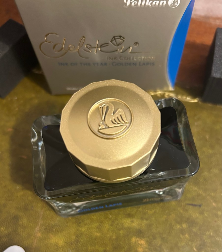
The golden cap has the modern Pelikan logo on it, with a Pelican and one chick:
The Edelstein cap
I filled a Pelikan M205 Petrol Marbled EF pen with the ink and used it for the swab and writing sample below. Here’s Golden Lapis on a Col-O-Ring card:
Pelikan Edelstein Golden Lapis ink swab
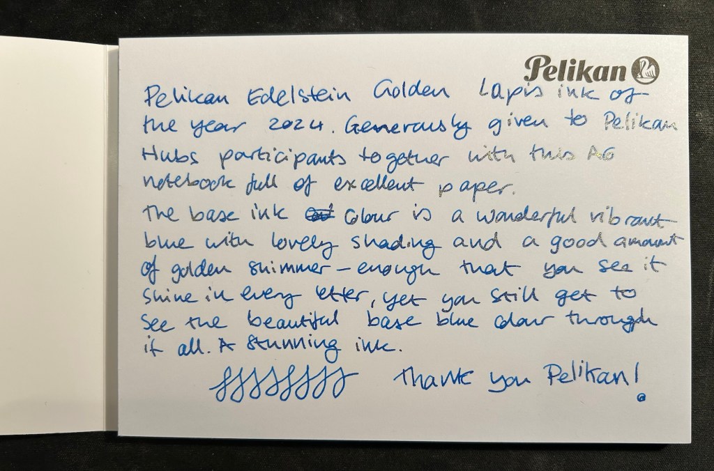
We got a nice A6 writing pad with bristol thick fountain pen friendly paper in it as part of the Pelikan Hub 2024 gifts. The paper is great though I wish there wasn’t a Pelikan logo on each page mostly because it takes so much space. The paper is thick enough for both sides of it to be useful, so it’s a shame to have to flip the page over and write only on one side if you want the full A6 page to yourself.
The A6 notepad that we received as part of the Pelikan Hub
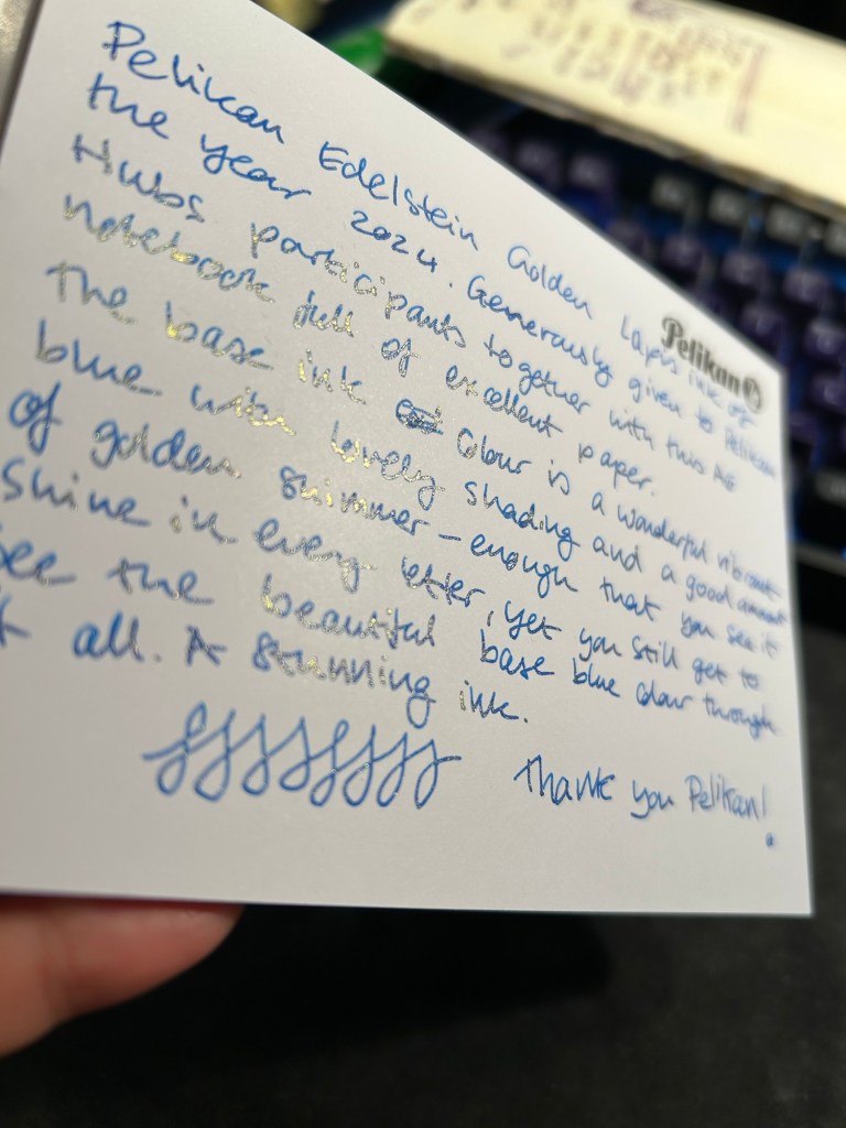
Pelikan Edelstein Golden Lapis is a gorgeous ink, period. The base rich, turquoise-y blue reminds me of Pilot Iroshizuku Asa Gao and that is high praise. The colour is rich, vibrant and has a good amount of shading that sets it apart from standard blues. To this fantastic base ink Pelikan added lots of fine, golden shimmer, and the result is stunning. Viewed directly from above the shimmer is present but subtle, oftentimes taking on the look of sheen:
Writing sample on the Pelikan A6 pad
But tilt the page slightly and the amount of gold in each letter makes the page glow:
Tilt it to the other side and the shimmer “vanishes”, which allows you to see the lovely blue ink’s colour shading much better:
Pelikan Edelstein Golden Lapis is a spectacular ink that manages to be unique in a market overflowing with blue inks with gold shimmer. The combination of the base colour, its shading properties, and the good spread of the shimmer make this an ink worth having in your collection if you’re a shimmer ink fan.
As for the Hub I participated in: it was fantastically well organized and I had a lot of fun meeting other fountain pen enthusiasts and seeing the pens they brought.