February 2025 Currently Inked Pens

I have finally written dry all of my Inkvent 2024 fountain pens, which means that after two months I get to write with a whole new set of fountain pens and inks. I normally don’t spend too much time selecting which pen and which inks I’ll use next, but this time I decided to use some criteria for the next pens in my rotation:

  • They need to include at least 50% vintage pens. I don’t use vintage pens with Inkvent inks, and vintage pens make up most of my pen collection.
  • All the pens need to be pens that I haven’t used in a long time (at least a year). It was time to mix things up.
  • The inks needed to be inks that are new to me, or that I haven’t used in years, and all of them need to be inks that I haven’t swabbed before. This was not only to mix things up, but to get me to use and swab more inks in my collection, instead of going again and again to a few select favourites.

Here’s February’s fountain pen lineup:
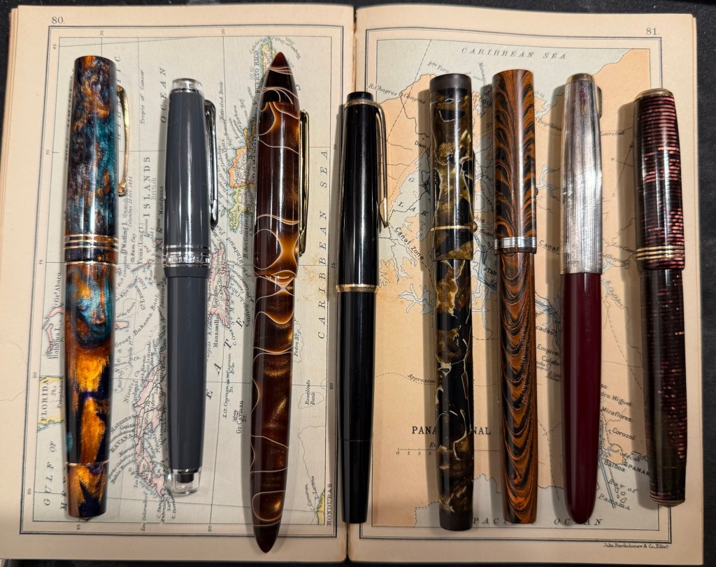
The pens from left to right: Leonardo Momento Zero Bohemian Twilight, Sailor Pro Gear Slim Graphite Lighthouse, Edison Nouveau Premiere Cappuccino, Montblanc 32, Mabie Todd Swan L2 Leverless pen, Waterman 52, Parker 51, Parker Vacumatic Standard double striped jewel.

And here are ink swabs of the inks that I’ll be using:

Ink swabs on Col-o-Ring cards

The Vintage Pens

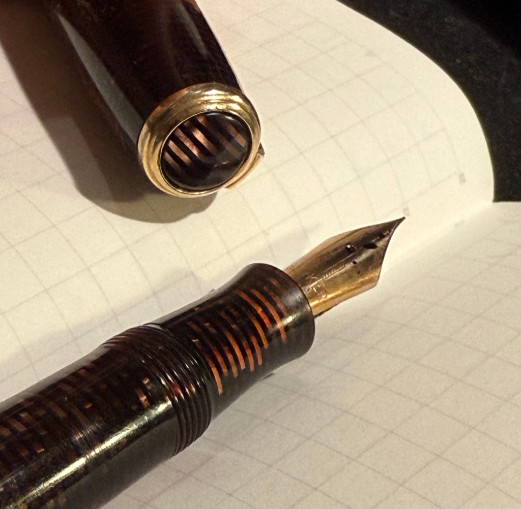
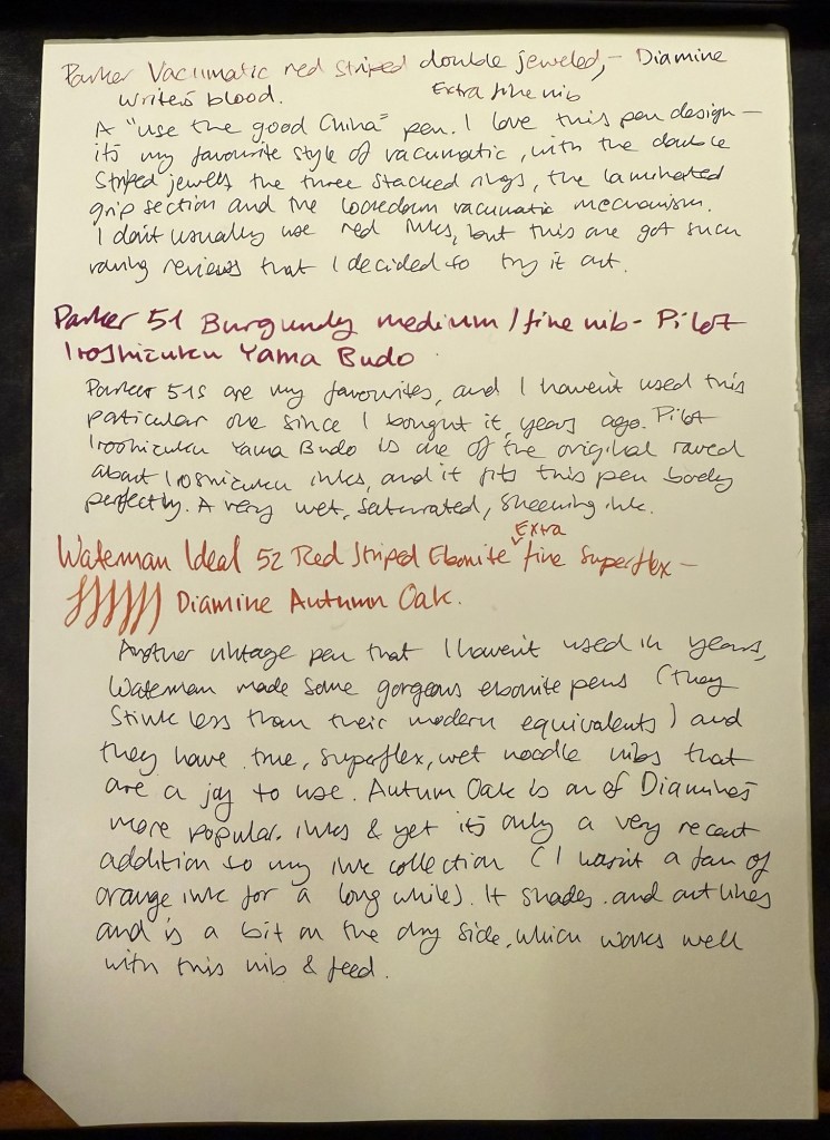
  • Parker Vacumatic 1st generation Laminated Burgundy Pearl Double Jewel (striped jewels, striped section) – I adore Parker Vacumatics and this is a “use the good china” pen. The grip section is also laminated (and not plain black), the body is transparent, and the nib is a sharp extra fine gold nib with a bit of character to it. It’s filled with a brand new ink for me, Diamine Writer’s Blood. I never use red inks, but this got raving reviews and seemed dark enough for me to try. I bought the ink in Oxford last year, and the pen years ago from the late Henry Simpole (Henry the Pen Man) in London. I don’t think I inked up this pen since I bought it, as it was too precious, and I still won’t let it leave the house, but I am looking forward to actually using it.
Parker Vacumatic first generation burgundy laminated grip section
Closeup on the striped jewel and the grip section of the Parker Vacumatic
  • Parker 51 Burgundy aerometric with a silver cap and gold filled arrow clip. I love Parker 51s, they are my absolute favourite fountain pens. I believe this cap is on the rare side, though it’s far from pristine or attractive (it’s blackened in specks, and there are a few scratches and micro scratches on it). The nib is a generous fine, bordering on medium, and like all other 51s that I’ve used, it’s magic. I haven’t used this pen since I bought it, so it’s time to give it a whirl. It’s filled with Pilot Iroshizuku Yama Budo, which is a lovely, sheening burgundy ink, one of the more popular inks in the Iroshizuku lineup. In hindsight coupling this ink with this pen wasn’t the best choice, as the 51 has generous nibs and Iroshizuku inks are on the wet side. It just means that I’ll have to steer clear of cheap paper with this combination.
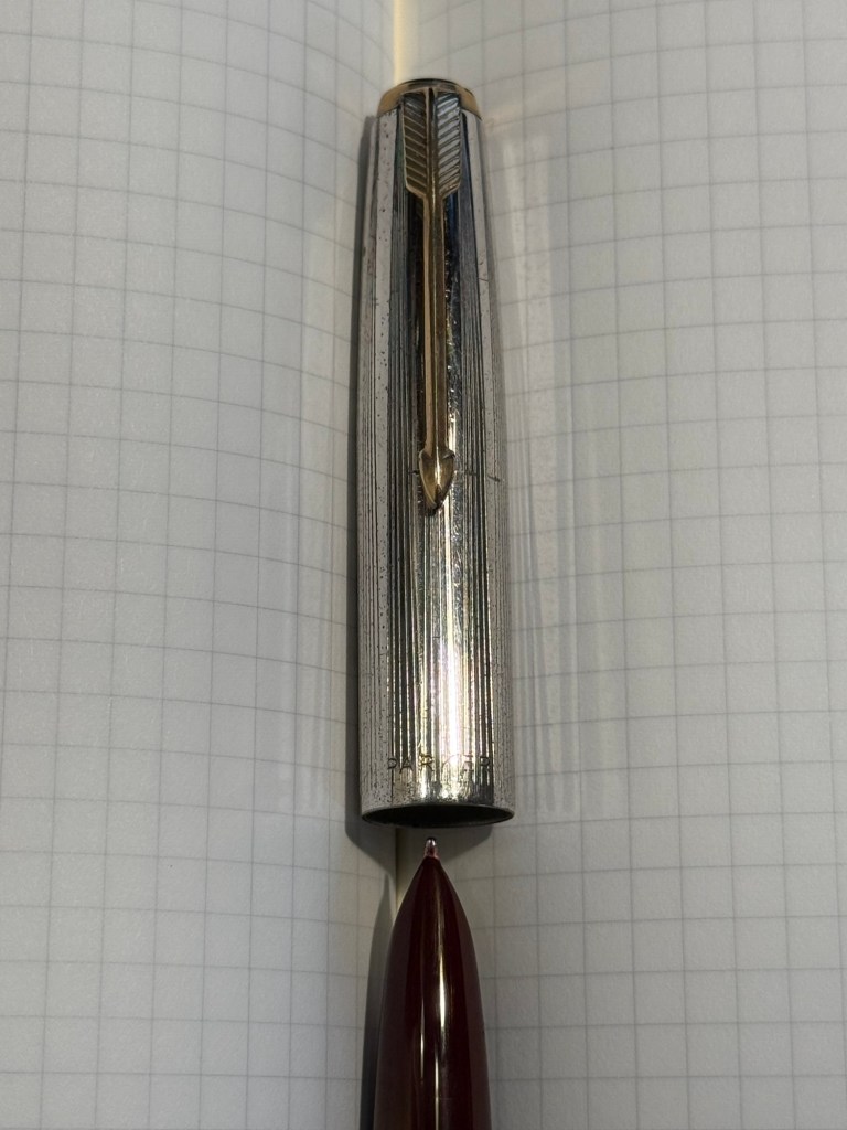
Parker 51 cap and nib closeup
  • Waterman Ideal 52 Red Ripple fountain pen with a super flex extra fine nib – my word but this pen has the most glorious nib. The pen itself is elegant and pristine, and because of its age it doesn’t have the ebonite stink to it. The nib is why I bought this pen, and it effortlessly moves between extra fine and broad or double broad lines, with the feed easily keeping up with tines. Like all Waterman nibs that I’ve tried, there is some feedback, so if you like butter on hot pan nibs this one isn’t for you. This is the kind of nib that you can only get in a vintage pen, and it puts modern flex pens to shame. It’s only minus is that this is a lever filler, and I hate cleaning out lever fillers, which is why I rarely use them. This pen is filled with Diamine Autumn Oak, which I haven’t used yet (in bottle form at least – I have cartridges of it). I wanted a brighter ink in this lineup, so Autumn Oak was a perfect choice.
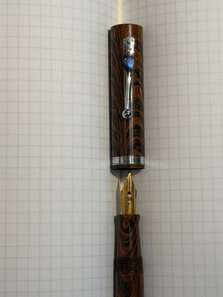
Waterman 52 cap and nib closeup. You know the nib is going to be fabulously flexy once you see that heart shaped breather hole and the slight bend down in the nib.
Writing sample on Midori MD Paper. Notes written with a Platinum Preppy.
  • Mabie Todd Swan L2 Leverless L205/62? Not sure – Swan did a poor job labeling their pens, and I didn’t write down notes when I bought it. This is a lovely pen that I bought from Henry Simpole years ago because of the phenomenal Swan nib. It’s an oblique flexible nib with Swan’s gimmicky “Leverless” filling system (which is a lever system in disguise, but such were the ’30s – you needed a gimmick to sell pen). I haven’t used it at all since I bought it because I don’t remember the experience of cleaning it out very fondly – imagine all the bother of cleaning out a Lamy 2000, but with a piston that has just one twist of travel. I used Pilot Iroshizuku Asa Gao with this fountain pen, and it’s a gorgeous ink with a good amount of sheen with this nib. I love this shade of royal blue, and I haven’t used this ink in a while. Take a look at the Swan above – it’s almost 100 years old and works perfectly.
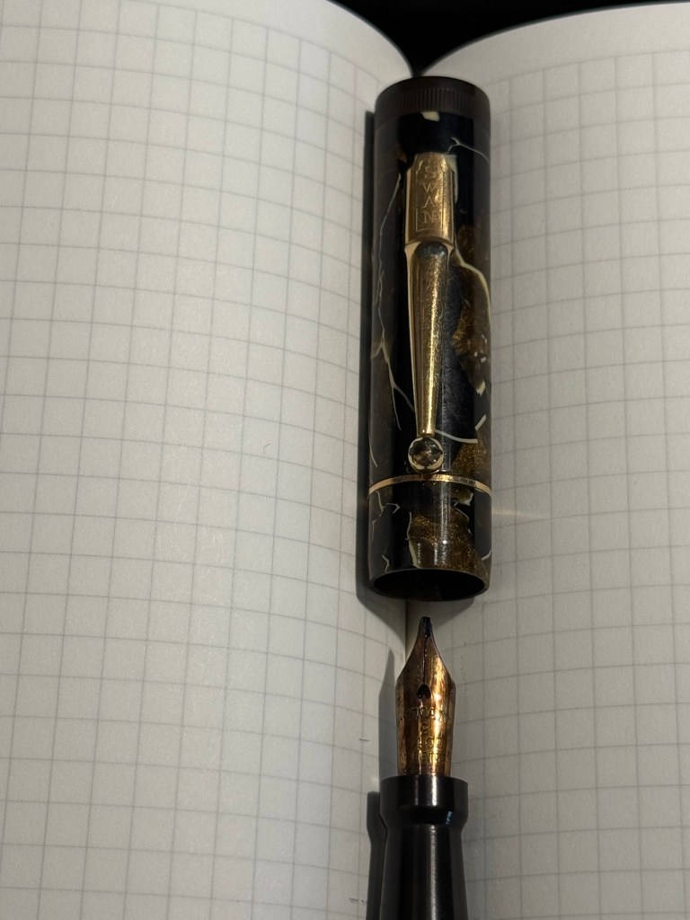
Closeup on the nib and cap of the Swan Leverless pen
Writing sample on Midori MD Paper. Notes written with a Platinum Preppy.
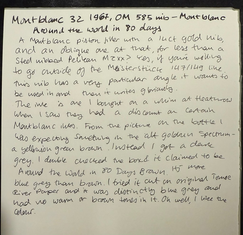
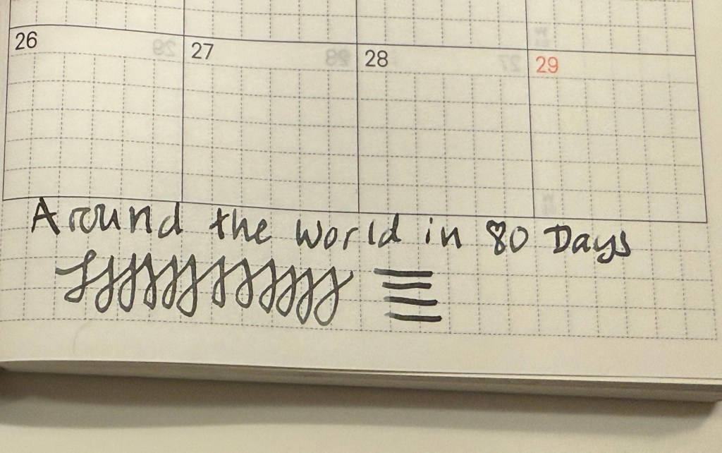
  • Montblanc 32 (1967) OM 585 nib – heavens, you can get a gold nibbed, piston filling original Montblanc with an Oblique Medium nib for less than a steel nibbed Pelian M2xx costs? Yes, you can. I love the design of this pen (you can read about it more here) and the nib is great… provided you write in the exact angle it expects. The Swan’s nib is generous in terms of the writing angles it accepts, and the Monblanc 32 is demanding: you will use the nib at the precise angle it is designed for, or it will not work at all! I only wish that the Montblanc Around the World in 80 Days ink was so exact. From the description and the illustration on the box I was expecting a brownish gold ink, maybe with a hint of green. In reality I got a dark, cold grey ink, with a hint of blue to it. No brown, no gold, nothing at all to do with the elephant illustration on the box. I had to double check just to make sure that I hadn’t landed on a bad bottle by chance.
Montblanc 32 semi hooded nib
Writing sample on Midori MD Paper. Notes written with a Platinum Preppy.
Writing sample on original Tomoe River Paper

Modern Fountain Pens

  • Sailor Pro Gear Slim Graphite Lighthouse H-EF nib – I haven’t used this pen in over a year, and I wanted a pen with a very fine nib, so that I can use it for note taking. It’s inked up with Sailor Black, a new ink for me and one that’s supposed to be water resistant. I’m using this combination for my certification study notes, and I may also try it out with some watercolours in a sketch, just to see if I can use Sailor Black ink as part of my sketching kit.
  • Edison Nouveau Premiere Cappuccino fine nib – I bought this pen in early 2012, before they did a run of seasonal limited editions of this pen design. I haven’t used in years, and the same goes for the ink in it: Lamy Petrol. This is a limited edition ink, one that Lamy issued with the Lamy Safari Petrol, and it’s a wonderful blue-black with red sheen.
  • Leonardo Momento Zero Bohemian Twilight fine nib – this pen has “only” been a year out of rotation, and it’s one of my favourite Leonardos. The colour of the resin is gorgeous, and it works very well with the Pilot Iroshizuku Tsuki-yo ink that it’s filled with. Tsuki-you is a bluish-teal with red sheen and a wet flow, and it suits the Leonardo’s fine nib.
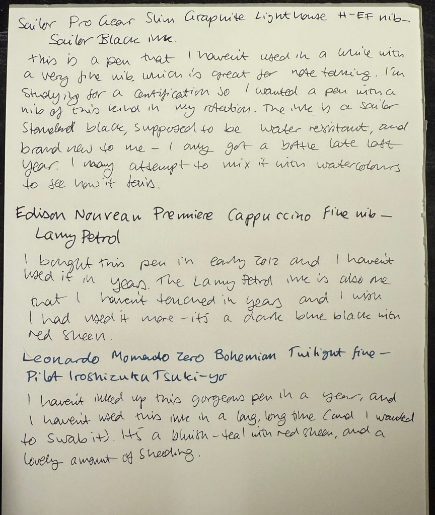
Modern pens writing sample on Midori MD paper.

August’s Currently Inked Fountain Pens

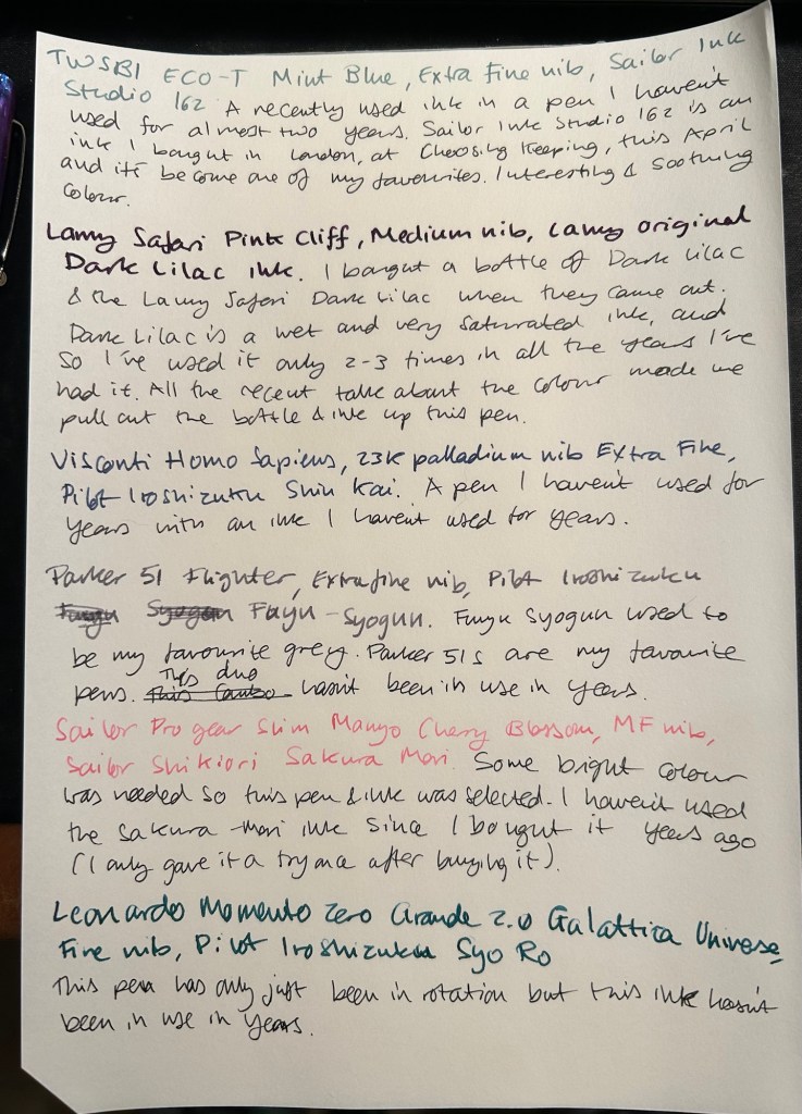
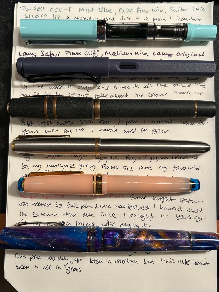
August is going to be a month of pens and inks that I haven’t used in a good long while. While I still have a small amount of ink in four of my July pens (the Kanelea, the TWSBI ECO-T Saffron, the Big I Design Fountain EDC and the Schon Design Faceted Pocket 6), they will all be written dry by the end of next week at the latest. It was time for a new lineup, and this is this month’s assortment:

Writing sample of August’s pens

The TWSBI ECO-T is one of my favourite TWSBI designs, and so I have a few of them. The TWSBI ECO-T Mint Blue hasn’t been in use for about two years, so I decided to pull it out and use the Sailor Studio 162 with it, just for colour matching reasons. The 162 is an ink that I’ve used a few months ago but I really like it, so I felt like giving it another month in rotation.

The Lamy Safari Pink Cliff is a recent purchase that I made in Paris last April. I’ve only now inked it up as I wasn’t sure what ink to use with it — until all the discussion about the new (and not as great) Lamy Dark Lilac ink made me want to use the original Lamy Dark Lilac ink. I purchased a bottle of Dark Lilac and the Dark Lilac Safari back when they first came out, but I haven’t used the ink very much. It’s wet and very saturated and so it works best with only a handful of paper options that I have. Still, it’s a very attractive ink.

Visconti Homo Sapiens — this is the original Homo Sapiens, the one that created quite a splash when it came out. At the time it was my most expensive fountain pens, and it’s still one of my most precious pens. I bought it at Mora Stylos in Paris and had it customized with the special initial badges on the finial. I got Pilot Iroshizuku Shin Kai as a gift with my purchase, and though I love this ink I haven’t used it in a while simply because I misplaced it behind another rarely used ink.

The pens from top to bottom- TWSBI ECO T Mint Blue, Lamy Safari Pink Cliff, Visconti Homo Sapiens, Parker 51 Flighter, Sailor Pro Gear Slim Manyo Cherry Blossom, Leonardo Momento Zero Grande 2,0 Galattica Universe

Vintage Parker 51 pens are my absolute favourites, to the point where I have a hard time seeing one in the wild and not buying it. This Parker 51 Flighter hasn’t been in use in years, but in the spirit of “use the good china” I’ve inked it up. Pilot Iroshizuku Fuyu Syogun used to be my favourite grey ink — and then Diamine came out with a series of excellent grey inks and Sailor came out with the 123. I haven’t used it in years, so I dusted off the bottle and decided to give it another try.

The Sailor Pro Gear Slim Many Cherry Blossom has been in rotation relatively recently, but the ink inside it, the Sailor Shikiori Sakura Mori, is one I haven’t used in years. I don’t have or use many pink inks, but I decided I needed something to brighten up this lineup, and the Sakura Mori ink is relatively readable. It also perfectly matches this pen, which is a nice bonus.

Leonardo Momento Zero Grande 2.0 Galattica Universe is also a relatively recently purchased pen that has been in rotation not too long ago. I just love the Momento Zero so much that I decided I wanted to ink one up, and so I chose the Pilot Iroshizuku Syo Ro to ink it up with. I haven’t used this inks in years, and I love teal inks so it was about time.

What have you got inked up for this month? Anything new? Old favourites or long forgotten pens or inks?

One Week 100 People Day 3

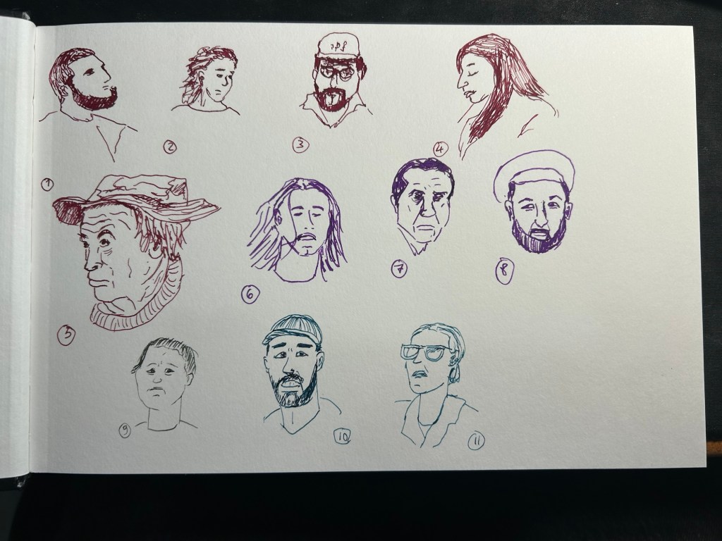
I had a busy day yesterday, so I only got three sketches in and didn’t have time to post them. Numbers 9-11 were what I added, with number 9 being sketched with a vintage Parker Vacumatic filled with Diamine Ash and numbers 10 and 11 being sketched with a Franklin Christoph 45L and Diamine Eau de Nil. I loved the lines that the Parker Vacumatic produced, but it’s an extra fine nibbed fountain pen and it really struggled on the tooth of the Stillman and Birn Alpha. These were the last batch sketched from the Street Photography group on Flickr. I found a better source for photos thanks to a great tip from Tina from the wonderful Fuelled by Clouds and Coffee blog.

One week 100 people day 2

I almost didn’t post today as I wasn’t up to sketching and I got only three sketches in, none of them great. But I like it when creators show their failures so I’m doing it myself today: my lack of shoulder mobility coupled with a lack of sleep and the difficulty of the subject made for a bad sketching day.

Parker 51 with Montblanc The Beatles Psychedelic Purple on a Stillman and Birn Alpha. Sketched 6-8 were done today. As usual the goal for me is to get to 100 even if it takes more than a week.

Celebrate your failures.

February 2024 in Pens and Paper

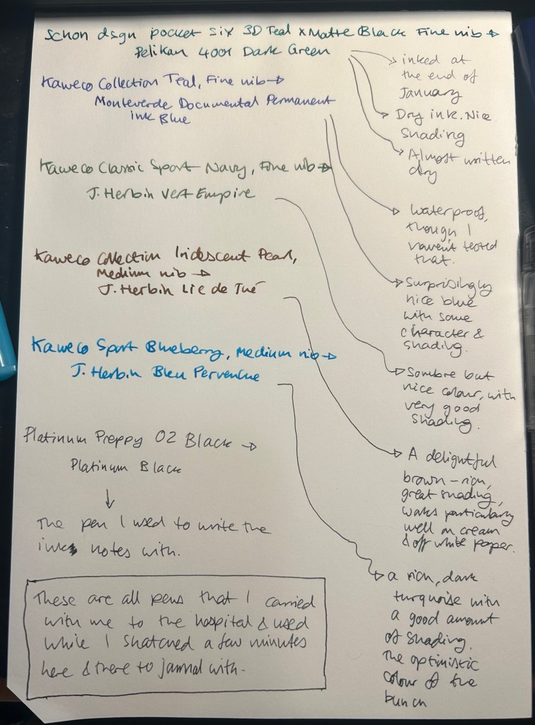
I started the month ready to spend the first half of it in hospital, with my dad. So the fountain pens I chose were all expendable pocketable pens that I was willing to have stolen (apart from the Schon Design Pocket 6 which was a leftover from January and never left my desk). So that meant I inked 4 Kaweco Sport fountain pens using various ink cartridges that I had on hand.

The portable lineup:

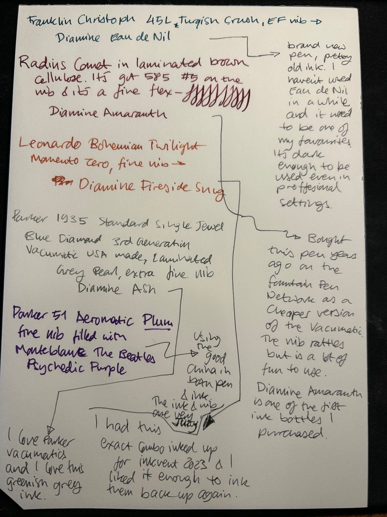
Once my dad got out of hospital and back home, I decided to celebrate by “shopping” from my collection. I inked up a Parker 51 Plum (use the good china!), a Parker Vacumatic, a Franklin Christoph 45L Turqish (spelled like that on their site) Crush that I had purchased but hadn’t inked before, and a vintage Radius Comet (because I heard that the brand was being revived).

The Franklin Christoph EF nib isn’t the best companion to the Eau de Nil as the ink tends to dry in the nib, causing hard start issues. The Radius is a flexible nib of the vintage kind, which means it’s really flexible and not just springy. It also rattles, which makes me not carry it around with me — it stays at home at my desk. The Leonardo is a beautiful pen with a beautiful ink that I refilled immediately — the only Inkvent 2023 ink I did that with. The two vintage Parkers are phenomenal, as usual. The extra fine nib on the vacumatic somehow really well with Diamine Ash, though I was worried at first that the combination would be too light to be readable. The Parker 51 Aeromatic is a treat to use. It’s the rare Plum colour, and it’s got a fantastic nib (as all 51’s have) which pairs very nicely with the Monteblanc The Beatles Psychedelic Purple.

In terms of paper I’ve been using Kokuyo A4 KB paper which I cut to half size (so A5) to manage my daily to do list. The paper is relatively cheap and very fountain pen friendly. I’m also able to use both sides of the page despite there being some show through.

Kokuyo A4 KB paper cut in half to A5 size. This is why standards are great.

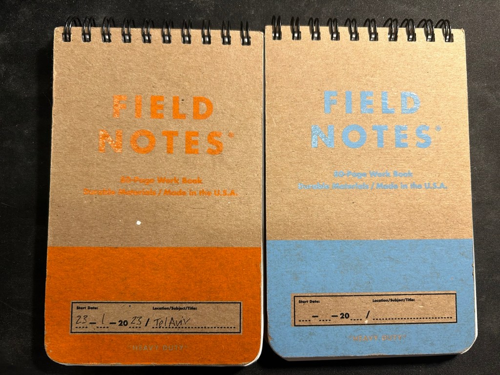
I’ve got a Field Notes Heavy duty on my desk at home and at work, and I just bought a new stock of them. These are where I jot down quick notes, phone call details, doodles during boring meetings. When they’re filled up they get tossed out as nothing in them is permanent — everything important in them moves to somewhere else as I work my way through them.

Field Notes Heavy Duty pocket spiral bound reporter notebooks

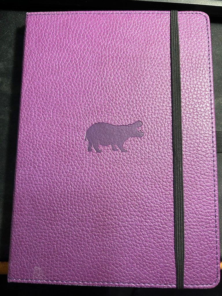
I have finally found a use for my Dingbats notebooks (beyond giving them away as gifts, as I have in the past): this lined purple hippo one is my blog notebook. I discovered that I have a much easier, much quicker time writing blog posts if I first draft them on paper, and this is where I do it in. I’ll likely write a dedicated post to this notebook soon.

Dingbats Puple Hippo A5 lined notebook

Apart from them I still use the notebooks I used last month.

Pencils

I’ve been using the Drehgriffel Nr. 2 as my daily driver. I use pencils extensively to plan, as my plans tend to change, and there’s something about this solid little mechanical pencil that makes me want to use it.

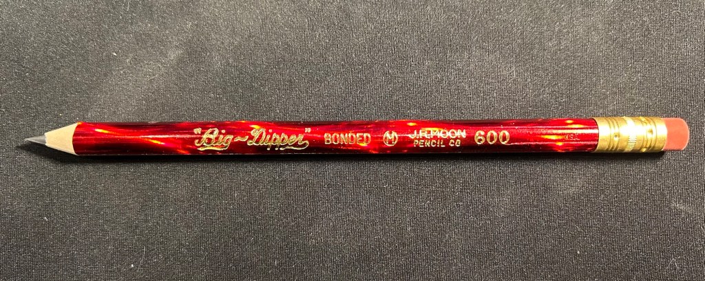
Apart from that I brought two pencils into the rotation, to try to use. One is from my last purchase from the late and great C.W. Pencils Enterprise, and it’s the “Big Dipper” J.R. Moon Pencil Co 600. It’s an oversized pencil, the kind of pencil that kids who are learning to write are expected to use. I’ve been having pretty significant neuropathy in my hands lately and I thought that this would be nice and easy to use, as after all it’s designed for kids just learning to develop their fine motor skills. So far it’s been a disappointment – the eraser and ferrule make it very top heavy, and I’ve been having a hard time manipulating it. I can’t imagine kids using this pencil and having an easy time with it. I like the over the top red foil with gold writing look though, so I haven’t given up on it yet.

Big Dipper J.R. Moon 600

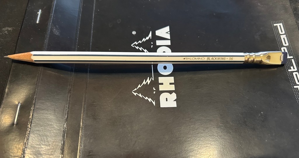
The second pencil is a Blackwing Volumes 56, the baseball themed one. The core is soft and dark, and I’ve been using it for quick and loose sketches. I’m trying to ease into one week 100 people by training myself to work faster than I normally would.

Blackwing Volumes 56

What did you use in February? Any planner changes? Pencil revelations? Pen preferences?

Parker Vacumatic Shadow Wave and How I Look at Vintage Pens

Our local fountain pen brick and mortar shop is closing down at the end of the month, and it’s a crying shame. There’s been a steady stream of collectors visiting the store to say goodbye and stock up on supplies, and on Thursday I joined them. I bought a few bottles of ink, a few fridge magnets with reproductions of old fountain pen adverts (most of them for Parker, of course), and there was a single tray of vintage pens.

“None of them work, I’m afraid,” the proprietor’s daughter said.

But I saw a Parker Vacumatic Shadow Wave among the lot, and I have a very hard time leaving Parker Vacumatics and 51s behind. I picked it up and took a quick glance. It was clearly a user grade pen, but I didn’t care – it was a speedline Vacumatic, which meant that it was fairly easy to fix. I asked her if they could perhaps be mistaken, and was there a chance that the pen worked. She brought out a cup of water and tried it out. It didn’t seem to hold any water, and she showed it to her dad, the proprietor and a well known pen repairman. “Oh, I can fix it, no problem. It just needs a filler swap”.

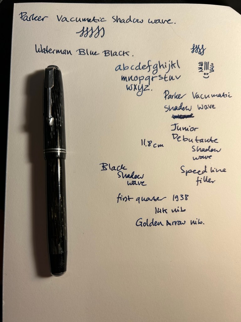
So today, in the midst of a rainstorm, I went to pick it up after its repair. It’s still a user grade pen, because it’s full of little nicks and scratches, and it has a well worn name engraved into it. But that’s part of what I love about vintage pens, and it’s something that I just can’t get with modern ones. I got a gold nibbed pen with a unique filling system and lovely material (that allows you to see the ink levels through it), in a classic design, for less than $130. And I got a bit of history, as this little workhorse has been around since the first quarter of 1938, and it’s still doing its job. Finally, there’s the mystery of it: puzzling out the model and the date code, maybe trying to find out about its previous owner (in this case, a Mary Thompson. It’s part of why I have no problem with engraved vintage pens), imagining what it’s been through over the decades. This pen is almost 85 years old. It’s a Junior Debutante, so it isn’t surprising that it belonged to a lady. It was likely a gift, and one wonders for what occasion and who the gift giver was. It was at the cusp of a world war that would change a lot of things for women. Was Mary Thompson starting out at her first job? Had she graduated from college? Did the pen pass to her children? How did end up in a pen shop in Tel Aviv 85 years later?

Yes, there’s a risk when buying vintage pens. There is also always a story, and a chance of a greatly rewarding experience, not to mention the possibility of getting a pen with a nib that writes like this (it’s a fine italic nib with nice amount of spring to it):

Caran D’Ache 849 Brut Rosé (Rose Gold)

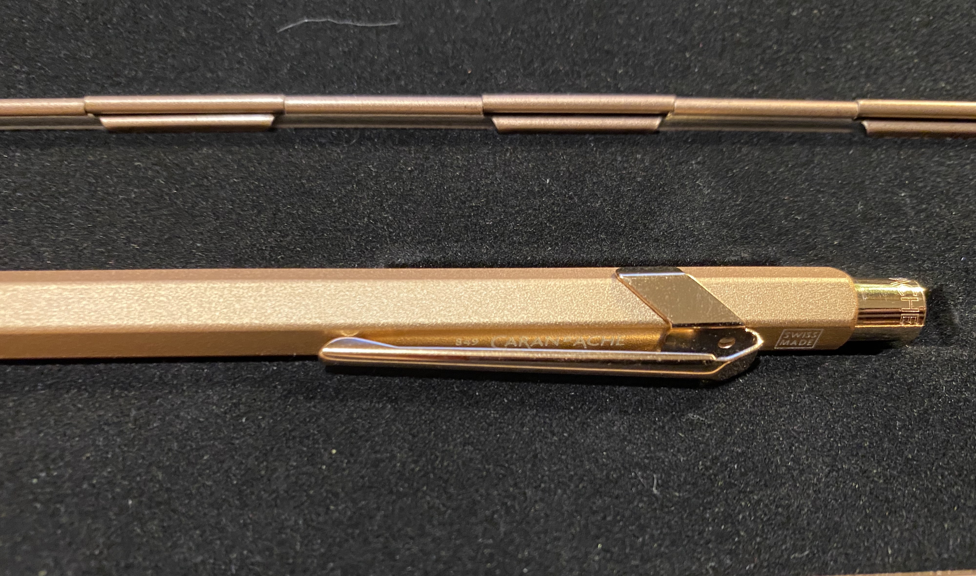
I’ve been on a Caran d’Ache 849 swing ever since I discovered that they can accept Ohto Flash Dry and Parker gel ink refills, and though I usually shy away from “blingy” pens, I was drawn to the 849 Brut Rosé (rose gold) . It is one of the few 849 pens that have a “rough”/ grippy texture.

The box.

The Brut Rosé Caran d’Ache 849 is part of “Celebratory” series that includes Sparkle Gold and Black Code pens. They all come in metal presentation boxes with fabric lining, magnetic closure, and what appears to be the tagline of this edition: “We write the 849 Legend, with added sparkle”.

The box is clearly meant to evoke a jewelry box, and it does so well. The pen itself has the added weight that the Caran d’Ache Nespresso 849 editions have (and the same texture) but is still not a heavy pen. The clip and nock appear in pictures to be gold and not rose gold, but that is only because this is an incredibly difficult pen to photograph. In reality the pen is entirely a warm rose gold.

The clip and nock are a slightly more coppery rose gold than the body, but they are still clearly rose gold.

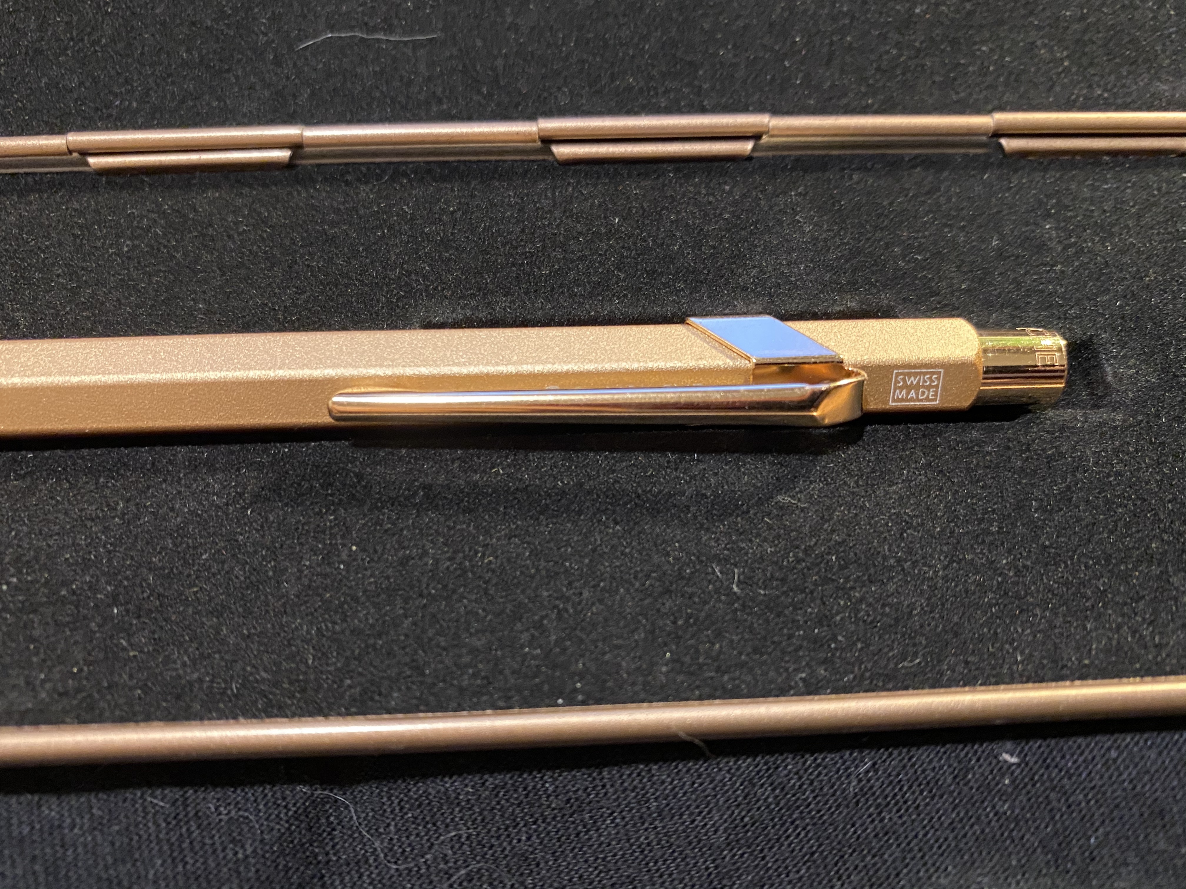
In terms of branding, this pen didn’t receive any special treatment (unlike the Nespresso pens). There’s no indication that this is a “special edition”: it has the same Caran d’Ache etching on the cap, a white “Swiss Made” screen print above the clip, and “849 Caran d’Ache” screen printed in white under the clip.

Swiss Made.

You can just about see the print under the clip here:

Thus the only indication that this is a more expensive “special edition” is the box.

The Caran d’Ache 849 Brut Rosé comes with the Caran d’Ache Goliath blue ballpoint refill. It is an excellent ballpoint refill, but as I’m not a fan of ballpoints, I’ll be switching it out for either the Parker gel 0.7 refill or the Ohto Flash Dry 0.5 refill.

The pen looks plain gold here, but that’s just the fault of the lighting.

The Caran d’Ache 849 Brut Rosé will make for a fantastic gift pen, whether for yourself or for someone you like. It’s on the more expensive side of 849 special editions, but I think that it makes a more subtle and sophisticated impression than the similarly priced “Claim Your Style” 849s.

A Friendly Suggestion for Beginner Vintage Fountain Pen Users

I’ve been catching up on the Pen Addict members-only “Friend of the Show” podcast (highly recommended), and person after person said that they prefer modern pens, and they have a vintage pen, an Esterbrook, which they don’t really use. That people’s first vintage pen is an Esterbrook didn’t surprise me, as it’s a great little pen at a very compelling price, and it can be easily modified to suit your writing style by swapping out the nib. What did surprise me a little is that people aren’t really using the Esterbrooks that they have.

Then again, I own five Esterbrook pens:

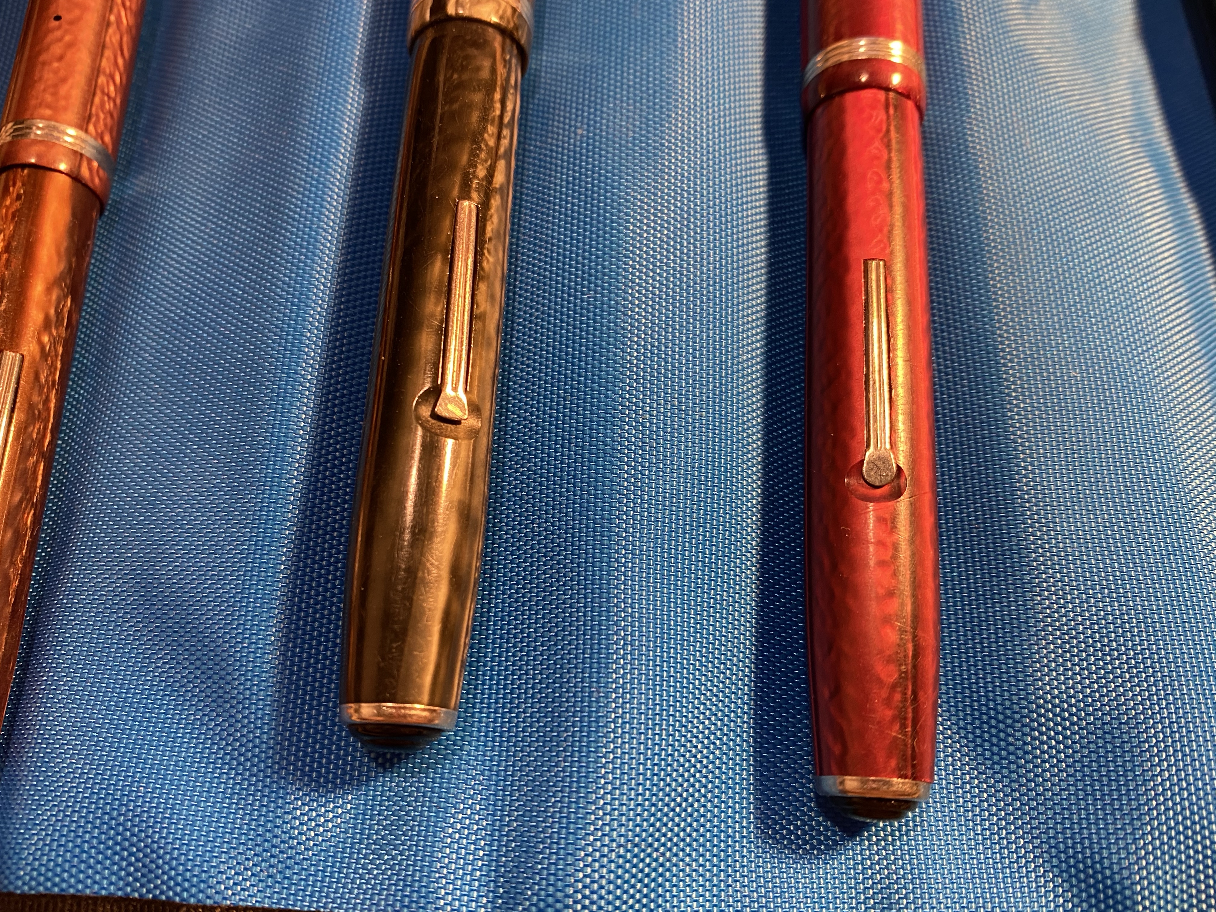
Yet I haven’t used them in years. They all have nibs that I carefully selected to fit my writing style perfectly, and still I haven’t used any of them since 2016 or so. And the reason I don’t use them is the reason why I’m going to suggest to people starting out with vintage pens to maybe not pick the Esterbrook as their first vintage pen, ubiquitous and cheap and beautiful as they may be.

They’re lever fillers, every last one of them.

The dreaded lever.

Lever filler mechanisms are very common in vintage pens, because they are so cheap and easy to produce. They’re also fairly easy to mend, and so you’ll find them everywhere on a vintage dealer’s table or on a vintage pen site. They are my second least favourite filling mechanism (hello button fillers, you get first place) because they are not great to use when you’re filling a pen, and they are really not great to use when you’re cleaning it.

The Esterbrook does allow you to bypass the annoying cleaning part in that you can unscrew the nib and clean the pen like that, but you still have to use the lever when you fill the pen, and you still have no earthly idea how much ink is in your pen while you’re writing with it.

So my friendly suggestion would be to delay your first purchase of a vintage fountain pen and buy something a little more expensive (in the $100-$150 range) that is easier to fill and clean. If it turns out that you like vintage fountain pens, then you can start getting used to lever fillers and their quirks.

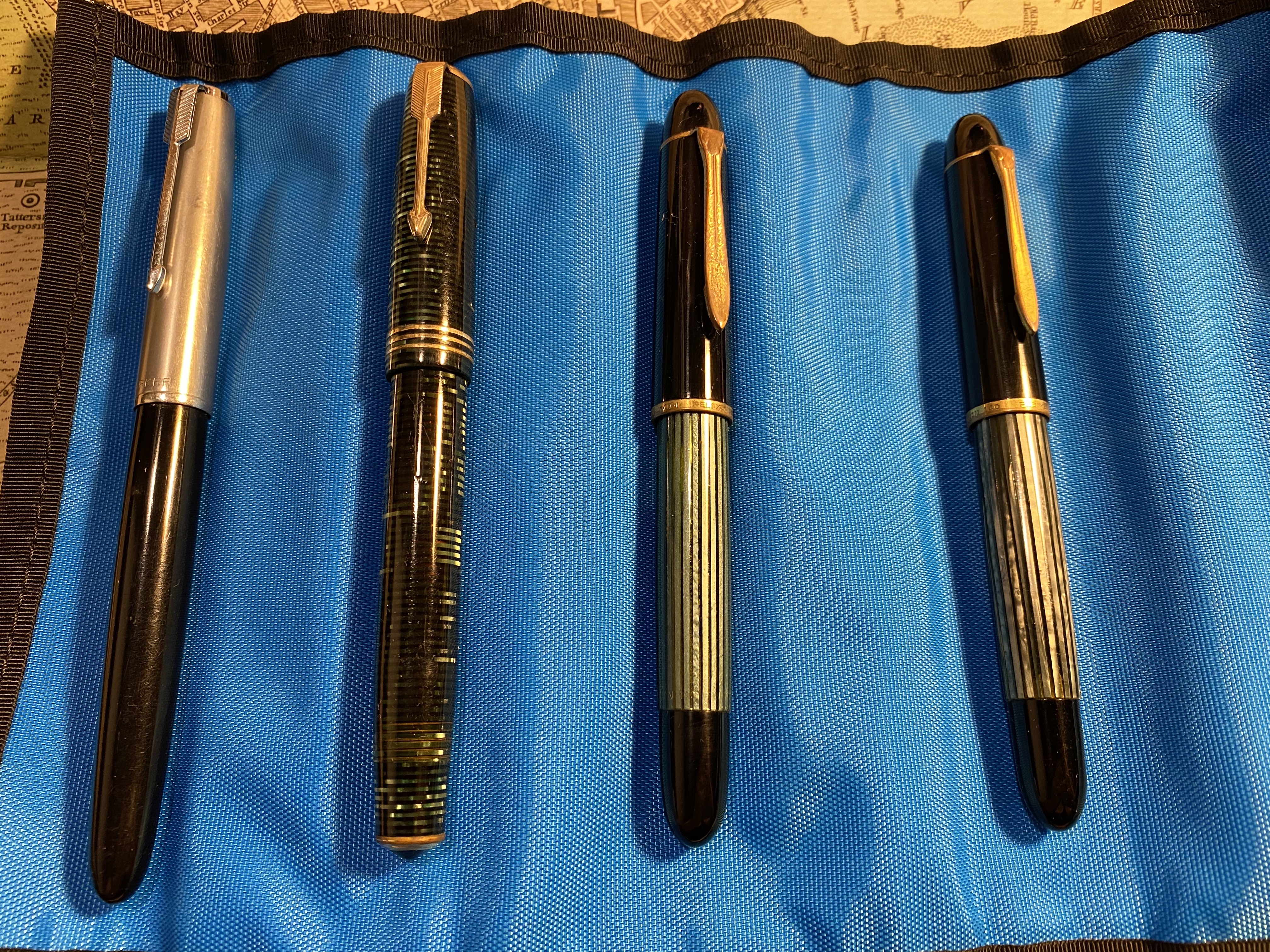
Parker 51, Parker Vacumatic and Pelikan 140

Here are my top three suggestions, in order of most beginner friendly to least beginner friendly (but still friendlier than a lever filler): the Pelikan 140 (a piston filler), the Parker 51 aerometric (an aerometric filler that works like a squeeze converter), and the Parker Vaumatic (a vacumatic filler).

Aerometric, Vacumatic and Piston filing mechanisms.

The Pelikan 140 is a piston filler with a gold nib, and a semi transparent body which allows you to see if you filled the pen properly and how much ink is left. It was made for over a decade and has a wide variety of nibs, so you can quite easily find it, and look for the perfect nib for you, just like with the Esterbrook. It is a more expensive pen, but you can still get a phenomenally good pen (ebonite feed, gold nib which can sometimes have flex, and a large ink capacity) for significantly less than what the same features would cost on a modern pen. The downside is the aesthetics, which can be a little spartan (Pelikan 140s are mostly black with green stripes), and the trim’s tendency for brassing. But brassing adds character, as once a very good vintage pen blog said. These pens are also likely to be more easily obtained in Europe than in the US or Asia.

Pelikan 140

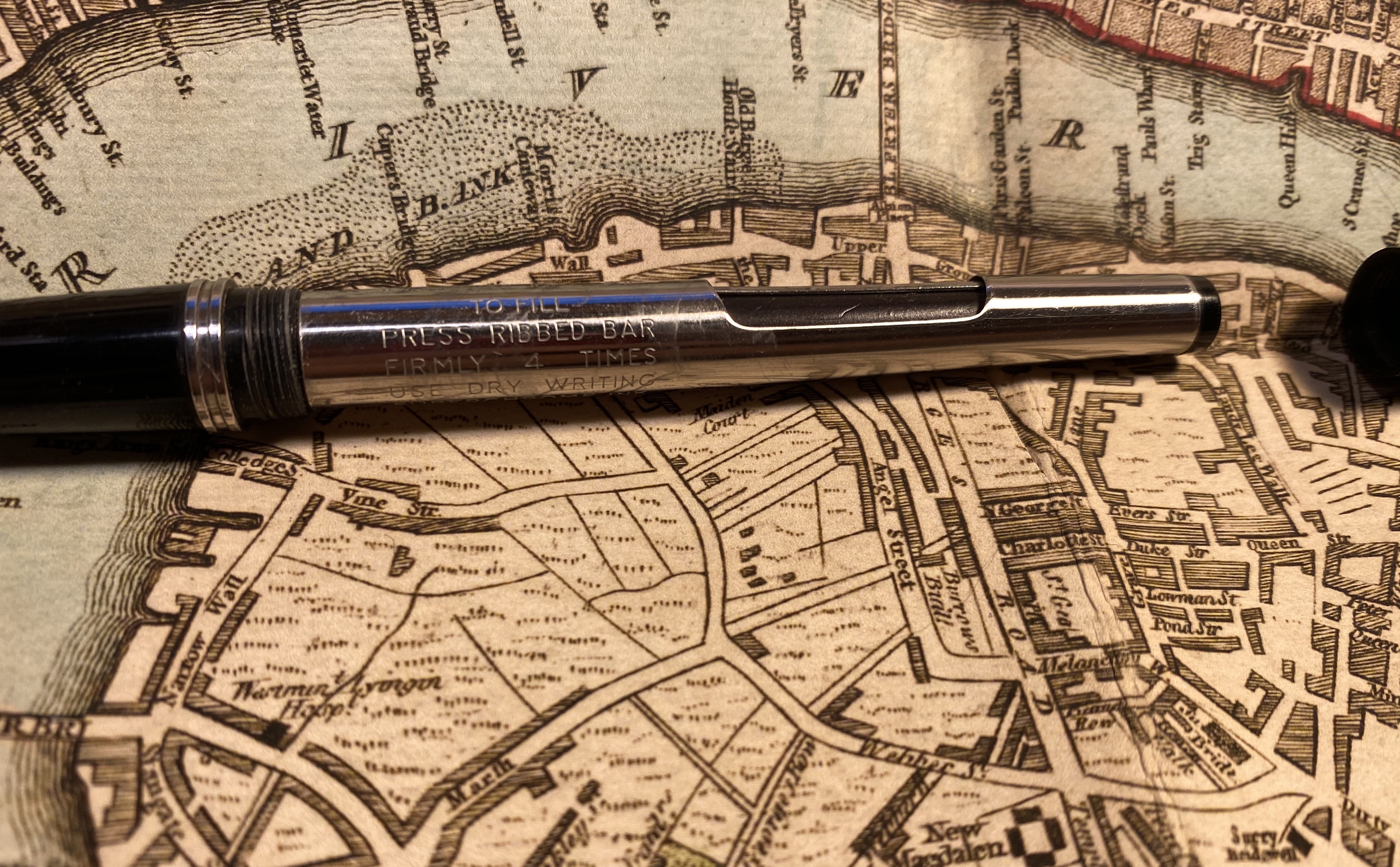
The Parker 51 is still my absolute favourite vintage pen, but that’s not why it’s here. It’s here because the aerometrics (which are also cheaper) sport a filling mechanism that works very much like a modern squeeze converter, albeit permanently attached to the pen, and the filling instructions are etched into the pen, which is very helpful of Parker.

Parker 51

Theoretically you can gauge if there’s ink in the pen using the transparent sack but in most cases the sack will no longer be transparent, and even if it was, its position doesn’t really tell you a lot about the state of the ink in the pen. So it’s relatively easy to fill and clean the pen, but you’re not going to have any indication as to how much ink is in it at any given time.

Filling instructions on the pen body.

The Parker Vacumatics are gorgeous pens with great nibs, and the striped Vacumatics let you know what the ink level is unless they are stained beyond belief, in which case I’d wait a bit for a pen in better condition. The Parker Vacumatics I’m recommending are those with a lock down mechanism. Of the three pens they are the most fiddly, and that’s why they’re in third place, but they allow for a relatively large ink capacity, and the option to see the ink levels at all times, so they go on the list. To fill the pen you unscrew the blind cap, give the metal nob on the top a slight turn and push (a bit like opening a child proof pill bottle) and then the metal plunger springs out. You push the plunger a few times to fill the pen, and then you push down the plunger and twist it once it’s down so that it locks back into place. If you’ve ever used a child-proof pill bottle then you’ll be familiar with the push and twist mechanism, and if not have it demonstrated when you buy the pen or find a youtube video that shows you how to do it. It’s not difficult.

This is a more expensive, double jewelled model, but the filling mechanism is generally the same on cheaper vacumatics.

The Parker Vacumatics are not as intuitive to use as a lever filler, but they allow for an ink window which means that you can see if you have ink left or if you’ve filled or cleaned the pen properly pretty easily:

You can see the ink levels through the orange transparent bits between the stripes.

These pens are never going to compete with the Esterbrook pens on price because they have gold nibs and more sophisticated filling mechanisms. They do quite easily compete with modern pens in terms of bang for your buck when it comes to getting things like a piston filler with a flexy double broad gold nib. If you’re buying a vintage fountain pen that you want to have a relatively easy time filling, using and cleaning, and that will give you a unique and oftentimes exceptional writing experience, any one of these three pens ought to do.
And just to set the record straight: I love Esterbrook pens, and there was a time when I used them constantly, and I still heartily recommend them as they are little workhorses of delight. It just occurred to me that perhaps that little lever combined with the opaque body may be off-putting to new users, and so I’m suggesting a few (much more expensive, sometimes harder to obtain) alternatives. With vintage fountain pens purchase patience is required and not FOMO, so it’s worth waiting for a great $100 pen that you’ll use more than buying a $50 one that you won’t.

Diamine Earl Grey Review

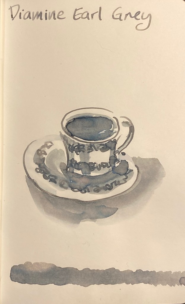
Ever since I saw the first reviews of Diamine Earl Grey I have been fascinated by this ink, and only partly because I love, love, love tea. The colour seemed to have shading properties and tonal depths that were similar to the much coveted yet hard to obtain Sailor Studio 123. I had vowed to cut down on my ink purchases, but as I broke down and bought some Diamine Blue (i.e. Christmas) inks, I had to add a small bottle of Diamine Earl Grey to the cart.

Parker Vacumatic Major with an medium italic nib on a Rhodia No. 16 pad.

This ink is sheer magic. It is very legible (unlike many lighter grey inks), it shades like mad, and even on Rhodia paper you can see a bit of its tonal depth.

Shading on every single letter.

On Tomoe River paper the depth of its hidden tones really comes to light:

Drawn with the Parker Vacumatic and a W&N Series 7 #2 sable brush.

There’s blue, even slight hints of turquoise, green, yellow, shades of pink, and in the dark recesses hints of warm brown. It’s like the greys I often create on my watercolour palette: a mix of reds, greens and blues, with a dash of brown. The result is a rich, “living” grey that surprises you every time.

I’ll probably skip the Sailor 123 Studio Ink because the price plus shipping plus customs will make it painfully expensive. Now that I have Diamine Earl Grey I don’t feel like I’ve missed out.

Caran D’Ache 849 Nespresso Arpeggio Limited Edition

Hey, look what just arrived in the mail:

Such great packaging.

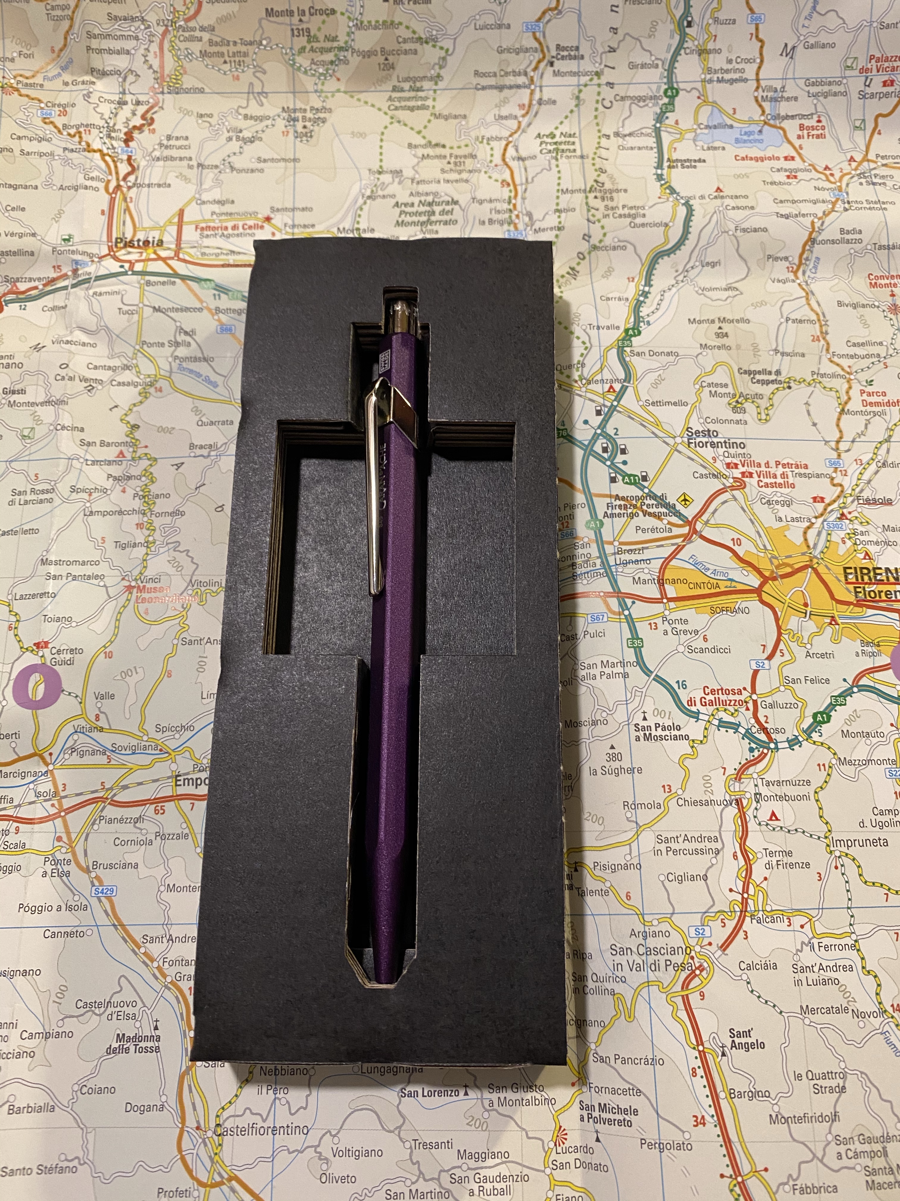
It’s the new Caran d’Ache 849 Nespresso limited edition and this time it’s Arpeggio that was chosen. Arpeggio is not only one of Nespresso’s more popular capsules, it’s also a gorgeous purple, which is a huge plus in my book, and big difference from their previous edition, the India.

But first, some photos of the phenomenal packaging of this pen:

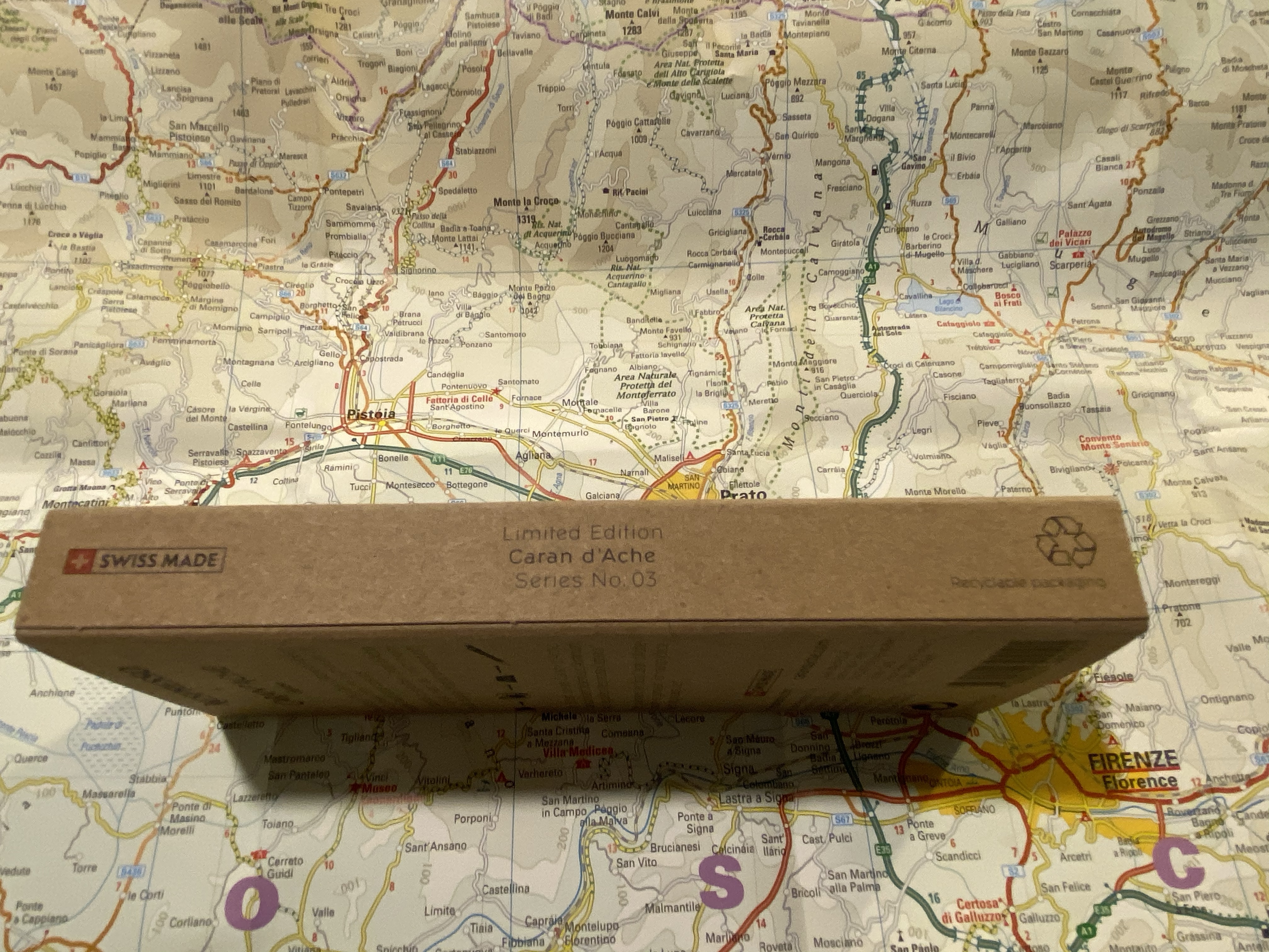
Side view, where you can also see that it’s the 3rd of the series.

The 849 Arpeggio is made out of recycled Nespresso capsules just like its predecessors:

The back of the pen box.

The cardboard cutout the pen comes in still on point: a simple and fitting material designed to perfection to best showcase the pen and its materials.

Look at that colour!

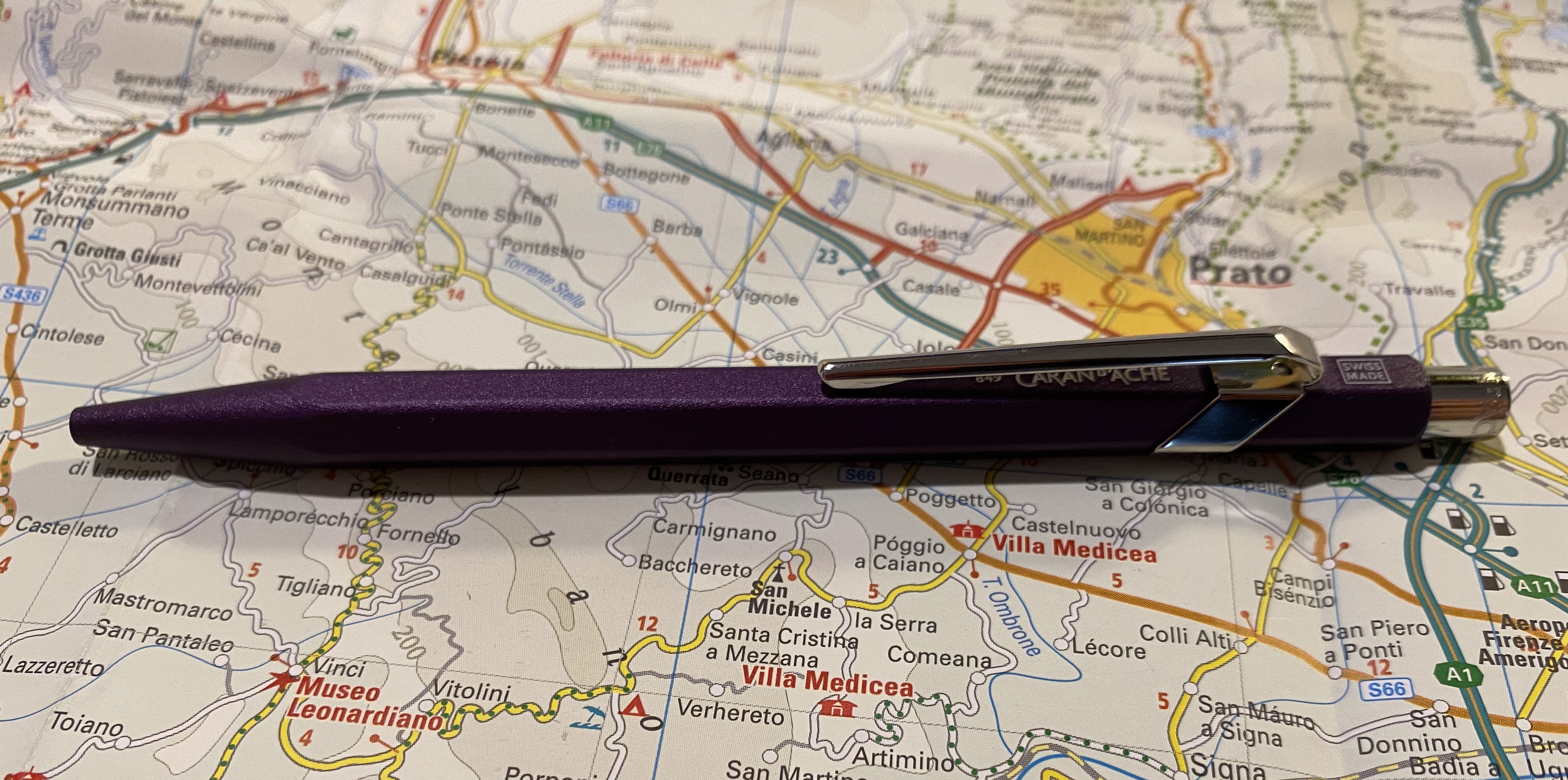
This came out darker than I would have preferred, but you can just about see the Caran d’Ache brand under the clip, and the “Swiss made” on top.

Swiss made.

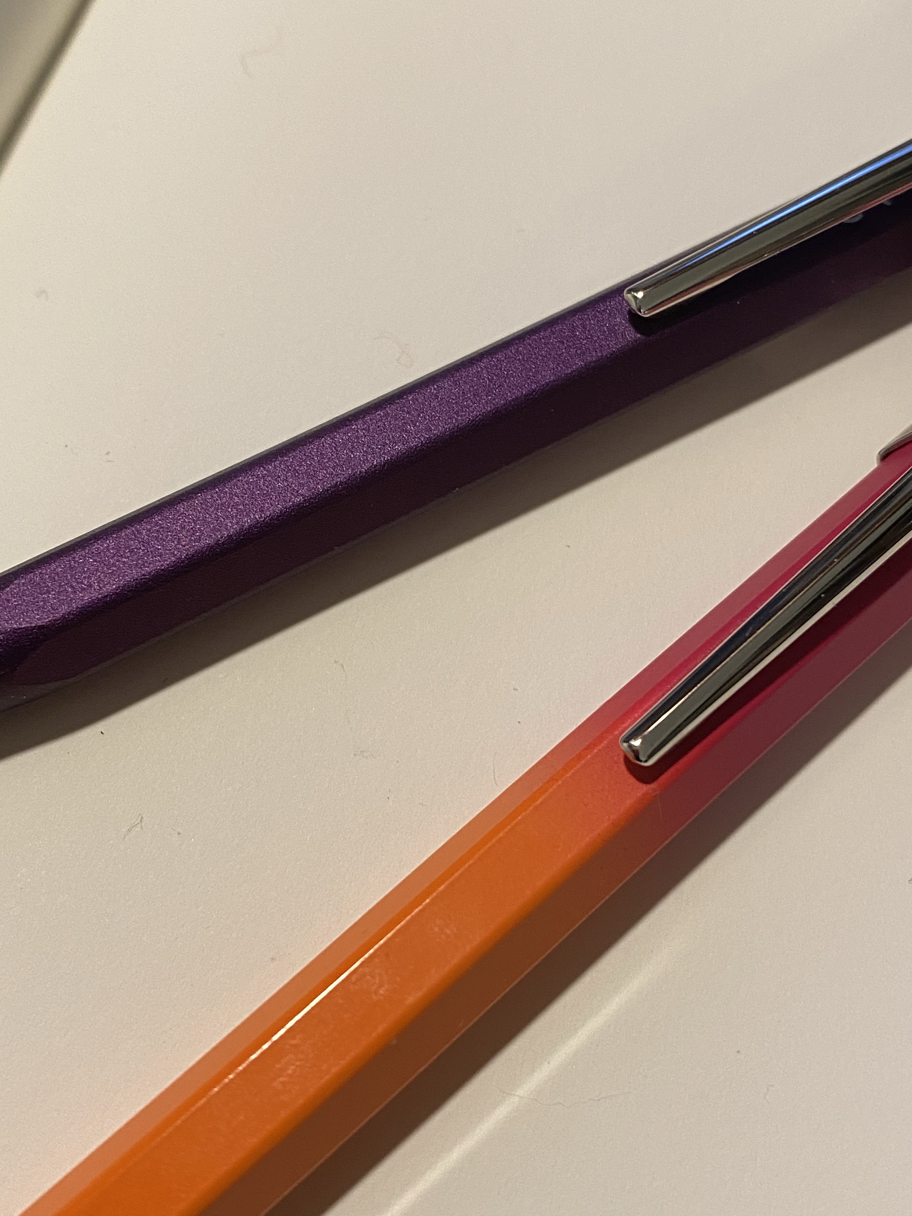
The 849 Arpeggio is a lovely deep purple, and has a great texture to it. The non-smooth surface makes it much easier to grip than many of the other 849 pens. You can see the difference in texture here between the Arpeggio and one of the 849 Tropics pens:

Textured Arpeggio finish vs the glass smooth finish on the Tropics 849

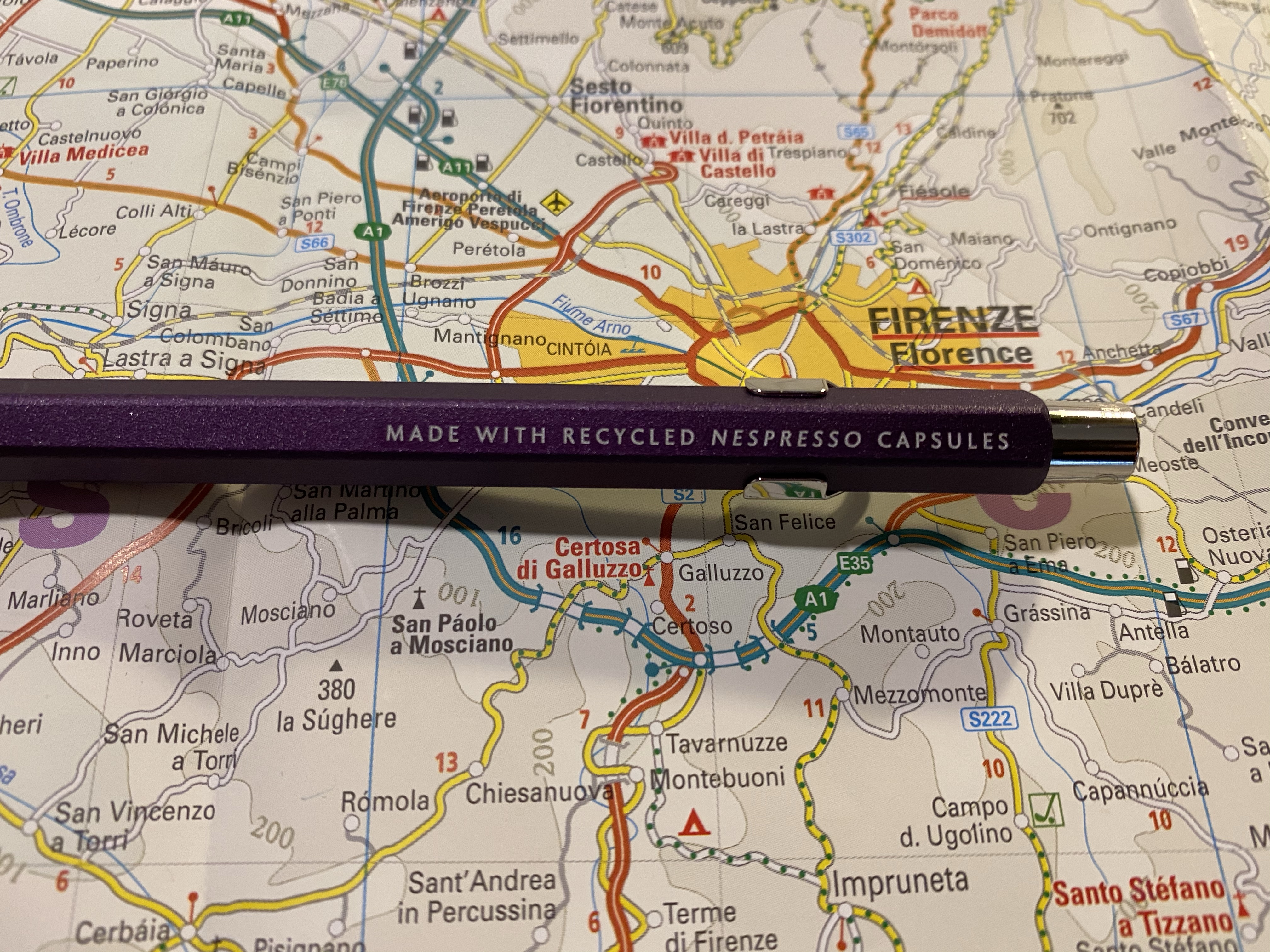
And here’s the by now familiar “made with recycled Nespresso capsules” tagline on the side:

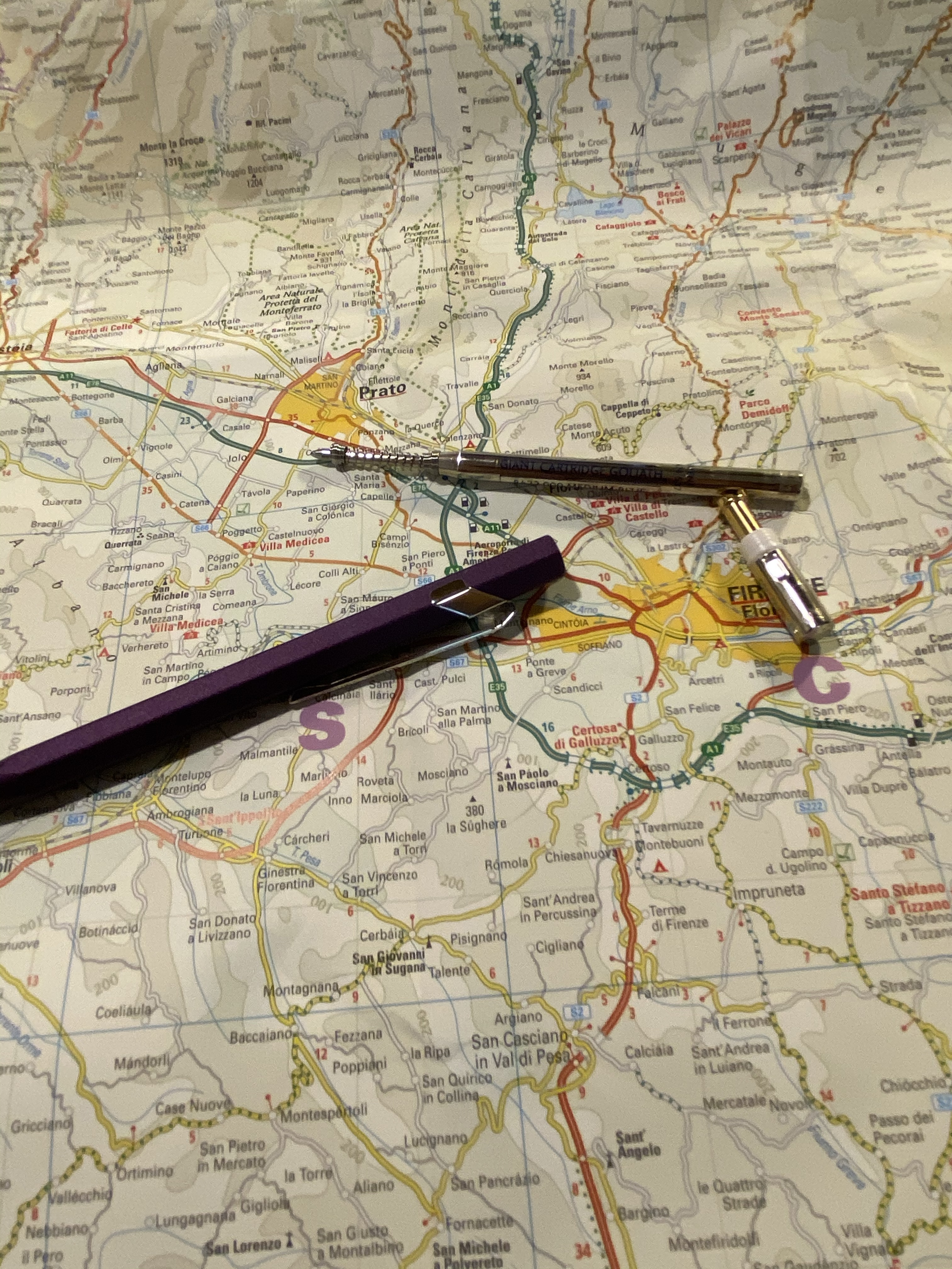
I changed the refill, and since somebody asked, I thought I’d focus on that for a bit. To change the refill you unscrew the clicker on top, and that might take a bit of fiddling, since it’s pretty securely screwed in. It doesn’t take force, just a bit of patience. Then take out the refill and swap it out with the new refill, and don’t forget to put the front spring on, preserving the right direction it was placed in when it came off.

Body, cap and original refill with the spring.

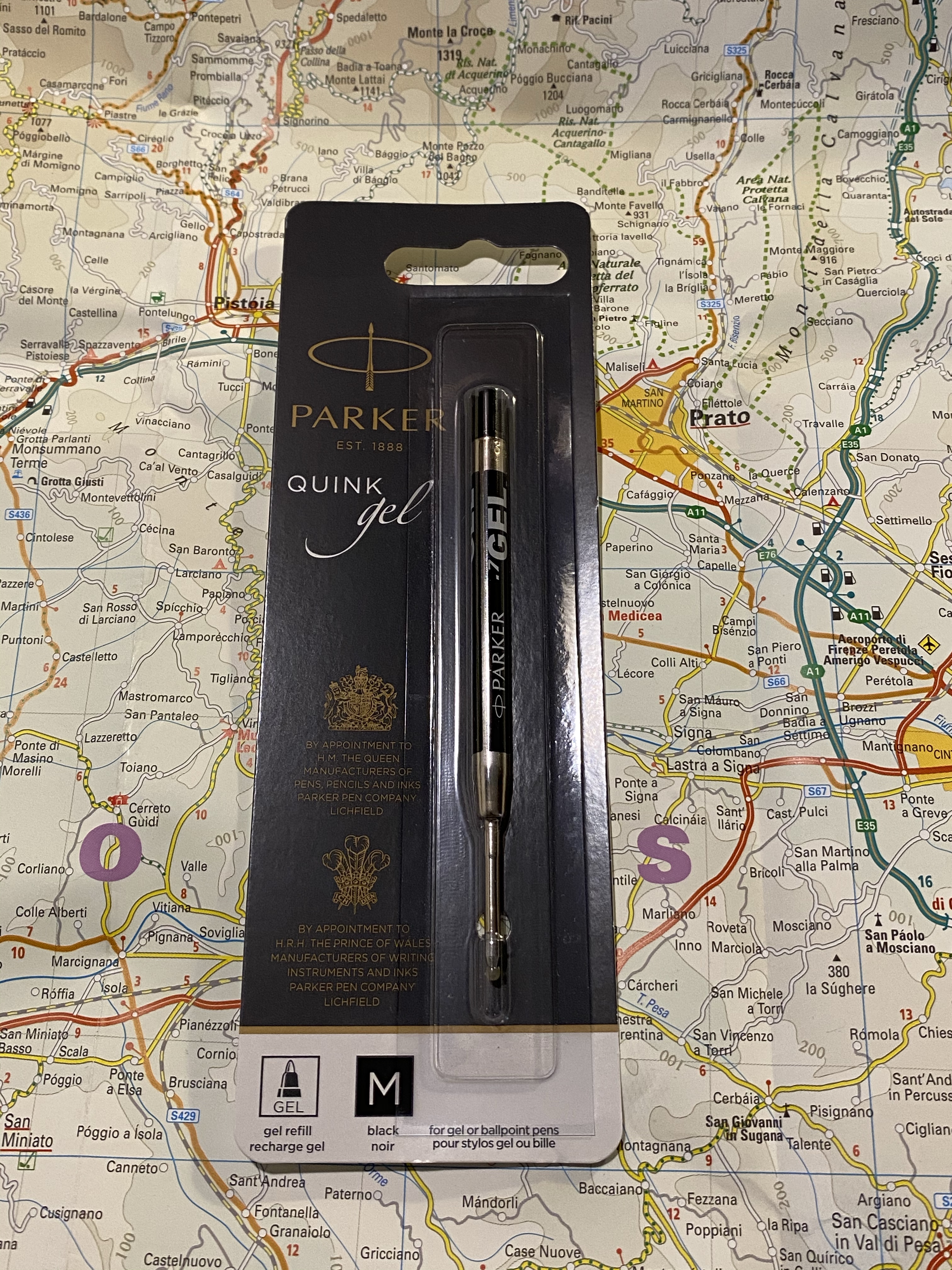
I replaced the original Caran d’Ache Goliath ballpoint refill with the Parker Quink medium gel refill (it’s 0.7 mm). Here it is in the packaging in case you’re looking for it. I bought a pack of these from the excellent, excellent CultPens (I’m not being paid to say this, I just really appreciate them and what they’re doing. If you’re a non-US pen addict in particular I recommend checking them out).

Here’s a writing sample with the Caran d’Ache Goliath ballpoint refill and the Parker Quink gel refill. If you’re a fan of ballpoints, the Goliath refill is excellent. I just happen to not like ballpoints, so I change them to gel refills whenever I can.

The Caran d’Ache 849 Arpeggio is a beautiful pen that would make for a great gift (if you can bear to part with it). I can’t recommend these series of pens enough, and I can’t wait to see what next year’s edition will be. Nespresso’s capsules come in a variety of pretty nifty colours, so I don’t think that Caran d’Ache can really miss with them.