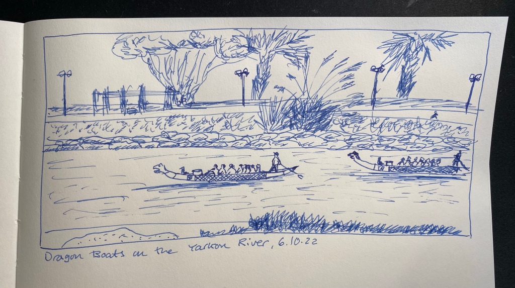
I run practically the same route every day, and yet it never gets boring, especially since the sea, the river and the park are constantly changing. Today it was dragon boats that were out in force on the river. I’ll probably do a watercolour sketch of the scene later on. In any case, this page will be sketched with a Platinum Plaisir filled with the cartridge it came with. It was supposed to highlight the fact that you can sketch with even the cheapest of fountain pens, but I have to say that I don’t recommend the Plaisir. The nib doesn’t flip well, the ink cartridge it comes with is proprietary and the ink inside is in a depressingly dull blue, and there are better pens to be had for a little more or a lot less.
It’s time for a wash, and this time it’s just water over Colorverse Golden Record ink. The sketch was done with a Diplomat Aero fine nibbed pen, which you can see at the bottom of this post, and on A4 Midori MD Cotton paper, which is not built for washes. It buckles almost immediately.
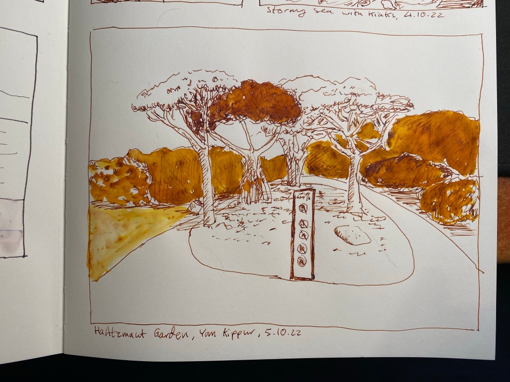
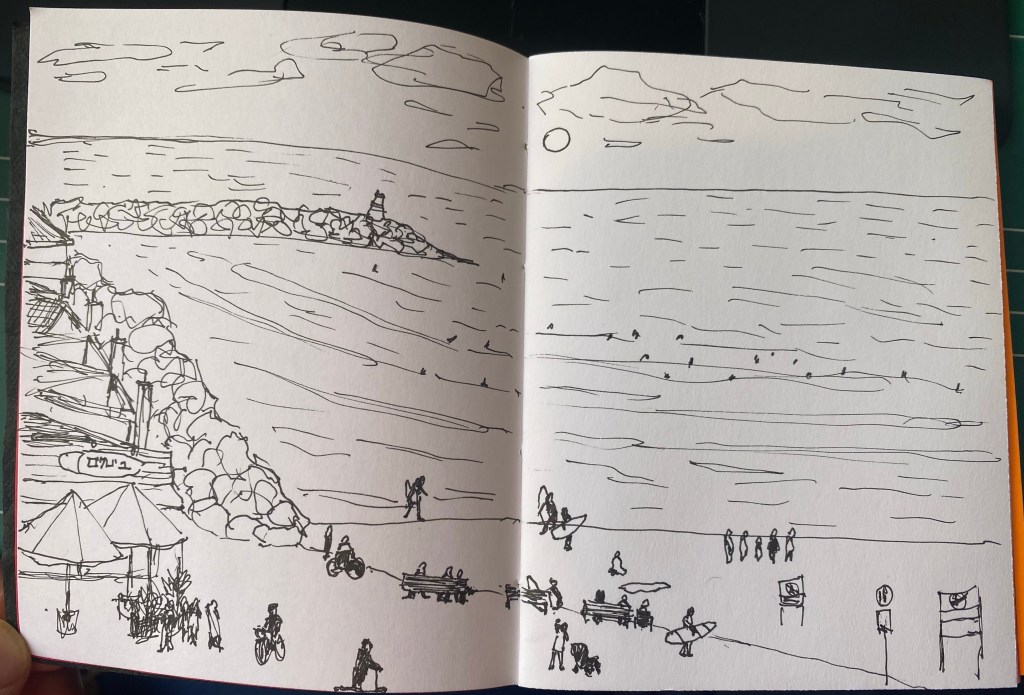
One of my favourite places in Tel Aviv, Independence Garden (Gan HaAztmaut).
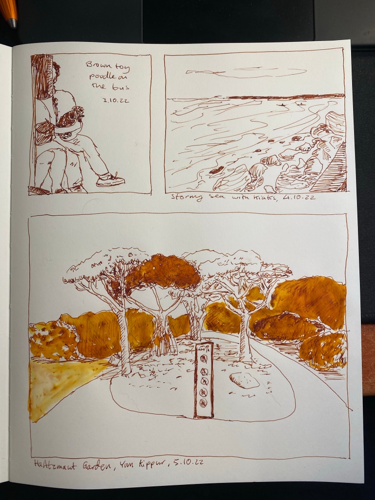
Here’s the complete page:
I like the comics like effect of it.
And here’s the pen that I used to sketch it all, the wonderful and highly recommended Diplomat Aero (in this case in orange, but it comes in a myriad of colours). The Colorverse Golden Record ink was part of a set, and I don’t recommend it.
I’m going for a page of sketches with this pen and ink combo, so here’s another small one, of two kayakers braving the stormy sea. Diplomat Aero fine nibbed fountain pen with Colorverse Golden Record on an A5 Midori MD Cotton notebook.
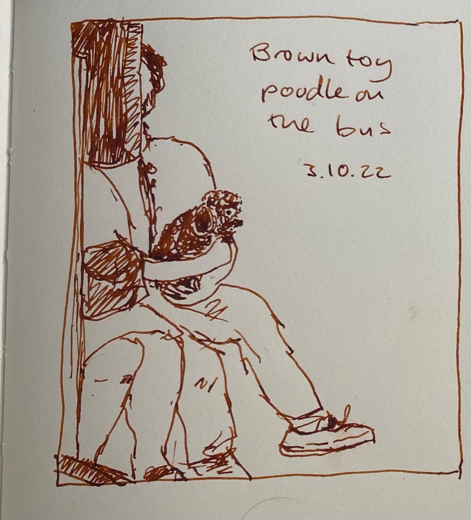
I had a busy day, so it was a very quick sketch this time, of a brown toy poodle sitting on her owner’s lap on the bus. She was quite the attraction, and reminded me of my old dog in the pure joy she took from everything around her.
Drawn on an A5 Midori MD Cotton notebook with a Diplomat Aero fine nibbed pen filled with Colorverse Golden Record. This ink has a tendency to dry out in pens, and it becomes darker in the pen after a day or two.
Today’s sketch was also done with a fine nibbed Karas Kustoms Velys Ignem Vertex and Kyo No Oto Sakuranezumi ink on a Midori MD Cotton A4 notebook. It’s a very quick sketch, done in less than 10 minutes, and I later on made the mistake of applying a wash on the sand, and pretty much ruined that part of the sketch.
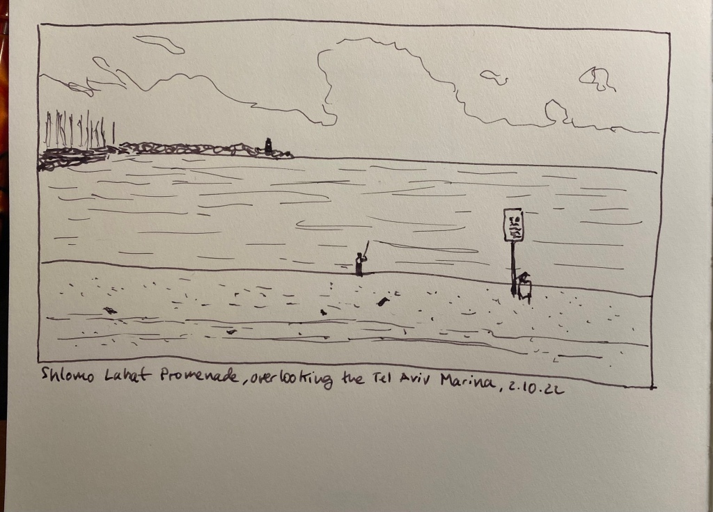
View of the sea from next to the Tel Aviv Marina
Here are the two sketches together on a complete page (before I destroyed the bottom one).
It’s Inktober again, and after a few days of hemming and hawing I decided to join it this year. Once again I’m not following the very Halloween themed prompts, but instead just sketching with fountain pens (for the most part) and ink. I’m sketching directly on paper (no pencil underdrawing), and I’m using an A4 Midori Cotton notebook for these sketches.
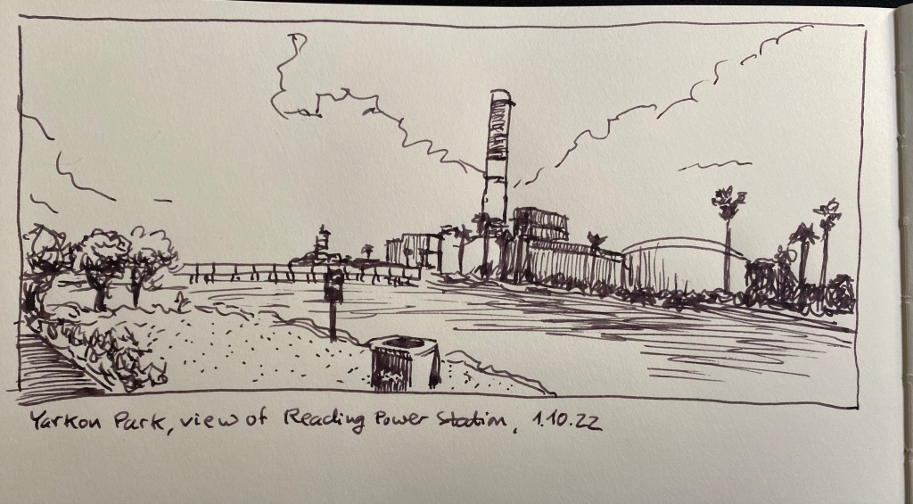
Yarkon Park, view of Reading power station.
This is a 10 minute sketch, done with a Karas Kustoms Vertex Velys Ignem fountain pen with a fine nib, filled with Kyo No Oto Sakuranezumi ink.
Vertex Velys Ignem.
This is my first Karas Kustoms fountain pen, and I really enjoy using it (I’ll be posting a full review once I’ve had more time with it). I used the nib on both sides (flipping it over for extra fine dots and lines), and it is smooth and well performing.
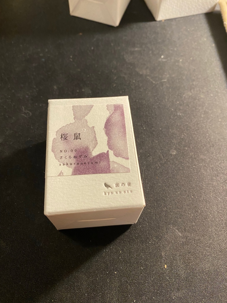
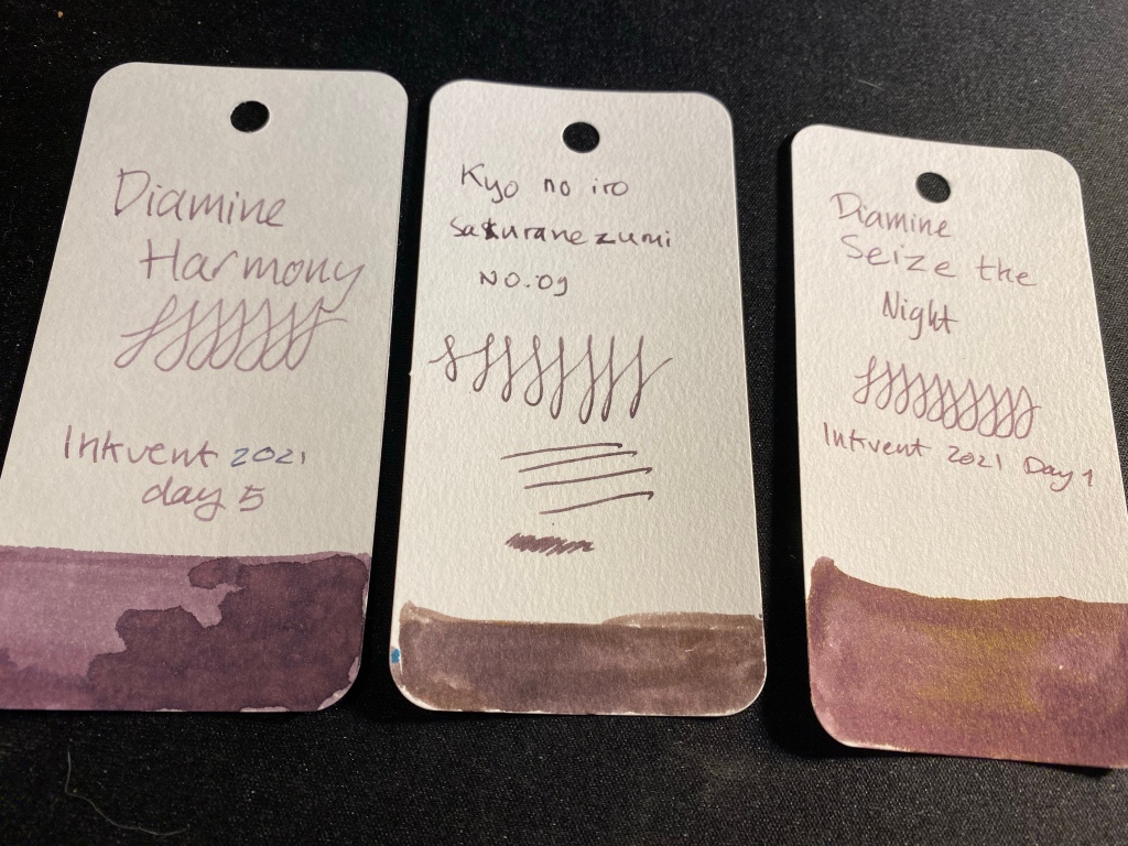
Kyo No Oto Sakuranezumi box.
For some reason I got the ink brand name mixed up in my head and I’ve been calling it kyo no iro. Embarrassing. In any case, I bought this ink on an ink shopping spree in Choosing Keeping in London during my latest trip there. It’s a dusky purple/mauve colour that reminded me of Diamine Harmony (and costs significantly more).
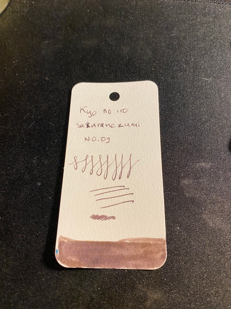
Ink sample on Col-o-ring tab.
Sakuranezumi is a purple with yellowish undertones that is darker than Diamine Harmony or Diamine Seize the Night, and shades significantly less than the other two. In a fine pen it is dark enough to be acceptable in office use, and I enjoy its dusky mystique. If you do wet the ink, the yellow undertones really become prominent, so take that into account if you plan to use it for ink washes, etc.
If you are looking for a mauve ink and you want something subdued and dark, Sakuranezumi would work for you. I personally find Diamine’s offerings to be more interesting, plus they are easier to obtain and significantly cheaper. Harmony shades more, and if you are looking for yellow undertones, then Seize the Night has the sheen for you.
It’s been a while since I posted an update, and there’s been fewer posts than usual during the last two months. This is mostly because I started a new job in June, and it’s been longer hours and more work than I anticipated at first. I am enjoying myself, but the change means I have less free time, and that I need to prioritise things differently to better fit the things that I care about into my life. Was moving from a cushy and undemanding job to an interesting and fun but much more demanding one a mistake? Time will tell, but so far I’m not regretting the switch.
As I’m starting to find my footing, I’ve been able to find more time for my hobbies. During the early days of my new job the only thing I did was work, exercise, sleep and eat. Then reading came back into my life, and journalling and sketching followed. Meanwhile the Sketching Now Watercolour course is over and I only had time for the first week, but thankfully the materials are all available online so I’ll be able to complete it all eventually.
What’s left my life almost entirely so far is watching TV, and I doubt that it will regularly return. In terms of media consumption, I read and listen to podcasts and that’s about it. I will watch specific things on Disney Plus or watch Adam Savage make things on YouTube, but even that isn’t something that I do often these days. It’s not a value judgement on TV – it’s just that I have less time now, and of the things I could easily get rid of, this was one of them.
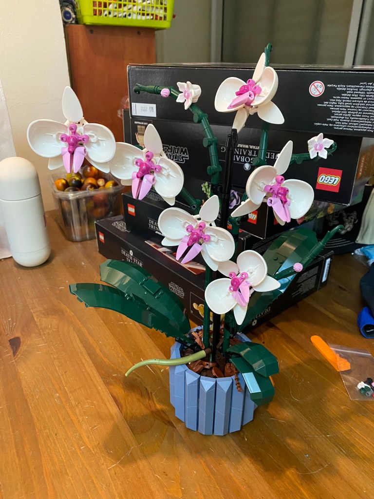
Lego Orchid set (it’s gorgeous). I find building these sets very relaxing, and as you can see in the background, I have quite a few more to build…
Another thing that went out the window is social media. I’ve stopped checking Twitter and Facebook regularly. The only thing left is Instagram, which I still spend too much time on for my liking, and as Facebook starts messing with it I may likely leave as well.
Health
I had a bit of a health scare in late June. It was 6 months after my last chemo treatment, and I had some blood work done for a check up with my hemato-oncologist. One of the results was extremely low, and it was for a test that people rarely get and I certainly have never gotten before, so I had no baseline to compare it to. What little information I found online indicated that I either was going through kidney failure/had a kidney tumor or had a rare form of blood cancer (beyond the blood cancer that I already had). Two sleepless nights later my hemato-oncologist (bless her), told me that everything was OK. The rest of my blood work was good, and this test was meaningless for people in my condition. She never asked for it, and I don’t know what possessed my GP to ask for it. In any case, I am now officially well enough to go on the regular post treatment checkup schedule, which means once every three months. Yay!!!
I’m running five times a week now, four 5ks a week and I’ve now started to work in a long run in the hopes to get back to running 10k. It’s tough running in this heat and humidity, especially with my lungs not being 100%, but I’m pushing through and enjoying myself. Running is my meditation, and has remained that way even though I now also meditate as part of ACT.
I’m also going twice a week to lift weights in the gym, nowadays with a mask on to avoid COVID. I’ve been vaccinated four times, but am now working from home again and staying masked as I can’t afford to get sick with the state of my lungs. Practically nobody is wearing masks anymore, and almost everyone around me is sick, so it’s been frustrating to try and stay healthy under these conditions. I’m hoping that the Omicron variant vaccine will be available here in a month or so, and I’m keeping an eye on the numbers to know when I can go back to the office and see people face to face again.
Reading
I’ve finished Hillary Mantel’s “The Mirror and the Light”, the third and final book in her trilogy about Thomas Cromwell. I’ll write a more lengthy review of it on Goodreads, but I will say that I got tired of the book at around the 60% mark (it’s about 900 pages long), and it didn’t really recover from that point on. I can see why Mantel struggled with this one, and I don’t regret reading it, but it’s not as good as the previous two books, and it could have done with some robust (and perhaps ruthless) editing.
I’ve also finished Ali Smith’s “Companion Piece”, which is a companion piece to her seasonal quartet of novels (Autumn, Winter, Spring, Summer) and is excellent. You don’t need to read the quartet to enjoy this book, and “Companion Piece” would also be a good introduction to Smith’s writing. It’s written in stream of consciousness style, although it’s fairly easy to understand (nothing as complex as Joyce), and there’s a joy in her writing, compassion, insight and humour that make reading her always an enjoyable and worthy pastime.
As these were a bit challenging to read, I had an Agatha Christie “palate cleanser” in the shape of two novels: “The Man in the Brown Suit” and “Crooked House”. “The Man in the Brown Suit” is a detective/adventure story that was originally light hearted, but today just doesn’t work. There’s too much racism and sexism to bear, especially if you know anything at all about the history of South Africa, diamond mines, and labour relations in Africa. “Crooked House” was one of Christie’s favourite novels, and it’s a fun and interesting book with many original characters (and yes, also spots of racism).
Pens, Pencils and Notebooks
I’ve been playing around a lot with ink washes lately, as I’ve written here. They’re a fun and quick way to add colour to a sketch, and having a limited palette makes me appreciate colour values more.
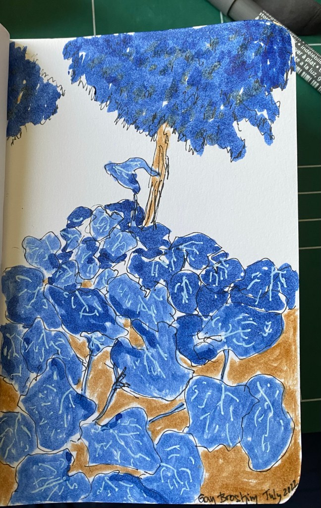
Quick sketch of squash plants gone wild in a local garden.
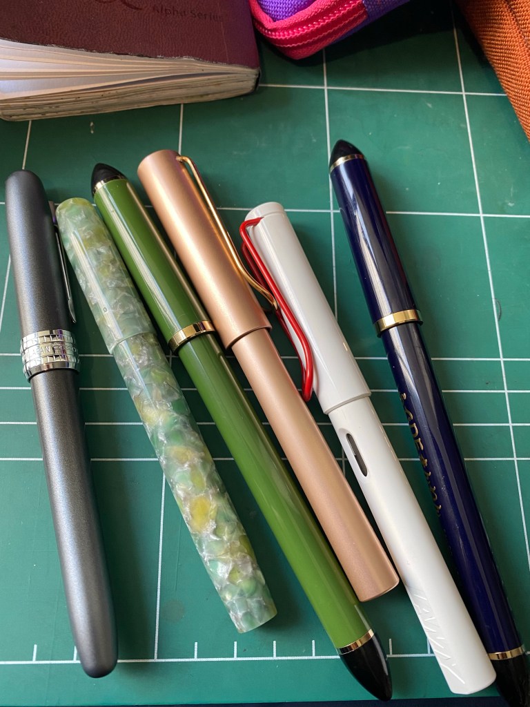
I’ve written almost all of my fountain pens dry, with the exception of a Franklin Christoph 45L Sage with a S.I.G fine nib (filled with Bungobox June Bride Something Blue ink) and a Platinum Plaisir filled with the blue cartridge it came with. The other fountain pens I have inked (two Lamy’s and two Sailor Fude pens) are used for sketching and not writing. I’ll likely fill up a few pens next week.
From left to right: Platinum Plaisir, Franklin Christoph 45L Sage, Sailor Fude pen, Lamy Lx Rose Gold, Lamy Safari white and red, Sailor Fude pen.
The BigIDesign Dual Side Click pen arrived from the kickstarted that I backed, and it’s fantastic. I hope to have a review up next week, but so far I’ve really enjoyed using it, and I think that it’s their best pen yet (which is saying something).
I’ve decided to start switching around the pencils that I use, instead of writing one down to a nub. I’ve been using a vintage Eberhard Faber Mongol pencil this week, and a Musgrave Tennessee Red one. They’re both #2 or HB pencils, but the Tennessee Red one is much softer and darker.
I’ve changed the way I use my notebooks, streamlining certain things, consolidating notebooks on the one hand, and starting a new notebook (MD A5 blank paper notebook) for insights and ideas that I would have previously explored on social media and now prefer to explore in private, on paper. I’m no longer chasing likes for these things, as I’m more interested in giving the thoughts in my head time and space to grow and change, and Twitter and Facebook are the last places to allow for that.
All the Rest
I’m back to decluttering my house, a project that I had started working on before I got sick and until now didn’t have energy to get back to. Yesterday I found a stash of half used notebooks that I forgot that I ever had, and it was bizarre to go over them and read what my pre-Covid, pre-cancer self thought about life in 2014-2015.
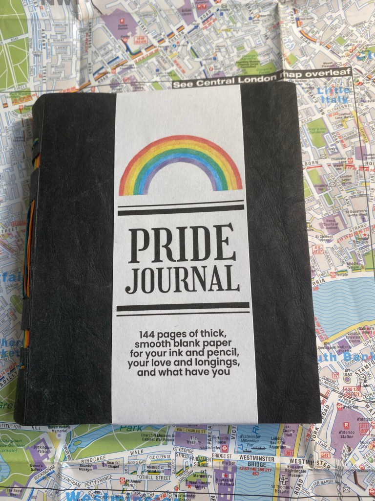
In my sizeable collection of notebooks and sketchbooks I have maybe one or two handmade ones. I tend to not buy handmade notebooks because the paper quality is oftentimes sacrificed in favour of cool covers or bindings. However, when I saw the Peekaboo Pride notebook on Pencil Revolution’s Etsy store, I couldn’t help but give it a try. The binding looked amazing, and I trust Johnny Gamber when he says that the paper inside is good.
I love this cover band. It made me smile.
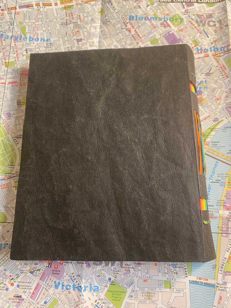
The notebook is small, 10cm x 12.5cm, and beautifully made. Every little detail is well designed, starting from the band that the notebook came wrapped in. You see the care and character in every part of this little notebook, which is precisely why you’d want to buy a handmade notebook in the first place.
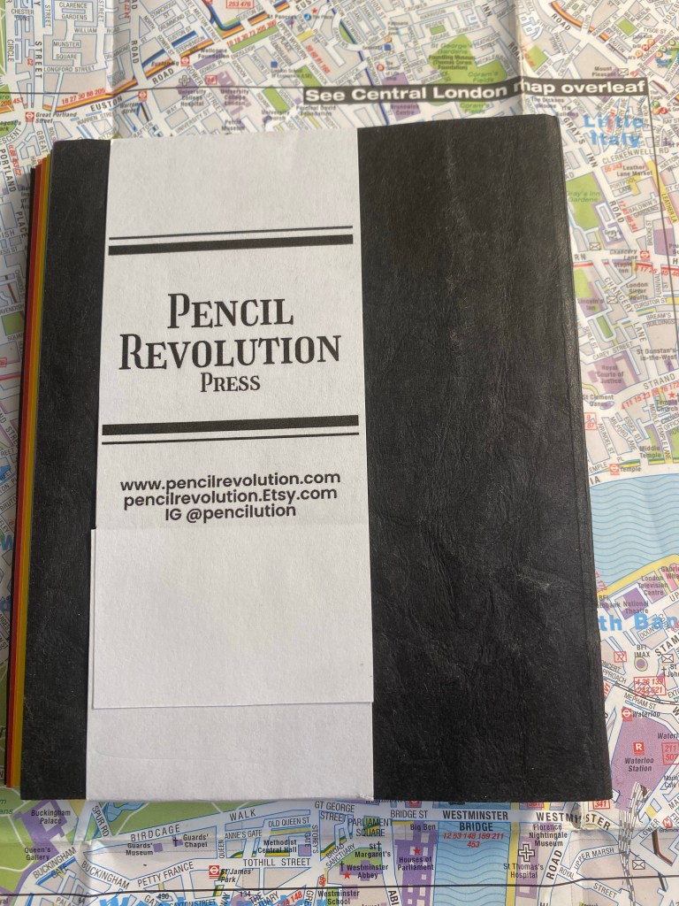
Back of the band.
The cover is made of “Kraft-Tex” which is a textured, durable, flexible, card-stock like paper. It’s ripe for customisation if you enjoy customising your notebooks.
The cover.
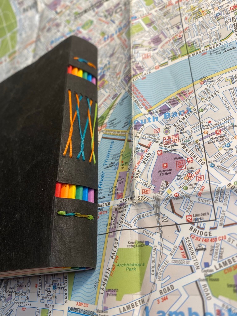
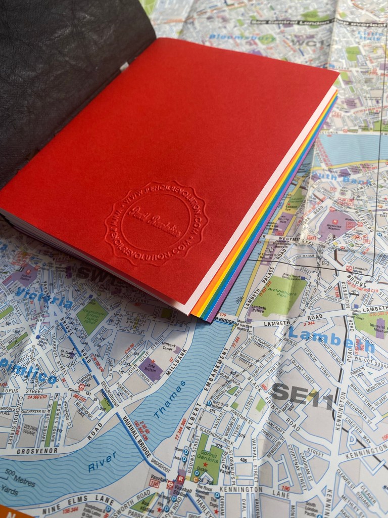
The spine is where the notebook really shines, and it’s what gives the notebook it’s “peekaboo” name. The notebook is made of six signatures the colour of the pride flag, and the cutouts in the spine allows you to see their colours. The threads used for binding are also pride coloured, and the result is stunning:
Peekaboo spine with pride signatures and threads showing.
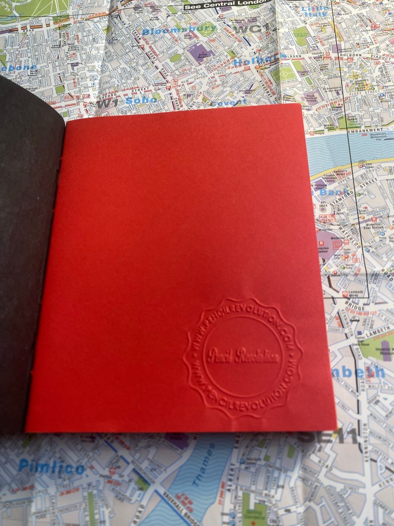
The cover of the first signature has a Pencil Evolution stamp embossed on it. That, together with a label inside the inside of the back cover is the only branding on the notebook. Very subtle and tasteful.
Pencil Revolution stamp.
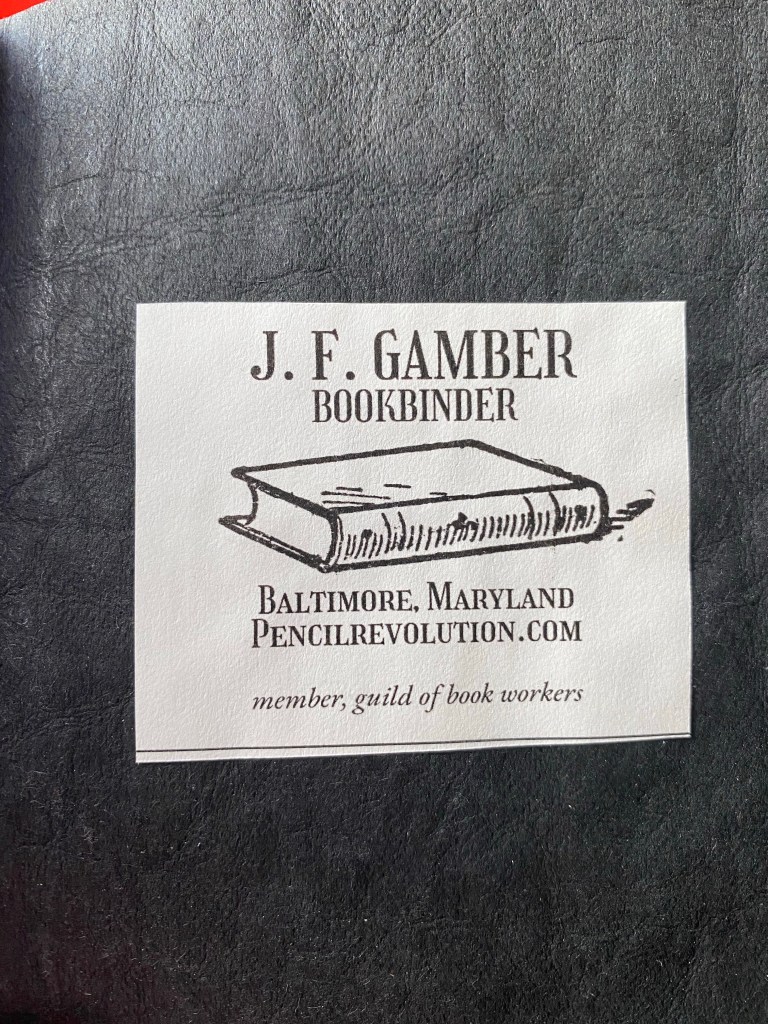
I just love the back label. There’s such pride of craftsmanship here:
Back label.
Here’s a look at the colourful signatures from inside. Everything about this little notebook is perfect, and makes me smile:
Pride colours on show.
And inside each signature you get glimpses of the multicoloured thread used to bind this notebook.
You can see the thread change colour on the top.
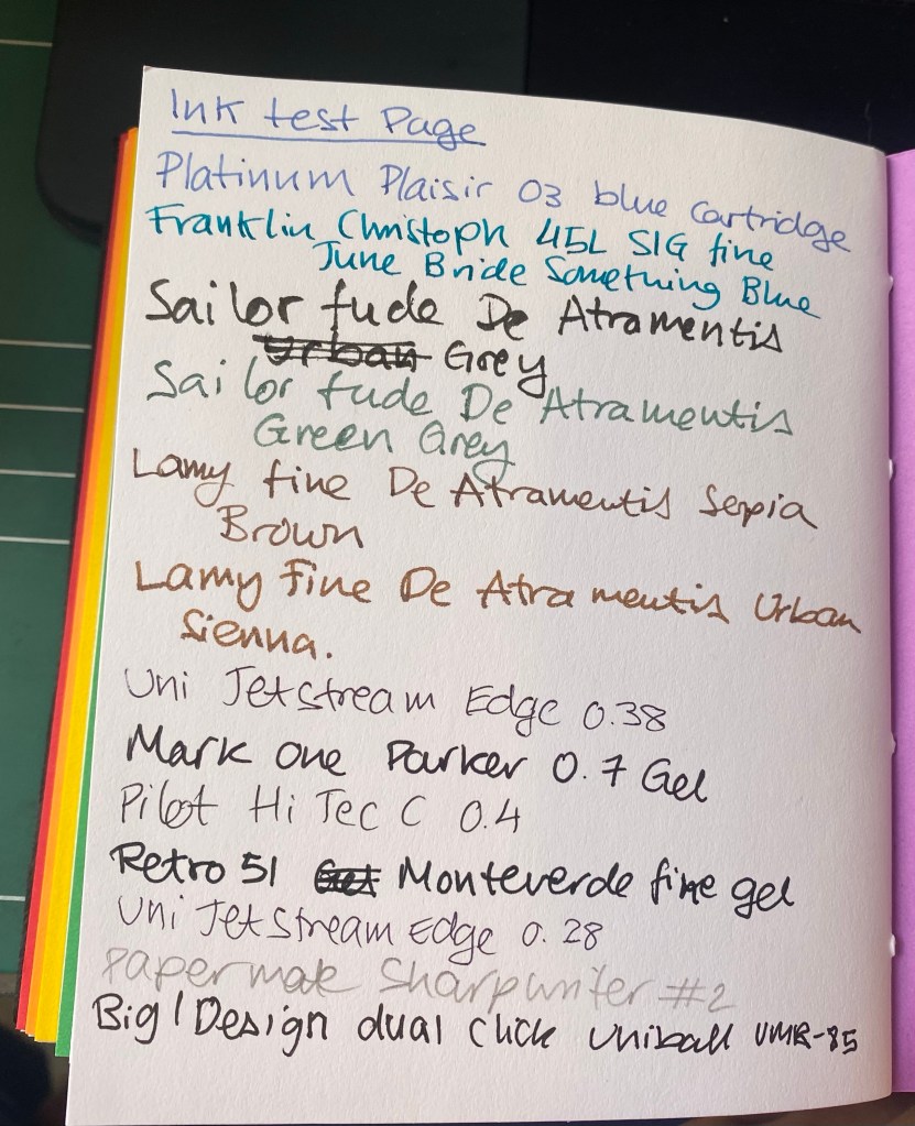
I was worried that the paper wouldn’t be fountain pen friendly, but I had nothing to worry about. The Neenah’s Astrobrights paper is very fountain pen friendly, despite not being coated paper. That means that inks dry quickly on the page, and it means that you can use this little notebook for pen and ink wash sketches.
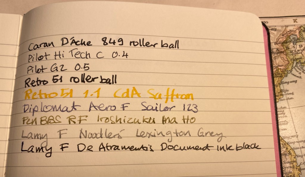
Testing various inks and pens.
There’s no bleed through, even with the Sailor Fude nibs that lay down a lot of ink, and there’s very little show through.
Very well behaved paper.
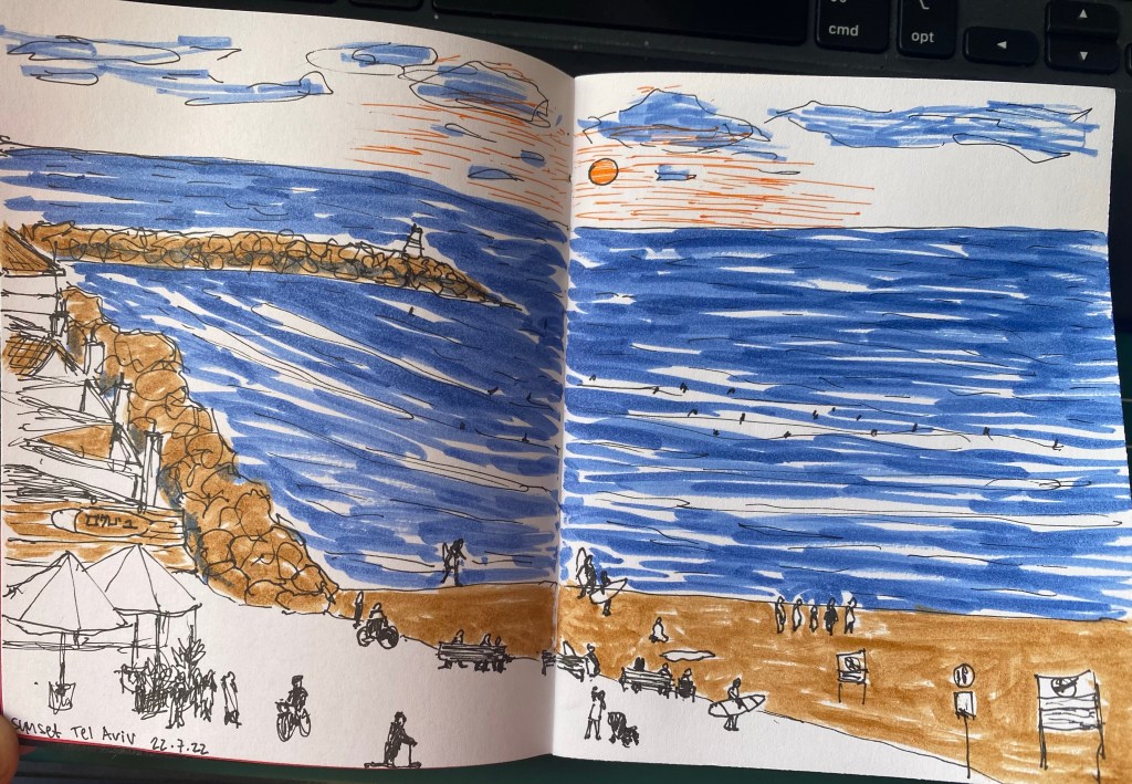
The paper was so well behaved that I decided to see how well it would take to an ink and wash sketch. Here’s the basic sketch, done with a Staedtler 0.1 pigment liner.
Initial sketch.
Then I laid down ink washes, and the paper behaved beautifully. It didn’t deteriorate, the colours popped on it, and it was fun to use.
Sketch of the Tel Aviv beach on the paper.
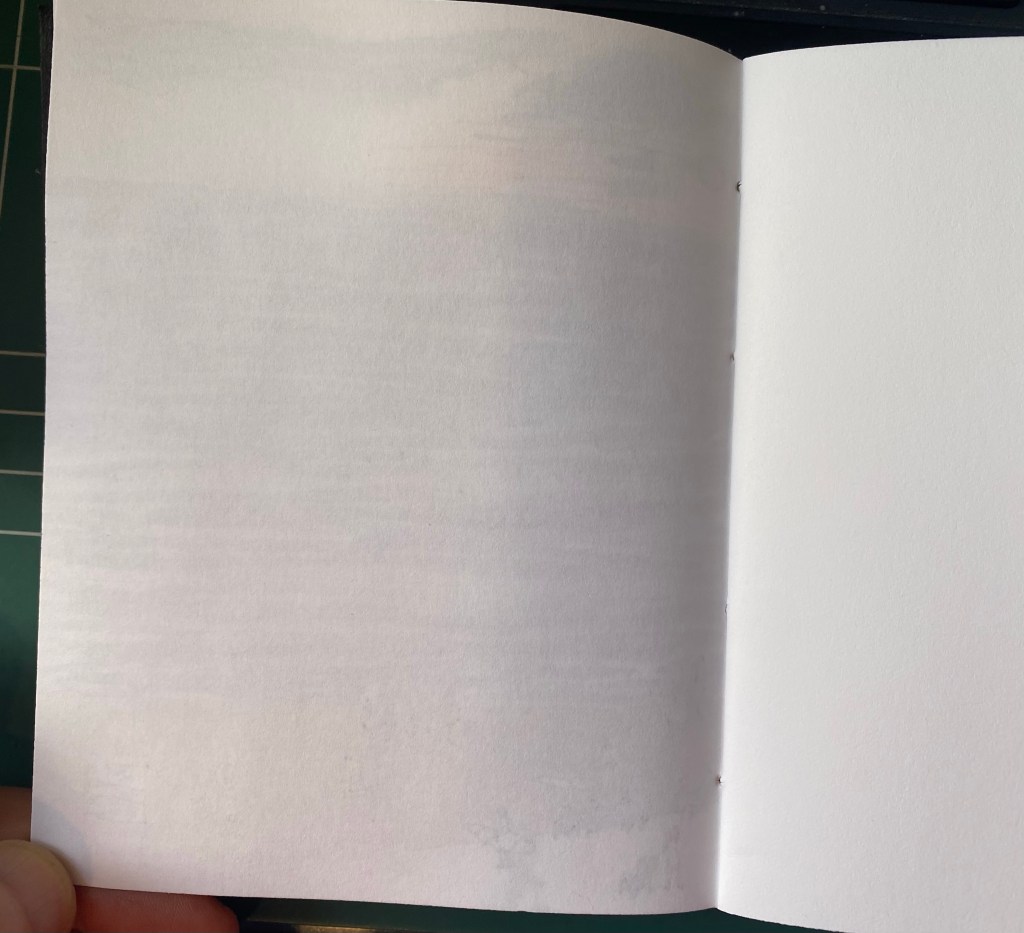
Here’s the other side of the paper. It’s amazing that there’s no bleed through and very little show through. This paper behaves better than my Stillman and Birn Alpha with ink washes.
Back side of the sketch.
The Peekaboo Pride notebook is phenomenally well made, with excellent paper, and it’s just a joy to use. I’m close to finishing my pocket Stillman and Birn Alpha, and this little notebook will be the next sketchbook in line to replace it. I won’t be using it for watercolour (no paper this thin has a chance of handling watercolour washes), but it’s great for pen and ink sketches, and for ink washes.
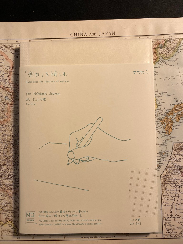
I got this Midori MD Notebook Journal A5 Dot Grid as part of the Cult Pens Paper Box, which is no longer being offered. I’ve used and liked Midori paper before, as part of their Traveler’s Notebook offering, but I’ve never taken the opportunity to purchase one of their notebooks before. One of the main reasons I purchased the Paper Box was to give this notebook a try.
MD Notebook Journal A5 front cover
The MD Notebook Journal is a soft cover notebook with a minimalist design. It’s an A5 dot grid notebook that opens flat, has 192 fountain pen friendly pages, and comes with the bare minimum needed to turn it into a more structured journal: two enlarged dots for the dates and an index insert that you can use to mark the months. Everything you need to know about the notebook is thoughtfully written on its paper wrapper. Everything but the paper weight. I’d start a rant here, but I don’t think it will do something to solve the various standardization issues in the notebook/journal world, so I’m just going to note that I find it annoying. Write the gsm please. It’s not that hard.
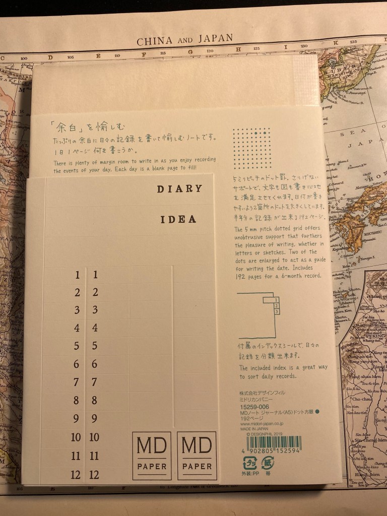
MD Notebook Journal A5 back cover with index.
The MD Notebook Journal comes wrapped in a crinkly parchment paper that is meant to protect the cardboard covers, and I kind of liked the way that it felt. On a whim I grabbed some washi tape and taped it to the cover as a cover protector. I don’t know how long it will last (I’ll probably need to add more tape later on), but for now I’m enjoying it.
Inside the front cover is a place to write your details. As usual, I highly recommend writing your name and email, in case of loss.
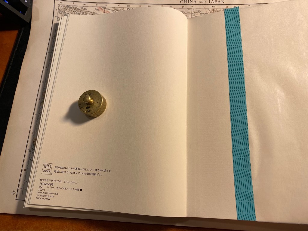
Front endpaper.
The backend paper contains information about the notebook, and no pocket. It really isn’t missed on such a minimalist design, although you could easily tape an envelope here to serve as a pocket if you are so inclined.
Back endpaper.
The MD Notebook Journal paper is fountain pen friendly and shows off the various properties of fountain pen ink very well. The drying time isn’t great, but that’s to be expected considering the coating on the paper. Now for a little side note: I purchased the 2021 Diamine Inkvent calendar and I plan on reviewing all of the inks in it, opening each one on the relevant day, just like I did in 2019. I’ll be using old Tomoe River Paper and this MD Notebook Journal for the purposes of the review. So if you want to see this notebook get a little more use before giving it a go, stay tuned.
Fountain pen friendly paper that shows sheen, shading and outlining well.
The paper in MD Notebook Journal isn’t very thick, so there is some show-through, but no bleed-through, with all the inks that I used. It wouldn’t bother me, but if you find show-through distracting, you might want to use lighter inks, fine and extra fine nibs, or just one side of the paper.
Show-through on the back side of the paper.
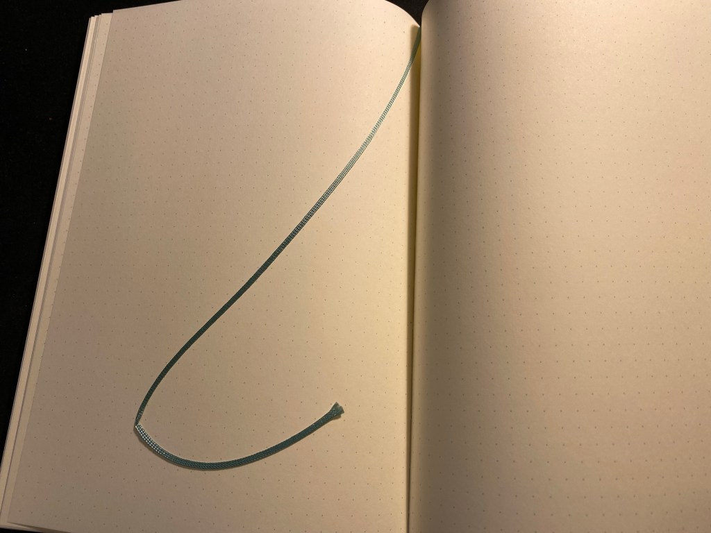
There’s a thin ribbon bookmark attached to the notebook, which is both charming and adds the only touch of colour (a lovely teal) to this minimalist journal.
The bookmark.
I look forward to giving the Midori MD Notebook Journal A5 dot grid a thorough try out next month. From what I’ve seen of it so far it’s going to be a fun notebook to use (and I don’t even like dot grid notebooks normally). There’s something about the starkness of it that makes it appealing, in that it really is a sandbox that you can play in. I can imagine people placing it in various notebook covers, or covering the covers with stickers and drawings, or just trashing it with use.
A journal with endless potential and excellent paper – what more do you need?
Cult Pens offered a paper box about a month ago. For £25 you got 3 notebooks, 2 sketchbooks, 1 fineliner, 1 marker, 4 pencils, 4 pens and a handful of Smile Clips. I don’t usually buy boxes of stationery (I especially avoid mystery boxes), but as I was interested in trying out the Moleskine Studio that was already part of the box, and as I was interested in most of the rest of the box’s contents, I decided to give it a try.
The box is no longer being offered, but if it was I’d suggest that Cult Pens would do better to pack the notebooks in an actual well-fitted box and not in a zip-lock bag that bumps around in a large box. The result is that the corner of the Moleskine Studio box was crushed, and one of the pads that came in the box was also damaged.
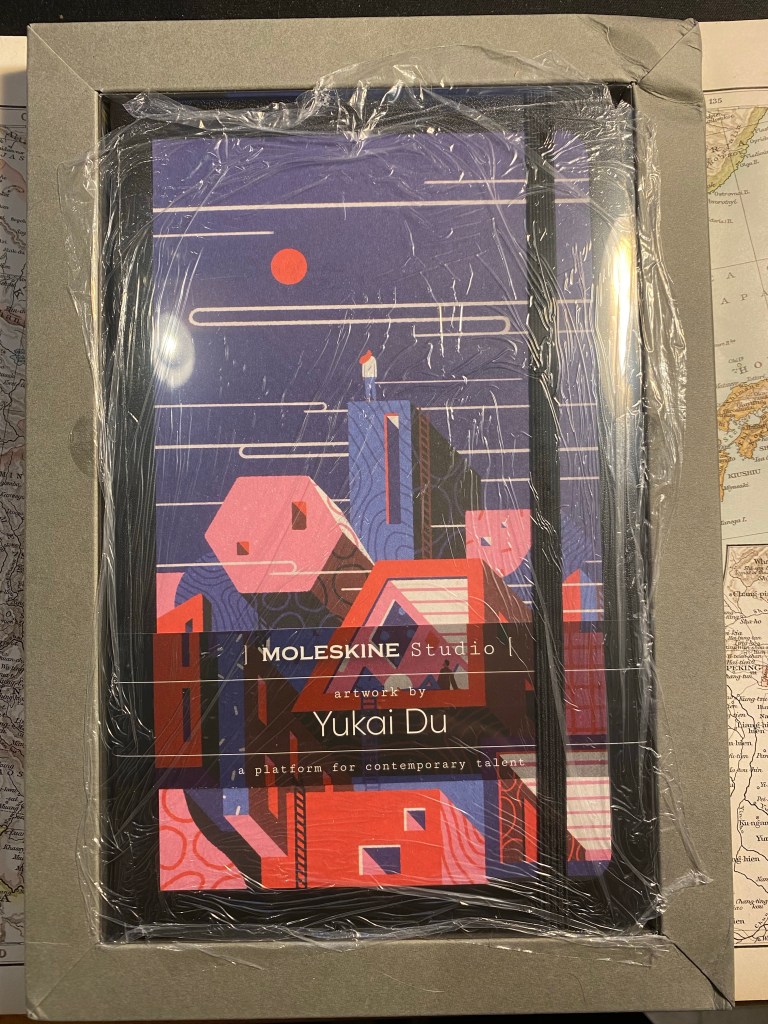
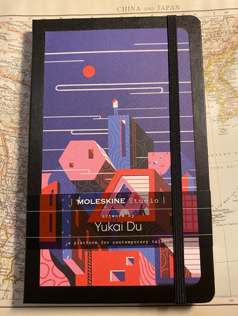
Now for the Moleskine Studio: this is a new offering from Moleskine, made in collaboration with six artists. Each artist’s artwork is featured on the front cover, on the end papers, on a sheet of themed stickers, and on the box the notebook comes in. The box serves as a frame for the artwork, allowing you to hang it if you wish. The notebooks are available in Plain or Ruled layouts, and, here’s the really interesting bit, contain 100 gsm ivory coloured paper.
Here’s the box as I received it:
Crushed corner, weird cling film wrapping – there’s a lot going on here
So the notebook’s box/frame came with a crushed top right corner, which is unfortunate. The notebook itself was covered with cling film, a form of packaging I’ve never seen come from Moleskine before, and a plastic cover that was attached to the box/frame. While the frame is designed to be reusable, I’ve purchased another Moleskine Studio that came completely without it, and I have a feeling that there’s very little chance for the frame to survive shipping without being mangled. As it is, I feel that there’s way too much packaging here.
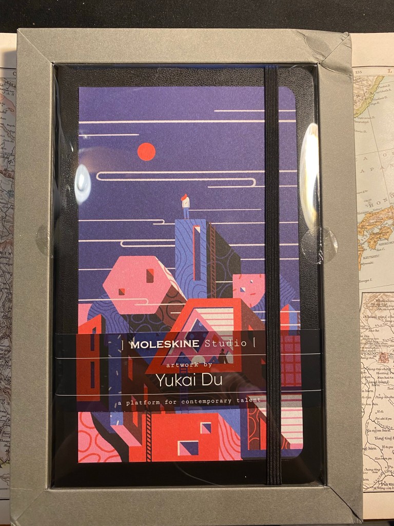
Box frame, notebook, and plastic cover.
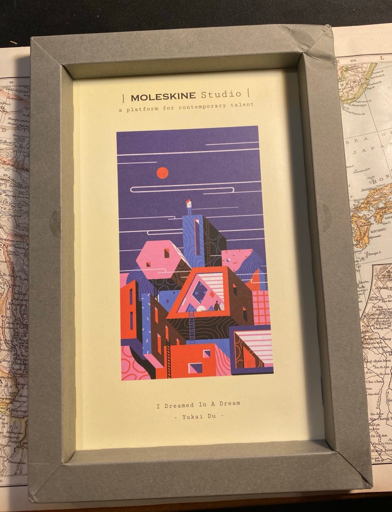
The frame with the artwork inside:
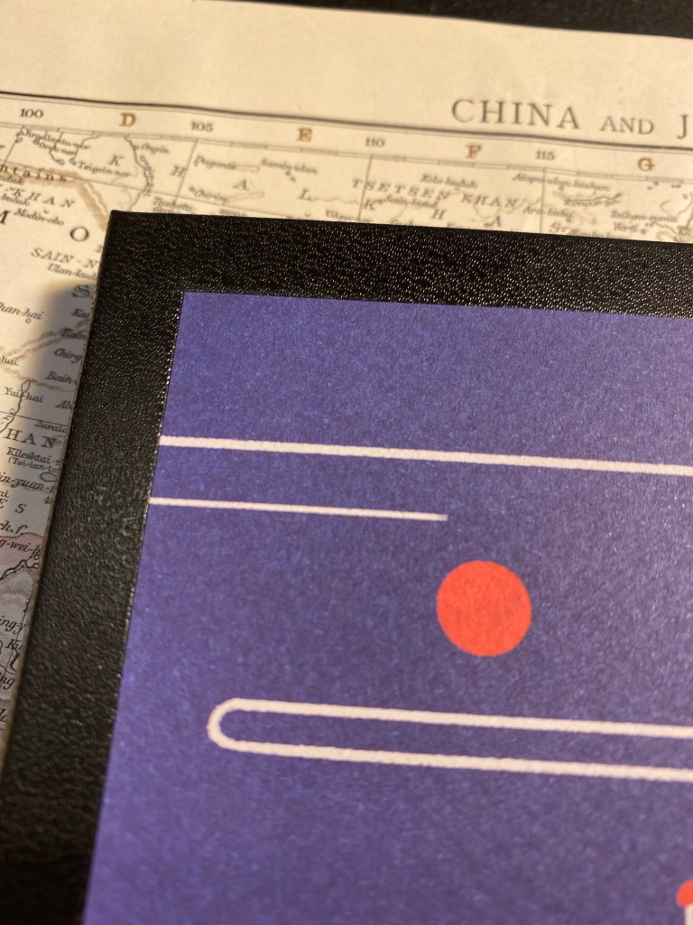
Yukai Du’s “I Dreamed In A Dream”
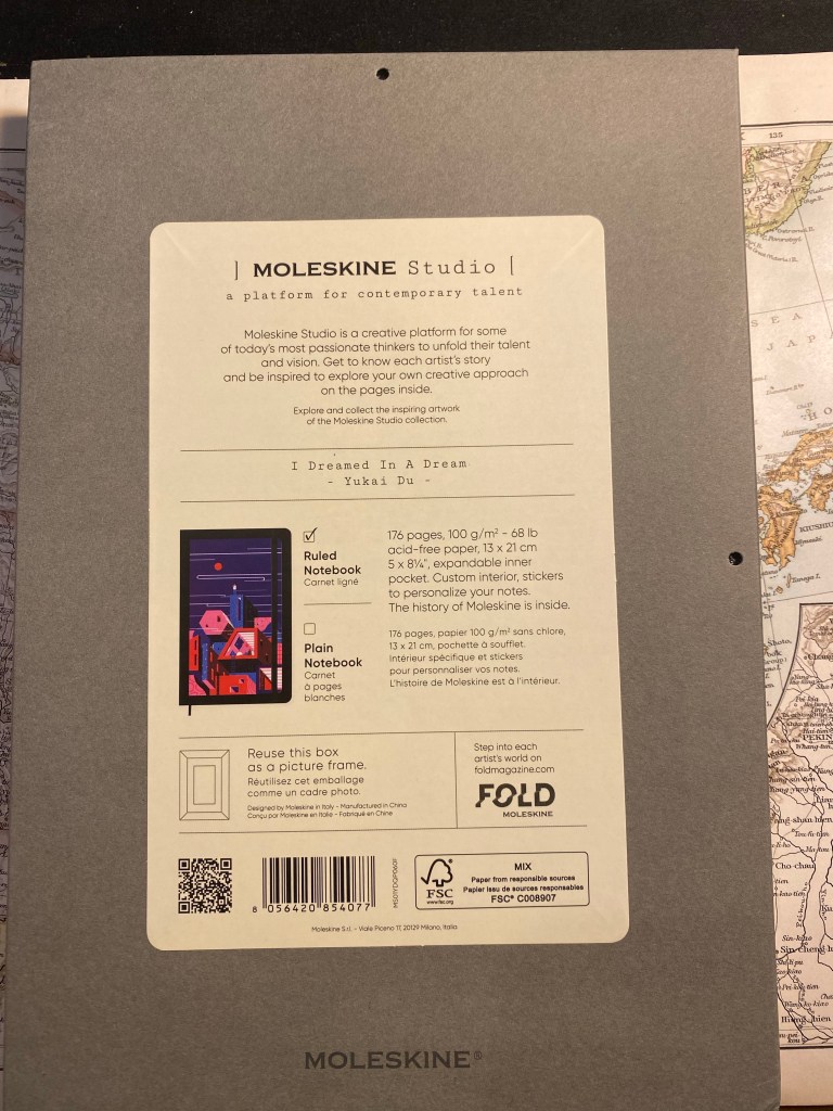
The flip side of the frame. You can see that there are holes for hanging the frame, as well as information about the paper in the notebook (gasp!). I wish Moleskine would print this info on every notebook they sell.
The back of the frame box.
Here’s the notebook, and here’s where I start having more serious reservations about Moleskine’s manufacturing choices regarding this lineup. The artwork isn’t printed on the notebook cover, it’s glued onto it. I have a feeling that the glue isn’t going to last long, and in general it just cheapens an otherwise premium notebook experience.
Front cover (with paper wrap still on)
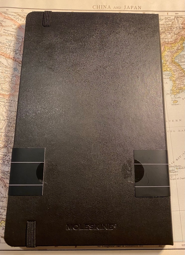
The back cover is a bit weird in that the paper wrap doesn’t reach all the way around and is just stuck to the cover with two stickers. The stickers are easy to remove and don’t leave any residue, but it’s the only Moleskine I’ve seen with this setup and I can’t help but wonder why.
Back cover.
Here’s a closeup to the glued artwork on the cover. I’m also a little disappointed that the artwork hasn’t been signed by the artist, Yukai Du.
Closeup on the glued corner of the artwork.
Inside the front covers is more of Yukai Du’s work, and it’s wonderful. This is where Moleskine shines, and I wish these artists could have had their work properly printed or even embossed on the covers of a Moleskine. They deserve it.
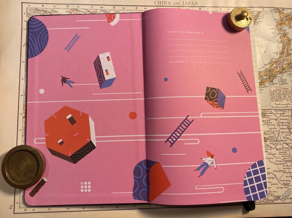
Inside the front cover, with “In case of loss”.
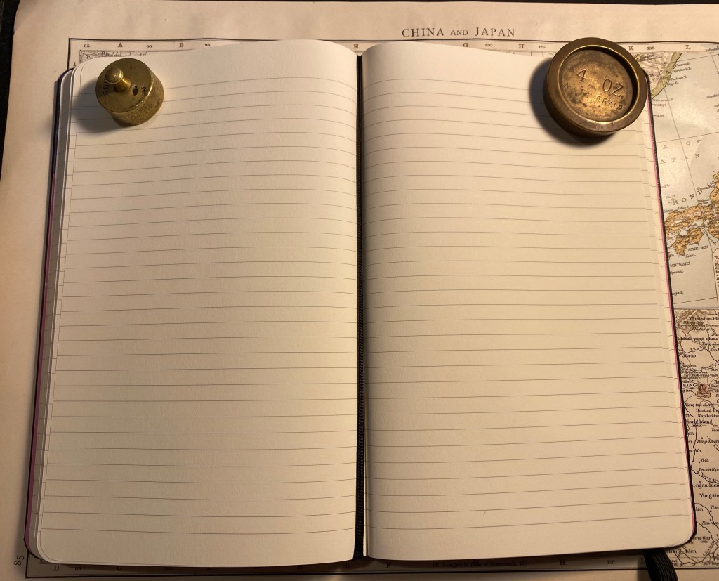
The paper is very good (not your standard Moleskine affair, which has its particularities). Ivory coloured, 100 gsm, not glass smooth but not textured, and it lays flat. There’s some writing samples ahead, but spoiler alert, yes it’s fountain pen friendly. There’s also the famous ribbon bookmark, which I wish was pink but in this case is black.
Paper and bookmark.
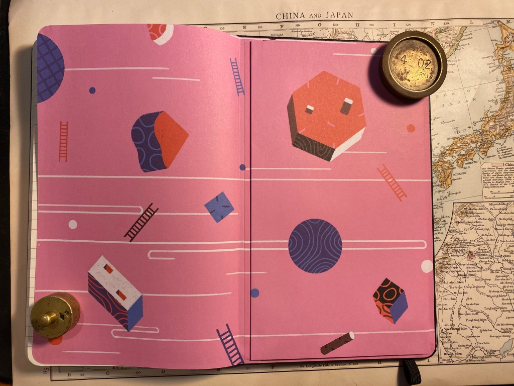
The back cover end papers feature more of Yukai Du’s artwork, perfectly aligned on the back pocket.
Inside the back cover.
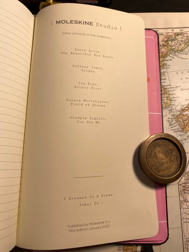
On the last page in the notebook, usually left blank, Moleskine has featured more information about the Moleskine Studio edition. In their marketing they’re calling this a new platform for collaboration with artists, and this page makes me think that this is going to be an ongoing project for them. I hope that they do continue with these, as the overall result is very good.
The last page.
Here’s the sticker page that comes with this edition. Again, very well made:
Sticker page.
Finally, the paper. I was hoping that this is going to be a fountain pen friendly Moleskine and it is. There’s no feathering, no spreading, no bleed through and very little show through with this paper (there’s more show through with the rollerballs than with the fountain pens). Your milage may vary, but I am very happy with this paper, and a Moleskine Studio is going to be my next journalling notebook.
Ink test.
The reverse side of the page:
The reverse side of the page.
Overall, the Moleskine Studio is a strong new offering from Moleskine, one that really plays to their design strengths. It’s not perfect, but I hope to see them iterate and improve on it with time, and I hope that many artists get to have their artwork featured on an iconic notebook.