February 2024 in Pens and Paper

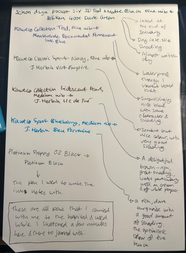
I started the month ready to spend the first half of it in hospital, with my dad. So the fountain pens I chose were all expendable pocketable pens that I was willing to have stolen (apart from the Schon Design Pocket 6 which was a leftover from January and never left my desk). So that meant I inked 4 Kaweco Sport fountain pens using various ink cartridges that I had on hand.

The portable lineup:

Once my dad got out of hospital and back home, I decided to celebrate by “shopping” from my collection. I inked up a Parker 51 Plum (use the good china!), a Parker Vacumatic, a Franklin Christoph 45L Turqish (spelled like that on their site) Crush that I had purchased but hadn’t inked before, and a vintage Radius Comet (because I heard that the brand was being revived).

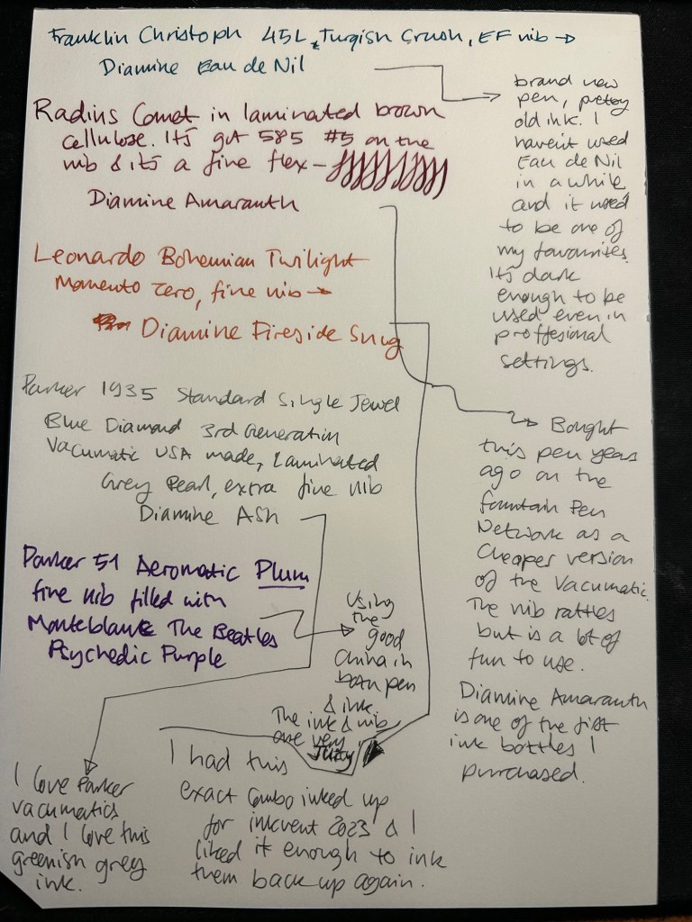
The Franklin Christoph EF nib isn’t the best companion to the Eau de Nil as the ink tends to dry in the nib, causing hard start issues. The Radius is a flexible nib of the vintage kind, which means it’s really flexible and not just springy. It also rattles, which makes me not carry it around with me — it stays at home at my desk. The Leonardo is a beautiful pen with a beautiful ink that I refilled immediately — the only Inkvent 2023 ink I did that with. The two vintage Parkers are phenomenal, as usual. The extra fine nib on the vacumatic somehow really well with Diamine Ash, though I was worried at first that the combination would be too light to be readable. The Parker 51 Aeromatic is a treat to use. It’s the rare Plum colour, and it’s got a fantastic nib (as all 51’s have) which pairs very nicely with the Monteblanc The Beatles Psychedelic Purple.

In terms of paper I’ve been using Kokuyo A4 KB paper which I cut to half size (so A5) to manage my daily to do list. The paper is relatively cheap and very fountain pen friendly. I’m also able to use both sides of the page despite there being some show through.

Kokuyo A4 KB paper cut in half to A5 size. This is why standards are great.

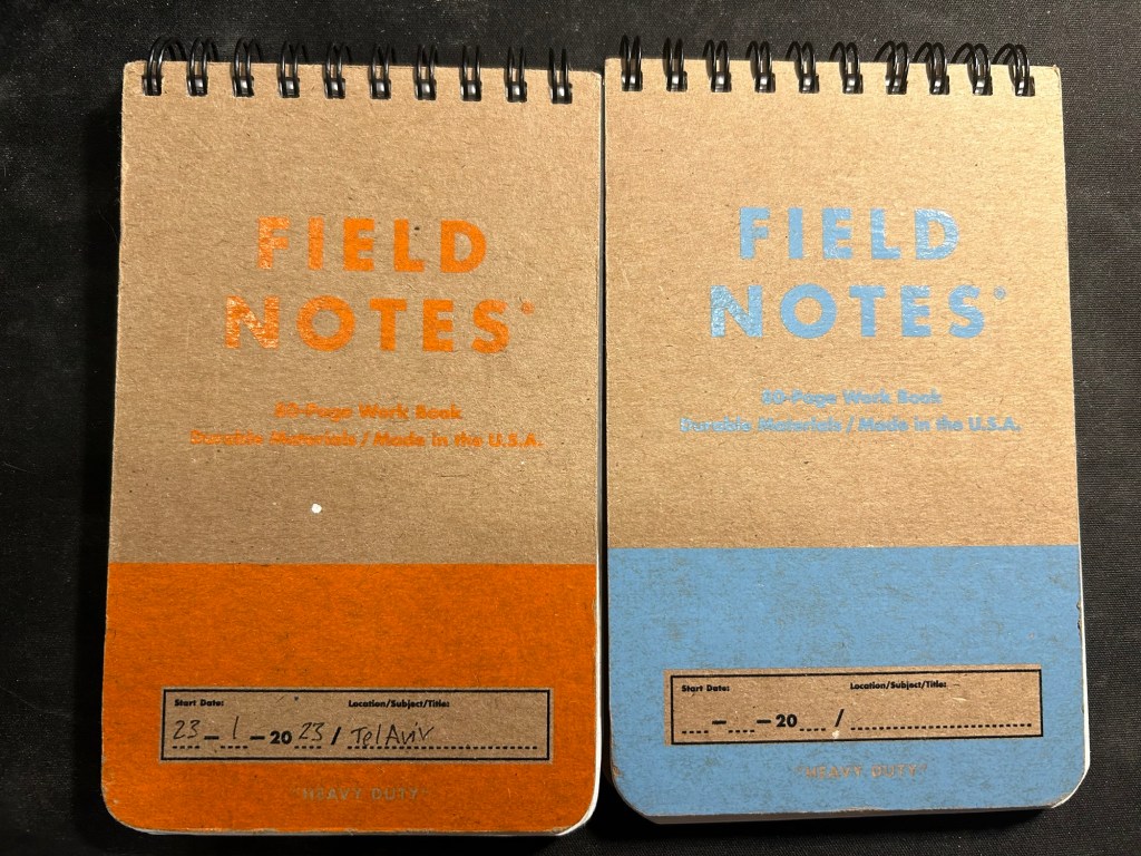
I’ve got a Field Notes Heavy duty on my desk at home and at work, and I just bought a new stock of them. These are where I jot down quick notes, phone call details, doodles during boring meetings. When they’re filled up they get tossed out as nothing in them is permanent — everything important in them moves to somewhere else as I work my way through them.

Field Notes Heavy Duty pocket spiral bound reporter notebooks

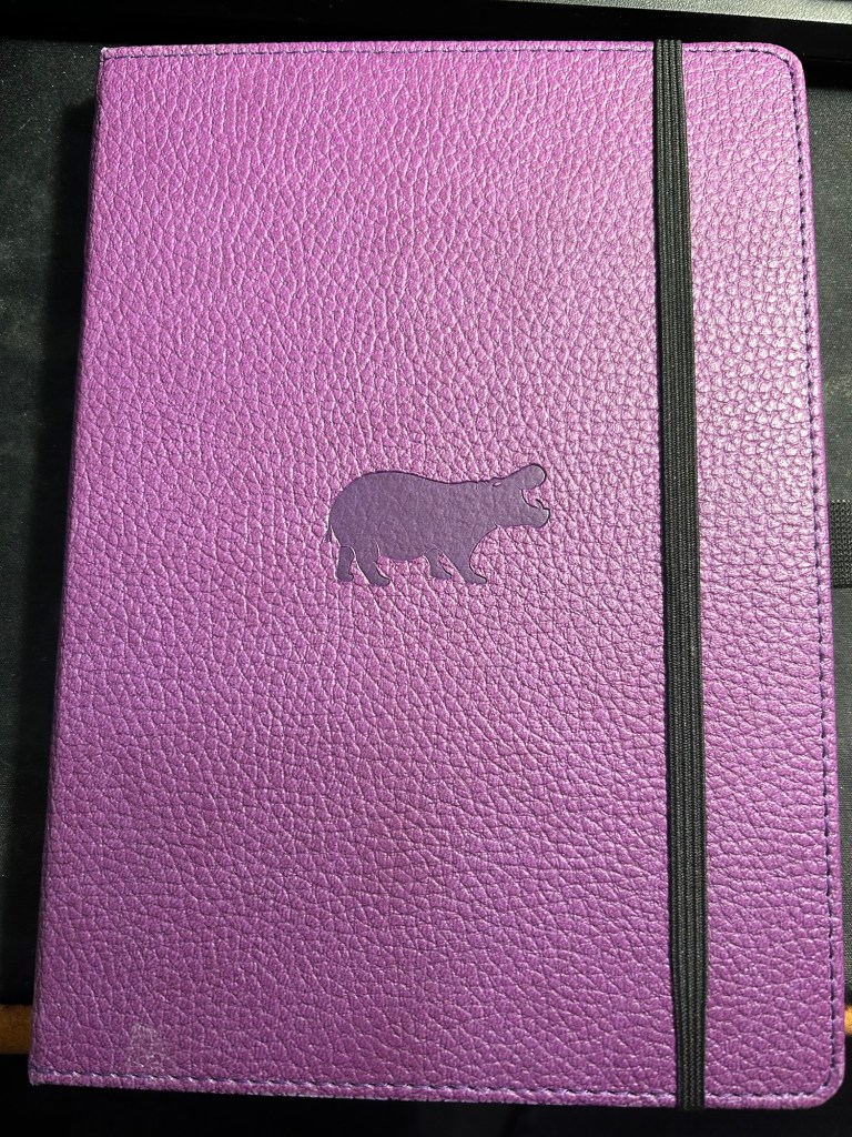
I have finally found a use for my Dingbats notebooks (beyond giving them away as gifts, as I have in the past): this lined purple hippo one is my blog notebook. I discovered that I have a much easier, much quicker time writing blog posts if I first draft them on paper, and this is where I do it in. I’ll likely write a dedicated post to this notebook soon.

Dingbats Puple Hippo A5 lined notebook

Apart from them I still use the notebooks I used last month.
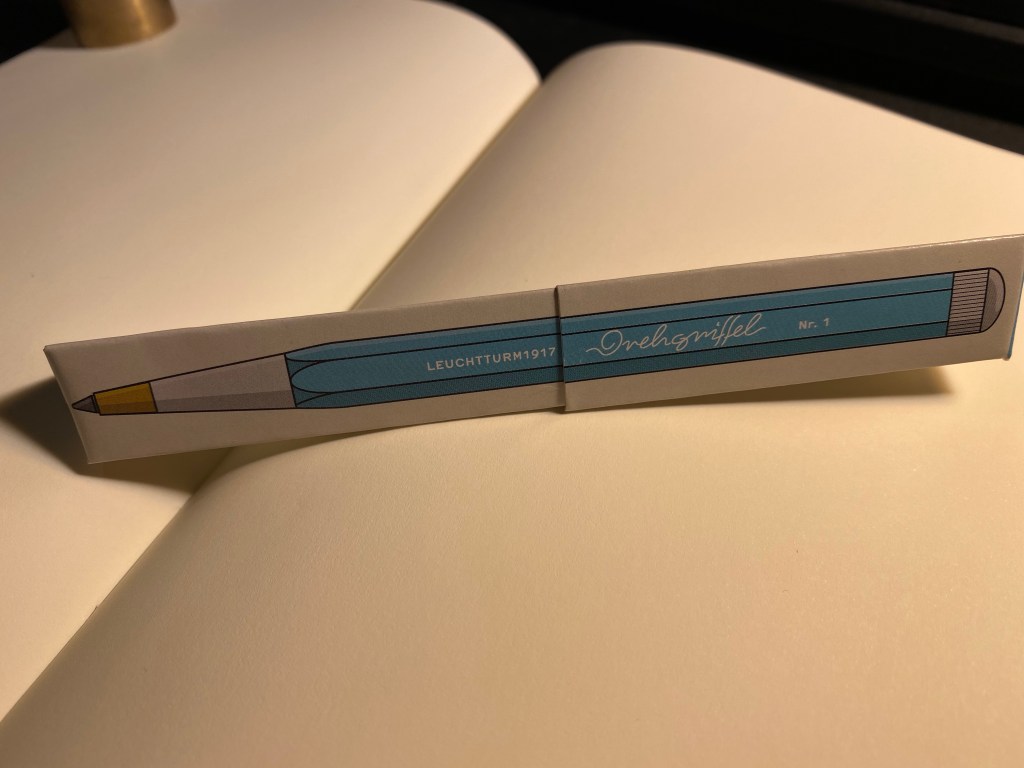
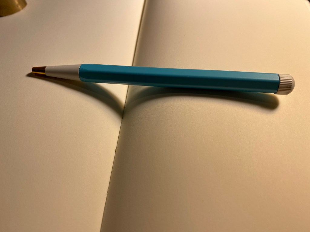
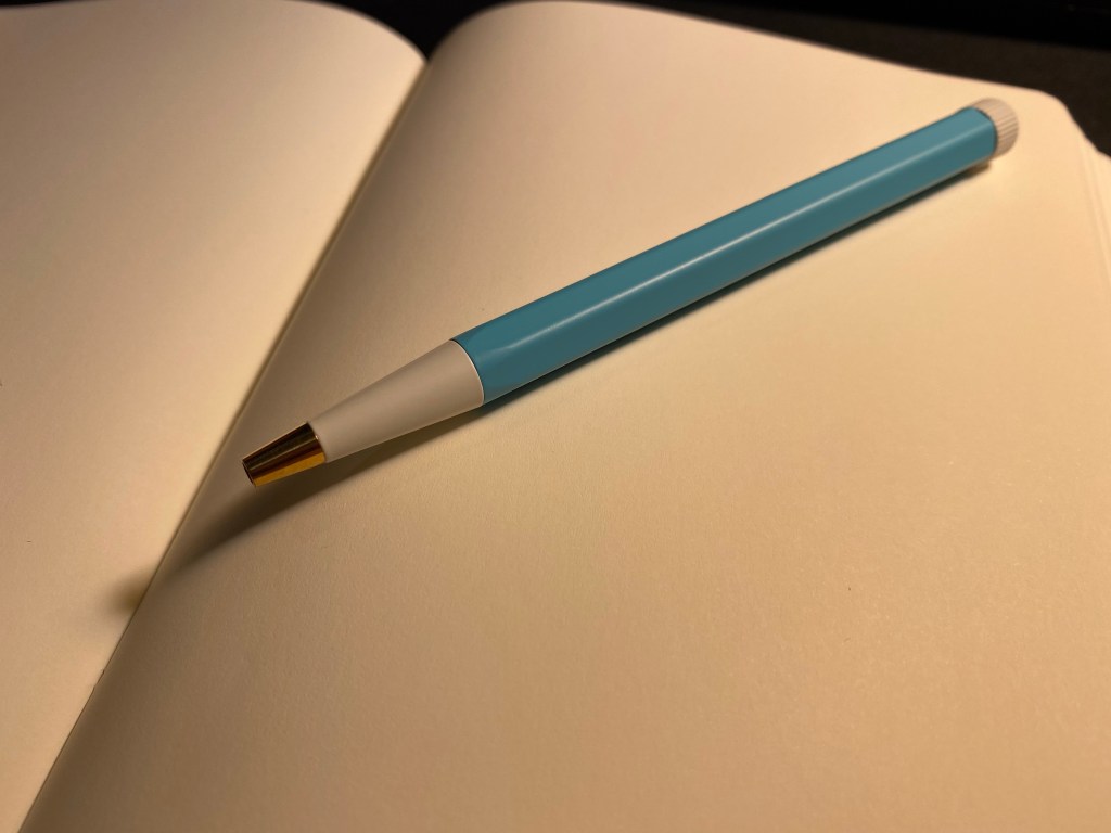
Pencils

I’ve been using the Drehgriffel Nr. 2 as my daily driver. I use pencils extensively to plan, as my plans tend to change, and there’s something about this solid little mechanical pencil that makes me want to use it.

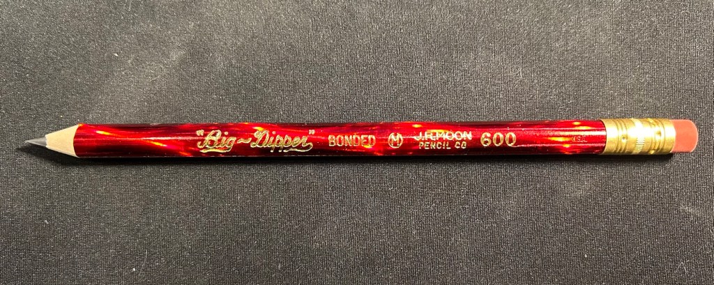
Apart from that I brought two pencils into the rotation, to try to use. One is from my last purchase from the late and great C.W. Pencils Enterprise, and it’s the “Big Dipper” J.R. Moon Pencil Co 600. It’s an oversized pencil, the kind of pencil that kids who are learning to write are expected to use. I’ve been having pretty significant neuropathy in my hands lately and I thought that this would be nice and easy to use, as after all it’s designed for kids just learning to develop their fine motor skills. So far it’s been a disappointment – the eraser and ferrule make it very top heavy, and I’ve been having a hard time manipulating it. I can’t imagine kids using this pencil and having an easy time with it. I like the over the top red foil with gold writing look though, so I haven’t given up on it yet.

Big Dipper J.R. Moon 600

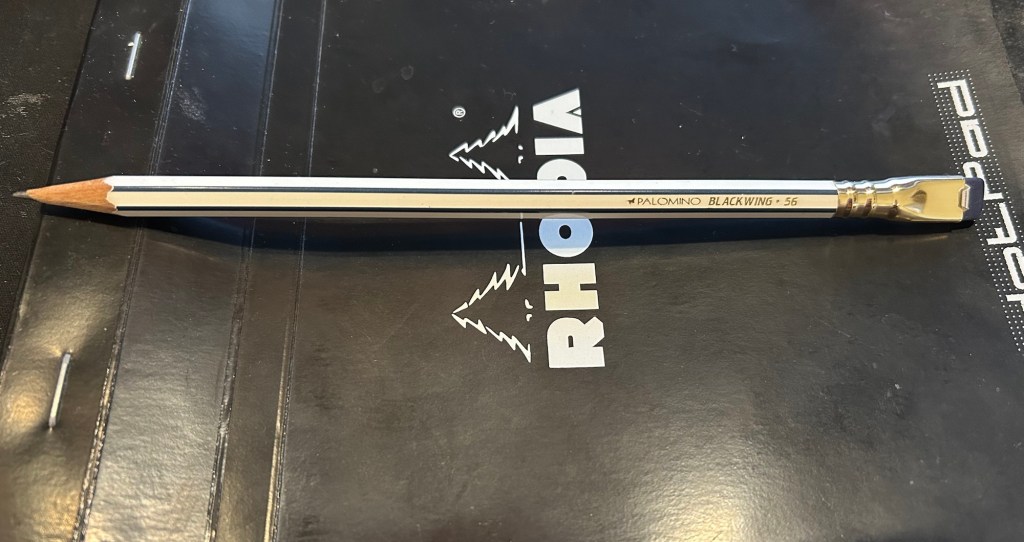
The second pencil is a Blackwing Volumes 56, the baseball themed one. The core is soft and dark, and I’ve been using it for quick and loose sketches. I’m trying to ease into one week 100 people by training myself to work faster than I normally would.

Blackwing Volumes 56

What did you use in February? Any planner changes? Pencil revelations? Pen preferences?

Drehgriffel Nr. 1: A Review of the Leuchtturm1917 Gel Ink Pen

London Graphic Centre is one of my favourite stores in London. It’s tucked away in the corner of a street off of Neal street in Covent Garden, and it’s a real haven for artists, designers, architects and anyone who loves stationery and art supplies. I visit it several times whenever I’m in London, and I never fail to find something new and interesting there to try out. This time was no different, and one of the first things that caught my eye while I was there was this:

Rectangular box, Leuchtturm1917 logo, aquamarine colour, unusual pen design – of course I had to check it out.

It was just above the Leuchtturm1917 notebook display, and there were just three or four colours available, but it was obvious that this pen was designed to match the colours on offer in the Leuchtturm notebook lineup. I assumed at first that it was a ballpoint, in which case I wasn’t really interested in it, until I saw that it was prominently labeled as a gel ink pen. Now that was intriguing.

Rectangular cardboard box, with Nr. 1 and “Gel” clearly marked on it, plus the aquamarine colour.

The box was a bit confusingly marked as both “Gel” and “Gel ballpoint”. Checking out the Leuchtturm site clarified that this pen (we’ll get to the name in a minute) is indeed a gel ink pen, with a Japanese refill and a “Ceramic Ball” tip. The refill itself looks very much like the Monteverde Capless Ceramic Gel ink refill. My guess would be that this is the same refill, but more on that later.

Several things of interest here: the “Designed in Germany, Made in Taiwan” that is reminiscent of Apple’s packaging. The prominent “Gel” marking and then the confusing “Gel ballpoint” designation. And the “Ceramic Ball” notation.

Somebody really took the time to design this box, but really didn’t consider how illegible the pen’s name is:

I was sure that the pen was called orehgriffel or ovehgriffel.

The pen is called Drehgriffel Nr. 1, a bit of a mouthful. Apparently Drehgriffel means “rotary stylus”, which probably refers to the pen’s twist mechanism.

The pen has an aluminum body, a white twist nob at the end and brass pen tip. It’s well balanced, heavier than a plastic pen but lighter than a Retro 51 or a machined pen. It’s slightly heavier than a metal bodied Caran d’Ache 849, but if they were put in a boxing ring they’d both be in the same weight category.

The Drehgriffel has a very 60’s look, which I happen to like, but other people may find to be dated. Also, the Nr. 1 is a weird designation when you don’t have any other pen on offer. Will there be a Nr. 2? A Nr. 3?

Here’s the pen’s refill and parts. It’s weighted slightly towards the tip because the tip is brass (and, of course, the pen tip will tarnish with time).

The Drehgriffel taken apart.

Here’s the Drehgriffel refill side by side with a Monteverde Capless Ceramic Gel refill, and they are exactly the same. Good to know if you’re looking to replace refills, although I suspect that it will take a while to write this pen dry.

Monteverde refill on the top, Leuchtturm refill on the bottom.

The Drehgriffel is similar in size and weight (and price) to the Caran d’Ache 849 metal barrelled pens. It’s a smidge wider and heavier than the 849, but they are very much in the same ballpark. Here they are side by side:

Leuchtturm1917 Drehgriffel on the left, Caran d’Ache 849 on the right.

Here’s a writing sample of the Drehgriffel against a few other gel refills. It’s noticeably wider than Japanese 0.5 gel in pens, and is closer to 0.7 gel ink refills. I tested it on a Moleskine squared notebook (and further down you can see it on a Leuchtturm1917 notebook).

Writing samples.

Here’s the reverse side of the Moleskine page. The Drehgriffel bled a bit more than its counterparts:

The reverse of the page.

Here’s a writing test on a Leuchtturm1917 80gsm blank notebook:

Leuchtturm1917 writing sample.

Here too there was visible show through an some bleed through, although there was less bleed through than the Moleskine.

The reverse side of the Leuchtturm1917 page.

The Drehgriffel writes smoothly, but there’s nothing in the pen’s smoothness that justifies the advertising. It’s a nice pen, that comes in a variety of colours and that has an interesting design and good refill. In my opinion it would have been more popular if it came with a click mechanism and was a little cheaper, but I still appreciate the fact that Leuchtturm chose to come out with a gel ink pen first and not the more obvious choice of a ballpoint. I like the look and feel of my Drehgriffel, although I would have liked it better if it would have been a little bit wider. As it is if I use it for more than a page or so without pause it causes my hand to ache and cramp up.

Now I’m wondering if there’s going to be a Drehgriffel Nr.2 with a click mechanism perhaps?