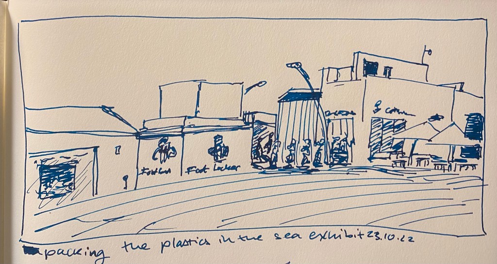
Vintage Radius Comet Fountain Pen Review

In April 2010 back when I was relatively new to collecting vintage fountain pens, I purchased a vintage Radius Comet on the Fountain Pen Network. The body was brown laminated celluloid, just like Parker striped Vacumatics, and you could see the ink levels through the stripes, just like with a Parker Vacumatic, and it had a jewel on the cap, just like a Parker Vacumatic. It was, however, a piston filler, unlike the Parker Vacumatic, and it had a superflex gold nib, also unlike a Parker Vacumatic. So even though I had never heard of the brand before and there was very little information about them to be found, I took the risk and bought the pen. It cost €120 shipped.

Radius Comet

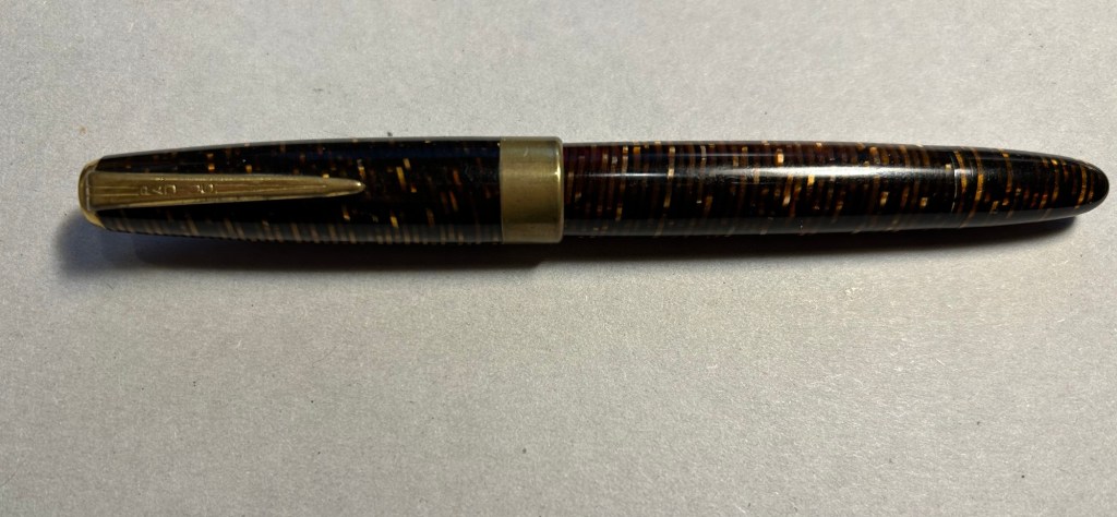
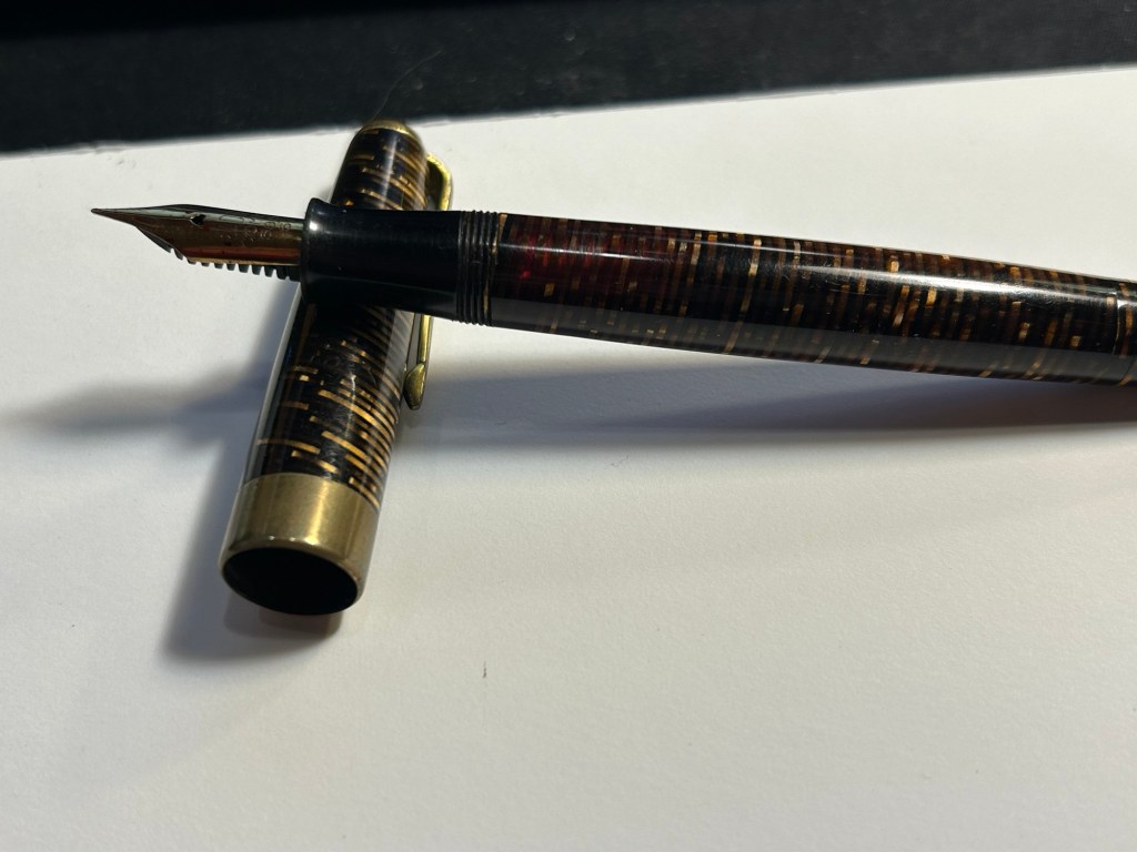
The pen was obviously user-grade, as there was brassing and tarnishing on the hardware, a lot of micro-scratches on the body, and some ambering in parts of the celluloid. It’s still a good looking pen, though.

The stripes had darkened with time, but some still have their original glow

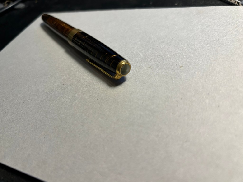
The design of the clip and the jewel on the end of the cap was clearly influenced by the ultra popular Parker Vacumatic.

The jewel on top, a clear copy of the Parker design.

Even though the celluloid has darkened and ambered with time, you can still clearly see the ink levels through the stripes. As a piston filler it has an impressive ink capacity, which works well with the flex nib, as it can lay down a good amount of ink when fully flexed.

You can see the ink levels through the stripes.

It works perfectly – the filling system is and always was a joy to use, and the nib… Well, the literally don’t make nibs like this any more:

The nib

When you apply no pressure it’s a wonderfully smooth fine nib, but when fully flexed it goes up to broad/double broad territory. The feed keeps up with the ink flow with ease, and I’ve never had a hard start with it, ever.

Writing sample on Midori MD paper with Diamine Amaranth

Leonardo has revived the brand in recent years, and now you can buy a brand new Radius with a cartridge/converter system, resin body and (obviously non-flexible) steel nib for around €150, not including shipping. No modern pen manufacturer is capable of creating a pen like the vintage Radius or any of its contemporaries, neither in body material, nibs or filling systems at the price that they were once made. It’s a question of both volume and lost knowledge and tooling, which means that the vintage and new Radius pens have very little to do with each other beyond having the same brand name.

Buying vintage is always a risk in a way buying modern pens isn’t, but the value for money still cannot be beaten. I might buy a modern Radius at some point in the future (I like their designs and I’m curious about the pens), but I have no doubt that in terms of looks, nib and filling system it won’t be able to hold a candle to its well-worn and well-loved vintage namesake.

London Haul: Carrying Cases and Standard Pens

I’m working on my backlog of posts after about a month of hiatus (work and health related) so here’s a look into more of my haul from my latest London trip.

Muji happened to have a sale on its standard pen sets, so I bought a pouch of these 0.38 gel pens (I think that Zebra makes their refills but I’m not sure) to have around. There are 10 pens in the set, and my plan is to bring them into the office to have them around as occasional highlighters, pens to doodle with or pens to loan with no expectations of seeing them again.

The red Olfa Touch Knife was an impulse buy and is the thing I use most from this bunch. I used it while gift wrapping books, I used it to open packages, and I’m using it now to open Lego bags for my current build (the large Disney Castle). This is a nifty and handy little tool and I’ll probably buy another one at some point as a backup.
The bronze paper clip is just a nicer version of the clip that I use to keep my pocket Stillman and Birn Alphas shut, as they don’t come with any kind of elastic closure.

The gold bics are from Present and Correct and they made me laugh. I plan on giving one away to a designed friend, in the hopes that it will make her laugh too. I used to use them so much when I was a teenager (before gel ink pens became widely available) and I hated them so much that having a gold one is just beyond perfect.

The black and yellow pen is the Bauhaus edition of the Leuchtturm1917 Drehgriffel Nr. 1 ballpoint. It’s a twist mechanism aluminium and brass hexagonal ballpoint pen that comes with a blue refill. I reviewed the gel ink version (identical apart from the refill) here. I purchased this pen in London Graphic Centre near Seven Dials/Covent Garden, and it was completely an impulse buy. Should you buy one yourself? If you’re in need of a pocketable ballpoint that doesn’t use a click mechanism, then maybe. Ergonomically it’s not the best for long writing sessions, and the twist mechanism doesn’t make it great for quick deployment, so there are better options in the market. The design is very fetching, and if you like it you might be willing to overlook the pen’s shortcomings. The Bauhaus edition was created as a companion to Leuchtturm’s Bauhaus notebooks.

Drehgriffel Nr. 1 Bauhaus ballpoint.

I bought the Drehgriffel ballpoint to accompany the Drehgriffel mechanical pencil that I bought at the same time. The pencil is fire engine red and grey with silver trim, and the pen is black and yellow with brass trim, and the pencil is slightly heavier than the pen, though they’re both the same size.

Pen on top, pencil on the bottom.

I also got two carrying cases, one a blue Cordura pen case from Midori. The case is called the two way pouch, and it appears very well made.

Midori two way pouch.

The pouch is divided into two identical compartments (hence the name) each with a small divider/pocket inside. It also has a prominent and robustly built handle. I am considering using this pen case for my Caran d’Ache neocolors, but we’ll see.

The second case is a heavily discounted net pouch from Muji. This is going into my travel backpack as a way to keep easily lost bits and bobs together and easily found.

The net side of the Muji case

The net is just on one side of the case, which is perfect, as it allows you to see what’s inside the pouch and also have this little bag have some sort of body and structure to it due to the solid side.

The solid side of the Muji case next to the Drehgriffel pencil and pen.

I also bought a solid plastic box for the my neocolors at Muji, but I decided not to use if for them in the end. It was too small for them and they rattled around in it and made a racket every time I walked, and I didn’t like that.

All in all this was probably my most “impulse buy” bit of the trip, and I’m OK with that. Compared to previous years I’ve really toned down my “must try all the pens in the world to find just the perfect one!” tendencies. If you’re reading this I assume that you can relate.
Now to just use it all…

Inktober Day 23: Packing Up the Plastics in the Sea Exhibit

As I was running a few days ago I saw some workers packing up the plastics in the sea exhibit and I stopped to take a picture of them as they tried to figure out how to fit all the statues into their truck. I sketched this purposely very loosely and very quickly, to see if I could capture a complex scene without getting overly absorbed in the detail. It’s a good exercise to try out, and one that I intend to do more of in the future.

TWSBI ECO fine with J. Herbin Emarald of Chivor on an A4 Midori MD Cotton notebook.

Inktober Day 22: Indian Motorcycle

A friend was at a local vintage Indian motorcycle meeting and she took a photo of a 1948 Indian chief, so this is today’s sketch, directly in pen and ink. 3776 Plantinum UEF fountain pen with Sailor Epinard ink on an A4 Midori MD Cotton notebook.

Inktober Day 21: Autumn in Saskatchewan (autumn foliage part 5 – the finale)

My memories of autumn in Regina Saskatchewan are what inspired this small series, and so I thought that it would be fitting to draw a small panorama of autumn leaves in Regina.
Drawn with various brush pens and Staedtler markers on an A4 Midori MD Cotton notebook.

You can see the full page here. I kind of like the resulting effect:

And if you want a process video, here it is:

Inktober Day 19: Sugar Maple (Autumn foliage part 3)

The grey bark of the sugar maple make its orange foliage pop even more. Drawn with a Kuretake fudegokochi extra fine brush pen which I do not recommend for any sort of artwork – it takes ages to dry, and isn’t stable until it’s completely dry, and even then you can’t trust it not to make a mess of your artwork. Also used Faber Castell Pitt brush pens (which I do recommend) on an A4 Midori MD Cotton notebook.

Inktober Day 17: Ginko Biloba (Autumn Foliage part 1)

There’s no real autumn here, and I really miss the leaves changing colour and an actual autumnal season, so I decided to dedicate the next few inktober sketches to trees in autumn. The first is ginko biloba, with its gorgeous golden leaves.
This was sketched with a Pentel GFKP brush pen, the king of brush pens, and Faber Castell Pitt brush pens on an A4 Midori MD Cotton notebook.

Inktober Day 10: Sunrise of the Independence Garden

Had an unusual start to the day, with an early morning walk before my usual morning run. I’m embracing the spirit of experimentation with these, so this one was sketched using diluted Sennelier shellac based ink (non fountain pen friendly) in waterbrushes, paired with a fine nibbed TWSBI ECO filled with J. Herbin Emerald of Chivor, and a Diplomat Aero with a fine nib filled with Colorverse Golden Record. The Midori MD Cotton paper does not take nicely to any amount of moisture and there was bleed through (and of course see through) to the other side of the page, but in general it held up much better than I expected.

Independence Garden at Sunrise. Playing about with various kinds of inks.

Here are all the tools used for this quick sketch:

From left to right: waterbrush filled with blue in, waterbrush filled with sepia ink, TWSBI ECO, Diplomat Aero and a waterbrush filled with water.

And here’s the complete page:

Inktober Day 9: Surfers near the Marina

Today’s sketch includes a frame and characters drawn with a Staedtler pigment fineliner 0.1 pen, a sky drawn with a Vertex and kyo no oto Sakuranezumi ink, a sea drawn with a TWSBI ECO filled with J. Herbin Emerald of Chivor, a lighthouse sketch with a Platinum 3776 UEF nib filled with Sailor Epinard, and a beach and breaker sketch done with a Diplomat Aero and Colorverse Golden Record (plus a waterbrush).

Here’s the whole pen lineup used to create this page: