I’m finally done with reviewing the Diamine Inkvent 2024 Black Edition calendar and it’s been exhausting. I haven’t been able to get a proper buffer for the even this year, which meant that I was chasing every post every day.
On the plus side, it was nice to dust off 25 bears and sketch them. My sketching and my blogging had been in a rut recently and this event kickstarted them, so I am grateful for that. I also got some lovely comments from people, which is always wonderful to read.
Wild sunset today
Cal Newport
The latest episode of Cal Newport’s Deep Questions podcast was excellent, and in the final segment Cal discussed his new approach to making a quarterly plan. It’s worth listening to, but basically his idea of pillars and foundations and focusing on a certain pillar at a time really resonated with me. My next quarter will be focused on craft as a pillar, as I want to earn a professional certification and work towards a deeper understanding and more hands on experience with certain more obscure aspects of my job.
Reading
I finished reading the HBR “Dealing with Difficult People” book, and started reading Paul Auster’s “The New York Trilogy”. So far it’s a very Paul Auster book, for good and for bad.
Impressionism
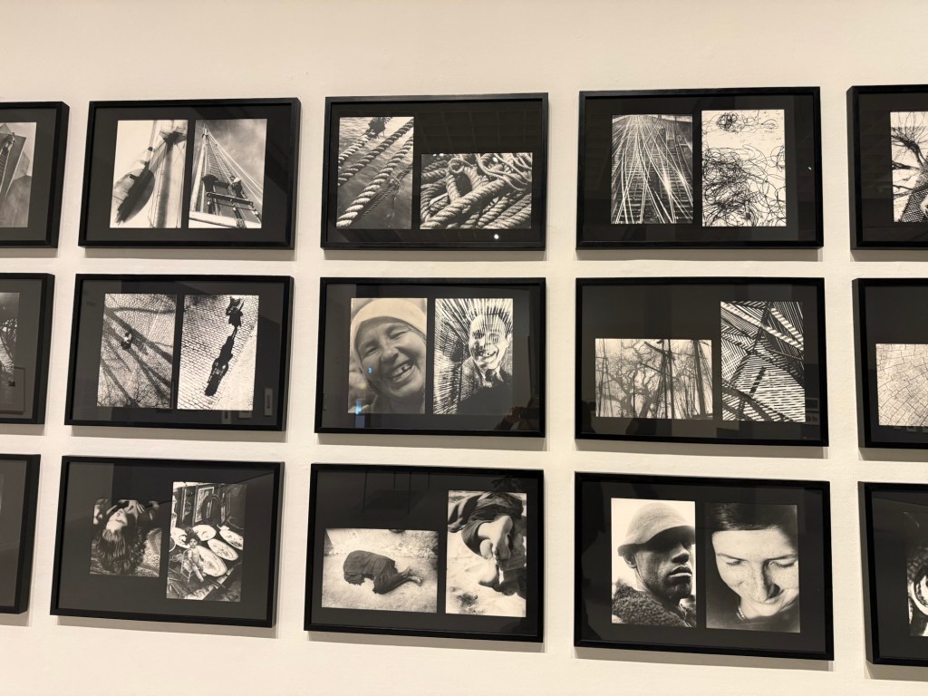
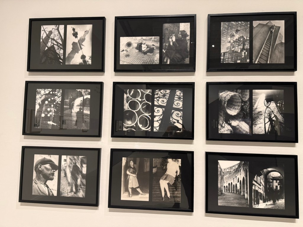
I went to see an Impressionist exhibition, celebrating 150 years to the movement, at the local art museum. The exhibition itself was nice enough, but a bit thin in terms of the artwork on display. There was also a nice print exhibition, and an excellent retrospective exhibition dedicated to Moi Ver. It was wonderful seeing a master photographer at work, and his design work is also worth seeing.
Ci-Contre Moi VerCi-Contre Moi Ver
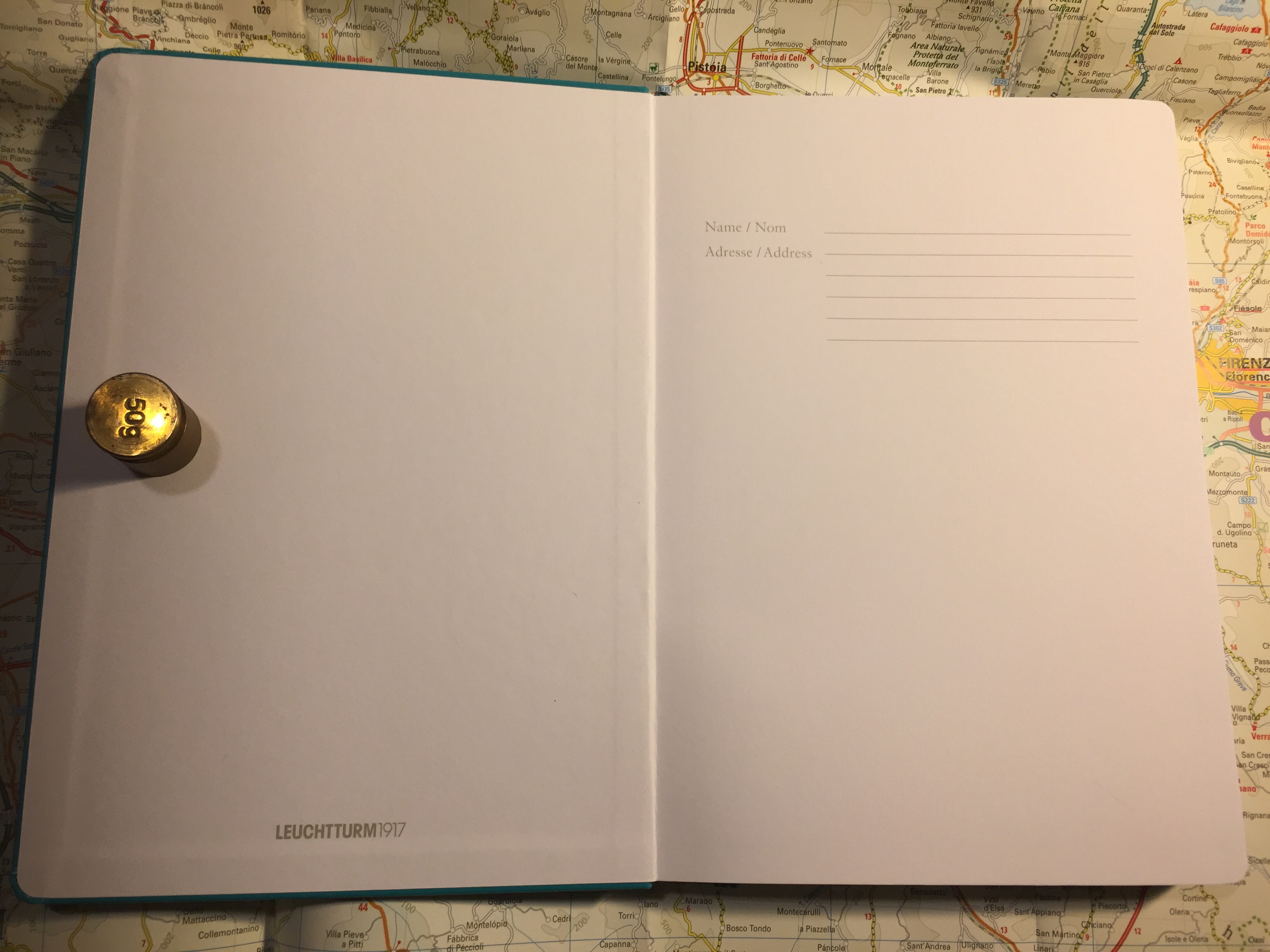
I went to the museum store later and went a little wild, purchasing a handmade ceramic cup made by a local artist, three postcards (which I wrote on and will give away), and a Leuchtturm1917 A5 dotted notebook that I didn’t need but I wanted anyway. I bought a Leuchtturm notebook the last time I was in that store, and it’s now my work daily driver notebook, so I assume I’ll find use for this notebook soon enough. The paper isn’t perfect, but it’s good enough for me for daily fountain pen use.
This is the second post on this topic. For an explanation on the 13 week year read this post.
As life tends to constantly throw curveballs at me, planning ahead in short bursts has proven to be invaluable. During the previous quarter my dad went through an unexpected open-heart surgery and I realized that I’d have to find a new apartment in the not so distant future. If I had planned ahead for an entire year (goals/themes, the system is immaterial), I would have had to scrap all my plans on February. As it was, I made a few minor adjustments, and finished not so far from where I originally planned.
Just before this 13 week/quarter started I got some bad news about my cat. That’s going to affect my plans, which I made before I realized that he was likely dealing with cancer. That’s OK – my plans are short term enough to allow me to easily change them, and I’ve already built plenty of wiggle room into the plans that I made. Unlike themes, which I find to be to vague to be useful, or yearly plans, which are too long term to be practical in my circumstances, 13 week planning allows for just enough time to make meaningful progress in the key areas of my life whilst being short enough to allow me to quickly pivot if necessary.
How I Make a 13 Week Plan
This is my third round with 13 week planning, and I’m getting progressively better at it. Here’s what I do that’s been working so far:
List all the roles and areas in my life and make sure I’m covering all of them. Some examples of the areas I use: Health and Fitness, Reading, Mental Health (important enough for me with my PTSD to have it under a separate area), Conversations (meaningful connections with friends – that’s face to face get togethers or one on one phone calls or zoom meetings, not WhatsAapp messages), French, Creative Projects, Film Photography (more on that in a separate post), Professional Development (this is the only work related stuff that I track at home), Decluttering (trying to prepare for a future move), Drawing, Blog, Money. Yes there are a lot of them, yes it’s worth listing everything down and addressing as much of it as you can with your plan.
Figure out measurable goals that can be reached during the 13 week stretch. Where possible I set a bare minimum, easily achievable goal, and then stretch goals. So for instance the minimum reading goal is 6 books, with 8 books and 10 books as my stretch goals. This means that if the unexpected happens, it’s almost always only my stretch goals that are affected. It also means that I’m not setting myself up to say: “this is impossible, why even bother?” Every little bit helps, and it helps to be kind to your future self.
Set up various scaffolds and aides to your goals. Wherever possible I use the app “Streaks” to help me hit my goals. I also use the great NRC (Nike Run Club) app to help me keep track of my running goals and challenge me there, and I schedule as many things as possible in my calendar ahead of time. GoodReads has a reading challenge that helps me track books. Then there is my weekly planning session, where I build up next week’s plan. During that time I go over all of my goals for the quarter and make sure that I’m hitting at least a few of them that week.
When executing your plan, break things down to monthly, weekly and daily goals. Whether it’s X amount of running sessions a month, X minutes of exercise a week, or how much time you spent away from screens every day, the longer term goals need to be broken down to shorter term chunks for you to actually be able to do them. It’s also helpful when reviewing your weekly or monthly plan to see where your quarterly (or 13 week) plan was too optimistic. If, for example, you’re travelling for two weeks in August, you need to make sure you didn’t account for those two weeks during your quarterly plan, because chances are you won’t be able to hit very many goals during that time.
Don’t be afraid to refactor the plan when major things happen. Your plan should be flexible enough to account for the small and medium sized surprises life throws at us (broken fridge, out of town friend unexpectedly drops by for a few days, you picked up a new hobby), but don’t be afraid to rethink your plans when the big things hit (major illness, unexpected move, promotion, job change, etc). You don’t score points for sticking to the plan – the plan is just a tool meant to help you achieve your goals.
My planning is done on paper, and then I use Fantastical (a calendar app) and Streaks on my phone to help me keep daily track of things. I look at my weekly plan almost every day, and I track things there as well. On a weekly basis I review my progress and decide what to focus on next week. If it’s a busy week I’ll select only a few relatively easy goals, for example. The point is to build a plan that is detailed enough to cover the most important areas in your life well, and yet allows for flexibility.
A small snippet from this quarter’s plan
Have you found this helpful? What tools do you use to achieve your goals?
Back in January I wrote about trying a new long term planning system that isn’t the Theme System or theme based, and isn’t yearly goal based, but rather is based on breaking the year into four 13 week blocks, each one representing a fully independent quarter.
I’m now in week 11 of the second of these blocks (quarter two, to put it more simply), and I’m starting to plan the next quarter. While working on my plan I thought that it would be useful to document the procedure, talk about my review process, and discuss how I planned the previous quarters, how things went, and what I plan to do differently in the third quarter.
The point of this system is to break the year into more manageable parts. This allows for greater flexibility in planning, time to “recover” from life’s surprises, and time to work on meaningful, long term projects. On the one hand the entire year isn’t a wash when life deals one of its blows, and on the other hand you can allow yourself to express a realistic amount of ambition.
Starting the Third Quarter’s Setup
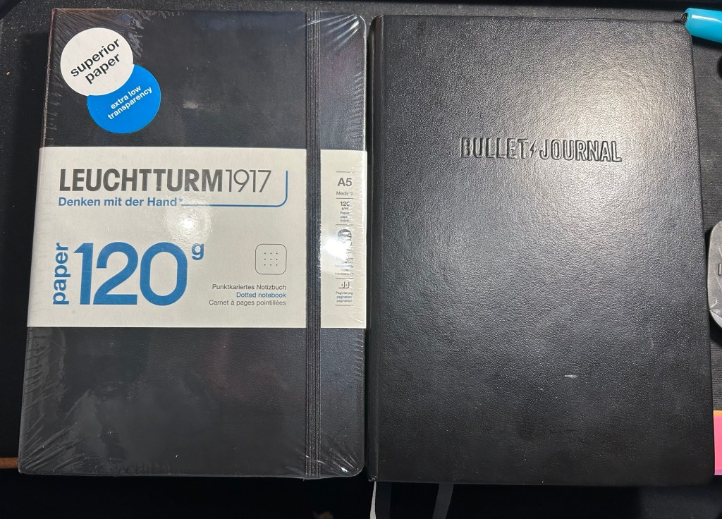
I use the Leuchtturm Bullet Journal for my planning, and it should last me to the end of the year. After that I’ll switch to a Leuchtturm 120gsm dot grid notebook, as I don’t use any of the Bullet Journal features in my current notebook.
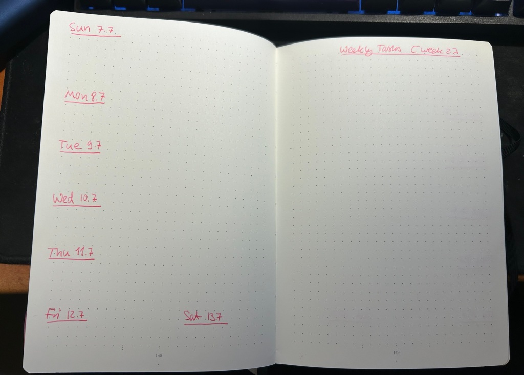
The first bit is a bit mindless, but I prefer to see it as meditative. Each week in my planner gets two pages, and so I leave four empty pages after the last spread of the previous quarter. These four pages will contain my plan for the quarter, broken into various sections. More on how I build that in a later post.
Then I sit down and draw out 13 weekly spreads. On the left side of the spread I write down the days of the week and the dates, and on the right I just put a “Weekly Tasks” title with the number of the week in the quarter in square brackets. I do this in one sitting for the entire quarter, and it takes about 30 minutes because I don’t rush it. This is how the pages look at this point:
This is how it looks when it’s filled and in use:
The left side gets filled with my exercise plan for the week, major appointments, and important things I don’t want to forget.
The right side has my weekly goals, both in the form of various checklists with checkboxes and more general lists. This is where my quarterly goals get put into action – every Friday or Saturday I look at my quarterly goals, and then try to advance as many of them as I can in the week. Things become more quantifiable at this point, though it’s often only in my daily to do lists that they become real, doable tasks. My daily to do list is something that I write the night before on an A5 loose sheet of paper, and recycle once I’m done with it.
Next time I’ll post a bit more about how I create the quarterly plan.
How do you plan your year? How is your planning going now that the year is halfway through?
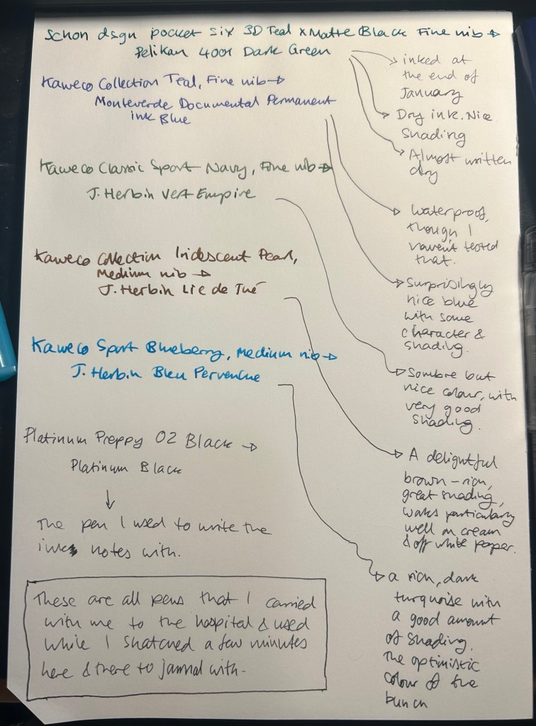
I started the month ready to spend the first half of it in hospital, with my dad. So the fountain pens I chose were all expendable pocketable pens that I was willing to have stolen (apart from the Schon Design Pocket 6 which was a leftover from January and never left my desk). So that meant I inked 4 Kaweco Sport fountain pens using various ink cartridges that I had on hand.
The portable lineup:
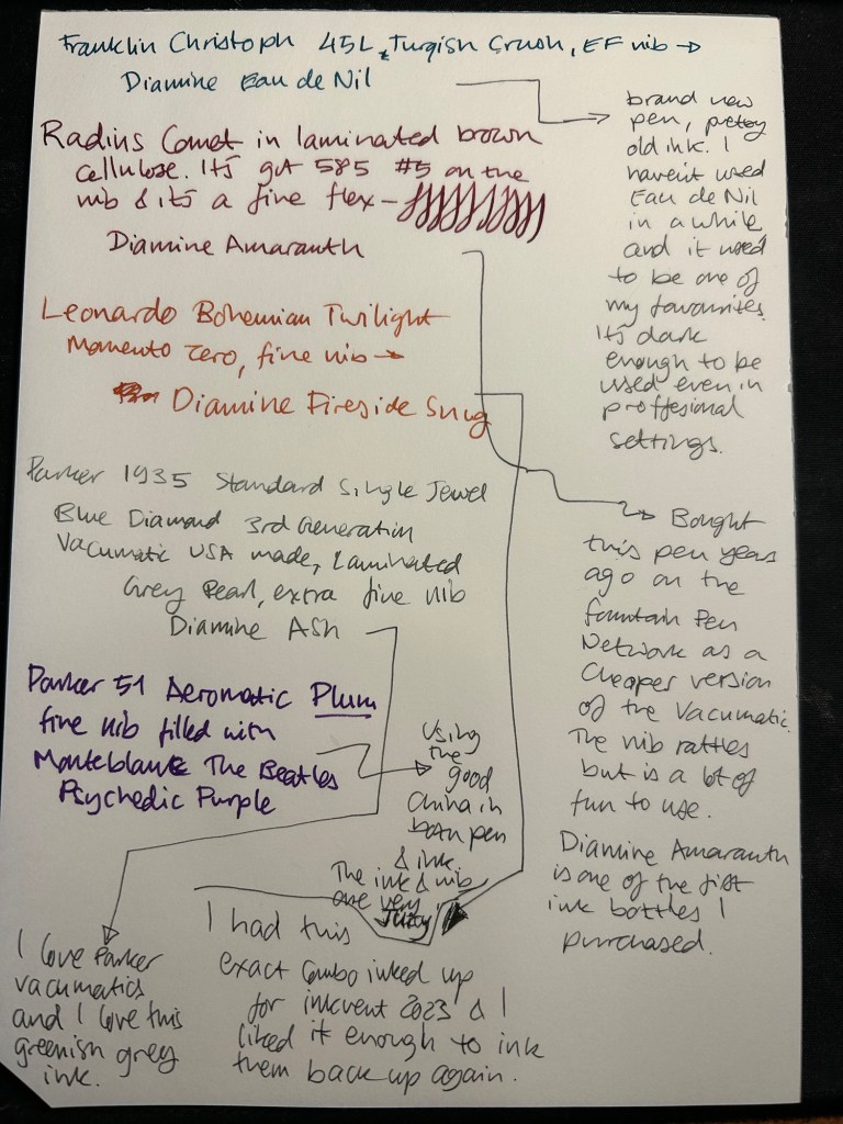
Once my dad got out of hospital and back home, I decided to celebrate by “shopping” from my collection. I inked up a Parker 51 Plum (use the good china!), a Parker Vacumatic, a Franklin Christoph 45L Turqish (spelled like that on their site) Crush that I had purchased but hadn’t inked before, and a vintage Radius Comet (because I heard that the brand was being revived).
The Franklin Christoph EF nib isn’t the best companion to the Eau de Nil as the ink tends to dry in the nib, causing hard start issues. The Radius is a flexible nib of the vintage kind, which means it’s really flexible and not just springy. It also rattles, which makes me not carry it around with me — it stays at home at my desk. The Leonardo is a beautiful pen with a beautiful ink that I refilled immediately — the only Inkvent 2023 ink I did that with. The two vintage Parkers are phenomenal, as usual. The extra fine nib on the vacumatic somehow really well with Diamine Ash, though I was worried at first that the combination would be too light to be readable. The Parker 51 Aeromatic is a treat to use. It’s the rare Plum colour, and it’s got a fantastic nib (as all 51’s have) which pairs very nicely with the Monteblanc The Beatles Psychedelic Purple.
In terms of paper I’ve been using Kokuyo A4 KB paper which I cut to half size (so A5) to manage my daily to do list. The paper is relatively cheap and very fountain pen friendly. I’m also able to use both sides of the page despite there being some show through.
Kokuyo A4 KB paper cut in half to A5 size. This is why standards are great.
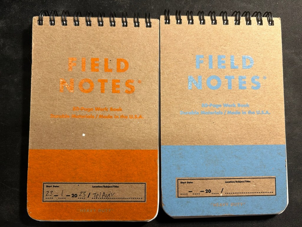
I’ve got a Field Notes Heavy duty on my desk at home and at work, and I just bought a new stock of them. These are where I jot down quick notes, phone call details, doodles during boring meetings. When they’re filled up they get tossed out as nothing in them is permanent — everything important in them moves to somewhere else as I work my way through them.
Field Notes Heavy Duty pocket spiral bound reporter notebooks
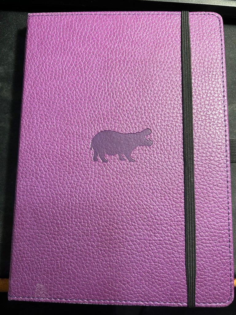
I have finally found a use for my Dingbats notebooks (beyond giving them away as gifts, as I have in the past): this lined purple hippo one is my blog notebook. I discovered that I have a much easier, much quicker time writing blog posts if I first draft them on paper, and this is where I do it in. I’ll likely write a dedicated post to this notebook soon.
Dingbats Puple Hippo A5 lined notebook
Apart from them I still use the notebooks I used last month.
Pencils
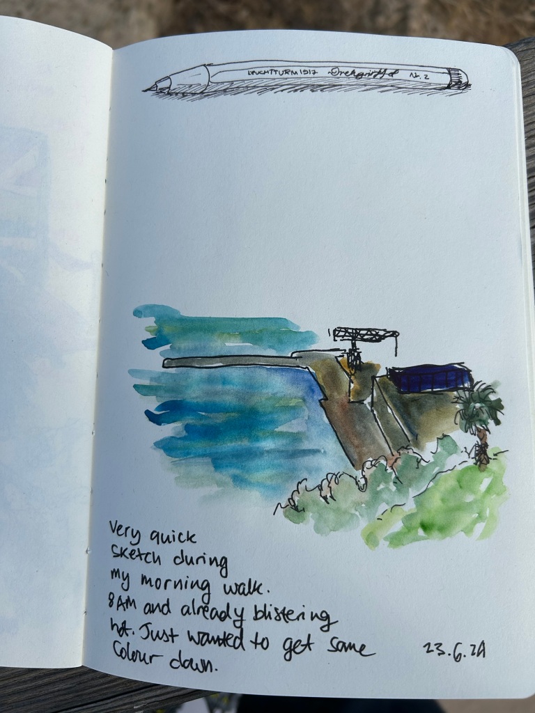
I’ve been using the Drehgriffel Nr. 2 as my daily driver. I use pencils extensively to plan, as my plans tend to change, and there’s something about this solid little mechanical pencil that makes me want to use it.
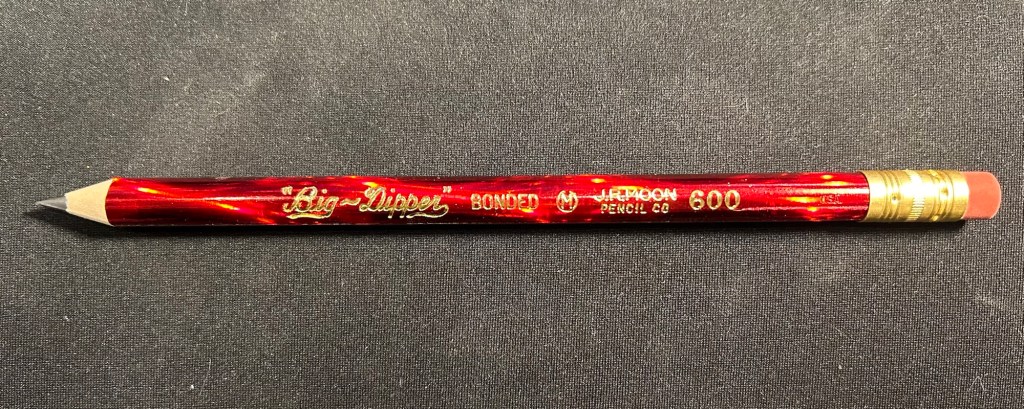
Apart from that I brought two pencils into the rotation, to try to use. One is from my last purchase from the late and great C.W. Pencils Enterprise, and it’s the “Big Dipper” J.R. Moon Pencil Co 600. It’s an oversized pencil, the kind of pencil that kids who are learning to write are expected to use. I’ve been having pretty significant neuropathy in my hands lately and I thought that this would be nice and easy to use, as after all it’s designed for kids just learning to develop their fine motor skills. So far it’s been a disappointment – the eraser and ferrule make it very top heavy, and I’ve been having a hard time manipulating it. I can’t imagine kids using this pencil and having an easy time with it. I like the over the top red foil with gold writing look though, so I haven’t given up on it yet.
Big Dipper J.R. Moon 600
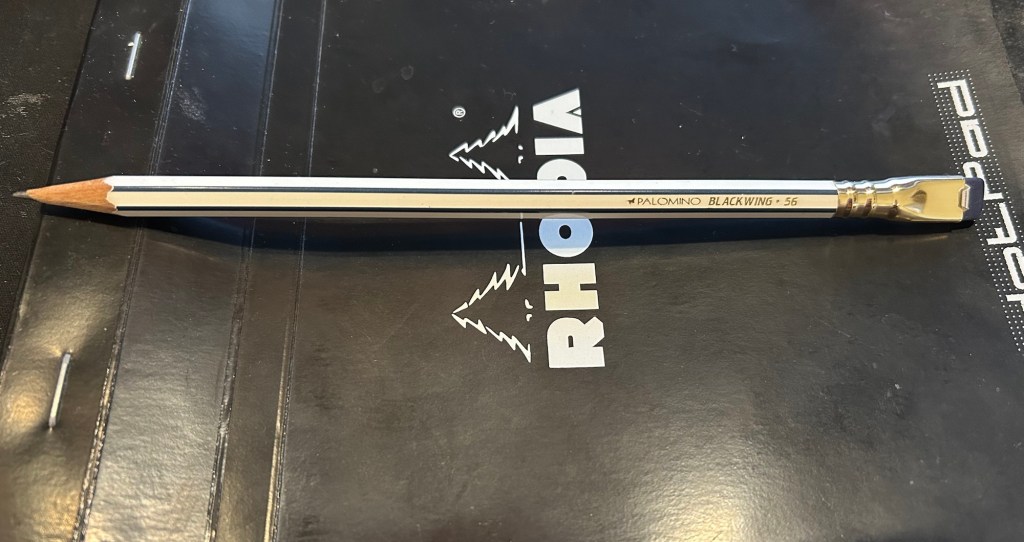
The second pencil is a Blackwing Volumes 56, the baseball themed one. The core is soft and dark, and I’ve been using it for quick and loose sketches. I’m trying to ease into one week 100 people by training myself to work faster than I normally would.
Blackwing Volumes 56
What did you use in February? Any planner changes? Pencil revelations? Pen preferences?
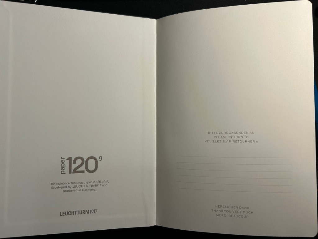
A few months ago I started using the Leuchtturm1917 Bullet Journal – at first as it was intended, but very quickly it turned into a general weekly and quarterly planner for me. As I neared the halfway mark of the notebook I decided to purchase a replacement, but instead of buying another Bullet Journal I purchased a 120gsm dot grid Leuchtturm A5 notebook. The paper was the same in both notebooks, and as I didn’t use any of the Bullet Journal features and the 120gsm notebooks are slightly cheaper, I thought that it would be a good replacement.
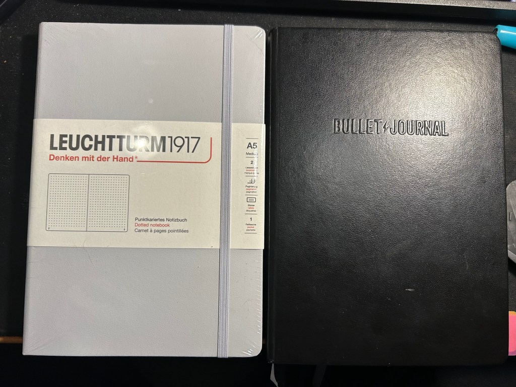
While I was still waiting for my 120gsm notebook to arrive, I happened to find a light grey standard (or 80gsm) dot grid A5 Leuchtturm notebook at a local store at a decent price. I purchased it and decided to compare the three notebooks.
The Bullet Journal is the most expensive of the three, but also comes with the most “stuff”. There’s a booklet that explains how to bullet journal, stickers for bullet journaling, a specially formatted front endpaper, a key for bullet journaling, three ribbon bookmarks instead of two, and several pages with dedicated bullet journal appropriate titles (intentions, index, future log). It has the fewest colour options (just three) and features Bullet Journal branding on the front cover and the spine.
The original- Bullet Journal
The Leuchtturm 120g notebook has a few more colour options, and is basically a stripped down Bullet Journal edition. In terms of thickness the two notebooks are the same (i.e. very thick notebooks, about twice the thickness of a Moleskine), but the 120g notebook has just two ribbon bookmarks (instead of three), no special endpapers, stickers (beyond the regular ones that come with each Leuchtturm notebook), titled pages, key or booklet. It’s cheaper than the Bullet Journal and has the same paper that the Bullet Journal has.
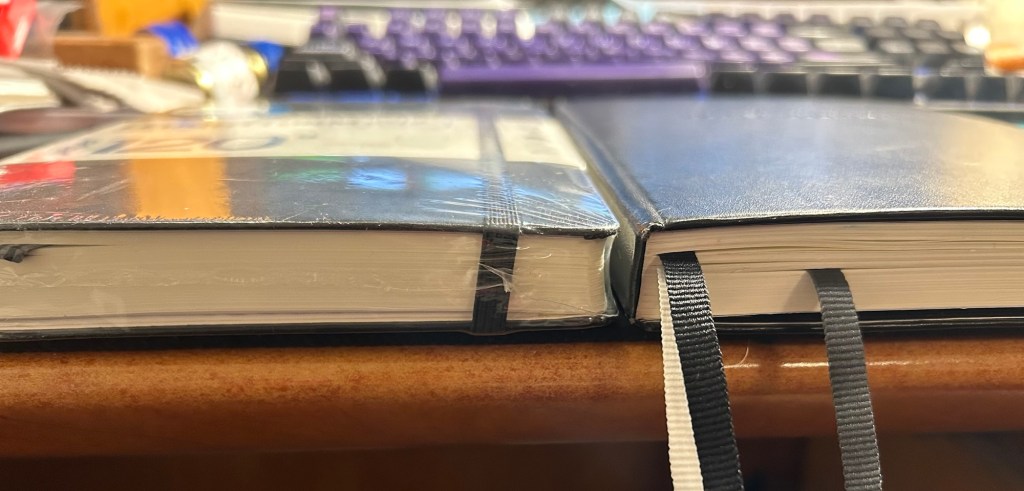
120gsm on the left, Bullet Journal on the right
Same thickness and form factor:
120gsm on the left, Bullet Journal on the right
The regular Leuchttuem dot grid (which I’ll refer to as the standard from now on) is 20% thinner than the other two, features 80gsm paper and not 120gsm and like the 120g has two ribbon bookmarks, label stickers for the notebook, and a pocket on the back. It’s also a bit lighter than the two other notebooks.
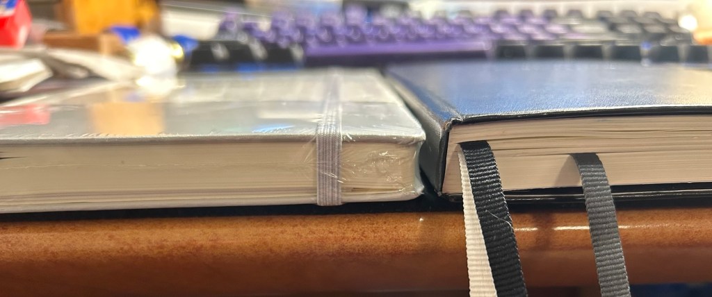
Standard on the left, Bullet Journal on the right
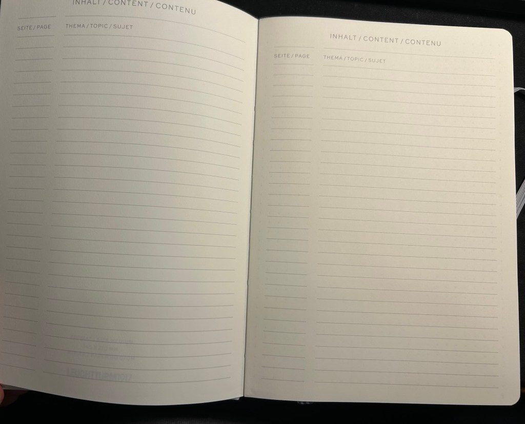
Where the standard notebook wins in a knockout is page count. The standard has 251 pages, the 120gsm has 203 pages and the Bullet Journal has 205 pages, but several of those pages feature dedicated Bullet Journal titles (Index, Future Log, etc).
Standard on the left, Bullet Journal on the right
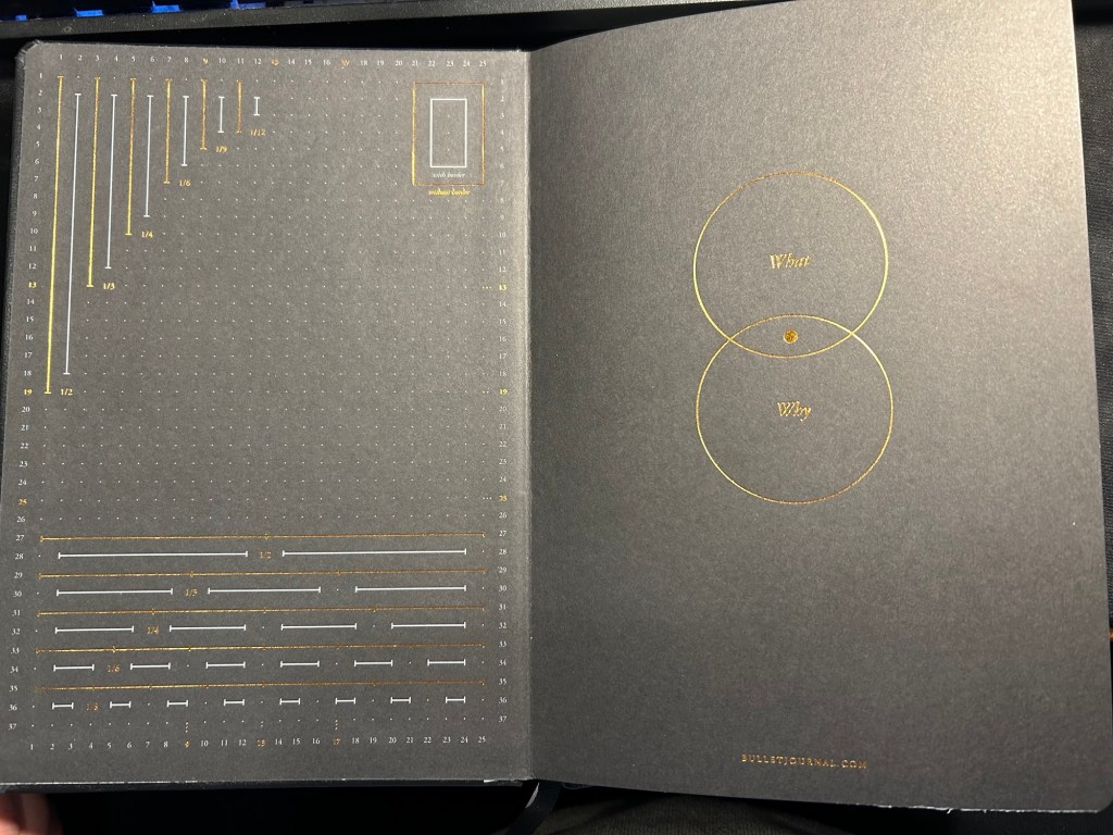
All three notebooks open flat, feature an off white paper, and the last 20 pages are perforated so you can tear them out. The standard and 120gsm contain two lined table of content pages, which the Bullet Journal does not. The Bullet Journal is also the only one to contain special divisions on the paper, which are notated on the front endpaper:
Bullet Journal front endpaper
The front endpaper on the standard and the 120gsm look very similar, but the 120gsm has a bit of additional branding:
Standard front endpaper120gsm front endpaper
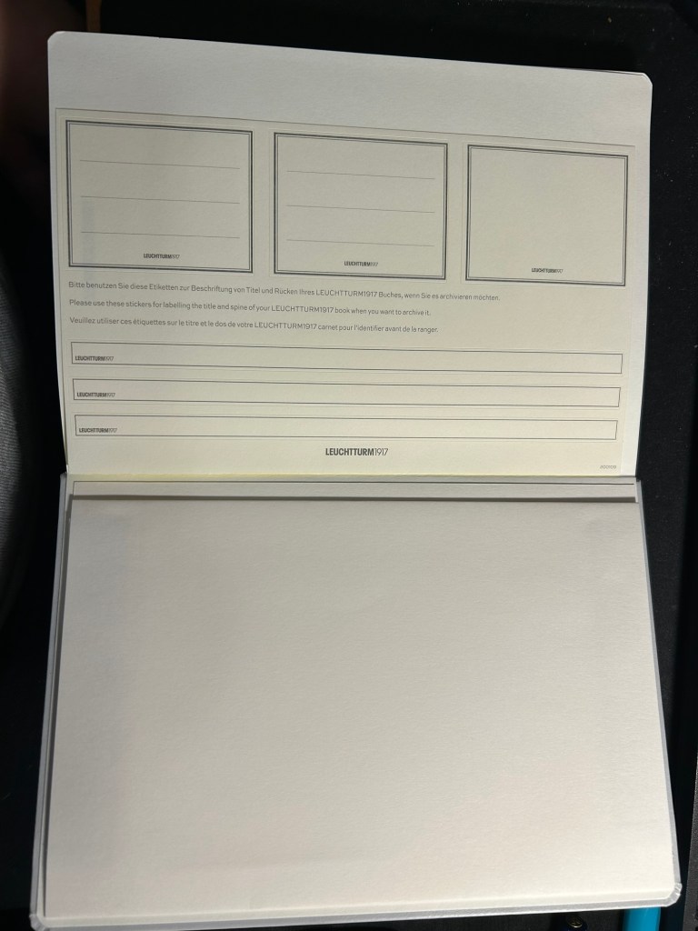
The stickers on the standard and 120gsm are the same, and are meant to be used on the cover and spine, to label the notebook:
Stickers in the Standard and 120gsm
The pockets on all three notebooks look and function pretty much the same.
Back endpapers and pocket in the Standard and 120gsm
The table of contents pages on the standard and 120gsm is useful if you use your notebook for project management or meeting notes, for instance, and want to be able to quickly reference a certain page. The pages are already numbered, so it’s just a matter of building the reference pages in a way that makes sense to you. This doesn’t exist in the Bullet Journal because Leuchtturm is assuming that you’ll be using the official Bullet Journal way of referencing and finding pages.
What Leuchtturm confusingly calls Bookmarks – two index pages in the Standard and 120gsm
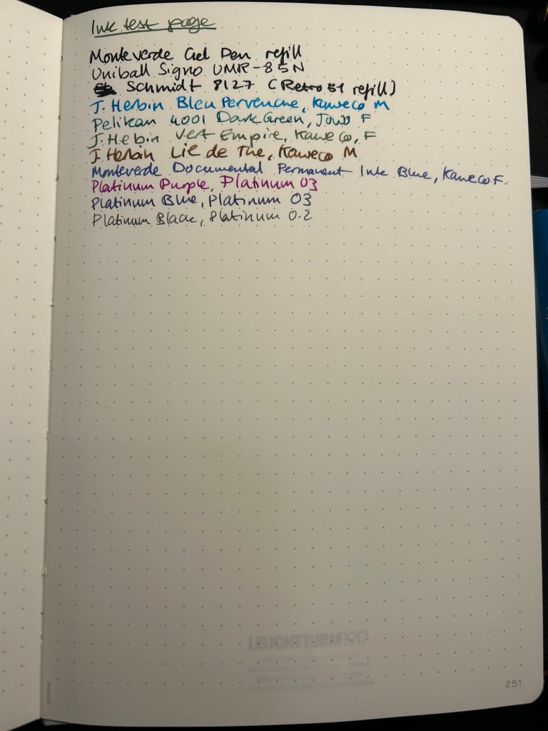
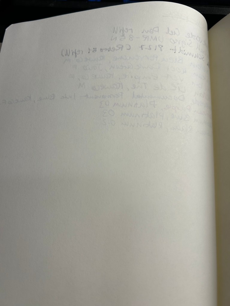
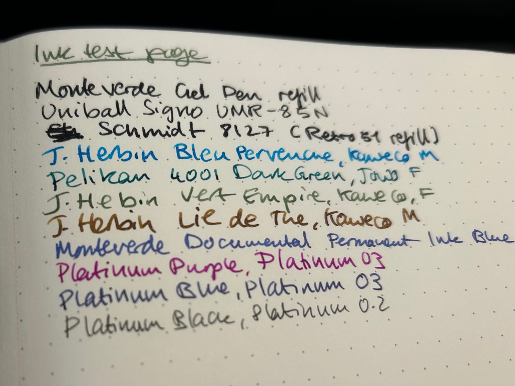
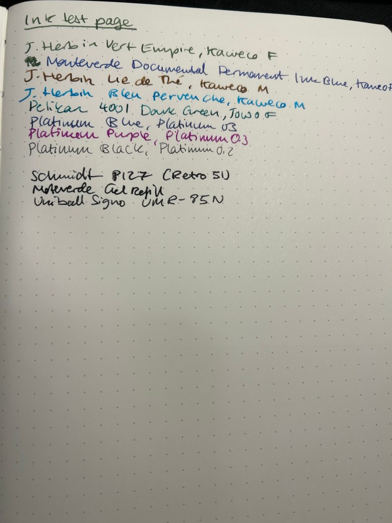
Now for the paper. The dot grid is the same on all three, but the paper in the standard is by far the inferior of the three. The page is practically transparent (you can see the Leuchtturm1917 logo on the back pocket on the bottom of the page) and you will have show through with all kinds of inks, pens and nib sizes, and bleed through with most pens and inks (including wider gel ink pens!):
Ink test page for the Standard
This is a notebook that you either need to use with a very specific kind of pen, or be willing to write on only one side of the page (therefore giving up on the price and page number advantage of the notebook):
Show through and bleed through on the Standard. Even the gel inks faired poorly.
Here’s a close up of the way the ink behaved. This is fountain pen friendly paper in terms of it not spreading or feathering, but the bleed through and show through will limit you to fine and extra fine nibs and less saturated inks:
No feathering, some spread with the Retro 51 refill
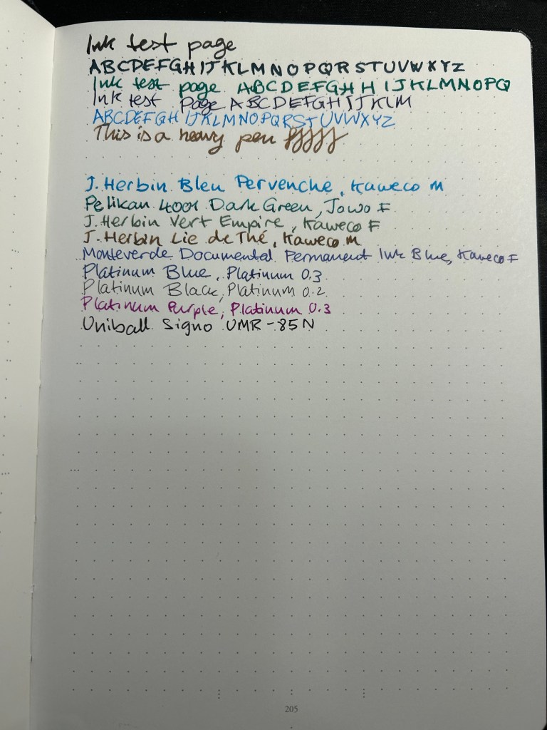
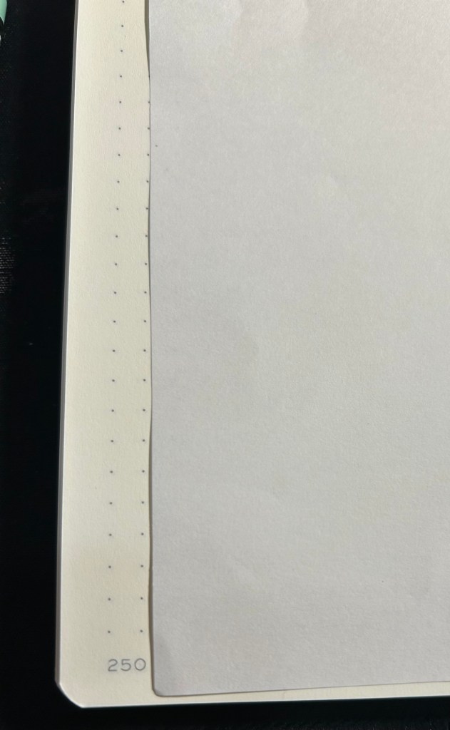
The 120gsm paper on both the Bullet Journal and the 120gsm notebook fair much better:
Ink test page on the 120gsm
You can definitely use both sides of the page with this notebook, and feel free to toss every kind of nib width and ink at it — I haven’t found one that it can’t handle.
Back of the 120gsm (Bullet Journal was the same)
I’ve been using the Bullet Journal for a while now and I have had no problems using even broad and flexible nibs on it, with wet inks. Inks take time to dry on it, but they don’t bleed through.
Ink test page with example of wet and wide nibs on the Bullet Journal
The paper in all three journals is off white. That may bother you. Here’s the page with a sample of a white page next to it:
Paper colour sample – Leuchtturm vs white paper
At the bottom and the left side of the page you can see the special Bullet Journal divisions, meant to help you create various BuJo formats of things. They’re very unobtrusive, so you can easily ignore them if you don’t need them:
Bullet Journal markings on the bottom and on the left margin
So, basically:
Standard — cheapest one, thinnest and lightest with the most pages. Works only if you use fine gel ink pens or fine and extra-fine nibs with unsaturated or light coloured inks. If you write with a heavy hand, or prefer to use ballpoints this paper will likely note work for you, as you’ll carve your way through several pages without really intending to. If you’re willing and able to work around its limitations, it’s worth getting. It’s also more widely available and comes with a much larger range of cover colours than the other two.
120gsm – when in doubt, get this notebook. It’s got the best paper for the least amount of money of the three. If two ribbon bookmarks aren’t enough for you, it’s likely that you’ll need more than three anyway — get post it tabs. If you don’t have to have the Bullet Journal addons and formatting, save a few bucks and get this notebook. You’ll also have a few more cover colour options.
Bullet Journal — get this if you want to use the Bullet Journal method or you want to try it. If you end up deciding not to use the method, you’re still left with a great notebook, and you can buy the 120gsm next time.
I hope this helps clarify things a bit. Personally I’m currently using the Bullet Journal as a regular notebook (my quarterly planning, weekly planner and long term lists are in it) after failing to find value in the Bullet Journal system, and the standard notebook for work projects. The 120gsm will replace the Bullet Journal once I’ve filled it.
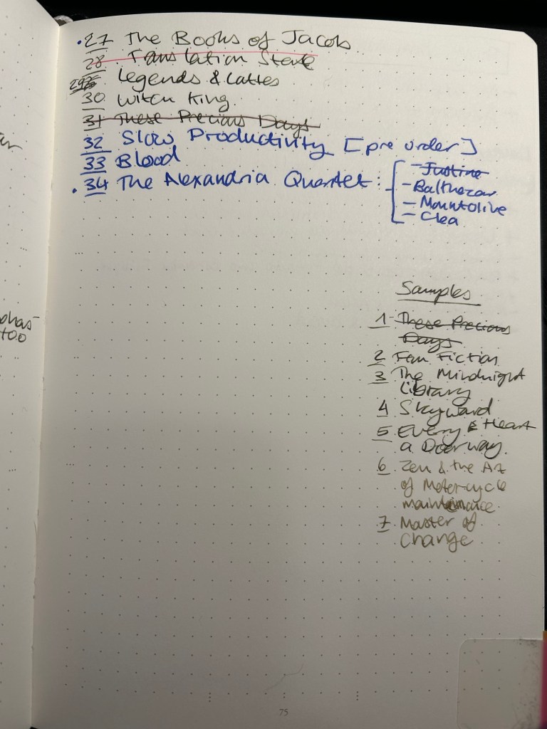
One of the things that I set up in my Leuchtturm1917 Bullet Journal is a list of the unread books on my Kindle. It’s supremely easy to buy books on a Kindle, as the whole system is set up a way to make book purchasing as fast and frictionless as possible.
This is a problem for me.
I love books, I adore reading, and I have pretty large group of friends that love reading too. This means that I’m inundated with great recommendations that run the gamut from light hearted fantasy and sci-fi to contemporary and classic literary fiction, with a whole host of fiction and non-fiction books in the middle (I don’t read horror and I don’t read romances and I rarely read poetry but that’s about the only limits I have in terms of my reading tastes). I get several such book recommendations a month, and with my initial impulse to rush out and buy them, and with the ease of purchasing books on a Kindle, things could get out of hand very quickly. This was one of the reasons why for years I was so resistant to buying a Kindle.
You see, it’s very easy to lose track of just how many unread books you have on your device. Even if you sort by unread books, you just don’t get a real feel for how many of them are actually waiting to be read. There’s no bookshelf groaning with the weight of unread books, and I was feeling the lack of that.
Enter my list of unread books on my Kindle:
It’s a simple numbered list of books that I haven’t read and are on my device. As I read a book, I cross it out. As I purchase more books I add them to the end of the list. As I’ve gotten into the habit of downloading samples, I’ve started to write them down too so they don’t get out of hand. It’s super simple, as bare-bones as it can be, and as practical as possible. The point is just to give my brain an idea of the scale of unread books on my device, and it works.
It works.
I’ve stopped compulsively buying books in the fear of “running out of something to read” or “forgetting what I was recommended”. Recommendations go into my GoodReads “Want to Read” list. And my brain can now see that there’s just no chance that I’ll run out of things to read any time soon. If I buy something I have to go over the list and convince myself that what I’m buying deserves precedence over the lovely books waiting patiently in line, some of them for years. I also photograph this list and keep it on my phone for reference, to prevent me from accidentally buying the same book in physical format (unless I purposefully intend to, which is rare).
What about the physical books stacked on shelves, some of them two books deep? I would love to have such a list for them as well, but that task is too daunting for me now. I remember where my books are visually, and moving them all just to catalogue them not only seems like an awful lot of backbreaking work, it will destroy my “memory catalogue of books”. So it seems that my physical books will remain uncatalogued for years to come.
Do you keep a list of all the books you own but haven’t read yet? Do you just keep a list of the books you intend to read next? Do you track your physical books in some way?
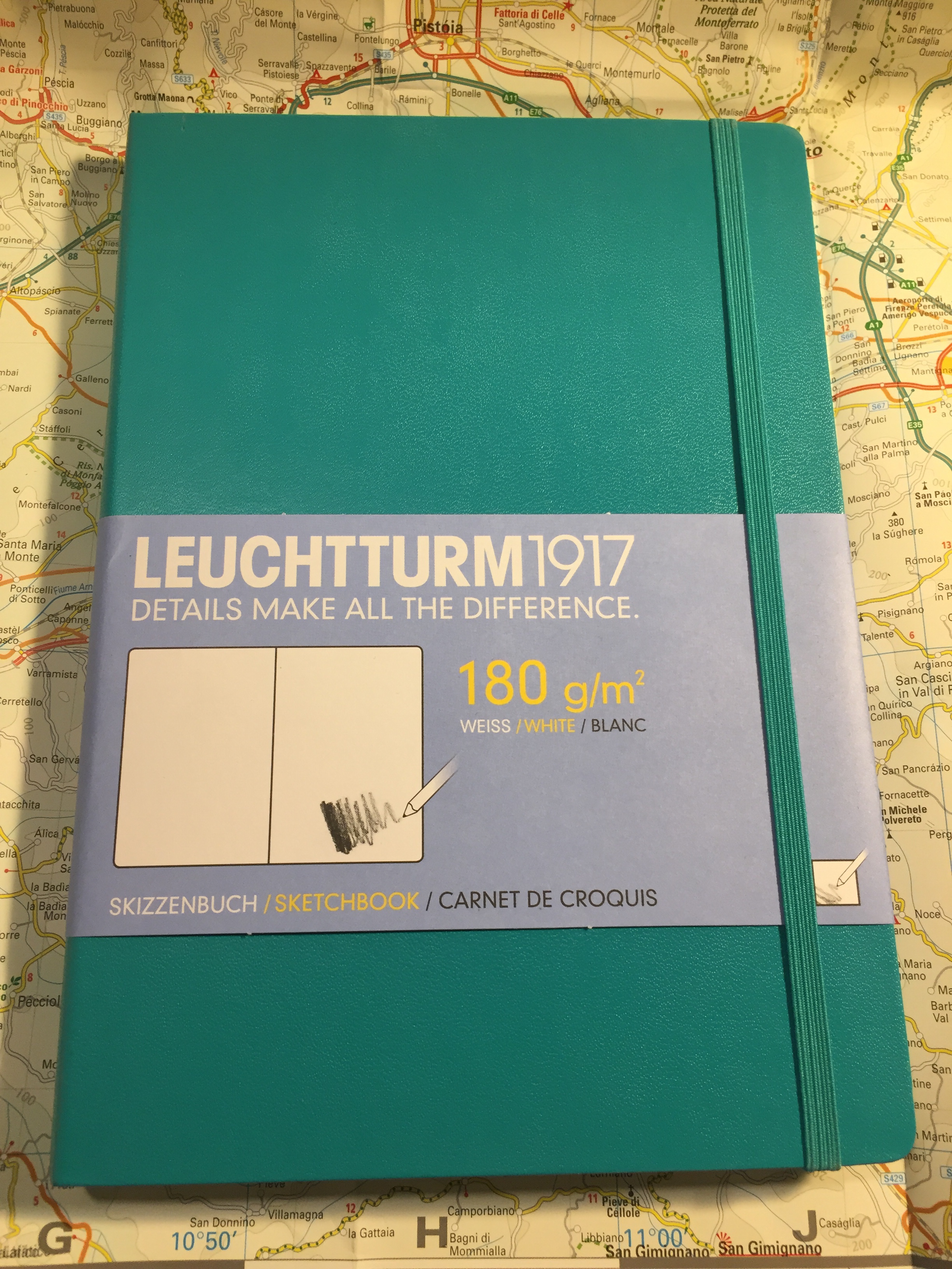
Leuchtturm1917 entered the busy sketchbook market about a year or two ago, with a lineup of A6, A5 and A4 sketchbooks with white 180 gsm paper.
The covers of the Leuchtturm1917 sketchbooks come in a wide variety of colours, which is a rarity in this market. Usually you find sketchbooks in black, or maybe one or two other colours, but Leuchtturm has decided to offer these in all the colour options available in their regular lineup.
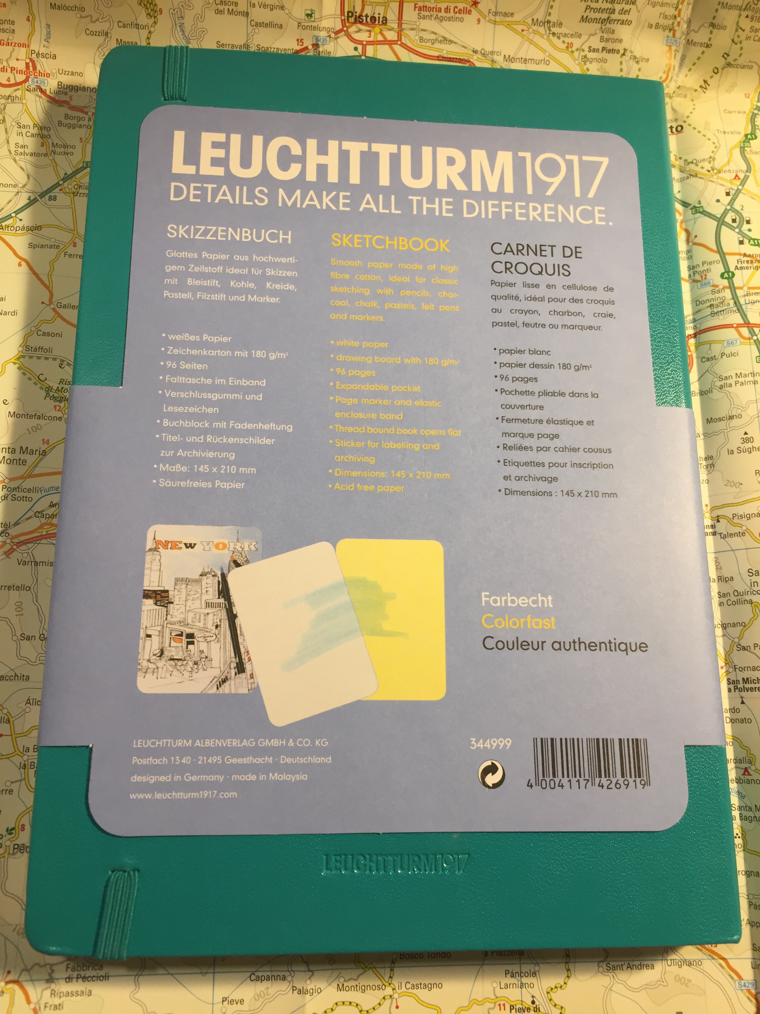
The sketchbook contains 96 pages of acid free 180 gsm paper, and it opens flat. There’s a note in the back packaging that says that the paper is colourfast, and shows a sketch made with a fineliner and markers. More on that later.
There’s a place to write your name and address on the front cover. I recommend writing your name and email address instead. It’s more practical, and more secure.
There is a back pocket. I don’t really think that it’s necessary in a sketchbook, but it’s nice to have.
Leuchtturm offers two unique things with its sketchbook. One is the offer to personalize it with an embossing of your choice. During last year’s Urban Sketchers they personalized the sketchbooks that they gave away as part of the symposium’s package, and the result is very nice.
Now for the heart of the notebook, it’s paper. The pages lie flat with a bit of coaxing, and are thick and substantial. You have to really layer down markers for them to bleed through, and there’s no show through, meaning you can use each page on both sides.
So how does the paper behave? It depends on the medium. This sketchbook excels at dry media (pencils, couloured pencils, conte crayons, etc).
It’s pretty horrible with wet media, including fountain pen ink, watercolour washes, and ink washes. The paper buckles, shows off colour poorly, turns into a grainy mess, and and the ink feathers and spreads. I wouldn’t recommend it even for the lightest washes. All the vibrancy of my schminke watercolours turned into a muddy mess here (the sketch was done with a medium nibbed fountain pen and R&K Emma SketchINK):
Even with fineliners you’re going to have spread. If you like sharp lines, find a different sketchbook.
Again, even from a bit of a distance you can see the spread. That’s just a shame, because if the paper was a little less absorbent then this would be an excellent sketchbook.
This brings me to my frustration with the picture on the back end of the paper band, the one showing a tiny marker and fineliner drawing. This is my experience using markers and fineliners on this notebook:
There’s no option to layer or blend the markers, but that’s OK. This isn’t marker specific paper after all. But even for casual use, or just for use with fineliners/brush pens this paper isn’t great.
So do I recommend this sketchbook? It depends. If the way it looks makes you want to use it, then yes, it’s a notebook for you. I’ve been using this sketchbook for my journal comics mainly to test it out. Will I continue using it? Only because I already have a body of work in it. Otherwise, there are better options out there, ones that aren’t only pencil great, but also work with pen, ink and light watercolour washes (the Stillman and Birn Alpha sketchbooks come to mind).
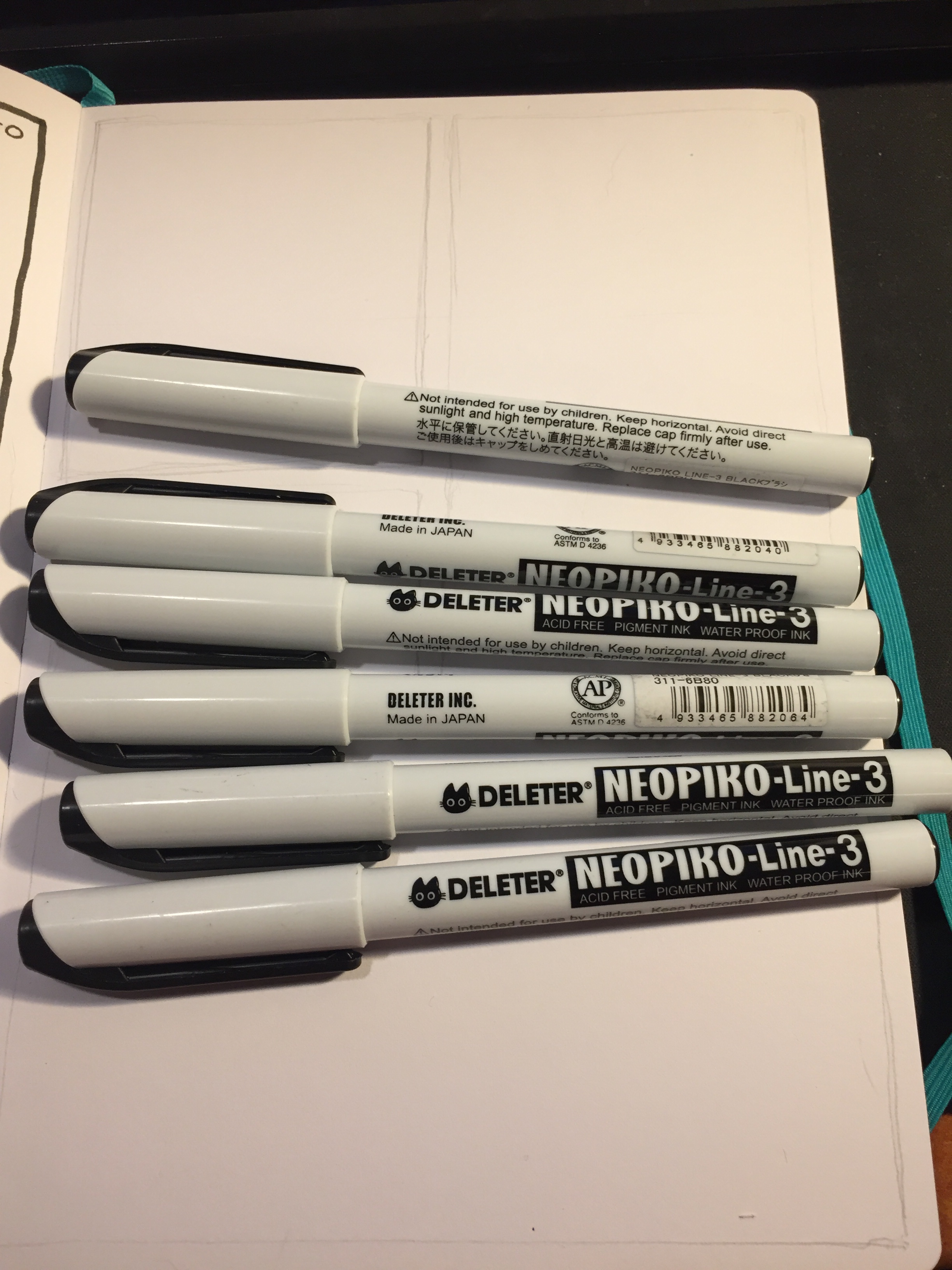
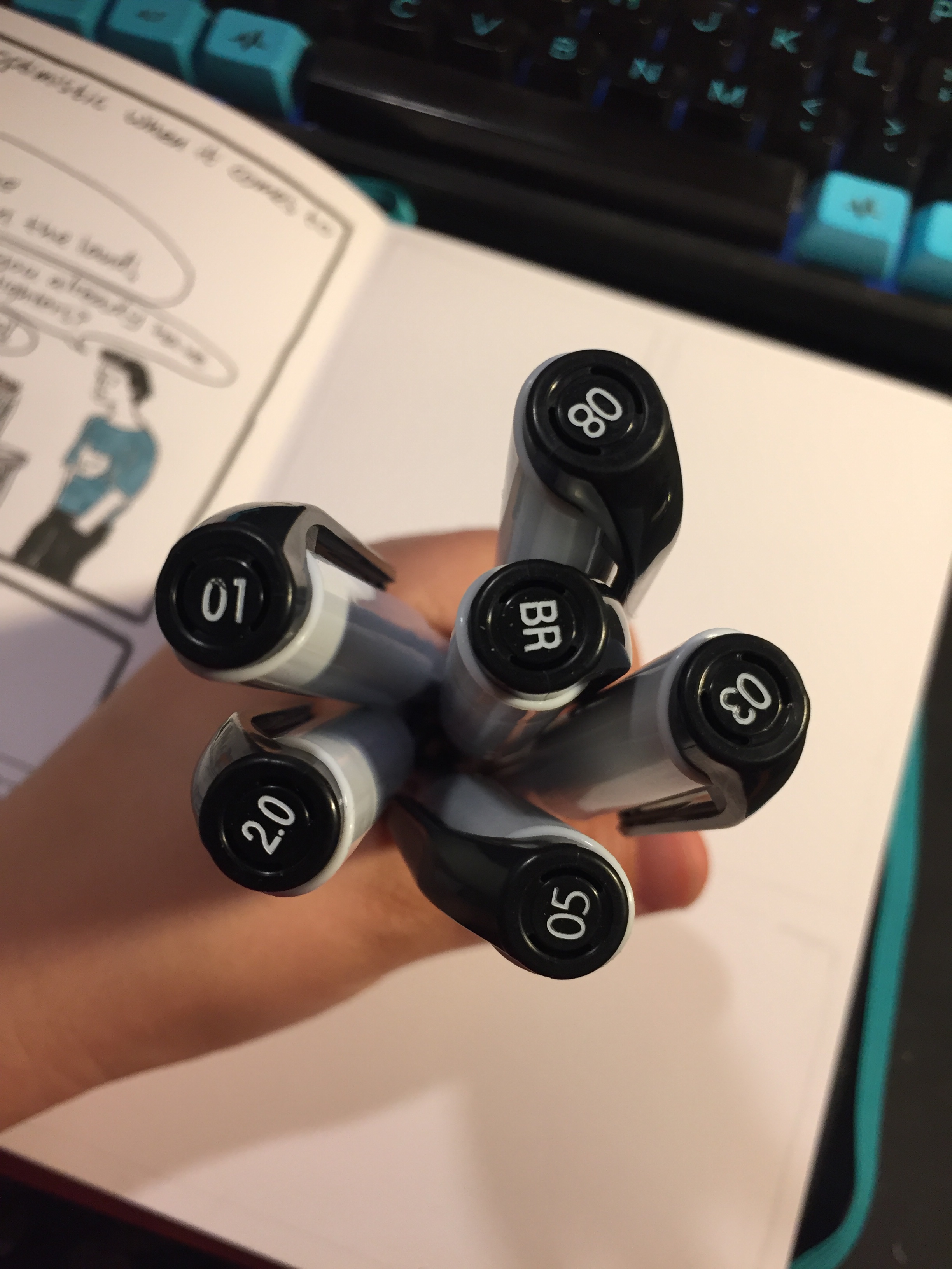
I have been using the Deleter Neopiko Line 3 felt tip pens for a while now as myjournalcomicspens, just to trythemout. I didn’t bother buying all of the lineup (pro tip: you never need all of the tip sizes in felt tip pens), instead choosing to focus on the tip sizes that I would use the most.
The cat logo is cute.
First thing first: the barrel design. These are wide enough and light enough to be comfortable for long use, but otherwise the Neopiko Line 3 has a terrible design.
You can’t tell which pen is which without looking at the cap, which is a fatal design flaw in these kinds of pens. I normally use several felt tip pens at the same time, and can oftentimes accidentally cap one pen with another one’s cap. That’s no big deal with the Staedtler, Copic or Faber Castell felt tip pens, as you just look at the pen body when using them to know which is which, but you just can’t afford to make this mistake with the Deleter Neopiko’s. You won’t mix up the 2.0 with the 0.2, but try telling between the 0.3 and the 0.5 when you’re in the middle of a drawing.
Another design drawback is also related to the cap: it’s requires a lot of force to use. This means that you can’t easily cap it with one hand, and if you draw to any extent with felt tips you know how bad that is.
These two choices on Deleter’s part meant that when I was using these pens I had to change my drawing method, working not panel by panel as I usually would, but pen by pen. You’ll see what I mean in a moment, when I review each individual pen.
The Deleter Neopiko Line 3 comes in the following tip sizes: 0.03, 0.05, 0.1, 0.2, 0.3, 0.5, 0.8, 1.0, 2.0, and Brush. These are pretty common tip choices in this kind of pens, with perhaps only the 2.0 tip size being unique to Deleter. I recommend not buying the 0.03 or 0.05 because they are much too fine (in any maker), and skipping the 0.2, as these pens do allow for some line variation (as all felt tips do), so you won’t be able to tell the difference between the 0.2 and the 0.3 in use.
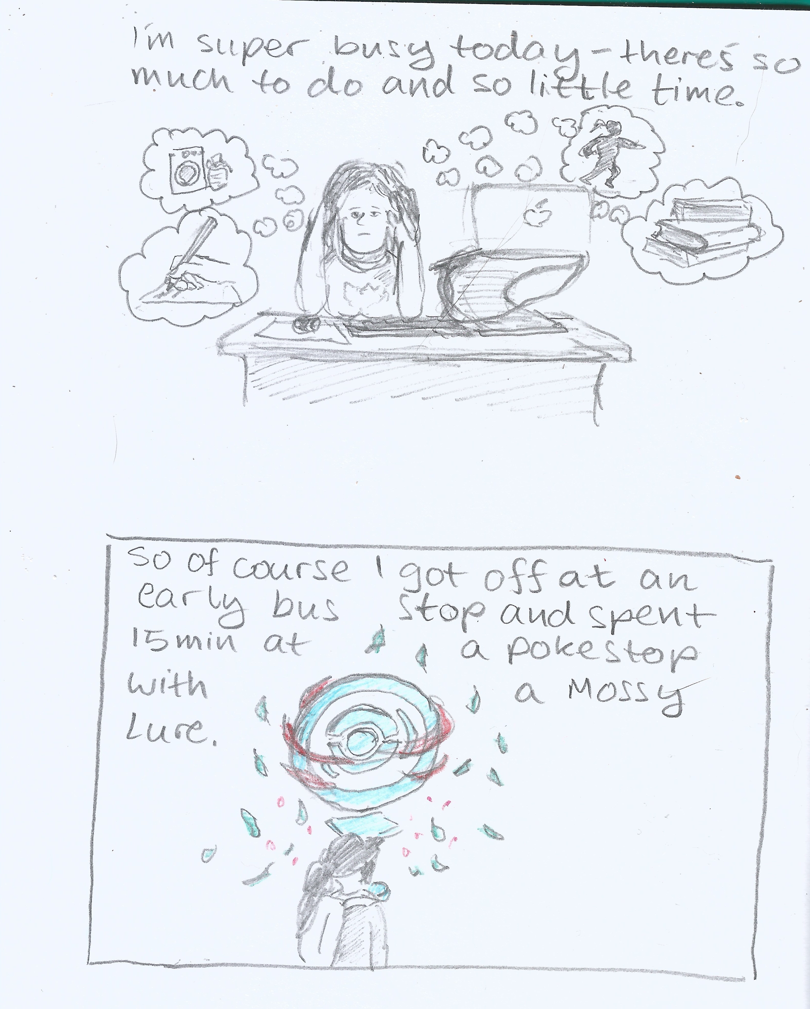
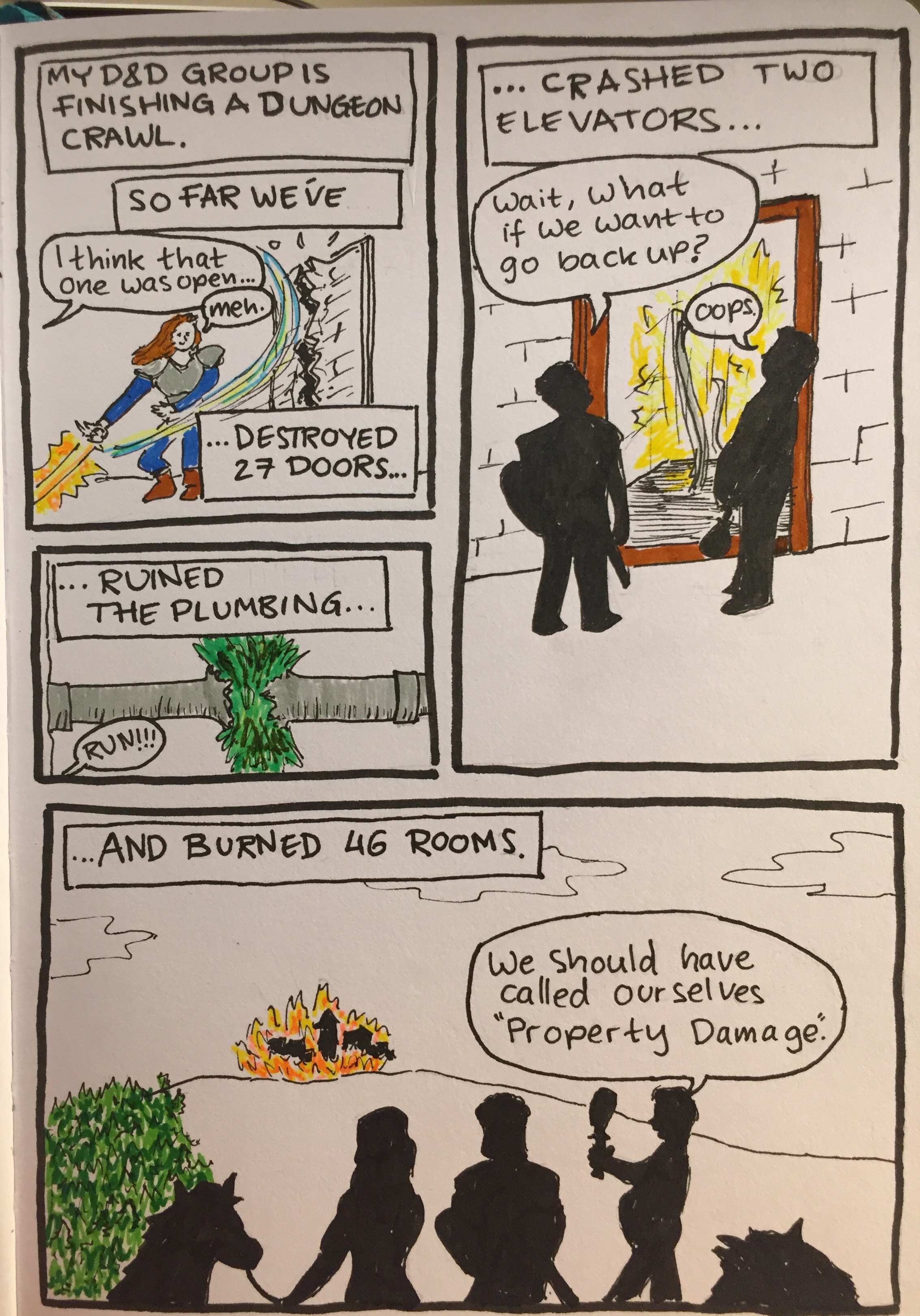
To showcase the pens in use, I decided to create a journal comic and show step by step how and when I use each of these pens.
The Deleter Neopiko Line 3 2.0 pen is what made me try out this pen lineup. It’s a fun and unique tip size that’s just perfect for comic borders or if you like big, bold lines in your drawings. This is the only pen in the Neopiko line 3 lineup that I recommend buying, despite the barrel design flaws.
The 0.8 tip size got very little use in my first journal comics with this set. Normally I would use this tip size for the panel borders, but I was using the 2.0 for that, so I had to remind myself to use it in other places. This is my least favourite of the lineup, as it was scratchy and gritty, and offered a lot of resistance, especially when drawing vertical or rounded lines. It was as if the tip had split, although in reality it hadn’t.
The 0.5 Deleter Neopiko Line 3 (wow to Japanese companies like long names for their products) is one of their most useful tip sizes. You can basically do with the 0.5 and the 0.1 for very fine detail, and the 2.0 for absolute fun, and you’re set for 99.9% of what you’d need for comic line work.
The 0.3 Neopiko is the second most useful pen in this lineup, and one that I used probably the most. If you don’t draw super small, it can probably even replace the need for a 0.1 tip pen for you.
As you can see, the 0.1 Neopiko Line 3 didn’t get much use in this comic, but when you need it, you need it. This is as fine as I would go, though, as already the tip is tiny and fragile, liable to break with too much pressure.
The Deleter Neopiko Line 3 brush pen is useful for filling in black areas, and not so much as a brush pen. It’s very firm, offering very little line variation or brush-like qualities. The only reason to buy it is to get big areas filled with black that is identical in shade to your other line work.
So, is the Deleter Neopiko Line 3 a contender against the Staedtler pigment liner? No, not even close. It is, however, worth giving the 2.0 a go, and if your drawing method is already a pen size by pen size one, then you might want to give these a go. They are waterproof, marker and eraser proof (once dry), and archival.