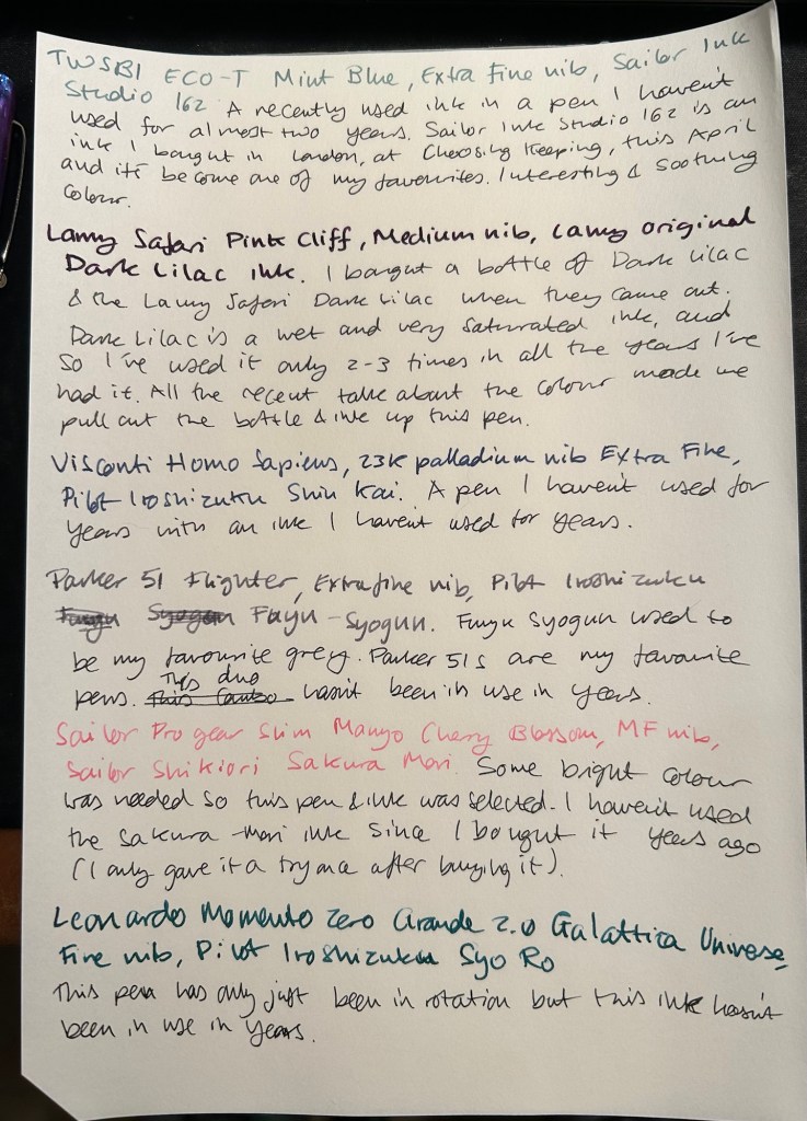
Radius Settimo Cielo Blu, Diamine 150 Regency Blue, Diamine Forever Raven, Pilot Iroshizuku Sui gyoku

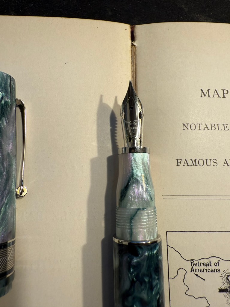
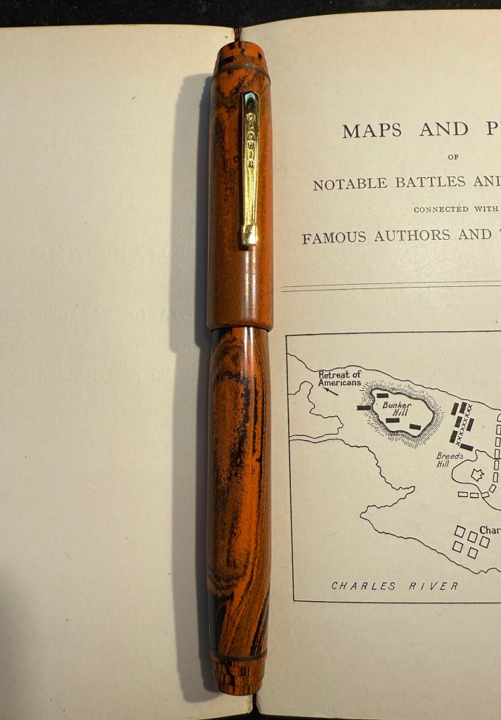
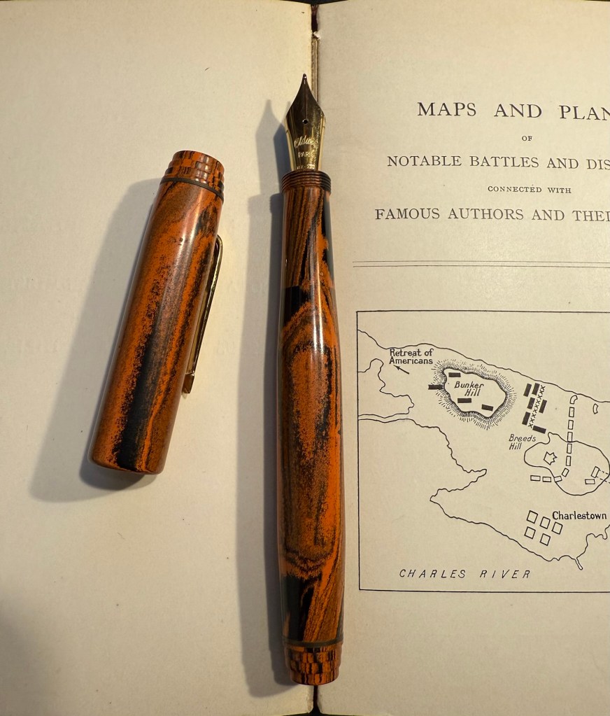
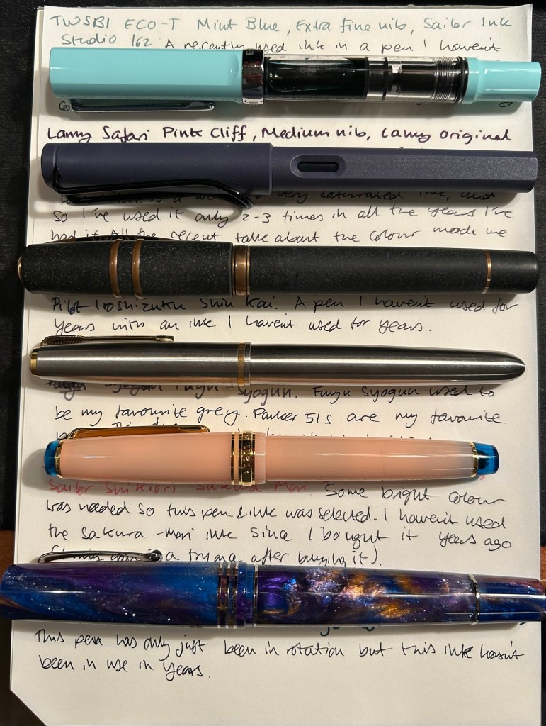
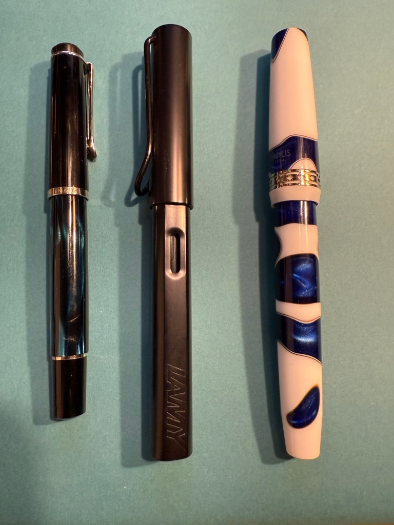
I just received a package from Fontoplumo and I immediately added the pen and inks it contained into rotation. While I already have a good amount of pens inked up, I really wanted to give the Radius 1934 Settimo Cielo Blu a try as soon as I got it. Not only is it a gorgeous looking pen, but I was also curious to see how it compares both the the vintage Radius fountain pen that I own and to my Leonardo fountain pens, as they are also the makers of the Radius.

Apart from the Radius the package contained two inks that I was interested in using as soon as possible, so I inked up a Pelikan M200 Petrol with Pilot Iroshizuku Sui gyoku and a Lamy AL Star with Diamine Forever Raven. The Radius got inked up withe Diamine 150 years Anniversary Regency Blue, a rich royal blue with moderate red sheen that fits the blue swirls on the pen body.

From left to right: Pelikan M200 Petrol, Lamy AL Star Black, Radius Settimo Celio Blu

Comparing the Diamine Forever Raven to Sailor Black reveals that the Sailor is slightly darker than the Raven, but both are dark enough to count as proper black inks (and not dark grey or brown). They both have a bit of shading, but the Raven interests me as a waterproof ink, so I’ll be testing it with some watercolour sketches later on.

Writing sample

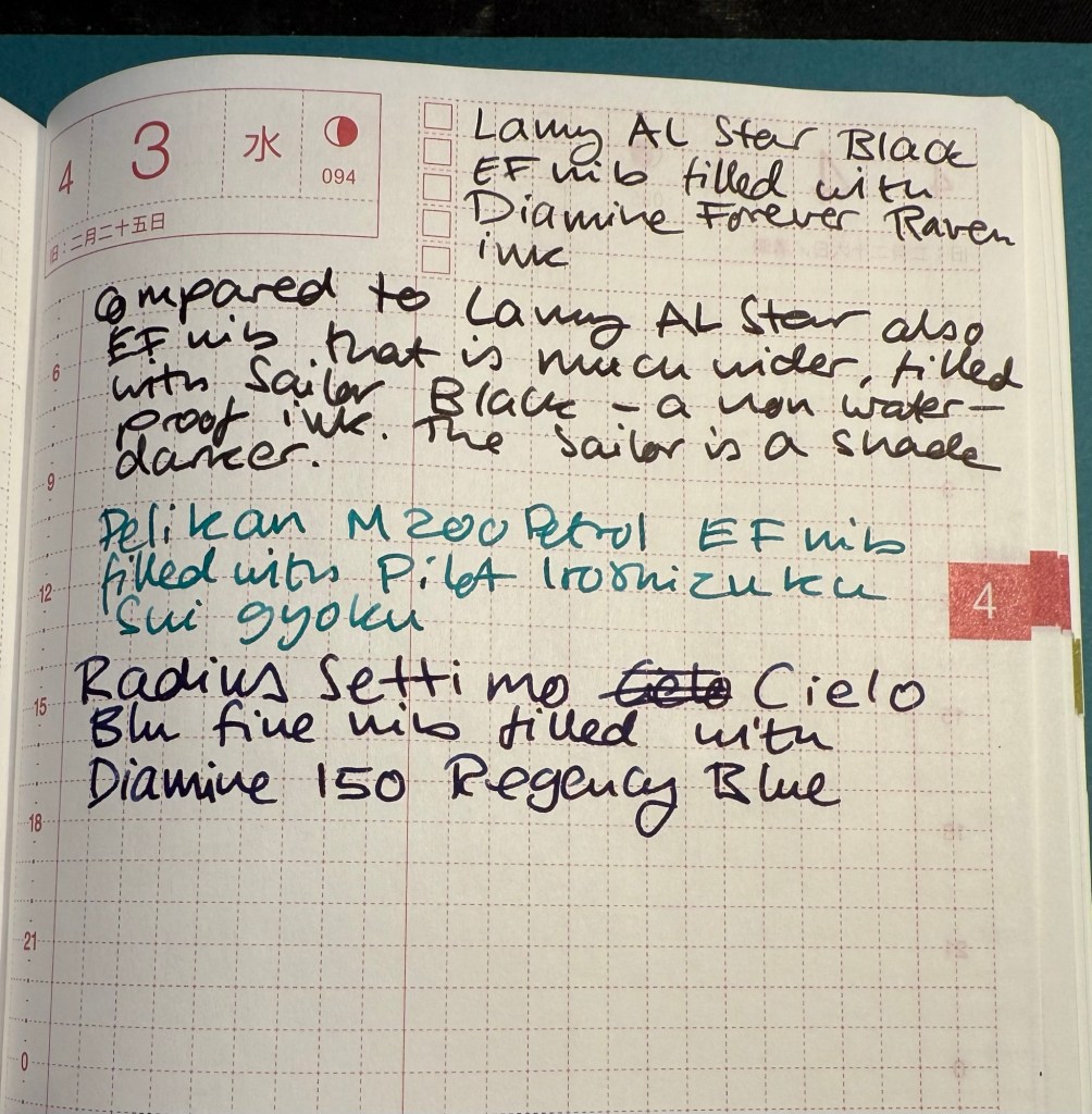
The Pilot Iroshizuku Sui gyoku isn’t what I expected. I was hoping for a more prominently green ink, but Sui gyoku is more of a turquoise than a green. I like turquoise inks so that won’t be a problem, but it means that I’m still on the lookout for an interesting, bright, readable green. The shading on this ink is delightful.

Diamine 150 Anniversary Regency Blue is a rich royal blue with some red sheen. It’s very saturated, especially in the Radius nib.

Gorgeous blue swirls on the Radius

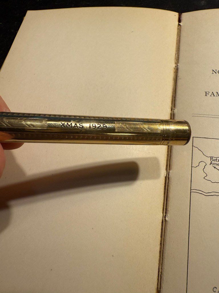
The Radius interested me not so much as a revival of the old Italian brand since the original Radius was a minor pen manufacturer, and I wasn’t blown away by the vintage Radius that I own. It seemed to me that the old Radius brand was busy making local copies of what Parker was doing at the time, which is understandable. However, Radius as a sub-brand of Leonardo is interesting since Leonardo have been hiking their prices lately but the Radius remains more affordable and offers resins and pen bodies that are just as attractive as what Leonardo has to offer.

Radius imprint on the nib

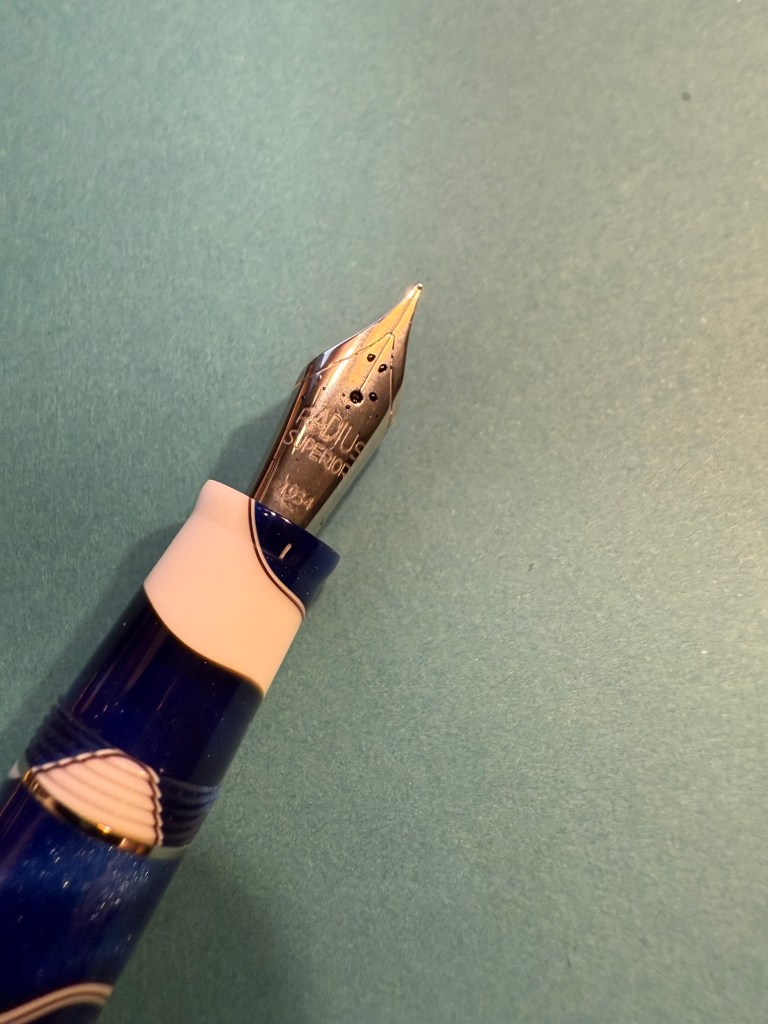
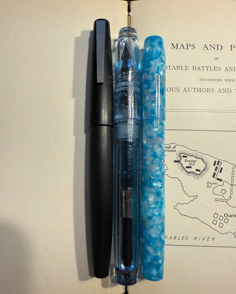
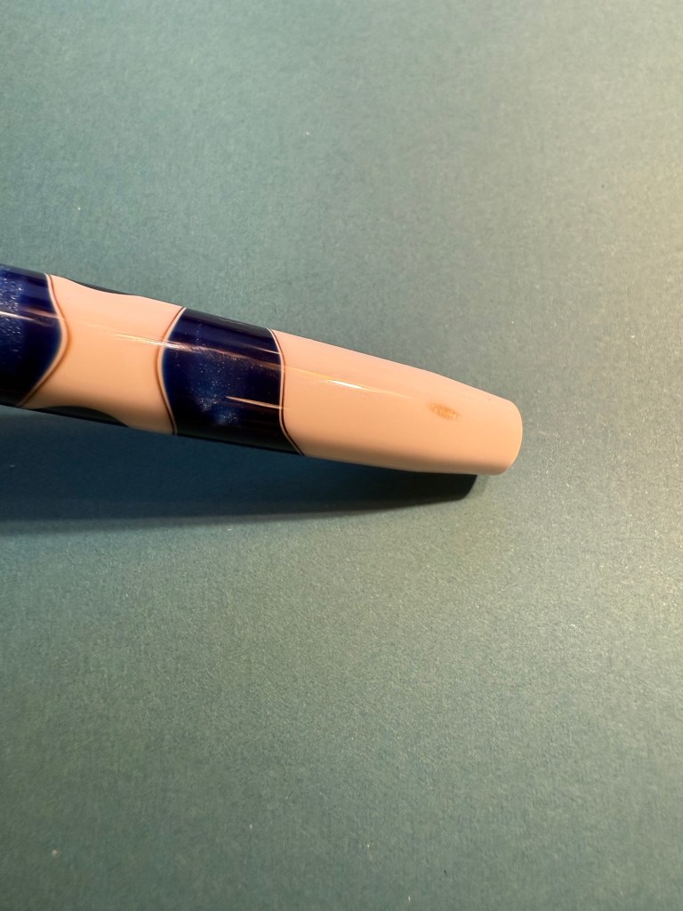
I love both the blue, white and brown swirly resin of this pen and the art deco-ish band. It’s a big wide pen, like the Leonardo pens and Viscontis, but light and comfortable to use.

Radius branding and band

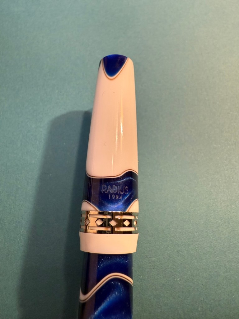
One tiny minus with my pen is that as the bottom part of the body tapers down, a smudge of brown resin was left, making it look like there’s permanent dirt on the pen body. Not ideal, but it’s something I can live with.

The smudge

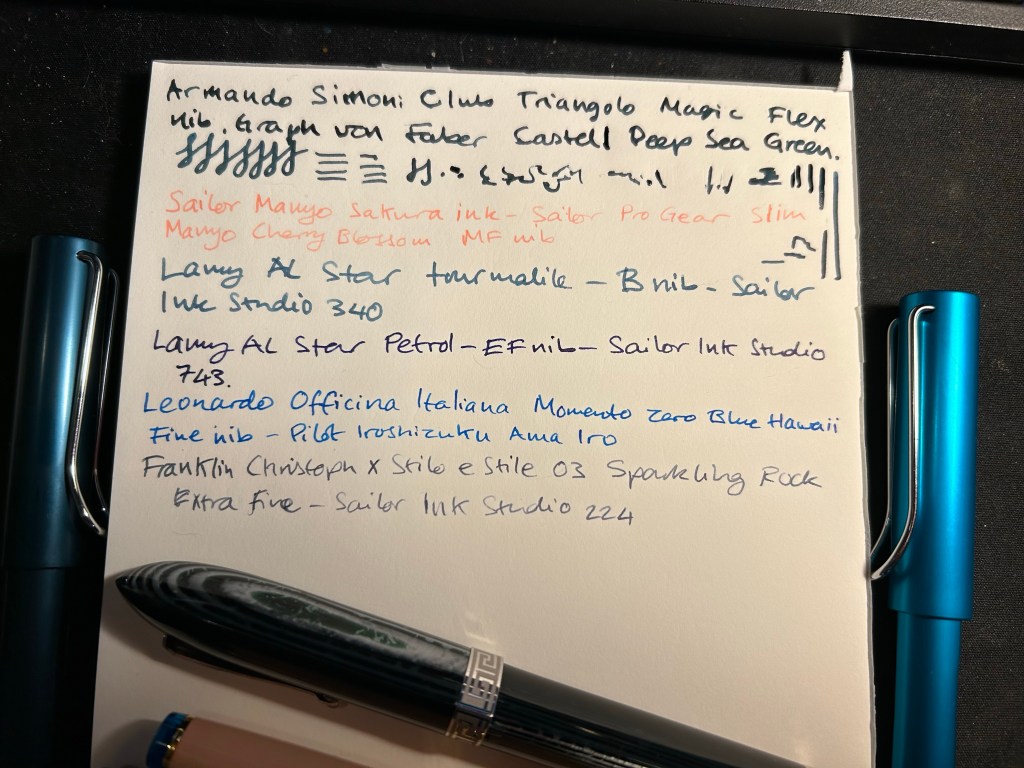
Here’s a writing sample of all three inks on Col-O-Ring cards.

Ink samples

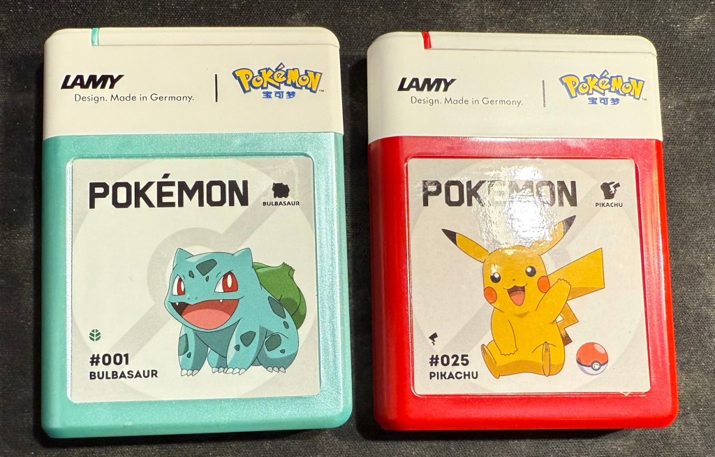
And as a silly little treat I also bought two cartridge boxes of Lamy Pokemon ink cartridges. They are filled with regular black Lamy ink cartridges, which I knew, but is still disappointing – a teal and a red would have been better.

April-May’s Currently Inked Fountain Pens

In the middle of April I inked up a bunch of new fountain pens, and at the end of the month I added two new fountain pens to this rotation. At the rate I’m writing with them I assume that this pen rotation will be with me until around the end of May, when I’ll be putting more “summery” inks into use.

This is a rather eclectic group of pens and inks, but I was mostly looking for inks that I haven’t used for a long time or I haven’t used at all. Here they all are (I was in a rush when I created the writing samples so they’re messy, but life isn’t Instagram, so messy it is):

Messy Writing Sample #1
Messy Writing Sample #2

Mabie Todd Swan “The Swan Pen” 2 nib with Waterman South Sea Blue – a vintage gold plated lever filler pen, this is one of two vintage gold plated pens that I bought in Paris in Mora Stylos years ago. I don’t usually like the bling of gold plated pens, but I was drawn by the fantastic, very wet, flexible swan gold nib, and by the engraving on the pen body.

The Swan Pen

Normally engravings lower the value of a vintage fountain pen, but this one added value for me – I find it endlessly intriguing. This was clearly a Christmas gift, in 1929, and it was likely a lady’s pen, given its size and general level of decoration. I can stare at this pen and spin dozens of stories from that engraving, and this is one of the main reasons I prefer vintage pens. This one is “use grade” – the engraving, the dings on the body, the brassing on the clip, and the multitude of microscratches on it make it so – but I don’t care. It’s a treasure of a pen with a fantastic nib that I got at a very good price and gives me much joy. What else does one need?

Closeup of the inscription XMAS 1929

I chose a Waterman ink for it because they’re the best inks for vintage fountain pens – very gentle, very easy to clean out of a pen, non-staining, and on the dry side (though not as dry as Pelikan 4001 inks) which works well with this very generous nib.

Swan 2 nib with heart shaped breather hole

Leonardo Mother of Pearl fine elastic nib with Kyoto TAG Kyo No Oto 03 Kokeiro ink – I wanted a Leonardo pen in rotation (I love them) and I wanted to try this new ink, and compare it to the Rohrer and Klingner Alt-Goldrün ink that I still had going at the time from March’s rotation. The inks are practically identical, with Alt-Goldrün being perhaps a shade lighter than the 03.

Leonardo Momento Mother of Pearl fountain pen

The Leondardo’s elastic or “flex” nib has cutouts in the nib shoulders to provide it a bit of give. It’s a nice nib that offers some line variation, but is nowhere near what you can get in vintage flex or super-flex nibs (particularly Swan and Waterman).

Closeup of the elastic nib with the cutouts in nib shoulders

Lamy 2000 fine nib with Diamine 150 anniversary Silver Fox ink – this is one of two Lamy 2000s that I have, and I really like this pens as workhorses. Silver Fox was part of the original collection of 150 anniversary inks that Diamine issued and it’s a nice mid grey that is very readable.

Franklin Christoph Model 46 Polar Ice extra fine nib with Bungunox June Bride Something Blue – I filled this pen about a week after the others since I wanted a teal ink that wasn’t in as wet a nib as the Swan. I got this ink as a gift from the Pen Addict Membership back in 2016.

Franklin Christoph Model 45L Turqish Crush extra fine nib with Diamine 150 anniversary Blue Velvet – another original 150 anniversary ink (Diamine later issued a second and perhaps also a third line of inks in this series, I don’t remember). This one is a nice royal blue, and another ink that I had used in years.

From left to right: Lamy 2000, Franklin Christoph Model 46 Polar Ice, Franklin Christoph Model 45L Turqish Crush

Oldwin Art Deco red and black striped ebonite, 18k medium nib with Diamine Writer’s Blood – as I’m writing this I have written this pen dry, mostly because it has a very wet and hungry nib and a standard sized converter. I bought this Oldwin from Mr Mora at Mora Stylos in Paris, and it’s a huge and surprisingly light pen.

Oldwin Art Deco red and black ebonite

The nib is also a very large nib (size 8 and not size 6), and the pen is surprisingly not smelly for an ebonite pen. The feel of the material is fantastic – ebonite is such a warm material – and I like it enough to consider refilling it instead of cleaning it out. Diamine Writer’s Blood has been in rotation recently, but it’s a new ink to me and I’m still trying to figure it out. Having it in this pen made me appreciate it more, as it really showed off its unique colour properties and shading plus sheen.

Oldwin nib

Manufactus Cappuccino Brown medium nib with Diamine Bilberry cartridge – this was a gift that I received from a dear friend who was just back from Italy and bought this (and a wonderful leather bound personalized journal) in the Manufactus store in Rome. The photo doesn’t do justice to the richness of the resin on this pen.

Manufactus Cappuccino Brown

The Manufactus has some heft to it, due to the metal body and trim, and while it states that it’s a medium nib, it runs closer to a fine nib in terms of line width. Diamine Bilberry is an interesting ink that I had in cartridge form, and I wanted a more unique ink than the standard black cartridge that came with this pen. Bilberry is saturated enough to pass as black at a cursory glance, but it’s a gorgeous rich purple with gold sheen that works well in this pen.

Manufactus Cappuccino Brown nib

Apart from these pens I still have about a quarter fill of ink in my TWSBI ECO T Saffron fine nib with Rohrer and Klingner Helianthus going from March’s ink rotation.

Which of these pens interest you the most?

August’s Currently Inked Fountain Pens

August is going to be a month of pens and inks that I haven’t used in a good long while. While I still have a small amount of ink in four of my July pens (the Kanelea, the TWSBI ECO-T Saffron, the Big I Design Fountain EDC and the Schon Design Faceted Pocket 6), they will all be written dry by the end of next week at the latest. It was time for a new lineup, and this is this month’s assortment:

Writing sample of August’s pens

The TWSBI ECO-T is one of my favourite TWSBI designs, and so I have a few of them. The TWSBI ECO-T Mint Blue hasn’t been in use for about two years, so I decided to pull it out and use the Sailor Studio 162 with it, just for colour matching reasons. The 162 is an ink that I’ve used a few months ago but I really like it, so I felt like giving it another month in rotation.

The Lamy Safari Pink Cliff is a recent purchase that I made in Paris last April. I’ve only now inked it up as I wasn’t sure what ink to use with it — until all the discussion about the new (and not as great) Lamy Dark Lilac ink made me want to use the original Lamy Dark Lilac ink. I purchased a bottle of Dark Lilac and the Dark Lilac Safari back when they first came out, but I haven’t used the ink very much. It’s wet and very saturated and so it works best with only a handful of paper options that I have. Still, it’s a very attractive ink.

Visconti Homo Sapiens — this is the original Homo Sapiens, the one that created quite a splash when it came out. At the time it was my most expensive fountain pens, and it’s still one of my most precious pens. I bought it at Mora Stylos in Paris and had it customized with the special initial badges on the finial. I got Pilot Iroshizuku Shin Kai as a gift with my purchase, and though I love this ink I haven’t used it in a while simply because I misplaced it behind another rarely used ink.

The pens from top to bottom- TWSBI ECO T Mint Blue, Lamy Safari Pink Cliff, Visconti Homo Sapiens, Parker 51 Flighter, Sailor Pro Gear Slim Manyo Cherry Blossom, Leonardo Momento Zero Grande 2,0 Galattica Universe

Vintage Parker 51 pens are my absolute favourites, to the point where I have a hard time seeing one in the wild and not buying it. This Parker 51 Flighter hasn’t been in use in years, but in the spirit of “use the good china” I’ve inked it up. Pilot Iroshizuku Fuyu Syogun used to be my favourite grey ink — and then Diamine came out with a series of excellent grey inks and Sailor came out with the 123. I haven’t used it in years, so I dusted off the bottle and decided to give it another try.

The Sailor Pro Gear Slim Many Cherry Blossom has been in rotation relatively recently, but the ink inside it, the Sailor Shikiori Sakura Mori, is one I haven’t used in years. I don’t have or use many pink inks, but I decided I needed something to brighten up this lineup, and the Sakura Mori ink is relatively readable. It also perfectly matches this pen, which is a nice bonus.

Leonardo Momento Zero Grande 2.0 Galattica Universe is also a relatively recently purchased pen that has been in rotation not too long ago. I just love the Momento Zero so much that I decided I wanted to ink one up, and so I chose the Pilot Iroshizuku Syo Ro to ink it up with. I haven’t used this inks in years, and I love teal inks so it was about time.

What have you got inked up for this month? Anything new? Old favourites or long forgotten pens or inks?

Sketching with Iron Gall Fountain Pen Ink: Rohrer and Kilngner Ebony

I have recently purchased the Rohrer and Klingner limited edition Ebony iron gall ink, and I’ve filled one of my Lamy Safaris with it. While iron gall fountain pen ink can be corrosive to pens, and it does change colour over time, it does have a pretty nifty trait: it’s waterproof when dry.

So I made this quick sketch with my Lamy Safari extra fine nibbed fountain pen on a Cass Art recycled paper sketchbook:

And then I added some watercolour to the sketches (note that although this isn’t watercolour paper, the paper in this sketchbook does take light watercolour washes):

As expected, it worked pretty well. Note two things about the combination of iron gall ink and watercolour:

1. The ink must be dry before applying the watercolour.

2. As the water causes the paper fibers to expand, your ink lines may “spread” or display soft edges if you apply watercolour over them. You can see this in both sketches. Different paper will lead to different results, of course.

This was a fun little experiment, and a great way to test out this ink a bit more.

Full sketching kit.

Have you ever used iron gall ink with watercolour in your sketches?

May 2024 Currently Inked Pens

April was a travel month which meant that I cleaned out all of my fountain pens apart from the Big Idea Design Fountain EDC that I took with me on my travels. So in the beginning of May I inked up five more fountain pens, many of them with new inks that I bought during my trip.

The Big Idea Design Fountain EDC is still a troublesome writer, but I keep reaching for it, so it’s still in the rotation with its second cartridge of Diamine Autumn Oak. Diamine Autumn Oak is a reddish orange with a lot of shading and it’s dark enough to be readable even with a fine nibbed pen.

There are two Franklin Christophs currently in my rotation (I misspelled the brand name in the writing sample, my apologies), and I am using them to compare the Sailor Studio 123 ink to the 224 ink. 224 is slightly more bluish and has less of a pink tint to it, but both are so similar that if you’re looking for 123 and it’s out of stock, you could use 224 and likely not notice the difference. I’ve been using these pens so much that I wrote the Sparkling Rock dry already, and the Thomas Hall Tibaldi edition is well on its way to joining it.

The Momento Zero Mother of Pearl is a gorgeous pen with a gorgeous, springy nib, and a joy to write with. Sailor studio 162, which I purchased on a whim at Choosing Keeping in London, is now one of my favourite inks. It’s a very unique shade of green/teal that makes me want to fill the same pen with it the minute I write it dry.

The Lamy Safari Savannah has Pilot Iroshizuku Kosumosu ink in it because I wanted something bright after all the muted greys and greens. The issue is that previously the pen had a shimmer ink in it and I apparently didn’t clean out all the particles, so I now have a shimmer version of Kosumosu. The result is fetching so I don’t mind this accident, but I will have to properly dismantle the pen and give it a thorough cleaning once I write it dry. It’s about halfway full now.

I like Rohrer and Klingner inks so when I saw the limited edition Ebony iron gall ink at Choosing Keeping, I immediately bought it. It’s very well behaved for an iron gall ink, but it’s not really a saturated black. I prefer darker blacks, but I’m getting used to the shading that Ebony provides.

A slightly late addition to the flock is the Leondardo Momento Zero Grande 2.0 Galattica Universe fountain pen, which arrived just in time for my birthday. It’s a stunning pen, and this photo does not do it justice. I knew I wanted a turquoise ink in it, and I haven’t used Bungo Box’s June Bride Something Blue in a while, so that’s the ink I chose. It was difficult to fill the pen from the flat Sailor shaped bottle, and I didn’t get a full piston-full of ink in it because of the awkward shape of the bottle. Lesson learned for next time.

What pens and inks did you use in May?

Inktober 2023 Day 2: Black Water Buffalo

It’s day 2 of Inktober, and it’s water buffalo time. These are big, impressive and pensive beasts that you don’t want to mess with. They were chewing their cud in the sun, keeping an eye on us as we admired them from a distance when we saw them at Animal Kingdom, Disney World.

Water buffalo sketch, Animal Kingdom

I sketched them using a Lamy Safari fine nib and Platinum Carbon ink. Carbon ink lays down a shiny black line that takes forever to dry and so is my least favourite waterproof black fountain pen ink to sketch with (De Atramentis Document Ink is first place, with R&K Sketch Ink Lotte and Noodler’s Bulletproof Black in the middle of the pack). Since I was afraid of smudging the ink, it’s kind of a barebones sketch.

There was a delightful cast member standing nearby, ready to answer questions, and he was a massive Star Wars fan. He clocked my brother and I’s Star Wars Celebration shirts and we started talking Star Wars while standing in front of these guys and gals’ paddock. Of course he got a cast compliment from us (talking to him made our day), and we got to hear about past Star Wars events at the parks from behind the scenes.

The funny thing is that if we would have rushed past their paddock on the way to see the tigers (like everybody else did), we wouldn’t have had this moment and memory, and the tigers everyone was rushing to see decided to hide in the shade anyway.

Quick Update and Currently Inked

I returned on Saturday afternoon from a 17(!) day trip to London, York and Paris, and I’m still in the process of adjusting back to my routine. It was a perfect trip and a perfect break from the hard reality that I normally live in, and so it’s been tough getting back. I missed my cats, and I missed my running routine, but I didn’t miss the slew of doctor appointments and medical related bureaucracy surrounding my cancer and my mom’s cancer, and I didn’t miss the political situation here at all.

So I’m trying to find comfort in journalling, in talking to friends, in enjoying the things that I got from abroad (of course I bought pens, paper, pencils, ink, cool vintage stationery, art supplies, etc). And I’m returning to blogging regularly. I have quite a few reviews in the works, and one more post in the “Ghosts of Planner’s Past” series, plus as I’m getting back to my reading routine more books will be featured here.

For now I’ve filled up four new fountain pens (none of which I’ve bought on this latest trip). The ASC Triangolo is a pen that I don’t remember buying at all, which is extremely unusual, and likely means that I bought it at Mora Stylos in 2022, on my first trip after finishing Chemo. Chemo brain is a real thing and I have chunks of that time (during treatment and a few months after it) that are completely missing in a very scary sort of way. The pen itself is an Omas 360 look alike, made with gorgeous arco verde material and has a “magic flex” nib. It’s the largest and one of the heaviest pens that I own, and the nib has issues (both problems starting and issues where it puts down too much ink). I filled it with Faber Castell Deep Sea Green, which from my experience is a drier ink, but that didn’t seem to affect it much. I doubt that I’d get much help from the Pen Family (their QC and service isn’t known to be the best though I will give them a try), so it’s a matter of seeing if I can fix it myself, and seeing what I can do to get it tuned locally, considering that the main guy working on pens here has recently retired. The ASC Triangolo is the big green striped triangular pen right beneath the writing.

The Sailor Pro Gear Slim Manyo Cherry Blossom is a pen that I bought on a whim in Choosing Keeping in London last year. I haven’t inked it since I bought it, but now I did, using the bottle of Sailor Manyo Sakura ink that came with it. This pen, unlike the Triangolo, perfectly fits my tiny hands (it’s the pink pen with the blue finials).

The two Lamy AL Stars (one on each side of the page) are a recent purchase from Pen Chalet. I wanted to try out a Lamy B nib, and I really liked the AL Star Petrol 2023 special edition, and the Tourmaline (2020?) one. They’re filled with Sailor Ink Studio inks that I purchased in Choosing Keeping during my last trip there.

The Leonardo Momento Zero Blue Hawaii and the FC Sparkling Rock travelled with me to London and back. They were a joy to use, and I’m glad that I took them along as they caused no issues – no leaks, etc – and were fun to use when I journaled during my trip.

Here’s a bit of a closer look at the writing sample. The Triangolo’s is unfortunately a mess. The Ink Studio 340 and 224 are my favourite inks of the bunch, though the Ama Iro and 743 are also great. The Sailor Manyo Sakura is too light of my tastes, especially in such a fine nib (the Sailor MF is like a Lamy EF).

Break out a nice pen or pencil to use. It’s the little things that can help make your day.

#OneWeek100People: Day 7

We’re having a cold snap this week, which means bad news for my hands. So there’s only 6 new sketches today, but at least I am back to pen and ink, and I haven’t been confined to gesture drawings (not that they’re bad, I just wanted to practice my portraits).

Drawn with a Lamy Safari Petrol fine nib, De Atramentis Document Urban Grey ink on a Stillman and Birn Alpha.

Our Old Friend Joe

We had our weekly zoom call with our old family friend, Joe. I did my best to sketch him while we talked. It was slow, hard work and came out only so-so, mainly because my neuropathy is really bad lately (which is also why there’s been a dearth of posts). Still, I’m glad that I tried.

Sketch of our old friend, Joe.

Drawn with a Lamy LX Palladium, fine nib, filled with Diamine Harmony (an Inkvent 2021 ink).

Writing done with a PenBBS 535 Year of the Ox, RF nib, filled with Pilot Iroshizuku Ina-Ho.

The sketchbook is a Stillman and Birn Alpha 5.5’’ x 8.5’’.

TIMEX x DDC

I tried to get my hands on the Timex X DDC Scout watch designed by Aaron Draplin for three times before I managed to snag one. They are sold out so quickly that if you want one you really need to set an alarm and be quick with your keyboard and mouse. Then our local post office tried to do a vanishing act with my package, but finally, a month after I ordered it, I got my hands on this orange and black beauty. I only use analogue watches, usually Swatch watches (in recent years it was System 51 Swatch mechanical watches), but I’ve never owned such a heavy watch. It took me a day to get used to it, and since then it has been my constant companion. It is a beast of a MACHINE but an eye catching one, and I couldn’t be happier with my purchase. I highly recommend getting one, if you have any interest in watches.

This page was created as part of Liz Steel‘s Sketchbook Design course and is all about the white space.