Currently Inked Pens March 2025

Of February’s pen lineup only two pens remain inked, the Parker 51 with Waterman Purple, and the Leonardo Momento Zero Bohemian Twilight with Pilot Iroshizuku Tsuki-yo. As they’re both running low on ink, it’s time for a new pen lineup, with a slightly different theme than last month’s one:

  • All the pens are modern (last time I had more vintage pens than modern ones in rotation) and ones that I haven’t inked in years.
  • All the inks are ones that I haven’t used in years or ever, apart from one that was in the last rotation but I still haven’t figured out so it got another go.
  • The ink colours are much brighter than those that I used in February.

Here’s March’s rotation:

Writing sample on Midori MD Cotton paper

Here’s a bit more about every pen and ink combo:

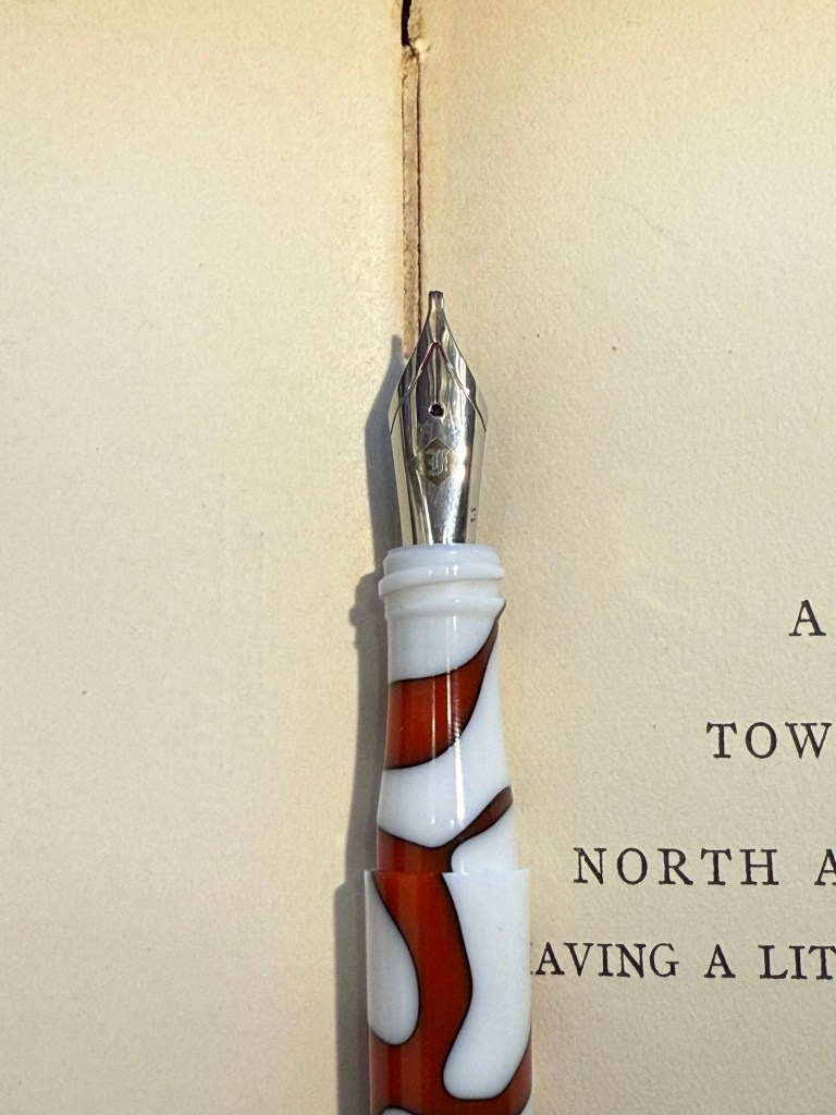
  • Franklin Christoph 03 modified prototype- Red/White/Black motion with a 1.1 HPSteel cursive calligraphy nib. This is a new pen that I bought last year as my chemo anniversary pen (I buy myself a present every year to mark the occasion). I love the unusual resin colour and pattern, and I like FC’s HPSteel 1.1 nibs. They are just wide enough to really show off the ink without becoming a nightmare to use because it takes ages for the ink to dry.
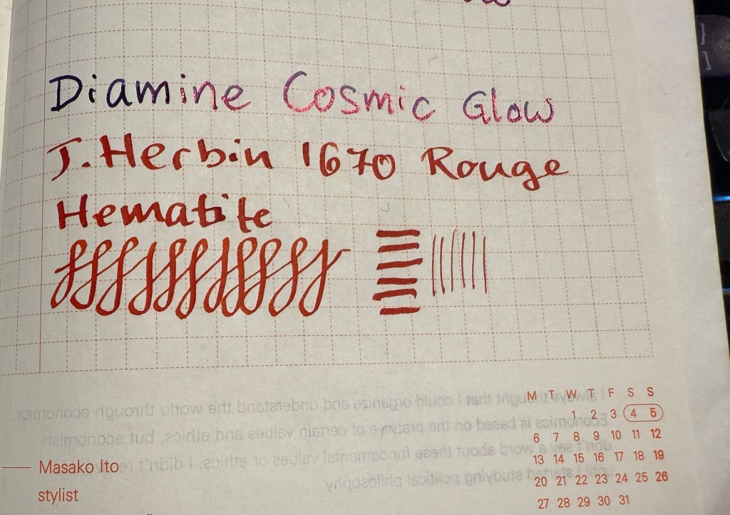
    As nice as the pen is (and it is), the ink is the star in this one in terms of interest: it’s the ORIGINAL J.Herbin 1670 Rouge Hematite, which means that it has NO GLITTER and NO SHEEN. It’s just a deep, bright red with some nice shading and good outlining, but it isn’t full of gold glitter and sheen to the point where you can’t see the base colour. Yes, this is also the bottle that had the problematic crumbly wax cover on the cap, but I really think that I prefer this version to the one they issued later (I have both). I don’t normally use red inks, but this one was perfect for this pen.
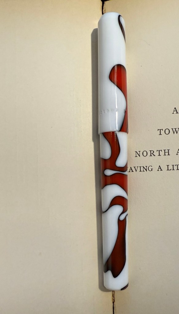
The FC 03
The HPSteel 1.1 nib
Original Rouge Hematite compared to Cosmic Glow on original Tomoe River paper. Note the lack of sheen or shimmer.
  • TWSBI ECO Saffron fine nib filled with Rohrer & Klingner Helianthus ink. I use yellow inks even less often that I use red inks, but this ink is fairly readable for a yellow ink. It is, however, not going anywhere near a vintage pen as it has a tendency to crust over (as many yellow inks do). I wanted something bright, cheerful and different, and this ink checked all three. The TWSBI ECO is a phenomenal pen for those starting out with bottled fountain pen ink, and I can’t recommend it enough.
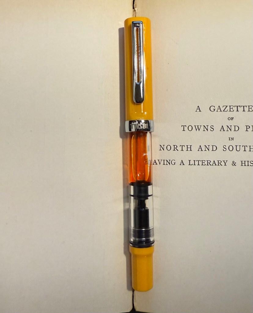
TWSBI ECO Saffron
  • Aurora Ipsilon medium nib with Rohrer & Klingner Alt-Goldrün ink. This is my one and only Aurora pen, which I bought years ago in Florence, Italy. Aurora nibs are nice enough, but the pens are priced well above what I believe that they are worth, so I have steered clear of them over the years. The Ipsilon is small pen, but you can’t post it, which is annoying for such a small pen. R&K Alt-Goldrün is a fantastic ink colour – a non standard green with plenty of shading and character – and the only reason I haven’t used it more is because it was tucked away behind two rows of other ink bottles. If you are just starting out with green inks, give Alt-Goldrün a try.
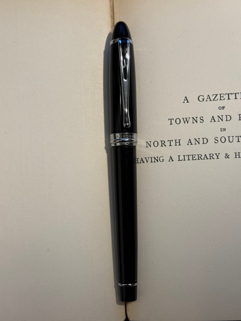
Aurora Ipsilon
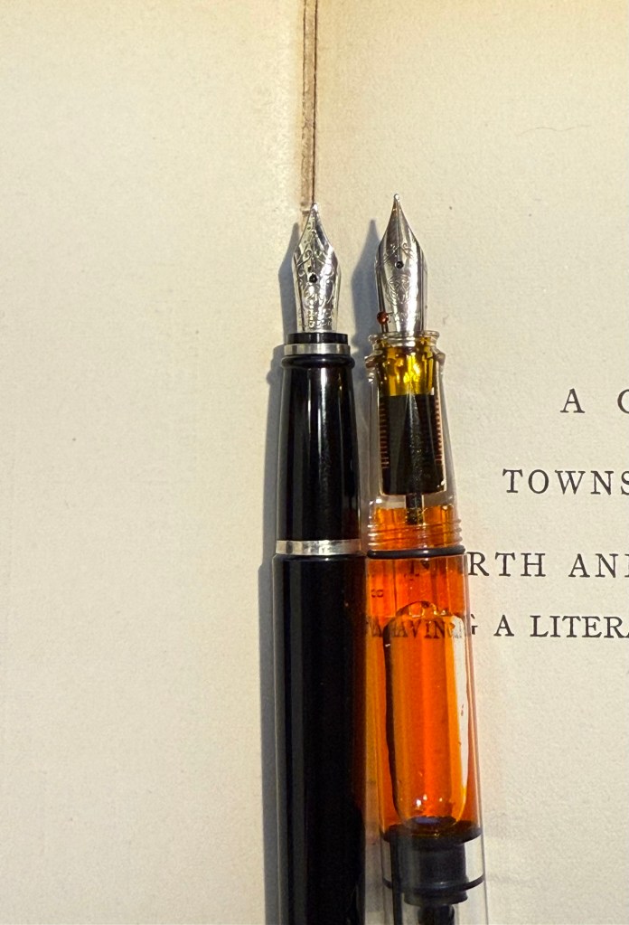
The Ipsilon nib looks ridiculously small but it’s just the design of the section that makes it appear that way. Comparison photo to a TWSBI ECO nib.
  • Leonardo Momento Zero Blue Hawaii Fine nib with Diamine Steel Blue ink. I have used this pen fairly recently compared to some of the others in this rotation, but the ink has been one that I actually forgot that I have. I love teal and turquoise inks, and Diamine Steel is a beautiful member of this group. There’s a hint of shading with it, and it just pops off the page so nicely. If you want a different take on “boring blue” inks, I highly recommend it.
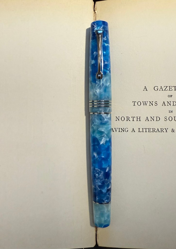
Leonardo Momento Zero Hawaii
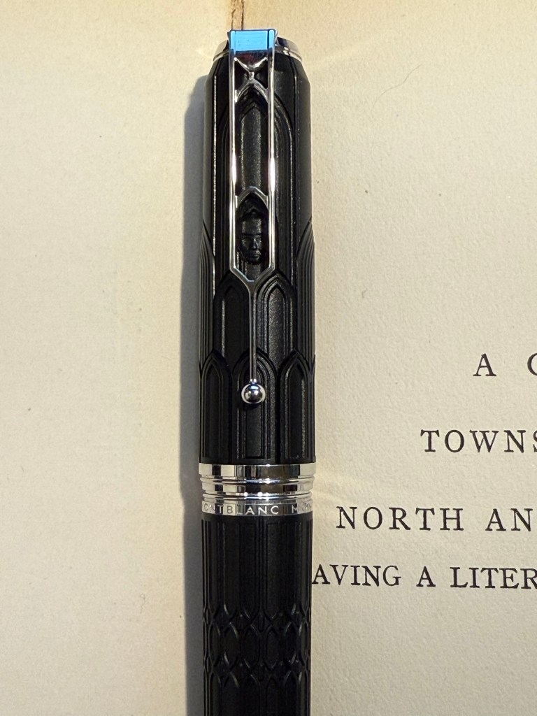
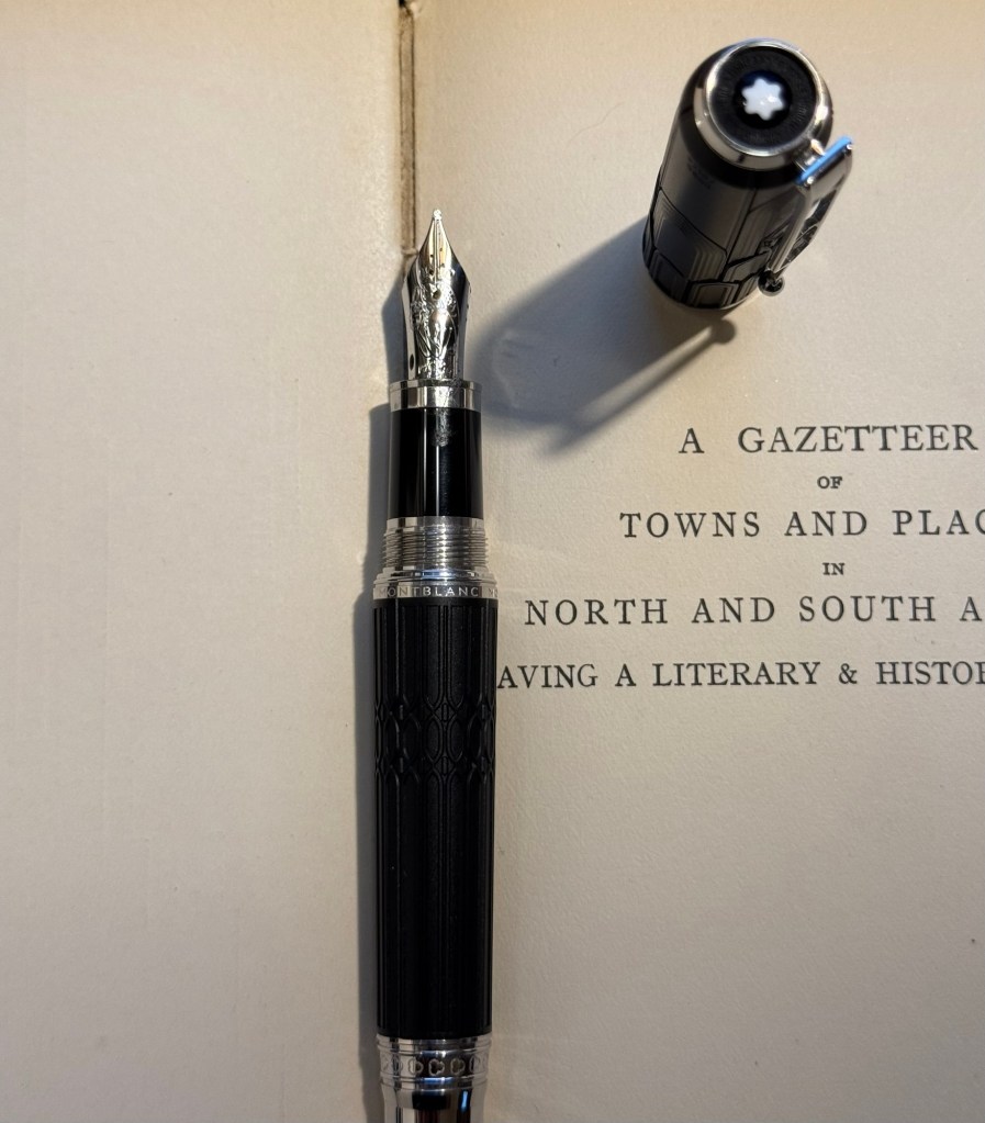
  • Montblanc Writer’s Edition Victor Hugo medium nib with Montblanc Around the World in 80 Days ink. I bought this pen in Mora Stylos in Paris before they closed mainly because I adore the Notre Dame de Paris cathedral and it’s featured on this pen. Hugo has the honour of being the saviour of this extraordinary cathedral, and though I shy away from Montblanc limited editions (talk about overpriced) I thought this one was worth purchasing. The ink was last in rotation, in a vintage Montblanc, last month. I just can’t get over how unrelated it is to the green-gold elephant on the box, and I’m not sure what to make of it. I was expecting it to be more like Alt-Goldrün than like the bluish-grey (Payne’s Grey really) that it is.
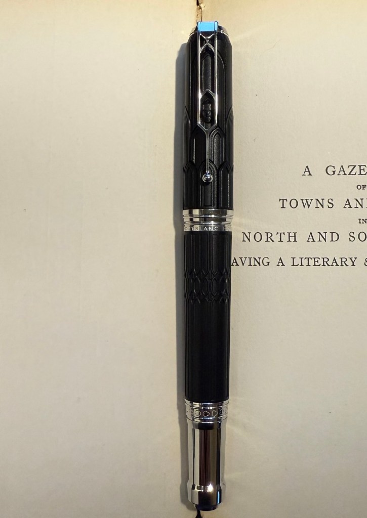
The Montblanc Writer’s Edition Victor Hugo
The Victor Hugo death mask on the cap
The nib, which features Victor Hugo
  • Finally, speaking of a pen and ink combo that have gotten “lost” in my collection: the Stipula Model T marbled grey pen was also an Italian purchase, and it has a very peculiar fine “flexy” titanium nib. I would characterize the nib as springy, and as my other titanium nib Stipula does, it squeaks sometimes as you write with it. The ink is one that I bought in 2013 in Fahrney’s pen store in Washington DC. Since then I haven’t opened it and used it, mainly because Fahrney’s Tempest Blue is a blue ink, and I don’t use blue inks often. It shades nicely, but other than that it looks close enough to my benchmark blue, Waterman Florida Blue (now renamed to Waterman Serenity Blue), for me not to bother using it often. Waterman Serenity Blue is a best-in-class blue in my opinion because it’s so well behaved, gentle and easy to clean out of pens that you can safely use it in any pen that you have, particularly vintage ones.
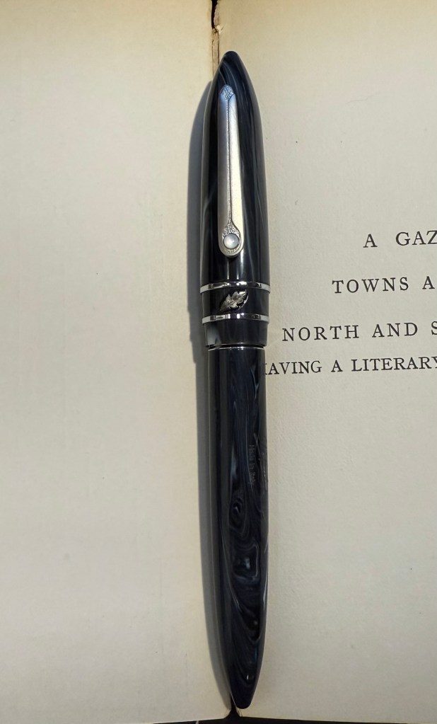
The Stipula Model T. A very sleek design.
The Model T titanium nib.

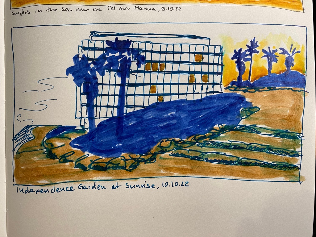
Inktober Day 10: Sunrise of the Independence Garden

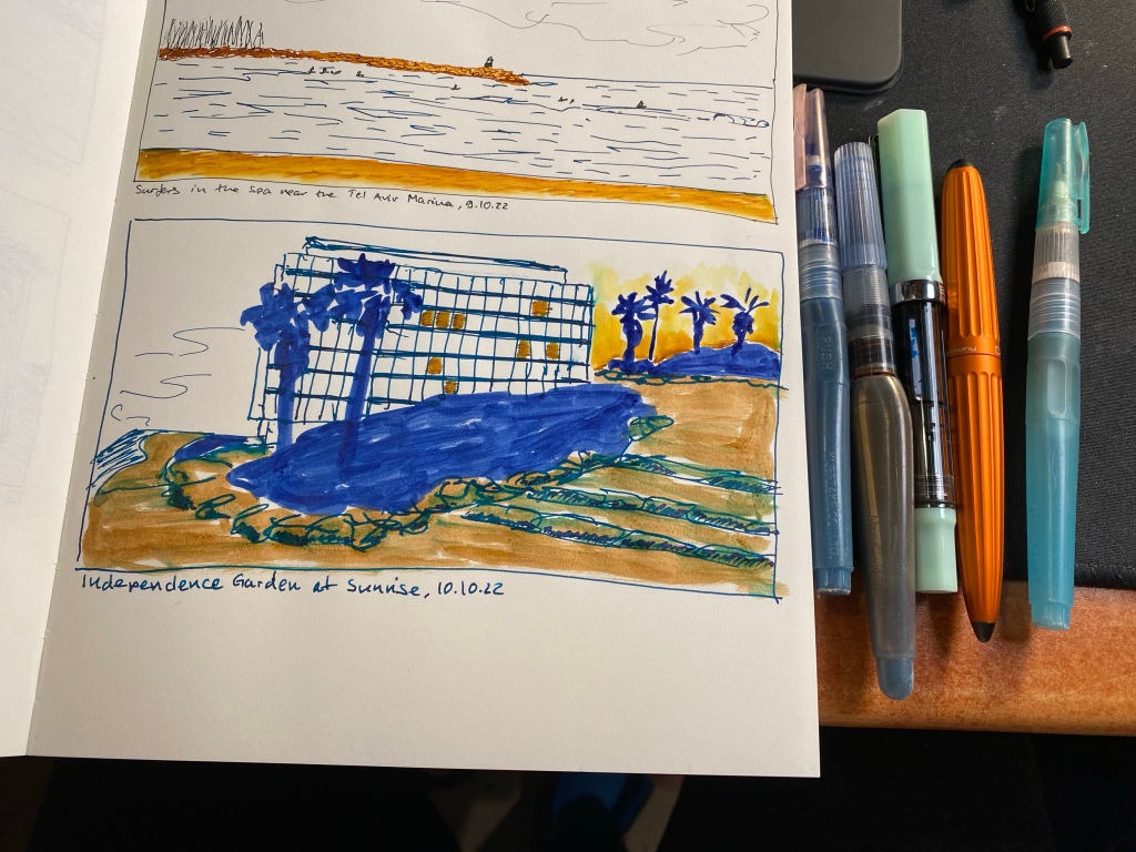
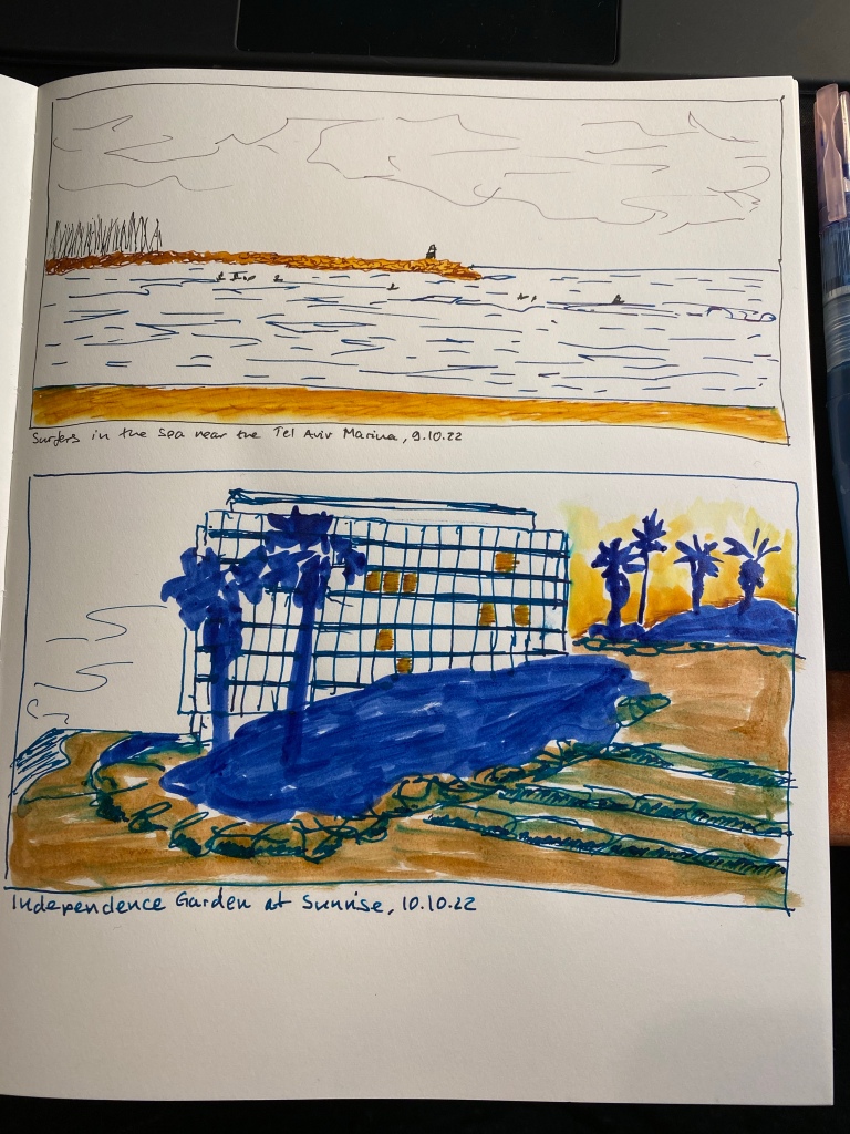
Had an unusual start to the day, with an early morning walk before my usual morning run. I’m embracing the spirit of experimentation with these, so this one was sketched using diluted Sennelier shellac based ink (non fountain pen friendly) in waterbrushes, paired with a fine nibbed TWSBI ECO filled with J. Herbin Emerald of Chivor, and a Diplomat Aero with a fine nib filled with Colorverse Golden Record. The Midori MD Cotton paper does not take nicely to any amount of moisture and there was bleed through (and of course see through) to the other side of the page, but in general it held up much better than I expected.

Independence Garden at Sunrise. Playing about with various kinds of inks.

Here are all the tools used for this quick sketch:

From left to right: waterbrush filled with blue in, waterbrush filled with sepia ink, TWSBI ECO, Diplomat Aero and a waterbrush filled with water.

And here’s the complete page:

Sketchbook Design Goals

My sketchbook design course goals, and a drawing of the Phoenix community garden in London.

The first week of Liz Steel’s Sketchbook Design course is underway, and so far I’m having a blast and drawing much more than I used to. I’m also learning a lot not just from Liz, but also from the other participants in the course. One of exercises this week was to create a page with our Sketchbook Design course goals, and here is mine. I also drew the Phoenix Community Garden in London’s West End to accompany my goals. Hopefully I’ll be able to return to it later this year.

Tools used: Stillman & Birn A5 Beta, Lamy Safari pens with J. Herbin Bleu Pervenche and Noodler’s Black, Schmincke watercolours.

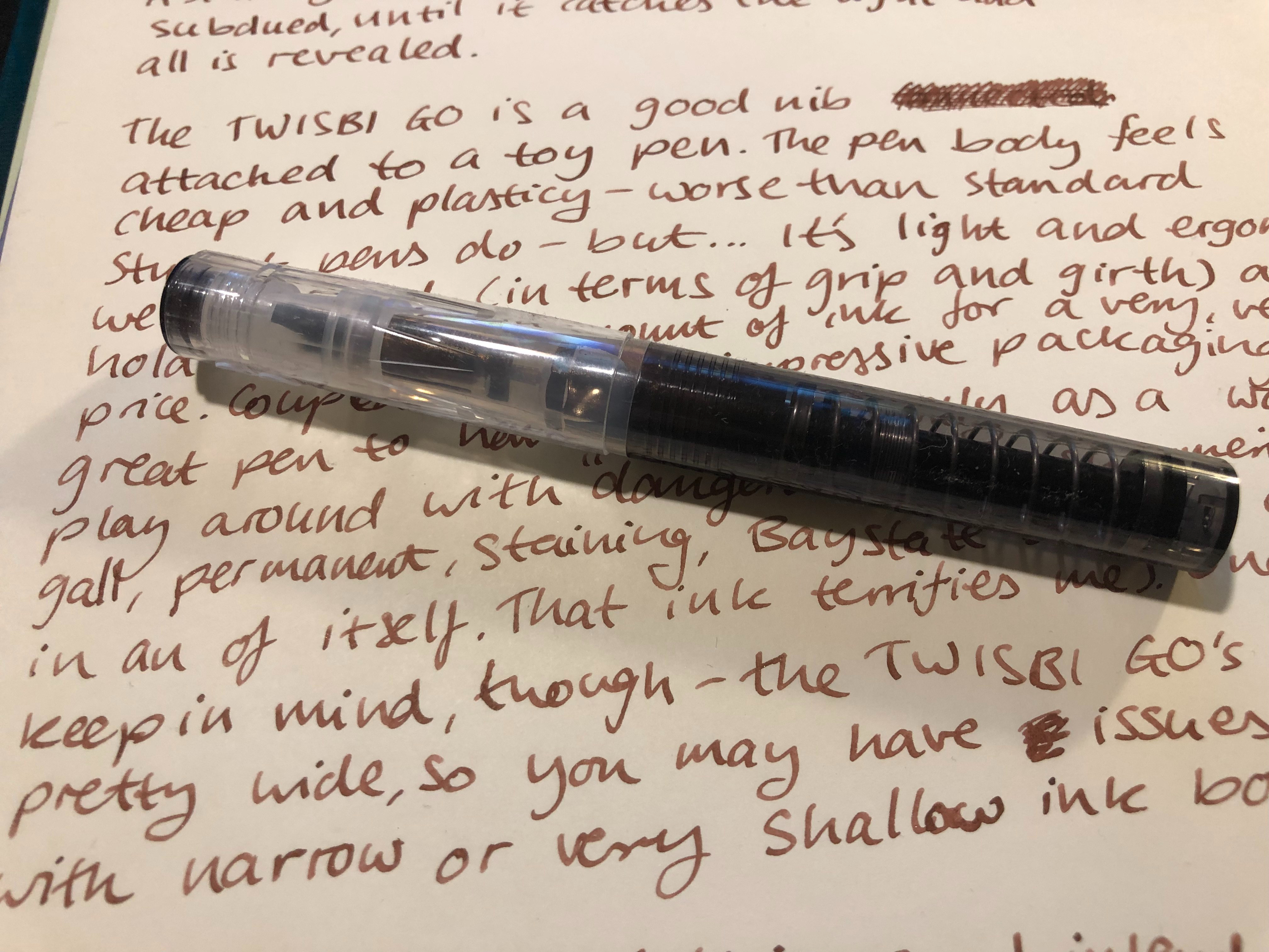
TWSBI GO and J Herbin Caroube de Chypre Ink Review

I’ve tried shimmering fountain pen inks (inks with little sparkly bits in them) only once before, when J Herbin first started producing them, and they ruined a Lamy Safari pen and converter with their non-removable sparkle. Over time more and more reviews came out lauding these pretty, shiny inks and saying that they’re completely fountain pen friendly nowadays, yet I kept my distance. No amount of glitter was worth another ruined pen, after all.

Enter the TWSBI GO, which is a a TWSBI nib connected to a toy pen that is so cheap that it practically has “Bay State Blue ready” written on it (I still don’t recommend going anywhere near the stainiest of stainy inks, no matter how gorgeous it is).

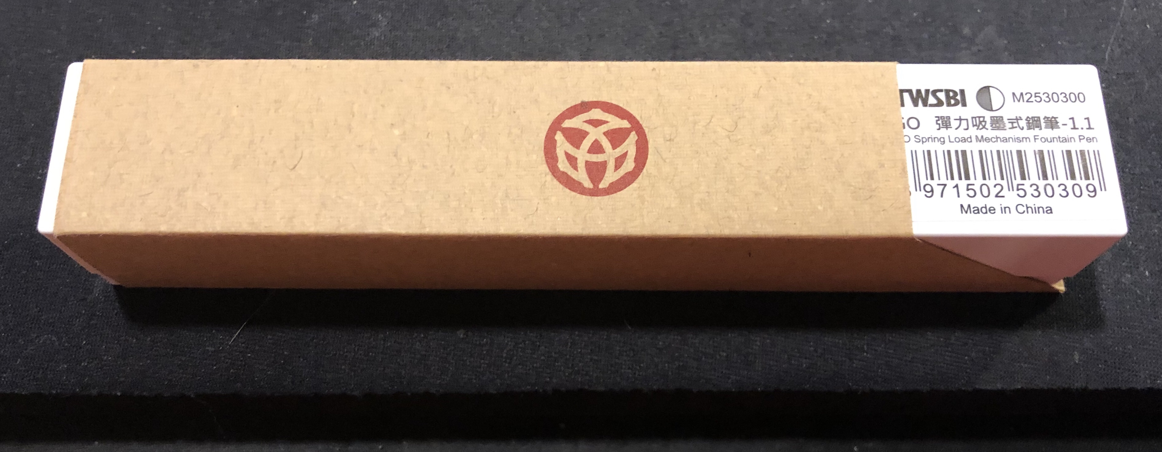
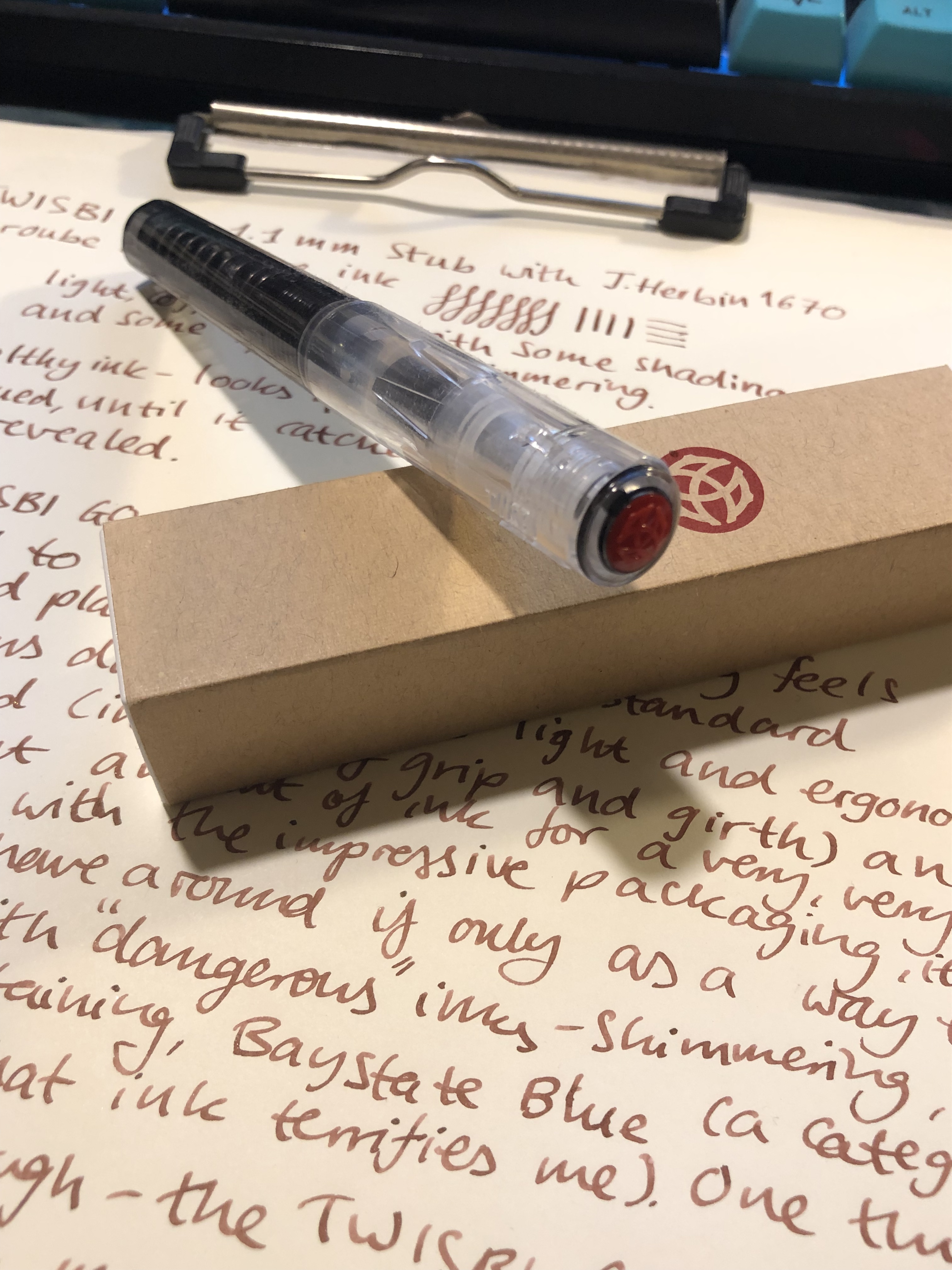
The packaging is bewilderingly good for such a cheap fountain pen. A cardboard sleeve over a plastic box that puts the cardboard Lamy Safari packaging (and price point) to shame.

Cardboard sleeve with TWSBI logo

Solid plastic box for the pen. I’m not a packaging person, but this is disproportionally good for the price.

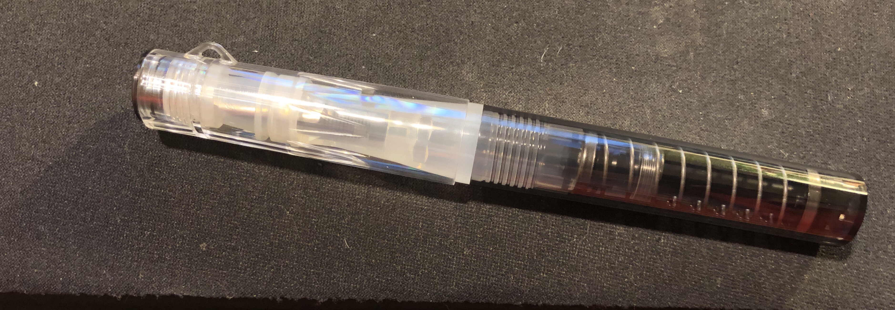
Then you open the box, and laugh. The pen looks and feels like a child’s toy, with its cheap feeling plastic, its light weight and ridiculous spring filling mechanism. It takes the ugly duckling bit a step beyond what even other TWSBI functional but ugly pens, like the ECO, have.

Ugly.

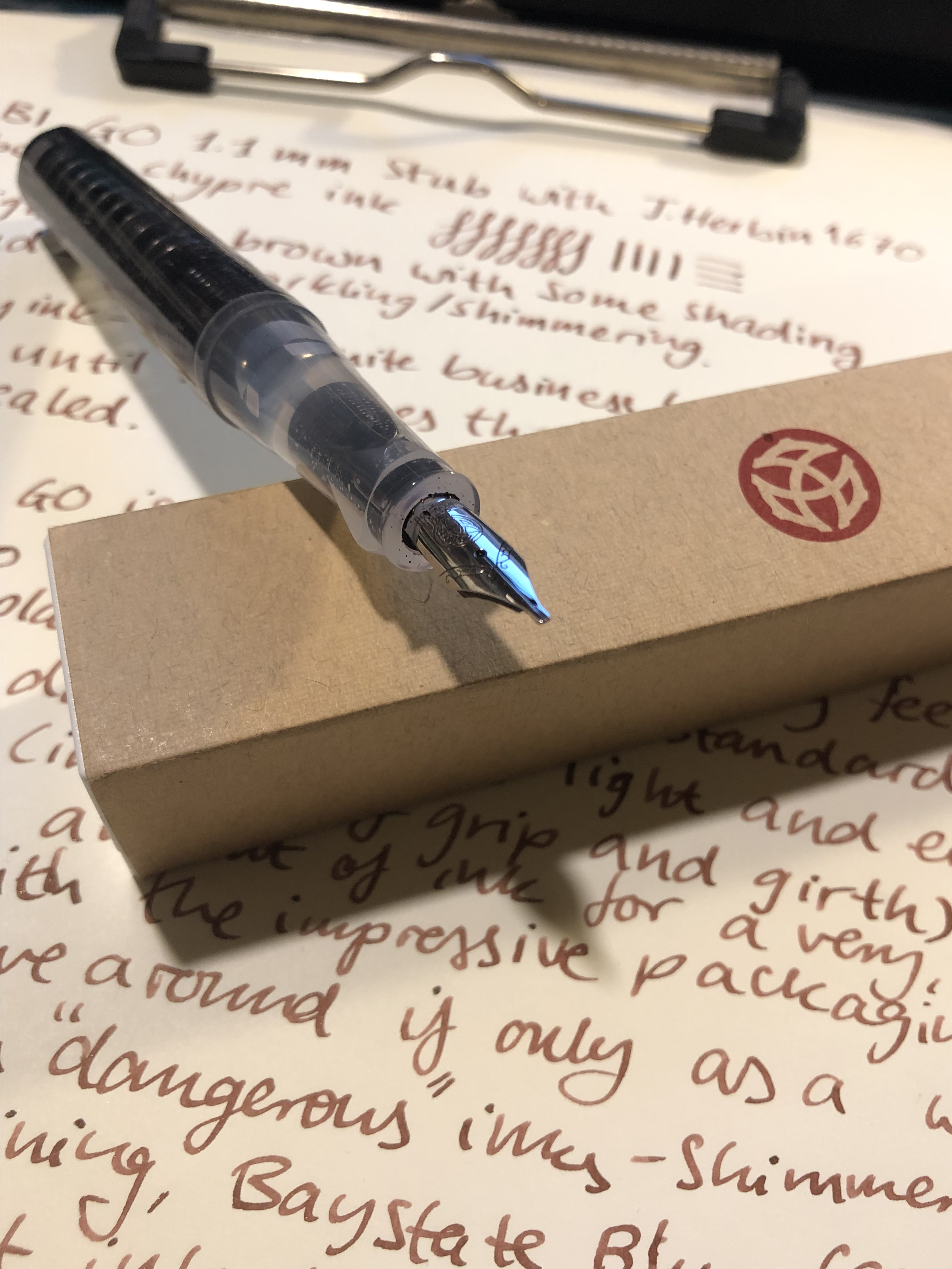
But then you start to write with it, and the silly little body has good ink capacity, is easy to fill, and most importantly, it has a TWSBI nib. TWSBI nibs are phenomenally good for the price, and they come in 1.1 stub sizes, which are super fun to use.

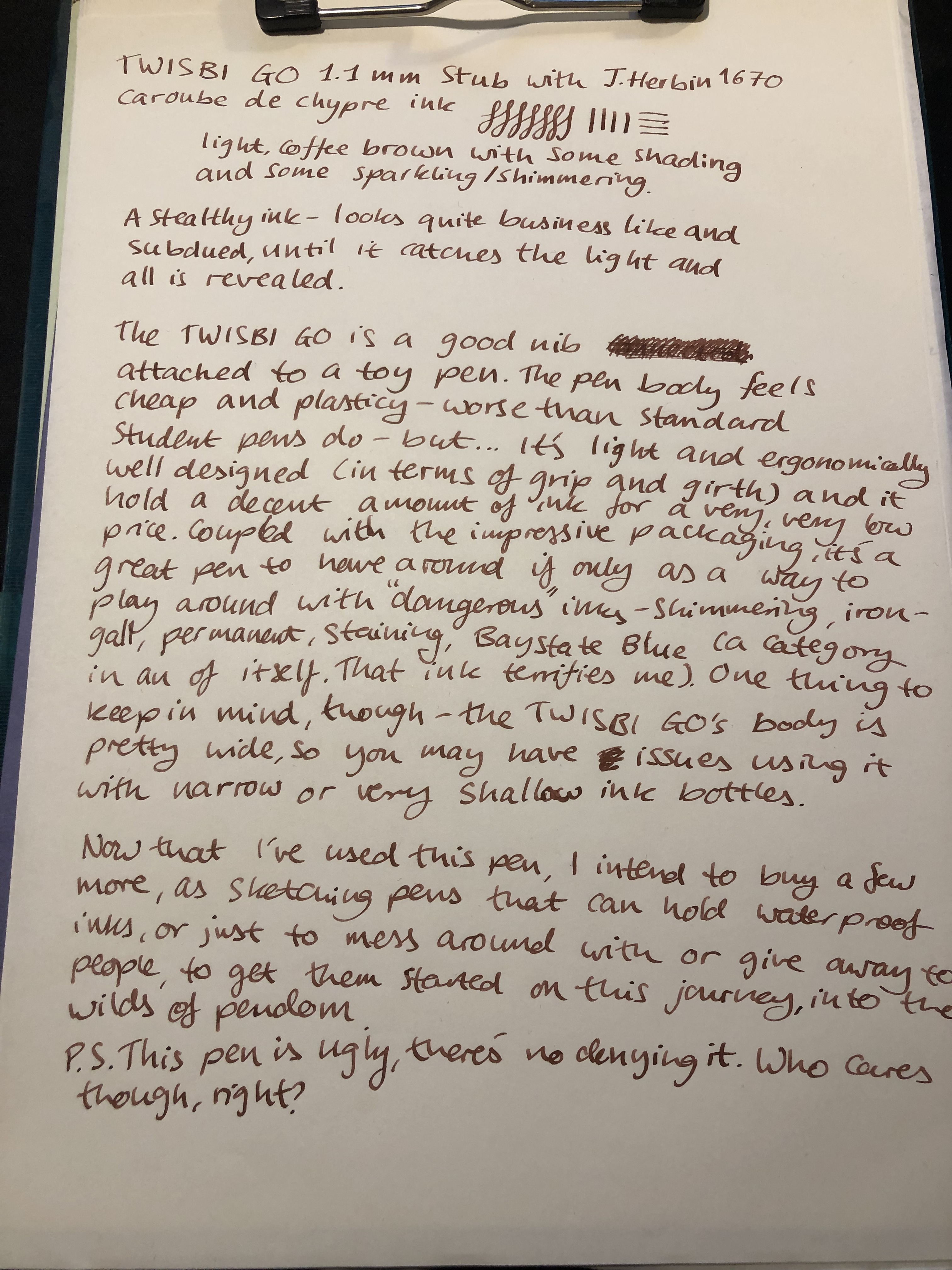
Here’s a writing sample with a TWSBI GO 1.1 stub, which I did late at night when I was pretty tired, and so I spelled TWSBI phonetically, so whoopsie.

The ink is J Herbin’s Caroube de Chypre, which I had bought but not yet used. It’s a light, coffee brown ink with a medium amount of shading and some gold sparkle that is just-impossible-to-photograph-unless-you-pour-half-a-bottle-of-the-stuff-on-the-page-so-you’re-going-to-have-to-trust-me-on-this-it-is-pretty.

Writing sample.

Can you get away with using this ink in a work setting? I believe you can, since the colour itself is pretty tame and the sparkle isn’t in your face, but just glints in the light in certain angles.

img_5626.jpg
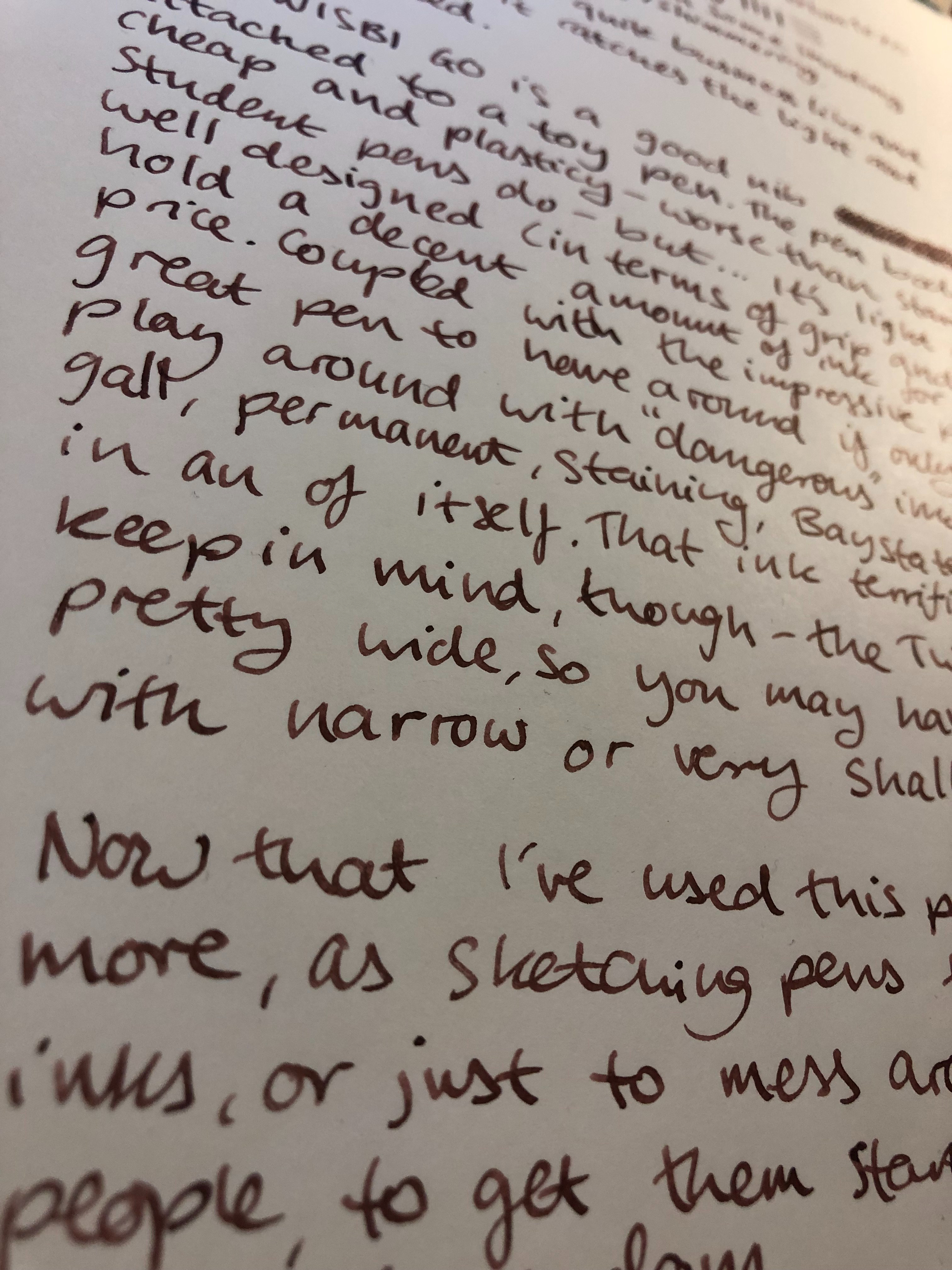
This photographed darker than it appears in reality, but is shows some of the depth of shading that you can expect to see with this ink.

img_5627.jpg
Ugly pen, ugly handwriting, pretty ink.

TWSBI logo on the cap.

The nib, which is the main reason to buy this pen.

Pen grip and pen feed, with ink capacity on display.

The pen itself is a paragon of practicality: super light, super comfortable grip, good ink capacity, excellent nib and feed, easy to use filling mechanism. For less than $20 that’s a tremendous feat on TWSBI’s part and it makes this pen a “no-brainer”. Whether you’re a beginner or a hardened collector, you should have at least one of these in your pen case. It’s a great workhorse, good for experimenting with “dangerous” inks (keep well away from Bay State Blue, yes you, I’m talking to you. I can see what’s in your shopping cart), good as a loaner pen to get more people into the wonderful world of fountain pens, and even good for people experimenting with nib grinds. In the beginner fountain pen category it is uglier than even the platinum preppy, but when it comes to bang for your buck, this pen puts all others to shame.