Pelikan Hubs 2025 and On Being A Female Pen Collector
Yesterday was the 2025 Pelikan Hubs event. Pelikan is so wonderful to organize these events, so generous and thoughtful with their gifts, and I love the company and their pens so much that I’m really heartbroken that this isn’t just a glowingly happy post.
This isn’t Pelikan’s fault. Their organization was as usual, impeccable. Their gift was tremendous – a beautiful box, with the Edelstein’s ink of the year Apricot Achat, a postcard and a notepad. Everything was so well designed it was breathtaking to open the box and see it all laid out perfectly.
Here’s the open box and the postcard:
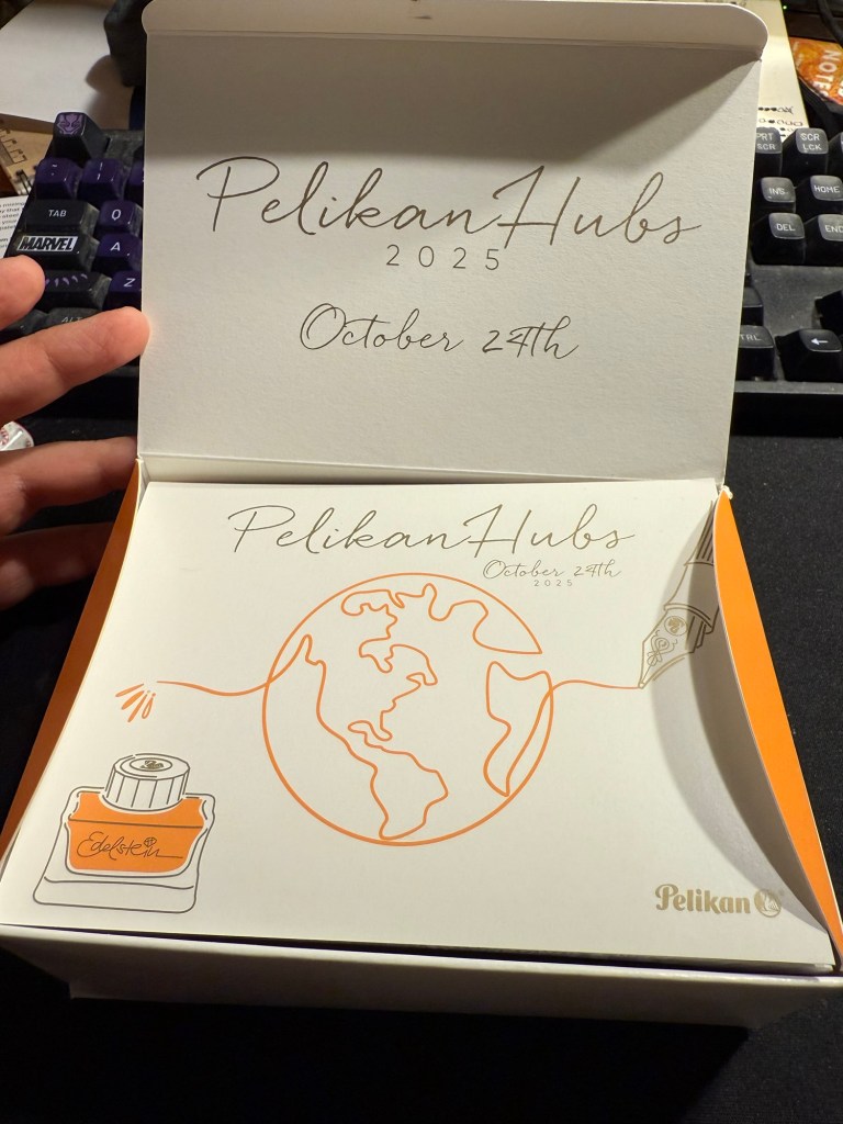
Here’s the notepad. You can see the design on the cover better in the next photo, but the paper is smooth, thick and perfectly fountain pen friendly.
I love the design of the cover of the box, the postcard and the cover of the notepad. It’s playful but elegant, and it works well together and ties in well with the typography and the design of the Edelstein box. That’s a 10/10 for design and quality.
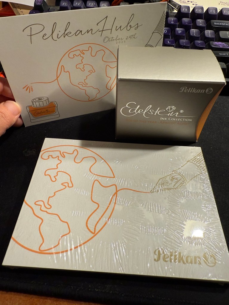
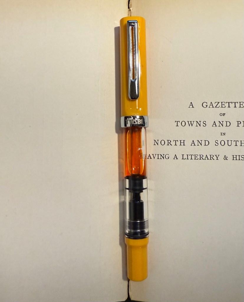
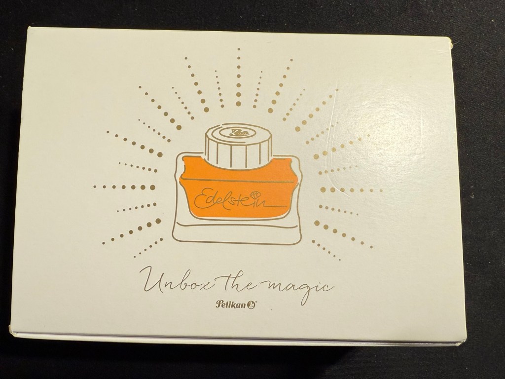
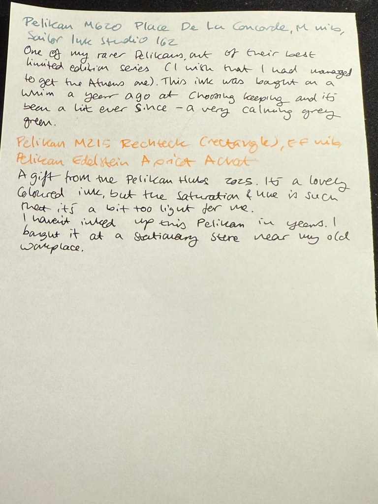
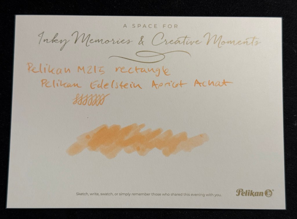
The that we received is the Edelstein Apricot Achat, which is the ink of the year 2025. The bottle is gorgeous, and the ink is non-shimmer this year, so it should be easy to clean out of pens.

The ink itself is indeed an apricot ink, with a hint of shading. It’s bright but light – a tad too light for me if I’m honest. I think that this exact ink just slightly more saturated would have been the perfect orange for people who like their orange right in the middle of the orange spectrum – not too yellow or too red.
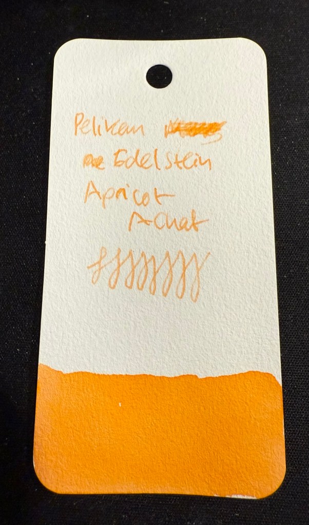
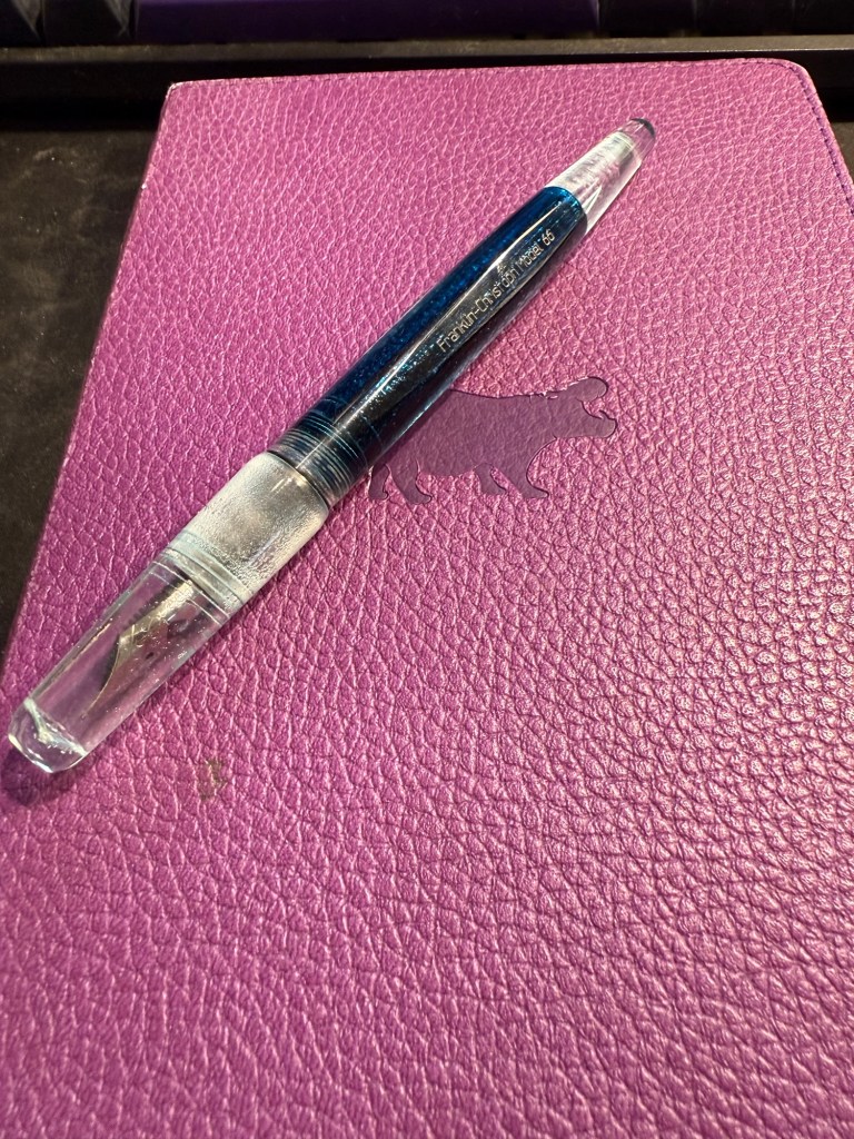
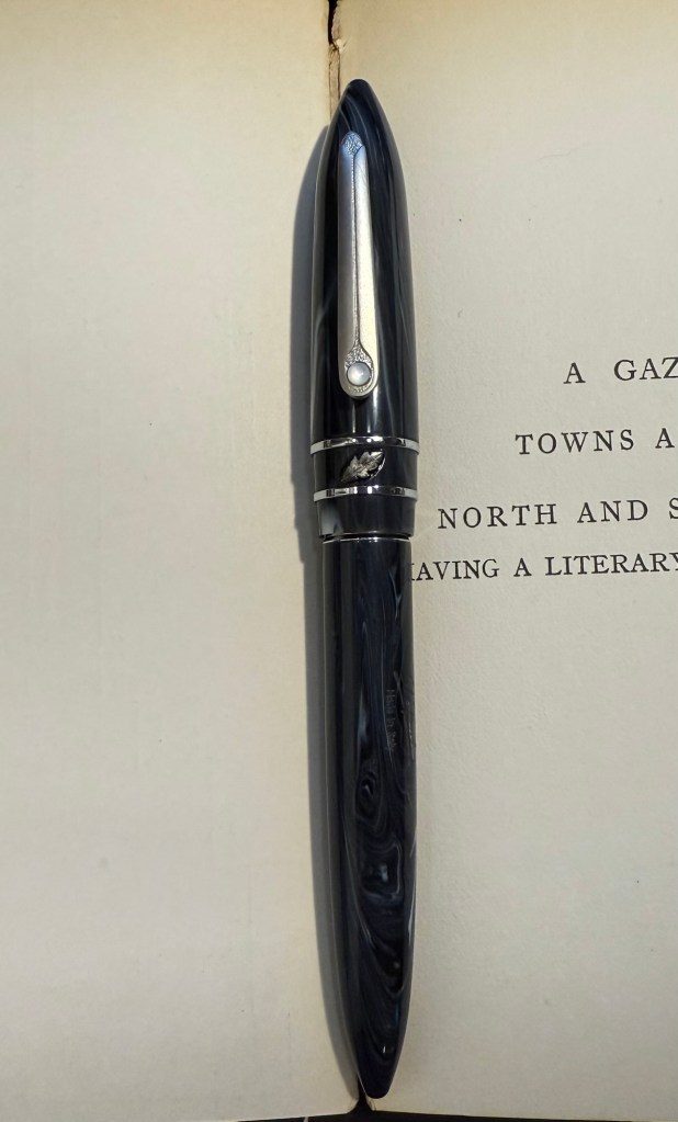
I filled a Pelikan M215 Rechteck (rectangle) with this ink, but I chose poorly, forgetting that it has an EF nib. Pelikan EF are on the wide side, but this ink would fare better in a medium or even a broad nib. I will still enjoy it as it works well with the other inks I currently have in rotation, but if you are looking to use this ink I’d suggest wide and generous nibs for it.
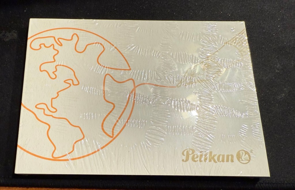
I tried it on the Postcard. The paper isn’t coated but is still rather sleek:
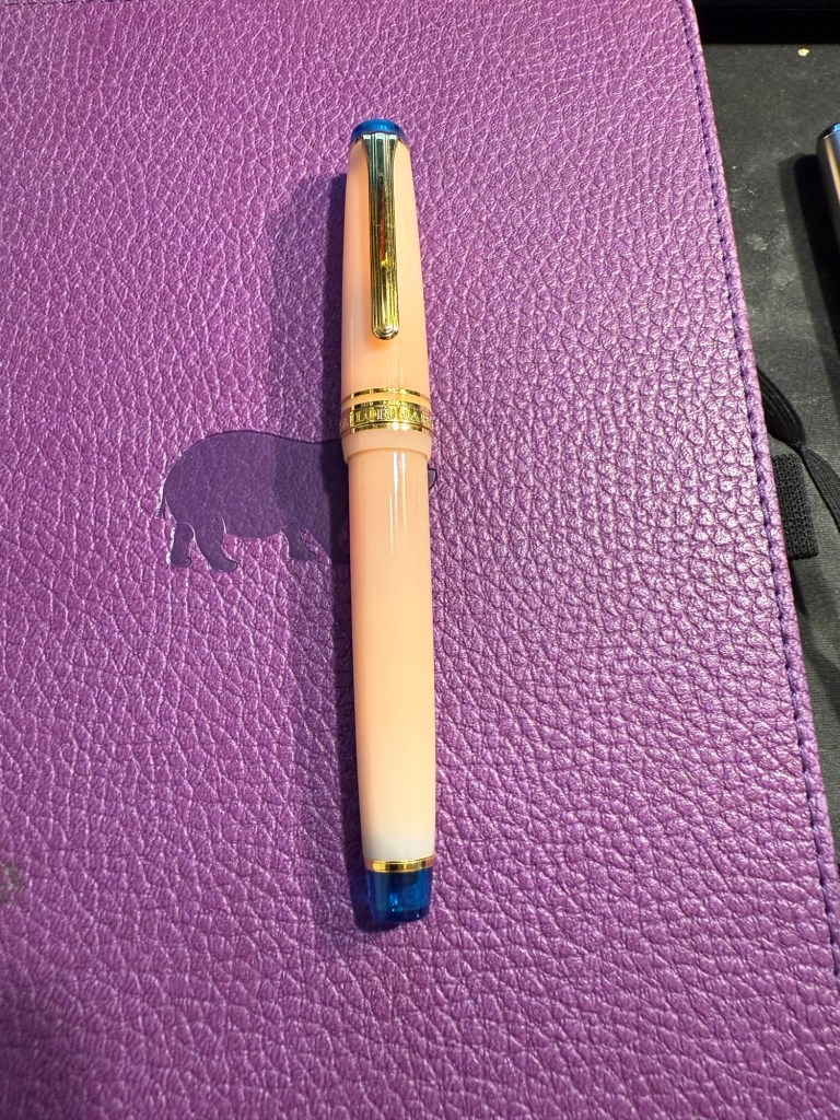
So thank you very much Pelikan for organizing this worldwide event and for your wonderful gift! I am actually considering buying the matching M200 because I like the look of the ink.
Now for the sad and ugly part:
Pen collection has a misogyny problem. I have experienced it during the previous Pelikan Hubs, I have experienced it when I tried to buy pens in brick and mortar shops, in flea markets, from pen makers. I experienced it during this year’s Pelikan Hubs and I’m tired of it, and kind of tired of all the talk about how wonderful and welcoming the pen community is. It’s wonderful and welcoming if you’re a guy, and time and again I have seen it close ranks and snarl if you’re a gal.
Just during yesterday’s event, where I stayed on for less than an hour (and even that was just to be at the edge of the group photo), I was told several times that:
- Women don’t collect pens.
- Only men collect pens.
- I am not a real pen collector.
- I can’t possibly be a pen collector.
- I can’t possibly have enrolled to the Pelikan hub.
- I am there as someone’s plus one.
- Women don’t understand pen collecting.
- I am a rare bird, the exception to the rule.
They had facts to back it up, they said. Their closed pen collectors group only had three women in it. That proved the point. I eye-rolled so hard. I had met and talked to one of the other female collectors at last year’s event and I fully understand why she didn’t brave this treatment to collect her gift this year. It’s because nobody wants to go out of their way to spend their precious free time with a bunch of *holes.
There are women collectors, they have every right to enjoy this hobby, and if you’re a guy and you don’t see women in your group, it’s not because they don’t collect pens. It’s because you’ve created a group that women don’t want to join.
Do better.
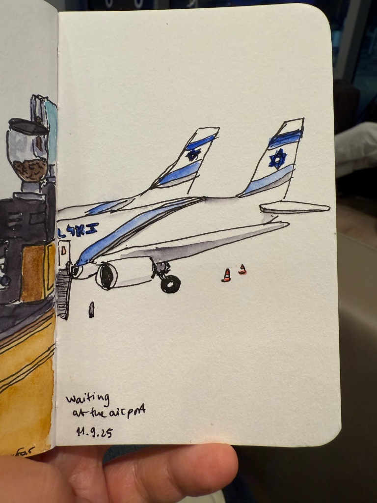
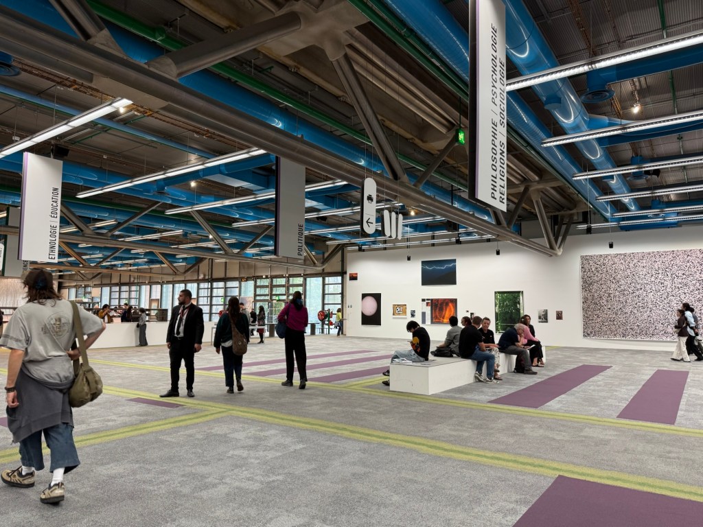
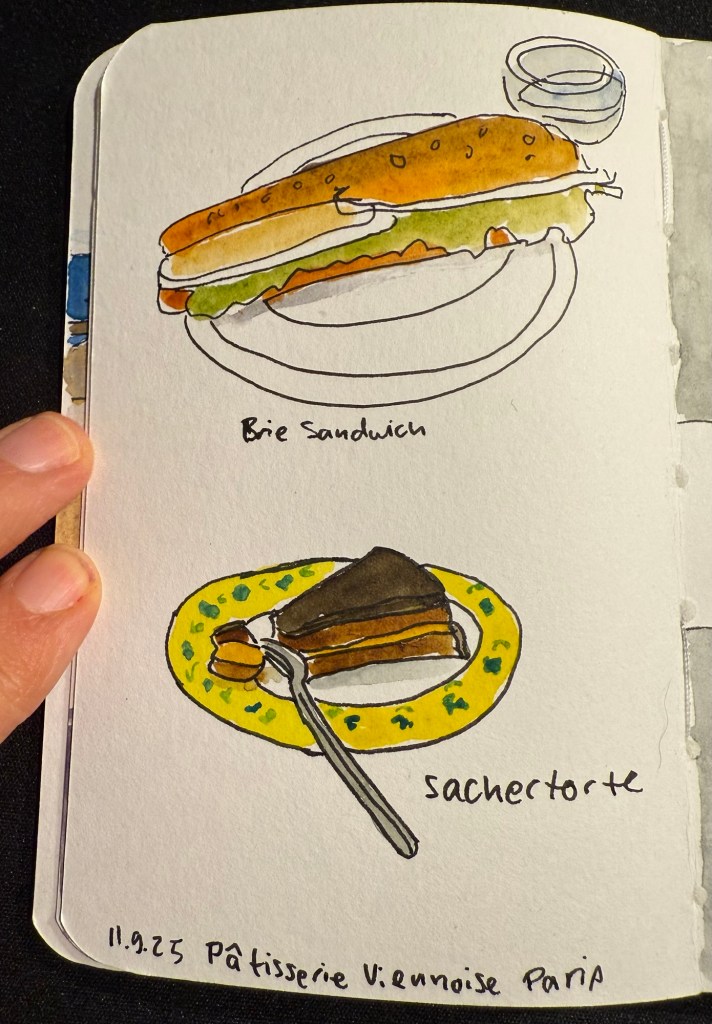
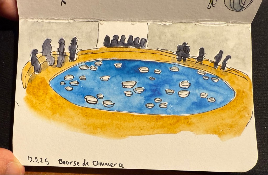
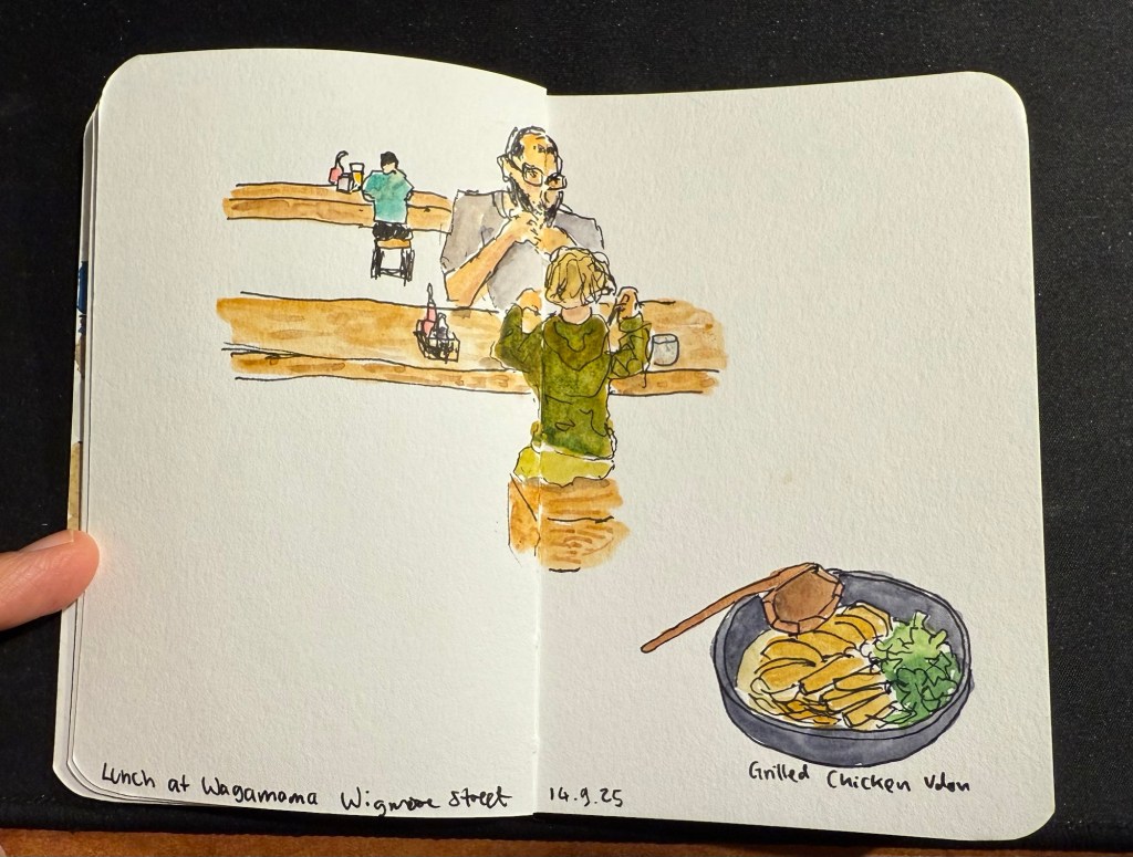
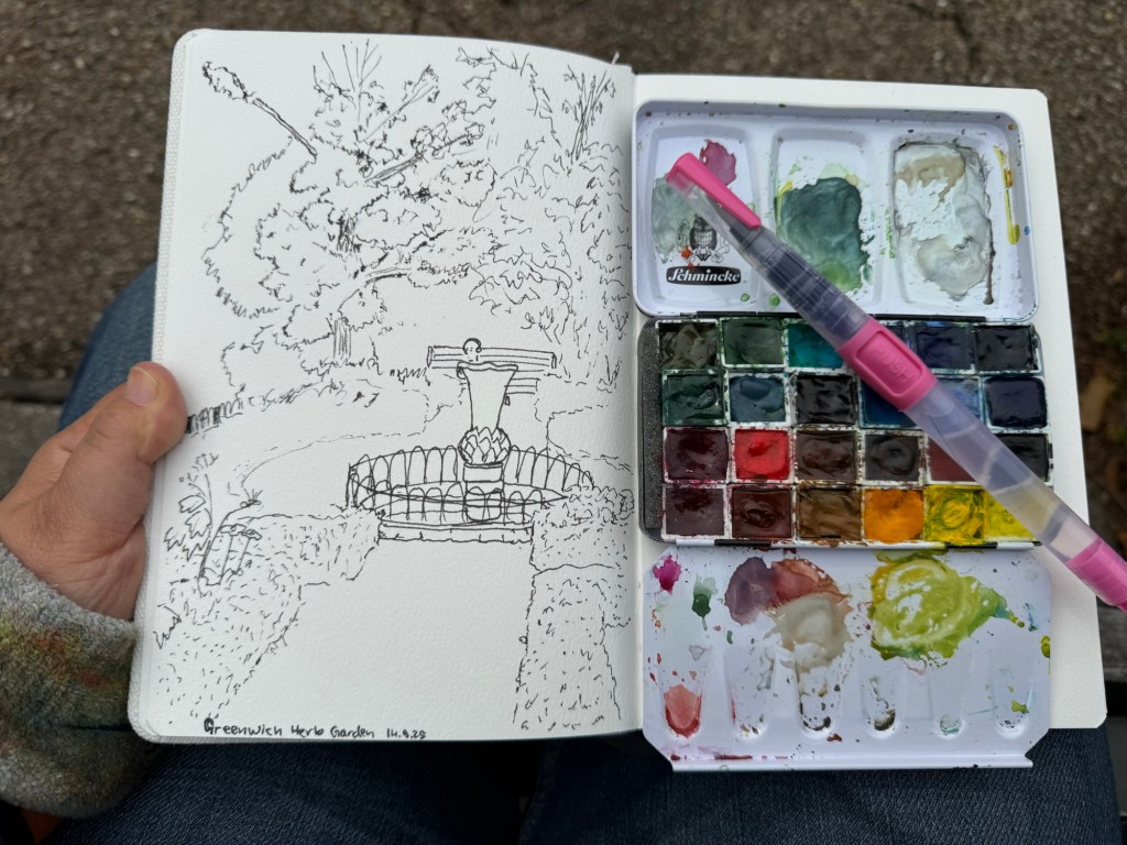
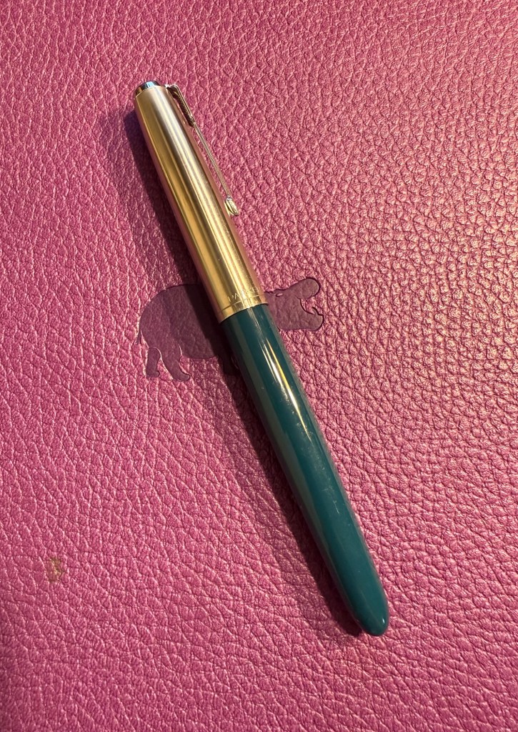
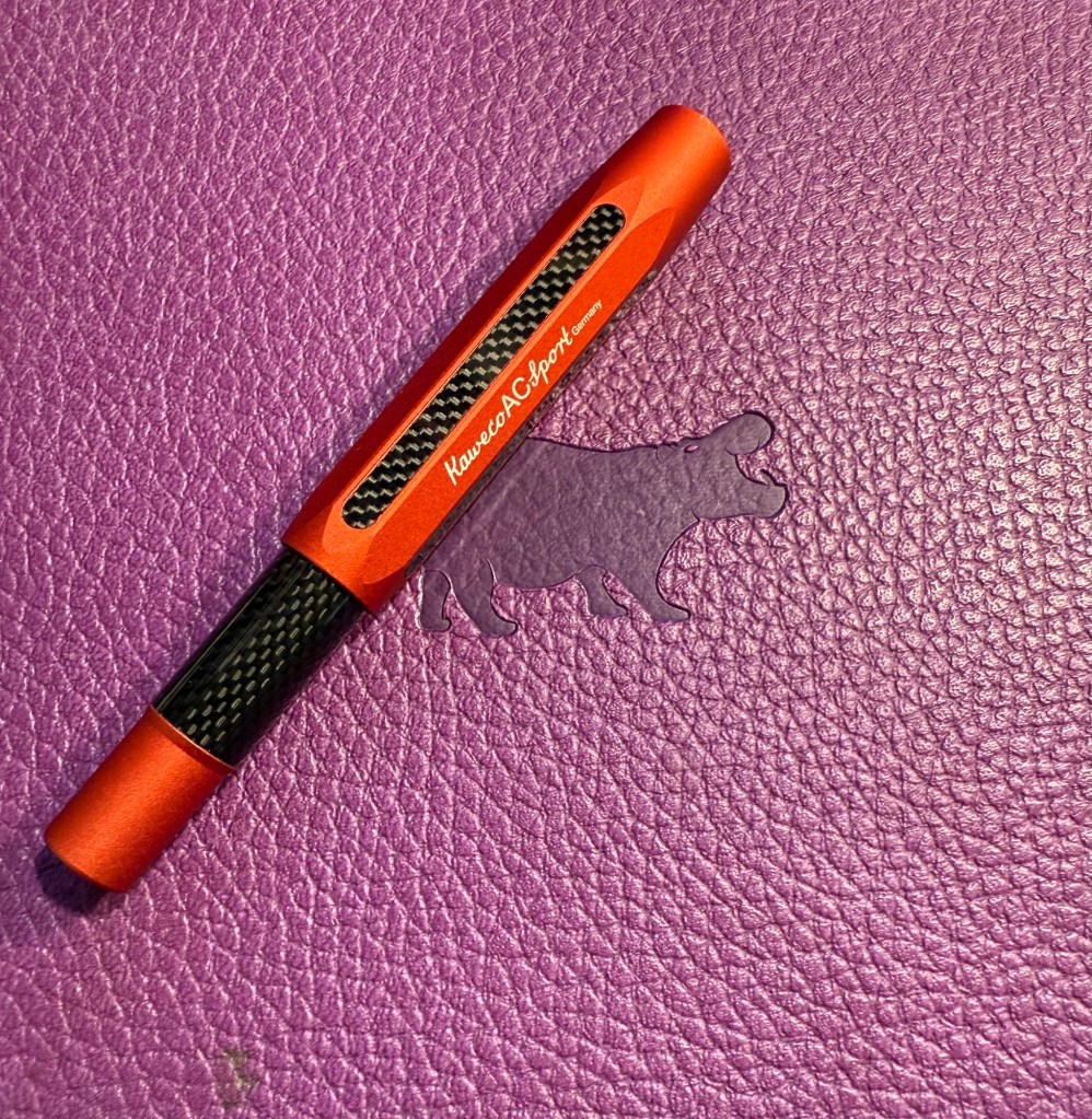
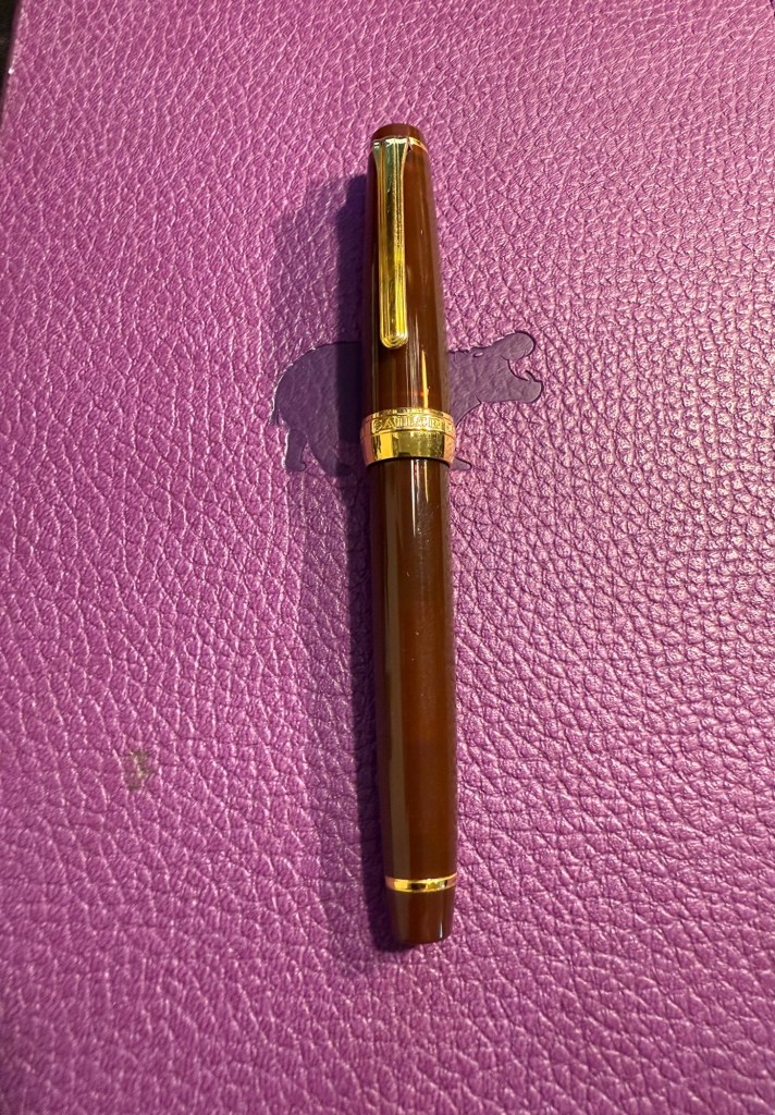
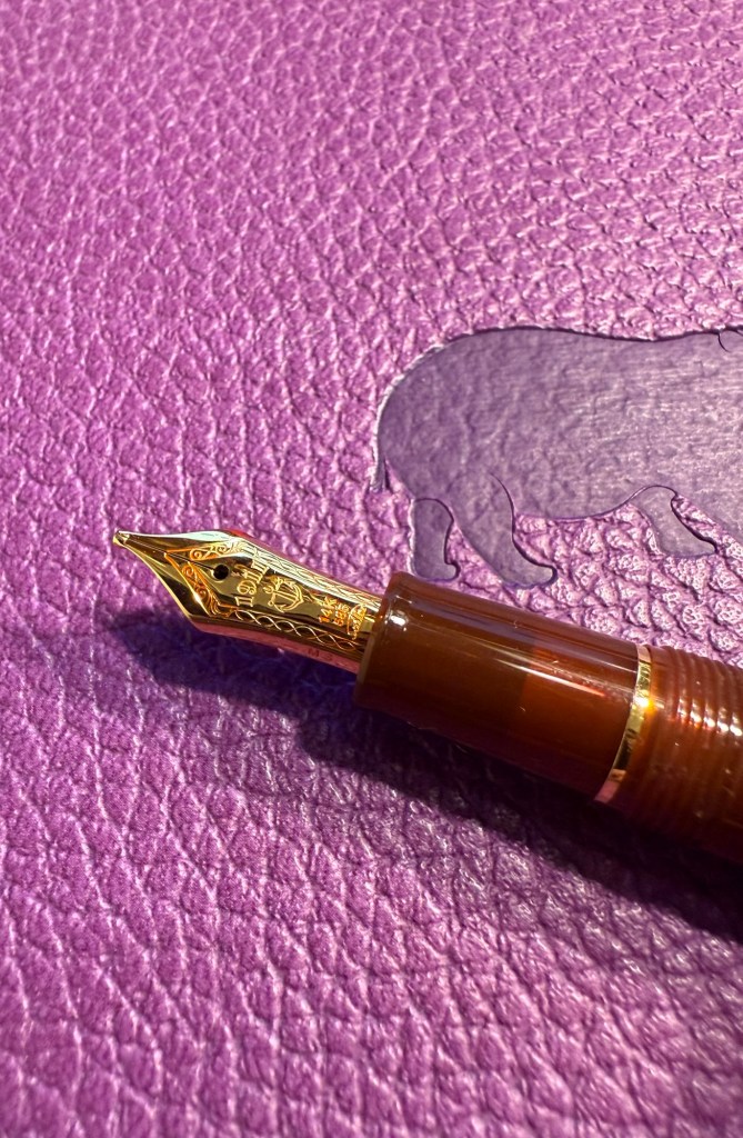
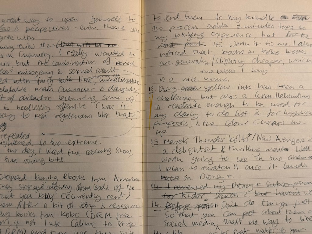
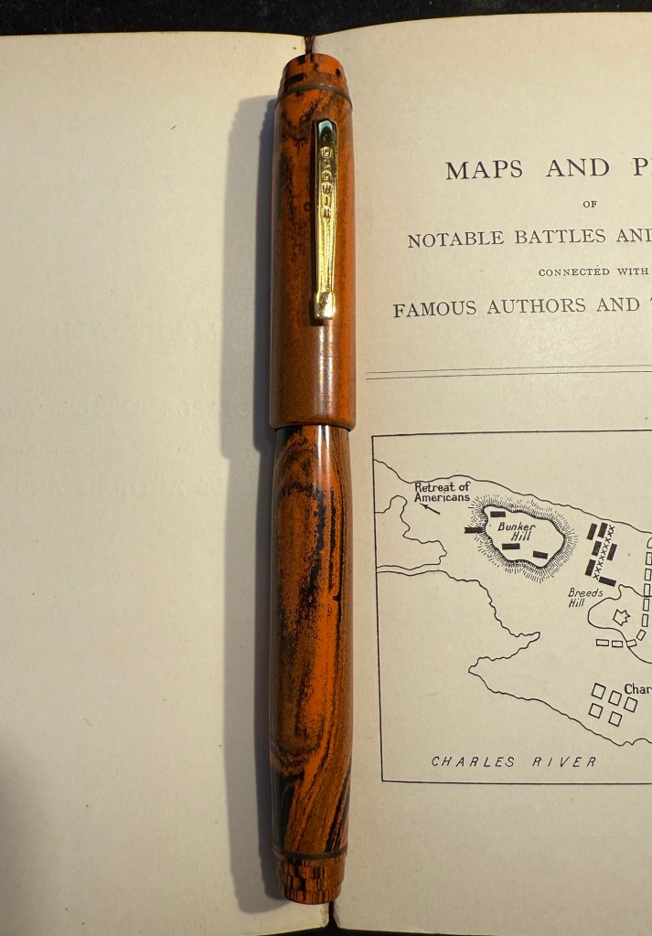
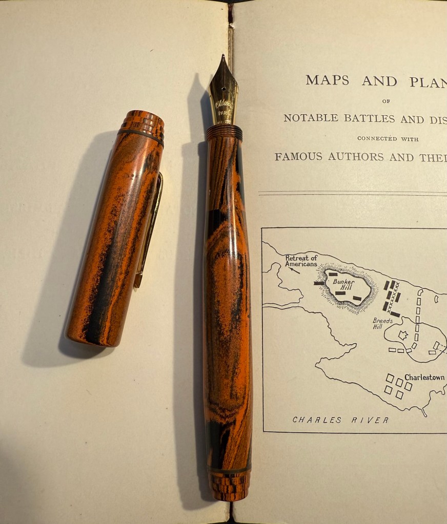
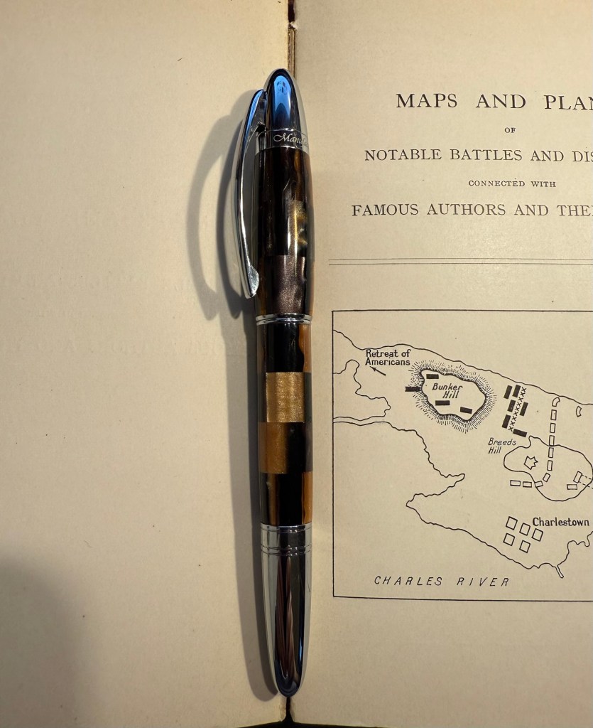
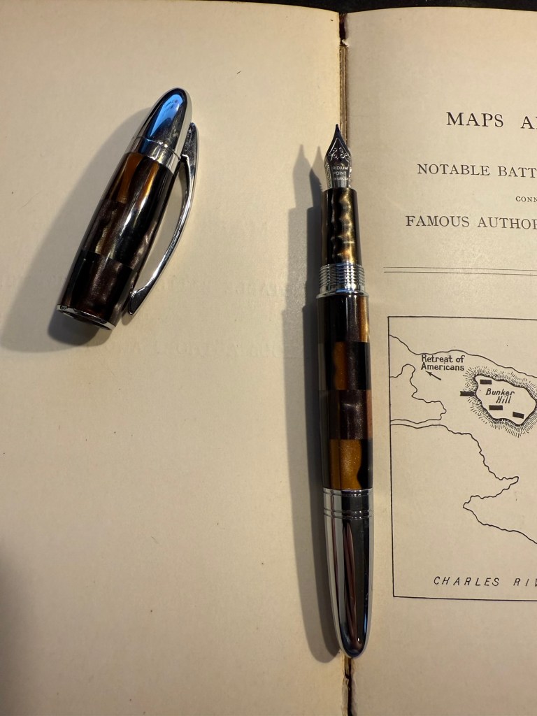
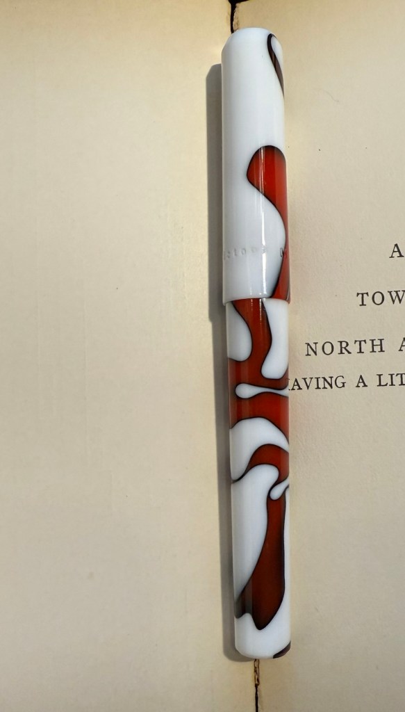
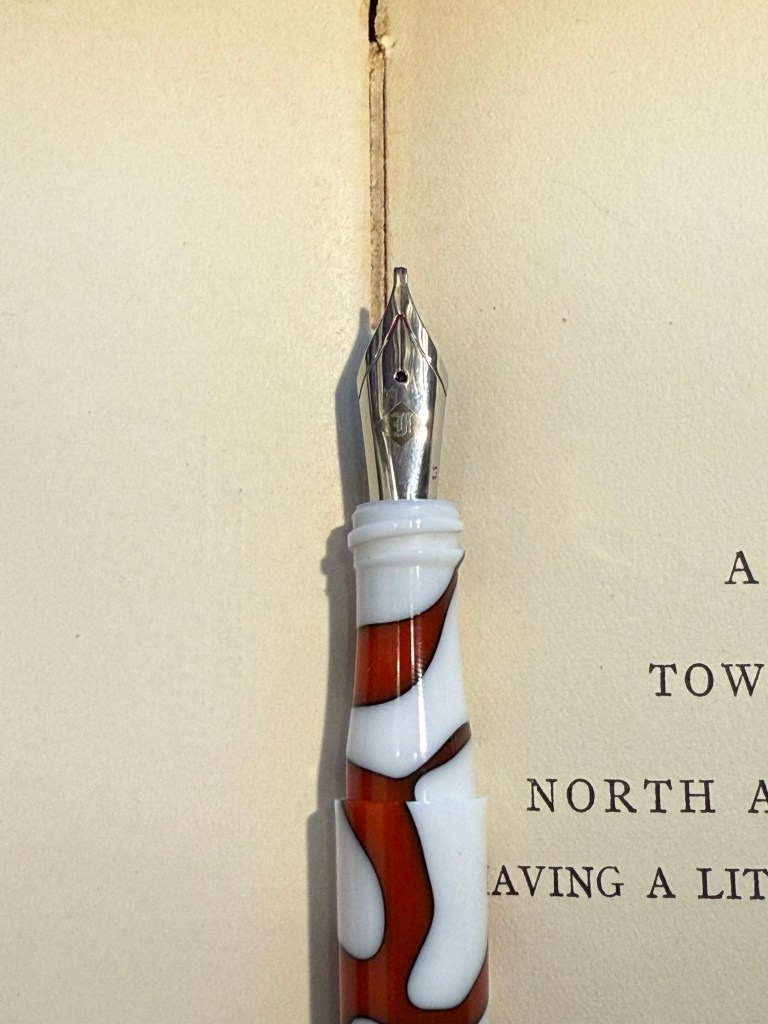
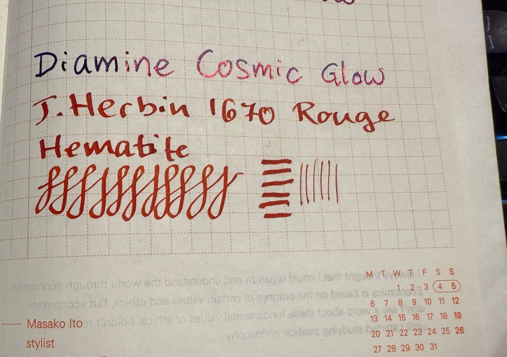
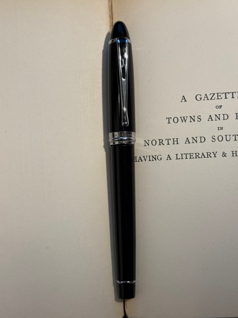
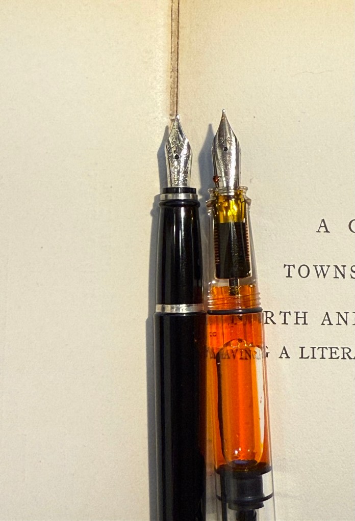
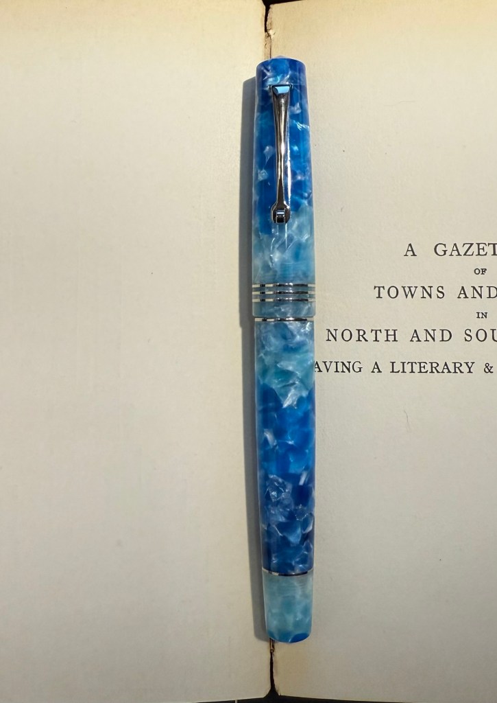
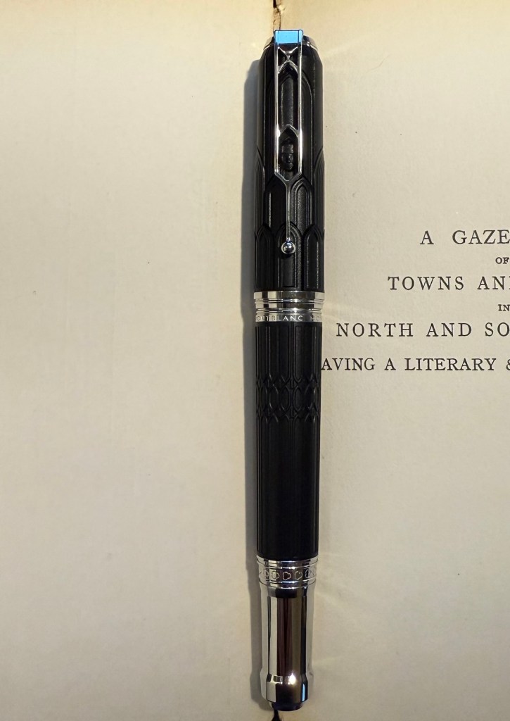
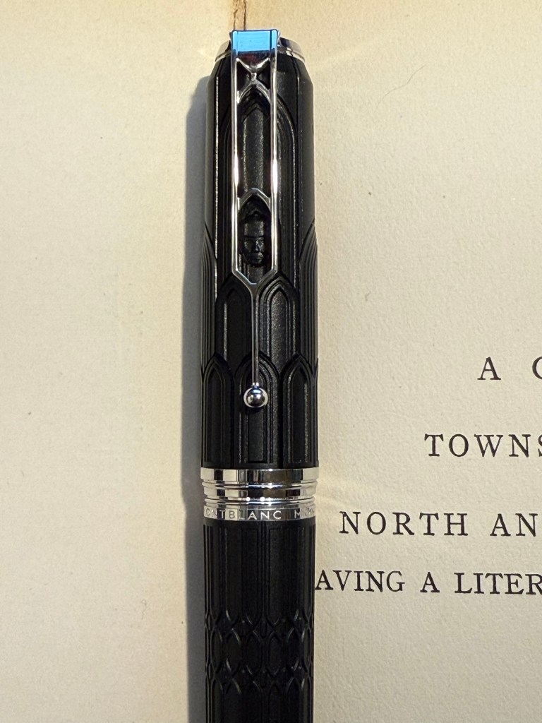
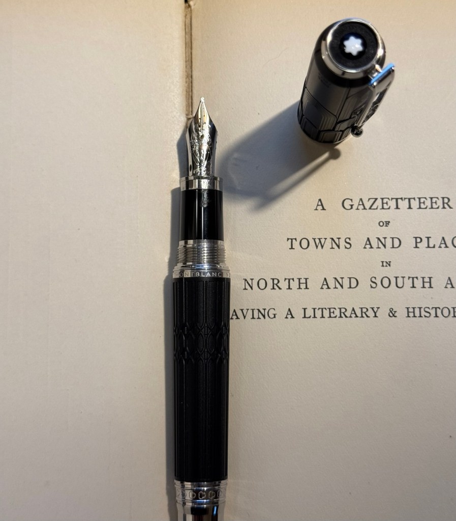
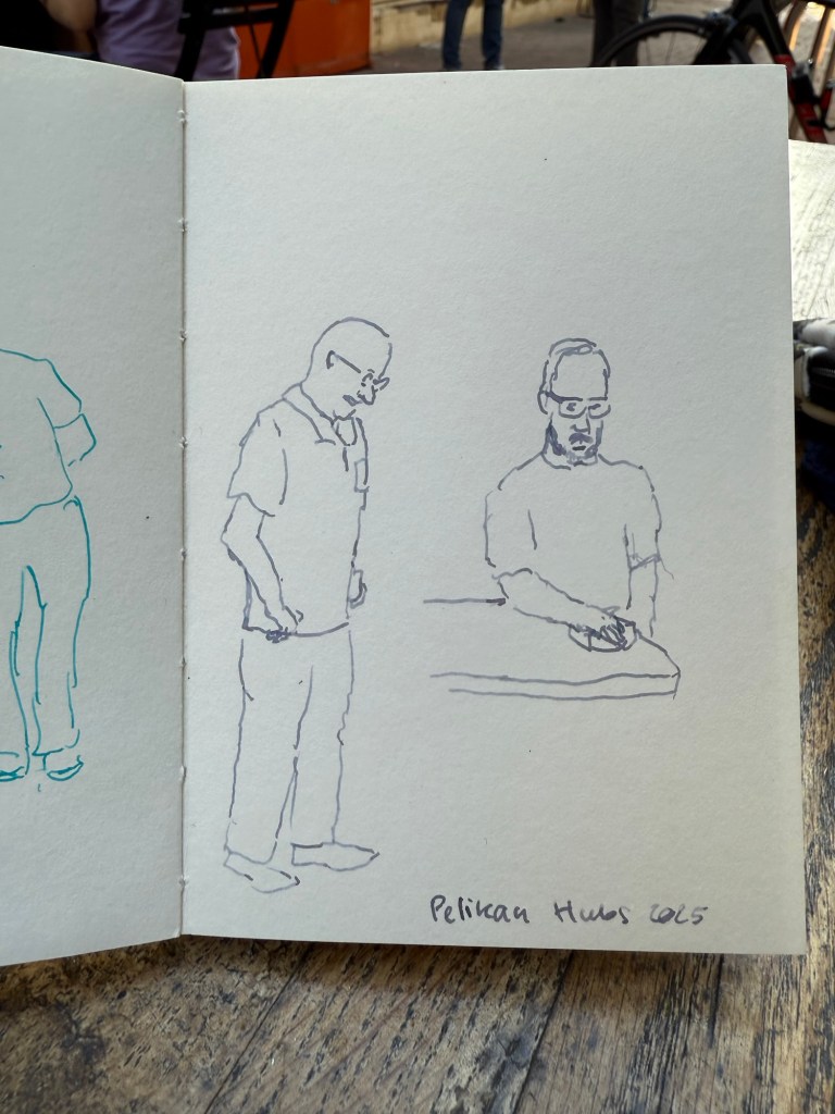
End of rant – and to end on a more positive note, I did manage to do a few 2-3 minute sketches while I was waiting for the group photo:

Thank you again Pelikan for the wonderful event. I intend to return next year even if the menfolk find my presence abhorrent. There were a few nice fellows that were willing to talk to me, and I will not let the trolls dissuade me from participating in a hobby that I have been enjoying for close to 20 years.