You can find part 1 here. You can see that there is a slight bit of show through with the Stillman and Birn Epsilon, but at only 150 gsm that’s to be expected.
The show through is most pronounced in the area between the goblin’s sword and the text above him.
I decided to play a bit more with ink colours and wider nibs here, so that’s a Sailor medium stub nib and Diamine Inkvent Blue EditionCandy Cane ink for spells and effects:
There’s no show through for the ink, and though it may not seem that way, there was no spreading. Also, if you like granulating watercolour effects, the Stillman and Birn Epsilon paper seems to be a champ for that.
A while ago a local art supply shop started stocking a wider variety of Stillman and Birn sketchbooks. I currently use the Stillman and Birn pocket Alpha as my daily sketchbook, but I decided to give the pocket Epsilon a try. The Epsilon features smooth, white 150 gsm pages which should work for pen, ink, dry media and light washes.
This sketchbook is in landscape format, which is what I normally prefer. I was planning to use it once I’ve finished with my current Alpha, but weeks stretched to months and meanwhile this sketchbook has been languishing away, unused.
So when I saw Liz Steel going on a virtual sketch tour in Italy, I was inspired to grab this notebook and fill it with a sketch tour of my own. I initially planned to sketch out my cancelled London trip, and I may yet do that, but something inspired me to take this idea to a completely new direction.
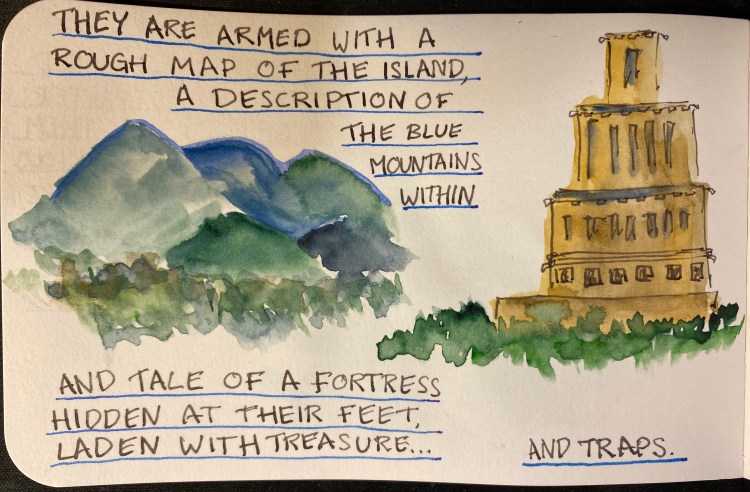
I’m going to sketch out a freeform fantasy roleplaying adventure for my regular D&D group, and use that as a way to test out this sketchbook, and to make good use of my fountain pens.
So without further ado: Vengeful Forest, a fantasy freeform adventure.
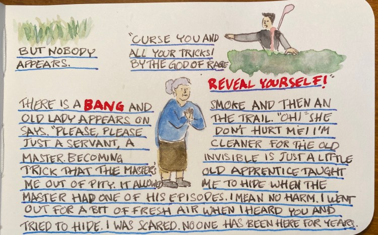
Sketch and writing done with TWSBI 540 Diamond F nib and Rohrer and Klingner Lotte SketchINK.Blue lines done with PenBBS 500 Fine and Sailor Sky High ink.Frying pan Rapunzel dressed in purple is probably copyrighted by Disney, but one of my players thought it would be funny to make my life interesting, so here she is.I tried to give each character a distinct enough colour scheme so you’ll be able to recognize them from a distance. Each player had one sentence to describe their character.
The watercolours are Schminke and I used a Windsor and Newton Series 7 number 2 brush and a Rosemary and Co 772 brush
I’ll continue posting as the adventure progresses, but so far this has been a lot of fun, and the players seem to be enjoying it too. The Stillman and Birn Epsilon has been an absolute champ: it takes light washes beautifully, with very little buckling, allowing me to use both sides of each page. It also works well with fountain pens, especially fine nibbed ones, which are commonly used for sketching. The white paper makes everything pop, and even though 150 gsm isn’t much when it comes to watercolour, it did allow for some layering and reworking without turning into a messy paper pulp. This is a sketchbook that I’m definitely going to purchase again.
I haven’t bought a fountain pen on eBay in years, but when I decided to celebrate completing a six month intensive DevOps course, I headed out to eBay in search for the Rotring 600 Levenger rollerball. Yes, you read that correctly, I was looking for the Rotring 600 rollerball, not the fountain pen. I love the design of the Rotring 600 Levenger pens, but I thought that there was zero chance that I’ll manage to snag a good quality fountain pen, not to mention a fountain pen and rollerball set, so I decided to focus on the cheaper to obtain rollerball. As it turned out, I landed on an estate sale Rotring 600 set, and managed to get a Rotring 600 Levenger fountain pen and rollerball in great condition for a pretty good price.
The Rotring 600 Levenger pens aren’t flashy. They both have metal hexagon bodies with knurled ends and the classic Rotring red rings on the cap ends. The cap ends and the grip and the pen finial and round, and the pen body and cap are hexagonal, and somehow the transition between these two shapes is perfect and seamless. Industrial design at its best.
The fountain pen cap snaps into place with the help of the two silver protrusions on the knurled grip section. These protrusions don’t get in the way while writing, no matter how weird your pen grip is, and the section itself is very comfortable to hold. The knurling isn’t as dense as on the Rotring 600 mechanical pencil, and it is smoothed over so it doesn’t dig into your fingers. It provides a secure grip, while giving the pen the traditional Rotring look.
Because of the silver protrusions the pen cap snaps very securely into place. The fountain pen came with no converter, just unbranded short international cartridges, but it was easy enough to take the converter off my Super5 pen and use it here. The nib grade is indicated on the pen cap, which is what you’d expect on a drafting pencil. I like that oh so Rotring touch.
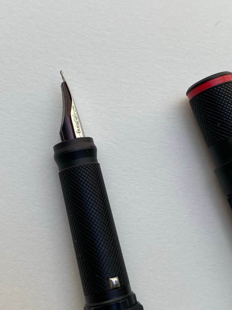
The Rotring 600 fountain pen comes with a steel nib that’s shaped a lot like a Lamy Safari nib. It’s stamped with Rotring’s logo on one side, and the nib grade on the other.
The nib is smooth and a lot of fun to write with, but it’s on the wider (European) side of fine. A 0.7 mm width line. Check out that grip section design:
The rollerball has a blue indicator, presumably for the colour of the ink refill inside. By the time I got it the refill had dried out, and so I replaced it with my favourite refill, the Uni-ball UMR-85N gel ink refill. This is the reason I bought the set and I couldn’t be happier with my purchase. Just look at it:
That’s so sleek and so clever, and I have no idea why they stopped producing them. Side by side you can see that the knurling on the fountain pen is slightly more pronounced. You can hardly feel the difference when in use, but I thought that it’s worth pointing out.
And here is that glorious nib in use, with a quick sketch of the Albert Memorial in London. The ink is Sailor Jentle Ink Epinard, which is a fun ink to sketch with an a green ink dark enough that you can sneak it into office use (not that anyone would notice or care right now).
It’s been a tough time, and a long and challenging six months course, but I couldn’t be happier with my “reward” for finishing it. If you run across a Rotring 600 rollerball or fountain pen at a reasonable price, by all means, buy them. The design on these pens is the kind that belongs in museums it’s so good, and they are a lot of fun to use too.
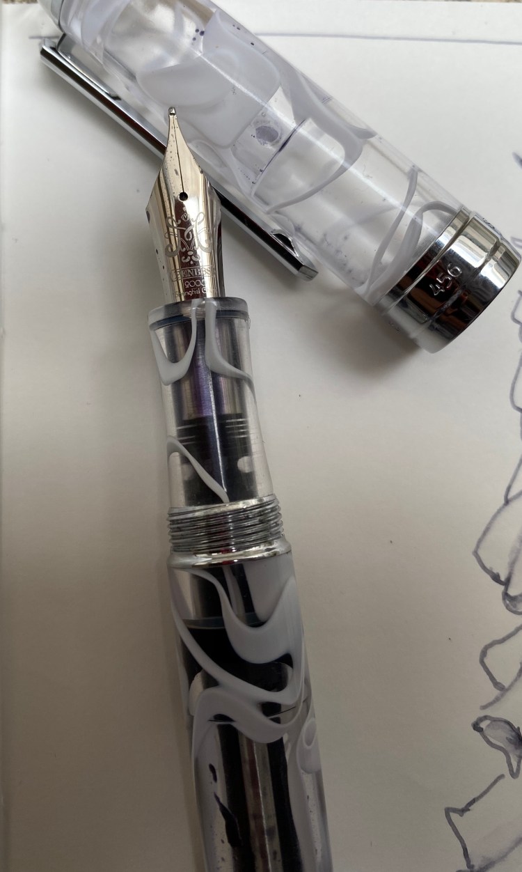
I ordered the PenBBS 456 Vacuum Filling Smog 54 RM at the same time I ordered the PenBBS 500, because I was intrigued by the filling system, and I wanted a PenBBS 500 with the Smog design but there weren’t any available. I was expecting to like the PenBBS 500 more because from the pictures it seems to have a more classic design, but the PenBBS 456 is the perfect example of how pen pictures often misleading.
The 456 is a much sleeker pen than its chubby 500 counterpart. There’s also significantly less hardware on the 456, which makes it both lighter and better looking. Massive chrome details on fountain pens just seem to cheaper their look in my eyes. If the cap band had been about half the size then the 456’s design would be better, but as it is it’s not a pen that I’d be ashamed to carry, and it looks more expensive than it actually is.
The steel nib on this is a medium, and it writes at about a 0.7mm line, as described. The nib design itself is elegant and clever, with a calligraphy “M” designating its width. The nib itself is smooth with some feedback, and has little or no give.
I purposefully filled this pen only about a third of the way up once I realized what a massive ink capacity it has. The filling mechanism is somewhat elaborate, like all vacuum fillers, but it works, and unlike the end-cap on the PenBBS 500, the PenBBS 456’s end-cap doesn’t twist off unintentionally.
The smog material is really beautiful, and it’s a way to get some of that Visconti vacuum-filler, London Fog feel without breaking the bank. This pen proves that you don’t have to pay hundreds and hundreds of dollars to have a nice pen that you enjoy writing with.
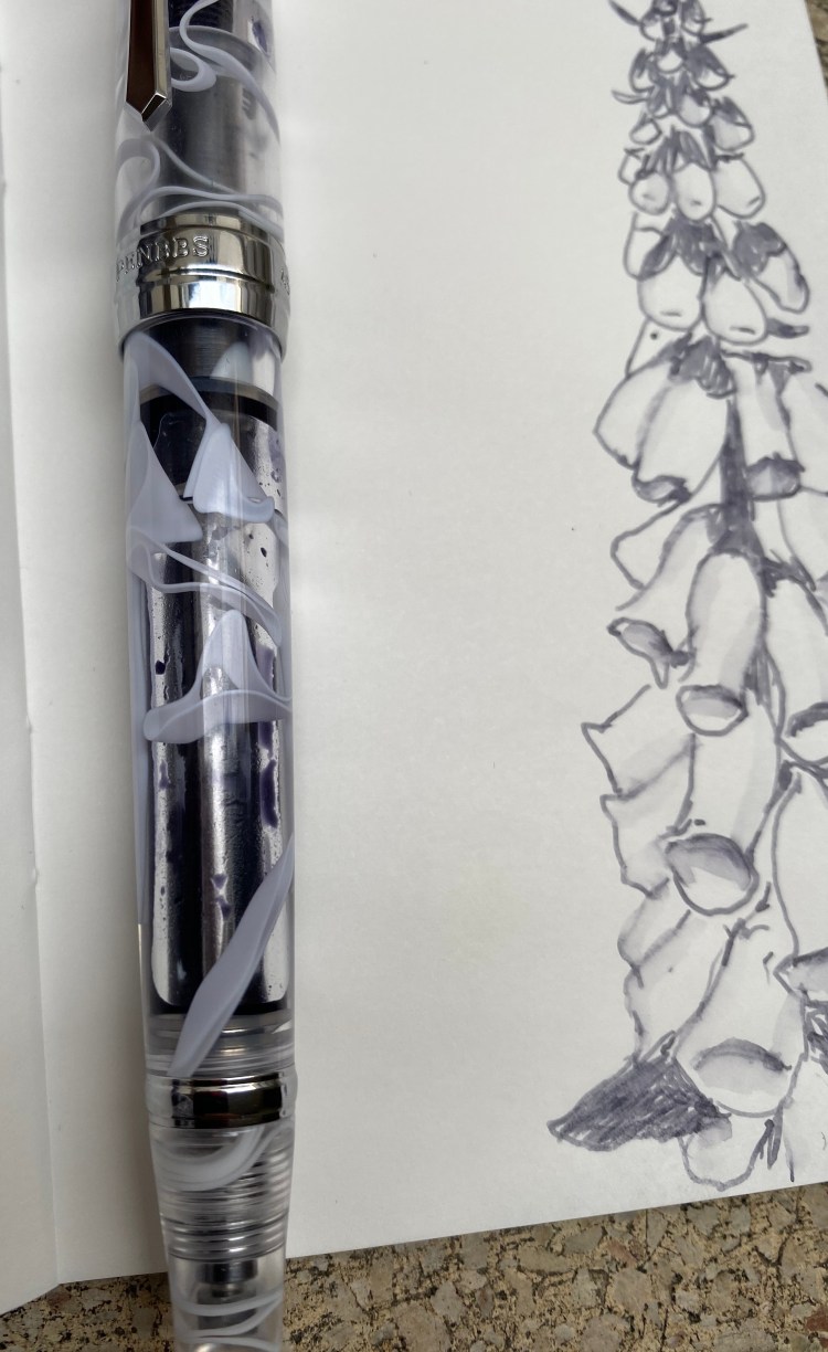
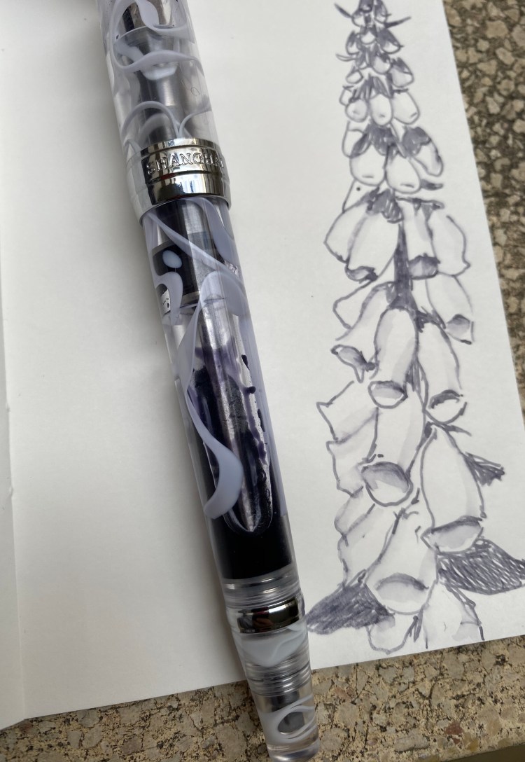
Some more closeups on the overly large cap band (if only it had ended on the line below the “Shanghai”) and the lovely smog material. You can also see the filling mechanism clearly:
The material looks even better when the pen is filled up with ink, but I just wasn’t willing to dump out so much ink, and I knew that I would be forced to do that if I topped the pen up:
Pilot Iroshizuku Fuyu Syogun was one of the first Pilot Iroshizuku inks that I splurged on. It shades beautifully, and is a lovely cool (i.e. bluish) grey that is utterly not waterproof, and so can be “stretched” and reworked as you can see in the small sketch that I did:
This was drawn on Tomoe River paper, but you’ll see shading on Rhodia and Clairefontaine paper as well. Of all the grey inks I own, this one is still my favourite. It’s dark enough to be readable (and appropriate for office use), and offers a lot of interest and drawing potential with its shading.
Like all pens that aren’t cartridge converters, cleaning this pen out will take a bit of effort, and vacuum filling pens are more difficult to clean out than piston fillers or lever fillers (only button fillers are worse IMHO). It just means that you’ll need to have patience when filling and cleaning this pen out, and that you probably shouldn’t put shimmering inks or inks that are difficult to clean out (or stain the pen body) in a pen like this. Then again, the pen costs $32, so if worst comes to worst, you haven’t ruined an expensive pen.
I wish that PenBBS would pick a naming convention that is easier to remember than the one it is currently using. But other than that and the not great cap band, for double the price the PenBBS would still be a great buy.
After a long wait my PenBBS 500 Summer finally arrived earlier last month. The PenBBS 500 is a piston filler with a new and rather elaborate filling mechanism for the shockingly low price of $29.99. At that price it can’t be very good, right?
This pen is about the size and thickness of a Pelikan M800, but it’s much heavier than the M800.
While the PenBBS 500 is far from a perfect pen, it is much better than the price tag would have you believe. It’s a heavy pen, made with beautiful acrylic that is both partly translucent and chatoyant, with swirls in pearlescent white, turquoise and royal blue.
There is a lot of branding on this pen, which accounts for some of the choices to slap a lot of chrome on it. You can see the piston spring through the pen body. The “summer” acrylic is beautiful.
The hardware isn’t to my tasting, as there’s too much of it, and it ends up cheapening the pen’s look. The finial has a nice art deco look to it, but when it comes to its functional design it could use some improvement. To fill the pen you twist the small circle in the centre of the finial until it pops out and you can access the spring/piston mechanism to fill the pen. It’s not very convenient to twist open on the one hand, and on the other hand if you’re not careful you can accidentally twist it open while carrying it.
The pen body is stepped down towards the end, maybe so you can cap it? But who caps fountain pens, and why on earth would you want to do that with such a heavy cap?
I like the clip design, but the cap band and the top of the cap hardware are much too pronounce for my taste, and they add a weight to the pen. The pen itself is top heavy, but not the point where it’s uncomfortable or awkward to write with.
I’m not a fan of that big glob of chrome at the end.
As the ink colour partially shows through this pen, I decided to use Sailor Sky High in it. I’ve had a bottle laying around since the days when Sailor discontinued it and I rushed out to buy some. That was a silly move, but in those days I didn’t know any better. There’s always going to be another ink, people. No point in chasing the discontinued ones only to have the reissued in a few years, or to discover that another brand as the same hue for a fraction of the price.
Sailor’s inks are fun to draw with, particularly with a water brush, as they are utterly non-waterproof, and yet remain true to colour when wet. As I’m staying at home I drew my “nasturtiums,” which I just learned were called Tropaeolums and come from South America originally. They are very easy to grow from seed and offer a lot of interest even when not in flower.
This PenBBS 500 Summer has a fine nib, which skews slightly wider than Japanese fine nibs, and closer to European ones. Sailor Sky High shades enough for it to show with this nib size, and on Tomoe River paper the shading is more pronounced and a red sheen appears.
Sailor Sky High on Canson paper.
On Tomoe River paper wherever the ink pools, there’s a red sheen, but if you write fast enough, you won’t see it, and the ink will skew lighter:
Sailor Sky High on Tomoe River paper.
The red sheen slightly appears on Rhodia and Canson paper, but not as much as on Tomoe River paper.
So, would I recommend the PenBBS 500 as a first piston filler for a newcomer to fountain pens? Probably not. It’s too finicky for that. But at such a low price and with such a good, workhorse nib this is the perfect pen for artists and users that want to experiment with various finicky or troublesome inks. Like the TWSBI GO, this is a pen that’s fun to use and your heart won’t break if you accidentally ruin it.
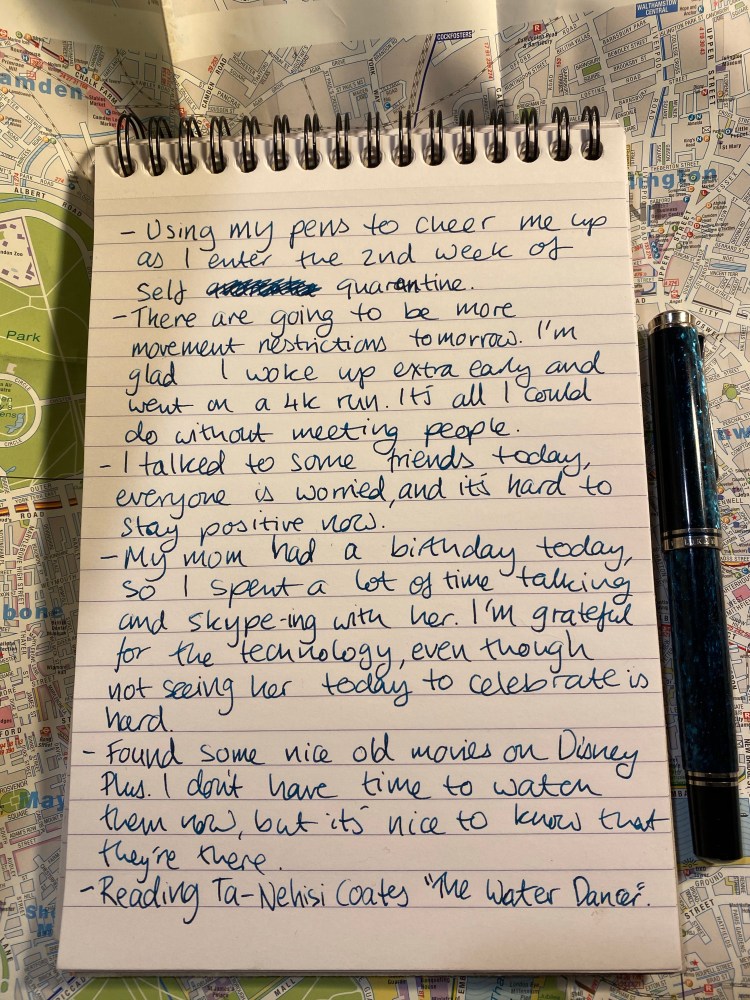
I’m using my pens to cheer me up a little, as we get ready for even more serious movement restrictions, and as the political and economical situation here go haywire. This was written using a Pelikan M805 Ocean Swirl with a fine nib and Sailor Peacock ink. The lighting situation at my desk doesn’t do this ink justice – it’s beautiful.
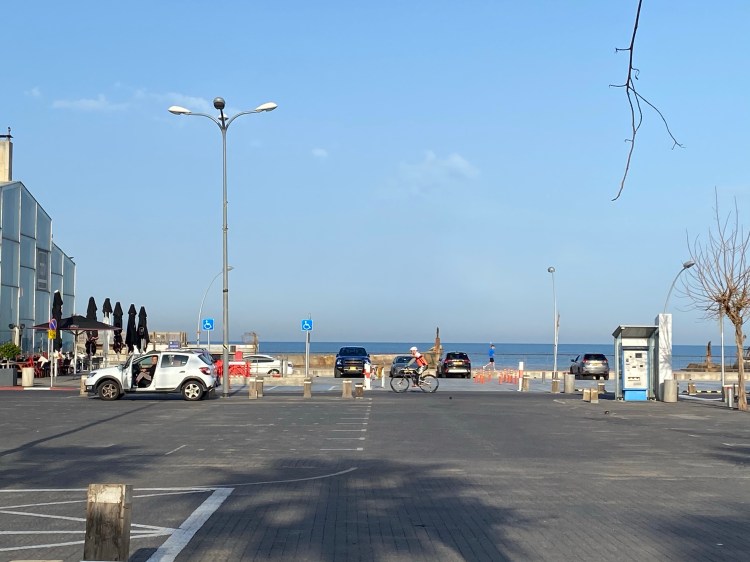
I managed to squeeze in a 4k run this morning. As I avoided people, I couldn’t run further than that, but I’m glad that I did. The weather is perfect for runs right now, and I really miss my running, but today’s run looks to be the last I’ll be able to go on for a while. I usually run along the waterfront, but so does everyone else, so I ran in parallel streets. This is a temporary goodbye to the sea, and I hope that it’s not a long one:
Stay healthy and safe, and look for the little things and little moments to keep you happy.
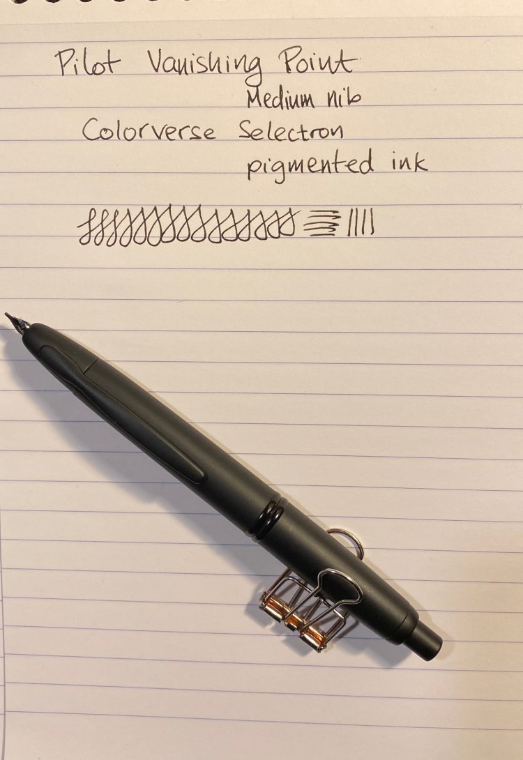
There’s something about black fountain pens and black ink that make them popular beyond what common sense would dictate. The blacker they are the more popular they are, especially if you add the word “stealth” somewhere in their name or the copy. Apparently everyone wants to be a ninja.
There’s so little nib and so much nib creep that investing in a black coated nib unit for this VP seems pointless to me.
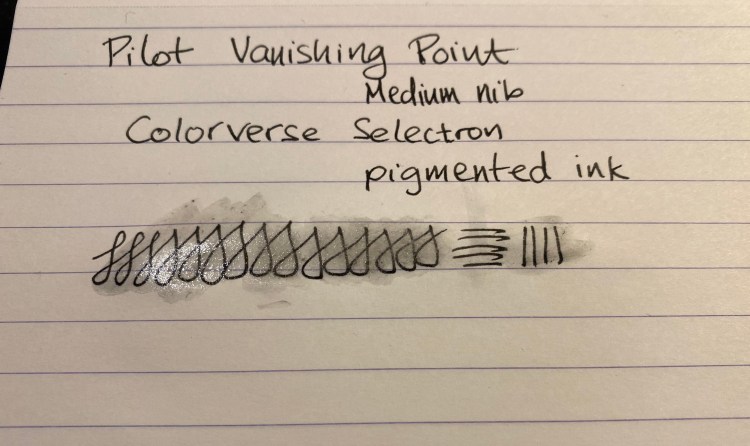
Colorverse Selectron is a pigmented ink that I obtained as part of the Electron/Selectron Multiverse box. Colorverse have lately started to sell some of these paired inks as individual bottles, and so if orange isn’t your thing (Electron is orange, don’t ask me why) you may be able to obtain just Selectron soon enough.
I bought this Matte Black Vanishing Point from Goulet Pens in 2013 I think, but it hasn’t seen much use in recent years. As part of my move to both use my fountain pens more and see if there are any that I might want to part with I dusted this one off and filled it with an “appropriately” coloured ink.
Is this not a handsome pen? Yes it is. Just don’t look too close.
I’ve written about Colorverse Selectron before as part of other reviews. I initially thought that it would be a perfect drawing ink, as it’s pigmented and fountain pen friendly I was hoping that it was also waterproof. As you’ll see later on, it is not.
In terms of the ink itself, there’s nothing remarkable about it. It’s a solid black with some sheen when layered and no variation, which is what you usually want from a black ink.
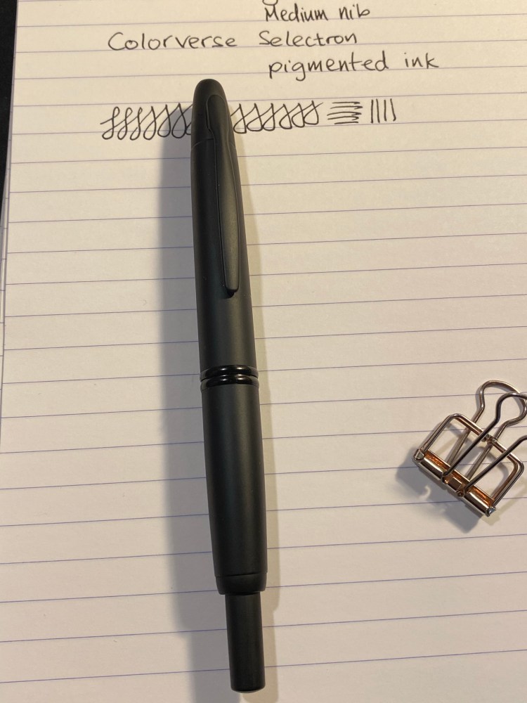
Ugh! You looked too close and now you can see where the coating has rubbed off! 😦
The Matte Black Pilot Vanishing Point is a VP like all VPs: a pen with a great nib, a body design that you either love or can’t use (depending on how you grip your pen) and a solid click mechanism. It still has a converter that holds about a drop and a half of ink and is annoying to fill, and it still suffers from nib creep.
The novelty here is in the matte finish, which is both very nice and not very durable. I hardly used this pen and already the coating is becoming glossy where I usually grip it. It’s a shame because the coating feels great and looks great when it’s unblemished, as in the body of the pen:
Pretty, pretty matte coating.
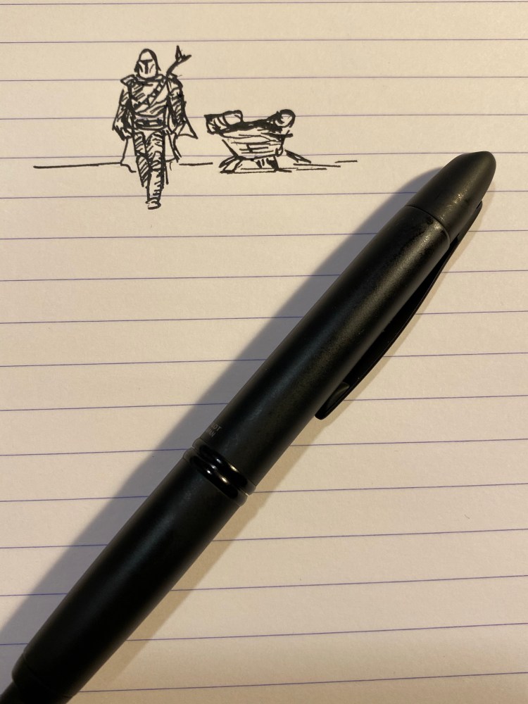
Like some other pigmented inks, the Colorverse Selectron is Moleksine friendly: there’s no feathering, spreading and bleed-through with fine/medium nibs (show through is going to be there no matter what). It’s also a fun ink to draw with:
I started watching “The Mandalorian” and I love it, can you tell?
And here are the results of the waterproof test:
Look at this mess… Not at all waterproof. You’ll be able to read your notes after a spill though.
Matte coated pens are difficult to do well, and Pilot haven’t done a stellar job with this Vanishing Point. Black fountain pen inks are a dime a dozen, and Colorverse haven’t done much beyond packaging and copy to create one that stands out. If I could have tested these in person they would have probably both remained on their respective shelves, but the online hype of the time swept me away. I’m much more wary of it and FOMO in general over the past two years.
Invest in things that will stand out and stand the test of time. And take care of yourselves (and your pens) in these troubling days.
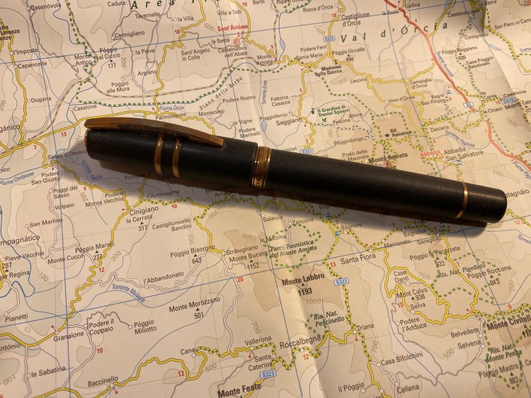
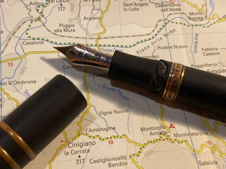
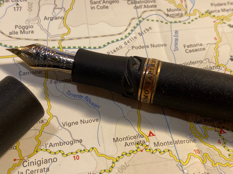
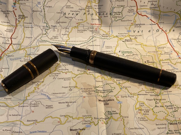
In late 2014 I visited the wonderful Mora Stylos in Paris, France. I was there to buy a pen. A specific pen. One that had made a buzz in the pen world the moment it came out. The Visconti Homo Sapiens:
There are dozens of Visconti Homo Sapiens reviews out there, and so I wasn’t planning on reviewing this pen. Yes, it’s beautiful. Yes, it has a satisfying heft to it, the material feels amazing to the touch, the nib has some delightful springiness to it, and did I mention that it’s a hulking large, beautiful pen?
It’s also a very, very expensive one. It was the most expensive pen I had purchased until then, and since then only three other pens in my collection have come close to it in price (my Nakaya, my Henry Simpole Silver Overlay Conway Stewart, and my Oldwin).
I remember spending a lot of time in that store, holding the pen (it’s large and I have tiny hands), trying out the nib (I bought an Extra Fine. Today I would have gone for something broader), debating the price of pen.
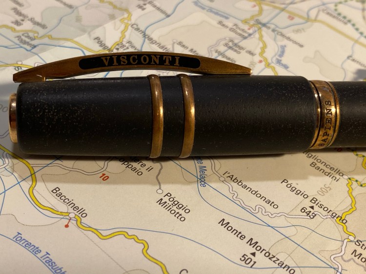
Look at that patina!
In the end I liked the aesthetics, the nib, the unique filling mechanism, and the story around the pen enough to buy it. As I bought it from Mora Stylos, it was customized with my initials on the finial. This made the pen even more special and precious to me.
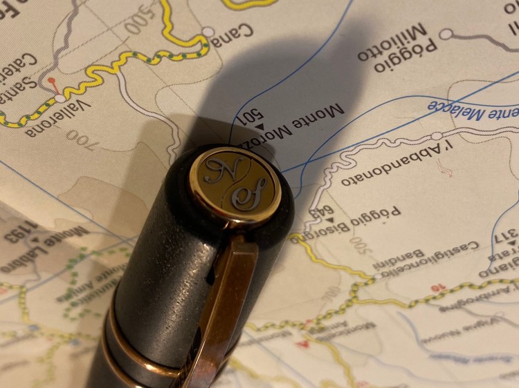
The finial can be customized by dealers, using a special magnetic mechanism.
I got home and I couldn’t get enough out of just looking at this pen, this piece of art that looked like it belonged in a museum.
Just look at the nib and the clever closing mechanism.
Who would want to sully this with ink, right? I could accidentally drop it or something.
A closer look at the scrolling on the nib and the patina on the band.
But I forced myself to fill it and try using it, if only at my desk at home. I loved writing with it. It’s truly a joyous pen to write with, especially if you have a light touch. The nib is something else, comparable to my Nakaya in terms of feel.
But then I had to clean it out. And that was an absolute nightmare that took ages and ages. The filling mechanism was great to use, but terrible to fully flush out. Who has the time for that, especially for a pen that I daren’t carry with me at all times?
So over the past 5 years I’ve used my Visconti Homo Sapiens a grand total of three (!) times. It stands to reason I should sell it and let someone else enjoy it. Yet I can’t bring myself to do that. Why?
You see, I’ve grown lazy in my fountain pen use over the years, and this pen was one of the turning points. Fountain pens require effort. They have always had. That’s why people moved to ballpoints the moment they were a semi viable substitution. Fountain pens can be messy. They need filling and cleaning, and care during use and storage and while cleaning them out. You don’t use them for convenience, you use them because they bring you joy.
I’ve lost touch of that, just as I’ve lost touch with the joy of playing around with various inks. My pen usage has fallen into a rut of mostly easy to clean inexpensive cartridge-converters or TWSBI pens filled with easy to clean inks.
Diamine Denim, which I haven’t used in more than two years and used to be one of my favourite inks. Still is.
It has taken me a while to realize that. As I was building my goals for 2020 the realization that I’ve stopped actually enjoying my pens and ink dawned on me, and I’ve decided to see if I can’t change that.
So I filled my gorgeous Visconti Homo Sapiens, and I actually carried it with me in my bag (the skies haven’t fallen yet and the pen is OK), and I’m thoroughly enjoying using it. And I dusted off my beloved Diamine Denim, one of my favourite blue-black inks and previously one of my favourite inks that has seen absolutely no use over the past two years, and I’m giving it a spin. It’s as richly delightful as it ever was. There’s no sparkle or sheen to it, and not much shading to speak of, and yet I still love it. Diamine Denim is just a very good blue-black ink period.
So, who knows what the future holds, but I hope that this pen that does so much to evoke humanity’s past will get me interested again in my fountain pen future.
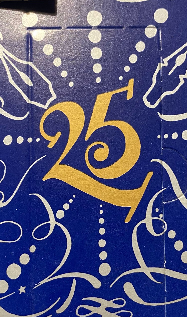
Diamine Inkvent Calendar is an advent calendar with a tiny (7ml) bottle of ink behind 24 windows, and a larger, 30ml, bottle of ink behind the 25th window. All the inks are limited edition, and only available through this calendar. You can read more about the calendar here.
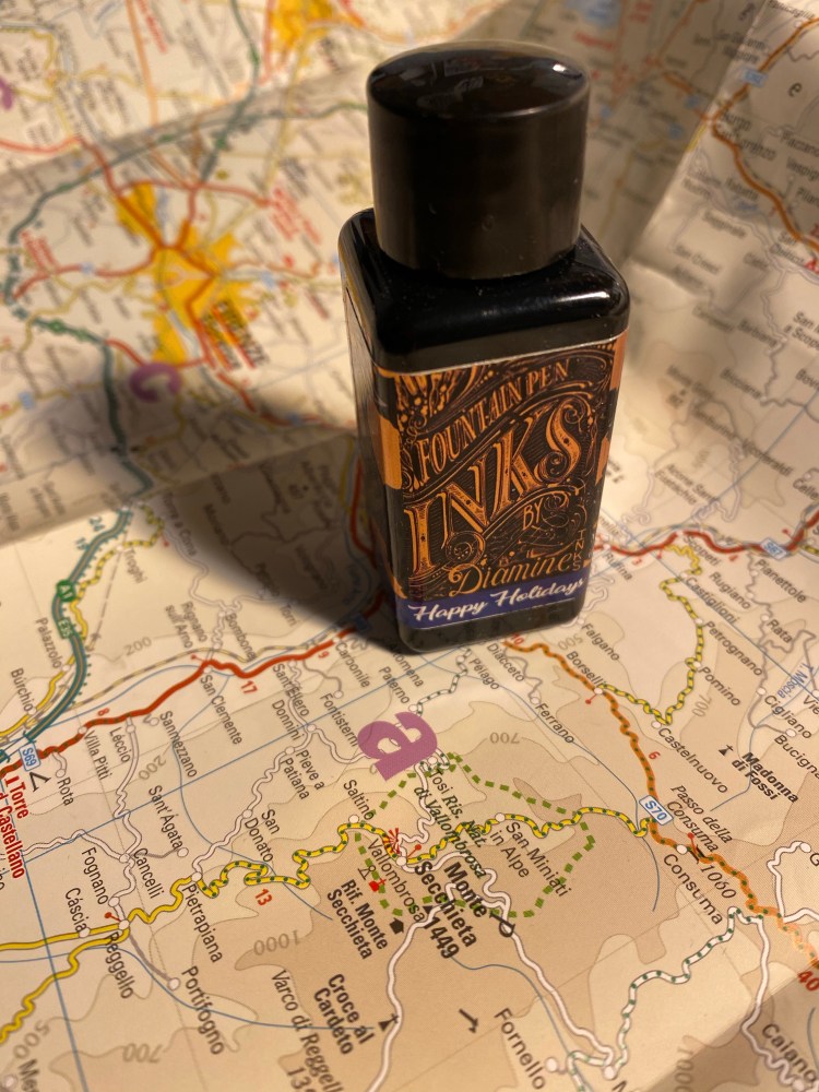
It’s the final day of the Diamine Inkvent calendar, and there’s a full 30ml bottle of ink behind today’s door. I guessed that today’s ink will probably be a shimmer and sheen ink, perhaps in the same shade of blue of the calendar. Then again, from the ink name there was a chance that it would be a green or a red, which I find less useful.
Turns out that my first guess was right. Day 25’s ink is Diamine Happy Holidays, and it’s a sheen and shimmer rich royal blue, just like the Inkvent calendar. The blue they chose is beautiful, dark but not so dark that it becomes black. It shades well, even though it’s saturated, and has a red sheen and light blue glitter in it.
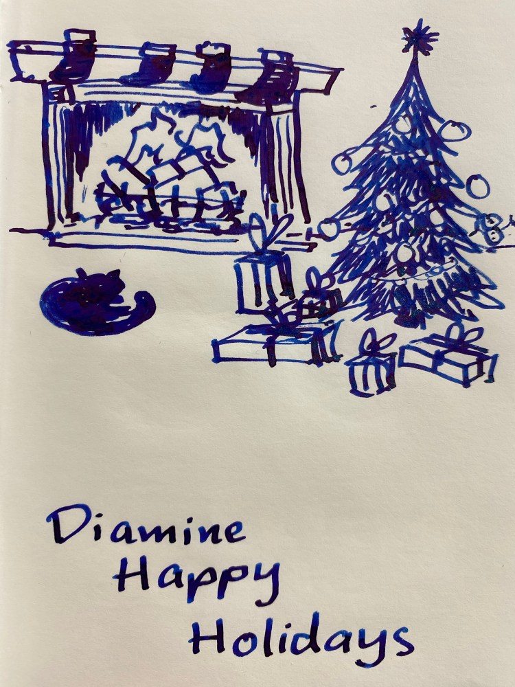
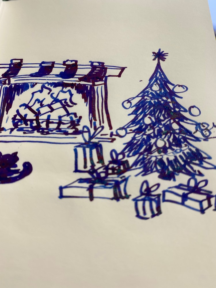
You can see the shading. Where the ink pools there’s sheen, and if you shake the ink well before use (including in the pen) you’ll see a good amount of shimmer. I filled a TWSBI Go 1.1 stub with this ink and on Tomoe river paper this ink shines.
You can see the sheen and shimmer best when you tilt the paper slightly.
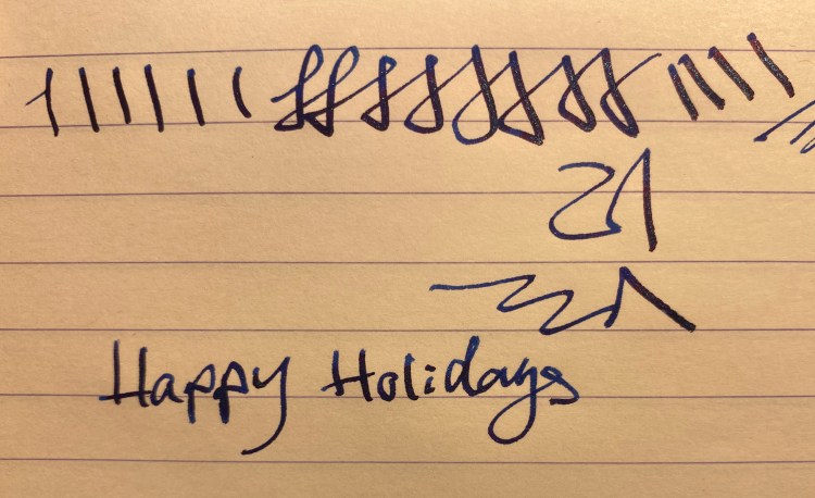
Even on Rhodia paper you can see the shimmer and sheen:
Diamine Happy Holidays is a lovely ink, and I’m glad that I now have a 30ml bottle of it. Is it the most unique colour in the calendar? No, it’s pretty close to the other four dark blues. However, looking over all of the other colours in the calendar, I don’t think that they could have selected a better ink for the last day.
I loved almost all of the inks in the Diamine Inkvent calendar (apart from Diamine Triple Chocolate). The calendar itself is a beautiful and well designed objects, the tiny bottles were charming (some of the labels had minor flaking problems, but who cares), and the sheer amount of unique inks produced for this is astounding. I know that Diamine said that these inks were made only for the calendar, but I would be glad to see some of them re-issued in larger bottles. If Diamine issue another calendar next year I will definitely buy it, probably even if it has the exact same ink colours. The Diamine Inkvent calendar is one of the best stationery products of the year, and certainly one of the most entertaining ones.