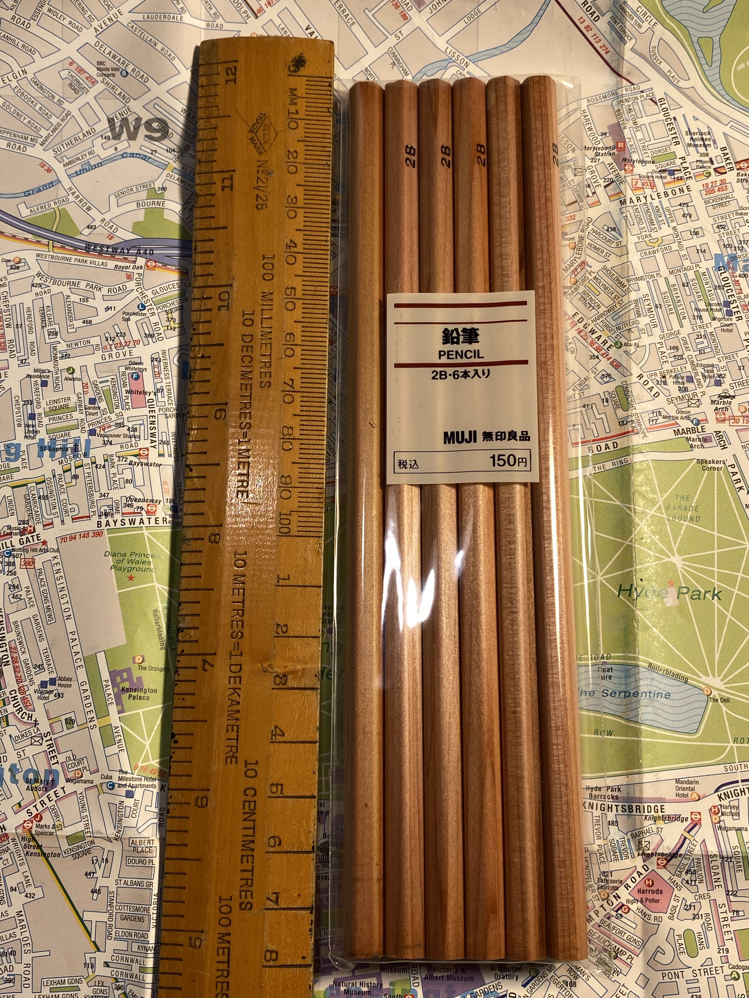
When I was in London last year I picked up a few stationery items from Muji, most of them pencils that I hadn’t seen at Muji’s before. One of these items was a six pack of 2B natural wood-cased pencils. They looked gorgeous, they were very fairly priced, and 2B wood-cased pencils are my go to sketching tool (unless I think that there’s a chance that I may want to watercolour over the sketch, in which case it’s H for the win). If you have any interest in sketching, the 2B pencil is your best friend.
For some reason I decided to photograph these next to a vintage wooden ruler. They’re standard pencil sized.
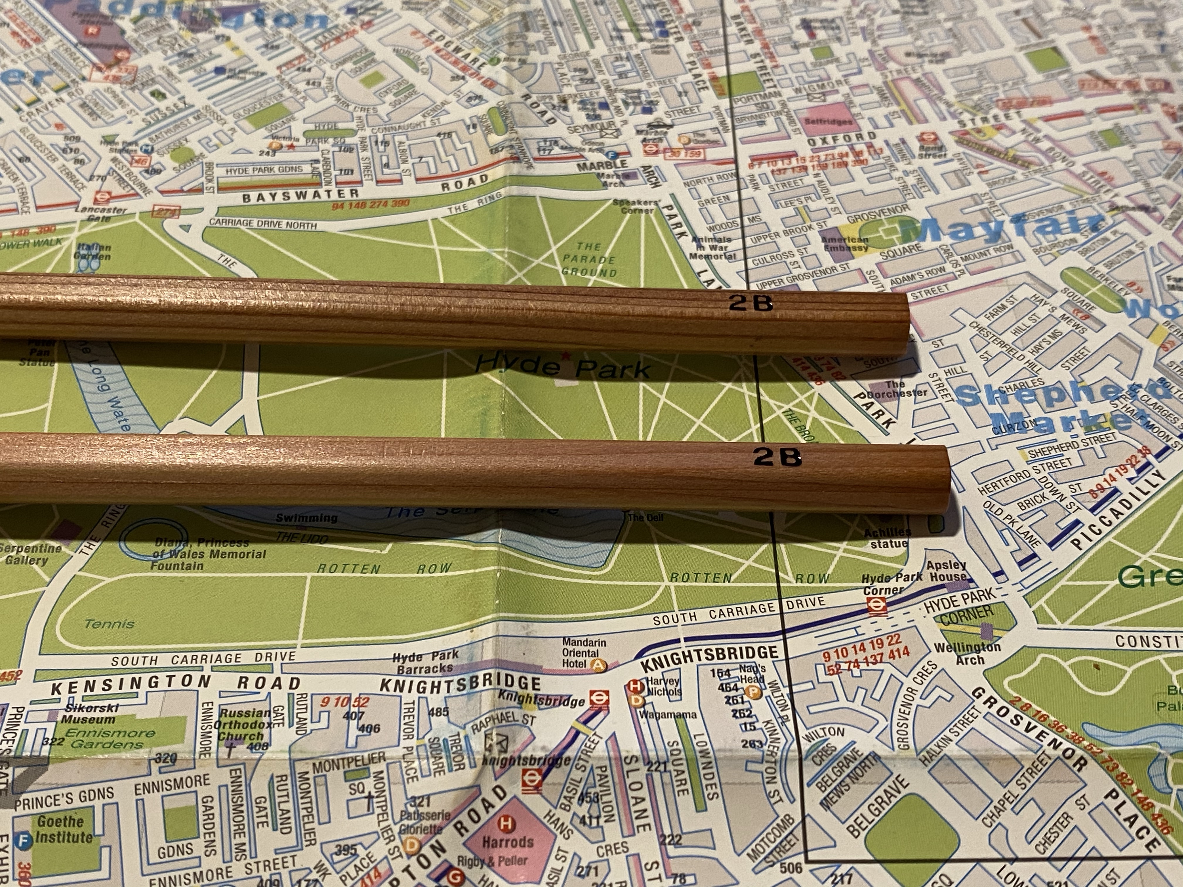
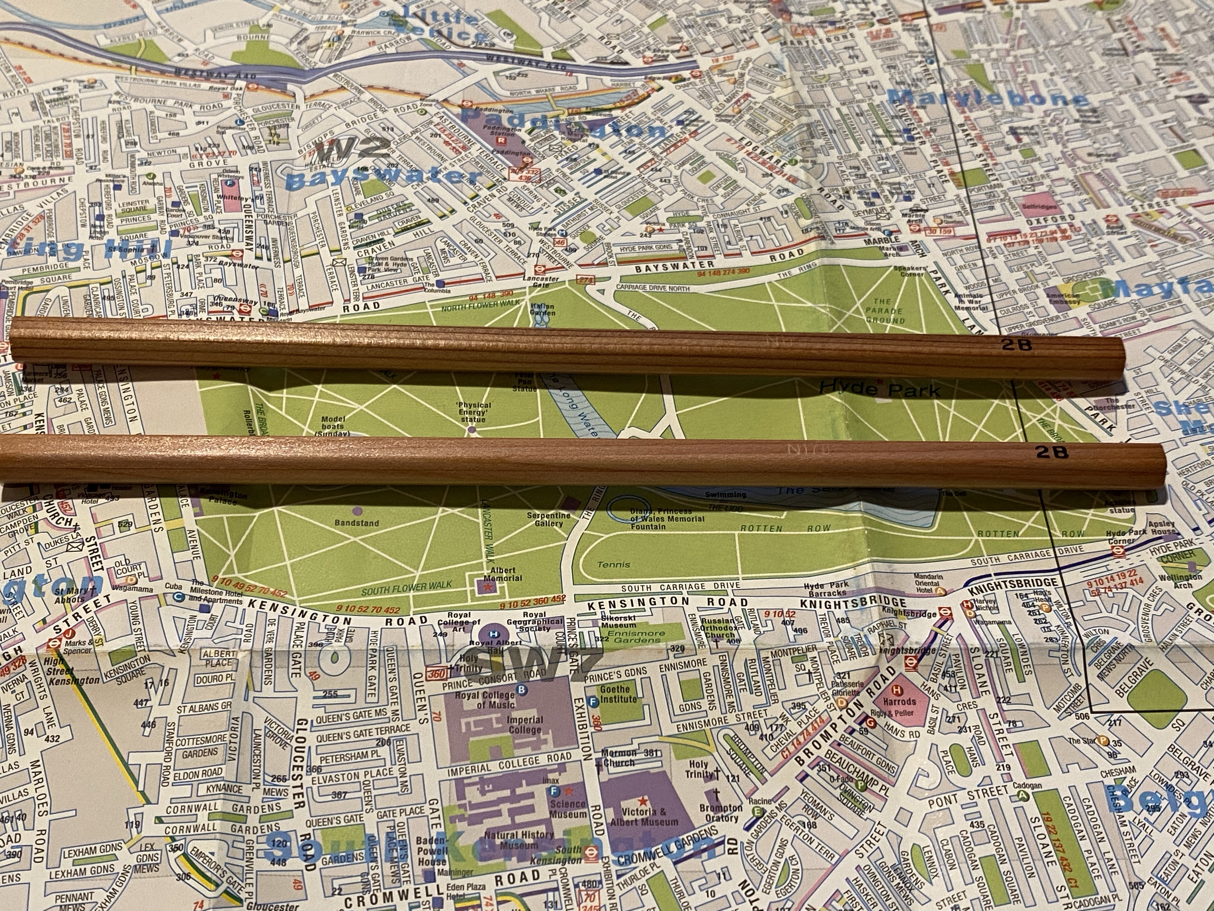
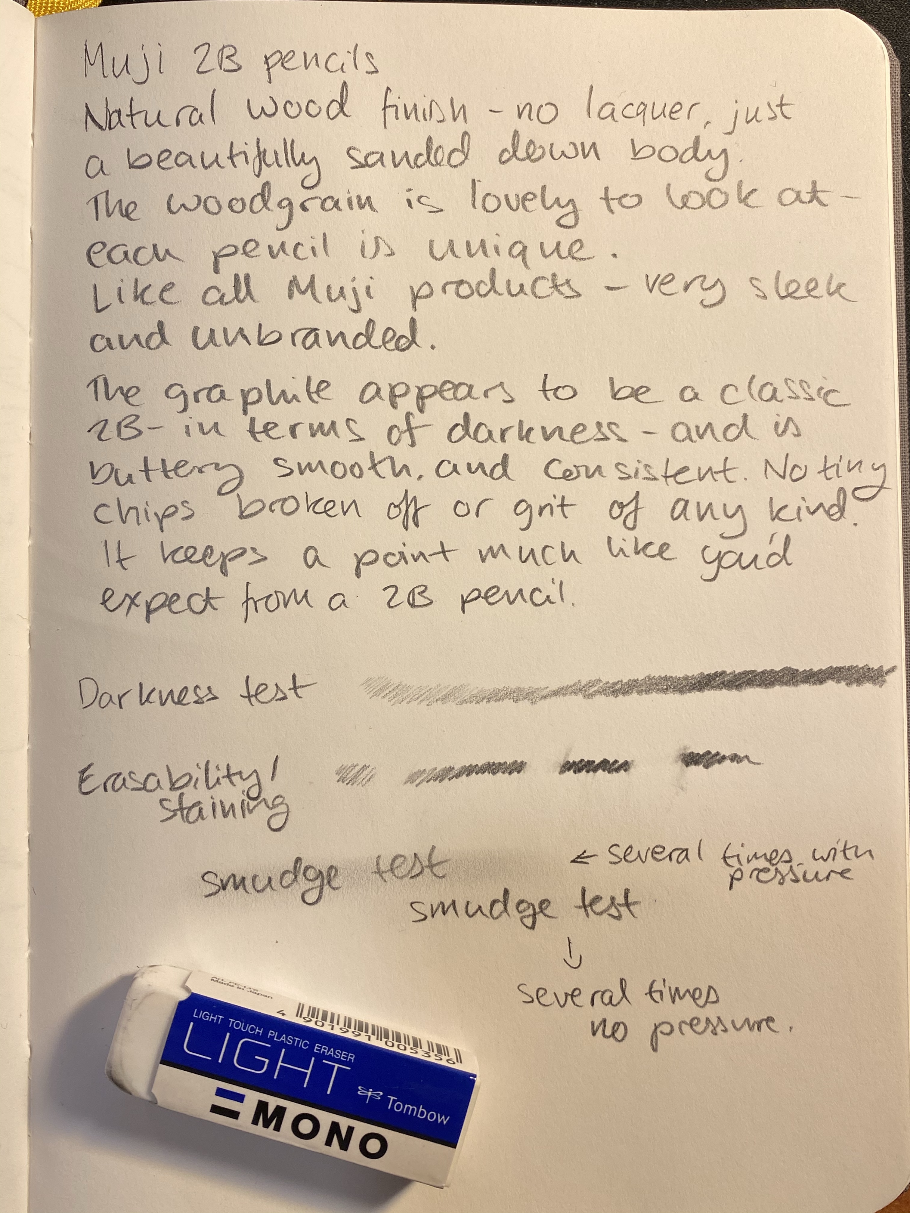
I don’t know what kind of wood the Muji natural wood-cased pencils are made of, but whatever it is it has a beautiful grain, it sharpens very well, and it smells lovely (though I doubt that it’s cedar). The pencils aren’t lacquered, but they do have a satiny finish that makes them lovely to hold and use, and like other Muji products, they have no logo on them, just the 2B grade boldly stamped in black foil.
Look at that satiny finish and lovely woodgrain.
Because of the natural finish and the woodgrain each pencil is unique and distinct, which is a nice bonus to natural pencils. They have no attached eraser, which is standard for sketching pencils.
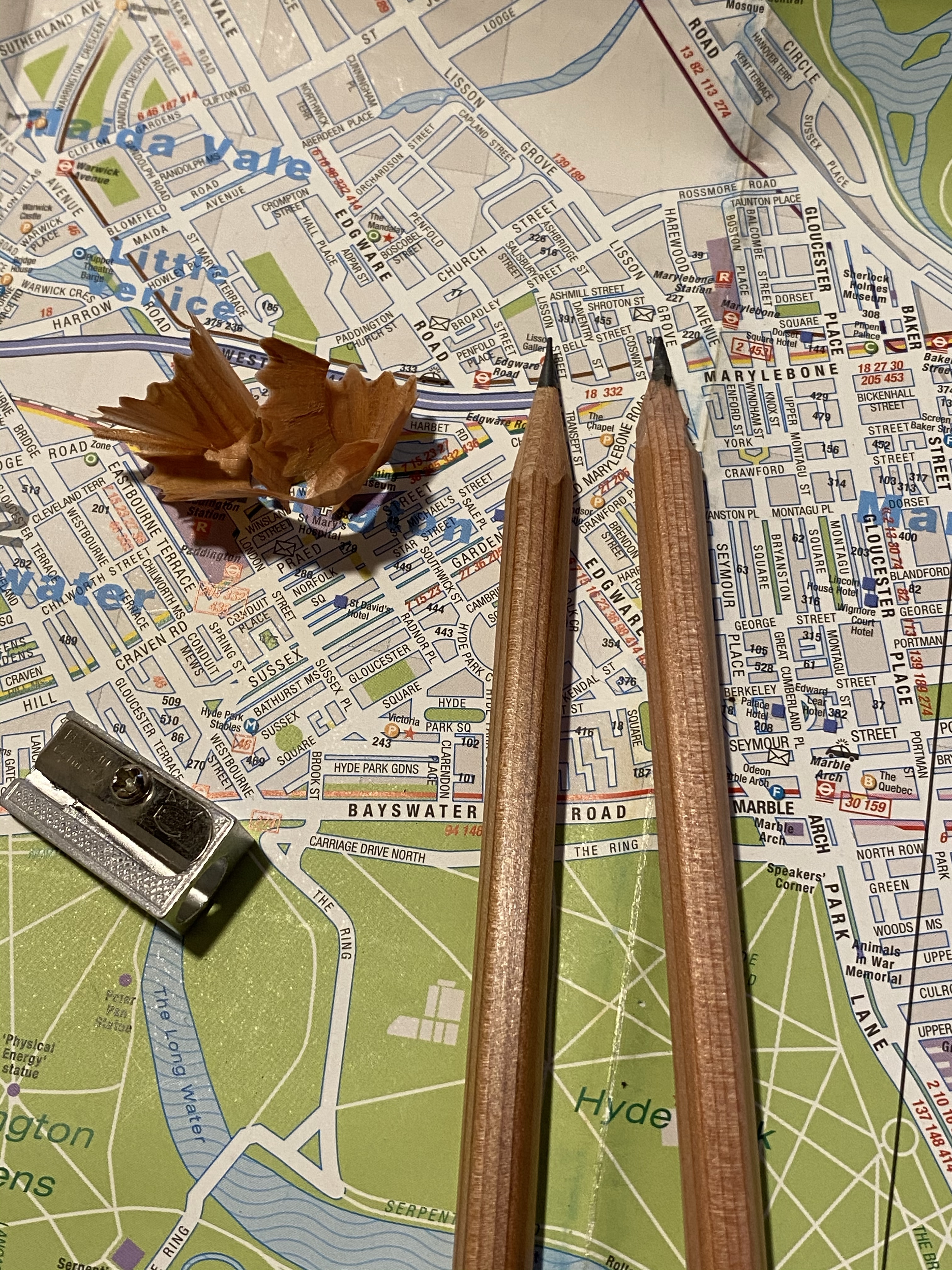
They sharpen really well, whether using a knife or a sharpener. They don’t hold a point for long, but if you’re using them for sketching, you can just use a knife sharpened pencil and rotate the pencil to get much longer use out of it. The graphite doesn’t crumble or break easily, and it’s got a standard 2B darkness and point retention.
Left pencil was sharpened with a sharpener, the right one was sharpened with a knife.
The Muji 2B natural wood-cased pencil writes a smooth, dark line that doesn’t smudge (unless you’re very determined), erases well and has the shading range that I expect from a 2B pencil (this shading range is what makes the 2B pencil the “goldilocks” sketching pencil grade). These are totally going into my sketching kit, and if I ever get a chance I’ll be buying at least another six pack again. I “chew” through 2B pencils at a terrifying rate, so these will come in handy. They are an absolute joy to use.
Written on a Baron Fig Confidant, erased with a Tombow Mono Light plastic eraser.
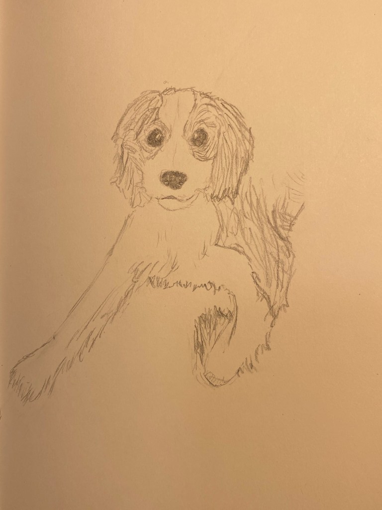
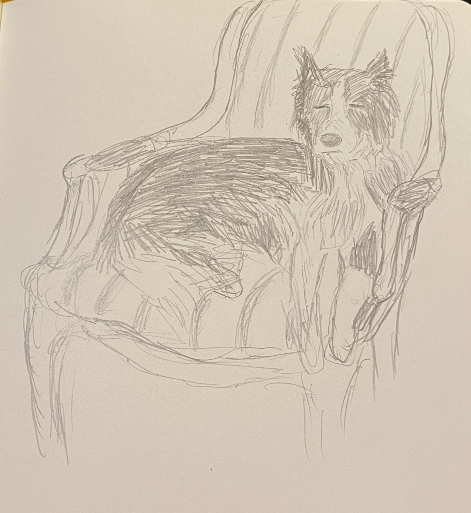
Yesterday was International Dog Day and so I decided to draw my friend’s rescue puppy. Nobody wanted this fellow because he’s blind in one eye, and it’s their loss because he’s a delightful scamp and a 14/10 dog. I’m so glad that he got a forever home.
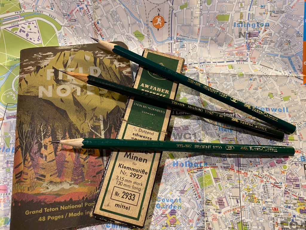
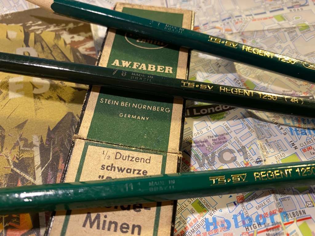
So a few years back I was at the main branch of a local art supply change while they were getting rid of a large amount of inventory by slashing down its prices. I was there to stock up on art supplies, and most of the sale inventory consisted of poorly made knock-off pens and no-name novelty print pencils, so I skipped the sale baskets and made a beeline for the tills. As I was standing in line my eye caught a small basket in the corner of the nearest sale table. It looked like it was full of Faber-Castell 9000 pencils offered at a 10th of the price of a Faber-Castell 9000. I left the line and went to investigate.
Don’t they look like Faber-Castel 9000s?
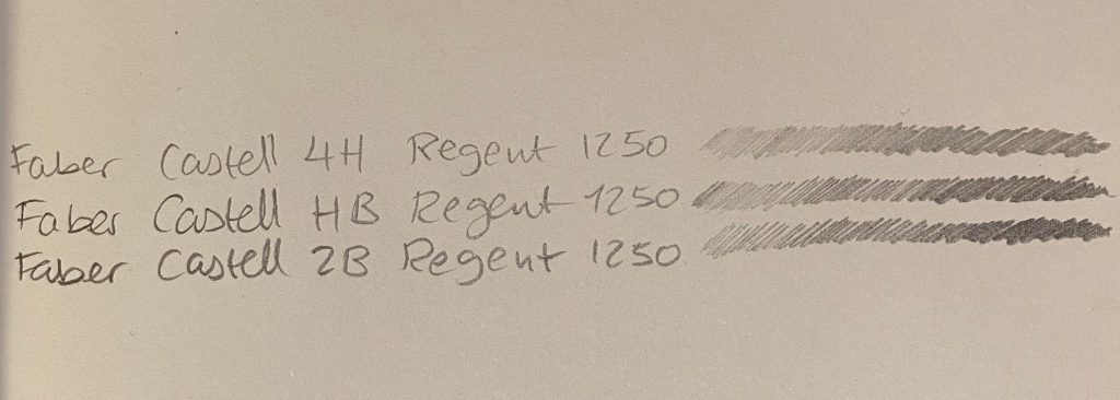
Now my go to pencil for sketching is the Faber-Castell 9000, and although they are excellent pencils, they are not cheap, and I use to go through quite a lot of them. Here I was offered a pencil that looked like a Faber-Castell 9000, was made by Faber-Castell, at a “practically free” price. I couldn’t test them, as they were all unsharpened, but I dug in and grabbed a few of the weird assortment of harnessed on offer: 2B, HB and 4H.
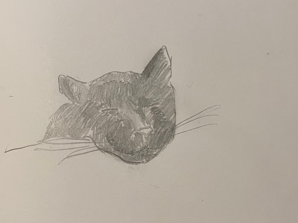
They were Faber-Castell Regent 1250 pencils made in Brazil, and what little I could find about them was people saying that they don’t compare to 9000s. I of course planned to add them into my rotation, which is why I almost immediately lost them. This happens quite often with pencils in my house, since my cat loves to steal them and play with them, so I usually hide the good ones and let him play with ones that I care less about. The result is that when it comes time to looking for a certain pencil I only have a vague idea about the various areas it can be in.
Now that I’ve found them, to the review:
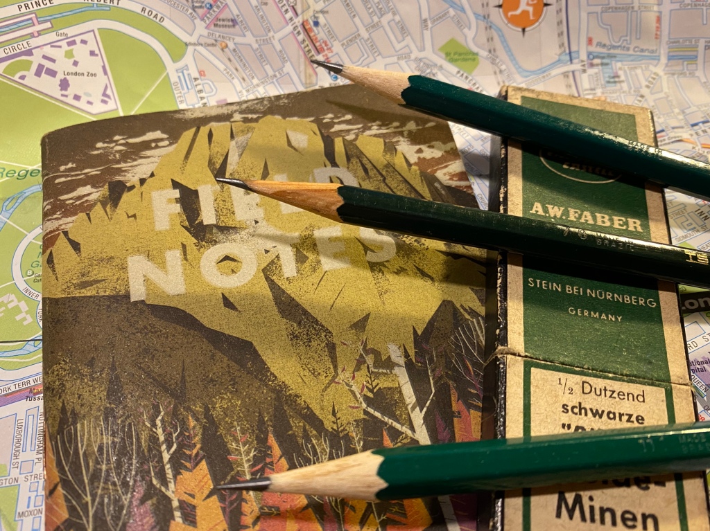
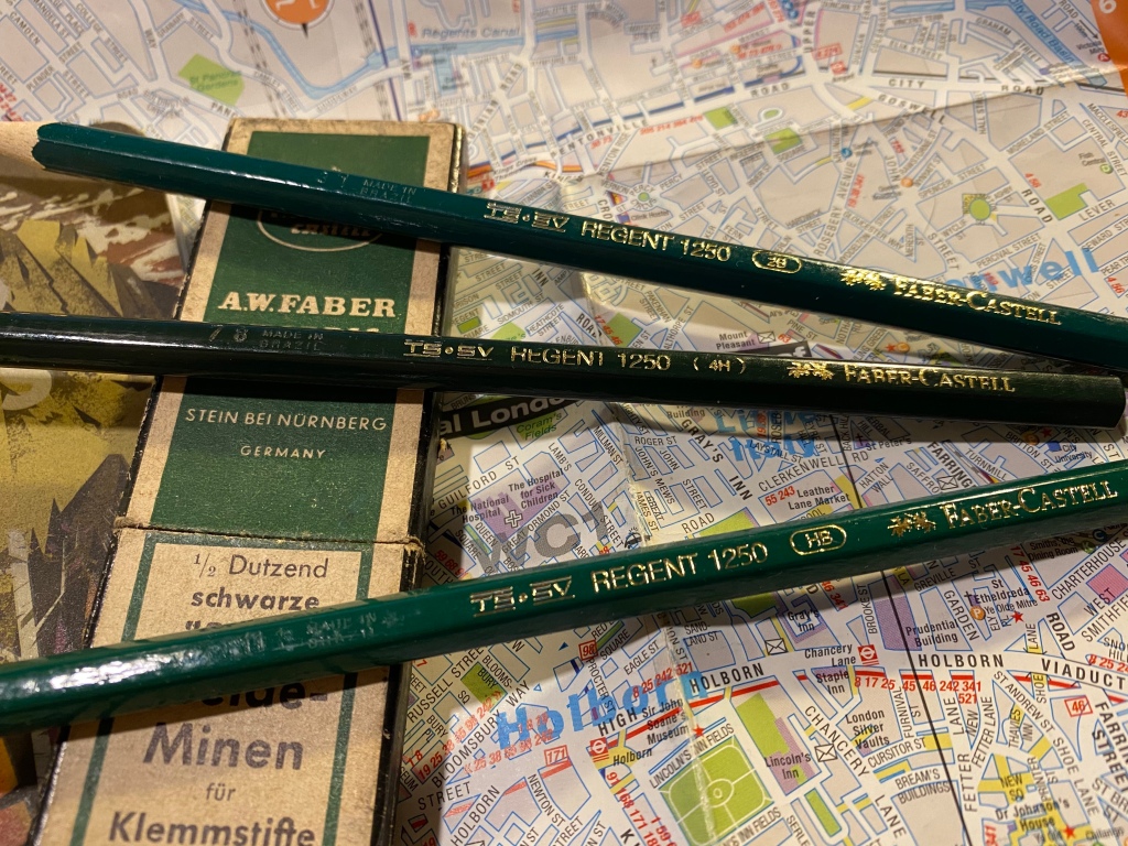
The Faber-Castell Regent 1250 are Brazilian made pencils that look like twins of the Faber-Castell 9000, minus the grey band on the tip. They don’t seem to be widely available outside Brazil, which is both frustrating and understandable. The Regent 1250 poses a risk to the 9000 sales: it’s a much cheaper counterpart that offers graphite performance that’s on par with the 9000. Artists aren’t usually swimming in money, and if FC made the 1250 widely available my guess is that their 9000 sales would take a significant hit.
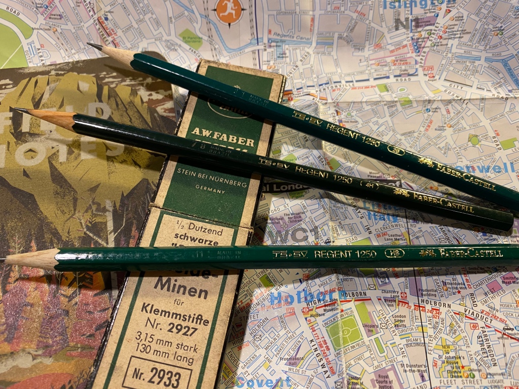
The gold foil branding appears on only one side of the pencil, and the lacquer appears rough, but not to a point where you’d actually feel it in use.
The Regent 1250’s body is where is where it falls short of the 9000, though I sincerely believe that not enough to justify the reviews that it has gotten so far. The 1250 is cheap and offered in Brazil because it’s made of abundant cheap Brazilian wood. The result is a pencil with a woodcase that doesn’t sharpen as nicely or easily as a 9000, and that has a somewhat rougher finish when it comes to the lacquering.
Made in Brazil. The 4H is a darker green and has a different imprint on it, which makes me thing that it was made during a different time period that the 2B and HB.
The wood is not terrible, and it doesn’t chip and break in large chunks. You just have to put a little more elbow grease when sharpening with a sharpener. If you sharpen with a knife you probably won’t feel the difference at all. The lacquer isn’t pretty: you can see pits and bumps in it, though they are not deep enough for you to actually feel them. The wood on the pencil isn’t consistent in its looks or particularly attractive.
The different appearance of the wood between the 4H and the other two pencils leads me to believe that it was made during a different time period.
These pencils only look premium from a distance. Up close they look battered and bruised. However, these are meant to be artist tools not museum pieces, and what’s most important about them is their graphite. Everything else has to be good enough, and so far it’s been good enough.
I doubt that if I saw two sketches, one made with 9000s and one made with 1250s, that I could tell the two apart. The graphite looks and behaves practically the same, both in drawing and erasing.
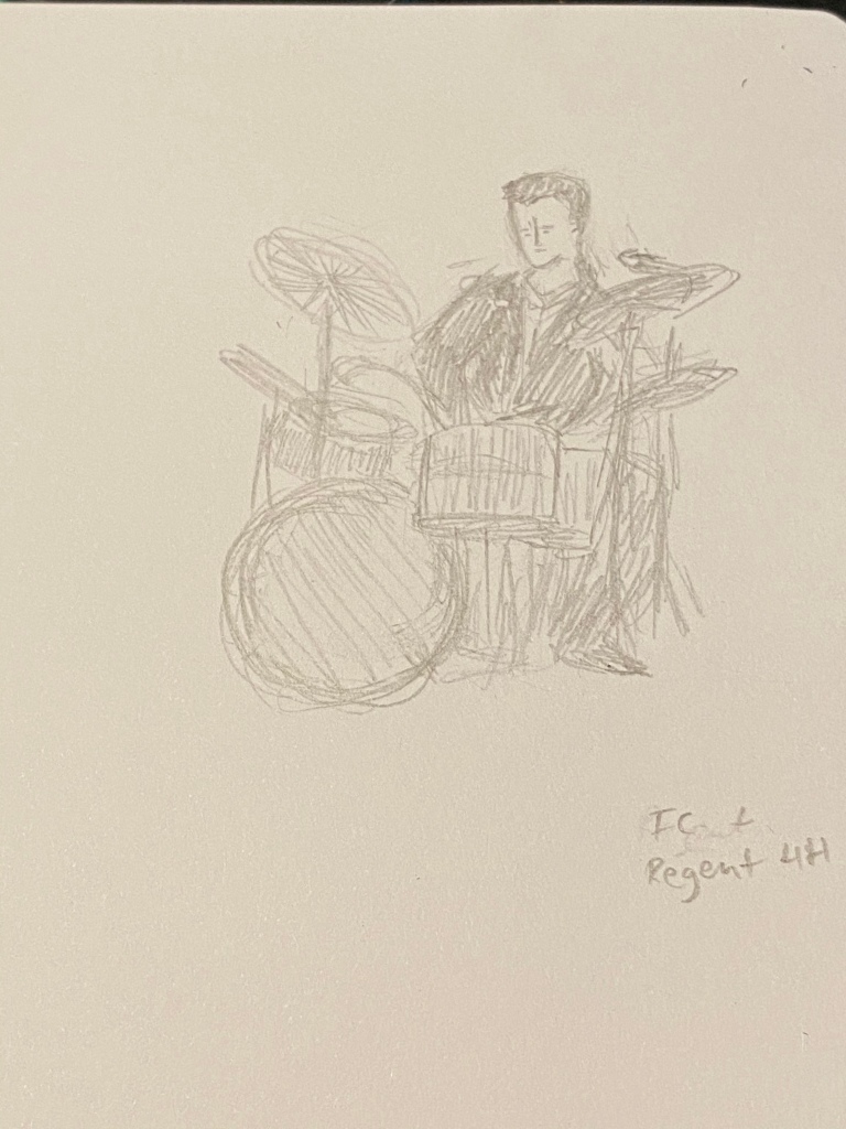
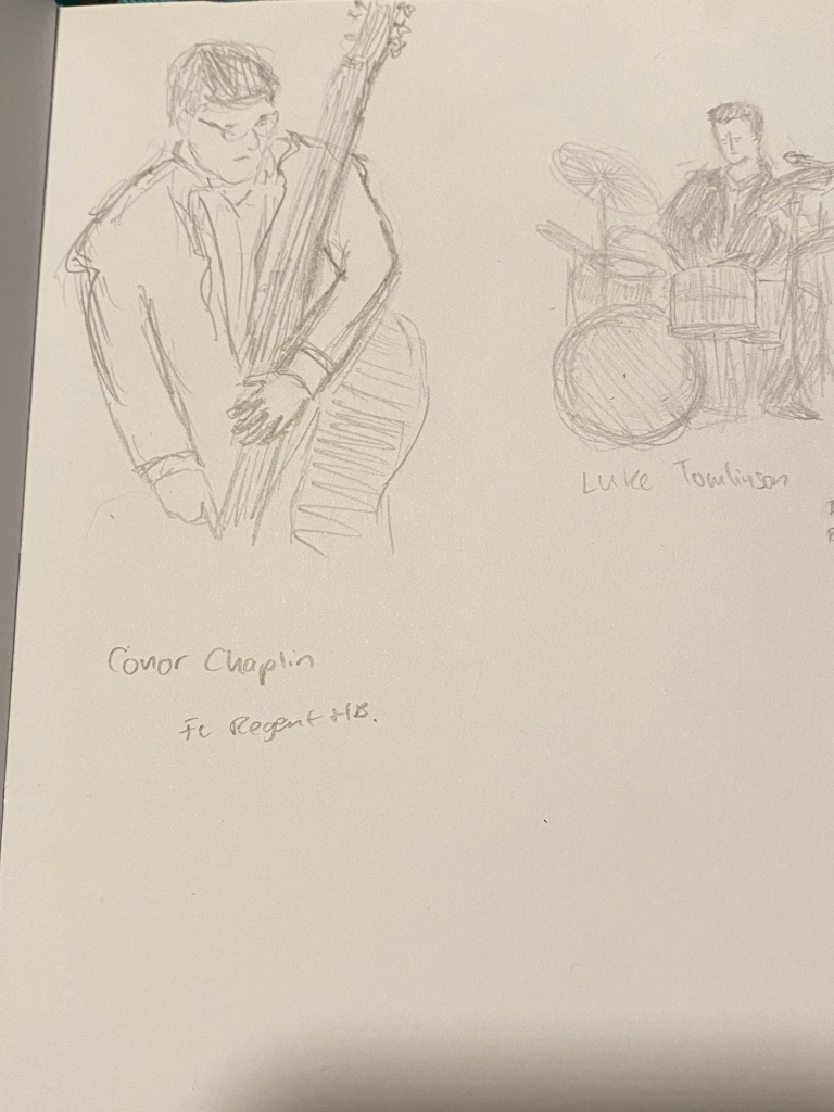
Regent 1250 4H on Baron Fig Confidant
It’s so tempting to look down at these pencils as cheap trash, but look what you can create with them:
Regent 1250 HB at work.
The graphite is smooth, the pencils hold a point for a long, long time, and they’re a joy to use, especially since I don’t have to feel so precious about them.
Regent 1250 2B
If anything I wish I could have purchased a wider range of Regent 1250, but seeing how they work I doubt that FC would ever widely offer them outside Brazil, as they would cannibalize the sales of their 9000.
Regent 1250 HB on a Baron Fig Confidant.
It’s frustrating knowing that a company has the ability to offer a good product for artists at a non-premium price and chooses not to. I understand the market forces at play, but I still find them annoying. And to all those who had a chance to use a 1250 and looked down on it: don’t judge a pencil by its lacquer.
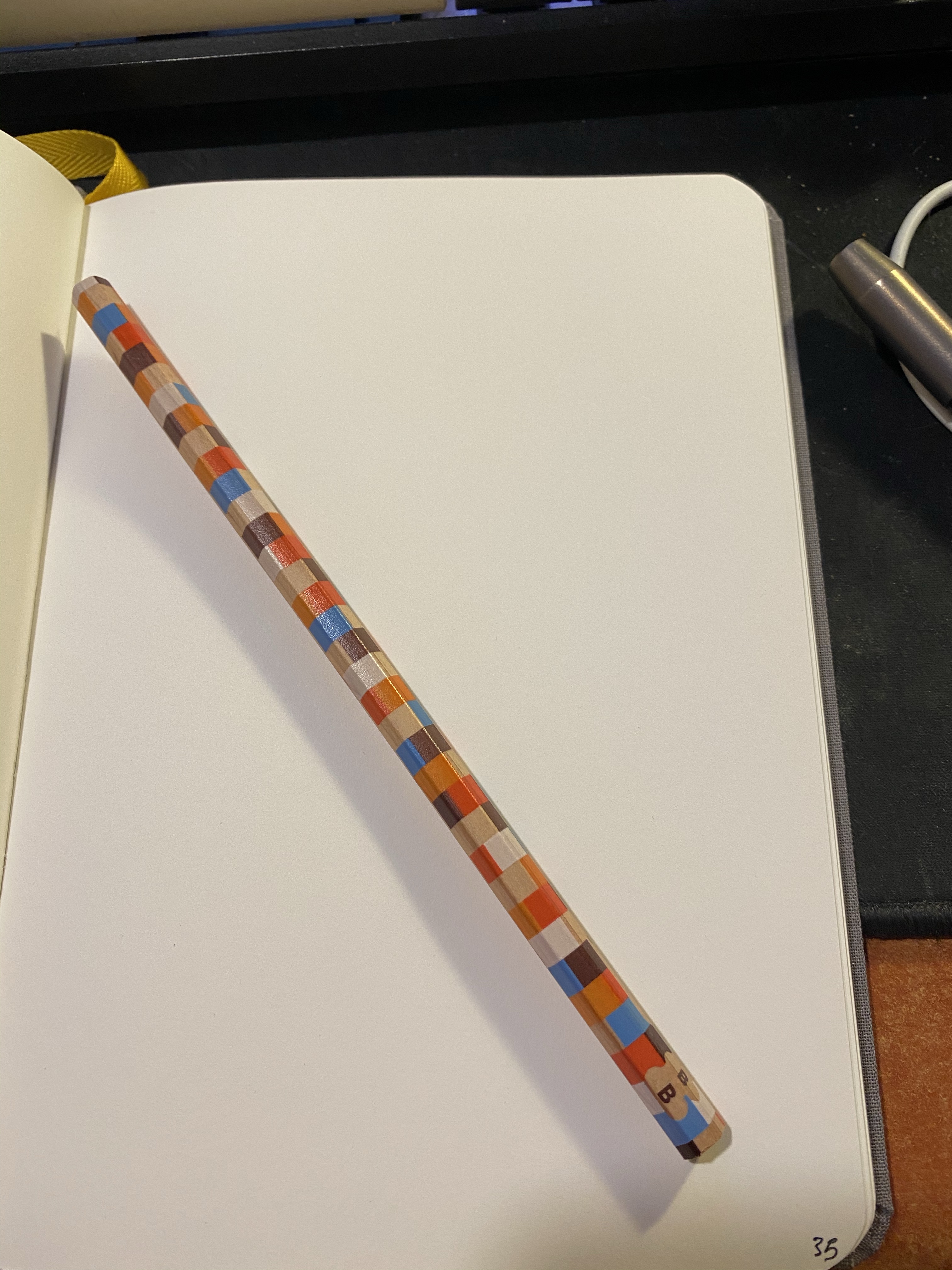
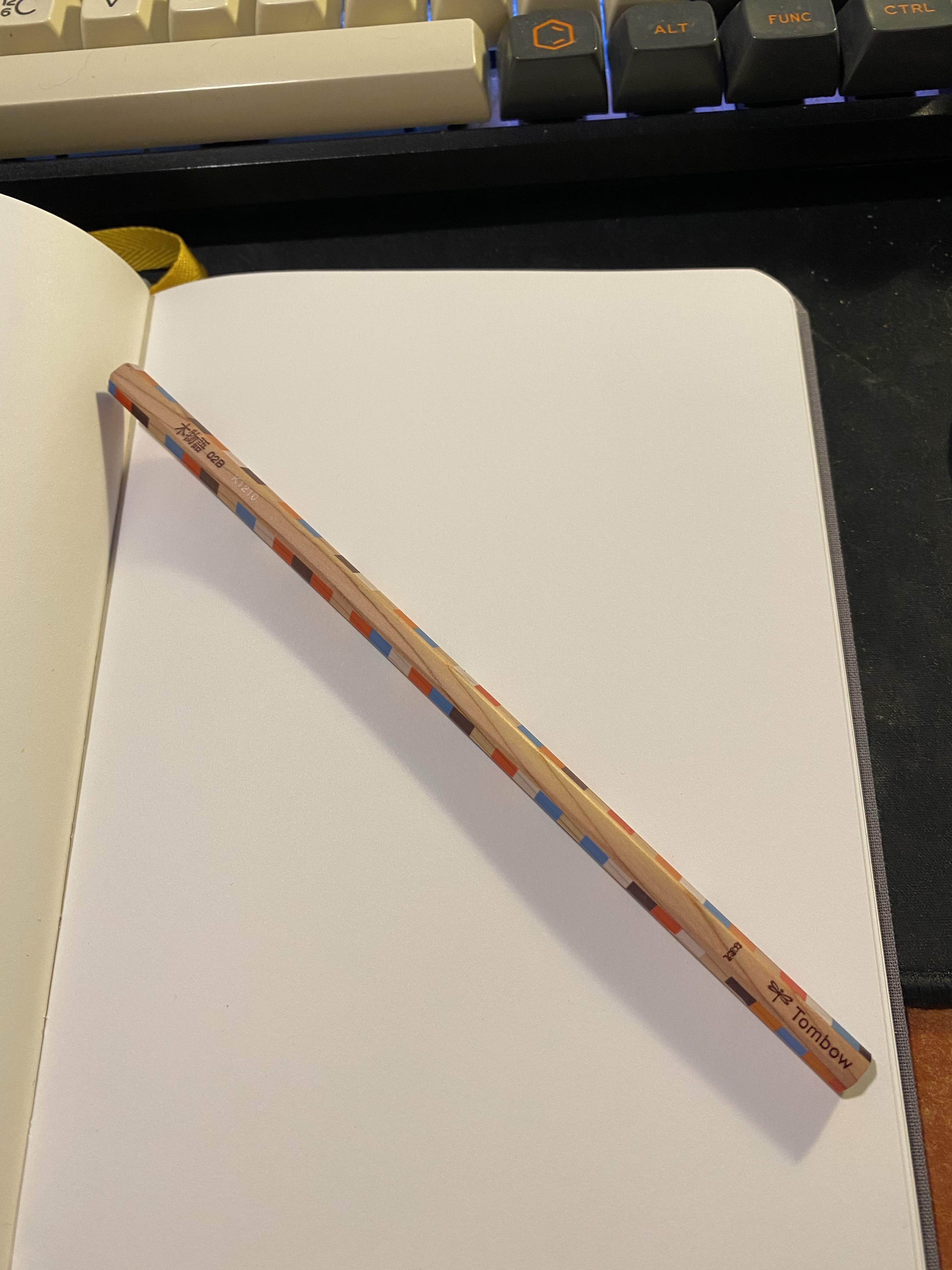
I was searching for a craft knife when I stumbled upon this cool pencil just lying around, being beautiful but of no use to anybody:
I’m pretty sure that I bought it somewhere in London, perhaps in the London Graphic Centre or in stationery section of Foyles, but in any case it isn’t new.
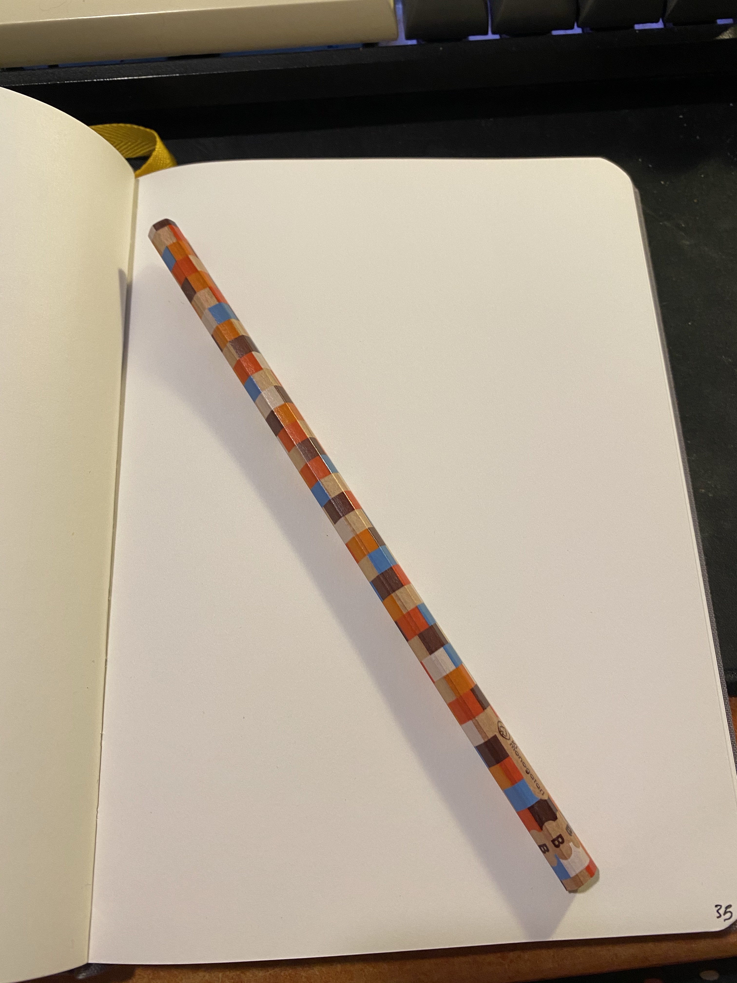
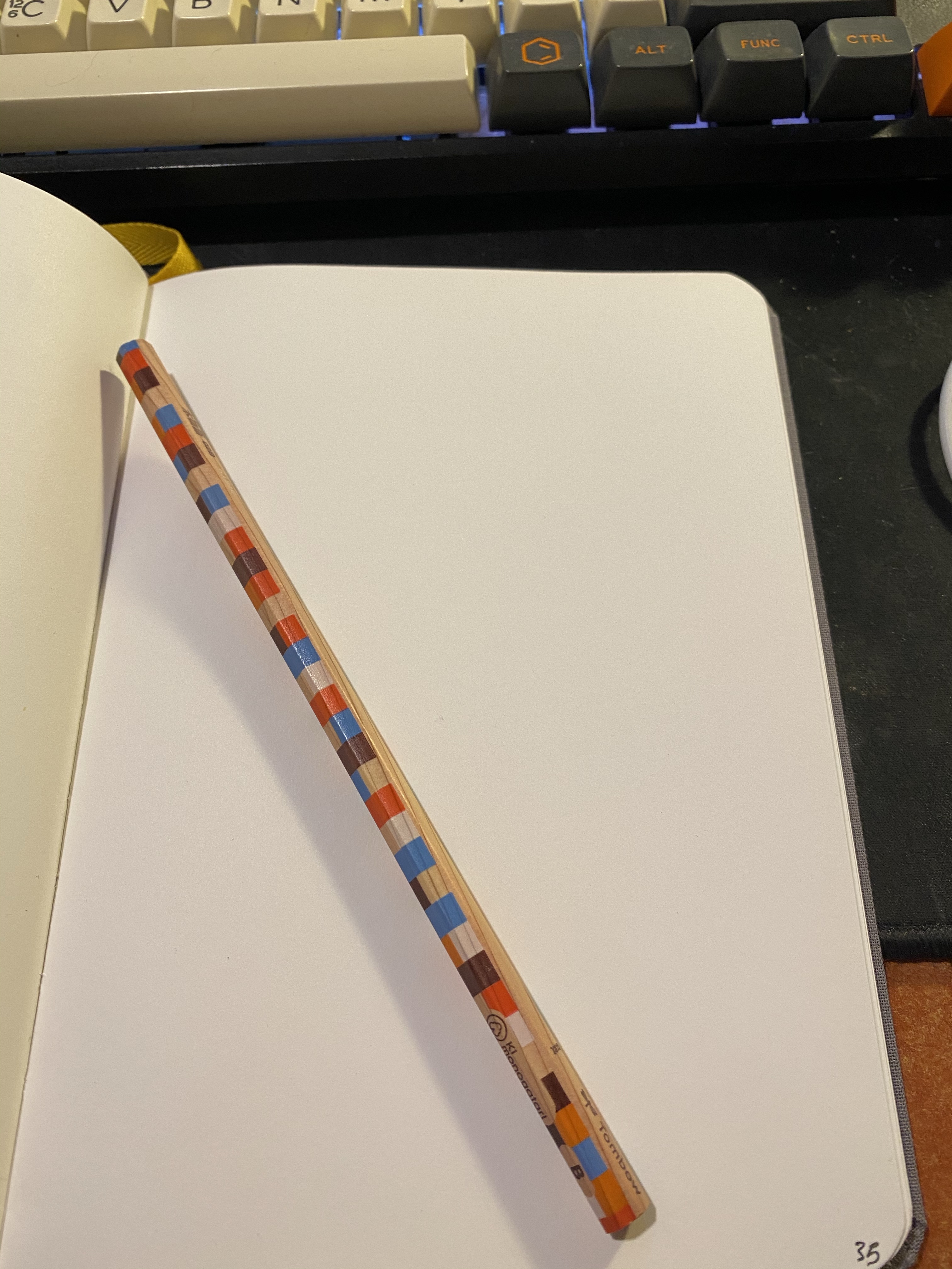
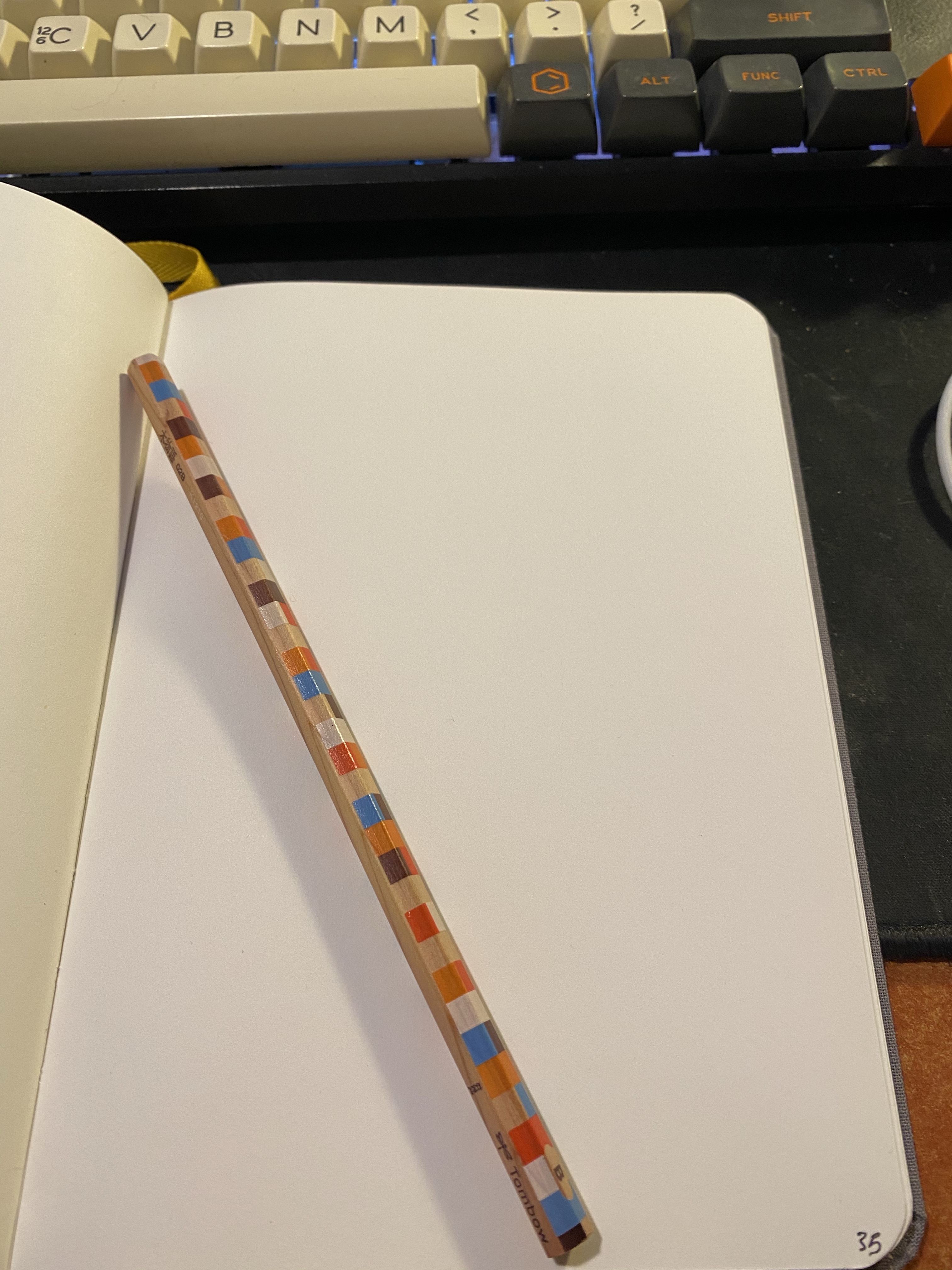
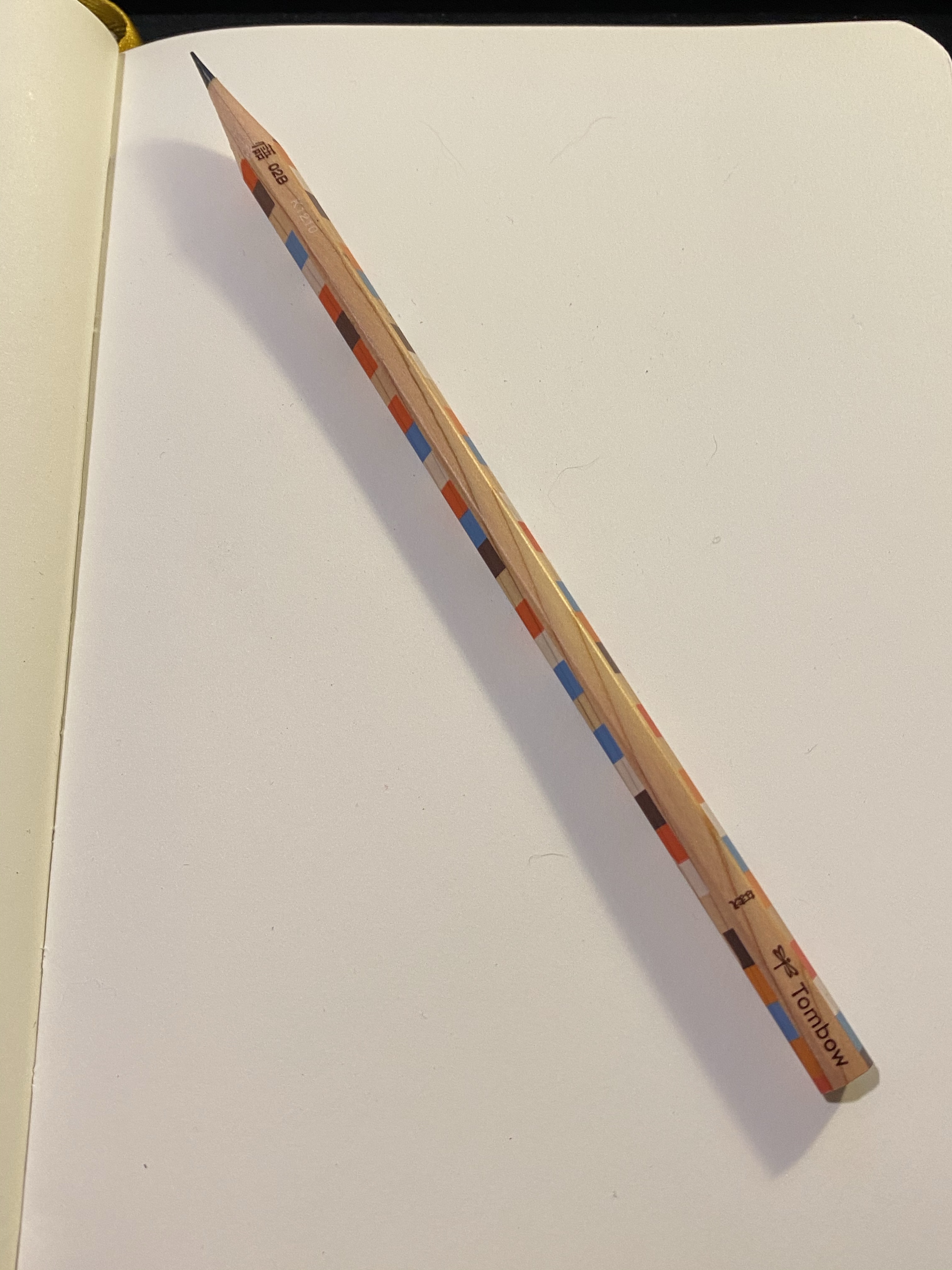
It’s an unlacquered woodcase pencil with a chequered print, a B grade core and it appears to be a Tombow Ki-Monogatari, part of their eco pencil range.
It has a silky smooth finish, and it’s one of the most attractive woodcase pencils I own. The wood is not cedar, but by the way it sharpens and feels it’s high quality stuff.
Tombow has one of the best logos in the business.
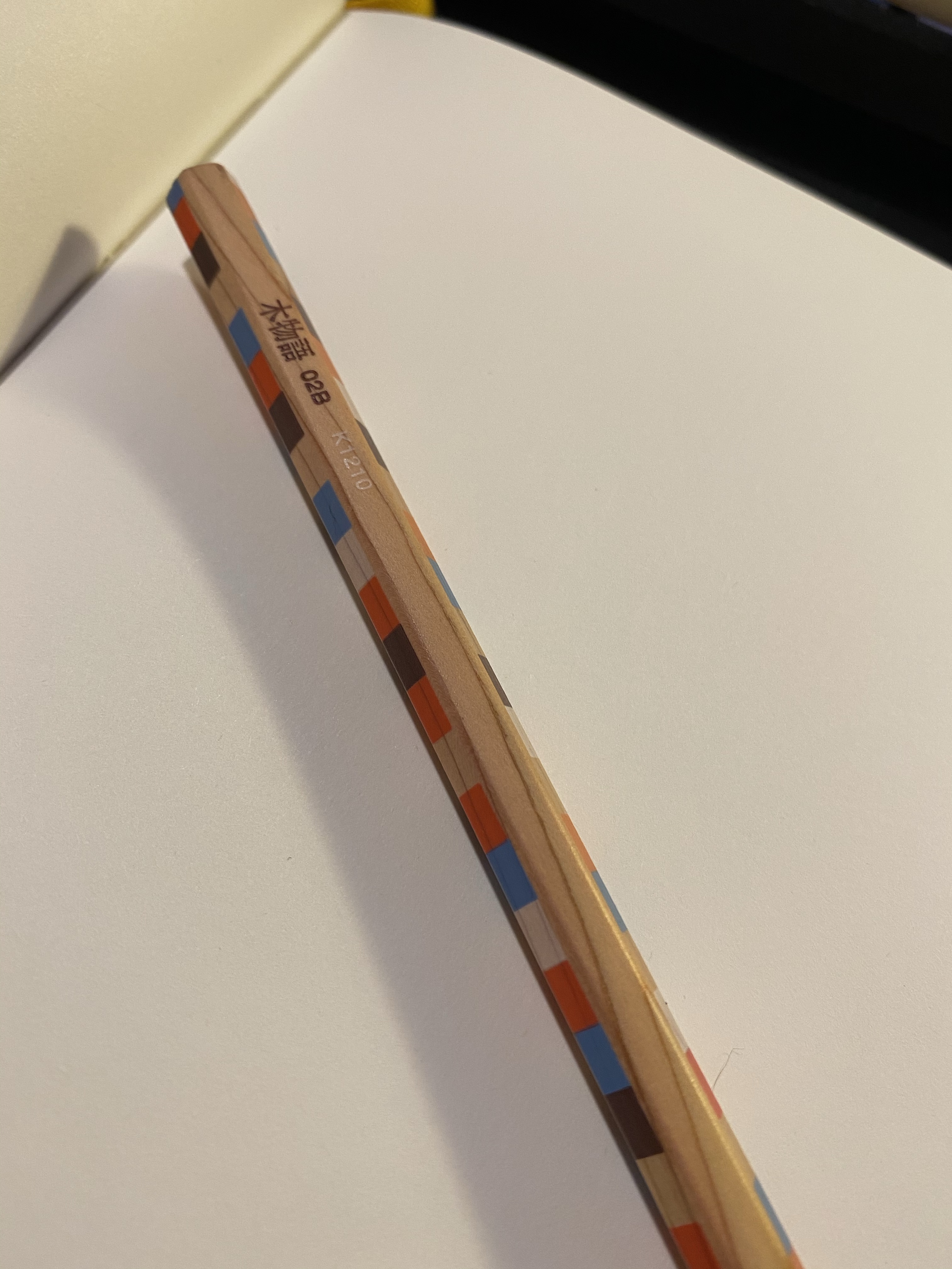
You can see the grain of the wood very nicely here:
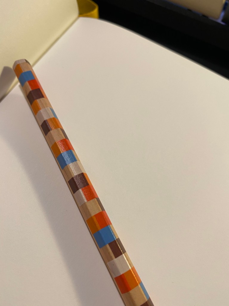
And also come through the chequered pattern:
It sharpens like a dream, with a perfectly centred core and no splinters or chunks falling out. High quality wood, high quality design, so what about the core?
This is a Tombow pencil and one of the things that Tombow do exceedingly well is make woodcase pencils. Drawing with this pencil is a dream – it glides on the page, there’s no “grit” to the core, it offers a good range of shading for a B grade, it doesn’t smudge and it keeps a point really, really well. This is a grade A drawing pencil.
Drawn on a Baron Fig Confidant. You can barely see where I tried to smudge the graphite near the front tire.
I found this pencil by accident, totally forgetting that I ever bought it. I have cool stuff, so why don’t I use it?
I have no idea what the actual model of the pencil is, I’m just guessing that it’s a Ki-Monogatari, which means that this isn’t a “you should buy it” review. It’s a “go open you stationery drawer(s) and see what cool stuff you find there” post. Treat yourself to the stuff you already own.
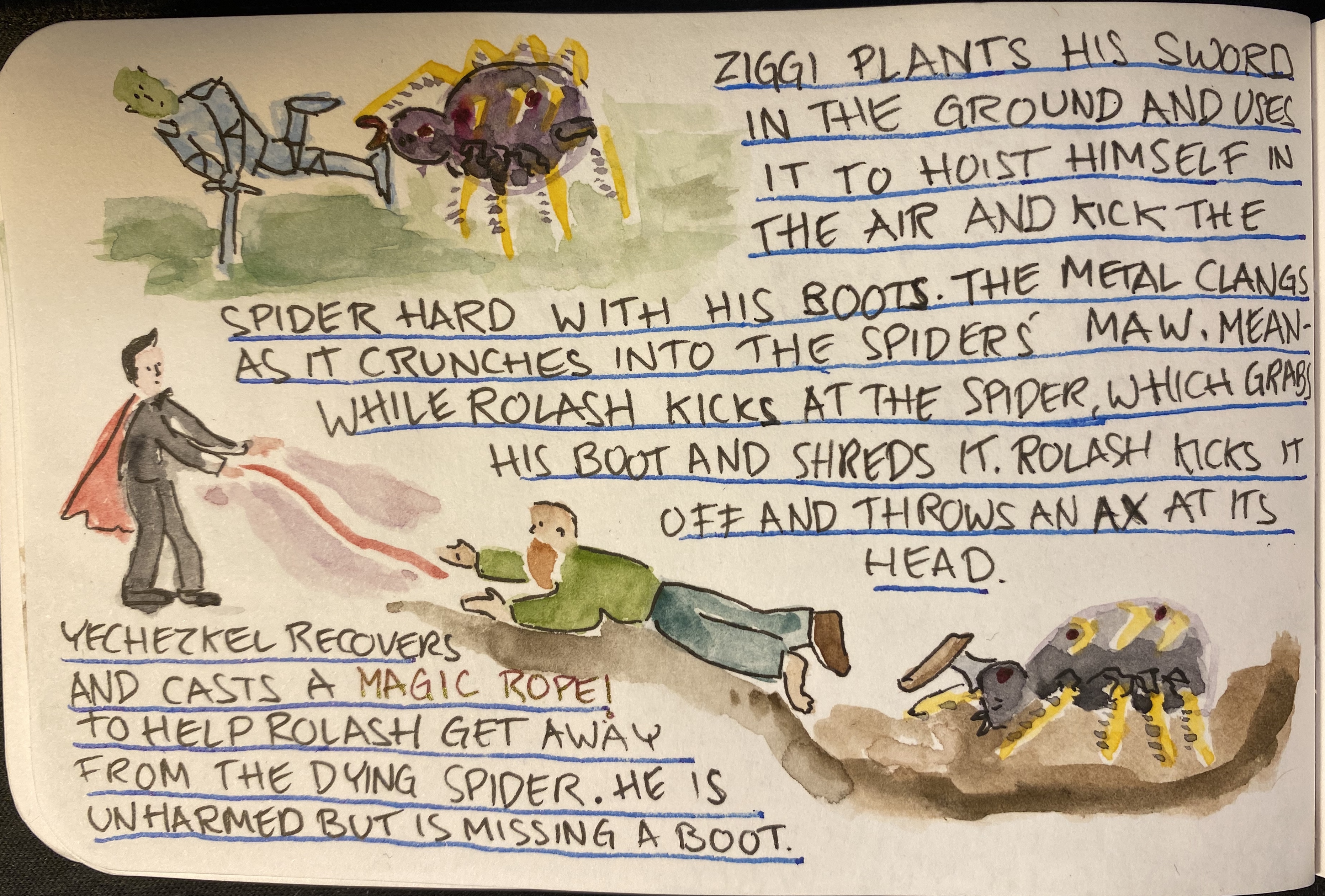
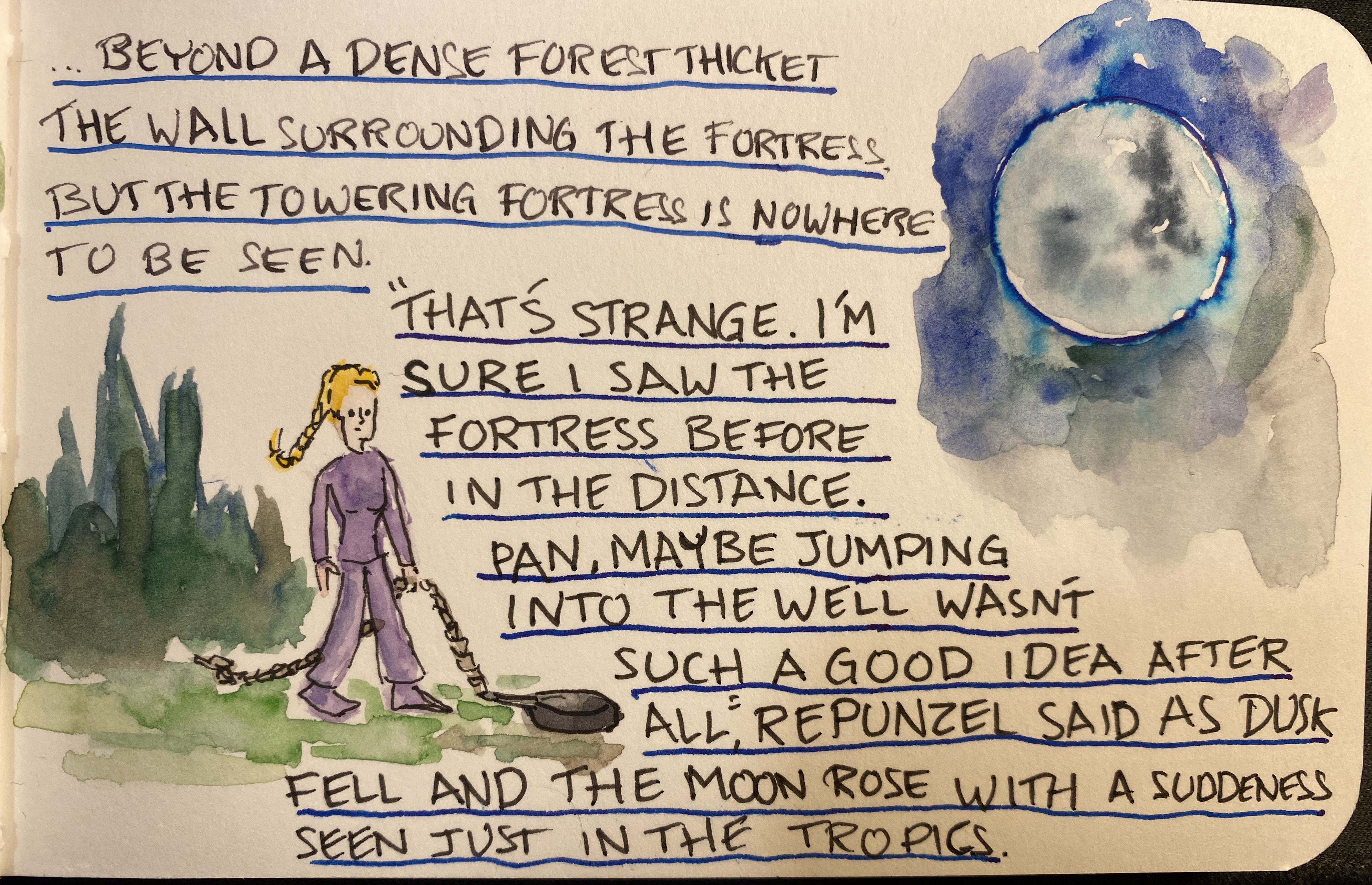
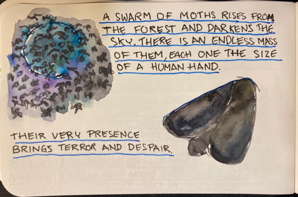
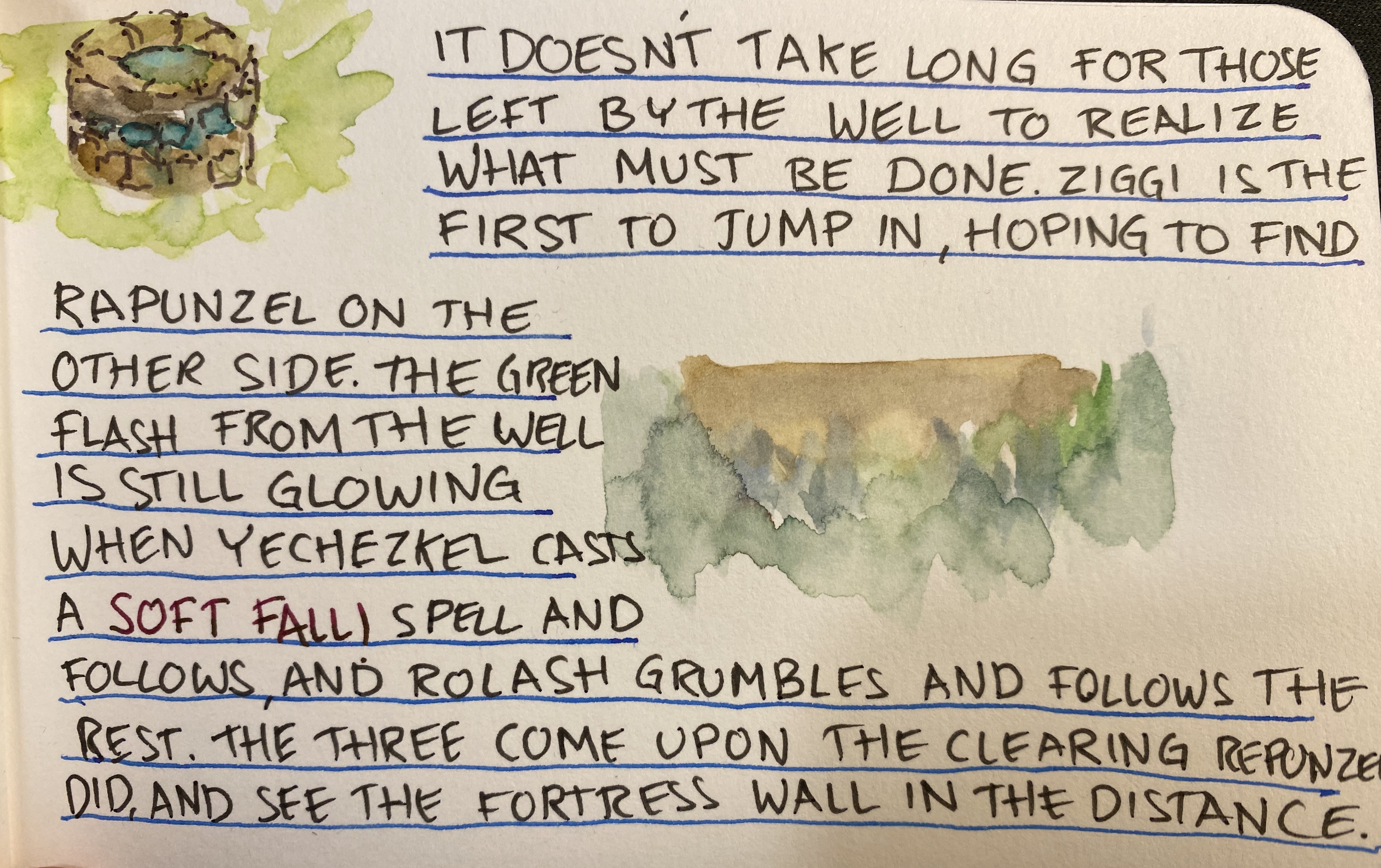
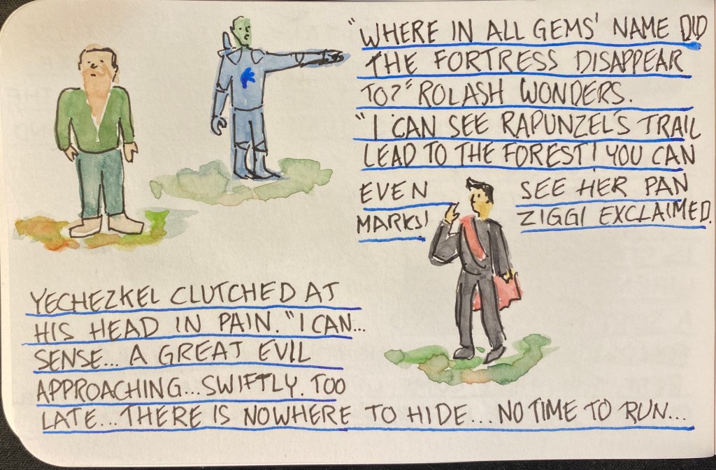
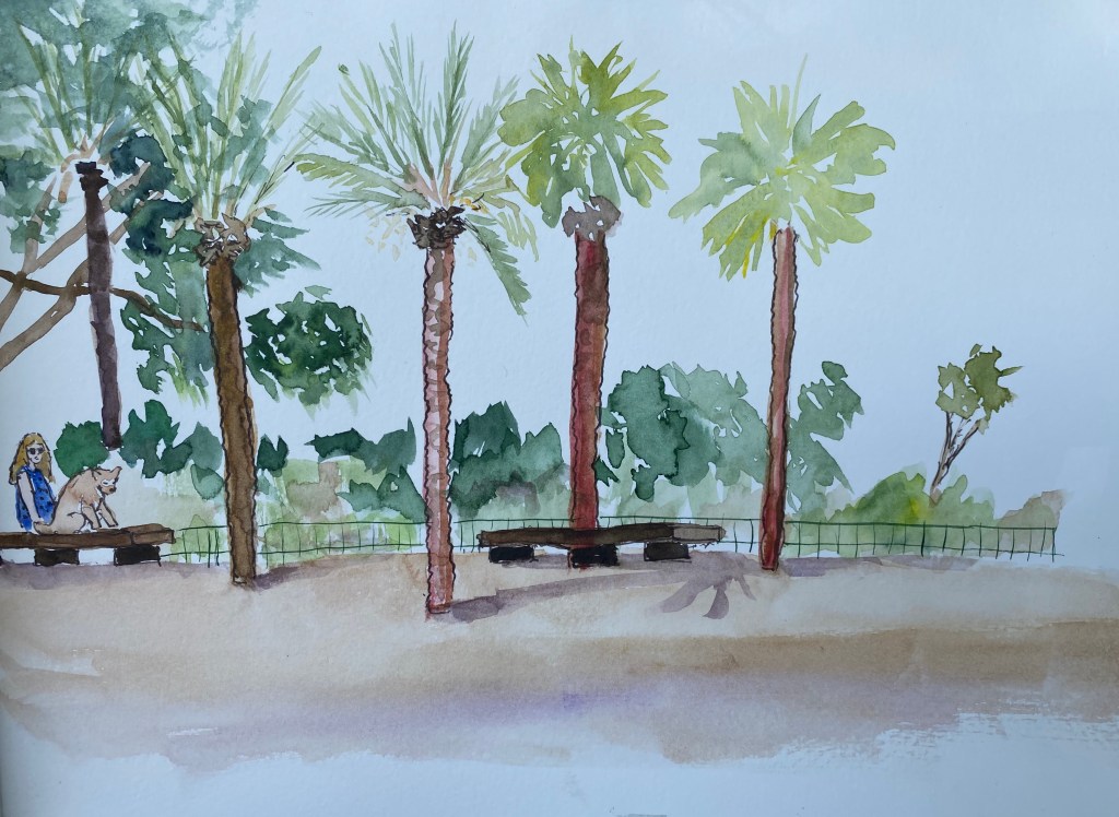
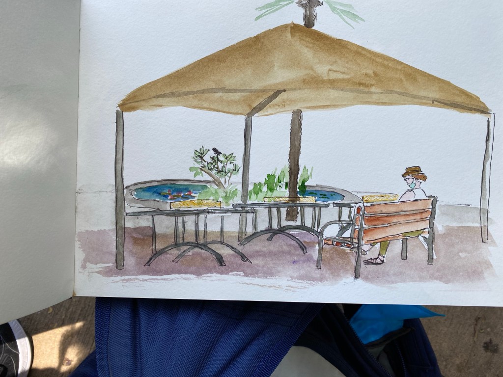
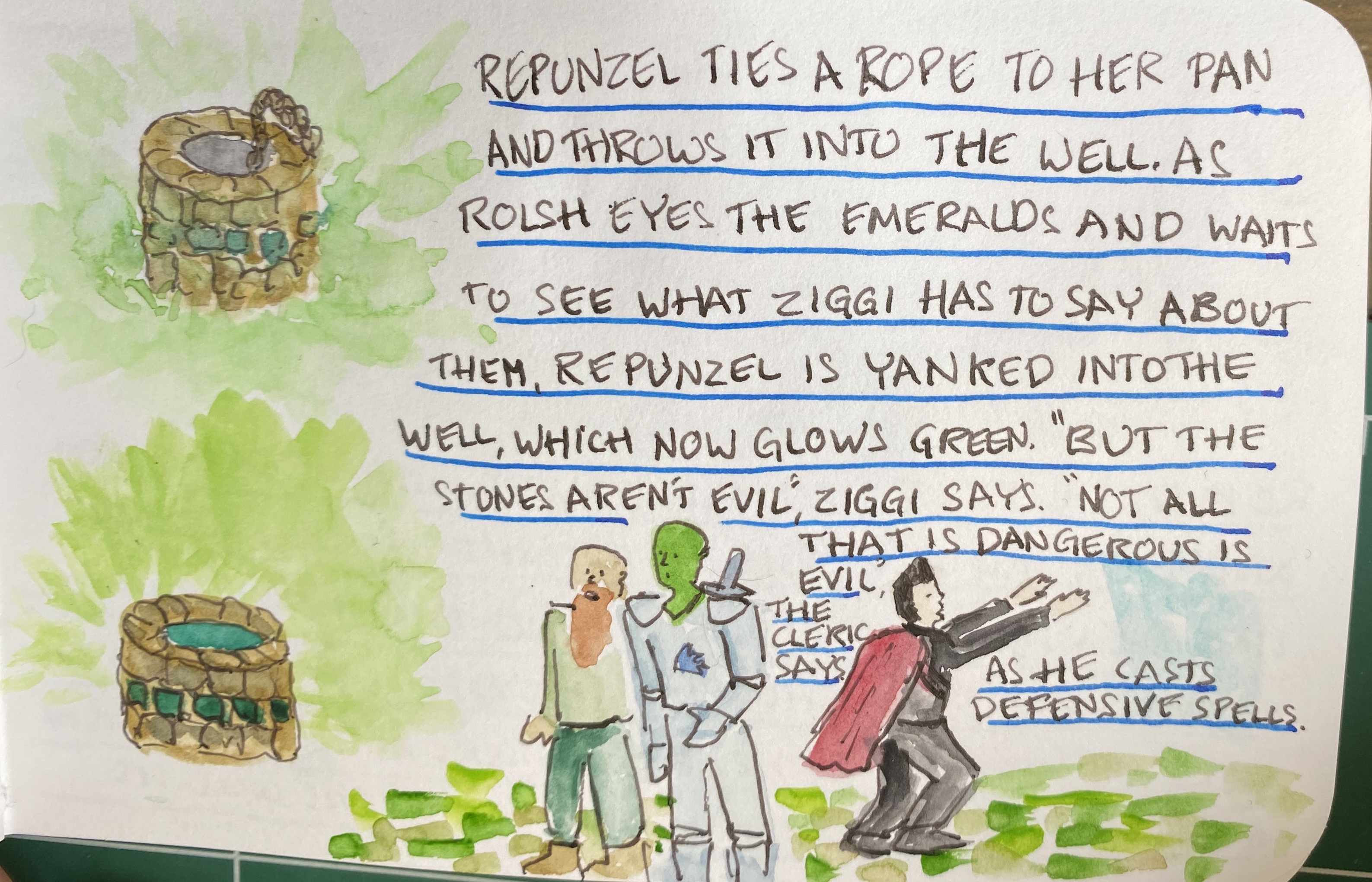
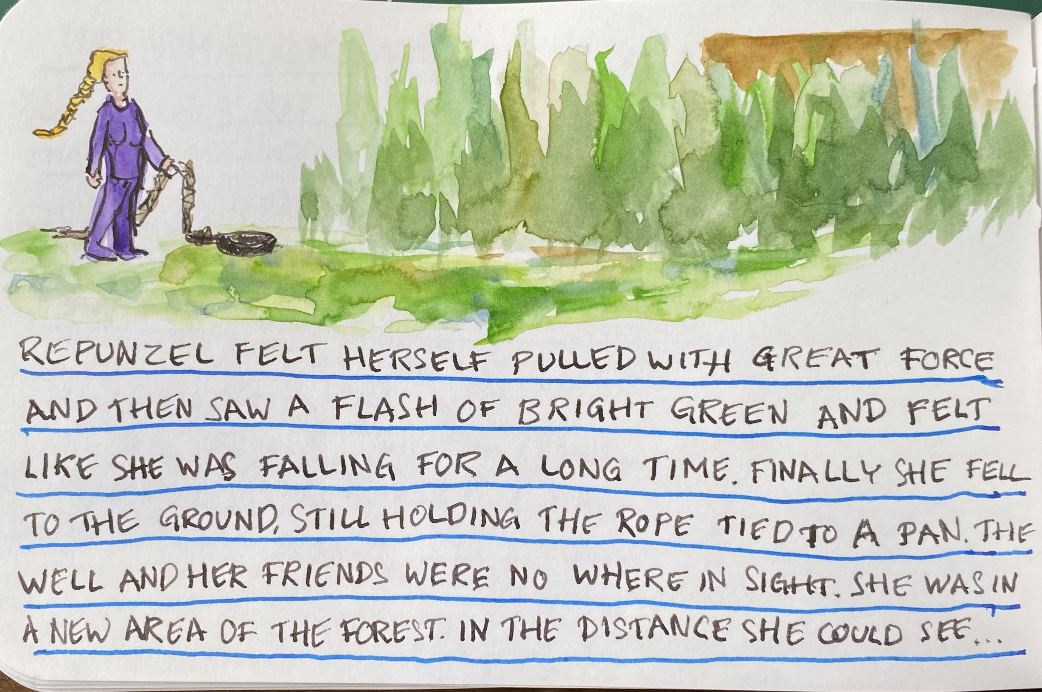
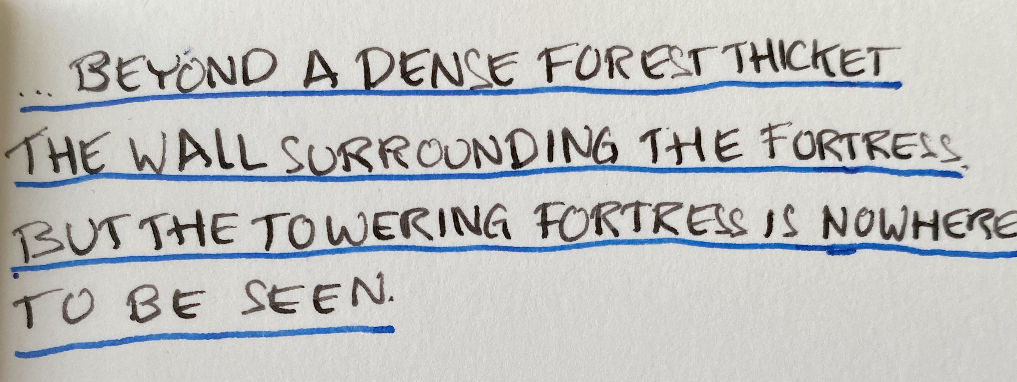
It’s combat time in Vengeful Fortress the free-form illustrated adventure that I’m currently running. See previous instalments here: part 1, part 2, part 3, part 4, part 5, part 6. Drawn on a Stillman and Birn Epsilon sketchbook (review in part 1), with Schminke watercolours, various fountain pen inks (Sailor Sky High, Diamine Earl Grey, Diamine Christine, Diamine Robert), and Deleter Neopiko-Line-3 fineliners.
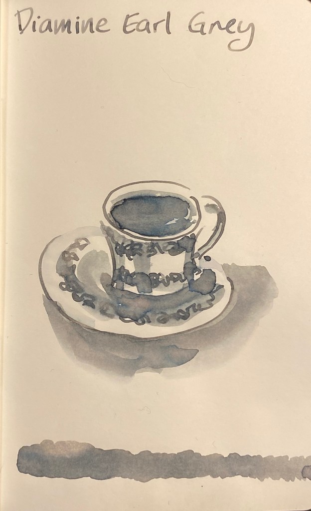
Ever since I saw the first reviewsofDiamine Earl Grey I have been fascinated by this ink, and only partly because I love, love, love tea. The colour seemed to have shading properties and tonal depths that were similar to the much coveted yet hard to obtain Sailor Studio 123. I had vowed to cut down on my ink purchases, but as I broke down and bought some Diamine Blue (i.e. Christmas) inks, I had to add a small bottle of Diamine Earl Grey to the cart.
Parker Vacumatic Major with an medium italic nib on a Rhodia No. 16 pad.
This ink is sheer magic. It is very legible (unlike many lighter grey inks), it shades like mad, and even on Rhodia paper you can see a bit of its tonal depth.
Shading on every single letter.
On Tomoe River paper the depth of its hidden tones really comes to light:
Drawn with the Parker Vacumatic and a W&N Series 7 #2 sable brush.
There’s blue, even slight hints of turquoise, green, yellow, shades of pink, and in the dark recesses hints of warm brown. It’s like the greys I often create on my watercolour palette: a mix of reds, greens and blues, with a dash of brown. The result is a rich, “living” grey that surprises you every time.
I’ll probably skip the Sailor 123 Studio Ink because the price plus shipping plus customs will make it painfully expensive. Now that I have Diamine Earl Grey I don’t feel like I’ve missed out.
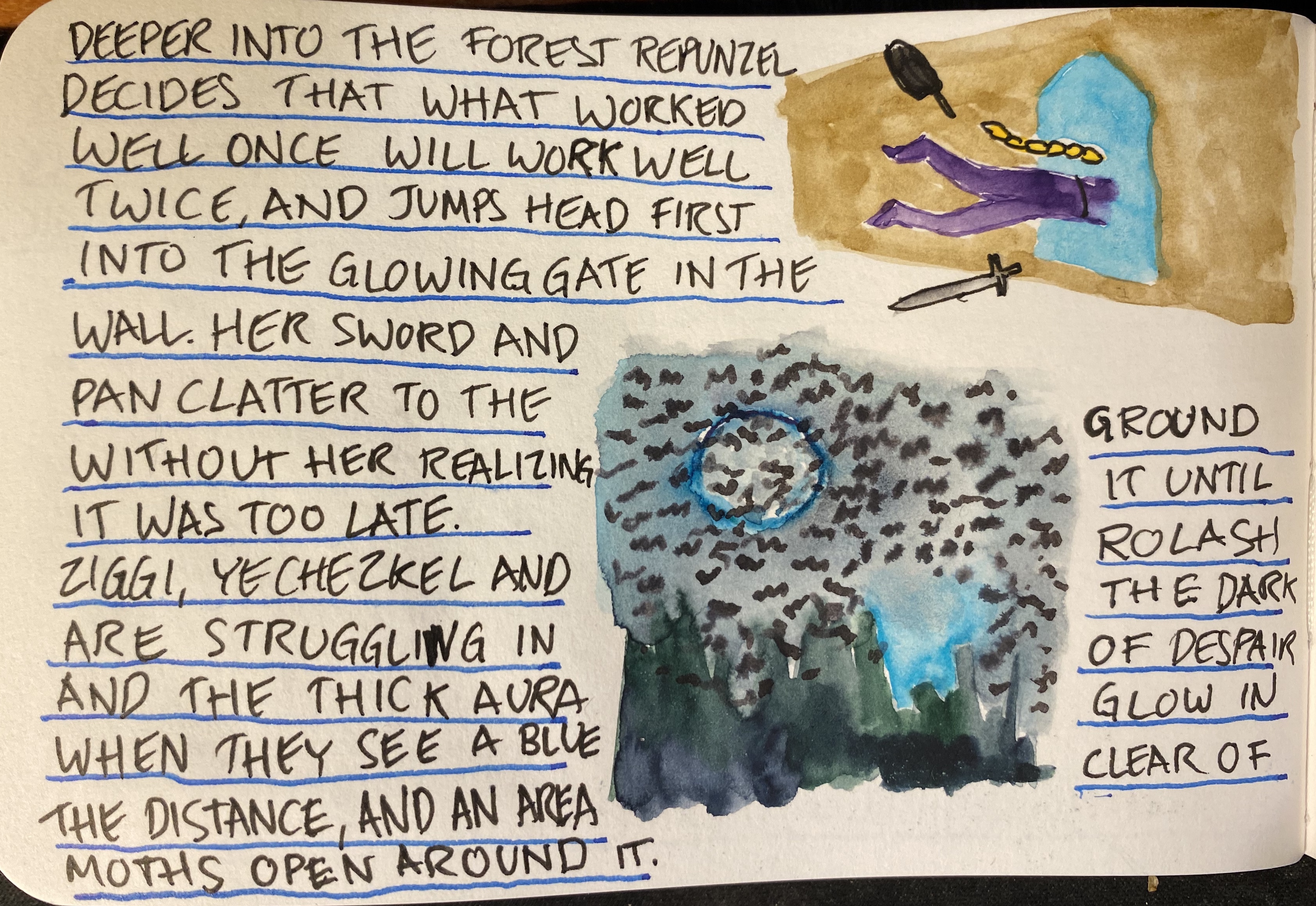
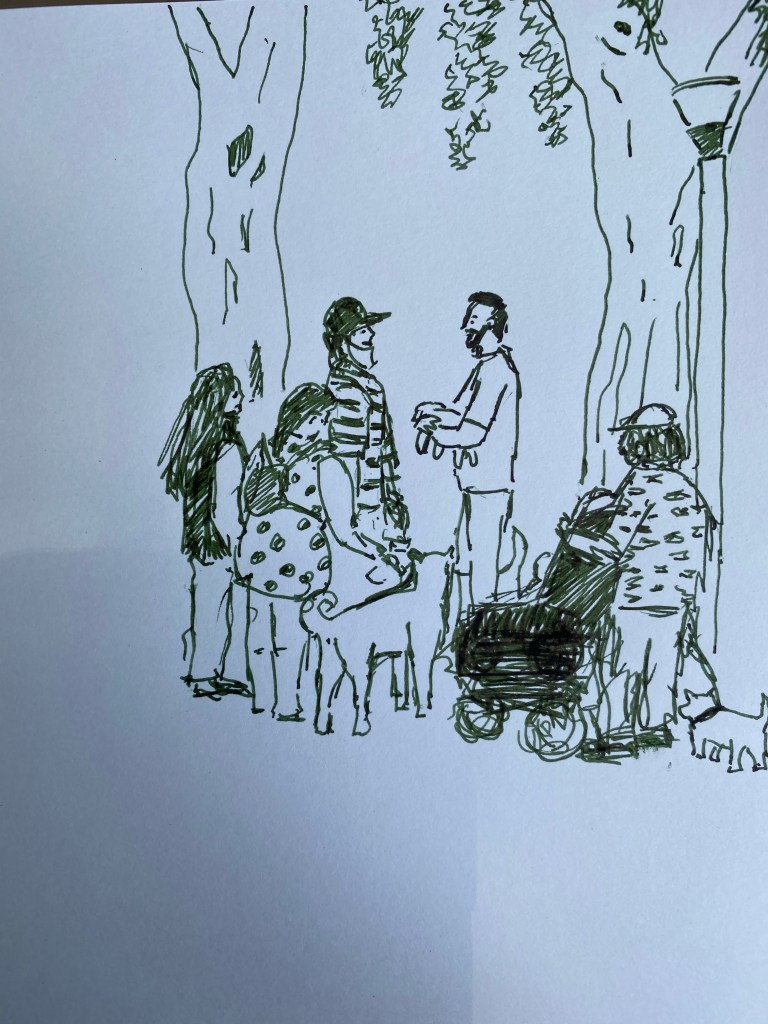
After a long, unplanned hiatus, I’m running my free-form illustrated adventure, Vengeful Fortress. See previous instalments here: part 1, part 2, part 3, part 4, part 5. Drawn on a Stillman and Birn Epsilon sketchbook (review in part 1), with Schminke watercolours, various fountain pen inks (see if you can guess which ones), and from this instalment, with Deleter Neopiko-Line-3 fineliners.
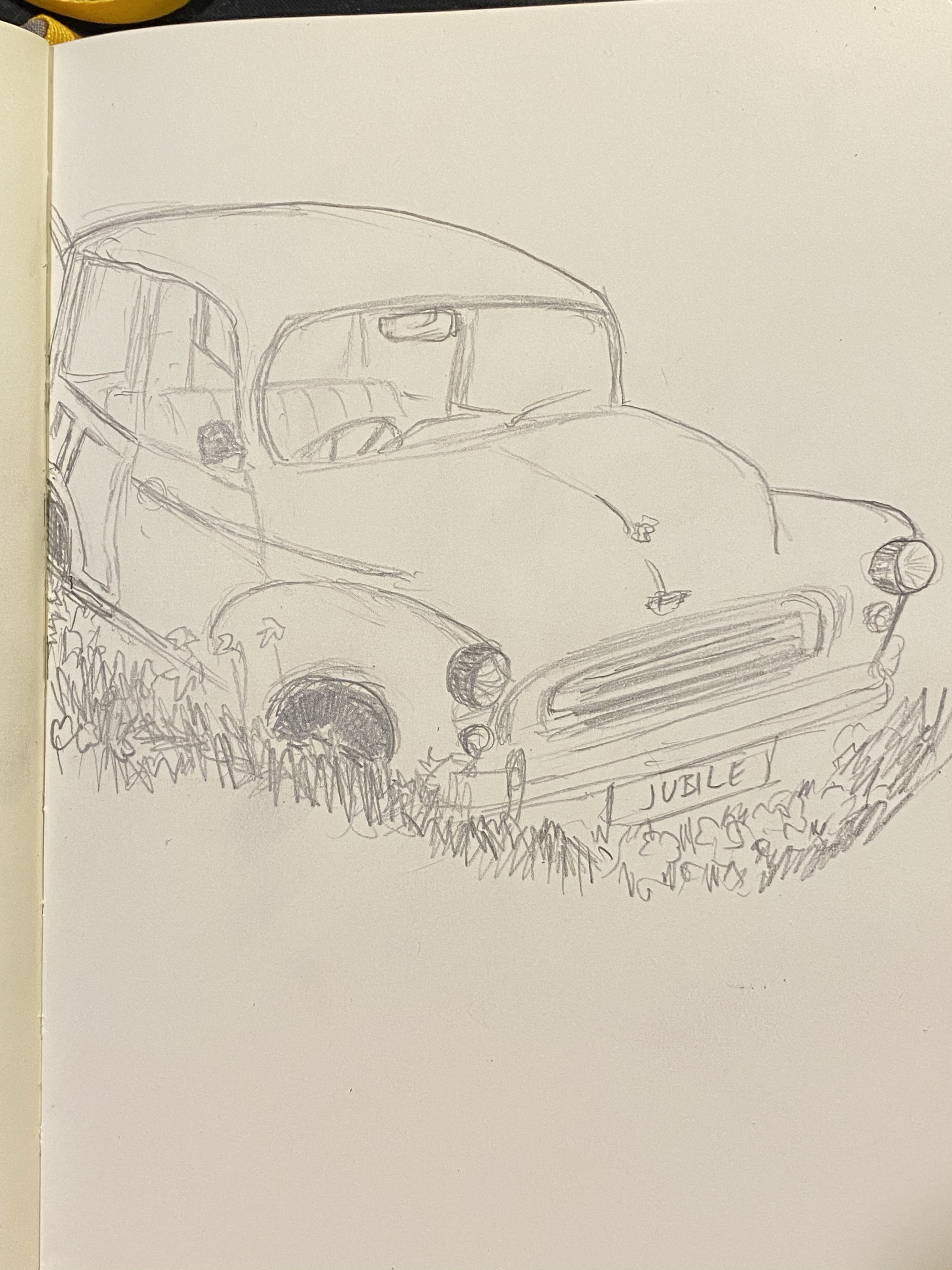
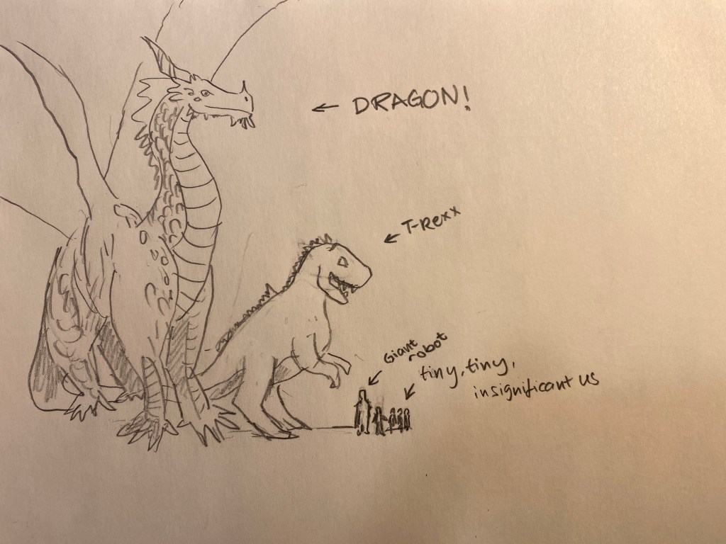
Our D&D group found itself next to a colossal sleeping white dragon, and one of the characters suggested that we could take it on. I grabbed my Blackwing (811) and created a quick illustration of relative sizes to emphasise just how crazy that idea was.