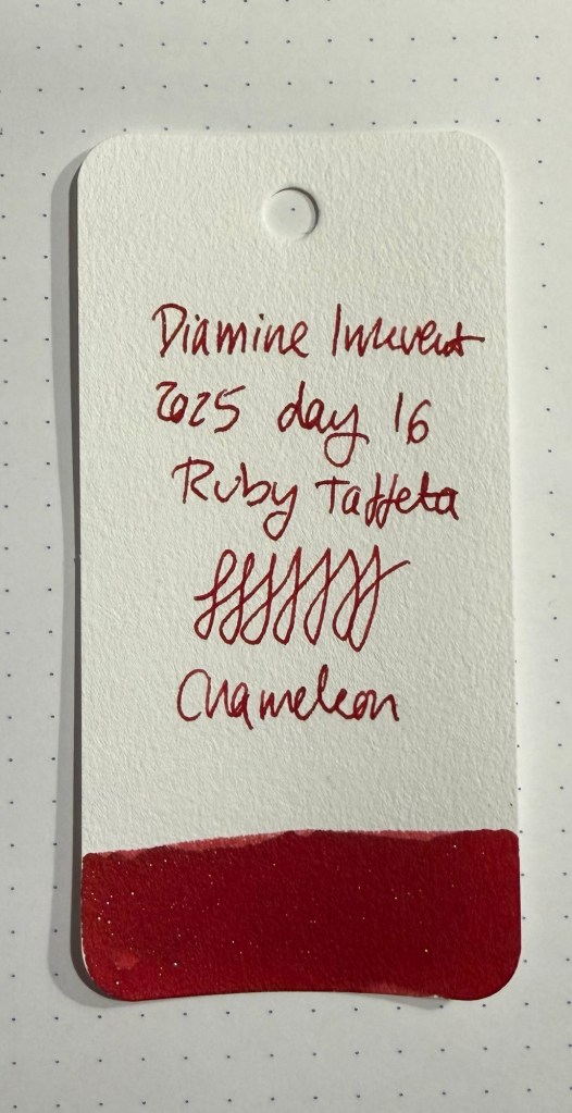
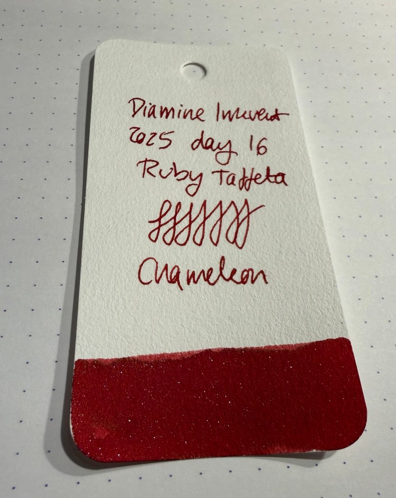
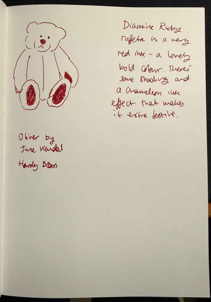
Day 16’s ink is Diamine Ruby Taffeta, a very red ink with chameleon shimmer. The photo here doesn’t capture how blood red this ink is, but believe me, spilling this ink would make people call an ambulance (possibly a unicorn ambulance, because of the shimmer).
Col-o-ring swab
I find this ink name peculiar. I understand the ruby part of it, but why is taffeta fabric involved? Because of the sheen and sparkle of the chameleon shimmer?
Closeup on the chameleon shimmer
Diamine Ruby Taffeta is a great ink for a Christmas themed calendar, and the ink is bold and beautiful.
Sketching and writing sample on Apica CD paper.
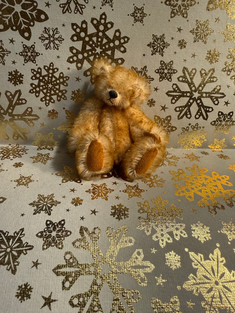
Today’s bear is Oliver by June Kendal of Hardy Bears. He’s one of a kind, and tiny but handsome.
The bear
While Diamine Taffeta is a great Inkvent ink, I don’t see myself ever reaching for it for journaling or everyday use. It’s too bright and bling-y, it really calls attention to itself, and that’s a bit too much for needs. Would you buy a full bottle of Ruby Taffeta?
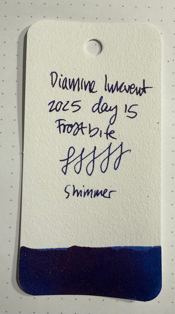
Day 15’s ink is Diamine Frostbite, a dark royal blue ink with light blue shimmer. It’s a nice ink and aptly named, but I feel like I’ve seen others like it in other Inkvent calendars – particularly in the first Inkvent calendar (the 2019 Blue Edition).
Col-o-ring swab
In fact I’m a bit surprised that Diamine haven’t had a “Frostbite” ink as part of their Inkvent calendar yet. This is a handsome and worthy ink to carry this name, even if there are other inks like in the Diamine lineup.
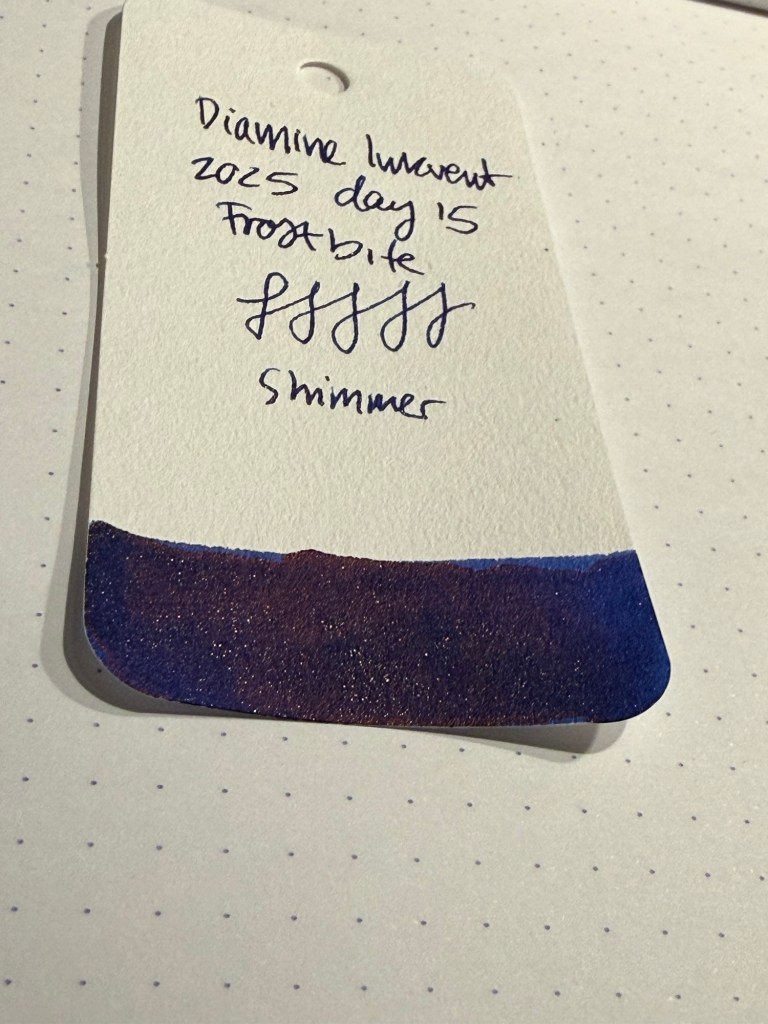
Closeup on the shimmer and sheen of Diamine Frostbite
Diamine Frostbite is a saturated ink, which means that it has a purplish red sheen to it as well as a light blue shimmer effect. It’s not new or exciting but it works well as a holiday/winter themed ink.
Sketching and writing sample on Apica CD
Here’s a closer look at the sheen and shimmer of Diamine Frostbite:
Closeup on the writing sample
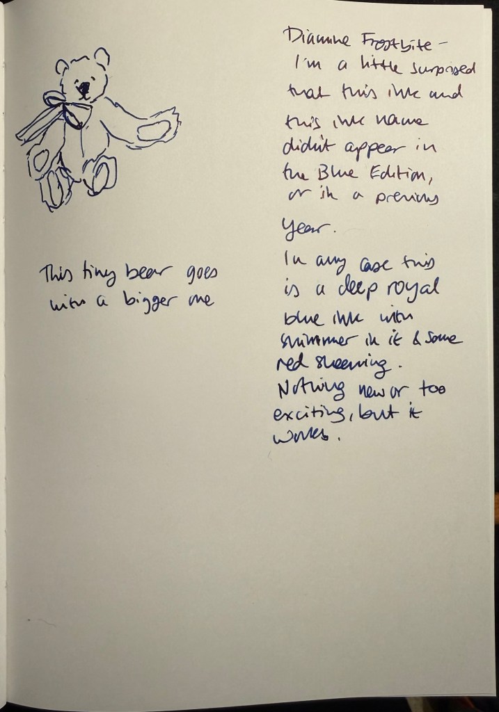
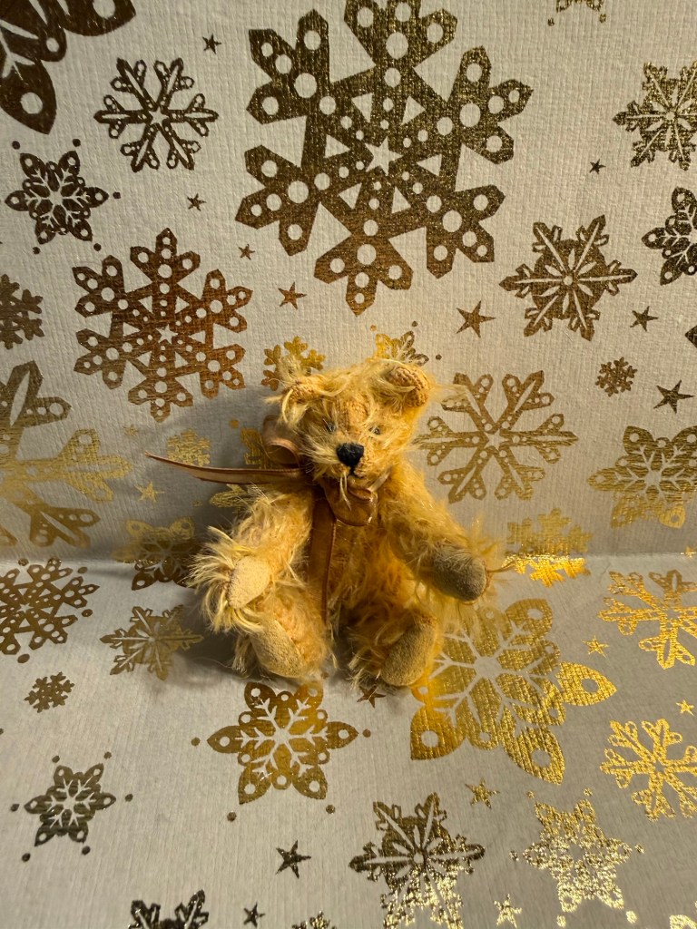
Today’s bear is a tiny but perfect, handmade teddy bear that serves as the teddy bear for another, bigger teddy bear. Complicated, I know. Just enjoy looking at him instead:
The bear
Diamine Frostbite is the first “proper” blue of this year’s Inkvent, and it’s a good one. It’s funny that Diamine have waited so long to issue an Invent ink called Frostbite, but this ink has definitely earned the name and is pretty enough to be worth the wait.
What do you think? Is Frostbite interesting or too similar to other Inkvent inks from previous years?
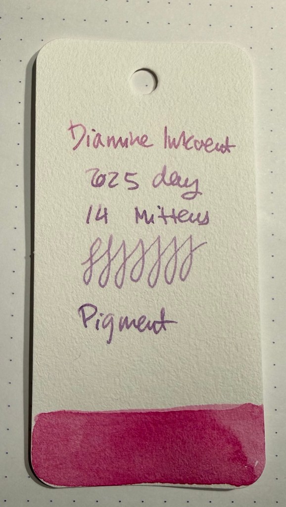
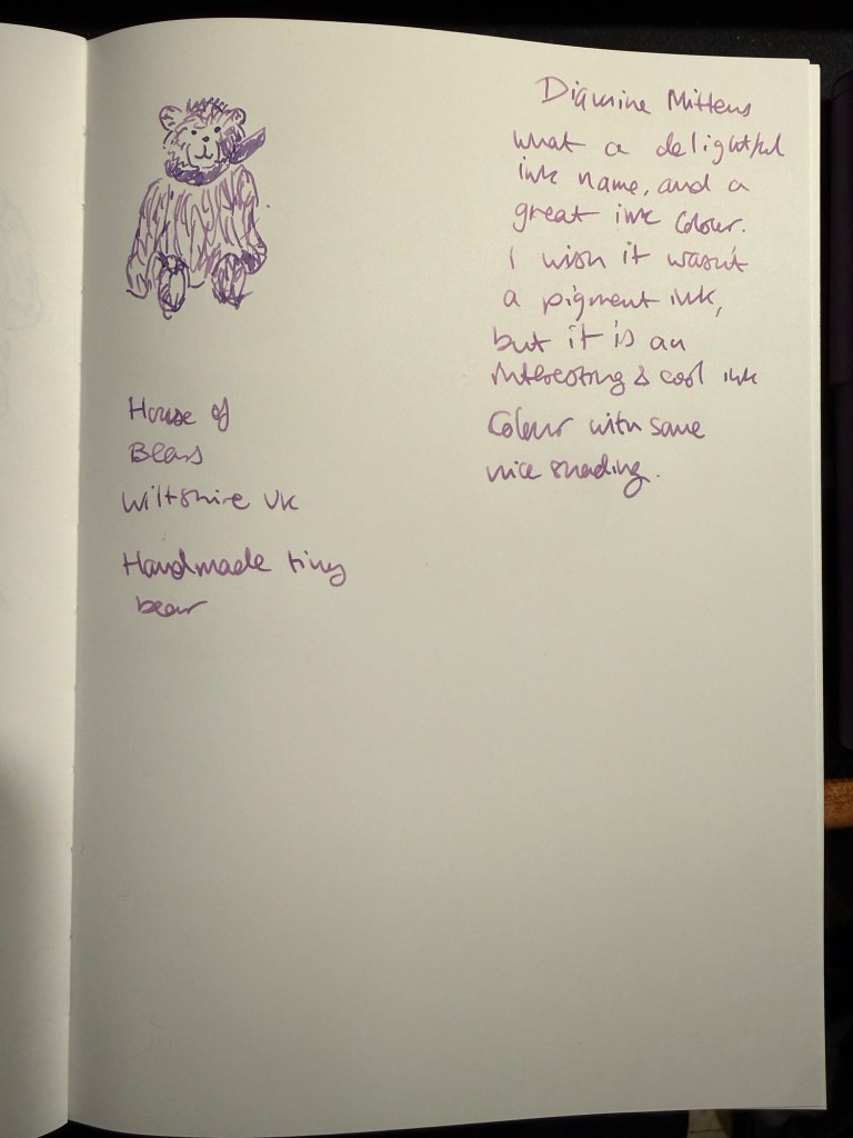
Day 14’s ink is Diamine Mittens, a fuchsia pink pigment ink with some nice shading to it.
Col-o-ring swab
I like the colour of Diamine Mittens, and I like the shading, but I wish it was a standard ink and not a pigment one. I just don’t see myself using it in sketches, though I might experiment and maybe find that it works. It’s also considerably darkened in my Lamy Safari – I thought that maybe the pen wasn’t properly cleaned, but after double checking I think that it’s just something with the ink. In any case I like the colour – it’s got a nice purplish tone to it.
Sketching and writing sample
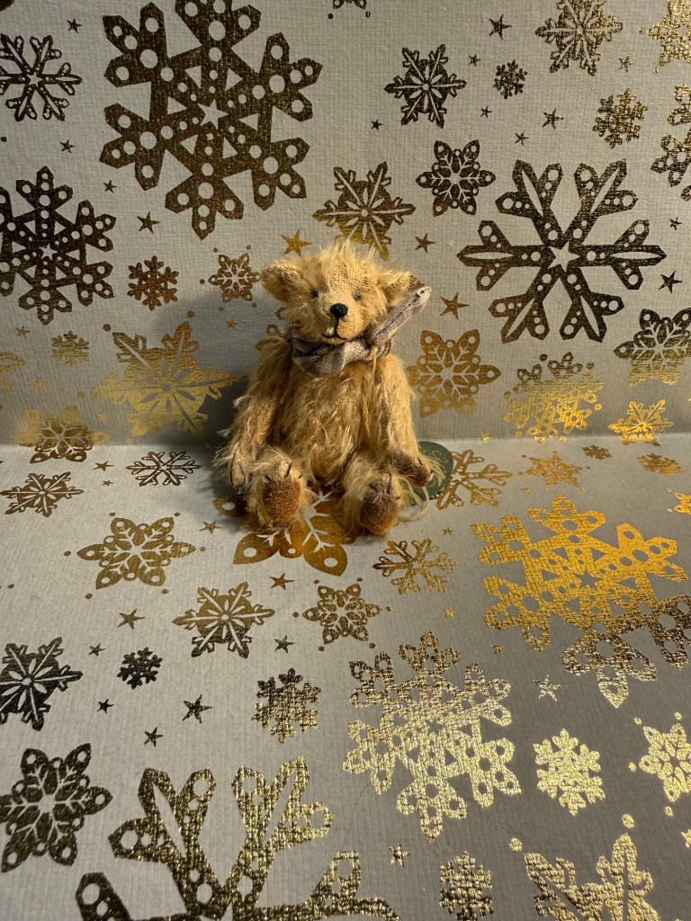
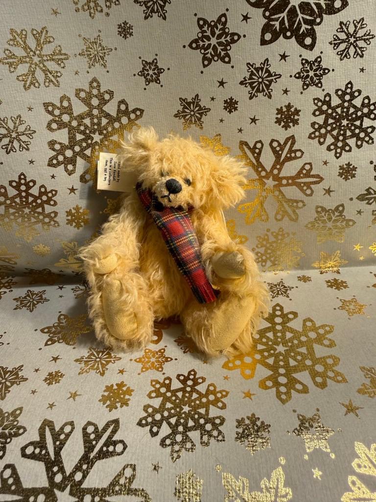
This little fellow doesn’t have a name, but does have a great little scarf and plenty of personality. I like him.
The bear
Diamine Mittens has a delightful name, and is a nice and interesting colour. It remains to be seen if it’s useful in watercolour sketches, but even if it isn’t I guess it would be nice to use it in greeting cards and letters and know that it won’t smudge if a splash of something lands on it.
Day 13’s ink is Molten Basalt, a standard dark blue ink with so much brown sheen that I don’t understand why this ink wasn’t categorized as a sheen ink. It’s a baffling ink, not something that I’d expect in an Inkvent calendar.
Col-o-ring swab
Something about this ink reminds me of Montblanc Around the World in 80 days – it’s a dark indigo blue ink that looks like spilled petrol more than anything. It reads as a dirty black ink – a brownish black.
Different angle of the Col-o-ring swab
This ink is interesting, even though I’m not sure it should be part of the Inkvent calendar. There’s something about its strangeness that makes me think that it could have been one of the those inks that Diamine designs with input from the community – like celadon cat.
Writing and sketching sample on Apica CD
The only way to see the base colour is to look at it while it dries. Once it’s dry you see the brownish purple sheen settle on every letter.
Close up on the writing
Today’s bear is Alex by June Kendall of Hardy Bears. I have several of her bears and I like her work.
The bear
I’m still not sure what I think of Molten Basalt. I will likely not buy a full bottle of it – will you?
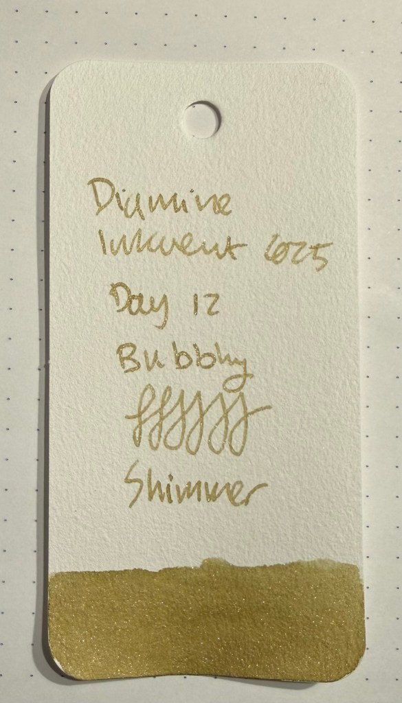
Day 12’s ink is Diamine Bubbly, a light olive green ink with gold shimmer. This ink perfectly evokes champagne. There’s a good amount of shimmer and some nice shading to it, and the base colour is pretty unique.
Col-o-ring swab
The combination of golden shimmer with the base light olive green/golden-green ink creates an ink that looks golden. This would be perfect for greeting cards.
Col-o-ring swab shimmer closeup
Diamine Bubbly is a lovely and unique colour, with a good amount of shading and shimmer, and an absolutely perfect name. It’s a wonderfully festive ink, an a great addition to this year’s Inkvent.
Sketching and writing sample on Apica CD paper
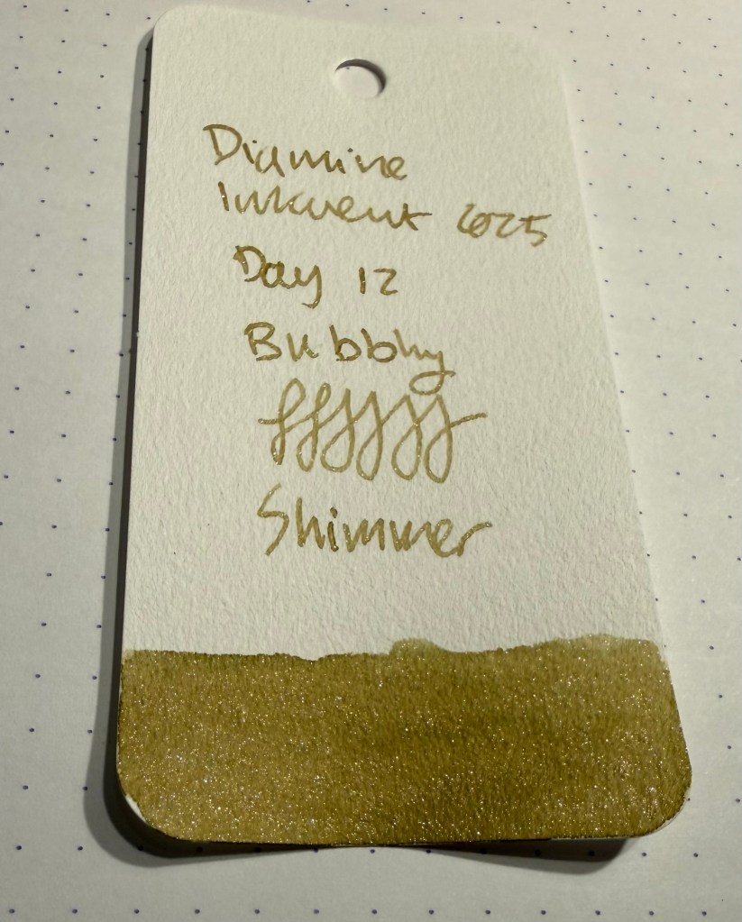
Here’s a closeup on the shading and shimmer:
Close up on the ink
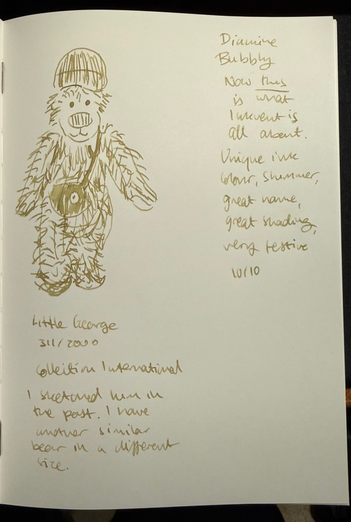
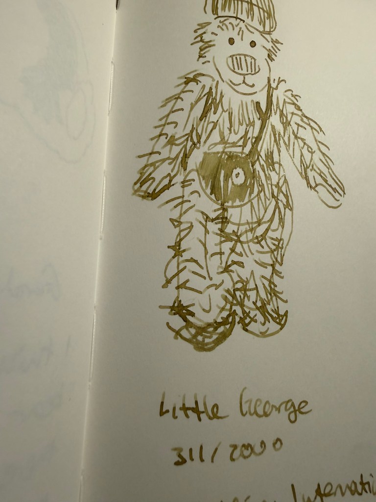
This is Little George, from Collection International – number 311 out of a run of 2000. I have a similar bear in a different size, and I’ve sketched them both in the past, but his weird fur was great for showcasing this ink’s properties.
The bear
Diamine Bubbly is a perfect ink for the holiday season – Diamine really outdid itself with this one. Will you be using it to write your holiday greetings?
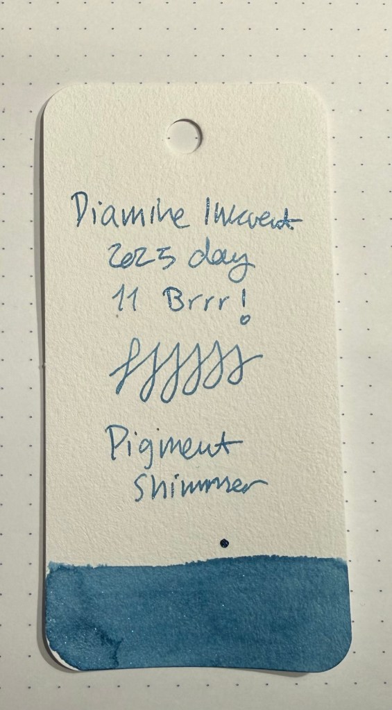
Day 11’s ink is Diamine Brrr! It’s a blue pigment shimmer ink – the first in the calendar. The base ink colour is a lovely icy blue with a hint of shading, and the shimmer is relatively subdued in this ink, but still visible. You can see the light blue shimmer in the swab:
Col-o-ring swab
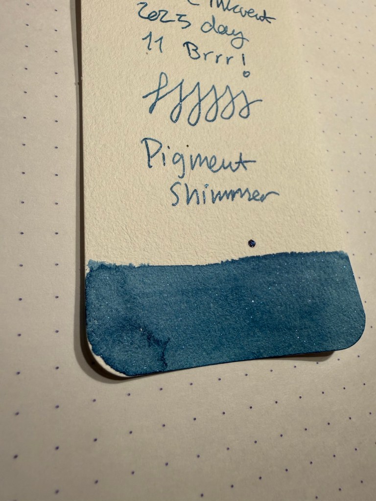
You can see the shading and the shimmer well here:
Close up of the col-o-ring swab
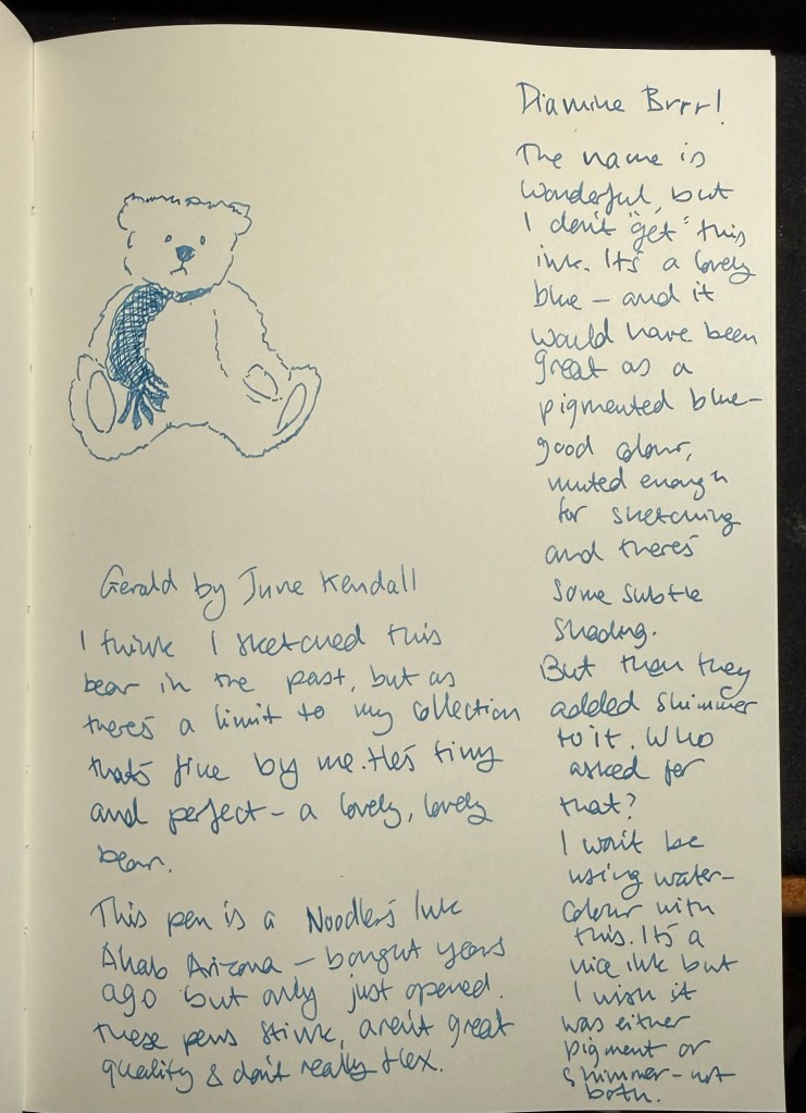
I don’t get this ink – I don’t understand why Diamine created it apart from their need to say that they made an ink that is both pigmented (i.e. waterproof) and shimmer (i.e. full of metallic flaky bits). This will be a challenge to clean out of a pen, especially if left unused for a little while, and the shimmer and pigment properties really don’t go together in terms of use cases.
Sketching and writing sample
If you are looking for a pigment ink you are either writing something that you think may get damaged by water, or more commonly, you want to use it for sketching and go over the ink with a wash. For these purposes Diamine Brrr! Would have been perfect if it didn’t have shimmer in it. Yes, it’s an unusual colour for sketching with, but I have sketched with blue ink before (and many sketchers use blue ballpoints in their sketches) and it works well with watercolour washes. The idea of an ink in this scenario is that it can fade into the background, it can work well with others.
Conversely if you’re looking for a shimmer ink, then you want some pizzazz, some verve and zing in your writing. It’s all about the bling, about calling attention to itself. The two properties don’t really match.
Close up of Diamine Brrr!
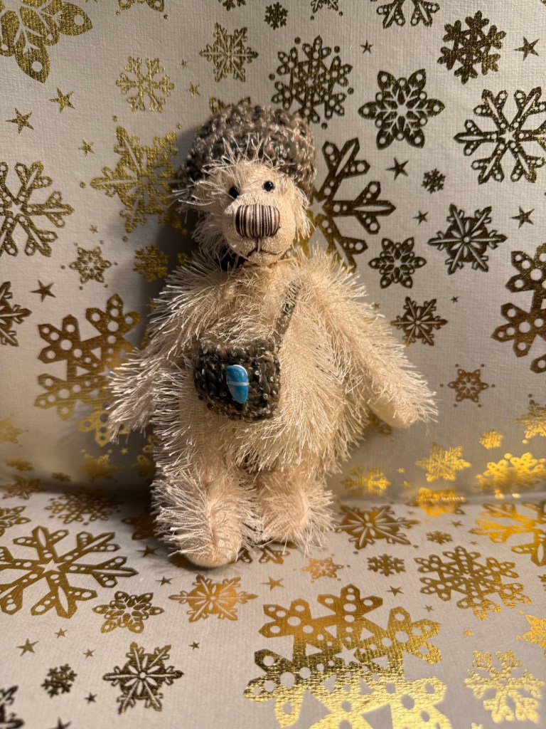
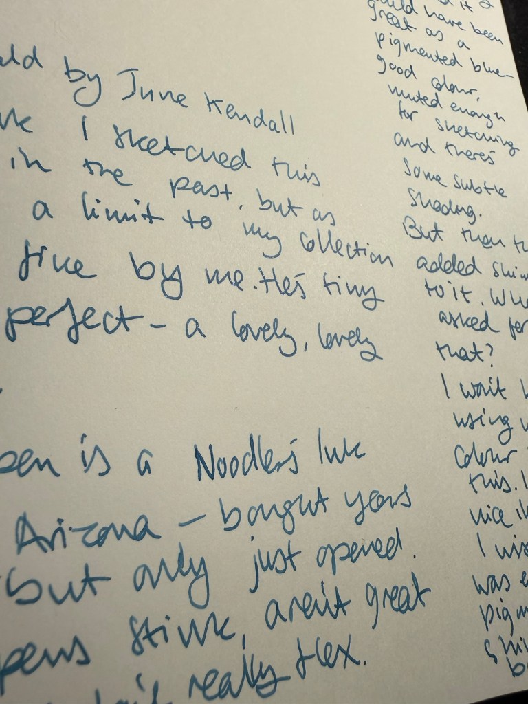
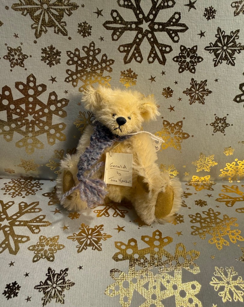
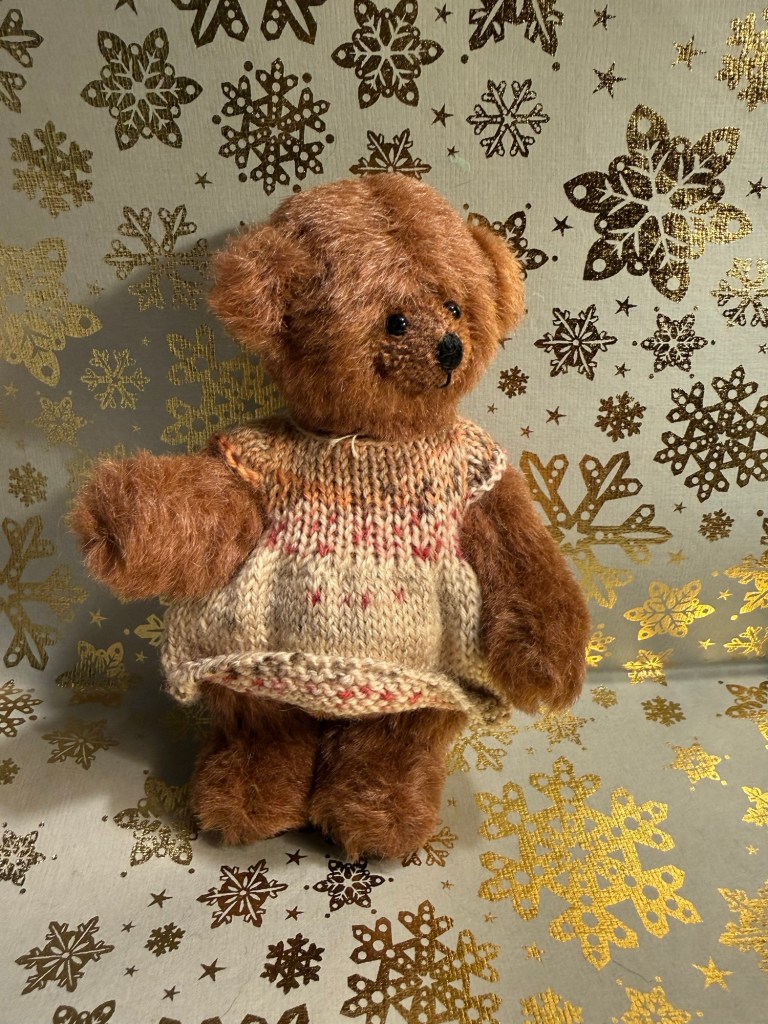
Today’s bear is Gerald, and I think that I’ve sketched him before. There’s a limit to my collection, so I’ll be sketching bears that have appeared here in previous years. I like this little fellow – he’s tiny, but he’s a perfect teddy bear.
The bear
I like Diamine Brrr!’s name, I like the colour and the shading, but I wish that it was either a pigment ink (my preference) OR a shimmer ink (as there have been shimmer inks close to Brrr! In hue I would have preferred the pigment over the shimmer property). What I don’t like about it is that it’s both a pigment and a shimmer ink. I’ll be cleaning it out shortly from this pen, just to make sure that it won’t clog it.
A note about the pen used to test this: back in November 2011, years before the Noodler’s scandals, I purchased three Noodler’s Ink Ahab fountain pens – Arizona, Medieval Lapis and Ivory Darkness. They were $20 each and they had just come out and were all the rage – “flex nibs at bargain basement prices”. The pens stank to high heaven, and weren’t really flexible – or well made. Of the three the only one that survived (i.e. the piston didn’t get jammed stuck) was the Arizona – because I never opened it. Well today I opened it and used it to test Diamine Brrr! Why? Mostly because I was scared of putting this ink in any other pen. I don’t care if this pen gets clogged to death (I’m hoping and expecting that it won’t because Diamine are good ink manufacturers), and so it was selected to test it. It would have been nice if the Ahab flexed, but it doesn’t really, so the resulting line is a fine.
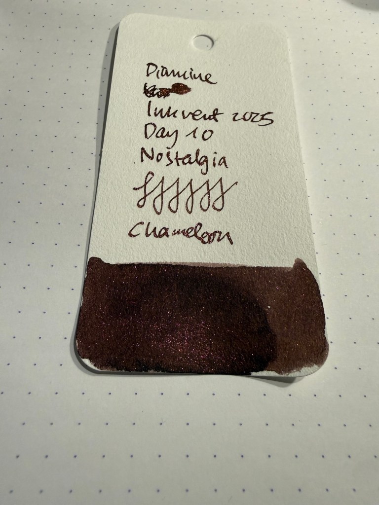
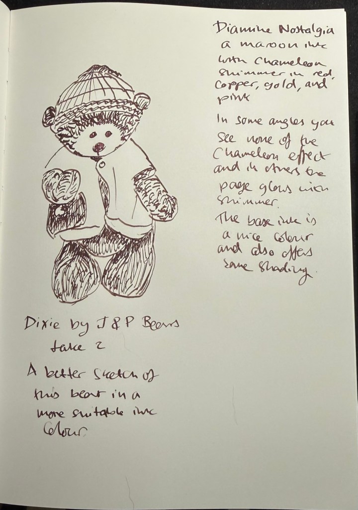
Day 10’s ink is Diamine Nostalgia, a maroon chameleon ink with some shading. I used a TWSBI GO with a 1.1 nib to test out this ink, and it really showed off both the chameleon shimmer and the ink’s shading properties well.
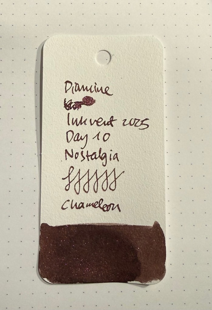
Col-o-ring swab
There’s gold, copper, pink and red chameleon shimmer in this ink, and the effect is quite fetching. There are angles where you see little to no shimmer, and others where all the lines shine. An ink full of surprises.
Col-o-ring swab from a different angle.
The chameleon shimmer lightens Diamine Nostalgia, at least in certain angles, and the base maroon colour is warm and attractive. I think this combination works really well, as brown inks can be either very interesting or very flat and boring. Diamine Nostalgia has depth and interest because of the combination of the base colour, the shading and the chameleon effect.
Writing and drawing sample on Apica CD paper
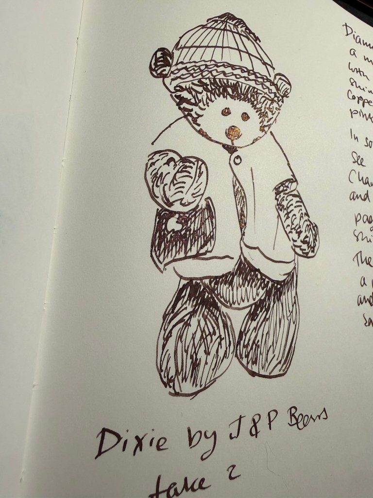
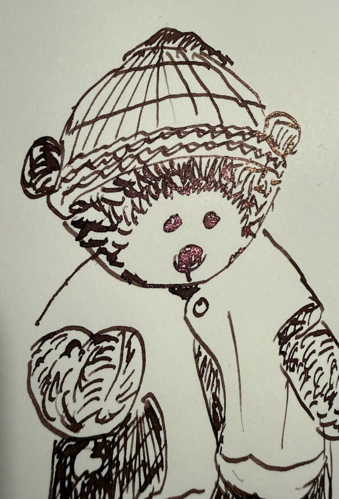
I redrew yesterday’s bear. Dixie, as I didn’t like my sketch yesterday. I like today’s sketch more. Look how Dixie’s nose glows in this angle:
Different angle of the sketch
Closeup of the chameleon effect:
Closeup. Look at the nose and eyes.
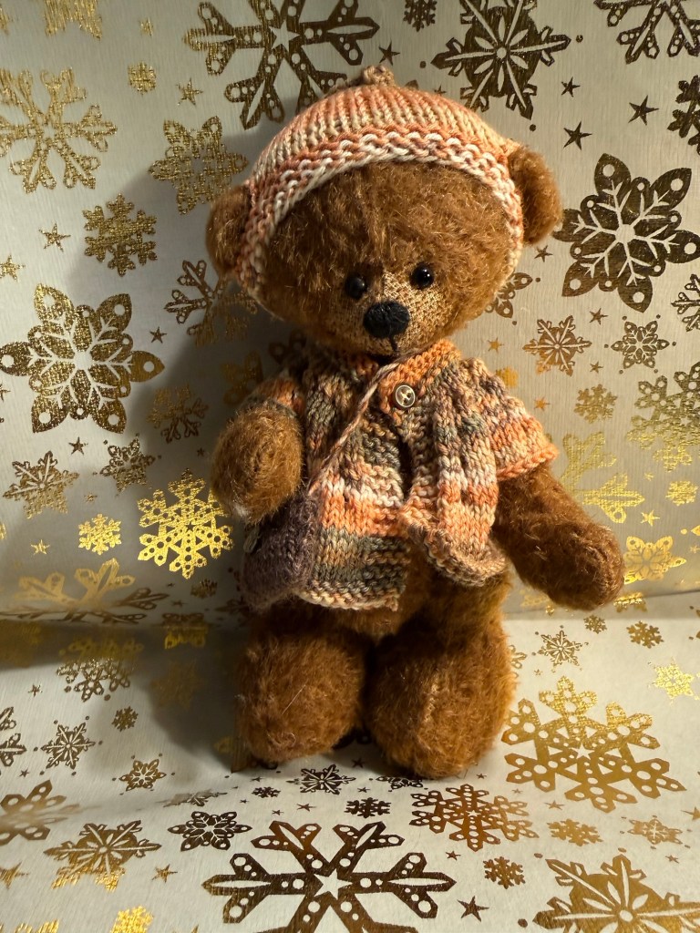
Today’s bear is Dixie from J&P bears – the same bear as yesterday, just reposed and redrawn.
The bear
I like Diamine Nostalgia – I think that it’s a good addition to the calendar, that it has a great (and appropriate) name, and that it will likely work fantastically well on cream coloured paper. What do you think?
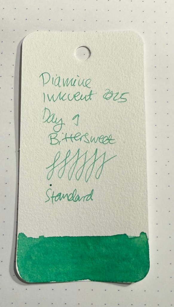
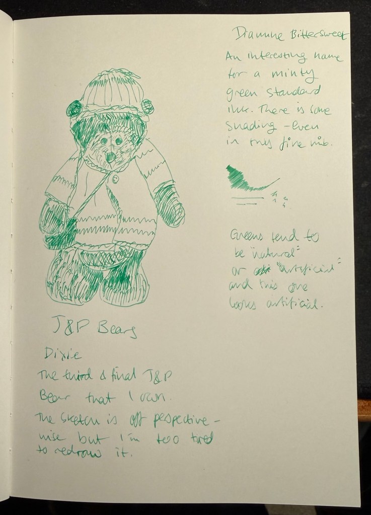
Day 9’s ink is Diamine Bittersweet, a minty green standard ink. I used a Pilot Metropolitan with a fine nib to test this ink, and it lays down a fine and relatively dry line, but still there was a hint a shading with Bittersweet.
Col-o-ring-swab
There is something about this ink that makes me think that Diamine Bittersweet is simply Diamine Mint Twist but without the chameleon shimmer. It’s not necessarily a bad thing, it’s just something that I’m curious about. In any case Diamine Bittersweet is a nice, solid ink and a good addition to the Inkvent calendar. It may not be the most interesting or unique ink of the bunch, but it’s still an ink that I can see myself journaling with – it’s very calming.
Sketching and writing sample
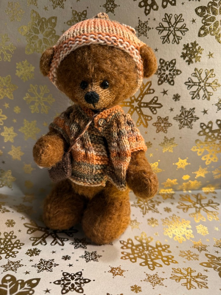
I’m tired so the bear in the sketch is off. I will redraw this bear with a different ink tomorrow, but for now here’s Dixie, my third and final J&P Bears bear.
The bear
What do you think? Are Diamine Mint Twist from last year’s calendar and Diamine Bittersweet related?
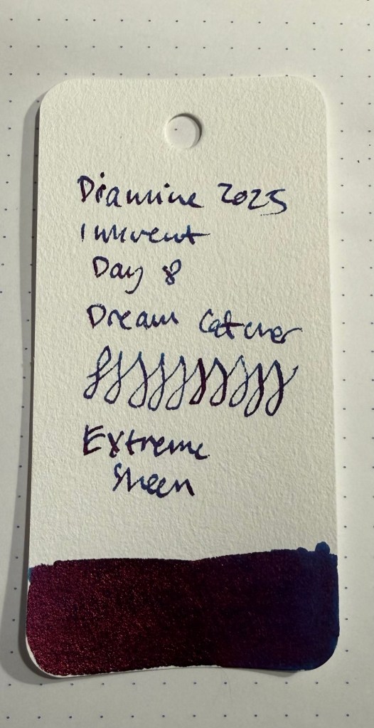
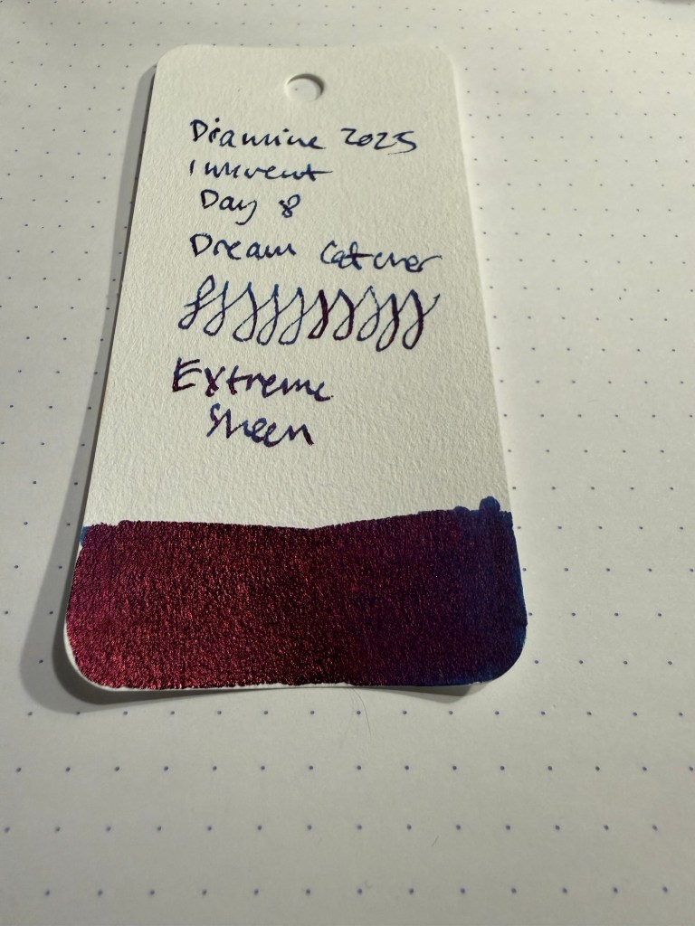
Day 8’s ink is Diamine Dream Catcher, a dark blue “extreme sheen” ink. It’s a super saturated ink with so much red sheen that it makes the ink look a bit purplish.
Col-o-ring swab
Here’s another angle of the sheen:
As you can see, the base ink colour barely appears in these samples:
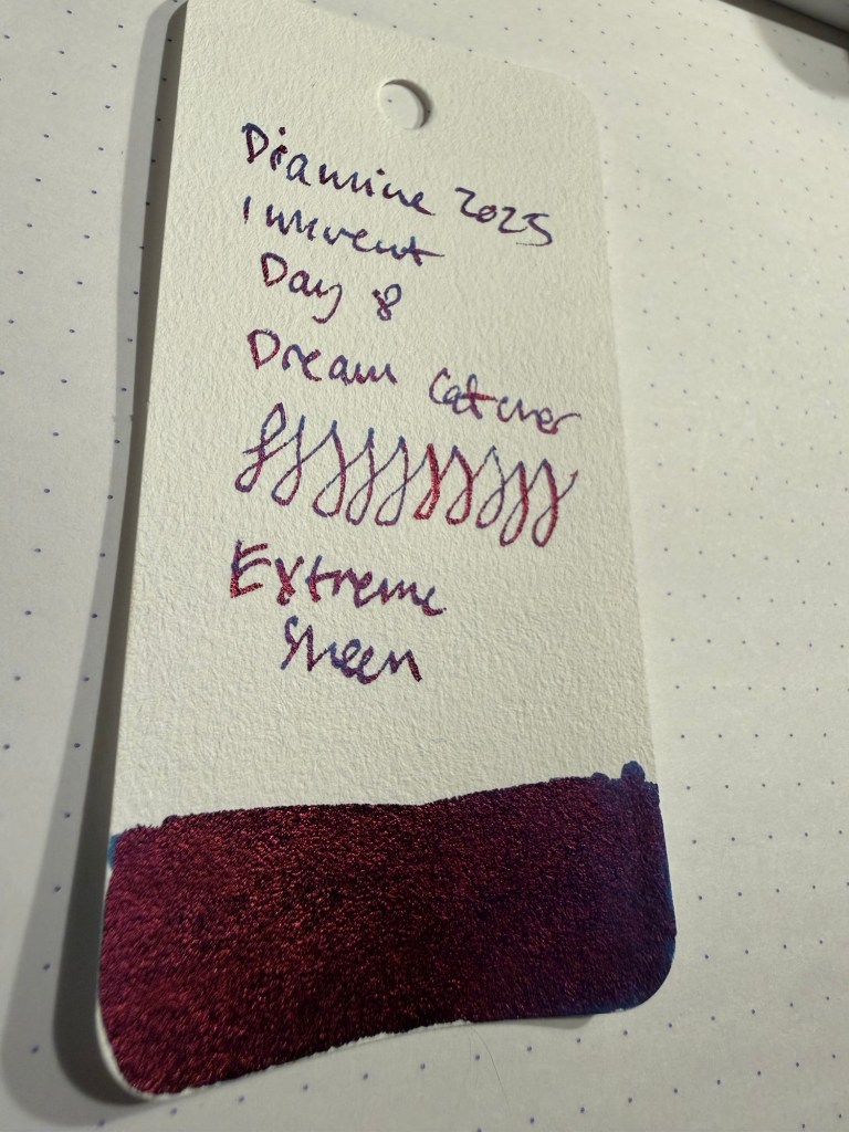
I was using a TWSBI GO with a 1.1 nib to test out Diamine Dream Catcher and I hadn’t seated the nib properly after cleaning (a common issue with my TWSBI GOs is how hard it is to get the nib and feed assembled well enough to not burp out ink or wobble when writing with them). This meant that I almost had the nib burp ink on the page, which is why there are a few smudges in this sample.
Sketching and writing sample on an Apica CD notebook
You can see the lovely dark blue base ink colour pretty well when you write with it, but as soon as the ink dries practically all you can see is red sheen. It also (unsurprisingly as it’s such a saturated ink) takes a long time to dry.
Another angle of the writing and sketching sample
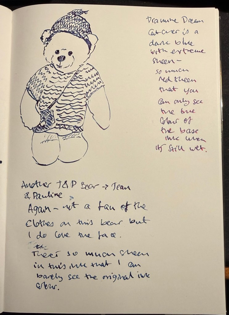
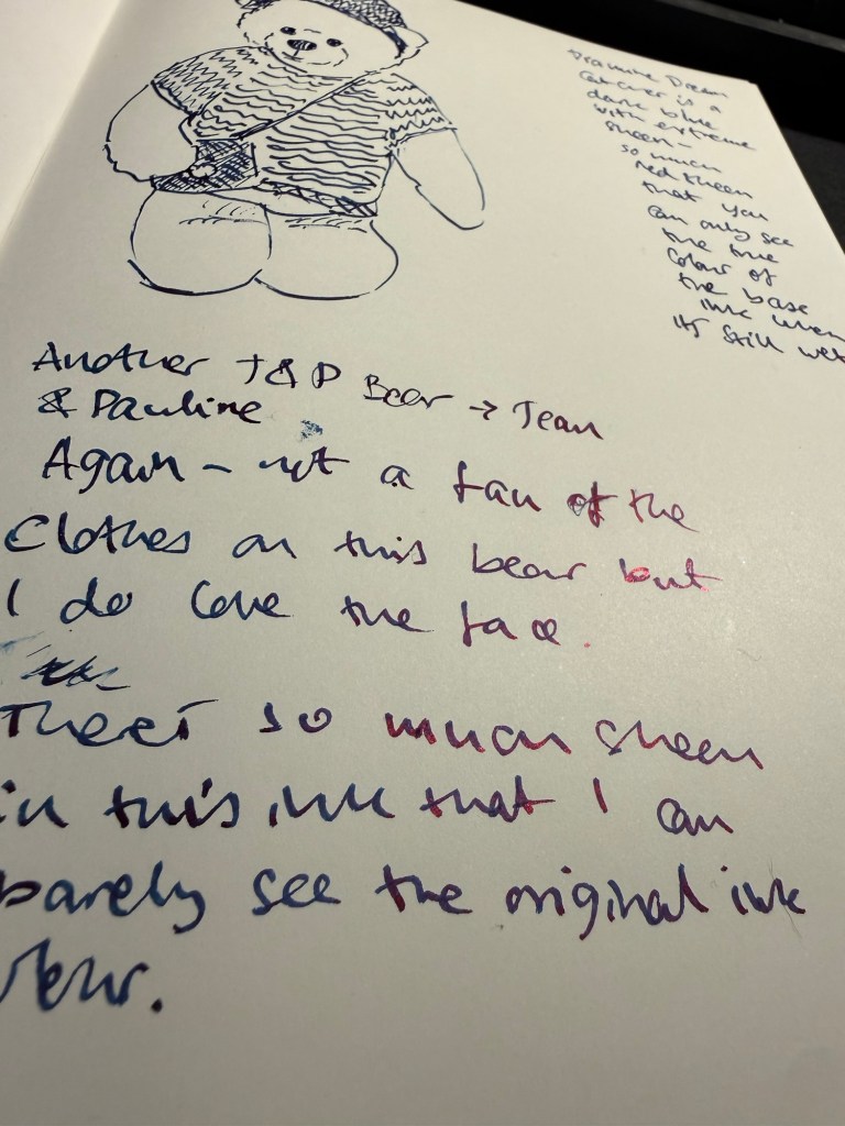
Today’s bear is called Tilly, and she was made by J&P (Jean & Pauline) Bears. I like her face but I don’t like that she’s clothed.
The bear
Diamine have a lot dark blue inks with varying degrees of red sheen, and in this Diamine Dream Catcher is a bit of a disappointment as it doesn’t really stand apart from its predecessors. If you want a super sheen ink, then maybe this will be for you. Personally I don’t plan on buying a full bottle of this.
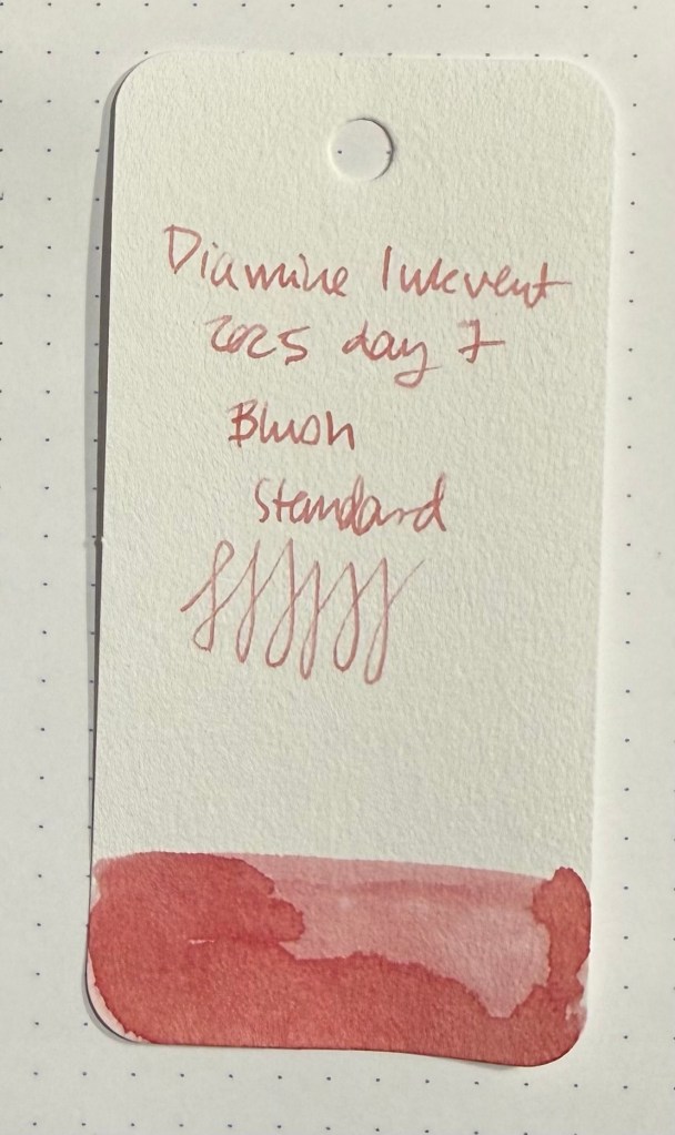
Day 7’s ink is Diamine Blush, a standard blush pink. This ink is a “super-shader” and the colour is lovely – a dusky pink that will work wonderfully well for greeting cards.
Col-o-ring swab
Whoever named this ink did a fantastic job – Blush perfectly describes the ink colour and the intense amount of shading that you get. It was a lot of fun sketching with this ink, and if it was waterproof it would be an interesting addition to my sketching rotation. As it is, it’s a very attractive ink that I’m pretty sure will be easy enough to clean out and well behaved enough to be safely used in vintage pens. It is slightly on the dry side, so take that into account when selecting a nib to go with it. I used a fine Lamy AL-Star nib.
Writing and sketching sample.
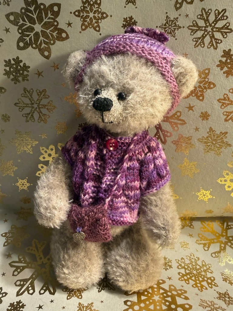
I think that today’s bear is called Abi – her tag was a little confusing. In any case she’s a British bear, made by J&P Mohair Bears – a small maker – and purchased in Stonegate Bears in York. I don’t like bears that are clothed, but I liked this bear’s face enough to overlook her knitted dress.
The bear
Diamine Blush is a wonderful ink, and a good addition to Diamine’s pink ink lineup. I don’t see myself purchasing a full bottle of it, but I will enjoy this sample while it lasts.