Caran d’Ache Nespresso India Green

When Caran d’Ache came out with this year’s limited edition Nespresso capsule 849 pen I breathed out a sigh of relief. I’m not a fan of their India capsules, and their olive green colour doesn’t speak to me, so I thought that it would be an easy pen to skip. Their previous collaboration, the Darkhan, was an excellent pen overall, especially as a gift purchase to the Nespresso or pen lover in your life, and I also loved the capsules and loved their colour.

Well Cult Pens celebrated their 15th anniversary, and I needed some refills, and somehow or other the India 849 found itself in my basket. I thought I would gift it away, but once it arrived I knew that this pen is staying with me.
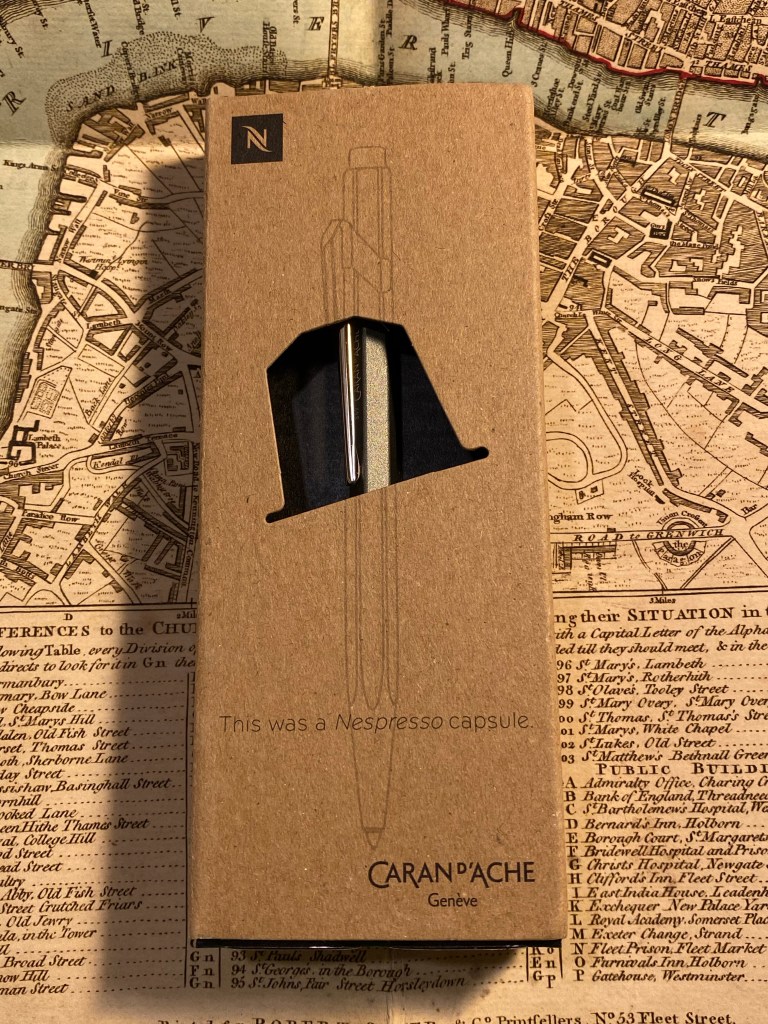
As with the previous edition, the packaging on this pen is genius. It shows off the pen and what it is beautifully, and it’s so well made and well considered. On the front there’s the “This was a Nespresso capsule” label, and a sketch of the pen that fits perfectly with the way the pen is presented in the box (that’s not left to chance. The box is designed so the pen will stay put in semi profile and show off the subtle “Caran d’Ache” logo underneath the clip).
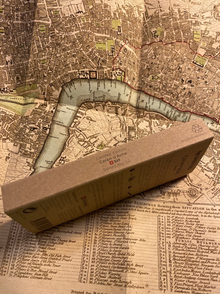
Limited Edition, Caran d’Ache 849, Series No 02.

On the back there’s a short explanation about what makes this pen special:

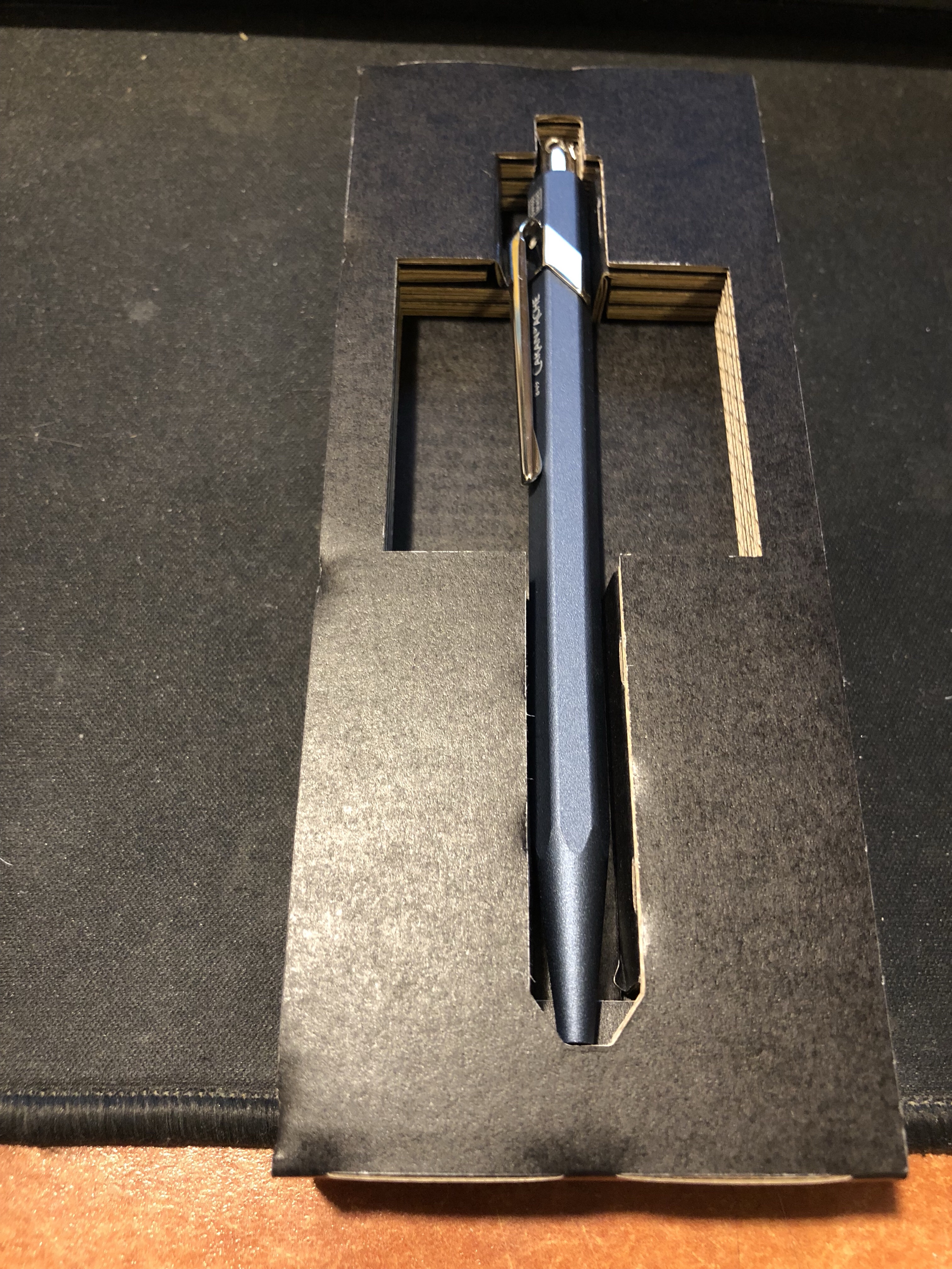
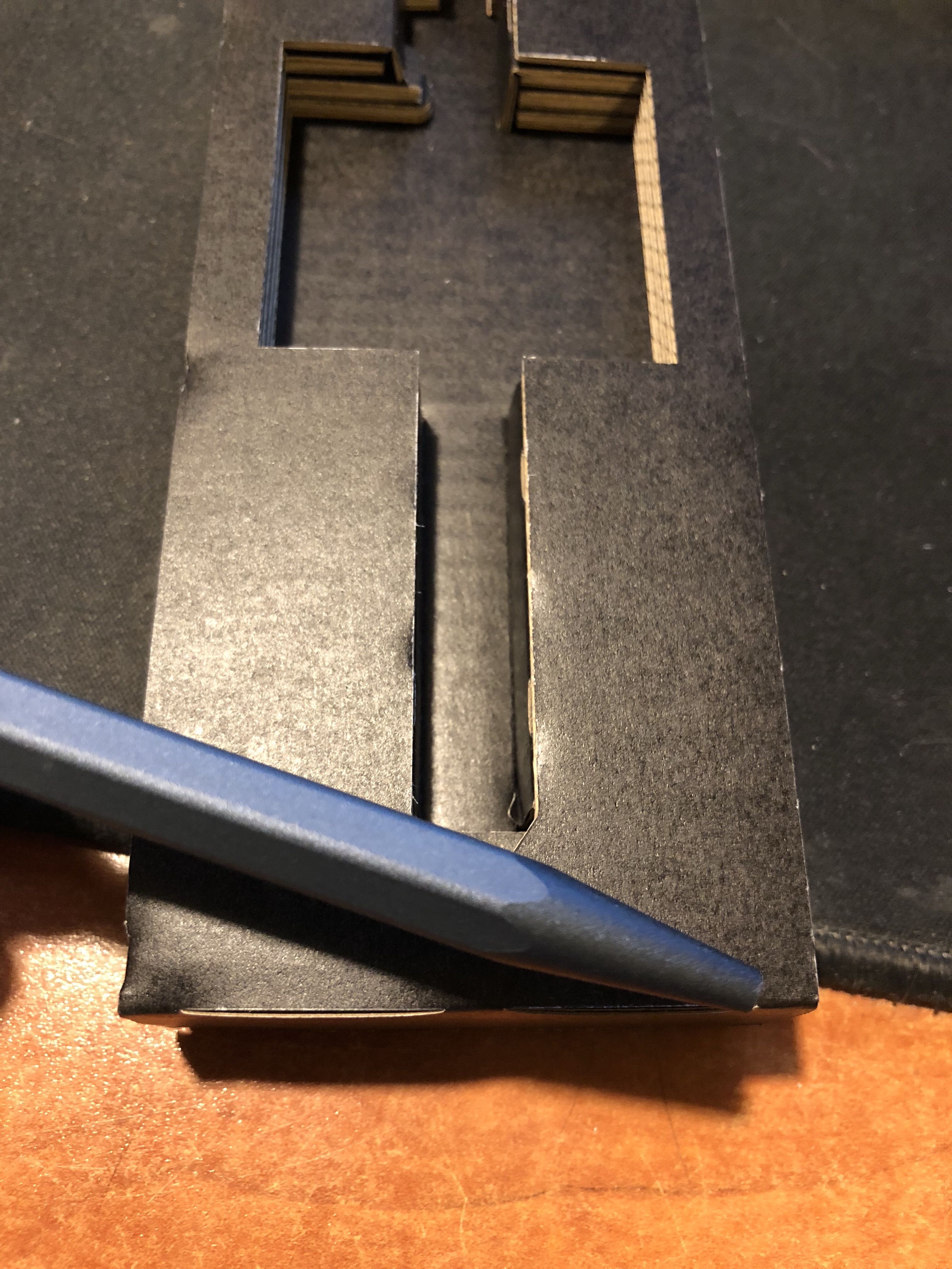
Inside the pen is securely slotted in its superbly designed cardboard housing, and here you can catch the first glimpse of why I decided to keep this pen: its colour.
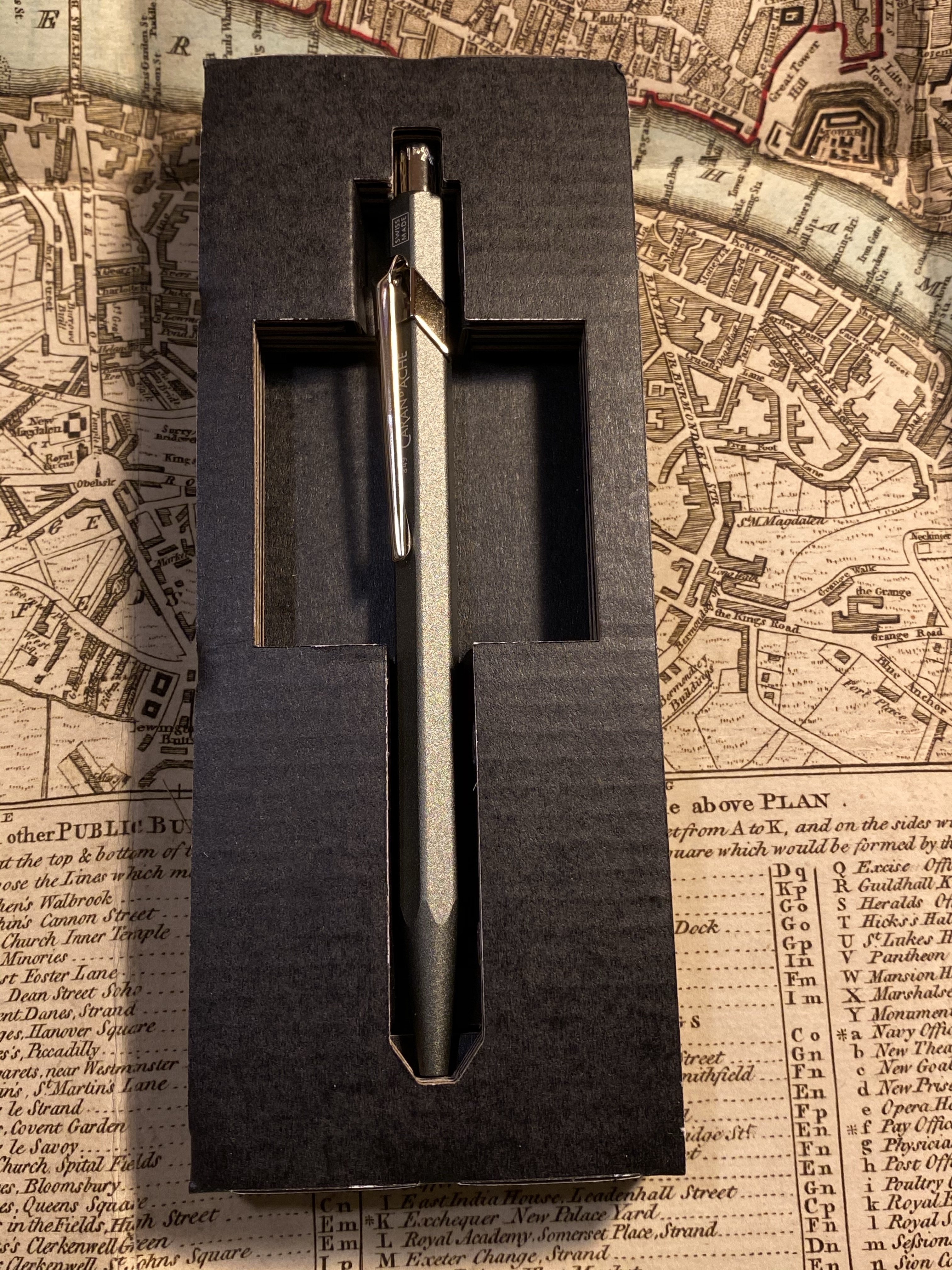
This is a beautiful pen that doesn’t photograph well. Its colour is wild, if subtle could be wild. It’s a cool grey with a slightly green hue. I’ve never had a pen like it, and the result is very, very cool.
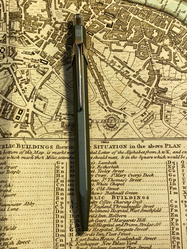
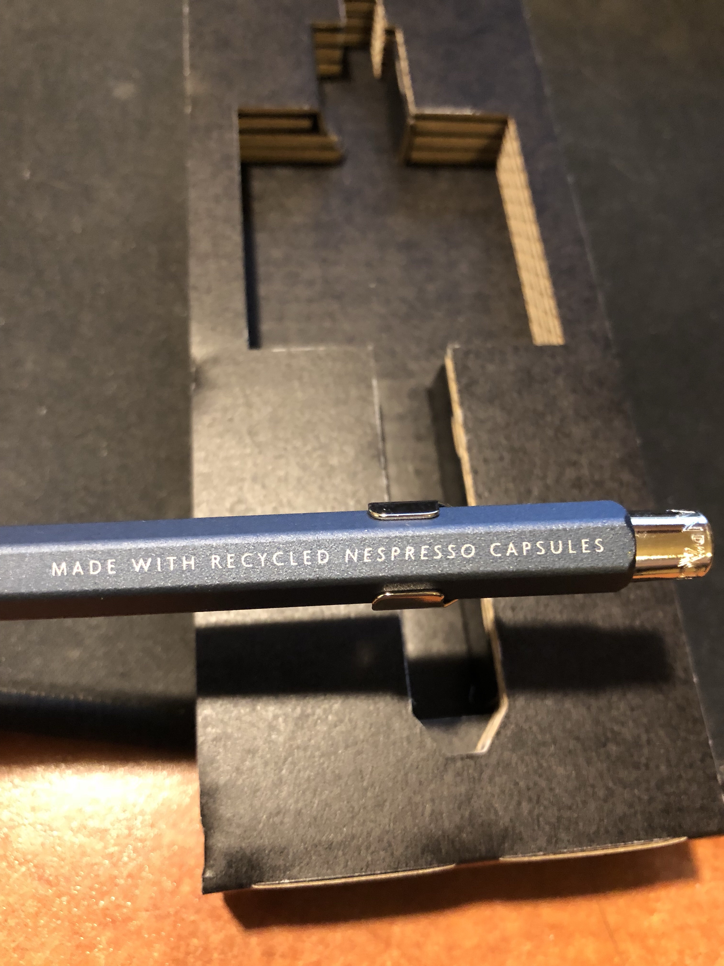
Unlike most 849’s and just like the Darkhan edition, this pen has writing on it beyond the hidden Caran d’Ache and the “Swiss Made”:
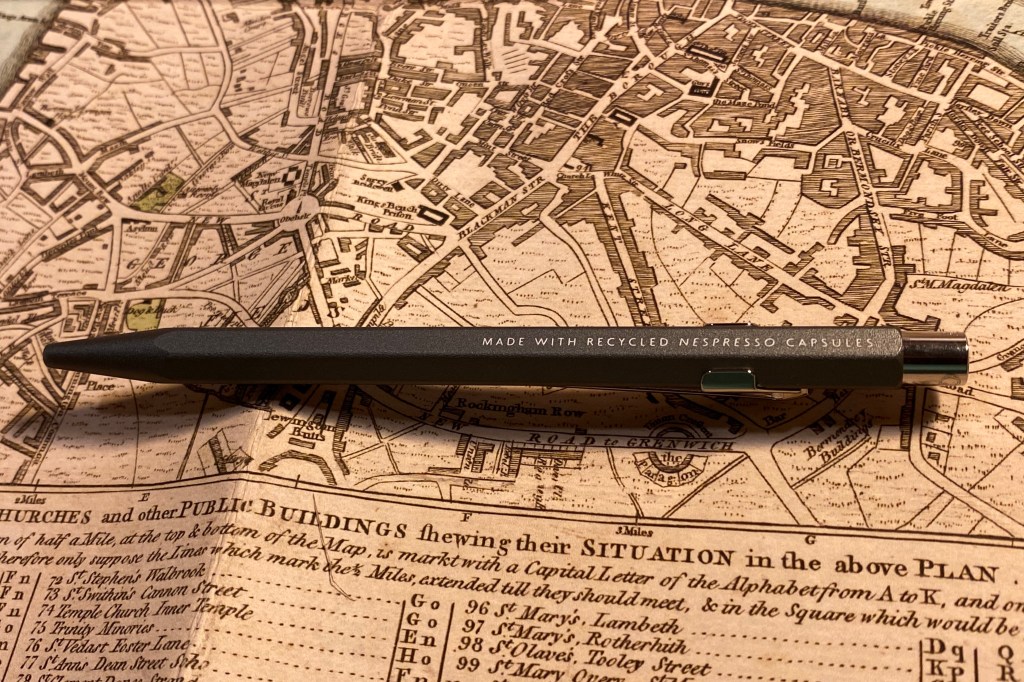
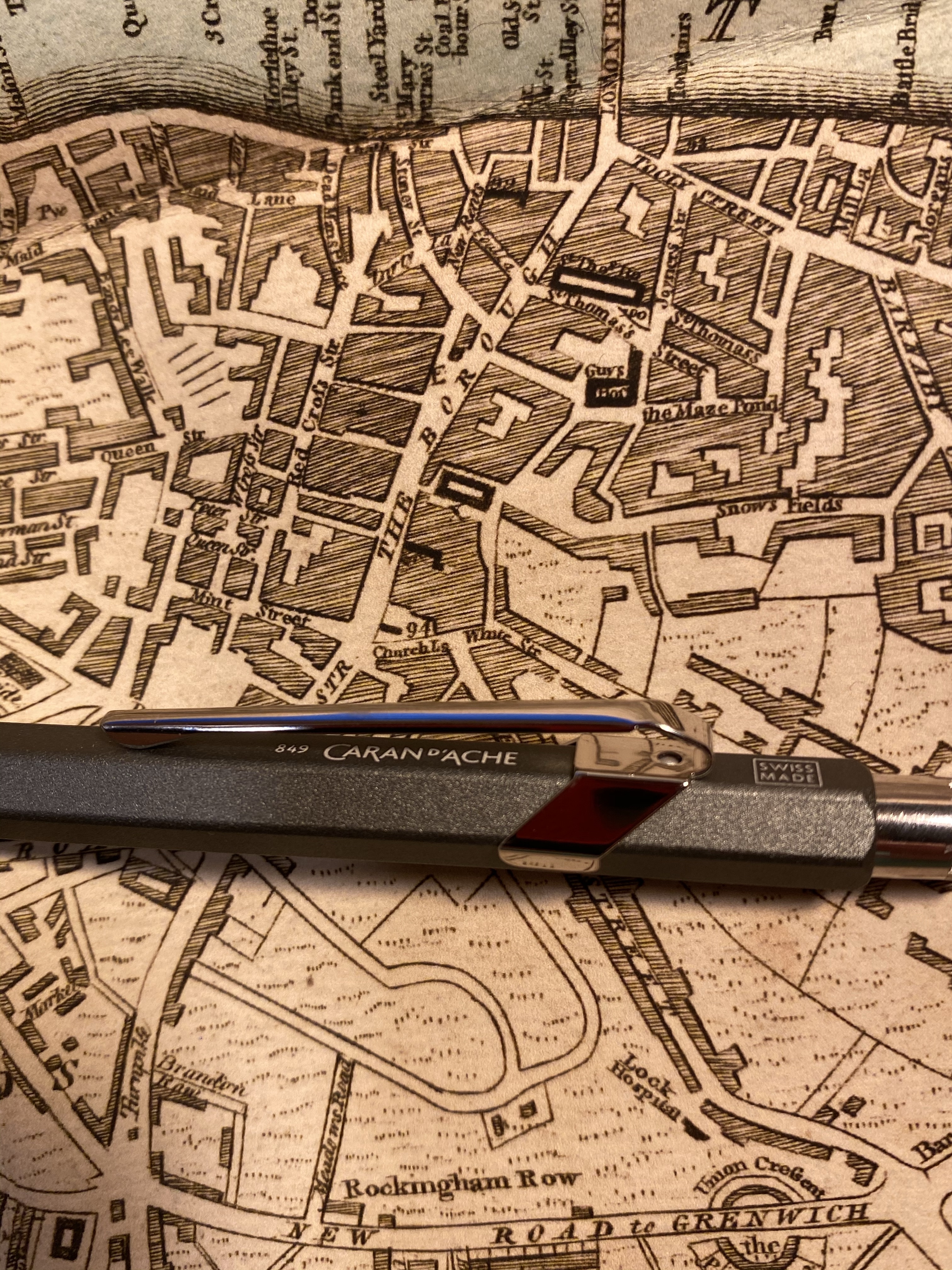
Made with recycled Nespresso capsules.
849 Caran d’Ache and Swiss Made, standard imprints on 849 pens.

The 849 is a ballpoint and has an excellent out of the box Goliath Caran d’Ache refill. I’m not a fan of ballpoints, so I switched my refill out with the 0.7 Parker gel refill in black, and now I can’t put this pen down. This pen weighs more than the featherweight 849, and it has a textured finish. The result is the 849 pen, only better.
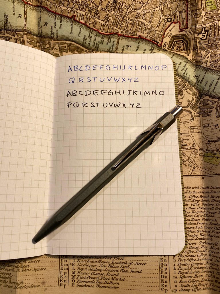
The writing on the top of the page is with the original Goliath refill, and below it the writing is with the Parker gel refill.

I highly recommend this pen to anyone who is even slightly interested in the Caran d’Ache 849, as it’s a significant improvement over an already great pen design. It makes for a great gift, and a great pen to carry around with you (just make sure nobody tries to nick it from you). I hope that Caran d’Ache and Nespresso continue this collaboration, and I can’t wait to see which capsule colour they select next.
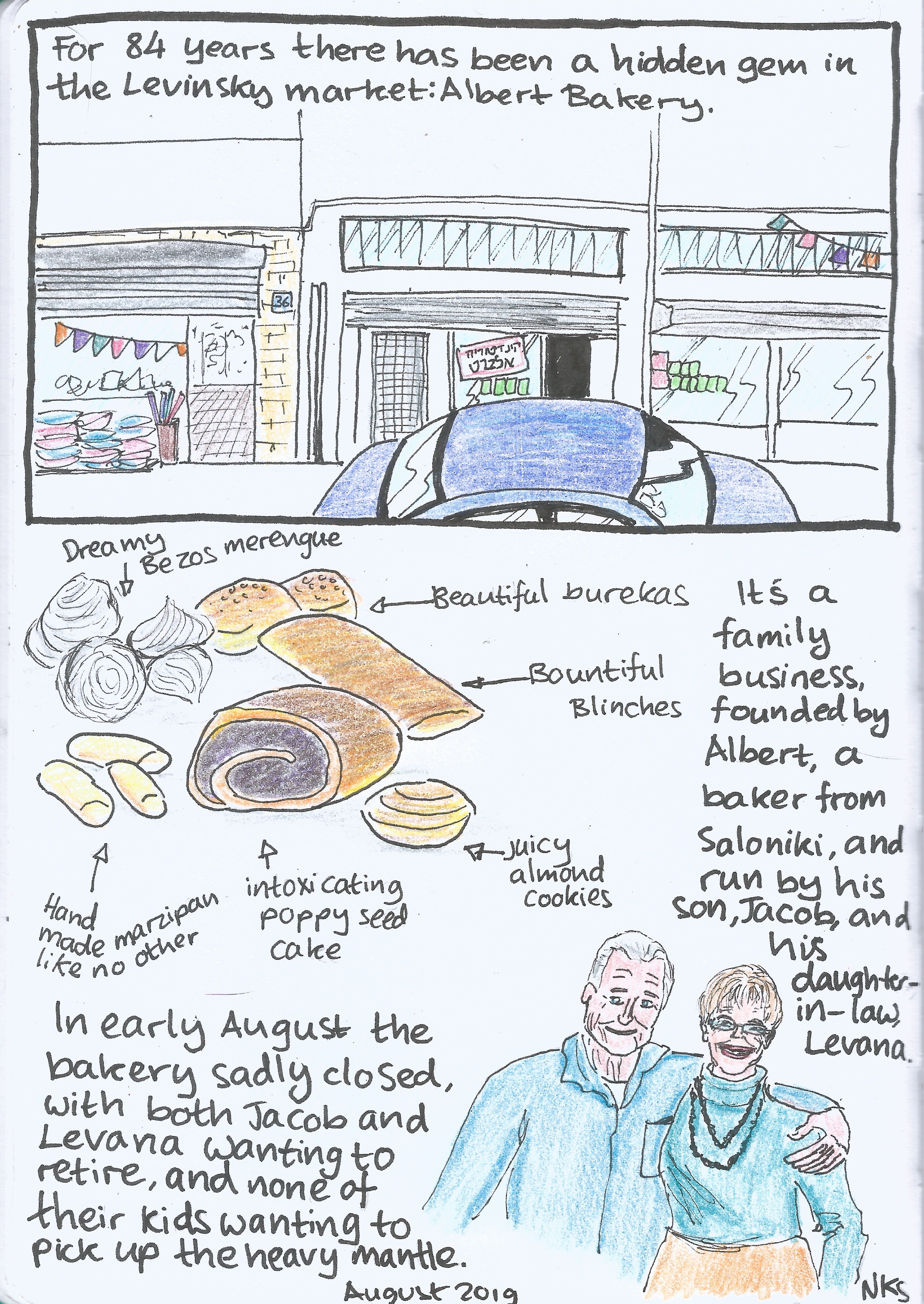
Closing Time (Journal Comic 11-8-19)

Journal Comic 11-8-19.jpeg

Leuchtturm1917 sketchbook, Kuretake Zig Mangaka pens, Deleter Neopiko-Line-3 pens, Caran d’Ache Pablo coloured pencils, Faber Castell Albrecht Dürer coloured pencils.

The Master Pencils Union No. 84 Pencil Review

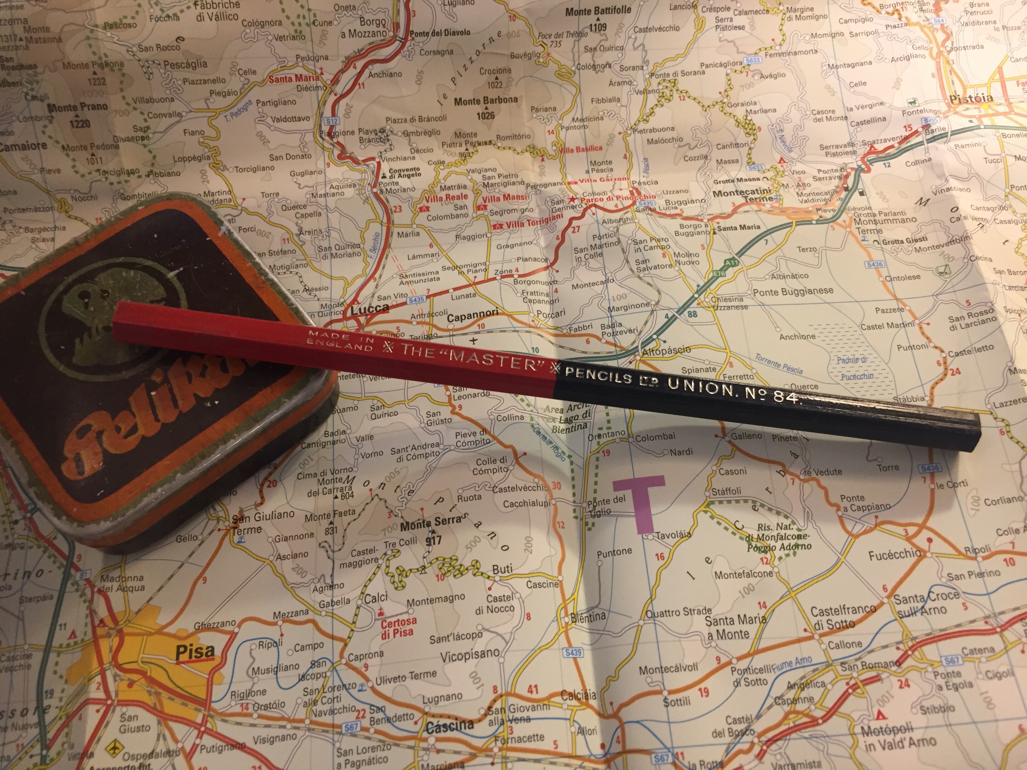
My latest flea market find is a red/blue Union No. 84 pencil from The “Master” Pencils Ltd, the English pencil company that also created the Golden Master pencils that I reviewed in the past.

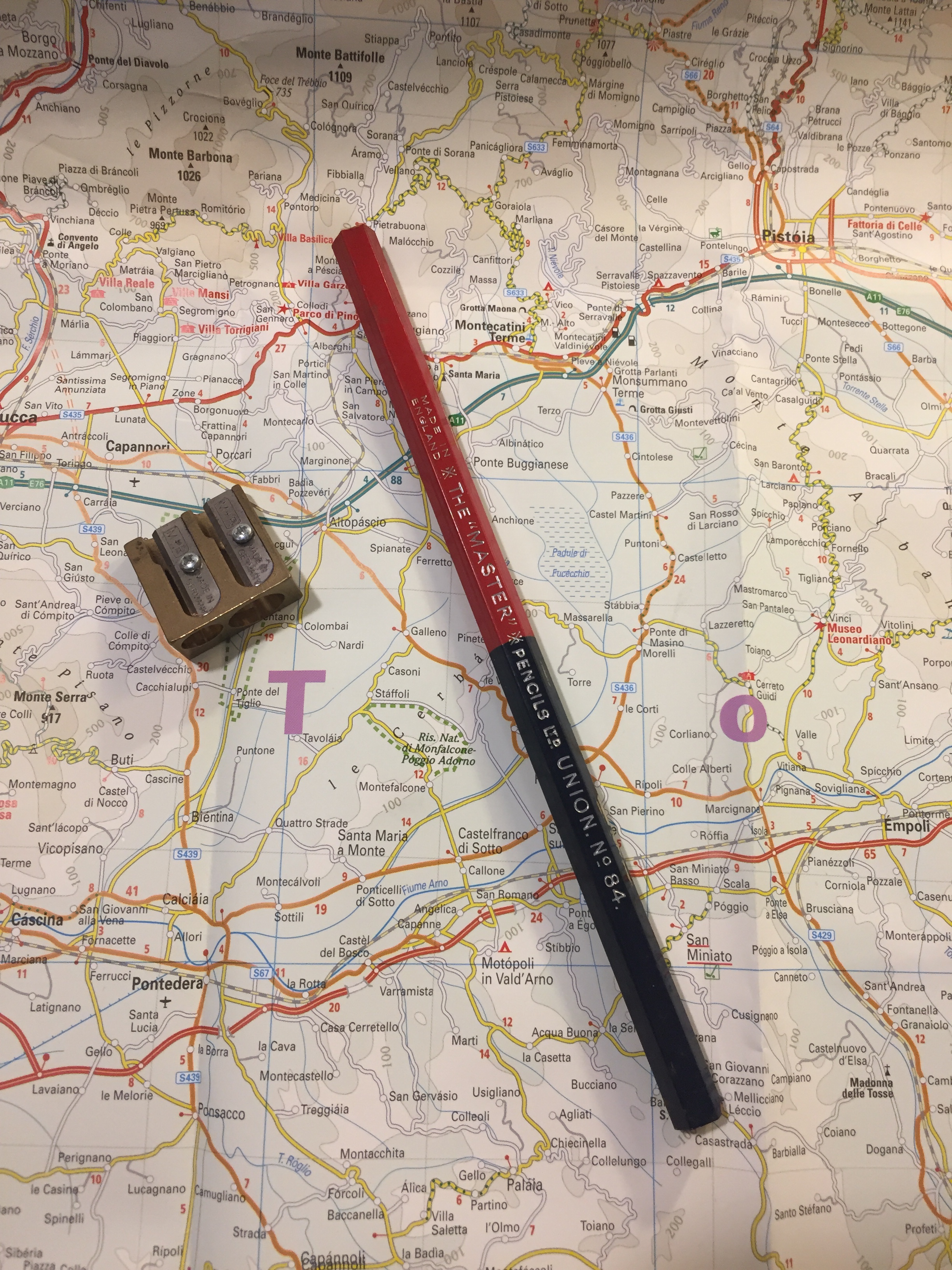
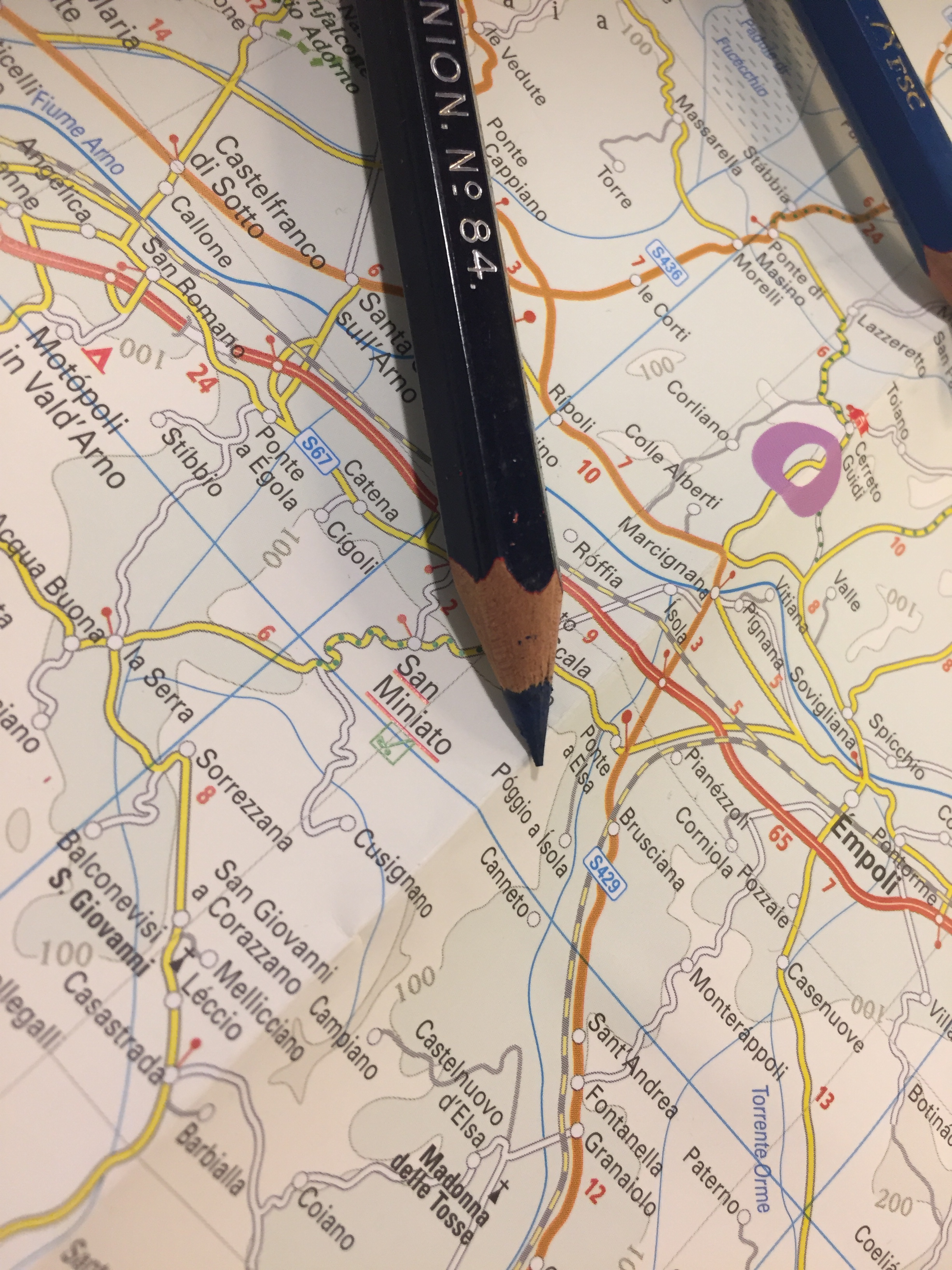
The Union No. 84 is an oversized pencil, with a red and navy core. I love the choice of font for the imprint: it looks clean and professional.

The pencil is thick, built like a children’s pencil, and so the cores are extra large as well.

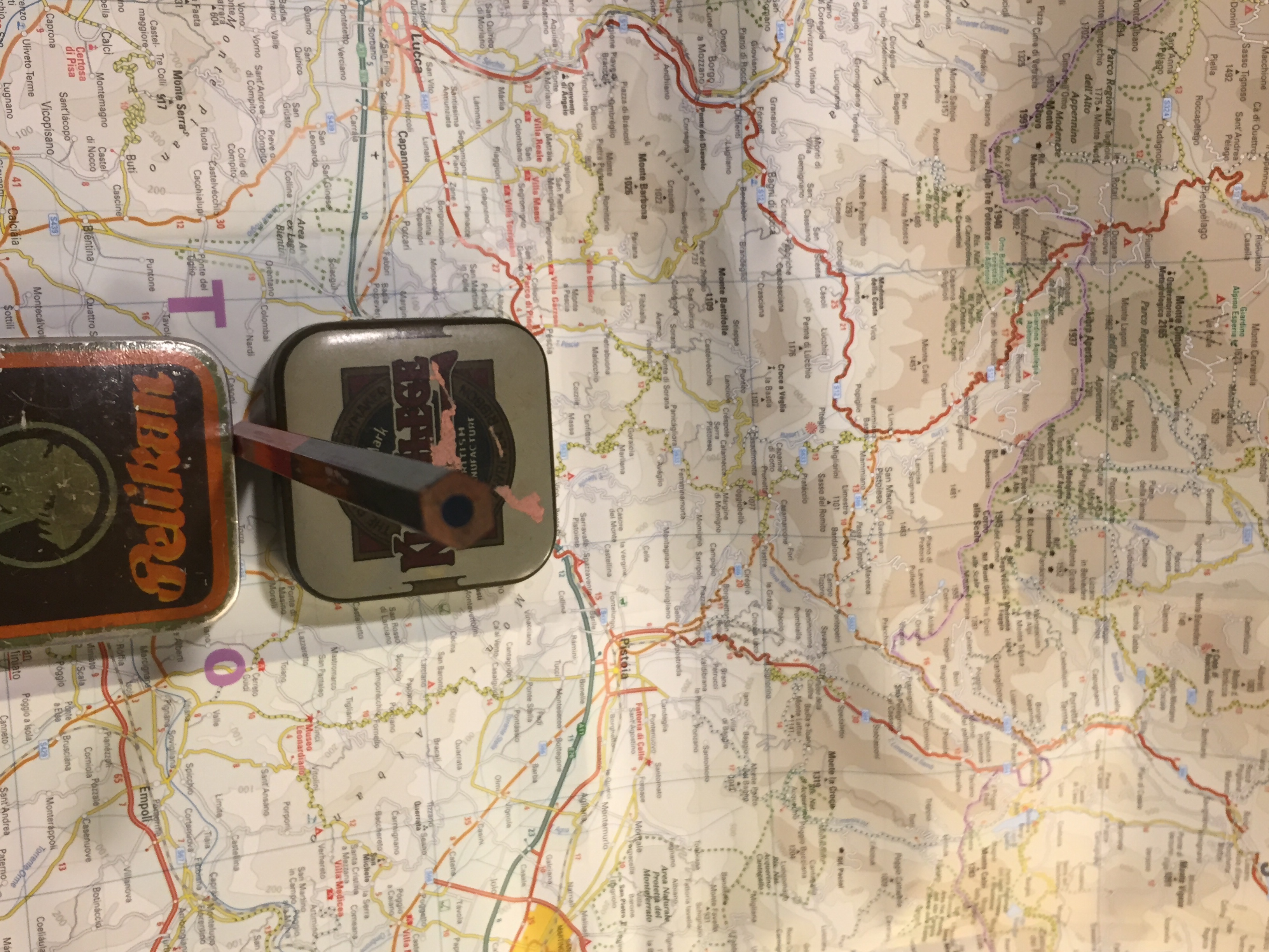
The navy core, almost black in appearance:

Finding a sharpener that can sharpen this pencil was a challenge. You’ll need one that’s designed for children’s pencils, yet is high quality enough to handle wood that has toughened over time, and a core that is still soft and brittle. I went with the M+R double brass sharpener Nr. 0603. Beware of the red core when you sharpen this pencil, as it can stain your hands.

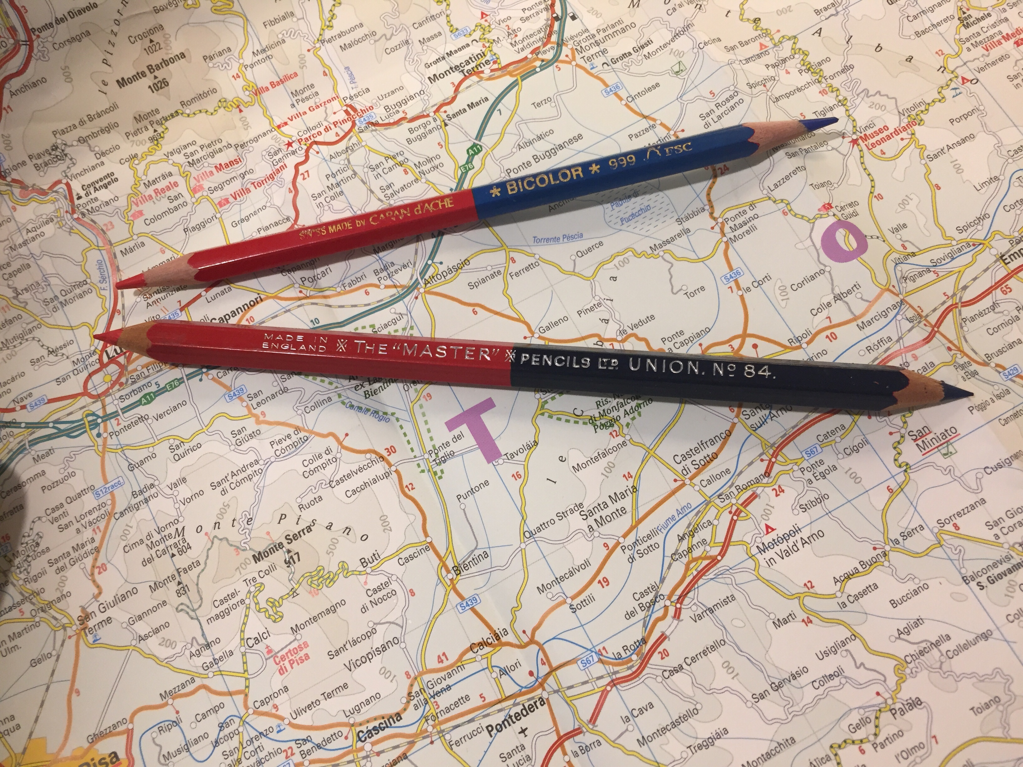
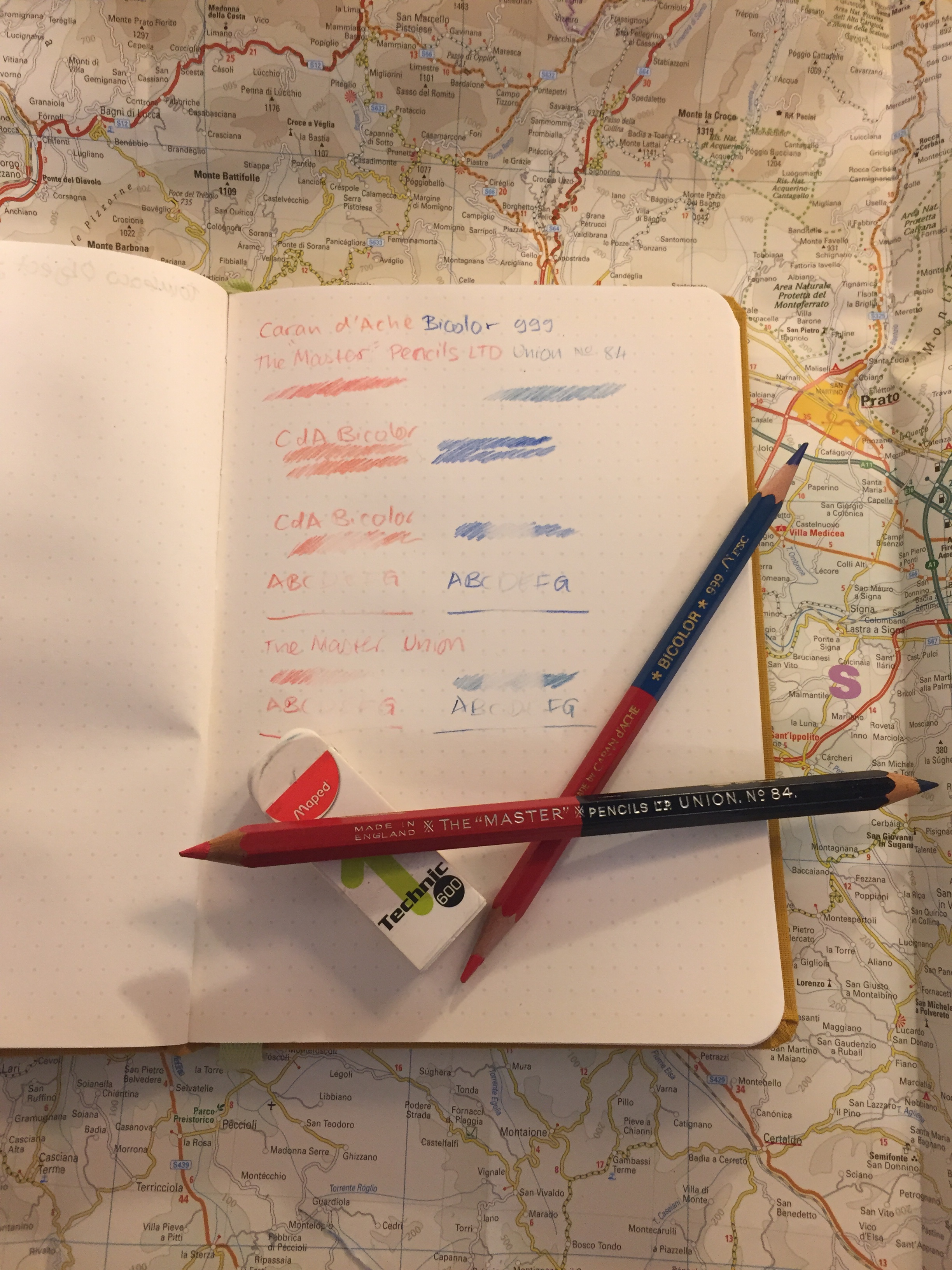
Here’s the Union No. 84 next to the Caran d’Ache Bicolor 999, the golden standard for red/blue pencils. You can see their size differences quite clearly.

The navy tip of the pencil:

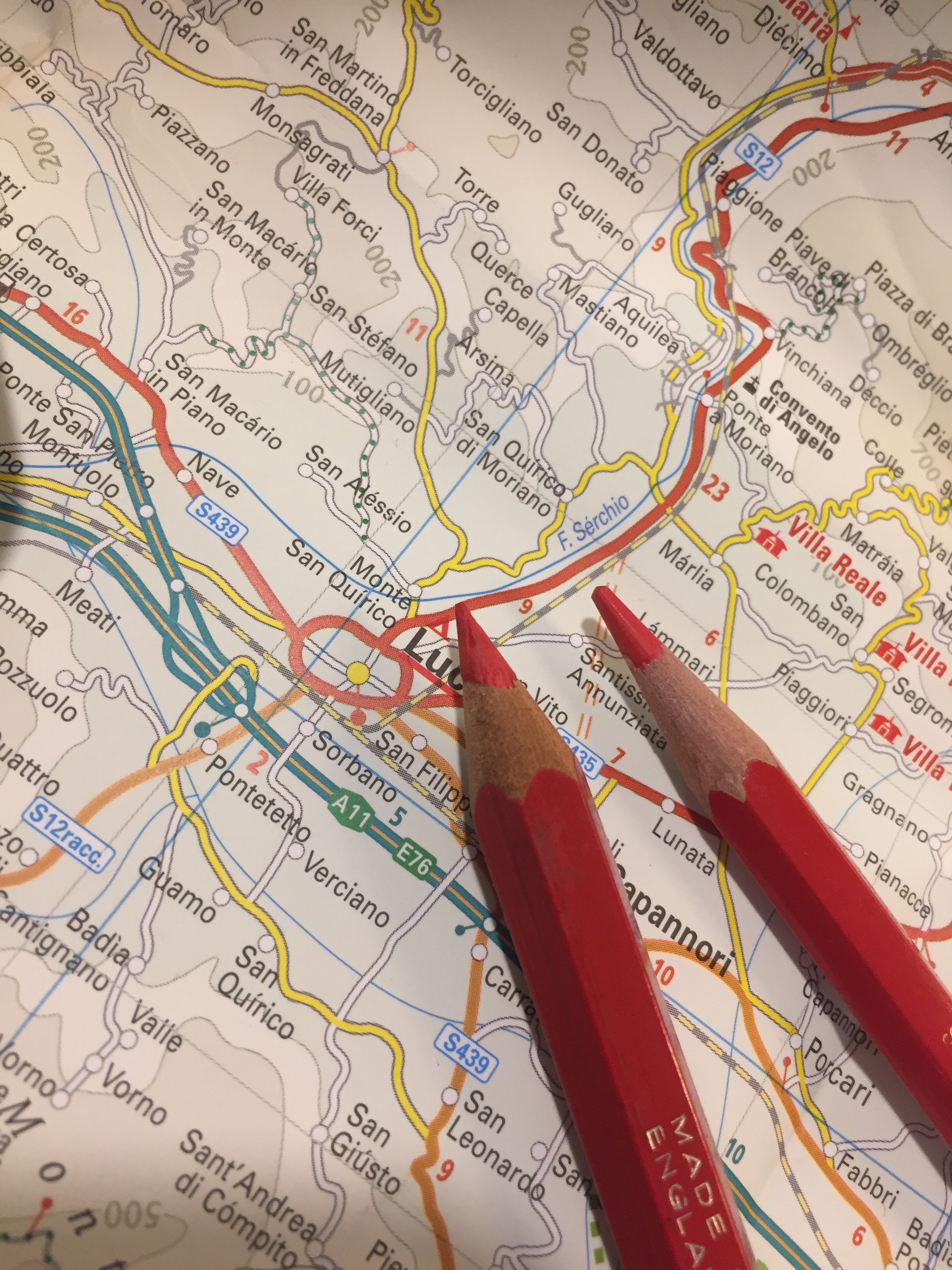
The red tip of the pencil:

The red tip of the pencil was much softer and more crumbly than the navy tip, but even though I was worried about it, it didn’t break with use.

I tested the Union No. 84 against the Bicolor 999, and discovered a few interesting things. The Union’s blue is indeed a shade darker than the Bicolor’s but it’s not as dark as I would have expected. The red shades of both pencils are virtually identical. The Union feels more like a pencil than the waxy Bicolor, with more feedback, and more shading possible when some pressure is applied. Both pencils erase poorly, but the Union erases better than the Bicolor, particularly the Union red, which doesn’t stain the paper.

I tested the pencils on a Baron Fig Confidant, my go-to pencil testing paper, and erased them with the Maped Technic 600.

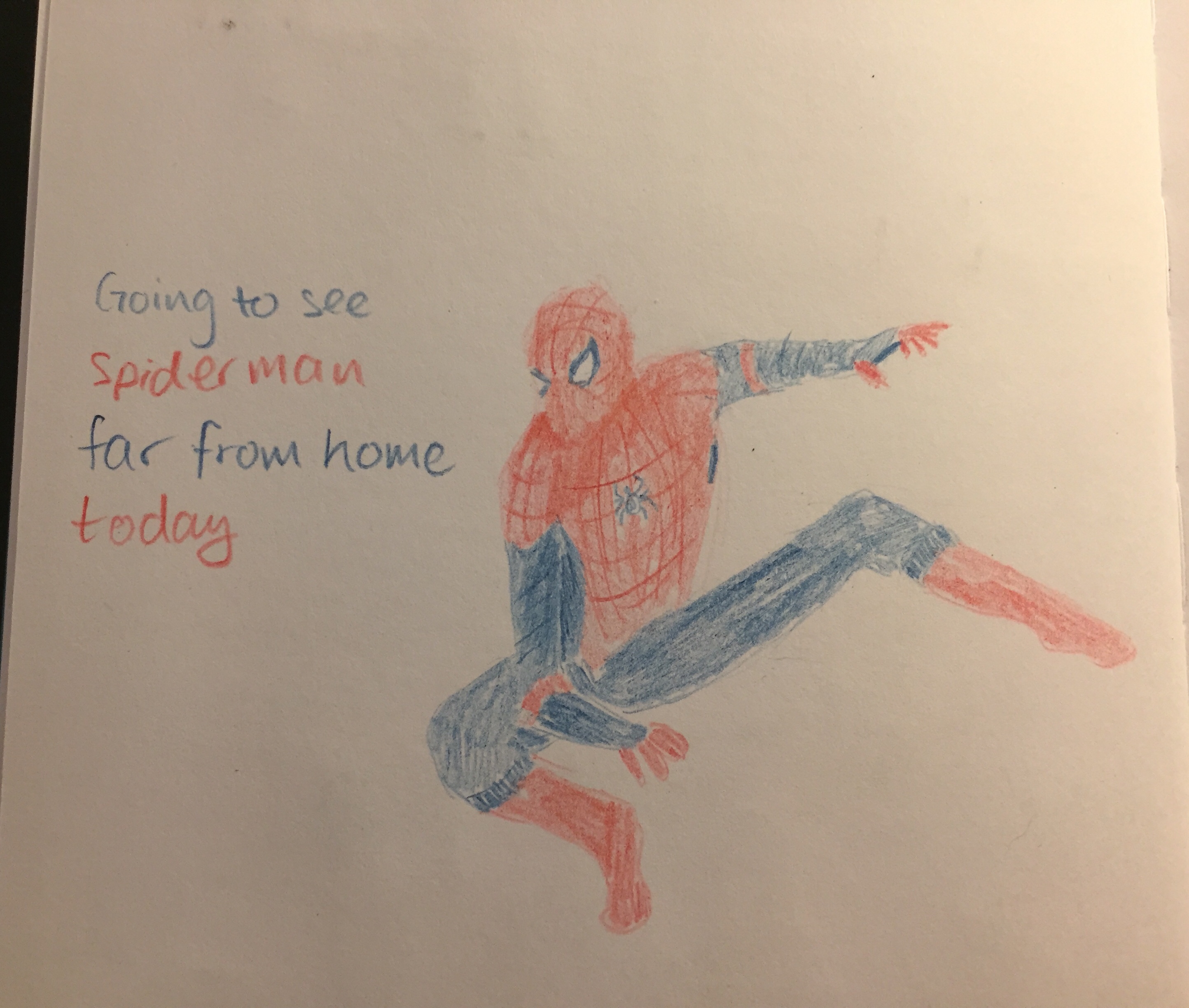
The Master Union No. 84 is a lot of fun to draw with, beyond being useful for highlighting and correcting text. It feels like a proper pencil, and not a waxy crayon, and it shades enough to allow for doodles like this one:

The Union No.84 is great and fun, and so was the Spiderman movie. I highly recommend them both.

My Reading Journal, or How I Taught Myself To Enjoy Reading Again

Ironically enough, by the time I finished with my MA in English Literature a few years ago I had “lost” the habit of reading. From someone who used to read at every available (and not so available) moment I had turned into a non-reader almost entirely. This bothered me so I set up to rectify it by “gamifying” reading until I had tricked myself back into the habit again.

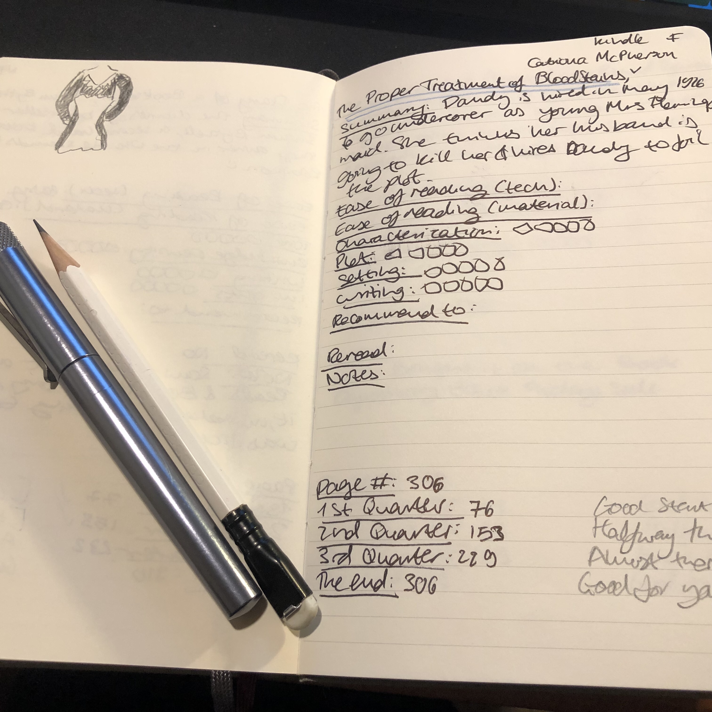
Field Notes had just come out with their Arts and Sciences, the perfect format for my plans. The idea wasn’t only to create a journal where I would log my thoughts on each book as I read it, but create a little set of “achievements” that I could unlock for each book as I read it. For each quarter of the book I read, I got an achievement, a little logo that symbolized the book which I drew on a separate page. The accumulation of those silly little symbols was enough to push me forward as I learned to enjoy reading again. I kept that up for three Field Notes Arts books and then when I ran out of them, I simplified the format and moved to the Moleskine Two-Go, which had just come out. The Field Notes Arts notebook wasn’t fountain pen friendly so I used a Karas Kustoms Render K, a Blackwing pencil and the Caran d’Ache Bicolor 999 double sided coloured pencil.

On the first year that I tried using this system (from March 2016) I got from not reading any new books (just my old familiar favourites) to reading almost 20 new books. On the second year (2017) I got up to 42 books. This year to date I’m at 58 books, and I’ll probably read 60-61 books by the end of the year. I no longer need to spend time drawing little “achievement badges” as my reading habit is back here to stay. I do, however, still keep a book journal even though I’ve started using Goodreads since 2017. It’s a satisfying way to keep track of my reading and organize my thoughts on the books that I’ve read.

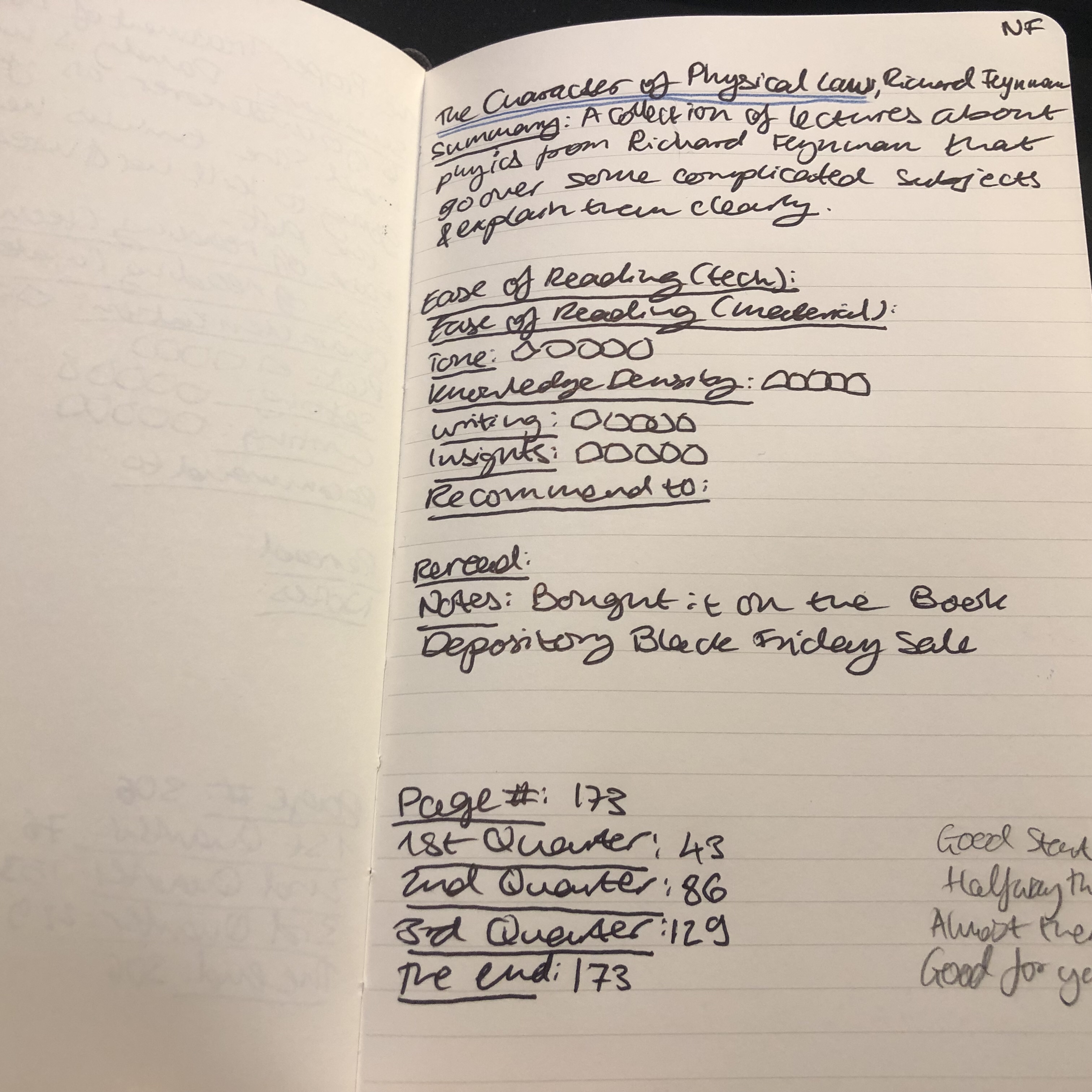
You can check out the format of the entries for fiction and non-fiction below. The unlined left side of the spread (verso) is where I do a little doodle that reminds me of something central in the book, and explain the star rating that I gave the book in each category. I really recommend that if you choose to create your own analog reading journal, you create your format yourself. Mine has changed over time, particularly for non-fiction, and it works with my reading goals for the year.

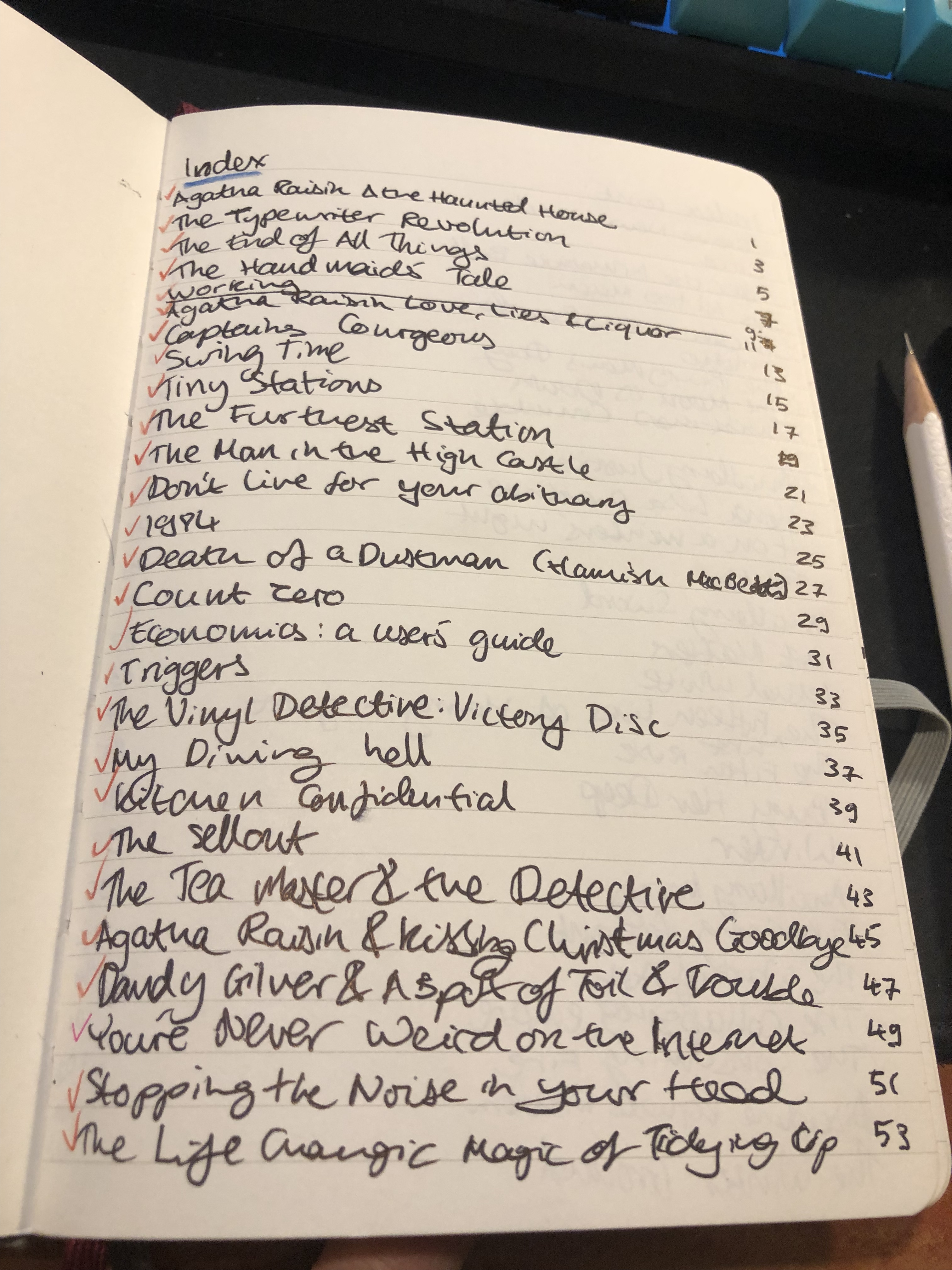
This is the index, which is useful for reference later on and is a good way to check my reading progress throughout the year.

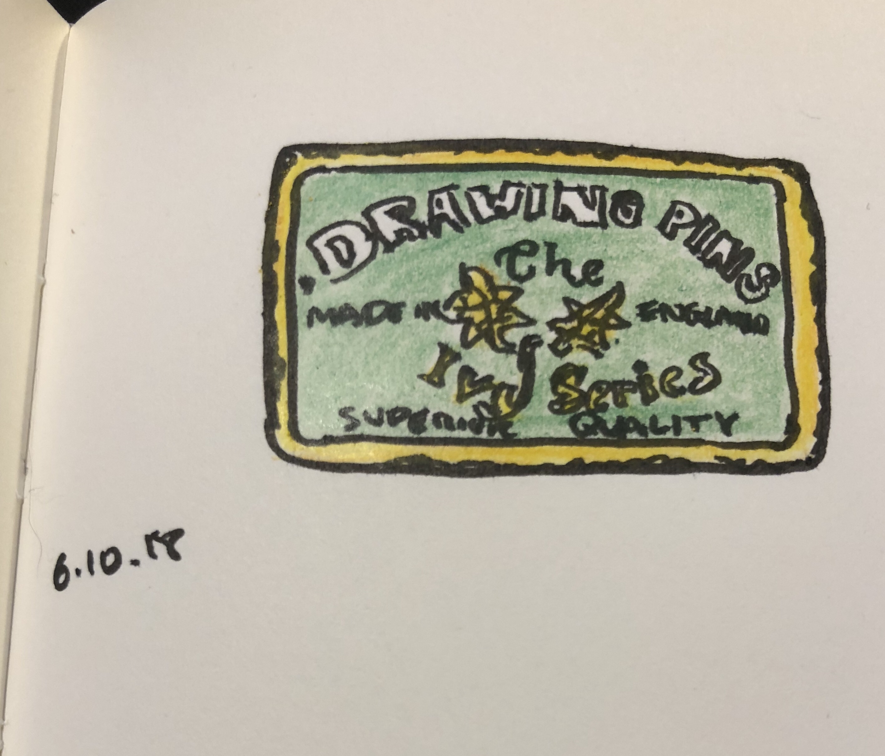
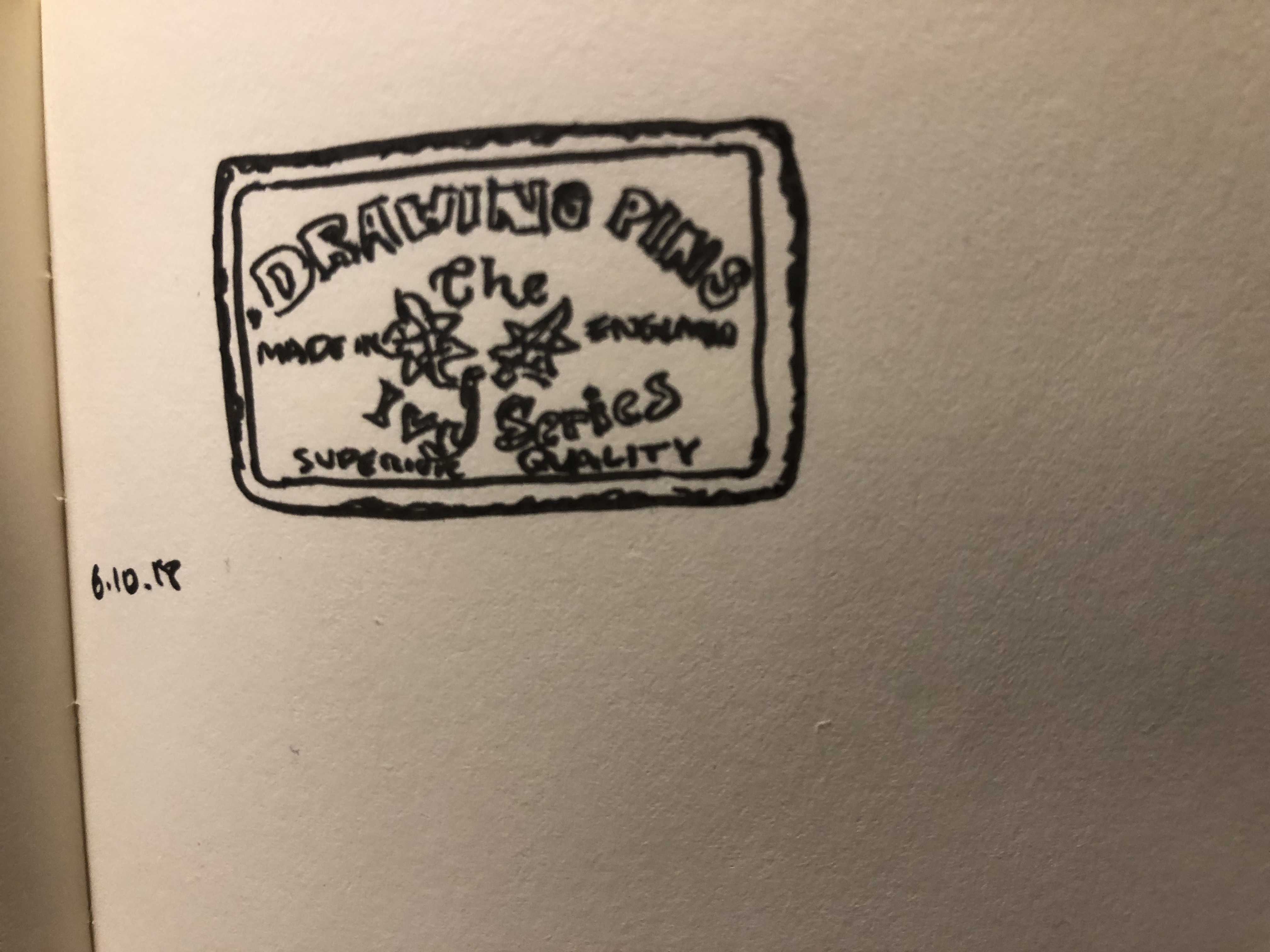
#inktober Day 6: vintage drawing pins tin

I like old tins, and this one is one of my favourites, because of the sheer amount of fonts packed into such a tiny box.

Drawn with a Pilot dual tipped brush pen on a blank Moleskine Star Wars notebook and coloured with Caran d’Ache Pablo pencils.

Caran d’Ache 849 Nespresso Pen

I was eying the Caran d’Ache 849 line for a while, wondering whether to try one or not. On the one hand I really liked their design. On the other hand, they’re ballpoint pens, and I have very little use for ballpoint pens. They require pressure to write with, and with my carpal tunnel problems, ballpoint-caused pain is what made me research and get into fountain pens in the first place.

Then I started getting emails about the Caran d’Ache 849 collaboration with Nespresso. From Cult Pen’s website:

In 2015 Nespresso launched its Second Life project, the aim of which is to recycle its aluminium coffee capsules and use them to create other products. Caran d’Ache’s 849 was a perfect candidate! An exclusive alloy using the aluminium from the Nespresso capsules was created in order to meet the 849’s quality requirements, and the ‘Darkhan’ capsule was chosen to lend its dark blue colour to the Nespresso 849 Limited Edition.

Well that got me hooked. I enjoy Nespresso’s capsules and especially its design, and I was intrigued by the idea of its capsules (which I recycle) ending up in such an iconic pen. A quick order from Cult Pens (who now have free international shipping for orders over £50) later, and this arrived:

The packaging is recycled, beautiful, and really evokes a Nespresso capsule sleeve:

The pen has ” Made with Recycled Nespresso Capsules” screen printed on it as well as all the usual, understated Caran d’Ache branding.

I took advantage of the free shipping to also order an 849 Tropical pen, and unlike that and other, more standard, 849s, this pen has a textured, beaded body. If you have sweaty hands, this is a blessing, of course.

Although it’s a metal-bodied pen it is surprisingly light and very well balanced. Even if you have tiny hands you shouldn’t have any trouble using this pen for long periods of time. The knock is so smooth that it doesn’t click, which I found a bit annoying. I’m used to pen knocks clicking unless they are faulty, and so I found myself constantly pausing to check if the mechanism had fully engaged before I started writing.

I don’t use ballpoints for writing, especially not for long periods of time, but this pen is obviously built to be a workhorse. Nothing rattles when you write, the refill is smooth, with no blobs of ink and no problems starting. Thin white streaks appear now and then while writing, but that’s to be expected and is hardly noticeable. Unlike many ballpoint refills, the Caran d’Ache Goliath refill that comes with this pen dries almost immediately, even on Moleskine paper, making it friendly for left-handed writers.

All in all a great pen, and a perfect gift for the Nespresso lover in your life.