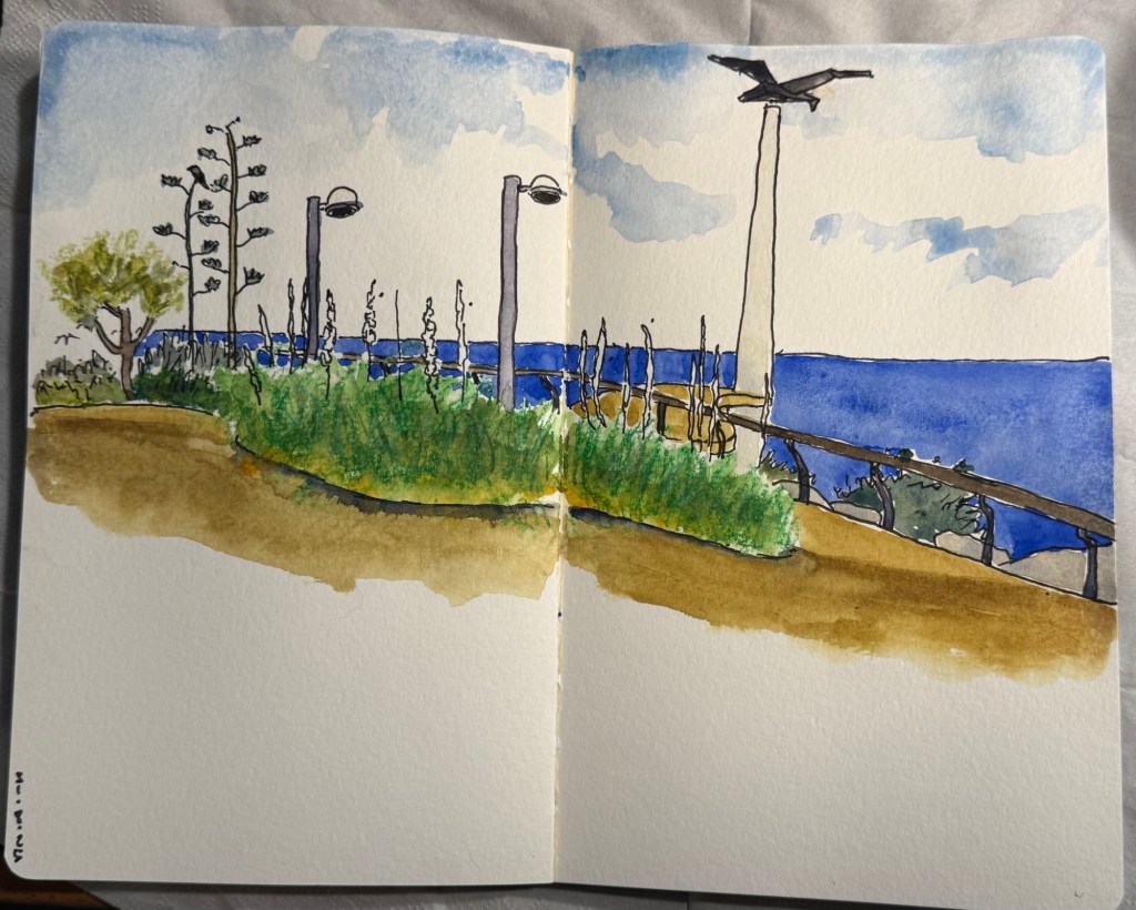
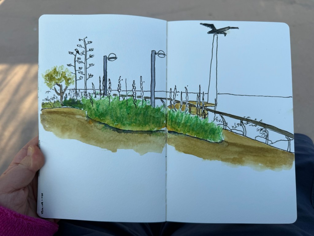
I started this one yesterday on location and then discovered that I needed a proper brush to finish it and not just a waterbrush, so I finished it at home today. The flowers are squills, which have a dreadful name in English but they are magnificent flowers and the heralds of autumn.
The Caran d’Ache 849 ballpoint is a classic which I have already reviewed in the past. While I rarely use ballpoints, I have several of these pens (all with gel refills that I have swapped instead of the Caran d’Ache Goliath ballpoint ones). Why? Because of their excellent limited edition designs.
While I was in London in April I picked up two new limited edition 849s – The Keith Haring edition in red and white, and the latest 849 Nespresso collaboration.
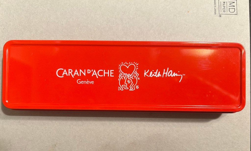
The box
The Keith Haring edition comes in black and in red and white. I think that the red and white edition is nicer, and it appears that so do other 849 fans: the black edition is still widely available but most places have long sold out of the red and white edition.
The box is very nice, and makes for a nice gift pack.
Outer box
Inside the box you also get to see some of Haring’s work.
Inside the box
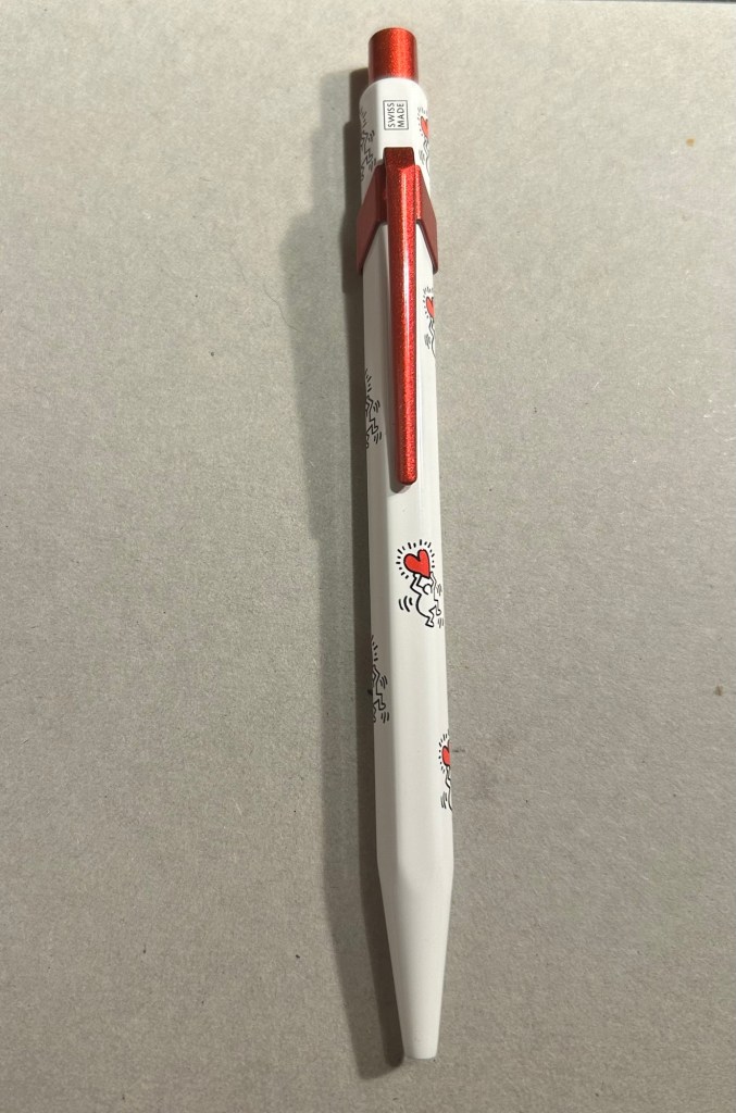
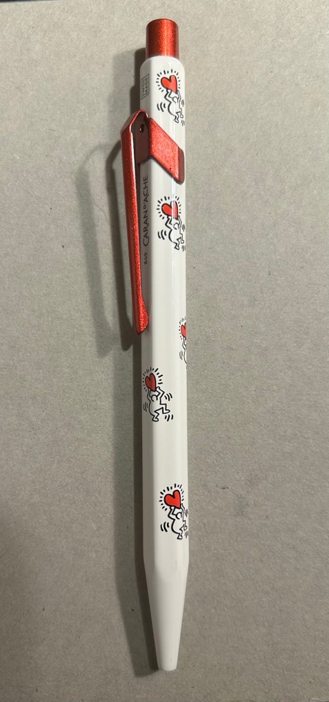
The pen itself is white, with a sparkly red knock and clip. The paint on these feels like lacquer, and the look is sleek and bold. There are dancing people holding red hearts all over the pen (so you get some Keith Haring artwork, but it’s not overcrowding the pen), and the pen body’s finish is the standard 849 glossy finish.
The Keith Haring 849
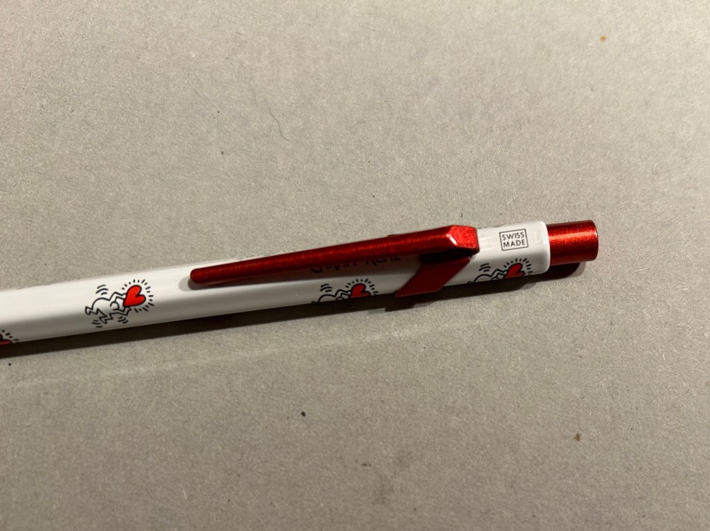
The knock and clip are probably the most striking thing about this pen. Surprisingly Caran d’Ache didn’t put any Haring branding on the pen, not even hidden with their branding under the clip.
You can see the branding on top.
The paint on the clip and knock look like someone poured them out of red glitter paint, and then waited until they set. All in all the result, together with the Keith Haring artwork and the included box, is one of the best 849 gift pens I have seen.
The Caran d’Ache Nespresso Kazaar edition, the 6th Caran d’Ache and Nespresso shared edition, is a bit different than previous editions. Unlike previous editions that featured a silver clip and knock, the Kazaar edition is monochrome. The dark blue pen has a clip and knock in matching colours, and the result is much better than previous pens in this series.
The Kazaar 849
As usual the pen is made at least in part from aluminium from Nespresso Capsules. The pen body has a bit of a matte texture to it, which makes it slightly easier to grip. It comes by default with the excellent Goliath refill, this time in black (the Keith Haring 849 also came with a black Goliath refill).
The pen touts its recycled origins.
The 849 Nespresso came in the same sort of recycled cardboard box that previouseditionscame in. It makes for a good gift pen, even though some may find the dark navy blue colour a bit… boring.
Swiss made. The colour matching on the knock, clip and pen body is superb.
If you like the idea of the 849 Nespresso but don’t much like the colour of the Kazaar one, I’d recommend waiting for the next edition. I have a feeling that it too will feature monochrome hardware, and it might be in a brighter colour as Nespresso are starting to run out of drab capsule colours.
The Goliath refill in action
Note to those who prefer gel ink refills and plan to swap the 849 refill out: the tolerances on these 849 pens are a bit weird. There are 849’s in which you can easily swap the refill for any Parker style refill with no issue, and those in which if you swap the refill you find that the knock won’t properly engage it. This is something worth taking into account if you plan on swapping the refill in the pen – there’s a risk that it won’t work with the specific pen you own. I’d recommend in this case to try swapping the refill before you purchase the pen if possible, or resign yourself to using a ballpoint. The Caran d’Ache Goliath refills are several cuts above what you get in a standard, disposable ballpoint, so the loss shouldn’t be too great.
What about you? Do you like the 849? Do you swap its refill?
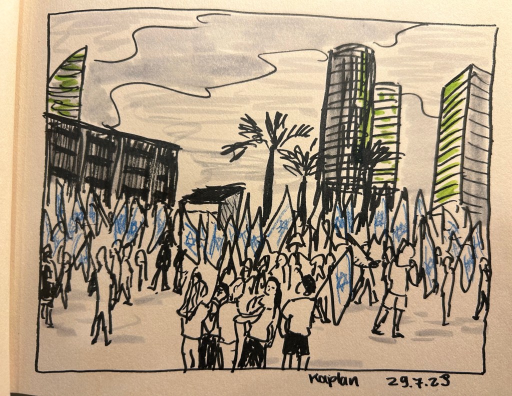
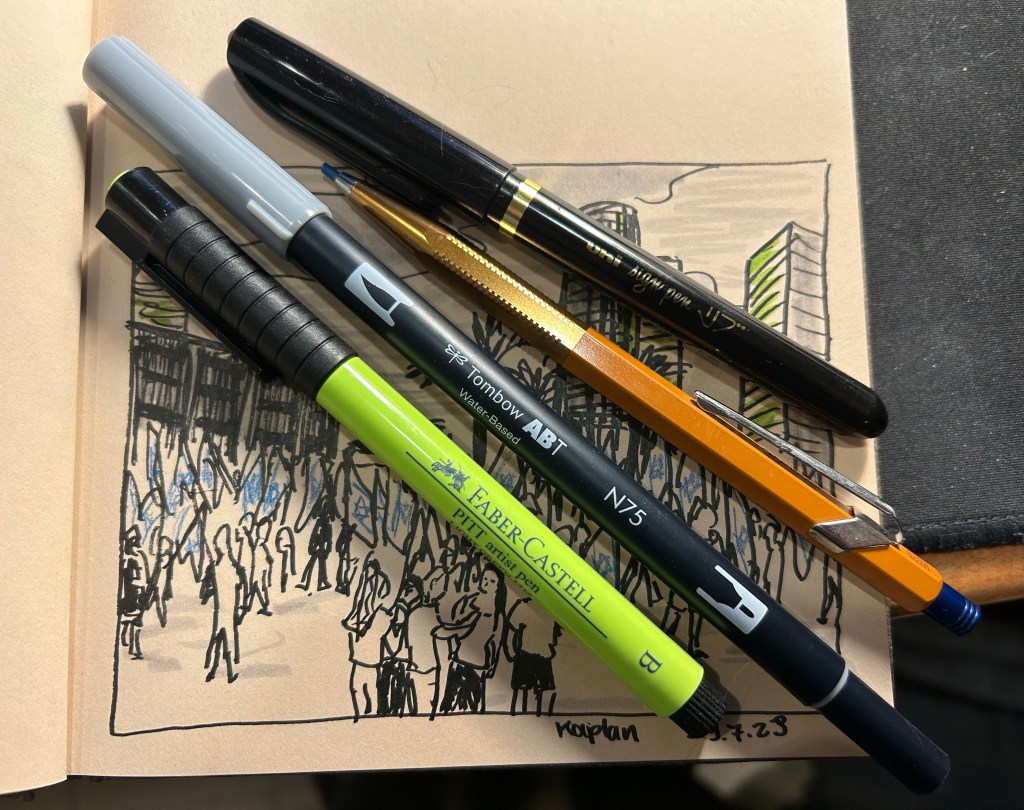
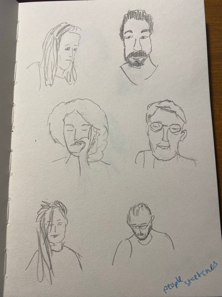
I went “shopping” in my stationery and art supply stash again, and this time used a Hahnemule Cappuccino sketchbook, a uni-ball sign pen, a Faber Castell PITT artist brush pen in light green (171), a Tombow ABT water based dual brush pen (I only used the brush side not the felt tip pen side) in light grey (cool grey 3 – N75), and a Caran d’Ache + Alfredo Haberli Fixpencil with a blue 2mm lead.
protest sketch
I used them all to draw the protest scene from this Saturday, using a photo I took during the protests. It was intensely hot and humid, and I went to the protests right after running a Dungeon World game at a small local tabletop roleplaying convention. With no art supplies on me, the best I could do was try and capture the scene to sketch later. When I was pulling things out to try out with this sketch, I decided to veer away from my comfort zone: I used tinted paper, a sign pen, mixed media, and an unusual colour. I like the result – for a quick sketch it captures the energy of the moment well.
tools used.
I like the Hahnemule Cappuccino sketchbook. The paper is smooth but has a touch of grain to it that makes it work for pencils as well. It’s way too thin for wet media, but works great for brush pens, pencils, markers, etc.
My main sketching tool was the Uni Sign Pen. This is the first time I’ve used a sign pen for “serious” sketching, as I normally only use them for illustrations that I gift to friends’ kids. I like it – it has relatively little line variation, but on the other hand offers more control, and a good bold line. If you are dipping your toes into brush pens for sketching for the first time, this might be a good place to start to get a feel for the kind of thick lines these kinds of pens create.
The Faber-Castell PITT brush pen is a classic, one that I’ve used many times before in sketches. I’d love to say that they don’t disappoint, but like most soft and medium soft brush pens, the tip doesn’t last for long. They do come in lots of great colours and if you cap them they last much more than many other markers and brush pens in the market. They’re also waterproof, which is a bonus if you’re mixing them with wet media.
The Tombow dual brush pen is completely new to me, and I liked it enough to want to add it to my current sketching setup. It works well for quick shading (and shading and colour make sketches pop).
The Caran d’Ache + Alfredo Haberli Fixpencil… This is something that I want to properly review sometime in the future, so it’s been waiting on my desk for a while. For now I’ll just say that it did the job, although I have other pens and pencils that would have done the job better.
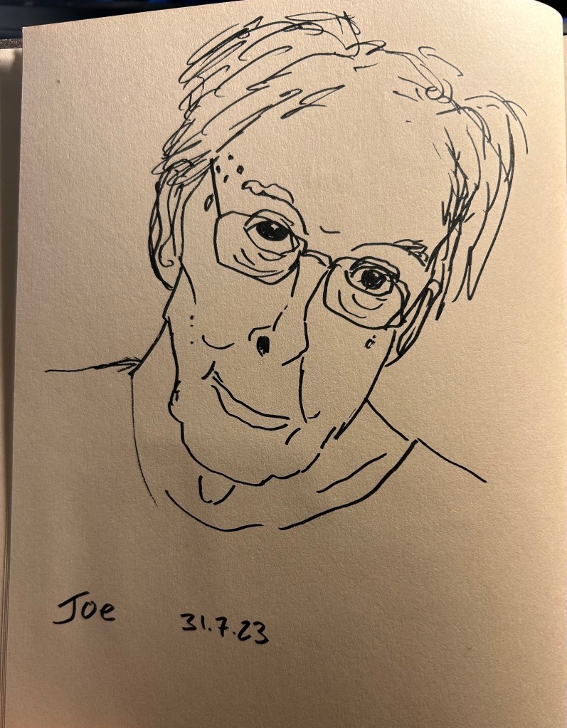
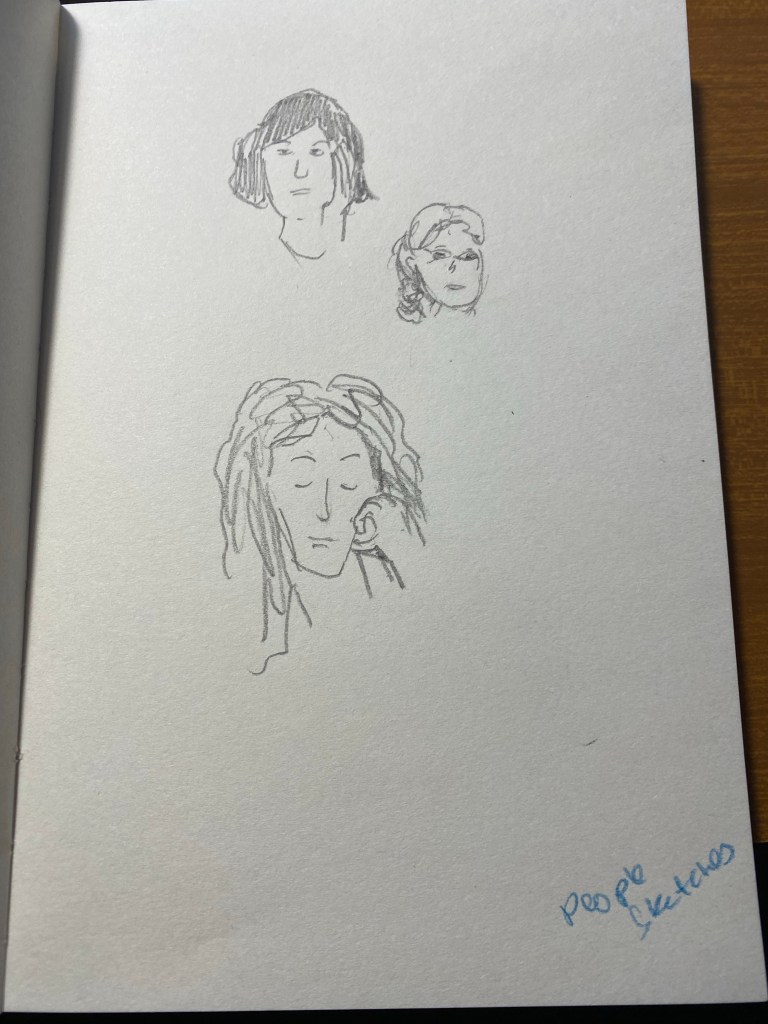
I also sketched our friend Joe during our weekly Zoom meeting, also on the Hahnemule Cappuccino and using the Uni Sign Pen. This was a very quick sketch, done it 2-3 minutes, and the sign pen does well with expressive lines.
Our friend Joe.
Now go rummage in your stationery/art supply stash and find something new to play with. It’s guaranteed to make you smile.
There is a local group of illustrators and animators that have set up a delightful new tradition during the pandemic: they meet up every Tuesday morning on Zoom for a sketch/doodle session, where they do quick, loose sketches and doodles just to warm up and experiment. Once a month the morning Tuesday meeting is replaced by a night Monday meeting with a guest artist leading the session with various prompts. Tonight my Urban Sketchers chapter head lead the session, and through her I joined the fun.
As I’m neither an illustrator or an animator, I’m posting everything here as quickly as possible before I see the other artists’ amazing work and lose my nerve.
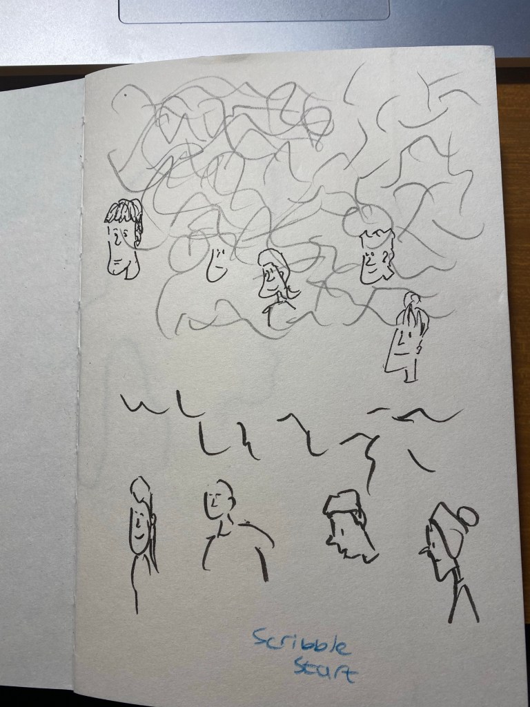
We started with the suggestion to just doodle while we waited for people to join. I was using a new sketchbook that was very cheap, laid flat and had thick textured paper (good for pencil). I used a Caran d’Ache Fixpencil with a 2B lead, and a Tombow brush pen throughout this one hour session.
Doodling before we started. Testing out the paper. Warming up.
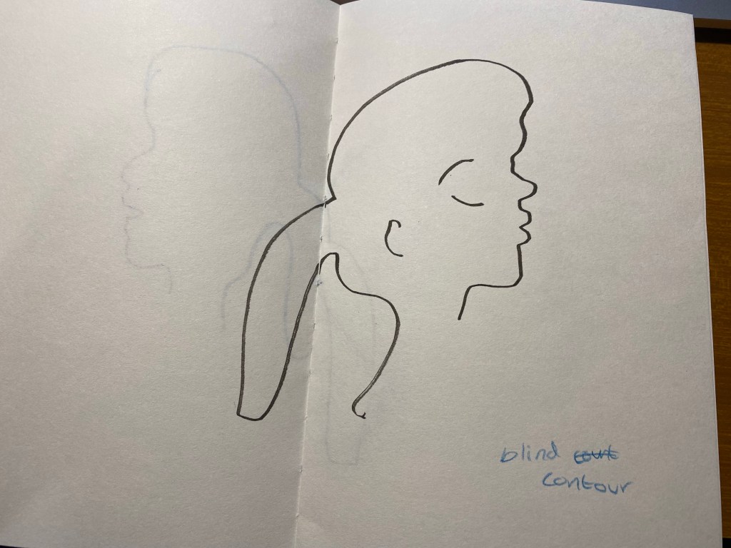
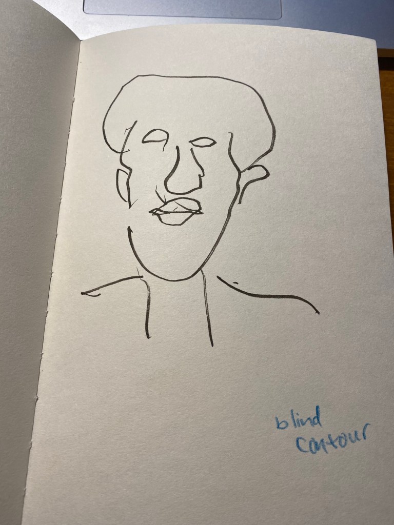
We started with a few blind contours, which I haven’t done for years, and so I kept catching myself automatically glancing down at the page. Definitely something I need to practice to get used to drawing these again. We were using Shutterstock films as our models, so that subject was moving around, some of them quite a lot. The idea was to get used to sketching people in motion, grasping as quickly as possible what captured their character.
Not so blind contour.
This looks good if you don’t know what the original looked like. I do, however, like the boldness and flow and expressivity of the lines here. Something to recapture in the future.
Blind contour.
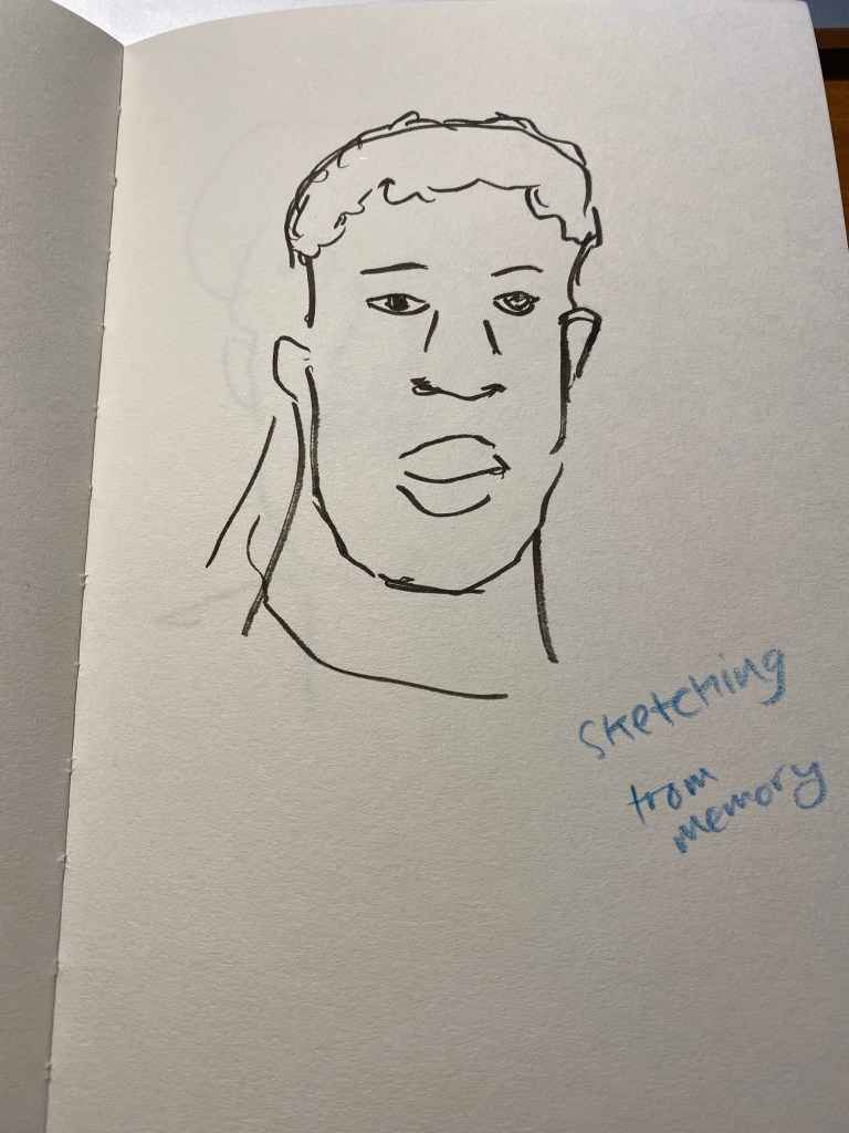
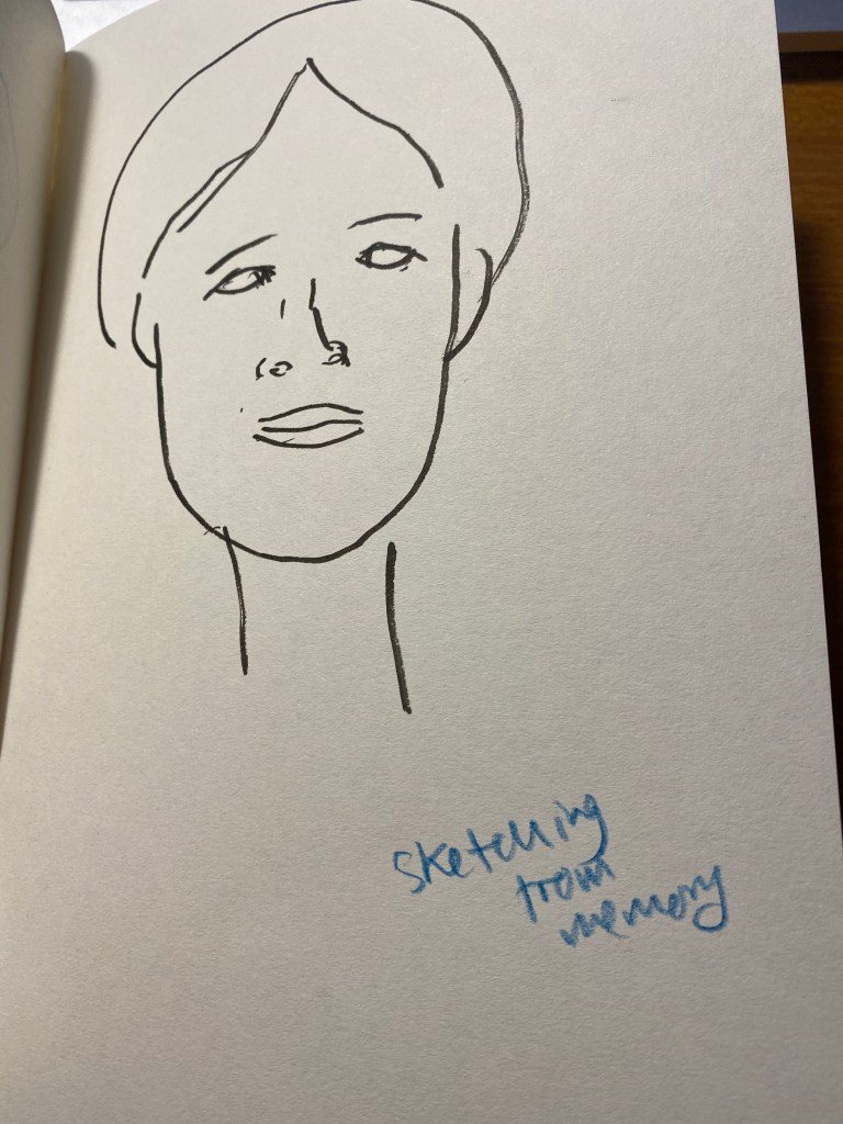
Then we did an exercise where we had 10 seconds to look at a moving person and try to remember what made them them, and then draw a portrait of them from memory. As Marina suggested, it’s easier if you describe the person to yourself in a few sentences.
Portrait from memory.
The second subject drawn as a blind contour:
Blind contour.
And from memory:
Portrait from memory in a minute.
We only had a minute for each portrait, and that was too little for me. It’s a good challenge to practice in the future (working under such short time limits with such complex, moving subjects).
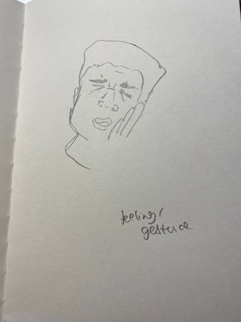
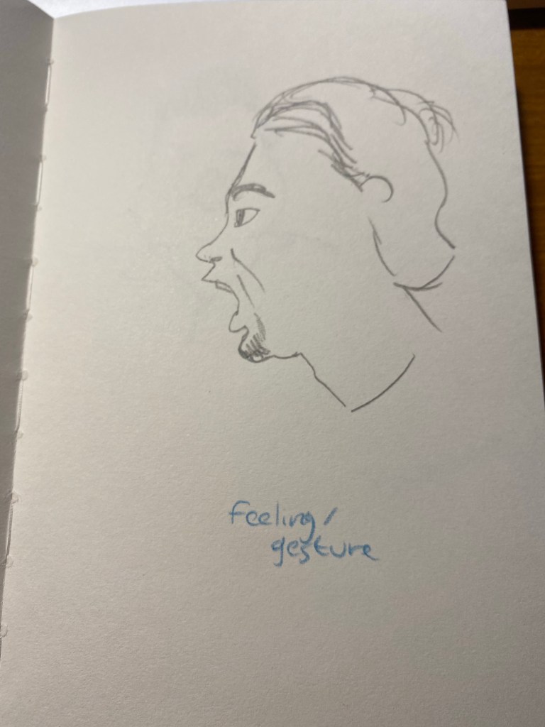
The next exercise was to capture the subjects feelings. Again, a 2 minute time limit would have been more in my wheelhouse.
Can you guess what he’s feeling?
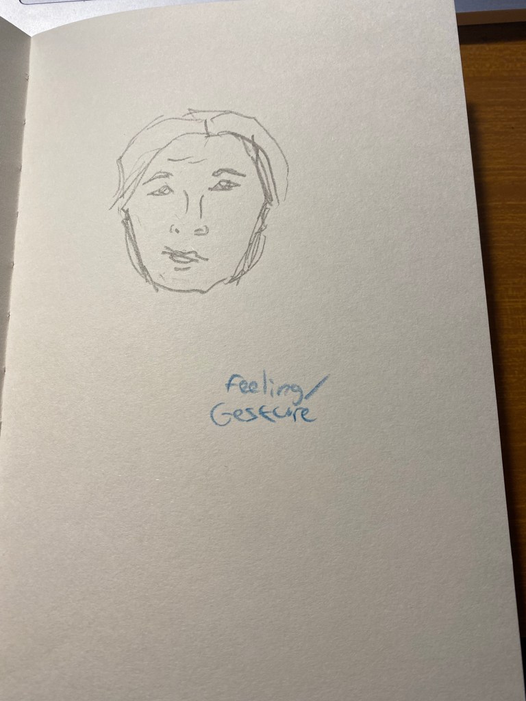
The second subject for this exercise went through every emotion in the book so I couldn’t settle on one.
Feeling? Gesture?
The third was just fun though:
What is he feeling?
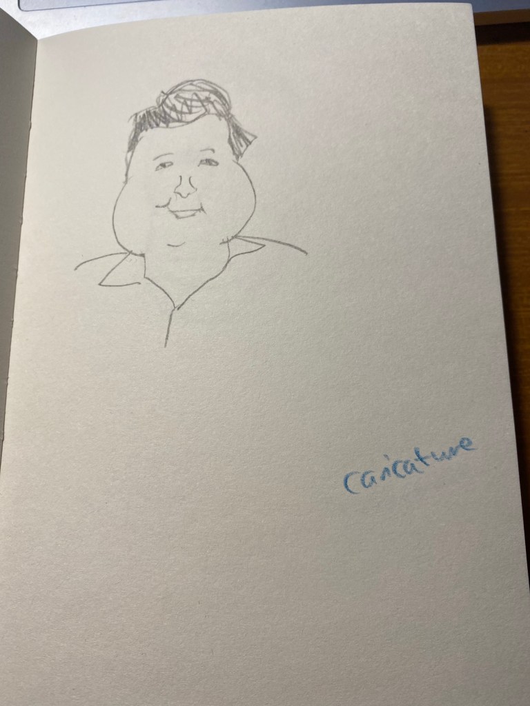
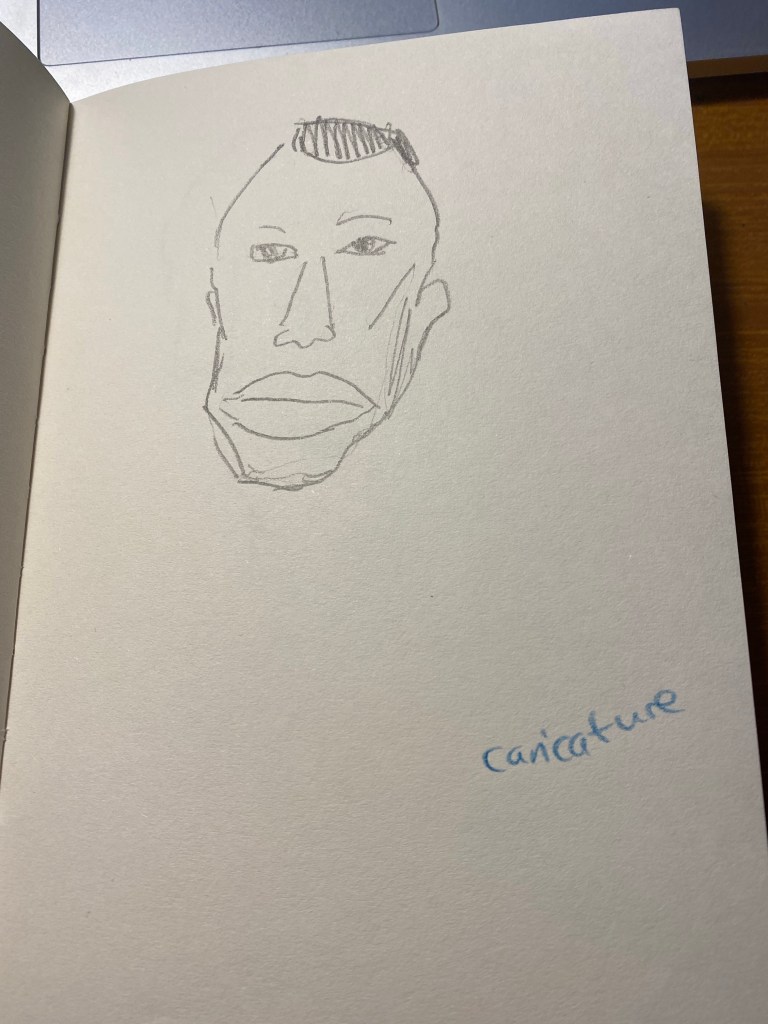
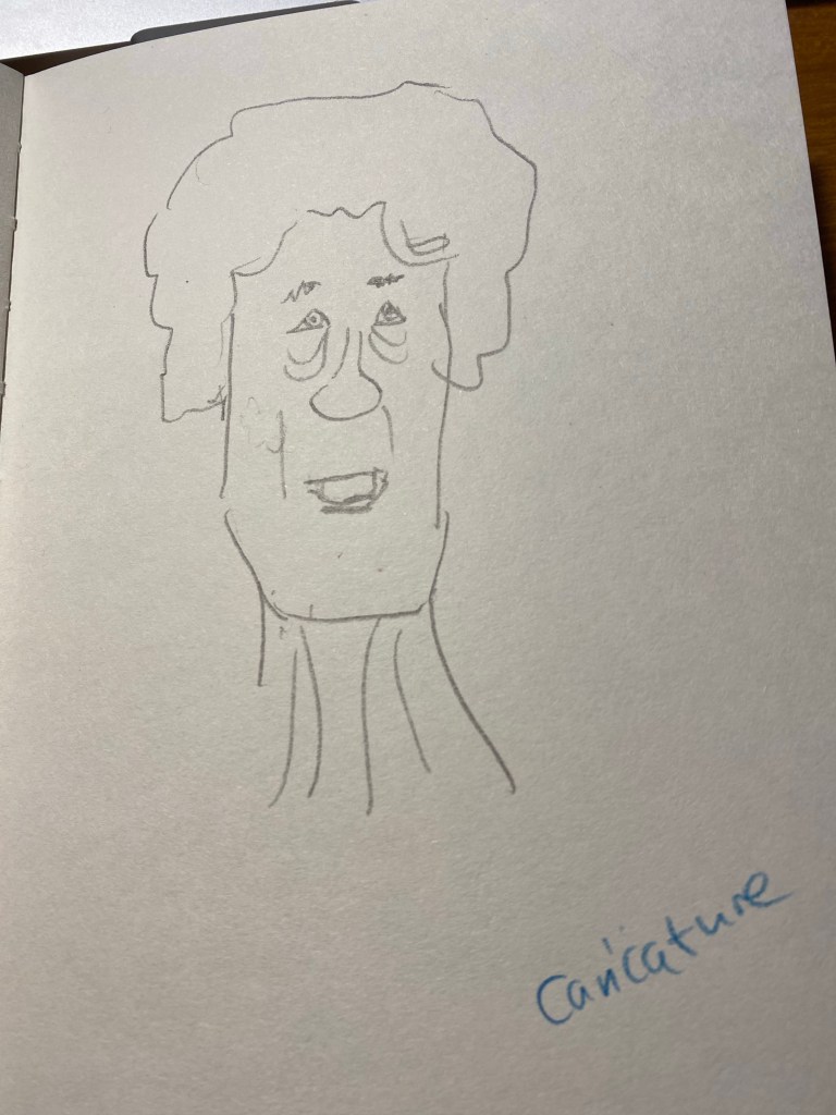
Then we did a caricature exercise, where we tried to draw people as not overly stylized caricatures. We has a minute for each, and I was starting to warm up at this point:
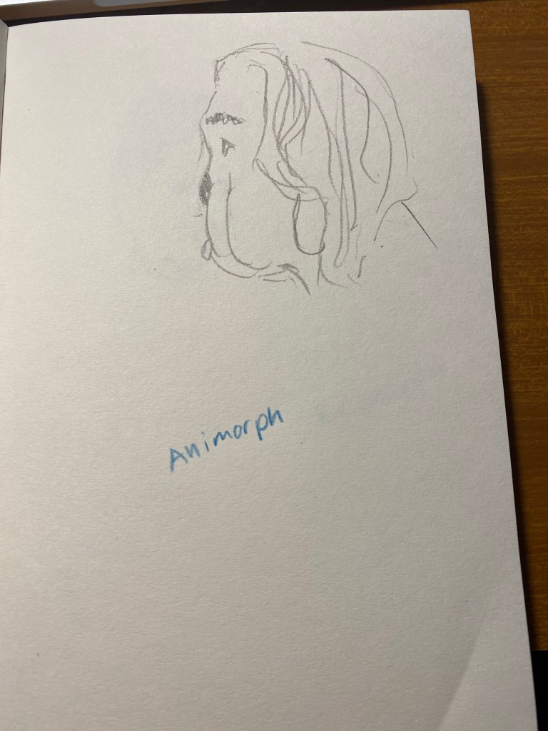
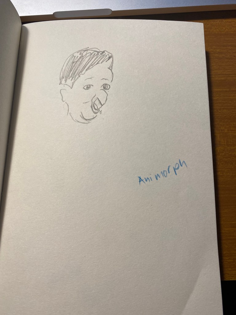
The next exercise was a strange one – to draw a person as if he was morphing into an animal and we caught them in the middle of the morph.
Bulldog man.
This was fun and very creative:
Parrot man.
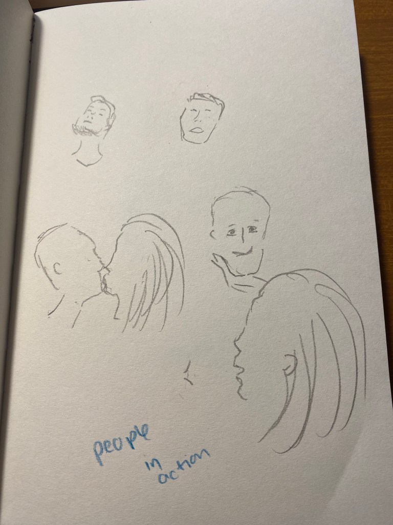
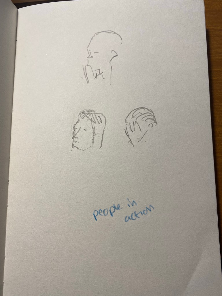
The next one was to draw people in action, in one minute. To capture as many gestures as possible. I guess that the animators had a field day with this one, but I really struggled.
Finally we had 15 minutes to draw each other. I had a lot of fun with this, and the earlier exercises really did help me warm up and loosen up and work faster.
These exercises are definitely something that I’ll try to warm up before drawing portraits, and they’re also just a lot of fun to do. If you have a minute, a pencil and a blank page I recommend that you give them a go.
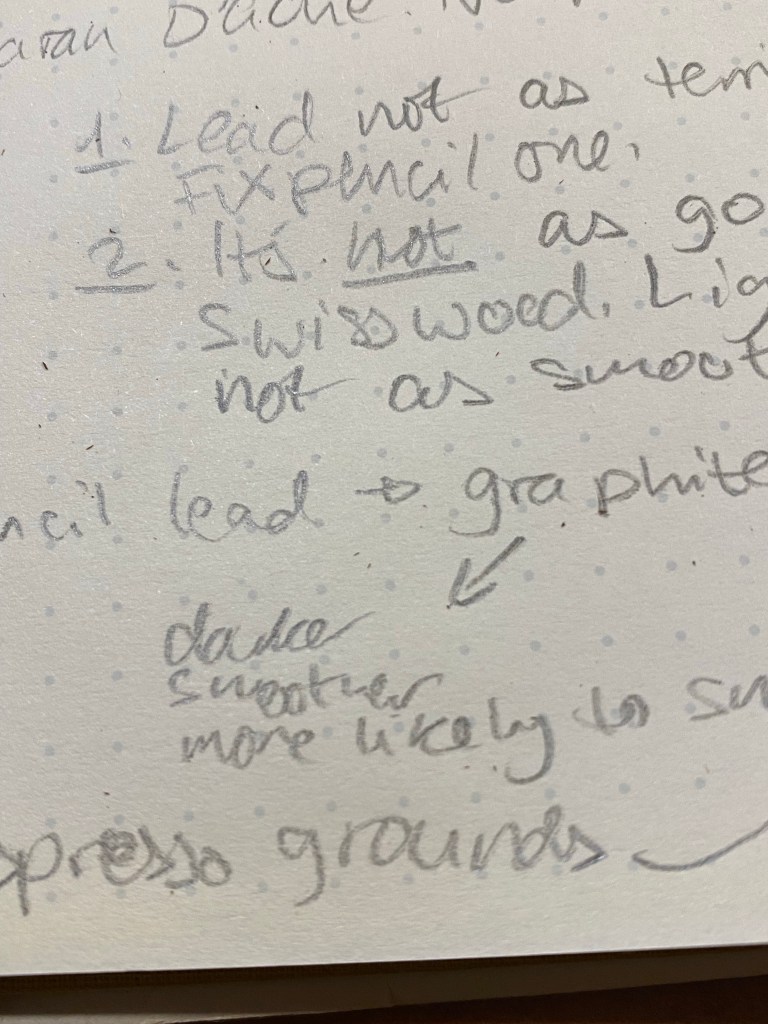
The Caran d’Ache Swiss Wood is one of my favourite pencils. There are those who hate its burnt caramel smell and have nicknamed it “the stink wood,” but I am not one of them. I love how the Swiss Wood smells like, how it looks like, and especially how it writes like. The pencil is a joy to hold, the tip lasts forever, and it puts down a dark and smooth line that is great for writing and sketching. Its only real downside for me is its price — the Swiss Wood is expensive, and only getting more expensive with time.
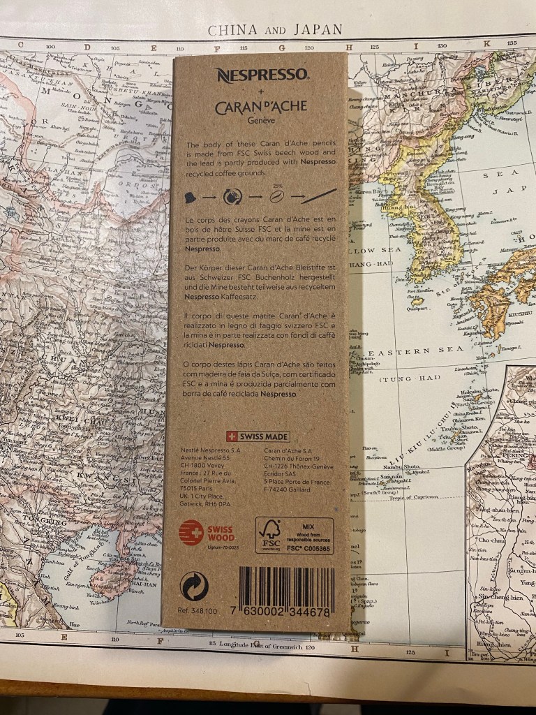
So when I saw that Caran d’Ache was creating a Swiss Wood in collaboration with Nespresso, I added it to my Cult Pens basket together with the Nespresso Fixpencil. What can be more cool that the Swiss Wood with a Nespresso theme and some added recycling thrown in? This three pack of pencils was very expensive, but I decided to treat myself.
Boy do I wish I hadn’t.
The front of the recycled box.
As with the rest of the Caran d’Ache x Nespresso collaboration, the pencils come in a 100% recycled box. The box is cleverly designed with coffee bean shaped cutouts that show glimpses of the pencils inside, and debossing that shows off the pencils’s shape and coffee beans to highlight what the recycling story in this collaboration is about. The rest of the “recycling story” is in the pencils’ lead, which is made of 25% coffee grounds. The pencils are made of FSC certified beech wood, which is the same as the normal Swiss Wood. You can find all this information on the back of the box:
The back of the box.
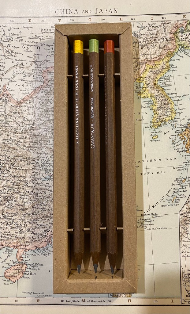
Inside the box are three very expensive pencils. They look (and smell) just like the Swiss Wood except for the imprint on the pencil body, and the dipped end-caps.
Three very expensive pencils.
The end-caps are metallic, and come in golden yellow, light green, and a bronzish red. They aren’t metal end-caps, but simply end-caps dipped in paint, just like the red Swiss Wood end-cap, only in different colours.
Closeup on the end-caps.
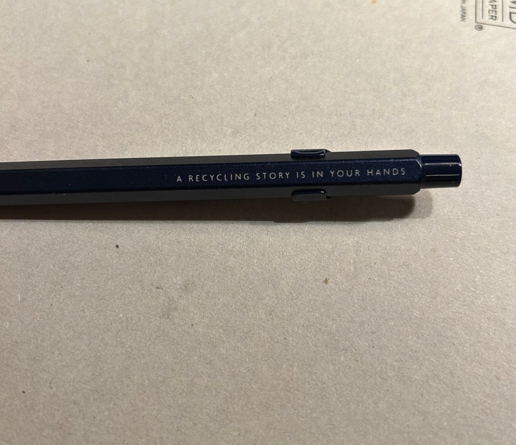
The imprint on the pencil is very similar to the original Swiss Wood, with the addition of the Nespresso logo, and the sentence: “A Recycling Story is in Your Hands”. The imprint is very crisp, and I like the font they chose for it.
The imprints on the pencils.
Here is where things started to go downhill. The clever and beautifully designed box that holds the pencils chipped into one of them, taking out a chunk. Not great for such an expensive set.
Damaged expensive pencil.
The end-cap is only dipped in paint. For this collaboration, especially considering the price, I expected the end-caps to be made of aluminium from recycled Nespresso pods. As it is, painted end-caps are a disappointment. Here are a bunch of modern and vintage pencils that cost much less and have better end-caps than the Nespresso Swiss Wood:
End-cap comparison.
Here’s a close up of the end-caps. From top to bottom they are: Nespresso Swiss Wood, Tombow Mono 100, Eberhard Faber Colorbrite (vitage), Mitsubishi Hi Uni, General’s Kimberly, Eberhard Faber No Blot (vintage). If they could do it why couldn’t Caran d’Ache?
Caran d’Ache Swiss Wood painted end-cap vs cheaper, more premium end-caps…
Here’s the Caran d’Ache Swiss Wood next to the original Swiss Wood. They look very much alike, apart from the imprint and the colour of the end cap. However, it’s not what’s outside that makes or breaks the pencil (pun intended) — it’s the core.
Caran d’Ache Nespresso Swiss Wood (top) vs the original Swiss Wood (bottom).
The core of the Nespresso Swiss Wood is made of 25% recycled coffee grounds from Nespresso capsules. The Nespresso Fixpencil had a similar recycled coffee ground core and was terrible. Is the core in these pencils as bad?
Writing sample of the Nespresso Swiss Wood vs the original Swiss Wood. Written on a Baron Fig Confidant.
It’s not that bad, but it isn’t great. The original Swiss Wood has a dark and smooth core that holds a point for a long time. The Nespresso Swiss Wood has a fragile core that is scratchy and lighter than its counterpart. It isn’t unpleasant to use to the point of being unusable, but it feels cheap, it looks cheap, it’s everything but a premium pencil in a world full of excellent premium pencils that cost less. There are actual white streaks in the writing it produces. If I want white streaks in my writing I can pick up a cheap ballpoint. For the price of these pencils I expect a better writing experience than the Swiss Wood, not a worse one.
Close up the writing, where you can see the white streaks.
The Caran d’Ache x Nespresso 849 collaboration produced some stunning pen designs. So far the pencil part of the collaboration hasn’t gone so well. I’d buy the Nespresso Fixpencil and toss out the lead, but I’d utterly avoid the Nespresso Swiss Wood. You get a worse pencil for a higher price, and the veneer of being good for the planet. Reduce, reuse, recycle are said in that order for a reason. In this case reduce, as I wish I had.
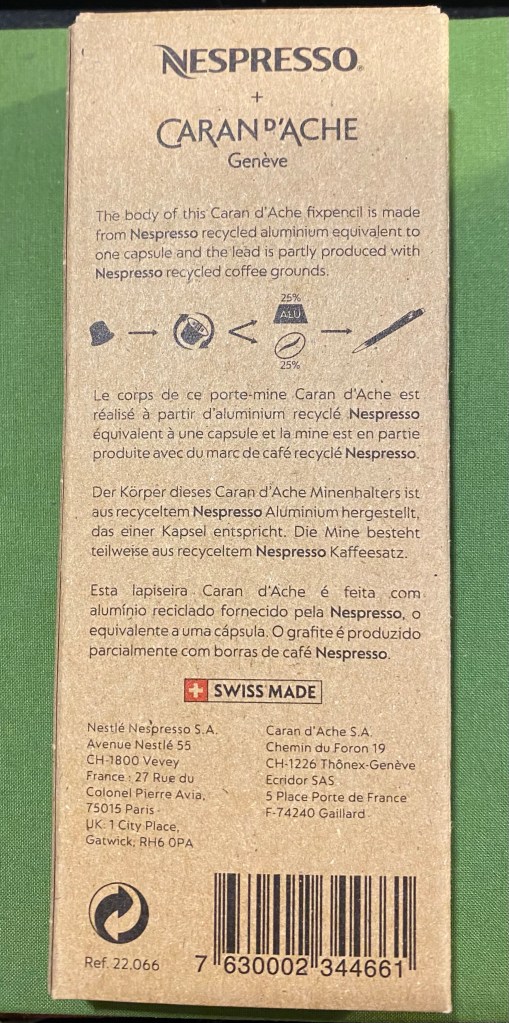
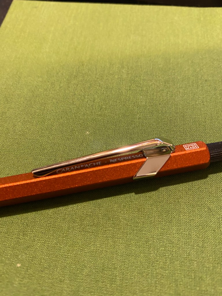
Caran d’Ache’s Fixpencil is their legendary clutch pencil offering. While the classic Fixpencil has a plastic body, the Fixpencil 22 is made of aluminum, giving it both an added weight and a more luxurious finish. The Nespresso Fixpencil 22 is also made of aluminum, hence the 22 in the name, but it’s aluminum body is partially made from a recycled Nespresso capsule, and it comes with a lead that’s partially produced from recycled coffee grounds. Just like the previous Caran d’Ache x Nespresso849pens, this brand collaboration is all about recycling with class.
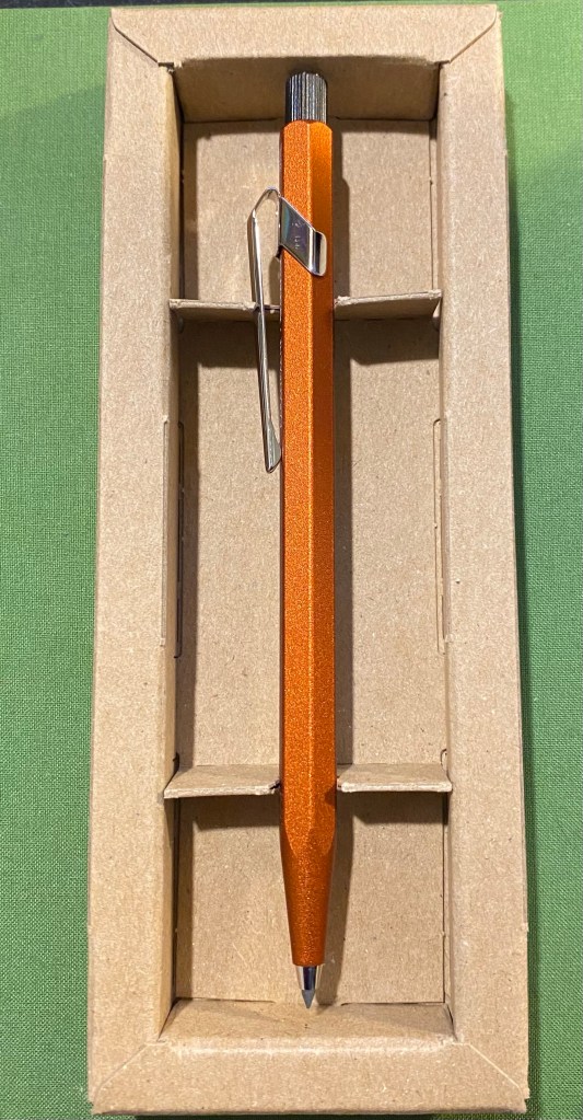
The front of the Caran d’Ache Nespresso Fixpencil box.
The box that the Nespresso Fixpencil arrives in is similar to its 849 counterparts: it’s made of 100% recycled cardboard and there’s a Nespresso capsule shaped cutout in the box that shows off the colour and texture of the Fixpencil. Clever embossing and tasteful design and branding make this a superb gift to give to someone who enjoys using pencils (with a caveat that I’ll get to later). The box is the most recycled thing about the product (being 100% recycled), but at least Caran d’Ache is honest and transparent about the quantity of recycled materials inside the fixpencil and lead: 25% of each, respectively. So there is a fair bit of “greenwashing” going on here.
Back of the Caran d’Ache Nespresso Fixpencil box.
The clever design of the box continues once you open it. It really shows off the beauty of the Fixpencil design and just how vibrant and warm the orange “ochre” colour is. It glows. You can also see the subtle texture the Fixpencil has.
Gorgeous orange Fixpencil nestled in a cardboard box.
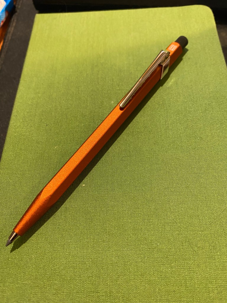
Here is my first, albeit minor, quibble with this product: it’s not ochre. It’s reddish orange. It’s mandarin. It’s anything but the yellowish brown that ochre brings to mind. I have no idea why it was so poorly named.
Fixpencil ochre? More red than yellow by far to be called that.
Caran d’Ache 849s and Fixpencils normally have very little branding on them. The Caran d’Ache brand is tucked discreetly under the clip and generally all that you see is the “Swiss made” with a white border around it just above the clip. The Nespresso collaborations are different in that Caran d’Ache adds an additional imprint to the pen/pencil: “A Recycling Story is in Your Hands”.
A recycling story (of sorts) is in your hand.
Of course the normal logos are where they usually are, with the addition of the Nespresso logo to the Caran d’Ache logo under the clip.
Logos discreet and visible.
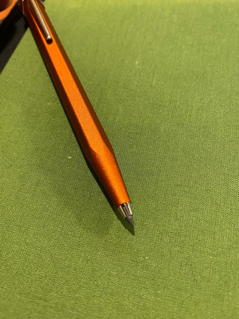
The Fixpencil is a joy to use because of its form factor, which is just like the 849, and the wonderful finish on the pencil body, which adds subtle texture that makes the Fixpencil fun and easy to hold.
A close up on the Fixpencil’s texture.
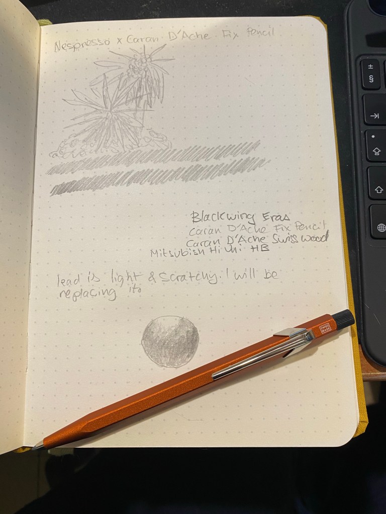
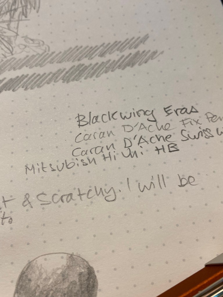
And now we come to the worst part of this collaboration: the pencil lead. The Nespresso Fixpencil doesn’t come with the normal fabulous Caran d’Ache pencil leads. Instead it comes with a pencil lead that has 25% coffee grounds in it and is supposedly a B grade lead. It’s terrible. The lead is scratchy, so light that it writes like an F or even an H grade lead, and hard to erase. After testing in on my standard pencil testing Baron Fig notebook, I threw it out and replaced it with a standard 2B lead from my regular stash. Not recycled, but actually usable.
Terrible pencil lead in action.
Here’s a close up where you can see in the word “scratchy” where the lead actually dug into the paper.
Closeup on the scratchy writing and some lead comparisons.
The Caran d’Ache Nespresso Fixpencil is a joy to use and will make for a fabulous gift once you pair it with a box of good quality B or 2B pencil leads. It’s a beautiful take on an already great product that I just wish also included the normal Caran d’Ache lead lineup.
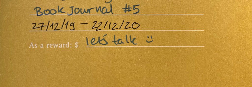
Yesterday I finished my fifth reading journal, and so I thought that it would be a good opportunity to write a post about how I set up my reading journal.
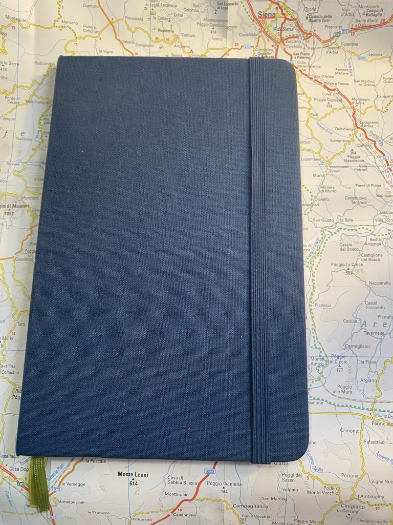
I use my reading journal to keep track of what I read and to encourage me to read more. This is the journal that I’ve just finished, a Moleskine Two-Go:
Moleskine Two-Go. The perfect size and format for my needs.
I used to use a Field Notes Arts and Sciences notebook for my reading journal, but once I got back to reading more it made sense to move to a larger journal. For the past three years I’ve used the Moleskine Two-Go, and I fill one book journal a year (70 books are logged in each notebook).
Start and end date for this reading journal.
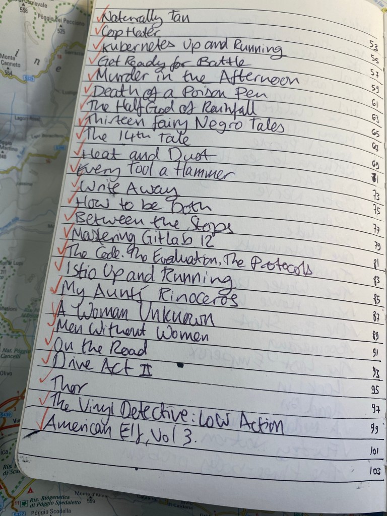
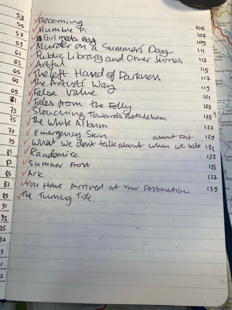
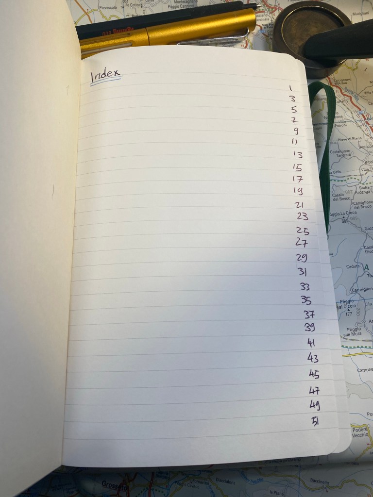
This is the setup in my old reading journal. Three pages of index:
First index page. Red checkmarks for books that I’ve read.
The Moleskine Two-Go comes with pages that are blank on one side and lined on another, which is perfect for my use case, except for the second index page, which I need to rule myself:
Ruled second index page.
I missed a line on the second index page, so the index numbering came out a little wonky. It’s only for me, so I don’t mind.
Off by one error in my index.
Here’s a sample of a complete page. I talked more about my thoughts behind the design in a previous post, but you can get the gist by looking at this sample. I like drawing something that captures the book for me on the opposite page, which is why I love the Moleskine Two-Go format.
I remember really not liking this book, and this is a reminder of why.
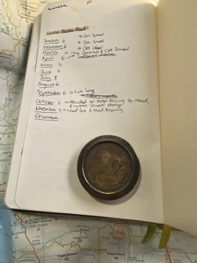
At the very last page of the journal I keep a log of how many books I read that month. It’s ten books so far for December, but the month isn’t done yet so that line isn’t filled.
Number of books per month tracker.
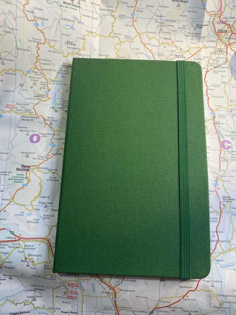
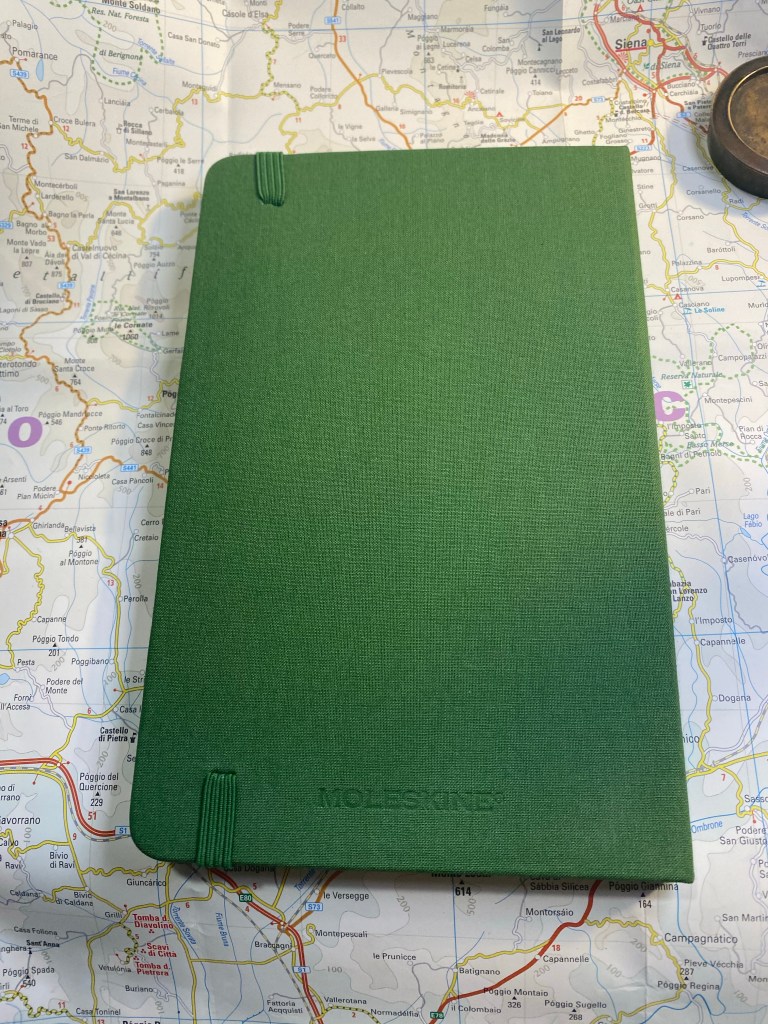
Here is my new reading journal, a Moleskine Two-Go, this time in green (my previous ones were in light grey, dark grey and navy):
Front cover.
I love the texture of the fabric colours on this, and the shade of green is interesting. The two contrasting bookmarks and the endpapers are grey.
Back cover
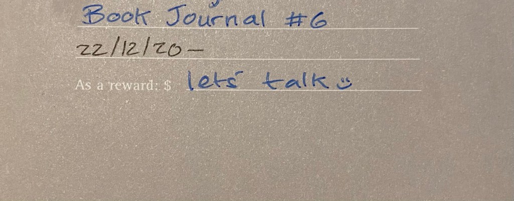
The first page, marking when I started the notebook and which journal number it is. This notebook doesn’t leave my desk yet I still write my name and email in case I misplace it somehow.
Front page
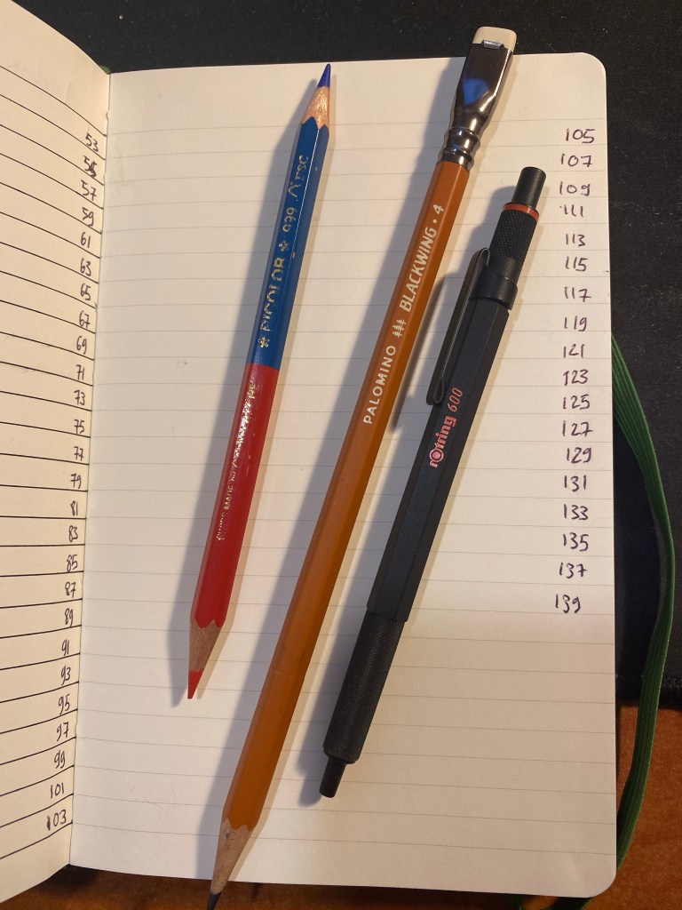
Next comes the index page. Since this is my third Two-Go reading journal I already know to number the pages until 139 (I number odd pages only, since my reviews are on odd pages), which comes out to 70 books.
Index page.
I rule the second page, because I tried just winging it on the first year and it didn’t come out great.
Spoke pen for the win.
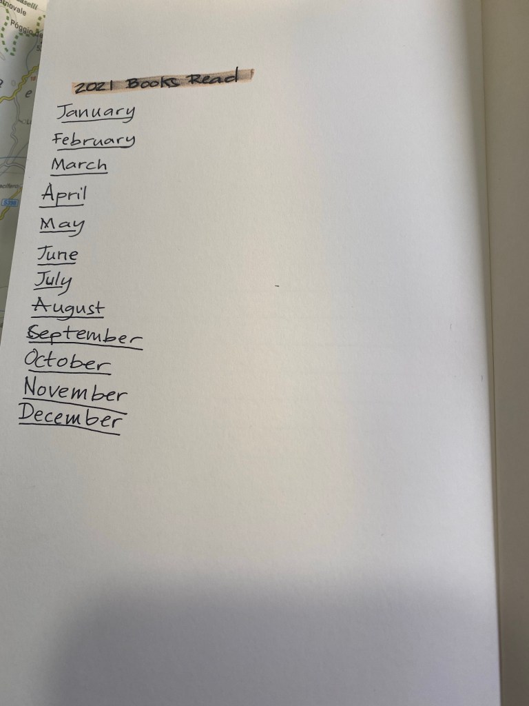
On the last page I create my books per month tracker:
Zebra mildliner highligher smears gel ink, but I still like it.
I number all the pages of the index, but only the first 25 pages of the actual book journal. I will continue numbering pages in batches as I add books to the journal. The great advantage of using a completely unstructured book here is that I can do whatever I want with it, including starting the numbering after the index pages and not on the first notebook page.
These are the pen and pencils that I’ll be using in this journal. The Rotring 600 is a ballpoint, and the only ballpoint that I regularly use. The Caran d’Ache Bicolor has been my companion in these notebooks for several years. I use it to highlight things, and sometimes in my book scene sketches. I used the Blackwing 611 in my previous reading journal, and this time I’ll be using the Blackwing 4.
Caran d’Ache Bicolor, Blackwing 4, Rotring 600 ballpoint.
The first non fiction book in this journal:
The Good War
The first fiction book in this journal:
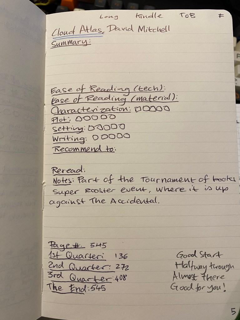
Cloud Atlas. ToB means Tournament of Books.
That’s my new reading journal all set up and ready to go. I hope that this inspires you to keep a reading journal of your own, one that will encourage you to read more and help evoke the memories of reading a specific book.
Since I’ve been working from home I’ve had more time to dig into my stationery and art supply stash and add new things into my rotation. My favourite lead holder is a vintage Eagle Turquoise Prestomatic 3377, which is all metal and a little on the heavy side, but it’s a fabulous sketching tool. If I want to carry something lighter around I fall back to the all time classic Staedtler Mars technico.
Eagle Turquoise Prestomatic on top, Staedler Mars technico on the bottom
I use these lead holders as sketching tools, and so they normally hold B or 2B leads from Staedler, Mitsubishi, or Caran d’Ache. Good quality leads aren’t cheap, so I expect any lead holder I use to protect them sufficiently well, as well as provide a solid grip that works in many drawing angles. Any added bells and whistles, like clips, a lead sharpener or a built in eraser, are just not things that I’ll use, so I don’t take them into account when I decide whether to purchase a lead holder or not.
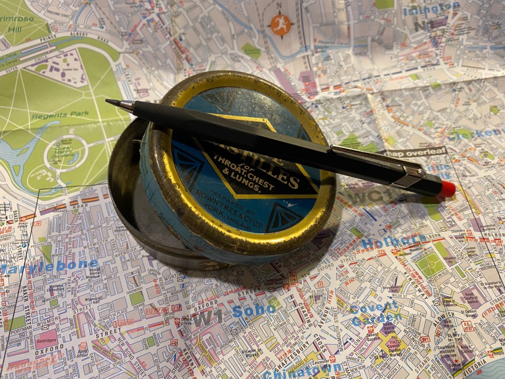
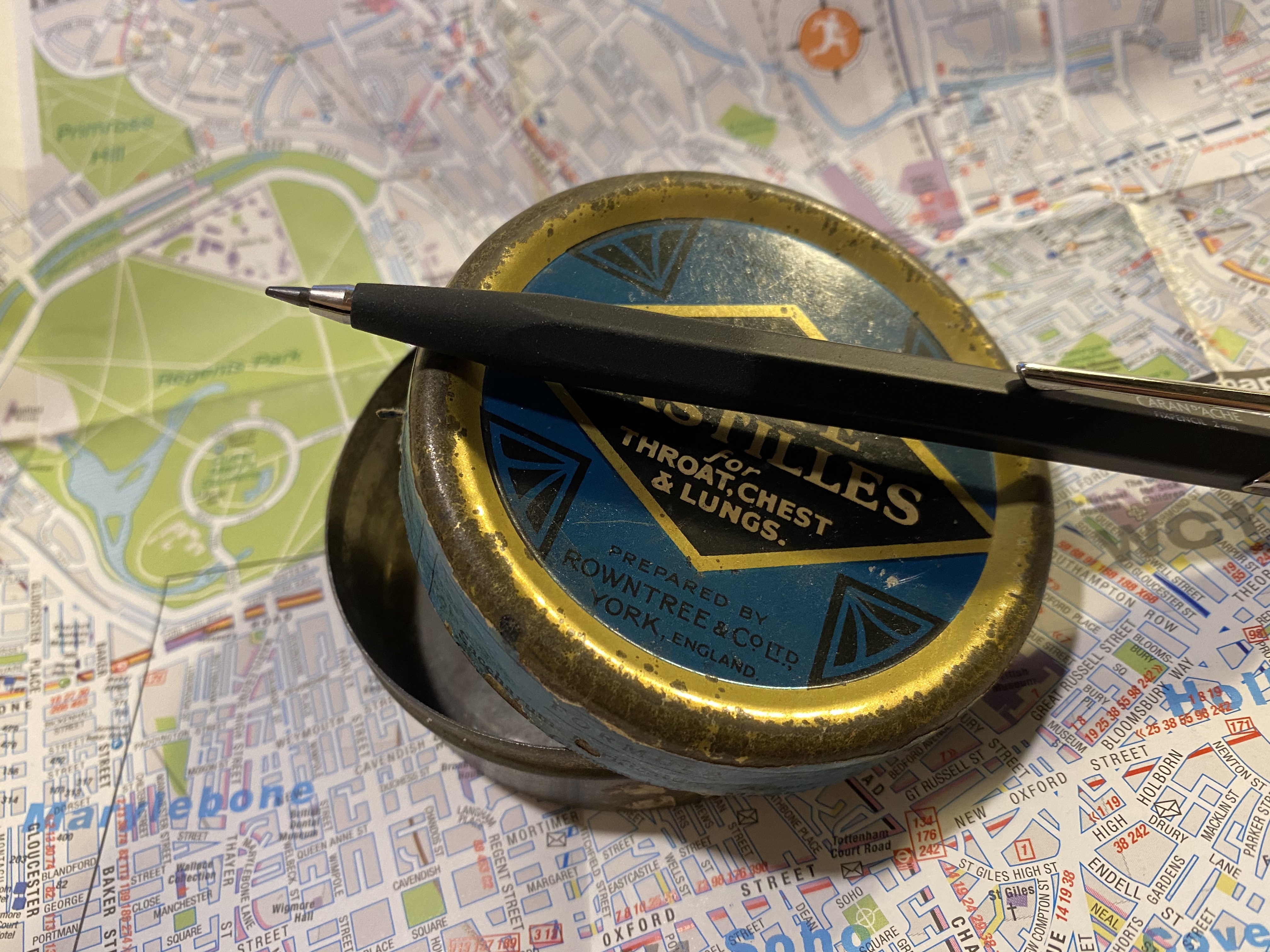
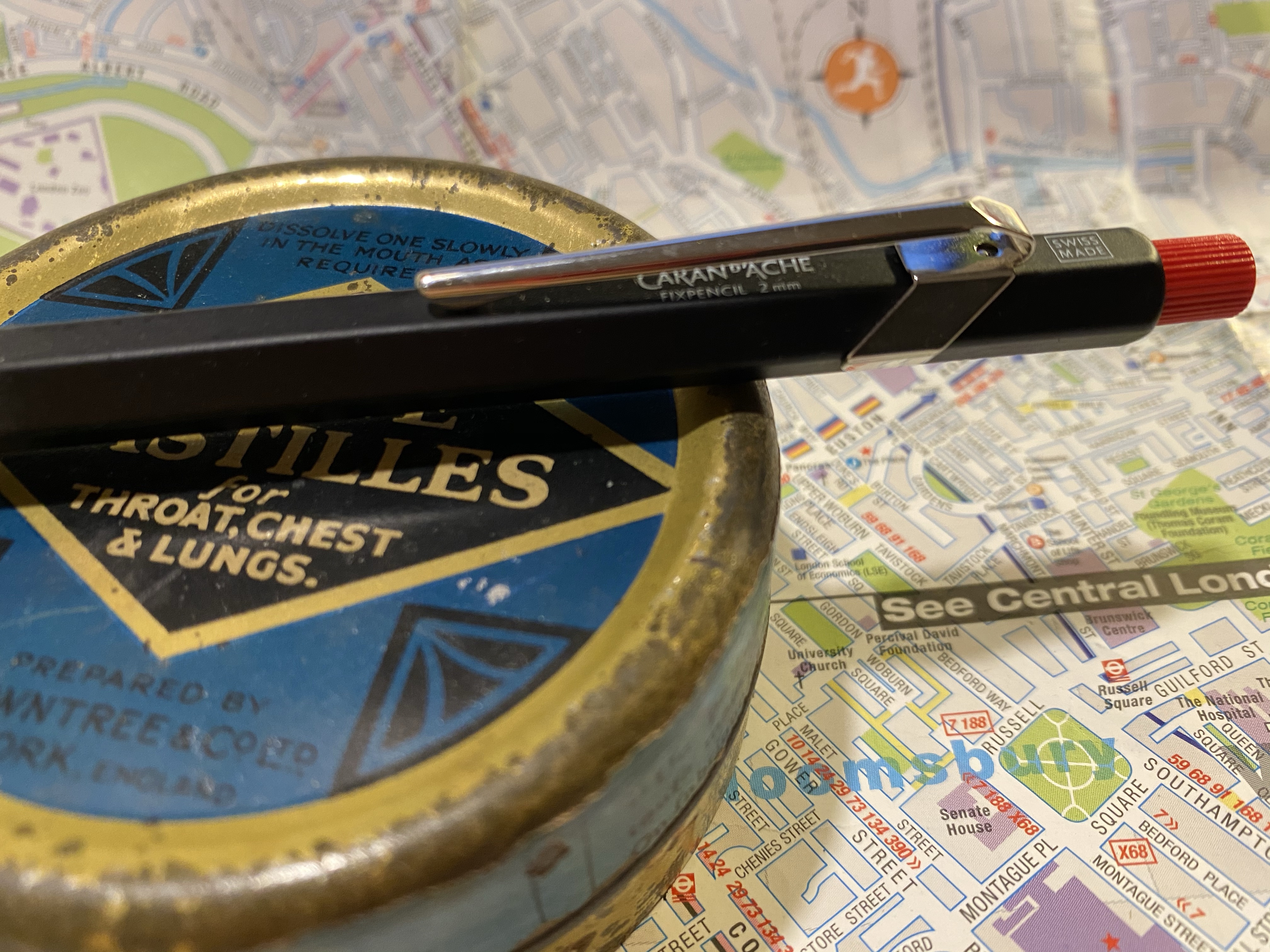
Caran d’Ache Fixpencil
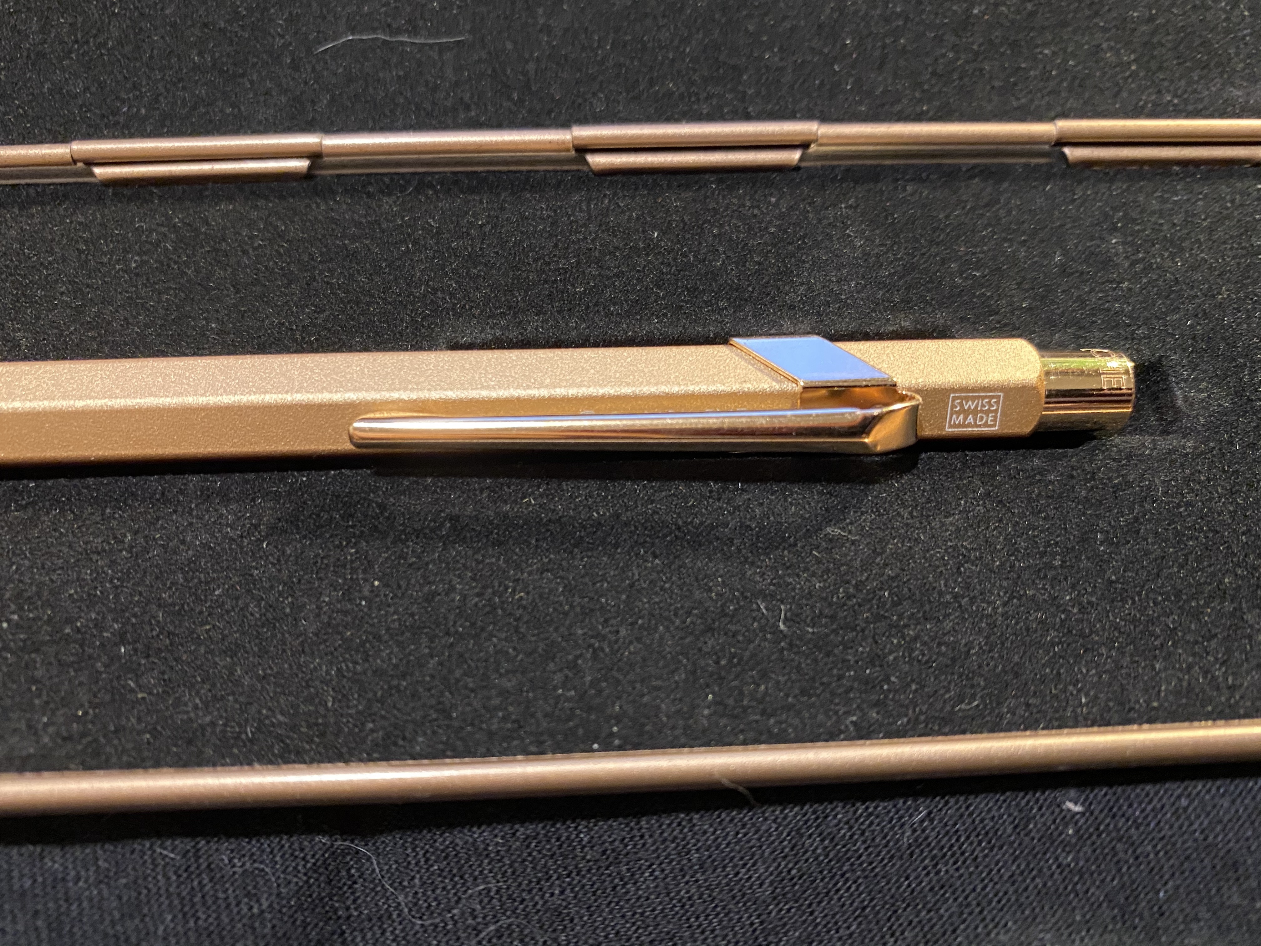
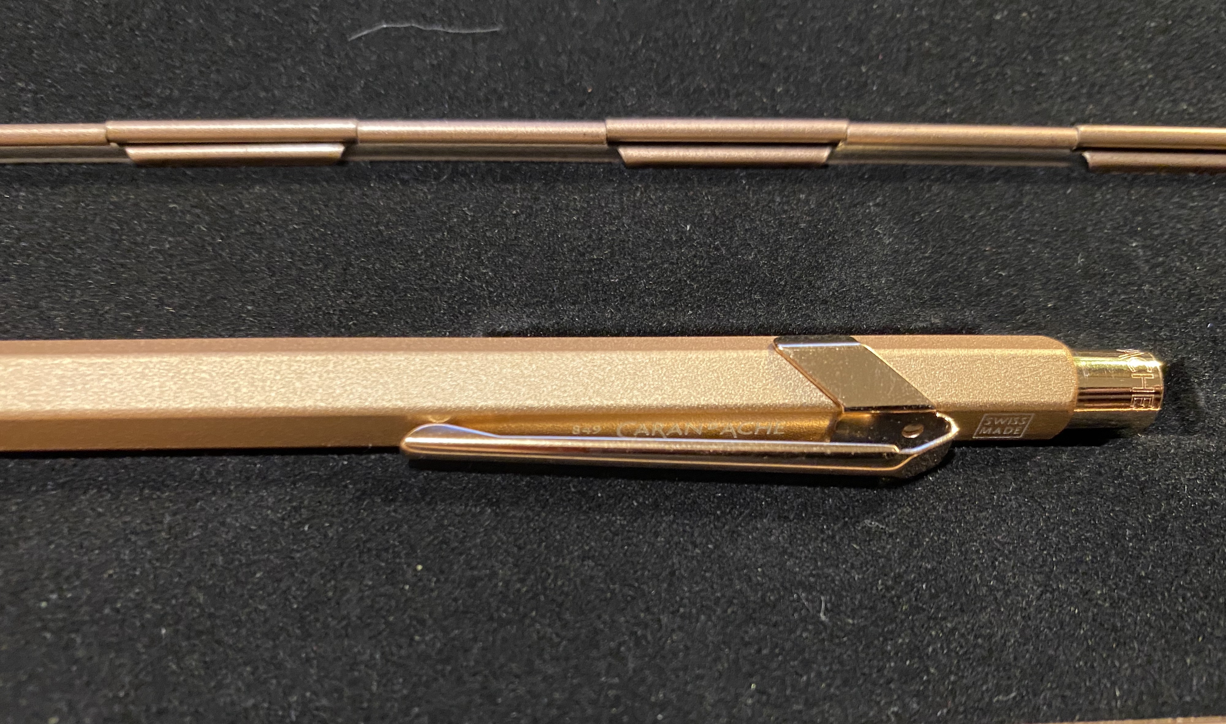
The Caran d’Ache Fixpencil is not a new lead holder on the market, but it is a new lead holder for me. Something about its price range and design made me think that it’s a lead holder for people who like to write with lead holders, not so much for people who like to sketch with them. Lead holders ordinarily have a very functional, “tool-like” vibe to them, and not a lot of polish. Contrary to that, the Caran d’Ache Fixpencil is a sleek and polished thing of beauty.
Grip texture vs body texture.
Having used the Caran d’Ache 849 I was worried that the Fixpencil would have the same slippery texture, with a grip that isn’t up to the task. If I’m drawing with a lead holder, then I’m working fast and loose, and the last thing I want to worry about is the holder flying out of my hands. Unlike other lead holders, the Fixpencil doesn’t have a knurled or striated grip, but rather uses a sandpaper like texture on its grip section instead. As I shift my drawing angle a lot, I find that texture really unpleasant. I also wonder how superficial it is, and whether it will wear down to sleekness after a relatively short time.
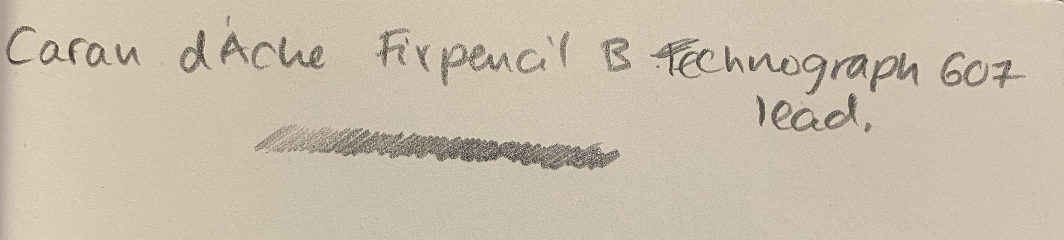
The Fixpencil is a thing of beauty, with the same minimal branding as the 849, and the same clip and body design. Apart from the clip, there are no bells and whistles here, but that doesn’t detract from the holder. It comes with a B Caran d’Ache technograph lead, which is excellent.
Written on a Baron Fig Confidant
I watched an live streamed concert from Ronnie Scott’s Jazz Club in London, and sketched the singer using the Fixpencil and a Leuchtturm1917 Sketchbook and it worked well. I would never use it as my main lead holder, as I don’t like the grip, but your milage may vary, especially if you plan to write and not sketch with it.
If you’re just starting your sketching journey I’d recommend the Staedtler Mars technico line, whether vintage or new. They are ugly ducklings, but they are great, relatively cheap workhorses. I’d recommend trying the Fixpencil before you buy it, as you may find its grip section as unpleasant as I found it, or it may be one of your favourite tools.
I’ve been on a Caran d’Ache 849 swing ever since I discovered that they can accept Ohto Flash Dry and Parker gel ink refills, and though I usually shy away from “blingy” pens, I was drawn to the 849 Brut Rosé (rose gold) . It is one of the few 849 pens that have a “rough”/ grippy texture.
The box.
The Brut Rosé Caran d’Ache 849 is part of “Celebratory” series that includes Sparkle Gold and Black Code pens. They all come in metal presentation boxes with fabric lining, magnetic closure, and what appears to be the tagline of this edition: “We write the 849 Legend, with added sparkle”.
The box is clearly meant to evoke a jewelry box, and it does so well. The pen itself has the added weight that the Caran d’Ache Nespresso849editions have (and the same texture) but is still not a heavy pen. The clip and nock appear in pictures to be gold and not rose gold, but that is only because this is an incredibly difficult pen to photograph. In reality the pen is entirely a warm rose gold.
The clip and nock are a slightly more coppery rose gold than the body, but they are still clearly rose gold.
In terms of branding, this pen didn’t receive any special treatment (unlike the Nespresso pens). There’s no indication that this is a “special edition”: it has the same Caran d’Ache etching on the cap, a white “Swiss Made” screen print above the clip, and “849 Caran d’Ache” screen printed in white under the clip.
Swiss Made.
You can just about see the print under the clip here:
Thus the only indication that this is a more expensive “special edition” is the box.
The Caran d’Ache 849 Brut Rosé comes with the Caran d’Ache Goliath blue ballpoint refill. It is an excellent ballpoint refill, but as I’m not a fan of ballpoints, I’ll be switching it out for either the Parker gel 0.7 refill or the Ohto Flash Dry 0.5 refill.
The pen looks plain gold here, but that’s just the fault of the lighting.
The Caran d’Ache 849 Brut Rosé will make for a fantastic gift pen, whether for yourself or for someone you like. It’s on the more expensive side of 849 special editions, but I think that it makes a more subtle and sophisticated impression than the similarly priced “Claim Your Style” 849s.
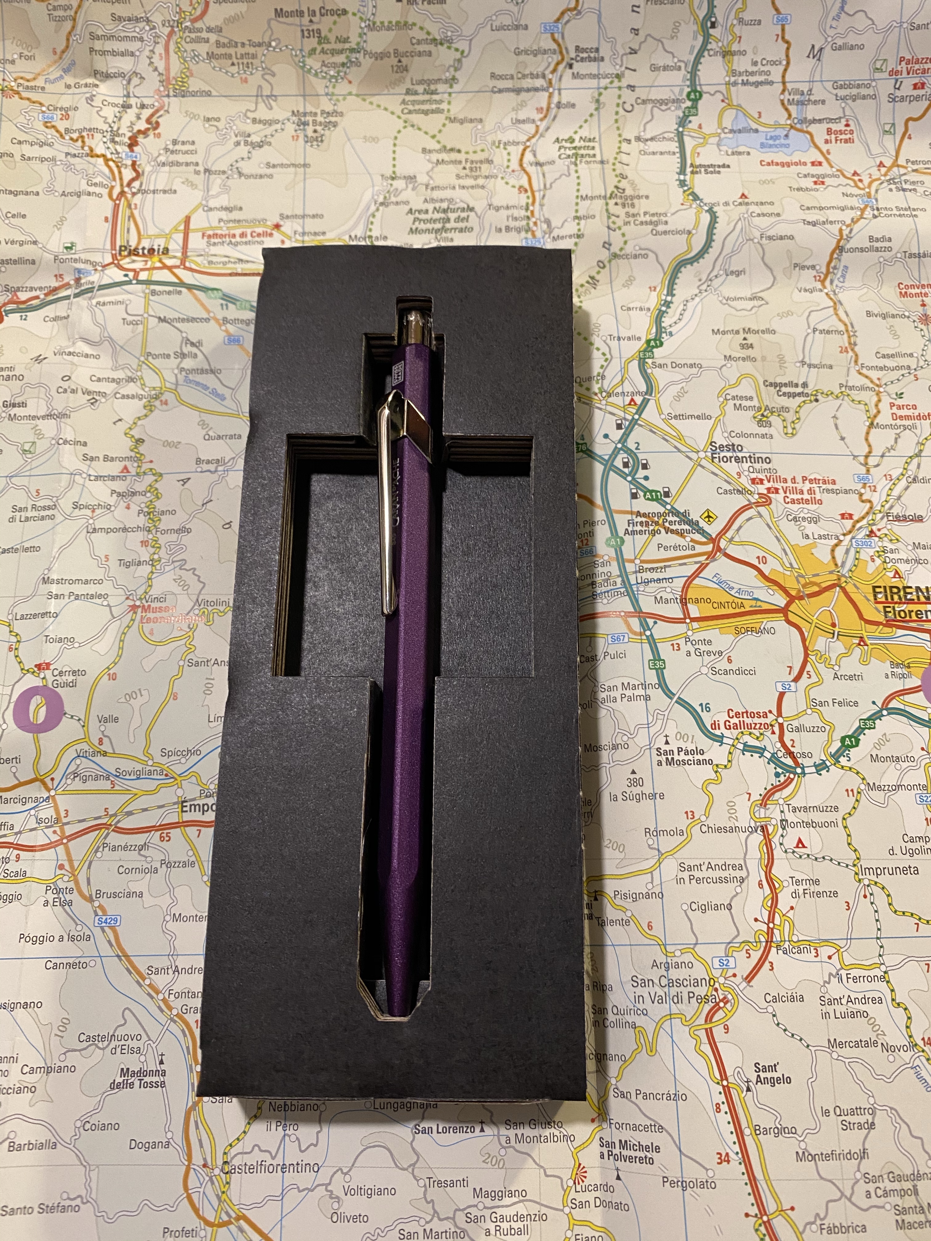
It’s the new Caran d’Ache 849 Nespresso limited edition and this time it’s Arpeggio that was chosen. Arpeggio is not only one of Nespresso’s more popular capsules, it’s also a gorgeous purple, which is a huge plus in my book, and big difference from their previous edition, the India.
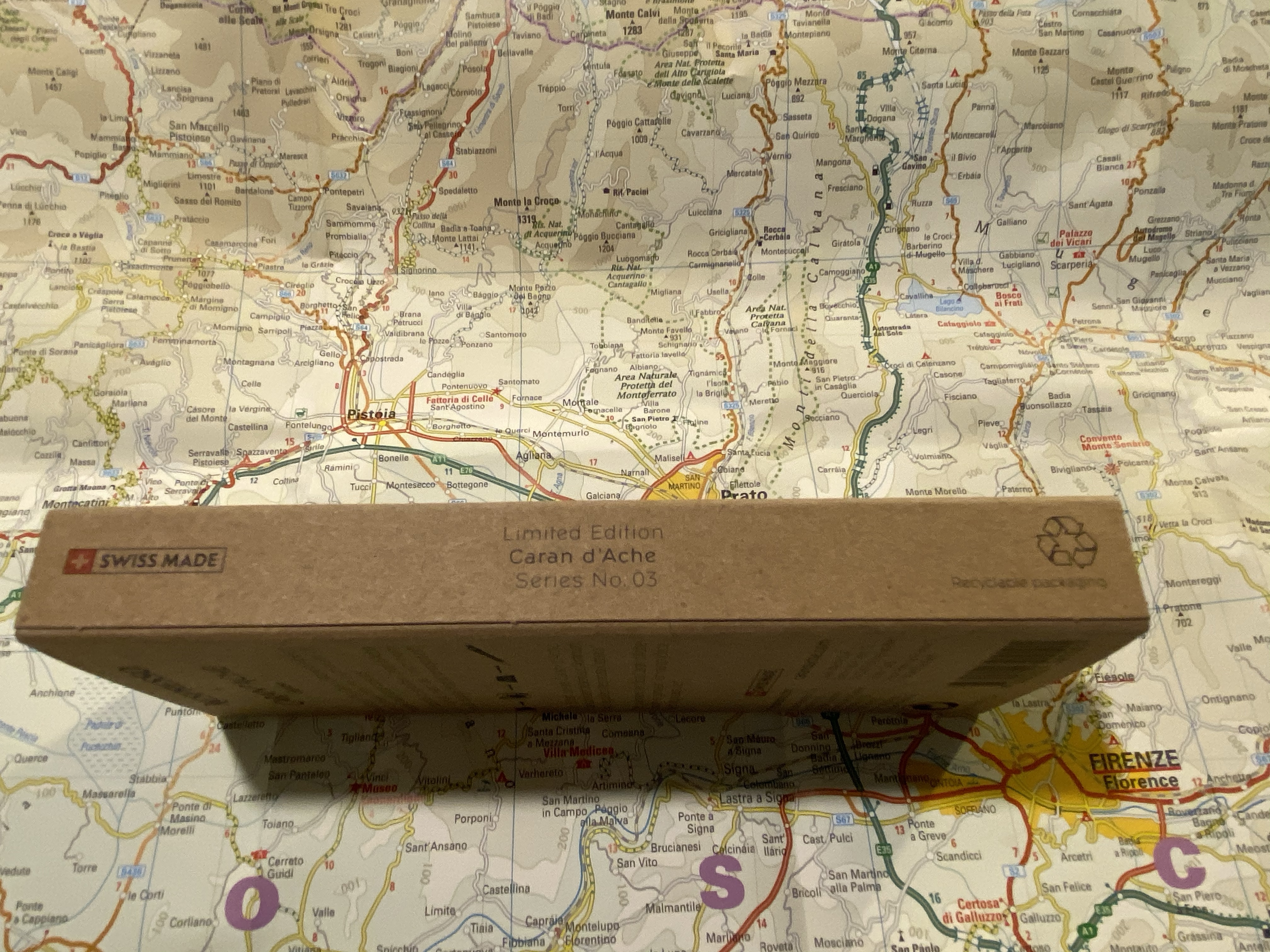
But first, some photos of the phenomenal packaging of this pen:
Side view, where you can also see that it’s the 3rd of the series.
The 849 Arpeggio is made out of recycled Nespresso capsules just like its predecessors:
The back of the pen box.
The cardboard cutout the pen comes in still on point: a simple and fitting material designed to perfection to best showcase the pen and its materials.
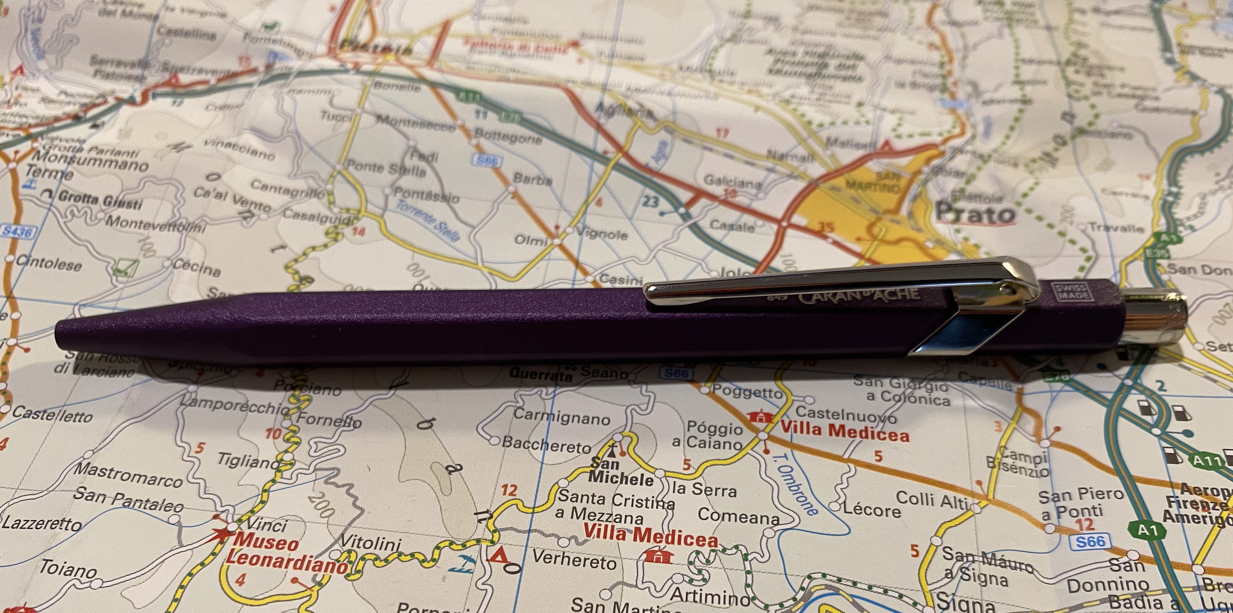
Look at that colour!
This came out darker than I would have preferred, but you can just about see the Caran d’Ache brand under the clip, and the “Swiss made” on top.
Swiss made.
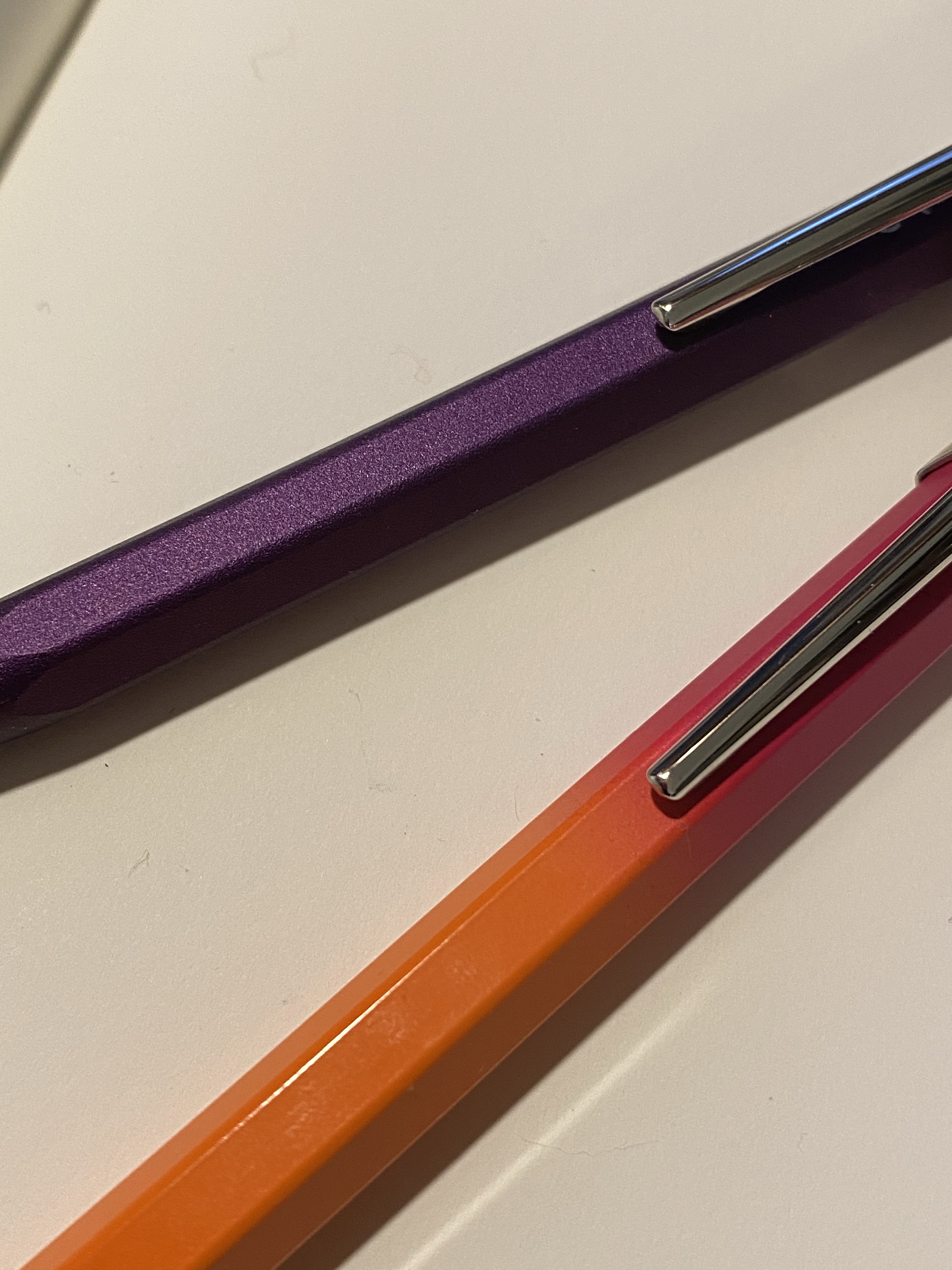
The 849 Arpeggio is a lovely deep purple, and has a great texture to it. The non-smooth surface makes it much easier to grip than many of the other 849 pens. You can see the difference in texture here between the Arpeggio and one of the 849 Tropics pens:
Textured Arpeggio finish vs the glass smooth finish on the Tropics 849
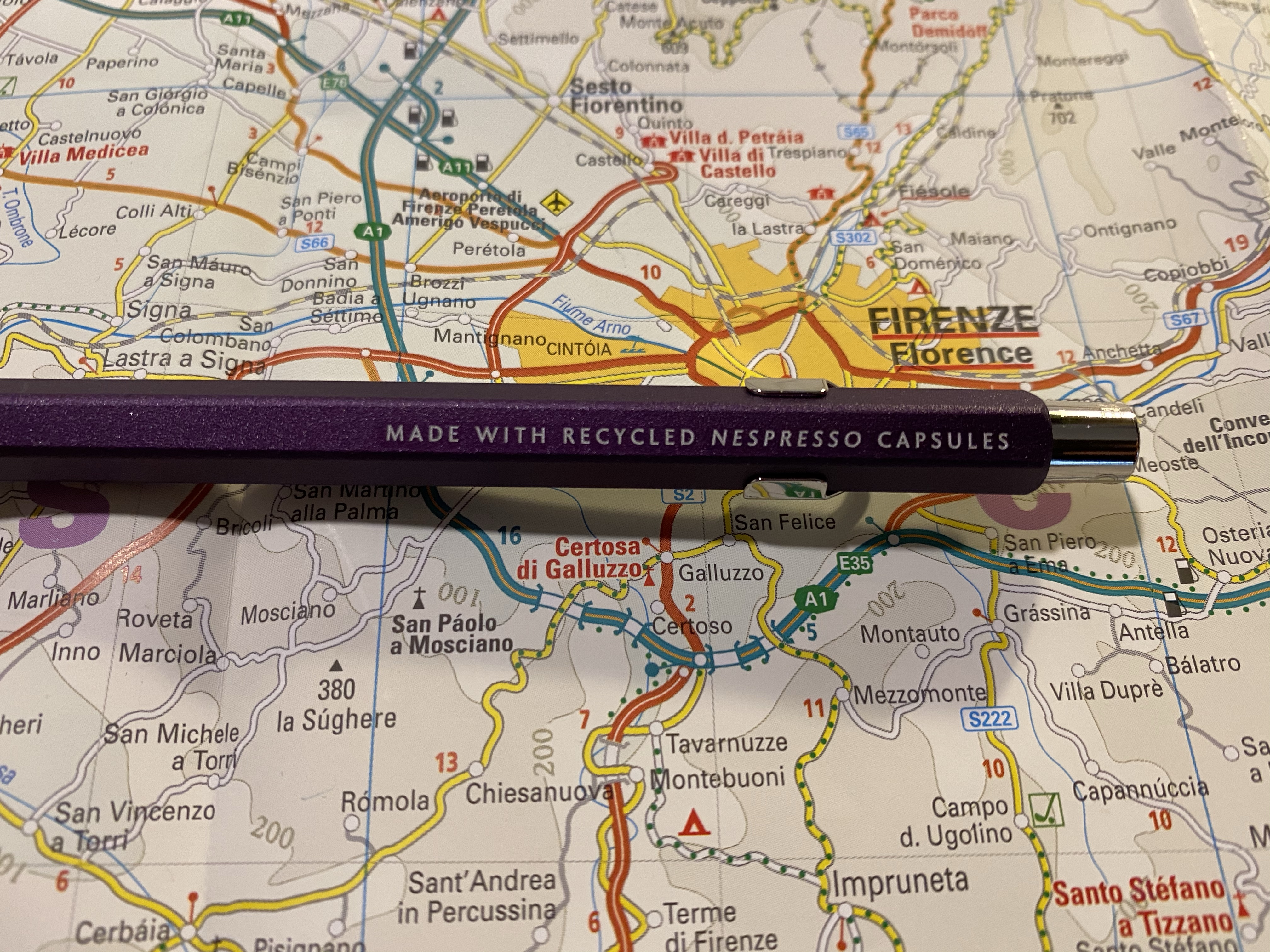
And here’s the by now familiar “made with recycled Nespresso capsules” tagline on the side:
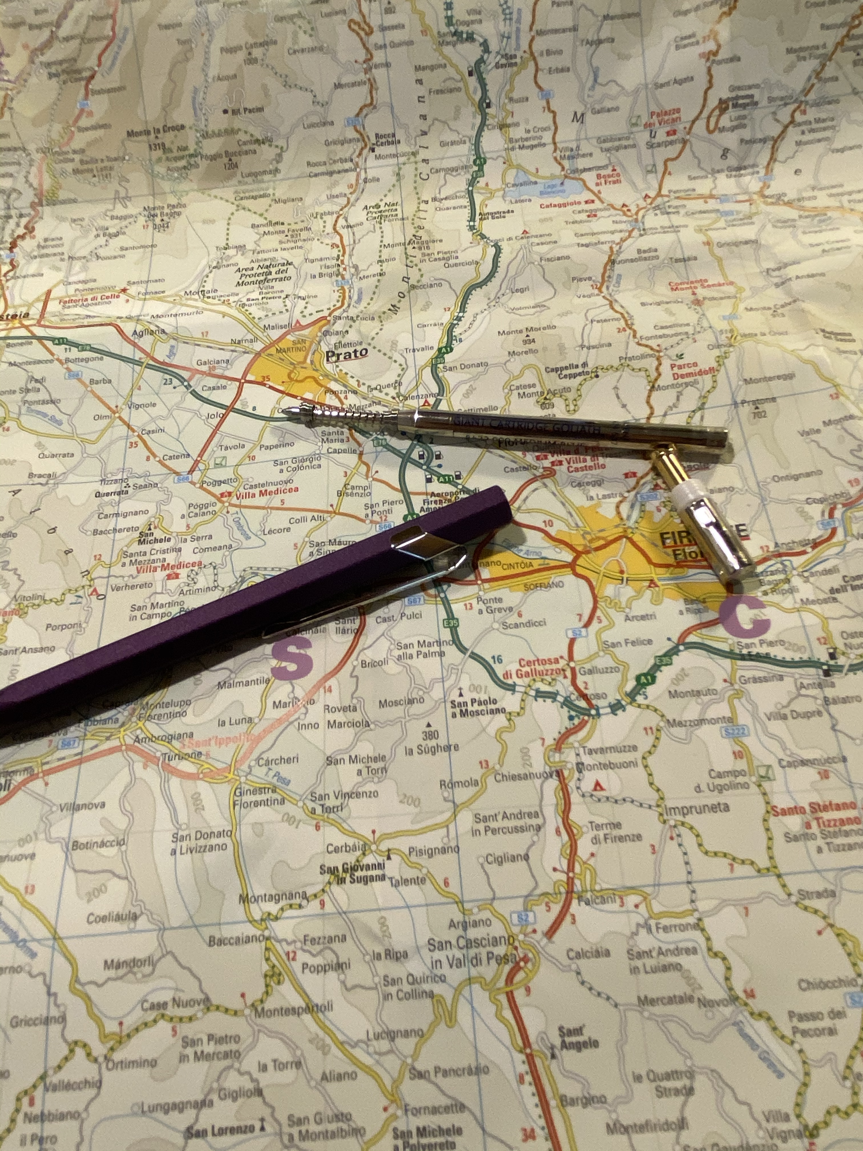
I changed the refill, and since somebody asked, I thought I’d focus on that for a bit. To change the refill you unscrew the clicker on top, and that might take a bit of fiddling, since it’s pretty securely screwed in. It doesn’t take force, just a bit of patience. Then take out the refill and swap it out with the new refill, and don’t forget to put the front spring on, preserving the right direction it was placed in when it came off.
Body, cap and original refill with the spring.
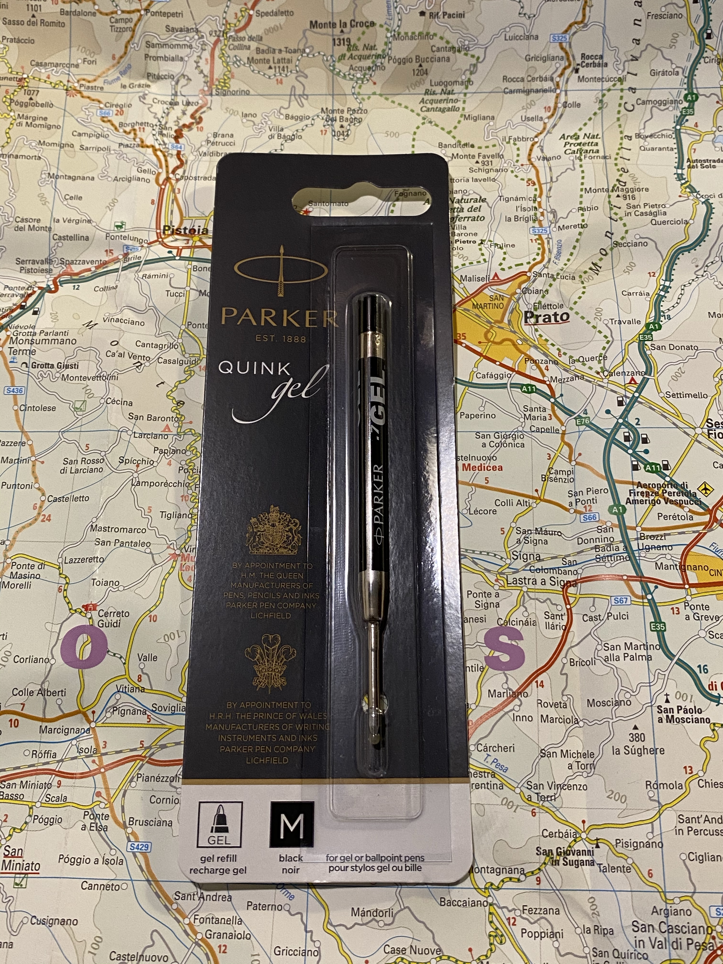
I replaced the original Caran d’Ache Goliath ballpoint refill with the Parker Quink medium gel refill (it’s 0.7 mm). Here it is in the packaging in case you’re looking for it. I bought a pack of these from the excellent, excellent CultPens (I’m not being paid to say this, I just really appreciate them and what they’re doing. If you’re a non-US pen addict in particular I recommend checking them out).
Here’s a writing sample with the Caran d’Ache Goliath ballpoint refill and the Parker Quink gel refill. If you’re a fan of ballpoints, the Goliath refill is excellent. I just happen to not like ballpoints, so I change them to gel refills whenever I can.
The Caran d’Ache 849 Arpeggio is a beautiful pen that would make for a great gift (if you can bear to part with it). I can’t recommend these series of pens enough, and I can’t wait to see what next year’s edition will be. Nespresso’s capsules come in a variety of pretty nifty colours, so I don’t think that Caran d’Ache can really miss with them.