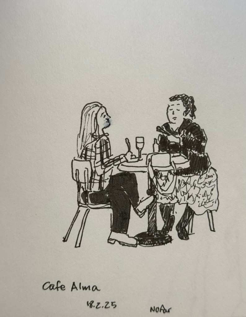
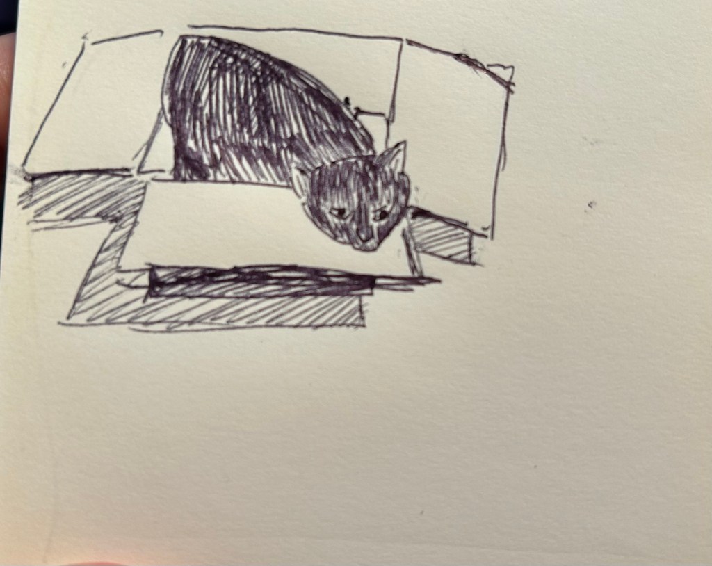
Earlier this week I went to a standup gig – a NY comedian was trying out new material, and it was an interesting (and funny) experience to see him work. Before the show I had about 5 minutes to sketch the people in a nearby cafe, so I sketched this couple using a Staedtler 0.5 Pigment Liner.
In terms of fountain pens the Parker Vacumatic is out of rotation, though I may give Diamine Writer’s Blood a try in another pen soon enough. I decided that I want to have the nib tuned on it, in terms of flow, though I don’t know who I’ll be able to find to do the tuning for me.
I also dumped out the Pilot Iroshizuku Yama Budo out of my Parker 51 as I couldn’t get it to not bleed and feather on practically any paper. I cleaned out the pen and refilled it with Waterman (Tender) Purple ink and it’s been wonderful to use since. Waterman inks are not only fantastically well behaved, beautiful, cheap and very, very easy to clean out of pens, they’re also dry inks. As Parker 51 generally have a generous ink flow, and this one is no different, a dry ink serves particularly well with this pen.
I’ve been reading Mrs Palfrey at the Claremont by Elizabeth Taylor (the British novelist, not the famous actress) and it’s a wonderful study of character, age and aging.
Next week is the Tel Aviv marathon, which is sold out for the very first time. There were no big local running events last year, and there’s clearly a hunger for them.
This week has been crushing from both a personal and a national perspective. I’ve taken solace in friends and in reading, but there have been times where it’s been a struggle. It’s at times like this when I need to remind myself to stop, take a breath, allow myself to feel what I need to feel, and only then pick myself up and move on.
Be kind to yourself and others, and have a great week.
It’s been a hectic week as my team at work is basically crumbling: our new senior member is leaving after just two months, the team lead is leaving after a bit more than a year, and the other team member is on holiday until the end of the month. That just leaves me with two trainees to hold the fort for a while, and it’s far from ideal. As I’m also working my way through an intense certification course, posts on this blog have taken (and will likely continue to take) a bit of a hit.
Reading
I’ve finished reading Looking for a Ship by John McPhee and I’ve reviewed it here. It’s a fascinating narrative of a now extinct world, that of the American Merchant Marine. I’ve now started reading Oliver Burkeman’s Four Thousand Weeks as well as Legends and Lattes by Travis Baldree.
Stationery
My Field Notes order has arrived, as has the 2024 Hobonichi Techo (yes, 2024) that I bought with a Black Friday discount. The Hobonichi will be used to supplement my 2014 Hobonichi when it comes to testing out inks. The 2024 Techo has’s got paper that is close enough to original Tomoe River Paper that’s in my 2014 Techo, though from my understanding the 2025 Hobonuchi’s have worse paper than the 2024 ones, so take that into account if you’re considering buying one. I have posts planned for both purchases, and hopefully I’ll get the time to write them.
Model Sketching
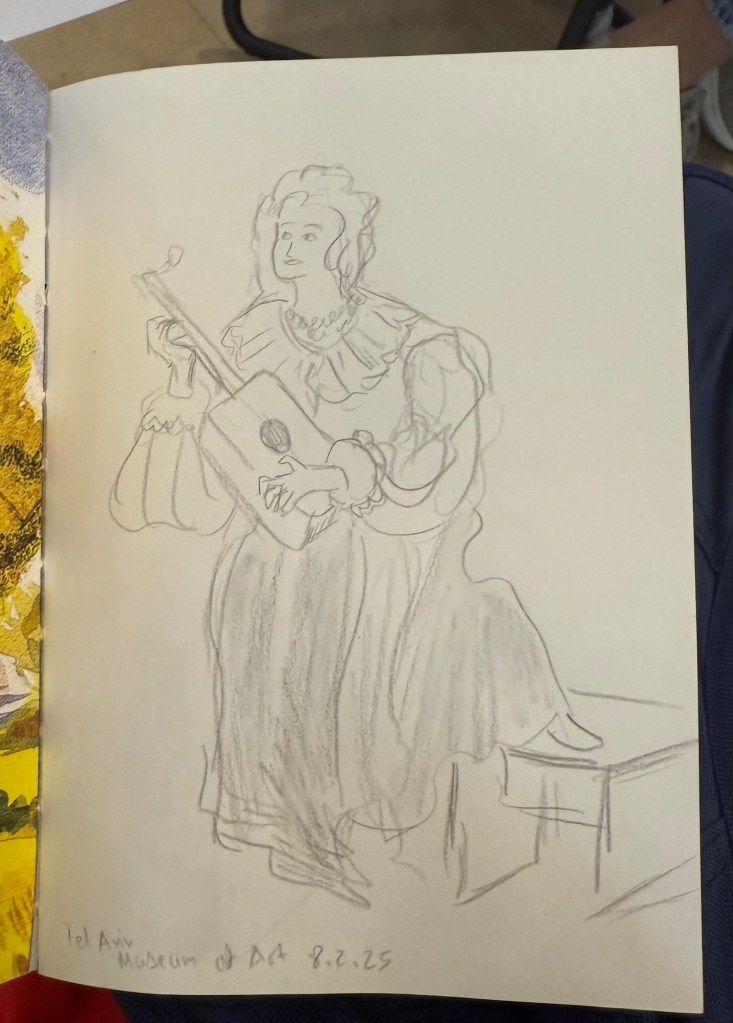
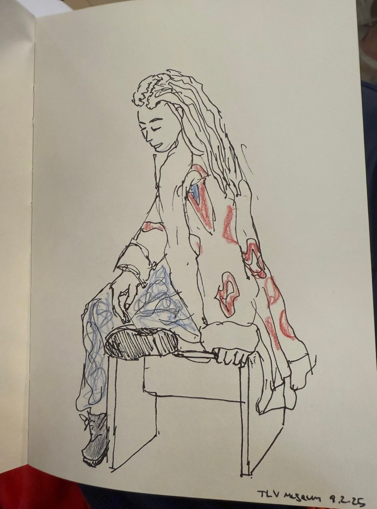
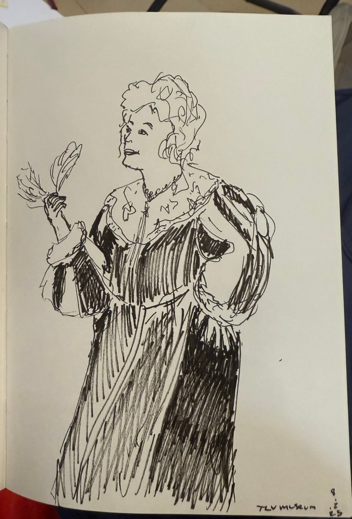
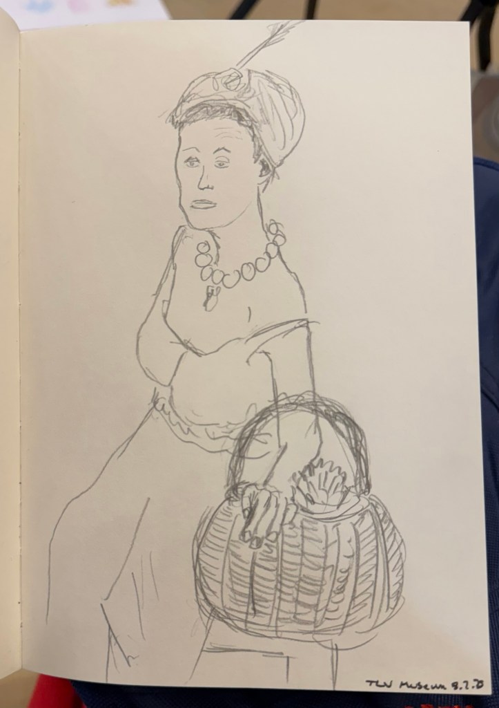
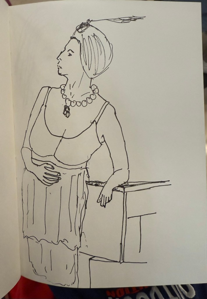
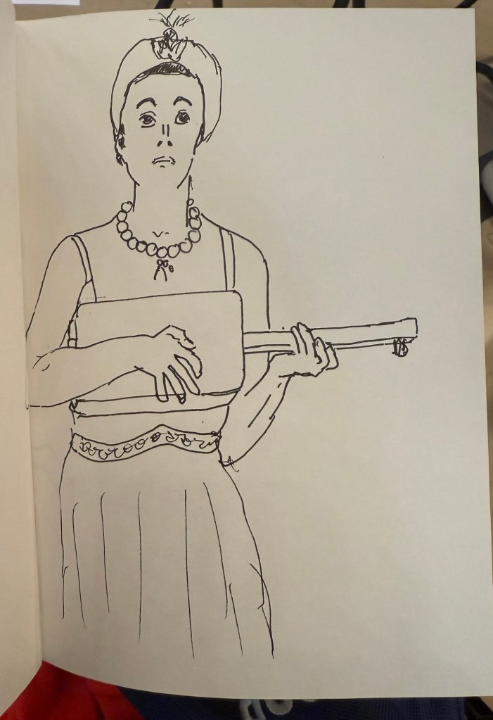
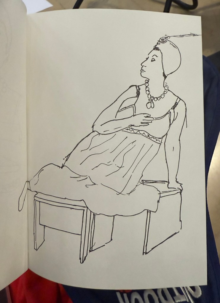
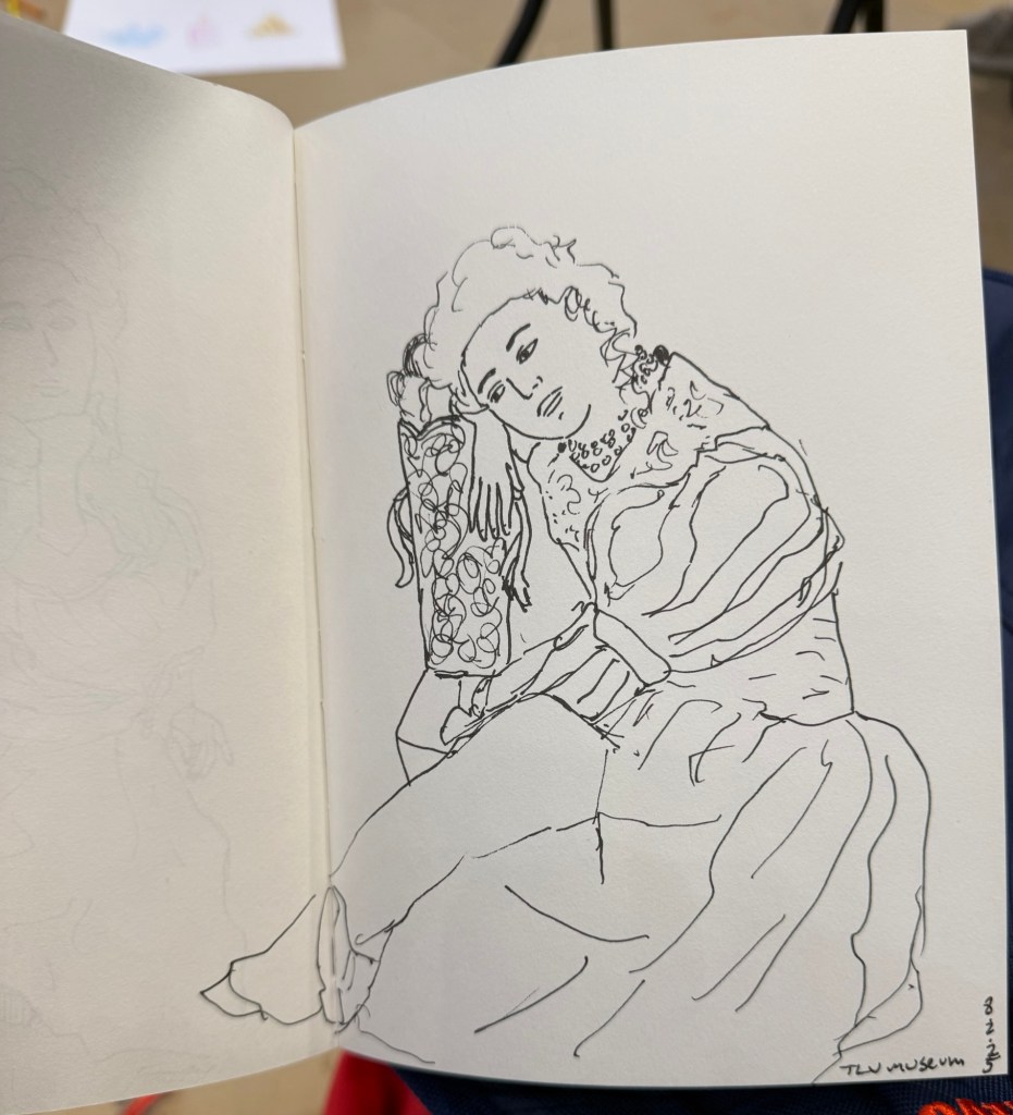
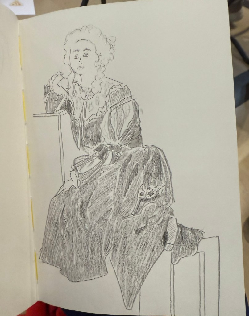
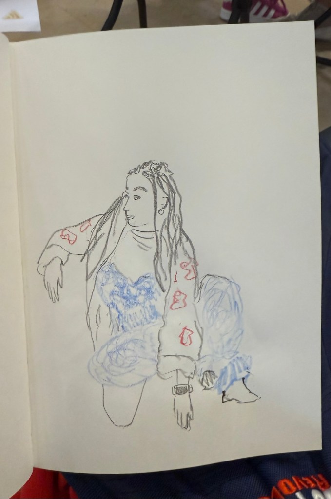
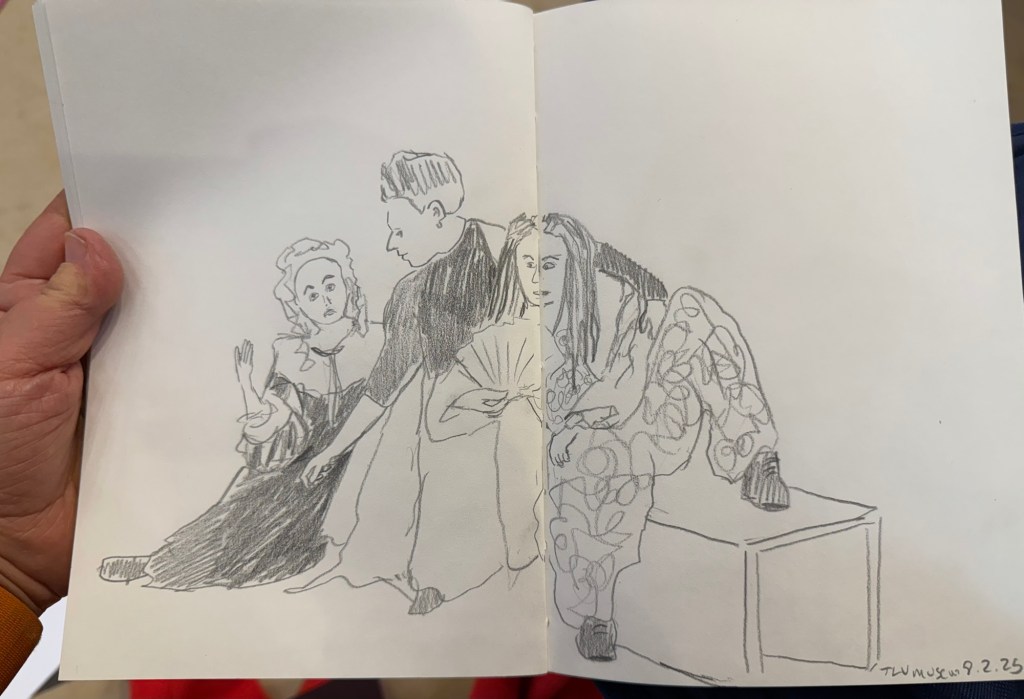
I went to the Tel Aviv Museum of Art today for a special sketching event that they organized: three models dressed in clothing that reflected some of the artwork in the collection, posing for sketches for 3 hours. These were mostly 10 minute sketches, with the last two poses being 20 minute ones. The last pose was a rare treat – a group pose, which is something you don’t get to sketch a lot.
In general when sketching models, whether clothed or not, you have one model that poses. Here there were three, and they switched places, so wherever you sat you got to sketch all three (and you could always sketch a model that was a bit further than the one right in front of you). The museum was busy, and there were children’s plays being shown in the auditorium, and so a lot of kids were around us, sketching on bits of paper with coloured pencils, with parents and grandparents cooing with delight and hovering around. It was wonderful to see how joyously kids took to sketching, whether it was the ladies in the dresses before them, or just anything that came into their imagination.
Here are the sketches I made throughout the event. The sketchbook I used was by French maker Pascale Éditions (it was lovely), and I used a Faber Castell 9000 2B pencil, a Faber Castell 4B Graphite Aquarelle pencil, various Faber Castel Albrecht Dürer watercolour pencils, a Tombow brush pen, and a 0.5 Staedtler Pigment Liner (this was my most used sketching tool).
First sketch. Warming up, so trying to keep it as loose as possible. 20 minute sketch, so I had time for some shading. The only sketch where I wet the paper slightly with a waterbrush before sketching20 minute final group posePotato quality photo of the three models
I haven’t done a watercolour sketch in a while, so I broke out the trusty Moleskine Watercolour sketchbook, my Staedtler Pigment Liners (0.3 and 0.5) and my Schmincke and Daniel Smith watercolours and made this quick sketch:
Prickly pear watercolour sketch
It was fun and it took me less time than I thought, so I should do it more often.
This was a big ink week, as I wrote many of my Inkvent fountain pens dry: Wishing Tree, Snow Globe, Winterberry, Salted Caramel, Pine Needle, Nutmeg, and Wilted Rose. I also dumped Sleigh Ride as I found the ink colour depressing. This leaves me with 9 Inkvent inks still inked in my pens, with most of them half or quarter full. I doubt that I’ll be able to write them all dry by the end of the month, but hopefully I’ll get as close to that as possible. In any case I’ll reassess in the beginning of February if I want to keep using my Diamine Inkvent inks or if I’ll just dump out and clean up whatever I still have inked at the time and start fresh.
I finished reading “The New York Trilogy” and it’s a very Paul Auster book. Next week I’ll start on “The Last Kashmiri Rose” by Barbara Cleverly and finish “The Comfort Crisis” by Michael Easter.
Have a great week full of pens, books and good news.
I’m a week away from getting back to a 10k long run, and the running weather has been pretty perfect so far. I ran a 30 minute hilly recovery run today and for the first time ever I ran it without headphones. I normally run with earbuds and listen to podcasts or music, except during races where I leave my earbuds at home for safety reasons (and to get the full race experience). It was relatively early and the trail I was running through was deserted, so it was quite the experience listening just to birds and the sound of my feet and my breath. This is definitely something that I plan on adding to my running routine.
Reading
I’m two thirds into “The New York Trilogy” by Paul Auster and I’m dreading starting the 3rd and final story. The writing is excellent, but it’s like reading through version after version of Bartleby the Scrivener – not something that you particularly want to do. I’ve come so far that I will finish the book at this point, but after reading several Auster books it’s clear to me that while he’s a very good writer, his books are not for me.
Meanwhile I’ve started on “The Comfort Crisis” by Michael Easter, and though it is clear that it suffers from many of the same problems that books of this kind suffer from (cherry picking or hand waving “research” over complex and nuanced topics), there are some interesting ideas within.
Fountain Pens
I’ve decided to sketch more with my Inkvent ink filled fountain pens to try and run them dry more quickly, so here’s a motorcycle sketch done with a Levenger True Writer Cappuccino with a fine nib and Diamine Nutmeg.
I’m finally done with reviewing the Diamine Inkvent 2024 Black Edition calendar and it’s been exhausting. I haven’t been able to get a proper buffer for the even this year, which meant that I was chasing every post every day.
On the plus side, it was nice to dust off 25 bears and sketch them. My sketching and my blogging had been in a rut recently and this event kickstarted them, so I am grateful for that. I also got some lovely comments from people, which is always wonderful to read.
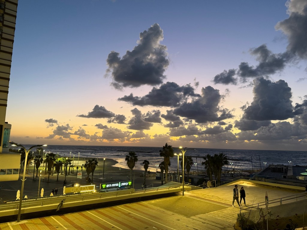
Wild sunset today
Cal Newport
The latest episode of Cal Newport’s Deep Questions podcast was excellent, and in the final segment Cal discussed his new approach to making a quarterly plan. It’s worth listening to, but basically his idea of pillars and foundations and focusing on a certain pillar at a time really resonated with me. My next quarter will be focused on craft as a pillar, as I want to earn a professional certification and work towards a deeper understanding and more hands on experience with certain more obscure aspects of my job.
Reading
I finished reading the HBR “Dealing with Difficult People” book, and started reading Paul Auster’s “The New York Trilogy”. So far it’s a very Paul Auster book, for good and for bad.
Impressionism
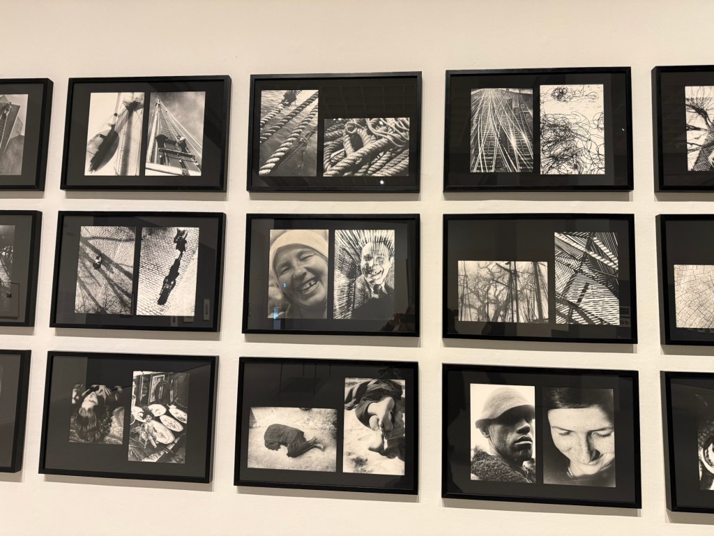
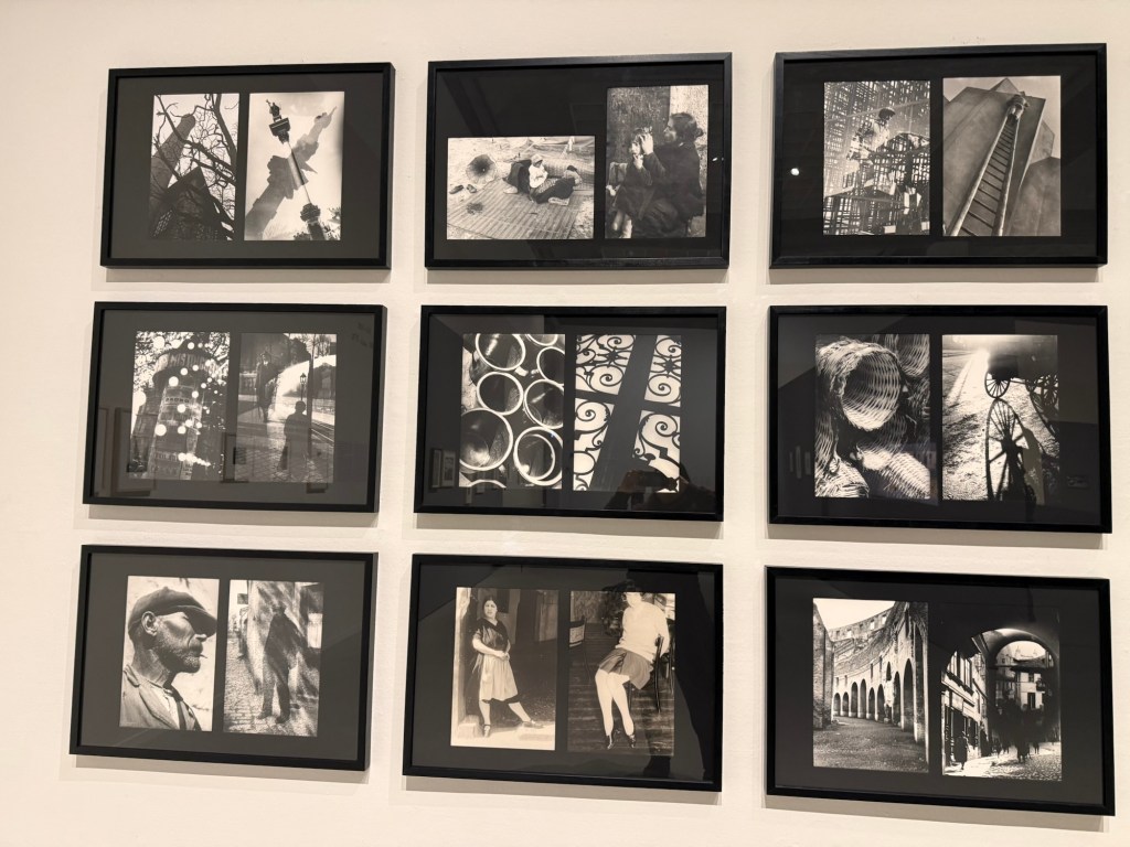
I went to see an Impressionist exhibition, celebrating 150 years to the movement, at the local art museum. The exhibition itself was nice enough, but a bit thin in terms of the artwork on display. There was also a nice print exhibition, and an excellent retrospective exhibition dedicated to Moi Ver. It was wonderful seeing a master photographer at work, and his design work is also worth seeing.
Ci-Contre Moi VerCi-Contre Moi Ver
I went to the museum store later and went a little wild, purchasing a handmade ceramic cup made by a local artist, three postcards (which I wrote on and will give away), and a Leuchtturm1917 A5 dotted notebook that I didn’t need but I wanted anyway. I bought a Leuchtturm notebook the last time I was in that store, and it’s now my work daily driver notebook, so I assume I’ll find use for this notebook soon enough. The paper isn’t perfect, but it’s good enough for me for daily fountain pen use.
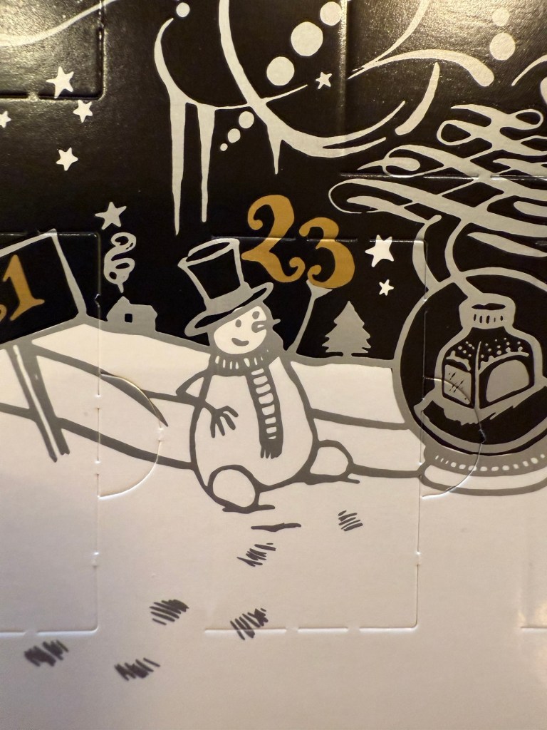
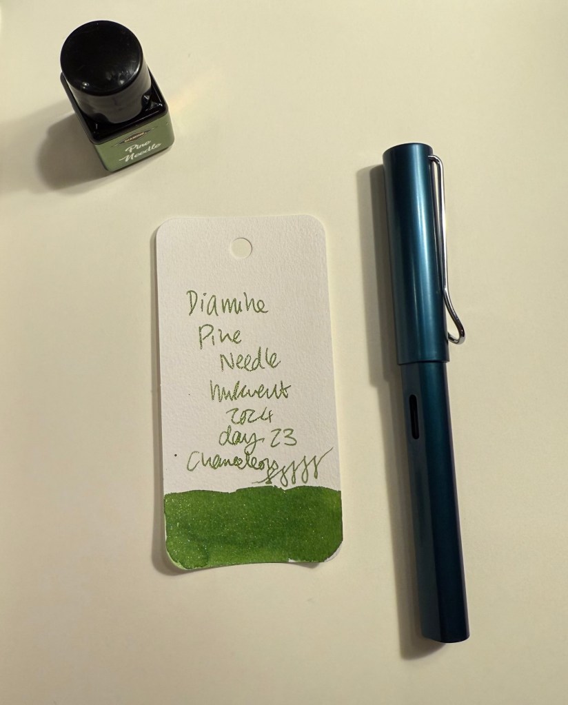
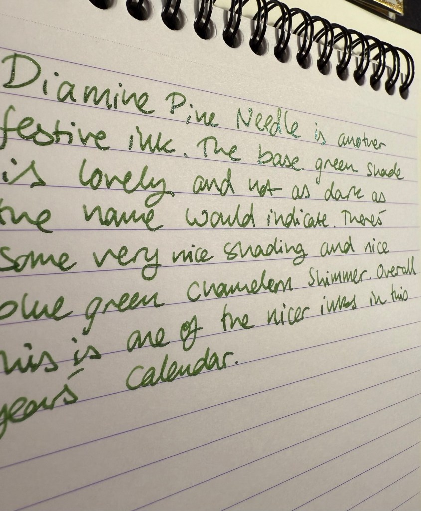
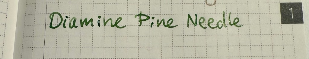
Day 23’s ink is Diamine Pine Needle, a sap green with chameleon shimmer in green and blue. I used a Lamy AL Star with a broad nib to test out this ink.
Col-O-Ring swab of Diamine Pine Needle
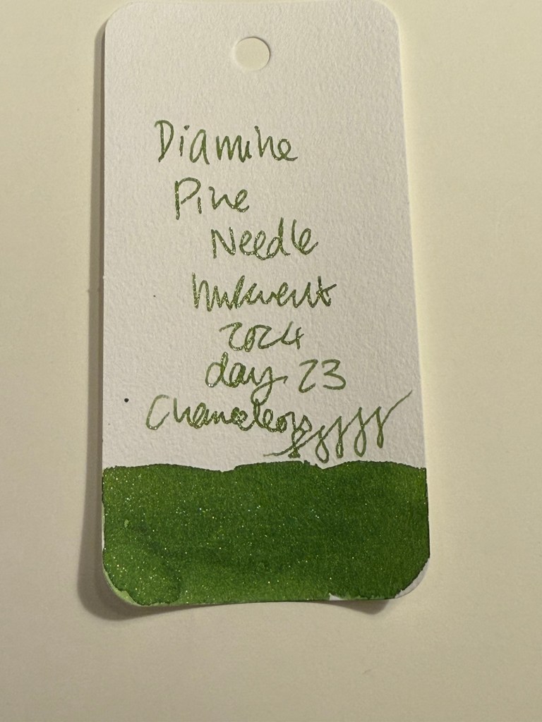
Here’s a close up of Diamine Pine Needle’s Col-O-Ring swab. There’s a bit of shading with this ink, and the chameleon shimmer adds interest to what otherwise would be not the most interesting shade of green.
Close up of Col-O-Ring swab of Diamine Pine Needle
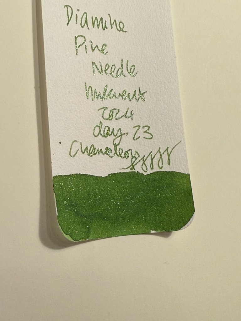
Here’s the Col-O-Ring swab from a different angle, where you can better see the chameleon shimmer:
Different angle of Col-O-Ring swab of Diamine Pine Needle
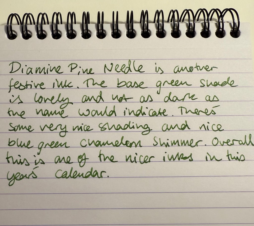
Diamine Pine Needle is definitely one of the more festive inks in this year’s calendar, and it’s delightfully neither grey nor brown, which is an added bonus. I use sap green as the base green of my watercolour palette so it was nice to get to see it in a different context and with a bit of chameleon pizzazz added.
Writing sample on Rhodia paper
Here’s the chameleon effect on the Rhodia paper. You can also see that Diamine Pine Needle shades quite nicely:
Different angle of writing sample on Rhodia paper
You can see the shading more clearly on original Tomoe River paper:
Writing sample on original Tomoe River paper
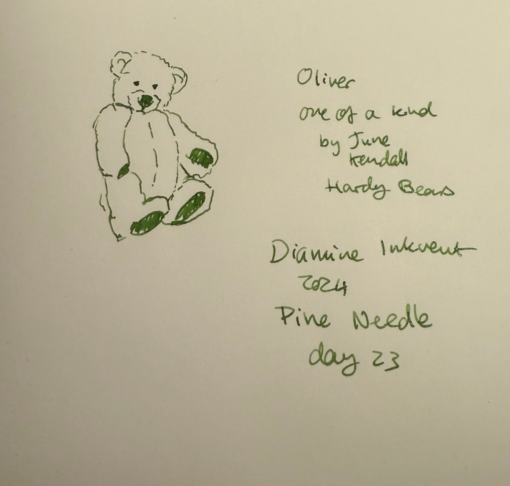
Even without the chameleon shimmer Pine Needle would have been a nice ink, but with it it’s one of the best inks in this year’s Inkvent. Here’s today’s bear sketch on Midori MD Cotton paper:
Sketch on Midori MD Cotton paper
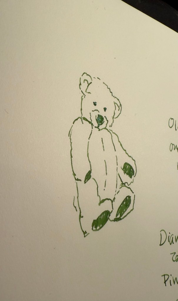
A different angle to show off the chameleon shimmer of Diamine Pine Needle:
Different angle of sketch on Midori MD Cotton paper
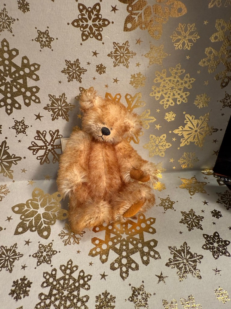
Today’s tiny bear is Oliver, a one of a kind handmade bear by June Kendall for Hardy Bears, a small English maker. His mohair is two toned and gorgeous and I love his classic teddy bear look in minuscule size.
The bear
Diamine Pine Needle isn’t really the blue green shade of pine needles, but I don’t care much. It’s a nice, festive ink with a good amount of shading and lovely chameleon shimmer, and it’s one of the brightest inks in this year’s Inkvent. It’s like a breath of fresh air after all of the drab and muted colours we’ve seen this year.
What do you think of Diamine Pine Needle? Do you like this shade of green?
Shana Tova to all who celebrate the Jewish New Year. The passing year has been an extremely tough one on a personal and national level. I sincerely hope that the coming year will be better in every possible way, that the hostages will return and we will have some much needed peace in our region.
I’ve had a lot of the worst kind of upheaval at work during the past two weeks and so I haven’t been keeping up with all the comings and goings in the stationery-sphere. There has been drama of the ugly kind, which I don’t intend to get into. I will just say that this blog is LGBTQIA+ friendly (I am a member of the community myself), and anyone equating homosexuality to murder is both extremely wrong and very hateful person.
I have had to take a break in the SketchingNow Travel Sketching course but am now returning to it and will be making a post about the second week of classes (Shapes).
I will not be participating in Inktober this year. I just don’t have the time for it, and I want to focus on working through the Travel Sketching course instead, as I have some travel planned for later this month and I’m hoping to incorporate what I learned into my travels.
So the first week of actual lessons in Liz Steel’s Sketching Now Travel Sketching course started and already there’s been a slight change of materials.
As this week will be entirely focused on line drawings, I’m switching to a non-watercolour sketchbook. For the first part of this week’s exercise, which includes working from reference photos, I’m using the Midori MD Cotton notebook in A4. It’s neither a proper sketchbook nor the A5 size format that Liz recommended, but as she also requested to upload as few photos as possible to this week’s gallery (and no more than 6) and as we have quite a bit of work to do, I decided to at least use a large notebook so I can fit more than one or two sketches on a page and thus avoid the need to stitch photos.
Eiffel Tower
We have several scenes we need to sketch as quickly as possible, starting with just 7 lines to define the scene. The 7 lines idea worked quite well with the Eiffel Tower but broke down completely for me once we got into a complex building like the Big Ben. That’s when I decided to just work with shapes and let the architecture details on the building help me determine its length and proportions.
Big Ben
Generic rules like “start with just 7 lines” are nice ideas on paper, but they oftentimes break down when we’re faced with reality. I think that the 7 lines idea would actually slow me down when sketching on location (it slowed me considerably while I was at home, and it failed completely with the Big Ben), but the basics of contour, shapes, perspective, proportion hints work no matter what.
I will try the 7 lines for the rest of the week, to see if it’s just a matter of practice, but I suspect that it isn’t.
I travel a few times a year and while I already sketch during my travels, I want to improve my speed and gain enough confidence to sketch in less than ideal conditions. I rarely sketch standing up, and I don’t feel comfortable sketching while I’m waiting in line, for instance, and these are useful skills to have if you plan to sketch while on a trip that isn’t dedicated to sketching.
As usual with Liz Steel’s excellent courses, the first part is an introduction which includes an overview of the course, setting personal goals for the course, materials list/discussion and a review of where you are starting from.
I have decided to take a different approach to the materials requirements for this course. I have a pretty compact and set travel sketching set of materials, but I’m allowing myself to expand on it and change it a bit to experiment with some new techniques.
The first big change is the sketchbook I’m using. It’s a Hahnemühle A5 Watercolour Book, which includes 200gsm fine grain paper. I’ve never used it before, but as I regularly use the Stillman and Birn Alpha that Liz is using for the course and I’m not a huge fan of it, I decided to give this paper a spin instead. If it works it would be ideal for travel sketching, as it’s thin and lightweight, the paper takes watercolour washes much better than the Alpha, and I appreciate the elastic closure and hard covers. They are very convenient additions that should help me sketch while standing, and keep the sketches safe while I carry the notebook in my bag.
Hahnemühle A5 Watercolour Book
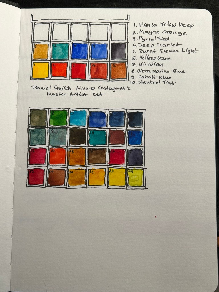
I’ve also changed my watercolour palette somewhat (it’s the bottom palette, not the top one). As I’m still not certain about it, I’m not fully documenting it at the moment. This course isn’t geared heavily towards watercolour, but I tend to like to sketch as quickly as possible on location when travelling, take a few reference photos and complete the sketch with watercolours later that evening.
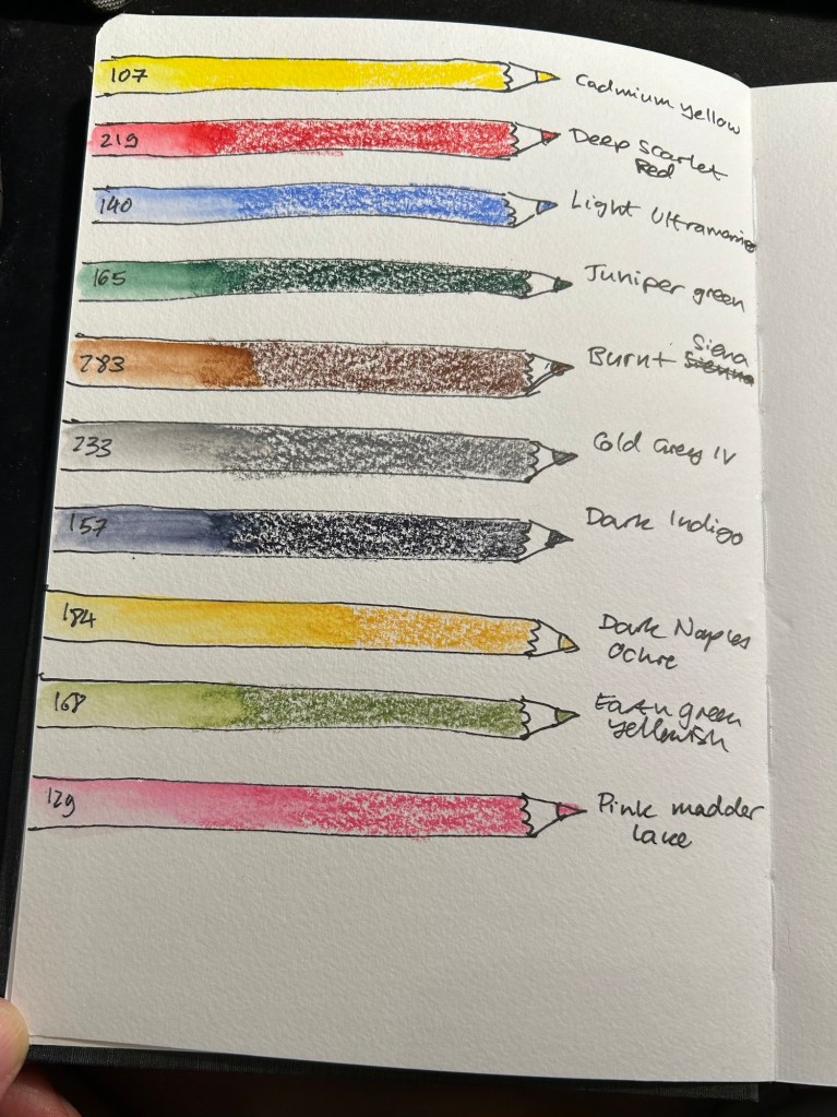
The palette I’m using is the bottom one, with 24 colours, both Schmincke and Daniel Smith.
For the first time I’m adding watercolour pencils to my travel sketching kit. As Liz recommended I have a triad (yellow, red, blue), a green, a brown, a grey, a dark, and while she recommended having two lights, I have three. Why? Because having quickly available greens is very useful, the pink is useful for skin tones, and the ochre is too generally useful to be left out. All of these pencils are Faber-Castell Albrecht Durer.
Watercolour pencils.
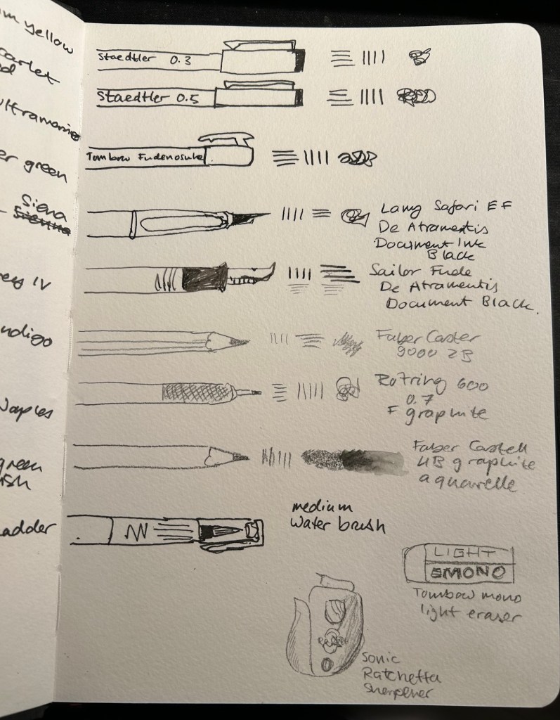
Dry media is also more than double what I normally carry on me. Here the point is to experiment, and it’s very likely that I will say goodbye to several of these tools during the course. I normally use only Staedler Pigment Liners in 0.3, 0.5 and sometimes 0.8 when I sketch, but here I’ll be adding a Tomboq Fudenosuke brush pen to the mix, two fountain pens (a Lamy Safari and a Sailor Fude both with De Atramentis Document Black), three pencils (Faber Catelll 9000 2B, Rotring 600 0.7 and for the first time ever, Faber Castell 4B graphite aquarelle), an eraser and a pencil sharpener. I’ll also be using a medium waterbrush instead of my usual fine one.
Sketching media.
All of these tools will be carried in a Nock Co case, with the exception of the watercolour tin and rag, and a brush case.
Nock Co case, watercolour tin and rag.
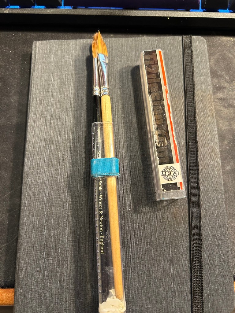
I don’t think that I’ll be using these too much during this course, but these are my travel ready brushes. I keep them in a Ti2 design tube with glue tac at the bottom to prevent the brushes from moving. The brushes are Windsor Newton Series 7 numbers 4 and 7 and Rosemary & Co dagger brush 772.
Brushes
That’s the whole kit, and now it just remains to try it out and see what works and what doesn’t.
The Caran d’Ache 849 ballpoint is a classic which I have already reviewed in the past. While I rarely use ballpoints, I have several of these pens (all with gel refills that I have swapped instead of the Caran d’Ache Goliath ballpoint ones). Why? Because of their excellent limited edition designs.
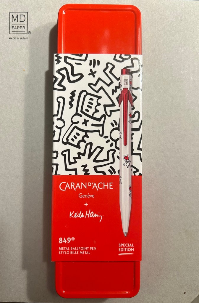
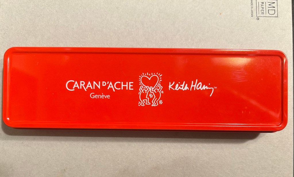
While I was in London in April I picked up two new limited edition 849s – The Keith Haring edition in red and white, and the latest 849 Nespresso collaboration.
The box
The Keith Haring edition comes in black and in red and white. I think that the red and white edition is nicer, and it appears that so do other 849 fans: the black edition is still widely available but most places have long sold out of the red and white edition.
The box is very nice, and makes for a nice gift pack.
Outer box
Inside the box you also get to see some of Haring’s work.
Inside the box
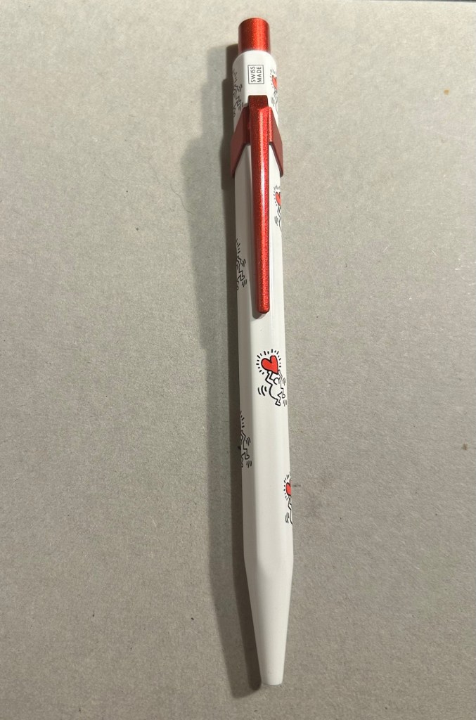
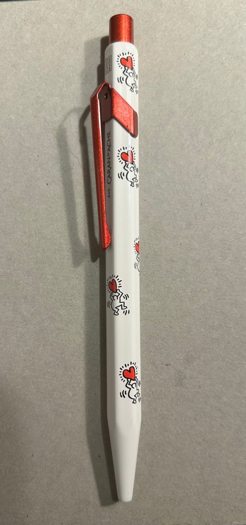
The pen itself is white, with a sparkly red knock and clip. The paint on these feels like lacquer, and the look is sleek and bold. There are dancing people holding red hearts all over the pen (so you get some Keith Haring artwork, but it’s not overcrowding the pen), and the pen body’s finish is the standard 849 glossy finish.
The Keith Haring 849
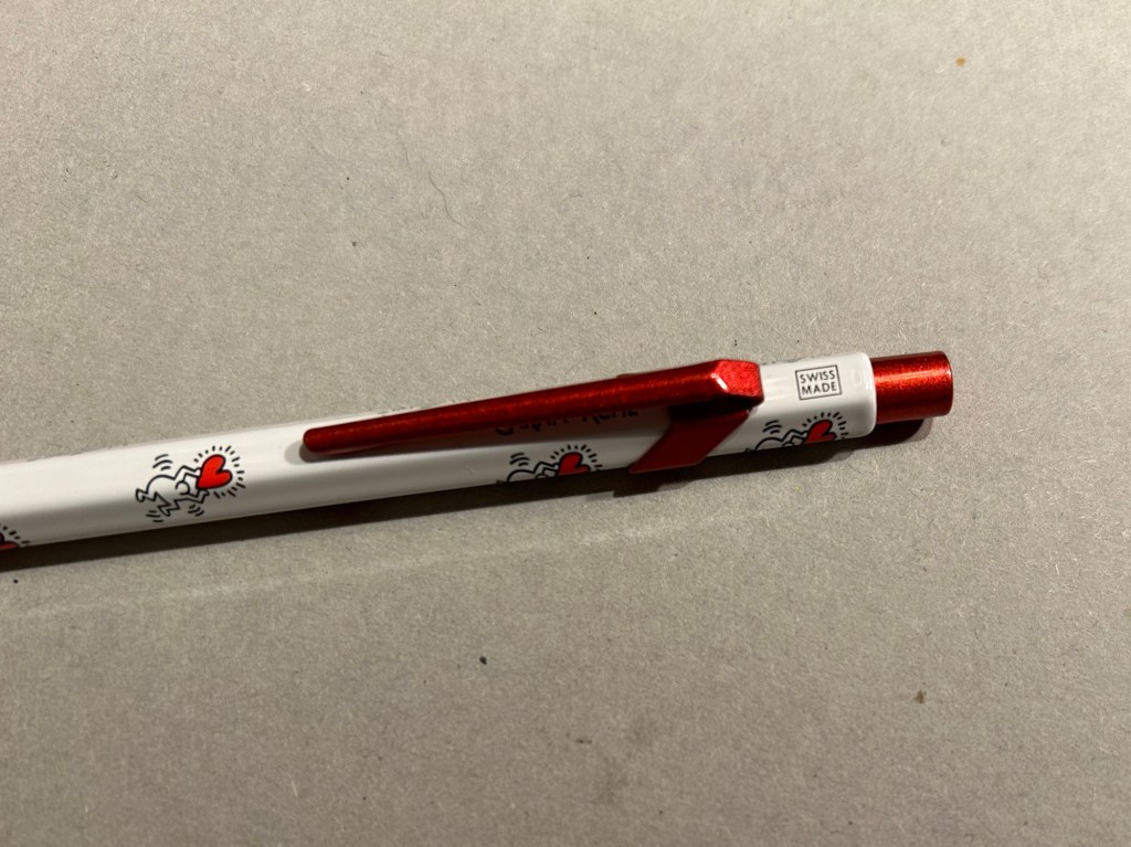
The knock and clip are probably the most striking thing about this pen. Surprisingly Caran d’Ache didn’t put any Haring branding on the pen, not even hidden with their branding under the clip.
You can see the branding on top.
The paint on the clip and knock look like someone poured them out of red glitter paint, and then waited until they set. All in all the result, together with the Keith Haring artwork and the included box, is one of the best 849 gift pens I have seen.
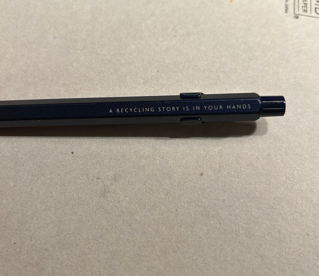
The Caran d’Ache Nespresso Kazaar edition, the 6th Caran d’Ache and Nespresso shared edition, is a bit different than previous editions. Unlike previous editions that featured a silver clip and knock, the Kazaar edition is monochrome. The dark blue pen has a clip and knock in matching colours, and the result is much better than previous pens in this series.
The Kazaar 849
As usual the pen is made at least in part from aluminium from Nespresso Capsules. The pen body has a bit of a matte texture to it, which makes it slightly easier to grip. It comes by default with the excellent Goliath refill, this time in black (the Keith Haring 849 also came with a black Goliath refill).
The pen touts its recycled origins.
The 849 Nespresso came in the same sort of recycled cardboard box that previouseditionscame in. It makes for a good gift pen, even though some may find the dark navy blue colour a bit… boring.
Swiss made. The colour matching on the knock, clip and pen body is superb.
If you like the idea of the 849 Nespresso but don’t much like the colour of the Kazaar one, I’d recommend waiting for the next edition. I have a feeling that it too will feature monochrome hardware, and it might be in a brighter colour as Nespresso are starting to run out of drab capsule colours.
The Goliath refill in action
Note to those who prefer gel ink refills and plan to swap the 849 refill out: the tolerances on these 849 pens are a bit weird. There are 849’s in which you can easily swap the refill for any Parker style refill with no issue, and those in which if you swap the refill you find that the knock won’t properly engage it. This is something worth taking into account if you plan on swapping the refill in the pen – there’s a risk that it won’t work with the specific pen you own. I’d recommend in this case to try swapping the refill before you purchase the pen if possible, or resign yourself to using a ballpoint. The Caran d’Ache Goliath refills are several cuts above what you get in a standard, disposable ballpoint, so the loss shouldn’t be too great.
What about you? Do you like the 849? Do you swap its refill?