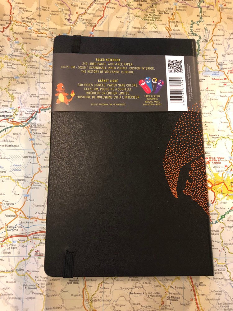
Moleskine Limited Edition Pokémon Box Review

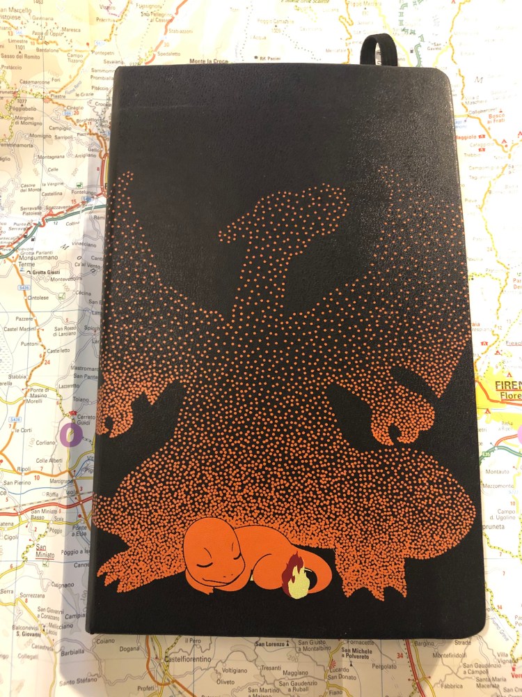
I was going to  write a review of the Moleskine Pikachu Pokémon limited edition notebook first, but I forgot that I gifted someone the copy that I had. After a bit of internal debate, I decided to write about the highlight of the Moleskine Pokémon limited edition set, the Pokéball Box, first, and order another copy of the Pikachu notebook for later review. As these make such great gifts, I suspect that this copy too won’t make it into my rotation but instead be snagged by a friend.

Last spring I was visiting London with my family, staying right next to a Moleskine store (my poor, poor wallet) and trying to take my luggage allowance into account (notebooks are heavy, and Moleskines are easily purchasable online after all), when I first saw these. At the time, I wasn’t into Pokémon, I hadn’t played the Nintendo games, and the Pokémon GO craze passed over me without leaving its mark. I thought I was safe. Then I saw this box at the store.

Such a simple design, but so effective

I left London without purchasing the box, but I kept thinking about it. As my family left on a flight two days after me and it turned out that they had weight to spare, they asked me if there’s anything I wanted from the Moleskine store. I considered for a while, and then asked for the Pokémon box. They ended up buying all three notebooks for me.

It’s been almost a year since then, and I’ve been swept into Pokémon GO as a way to handle my anxiety while dealing with my mom’s illness, and so when I photographed this box today, it was no longer an abstract thing that I had very little emotional ties to. The design, however, has not changed.

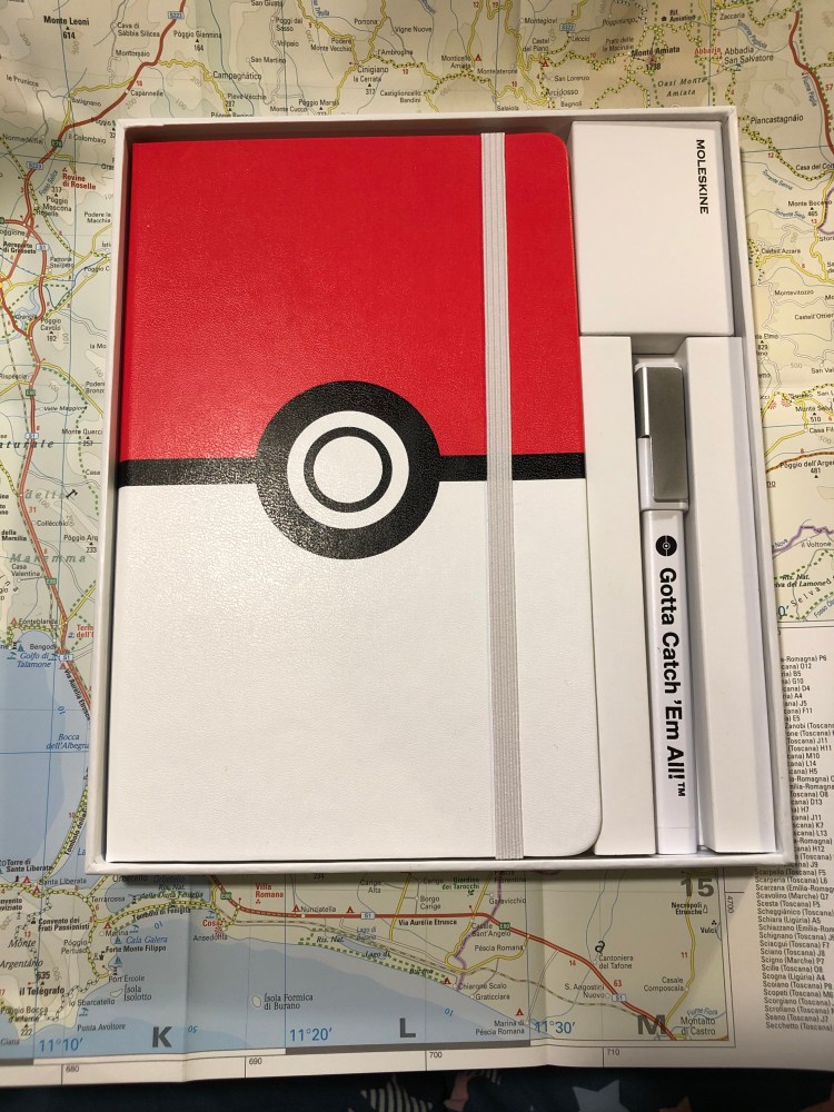
Unlike many other Moleskine limited edition boxes, this one comes with a Moleskine pen. The tradition started a few years ago with the Writing Box, and this year it’s part of the Basquiat box.

This isn’t a review of the Moleskine rollerball, but of the Pokémon box, so I’ll just point out two things: Strangely enough the logo on the clip is set so the Moleskine logo isn’t aligned with the Gotta Catch ‘Em All! logo. When one of them is right side up, the other isn’t. Also, the Gotta Catch ‘Em All is printed only on one side of the pen, which is disappointing. If you clip it to a notebook there’s a 50/50 chance that you won’t see the logo, unless you make sure the cap is positioned so the clip isn’t on the side of the logo.

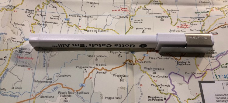
The other thing that’s disappointing here is the choice of the body colour of the pen. Red would have been so much more functional, as the white is going to look grimy and tarnished just about the moment you start using it.

The pen uncapped. Now imagine in it bright red. So much better, right?

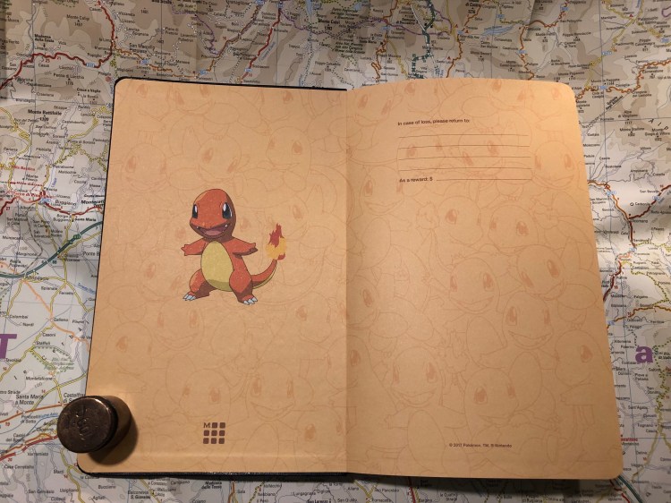
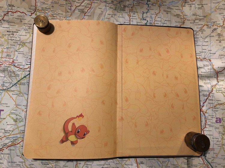
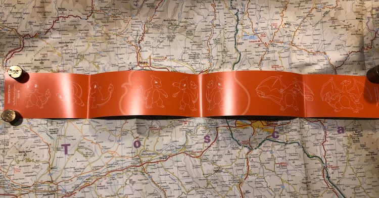
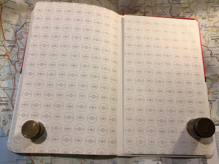
Inside the notebook you are greeted with a whole lot of Pokéballs, both on the front and back endpapers.

Front endpaper
Back end paper

The design even continues into the inner lining of the back pocket:

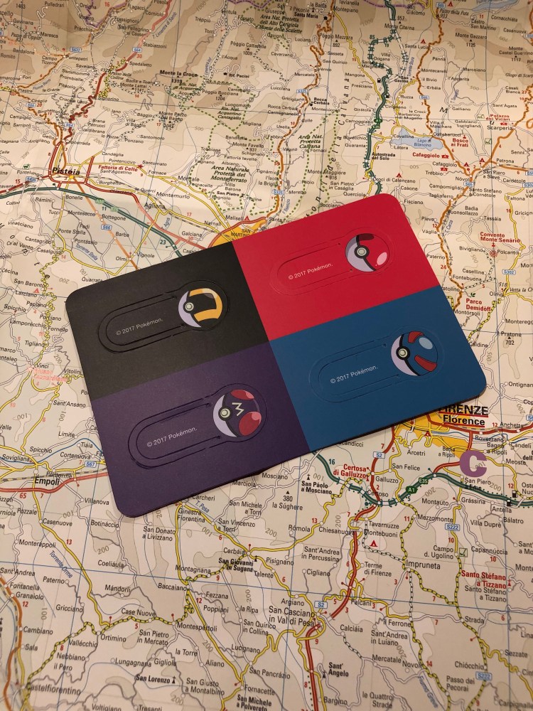
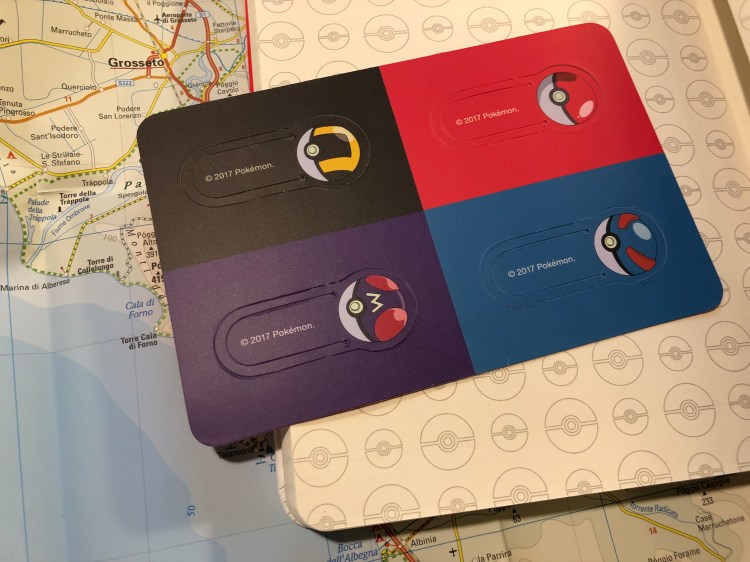
This edition comes with four Pokéball bookmarks, like the other Moleskine Pokémon limited editions.

All in all it’s a nice box, but in terms of design, it’s all in the cover. The endpapers are bland in my opinion, and they could have done a much better job on the pen. The initial price on these was pretty high, but as it’s now dropped somewhat, I still think that they make a great gift for the Pokémon lover in your life, though you might want to consider the other Moleskine Pokémon notebooks.

Tournament of Books: The Italian Teacher

I just finished reading the seventh Tournament of Books 2019 book, Tom Rachman’s “The Italian Teacher“, which is running against Anna Burn’s “Milkman” in the second round of the competition.

What a difference one round makes. The Tournament of Books play-in books were all excellent, setting up high expectations for the first round of books. If only those expectations were met. Both “Warlight” and “Call Me Zebra” were very mediocre books, verging on the terrible. A good premise and sweaty efforts that exude out of every page do not a good book make. It would have been very easy to give up on the Tournament of Books at this point, but I’m so glad that I stuck to it.

The round 2 books were the complete opposite of round 1, finally giving the play-in books a run for their money. “Milkman” is one of the best books that I have ever read, period. It deserves to stand in any capital L Literature shelf in every library around the world. I was genuinely worried for “The Italian Teacher”, sure that “Milkman” would mop the floor with it. It didn’t.

Tom Rachman’s “The Italian Teacher” is a study of what makes an artist, how humans connect and how those connections evolve with time, and the gap between what people’s expectations of what an artist’s life and work process is versus the often lacklustre reality of their lives. It is far from a treatise though — every character pops off the page, juicy and real and warm, the dialogue sparkles, the oftentimes tragic story is sprinkled with humour and good nature, making it a fun read, even though oftentimes you want to punch this or that character in the mouth or shake them to awareness. Every little detail is well thought out, but unlike “Call Me Zebra”, you don’t see the sweat. It feels so effortless to read that you’re lulled into thinking that it was effortless to write.

If it was placed against any of the round 1 Tournament of Books books it would have easily trounced them. As it stands against “Milkman”, I doubt that it will advance beyond this round. “Milkman” has a timeless, monumental quality about it, even though its heroine leads a much less glamorous life than Bear and Pinch, or even Natalie. In a place where the sky is always blue and sunsets are not something you go and watch, great novels grow.

Westinghouse No. 2 Pencil: Not a Review

I just started using a vintage Westinghouse number 2 pencil, instead of the Palomino Blackwing 530 which reached the Steinbeck stage. There’s no point in reviewing a pencil that isn’t widely available, but I got a pack of these on eBay for a pittance and they are excellent pencils, so if you’re looking for great, super cheap pencils and don’t mind petrified erasers, give branded vintage pencil listing on eBay a try. You never know what you’ll find.

This Week’s Long Run: The Calm After the Storm

Last week’s long run was the Tel Aviv Marathon 10k (I broke my PR!), and the week before that was a majorly stormy day, so it was nice to get back to an early morning 10k after a hiatus.

There was a storm on Thursday, which meant that the sea was choppy, sand-brown, and there were even more seabirds about than usual.

That was 10k done and dusted, and as a bonus I’m adding some pictures from yesterday evening’s 5k, because the sea at sunset now is extra gorgeous.

How majestic is that sunset?

Tel Aviv’s Gordon and Metzizim beach, flooded after the storm:

Tournament of Books: Milkman

I just finished reading the sixth Tournament of Books 2019 book, Anna Burn’s “Milkman“, which is running against Tom Rachman’s “The Italian Teacher” in the second round of the competition.

“Milkman” is an excellent piece of Literature (capital L). Set in Northern Ireland in the 1970’s Anna Burns deftly writes a novel that is both of its time and utterly timeless. Written from the point of view of Middle Sister, “Milkman” portrays the life of a community at siege, and yet alive, growing, changing. Middle Sister wants to stay under the radar in a place where being noticed often times means getting yourself killed, but she lives in a world where that’s not really an option for her. Walking, reading, running, just being a young woman, mean that she’s subject to scrutiny, criticism, and attack.
Most characters in “Milkman” are nameless, the exact place and time it takes place in isn’t specified, but is entirely believable in its realism, in the way the plot inevitably moves towards its conclusion — and yet at the last moment twists, turns and surprises you in a way only real life can. “Ah,” you say, “I should have seen it coming,” and yet how delightful it is that you don’t. It’s almost unbelievale that Burns managed to write a novel that is so, so clever, and so full of heart.

“Milkman” won the Booker in 2018 and boy does it deserve it. I have a feeling that it will end pretty high up in the competition

How I use my notebooks: Tournament of Books tracking

Most stationery blog posts focus on reviewing products and less on how people actually use all the paper, pens and inks that they buy. I thought I’d try to write a bit more about how I use my stuff, and not just on how cool is all the stuff I have.

This is my latest Field Notes, the Campfire Night. I use a binder clip to keep it closed as it bashes around in my backpack. Without the clip the pages get crumpled and torn after a few days of use. The clip used to be nice and copper coloured but now is just nice and worn silver.

Apart from my day to day to do lists, this notebook currently hosts my Tournament of Books trackers. There’s a list of books that are participating in the contest, divided per round. Those that I’ve read are marked off with blue pencil. This is for my personal use, so you’ll not see any Instagram level calligraphy here. I wasn’t planning to photograph this and blog about it when I created these.

This is where I’m logging who I think should win each round. When the tournament starts I’m going to log who actually won each round on the opposite page.

Since doing this challenge means reading 18 books in a very short period, I’m tracking my reading progress in this notebook as well as in my reading journal, just to make sure that I’m on track (I won’t finish reading these in time, as I’ve started too late, but my goal is to finish reading them all by mid April).

That’s it.

Kaweco Liliput Brass Fountain Pen Review

A certain famous young actress, whose work I love, was recently photographed while pensively holding the copper version of this fountain pen, and this summarises this pen perfectly: it’s very, very photogenic.

I got this pen at a close out sale in a local art supply store, and the only reason I was tempted to buy it was because it was so shiny and pretty and at bargain price. Even so, I should have left it to languish unloved at that store’s counter. This is not a good pen. It’s not even a usable pen. It’s a lovely prop.

As its name suggests, this pen is tiny. You can’t use it unposted, and even posted it’s far from comfortable to use. I have tiny hands and even for me the Kaweco Liliput, posted, is just a hair breadth above the Steinbeck stage.

How does the pen write? Fine, as long as it writes. This is a fine nibbed pen and it writes like a Japanese fine nib (despite being made in Germany), if the Japanese fine nib that you have in mind has serious flow issues. The nib constantly dries up. I used a Diamine blue black cartridge in it (there’s no really viable converter option for this pen), a good, middle of the road ink, and the Liliput behaved as if I was using the driest ink ever and had left it uncapped for at least 10 minutes before I started writing. I wouldn’t even call it a writing experience, as so little writing went on. Start, stop, shake. Start, stop, shake. Nothing but shaking would get it writing again for another letter or two.

The pen is already starting to show some patina, which is excellent (you buy a brass pen for the patina potential after all). This means that it will only look better with time. If you’re a petite actress trying to look pensive and sophisticated for a photo op, this is wonderful news for you — the Kaweco Liliput Brad’s is the perfect pen for you. Everyone else: spend your money elsewhere.

Tournament of Books: Call Me Zebra

I just finished reading the fifth Tournament of Books 2019 book, Azareen Can Der Vlier Ollomi’s “Call Me Zebra“, which is running against Michael Ondaatje’s “Warlight” in the first round of the competition.

So Oloomi had a great premise — to write a modern take on Don Quixote with a young woman, an Iranian refugee, at its centre. That’s where the great parts of this novel end. Zebra, the main character, has none of the charm or pathos of Don Quixote. She’s insufferable – selfish, childish, bigoted, narcissistic, clinically cerebral, depressed and depressing. She also doesn’t change until the very, very end, much like Don Quixote, and her adventures are similarly repetitive, but without the humour and warmth of the original Cervantes. But what is worse is that Oloomi has piled so much literature on the narrative that it’s unreadable. It’s like reading a laundry list of quotes and literary factoids which you are expected to plow through to get to a glimmer of plot or dialogue.
It was so bewildering to me that “Call Me Zebra” got good reviews that I went and read them. It’s pretty clear that the reviewers didn’t read the book through – they just skimmed the first bits (the most interesting parts in the novel), and then just wrote the reviews based on that and the excerpt that they got.
I’m reading this as part of the Tournament of Books 2019, and the book has managed to make it to the first round (against the almost equally terrible “Warlight”), while excellent books like “America is Not the Heart”, “Speak No Evil” and “A Terrible Country” are languishing in the play-in round. In the end I couldn’t care less if “Call Me Zebra” or “Warlight” win this round (“Call Me Zebra” is marginally better because of the first part of the novel, the description of the family’s exile from Iran), but I do wish I knew how they got selected to participate in the first place.

Oh well, the next book up won the Man Booker prize in 2018, so I am expecting a better reading experience.

Moleskine Pokémon Charmander Limited Edition Review

Moleskine’s Pokémon limited edition notebooks are some of the most attractive and colourful ones that the company has come out with in recent years. Even if you aren’t a fan of the franchise you might want to pick one of these up, just for their design. Also, if you’re looking for a gift for the Pokémon fan in your life, look no further. Even if they aren’t a notebook fan they’re bound to love these gems.

The cover design, with the paper wrapper still on, is fantastic. You can see little Charmander dreaming of when he’ll be all grown up and a Charizard. It’s cute, perfectly aligned with the wrapper, and the colour contrast with the black background really make Chaemander pop.

Dreaming Charmander
The back cover. I love how understated Moleskine’s logo is.


The cover looks great even without the wrapper, which is a thing because Moleskine has created designs in the past that look much better with the wrapper on than they do unwrapped. The only thing that could make this cover better is if dream Charizard was embossed on the cover, adding a little texture to it. On the other hand, that would have almost certainly made the design less durable over time, so I guess that’s it’s good that Moleskine went for a simple print this time.

Inside the front cover you are greeted by a multitude of very happy Charmanders, and that design continues in the back.

Just look at the perfect alignment of the print on the back pocket. Also, way to go Moleksine for fully embracing the cute.


Instead of the usual specially designed sticker set, this edition gets Pokéball bookmarks. Again, these are super well designed, but like all bookmarks of this type, they’re not likely to hold up to much use.

The B-side of the wrapper shows the various evolutions of Charmander (Charmeleon, Charizard), which is nice, if not Moleskine’s best B-side idea yet.

There are two more notebooks in the Moleskine Pokémon limited edition set and I’ll review those later on. Meanwhile, if you’re looking for a cool gift (that costs less than a Nintendo Switch) for the Pokémon lover in your life, this is definitely it.