Big Celebratory Birthday Update Part 2

A smorgasbord of stuff for your delectation. You can read part 1 here.
13. Big bold announcement: next month is Bloomsday, and after much hemming and hawing i’ve decided to reread James Joyce’s Ulysses and blog about it as I go along.
I’ve read Ulysses three or four times between 2009-2013 but I haven’t touched it since. While I still have some of my notes on this book, my goal isn’t to reconstruct them or to lecture on the topic, but to enjoy a very good book, and see how my memory of it fairs post-chemotherapy (which has affected my memory).
Why should you join along? Because Ulysses is a phenomenally good book that is enjoyable to re-read (but very challenging to read for the first time). It’s funny and touching, profound and full of adventure. It’s just built on very well crafted layers of language, meaning and context, and it’s paradoxically a book that is meant to be re-read, not read. Hopefully I will make it a bit easier and less scary to read for the first time for those brave enough to join me.

14. I have been switching my podcast listening queue around lately, which means that I got to listen to this wonderful two part episode of Alie Ward’s “Ologies”: Salugenology (Why humans require hobbies). Guest Julia Hotz talks about the things that we need to be happy as humans, and the conversation is fun to listen to and enlightening. I highly recommend it, and the “Ologies” podcast in general.

15. I’ve stopped buying eBooks from Amazon after they stopped allowing customers to download the books that they purchased (so you basically don’t own the book that you paid for if you buy in from Amazon now). I still use my Kindle Paperwhite, but I’m buying books from Kobo. I buy them DRM free where possible, and if not I use Calibre to strip them of DRM and then this site to transfer them to my Kindle (if they are DRM free you just use the sendtokindle site to upload them to your Kindle). It took me 30 minutes to get the setup working the first time, and it now adds 1-2 minutes tops to every book purchase, which is plus for me. It means that I don’t mindlessly purchase books that I don’t intend to read, and I actually think through each book purchase. I also noticed that the books I’m interested in are priced slightly cheaper on Kobo, which is a nice little bonus.

16. Using yellow ink (Rohrer and Klingner Helianthus) has been a challenge but also an education. Helianthus is readable enough to be used for my daily todo list, but thanks to this ink I’ve been learning to enjoy using a fountain pen for highlighting purposes. It’s more subtle and better behaved than traditional highlighters, and the colour pops on the page without resorting to neon shades.

17.I am thinking about the next inks to put into rotation, which is a bit unusual for me as I normally start with the pens that I want to fill, and then go find inks that go well with them. I want a blue-black for practical reasons, a cheerful green, a pink or orange, and a turquoise or teal. How do you select which pens and inks you use?

18. A bit of behind the scenes: I draft these posts longhand in a Dingbats notebook and a fountain pen. I think better on paper and it’s a way to use the pens and inks that I have. There are no AI/LLM agents/bots involved in this blog, and that’s the way it will remain. I enjoy writing, I created this blog as a hobby because I enjoy writing, and while I use AI agents as part of my job, I have no intention of letting them take away any part of the creation of this site.

Draft of this post
Well worn Dingbats blogging notebook

19. Journaling tip #1: If you’ve been feeling down lately, take the time at the end of each day to review your day and score it. It doesn’t matter what scoring system you choose, but I recommend that you keep it simple and not too granular: -1, 0, +1 or 1, 2, 3, or “great”, “OK”, “meh”, “terrible”. You just want a quick way to know if the day was a good day, an average day, or a bad day.
At the end of every day for a week or two think back on what happened throughout the entire day, give it a score, and explain the score in no more than a sentence or two. So for me today was: “OK – was super tired at the start, but I managed to get two naps in and recovered enough to get most of what I planned done”.
At the end of the week, when you do your weekly review and plan ahead what you want to stop doing, start doing and keep doing, use these scores as an input for your decisions.
Repeat this whenever you feel the need to recalibrate.

20. Journaling tip #2: if you’ve stopped journaling and want to restart, don’t attempt to backlog the days that you missed. Forgive yourself the journaling “debt” and start fresh. This is easier to do if you switch something up in your journaling routine – use a new pen, pencil or ink, a new notebook, or write in a new location.

21. A dear friend and colleague has moved to a new job in a different company. While I’m happy for him and I wish him the best of luck, I already miss working alongside him. This brings me to the following journaling tip:

22. Journaling tip #3: Take a journal, either your usual one or a new one for a special journaling “events” and write down a list of names of people that have inspired or taught you something that you are grateful for, and write down what it is they taught you. Start with those that affected you by their positive actions (kindness, encouragement, setting good examples), and then challenge yourself to journal about those that taught you by being negative presences in your life. Did an office bully teach you to be kind? Did the talentless brown-nose teach you about how much you value your integrity?
You can write about both people you personally know and those in the public sphere, and you can return and edit or add on to this list whenever you want. It’s a good reference in troubled times to remind you of who you are, what you stand for, and where you want to be.

Manufactus notebook that I plan on using for journaling tip #3

Big Celebratory Birthday Update Part 1

It’s been a long while since I’ve posted a weekly update, and it’s my birthday week, so to celebrate I decided to write 43 points (split up to several posts to make them more manageable), in no practical order:

  1. After a bit of drama I have managed to enrol to the 2025 Urban Sketchers’ Symposium in Poznan, Poland. I will be posting about my sketchbook and art supplies packing list later on, but do let me know in the comments if you’ll be there.
  2. Rising tariffs and shipping costs have made online pen, ink and paper purchases prohibitively expensive for me. This may not be a bad thing, as it should encourage me to use the large stash of “stuff” that I already have.
  3. I have been gifting people nice notebooks and pens lately, and it’s been a surprisingly heartwarming success. Giving people a notebook that matches their style and needs, coupled with a pen that suites them and an encouragement to start journaling about their lives has been one of the joys of my life in recent months.
  4. Moleskine came out with a cool Peanuts collection of notebooks and Blackwing pencils (plus a backpack and set of pins). It’s refreshing to see them use the XL cahiers for a limited edition, as I don’t think they’ve done that since the Art collection about a decade ago.
  5. Lightening Book Review #1 (I have a huge pile of books to review and not enough time to write a dedicated post for all of them): When the Moon Hits Your Eye, John Scalzi. Scalzi is normally very good at humorous sci-fi, but this book is not one of his successes. It’s an overtly silly, very lightweight book that is not on par with the other books he groups in this loosely thematic trilogy, The Kaiju Preservation Society and Starter Villain. It really suffers from the constant jumping around amongst a giant cast – the plot loses momentum, and you find it hard to connect to any set of characters. While it was not great hardship reading it and it’s a decent light read, feel free to skip this one and wait for the next instalment of his “Old Man’s War” series.
  6. It’s OK to splurge and buy yourself flowers every once in a while, if you enjoy flowers.
  7. I’ve started rucking, which is basically walking at a brisk pace outside with weight on your back. I use an Osprey hiking daypack weighed down mostly with water, but also with a giant cookbook, my journal and kindle, which brings it to around 10kg of weight. I take a break about 15 minutes into my session to sit outside and journal or meditate. If you’re curious, start with a bag that has a waist belt and not too much weight for too long, and skip the $400 overhyped specialized bags and weight plates.
  8. Go see a play (not a musical or comedy) at your local theatre. It’s a great way to open yourself to new ideas and perspectives – especially those that you don’t agree with.
  9. Lightening Book Review #2: Lessons in Chemistry, Bonnie Garmus. I really wanted to like this book, but the combination of graphic, repetitive and unrelenting “period piece” misogyny and sexual assault coupled with a frankly unbelievable, non-relatable and largely unlikable heroine made it impossible. Couple this with an even less believable daughter and dog (though the dog is cute), lots of didactic and condescending lecturing that is so blatantly not period true and can at times be needlessly offensive (was the vegetarian bashing necessary?) and this was a book that I didn’t really enjoy. The cooking show, dog and rowing bits were nice, though.
  10. Marvel’s Thunderbolts*/New Avengerts is a delightful, touching, thrilling and generally great movie. It’s well worth the cinema visit, and I plan to rewatch it once it lands on Disney+.
  11. Please don’t do things just so that you can post about them on social media. That’s no way to live your life. It’s the equivalent of voluntarily turning yourself into one of the Matrix human batteries – for AI training models’ and advertisers' use.
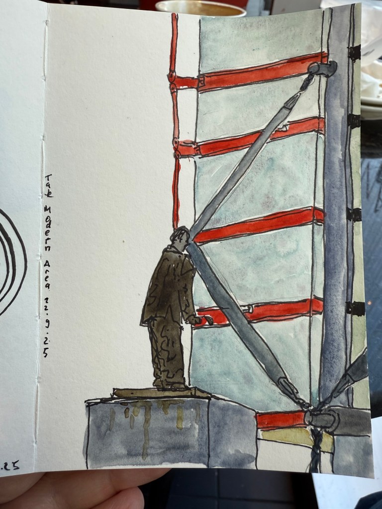
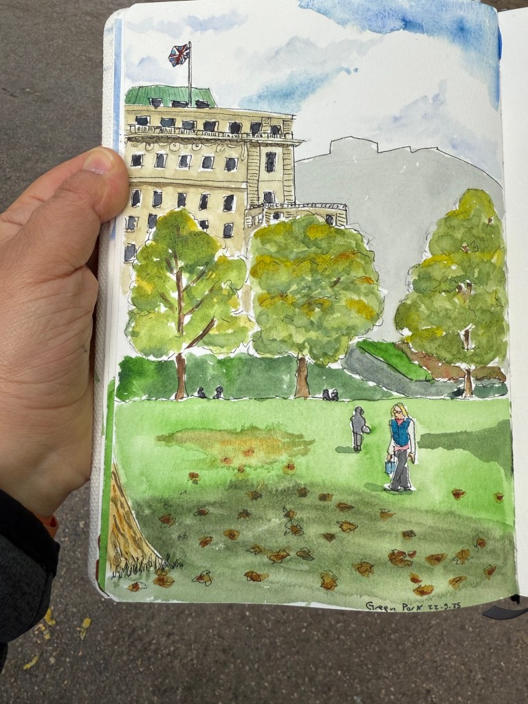
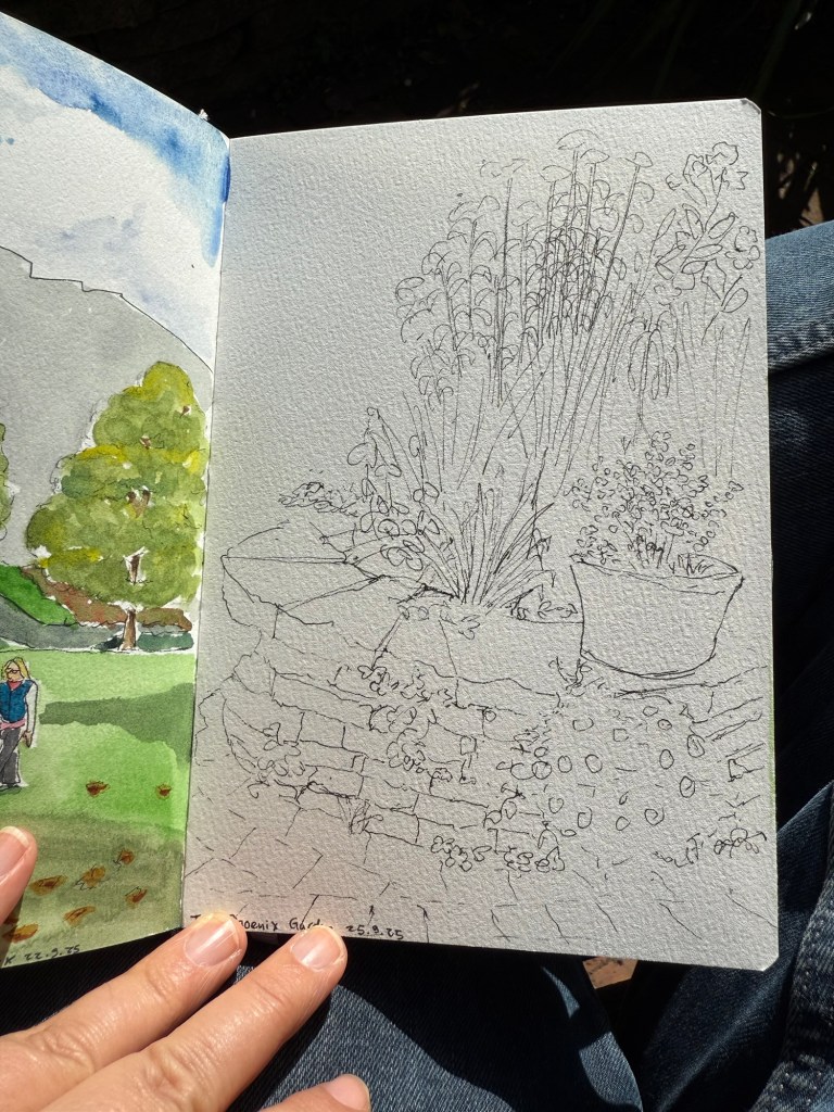
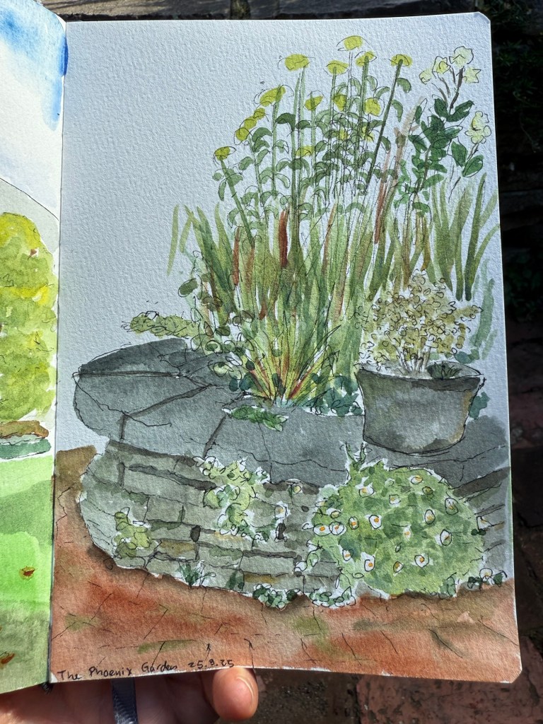
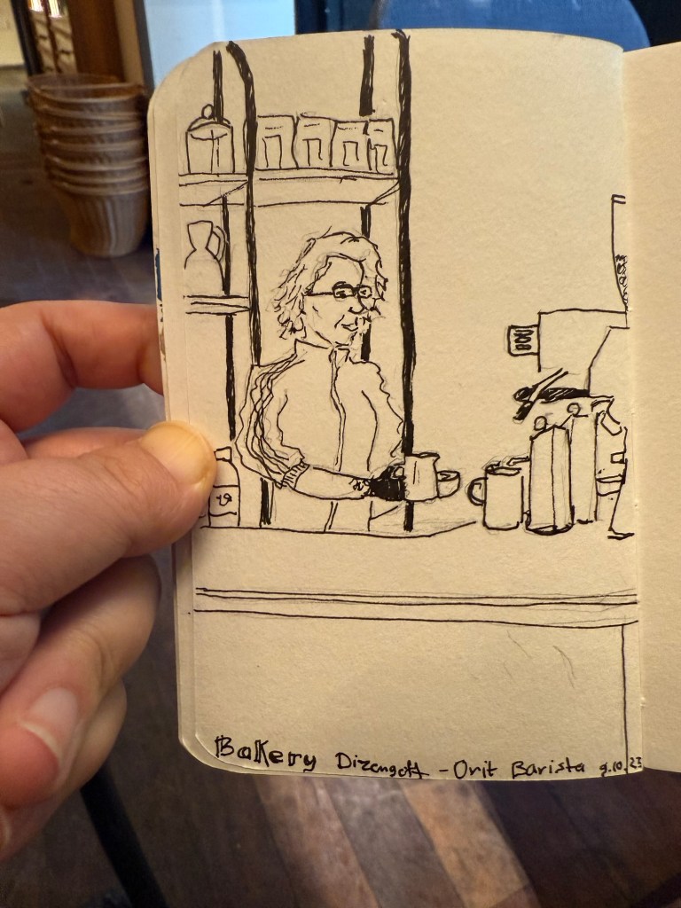
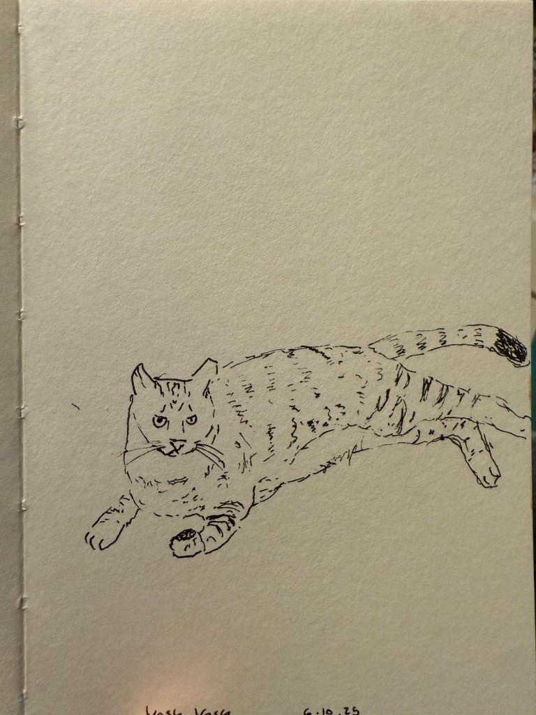
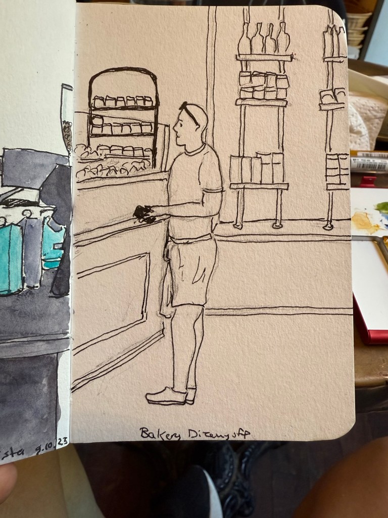
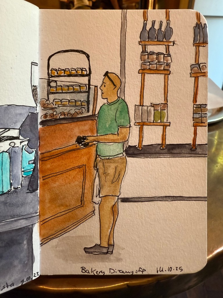
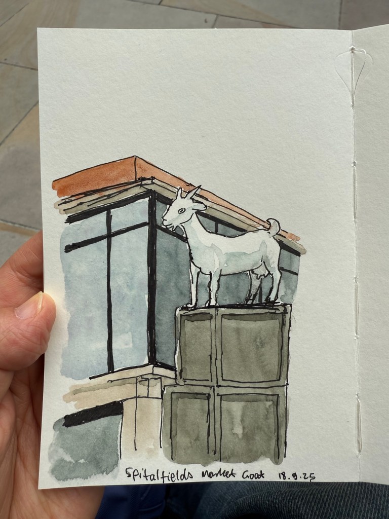
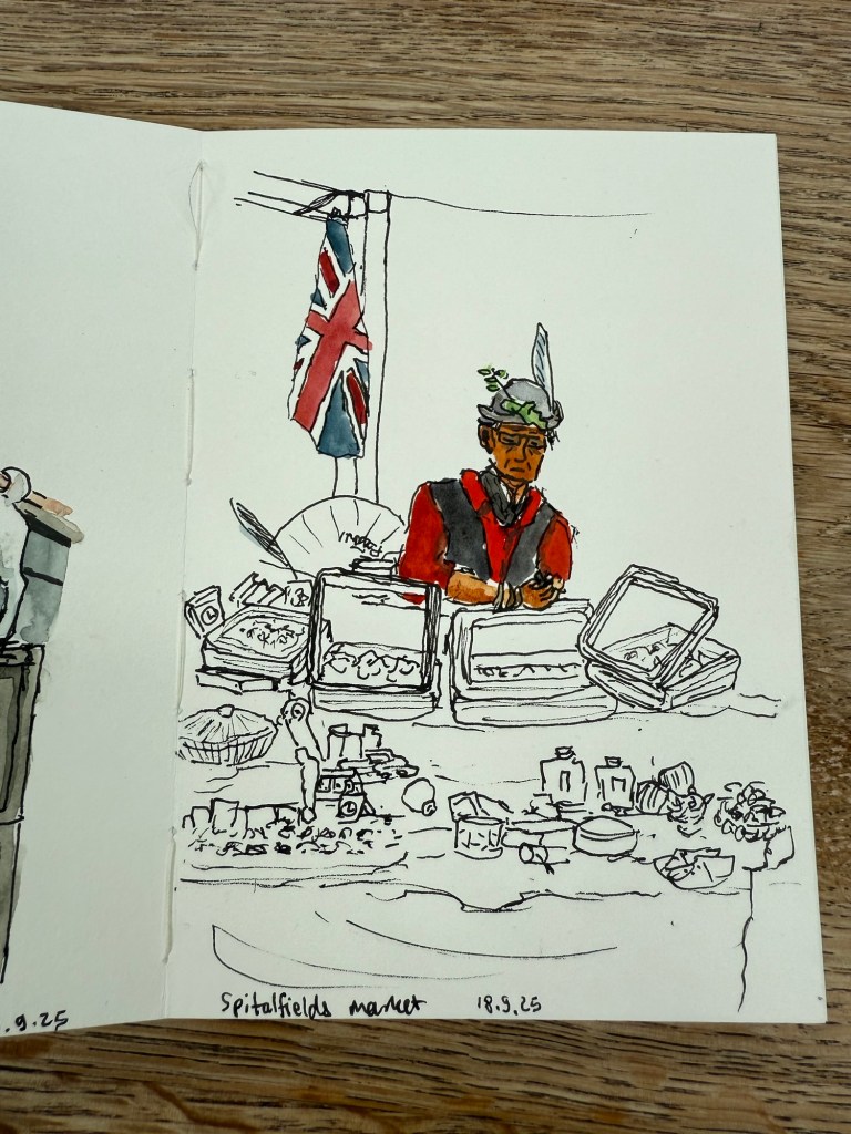
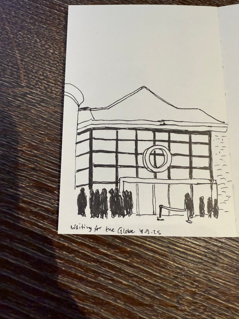
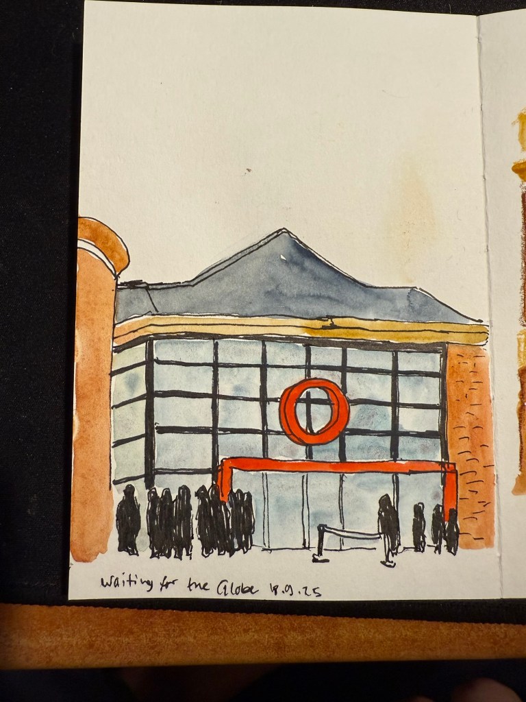
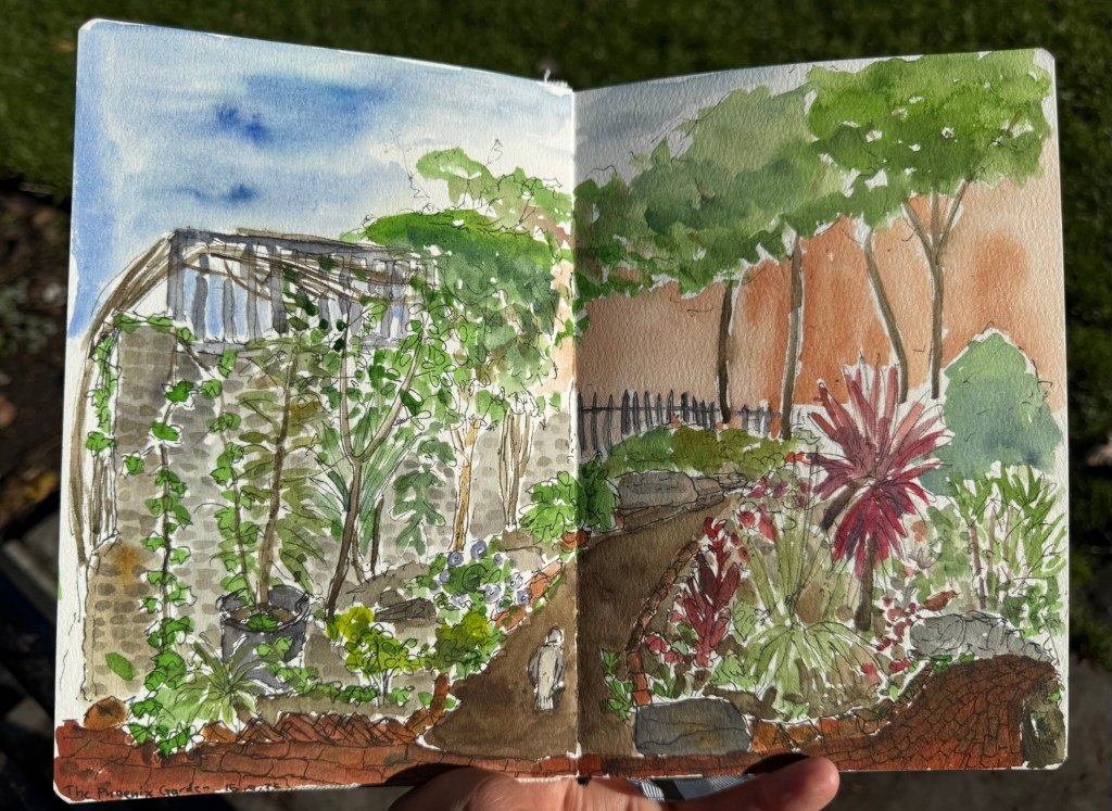
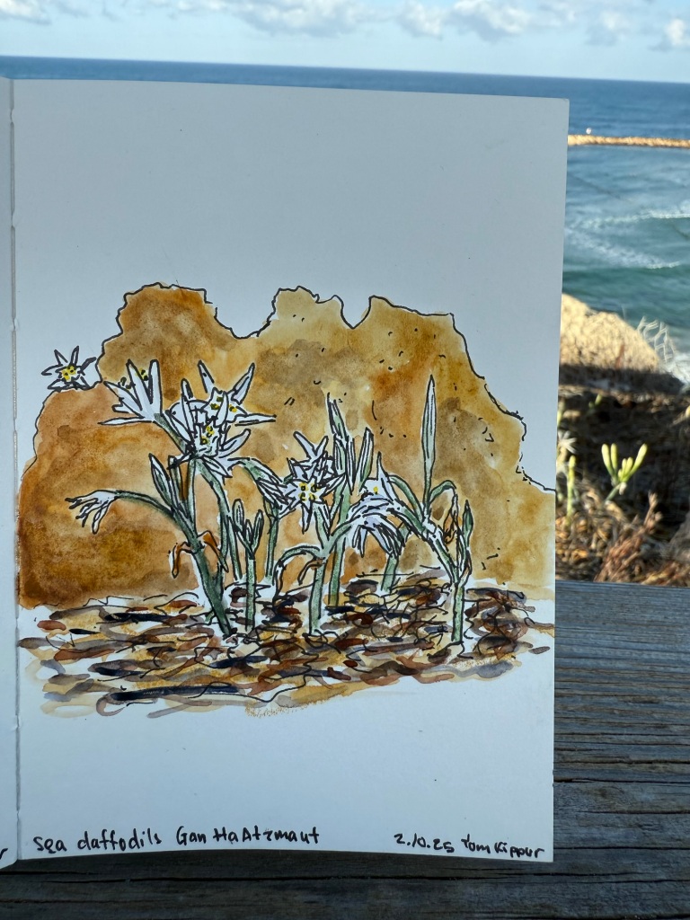
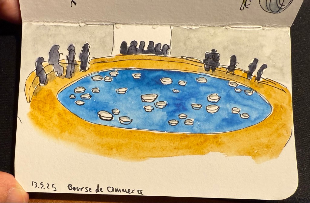
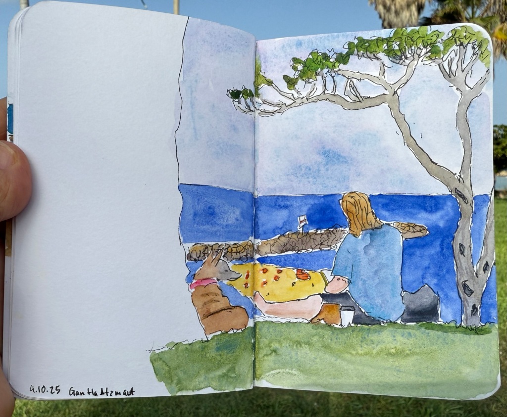
  12. Here’s a recent sketch that I did:
Pen and watercolour sketch

Have a great week and see you in part 2.

April-May’s Currently Inked Fountain Pens

In the middle of April I inked up a bunch of new fountain pens, and at the end of the month I added two new fountain pens to this rotation. At the rate I’m writing with them I assume that this pen rotation will be with me until around the end of May, when I’ll be putting more “summery” inks into use.

This is a rather eclectic group of pens and inks, but I was mostly looking for inks that I haven’t used for a long time or I haven’t used at all. Here they all are (I was in a rush when I created the writing samples so they’re messy, but life isn’t Instagram, so messy it is):

Messy Writing Sample #1
Messy Writing Sample #2

Mabie Todd Swan “The Swan Pen” 2 nib with Waterman South Sea Blue – a vintage gold plated lever filler pen, this is one of two vintage gold plated pens that I bought in Paris in Mora Stylos years ago. I don’t usually like the bling of gold plated pens, but I was drawn by the fantastic, very wet, flexible swan gold nib, and by the engraving on the pen body.

The Swan Pen

Normally engravings lower the value of a vintage fountain pen, but this one added value for me – I find it endlessly intriguing. This was clearly a Christmas gift, in 1929, and it was likely a lady’s pen, given its size and general level of decoration. I can stare at this pen and spin dozens of stories from that engraving, and this is one of the main reasons I prefer vintage pens. This one is “use grade” – the engraving, the dings on the body, the brassing on the clip, and the multitude of microscratches on it make it so – but I don’t care. It’s a treasure of a pen with a fantastic nib that I got at a very good price and gives me much joy. What else does one need?

Closeup of the inscription XMAS 1929

I chose a Waterman ink for it because they’re the best inks for vintage fountain pens – very gentle, very easy to clean out of a pen, non-staining, and on the dry side (though not as dry as Pelikan 4001 inks) which works well with this very generous nib.

Swan 2 nib with heart shaped breather hole

Leonardo Mother of Pearl fine elastic nib with Kyoto TAG Kyo No Oto 03 Kokeiro ink – I wanted a Leonardo pen in rotation (I love them) and I wanted to try this new ink, and compare it to the Rohrer and Klingner Alt-Goldrün ink that I still had going at the time from March’s rotation. The inks are practically identical, with Alt-Goldrün being perhaps a shade lighter than the 03.

Leonardo Momento Mother of Pearl fountain pen

The Leondardo’s elastic or “flex” nib has cutouts in the nib shoulders to provide it a bit of give. It’s a nice nib that offers some line variation, but is nowhere near what you can get in vintage flex or super-flex nibs (particularly Swan and Waterman).

Closeup of the elastic nib with the cutouts in nib shoulders

Lamy 2000 fine nib with Diamine 150 anniversary Silver Fox ink – this is one of two Lamy 2000s that I have, and I really like this pens as workhorses. Silver Fox was part of the original collection of 150 anniversary inks that Diamine issued and it’s a nice mid grey that is very readable.

Franklin Christoph Model 46 Polar Ice extra fine nib with Bungunox June Bride Something Blue – I filled this pen about a week after the others since I wanted a teal ink that wasn’t in as wet a nib as the Swan. I got this ink as a gift from the Pen Addict Membership back in 2016.

Franklin Christoph Model 45L Turqish Crush extra fine nib with Diamine 150 anniversary Blue Velvet – another original 150 anniversary ink (Diamine later issued a second and perhaps also a third line of inks in this series, I don’t remember). This one is a nice royal blue, and another ink that I had used in years.

From left to right: Lamy 2000, Franklin Christoph Model 46 Polar Ice, Franklin Christoph Model 45L Turqish Crush

Oldwin Art Deco red and black striped ebonite, 18k medium nib with Diamine Writer’s Blood – as I’m writing this I have written this pen dry, mostly because it has a very wet and hungry nib and a standard sized converter. I bought this Oldwin from Mr Mora at Mora Stylos in Paris, and it’s a huge and surprisingly light pen.

Oldwin Art Deco red and black ebonite

The nib is also a very large nib (size 8 and not size 6), and the pen is surprisingly not smelly for an ebonite pen. The feel of the material is fantastic – ebonite is such a warm material – and I like it enough to consider refilling it instead of cleaning it out. Diamine Writer’s Blood has been in rotation recently, but it’s a new ink to me and I’m still trying to figure it out. Having it in this pen made me appreciate it more, as it really showed off its unique colour properties and shading plus sheen.

Oldwin nib

Manufactus Cappuccino Brown medium nib with Diamine Bilberry cartridge – this was a gift that I received from a dear friend who was just back from Italy and bought this (and a wonderful leather bound personalized journal) in the Manufactus store in Rome. The photo doesn’t do justice to the richness of the resin on this pen.

Manufactus Cappuccino Brown

The Manufactus has some heft to it, due to the metal body and trim, and while it states that it’s a medium nib, it runs closer to a fine nib in terms of line width. Diamine Bilberry is an interesting ink that I had in cartridge form, and I wanted a more unique ink than the standard black cartridge that came with this pen. Bilberry is saturated enough to pass as black at a cursory glance, but it’s a gorgeous rich purple with gold sheen that works well in this pen.

Manufactus Cappuccino Brown nib

Apart from these pens I still have about a quarter fill of ink in my TWSBI ECO T Saffron fine nib with Rohrer and Klingner Helianthus going from March’s ink rotation.

Which of these pens interest you the most?

How I Use My Notebooks: New Streamlined Weekly Review Format

A few months ago I published an overview of my new weekly review format. I had been successfully using it for a few months at the time, and I have since continued to use it until about a month ago. Since then I’ve tweaked it a bit to streamline things and speed up the review process. If you found my previous review format a bit confusing or elaborate, you might want to try my new one.

The new review format consists of four questions that I answer at the end of every week before I build next week’s plan. I write down my answers in my regular journal (currently the Stalogy 365 B6) using last week’s plan as a reference. Here are the new questions:

  • What Worked – no change from last time, except that I allow myself to elaborate more and I don’t emphasize the order of the things that I did and that I want to keep doing. I discovered that it doesn’t really matter if something worked because I changed things, remained consistent or stopped doing something, the only thing that really matters is that it worked. Being more loose here allows me to spend more time reflecting positively on the week instead of worrying about writing things in a certain order.
    An example from the past week – exercise. I got a 10k in, my first speed run since my last race, two gym sessions, two swimming sessions, two rucking sessions and a bunch of walking and NTC pre and post workout stretches. Prioritizing these sessions in my weekly plan, doing them first thing in the morning and setting out workout clothes and gym/pool bags the night before really aided my success.
  • What Didn’t Work – this changed slightly to not only include things that didn’t work due to planning, priorities, “life” or infrastructure but also things that cause me anxiety or distress that need some rethinking.
    An example from the past week – I went back to watching YouTube videos as a “self soothing” source of comfort. We live in stressful times and I’m going through a stressful period at work, so it’s clear that I need something to provide this “warm blanket” function. The issue is that I oftentimes use reading as a source of comfort, and I’m currently reading a book that is purposefully designed to induce anxiety in the reader.
    Note that at this point I’m not focusing on what to do about the things that didn’t work. My point is just to acknowledge them and if relevant name the feelings they induce.
  • What’s Next – this is the biggest difference from the previous review format. Here I write down what I plan to try and keep or change or observe in the coming week. This feeds directly into my weekly plan, and will help me get the most out of last week’s experiences.
    So in the case of the examples above, I’m going to keep to an identical general exercise plan in the coming week, and I’m going to add a “comfort book” to my current reading rotation.
    If anything more long term needs to happen due to these reviews I will just add it to my quarterly plan. The point is not just to blindly follow a plan, but to try things, observe, reflect and change them if needed.

You’ll note that I removed the “people of the week” section. I just found it redundant, as these three questions generally cover it.

As usual, I’d love to hear more about your weekly review formats, and if you found this helpful.

Currently Inked Pens March 2025

Of February’s pen lineup only two pens remain inked, the Parker 51 with Waterman Purple, and the Leonardo Momento Zero Bohemian Twilight with Pilot Iroshizuku Tsuki-yo. As they’re both running low on ink, it’s time for a new pen lineup, with a slightly different theme than last month’s one:

  • All the pens are modern (last time I had more vintage pens than modern ones in rotation) and ones that I haven’t inked in years.
  • All the inks are ones that I haven’t used in years or ever, apart from one that was in the last rotation but I still haven’t figured out so it got another go.
  • The ink colours are much brighter than those that I used in February.

Here’s March’s rotation:

Writing sample on Midori MD Cotton paper

Here’s a bit more about every pen and ink combo:

  • Franklin Christoph 03 modified prototype- Red/White/Black motion with a 1.1 HPSteel cursive calligraphy nib. This is a new pen that I bought last year as my chemo anniversary pen (I buy myself a present every year to mark the occasion). I love the unusual resin colour and pattern, and I like FC’s HPSteel 1.1 nibs. They are just wide enough to really show off the ink without becoming a nightmare to use because it takes ages for the ink to dry.
    As nice as the pen is (and it is), the ink is the star in this one in terms of interest: it’s the ORIGINAL J.Herbin 1670 Rouge Hematite, which means that it has NO GLITTER and NO SHEEN. It’s just a deep, bright red with some nice shading and good outlining, but it isn’t full of gold glitter and sheen to the point where you can’t see the base colour. Yes, this is also the bottle that had the problematic crumbly wax cover on the cap, but I really think that I prefer this version to the one they issued later (I have both). I don’t normally use red inks, but this one was perfect for this pen.
The FC 03
The HPSteel 1.1 nib
Original Rouge Hematite compared to Cosmic Glow on original Tomoe River paper. Note the lack of sheen or shimmer.
  • TWSBI ECO Saffron fine nib filled with Rohrer & Klingner Helianthus ink. I use yellow inks even less often that I use red inks, but this ink is fairly readable for a yellow ink. It is, however, not going anywhere near a vintage pen as it has a tendency to crust over (as many yellow inks do). I wanted something bright, cheerful and different, and this ink checked all three. The TWSBI ECO is a phenomenal pen for those starting out with bottled fountain pen ink, and I can’t recommend it enough.
TWSBI ECO Saffron
  • Aurora Ipsilon medium nib with Rohrer & Klingner Alt-Goldrün ink. This is my one and only Aurora pen, which I bought years ago in Florence, Italy. Aurora nibs are nice enough, but the pens are priced well above what I believe that they are worth, so I have steered clear of them over the years. The Ipsilon is small pen, but you can’t post it, which is annoying for such a small pen. R&K Alt-Goldrün is a fantastic ink colour – a non standard green with plenty of shading and character – and the only reason I haven’t used it more is because it was tucked away behind two rows of other ink bottles. If you are just starting out with green inks, give Alt-Goldrün a try.
Aurora Ipsilon
The Ipsilon nib looks ridiculously small but it’s just the design of the section that makes it appear that way. Comparison photo to a TWSBI ECO nib.
  • Leonardo Momento Zero Blue Hawaii Fine nib with Diamine Steel Blue ink. I have used this pen fairly recently compared to some of the others in this rotation, but the ink has been one that I actually forgot that I have. I love teal and turquoise inks, and Diamine Steel is a beautiful member of this group. There’s a hint of shading with it, and it just pops off the page so nicely. If you want a different take on “boring blue” inks, I highly recommend it.
Leonardo Momento Zero Hawaii
  • Montblanc Writer’s Edition Victor Hugo medium nib with Montblanc Around the World in 80 Days ink. I bought this pen in Mora Stylos in Paris before they closed mainly because I adore the Notre Dame de Paris cathedral and it’s featured on this pen. Hugo has the honour of being the saviour of this extraordinary cathedral, and though I shy away from Montblanc limited editions (talk about overpriced) I thought this one was worth purchasing. The ink was last in rotation, in a vintage Montblanc, last month. I just can’t get over how unrelated it is to the green-gold elephant on the box, and I’m not sure what to make of it. I was expecting it to be more like Alt-Goldrün than like the bluish-grey (Payne’s Grey really) that it is.
The Montblanc Writer’s Edition Victor Hugo
The Victor Hugo death mask on the cap
The nib, which features Victor Hugo
  • Finally, speaking of a pen and ink combo that have gotten “lost” in my collection: the Stipula Model T marbled grey pen was also an Italian purchase, and it has a very peculiar fine “flexy” titanium nib. I would characterize the nib as springy, and as my other titanium nib Stipula does, it squeaks sometimes as you write with it. The ink is one that I bought in 2013 in Fahrney’s pen store in Washington DC. Since then I haven’t opened it and used it, mainly because Fahrney’s Tempest Blue is a blue ink, and I don’t use blue inks often. It shades nicely, but other than that it looks close enough to my benchmark blue, Waterman Florida Blue (now renamed to Waterman Serenity Blue), for me not to bother using it often. Waterman Serenity Blue is a best-in-class blue in my opinion because it’s so well behaved, gentle and easy to clean out of pens that you can safely use it in any pen that you have, particularly vintage ones.
The Stipula Model T. A very sleek design.
The Model T titanium nib.

Weekly Update: One Week 100 People, Newly Inked Pens and Preparing for a Doctor’s Visit

I finished the One Week 100 People challenge on day 4, but kept going for day 5 (which was yesterday) and added a few sketches on day 6 (even though the official challenge is 5 days long). It was the first time that I sketched only live subjects and not from photos, and it really pushed me to find ways to work fast.

Today I added a few final sketches to my Field Notes sketchbook, this time using Faber Castell Pitt brush pens for blocks of colour and a Pilot brush pen for the sketches themselves. I was trying to work mainly with silhouettes and capture people in movement. It took me longer than I thought to capture a mere 6 subjects, mostly because what people do when they walk around nowadays is stare at their phones.

As I wrote two fountain pens dry this week, I filled six new fountain pens, bringing my rotation up to nine pens. Next week I’ll write a post about the pens and inks that I chose, but I will say that there are some pretty rare ones in the rotation this time.

Next week is pretty stressful as I have some tests and a checkup coming up with my hemato-oncologist (that’s a cancer doctor that specializes in blood cancers, which is the kind of cancer that I’m in remission from). I will give out one important tip for anyone who is going to see a doctor for any reason:

Write down ahead of time whatever it is that is bothering you/you need help with, and make sure that it’s in order of importance. There’s a good chance that if you won’t do this you will forget things, or you’ll focus on the least important thing, or you’ll have trouble articulating the issue. A doctor’s office is a stressful location, so you want to take the time and prepare this list in advance when you are sitting calmly at home. Make sure that the first 2-3 items on that list are really the most important things that you want to focus on because there’s a good chance that you’ll only get to focus on these items (your time in there is going to be limited). Reference the list when in the doctor’s office (don’t be embarrassed, there’s nothing embarrassing about being prepared). Be clear and specific, and insist on getting all your questions answered when it comes to these things. Double check before you leave that all the medications you discussed and tests that the doctor ordered were properly documented. Doctors are people too and the electronic medical record systems they work with aren’t the best, so it’s worth checking that everything is in order before you leave (even if you do the check with the medical secretary, just so long as you’re still in the doctor’s office and any errors and omissions can be fixed).

Take care of yourself and have a great week!

One Week 100 People 2025: Day Five

Last official day of the challenge, though I plan on doing a few more sketches tomorrow. These were all done at the gym, from 102-112, including a failed sketch.

My favourite on this page is 111. What’s yours?

One Week 100 People 2025: Day Four

I have a super busy day so I took my sketchbook (Moleskine pocket watercolour) to the gym and did sketches 79-90 there, and then I completed 91-101 sitting on a bench on my way home.

So 100 people completed – the fastest ever I’ve done this challenge, and all of them sketched from life. I plan to complete this page tomorrow and then go back to my Field Notes sketchbook to try another style of sketching people on the move.

As usual, pick which one you like best. I am having trouble choosing.

One Week 100 People 2025: Day Three

It was dark and cold once I finished, and my fingers had trouble grasping the pen because of my neuropathy. My original plan was to finish all 100 today, but I only got to 78. Tomorrow I have very little time to sketch, but I am getting faster and better and capturing quick moving targets.

I am using the watercolour “blobs” mostly as general guides for the size of each sketch. I create them first and then sketch over them later.

These were done on a Moleskine pocket watercolour sketchbook using Schmincke and Daniel Smith watercolours, a water brush and a Staedtler 0.3 pigment liner pen. They each took only a few seconds to sketch.

As usual – pick your favourite. Mine is 56.

One Week 100 People 2025: Day Two

I went out for 45 minutes after work and sketched all of these as fast as I could. I only stopped when it got too dark outside. Yesterday’s sketches were done with a Staedtler 0.5 pigment liner on a Field Notes sketchbook. Today’s sketches were done on a pocket Moleskine watercolour sketchbook using a 0.3 Staedtler pigment liner, a water brush and watercolour.

First batch when it was still light outside

People moved by in the street so I had seconds to capture each figure (the more detailed ones stopped for a minute or two). As this is what normally happens when you urban sketch, I found this exercise to be very useful.

Second batch finished in the lamp light

Which one is your favourite?