I decided to make an embroidered key chain as a birthday gift, which is why I practiced creating an embroidered Nespresso capsule keychain in the first place.
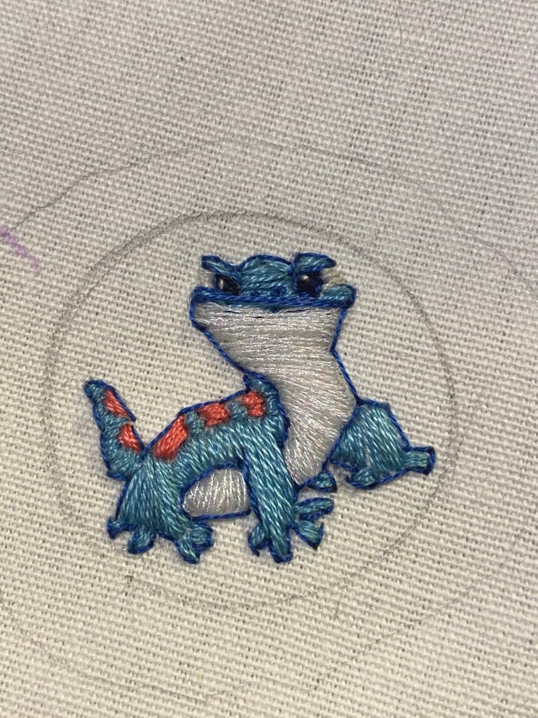
I used an embroidery hoop this time, as well as thicker fabric. The white fabric allowed me to pencil in my design for Bruni, the fire spirit from Frozen 2.
Not sure that you can see but his white belly is embroidered with sparkling thread.
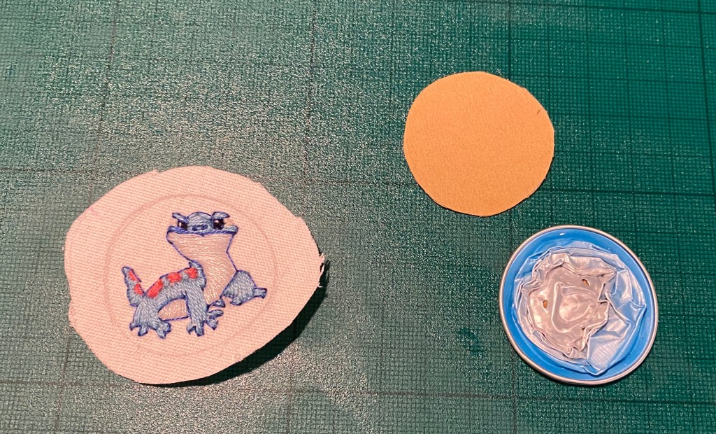
The pieces ready for assembly: clean and crushed Nespresso capsule, cardboard backing and embroidered piece.
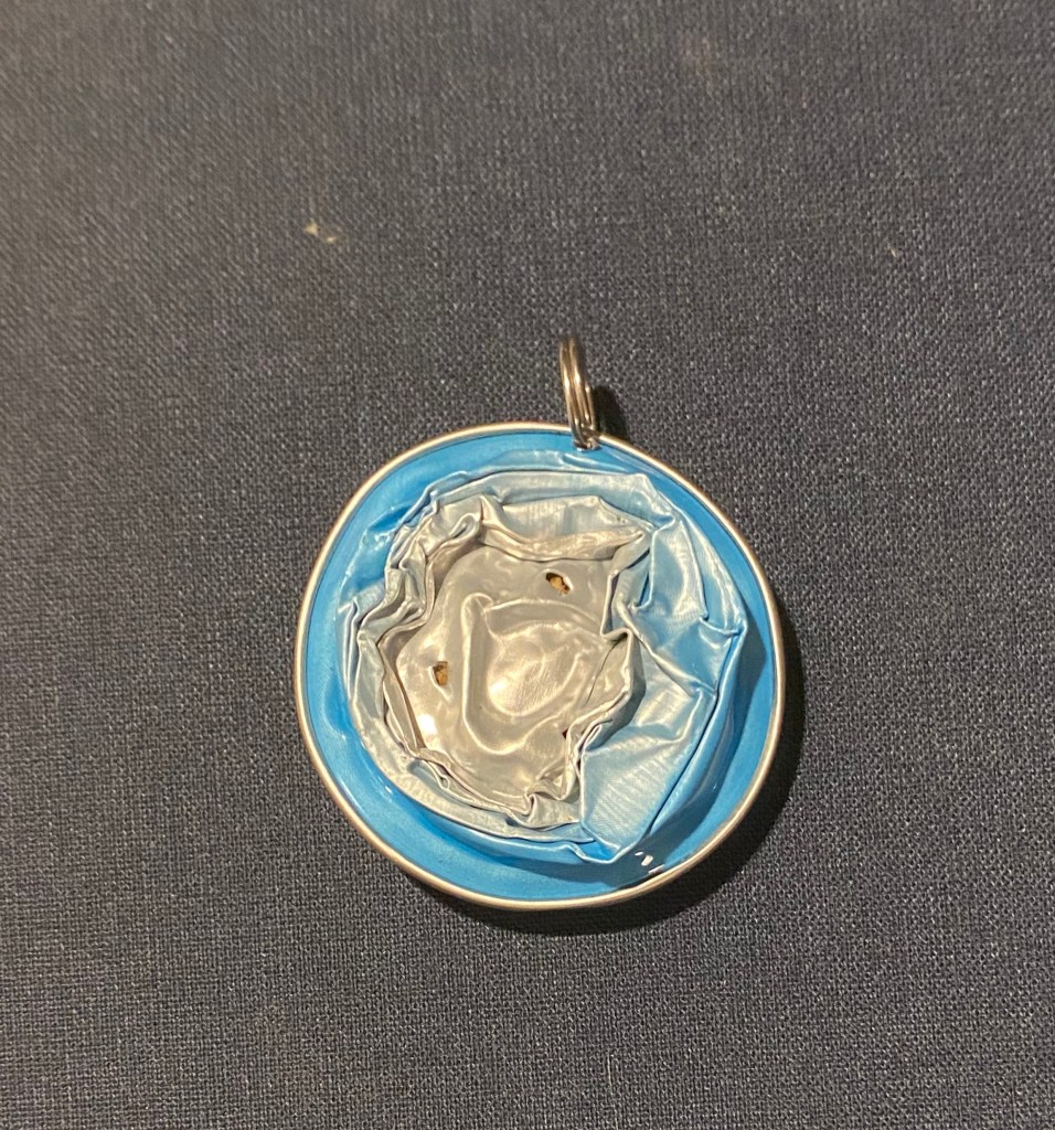
The back of the capsule:
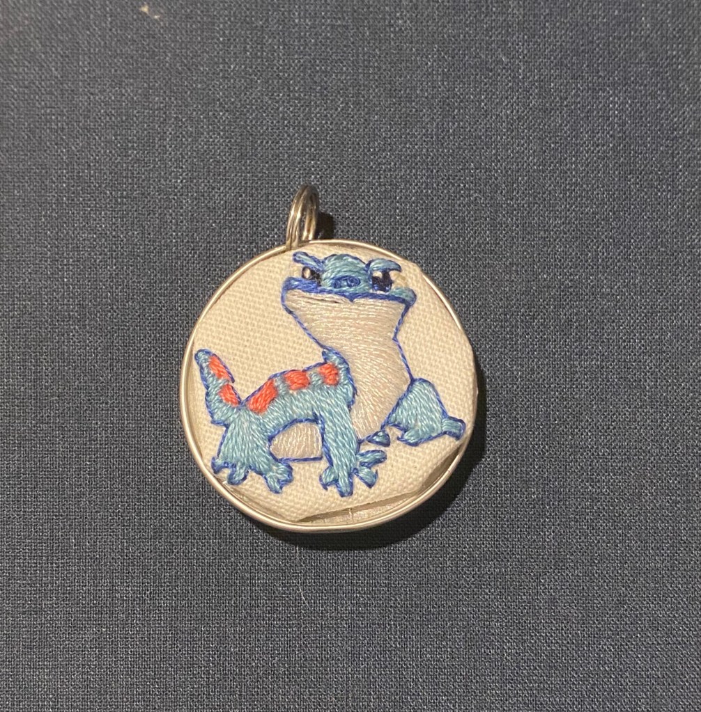
The finished piece:
This turned out much better than my first try, even though there’s still room for improvement. This new fabric didn’t mount like I expected because it was thicker than I had planned and the result is the little gap you see in the bottom. I plan on making more of these, so I’ll hopefully get better with practice.
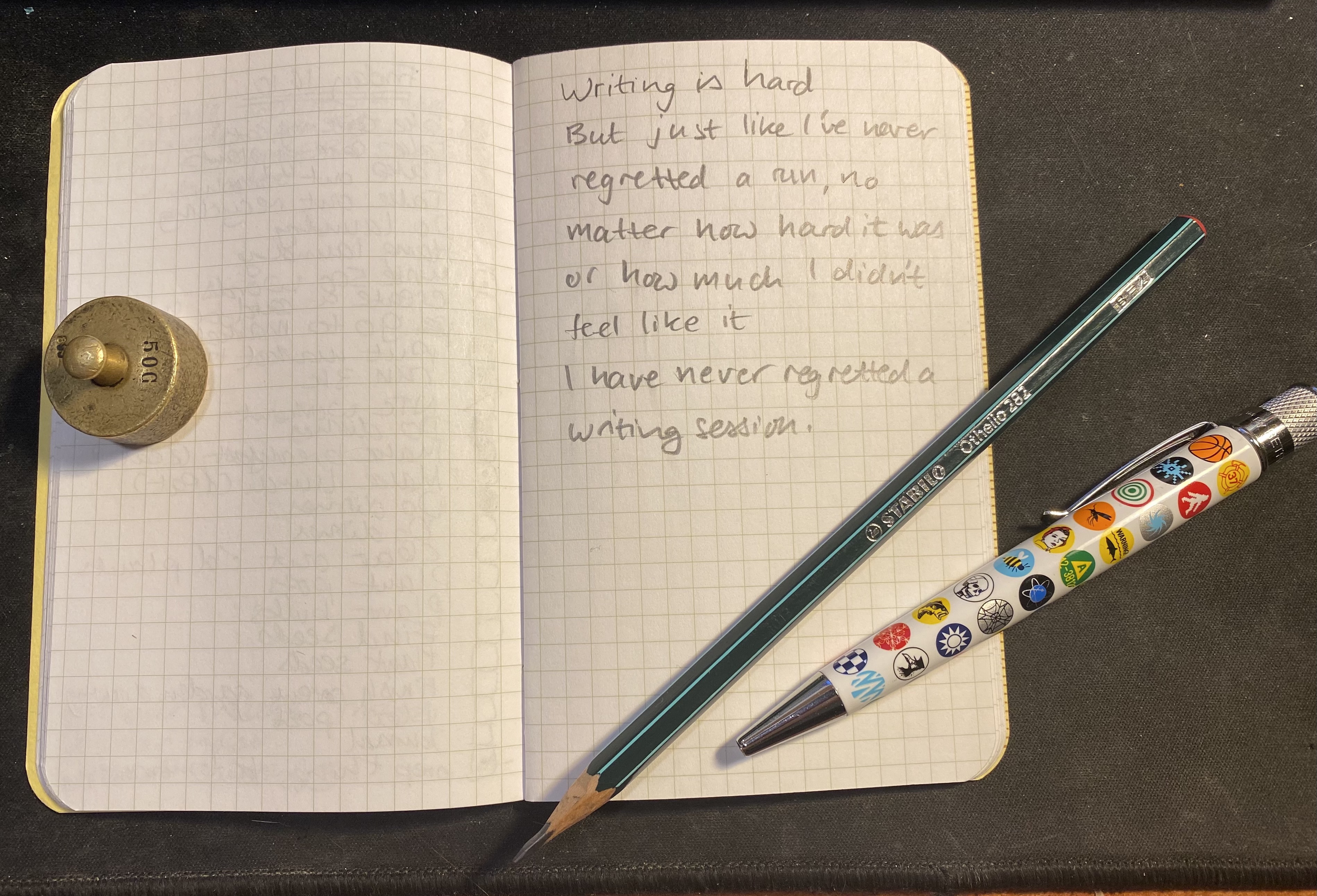
I was planning on doing a 30 day drawing challenge when Covid offered me an unexpected opportunity: a local sci-fi convention that usually commissions stories for a short story collection they publish each year decided to allow story submissions this year. The only catch was that the deadline was tight: two weeks.
I couldn’t give up on the opportunity, and I was looking for a way to kickstart my writing again, so I put my drawing challenge on hold and wrote a short story instead. I wrote first draft (about 4,000 words) in about four days, then polished it and sent it out to a beta reader. I got his input, fixed and rewrote some stuff and then sent it in.
Meanwhile November was approaching, and with it NaNoWriMo. Now I’m not a fan of NaNoWriMo but this short story experience as well as a great episode of the Writing Excuses podcast made me realize that:
a. I needed to get used to writing to a tight deadline. b. I needed to get back to writing.
NaNoWriMo was a great excuse for that, even though I had no intention of holding myself to 1,667 words a day. I do plan to write everyday, and push myself as much as possible beyond my comfort zone. This became especially relevant when I got my story back from the editor with a request to rewrite large swaths of it. I had three days to rewrite and edit around 3,700 words, and it was a tough but rewarding challenge. Even if the resulting story doesn’t get published, I learned a lot from the experience, and I have a solid piece of work that I’m pretty happy with.
So what about my drawing challenge? I actually had about 5 days left on it (there were a few drawings that I made that are not something that I’m going to publish here), but I decided to extend it to 10 days, which I’ll do probably sometime in early December.
I am happy that doing 30 days of drawing instead of Inktober has provided me with an opportunity to really get to know my palette, to draw more quickly and without a preliminary pencil sketch, and to better understand what draws me to a scene and what makes it worth drawing.
I hope that 30 days of writing to a deadline will provide just as much insight, skill and experience as that.
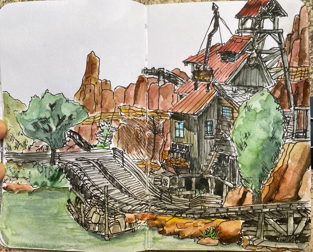
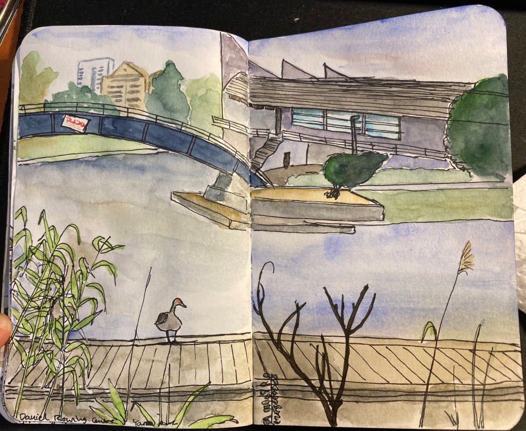
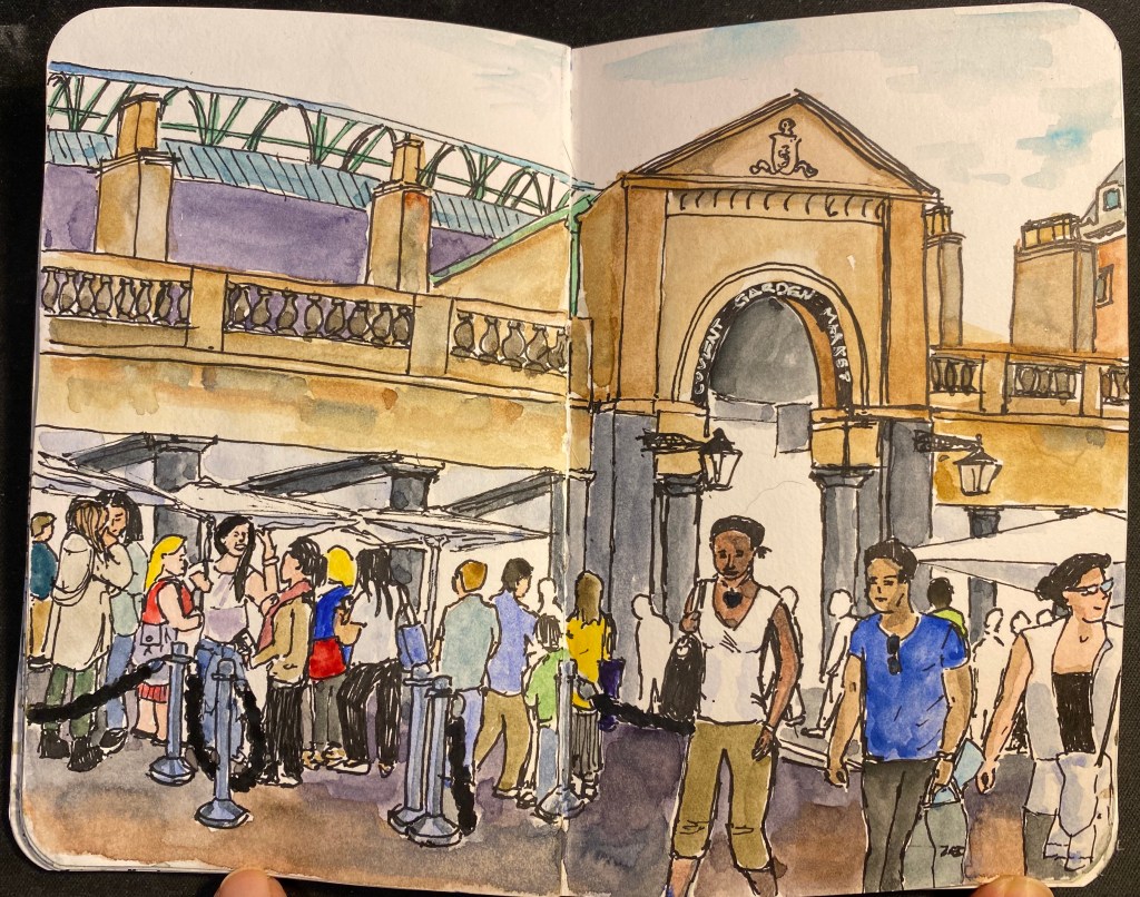
I decided not to take part in Inktober this year. Instead I’ll be drawing at least one page a day in my Stillman and Birn Pocket Alphas. You can see days 1-5 here, days 6-10 here and days 11-15 here.
I drew the first four of these days as scheduled and then the last drawing took much more time than I planned, so I decided to invest a little more time in it. While I was working on that I had an opportunity to submit a short story to a collection that doesn’t usually accept submissions. The deadline was tight, but I decided to go for it, which meant putting this challenge on hold. As I’m refocusing my energy on my writing I’m going to stretch this challenge to December (more on that in a later post). So far it has worked to get me more comfortable with working directly with ink and with a pared down palette and brush selection, so I’m happy with that.
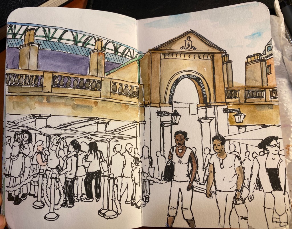
All these were drawn on a Stillman and Birn Pocket Alpha with a 0.3 Staedtler fineliner and Schminke Horadam watercolours.
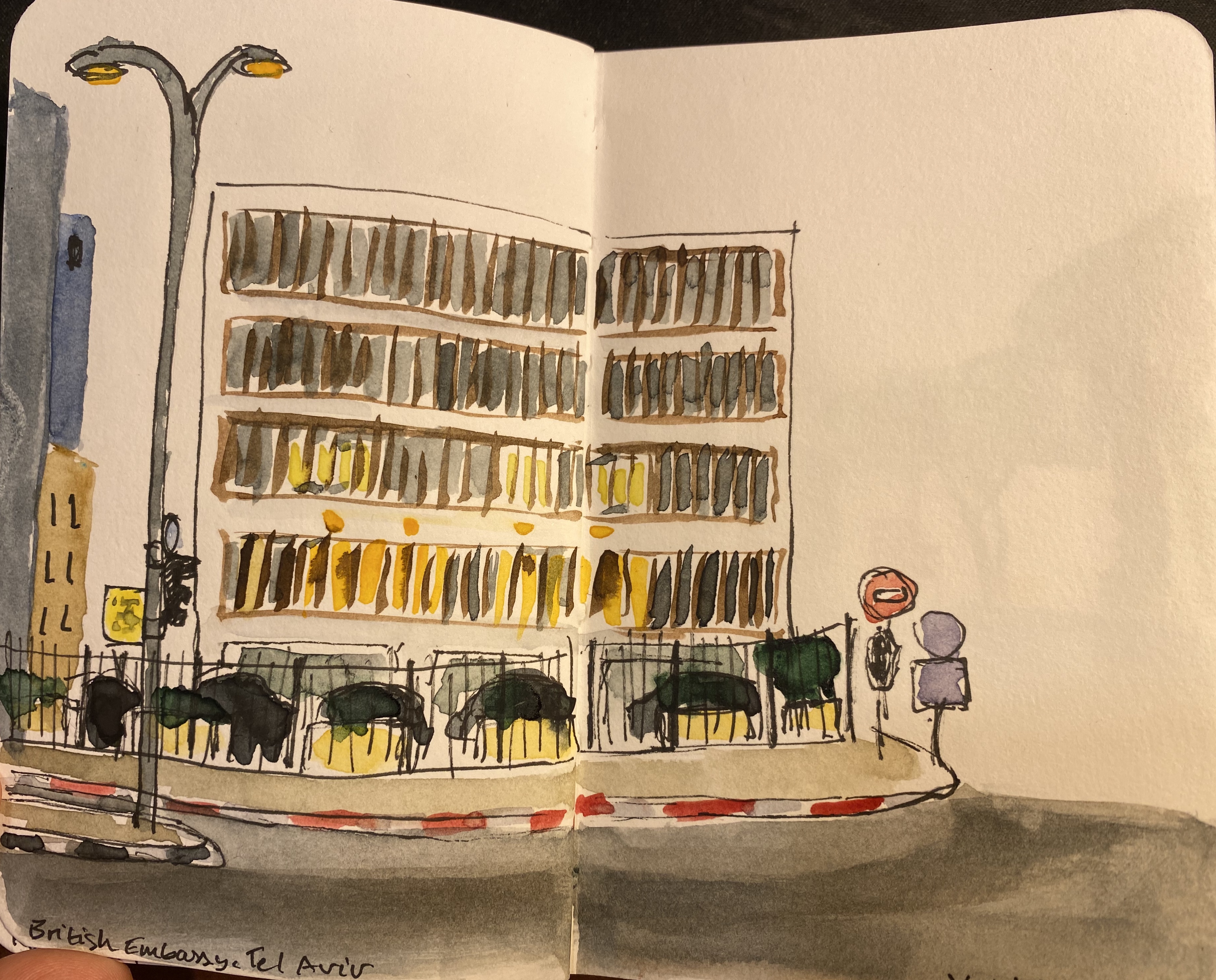
Birds of the Yarkon Park. A two page spread that took me two days to complete. Big Thunder Mountain in Disneyland Paris. I miss going to the park, and participating in the runDisney weekend.Daniel Rowing Centre, Yarkon Park. Not happy with the perspective on this one, but you learn from your mistakes.Covent Garden Market, which I miss a lot, a lot. This was done with no underdrawing and I’m super proud of how it came out.
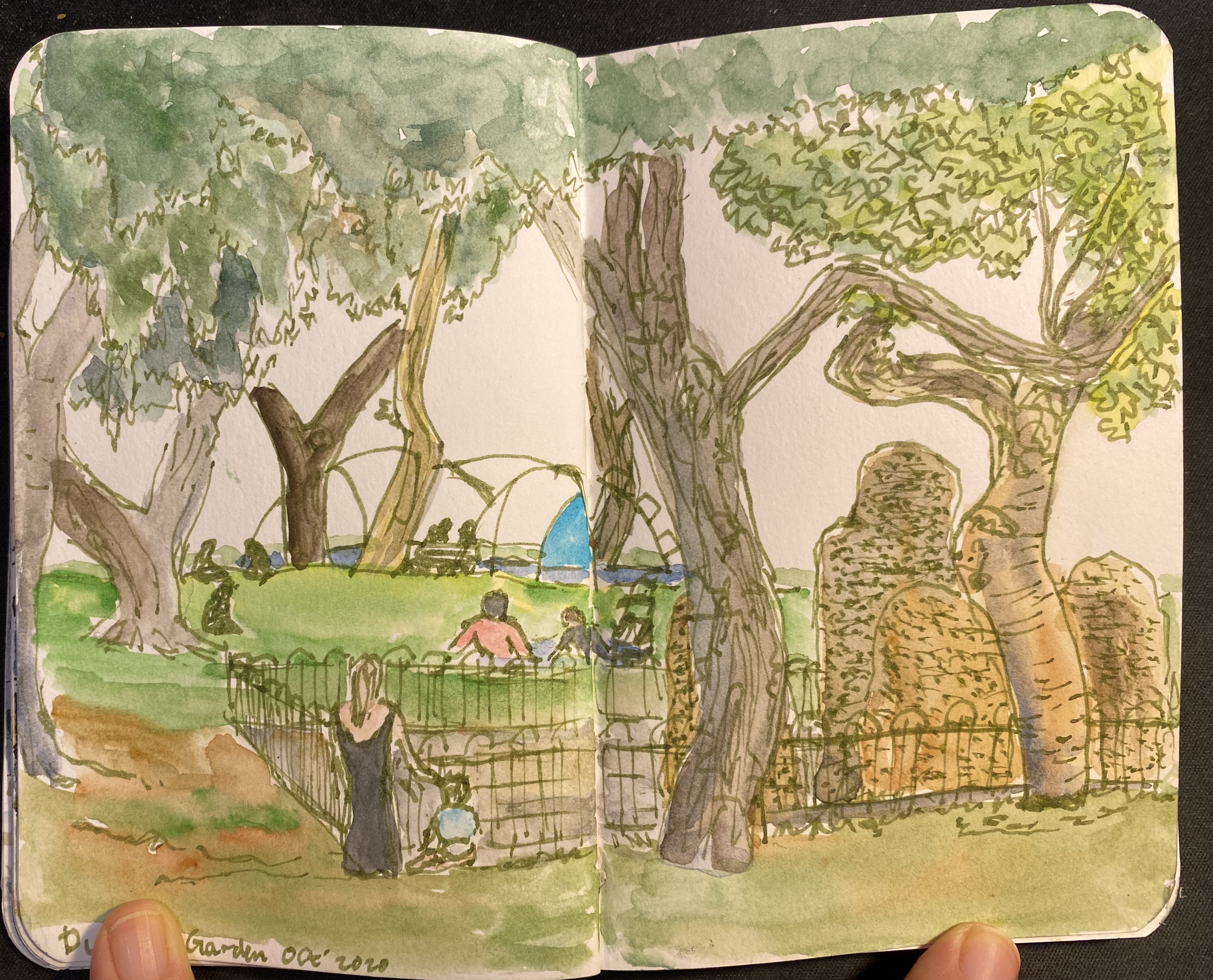
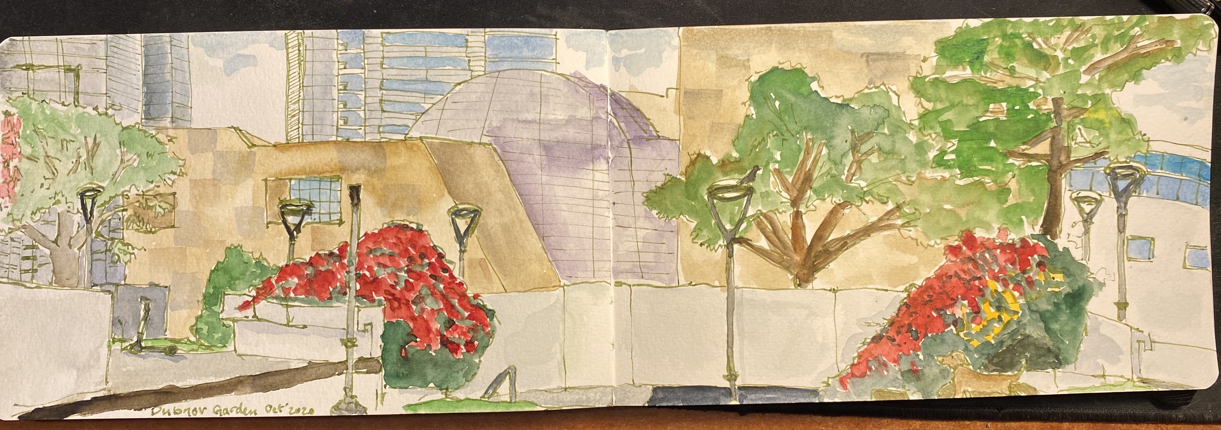
We haven’t had an Urban Sketchers sketchwalk in Tel Aviv since June due to Covid-19. We met today and drew, socially distanced and with masks, for three hours in Dubnov garden, which is not far from Rabin Square and is just behind the Tel Aviv Museum of Art.
The first drawing, focusing on the strange rock sunken sculpture in the middle of the garden, was drawn on a Stillman and Birn Pocket Alpha, with a TWSBI ECO 1.1 stub filled with Rohrer and Klingner Emma SketchINK and Schminke watercolours.
The second drawing is a panorama of the architecture near the park, and it was drawn on a Moleskine Large Watercolour notebook, with the same materials and the drawing above.
My drawing challenge has allowed me to streamline my process and bring in much fewer art supplies to the sketchwalk without feeling that I’m missing out. It was also the first time I brought my Walkit sketchbag to a sketchcrawl and it worked very well. I’ll write a review of it later on, once I’ve finalized the kit I put in it.
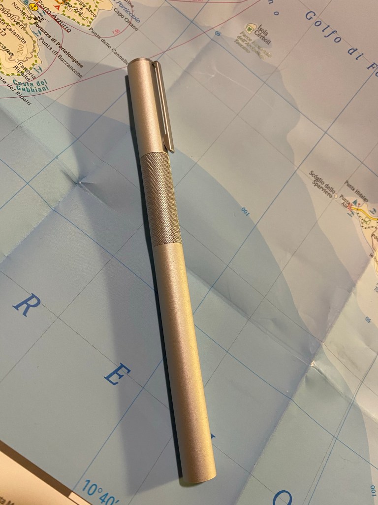
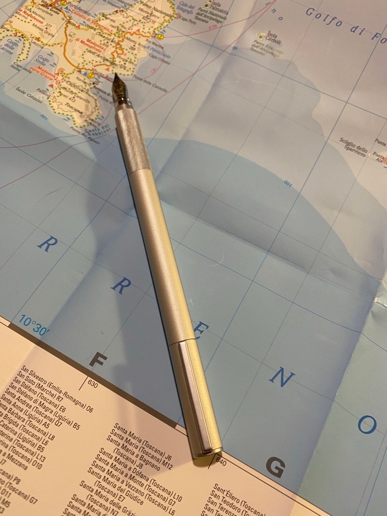
When the Muji fountain pen came out a few years ago it got pretty rave reviews from quite a number of reviewers. My only conclusion is that either they hadn’t used the pen for long, or they have steel clad hands. This is a textbook example of form over function, and the form isn’t even interesting or innovative enough for you to forgive the loss of function.
First off, the form: the Muji fountain pen has the standard minimalist, IKEA-like design of their otherstationeryproducts. It’s made of brushed aluminum, it has a knurled grip (why?), has two grey-brown discs on the ends of the pen, and the same sort of clip that their mechanical pencils have. It’s a bland and boring look, but if you’re looking for a minimalist pen then this fits the bill.
You can’t pick interesting colours for the finials, because that would give the pen too much character. Can’t have that.
What works in mechanical pencils falls flat in a fountain pen, in my opinion. A fountain pen craves more flair, more personality – yes, even the “plain” black ones. A Montblanc 149 or a black Sailor 1911 have class, whilst the Muji fountain pen is a thin aluminum tube with a knurled grip (why?). You just look at it and wonder why it was made and for whom.
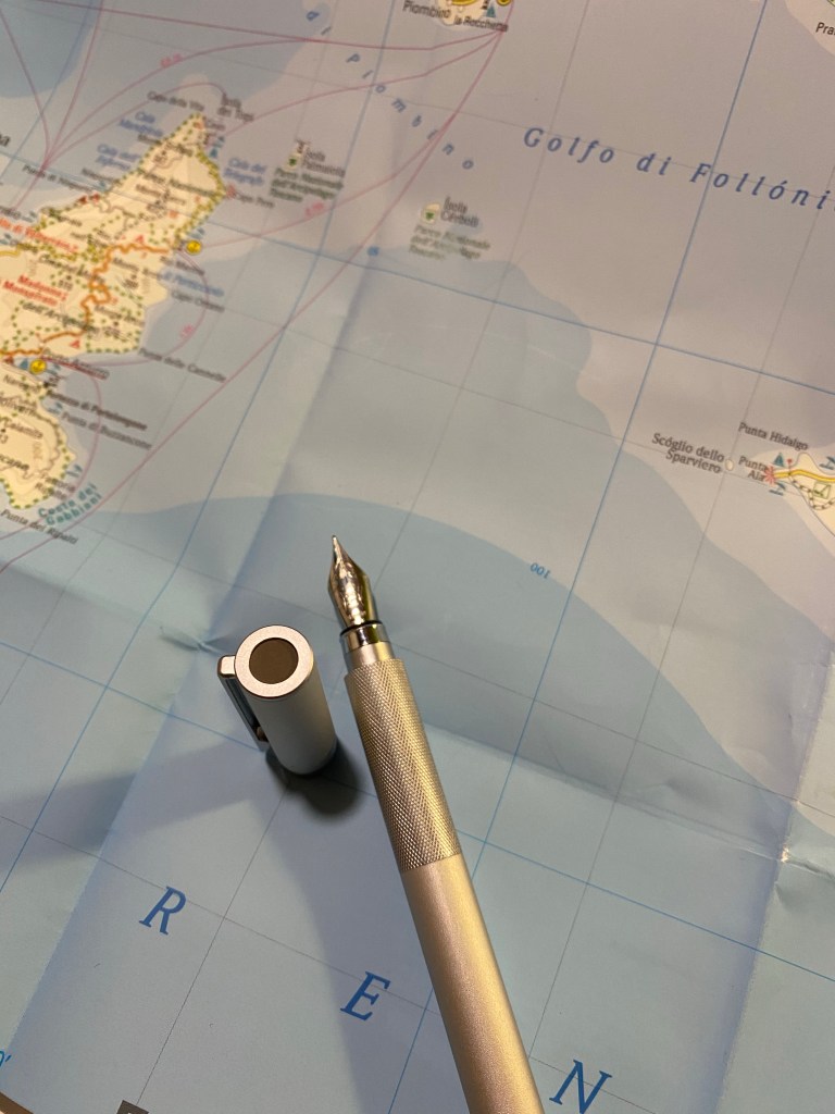
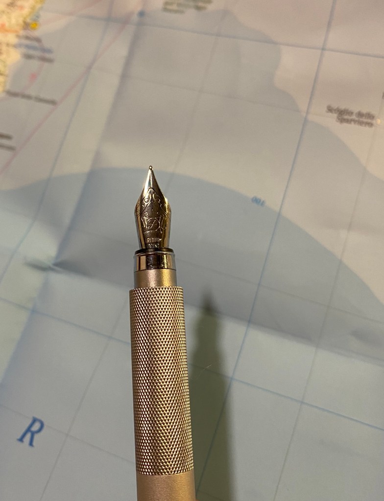
Nail nib and inexplicable knurling – a match made by Muji.
My Muji fountain pen has a fine nib with the classic “iridium point” stamped on it and some nice scrolling on it. I’m guessing the nib is a Schmidt nib, but that’s just a guess; what’s not a guess is that it’s an absolute nail. There’s no give whatsoever in this nib, to the point where I have fineliners that show more line variation that it does. It’s not scratchy but the lack of give may put you off if you’re looking for a more “fountain pen” experience (and this is a fountain pen, why wouldn’t you?). Both the Lamy Safari and the Pilot Metropolitan have nicer nibs at around the same price range. They also have the added bonus of a personality.
Spoilers for the rest of the review.
The grip is just… why? It’s not like the pen body is slippery and the knurling on the grip is necessary. Visually I find it jarring, and there is zero chance that it is there for ergonomic reasons. This is an ergonomically terrible pen. If Muji wanted to do a better job it would have made the barrel wider, moulded a grip section not out of aluminum, and redesigned the cap entirely. The knurling itself is so poorly made that it just makes the grip more slippery, not less.
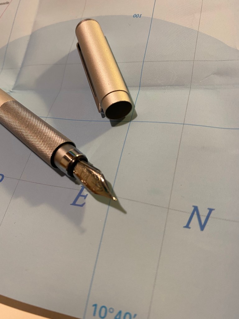
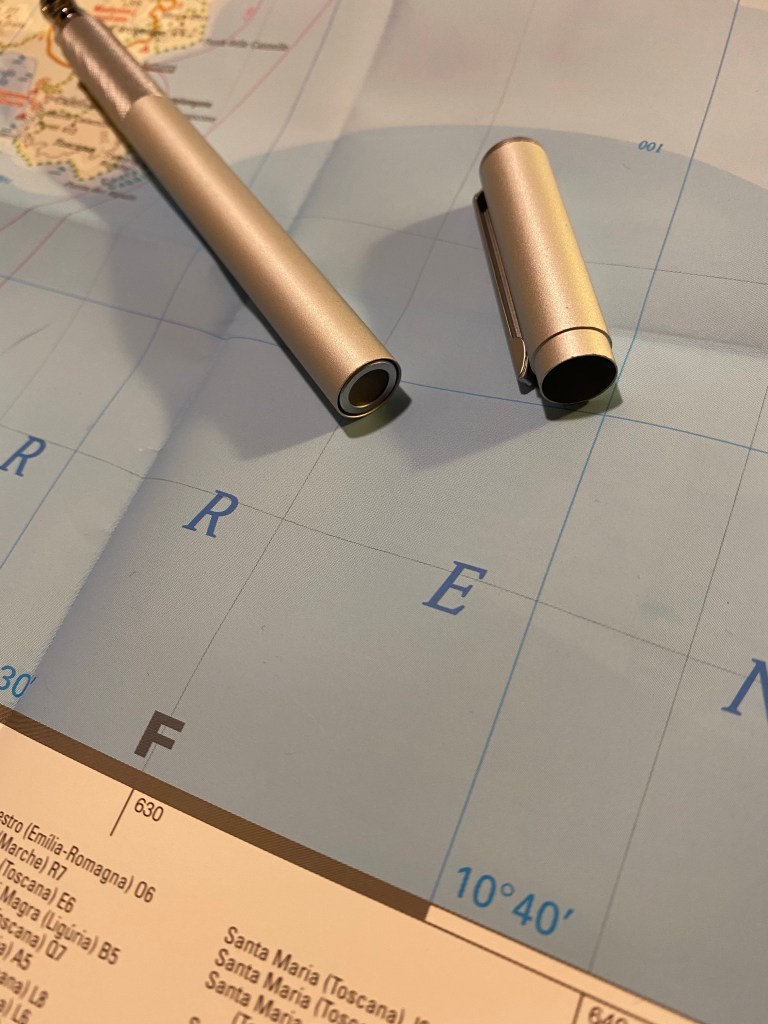
The worst cap design I have ever encountered.
All this is not great by any means, but I just wouldn’t have bothered to write a review about a boring, mediocre pen. The Muji fountain pen, however, pushes past the boring and mediocre and heads straight into terrible territory with its cap design. The cap has a razor sharp and thin edge that slots into a deep and narrow cutout around the nib. The result is that you can and will cut you fingers on that cap edge, you will have to learn to grip the pen really far away from the nib or you will cut your fingers on the edge of the cutout at the end of the knurled (why?) grip, or it will dig uncomfortably into your fingers. If you dare try to absentmindedly cap the pen then there’s a good chance that you’ll catch your finger in between the cap edge and the knurled (why?) grip and that is pure torture. Also guess what, Muji let’s you have the same finger cutting experience on the other end of the pen too!
I also replaced the terrible cartridge that Muji supplies with this pen with a converter (a Pelikan converter). It fit perfectly, but I didn’t fill the converter first and then attach it to the pen, I made the mistake of dipping the pen in a bottle of ink and filling the converter through the nib. The mess was a sight to see. First of all, the knurling on the grip is a real ink magnet, but it’s the deep groove that the cap goes into that’s the winner here. Ink not only seeps into it and is then extremely difficult to clean out without taking the pen apart and soaking it in water, if you don’t do that then the cap lip gets soaked in ink every time you cap the pen, and so you’ll get ink stains everywhere.
Oh God, who let them do this twice?
The pen posts using the same terrible mechanism as the cap, which means that there’s a second deep groove that you can cut your fingers on, on the other end. If you’re a pen fidgeter, this will teach you not to fidget. Is that a plus?
But look how pretty it is! It posts so well!
If you’re filming an IKEA commercial, feel free to use this pen. Otherwise, do yourself a favour and buy a Pilot Metropolitan.
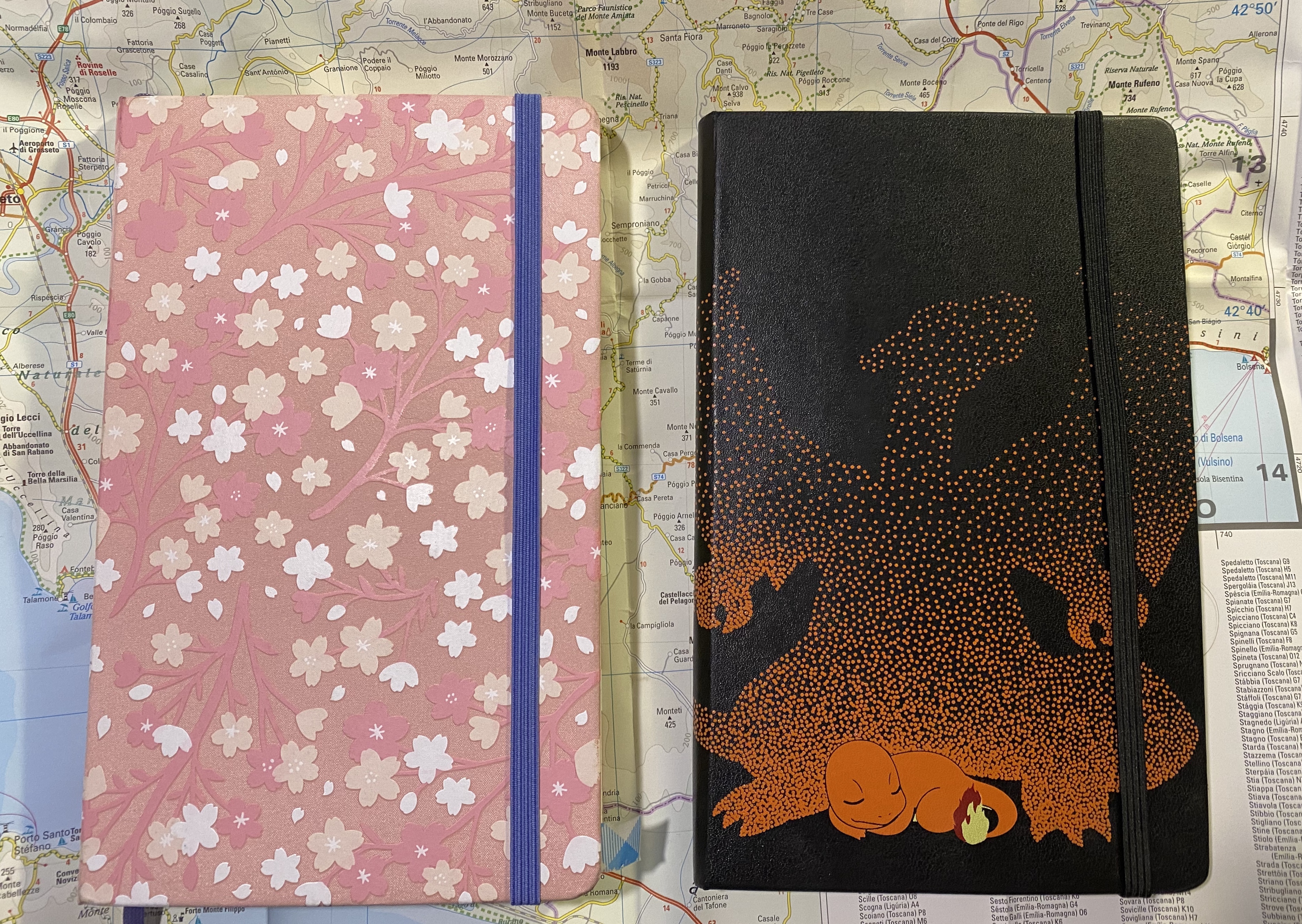
I finished my Moleskine Sakura journal and started a Moleskine Pokemon Charizard journal a few days ago. It’s always fun to finish a journal, to have a beautiful physical object to hold in your hands, one that is heavy with words and memories.
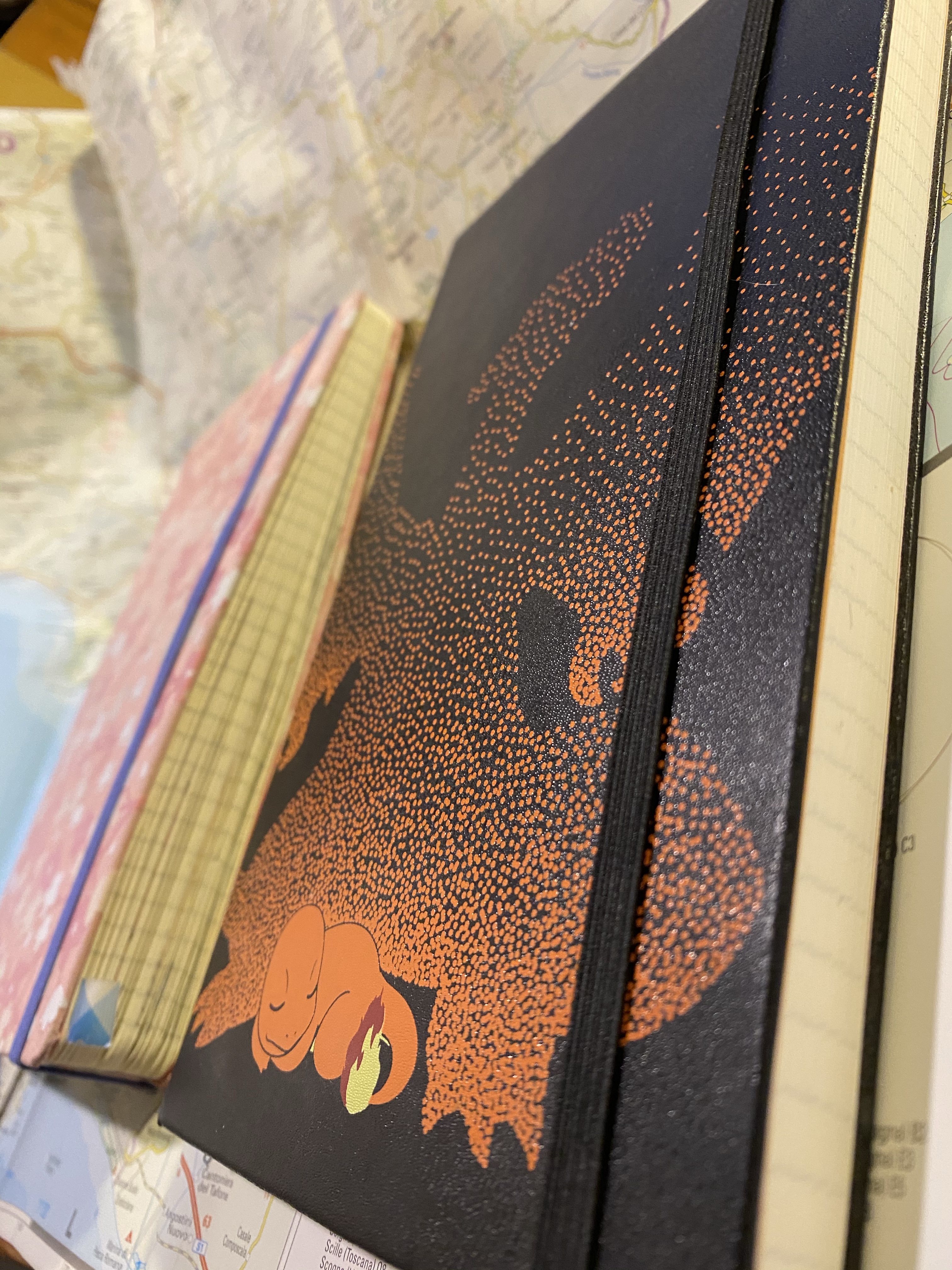
Sakura on the left, Charizard on the right
I started the Sakura journal when we were already quarantined, and the world and my life were getting really strange and pretty stressful. I managed to journal every day until the end of June, which is when I broke my streak and my journaling habit started unravelling.
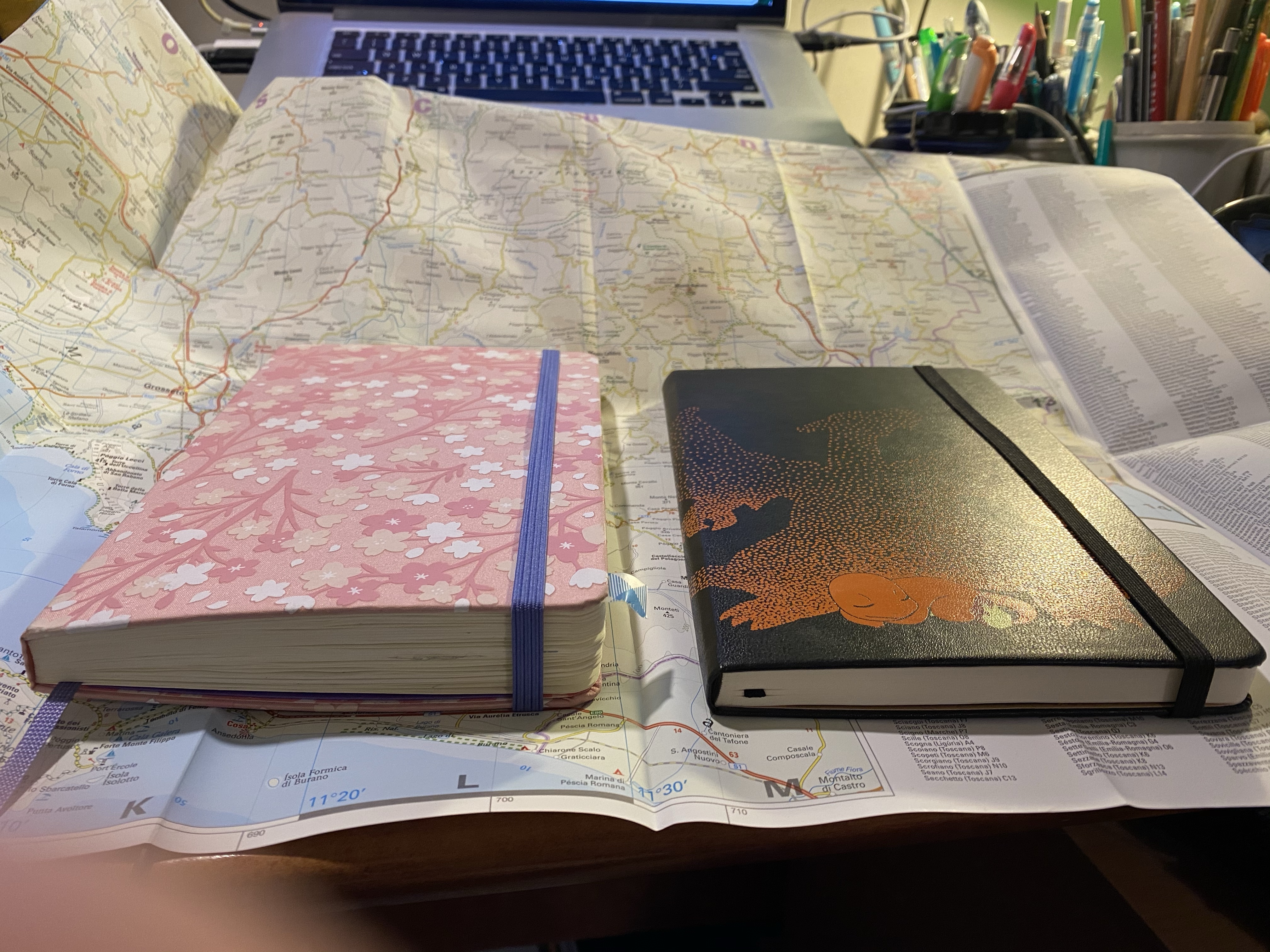
I love how chonky my finished journals are.
I usually finish a journal every 3 months or so. This one lasted for double that, because I barely journaled in July and August, and I didn’t journal at all in September. Every day I wanted to sit down and write, but I couldn’t face the added stress of the backlog that I felt the constant urge to make up for.
I stopped writing because of some serious family health issues, and I was so stressed out and tired during it all that I couldn’t pick up a pen at the end of the day and relive everything again. I knew that getting things out on paper would help, but I was overwhelmed.
In October I decided to give myself a break. Forget about the backlog. Leave those months empty, and move on. I went back to journalling, writing twice a day, every day for the past two weeks (once at the tail end of my morning routine, and once before I go to sleep). I also don’t care if I filled two pages (as was my usual standard), a page and a half, or half a page. I write about the little things in my life, and really try to keep it positive, to make journalling a joy again, a point of escape, and not another “let’s enumerate the ways in which the world is terrible these days” exercise. I have enough of that on social media. So far it’s working and I’m having fun. Will it last? I hope so. If not, I’ll take a break and get back to it later. The point is that I’m no longer willing to let journalling become a stressor in my life. It’s either something I enjoy, or something that I don’t do.
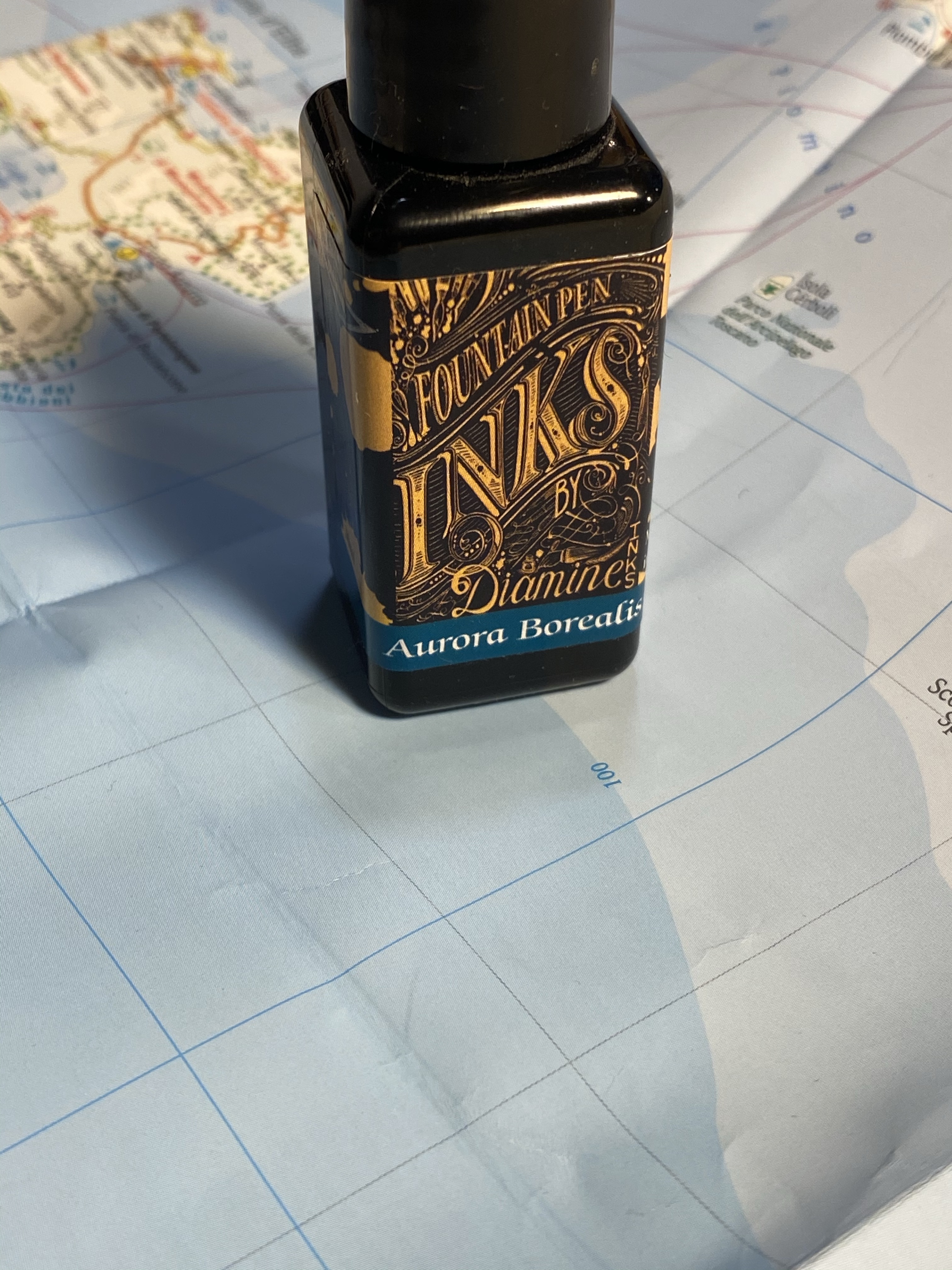
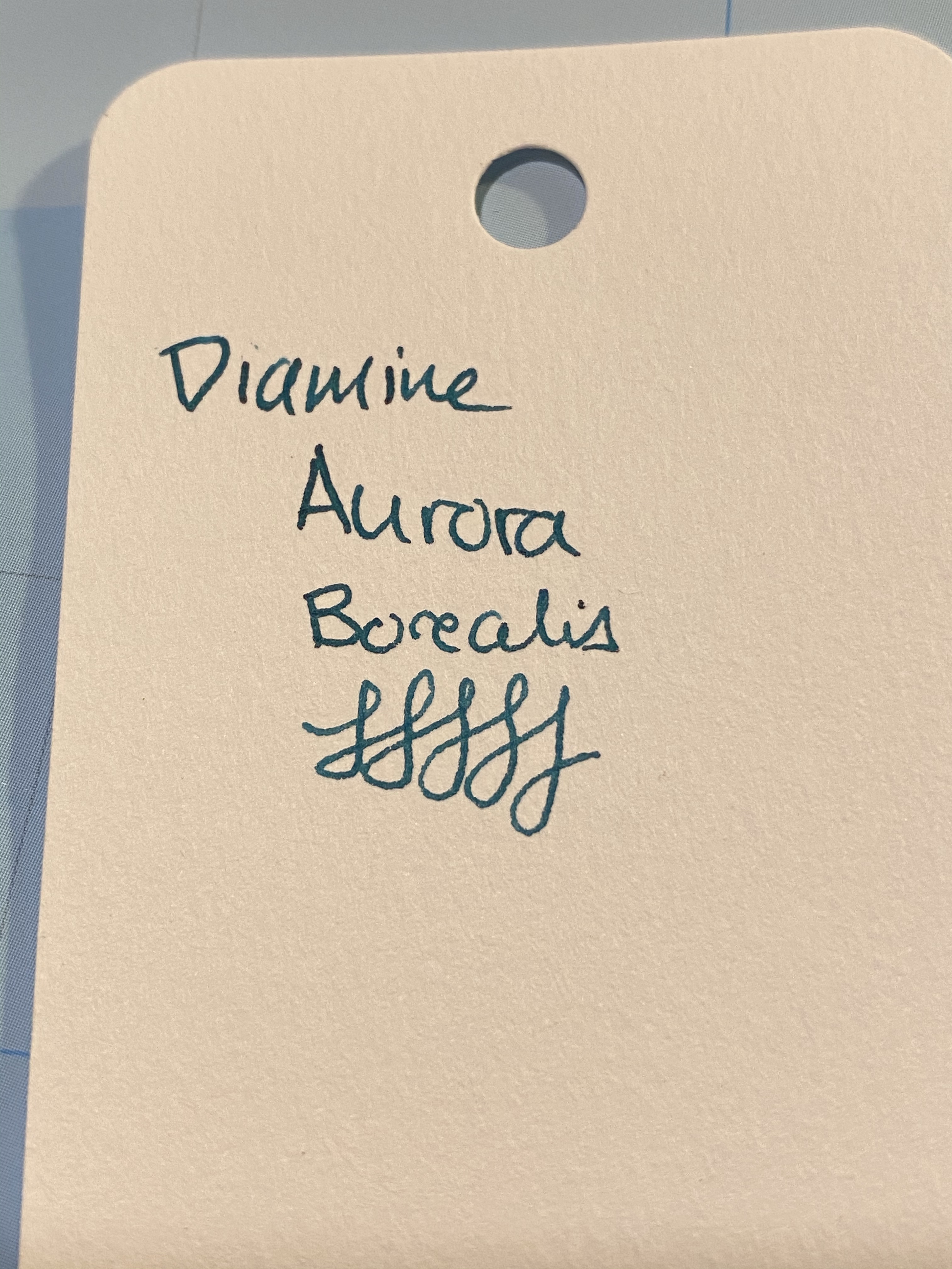
Diamine Aurora Borealis fountain pen ink was created by Diamine in collaboration with the /r/fountainpens reddit community, who chose the colour. I love teal inks, but at first I thought that I had enough inks that are close enough in colour to skip this one. I have no recollection of how it landed in my basket during my last Cult Pens purchase 🙂
Beautifully designed label.
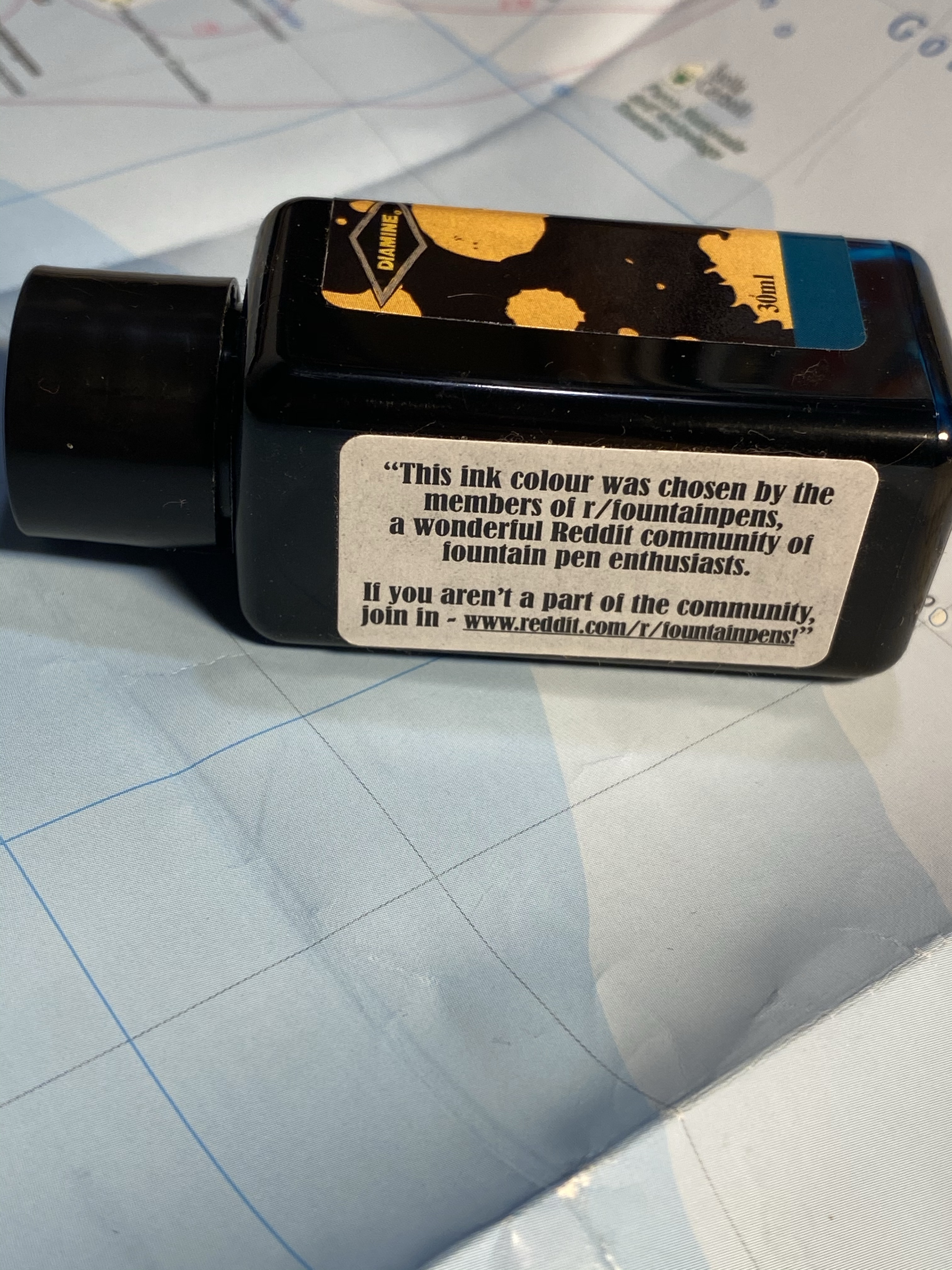
I don’t normally spend much time on the packaging, but Diamine’s 30ml plastic bottles are deep and wide enough to allow for filling even chunky pens, and their (relatively new) label design is splendid. This bottle is unique in that it has another label, crediting the /r/fountainpens community with selecting the ink colour:
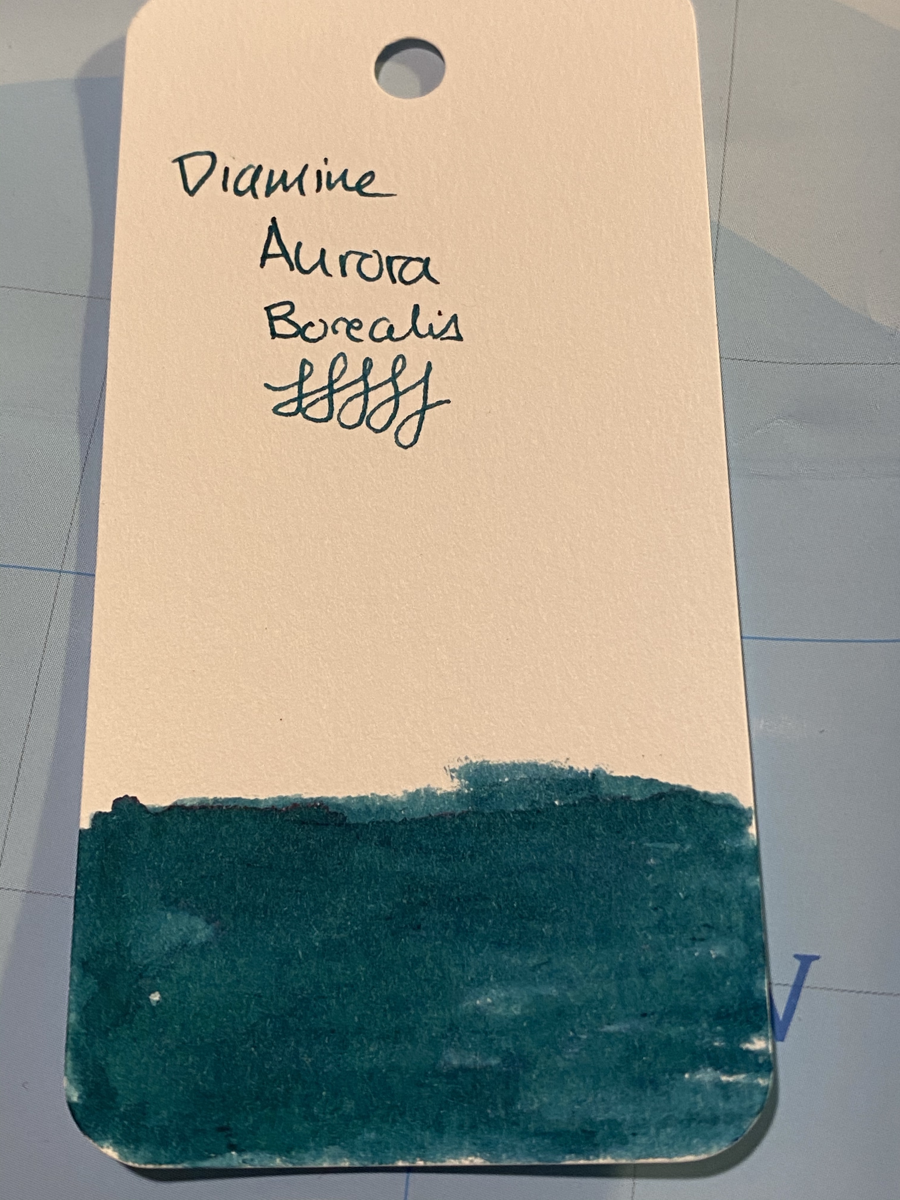
Aurora Borealis is a dark teal with some red sheening, and a good amount of shading for such a saturated ink. It also dries surprising fast for such a saturated ink (although I wouldn’t call it a fast drying ink).
Swab on a col-o-ring card.
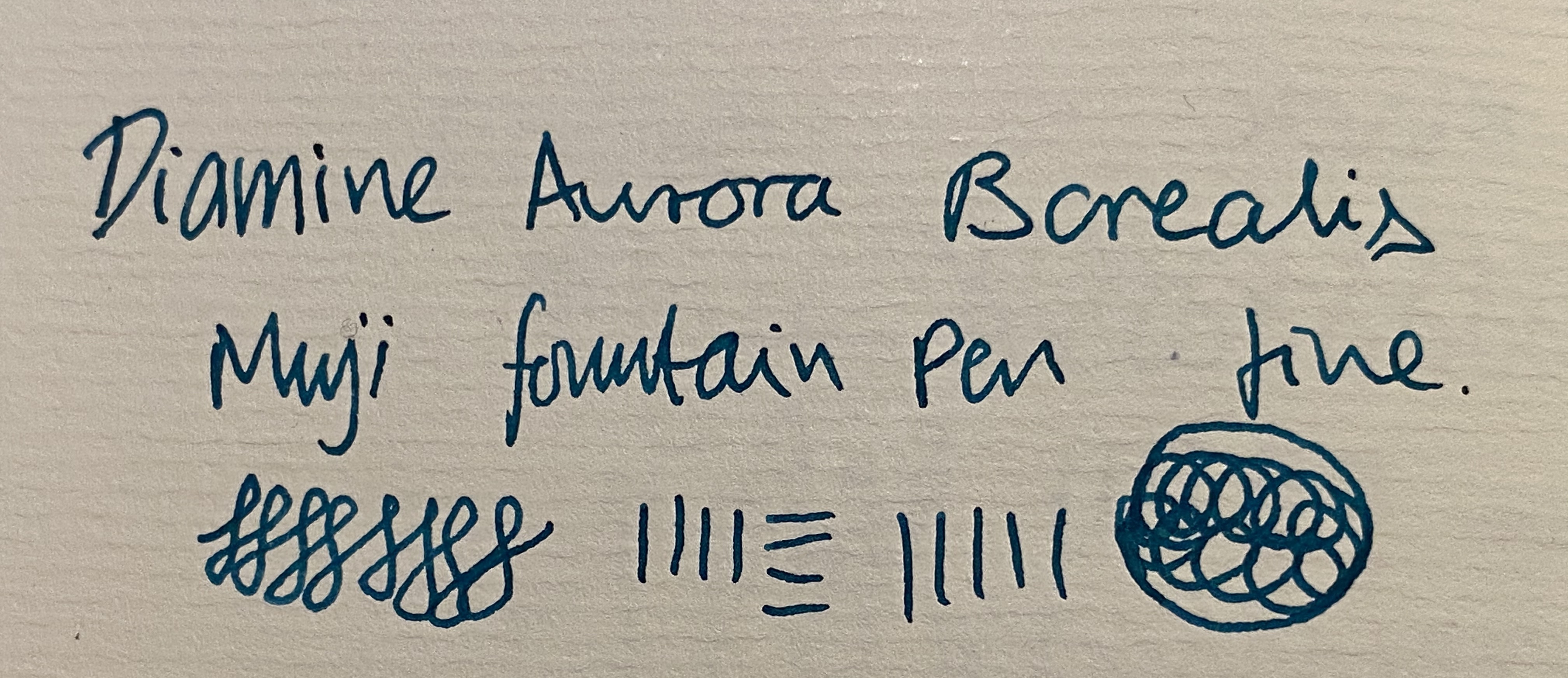
You can see a bit of the red sheen here, on the top of the “A” in aurora:
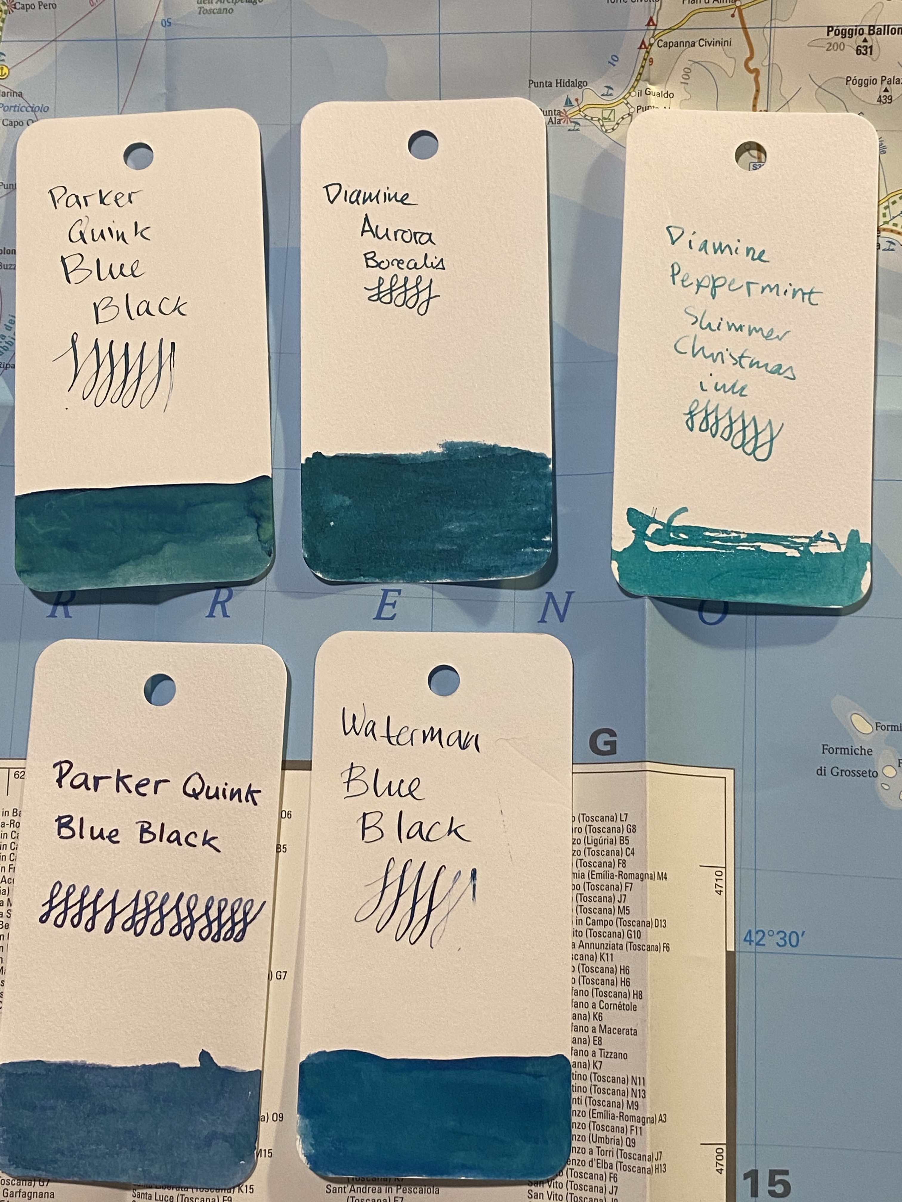
I a few inks that are in the region fo Diamine Aurora Borealis, but not many of them are swabbed. I will say that the ink is dark enough to be fine for office use, and that is still shows plenty of interest and character:
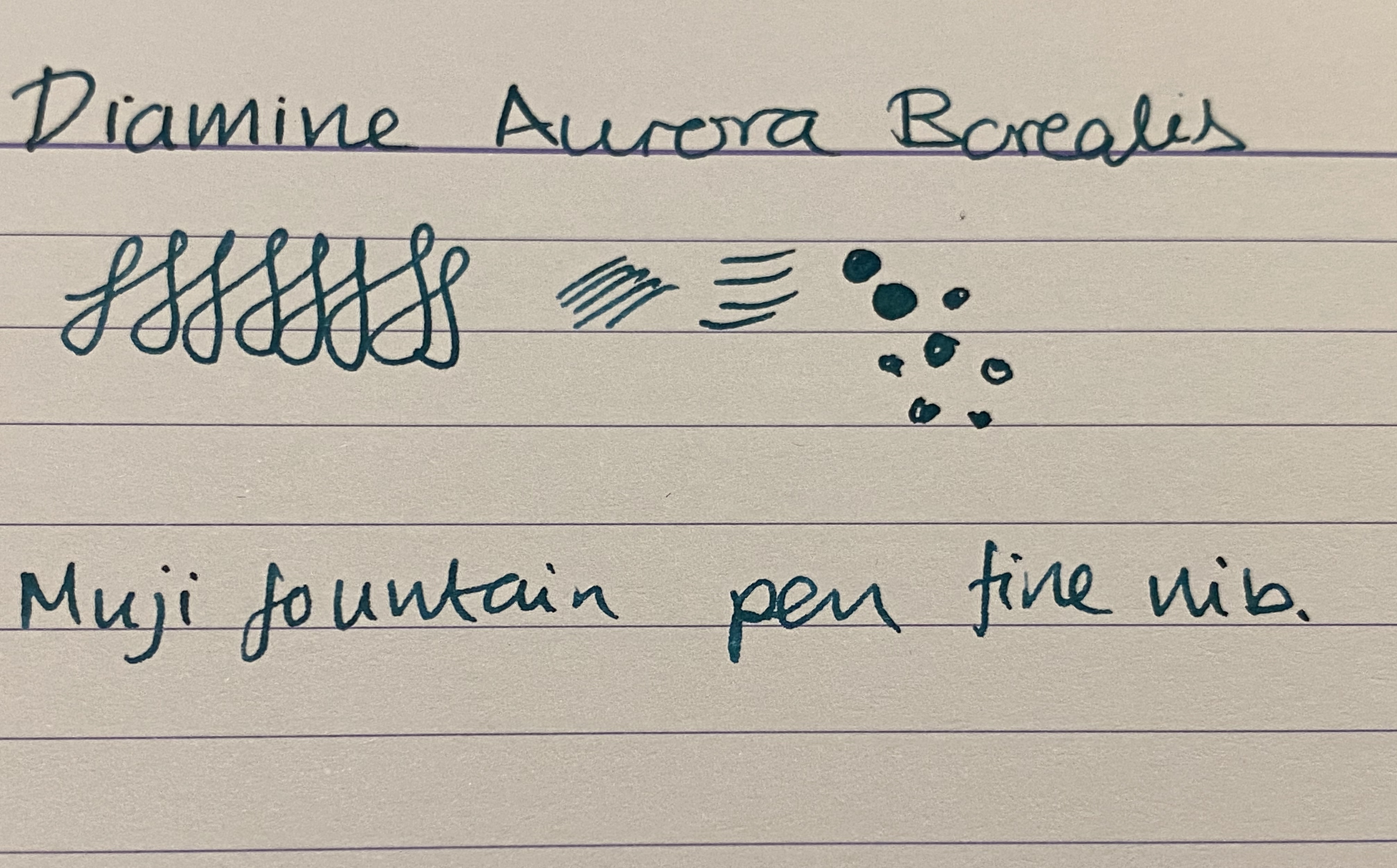
I tried it also on Paperblanks paper, and on Rhodia paper. In both cases the ink dried darker than it looked when I was writing with it, although the photos picked up less colour than it originally had. The best colour reproduction is in the final photos of Tomoe River Paper, further below. It is worth pointing out though that if you have a wet nib, you’re going to see darker results than you’d expect from the swabs.
Paperblanks
In any case Aurora Borealis came out much darker than it appears on Goulet Pens site, for instance, although not as dark as it appears here:
Rhodia
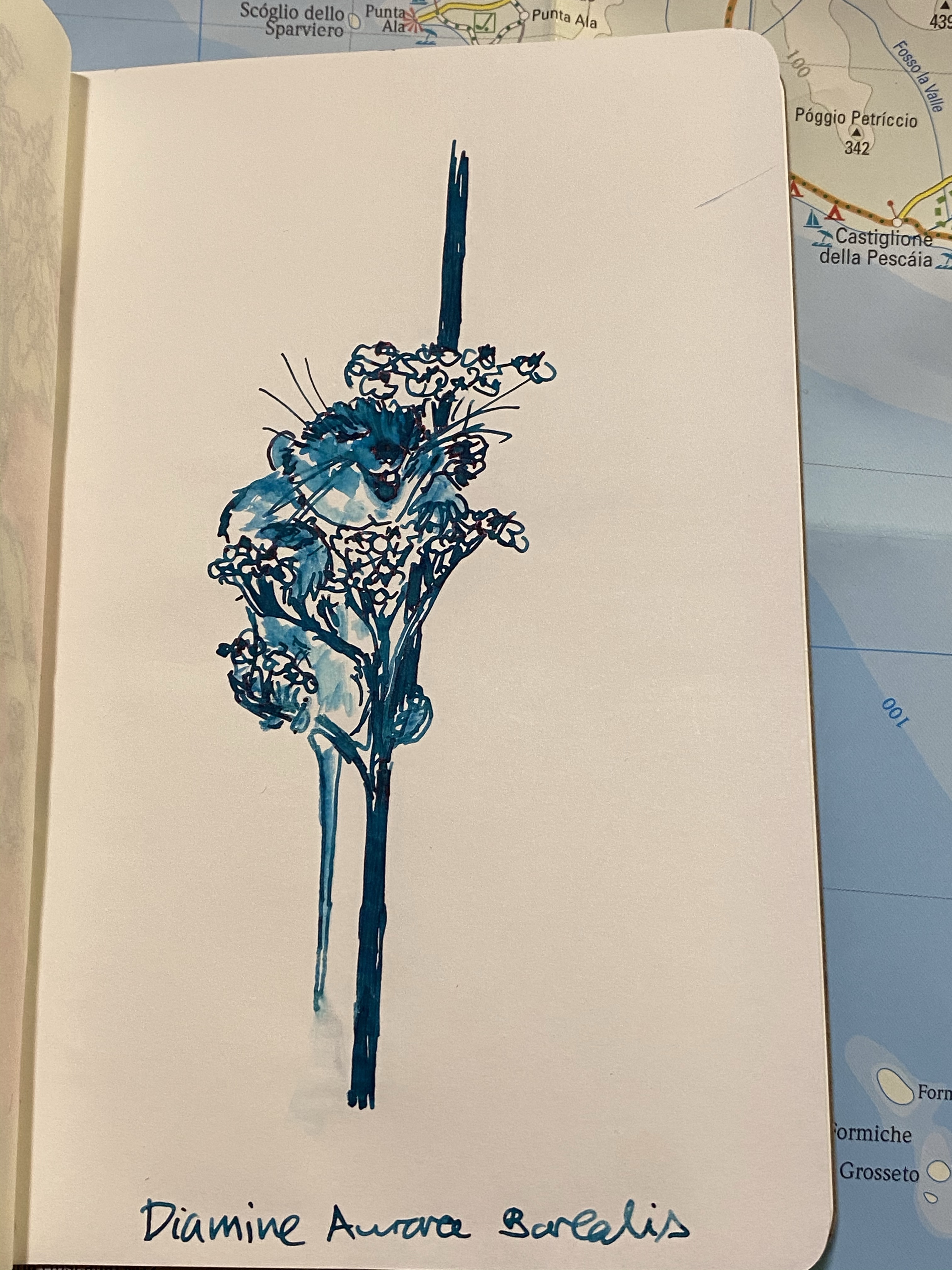
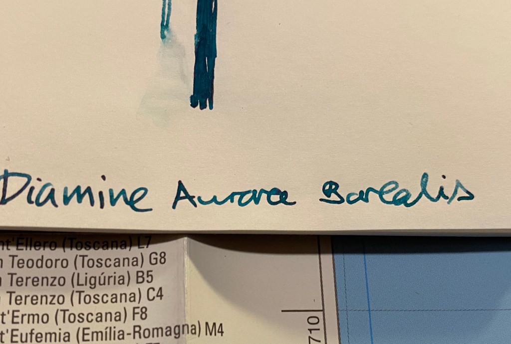
I gave the ink a spin on some (old) Tomoe River paper, and “opened” it up with some water and a fine brush. As is the case with most Diamine inks, Aurora Borealis isn’t waterproof or water resistant, and doesn’t market itself as such. It is, however, a lot of fun to draw with:
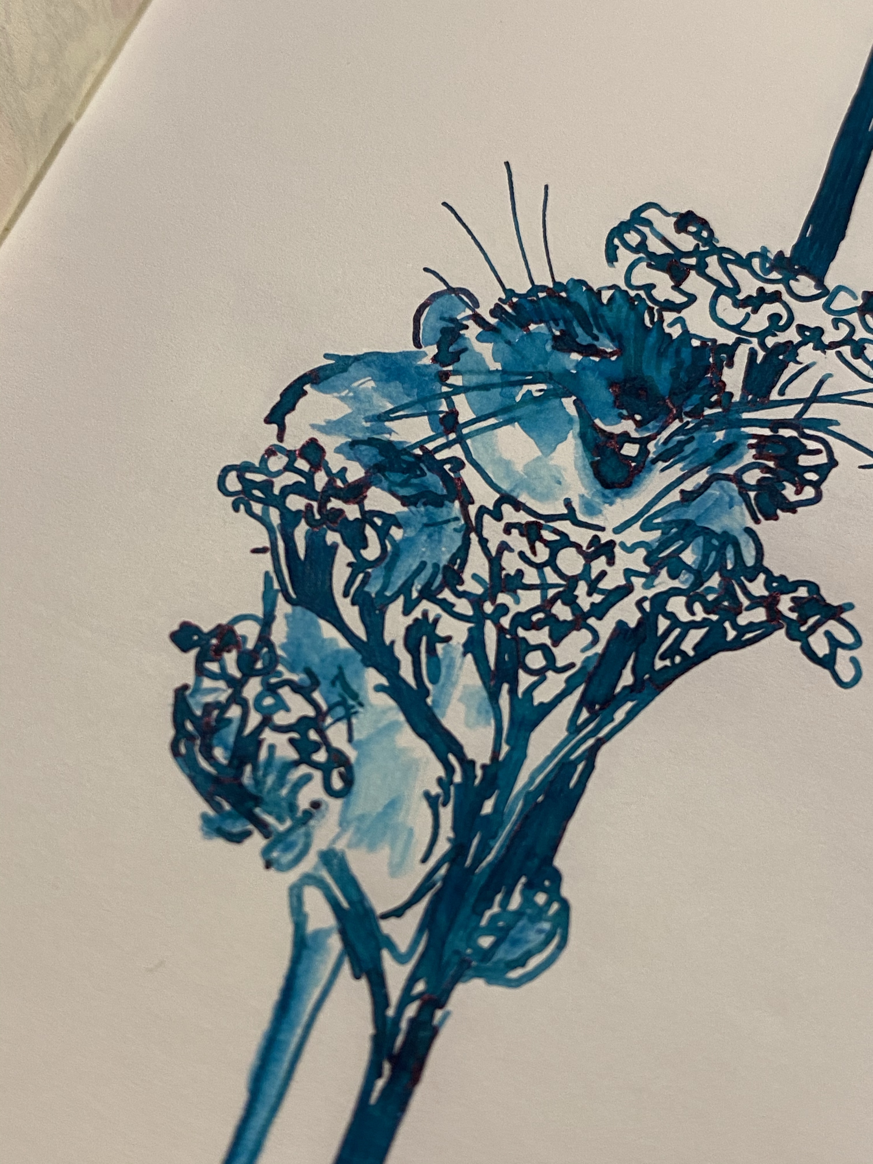
You can see red sheening on the happy little dormouse’s nose, as well as on the flowers. You can also see the shading in the flowers:
This is the best sample of all the properties of this ink: the relatively dark colour, the shading, and the slightly red sheen:
Diamine Aurora Borealis is fun dark teal ink that will likely appeal to anyone who likes teal/turquoise inks. It’s inexpensive and unassuming, and so you can take an interesting ink for a spin without spending Sailor or Iroshizuku money.
I decided not to take part in Inktober this year. Instead I’ll be drawing at least one page a day in my Stillman and Birn Pocket Alphas. You can see days 1-5 here, days 6-10 here.
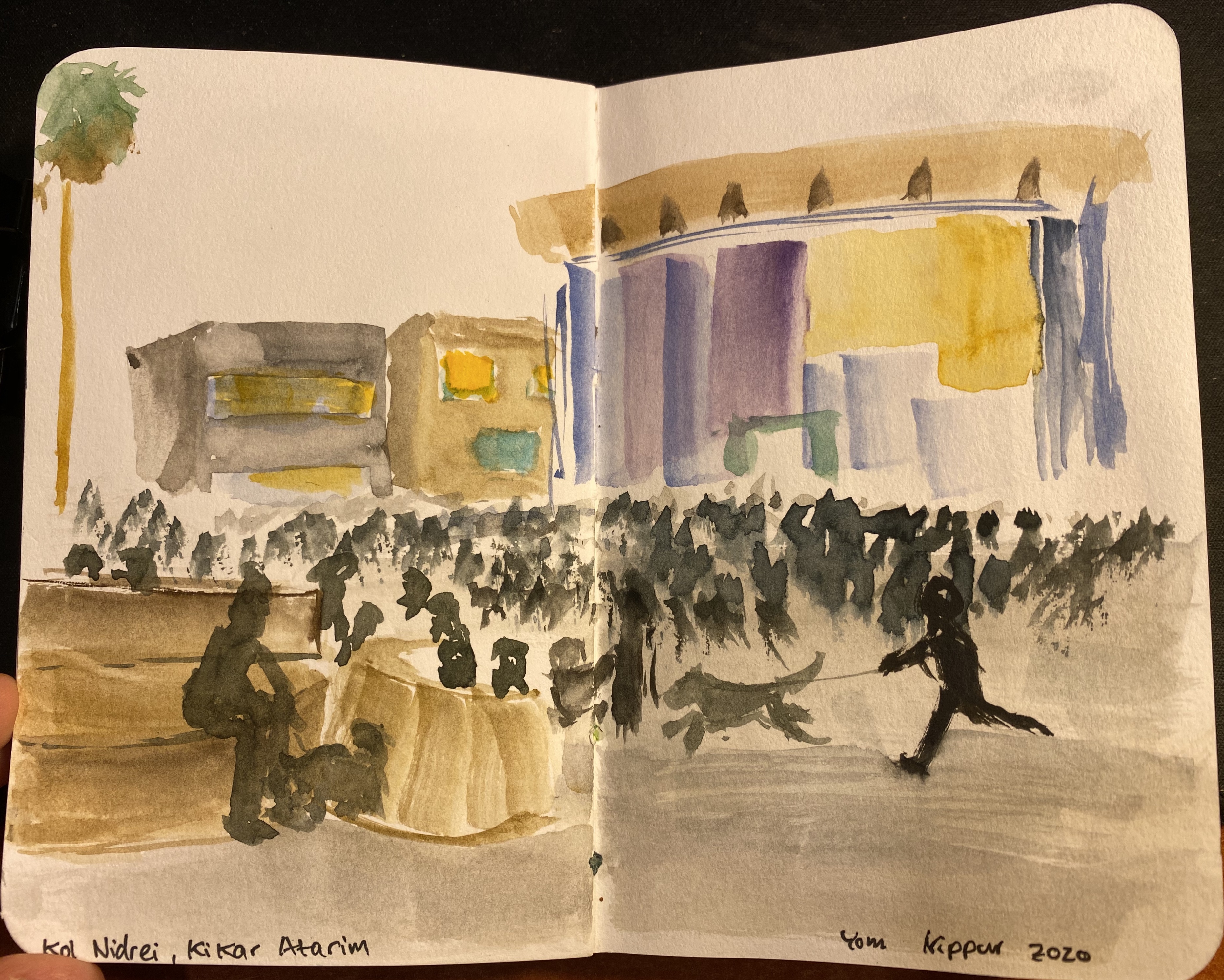
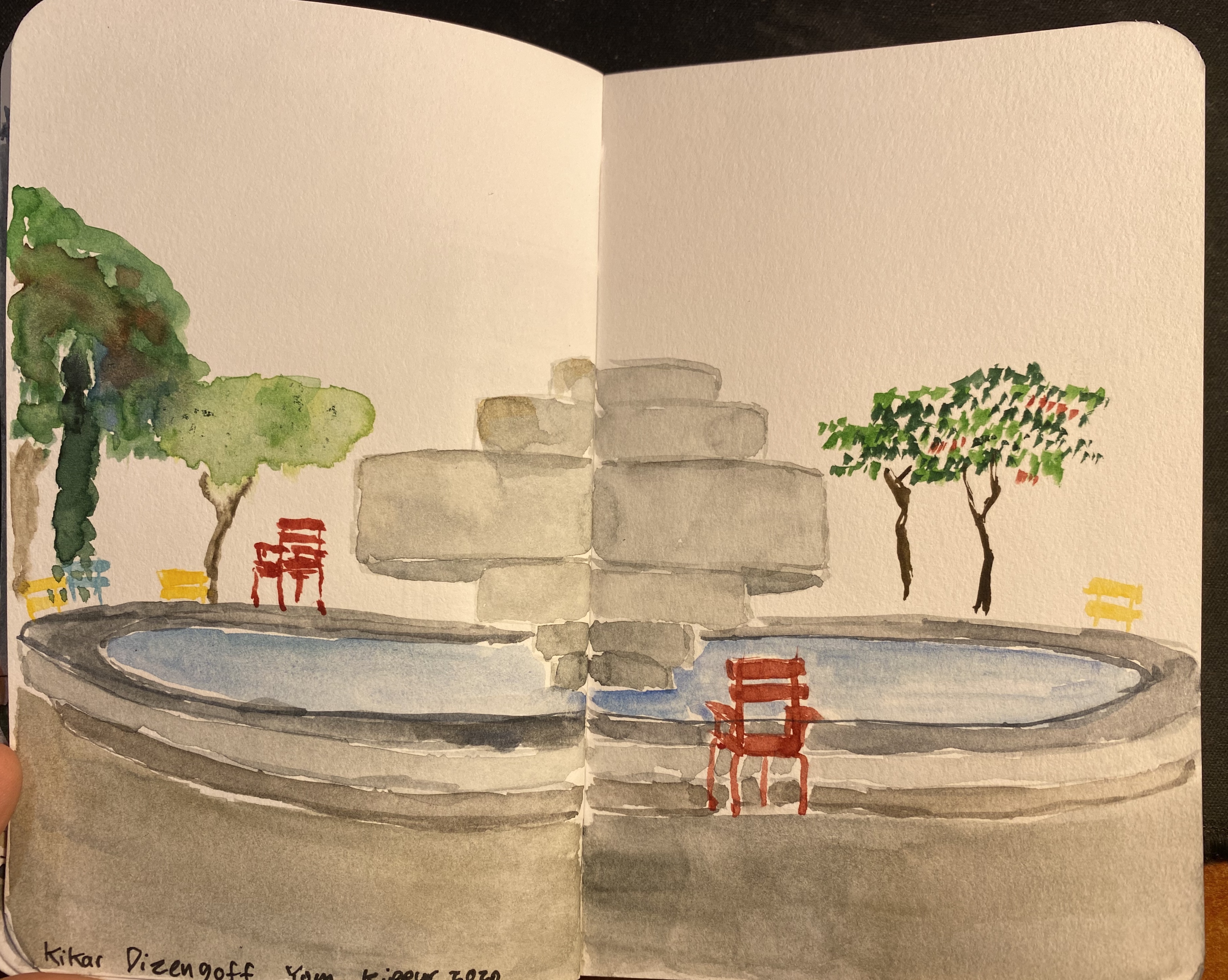
It was Yom Kippur when I drew these, and a very strange Yom Kippur it was. The country was under lockdown, and so some of the prayers were set outside, including this one in Kikar Atarim:
The streets were more deserted than usual during Yom Kippur. There are no cars around, and everything is closed, but the pandemic added another eerie aspect to it all:
I woke up early in the morning to draw Kikar Dizengoff utterly deserted. The Agam fountain in its centre is still colourless, but I actually think that it works. I love how the multicoloured chairs around the fountain just grab your eye:
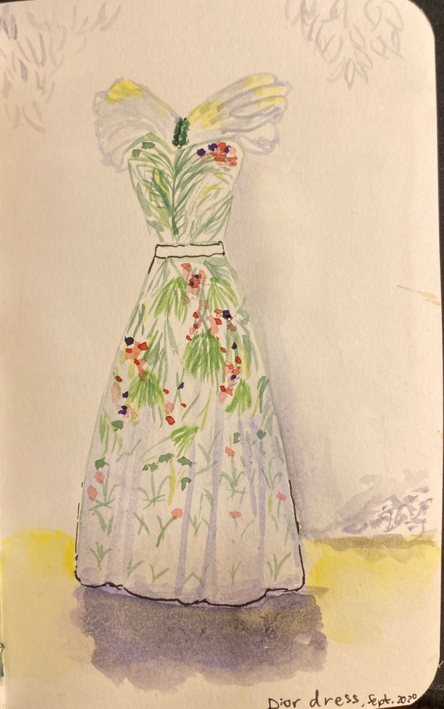
I was searching for some flowers to draw, when this came up: a Dior dress from the exhibition we saw over a year ago. I’m not very happy with the wild highlight and shadowing choices that I made, and you can see that the Alpha paper doesn’t allow for multiple washes, but you learn from your mistakes more than from your successes:
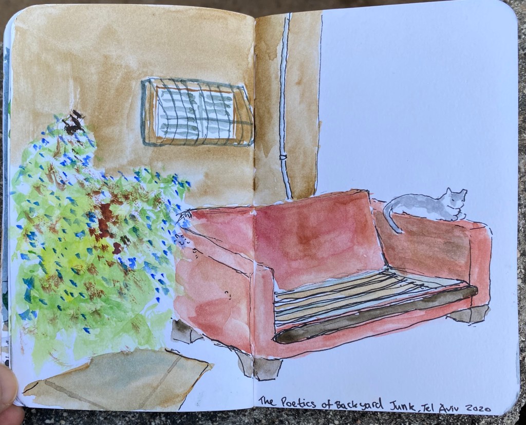
I went for a stroll looking for things to draw and found this abandoned couch lorded over by a local cat. I had to juggle all of my art supplies on my hands, so that was a challenge, but I like how the cat and couch came out. I may later on touch up the bush on the left, but as Stillman and Birn Alpha paper doesn’t take too well to reworking, I may just leave it as it is:
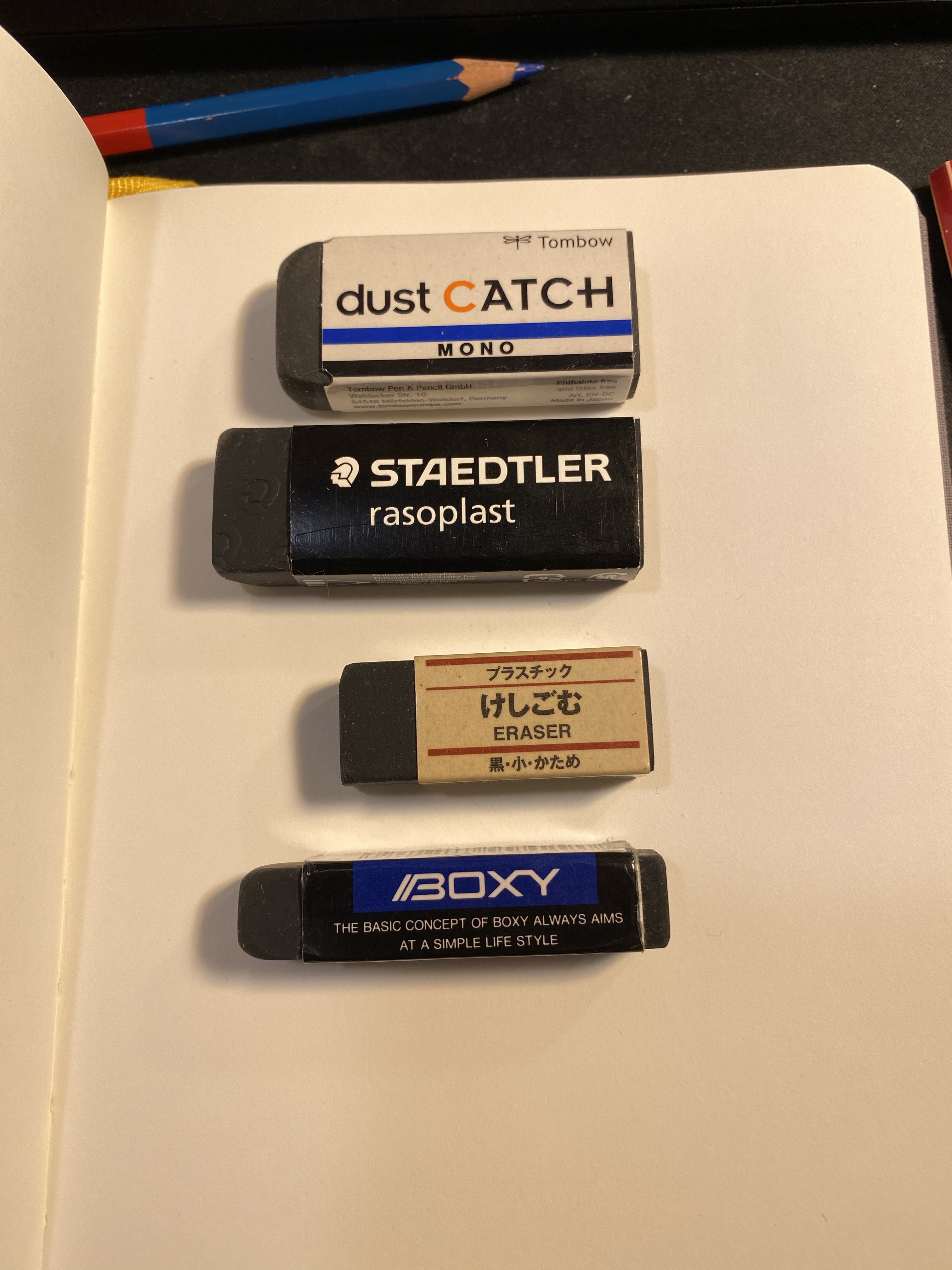
Black erasers have become more common in recent years, with the Boxy perhaps being the most well known of the bunch. I have a few that I use regularly, and a few that just lounge in my stationery drawers waiting to be used. As I’m streamlining my sketching kit and the boxy is now the eraser I carry in it, I decided to test it out against the competition, starting with other black erasers.
In terms of price they’re all around the same price range with the Muji eraser being the cheapest of the bunch, and the dust catch and boxy being on the more expensive side of things.
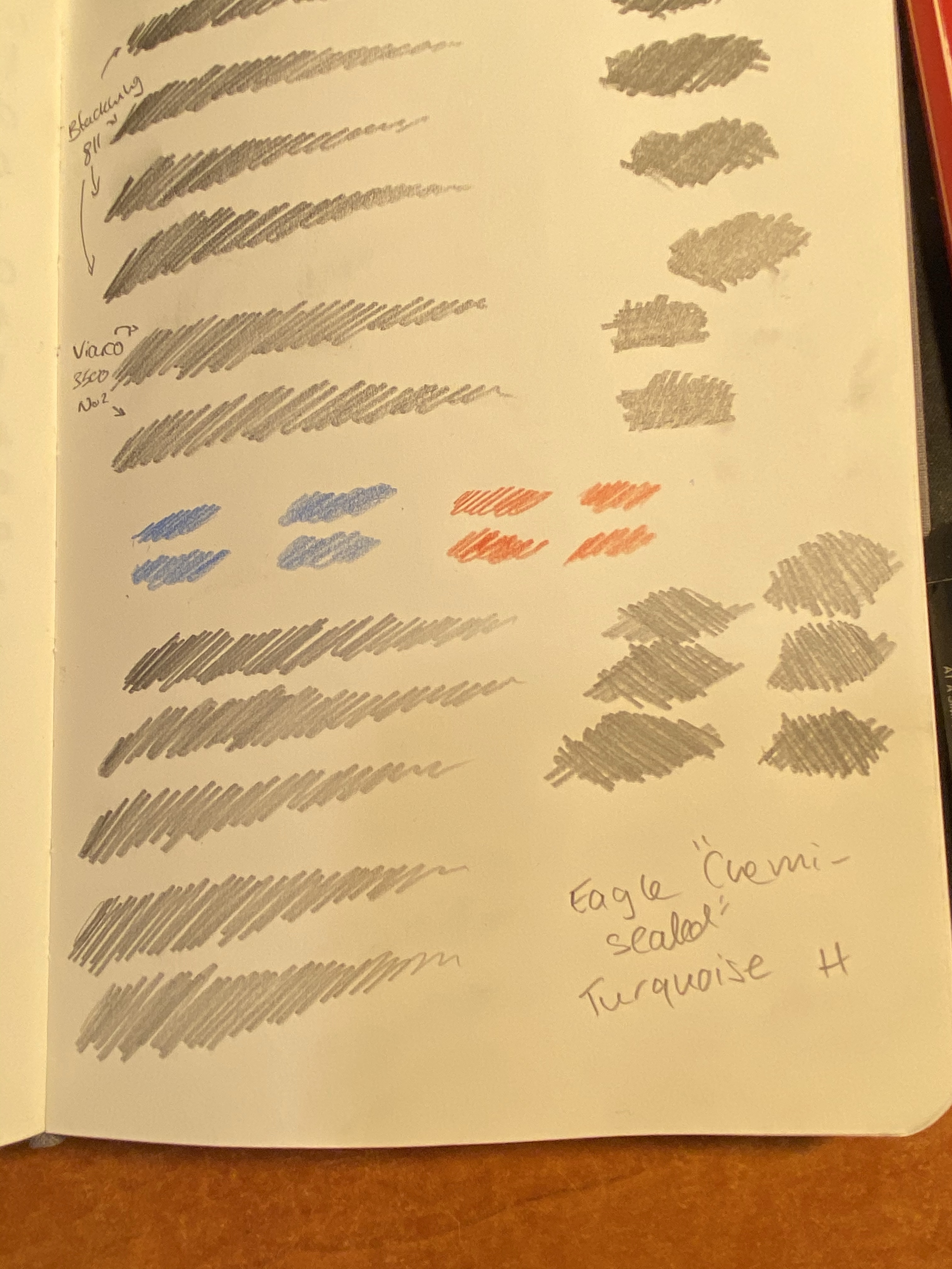
I took out my Baron Fig Confidant, since I do all my pencil tests on it, and scribbled in it in a variety of pencils and even using a Caran d’Ache red blue pencil, though I don’t expect regular erasers to do well with coloured pencils.
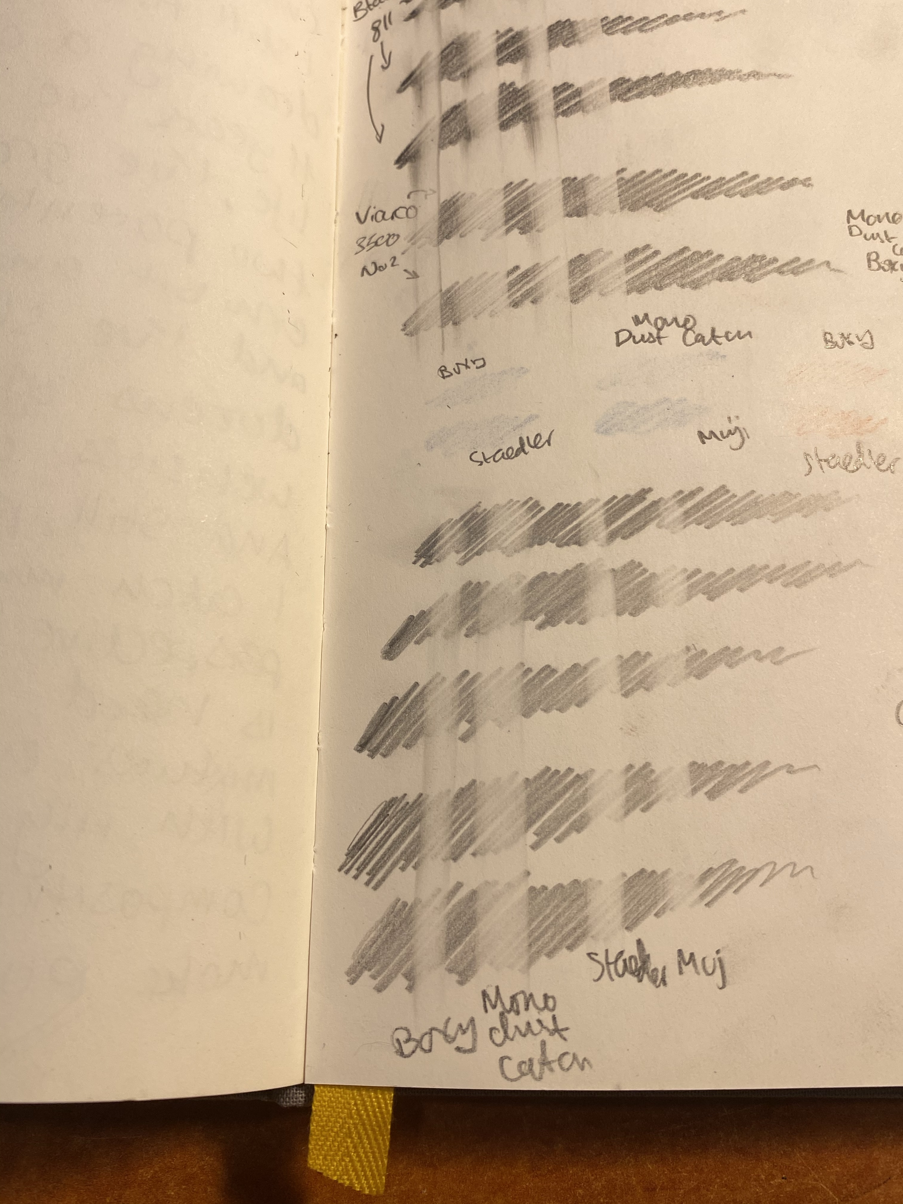
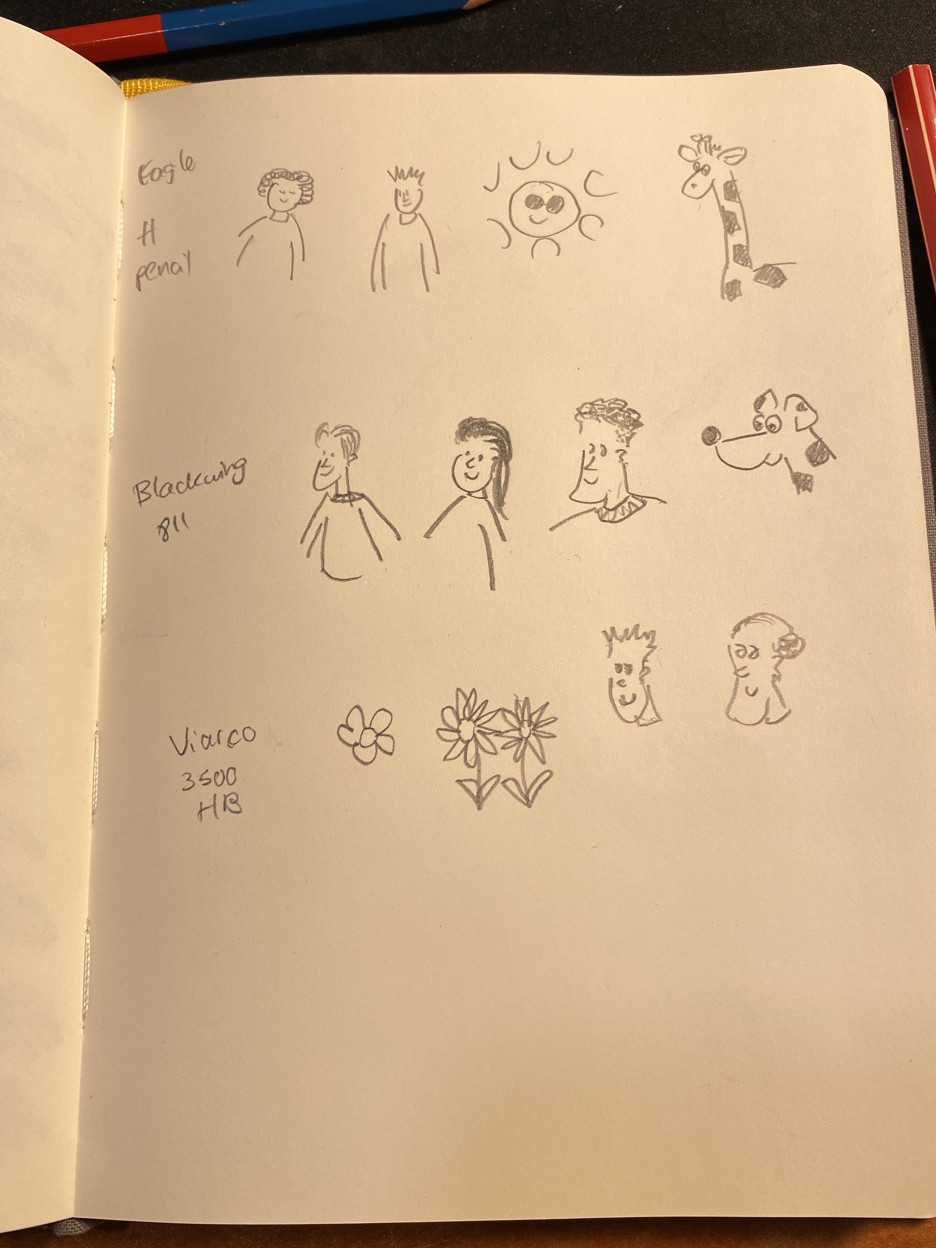
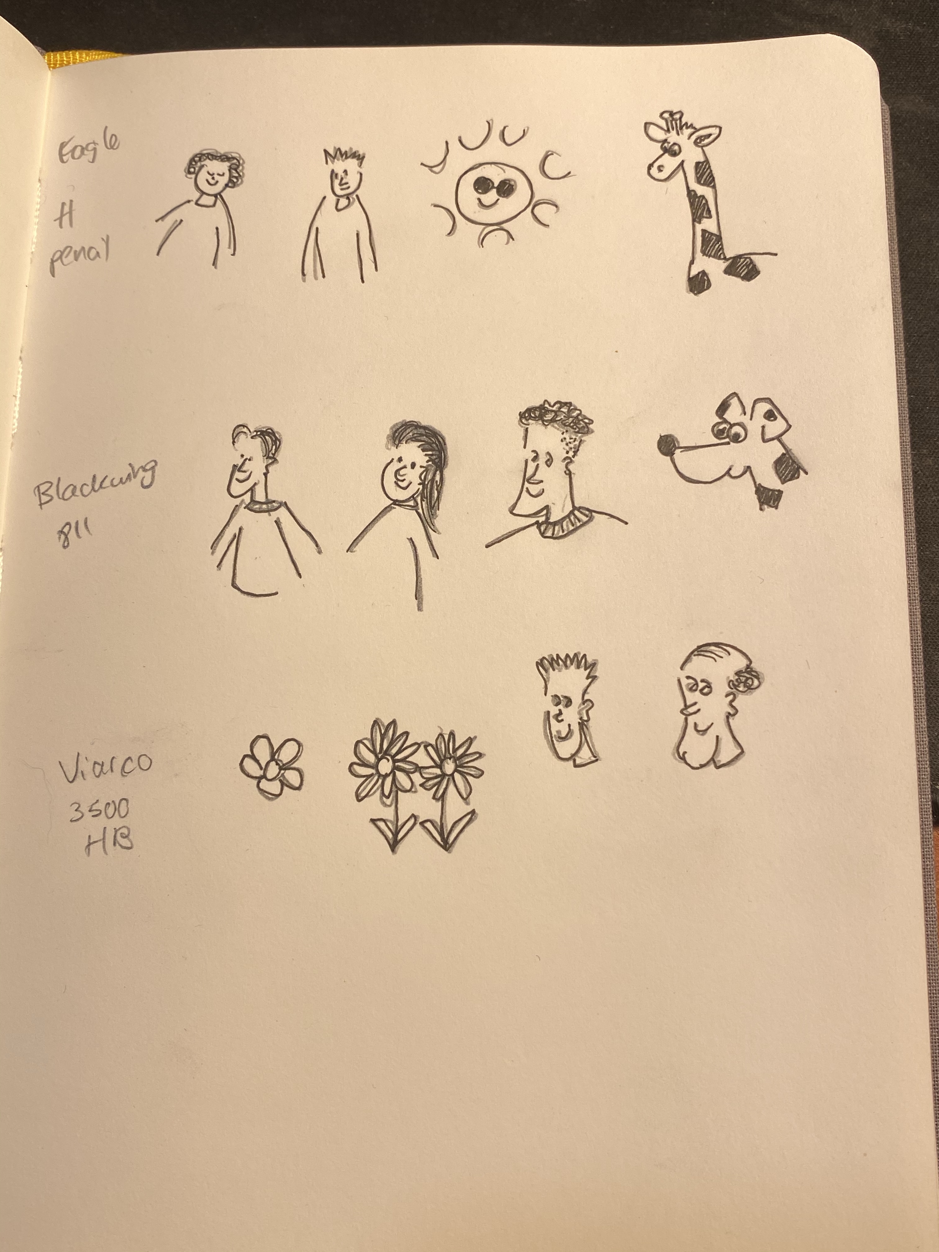
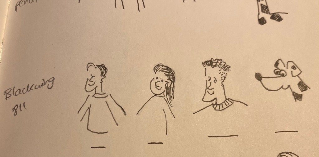
The pencils that I used were the Blackwing 811 (a darker, softer pencil), a Viarco 3500 No. 2 (a standard HB pencil) and a vintage Eagle “Chemi-Sealed” Turquoise H pencil. These seemed like a fairly representative bunch of general writing pencils, at least in terms of graphite behaviour. Though I did later check them for art use, these erasers are meant to be used when writing more than when drawing.
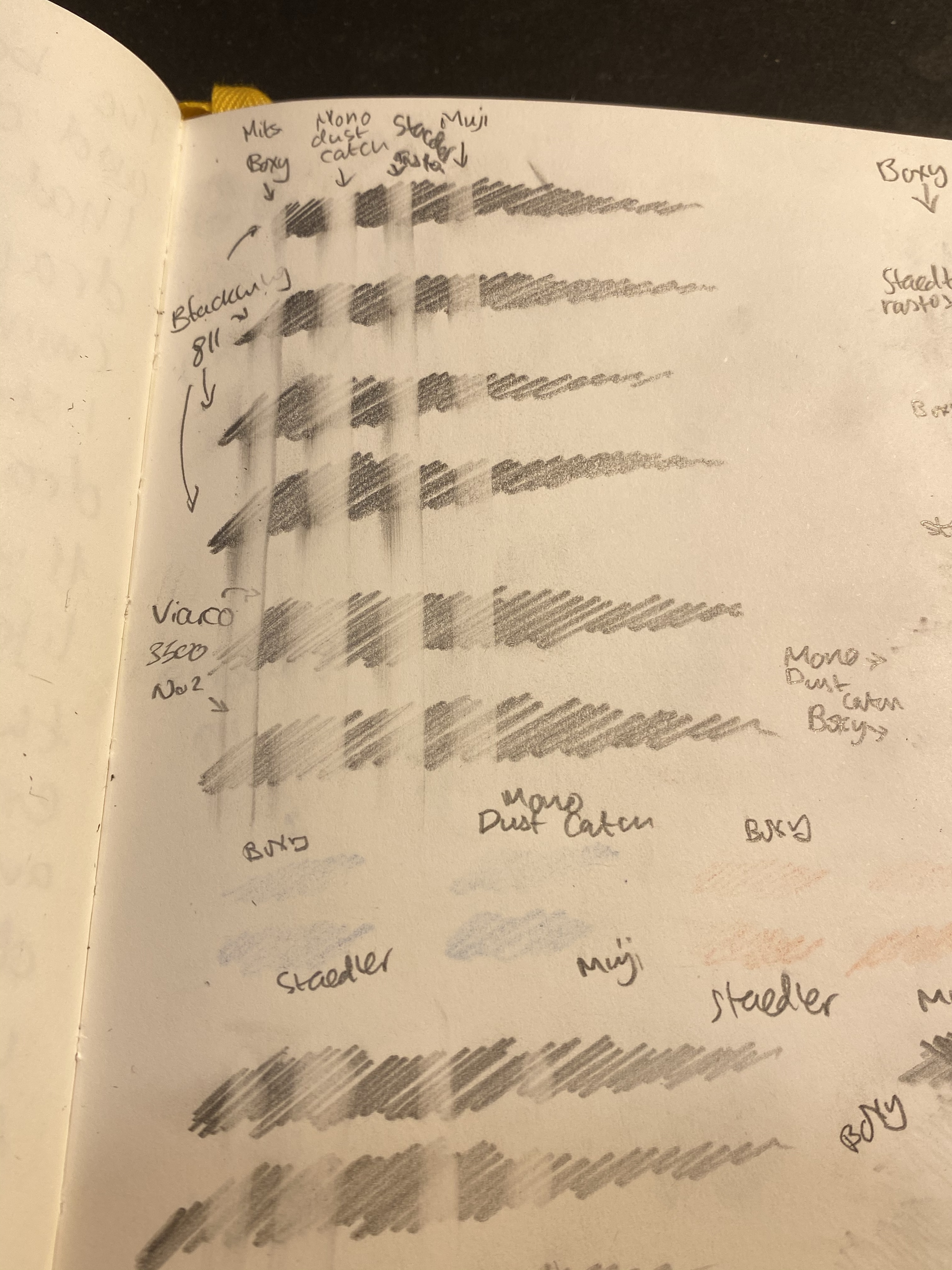
I did a single eraser pass on the left hand side of the page, and on the right side I split each scribble into two and tried to erase it completely (leaving an untouched graphite barrier in between each side).
Then I tried to erase the coloured pencil, which I wasn’t expecting much success in, and here are the results:
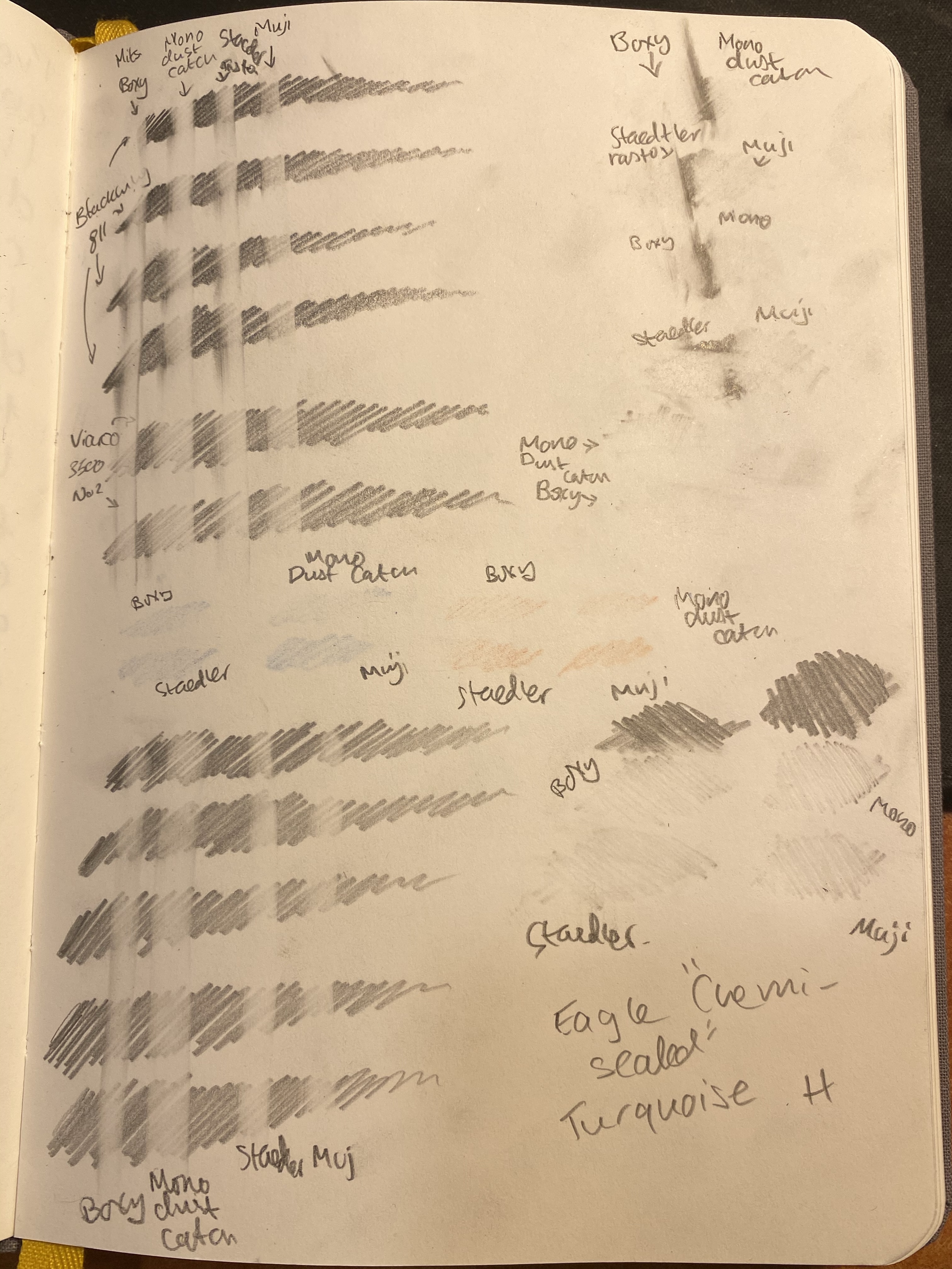
A closeup on the one pass side. You’d normally not erase this way, but it does give a good indication of how good the eraser is going to be:
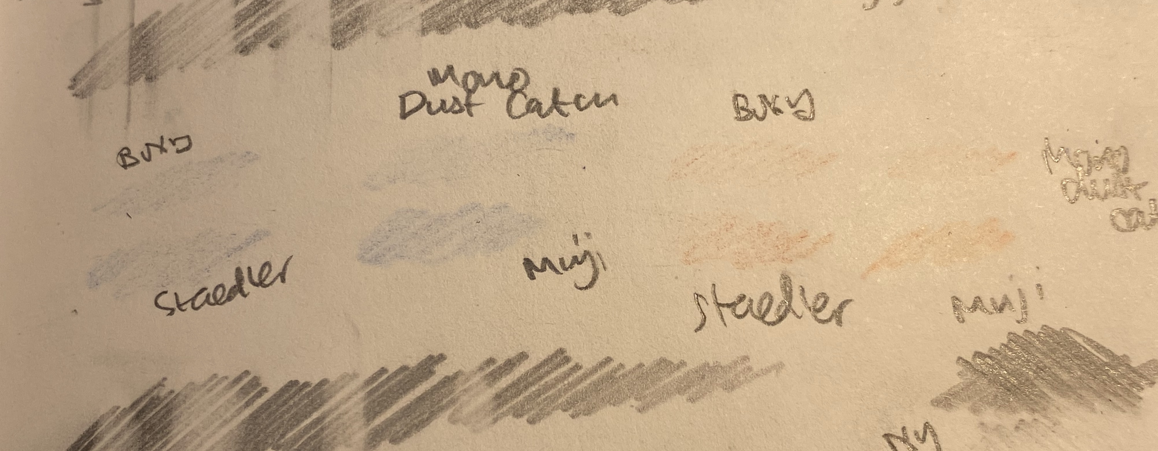
From left to right: Boxy, Dust Catch, Rasoplast, Muji.
A closeup on the H pencil one pass attempt. I deliberately pressed down on the H pencil, because from my experience H pencils are easy to erase when you apply little or no pressure to them, but they’re pretty tenacious if you apply normal or strong pressure on them.
Here’s the split scribble test above and the H scribble test below:
Finally the Caran d’Ache red/blue eraser test:
At this point I was ready to give the victory to the Boxy, with the Mono Dust Catch a pretty close second, the Staedler Rasoplast in third place and the Muji eraser trailing behind. The Boxy and the Dust Catch also had the easiest “eraser crumbs” to clean (long threads of the stuff, easily brushed aside), and the Muji had the smallest and the worst. None of the erasers damaged the paper, which perhaps isn’t surprising considering that they’re all pretty soft.
I’d also point out that none of these erasers are what I’d call “best”. They’re good erasers, but even the boxy left graphite ghosts behind. There are better erasers on the market, but these in general behaved better than average (even the Muji), and the Boxy and Dust Catch are pretty good. They held up well even against the Caran d’Ache red/blue pencil, which surprised me.
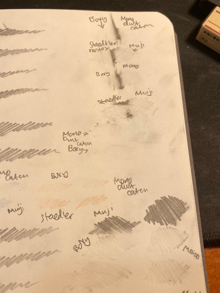
Even though these aren’t “art” erasers, I decide to try to draw some doodles in pencils, ink them with a fine liner and check how much ink each of these erasers lifted.
The pencil doodles.
Here’s the inking. You can see the pencil marks beneath, and I waited for the ink to completely dry before trying to erase the underdrawing.
Inked in.
The results were “ravishing” as to be expected:
All the erasers lifted a significant amount of ink, leaving the resulting ink grey and muted.
You can look at the closeup below and see just how much ink was lifted. These are all terrible for art use, which again, isn’t surprising. I drew an ink line for reference under these, just so you can see how much ink was lifted. Also the top line of left hand dude’s sleeve wasn’t erased so you can compare that too:
The Muji erased faired the best at this part of the test, although I still wouldn’t recommend using it to erase underdrawings.
Of the four erasers that I tested, the Boxy and Dust Catch are the best, and of these two the Boxy is the one I would choose, because of its compact size and its slightly better performance. None of these erasers are terrible, but if you’re investing in a good box eraser (and you should) the Boxy is definitely one to consider.
And why are these black? Presumably to not show dirt, though I find that both frivolous and counterproductive. If the eraser shows dirt, then you know that may need to clean it on a bit of scrap paper before using it, so that it won’t transfer that dirt onto your clean paper. However, I suspect that the real reason is that black erasers just look cool, and the rest is just plain marketing.