Currently Inked Fountain Pens – Pelikan Hubs Edition
Tomorrow is the Pelikan Hubs 2025 event, and to prepare I have inked up a whole flock of Pelikan fountain pens.
Here’s my current lineup of fountain pens and ink:
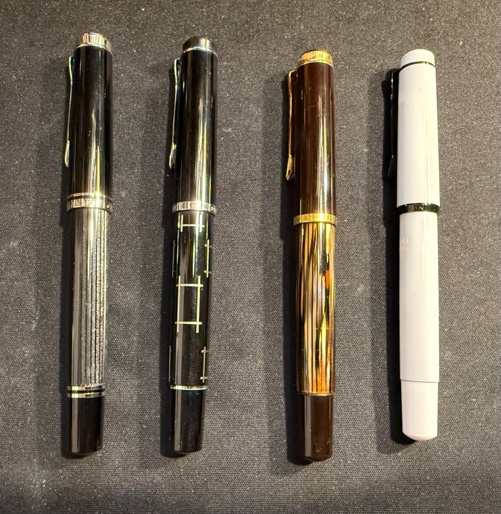
The top four have been inked way back in the beginning of August, but because of my travel schedule I’ve yet to write all of them dry. You can read about the Radius 1934 and the Pelikan M205 here as well.
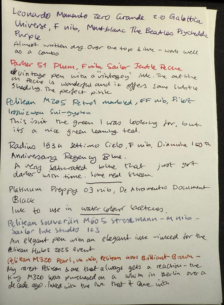
Leonardo Momento Zero Grande 2.0 Galattica Universe – F nib – Montblanc The Beatles Psychedelic Purple – great pen and ink combination. I wrote this pen dry just after writing the sample above.
Parker 51 Plum – F nib – Sailor Jentle Peche – all vintage Parker 51 fountain pens are fabulous and this one is no different. The plum colour is very rare, but I decided to “use the good China”. The ink is a long discontinued Sailor Jentle Peche, a beautiful pink with great shading and outlining. Sailor used to make fantastic inks at great prices – in terrible bottles. It was a struggle to fill this pen, even with their internal ink reservoir dingus.
Pelikan M205 Petrol Marbled – EF nib – Pilot Iroshizuku Sui-gyoku – I was hoping that Sui-gyoku would be the green ink that I was looking for, but it’s more of a teal than a green. The Pelikan M2xx series is a solid workhorse kind of pen, and I highly recommend it.
Radius 1934 Settimo Cielo – F nib – Diamine 150th Anniversary Regency Blue – the ink has grown darker with time, to the point where it’s almost black. This isn’t surprising as it was a very saturated dark blue ink to begin with, and it’s had some time in the pen. I will likely write this pen dry today or tomorrow. The new Radius pens by Leonardo feel very much like Leonardo Momento Zeroes but with a slightly different design. That’s not a bad thing – they are gorgeous pens, and for now they’re slightly cheaper than the Momento Zeroes.
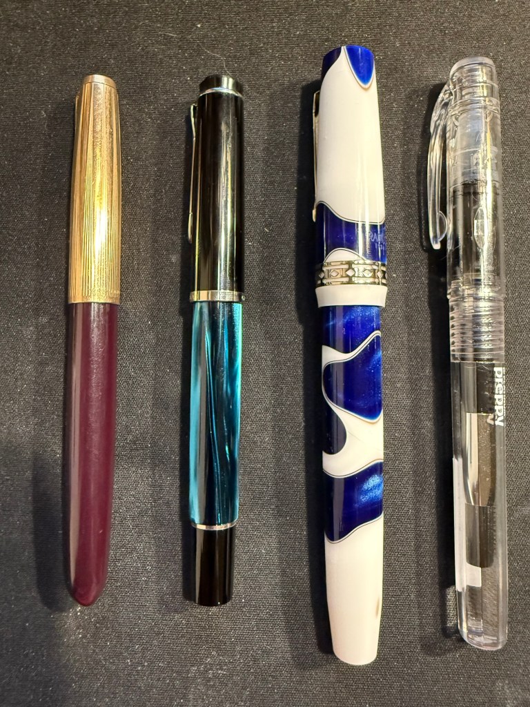
Last week I inked up a new Platinum Preppy 03 nib with De Atramentis Document Ink Black as part of a post that I am working on. It’s the first time I’ve used a Preppy with a converter and not the Platinum cartridge it comes with – and it works well.

I inked these pens today for the Pelikan Hubs event tomorrow:
Pelikan M605 Stresemann – M nib – Sailor Ink Studio 123 – a classic and elegant pen and ink combination. The Sailor 123 is really that good, and the generous medium nib shows off its dual shading properties.
Pelikan M320 Pearl – M nib – Pelikan 4001 Brilliant Brown – my rarest Pelikan, always a crowd pleaser at the hubs. This tiny pen came with a tiny brilliant brown bottle and so far I’ve filled it only with that. I bought it about a decade ago in Berlin on a whim, and I’m so glad that I did.
Pelikan M800 Blue O Blue – F nib – KWZ Exclusive for epiora.pl Błękit Warty Poznania – this pen was a very expensive birthday gift and my first M800 Pelikan. I bought it at a local pen store that no longer exists. The ink is even more special – it’s my first KWZ ink, gifted to me from the store that it was exclusively made for. I had purchase my M600 Glauco Cambon there just before they were closing for the day on the last day of the USK Symposium in Poznan. The name means Poznan Warta Blue – and it’s tied to the unique blue of the city and the Warta river. It’s a gorgeous blue and it reminds of Poznan, the store, the lovely seller and the nice symposium volunteers that saw me in the store and helped me out with my purchase.
Pelikan M400 White Tortoise – M nib – Sailor Ink Studio 767 – This is the green I was looking for! I purchased this ink last month at Choosing Keeping in London, and it’s the perfect bright and cheerful green that I was looking for, with some great shading to boot. The Pelikan Tortoise pens are gorgeous, and this one is a particularly nice one.
Pelikan M805 Ocean Swirl – F nib – Montblanc Maya Blue – I have been priced out of Montblanc inks (there’s only so much I’m willing to pay for ink) but this ink was heavily discounted at the Montblanc boutique in Heathrow. It’s a lovely bright turquoise with great shading, and it works well coupled with this pen.
Pelikan M600 Art Collection Glauco Cambon – F nib – Pilot Iroshizuku Ajisai – this is the pen that I purchased at Epiora in Poznan, and while I saw it online and loved the concept, I never thought that I’d buy it because of the price. Seeing it in person changed my mind because no photos can do this pen justice – the pattern on it glows! It’s beyond vibrant, and the pen body itself feels different than other Pelikans – heavier and cooler to the touch. The ink is also a Choosing Keeping purchase, and I love the colour very much.

Pelikan M620 Place De La Concorde – M nib – Sailor Ink Studio 162 – this is one of my rarer Pelikans, one that I bought a year or two after the series had been complete and no longer for sale. If ever there was a series of pens that I wish that I owned it was the Pelikan M620 City series, and for years I searched for an Athens pen before giving up – it was just too expensive.

Apart from my inked Pelikans, I’m also taking three uninked Pelikans with me – one to fill with the ink that we’ll be getting, and the others just to share.
Are you going to a Pelikan Hub? If so, what pens did you bring with you?