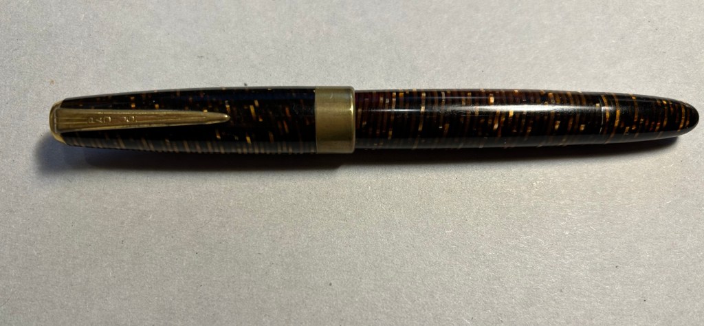
In April 2010 back when I was relatively new to collecting vintage fountain pens, I purchased a vintage Radius Comet on the Fountain Pen Network. The body was brown laminated celluloid, just like Parker striped Vacumatics, and you could see the ink levels through the stripes, just like with a Parker Vacumatic, and it had a jewel on the cap, just like a Parker Vacumatic. It was, however, a piston filler, unlike the Parker Vacumatic, and it had a superflex gold nib, also unlike a Parker Vacumatic. So even though I had never heard of the brand before and there was very little information about them to be found, I took the risk and bought the pen. It cost €120 shipped.
Radius Comet
The pen was obviously user-grade, as there was brassing and tarnishing on the hardware, a lot of micro-scratches on the body, and some ambering in parts of the celluloid. It’s still a good looking pen, though.
The stripes had darkened with time, but some still have their original glow
The design of the clip and the jewel on the end of the cap was clearly influenced by the ultra popular Parker Vacumatic.
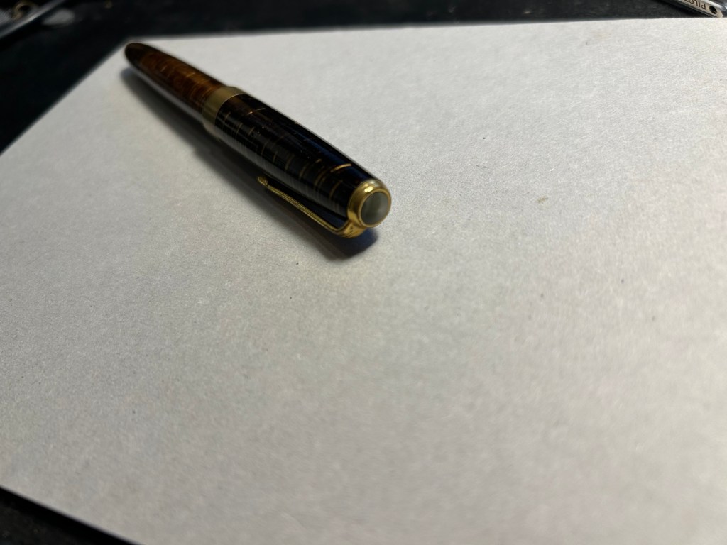
The jewel on top, a clear copy of the Parker design.
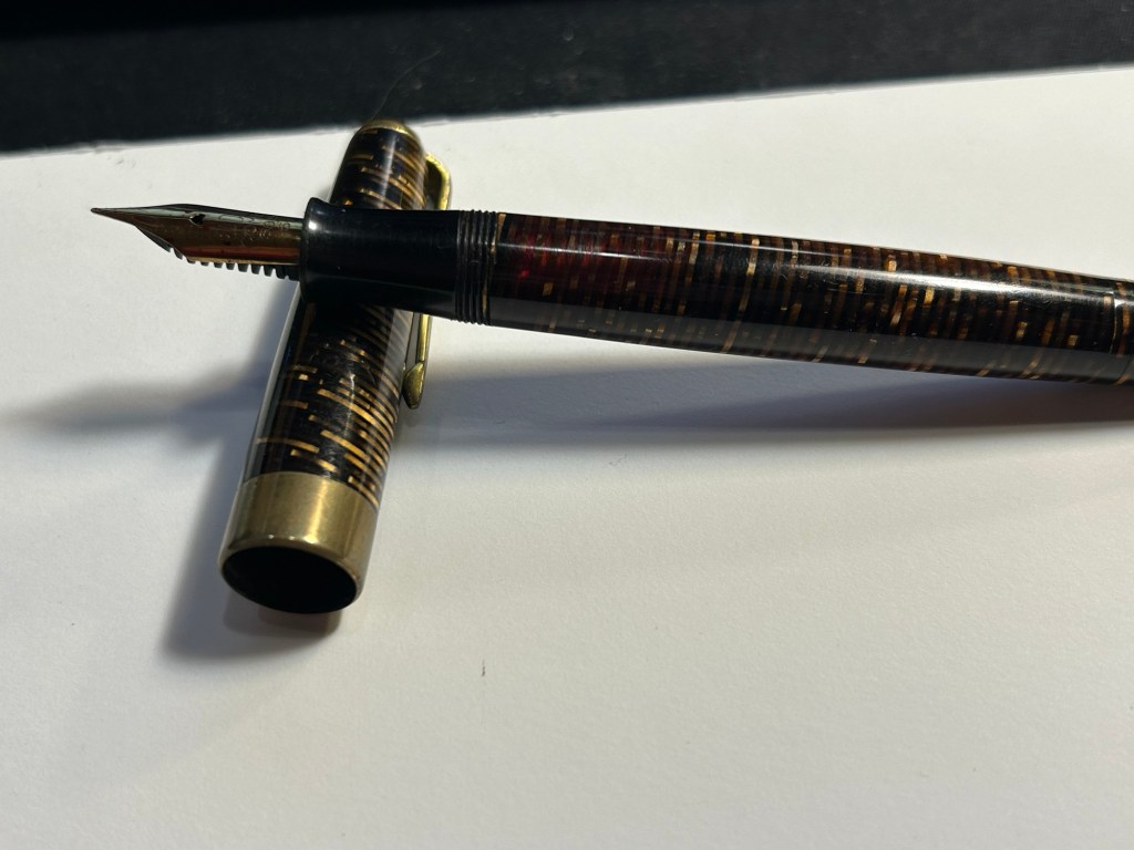
Even though the celluloid has darkened and ambered with time, you can still clearly see the ink levels through the stripes. As a piston filler it has an impressive ink capacity, which works well with the flex nib, as it can lay down a good amount of ink when fully flexed.
You can see the ink levels through the stripes.
It works perfectly – the filling system is and always was a joy to use, and the nib… Well, the literally don’t make nibs like this any more:
The nib
When you apply no pressure it’s a wonderfully smooth fine nib, but when fully flexed it goes up to broad/double broad territory. The feed keeps up with the ink flow with ease, and I’ve never had a hard start with it, ever.
Writing sample on Midori MD paper with Diamine Amaranth
Leonardo has revived the brand in recent years, and now you can buy a brand new Radius with a cartridge/converter system, resin body and (obviously non-flexible) steel nib for around €150, not including shipping. No modern pen manufacturer is capable of creating a pen like the vintage Radius or any of its contemporaries, neither in body material, nibs or filling systems at the price that they were once made. It’s a question of both volume and lost knowledge and tooling, which means that the vintage and new Radius pens have very little to do with each other beyond having the same brand name.
Buying vintage is always a risk in a way buying modern pens isn’t, but the value for money still cannot be beaten. I might buy a modern Radius at some point in the future (I like their designs and I’m curious about the pens), but I have no doubt that in terms of looks, nib and filling system it won’t be able to hold a candle to its well-worn and well-loved vintage namesake.
The second of the Alexandria Quartet this book is much easier to read than the first one, Justine. While it is written from the point of view of the same narrator as Justine was, Balthazar undoes and rewrites significant parts of the previous narrative. This isn’t an accident, but a very deliberate, very well thought out move by Durrell. He’s not merely creating an unreliable narrator, he’s creating a narrator that doesn’t see the full extent of the reality he’s living in, and then has a trusted friend come in and fill in the gaps, correct him, reveal truths he had no way of knowing. As Balthazar’s insights force the narrator to reflect again on what happened in Alexandria at the time, more memories begin to surface and so a few new characters join us (chief among them the enigmatic Mountolive) and a few others get revealed in surprising ways. Nessim becomes fleshed out and more human and relatable as we see him with his brother and mother at the family estate. Scobie shows hidden parts of himself that make him tragically human, and not just a comic relief. Justine too becomes less of a fable and more of an actual person, and Clea gets a bit more depth (though she’s still something of a mythical creature here). Nessim’s brother Narouz and his mother Leila are fantastic characters in and of themselves, and the narrative comes to life with their addition and with the fact that we get some distance from the overly cerebral and neurotic narrator. Balthazar brings high romance to the story, an air of a Victor Hugo novel at times, and so this book flows more easily, is much kinder in its demands from the reader than Justine was.
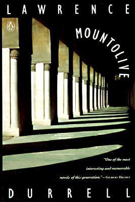
Mountolive, Lawrence Durrell
The third novel in the Alexandria Quartet and the one I was most looking forward to reading. While Justine set the basic story and introduced the main characters, and Balthazar gave new depth, perspective and meaning to their actions, Mountolive overturns them both by giving the characters motives and political context.
Without spoiling the novel, Mountolive introduces David Mountolive, the new British Ambassador to Egypt and Leila’s former lover. Leila is Nessim and Narouz’s mother, and she and her family become the heart of the story, with Darley (the narrator and protagonist of the previous two novels) barely appearing in Mountolive. The narrator changes, pace changes, the love story changes, even the genre changes in this novel compared to the other two, and Durrell has done a magnificent job with this switch. You don’t see it coming, but once he starts revealing what really took place you see that he’s very quietly laid all the groundwork for it there.
Mountolive himself is a fantastic character, and Narouz… I tip my hat to Durrell for creating a larger than life character that could be at home in a Victor Hugo novel and yet is completely believable.
It’s worth reading Justine and Balthazar just to read Mountolive, and no, you can’t skip them just to read this.
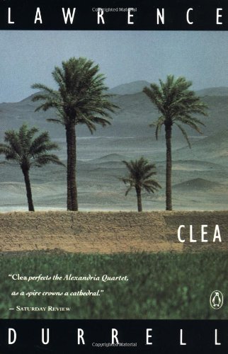
Clea, Lawrence Durrell
The fourth and final book of the Alexandria Quartet Clea takes place a few years after the events in the first three books (which happen simultaneously), during and immediately after WWII. It’s the final layer of a multi-layered narrative, one that reveals more about the characters, allows them to mature, evolve, create new ties and explore old ones. Scobie gains a deserved mythical status, Darley grows up, Clea becomes more human and less of an angel in the shape of a woman, and Justine, Nessim and even Narouz get their final say. Above all this is a farewell to Alexandria, which is arguably the main character in this quartet. The city looms large over the life and events of these novels, providing much more than a setting. Durrell is a master at evoking the spirit of place, and here he is at the heights of his powers, writing what is likely one of the most nuanced, multi-layered, tormented and transcendent boy-meets-girl stories ever written.
The Alexandria Quartet
The Alexandria Quartet as a whole is a difficult and demanding set of novels to read – it makes demands on the reader, and some of the content is hard for both contemporary and current audiences. Yet Durrell isn’t creating a picture postcard of a city, or of his characters. They both have teeth and a significant underbelly and have no problem showing either one. Characters you like show mean, petty and intolerant streaks, and the city is both magnificently charming and a seat of horrors beyond description at the same time.
When it comes to reading demanding books, the question always is “was it worth it”? In the case of The Alexandria Quartet it most certainly is. The dizzying narrative of Justine, that gives to credence to the linear narrative, is overturned by Balthazar, which adds order, depth, insight to it, and a multitude of various contexts. Mountolive adds political and social context and depth over what Balthazar provided, and another set of love stories, this time ones coloured by tragedy. Then Clea breathes time over the trilogy, allowing characters to mature, evolve, reinvent themselves. The artist lost in Mountolive inspires a wedding and two artists found in Clea, and Justine finds her true calling once again.
My only regret with this quartet is that I read it on a kindle. These books require paging backwards and forwards (especially Justine), and they need deep reading not fast reading. I have several more of Durrell’s books that I plan on reading, and all of them are in print format. He is a writer to savour, not to rush through.
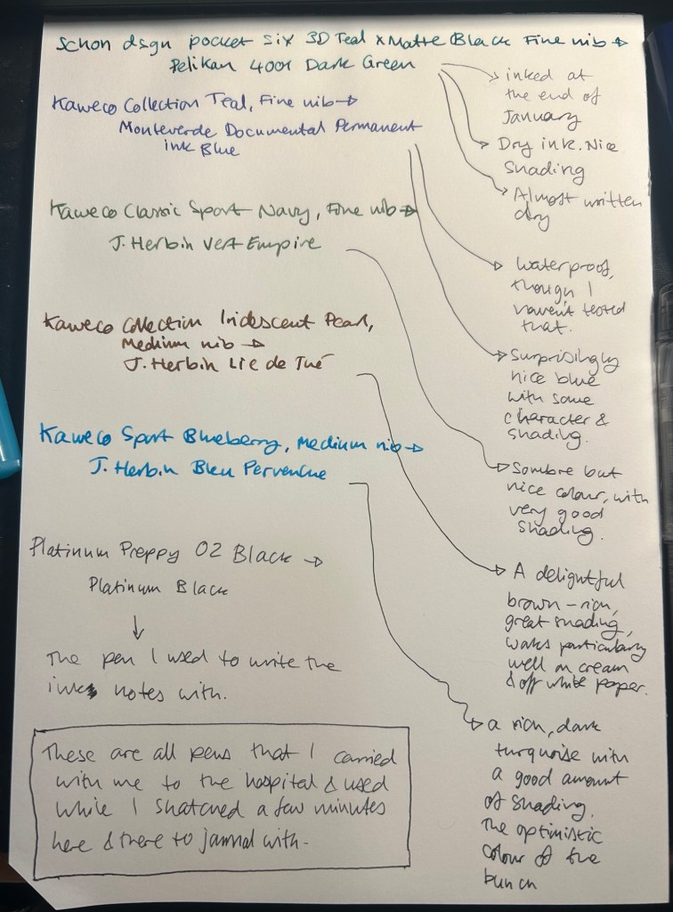
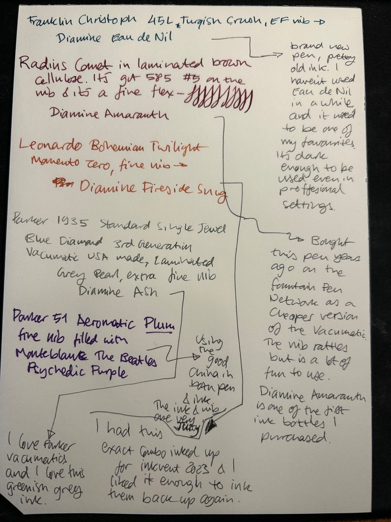
I started the month ready to spend the first half of it in hospital, with my dad. So the fountain pens I chose were all expendable pocketable pens that I was willing to have stolen (apart from the Schon Design Pocket 6 which was a leftover from January and never left my desk). So that meant I inked 4 Kaweco Sport fountain pens using various ink cartridges that I had on hand.
The portable lineup:
Once my dad got out of hospital and back home, I decided to celebrate by “shopping” from my collection. I inked up a Parker 51 Plum (use the good china!), a Parker Vacumatic, a Franklin Christoph 45L Turqish (spelled like that on their site) Crush that I had purchased but hadn’t inked before, and a vintage Radius Comet (because I heard that the brand was being revived).
The Franklin Christoph EF nib isn’t the best companion to the Eau de Nil as the ink tends to dry in the nib, causing hard start issues. The Radius is a flexible nib of the vintage kind, which means it’s really flexible and not just springy. It also rattles, which makes me not carry it around with me — it stays at home at my desk. The Leonardo is a beautiful pen with a beautiful ink that I refilled immediately — the only Inkvent 2023 ink I did that with. The two vintage Parkers are phenomenal, as usual. The extra fine nib on the vacumatic somehow really well with Diamine Ash, though I was worried at first that the combination would be too light to be readable. The Parker 51 Aeromatic is a treat to use. It’s the rare Plum colour, and it’s got a fantastic nib (as all 51’s have) which pairs very nicely with the Monteblanc The Beatles Psychedelic Purple.
In terms of paper I’ve been using Kokuyo A4 KB paper which I cut to half size (so A5) to manage my daily to do list. The paper is relatively cheap and very fountain pen friendly. I’m also able to use both sides of the page despite there being some show through.
Kokuyo A4 KB paper cut in half to A5 size. This is why standards are great.
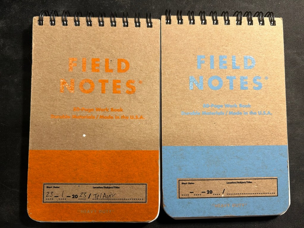
I’ve got a Field Notes Heavy duty on my desk at home and at work, and I just bought a new stock of them. These are where I jot down quick notes, phone call details, doodles during boring meetings. When they’re filled up they get tossed out as nothing in them is permanent — everything important in them moves to somewhere else as I work my way through them.
Field Notes Heavy Duty pocket spiral bound reporter notebooks
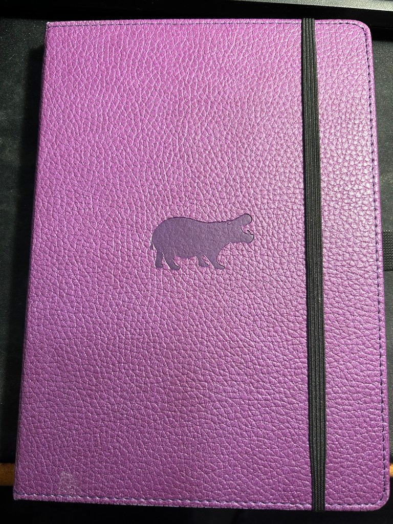
I have finally found a use for my Dingbats notebooks (beyond giving them away as gifts, as I have in the past): this lined purple hippo one is my blog notebook. I discovered that I have a much easier, much quicker time writing blog posts if I first draft them on paper, and this is where I do it in. I’ll likely write a dedicated post to this notebook soon.
Dingbats Puple Hippo A5 lined notebook
Apart from them I still use the notebooks I used last month.
Pencils
I’ve been using the Drehgriffel Nr. 2 as my daily driver. I use pencils extensively to plan, as my plans tend to change, and there’s something about this solid little mechanical pencil that makes me want to use it.
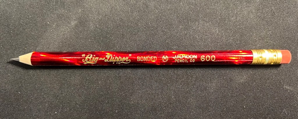
Apart from that I brought two pencils into the rotation, to try to use. One is from my last purchase from the late and great C.W. Pencils Enterprise, and it’s the “Big Dipper” J.R. Moon Pencil Co 600. It’s an oversized pencil, the kind of pencil that kids who are learning to write are expected to use. I’ve been having pretty significant neuropathy in my hands lately and I thought that this would be nice and easy to use, as after all it’s designed for kids just learning to develop their fine motor skills. So far it’s been a disappointment – the eraser and ferrule make it very top heavy, and I’ve been having a hard time manipulating it. I can’t imagine kids using this pencil and having an easy time with it. I like the over the top red foil with gold writing look though, so I haven’t given up on it yet.
Big Dipper J.R. Moon 600
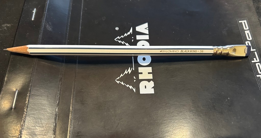
The second pencil is a Blackwing Volumes 56, the baseball themed one. The core is soft and dark, and I’ve been using it for quick and loose sketches. I’m trying to ease into one week 100 people by training myself to work faster than I normally would.
Blackwing Volumes 56
What did you use in February? Any planner changes? Pencil revelations? Pen preferences?
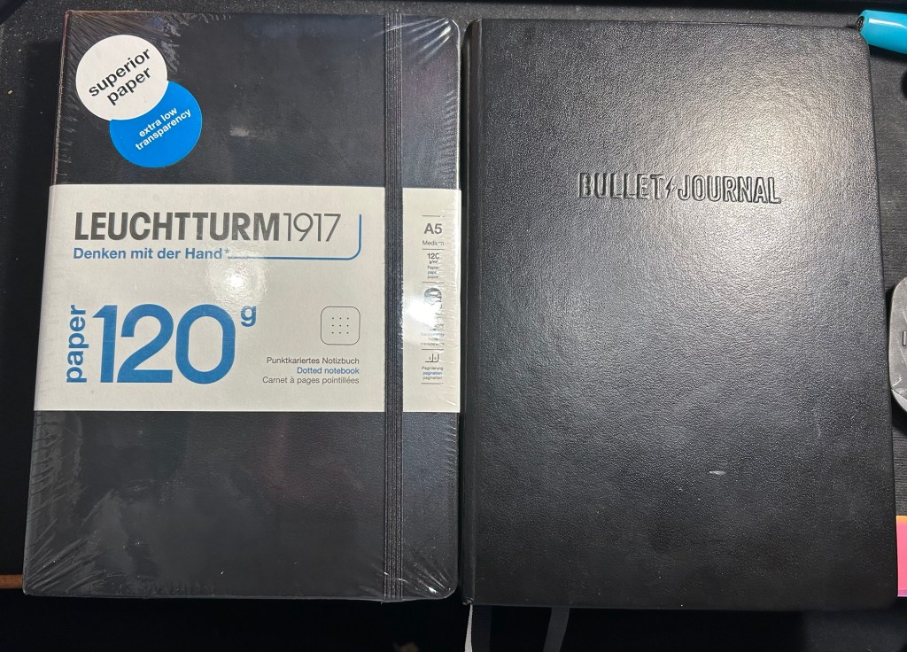
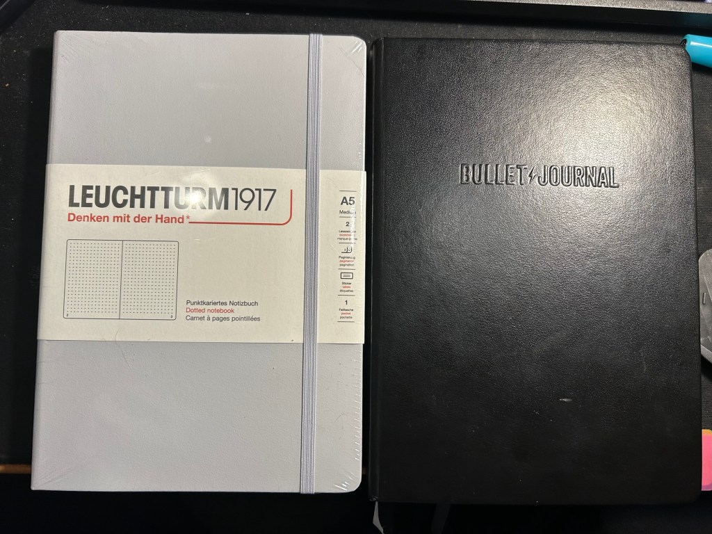
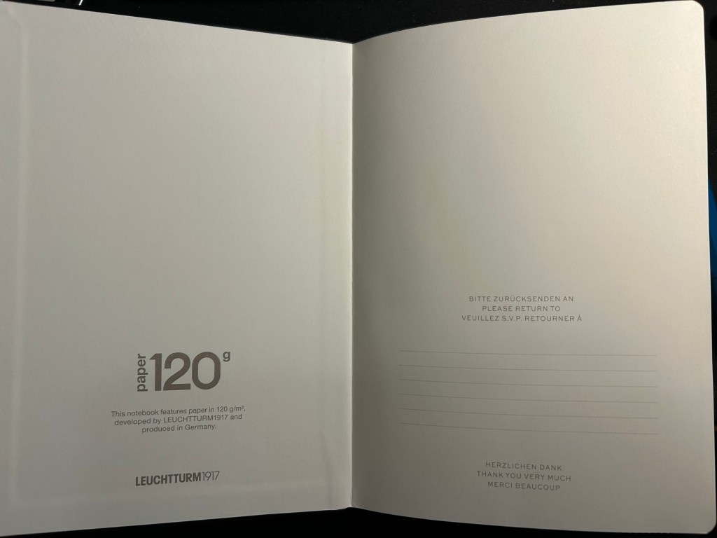
A few months ago I started using the Leuchtturm1917 Bullet Journal – at first as it was intended, but very quickly it turned into a general weekly and quarterly planner for me. As I neared the halfway mark of the notebook I decided to purchase a replacement, but instead of buying another Bullet Journal I purchased a 120gsm dot grid Leuchtturm A5 notebook. The paper was the same in both notebooks, and as I didn’t use any of the Bullet Journal features and the 120gsm notebooks are slightly cheaper, I thought that it would be a good replacement.
While I was still waiting for my 120gsm notebook to arrive, I happened to find a light grey standard (or 80gsm) dot grid A5 Leuchtturm notebook at a local store at a decent price. I purchased it and decided to compare the three notebooks.
The Bullet Journal is the most expensive of the three, but also comes with the most “stuff”. There’s a booklet that explains how to bullet journal, stickers for bullet journaling, a specially formatted front endpaper, a key for bullet journaling, three ribbon bookmarks instead of two, and several pages with dedicated bullet journal appropriate titles (intentions, index, future log). It has the fewest colour options (just three) and features Bullet Journal branding on the front cover and the spine.
The original- Bullet Journal
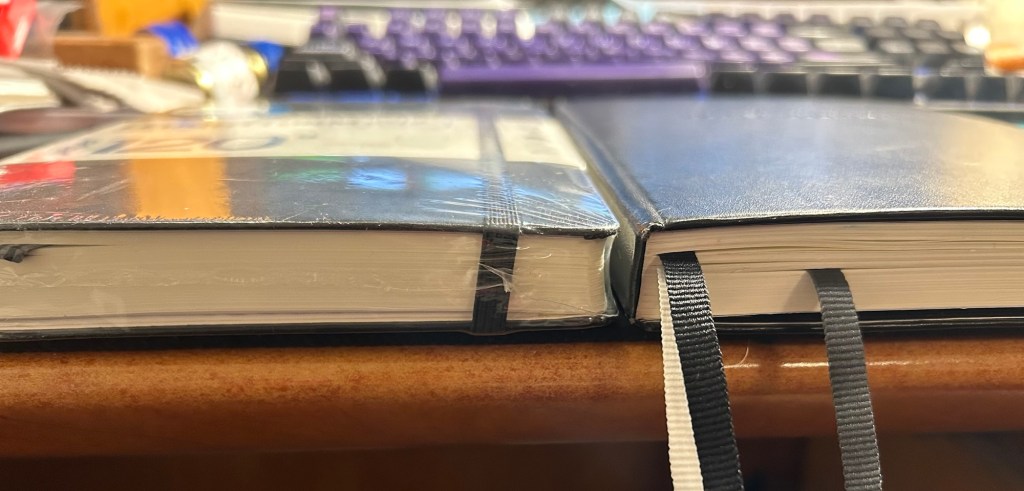
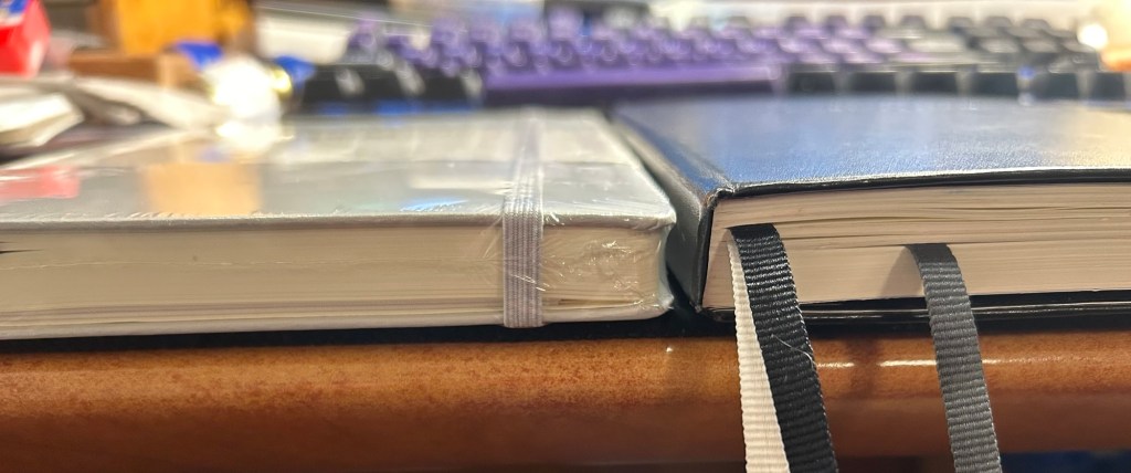
The Leuchtturm 120g notebook has a few more colour options, and is basically a stripped down Bullet Journal edition. In terms of thickness the two notebooks are the same (i.e. very thick notebooks, about twice the thickness of a Moleskine), but the 120g notebook has just two ribbon bookmarks (instead of three), no special endpapers, stickers (beyond the regular ones that come with each Leuchtturm notebook), titled pages, key or booklet. It’s cheaper than the Bullet Journal and has the same paper that the Bullet Journal has.
120gsm on the left, Bullet Journal on the right
Same thickness and form factor:
120gsm on the left, Bullet Journal on the right
The regular Leuchttuem dot grid (which I’ll refer to as the standard from now on) is 20% thinner than the other two, features 80gsm paper and not 120gsm and like the 120g has two ribbon bookmarks, label stickers for the notebook, and a pocket on the back. It’s also a bit lighter than the two other notebooks.
Standard on the left, Bullet Journal on the right
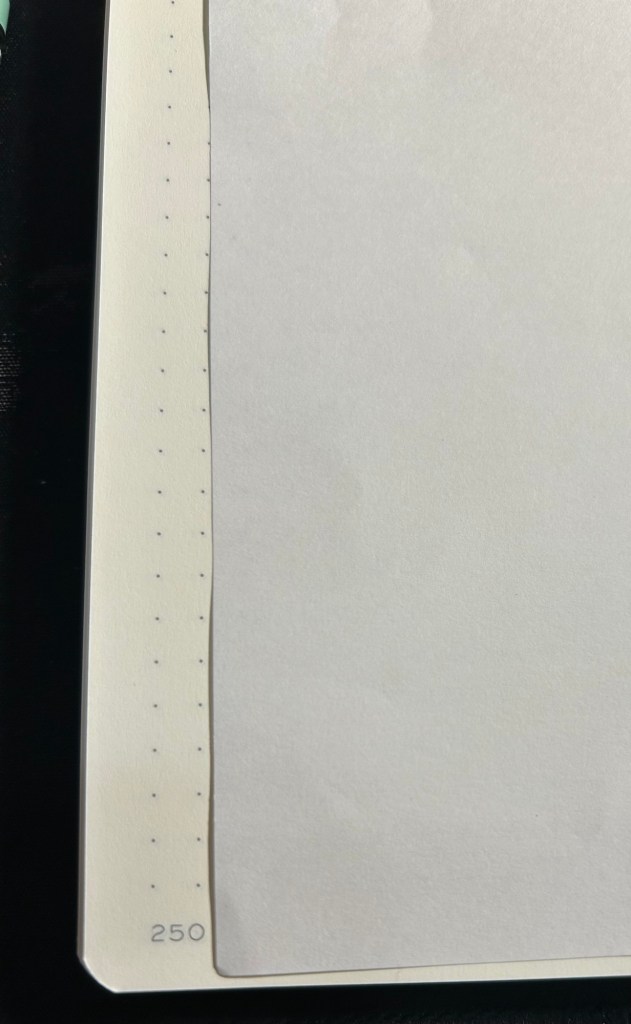
Where the standard notebook wins in a knockout is page count. The standard has 251 pages, the 120gsm has 203 pages and the Bullet Journal has 205 pages, but several of those pages feature dedicated Bullet Journal titles (Index, Future Log, etc).
Standard on the left, Bullet Journal on the right
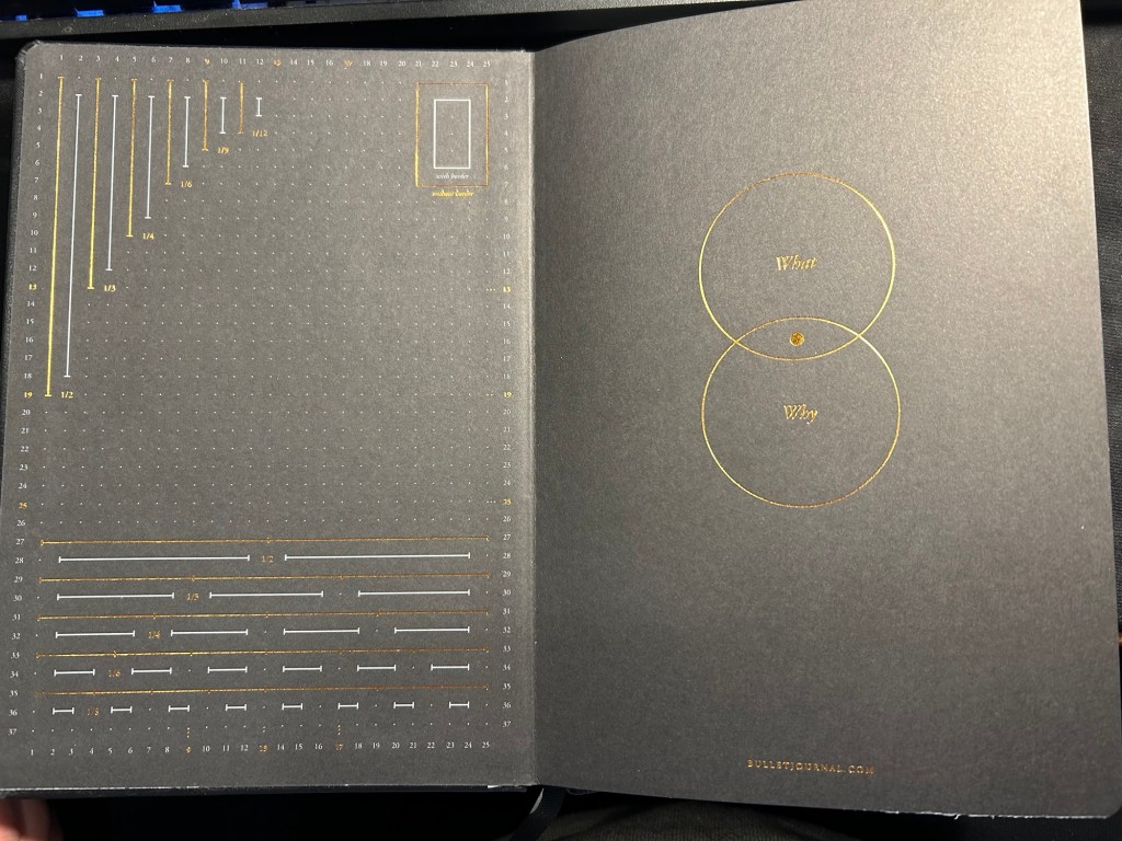
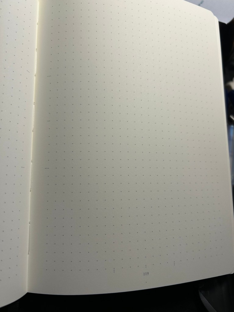
All three notebooks open flat, feature an off white paper, and the last 20 pages are perforated so you can tear them out. The standard and 120gsm contain two lined table of content pages, which the Bullet Journal does not. The Bullet Journal is also the only one to contain special divisions on the paper, which are notated on the front endpaper:
Bullet Journal front endpaper
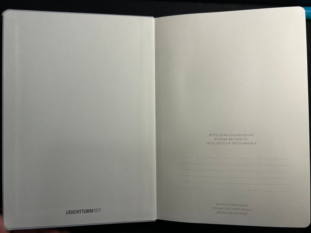
The front endpaper on the standard and the 120gsm look very similar, but the 120gsm has a bit of additional branding:
Standard front endpaper120gsm front endpaper
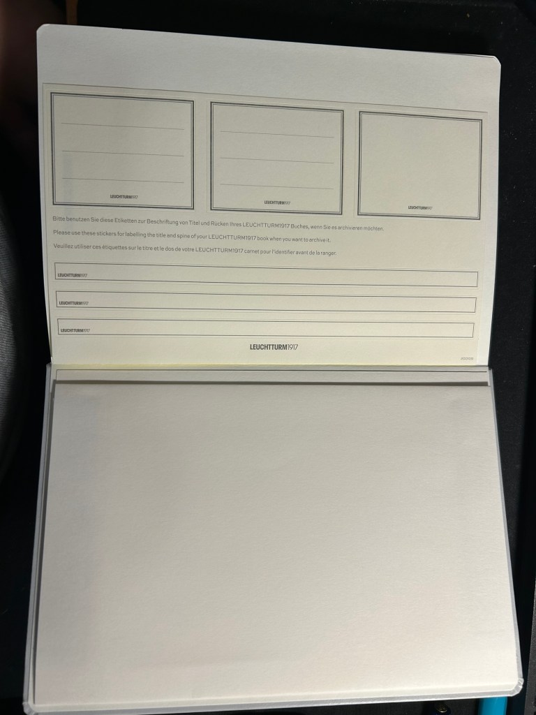
The stickers on the standard and 120gsm are the same, and are meant to be used on the cover and spine, to label the notebook:
Stickers in the Standard and 120gsm
The pockets on all three notebooks look and function pretty much the same.
Back endpapers and pocket in the Standard and 120gsm
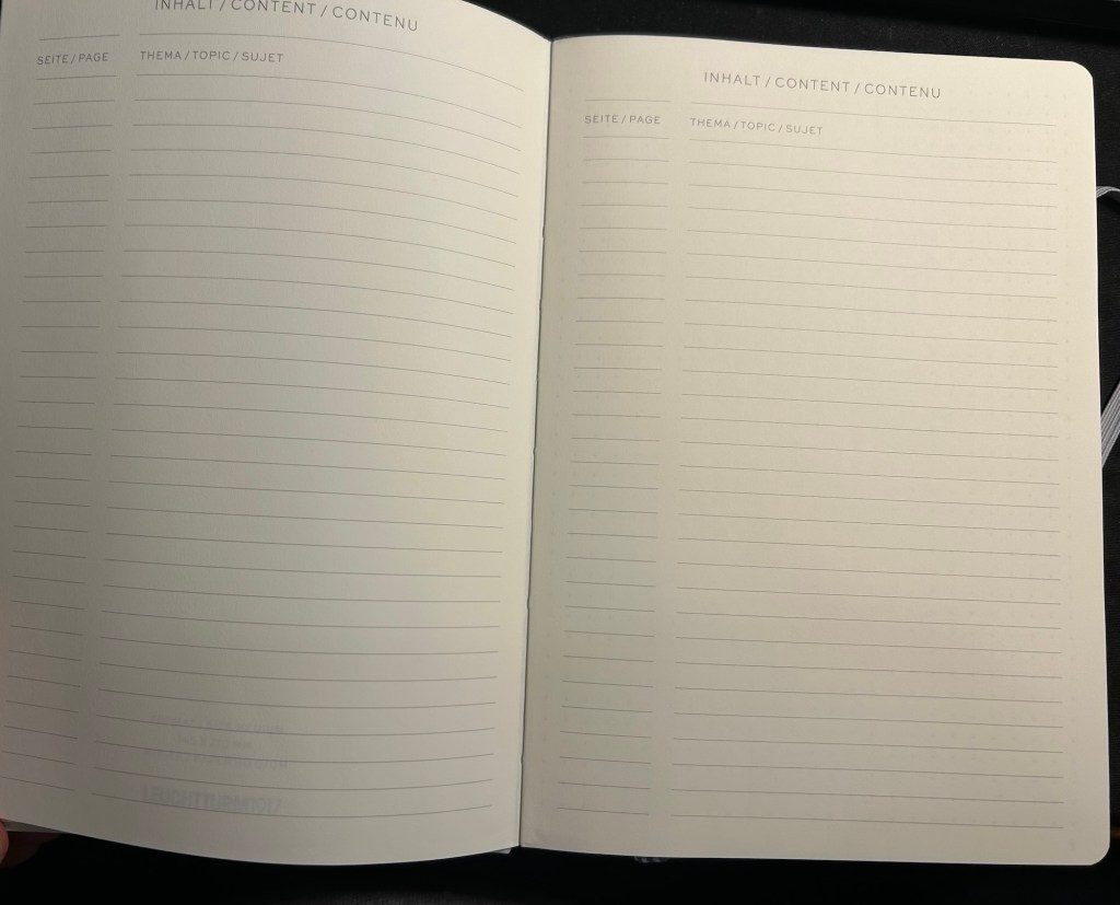
The table of contents pages on the standard and 120gsm is useful if you use your notebook for project management or meeting notes, for instance, and want to be able to quickly reference a certain page. The pages are already numbered, so it’s just a matter of building the reference pages in a way that makes sense to you. This doesn’t exist in the Bullet Journal because Leuchtturm is assuming that you’ll be using the official Bullet Journal way of referencing and finding pages.
What Leuchtturm confusingly calls Bookmarks – two index pages in the Standard and 120gsm
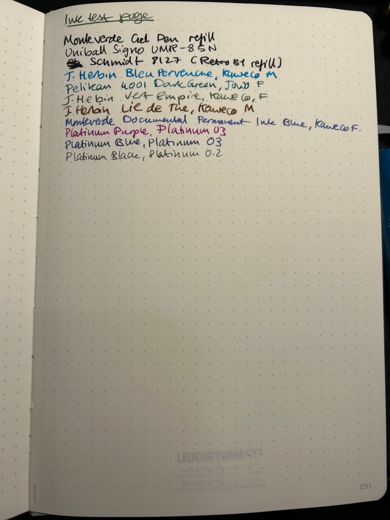
Now for the paper. The dot grid is the same on all three, but the paper in the standard is by far the inferior of the three. The page is practically transparent (you can see the Leuchtturm1917 logo on the back pocket on the bottom of the page) and you will have show through with all kinds of inks, pens and nib sizes, and bleed through with most pens and inks (including wider gel ink pens!):
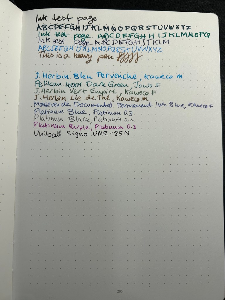
Ink test page for the Standard
This is a notebook that you either need to use with a very specific kind of pen, or be willing to write on only one side of the page (therefore giving up on the price and page number advantage of the notebook):
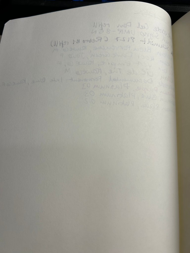
Show through and bleed through on the Standard. Even the gel inks faired poorly.
Here’s a close up of the way the ink behaved. This is fountain pen friendly paper in terms of it not spreading or feathering, but the bleed through and show through will limit you to fine and extra fine nibs and less saturated inks:
No feathering, some spread with the Retro 51 refill
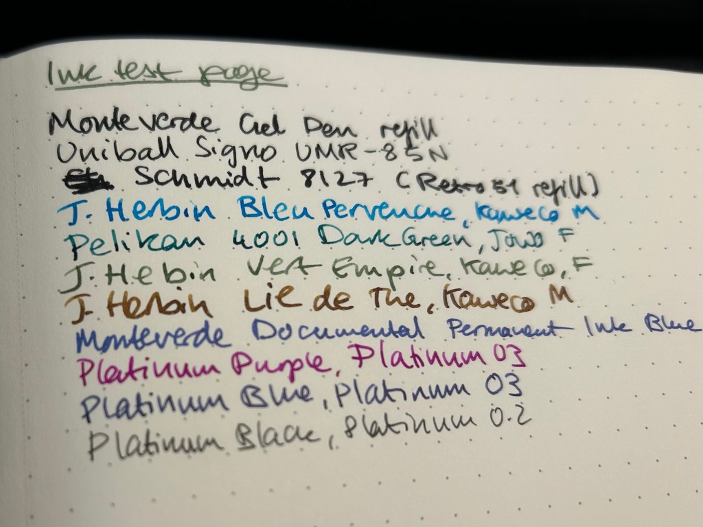
The 120gsm paper on both the Bullet Journal and the 120gsm notebook fair much better:
Ink test page on the 120gsm
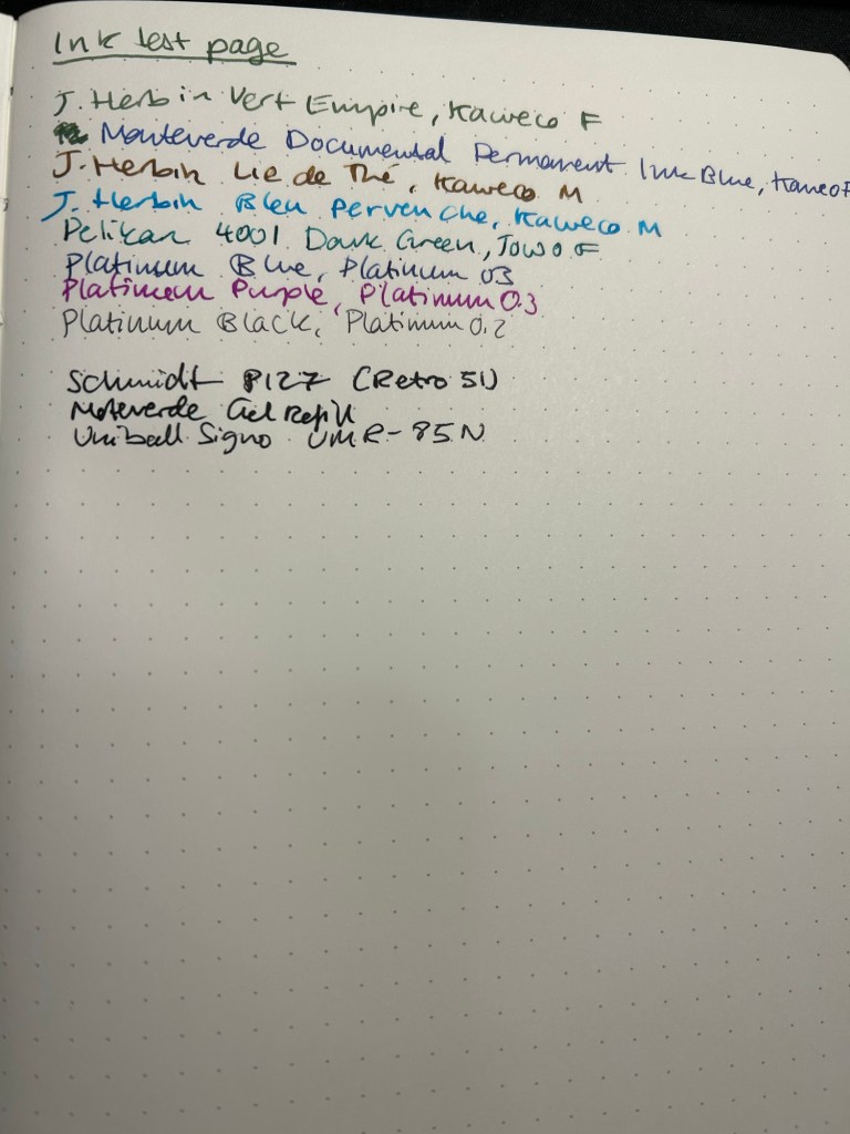
You can definitely use both sides of the page with this notebook, and feel free to toss every kind of nib width and ink at it — I haven’t found one that it can’t handle.
Back of the 120gsm (Bullet Journal was the same)
I’ve been using the Bullet Journal for a while now and I have had no problems using even broad and flexible nibs on it, with wet inks. Inks take time to dry on it, but they don’t bleed through.
Ink test page with example of wet and wide nibs on the Bullet Journal
The paper in all three journals is off white. That may bother you. Here’s the page with a sample of a white page next to it:
Paper colour sample – Leuchtturm vs white paper
At the bottom and the left side of the page you can see the special Bullet Journal divisions, meant to help you create various BuJo formats of things. They’re very unobtrusive, so you can easily ignore them if you don’t need them:
Bullet Journal markings on the bottom and on the left margin
So, basically:
Standard — cheapest one, thinnest and lightest with the most pages. Works only if you use fine gel ink pens or fine and extra-fine nibs with unsaturated or light coloured inks. If you write with a heavy hand, or prefer to use ballpoints this paper will likely note work for you, as you’ll carve your way through several pages without really intending to. If you’re willing and able to work around its limitations, it’s worth getting. It’s also more widely available and comes with a much larger range of cover colours than the other two.
120gsm – when in doubt, get this notebook. It’s got the best paper for the least amount of money of the three. If two ribbon bookmarks aren’t enough for you, it’s likely that you’ll need more than three anyway — get post it tabs. If you don’t have to have the Bullet Journal addons and formatting, save a few bucks and get this notebook. You’ll also have a few more cover colour options.
Bullet Journal — get this if you want to use the Bullet Journal method or you want to try it. If you end up deciding not to use the method, you’re still left with a great notebook, and you can buy the 120gsm next time.
I hope this helps clarify things a bit. Personally I’m currently using the Bullet Journal as a regular notebook (my quarterly planning, weekly planner and long term lists are in it) after failing to find value in the Bullet Journal system, and the standard notebook for work projects. The 120gsm will replace the Bullet Journal once I’ve filled it.
I started losing my hair after the second chemo treatment.
It was terrifying.
You don’t realize what losing your due to chemo means until you’ve experienced it first hand. It’s not like your hair sheds more, as it does with women postpartum or when men start losing their hair after a certain age.
It falls out in large clumps, without warning. You brush your hand casually against your hair and are left with a thick clump of it in your hand. It was like something out of a cheap horror movie, like some sort of farce. I had no idea my body could do that. Why hadn’t anyone told me that this was how it was going to be?
It also hurt. It was if my scalp suddenly felt the weight of each and every hair, and it couldn’t take it anymore. Imagine the feeling of having weights tied to each hair follicle, constantly tugging your hair down, and you’ll get some kind of idea how it feels.
I lost the most hair during the first shower after my second chemo treatment, and I couldn’t get to the hairdresser fast enough. “Off, I want all of it off!” I commanded him. He gave me a buzzcut that made me look like a punky 16 year old, but I was relieved. My scalp stopped hurting, and I didn’t see hair falling out in clumps anymore. Yes, my hair kept falling out throughout the treatments — normal hair falling out an a strange fuzzy plume growing instead only to fall out too — but I didn’t feel it and I didn’t see the scary clumps. That was good enough for me.
You see it was these clumps that gave me a vivid visual representation of just what my body was going through. You don’t otherwise see the damage the chemotherapy is doing to each and every one of your cells — you just feel it. So when I go that buzzcut I was taking control, pushing the damage away so I could better handle it. Other patients react differently to this message — oftentimes with denial, or by fighting it. They hold on to every wisp of hair, they hope against hope that somehow they won’t be affected.
At the time I thought they were being silly and immature and just causing themselves unnecessary pain. I know better now. This journey is excruciatingly hard and scary for anyone who goes through it. What gets you through, how you react to it, these are personal things that cannot and should not be judged, even by a fellow cancer patient. Some of us need to mourn through our hair. I needed to learn that and accept that. One of the things that helped me do that is the bitter realization that we live in a world where losing your hair isn’t a superficial change.
My dad went through open heart surgery to replace his aortic valve and repair his aorta. The surgery went well, but the recovery is long and hard. He’s home now bus still severely limited in what he can do, and dealing with the surgery’s side effects. We have about a month more of regular tests, hospital visits, and recovery before he can start building back his strength again.
I’ve had a lot of hospital time lately, which has meant a PTSD flare up. I’m struggling not to fall back to my old coping habits, and I’m journaling a lot to help with that – journaling and running.
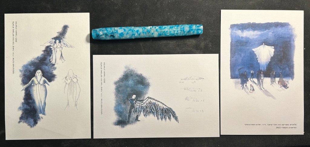
I went to see a special “Angels in America” event – part 1 and part 2 in the same day, with a panel with the production’s creatives, and an exhibition about the play in between. It was a fantastic and very moving experience, and the 6 1/2 hours of the play passed in the blink of an eye. I bought three postcards with sketches from the production development and will use them to send postcards to my family.
Angels in America postcards
Next month is my turn at the hospital, as my oncological checkup is coming up. I’ve started lining up the pre-checkup appointments and tests, but I really hope that I get my stress levels from my dad’s procedure down ASAP because they’re about to sky-rocket as the checkup day approaches.
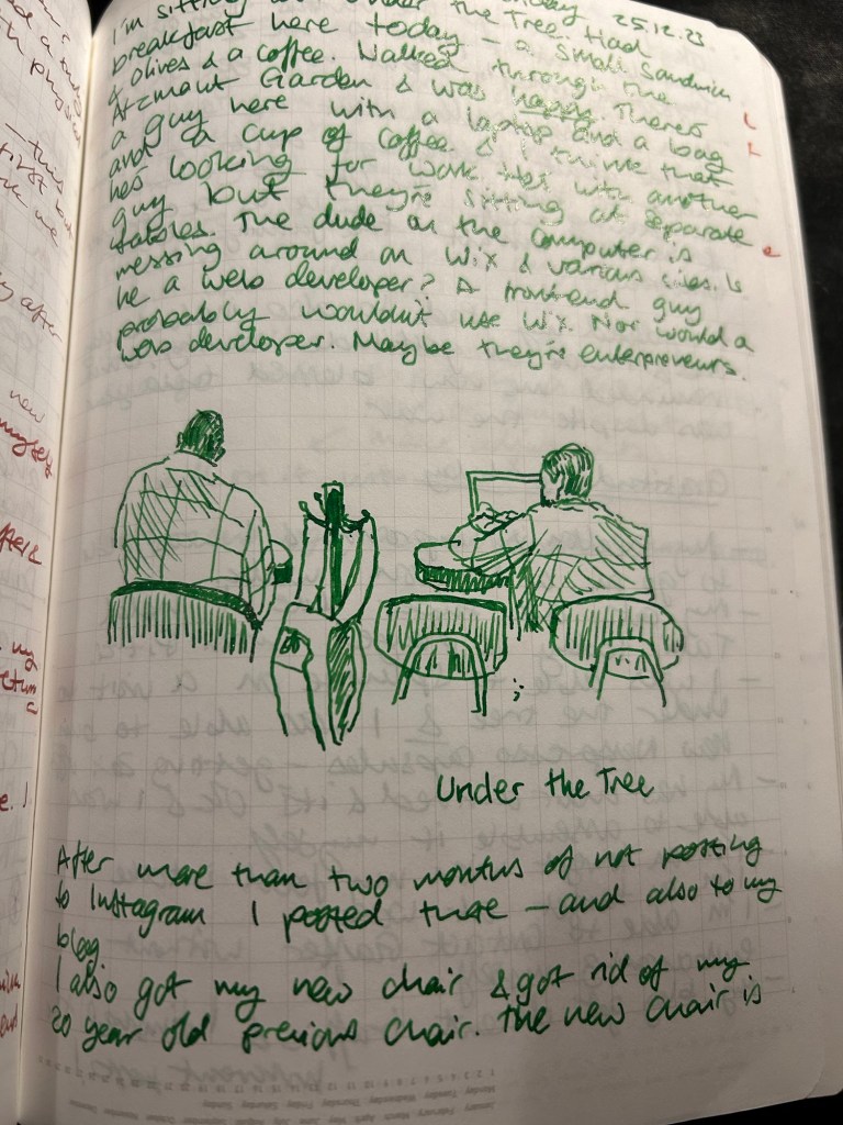
Next month is one week 100 people and I intend to join it again – but this time I won’t be posting to social media. I’ve stopped posting and using social media for the past two months, and it’s been tremendously beneficial for both my productivity and my mental state. If you need encouragement to do the same I suggest watching this video or reading Cal Neport’s Deep Work.
I’m about to restart the cancer project (a series of essays on my journey with cancer), but not through the alphabet superset challenge, nor are my posts going to be deeply technical. I’m going back to personal essays with insights and tips embedded in them. I find them to be more genuine and more genuinely useful, and I didn’t like the arbitrary constraint of the alphabetical posts as a framework for the subject.
After finishing my previous journal I just started a new journal, which is both an exciting and daunting prospect whenever it happens. There is so much potential in a new journal – it makes me want to crack it open and fill as many pages as possible in the first sitting. Yet opening that first blank page also makes me freeze in fear of “ruining” a perfectly good notebook with my scrawls.
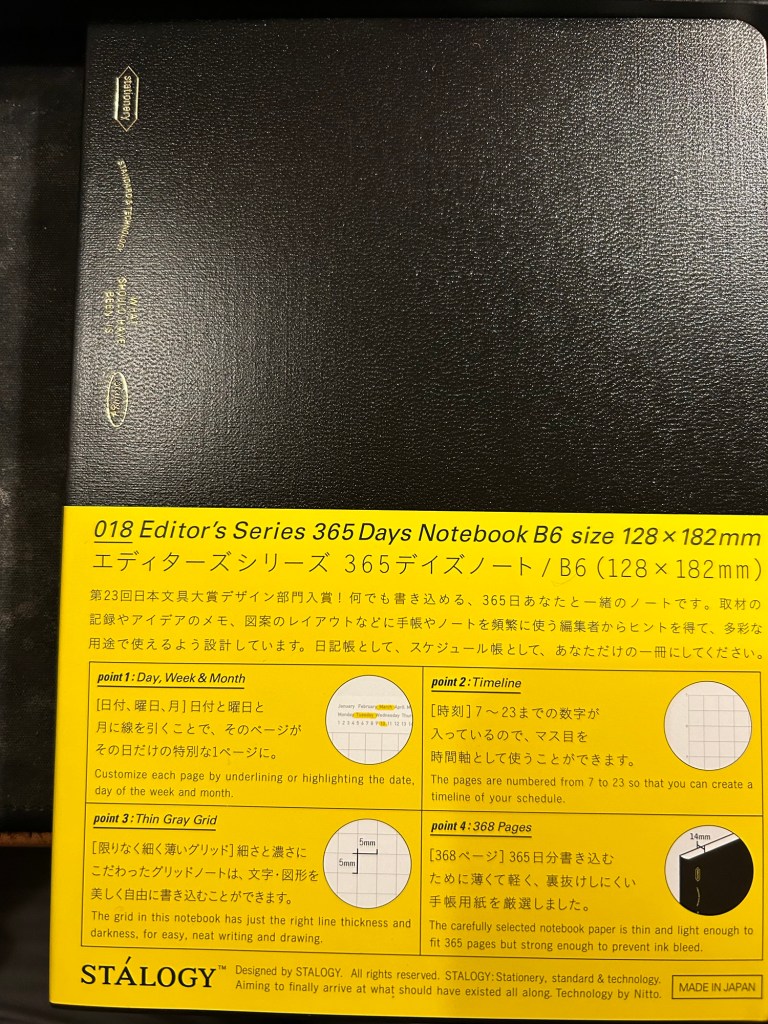
Stalogy 365 Days B6
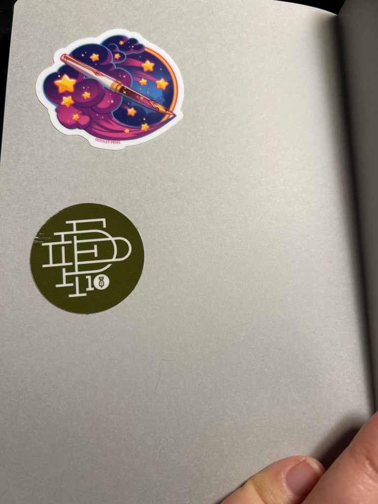
There are many tips on how to overcome that fear, ranging from deliberately destroying the first few pages to using various formulas to inspire you to fill those first pages. What I currently do is just open a new Stalogy 365 Days notebook, turn it upside down (so the header, which I don’t like, is at the bottom) and slap 2-3 stickers on the back endpages. This time I chose a 10th anniversary fountain pen day sticker and a Goulet Pens dream pen sticker to start off, but I usually add a few more stickers as I use the journal.
Stickers on the back
I then turned to the first page and started my first journal entry with the following sentence:
“New journal! My third Stalogy 365.”
After that came my usual daily gratitude list, and so I had most of the first page filled up in no time and had no problem moving on after that.
For those still in search for “new journal” inspiration, here are some pointers:
Personalize your new journal in some way. It’s about to hold your innermost thoughts, so you might as well make it your own.
Switch formats mercilessly if you find an old journaling format isn’t working for you – page size, ruling, type, etc.
Have a starting formula for your journal. If you find it difficult to start journaling each day, then pick a formula that you can use each day – like a daily gratitude list, a quote, notes about the weather, your plans for the day.
The first few entries are the hardest, but they’re also only 2-3 days out of the entire life of a journal. It’s worth remembering that and plowing through those days.
When in doubt pick a quote from a book or article you’re reading and start a discussion with the author.
If you’re really at a loss for starting ideas, use the first page, not the last one, as an ink testing page.
Do you have any new journal rituals or tips? Do you enjoy starting a new journal or find it daunting?
As I’m writing this I’m two or three pages away from finishing another journal. It’s not the first journal that I’ve finished, but somehow it’s always a tiny, little momentous occasion. After all from the moment we crack open a new notebook and dare to write on its pristine pages we envision this outcome: a notebook chock full of words, sketches and mementos.
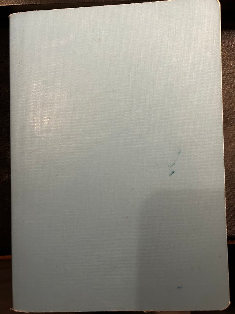
Slightly frayed and ink stained but this Stalogy 365Days B6 notebook has served me well for about 6 months
For me the end of a journal offers a change to review and reflect on its contents. The last few pages aren’t used for normal journaling, but rather are reserved for me to write notes in as I leaf through the completed journal’s pages. What key moments does it hold? What revelations? How can I look back with kindness at moments of weakness or failure, and how can I learn and grow from them? This is not always a pleasant or easy experience, but I have always found it worthwhile.
Sample page with a sketch.
This is also a time when I consider whether I need to switch a journal format or not. I’ve been using the Stalogy Editor’s Series 365Days B6 notebook for the past two journals and I’ve been happy with it, so that’s what I’ll continue using for now.
What about you? Do you have any “end of journal” or “end of notebook” habits and rituals?
I’ve been spending practically every day for the past week or so with my dad in hospital.
There’s this phenomena that when you most need journaling, the it will help you the most, you find yourself least able to do it.
Hospitals are journaling hostile environments. There are no tables to use, there’s constant noise and distractions, there’s zero privacy and you never know when the staff will pop into the room with something. Whether you yourself are hospitalized or you’re there with someone else, there’s very little opportunity to crack open your journal and start writing.
Hospitals are also where weird, interesting, scary and new things happen, so you generally do what to write about them, to process them on paper. Fo instance, today three policemen escorted a prisoner into the heart surgery department. It wasn’t something I ever expected to see, a sort of non-sequitur that took me a minute or two to process.
The solution is to take temporary notes on your phone, put a reminder for an appointment with your journal in the evening or when things quiet down around you.
If you’re the one hospitalized, try to journal two or three times a day, documenting what’s going on, how you’re feeling, what the staff said, who visited you, etc. The best time to journal is during the nursing staff shift changes, because that’s when nobody will bother you.
Journaling is like running – oftentimes it’s really hard to start, but I haven’t regretted a run or a journaling session yet.
At night you can escape to these empty spaces and write