Since November 2023 I have picked up a new habit of sorts – writing letters without posting them. I address them to people I know, some alive, some no longer so, and they’re usually short – an A5 page or two at the most. I write them with no intention of ever posting them, and I deliberately phrase them as letters to a specific person.
Why would I do that?
This started because I wanted to write about certain things with a particular person in mind, and I knew that with the state of our local post office they would never be posted. This was fine by me as I didn’t have the time and mental capacity to start and maintain a true correspondence with someone.
I wanted to write a letter and not a journal entry because I wanted to address my thoughts to someone. When you write a letter you find yourself shaping your thoughts, points, ideas to fit to the person you’re addressing – whether you’re trying to convince them of something, explain something to them, let them know what’s going on in your life, or argue with them. The writing needs to be clear, poignant, convincing and oftentimes entertaining.
I can be sloppy in my journal writing, but letter writing requires more discipline and care. It’s a good writing and thinking practice even if you have no aspirations of being a writer.
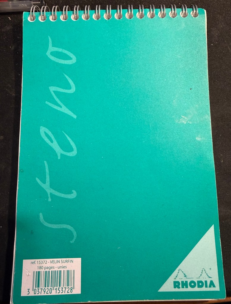
The pad that I use
Who do I address the letters to?
Mostly dead people. Dead mentors, dead relatives, people that are no longer in my life. I keep them posted on what’s going on, wonder what their opinion would be of current events, and through writing to them I work out what I think of what’s going on in my life and the world. Occasionally I’ll write to people that are alive and well and in my life – just things that I want to get off my chest but that are better off unsaid. Unlike what social media would have you think, not all thoughts are worth publicly airing.
I use a Rhodia blank steno pad and whatever fountain pens I have in rotation. The medium is less important than the actual practice. I tend to write about one or two letters a month, although there are months that I write more letters in and those where I write none at all.
I’d recommend giving this idea a try, and start by writing to people you know and not celebrities or famous people. It’s easier addressing someone you’re familiar with – like a grandmother, aunt, cousin or teacher. You can destroy the letter after you wrote it – the point of this exercise is the writing process of the letter itself, not the resulting letter.
I think you’ll find that it will give you some clarity and peace of mind.
I wrote about my newest notebook, my “Work in Progress” notebook here. It’s basically a notebook that I use for self improvement, dedicated for various exercises in focused meditation, working through gnarly personal issues, and for more intense personal journaling.
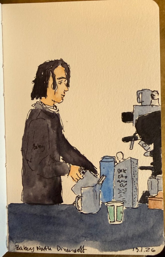
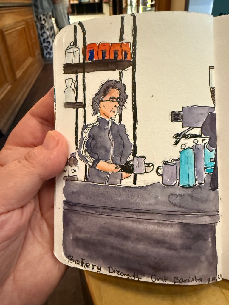
Barista sketch because people need pictures in posts or they get bored.
One of the things that I do as an ongoing exercise in this notebook is keep a list of people that I personally know (so no celebrities or influencers) and what I learned from them. The idea came to me as I was reading Marcus Aurelius’s Meditations.
The book starts with a list of people that Marcus is indebted to – from his immediate family, then onwards to friends, teachers and advisers. This inspired me to create a similar list of my own, also starting from my immediate family and expanding onwards from that.
Some people are kind, inspiring, provide a good example and so they were easy to add to the list. Others were more challenging, but I forced myself to confront my relationship to them, and to find the valuable lessons that I learned from them. The point isn’t to be vicious, cynical, or facetious, but rather to take a second look at people and relationships that you have labelled in a certain way. So the terrible boss taught me what I value in myself and in my managers, certain mean people taught me how to recognise hypocrites, and bad teachers taught me to appreciate good ones and to learn on my own.
I highly recommend doing this exercise and returning to it. It will make you appreciate and feel grateful for the people in your life, and you may even be moved to thank a few of them, even though that’s not the point of this. The point is to realise that:
No man is an island,
Entire of itself;
Every man is a piece of the continent,
A part of the main.
If a clod be washed away by the sea,
Europe is the less,
As well as if a promontory were:
As well as if a manor of thy friend’s
Or of thine own were.
Any man’s death diminishes me,
Because I am involved in mankind.
And therefore never send to know for whom the bell tolls;
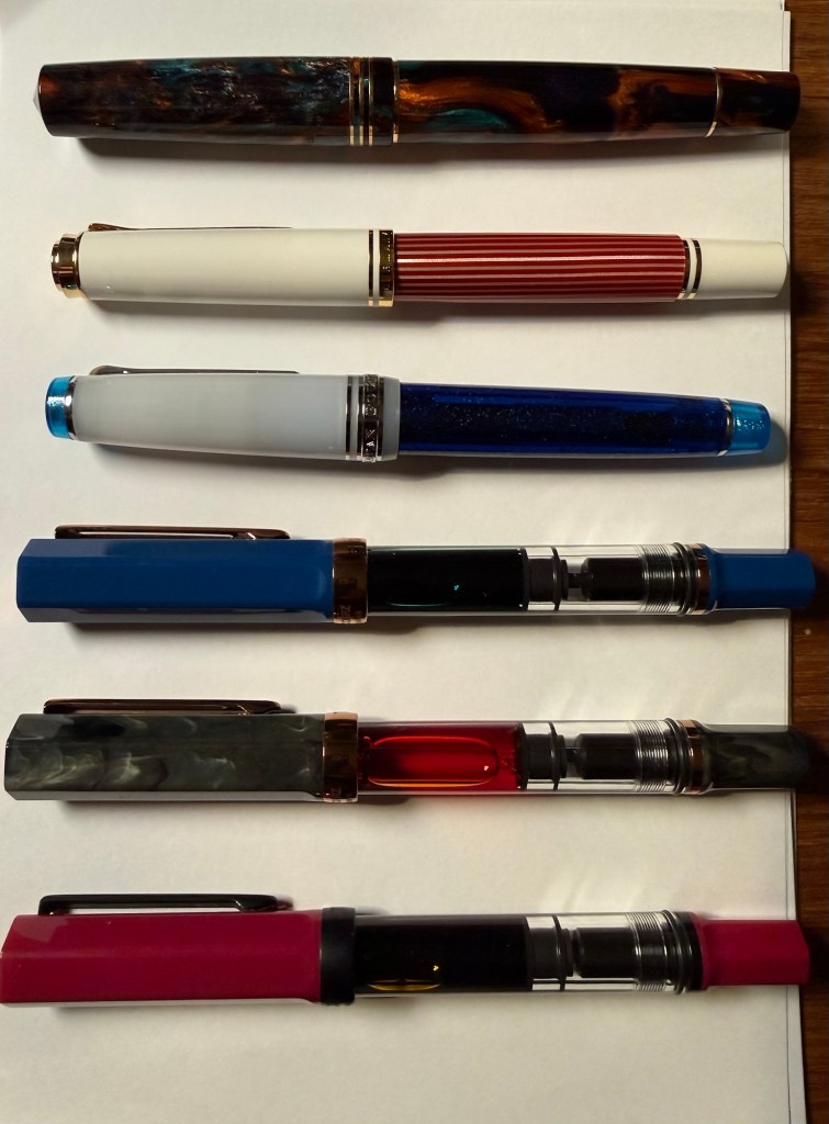
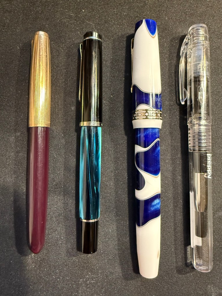
It’s been a while since I’ve posted one of these, mostly because through November I was still working through the Pelikan Hubs pens and then December was Inkvent time. However, I have just cleaned out all of my fountain pens and started out with a fresh batch for the new year. Here’s the lineup for January, and it’s mostly dedicated to new pens with interesting inks.
The pens top to bottom: Leonardo Bohemian Twilight, Pelikan M600 Red and White, Sailor Pro Gear Sunlight from the Ocean Floor, TWSBI ECO indigo blue and bronze, TWSBI ECO Serpentine and bronze and TWSBI ECO Plum and onyx
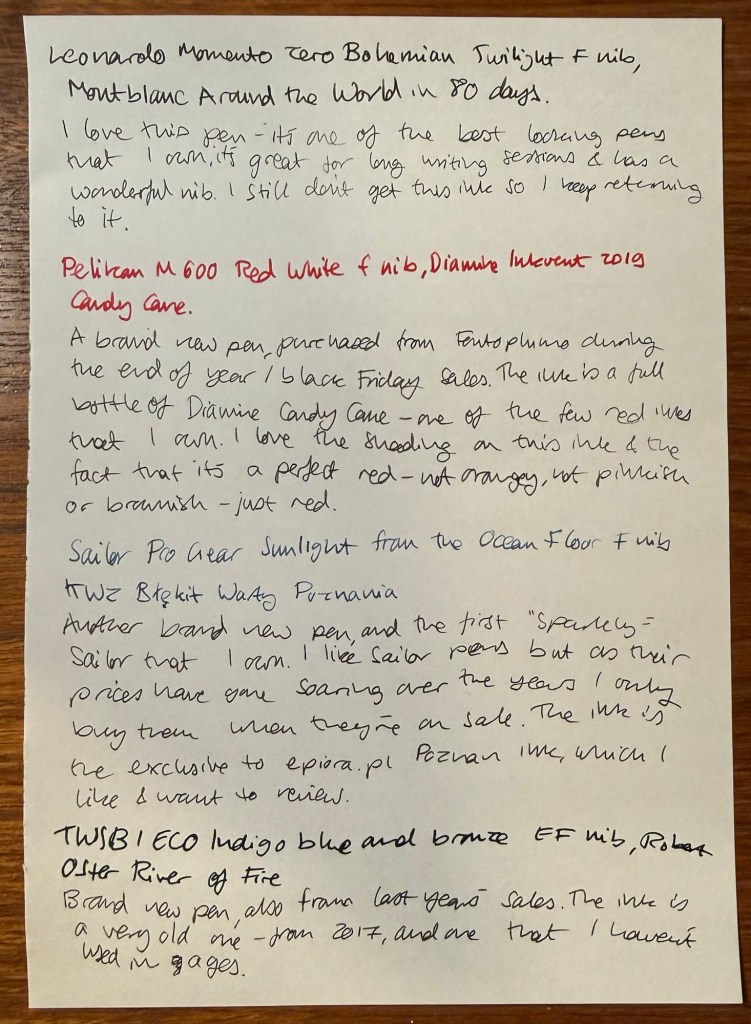
Leonardo Momento Zero Bohemian Twilight fine nib inked with Montblanc Around the World in 80 Days. I love this pen so much – the minute I saw it as I was stowing away my cleaned out pens I realised that I have to ink it again. It hasn’t been far from rotation from the minute I purchased it, because it’s a gorgeous pen with a wonderful nib that is comfortable for long writing sessions. The ink is beguiling – ever since I realised that it isn’t the mustard green that I was expecting I keep trying to figure it out. It’s on the spectrum between dark grey and blue-black, and there’s something about weirdly undefinable inks that appeals to me.
Pelikan M600 Red and White fine nib inked with Diamine Inkvent 2019 Candy Cane. I reviewed the ink here (it was from the first Inkvent calendar) and I liked the ink enough to buy a full bottle of it. Pelikan M600 is my favourite Pelikan size (even though there’s not much difference between it and the M800) and I didn’t have any of the red editions of the Pelikan Souveran line. When this one went on sale I just had to buy it. Pelikan’s are workhorses with a giant ink capacity and fantastic nibs. If you don’t have one, I recommend buying an M200 at least, and splurging on the M600 or M800 when you can. Note that Pelikan nibs are wider than their Japanese counterparts.
Sailor Pro Gear Sunlight from the Ocean Floor fine nib inked with KWZ Exclusive for epiora.pl Błękit Warty Poznani. This is my first sparkly Sailor fountain pen (most of my Sailor fountain pens are black, from the time before they started issuing pens in wild colours and sparkly finishes) and I bought it on sale. As Sailor have raised and raised their prices over the years I only buy them when they’re heavily discounted. Sailor fine nibs as usual are very fine and with plenty of feedback. The ink is an exclusive that KWZ created for a lovely local fountain pen store in Poznan, Poland called Epiora. I bought my Pelikan Art Edition there during the last day of the Urban Sketchers symposium and I got this ink for free. My plan is to review it, as it’s an attractive blue-black.
TWSBI ECO Indigo blue and bronze extra fine nib inked with Robert Oster River of Fire. A brand new pen for me, purchased at the same time as the other TWSBI ECOs in this rotation. The ink is old, from 2017, and an ink that I haven’t used in years. It’s very saturated, we’ll see how well it behaves on various notebooks.
Writing sample
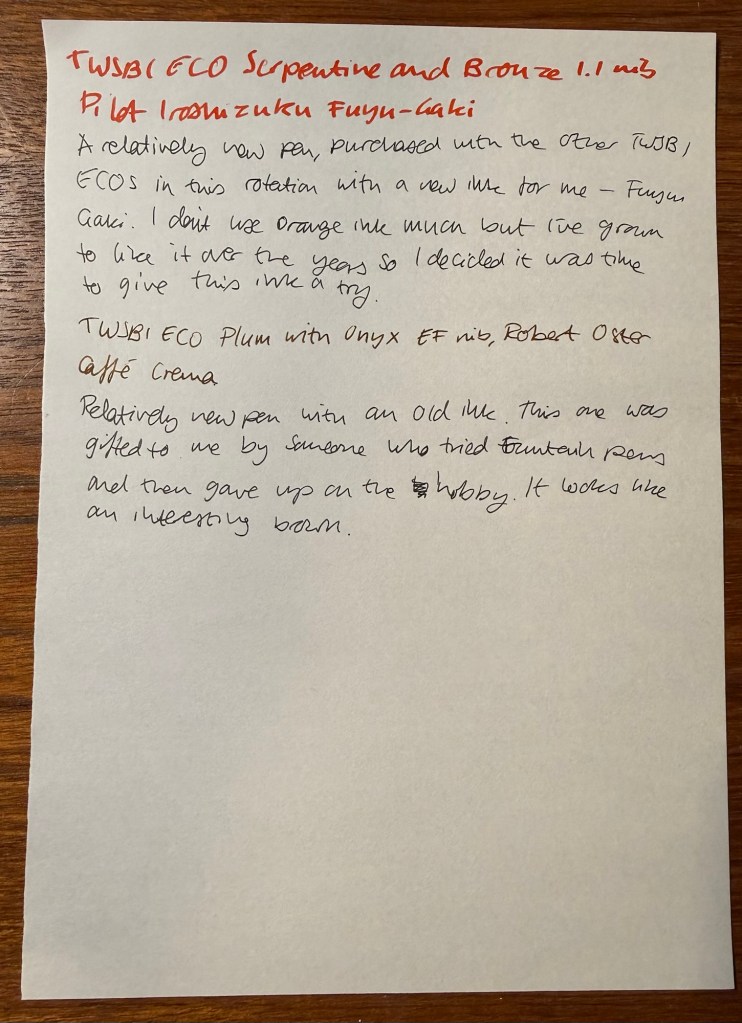
TWSBI ECO Serpentine and bronze 1.1 nib inked with Pilot Iroshizuku Fuyu-Gaki. A new TWSBI ECO with a new (to me) classic Pilot Iroshizuku ink – Fuyu-Gaki. I’ve learned to love orange inks in recent years, and so I’ve decided to purchase this most classic of orange inks. Looking forward to giving it a try.
TWSBI ECO Plum with onyx extra fine nib inked with Robert Oster Caffe Crema. New pen with an old ink – recently gifted to me from an ex-fountain pen user. It’s an interesting shade of brown and I look forward to giving this ink a try.
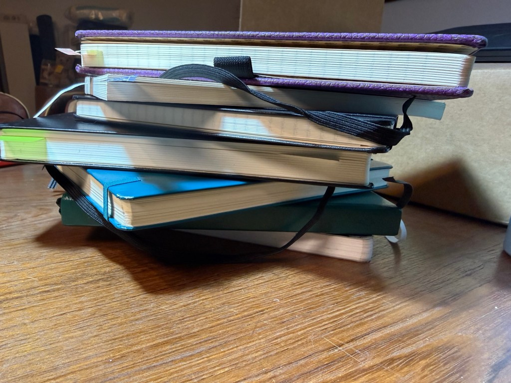
From top to bottom: single project notebook (blog drafts), single project notebook (study notes), single project notebook (D&D planning), work-in-progress notebook, work planner, personal planner, journal
Hi there, do you have a big stack of beautiful, brand new notebooks just waiting to be used? Do you have goals and plans for the new year? Do you want to improve your life in many different areas? Great! This post is for you.
Go grab a handful of those notebooks. We’re going to take the dust off them and get them to work for you. Remember: a beautiful notebook looks even better once it’s full. Notebooks are meant to be used as tools, not stared at like art objects.
Here are a few kinds of notebooks you should keep in 2026:
Journal – this is an absolute must for everybody. I know it’s hard to be consistent – believe me I struggle with it daily – but journaling is a habit that is guaranteed to pay back dividends. I start mine daily with a list of things that I’m grateful for, and end with a mini review of the day (did I fulfil my five ACT values?). In between is a running log of the day, and sometimes a section where I work things out on the page. Don’t post your opinions and thoughts on social media – write them in your journal instead. A journal will give you peace of mind, perspective, joy and a safe place to vent. Don’t take it out on people, put it on the page. I currently use a Stalogy 365 B6 for my journal, though for years I have used limited edition lined Large Moleskine hardcovers, and I may yet return to them.
Work In Progress notebook – this is the newest addition to my notebook rotation and I wish I had started a notebook like this sooner. What is a Work In Progress notebook? It’s where I spend time working on things in my life that I want to reflect on and change. You can do this in your journal, but as I’m dedicating time and effort this year to make some significant behavioural changes I wanted the place to work through these things. This is also a place where I reflect and take notes about the non-fiction, history, philosophy and self-help books that I’m reading, and it’s a place where I take time to consider my values and purpose in life. Heady stuff that we’ve been encouraged to abandon in this cynical and commercial age – much to our detriment. You can change and evolve, it’s worth investing time in trying to become a better version of yourself, and consistent daily work and reflection in this area is worth doing. I highly recommend keeping a notebook dedicated to this endeavour.
Planners – I believe that the best planner is the one that you customise for your needs. This is why I recommend not buying a pre-formatted planner, and instead making a planner yourself. I keep a work planner and a personal (home) planner and I recommend that you do the same – keep work at work and home at home whenever possible. Take into account that you’ll have to experiment to see what works for you, and that there will be a level of compromise that you’ll have to grow comfortable with. There is no “perfect” planner – there is a planner that works for you. Planners don’t replace reminders or calendar appointments – they’re there to give you a broader view of your week, month and year, and let you make some long term plans.
Single Project notebooks – “Single Project” notebooks are exactly that – a notebook dedicated to a single project or area in your life. It can be a hobby (I have one dedicated to my D&D plans, and I used to have one dedicated to my running), an actual project that you’re working on (I’m studying for a certification so I have a dedicated notebook for my study notes), or an idea that you want to develop. I try to select a notebook that fits the project that it’s dedicated to in terms of size, format, cover and number of pages. My running notebook was a Field Notes, my study notebook is a Midori MD notebook. If it’s something that you’re working on for a while and that’s important to you, I recommend dedicating a notebook for it.
Daily To Do List – I don’t use a notebook for this at the moment, but I used to use a large squared Moleskine for this. I currently use Kokuyo KB A4 loose leaf paper that I cut in half to A5 size. These lists are disposable to me, so I have no problem crumpling the daily list away and tossing it into recycling. You can use a notebook, index cards, loose leaf paper – but I recommend keeping a hardcopy, analog version of your daily to-do list. Why? Because to-do apps give you excuses to pick up your phone, because writing things down makes you stop and consider what you’re committing to, and because you’ve got all those pretty notebooks and pens and it would be a shame not to use them.
Scratch pad – keep one at hand to doodle on, for quick capture and to test out pens and inks.
Hopefully this will help you get more enjoyment and use out of that big pile of notebooks in your closet. Let me know if this helps or if you have more ideas on how to use your notebooks.
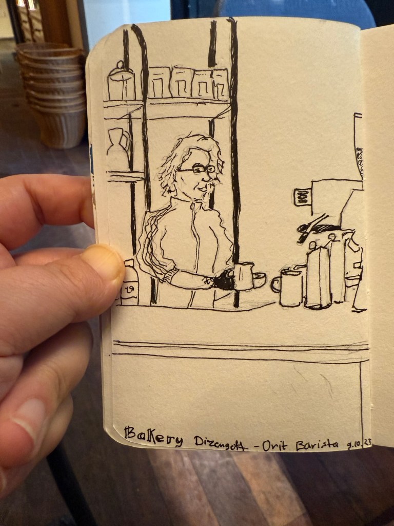
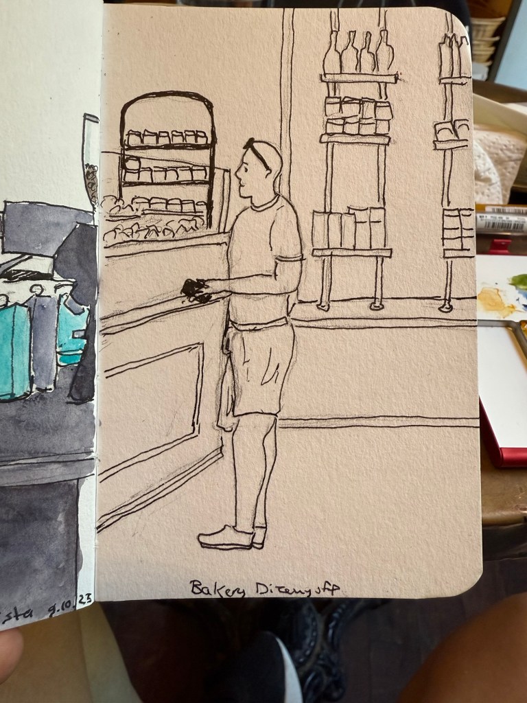
I went to see a local production of Singer, a play by Peter Flannery. It was phenomenal but it kept me up at night, which meant that the following morning I headed straight to my local cafe. I sketched the barista but something didn’t work in terms of getting her face right – she turned out sadder than she is. Sketching tired is rough.
Sketch on Stillman and Birn pocket Beta
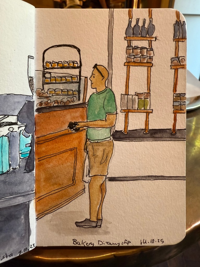
Here’s the rather messy pencil and pen sketch. I can tell just by the line quality that I was very, very tired.
A day later I went to sketch at the nearby park and you can see the difference in the line quality in this sketch:
Sketch on a Pith Kabosu sketchbook
Initial sketch:
Later that week the film photographs that I’d had developed were returned to me. Here are a few of my favourites:
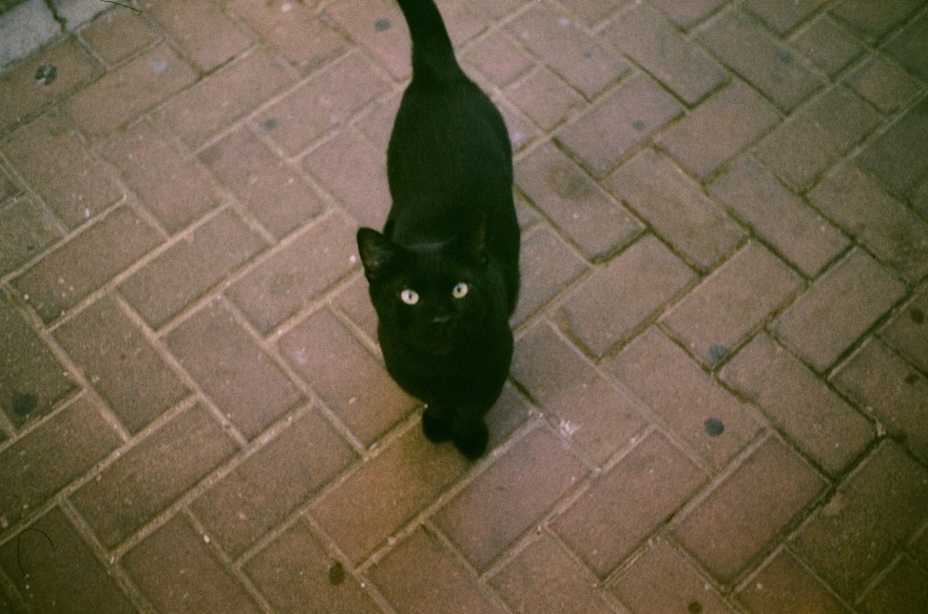
The local community cat that I feed twice a day coming to say hi
I love the atmosphere that the film gives this simple photo:
Ramat Hanadiv rose garden
All of these photos are unedited. I’ll likely clean them up later on.
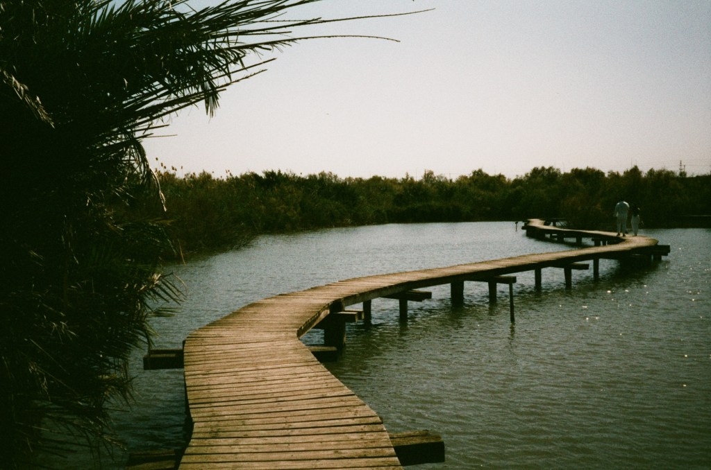
Bridge over water at a nature reserve near Haifa
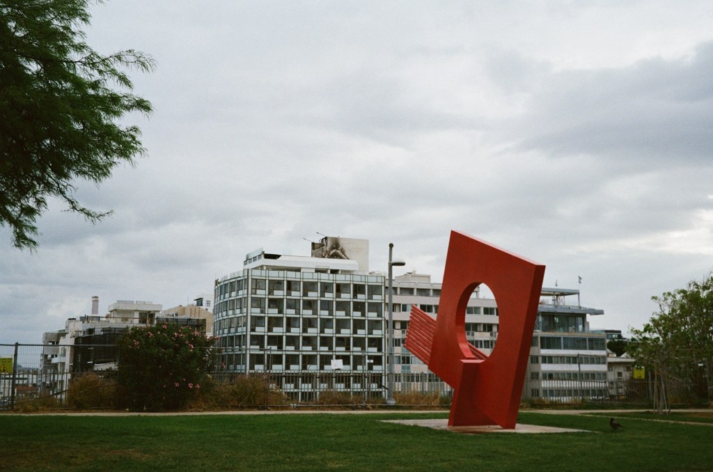
There was a fire on the roof of a nearby hotel. I took this photo a day after the fire, and you can see the damage:
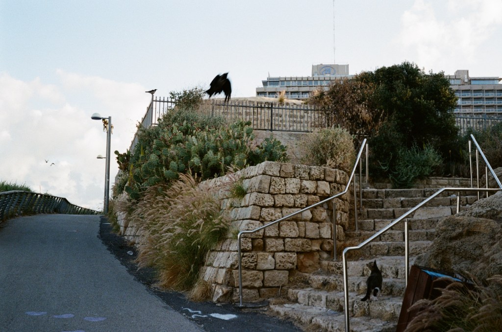
Cat failing to hunt a crow:
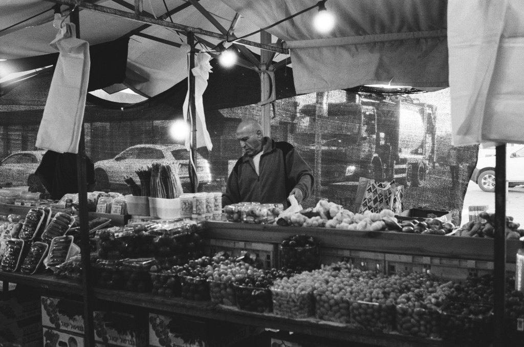
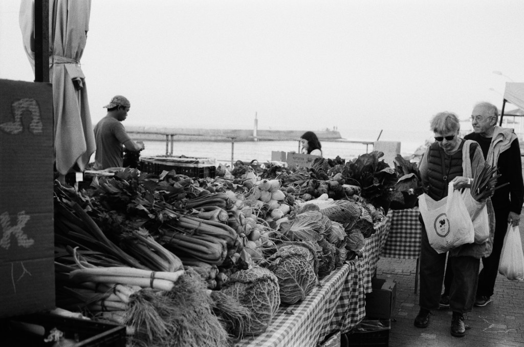
A stall at the local farmer’s market:
A stall at the local farmer’s market. You can see the see in the background.
I was supposed to run at a 10k night race on Wednesday, but I wasn’t feeling too good and I was apprehensive about dealing with the crowds so I ran the distance by myself a few hours before the official race start. It was a good decision as I was really struggling during the first 3k – but I did manage to finish, and finish strong.
I finished reading “Helmet for My Pillow” by Robert Leckie (a powerful narrative, but not as punchy as “With the Old Breed”), read “Death of a Nurse” by M.C. Beaton as a palate cleanser, and I’ve now started “The Shattering Peace”, John Scalzi’s long awaited sequel to his Old Man’s War series.
I’ve been overwhelmed with the responses to my Pelikan Hubs post. Thank you all for your kindness and for the thought and effort you put into your comments. I read them all, I just wasn’t able to respond to all of them this week.
Speaking of the Hubs, all of my pre-hubs inked pens have been written dry, which means that I currently have a 100% Pelikan rotation, plus some Platinum Preppy’s that I use for sketching.
Tomorrow is the Pelikan Hubs 2025 event, and to prepare I have inked up a whole flock of Pelikan fountain pens.
Here’s my current lineup of fountain pens and ink:
Currently inked part 1
The top four have been inked way back in the beginning of August, but because of my travel schedule I’ve yet to write all of them dry. You can read about the Radius 1934 and the Pelikan M205 here as well.
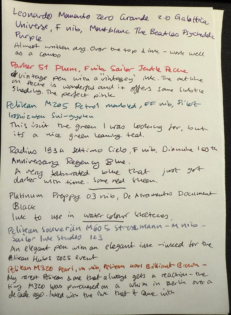
Leonardo Momento Zero Grande 2.0 Galattica Universe – F nib – Montblanc The Beatles Psychedelic Purple – great pen and ink combination. I wrote this pen dry just after writing the sample above.
Parker 51 Plum – F nib – Sailor Jentle Peche – all vintage Parker 51 fountain pens are fabulous and this one is no different. The plum colour is very rare, but I decided to “use the good China”. The ink is a long discontinued Sailor Jentle Peche, a beautiful pink with great shading and outlining. Sailor used to make fantastic inks at great prices – in terrible bottles. It was a struggle to fill this pen, even with their internal ink reservoir dingus.
Pelikan M205 Petrol Marbled – EF nib – Pilot Iroshizuku Sui-gyoku – I was hoping that Sui-gyoku would be the green ink that I was looking for, but it’s more of a teal than a green. The Pelikan M2xx series is a solid workhorse kind of pen, and I highly recommend it.
Radius 1934 Settimo Cielo – F nib – Diamine 150th Anniversary Regency Blue – the ink has grown darker with time, to the point where it’s almost black. This isn’t surprising as it was a very saturated dark blue ink to begin with, and it’s had some time in the pen. I will likely write this pen dry today or tomorrow. The new Radius pens by Leonardo feel very much like Leonardo Momento Zeroes but with a slightly different design. That’s not a bad thing – they are gorgeous pens, and for now they’re slightly cheaper than the Momento Zeroes.
Last week I inked up a new Platinum Preppy 03 nib with De Atramentis Document Ink Black as part of a post that I am working on. It’s the first time I’ve used a Preppy with a converter and not the Platinum cartridge it comes with – and it works well.
Pelikan Flock – currently inked part 2
I inked these pens today for the Pelikan Hubs event tomorrow:
Pelikan M605 Stresemann – M nib – Sailor Ink Studio 123 – a classic and elegant pen and ink combination. The Sailor 123 is really that good, and the generous medium nib shows off its dual shading properties.
Pelikan M320 Pearl – M nib – Pelikan 4001 Brilliant Brown – my rarest Pelikan, always a crowd pleaser at the hubs. This tiny pen came with a tiny brilliant brown bottle and so far I’ve filled it only with that. I bought it about a decade ago in Berlin on a whim, and I’m so glad that I did.
Pelikan M800 Blue O Blue – F nib – KWZ Exclusive for epiora.pl Błękit Warty Poznania – this pen was a very expensive birthday gift and my first M800 Pelikan. I bought it at a local pen store that no longer exists. The ink is even more special – it’s my first KWZ ink, gifted to me from the store that it was exclusively made for. I had purchase my M600 Glauco Cambon there just before they were closing for the day on the last day of the USK Symposium in Poznan. The name means Poznan Warta Blue – and it’s tied to the unique blue of the city and the Warta river. It’s a gorgeous blue and it reminds of Poznan, the store, the lovely seller and the nice symposium volunteers that saw me in the store and helped me out with my purchase.
Pelikan M400 White Tortoise – M nib – Sailor Ink Studio 767 – This is the green I was looking for! I purchased this ink last month at Choosing Keeping in London, and it’s the perfect bright and cheerful green that I was looking for, with some great shading to boot. The Pelikan Tortoise pens are gorgeous, and this one is a particularly nice one.
Pelikan M805 Ocean Swirl – F nib – Montblanc Maya Blue – I have been priced out of Montblanc inks (there’s only so much I’m willing to pay for ink) but this ink was heavily discounted at the Montblanc boutique in Heathrow. It’s a lovely bright turquoise with great shading, and it works well coupled with this pen.
Pelikan M600 Art Collection Glauco Cambon – F nib – Pilot Iroshizuku Ajisai – this is the pen that I purchased at Epiora in Poznan, and while I saw it online and loved the concept, I never thought that I’d buy it because of the price. Seeing it in person changed my mind because no photos can do this pen justice – the pattern on it glows! It’s beyond vibrant, and the pen body itself feels different than other Pelikans – heavier and cooler to the touch. The ink is also a Choosing Keeping purchase, and I love the colour very much.
Currently inked part 3
Pelikan M620 Place De La Concorde – M nib – Sailor Ink Studio 162 – this is one of my rarer Pelikans, one that I bought a year or two after the series had been complete and no longer for sale. If ever there was a series of pens that I wish that I owned it was the Pelikan M620 City series, and for years I searched for an Athens pen before giving up – it was just too expensive.
The Pelikans left to right – Place de la Concorde, Glauco Cambon, Ocean Swirl, White Tortoise, Blue O Blue, Pearl
Apart from my inked Pelikans, I’m also taking three uninked Pelikans with me – one to fill with the ink that we’ll be getting, and the others just to share.
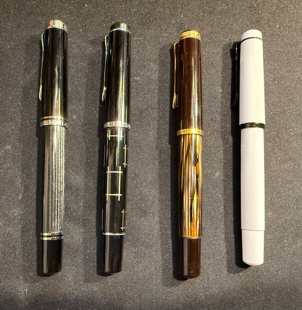
Pelikan Flock – left to right – Stresemann, M215 Rectangle (uninked), vintage M400 Tortoise (uninked), Stormtrooper (uninked)Left to right: Parker 61 Plum, M205 Petrol Marbled, Radius 1934 Settimo Cielo, Platinum Preppy
Are you going to a Pelikan Hub? If so, what pens did you bring with you?
Long time no update so this one contains multitudes.
I have started taking a small sketching kit with me on my long runs. I take my Pith Kabosu, Aquarius Urban Sketchers watercolour palette, a fineliner of some sort, a waterbrush and a Pentel P209 mechanical pencil. I finish my runs at my local cafe and sketch there over a sandwich and coffee.
My favourite barista at work
Here’s the preliminary sketch, done in pencil and a 0.5 fineliner:
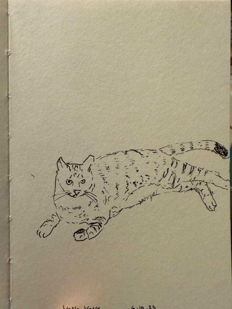
I am really enjoying my Pith sketchbook, and I’ve been taking it with me almost every day and sketching a lot more. My brother’s cat:
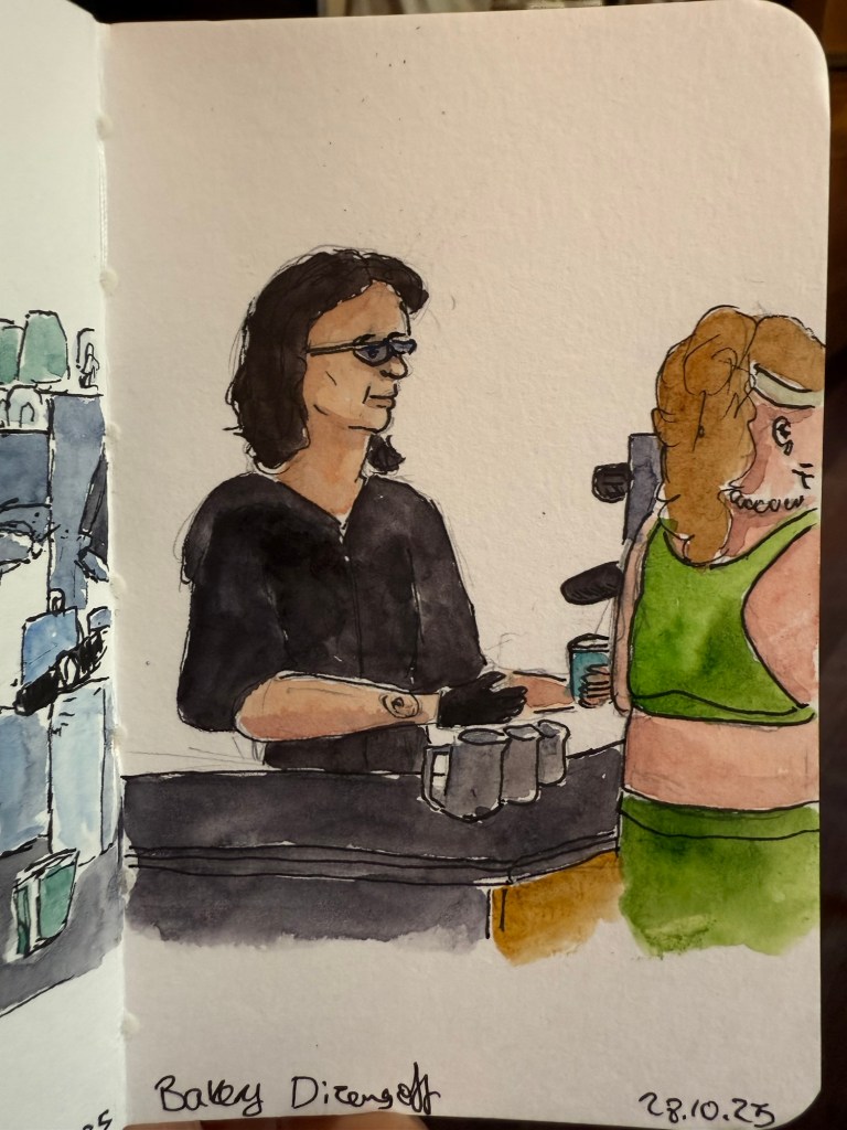
Another sketch at the cafe, this time of a customer:
While I’ve been sketching a lot more since the Urban Sketcher’s Poznan symposium, my journaling has taken a big hit. This oftentimes happens to me after traveling, as I rarely have time for regular journaling during a trip, and I often replace writing with sketching when traveling. The issue is that this time I’ve been struggling to return to the habit, mostly because I’ve picked up a few bad habits during the last two months of travel and chaos.
As many in the Urban Sketchers community use Instagram I started using the app before the symposium (I didn’t have it installed on my phone beforehand), and I got into the unfortunate habit of using it. Earlier this week I deleted it and logged out of YouTube on my phone, as I’ve been wasting time on there too. It’s been a relief – I’m not posting my sketches there, but I realized that I don’t really have an audience there – I’m just unpaid labour for billionaires. It’s bad enough that AI bots are scraping my site for content, but I don’t see a reason why I should allow my brain to be addicted to the slot machine tactics of an ecosystem that relies on me spending as much time as possible there to make its money.
My planning also took a hit due to travel, but I’ve gradually gotten things on track. My Q4 planning was about two weeks late, but as these were holiday weeks it wasn’t a big deal. I’ve also scaled down my plans to better accommodate holidays and travel.
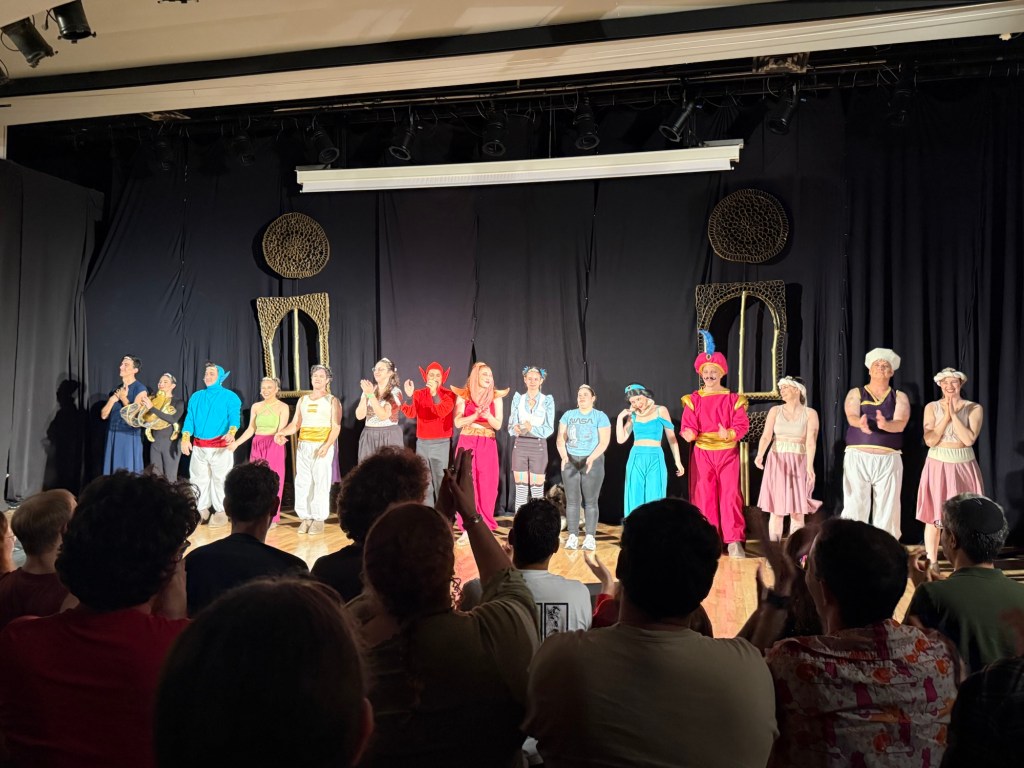
Lest you think that I only go to plays when I’m abroad, I did catch two plays during the past two weeks. One was a wonderful community theatre staging of “Twisted”, performed during the local “comicon” – a sci-fi, fantasy and roleplaying game convention that happens once a year.
Twisted cast.
Twisted is a StarKid musical that is a funny, profanity full take of Aladdin from Jafar’s point of view. One of the striking things about it is that it highlights the actual problem points with the original plot.
Speaking of that convention, I also got to give a lecture, run a tabletop RPG (a Dungeon World adventure that I wrote and ran), help master a LARP and meet a lot of cool friends. Oh, and sell a good amount of books that I no longer needed. Yay to more room on my overcrowded shelves!
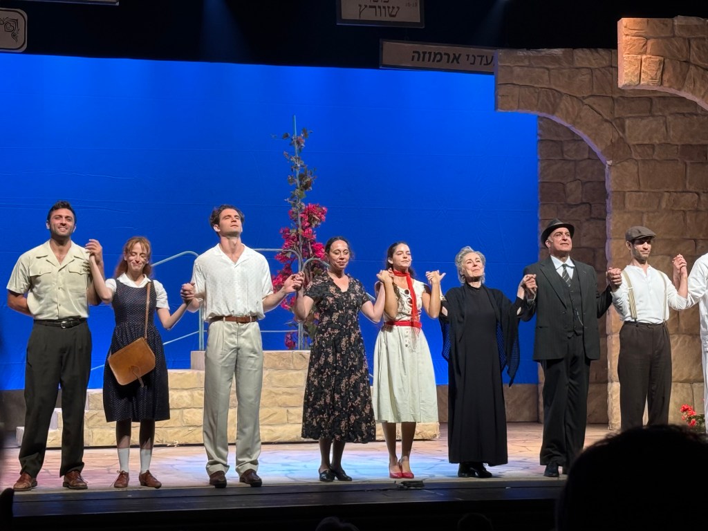
This week I got to see a play at the local theatre, “The Beauty Queen of Jerusalem”. The play is based on a bestseller by the same name, and there has already been a TV series on the saga of the Ermoza family. While the actors were good, I thought that the play lacked depth, likely because the story needed more time to unfold.
The cast of The Beauty Queen of Jerusalem
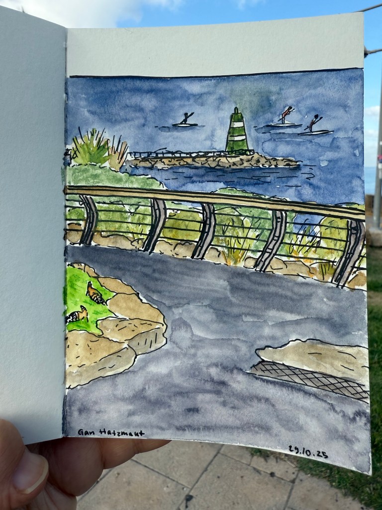
This morning I went on a walk before my usual swim. This sketch was made using a combination of Aquarius watercolours, Caran d’Ache neocolor II crayons, a Tombow brush pen and a 0.5 fineliner, all on a Pith Kabosu sketchbook.
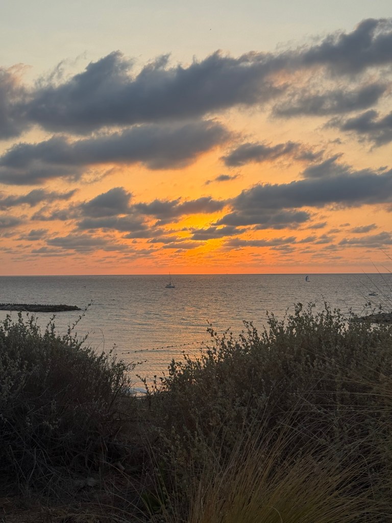
We’ve been having some stunning sunsets lately. Have a great and peaceful week!
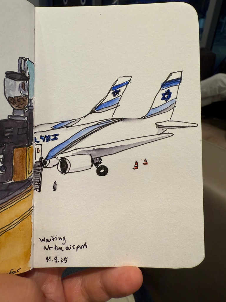
I recently returned from a pretty long trip to Paris and London with my family. I ended up sketching a lot more than I normally do during trips, largely thanks to things that I learned during the Urban Sketchers Symposium in Poznan (more on that in a later post). Here is part 1 of some highlights from my trip.
Quick sketch in a Stillman & Birn pocket beta while I was waiting for my flight
Centre Pompidou, my favourite museum in the world, was closing down until 2030 (!) so I went to pay it a last visit. Already parts of the colourful outside facade have been repainted white, and I’ve never seen the area around the museum so deserted.
The iconic Pompidou facade
The library was the only area still accessible, and it had been turned into a giant project playground for German photographer Wolfgang Tillmans to work with. It was something that only Pompidou could do, and it was breathtaking, thought provoking, fun, interesting, and unique. I wish I could have spent hours there, but at this point in my trip I became badly ill and for the entire Paris leg of the trip I was struggling.
The Pompidou library transformed.
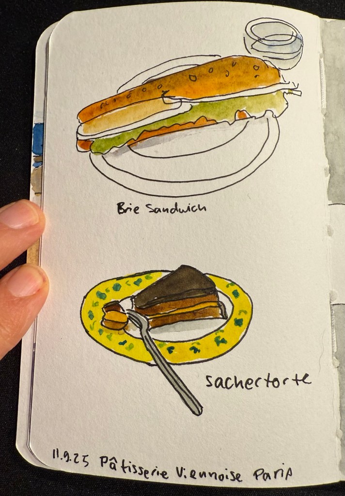
I ended up largely not eating in Paris, but this was my first meal there – in the fantastic Patisserie Viennoise in the Latin Quarter.
Stillman and Birn pocket alpha watercolour sketch
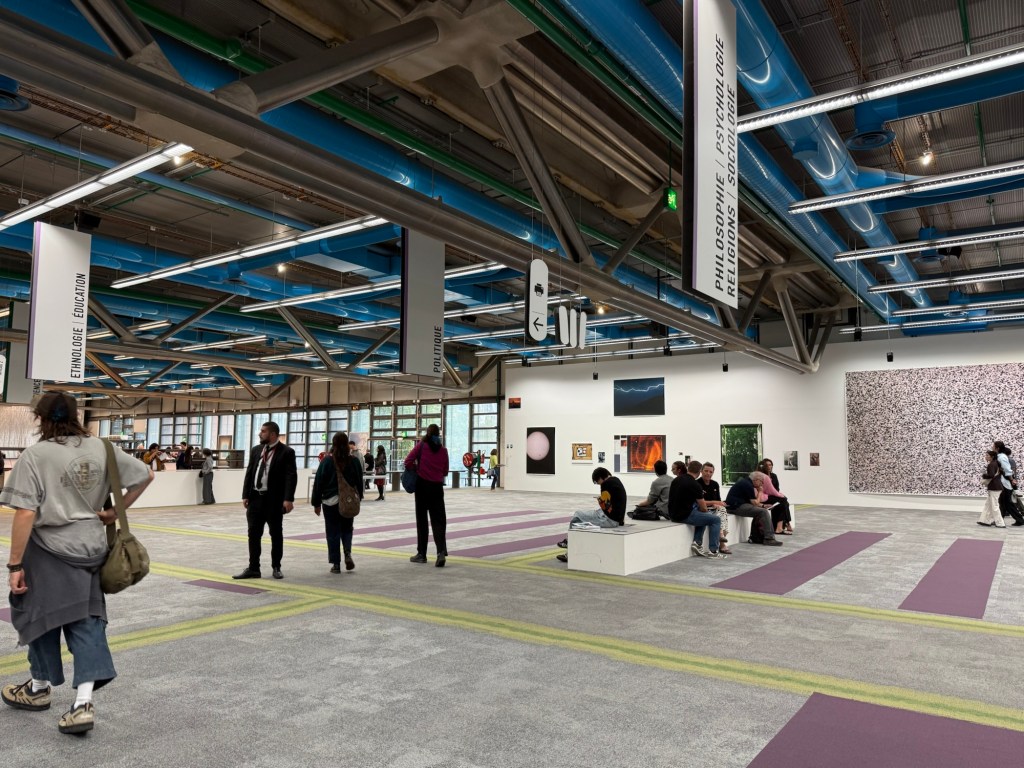
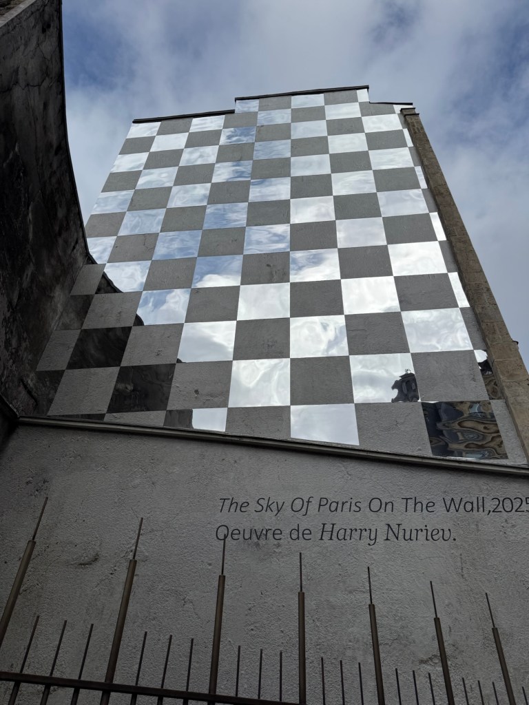
We also went to a new museum, the Bourse de Commerce and I saw this great artwork on the way there:
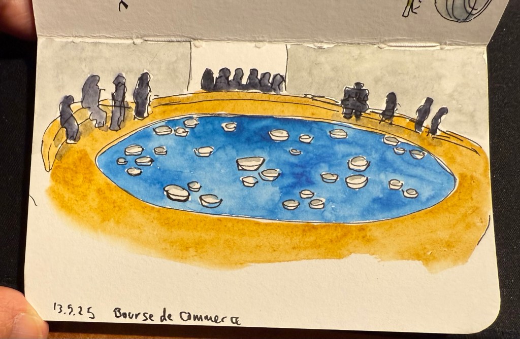
The museum was in between putting up exhibitions, so while a large part of it was closed we managed to view some great and moving art pieces with relatively few crowds and at a discounted price. I did a VERY quick sketch while I was there:
Stillman and Birn pocket alpha watercolour sketch
This is the artwork that I was sketching.
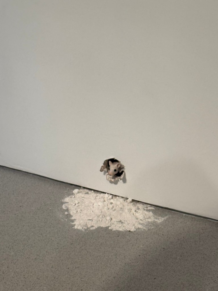
And this little fellow is also part of the art exhibits there:
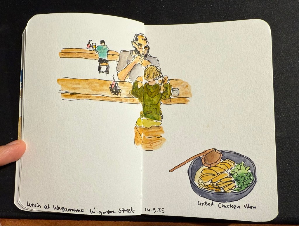
We then took the Eurostar to London. This is where I switched sketchbooks – this sketch of a boy and his father having lunch at a table across from me at Wagamama is the last sketch I created in my Stillman and Birn pocket beta. The beta has decent watercolour paper but it’s not half as good as the paper in my Etchr labs watercolour sketchbook, and the glued in pages make it a struggle to create full page spread sketches, as you can see here:
Last trip sketch in the Stillman and Birn pocket beta.
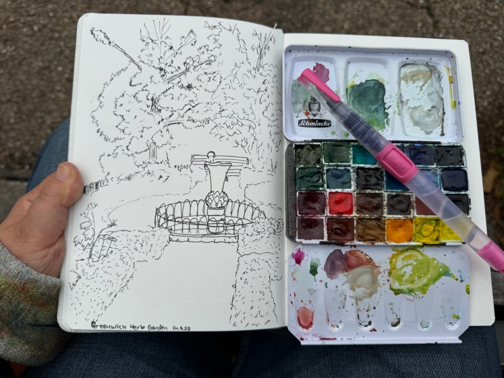
I created my first sketch in an Etchr lab cold pressed watercolour notebook while in the Greenwich Park herb garden and the paper is astonishingly good. Here’s the ink sketch (my tree sketches have gotten so much better thanks to a workshop I took in Poznan):
Etchr lab watercolour sketchbook sketch
And here is the watercolour:
The paper not only makes the colours pop, it actually allowed me ample time and space to work with the washes, adding layers of well blended colours that gave depth and life to the scene. Never have I ever seen the importance of good quality watercolour paper demonstrated so well. I have about half a dozen sketches of this garden throughout the years and this is by far the best one.
That’s it for part 1, I’ll try and upload part 2 later this week.
It’s been a while, mostly because life has been hectic, not because I don’t have things to write about. Here’s to trying to get more posts in, even if they aren’t perfect or particularly long.
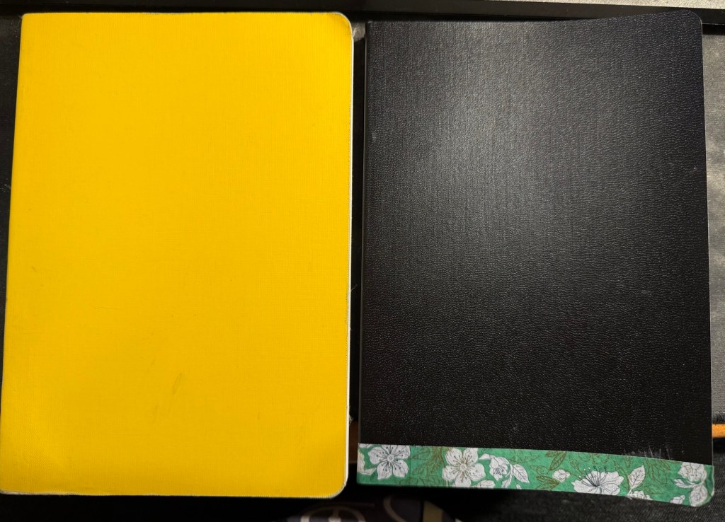
I’ve just finished another journal (the yellow one on the left in the photo below) and have set up my new one. Both are Stalogy 365 B6 notebooks, and both have a similar initial setup:
1.I flip the notebooks upside down so that the header with the dates is on the bottom and out of the way, as I don’t use it.
2. I use the front endpaper to write an “in case of loss” message (my name, email, phone number and a request for the finder to do the right thing).
New journal on the right, old journal on the left.
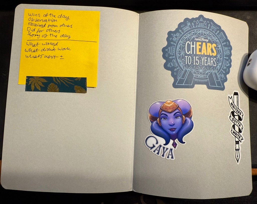
3. I use the back endpaper as a sort of “dashboard”. One side gets stickers on it, the other gets a post it with some journaling and review prompts.
Endpaper view of the new journal.
My new journal’s cover was damaged in transit, so I covered the worst of the damage with washi tape. It adds some character to the black cover, and if it gets too grimy or peels off I can always replace it.
My old journal lasted me for 5 months, which is about what these notebooks last for. My Moleskine journals lasted for 3-4 months because they had fewer paged and I used them for scrapbooking as well.
In other news “Writing at Large” is 10 years old. I never thought that I’d be publishing it for so long, but I’m glad that I started it way back in July of 2015, and I hope to keep it going for many years more. I’ve been through a lot over the past decade, and this site reflects a tiny part of that. If I can recommend something it’s to invest your time in your own site and your own work instead of on social media. If you persist, it pays dividends.
Reading
Finished The Day of the Jackal by Fredrick Forsyth and found it fascinating. I’m planning on reviewing it here.
Started on We Solve Murders by Richard Osman and I’m working on some Ulysses posts.
Health and Fitness
It’s getting hard to run outside, harder than it ever was, in this heat and humidity. Global warming is making treadmill runs more attractive. I’ve started using the NRC app‘s guided treadmill runs and they are pretty good and making treadmill running more bearable.