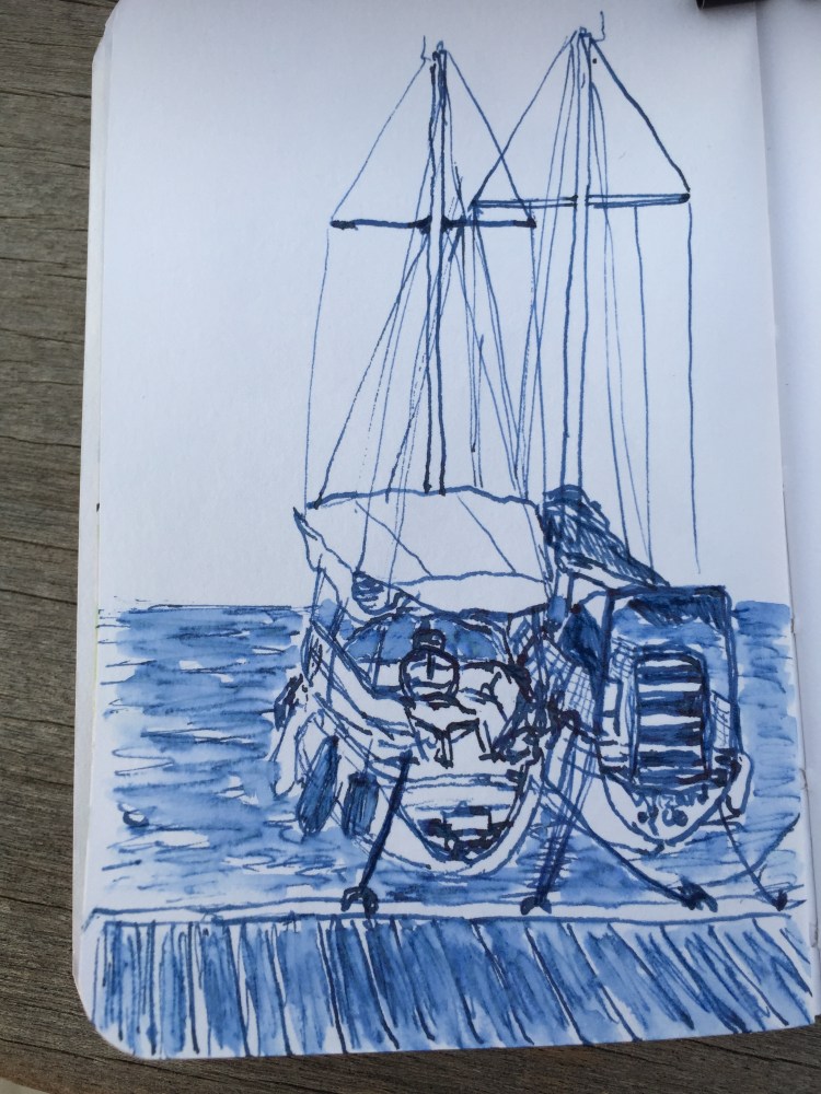
Inktober 5: Tel Aviv Marina Boats
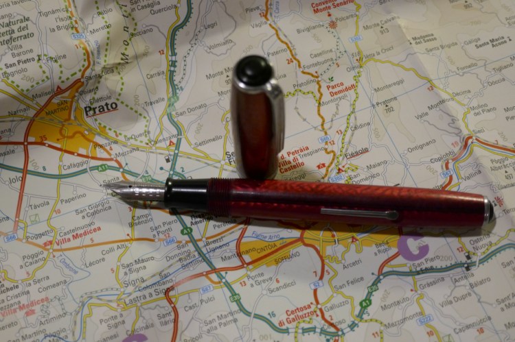
Parker Vacumatic Oversize with Pilot Iroshizuku Shin Kai.
A blog about writing, sketching, running and other things
Parker Vacumatic Oversize with Pilot Iroshizuku Shin Kai.
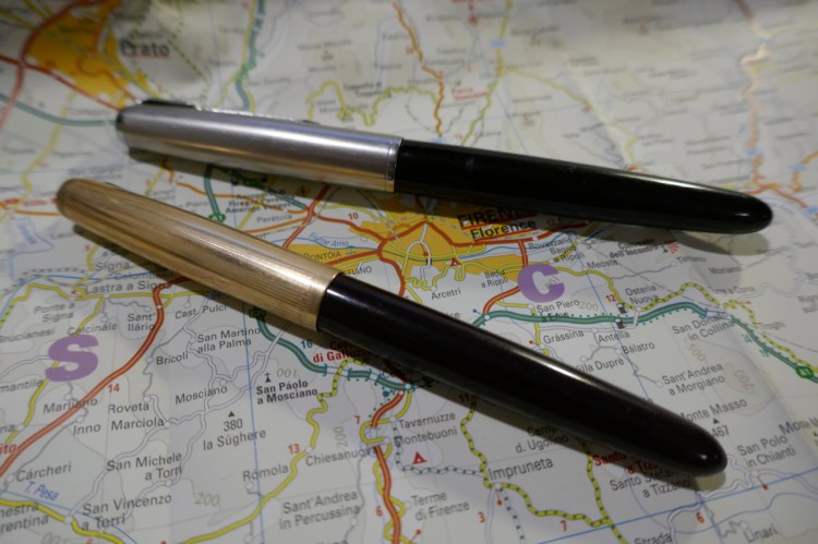
Since there’s a good chance that people reading this post, about buying your first vintage fountain pen, will want to purchase a Parker 51, I thought I’d write a separate post with a few extra tips on how to get a good, working Parker 51 at a decent price.
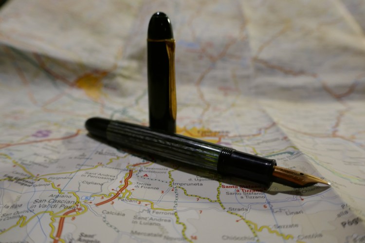
So, one of these pens costs upwards of $400 and the other can be purchased for closer to $40. Which is which?
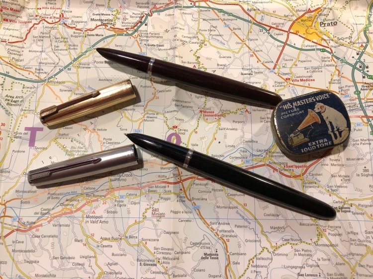
This is one of the dilemmas facing a new Parker 51 buyer: you’ve heard that this is a great vintage pen, but you can’t make heads or tails of its market value. How do you know what to buy and that you aren’t being ripped off?
Here are a few things worth knowing, if you want to buy a Parker 51 that you actually intend to use. If you’re looking to buy a pen to collect, this is not the guide for you. I’m assuming that you want a good, writing pen that will last you for years and won’t break the bank.


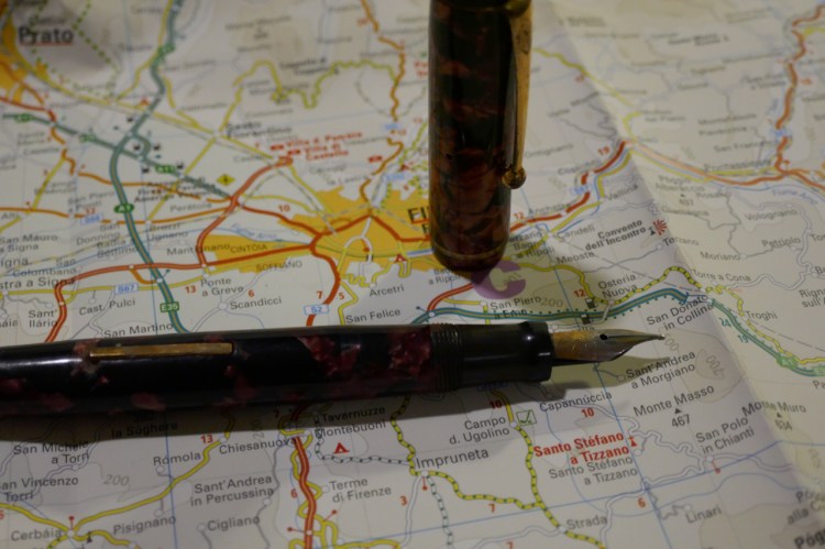
The answer is to flip the pen and look at the flip side of the nib. The tipping material looks like a shiny dot on the tip of the nib. If there’s no shiny dot and you just see the gold nib, the tipping material is gone. You’ll also feel it immediately when writing, as the pen will drag over the paper instead of floating on it, and may even be scratchy. Parker 51 nibs don’t get misaligned very often, so a scratchy nib usually means the tipping material is gone.


Bottom line: you can get a phenomenal gold nibbed pen in a beautiful Jetson design for less than $100 if you know what not to pay for. Now can you tell which pen is the Plum?

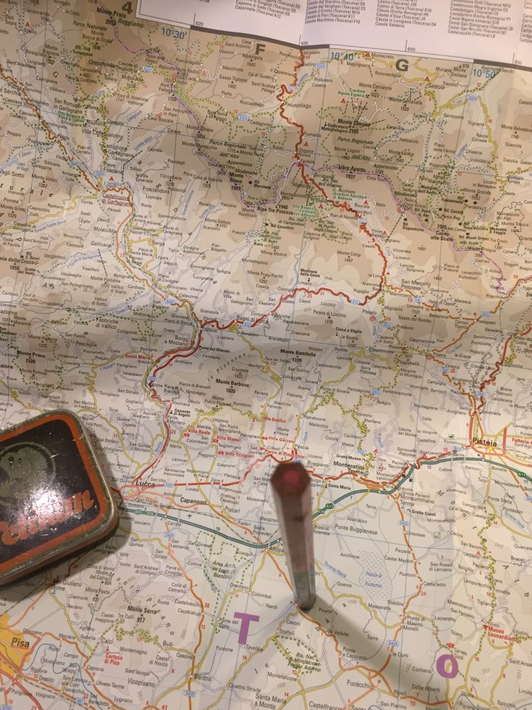
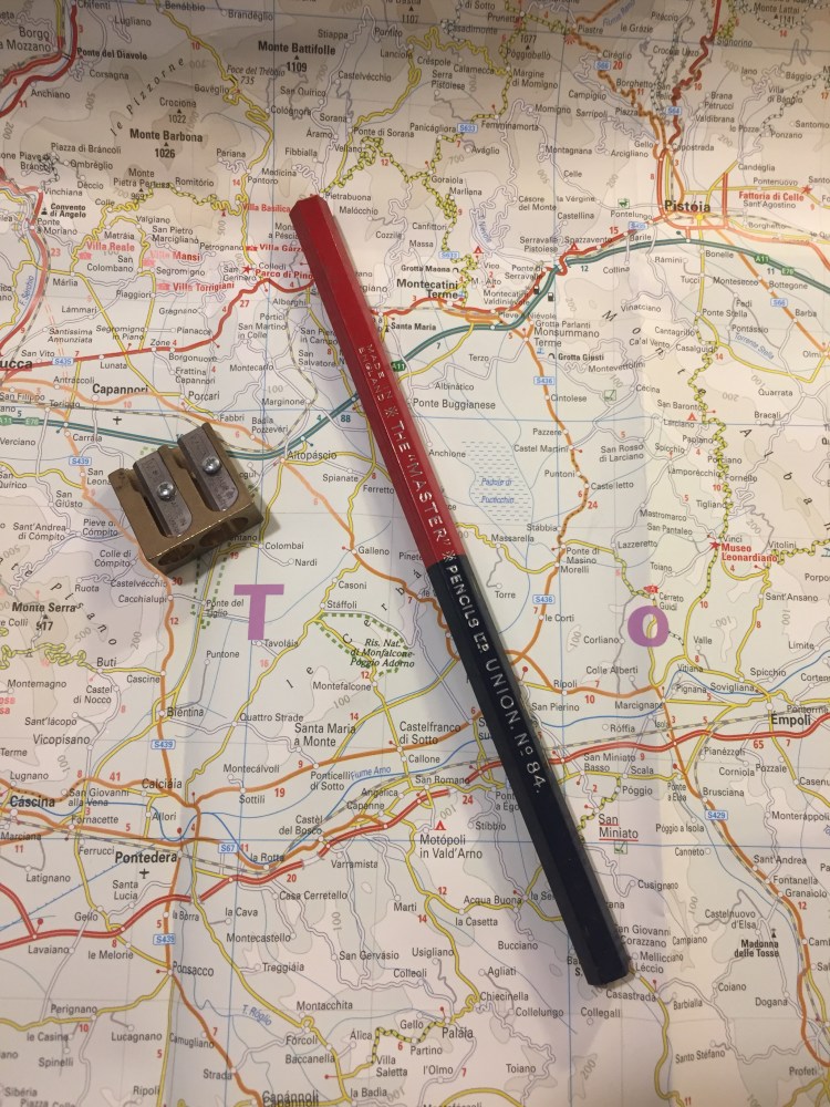
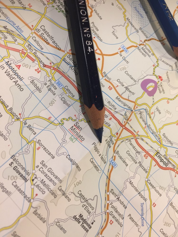
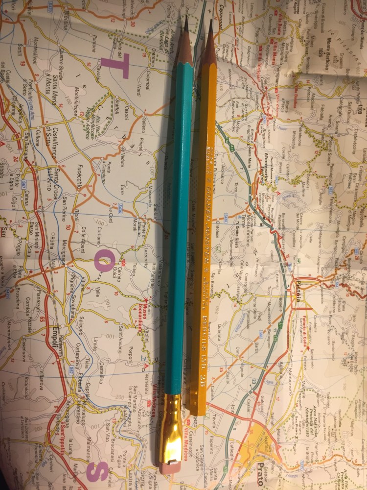
My latest flea market find is a red/blue Union No. 84 pencil from The “Master” Pencils Ltd, the English pencil company that also created the Golden Master pencils that I reviewed in the past.
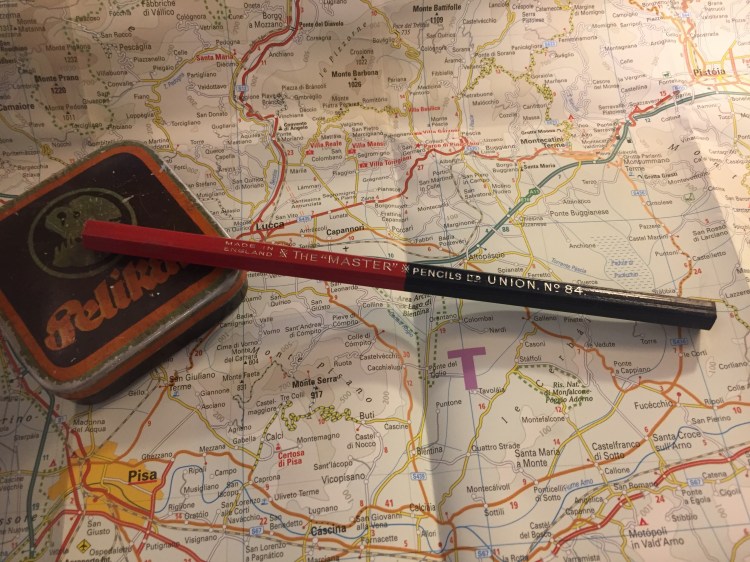
The Union No. 84 is an oversized pencil, with a red and navy core. I love the choice of font for the imprint: it looks clean and professional.
The pencil is thick, built like a children’s pencil, and so the cores are extra large as well.
The navy core, almost black in appearance:
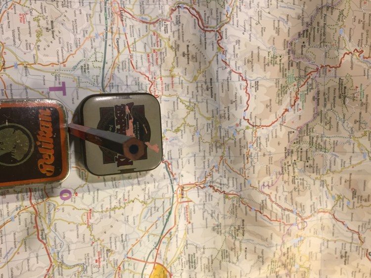
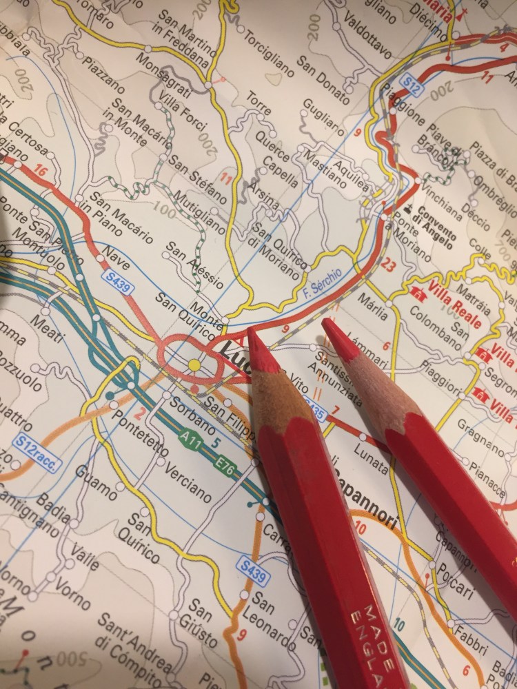
Finding a sharpener that can sharpen this pencil was a challenge. You’ll need one that’s designed for children’s pencils, yet is high quality enough to handle wood that has toughened over time, and a core that is still soft and brittle. I went with the M+R double brass sharpener Nr. 0603. Beware of the red core when you sharpen this pencil, as it can stain your hands.
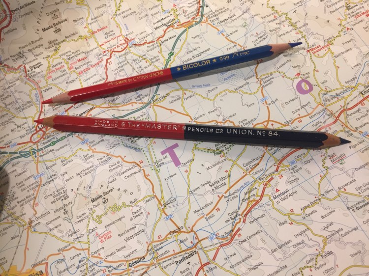
Here’s the Union No. 84 next to the Caran d’Ache Bicolor 999, the golden standard for red/blue pencils. You can see their size differences quite clearly.
The navy tip of the pencil:
The red tip of the pencil:
The red tip of the pencil was much softer and more crumbly than the navy tip, but even though I was worried about it, it didn’t break with use.
I tested the Union No. 84 against the Bicolor 999, and discovered a few interesting things. The Union’s blue is indeed a shade darker than the Bicolor’s but it’s not as dark as I would have expected. The red shades of both pencils are virtually identical. The Union feels more like a pencil than the waxy Bicolor, with more feedback, and more shading possible when some pressure is applied. Both pencils erase poorly, but the Union erases better than the Bicolor, particularly the Union red, which doesn’t stain the paper.
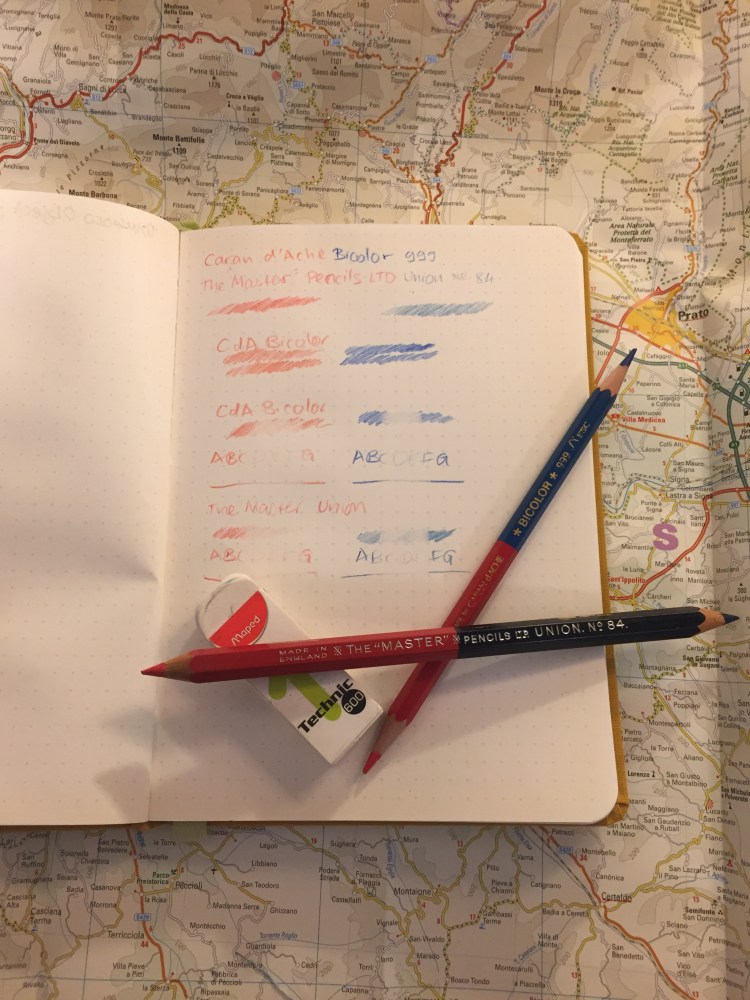
I tested the pencils on a Baron Fig Confidant, my go-to pencil testing paper, and erased them with the Maped Technic 600.
The Master Union No. 84 is a lot of fun to draw with, beyond being useful for highlighting and correcting text. It feels like a proper pencil, and not a waxy crayon, and it shades enough to allow for doodles like this one:
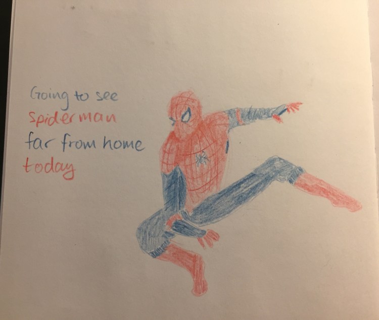
The Union No.84 is great and fun, and so was the Spiderman movie. I highly recommend them both.
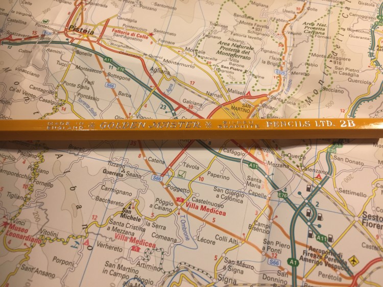
A box of these beauties was languishing together with other art supplies in a stall in London’s Spitalfields market. I saw the box, saw their name, “The ‘Golden Master’ Pencil” and I couldn’t resist.
Just look at this design:
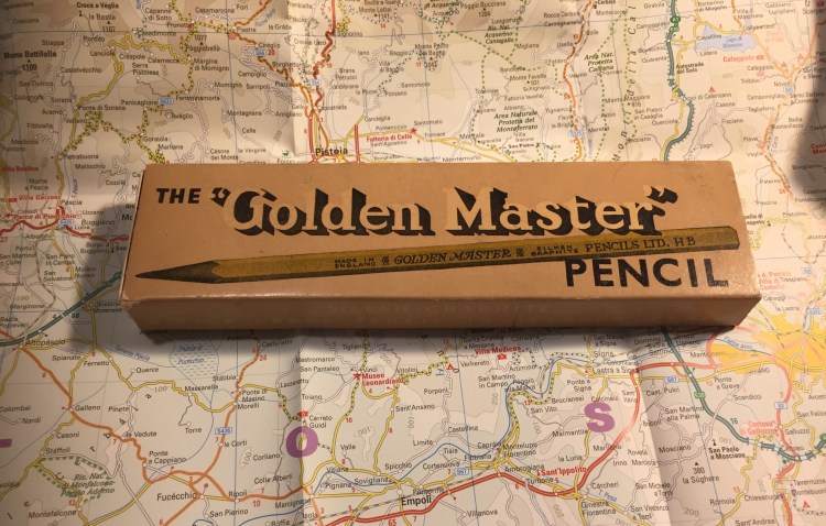
Who doesn’t want “Silken Graphite”? Or “A High Grade Pencil in Hexagon Cedar”? I’ve rarely seen a company take such pride in a pencil, outside of the Japanese market.
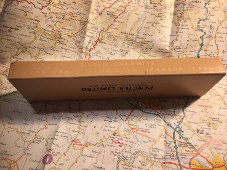
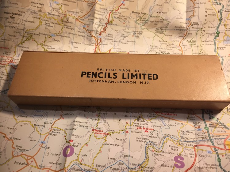
British made, from an era where Britain made things — and in London, too!
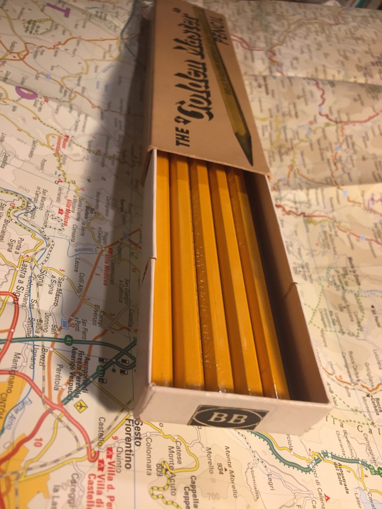
The pencils aren’t really Golden Master HB, but 2B (a bonus from my point of view). They’re labeled as such on the pencil, and strangely enough as two Bs on the box. I’ve never seen 2B pencils labeled that way. I wonder if they printed six Bs for their 6B pencils. I doubt they’d have room on the box.
In any case, the pencils slide out of the box in a sort of cardboard tray that is pretty robust. It works just like an old Eagle Pencil box, and I wish that more modern pencil makers would use this design.
The pencil itself has a good coating of yellow lacquer that has withstood the test of time, and has “Made in England”, “Golden Master”, “Silken Graphite”, “Pencils LTD.” and the grade stamped on it in gold foil.

The hexagonal shape is sharper, has sharper edges, than more modern pencils do. It doesn’t cut into your hand, but you feel it, and I have a feeling that without the lacquer this pencil wouldn’t be as nice to use.
The pencils come unsharpened in the box, and they’re a standard pencil size. As you can see there’s no eraser and no ferrule, but I don’t mind that. I rarely use pencil erasers, but rather keep a block eraser on my desk, or scribble things out if I’m writing.
I drew a journal comic with this pencil. It’s very smooth and holds a point forever, but it’s not a 2B pencil in terms of darkness. It’s closer to a standard B, but there’s a chance that time has done wonky things to make the graphite lighter. It erases well, and every core in the box that I have is perfectly centred. If you can get your hands on these, I recommend giving them a try. They’re great pencils, and I wish that they were still in production today.
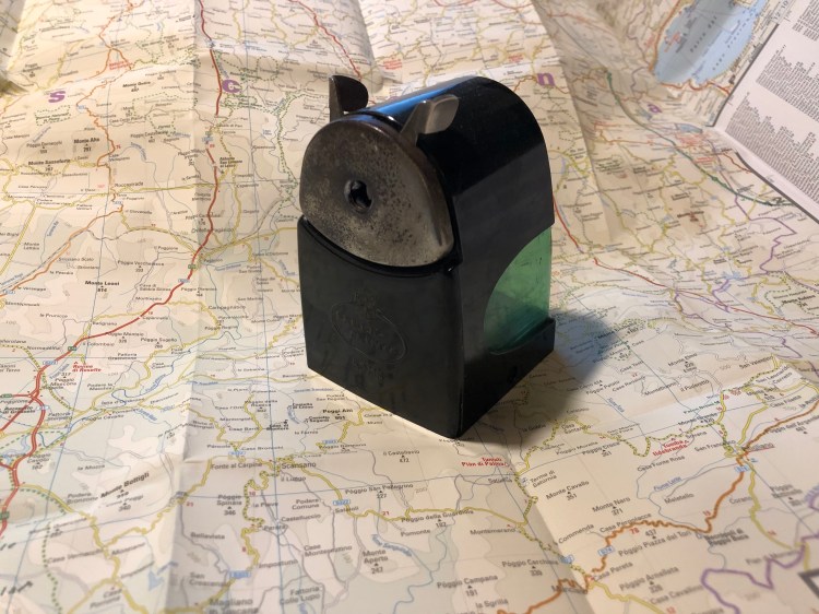
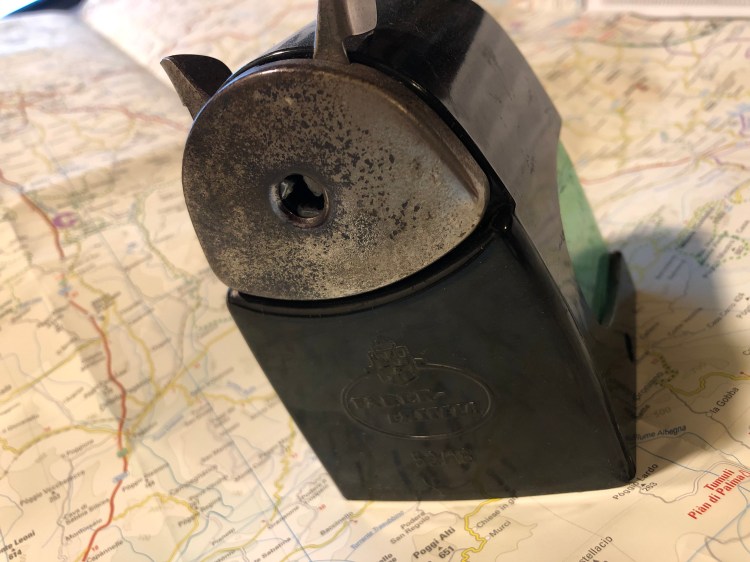
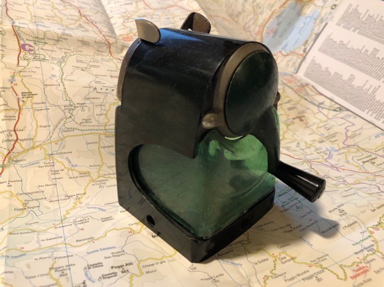
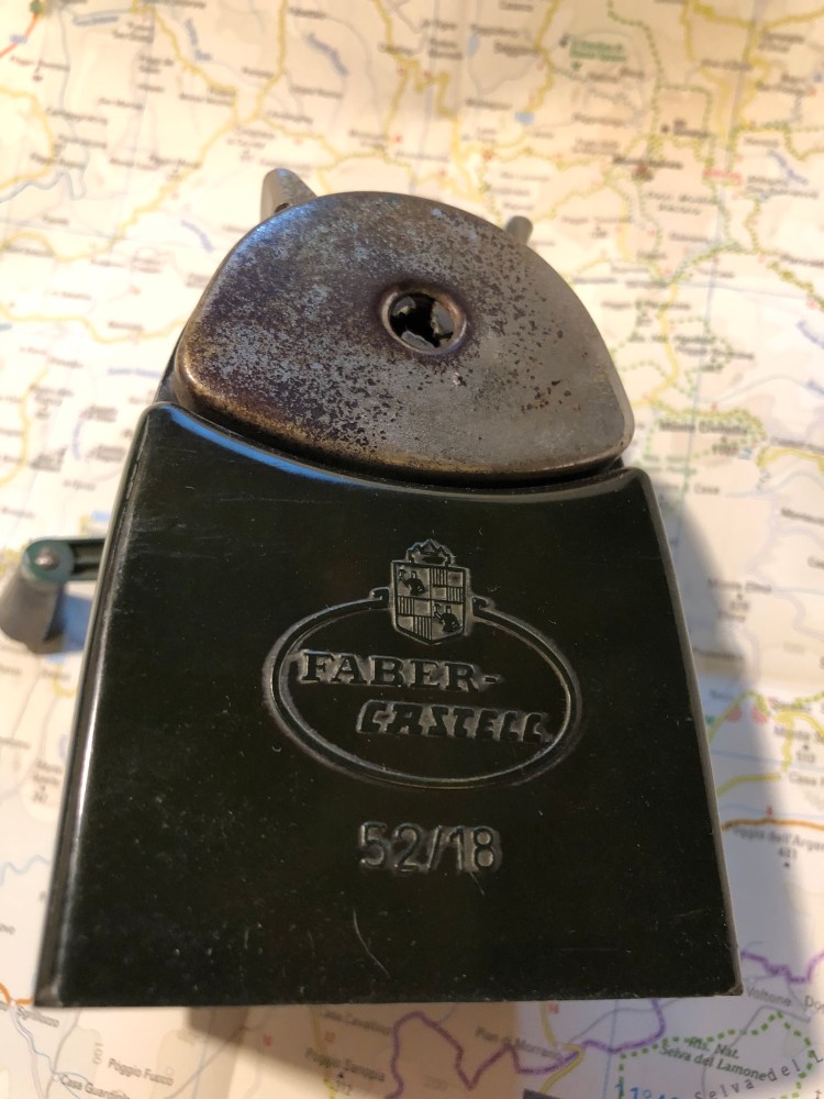
I found this beast in a dusty corner of my favourite vintage shop in Jaffa. It’s far from pristine, but it’s so overbuilt that it still works. The body is Bakelite and somehow still whole, and even the green shavings receptacle isn’t cracked. I haven’t been able to find anything about the Faber Castell 52/18 (except for an eBay listing that says that it’s rare), but I love the design enough to wish that they were still being made today. Something about that green cutout in the black body just works.

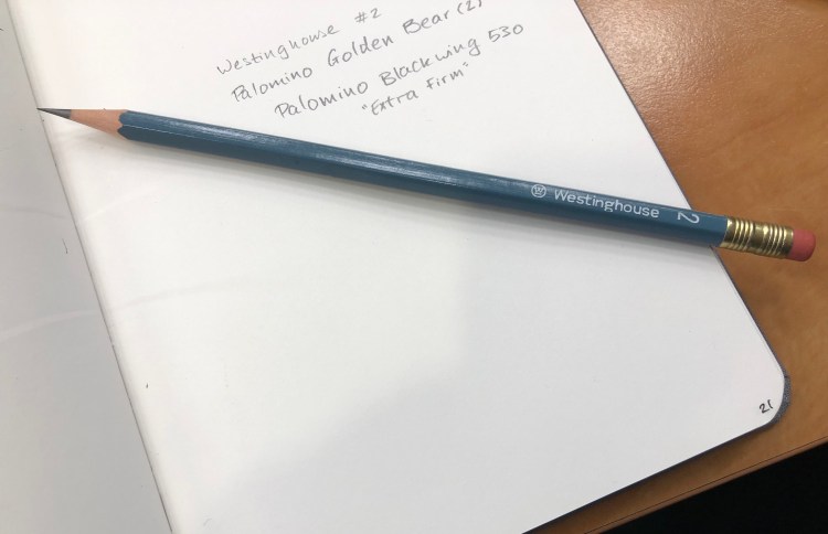
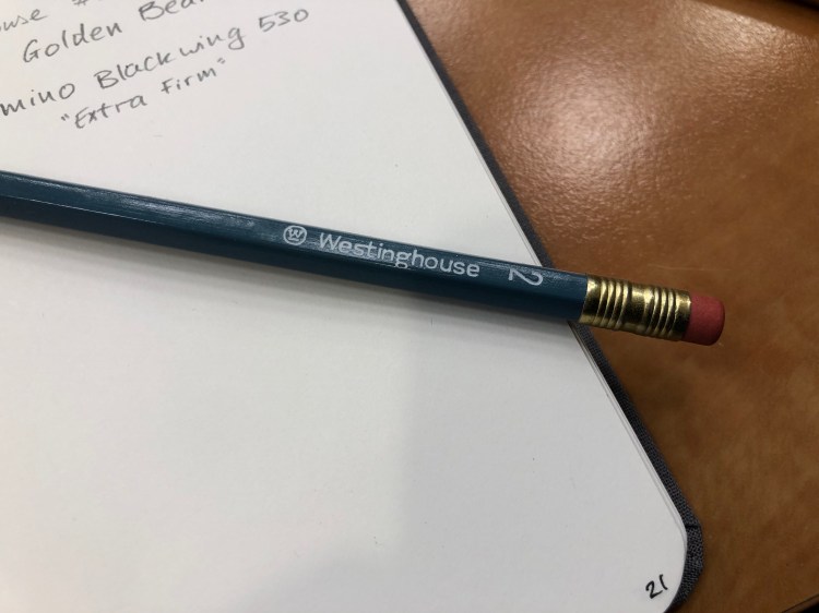
I just started using a vintage Westinghouse number 2 pencil, instead of the Palomino Blackwing 530 which reached the Steinbeck stage. There’s no point in reviewing a pencil that isn’t widely available, but I got a pack of these on eBay for a pittance and they are excellent pencils, so if you’re looking for great, super cheap pencils and don’t mind petrified erasers, give branded vintage pencil listing on eBay a try. You never know what you’ll find.


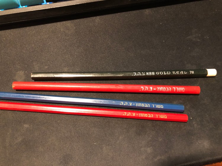
A lucky find in the Jaffa flea market, three pencils and one coloured pencil made by Jerusalem Pencils, likely in the 70s or maybe the 80s, for the IDF.
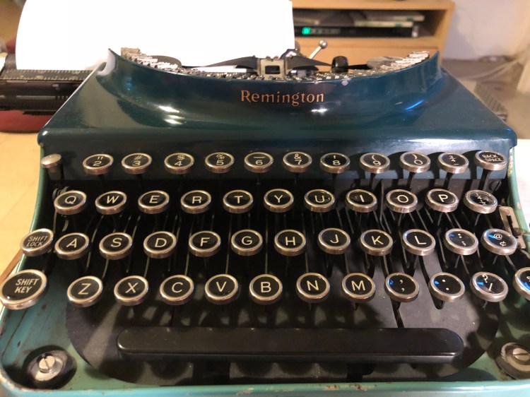
Trying to replace Twitter with this, as it’s become an even worse time-sink-of-horror-and-cruelty. Banging my frustrations out on these keys is exhilarating.
I like old tins, and this one is one of my favourites, because of the sheer amount of fonts packed into such a tiny box.


Drawn with a Pilot dual tipped brush pen on a blank Moleskine Star Wars notebook and coloured with Caran d’Ache Pablo pencils.
