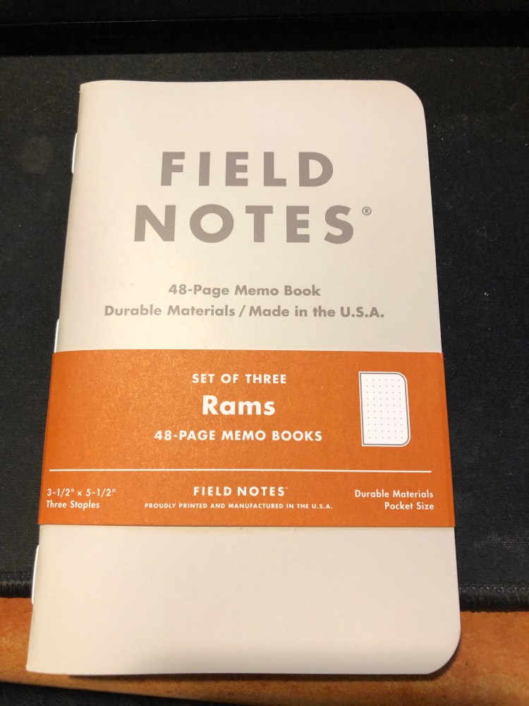
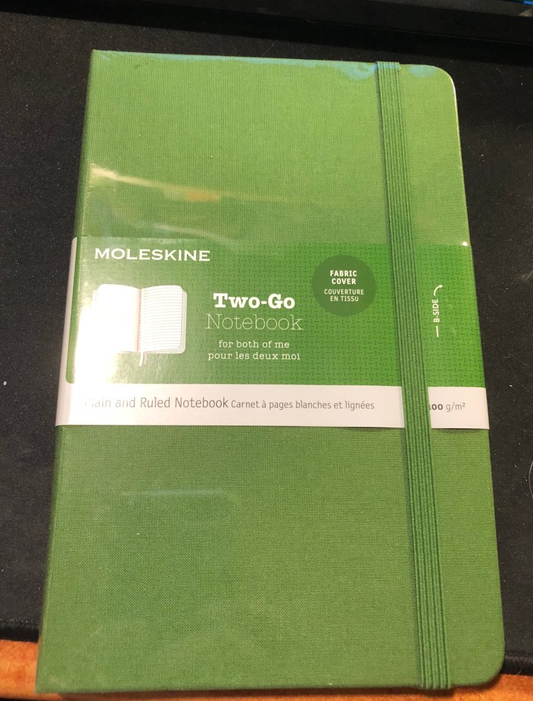
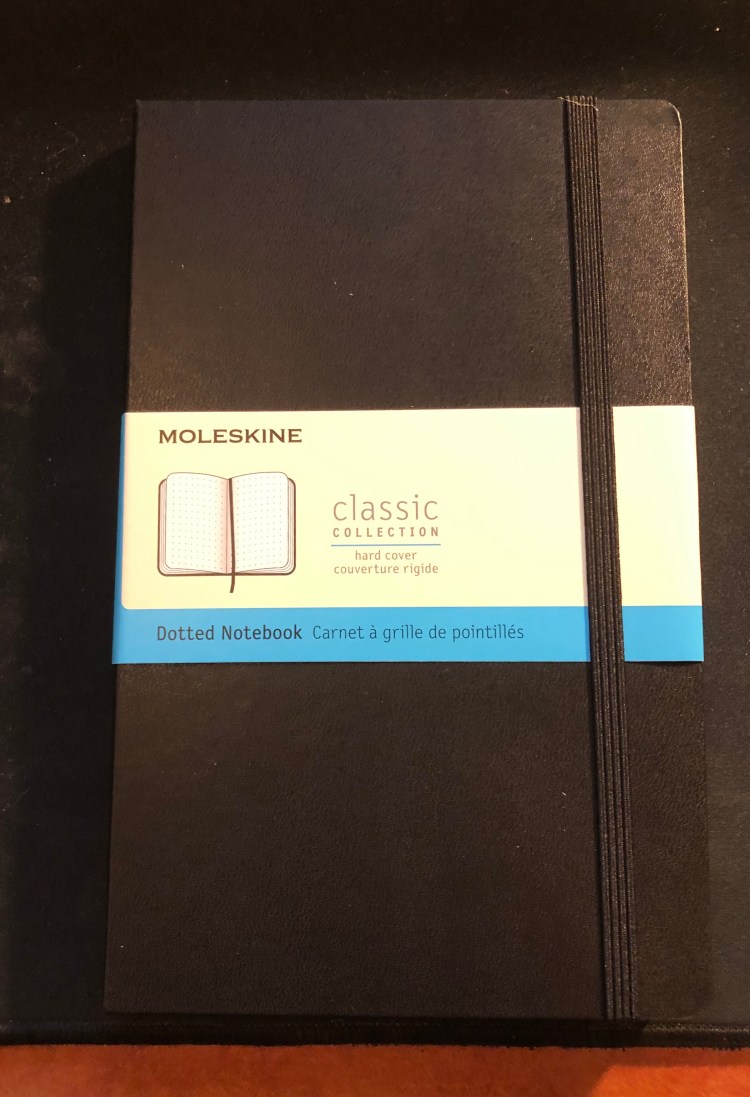
Moleskine Large Dotted Hardcover Notebook

So it appears that Moleskine has finally hopped on the dot grid bandwagon, releasing several of their classic collection notebooks in dot grid, even going as far as creating dot grid versions of some of their seasonal colours (gasp!). Next thing you know they’ll be releasing limited edition notebooks in squared and dot grid paper, and then where will we be? (Don’t worry, it’s not going to happen).

The classic Moleskine collection consists of their hardcover and softcover notebooks, in pocket, large and extra large. Currently the dot grid is offered in black covers, both in hardcover and softcover, and in underwater blue (such a pretty seasonal colour) and beige in softcover. However, it apparently was enough of a success for them to issue the dot grid option in all their classic collection core colours (black, red, blue sapphire, and myrtle green), and in seasonal reef blue (both hardcover and softcover). These colours will start being available in February-March, so it may be worth waiting a little while before purchasing (although some of the hardcover core colour options already seem available).

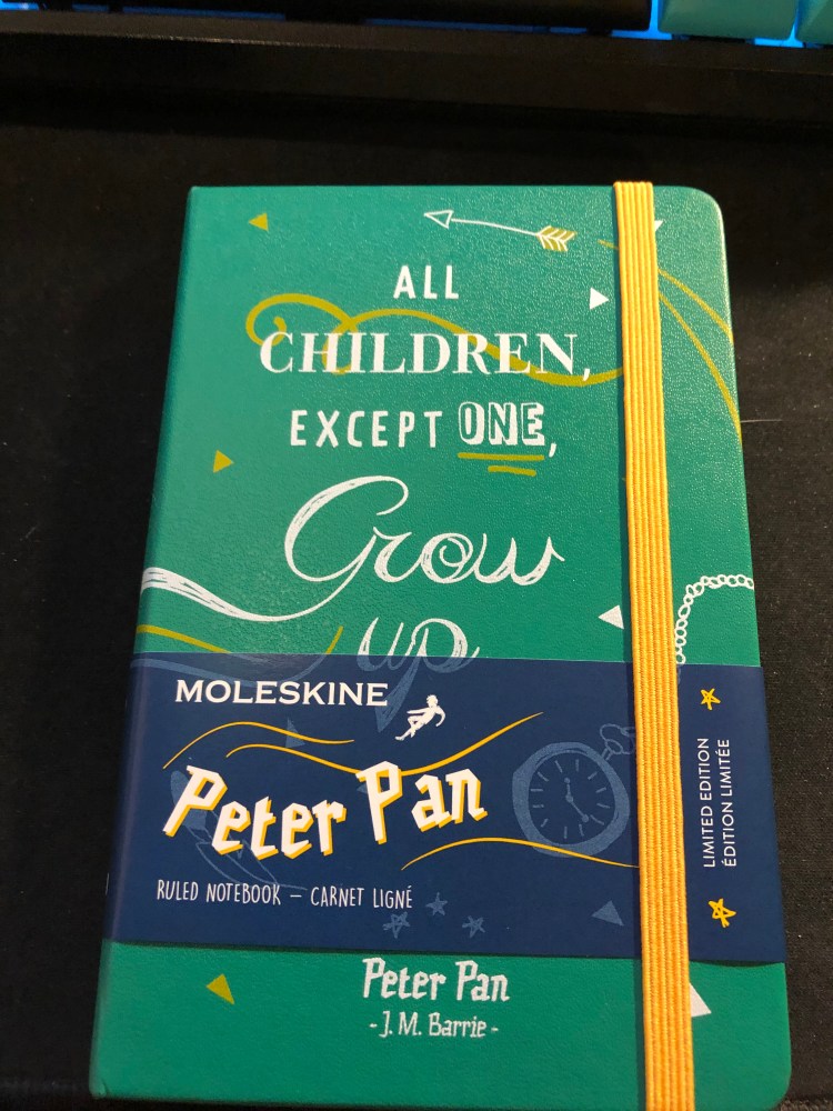
Now to the review. I got the classic large black hardcover notebook, as it’s probably Moleskine’s best selling notebook, and what people have in mind when they say “Molekine”.

Dotted paper gets a new band colour – blue.

First thing’s first, Moleksine have listened to customer feedback and significantly strengthened their notebooks’ elastic bands. They’re a little thicker and wider, and there’s little chance that they’ll turn into the floppy mess that some of their earlier elastic closures turned into after a few months of use.

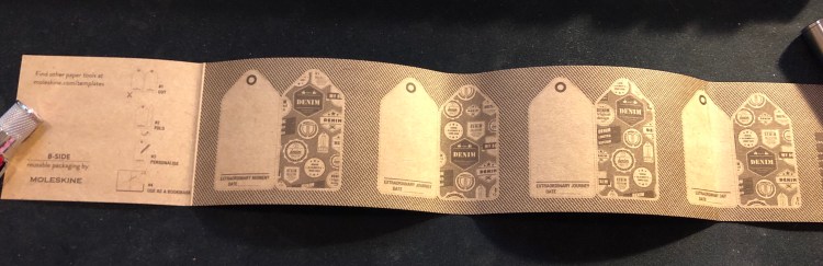
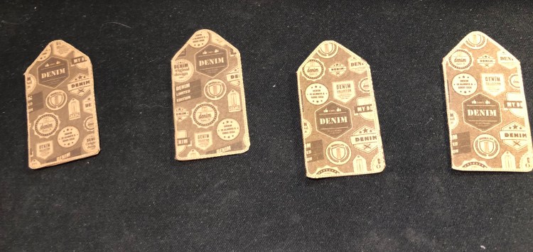
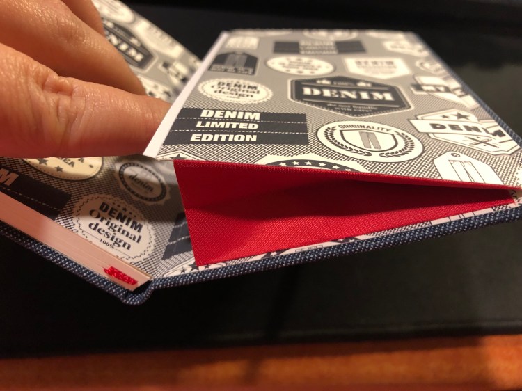
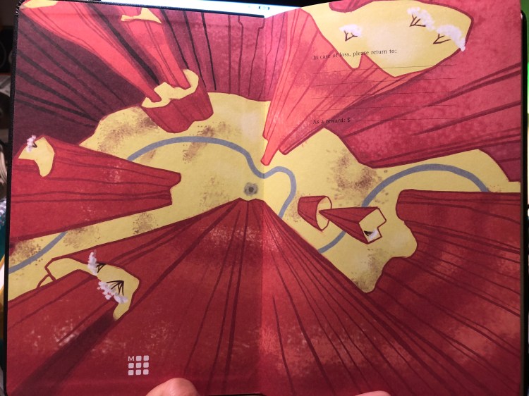
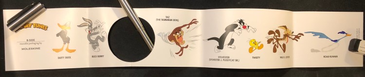
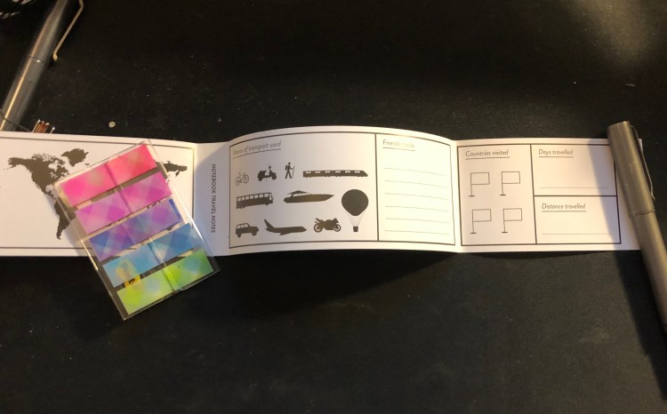
The sleeve also has a B-Side, this one is pretty travel oriented, and I love it because maps!

Phileas Fogg would have been proud.

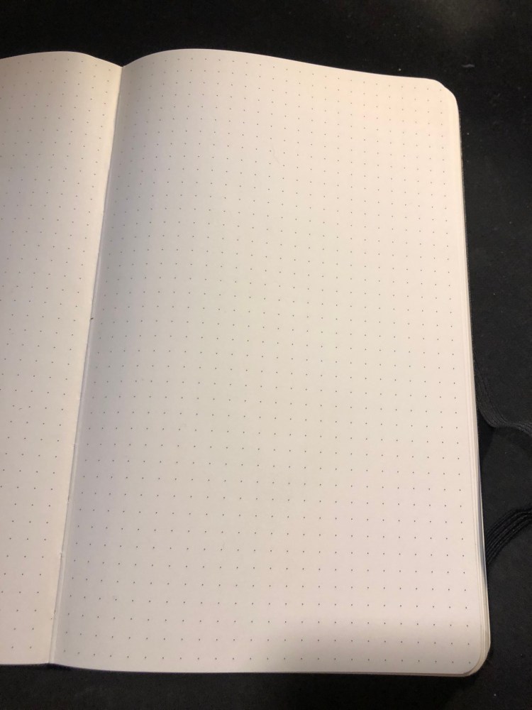
Which brings us to the paper. The dot grid pattern is medium grey, dark enough to be visible, light enough to not be too distracting. It also is very precisely aligned on all pages, if those kind of things bother you.

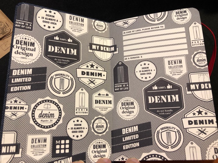
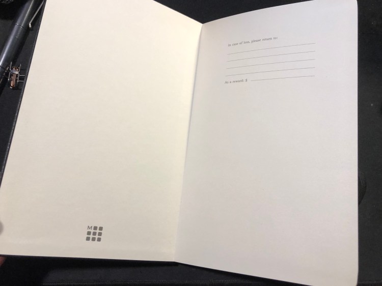
The “In case of loss” endpaper, with the Moleskine logo, a relatively recent addition.

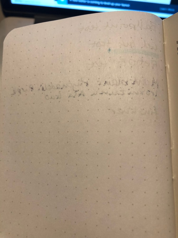
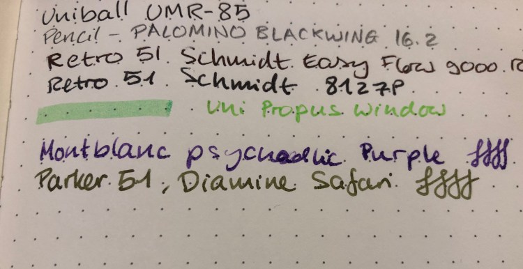
How does the paper perform? Better than you’d expect. Gel, ballpoint and pencil work well with the paper, but even fountain pen inks, including pretty saturated messes like the Montblanc psychedelic purple work pretty well. There’s no more weird spidering, as there used to be and the spreading is minimal (better than Baron Fig, well above average). If you don’t insist on super saturated inks, you’ll be able to enjoy using fountain pens in this notebook.

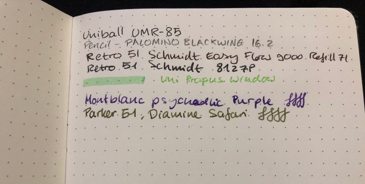
A closeup of my writing samples. Montblanc purple has behaved this way on Rhodia paper too, so I blame the ink, not the notebook:

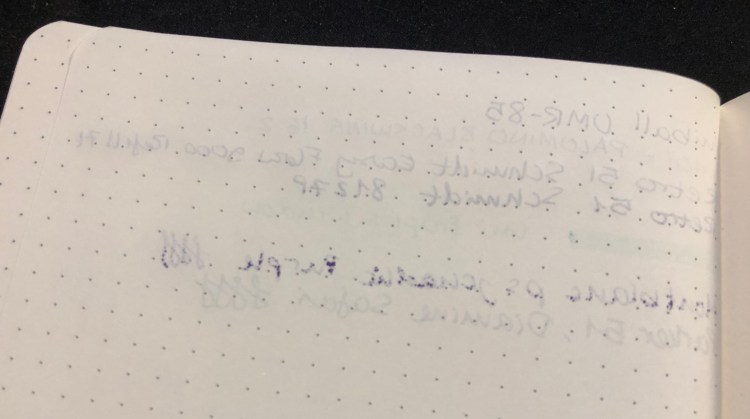
Show through is better than tomoe river paper, but not as good as Rhodia (I’ve had mixed results with Baron Fig, so I’m not using them for comparison here). Again, the only real problem was with the Montblanc ink, which is a problematic ink in general, so I’m not using it for comparison. I’d find this notebook to be usable on both sides of the page, but again, that comes down to preference.

Moleskine seems to be making an effort not only to come up with innovative limited editions, but also to give their regular line-up a bit of a refresh (with new added colours) and boost (with new dotted paper, better quality paper, and a fix for their elastic closure problems). That’s a move in the right direction, and one that I plan to enjoy.

I still need to figure out what’s going on with that Montblanc ink, though…

New Year’s Resolutions

For the last three years I’ve been making and tracking yearly goals in a Baron Fig Three-Legged Juggler Confidant. I call my new year’s resolutions my yearly goals because unlike resolutions, goals are something concrete and well defined that you continually strive to achieve.

The goals are personal, so I’m not going to share them here, but I am going to go over how I set them up, in the hopes that it might help and inspire those working on their own yearly goals.

  • Set yourself up for success by picking goals that you:
        1. Actually care about.
        1. Are measurable.
        1. Are achievable even if your year goes horribly wrong. The trick is to set up easily achievable basic goals, and then “bonus” or extended goals that go beyond them in various tiers. So if you aren’t reading at all and you want to read more a good basic goal would be “read 4 books a year”, with extended goals of “read 8 books a year”, “read 12 books a year” and so on.
        1. Are a mix of things that you track all year and one time events ( for example: participate in X number of races, and run X kilometers a month/year).
        1. Aren’t focused on one area only (to avoid boredom and burnout).
  • I use a paper notebook to track my yearly goals and the “Streaks” app to get my streaks going. The notebook is something I open and update at least once a week and so is constantly on my desk, resting against my laptop. It’s a physical and constant reminder of what I need to do. I can’t emphasize enough how important the physical aspect of putting a check mark or crossing out a box is for this to work.
  • Be ambitious only with extended goals, or you are going to disappointed and discouraged very quickly. Human beings are terrible at assessing deadlines and the amount of effort required to achieve a goal. Cut your goals by 25-50% at least from what you think you can achieve. Yes, it’ll make them easy, but the point is to create a momentum of action and success, not frustration and failure. If you know you’ve missed all or most of your goals you’ll stop looking at them, and by March 2019 you’ll be done.

Field Notes Rams Review

I got these notebooks because I like Field Notes more minimalist designs, and this is most certainly one of them. I’m not a fan of dot grid though, so I’m not sure whether I’ll actually enjoy using it.

The orange highlights go well with the cream coloured covers and the grey type.

White staples, to complement the covers:

The best part of this notebook, Dieter Rams Ten Principles of Good Design:

Testing the pages a bit:

The reverse side of the page:

The Field Notes Rams edition is a utilitarian notebook that would be perfect with a Lamy 2000, provided that you’d fill the pen with something like Noodler’s Black. As it is, because of the dot grid, I have no idea when and how this edition will get into my rotation. If you prefer dot grid notebooks, this notebook is definitely worth checking out. Otherwise, the more colourful Three Missions or the more interesting Clandestine would probably be a better purchase.

My Reading Journal, or How I Taught Myself To Enjoy Reading Again

Ironically enough, by the time I finished with my MA in English Literature a few years ago I had “lost” the habit of reading. From someone who used to read at every available (and not so available) moment I had turned into a non-reader almost entirely. This bothered me so I set up to rectify it by “gamifying” reading until I had tricked myself back into the habit again.

Field Notes had just come out with their Arts and Sciences, the perfect format for my plans. The idea wasn’t only to create a journal where I would log my thoughts on each book as I read it, but create a little set of “achievements” that I could unlock for each book as I read it. For each quarter of the book I read, I got an achievement, a little logo that symbolized the book which I drew on a separate page. The accumulation of those silly little symbols was enough to push me forward as I learned to enjoy reading again. I kept that up for three Field Notes Arts books and then when I ran out of them, I simplified the format and moved to the Moleskine Two-Go, which had just come out. The Field Notes Arts notebook wasn’t fountain pen friendly so I used a Karas Kustoms Render K, a Blackwing pencil and the Caran d’Ache Bicolor 999 double sided coloured pencil.

On the first year that I tried using this system (from March 2016) I got from not reading any new books (just my old familiar favourites) to reading almost 20 new books. On the second year (2017) I got up to 42 books. This year to date I’m at 58 books, and I’ll probably read 60-61 books by the end of the year. I no longer need to spend time drawing little “achievement badges” as my reading habit is back here to stay. I do, however, still keep a book journal even though I’ve started using Goodreads since 2017. It’s a satisfying way to keep track of my reading and organize my thoughts on the books that I’ve read.

You can check out the format of the entries for fiction and non-fiction below. The unlined left side of the spread (verso) is where I do a little doodle that reminds me of something central in the book, and explain the star rating that I gave the book in each category. I really recommend that if you choose to create your own analog reading journal, you create your format yourself. Mine has changed over time, particularly for non-fiction, and it works with my reading goals for the year.

This is the index, which is useful for reference later on and is a good way to check my reading progress throughout the year.

“Triggers” Daily Questions and a Moleskine Pocket Peter Pan Limited Edition review: All Children, Except One, Grow Up.

Ever since I’ve read the book “Triggers” by Marshall Goldsmith about six months ago I’ve been searching for ways to track the progress of my Daily Questions (“Did I do my best to…”). I tried using my journal for several months, then used a Google Sheet for two months, and in both cases something was missing. The Google Sheet was great for statistics and tracking, but not as satisfying and meaningful as writing my daily scores down (and I didn’t really find the statistics useful). The journal was much better, but as my goals changed it was time consuming to create a new table each time, and I needed a way to for me to justify my daily scores.

Enter tracking system number three: a Moleskine pocket Peter Pan limited edition notebook and an index card. Let’s start with the notebook:

The Peter Pan Moleskine limited editions showcase some of Moleskine’s best design work in recent years. Both the colourful covers, the drawing and the lettering evoke the spirit of Peter Pan without resorting to Disney-esque tropes. They’re naive without being childish, colourful without being brash, and the quotes on the covers are brilliantly selected.

Inside the covers are more illustrations in the same vein and even the famous “In case of loss” is set in a hand lettering like font. The palate of the entire Peter Pan line is limited (navy, orangey-yellow, green and white) but it never feels that way.

The back cover. Again, extra points for aligning the design so well with the back pocket. It almost seems like they’re flying into it:

This edition comes with stickers that are a lot of fun and well drawn in a naive style:

And the B-Side of the sleeve instructs you on how to build paper planes and also uses quotes from the books or that reference the book:

So that’s the review of the notebook itself. I highly recommend all of the Moleskine Peter Pan notebooks — they rank alongside the Denim and some of the Harry Potter limited edition notebooks as my favourites of recent years. I didn’t buy it specifically to try to use it as a Triggers Daily Questions tracker, but it was languishing in my “to use” pile and a used notebook is better than an unused notebook, so I decided to give it a spin.

The idea of writing down my Daily Questions each time was what made me stop using my journal for this purpose in the first place, so I decided to write them down once on an index card (which I would slip in the notebook’s back pocket), and then number each question, and date the card. Every day I would write down a score for each daily question, and a very short justification for the score. The justification is short to make it easy to write them down (if it’s a hassle I’ll have a hard time sticking with it), and that’s why I chose the pocket notebook (it’s also light and easy to carry around). When I feel like I need to change the questions up, I’ll create a new index card, put an end date on the old index card and archive it in the notebook’s back pocket. Every day will be dated in the notebook, and I use the appropriate index card if I really want to reference that particular day in the future. This may seem a little clunky for reference purposes, but as I learned over time, I don’t really go back to reference my past answers, so that’s not a meaningful setback.

I’ll check in a few months and document how it goes, but judging by my previous experience, this looks like a pretty good setup for now.

Some pencils keep getting better

I did not like the Blackwing 530 when it came out (too much bling for my taste), but now that pencil that I’ve been using has gotten worn down and dinged a bit an underpainting of verdigris has been revealed, and I love the effect. It’s just a little reminder that I should give things a chance even if I didn’t fall in love with them at first glance (also this pencil is super difficult to photograph, because of the bling, so forgive me for the potato quality photo).

Moleskine Denim 12 Months 2019 Pocket Weekly Planner review

The Moleskine Denim 12 Months 2019 Pocket Weekly Planner arrived today, and it is a beauty.

I’m not a big planner user, but over the past year I’ve used a weekly planner just to get a better idea of how my week looks like and how to plan ahead accordingly. The slim, minimalist setup of the Moleskine Pocket Weekly planners is perfect for this.

Beyond the regular planner editions, Moleskine offers a wide variety of planners in their various limited edition designs (Harry Potter, Star Wars, Peanuts, Le Petit Prince and more), among them in their Denim collection, which is one of my favourites.

The covers are covered in Denim fabric, with jeans-like labels on them. The craft sleeve around the planner turns with a few minutes of work into bookmarks perfectly sized for the planner:

The endpapers are really nicely designed to evoke various denim labels, and the red elastic closure is echoed in the small back pocket:

As usual with Moleskine limited editions, it comes with a little something extra in the back pocket, this time stickers:

As for the internals, it’s the same as other Moleskine weekly planners, with a weekly schedule on the left side of the spread and a ruler page on the right, monthly calendars and information pages at the beginning of the planner, and a few general planning pages.

If you’re looking for a pocket weekly planner that’s beautiful, lightweight and not overly structured, I highly recommend this planner.

Moleskine Looney Tunes Limited Edition Notebooks and a New Moleskine Two-Go

At almost the last minute of my trip to Paris I managed to sneak in a short visit to a Moleskine store, and was caught by surprise by their new Looney Tunes collection. I’m not a rabid Looney Tunes fan, but the Bugs and Wile E. Coyote were too well-designed to pass, and I’m curious enough about any limited edition that couples Tweety, drawing pencils and a sketchbook to give it a spin. These all obviously come with a Moleskine premium, but if you’re remotely into Looney Tunes, I’d recommend them.

I’ve only opened the Wile E. Coyote notebook at the moment, though I have seen the others open in the shop and they are as tremendously well designed as the Wile E. Coyote one is. The endpapers are so colourful and a lot of fun, and they work with the cover design so well.

It comes with stickers of course:

And a cute B-Side band:

Another pleasant surprise was a new cover colour to the Moleskine Two-Go editions, green. The Two-Go notebooks have thicker paper than regular Moleskines, and they’re smaller than large Moleskines, with one side of the page blank and the other side ruled. I use them as my reading journals, and highly recommend them, especially if you were at all fond of the Arts notebooks of Field Notes’s “Arts and Sciences“.

Beginner’s Tips to Watercolours, Part 1: How to Build Your First Palette

Watercolours are scary to work with, because unlike other drawing mediums (except ink washes), they have a mind of their own and don’t stay where you put them, and they don’t mix like other mediums, because of their transparency. There’s also a lot of very cheap, poor quality watercolours out there that the beginner may be tempted to buy, that will only be able to produce “grainy” or washed-out drawings. So, here’s how to build your first watercolour palette:

Which company should I choose?

Any company that has artist grade watercolours that has several series of paints, with different price points for each series, is a good choice. The key word is “artist” and not “student” grade, and that Cobalt Blue (expensive) should not cost the same as Yellow Ochre (cheap).

Quick explanation: student grade pigments are low quality pigments whose only winning quality is that they’re cheap. Your time and work are worth more than that, trust me. Artist grade pigments are much higher quality, and since we live in a “post truth” world, don’t trust the label, check that there’s a price difference between different pigments. Certain pigments cost more, and the companies that use them want you to pay for that. Usually companies will have about 4 “series”, with 1 being the cheapest, and where you’ll find most of the browns, and series 4 being most expensive and where you’ll find most of the blues and some yellows and reds. Don’t fall into traps like “this is a Japanese maker,” or “these are hand made,”  — every good quality maker will have grades to their paints. It’s not a “Western” or “Big Company” thing — it’s economical common sense.

OK, artist grade and several, differently priced series, but really, which company should I choose?

It depends what you’re going for and where you live. If you live in the US, Daniel Smith is a good option, since they’re the most readily available. The problem is they come in tubes, which isn’t the most economical or convenient of ways to start working with watercolours. If you want to start with Daniel Smith you’ll either need to buy empty half-pans and fill them, waiting for a few days for them to set, or buy a plastic watercolour palette with wells, fill them and wait for them to set.

Winsor and Newton Professional half-pans are probably the best place to start, if you can get them (and they’re pretty widely available). These are excellent and affordable. Just avoid the Cotmans paints, which are their student grade ones. Make sure that there’s “professional” printed on the label. They are the goldilocks of watercolour pigments

Schmincke Horadam (not Academie) is what I use, and is the favourite of many watercolourists as it has the most vibrant pigments that are the easiest to lift and rework. They’re more expensive and difficult to obtain, and if you’re used to other pigments their vibrancy might scare you off at first. (BTW – Schmincke is pronounced shmin-keh, and not schminkee. It’s a German company).

Sennelier is even more difficult to find, and is the opposite of Schmincke, being more subdued and transparent. If you really want to get into glazing, these may be for you, otherwise, I wouldn’t recommend them.

White Nights watercolours are also good, a midway between W&N and Schmincke, but they’re difficult to find, particularly outside of sets.

Which should I pick: Half-Pans, Full-Pans or Tubes?

Half-pans.

Quick explanation: you’re starting out, so half-pans are the best, and should last you for a long, long time, since you use so little pigment in watercolour painting. This will also let you experiment with different pigments later on, maybe even switching companies without breaking the bank. When you get into “heavy” use, you can switch to full-pans, or tubes, which are the most economical of options, if you actually get to use them.

Which colours to choose?

Start with these: Lemon Yellow, Raw Ochre, Burnt Sienna, Raw Umber, Ultramarine Blue, Cobalt Blue, Sap Green, Alizarine Crimson, Payne’s Grey (blue tone).

Every company will have them, although their names may differ a bit.

Later on I’ll discuss how to understand pigment labels (so you can pick your own), and which ones to pick for different kinds of drawing, but with these you’ll be able to draw landscapes, portraits and still-life, and they’re all transparent pigments, which means they mix well and glaze well, without creating “muddy” effects.

Quick explanation: this is the standard, classic watercolour palette, except that I’ve switched a few pigments with others that mix better. That’s why there’s no Cadmium Yellow or Cadmium Red here. Payne’s Grey is God’s little gift to watercolourists — you’ll use it a lot for shading and mixing, and as an added bonus, except the Cobalt Blue, these are all series 1 and 2 paints, which make them cheap.

This week’s long run: how to run when you really don’t want to

My mom has some very serious health problems, and that (coupled with some travel) has  made me put my running on a two week haitus. Except for an “angry run” of 4k that turned into 6k, I haven’t been lacing up lately, and that’s not good.

Yesterday I put in a 4k, and as usual after a break, it was pretty rough. Not as rough as I knew this morning’s run would be. It was scheduled to be a 10k, but I dropped it to a 7k, knowing that all things considered even that would be a challenge. I would have to fight my lizard brain all the way through this one, so I would have to use all the tricks I had to get through it:

Trick #1: Remove all obstacles to getting out the door. For me that meant setting an alarm, setting out my workout clothes, and charging my headphones the night before.

Trick #2: Promise yourself something nice once you complete the run. For me it was breakfast at my favourite cafe.

Trick #3: Distraction, distraction, distraction. This is the most important thing, and why I chose a new route, and I saved my favourite podcast (Do By Friday) for this run.

Trick #4: Give yourself a break. I allowed myself to stop for breaks, so long as they were only for a few seconds, and I went right back to running again. I needed to decide this in advance so I wouldn’t feel bad about taking the breaks that I knew that I would need. The point was not to beat myself up for something that couldn’t be helped.

It worked, and I got rewarded with some pretty nifty new views:

Get out there and run. You can crush it, no matter what the little lizard says.