January was a big month in terms of writing pens dry. For the first time ever I managed to write all of the Inkvent pens dry by the end of the month. That’s 12 fountain pens written dry, which is the most I’ve ever written dry in a month. The secret is not filling them more than 50% full, and making sure to journal and note-take consistently.
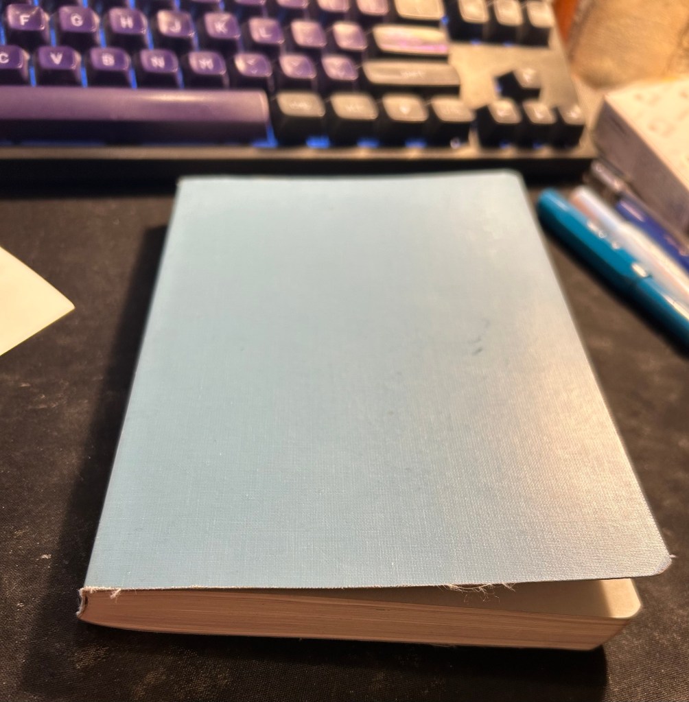
In terms of paper products I’ve journaled in my Stalogy 365 B5 journal and will be switching to a new journal next month (also a Stalogy 365 B5 because I like the paper and the format). I do have a little quirk with these notebooks – I use them upside down because I don’t like the header with the dates on it, so I flip the notebook around so that it’s at the bottom of the page. That way it doesn’t bother me as much.
Stalogy 365
I’ve also been using a Rhodia A5 dot pad to time block my day, and Kokuyo A4 KB which I cut in half (to get two A5 pieces of paper) and write my daily todo list on. At work I use a Maruman Mnemosyne horizontal A5 notebook (either squared or blank) to brainstorm on, track my tasks, take meeting notes, etc. My weekly plans and long term 12 week year goals are in a Leuchtturm1917 Bullet Journal that stays at home, on my desk. The rest (Stalogy B5 journal, two pieces of daily planning paper, and the Mnemosyne) travel with me when I go to the office.
I have a monthly calendar with some monthly reading, running, gym, swimming and blogging targets on it and I draw that on a Well Appointed Desk “Rebel Plans” notepad.
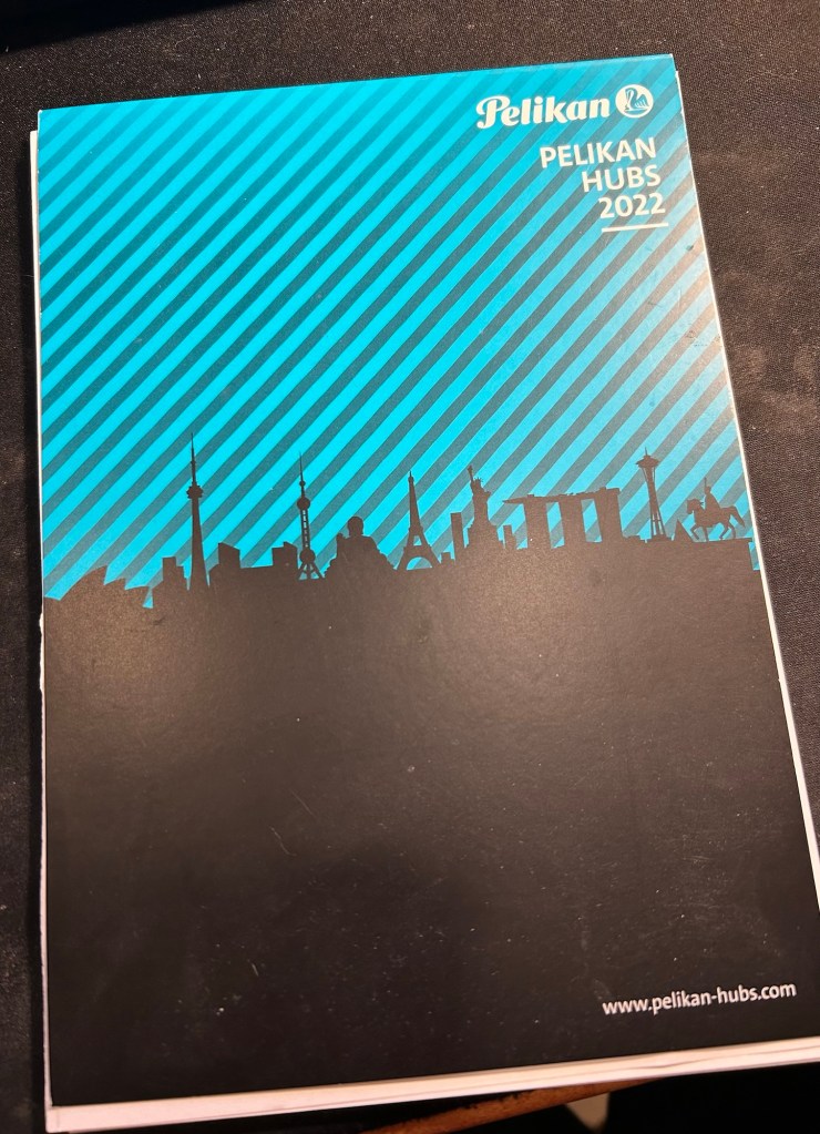
Earlier this month I used the wonderful Pelikan Hubs paper to do my daily planning, and it was amazing (cardstock thick and fountain pen friendly). I was running out of it quickly though, which is why I moved to the Kokuyo.
Pelikan Hubs paper pad
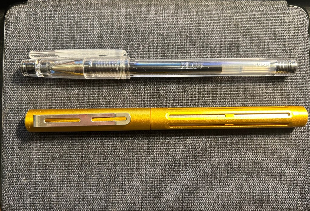
In terms of standard pens I’ve used the Pilot Hi-Tech-C in 0.4, my Spoke Design Spoke Pen in orange crush, and a Pilot Juice Up 04 in orange and light blue. As I will be spending a lot of time at hospitals next month, I will likely be using more standard pens then.
Pilot Hi Tec C and Spoke Design Pen
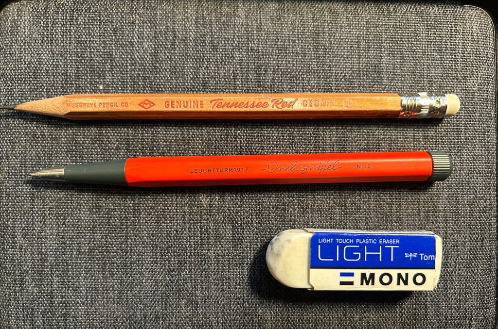
Pencils in use were the Tennessee Red, which is gorgeous and a treat to use, and Leuchtturm1917 Drehgriffel Nr.2 mechanical pencil in red and grey. I have better mechanical pencils that this one, and yet I keep returning to it. Something about the Drehgriffel design is simply appealing to me. You can read my review of it here.
Next month will likely see more use of standard pens and pocket or cheap fountain pens. I will be in the hospital a lot, so that means that my setup will change to reflect that.
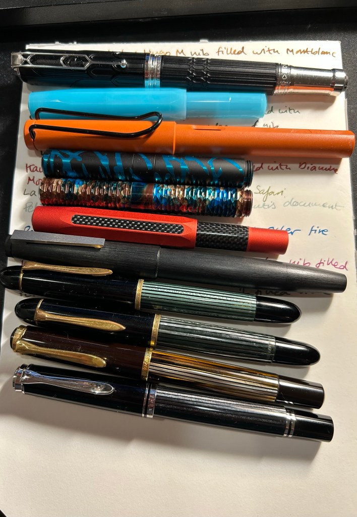
Here are the fountain pens I filled for February:
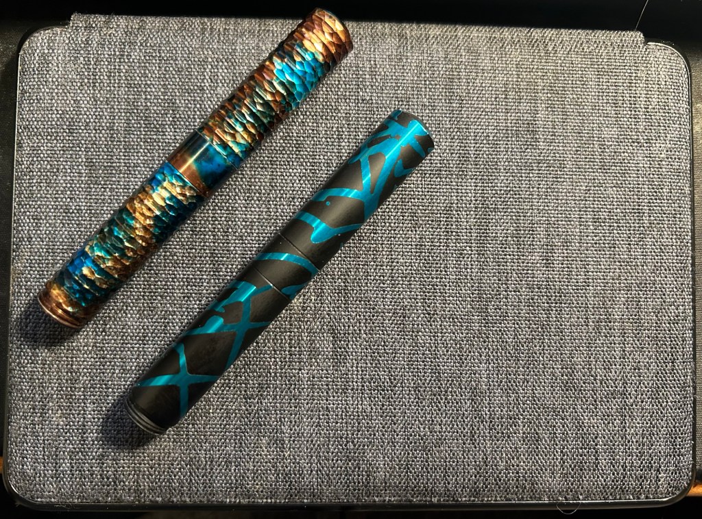
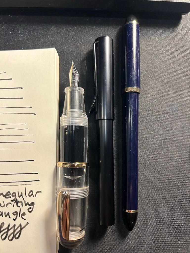
Schon Design Pocket 6 pens.Kaweco Sports.
The new and challenging setting will mean that I’ll likely go back to my trusty Moleskine hardcover and Ti Arto for the duration of my dad’s stay in hospital.
What stationery products have you been using in January?
Happy fountain pen day to all who celebrate. I purchased a Leonardo Momento Zero Nuvola rose gold fine flex nib from Fontoplumo with the hopes that it will arrive at some point in the future (deliveries are still severely delayed).
Unlike past years I’ve started working on my Inkvent reviews now instead of in real time, as a way to make them less stressful. I decided to theme my sketches this year around my teddy bear collection.
My PTSD has been kicking my ass since Tuesday, when I got caught in a crowded shelter (small room, no windows, closed door, large rocket barrage. Couldn’t have been more triggering if I’d designed it). I’m taking some time off daily posting to take care of myself.
I’ve recently switched out most of my fountain pens and inks for a new batch, so here’s a quick overview of them (from top to bottom):
Currently inked writing sample
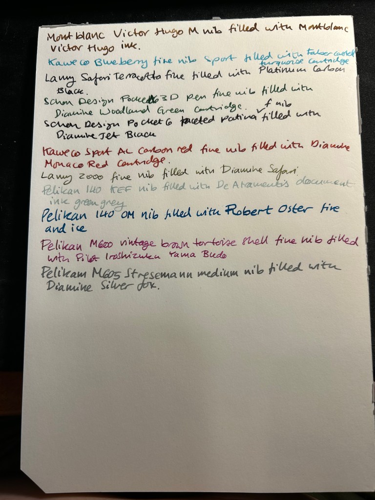
Montblanc Victor Hugo medium nib filled with Montblanc Victor Hugo ink. I bought this at Mora Stylos just before they closed, mainly because the design is based on the Notre Dame de Paris, which I adore. It’s a weird design and quite a hefty pen, but I enjoyed the nib, despite it being a medium. The ink, also limited edition (but knowing Montblanc is likely a relabeled existing ink) is a nice, warm brown with a good amount of shading. As I post this I’ve written this pen dry.
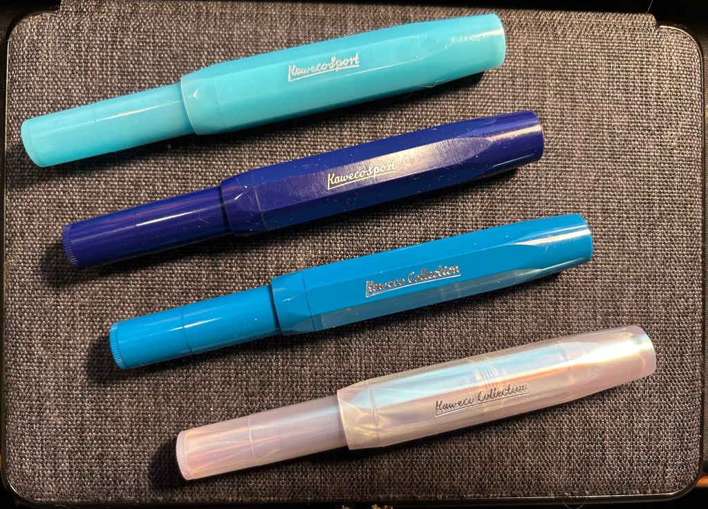
Kaweco Sport Frosted Blueberry fine nib filled with a Graf von Faber-Castell turquoise cartridge. This is the only fountain pen that I took with me on my recent trip to the US, and I used it on the plane (not during takeoff and landing).
Lamy Safari Terracotta fine nib filled with Platinum Carbon ink. I wanted a waterproof ink for my sketches, and I haven’t used Platinum Carbon for ages. The Safari Terracotta is the perfect coloured pen for this season.
Schon Design Pocket Six 3D Teal x Matte Black pen with a fine nib filled with a Diamine Woodland Green cartridge. This pen is already been written dry by the time I’ll post this.
Schon Design Pocket Six Faceted Patina fine nib filled with a Diamine Jet Black cartridge. Schon Design pens made me enjoy pocket fountain pens, and Diamine Jet Black is proving to be a solid, dark black ink (not greyish or brownish).
Kaweco Sport AL Carbon Red fine nib filled with a Diamine Monaco Red cartridge. The perfect pen and ink match. I don’t normally use red inks, but Monaco Red skews towards the raspberry side of things, and is very pleasant.
Lamy 2000 fine nib filled with Diamine Safari. Before I filled a flock of Pelikans, this was supposed to be my workhorse pen. Diamine Safari is great for sneaking unusually coloured inks into serious office settings without drawing attention to yourself.
Pelikan 140 KEF nib filled with De Atramentis green grey document ink. Another sketching combo, perfect for watercolours when I want my line work to melt into the background. KEF stands for Kugelspitze Extra Fine – or Ball-tip extra fine. It’s a very forgiving and rather firm gold extra fine nib. I inked this up on the Friday of the Pelikan hubs even though I didn’t go to a hub. The 140 is a piston filler from the 1950s with a gold nib that was dirt cheap and is an utter workhorse. It’s user grade due to the brassing, but brassing adds character.
Pelikan 140 OM nib filled with Robert Oster Fire and Ice – Pelikan stopped making OM nibs in 2014 because they’re scratchy and unpleasant to write with if you don’t hold them at the right angle. But at the right angle this nib is phenomenal, and it works great with inks that shade and sheen – and Robert Oster Fire and Ice is definitely one of those. You can see a visible sheen at the edges of each letter, and it makes them all glow. I inked this to celebrate the Pelikan hubs.
Pelikan M600 brown tortoise shell fine nib inked with Pilot Iroshizuku Yama-Budo. This is a vintage M600 from the 1980s, with West Germany printed on the band. It’s a lovely workhorse, like all Pelikan Souveräns, and the Yama Bodu ink manages to shade even with the Pelikan fine nib. Also inked for the Pelikan hubs.
Pelikan M605 Stresemann medium nib filled with Diamine Silver Fox. I haven’t had a grey ink in rotation for a while, and Silver Fox is an interesting and dark grey with plenty of shading, particularly with a juicy Pelikan medium nib. Also inked for the Pelikan hubs.
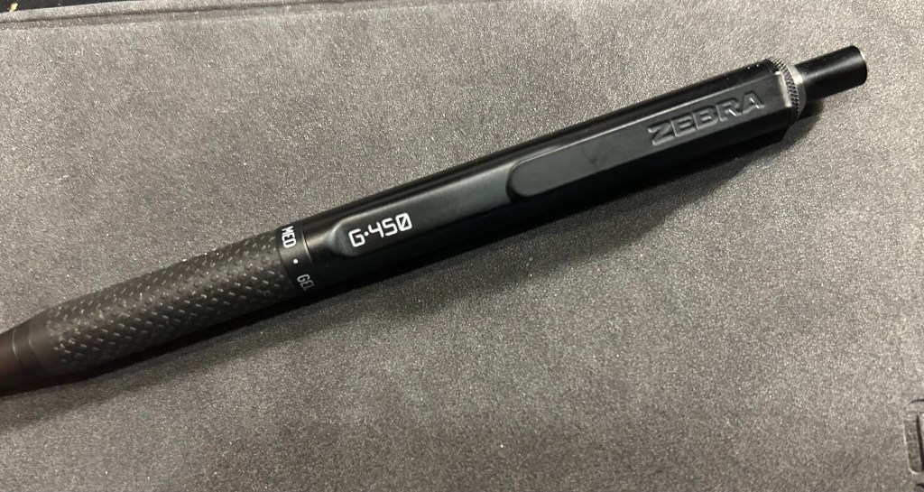
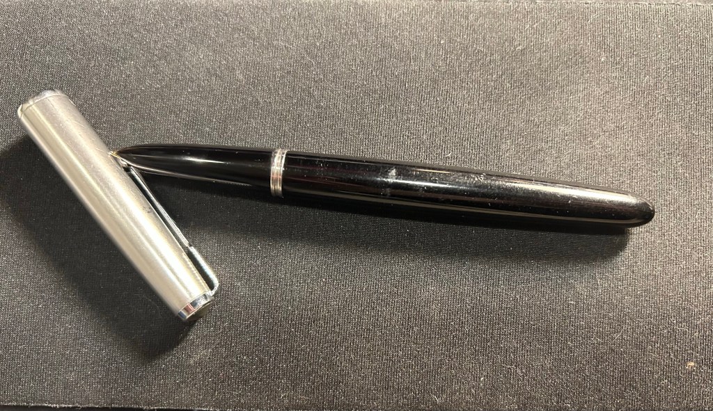
Never have I ever fallen in love with a standard pen faster than the Zebra G-450. Even the Uni-ball Signo RT 0.5 took a bit of time until it became my favourite, and I had much less experience with gel ink pens at the time. I liked the Zebra G-450 so much that after writing a few pages with it, I put in an order for two more packs, just so I’ll have backups and multiples of it.
So, what’s so special about this pen?
Zebra G-450
First of all, the Zebra G-450 looks like it was designed to be a prop in the Jason Bourne movies. It doesn’t have the “I’M A TACTICAL PEN, LOOK AT ALL THE WEAPON LIKE APPLICATIONS YOU CAN GET WITH ME” look of tactical pens. I find that look childish, and I find that it makes for very uncomfortable to write with pens. The G-450 is nothing like that: it’s sleek, features a durable and hefty-without-being-heavy brass body, knurling on the top, a very well designed rubber grip, and very Jason Bourne like fonts.
G-450
The G-450 has a well designed and solid clip, with a step down/cutout right in front of it that adds interest to the pen silhouette and makes it easier to clip onto things.
Step down, clip and fonts
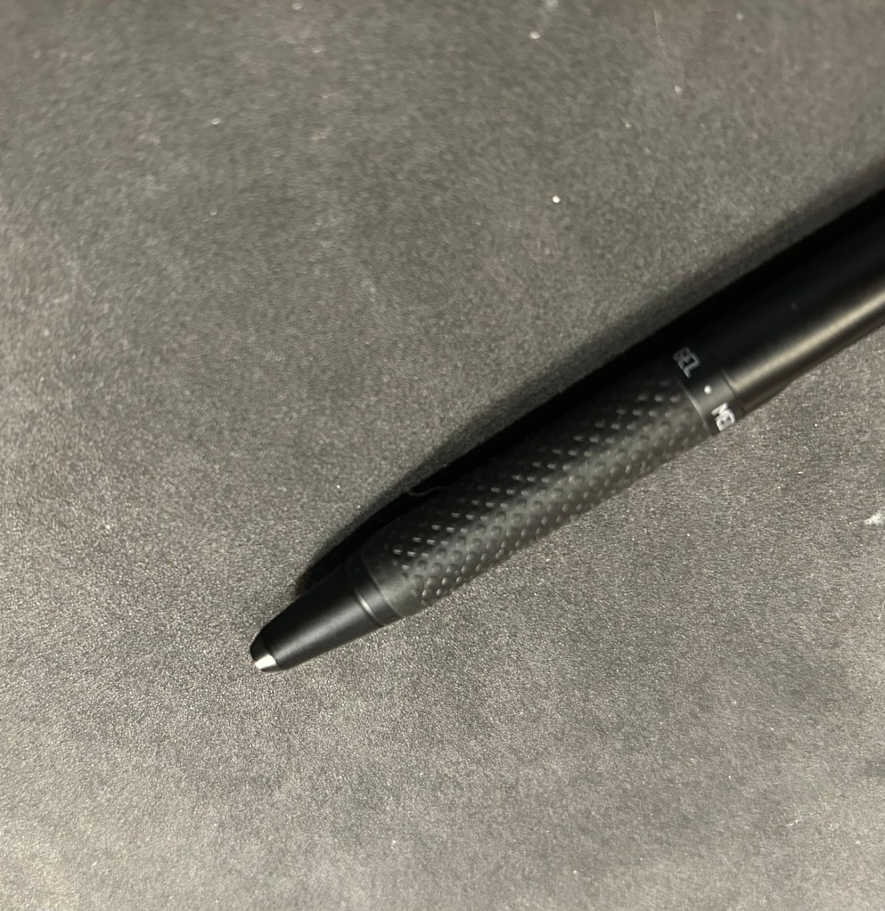
I love the console like fonts in white, and I really love the grip. It isn’t mushy like a silicon grip, but it is softer than the pen body, and with the raised pattern on it, gives you a rock solid grip on the pen. The ring on top of the grip announces that this is gel pen, with a medium (0.7) tip. The pen cone has an extra small taper towards the tip, adding interest and perhaps also helping stabilize the refill. There’s no clicking, jiggling or noise from the tip as you write with the G-450.
Grip closeup.
The click mechanism is solid. The clicker (is it called that? let’s assume it is) stays extended at all times, even when the tip is engaged, and it has a very satisfying click. There’s a red jewel with Japanese writing in silver on the end cap, and it adds a nice and subtle splash of colour to the pen.
end-cap closeup
All this is wonderful, but it’s the refill that makes it all sing. It’s dark, super smooth, and it dries almost instantly. Yes, even on Stalogy paper, even on Rhodia and other fountain pen friendly paper, it just dries as soon as you write with it. This is a perfect lefty pen (I’m not a lefty) and it’s perfect for jotting things down in a rush. It will write a bold, clear line, and not smudge.
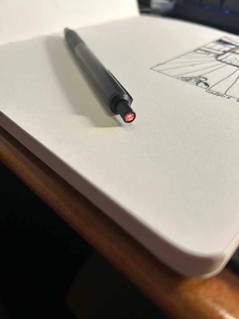
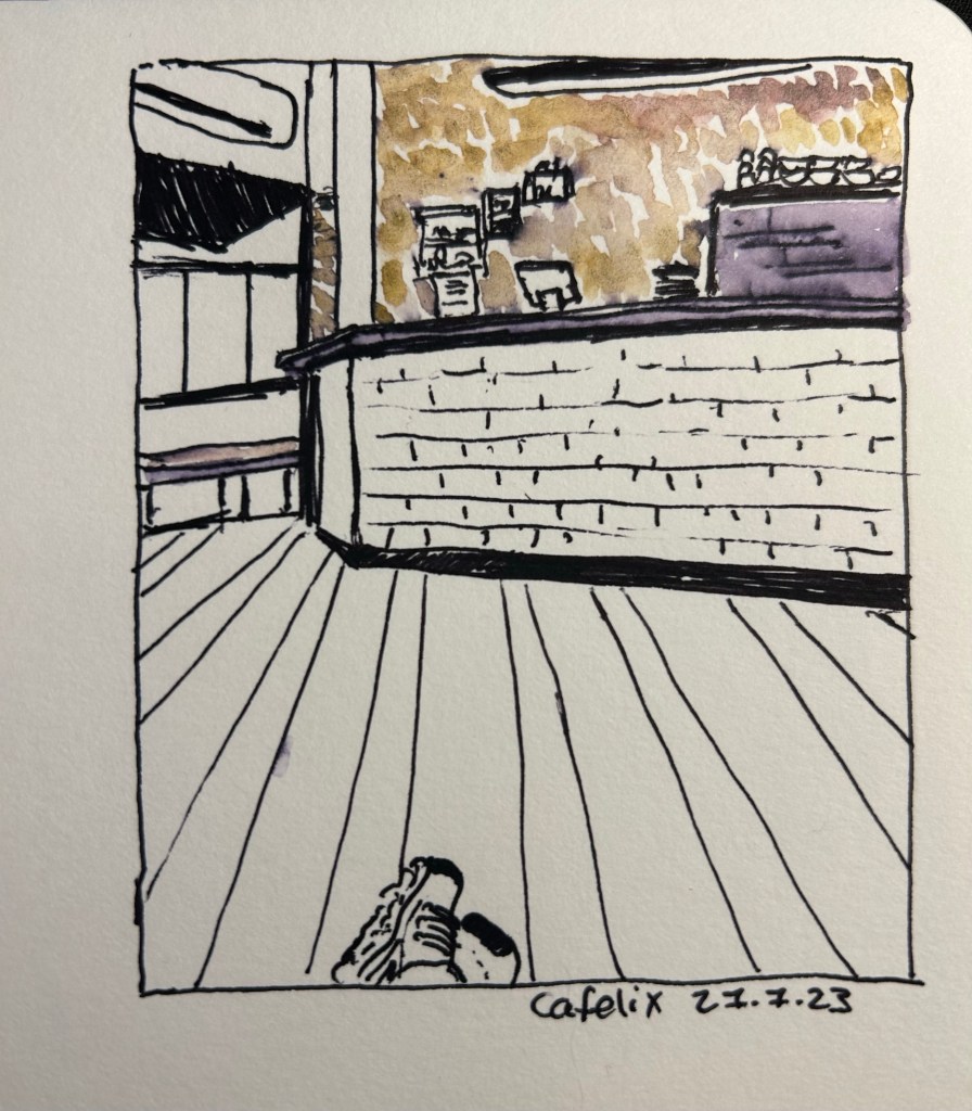
I sketched a local cafe with the Zebra G-450, on Stillman and Birn Alpha paper. I then “opened” up the lines using a waterbrush, as the the Zebra G-450’s fast drying refill isn’t waterproof (as is to be expected with gel ink pens). The result was a nice greyish purple that you can see on the coffee machine on the right. The coloured graphite was provided by the Derwent Inktense paint set, but that’s a review for a different day. Suffice to say that while the Zebra G-450 isn’t a sketching pen, it will work well as one in a pinch, as long as you like thick lines, and don’t mind it not being waterproof.
Rarely have I encountered a pen that I wholly like after just a day of use. I love the G-450’s aesthetic, its refill and its feel in the hand enough to immediately add it to my daily carry. I used Zebra’s wonderful G-301 pen daily for years, and I can see the G-450 easily replace it on merits of the refill alone. Sometimes a pen just ticks all the boxes for you, and this one clearly does for me. I recommend giving it a try if you possibly can. Who knows, maybe it will become a new favourite for you as well.
First thing’s first: if you are looking for a writing pen, then the Majohn Q1 mini fountain pen is likely not for you. While you can purchase it with an extra-fine, fine or medium nib, it’s weird body shape would likely make it uncomfortable for long writing session, and as it’s an eyedropper filler, it’s designed to have a giant ink capacity, normally suitable for long writing sessions.
If, on the other hand, you are looking for a fountain pen to sketch with, the Majohn Q1 may be a very worthy addition to your kit.
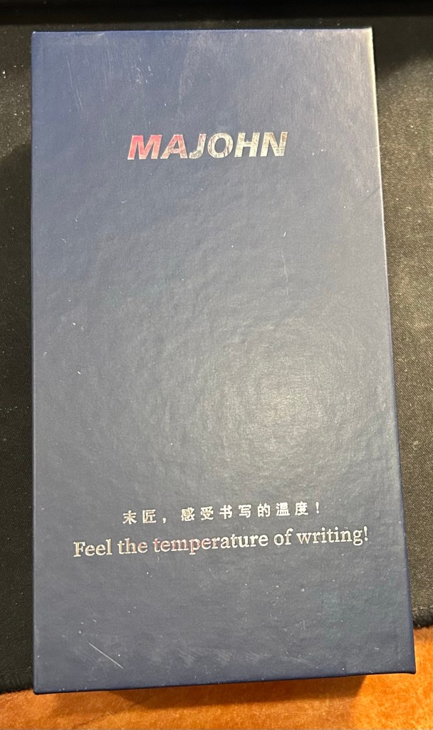
The box. I love the “Feel the temperature of writing!” inscription on it.
I purchased the Majohn Q1 bent nib fountain pen after seeing Paul Heaston use it in one of his sketches. “What is THAT?!” I asked, and immediately set out on getting one. This weird looking fountain pen reminded me of the Tombow Egg pen (google it. I’ll wait), which I always wanted and never got because I couldn’t afford one at the time. The Majohn Q1 appears to have almost the exact same design as the Tombow Egg, with a few minor details in the trim and molding of the grip section. I purchased mine on Amazon for $22.
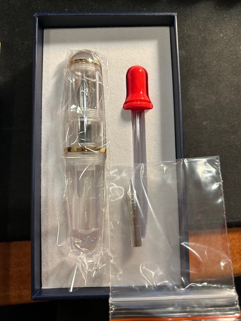
What’s in the box: fountain pen with bent nib installed, eyedropper, and a spare medium nib.
The box the Majohn Q1 arrives in is good looking enough to gift someone. Inside there’s the pen with the Fude/bent nib installed, a spare medium nib (the bent nib is an “aftermarket” installation) and a glass eyedropper that you can use to fill the pen with. The pen itself comes installed with an o-ring so that it can safely be eyedroppered. I filled mine with De Atramentis Black Document ink, which is waterproof when dry.
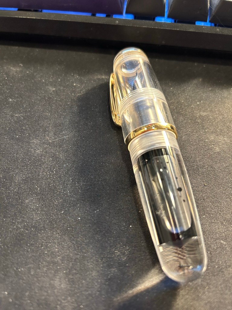
I filled the pen only to 3/4 and still it holds a tremendous amount of ink, especially for such a small pen.
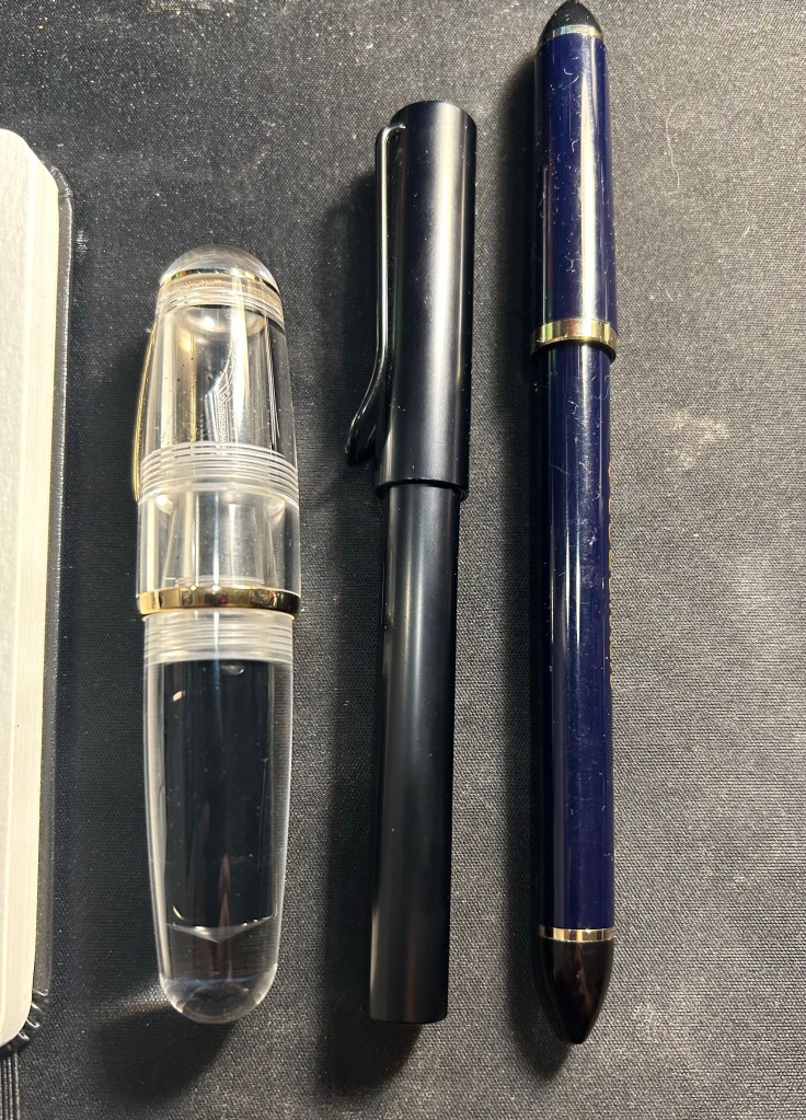
Now the Majohn Q1 is a very small pen, that holds a very, very large amount of ink. That’s why I was interested in it, as I thought that it would be a perfect fountain pen to add to my urban sketching kit. I currently use a Sailor Fude DE Mannen fountain pen for my urban sketching, and it’s a favourite among urban sketchers for the expressive, painterly lines it creates. It is, however, very long and pretty unwieldy: difficult to pack, and sometimes awkward to hold. Here are the Majohn Q1, a Lamy AL Star and a Sailor Fude pen laid next to each other, for size comparison:
As you can see, the Majohn Q1 is pocket pen sized in length, and very, very wide. It can’t be used unposted, as is to be expected with pocket pens, but once it’s posted, it just becomes an extra wide standard length fountain pen:
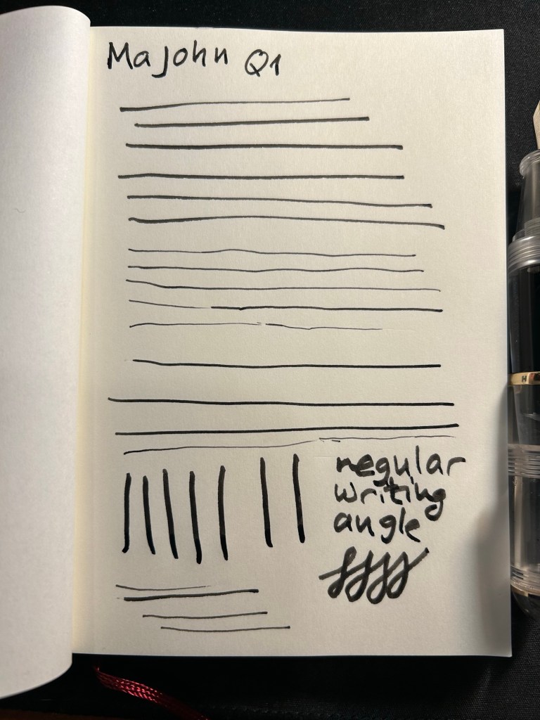
The point of this pen is the bent/Fude nib, so here it is, in all the different line widths it can create:
And here’s the Sailor Fude for comparison:
The Majohn Q1 offers much more line width control and consistency than the Sailor Fude, but you sacrifice some of the painterly quality and dynamism of the Sailor Fude to achieve that control.
The Majohn, like the Sailor, isn’t perfect in terms of gripping experience. While it’s much easier to grip the Majohn in a variety of different angles to get a variety of different lines, there’s a pretty pronounced step between the pen body and the grip section that can be uncomfortable if that’s where your fingers naturally land on. For me, I grasp the pen either closer to the nib, or not on the section at all but rather on the pen body. I’d recommend trying it out first, but for $22, it might be worth it just to buy the pen and try it out for a while.
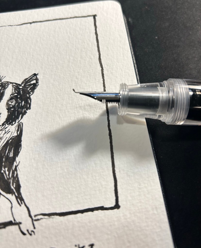
Bent nib and grip section closeup.
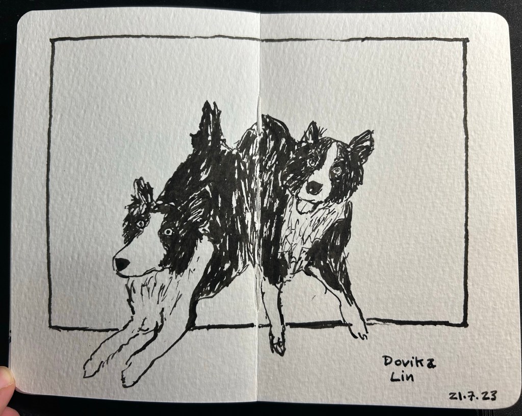
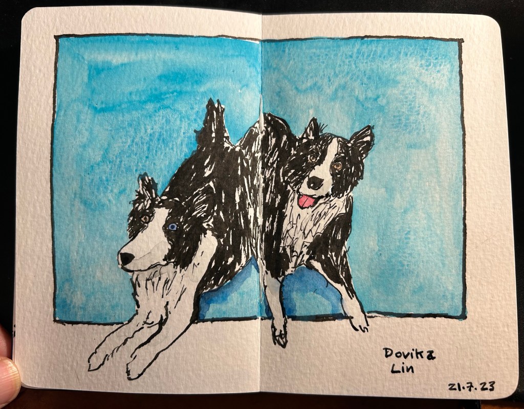
Here’s a sketch of a friend’s border collies sketched with the Majohn. As you can see, it’s relatively easy to get both a good level of control with this pen, a lot of line variation, and some of that painterly quality to the line that makes it more interesting and expressive.
Majohn Q1 bent nib, De Atramentis Document Ink Black, Moleskine Pocket Watercolour notebook.
Here’s the complete sketch, just for fun:
Schmincke watercolours added.
If you’re at all interested in fountain pen sketching, and especially if you are an urban sketcher, I recommend giving the Majohn Q1 bent nib fountain pen a try. It’s easier to control and to transport that a Sailor Fude, and holds a much larger ink capacity, which is great for long sketching sessions or when you need to block out a large section with ink. For such a low price you get quite a lot, and the learning curve is much less steep than with a Sailor Fude DE Mannen fountain pen. I don’t do calligraphy, but I assume that it could be worth a try for calligraphy as well, especially if you are looking for a travel friendly solution. And who knows, maybe you’ll get to feel the temperature of writing while using it…
I don’t normally celebrate this blog’s anniversary, but I decided to answer The Well Appointed Desk’s 21 Pen Questions and The Gentlemen Stationer’s 5 More Pen Questions to celebrate this year. You’ll see that my answers skew towards vintage pens and sket
#21PenQuestions
1: What is the pen they’ll have to pry out of your cold dead hands? My very first Parker 51 (an aerometric black one that’s worth very little but is still my favourite). I love writing with it, and it was such a significant purchase at the time. It was the first vintage pen that I bought, I got it from the Fountain Pen Network without having tried a Parker 51 or a gold nibbed pen or a vintage pen before, and it was so expensive for me at the time. I’m so glad that I took that leap of faith, and that it worked out so well.
My first ever Parker 51
2: What’s your guilty pleasure pen? My Nakaya Cigar Piccolo Negoro Kise Hon Kataji black/red with elastic flexible medium rhodium nib. It’s a joy to use but it was so expensive to purchase, I had to wait so long for the pen to be made and then I had to go release it from customs myself because they wouldn’t believe its price, so it never leaves my house. I bought it years ago from Mora Stylos in Paris.
My Nakaya
3: What’s the pen you wish existed? I’m curious about how a red Lamy 2000 would look. If it’s anything like I think it would then I want one.
4: What pen would you give to a new enthusiast? It depends on the person but either a Lamy Safari or a Pilot Metropolitan. If they were remotely interested in vintage pens, I’d have them try the magic that is the Parker 51. If they are an artist, then a Sailor Fude De Mannen with a bottle of De Atramentis Document ink.
5: What pen do you want to get along with but it just never clicked? Pocket pens, particularly the Kaweco series. I use them sparingly because it’s such a hassle to uncap and post them each time I want to use them. The same goes for the Schon Design Pocket 6. I have two of them, they’re great, but they’re too much of a hassle to use regularly.
6: What pen do you keep only because it’s pretty? I have some vintage pens that I daren’t use, the prime example being a retractable Waterman that I’m afraid to fill. You are supposed to pour the ink directly into where the nib is extracted from, and I can’t bring myself to do it.
Retractable vintage Waterman
7: What pen (or stationery product) did you buy because everyone else did? My worst pen ever, the remade Conklin Crescent filler. I bought it because people on the Fountain Pen Network went wild when they came out, and it is plasticky garbage that fell apart after one use, is horrible to fill and use, and was an utter waste of money. I’m now writing with a vintage Conklin crescent filler and A. The filling mechanism looks cool but isn’t practical (hard to fill, hard to clean), B. The Conklin flexy gold nib is amazing. C. It’s made of BCHR so it stinks to high heaven and has aged poorly. But I couldn’t care less because the nib is amazing.
8: What pen (or stationery product) is over your head or just baffles you? The plotter. It looks like a less well made Filofax for much more money, and I don’t get the hype. I also don’t get $400 steel nibbed cartridge-converter pens with over-hyped advertising. I don’t care how pretty the box or the site or the story is — it’s a $250 pen, tops.
9: What pen (or stationery product) surprised you? The Stalogy 365 B6 notebook. I wasn’t expecting them to become my main journaling notebook, but I like the paper and the size. Also the Retro51 tornado, which I thought was a gift shop pen but turned out to be pretty good, even though I don’t love the refill.
10: What pen doesn’t really work for you but you keep it because it’s a collectible?
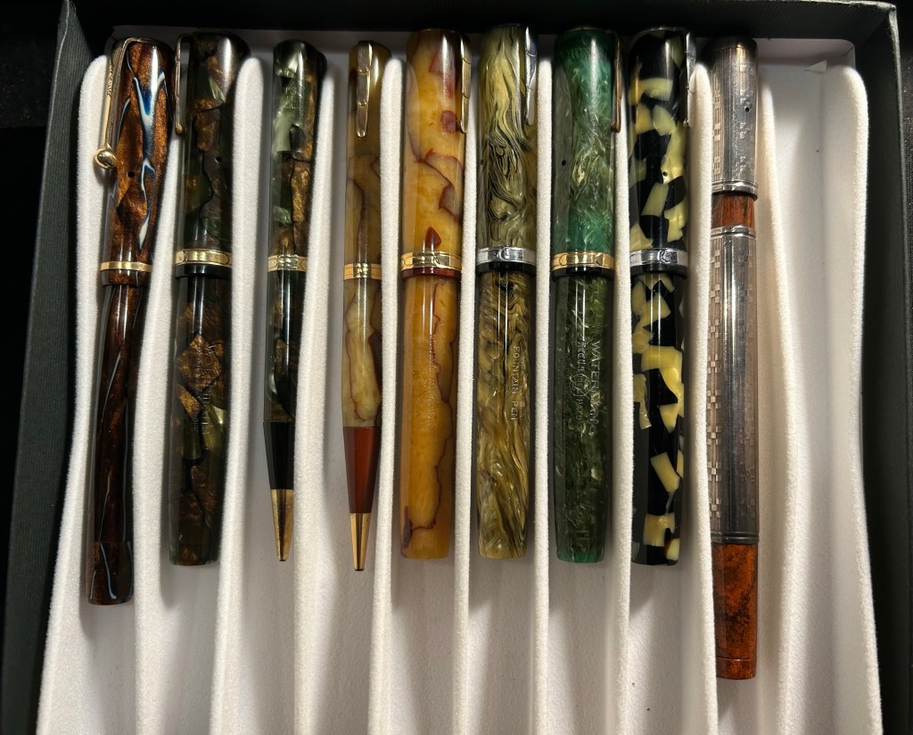
I have a few vintage lever filler fountain pens from Waterman and Parker that I rarely use because they’re such a hassle to fill and even more of a hassle to clean out.
Gorgeous lever fillers (and two propelling pencils) that I never fill. Retractable Waterman on the right.
11: What is your favorite sparkly pen (or ink)? I rarely use sparkly ink outside of Inkvent testing (I’m foolish enough to fill entire pens to test the ink instead of just dip testing them), and I have two sparkly pens only (both by Franklin Christoph) as I’m not a fan of the genre. That being said, between my Sedona Spa and Sparkling Rock I prefer the Sparkling Rock.
12: Which nib do you love — but hate the pen? Conklin Crescent filler. I also have some flex nibs on vintage button fillers (which I hate) that I keep for the nib alone.
13: What pen (or stationery product) gives you the willies? Noodler’s Bay State Blue. Because of the ink and because of the company.
14: What’s your favorite pen for long form writing? Parker 51, Lamy 2000 or a Pelikan with a fine nib. They’re all excellent writers, and the Lamy 2000 and Pelikan have giant ink capacities. The Parker 51 just makes me want to write more and more with it.
15: What pen (or stationery product) do you love in theory but not in practice? The traveler’s notebook. I love setting them up but I never use them because the format (both pocket and regular size) just doesn’t work for me. It’s too small and too narrow.
16: What pen (or stationery product) would you never let someone else use? I tend to not loan my pens out because they walk off my desk, to a point where I no longer keep any pens in the office (they all live in Sinclair bags and travel with me everywhere). If it’s at a pen gathering then I have no problem letting people try out my pens.
17: What pen (or stationery product) would you never use for yourself?
Lined notebooks where the lines don’t reach the end of the page. I loath them.
18: What pen (or stationery product) could you NOT bring yourself to buy? A Sailor King of Pen, because of the size and the price (and I’ve been eyeing one since they’ve been significantly cheaper). I actually tried one out and it felt ridiculous in my small hands.
19: What’s your favorite vintage pen? Parker pens, particularly the 51s but also the striped Vacumatics. But I have a hard time not buying every Parker 51 that crosses my path. I love the nibs, the sleek look, how reliable they are and how easy they are to fill and clean out.
20: What is your favorite EDC/pocket pen? Schon Design Patina faceted pocket 6. I love the design, the facets and the colours.
21: What’s the pen (or stationery product) that got away? Retro51 Pink Robots. I was a Pen Addict member when it came out but I didn’t get it in time as I was distracted by my mom’s cancer diagnosis and treatment at the time. When I got cancer I wanted it even more, but I haven’t been able to get one. If you’re reading this and you have one for sale for a reasonable price, let me know.
#5MorePenQuestions
Why do pens and stationery continue to play such an important role in your life, especially in an age when everything is supposed to be going paperless and digital? I started using fountain pens as a way of dealing with my carpal tunnel issues. Then I started sketching with them, and then I really got into vintage fountain pens. I always used paper and pens/pencils both for my sketches, and because I process and recall information much better on paper. Beyond the practicality of it all, I love my pens, pencils and notebooks as objects. I love their designs, the feel of using them, their history and the way they gather meaning as objects for me.
What do you view as the key benefit of writing by hand? I think best when I write by hand. I enjoy the physicality of the process, and the way that it helps me slow down, focus, see things more clearly. I also remember things best when I write them down, even if I don’t go back to reading my notes later on.
What is your favourite thing about the pen/stationery hobby? That it affords me an immediate connection with the past. Most of my family was wiped out in the Holocaust. I don’t have a family history. I don’t have heirlooms. Using vintage fountain pens, real survivors (in my eyes), brings me so much joy – particularly when I know that I’ve “rescued” them from being tossed away or gathering dust in a drawer. I love researching them, trying to imagine their past, wondering who their previous owners were, and what they were like. It’s part of why I have no problem buying vintage fountain pens with names engraved on them.
What is your least favourite thing about the pen/stationery hobby? The way that I’m treated as a woman in local fountain pen circles, and in vintage fountain pen circles. The assumption is that I don’t belong, and I must be buying a pen for my boyfriend or something, that I’m a “fake” fountain pen enthusiast. I tried joining the local fountain pen group but they were so hostile (yes, even after I gave out free bottles of fountain pen ink, showed my collection and proved my knowledge) that I left, never to return. It’s the same when I visit vintage fountain pen dealers for the first time, and I’ve gotten used to it, but it still annoys me.
If you could choose one combination of stationery items to use for the rest of your life, exclusively, what would those be and why? A Parker 51 Aerometric fountain pen with a fine or medium nib; Waterman Blue-Black/Mysterious Blue; Midori MD Cotton Paper (blank) in a pad or notepad. I think that the Parker 51 is self explanatory at this point 🙂 Waterman Blue-Black has a lot interesting shading, and even some teal in it, and some red sheen. It’s also very easy to clean out of pens, which is always a plus for me. The Midori MD Cotton Paper is very well behaved with fountain pens, and ink doesn’t take hours to dry on it. I also like its minimalistic aesthetic.
I was about to write a post about my currently inked pens, when I realized that I hadn’t finished writing up and publishing this post. Such is the state of my blogging backlog that things have been languishing in it since May.
My April London-Paris trip was the first one I made where I had nowhere to buy vintage fountain pens from. Henry the Pen Man (Henry Simpole) had passed away, and Mora Stylos in Paris had closed his shop in the end of December 2022. Would I even buy any fountain pens?
The answer is of course, yes. None of these pens are rare or expensive, but they are fountain pens nonetheless.
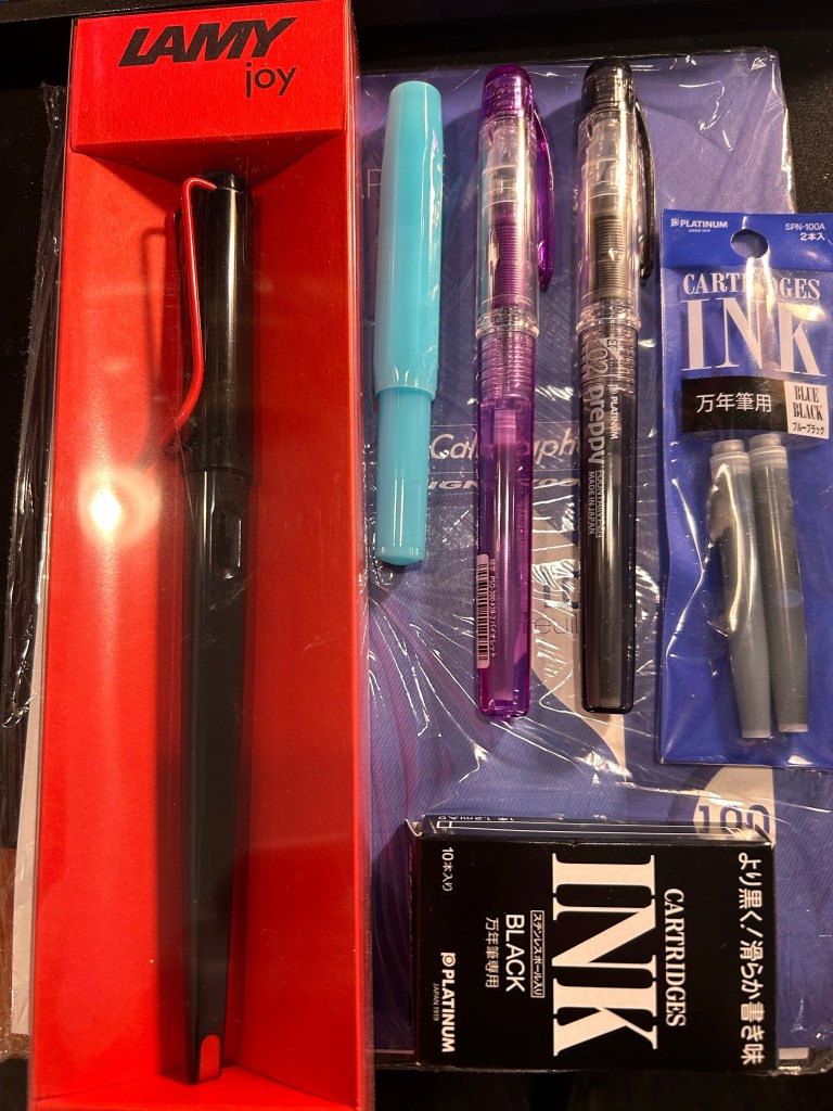
The haul: Lamy Joy, Kaweco Sport, Platinum Preppy pens and Platinum ink cartridges, on top of much needed blotting paper.
I had one thing that was a “must buy” for this trip, and I almost didn’t find it: blotting paper. I’m using a Stalogy notebook as my journal these days, and with some juicy ink and nib combinations a piece of blotting paper is necessary. Alas, I was unable to find any in London: not in Choosing Keeping or in Present and Correct or in any bookstore, stationery store or antique/vintage/flea market that I looked in.
Here Paris came to my rescue, with its fabulous Latin Quarter stationery and art supply shops. I found blotting paper, and then got carried away and added a few cheap fountain pens and ink cartridges to my bag.
I already have a Lamy Joy, and they make for great sketching pens, but I wanted one in black and red and to try and sketch with the included 1.5 nib instead of automatically switching it out for a fine or extra fine. There’s a charm to sketches made with bold, thick lines, after all.
The Kaweco Sport in Blueberry was just an impulse buy, because I liked the colour and I have cartridges languishing around that I want to start using. The Platinum Preppies though, there’s a bit of a story there. I bought a few Platinum Preppies in my very early days with fountain pens, and I purchased o-rings and silicon grease with them, intending to convert them to eye-dropper pens. They all cracked. Immediately. After the first use. One of them was even cracked before I used it.
I’m very gentle with my fountain pens, so I was very disappointed with the plastic quality on these, especially after I learned on the Fountain Pen Network that this was a common occurrence. Well, as I couldn’t care less for the ink cartridges supplied with this pens, I didn’t use them. For me the Platinum Preppy was trash.
Time passed and the Preppy kept getting recommended as a great beginner fountain pen, to my bafflement. It cracks, so why recommend it? Then again, I stopped seeing reports of cracked Preppies. Could Platinum have changed the plastic? Were they all using boring old Platinum blue cartridges and ignoring the cracks?
So when I saw a bunch of Preppies in a Paris art supply store (the wonderful Rougier & Plé) I decided to take a closer look. Wow! They come with purple ink now! And there’s a black ink one too… I decided to give them a try and add a few ink cartridges to my purchase too. The Platinum cartridges are proprietary ones, but I do have a Plaisir, so if all my Preppies crack, I can always use them with the metal-bodied Platinum Plaisir.
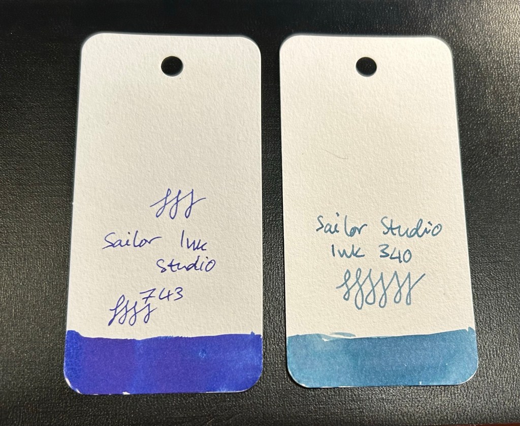
Sailor Studio fountain pen inks
I also purchased two Sailor Studio inks at “Choosing Keeping” in London. The Sailor Studio 340 is a calm greyish powder blue and the 743 is an electric purply blue, and I love them both. These are expensive inks, and so they’re a rare treat for me, one that I indulge in rarely.
I’m working on my backlog of posts after about a month of hiatus (work and health related) so here’s a look into more of my haul from my latest London trip.
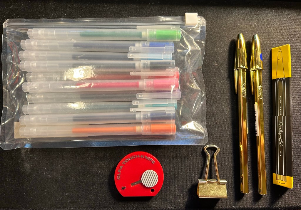
Muji happened to have a sale on its standard pen sets, so I bought a pouch of these 0.38 gel pens (I think that Zebra makes their refills but I’m not sure) to have around. There are 10 pens in the set, and my plan is to bring them into the office to have them around as occasional highlighters, pens to doodle with or pens to loan with no expectations of seeing them again.
The red Olfa Touch Knife was an impulse buy and is the thing I use most from this bunch. I used it while gift wrapping books, I used it to open packages, and I’m using it now to open Lego bags for my current build (the large Disney Castle). This is a nifty and handy little tool and I’ll probably buy another one at some point as a backup. The bronze paper clip is just a nicer version of the clip that I use to keep my pocket Stillman and Birn Alphas shut, as they don’t come with any kind of elastic closure.
The gold bics are from Present and Correct and they made me laugh. I plan on giving one away to a designed friend, in the hopes that it will make her laugh too. I used to use them so much when I was a teenager (before gel ink pens became widely available) and I hated them so much that having a gold one is just beyond perfect.
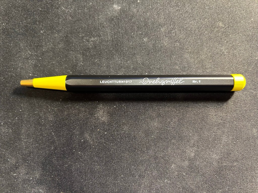
The black and yellow pen is the Bauhaus edition of the Leuchtturm1917 Drehgriffel Nr. 1 ballpoint. It’s a twist mechanism aluminium and brass hexagonal ballpoint pen that comes with a blue refill. I reviewed the gel ink version (identical apart from the refill) here. I purchased this pen in London Graphic Centre near Seven Dials/Covent Garden, and it was completely an impulse buy. Should you buy one yourself? If you’re in need of a pocketable ballpoint that doesn’t use a click mechanism, then maybe. Ergonomically it’s not the best for long writing sessions, and the twist mechanism doesn’t make it great for quick deployment, so there are better options in the market. The design is very fetching, and if you like it you might be willing to overlook the pen’s shortcomings. The Bauhaus edition was created as a companion to Leuchtturm’s Bauhaus notebooks.
Drehgriffel Nr. 1 Bauhaus ballpoint.
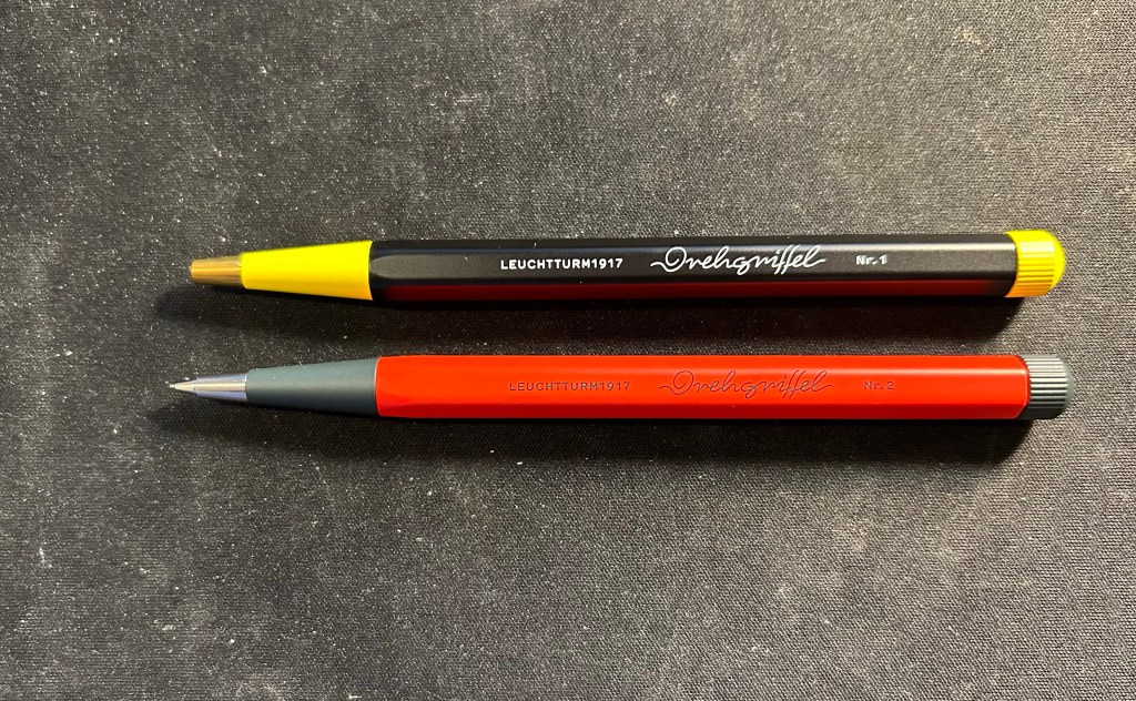
I bought the Drehgriffel ballpoint to accompany the Drehgriffel mechanical pencil that I bought at the same time. The pencil is fire engine red and grey with silver trim, and the pen is black and yellow with brass trim, and the pencil is slightly heavier than the pen, though they’re both the same size.
Pen on top, pencil on the bottom.
I also got two carrying cases, one a blue Cordura pen case from Midori. The case is called the two way pouch, and it appears very well made.
Midori two way pouch.
The pouch is divided into two identical compartments (hence the name) each with a small divider/pocket inside. It also has a prominent and robustly built handle. I am considering using this pen case for my Caran d’Ache neocolors, but we’ll see.
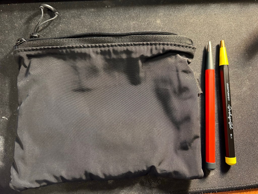
The second case is a heavily discounted net pouch from Muji. This is going into my travel backpack as a way to keep easily lost bits and bobs together and easily found.
The net side of the Muji case
The net is just on one side of the case, which is perfect, as it allows you to see what’s inside the pouch and also have this little bag have some sort of body and structure to it due to the solid side.
The solid side of the Muji case next to the Drehgriffel pencil and pen.
I also bought a solid plastic box for the my neocolors at Muji, but I decided not to use if for them in the end. It was too small for them and they rattled around in it and made a racket every time I walked, and I didn’t like that.
All in all this was probably my most “impulse buy” bit of the trip, and I’m OK with that. Compared to previous years I’ve really toned down my “must try all the pens in the world to find just the perfect one!” tendencies. If you’re reading this I assume that you can relate. Now to just use it all…
I returned on Saturday afternoon from a 17(!) day trip to London, York and Paris, and I’m still in the process of adjusting back to my routine. It was a perfect trip and a perfect break from the hard reality that I normally live in, and so it’s been tough getting back. I missed my cats, and I missed my running routine, but I didn’t miss the slew of doctor appointments and medical related bureaucracy surrounding my cancer and my mom’s cancer, and I didn’t miss the political situation here at all.
So I’m trying to find comfort in journalling, in talking to friends, in enjoying the things that I got from abroad (of course I bought pens, paper, pencils, ink, cool vintage stationery, art supplies, etc). And I’m returning to blogging regularly. I have quite a few reviews in the works, and one more post in the “Ghosts of Planner’s Past” series, plus as I’m getting back to my reading routine more books will be featured here.
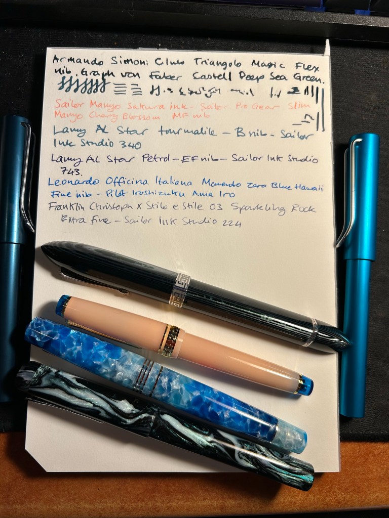
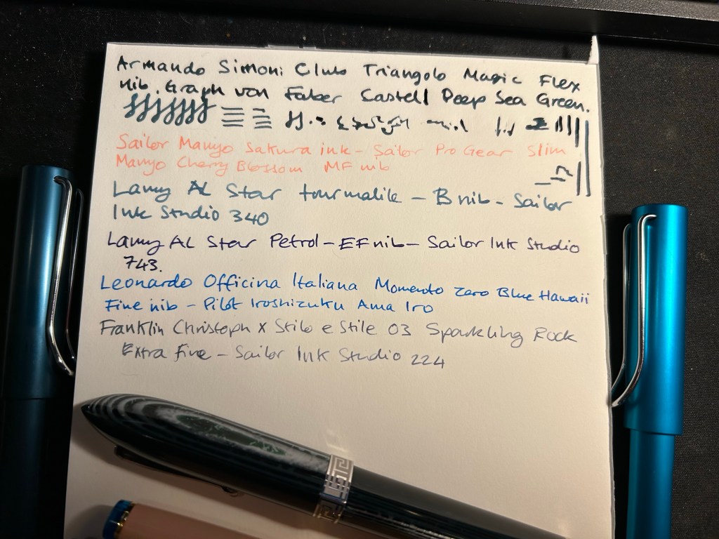
For now I’ve filled up four new fountain pens (none of which I’ve bought on this latest trip). The ASC Triangolo is a pen that I don’t remember buying at all, which is extremely unusual, and likely means that I bought it at Mora Stylos in 2022, on my first trip after finishing Chemo. Chemo brain is a real thing and I have chunks of that time (during treatment and a few months after it) that are completely missing in a very scary sort of way. The pen itself is an Omas 360 look alike, made with gorgeous arco verde material and has a “magic flex” nib. It’s the largest and one of the heaviest pens that I own, and the nib has issues (both problems starting and issues where it puts down too much ink). I filled it with Faber Castell Deep Sea Green, which from my experience is a drier ink, but that didn’t seem to affect it much. I doubt that I’d get much help from the Pen Family (their QC and service isn’t known to be the best though I will give them a try), so it’s a matter of seeing if I can fix it myself, and seeing what I can do to get it tuned locally, considering that the main guy working on pens here has recently retired. The ASC Triangolo is the big green striped triangular pen right beneath the writing.
The Sailor Pro Gear Slim Manyo Cherry Blossom is a pen that I bought on a whim in Choosing Keeping in London last year. I haven’t inked it since I bought it, but now I did, using the bottle of Sailor Manyo Sakura ink that came with it. This pen, unlike the Triangolo, perfectly fits my tiny hands (it’s the pink pen with the blue finials).
The two Lamy AL Stars (one on each side of the page) are a recent purchase from Pen Chalet. I wanted to try out a Lamy B nib, and I really liked the AL Star Petrol 2023 special edition, and the Tourmaline (2020?) one. They’re filled with Sailor Ink Studio inks that I purchased in Choosing Keeping during my last trip there.
The Leonardo Momento Zero Blue Hawaii and the FC Sparkling Rock travelled with me to London and back. They were a joy to use, and I’m glad that I took them along as they caused no issues – no leaks, etc – and were fun to use when I journaled during my trip.
Here’s a bit of a closer look at the writing sample. The Triangolo’s is unfortunately a mess. The Ink Studio 340 and 224 are my favourite inks of the bunch, though the Ama Iro and 743 are also great. The Sailor Manyo Sakura is too light of my tastes, especially in such a fine nib (the Sailor MF is like a Lamy EF).
Break out a nice pen or pencil to use. It’s the little things that can help make your day.
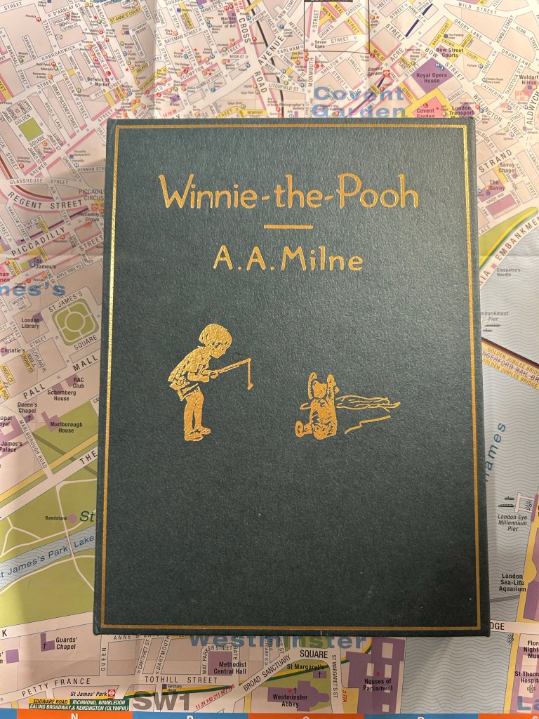
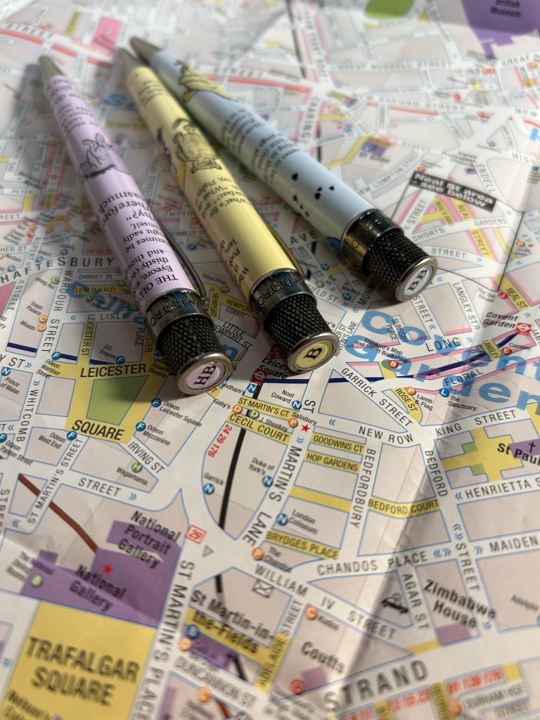
There’s a renewed interest in Winnie-the-Pooh lately, as it has come into the public domain (the copyright has expired). Retro 51 issued a pen and pencil set recently, which reminded me that I haven’t reviewed this Winnie-the-Pooh Retro 51 collection set, which came out last summer.The set included a box that looked like the original hardcover book, with three Retro 51 tornado rollerball pens and one mechanical pencil inside.
The box.
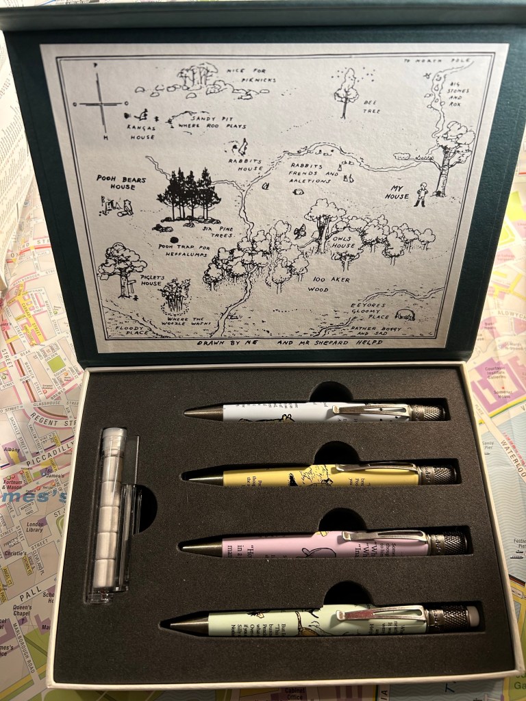
I’m usually not someone who cares very much for packaging, but in this case the cardboard box was too nice to toss out. It’s not just the outer cover that is thoughtfully designed, but there’s the famous map of 100 acre wood inside, and it is a delightful touch. Inside the box you get the three pens, the pencil, pencil leads and a tube of pencil erasers. Everything is held snugly inside, and the box has magnetic closure.
The full set inside the box.
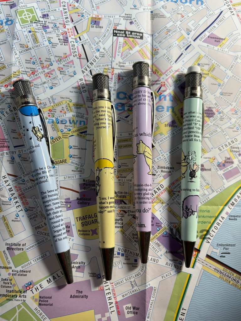
The pens and pencil feature E.H. Shepard’s charming original illustrations, as well as various sections of the book. The blue pen features the scene where Pooh tries to fool a nest of bees into believing that he’s a cloud (from the chapter “Winnie-the-Pooh and Some Bees”). The purple pen features the first appearance of Eyeore in the book, and is a mashup of two Eyeore chapters (from “Eyeore Loses a Tail and Pooh Finds One” and “Eyeore has a Birthday”). The yellow pen features the final chapter in the book, a delightful conversation between Pooh and Piglet (from “Christopher Robin Gives Pooh a Party and We Say Goodbye”) and the green pencil features an excerpt from the scene where Winnie-the-Pooh gets a pencil case with pencils in them that say B for Bear, BB for Brave Bear and HB for Helping Bear. This is of course a clever reference to HB, B and 2B pencil grades, and Retro 51 decided to not only use this excerpt very appropriately on a pencil, but also…
Three pens and a pencil.
To put B, HB, and BB on the pens’ finials. That’s the kind of thoughtful design touch that I appreciate. The pens have stonewashed pewter accents on their hardware, and the pastel bodies are lacquered, like most Retro 51 pens. The set was limited to 926 sets worldwide (the original book was published in 1926, which is the reason for this peculiar number), and as it was very popular, I doubt that you’ll manage to get your hands on one unless they pop up on the secondary market.
Clever finials.
So why review a pen set that’s out of stock? Because less than a year later Retro 51 issued a Winnie-the-Pooh pen and pencil set that are equally charming, but lower priced (as it’s just one pen and one pencil). The stationery scene is full of limited edition pens, pencils and notebooks and it’s very easy to get carried away on the FOMO train. This is a gentle reminder that after every limited edition pen or ink, there’s another one not very different from it, if you chanced to miss out. Don’t pay crazy prices on the secondary market or beat yourself up for missing out on something without taking a pause and remembering that there are very few stationery items that are ever truly limited and irreplaceable.
Oh, and how are the actual pens and pencil? The same as all the non-limited Retro 51 pens and pencils: I dislike the Schmidt refill they use for the pens and almost always replace it with something else, and the pencil is ok – it features a 1.15mm lead that most people will find way too wide, and it’s hard to find replacement leads for it.