I haven’t had the time or headspace to post this until now, but here’s March spring themed currently inked fountain pens.
Writing samples
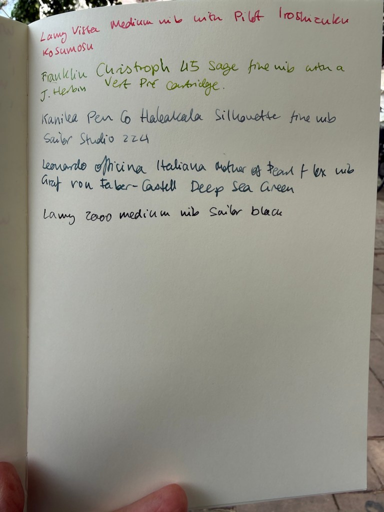
Lamy Vista medium nib with Pilot Iroshizuku Kosumosu ink. I wanted a pink ink in rotation and this is a new pen that I wanted to use. Kosumosu is a lighter pink so it benefits from wider nibs.
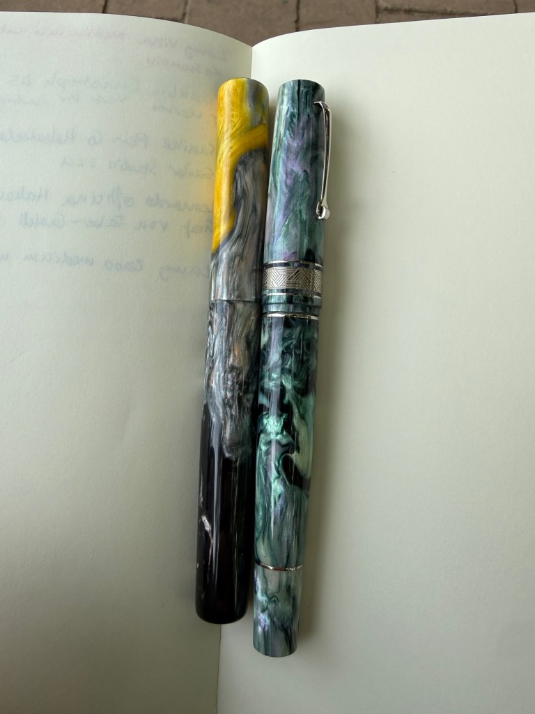
Franklin Christoph 45 Sage fine nib with a J. Herbin Vert Pré cartridge. Spring means grass green ink and Vert Pré fits the bill perfectly and works well with this pen. It was a little light at start but darkened with time.
Franklin Christoph and Lamy Vista
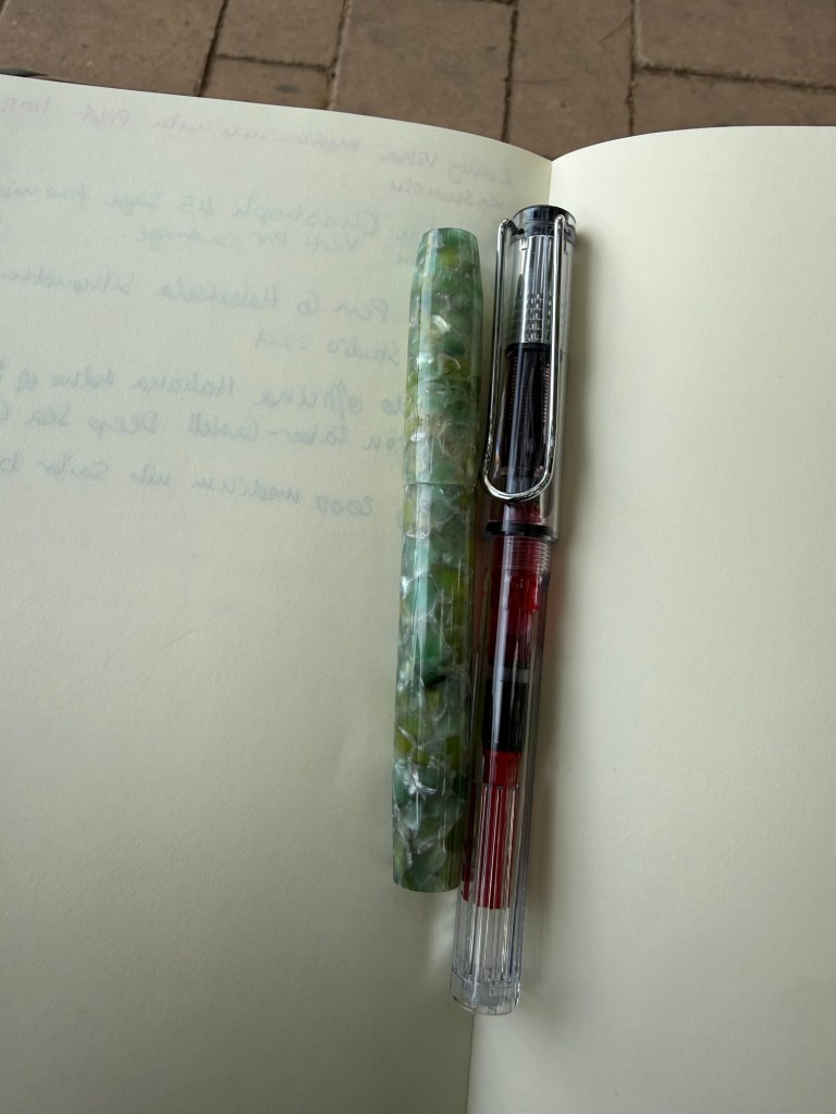
Kanilea Pen Co Haleakala Silhouette fine nib with Sailor Studio 224. I haven’t used this pen in a while and I like grey inks, which is why I almost always have one in rotation. Sailor 224 is one of my favourites.
Leonardo Officina Italiana Mother of Pearl fine flex nib with Graf von Faber-Castell Deep Sea Green. I love this pen and this nib and I haven’t used this grey green ink in a while.
Kanilea and Leonardo
Lamy 2000 medium nib with Sailor Black. Workhorse pen with workhorse ink.
It’s been a while since I’ve posted one of these, mostly because through November I was still working through the Pelikan Hubs pens and then December was Inkvent time. However, I have just cleaned out all of my fountain pens and started out with a fresh batch for the new year. Here’s the lineup for January, and it’s mostly dedicated to new pens with interesting inks.
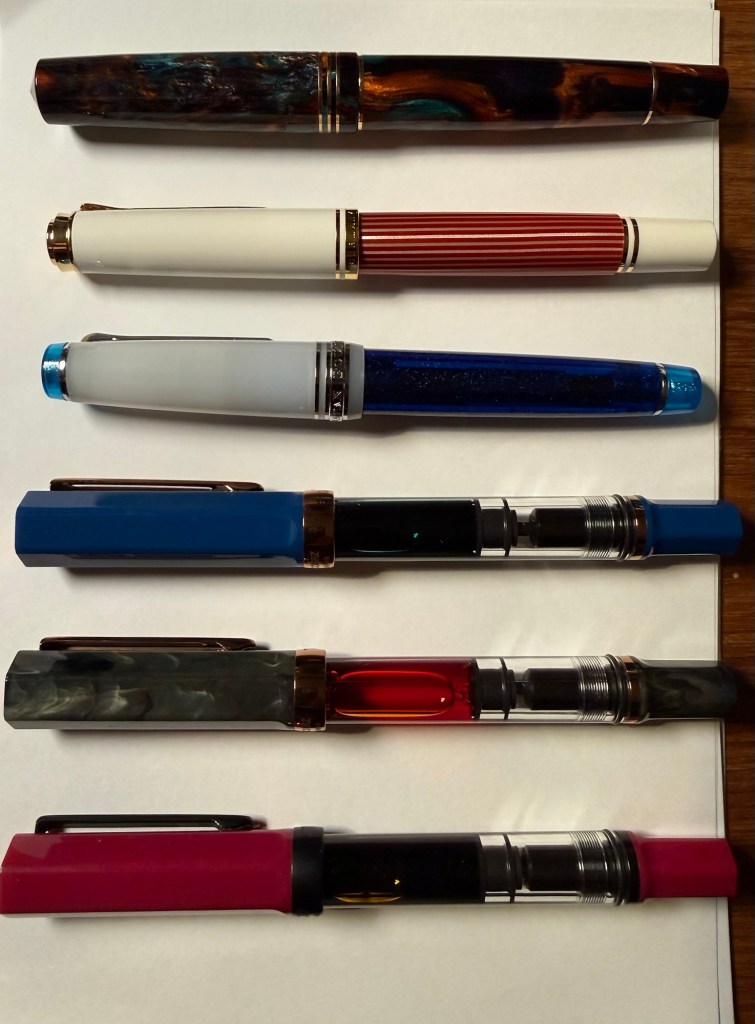
The pens top to bottom: Leonardo Bohemian Twilight, Pelikan M600 Red and White, Sailor Pro Gear Sunlight from the Ocean Floor, TWSBI ECO indigo blue and bronze, TWSBI ECO Serpentine and bronze and TWSBI ECO Plum and onyx
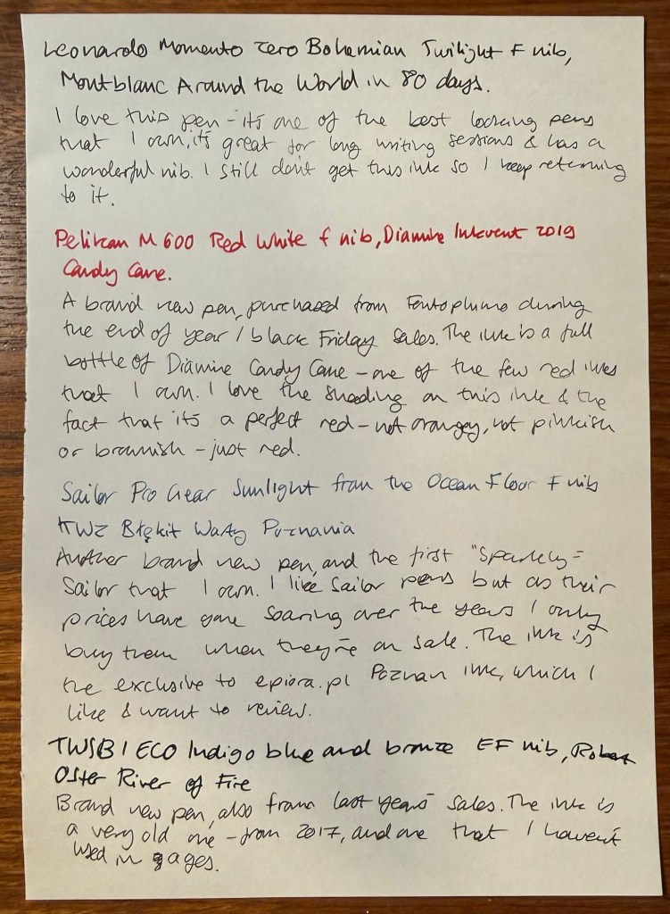
Leonardo Momento Zero Bohemian Twilight fine nib inked with Montblanc Around the World in 80 Days. I love this pen so much – the minute I saw it as I was stowing away my cleaned out pens I realised that I have to ink it again. It hasn’t been far from rotation from the minute I purchased it, because it’s a gorgeous pen with a wonderful nib that is comfortable for long writing sessions. The ink is beguiling – ever since I realised that it isn’t the mustard green that I was expecting I keep trying to figure it out. It’s on the spectrum between dark grey and blue-black, and there’s something about weirdly undefinable inks that appeals to me.
Pelikan M600 Red and White fine nib inked with Diamine Inkvent 2019 Candy Cane. I reviewed the ink here (it was from the first Inkvent calendar) and I liked the ink enough to buy a full bottle of it. Pelikan M600 is my favourite Pelikan size (even though there’s not much difference between it and the M800) and I didn’t have any of the red editions of the Pelikan Souveran line. When this one went on sale I just had to buy it. Pelikan’s are workhorses with a giant ink capacity and fantastic nibs. If you don’t have one, I recommend buying an M200 at least, and splurging on the M600 or M800 when you can. Note that Pelikan nibs are wider than their Japanese counterparts.
Sailor Pro Gear Sunlight from the Ocean Floor fine nib inked with KWZ Exclusive for epiora.pl Błękit Warty Poznani. This is my first sparkly Sailor fountain pen (most of my Sailor fountain pens are black, from the time before they started issuing pens in wild colours and sparkly finishes) and I bought it on sale. As Sailor have raised and raised their prices over the years I only buy them when they’re heavily discounted. Sailor fine nibs as usual are very fine and with plenty of feedback. The ink is an exclusive that KWZ created for a lovely local fountain pen store in Poznan, Poland called Epiora. I bought my Pelikan Art Edition there during the last day of the Urban Sketchers symposium and I got this ink for free. My plan is to review it, as it’s an attractive blue-black.
TWSBI ECO Indigo blue and bronze extra fine nib inked with Robert Oster River of Fire. A brand new pen for me, purchased at the same time as the other TWSBI ECOs in this rotation. The ink is old, from 2017, and an ink that I haven’t used in years. It’s very saturated, we’ll see how well it behaves on various notebooks.
Writing sample
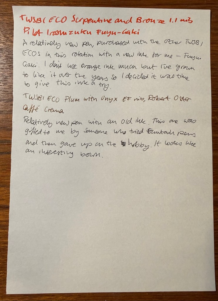
TWSBI ECO Serpentine and bronze 1.1 nib inked with Pilot Iroshizuku Fuyu-Gaki. A new TWSBI ECO with a new (to me) classic Pilot Iroshizuku ink – Fuyu-Gaki. I’ve learned to love orange inks in recent years, and so I’ve decided to purchase this most classic of orange inks. Looking forward to giving it a try.
TWSBI ECO Plum with onyx extra fine nib inked with Robert Oster Caffe Crema. New pen with an old ink – recently gifted to me from an ex-fountain pen user. It’s an interesting shade of brown and I look forward to giving this ink a try.
Yesterday was the 2025 Pelikan Hubs event. Pelikan is so wonderful to organize these events, so generous and thoughtful with their gifts, and I love the company and their pens so much that I’m really heartbroken that this isn’t just a glowingly happy post.
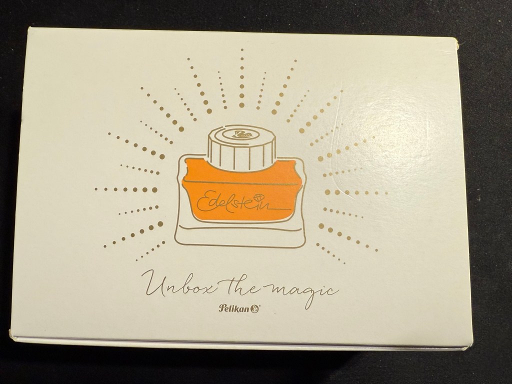
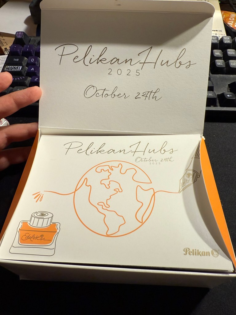
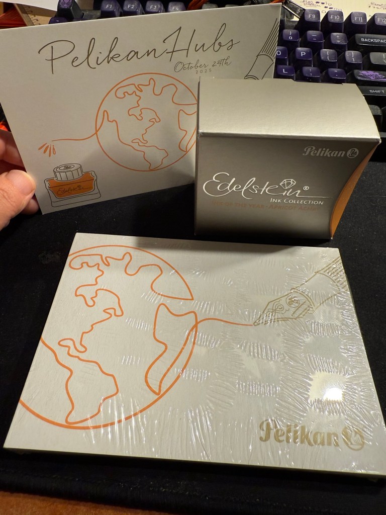
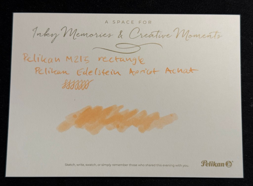
This isn’t Pelikan’s fault. Their organization was as usual, impeccable. Their gift was tremendous – a beautiful box, with the Edelstein’s ink of the year Apricot Achat, a postcard and a notepad. Everything was so well designed it was breathtaking to open the box and see it all laid out perfectly.
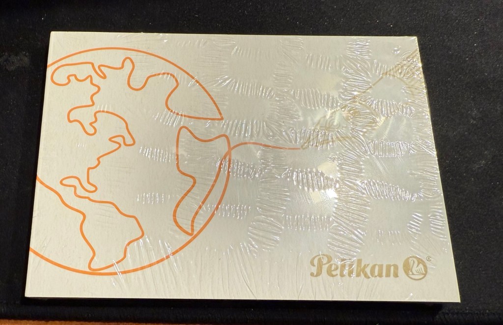
The box
Here’s the open box and the postcard:
The open box and the postcard
Here’s the notepad. You can see the design on the cover better in the next photo, but the paper is smooth, thick and perfectly fountain pen friendly.
Small notepad
I love the design of the cover of the box, the postcard and the cover of the notepad. It’s playful but elegant, and it works well together and ties in well with the typography and the design of the Edelstein box. That’s a 10/10 for design and quality.
Everything that was in the box: postcard, Edelstein Apricot Achat ink, and notepad
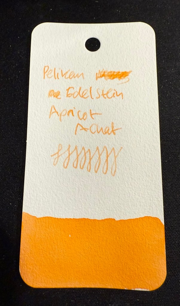
The that we received is the Edelstein Apricot Achat, which is the ink of the year 2025. The bottle is gorgeous, and the ink is non-shimmer this year, so it should be easy to clean out of pens.
Edelstein Apricot Achat
The ink itself is indeed an apricot ink, with a hint of shading. It’s bright but light – a tad too light for me if I’m honest. I think that this exact ink just slightly more saturated would have been the perfect orange for people who like their orange right in the middle of the orange spectrum – not too yellow or too red.
Swab on Col-o-Ring
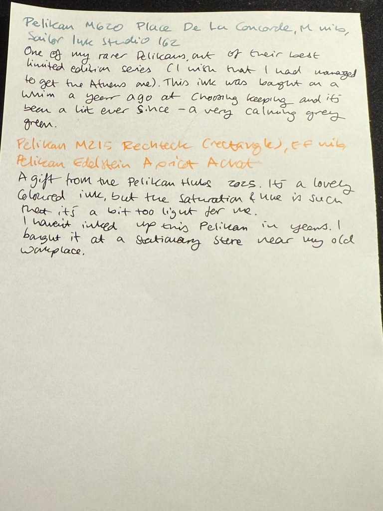
I filled a Pelikan M215 Rechteck (rectangle) with this ink, but I chose poorly, forgetting that it has an EF nib. Pelikan EF are on the wide side, but this ink would fare better in a medium or even a broad nib. I will still enjoy it as it works well with the other inks I currently have in rotation, but if you are looking to use this ink I’d suggest wide and generous nibs for it.
Writing sample on Kokuyo paper.
I tried it on the Postcard. The paper isn’t coated but is still rather sleek:
The postcard with an ink swab and writing sample
So thank you very much Pelikan for organizing this worldwide event and for your wonderful gift! I am actually considering buying the matching M200 because I like the look of the ink.
Now for the sad and ugly part:
Pen collection has a misogyny problem. I have experienced it during the previous Pelikan Hubs, I have experienced it when I tried to buy pens in brick and mortar shops, in flea markets, from pen makers. I experienced it during this year’s Pelikan Hubs and I’m tired of it, and kind of tired of all the talk about how wonderful and welcoming the pen community is. It’s wonderful and welcoming if you’re a guy, and time and again I have seen it close ranks and snarl if you’re a gal.
Just during yesterday’s event, where I stayed on for less than an hour (and even that was just to be at the edge of the group photo), I was told several times that:
Women don’t collect pens.
Only men collect pens.
I am not a real pen collector.
I can’t possibly be a pen collector.
I can’t possibly have enrolled to the Pelikan hub.
I am there as someone’s plus one.
Women don’t understand pen collecting.
I am a rare bird, the exception to the rule.
They had facts to back it up, they said. Their closed pen collectors group only had three women in it. That proved the point. I eye-rolled so hard. I had met and talked to one of the other female collectors at last year’s event and I fully understand why she didn’t brave this treatment to collect her gift this year. It’s because nobody wants to go out of their way to spend their precious free time with a bunch of *holes.
There are women collectors, they have every right to enjoy this hobby, and if you’re a guy and you don’t see women in your group, it’s not because they don’t collect pens. It’s because you’ve created a group that women don’t want to join.
Do better.
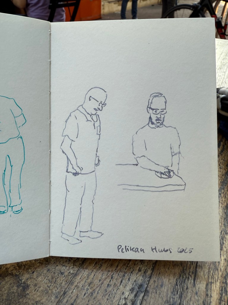
End of rant – and to end on a more positive note, I did manage to do a few 2-3 minute sketches while I was waiting for the group photo:
Sketched with Pelikan M805 Ocean Swirl F nib and Montblanc Maya Blue on a Pith Kabosu SketchbookSketched with Pelikan M605 Stresemann M nib and Sailor Ink Studio 123 on a Pith Kabosu Sketchbook
Thank you again Pelikan for the wonderful event. I intend to return next year even if the menfolk find my presence abhorrent. There were a few nice fellows that were willing to talk to me, and I will not let the trolls dissuade me from participating in a hobby that I have been enjoying for close to 20 years.
Tomorrow is the Pelikan Hubs 2025 event, and to prepare I have inked up a whole flock of Pelikan fountain pens.
Here’s my current lineup of fountain pens and ink:
Currently inked part 1
The top four have been inked way back in the beginning of August, but because of my travel schedule I’ve yet to write all of them dry. You can read about the Radius 1934 and the Pelikan M205 here as well.
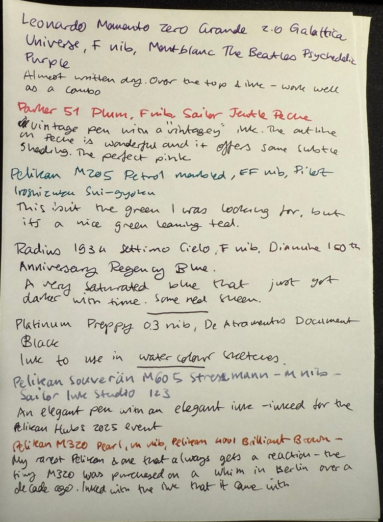
Leonardo Momento Zero Grande 2.0 Galattica Universe – F nib – Montblanc The Beatles Psychedelic Purple – great pen and ink combination. I wrote this pen dry just after writing the sample above.
Parker 51 Plum – F nib – Sailor Jentle Peche – all vintage Parker 51 fountain pens are fabulous and this one is no different. The plum colour is very rare, but I decided to “use the good China”. The ink is a long discontinued Sailor Jentle Peche, a beautiful pink with great shading and outlining. Sailor used to make fantastic inks at great prices – in terrible bottles. It was a struggle to fill this pen, even with their internal ink reservoir dingus.
Pelikan M205 Petrol Marbled – EF nib – Pilot Iroshizuku Sui-gyoku – I was hoping that Sui-gyoku would be the green ink that I was looking for, but it’s more of a teal than a green. The Pelikan M2xx series is a solid workhorse kind of pen, and I highly recommend it.
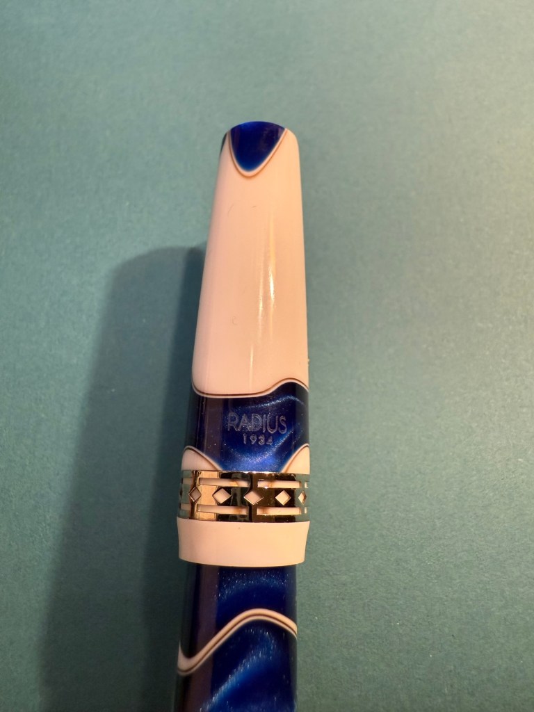
Radius 1934 Settimo Cielo – F nib – Diamine 150th Anniversary Regency Blue – the ink has grown darker with time, to the point where it’s almost black. This isn’t surprising as it was a very saturated dark blue ink to begin with, and it’s had some time in the pen. I will likely write this pen dry today or tomorrow. The new Radius pens by Leonardo feel very much like Leonardo Momento Zeroes but with a slightly different design. That’s not a bad thing – they are gorgeous pens, and for now they’re slightly cheaper than the Momento Zeroes.
Last week I inked up a new Platinum Preppy 03 nib with De Atramentis Document Ink Black as part of a post that I am working on. It’s the first time I’ve used a Preppy with a converter and not the Platinum cartridge it comes with – and it works well.
Pelikan Flock – currently inked part 2
I inked these pens today for the Pelikan Hubs event tomorrow:
Pelikan M605 Stresemann – M nib – Sailor Ink Studio 123 – a classic and elegant pen and ink combination. The Sailor 123 is really that good, and the generous medium nib shows off its dual shading properties.
Pelikan M320 Pearl – M nib – Pelikan 4001 Brilliant Brown – my rarest Pelikan, always a crowd pleaser at the hubs. This tiny pen came with a tiny brilliant brown bottle and so far I’ve filled it only with that. I bought it about a decade ago in Berlin on a whim, and I’m so glad that I did.
Pelikan M800 Blue O Blue – F nib – KWZ Exclusive for epiora.pl Błękit Warty Poznania – this pen was a very expensive birthday gift and my first M800 Pelikan. I bought it at a local pen store that no longer exists. The ink is even more special – it’s my first KWZ ink, gifted to me from the store that it was exclusively made for. I had purchase my M600 Glauco Cambon there just before they were closing for the day on the last day of the USK Symposium in Poznan. The name means Poznan Warta Blue – and it’s tied to the unique blue of the city and the Warta river. It’s a gorgeous blue and it reminds of Poznan, the store, the lovely seller and the nice symposium volunteers that saw me in the store and helped me out with my purchase.
Pelikan M400 White Tortoise – M nib – Sailor Ink Studio 767 – This is the green I was looking for! I purchased this ink last month at Choosing Keeping in London, and it’s the perfect bright and cheerful green that I was looking for, with some great shading to boot. The Pelikan Tortoise pens are gorgeous, and this one is a particularly nice one.
Pelikan M805 Ocean Swirl – F nib – Montblanc Maya Blue – I have been priced out of Montblanc inks (there’s only so much I’m willing to pay for ink) but this ink was heavily discounted at the Montblanc boutique in Heathrow. It’s a lovely bright turquoise with great shading, and it works well coupled with this pen.
Pelikan M600 Art Collection Glauco Cambon – F nib – Pilot Iroshizuku Ajisai – this is the pen that I purchased at Epiora in Poznan, and while I saw it online and loved the concept, I never thought that I’d buy it because of the price. Seeing it in person changed my mind because no photos can do this pen justice – the pattern on it glows! It’s beyond vibrant, and the pen body itself feels different than other Pelikans – heavier and cooler to the touch. The ink is also a Choosing Keeping purchase, and I love the colour very much.
Currently inked part 3
Pelikan M620 Place De La Concorde – M nib – Sailor Ink Studio 162 – this is one of my rarer Pelikans, one that I bought a year or two after the series had been complete and no longer for sale. If ever there was a series of pens that I wish that I owned it was the Pelikan M620 City series, and for years I searched for an Athens pen before giving up – it was just too expensive.
The Pelikans left to right – Place de la Concorde, Glauco Cambon, Ocean Swirl, White Tortoise, Blue O Blue, Pearl
Apart from my inked Pelikans, I’m also taking three uninked Pelikans with me – one to fill with the ink that we’ll be getting, and the others just to share.
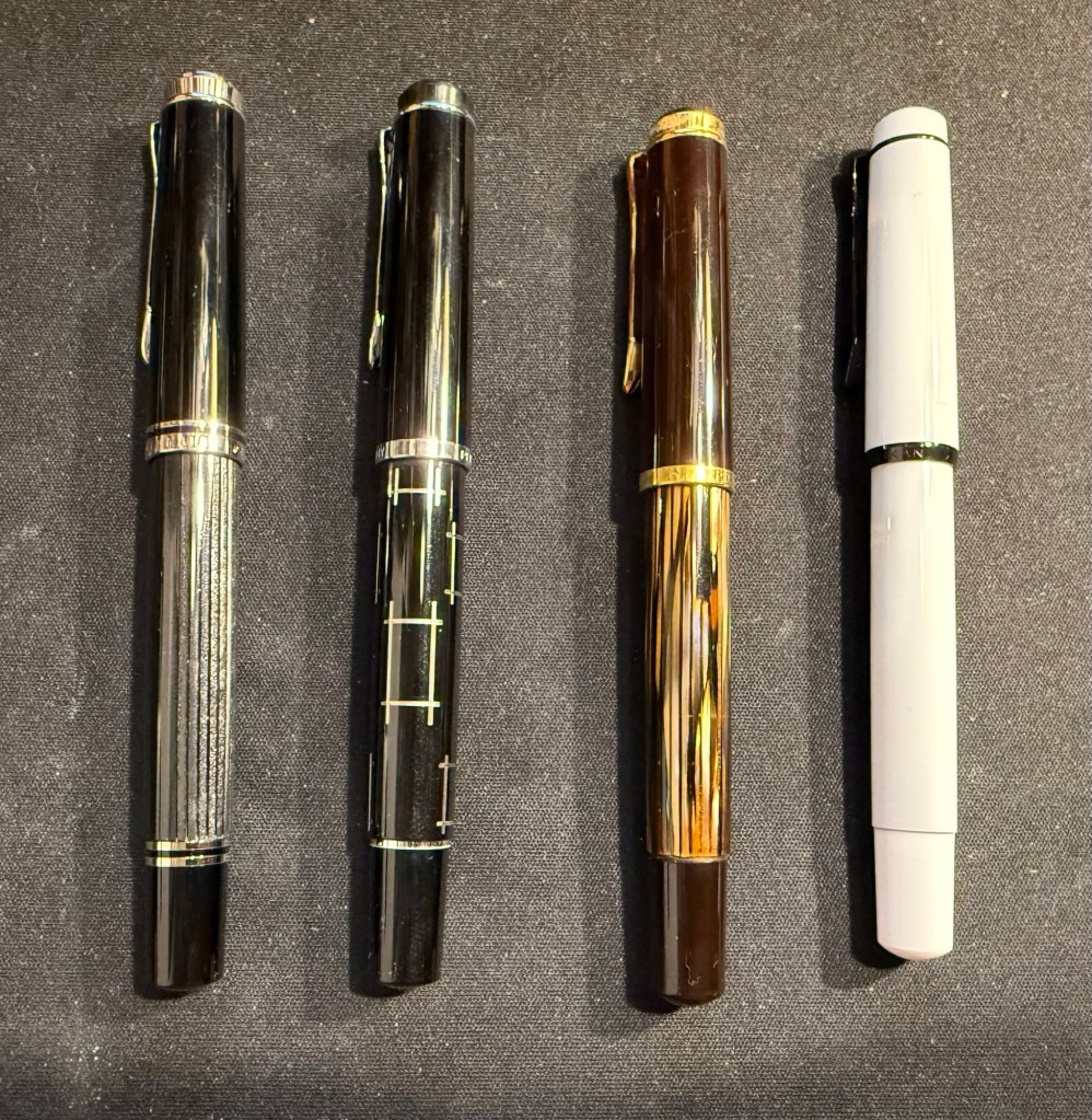
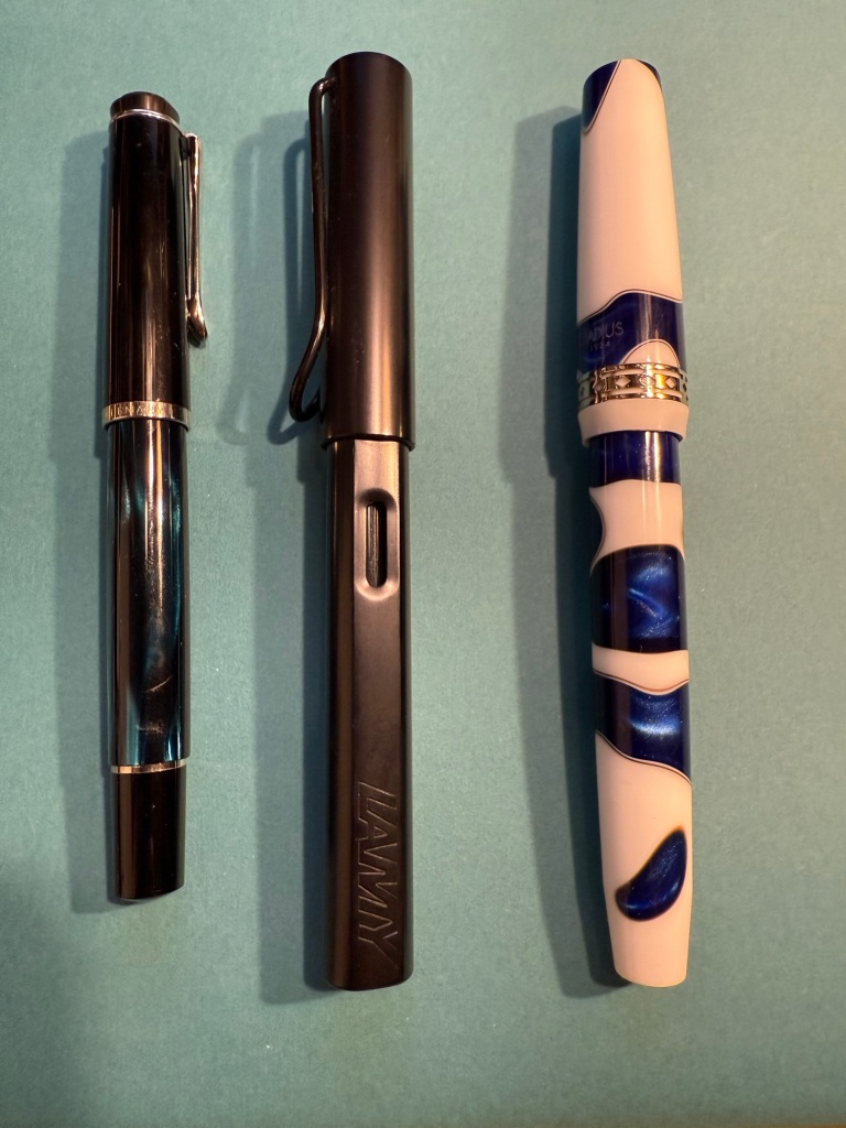
Pelikan Flock – left to right – Stresemann, M215 Rectangle (uninked), vintage M400 Tortoise (uninked), Stormtrooper (uninked)Left to right: Parker 61 Plum, M205 Petrol Marbled, Radius 1934 Settimo Cielo, Platinum Preppy
Are you going to a Pelikan Hub? If so, what pens did you bring with you?
I just received a package from Fontoplumo and I immediately added the pen and inks it contained into rotation. While I already have a good amount of pens inked up, I really wanted to give the Radius 1934 Settimo Cielo Blu a try as soon as I got it. Not only is it a gorgeous looking pen, but I was also curious to see how it compares both the the vintage Radius fountain pen that I own and to my Leonardo fountain pens, as they are also the makers of the Radius.
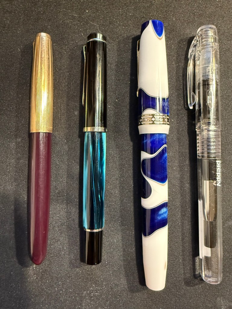
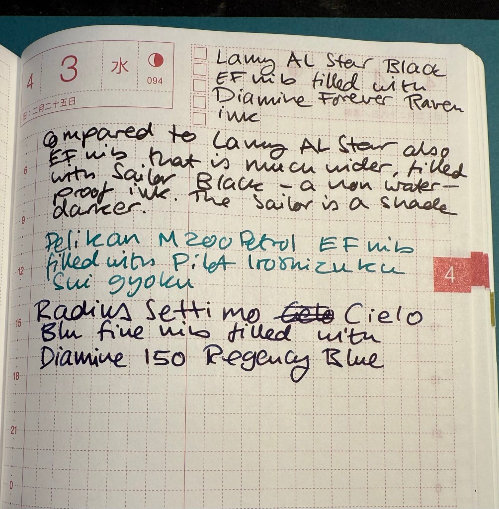
Apart from the Radius the package contained two inks that I was interested in using as soon as possible, so I inked up a Pelikan M200 Petrol with Pilot Iroshizuku Sui gyoku and a Lamy AL Star with Diamine Forever Raven. The Radius got inked up withe Diamine 150 years Anniversary Regency Blue, a rich royal blue with moderate red sheen that fits the blue swirls on the pen body.
From left to right: Pelikan M200 Petrol, Lamy AL Star Black, Radius Settimo Celio Blu
Comparing the Diamine Forever Raven to Sailor Black reveals that the Sailor is slightly darker than the Raven, but both are dark enough to count as proper black inks (and not dark grey or brown). They both have a bit of shading, but the Raven interests me as a waterproof ink, so I’ll be testing it with some watercolour sketches later on.
Writing sample
The Pilot Iroshizuku Sui gyoku isn’t what I expected. I was hoping for a more prominently green ink, but Sui gyoku is more of a turquoise than a green. I like turquoise inks so that won’t be a problem, but it means that I’m still on the lookout for an interesting, bright, readable green. The shading on this ink is delightful.
Diamine 150 Anniversary Regency Blue is a rich royal blue with some red sheen. It’s very saturated, especially in the Radius nib.
Gorgeous blue swirls on the Radius
The Radius interested me not so much as a revival of the old Italian brand since the original Radius was a minor pen manufacturer, and I wasn’t blown away by the vintage Radius that I own. It seemed to me that the old Radius brand was busy making local copies of what Parker was doing at the time, which is understandable. However, Radius as a sub-brand of Leonardo is interesting since Leonardo have been hiking their prices lately but the Radius remains more affordable and offers resins and pen bodies that are just as attractive as what Leonardo has to offer.
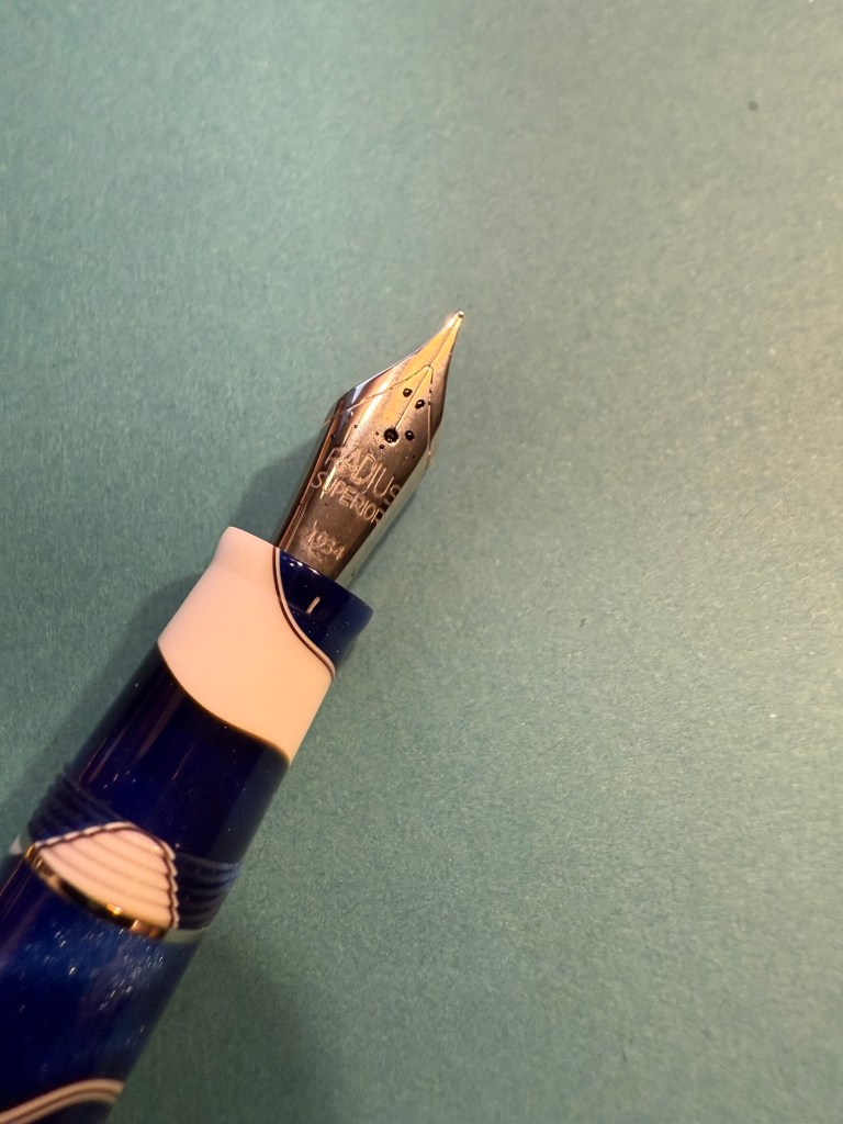
Radius imprint on the nib
I love both the blue, white and brown swirly resin of this pen and the art deco-ish band. It’s a big wide pen, like the Leonardo pens and Viscontis, but light and comfortable to use.
Radius branding and band
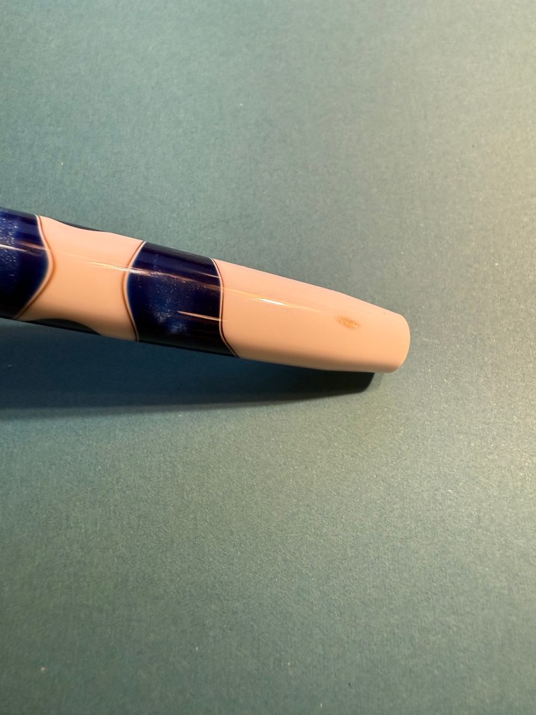
One tiny minus with my pen is that as the bottom part of the body tapers down, a smudge of brown resin was left, making it look like there’s permanent dirt on the pen body. Not ideal, but it’s something I can live with.
The smudge
Here’s a writing sample of all three inks on Col-O-Ring cards.
Ink samples
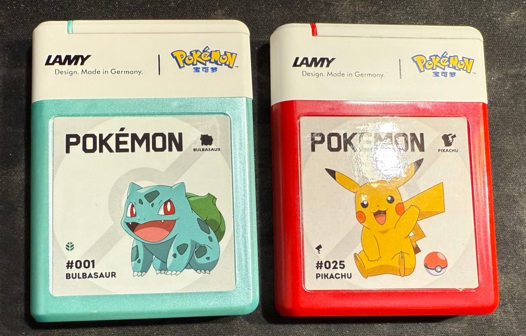
And as a silly little treat I also bought two cartridge boxes of Lamy Pokemon ink cartridges. They are filled with regular black Lamy ink cartridges, which I knew, but is still disappointing – a teal and a red would have been better.
A mixture of some pens left over from last month, coupled with a slew of new pens in mostly long unused inks characterizes this month’s lineup.
The paper is Hobonichi Techo 2024 this time (I bought it on Black Friday, to compare with the original Tomoe River Paper in my 2014 Hobonichi). The paper in it is almost as good as the original Tomoe River Paper for showing off ink properties.
From June’s rotation I only have:
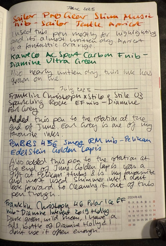
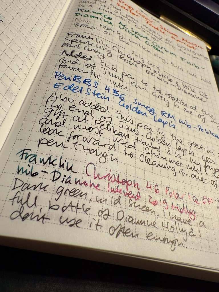
The mauve Sailor Pro Gear Slim with a music nib and delightful yet discontinued Sailor Jentle Apricot. A readable reddish orange ink with generous shading.
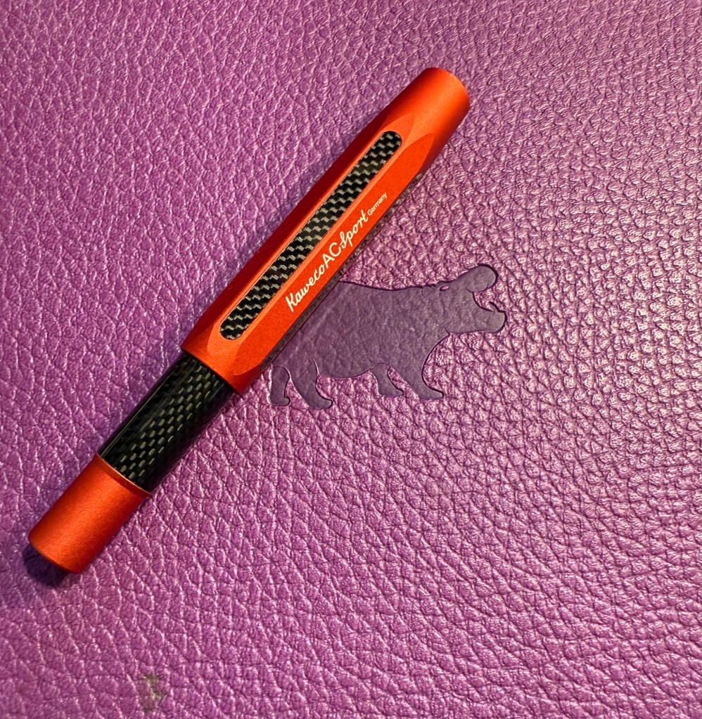
Kaweco AC Sport Carbon fine nib with Diamine Ultra Green. It’s almost written dry but has seen less use than I planned since I’m not in love with the ink colour. It is growing on me though.
Writing sample on Hobonichi 2024 paper
In the end of June I added two new pens into the rotation:
Franklin Christoph x Stilo x Stile 03 Sparkling Rock EF nib with Diamine Earl Grey. Earl Grey is still one of my favourite inks and if you want a readable, interesting grey I highly recommend it.
PenBBS 456 Smog with a RM nib and Pelikan Edelstein Golden Lapis ink. I have no idea what possessed me to fill a vacuum filler with this ink, but I’ll pay for that later. Golden Lapis was a gift from the Pelikan Hubs and has turned out to be my favourite shimmer ink.
Closeup on the sheen on Diamine Holly
The proper July inked pens are:
Franklin Christoph 46 Polar Ice EF nib with Diamine Inkvent 2019 Holly. I reviewed this ink here and I liked it enough to purchase a full bottle of it, though I have rarely used it since. Holly is a dark blue green with a wild red sheen and is saturated enough to pass as a serious businesslike black at a cursory glance, so you can sneak it into office use 🙂
Pilot VP Matte Black M nib with Pilot Iroshizuku Chiku-rin ink. I used to use my VPs a lot more, especially to take notes in meetings, but now I rarely use them because they have a tiny ink capacity and are a bit of a pain to clean out. They do have beautiful nibs, and I wanted a cheerful green ink so the pairing works well.
Visconti Homo Sapiens Lava black EF with Sailor Shikiori Yama Dori – this is the original Homo Sapiens pen, before Visconti did dozens of versions of it, when it took the pen world by storm. I bought mine at Mora Stylos, and they customized the finial with my initials. Yama Dori is a peacock blue with red sheen, and is a wonderful ink in Sailor’s annoying flat Jentle ink bottles.It was almost impossible to fill this pen due to the bottle shape.
Writing sample on Hobnonichi 2024 paper
Esterbrook Estie Sea Glass Journal nib with Diamine Aurora Borealis. I love the Journal nib, and it really shows off the gorgeous teal of Aurora Borealis. There’s some shading with this ink and a hint of red sheen. This ink is one of the few I own in both bottle and cartridge format.
Leonardo Momento Zero Grande 2.0 Galattica Universe F nib filled with Montblanc The Beatles Psychedelic Purple. A wild pen and a wild ink that have wildly jumped in price over the past year or two. I have a handful of Montblanc inks, but I’ve been priced out of the brand now. Leonardo makes great pens, but I no longer feel the need to buy every limited edition they come out with. The Beatles purple is a wonderful PURPLE – bright, not muddy and perfectly midway between red and blue.
Last but very far from least Parker 51 Plum F nib with Sailor Jentle Peche. A rare 51 and a long discontinued ink coupled together to make sure that I use the good china. Parker 51 pens are my favourites, and this one is a gold capped aerometric with a fantastic nib.
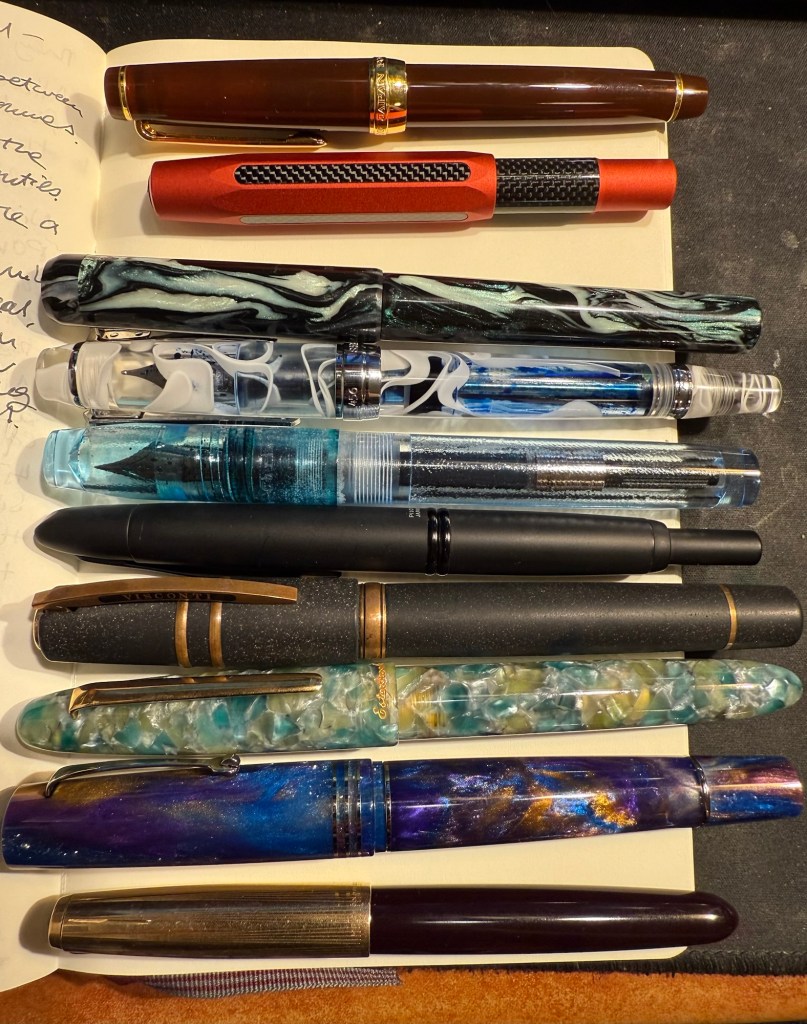
The pens in order of appearance here, from top to bottom.
A new month means a new set of inked pens. From my previous rotation I still have the Lamy 2000 inked with Diamine Silver Fox, the TWSBI ECO Saffron inked with R&K Helianthus (and just about to run dry) and the Manufactus Cappuccino Brown filled with a Diamine Bilberry cartridge, also just about to run dry.
This time I chose the ink hues and inks before I matched them with pens (I usually do it the other way around). I wanted a blue-black, an orange, a pink, a teal and a bright green. The only ink that was completely unknown to me was the green – Diamine Ultra Green in a cartridge. It was also the only ink that I’m unhappy with, and one that I had issues with, but more on that later.
This is the lineup:
Writing sample with all of the inks and pens. The notes were written using a Platinum Preppy 02 with black ink. The paper is a Rhodia dot pad.
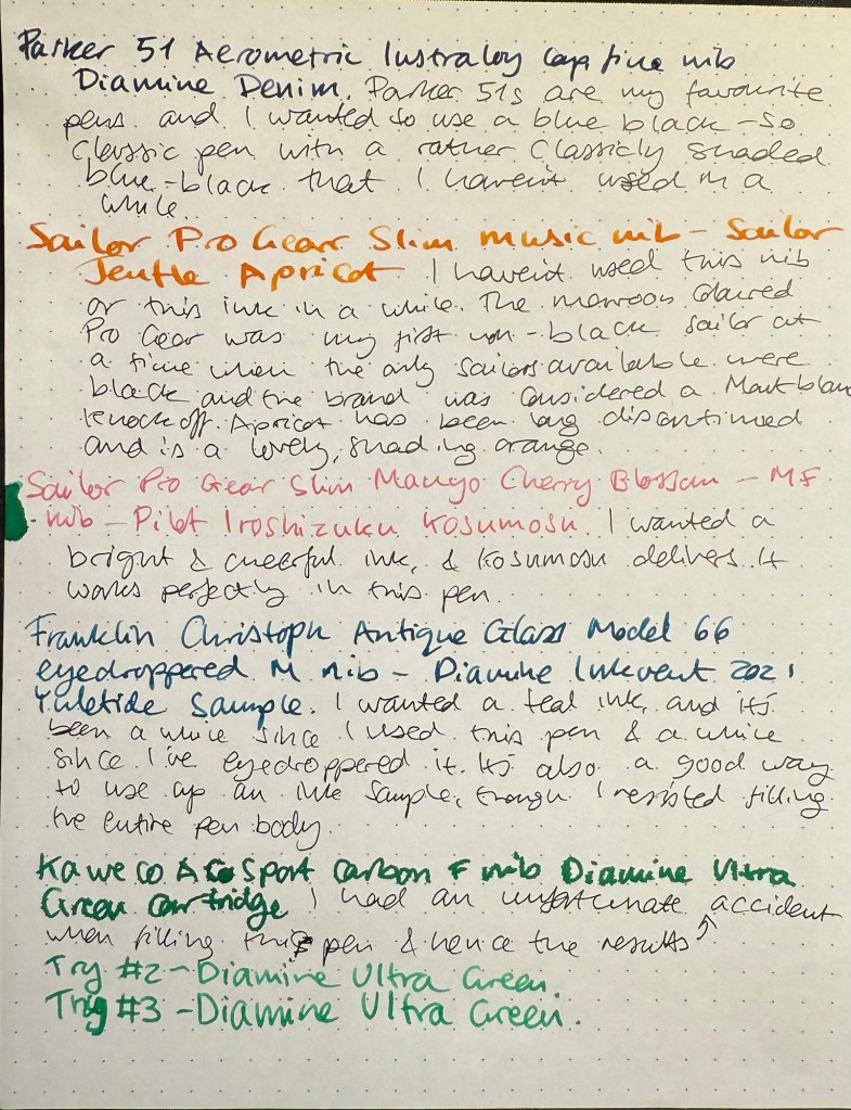
Parker 51 Aerometric Teal with a Lustraloy cap and generous fine-medium nib filled with Diamine Denim – vintage Parker 51s are my absolute favourite fountain pens, both for their look and feel and for the way they make my handwriting look. I haven’t used this specific one in years, and I like the pen body colour but I specifically chose to fill it with the blue-black and not the teal, to mix things up a bit. Diamine Denim is one of my favourite go to blue-black inks, and I love it because it’s well behaved, dark and offers some shading.
Parker 51 Aerometric Teal with a Lustraloy cap
Kaweco AC Sport Carbon fine nib Diamine Ultra Green cartridge – I wanted to try Diamine Ultra Green as I thought that it would fit the bill as the bright green that I wanted, but it didn’t. Two things happened – I flipped the pen upside down for a few minutes to get the cartridge going and I left it that way for too long, which meant that I got a mess. You can see it in the first writing sample and you can see it in the green ink splotch on the left of the page above. That would have been OK if the ink colour was to my taste, but it isn’t. Diamine Ultra Green is a viridian green, which is an unnatural shade of green that isn’t what I was looking for. In retrospect it looks like Diamine Kelly Green (which I don’t have) is closer to what I was looking for. The Kaweco AC Sport is nice but overpriced and I wouldn’t recommend it over an other Kaweco Sport. I got mine at a steep discount when an art supply store was closing down and looking to liquidate its stock.
Kaweco AC Sport Carbon
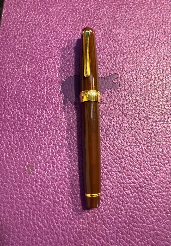
Sailor 1911 Pro Gear Slim Maroon music nib filled with Sailor Jentle Apricot – kids these days will turn up their nose on this pen body colour, but at the time it was the only Sailor that you could get that wasn’t black. I was into fountain pen nibs and didn’t really care what the pen body looked like, so long as I got to try the fabled Sailor music nib – a rare music nib that had only one slit and two tines instead of the usual two slits and three tines that other brand’s music nibs had. It still is a gorgeous nib that works very well with the long discontinued Sailor Jentle Apricot. You really see the shading with this pen and ink combination.
Sailor 1911 Pro Gear Slim Maroon
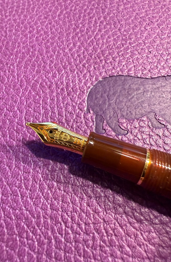
The magical Sailor music nib (yes, the ink flow is fantastic even with one slit):
Closeup of the Sailor Music nib
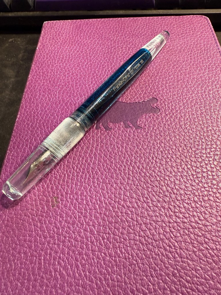
Franklin-Christoph Model 66 Antique Glass medium nib filled with Diamine Yuletide – this pen is now unavailable through Franklin-Christoph and only through second-hand resellers. It was one of my first Franklin-Christoph pens and one that I couldn’t wait to eyedropper (it’s built for that). The pen has a body that isn’t completely clear – beyond the slight fogging in the material (which is to be expected) the antique glass finish means that it has a blue-green tint, like a vintage coke bottle. It works exceptionally well with teal and turquoise inks, which is why I have only ever filled it up with teal and turquoise inks. In this case the ink of choice was Diamine Yuletide from the 2021 Diamine Inkvent calendar. I like this ink, but I’m still on the fence about buying a full bottle of it as I have a few other inks in a similar tone, some of them even Diamine inks. If you’re wondering how I eyedroppered this pen, it came with an o-ring and I have a tiny vial of silicone grease which I applied generously to the threads when filling it. So far no leaks, though as always with an eyedroppered pen, be careful with how you store it.
Franklin-Christoph Model 66 antique glass
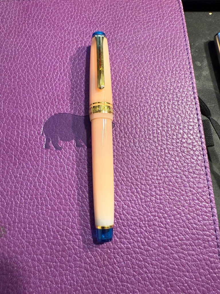
Sailor Pro Gear Slim Manyo Cherry Blossom Medium-Fine nib filled with Pilot Iroshizuku Kosumosu – I was planning on using an orange OR a pink ink, but eventually decided to use both. The Sailor Manyo Cherry Blossom is my nicest looking Sailor pen, one that I bought a few years ago at Choosing Keeping in London mostly because it had an MF nib and I wanted to try one of those. Sailor has been dazzling the fountain pen community with a plethora of mix and match pen body colours, but I remember the brand as an innovator and artisan in fountain pen nibs (which is why I rarely buy Sailors these days and most of my Sailor pens are black). The nib is, of course, perfect, and the ink works well with it. Kosumosu is practically bubblegum coloured, very bright, very cheerful and surprisingly readable.
Sailor Pro Gear Slim Manyo Cherry Blossom
Which fountain pen and ink in this rotation caught your eye? What are you using this month?
In the middle of April I inked up a bunch of new fountain pens, and at the end of the month I added two new fountain pens to this rotation. At the rate I’m writing with them I assume that this pen rotation will be with me until around the end of May, when I’ll be putting more “summery” inks into use.
This is a rather eclectic group of pens and inks, but I was mostly looking for inks that I haven’t used for a long time or I haven’t used at all. Here they all are (I was in a rush when I created the writing samples so they’re messy, but life isn’t Instagram, so messy it is):
Messy Writing Sample #1Messy Writing Sample #2
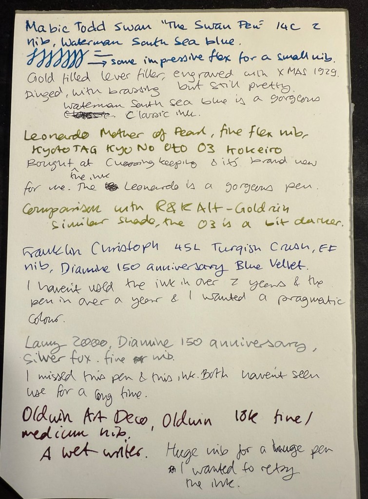
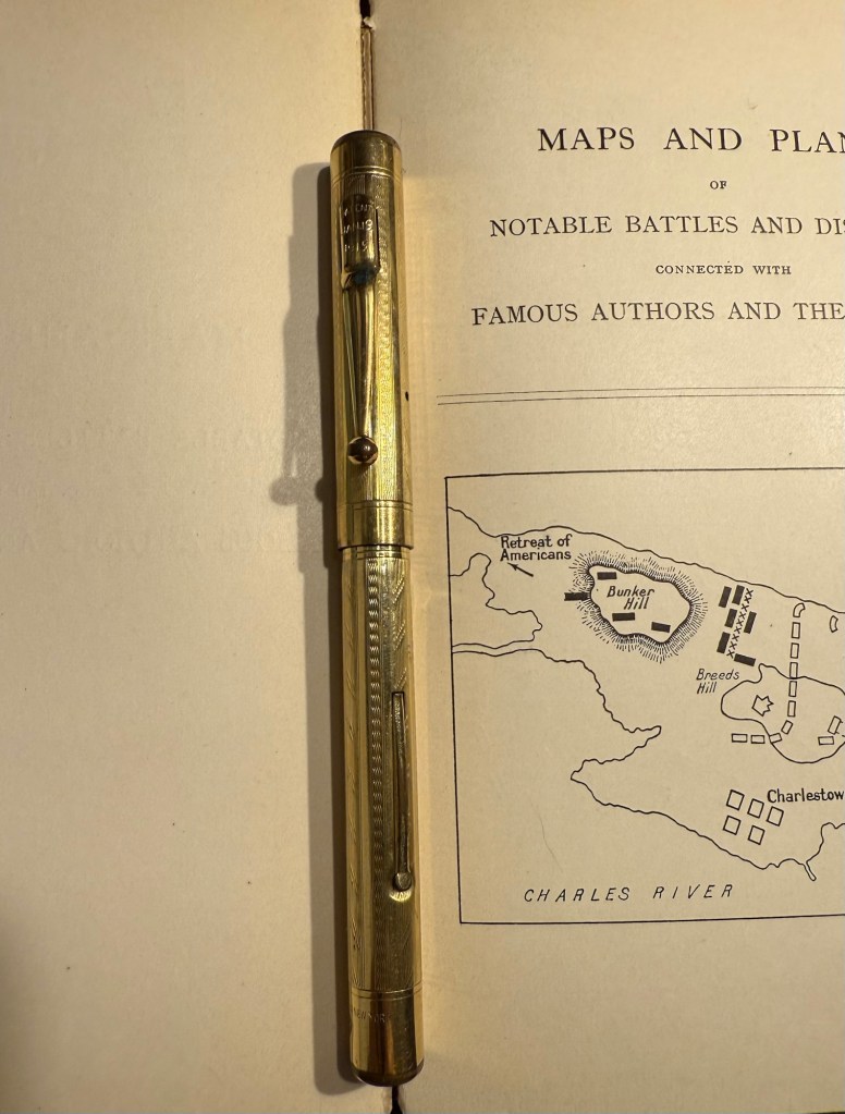
Mabie Todd Swan “The Swan Pen” 2 nib with Waterman South Sea Blue – a vintage gold plated lever filler pen, this is one of two vintage gold plated pens that I bought in Paris in Mora Stylos years ago. I don’t usually like the bling of gold plated pens, but I was drawn by the fantastic, very wet, flexible swan gold nib, and by the engraving on the pen body.
The Swan Pen
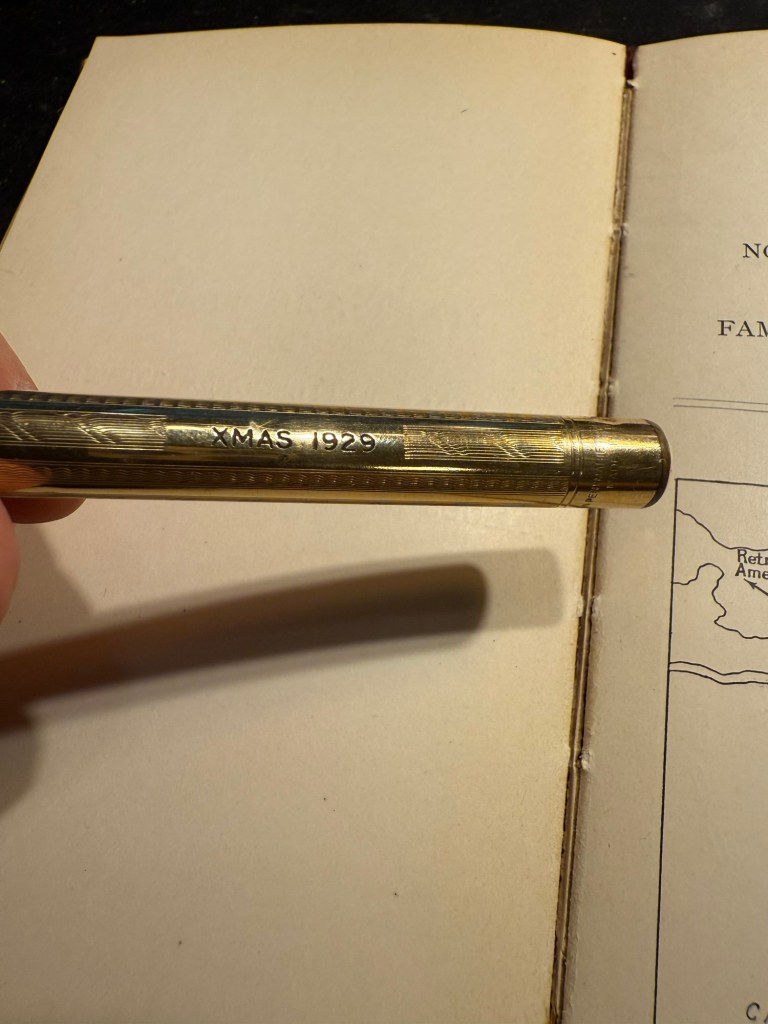
Normally engravings lower the value of a vintage fountain pen, but this one added value for me – I find it endlessly intriguing. This was clearly a Christmas gift, in 1929, and it was likely a lady’s pen, given its size and general level of decoration. I can stare at this pen and spin dozens of stories from that engraving, and this is one of the main reasons I prefer vintage pens. This one is “use grade” – the engraving, the dings on the body, the brassing on the clip, and the multitude of microscratches on it make it so – but I don’t care. It’s a treasure of a pen with a fantastic nib that I got at a very good price and gives me much joy. What else does one need?
Closeup of the inscription XMAS 1929
I chose a Waterman ink for it because they’re the best inks for vintage fountain pens – very gentle, very easy to clean out of a pen, non-staining, and on the dry side (though not as dry as Pelikan 4001 inks) which works well with this very generous nib.
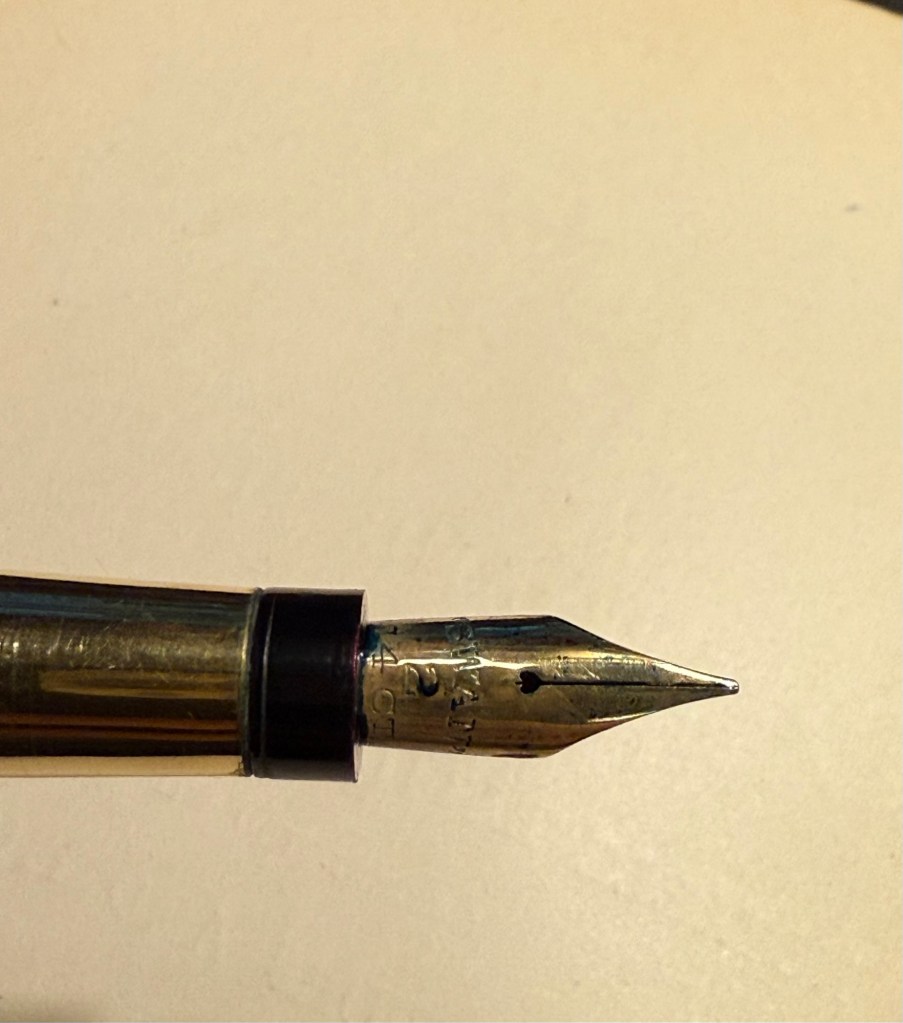
Swan 2 nib with heart shaped breather hole
Leonardo Mother of Pearl fine elastic nib with Kyoto TAG Kyo No Oto 03 Kokeiro ink – I wanted a Leonardo pen in rotation (I love them) and I wanted to try this new ink, and compare it to the Rohrer and Klingner Alt-Goldrün ink that I still had going at the time from March’s rotation. The inks are practically identical, with Alt-Goldrün being perhaps a shade lighter than the 03.
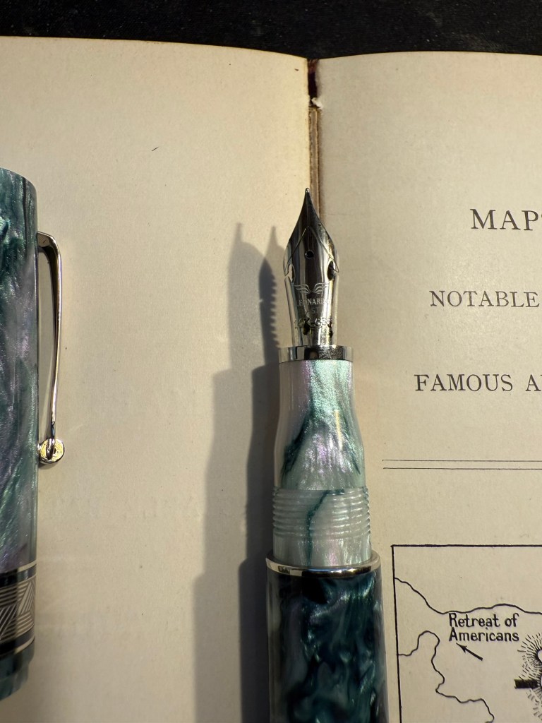
Leonardo Momento Mother of Pearl fountain pen
The Leondardo’s elastic or “flex” nib has cutouts in the nib shoulders to provide it a bit of give. It’s a nice nib that offers some line variation, but is nowhere near what you can get in vintage flex or super-flex nibs (particularly Swan and Waterman).
Closeup of the elastic nib with the cutouts in nib shoulders
Lamy 2000 fine nib with Diamine 150 anniversary Silver Fox ink – this is one of two Lamy 2000s that I have, and I really like this pens as workhorses. Silver Fox was part of the original collection of 150 anniversary inks that Diamine issued and it’s a nice mid grey that is very readable.
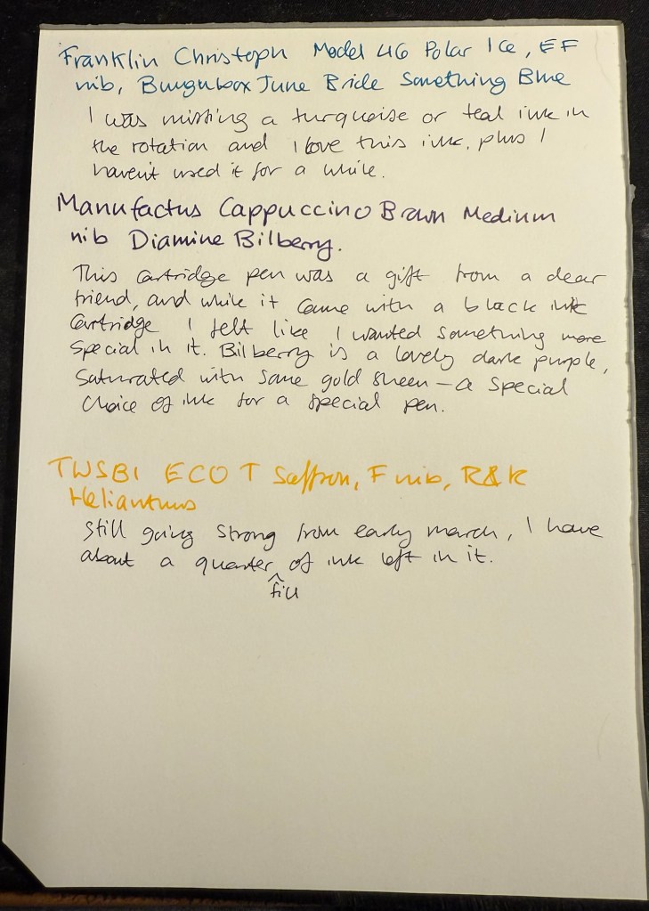
Franklin Christoph Model 46 Polar Ice extra fine nib with Bungunox June Bride Something Blue – I filled this pen about a week after the others since I wanted a teal ink that wasn’t in as wet a nib as the Swan. I got this ink as a gift from the Pen Addict Membership back in 2016.
Franklin Christoph Model 45L Turqish Crush extra fine nib with Diamine 150 anniversary Blue Velvet – another original 150 anniversary ink (Diamine later issued a second and perhaps also a third line of inks in this series, I don’t remember). This one is a nice royal blue, and another ink that I had used in years.
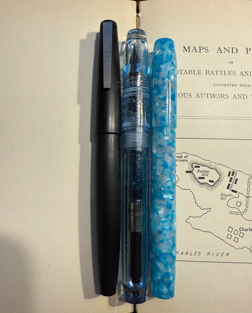
From left to right: Lamy 2000, Franklin Christoph Model 46 Polar Ice, Franklin Christoph Model 45L Turqish Crush
Oldwin Art Deco red and black striped ebonite, 18k medium nib with Diamine Writer’s Blood – as I’m writing this I have written this pen dry, mostly because it has a very wet and hungry nib and a standard sized converter. I bought this Oldwin from Mr Mora at Mora Stylos in Paris, and it’s a huge and surprisingly light pen.
Oldwin Art Deco red and black ebonite
The nib is also a very large nib (size 8 and not size 6), and the pen is surprisingly not smelly for an ebonite pen. The feel of the material is fantastic – ebonite is such a warm material – and I like it enough to consider refilling it instead of cleaning it out. Diamine Writer’s Blood has been in rotation recently, but it’s a new ink to me and I’m still trying to figure it out. Having it in this pen made me appreciate it more, as it really showed off its unique colour properties and shading plus sheen.
Oldwin nib
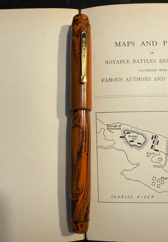
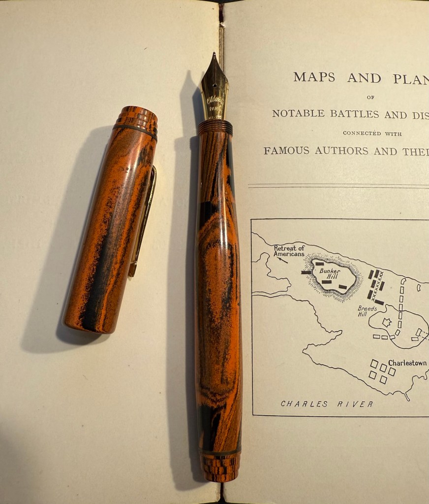
Manufactus Cappuccino Brown medium nib with Diamine Bilberry cartridge – this was a gift that I received from a dear friend who was just back from Italy and bought this (and a wonderful leather bound personalized journal) in the Manufactus store in Rome. The photo doesn’t do justice to the richness of the resin on this pen.
Manufactus Cappuccino Brown
The Manufactus has some heft to it, due to the metal body and trim, and while it states that it’s a medium nib, it runs closer to a fine nib in terms of line width. Diamine Bilberry is an interesting ink that I had in cartridge form, and I wanted a more unique ink than the standard black cartridge that came with this pen. Bilberry is saturated enough to pass as black at a cursory glance, but it’s a gorgeous rich purple with gold sheen that works well in this pen.
Manufactus Cappuccino Brown nib
Apart from these pens I still have about a quarter fill of ink in my TWSBI ECO T Saffron fine nib with Rohrer and Klingner Helianthus going from March’s ink rotation.
Of February’s pen lineup only two pens remain inked, the Parker 51 with Waterman Purple, and the Leonardo Momento Zero Bohemian Twilight with Pilot Iroshizuku Tsuki-yo. As they’re both running low on ink, it’s time for a new pen lineup, with a slightly different theme than last month’s one:
All the pens are modern (last time I had more vintage pens than modern ones in rotation) and ones that I haven’t inked in years.
All the inks are ones that I haven’t used in years or ever, apart from one that was in the last rotation but I still haven’t figured out so it got another go.
The ink colours are much brighter than those that I used in February.
Here’s March’s rotation:
Writing sample on Midori MD Cotton paper
Here’s a bit more about every pen and ink combo:
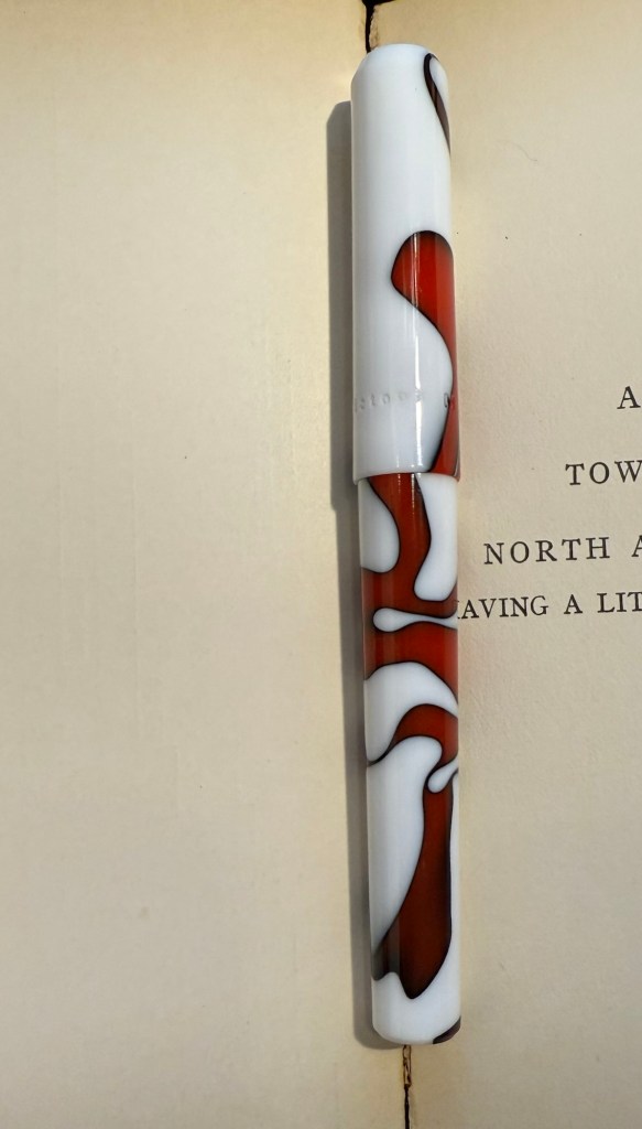
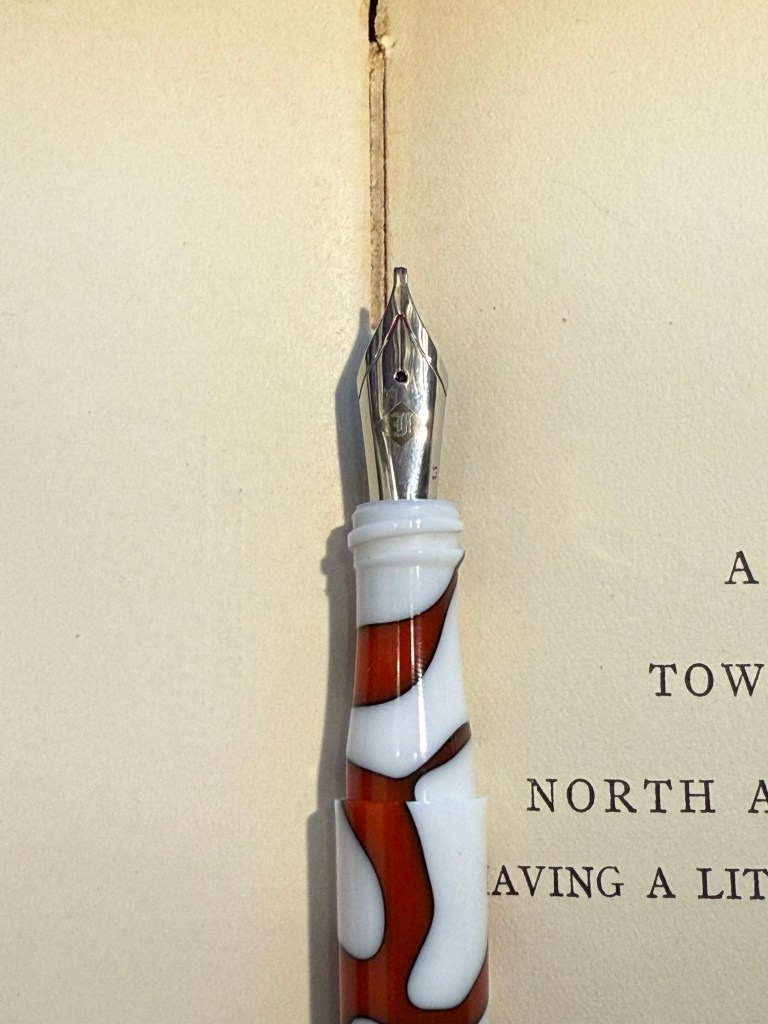
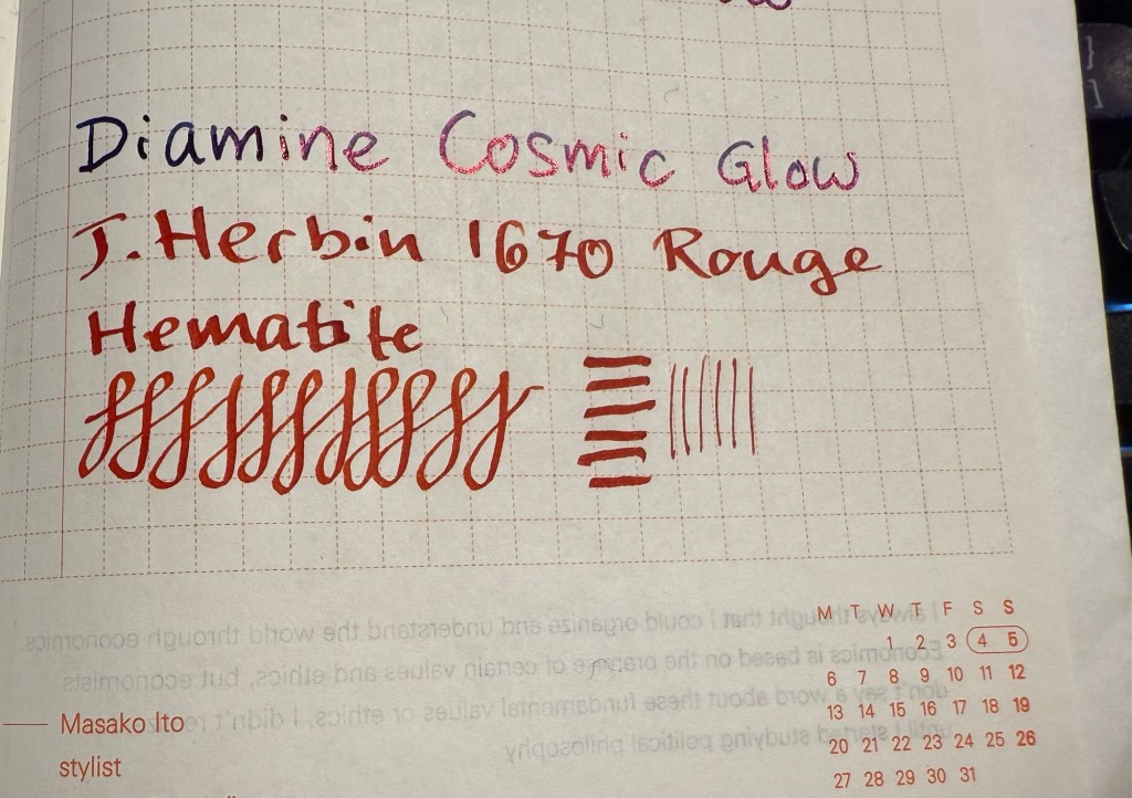
Franklin Christoph 03 modified prototype- Red/White/Black motion with a 1.1 HPSteel cursive calligraphy nib. This is a new pen that I bought last year as my chemo anniversary pen (I buy myself a present every year to mark the occasion). I love the unusual resin colour and pattern, and I like FC’s HPSteel 1.1 nibs. They are just wide enough to really show off the ink without becoming a nightmare to use because it takes ages for the ink to dry. As nice as the pen is (and it is), the ink is the star in this one in terms of interest: it’s the ORIGINAL J.Herbin 1670 Rouge Hematite, which means that it has NO GLITTER and NO SHEEN. It’s just a deep, bright red with some nice shading and good outlining, but it isn’t full of gold glitter and sheen to the point where you can’t see the base colour. Yes, this is also the bottle that had the problematic crumbly wax cover on the cap, but I really think that I prefer this version to the one they issued later (I have both). I don’t normally use red inks, but this one was perfect for this pen.
The FC 03The HPSteel 1.1 nibOriginal Rouge Hematite compared to Cosmic Glow on original Tomoe River paper. Note the lack of sheen or shimmer.
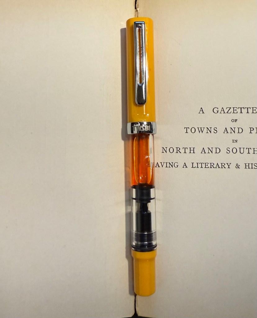
TWSBI ECO Saffron fine nib filled with Rohrer & Klingner Helianthus ink. I use yellow inks even less often that I use red inks, but this ink is fairly readable for a yellow ink. It is, however, not going anywhere near a vintage pen as it has a tendency to crust over (as many yellow inks do). I wanted something bright, cheerful and different, and this ink checked all three. The TWSBI ECO is a phenomenal pen for those starting out with bottled fountain pen ink, and I can’t recommend it enough.
TWSBI ECO Saffron
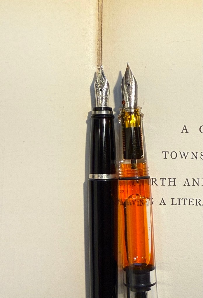
Aurora Ipsilon medium nib with Rohrer & Klingner Alt-Goldrün ink. This is my one and only Aurora pen, which I bought years ago in Florence, Italy. Aurora nibs are nice enough, but the pens are priced well above what I believe that they are worth, so I have steered clear of them over the years. The Ipsilon is small pen, but you can’t post it, which is annoying for such a small pen. R&K Alt-Goldrün is a fantastic ink colour – a non standard green with plenty of shading and character – and the only reason I haven’t used it more is because it was tucked away behind two rows of other ink bottles. If you are just starting out with green inks, give Alt-Goldrün a try.
Aurora IpsilonThe Ipsilon nib looks ridiculously small but it’s just the design of the section that makes it appear that way. Comparison photo to a TWSBI ECO nib.
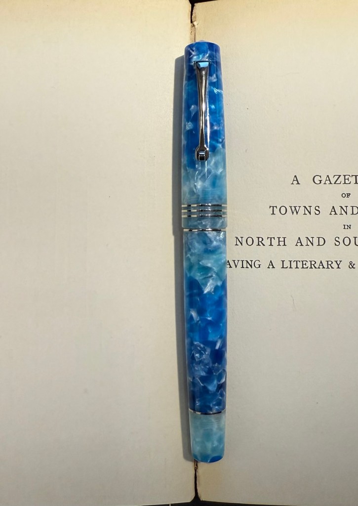
Leonardo Momento Zero Blue Hawaii Fine nib with Diamine Steel Blue ink. I have used this pen fairly recently compared to some of the others in this rotation, but the ink has been one that I actually forgot that I have. I love teal and turquoise inks, and Diamine Steel is a beautiful member of this group. There’s a hint of shading with it, and it just pops off the page so nicely. If you want a different take on “boring blue” inks, I highly recommend it.
Leonardo Momento Zero Hawaii
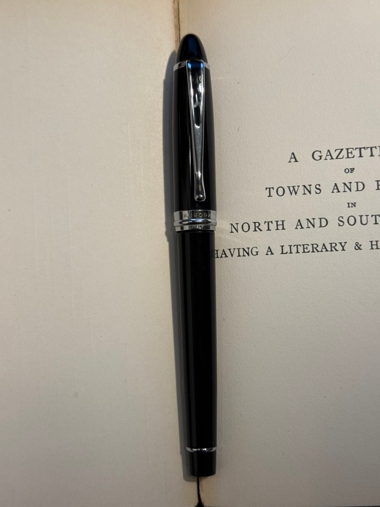
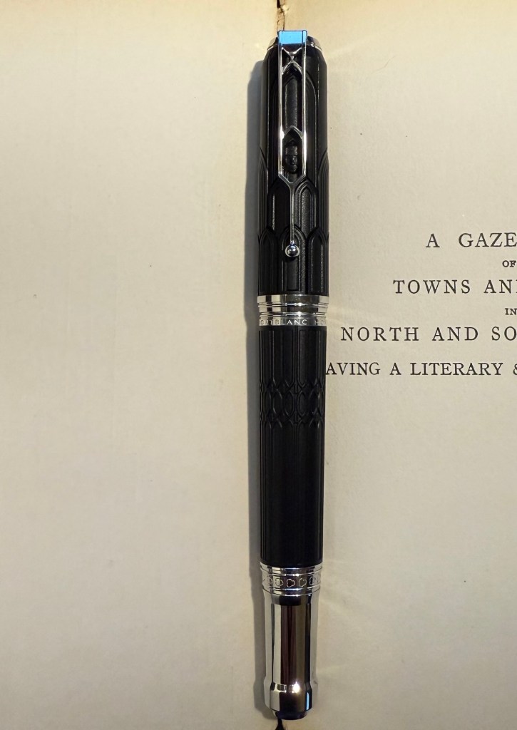
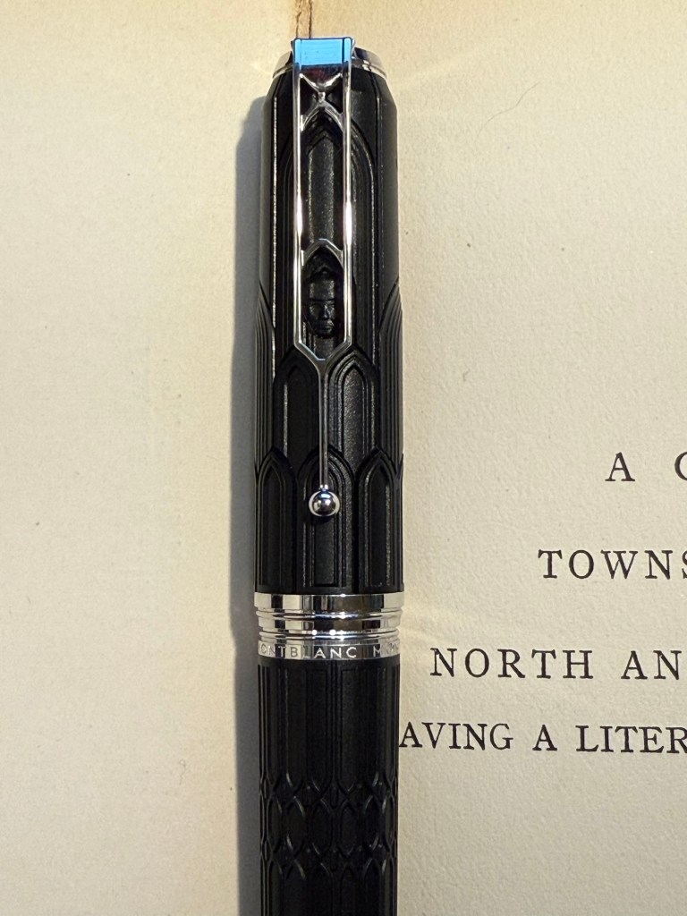
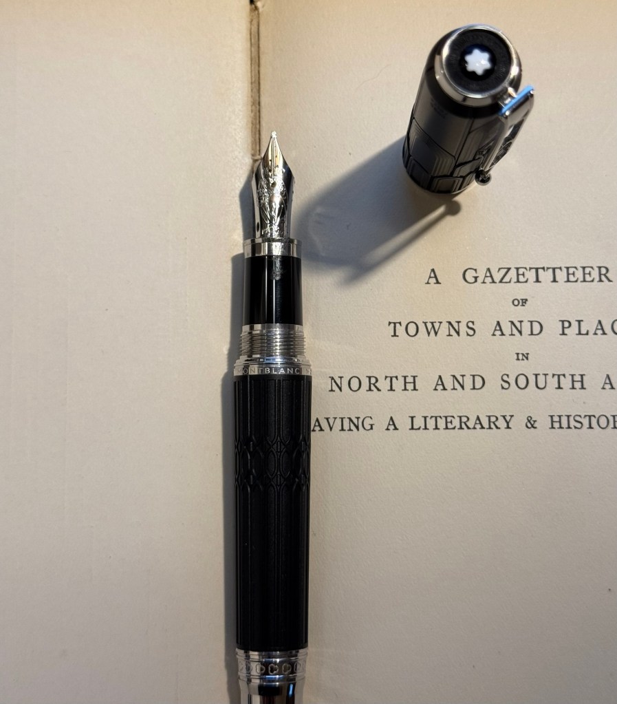
Montblanc Writer’s Edition Victor Hugo medium nib with Montblanc Around the World in 80 Days ink. I bought this pen in Mora Stylos in Paris before they closed mainly because I adore the Notre Dame de Paris cathedral and it’s featured on this pen. Hugo has the honour of being the saviour of this extraordinary cathedral, and though I shy away from Montblanc limited editions (talk about overpriced) I thought this one was worth purchasing. The ink was last in rotation, in a vintage Montblanc, last month. I just can’t get over how unrelated it is to the green-gold elephant on the box, and I’m not sure what to make of it. I was expecting it to be more like Alt-Goldrün than like the bluish-grey (Payne’s Grey really) that it is.
The Montblanc Writer’s Edition Victor HugoThe Victor Hugo death mask on the capThe nib, which features Victor Hugo
Finally, speaking of a pen and ink combo that have gotten “lost” in my collection: the Stipula Model T marbled grey pen was also an Italian purchase, and it has a very peculiar fine “flexy” titanium nib. I would characterize the nib as springy, and as my other titanium nib Stipula does, it squeaks sometimes as you write with it. The ink is one that I bought in 2013 in Fahrney’s pen store in Washington DC. Since then I haven’t opened it and used it, mainly because Fahrney’s Tempest Blue is a blue ink, and I don’t use blue inks often. It shades nicely, but other than that it looks close enough to my benchmark blue, Waterman Florida Blue (now renamed to Waterman Serenity Blue), for me not to bother using it often. Waterman Serenity Blue is a best-in-class blue in my opinion because it’s so well behaved, gentle and easy to clean out of pens that you can safely use it in any pen that you have, particularly vintage ones.
The Stipula Model T. A very sleek design. The Model T titanium nib.
I mostly use fountain pens when I write. If not fountain pens then gel ink pens. I rarely write in pencil, but I often sketch with pencils, and sometimes when I plan, I pencil things in. Pencil is great for writing impermanence, even though pencil marks last longer than pen ones – unless erased.
Yet there’s always a ballpoint on my desk and in my bag. I don’t like writing with ballpoint – the lines are as dark as I prefer, even with hybrid ballpoints like Uniball Jetstreams, and they oftentimes streak and blob. So why do I have a ballpoint at hand at all times?
Because ballpoint pens are a useful tool. The ink is waterproof , they’re good for signing things, and they’re robust enough to handle being tossed into a bag or a pocket. Ballpoint pens are also good for sketching – you can get a decent amount of shading and character with them (providing you don’t use a Jetstream).
One of the best bang for your buck ballpoints is this pen:
Zebra 301A BP
So why do I like the Zebra 301 A BP 0.7?
It’s made from aluminium, so it’s light and ultra durable. It also wears really well.
I love the pen body design and colour.
The grip and click mechanism are good: well designed and well made. You get a decisive click from this pen, and the plastic grip has enough texture to it to make writing as comfortable as possible without all the lint gathering, stickiness and durability issues of softer grips.
No tip wiggle.
It comes with a good, dependable, black refill that is replaceable.
Clip and click mechanism
I like the Zebra 301 A BP enough that I bought a large box of them and I frequently give them away as gifts. People like getting nice pens and if you’re used to cheap, plasticky, disposable ballpoints it’s nice getting a pen that’s a grade or two above what you find in the office supply cabinet.
Grip
Here’s a quick sketch done with a Zebra 301A BP 0.7 on a Field Notes Sketchbook. Ballpoint pen sketching isn’t my favourite technique, but it is a very useful technique for quick urban sketching.