Moleskine Lord of the Rings Moria Limited Edition Review
A few years ago Moleskine came out with a series of rather plain Lord of the Rings limited edition notebooks. This year they’ve had a redo, and this time they’ve decided to invest a little more in the cover designs. The result is a series of notebooks that really does the LotR justice.
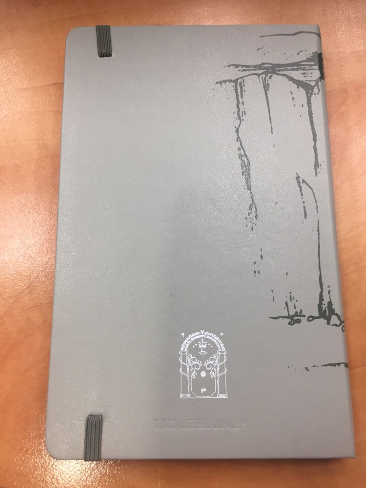
The Moleskine Lord of the Rings Moria limited edition is a proof that even if you choose grey as your colour scheme, you don’t have to create a dull product (I’m looking at you Blackwing volume 10).
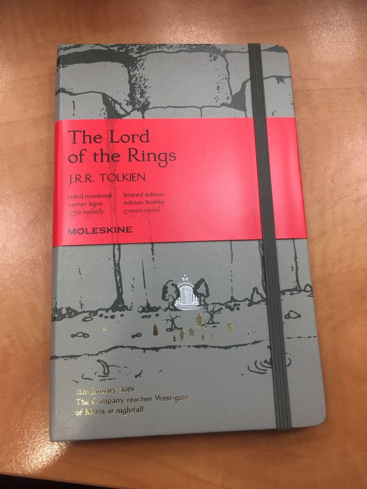
Notice how even the font on the paper band has been changed to fit the LotR design sensibility.
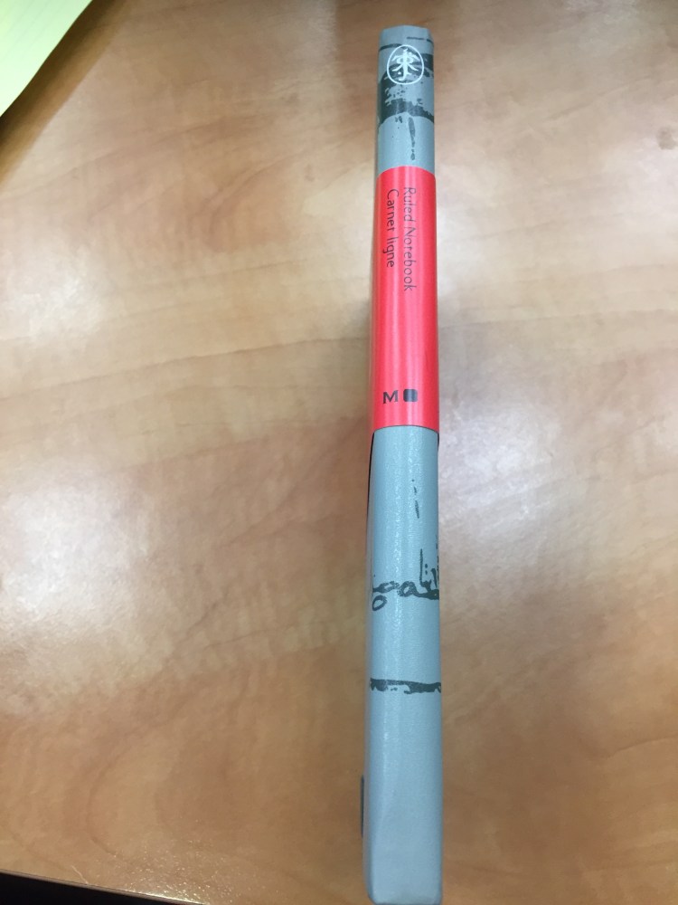
Every little detail counts, including the choice of colour for the paper band (it just pops), and the Tolkien symbol on the spine.
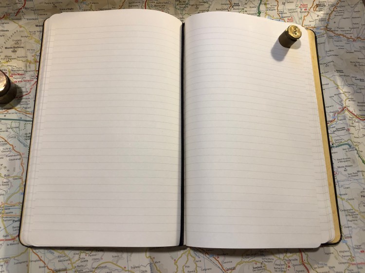
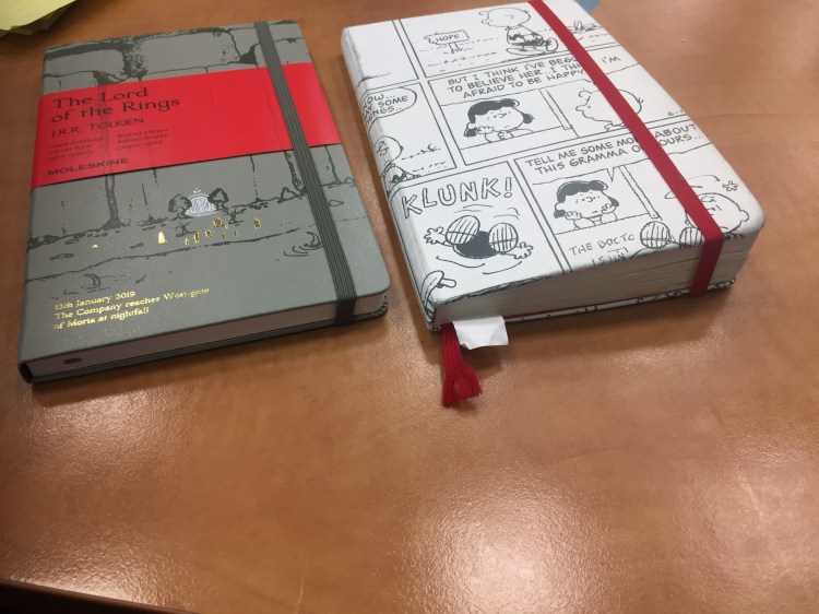
I’ve decided to use this notebook as my next journal. You can check out just how many things I pack into my journals by comparing the two notebooks’ thickness. They’ve got the same page count (192).
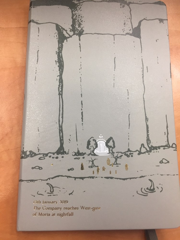
The front cover features a drawing of the entrance to Moria, in dark grey on a light grey background. The drawing continues on the spine and the back. You can see members of the fellowship (in gold foil) standing in front of Moria’s gates, the monster about to attack from the lake, and the carving of the two trees and the entrance runes. A description of the scene is given in gold foil, also in the LotR font.
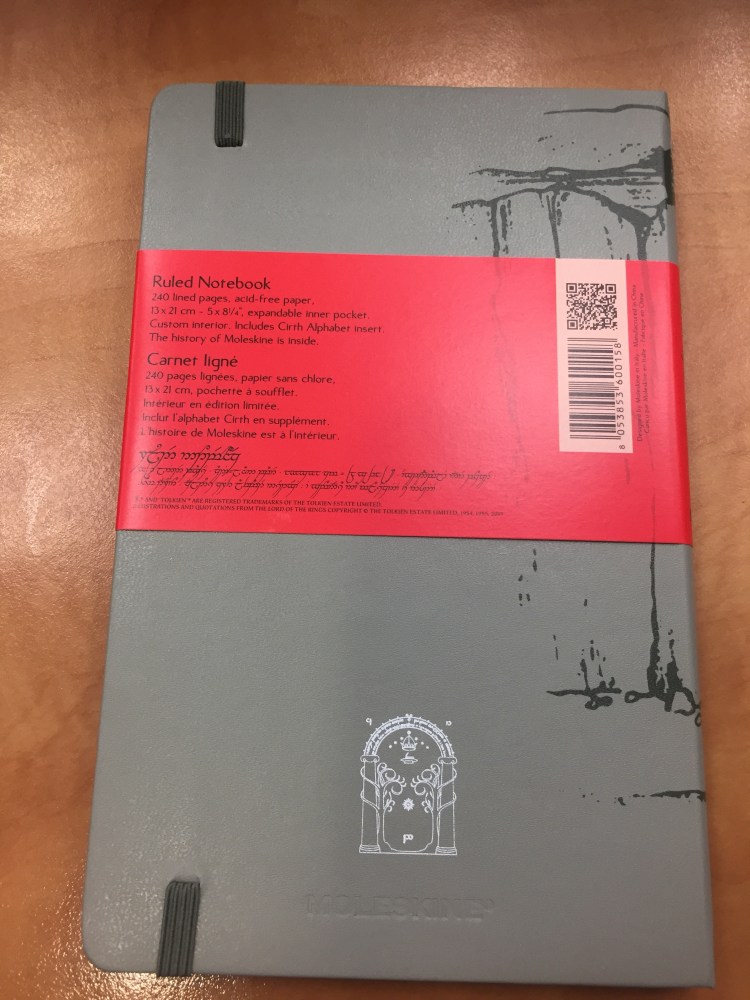
The back cover. You can see the gate rune to Moria in detail, and the Moleskine logo hardly at all. It’s just debossed into the cover. The elastic band matches the dark grey of the drawing.
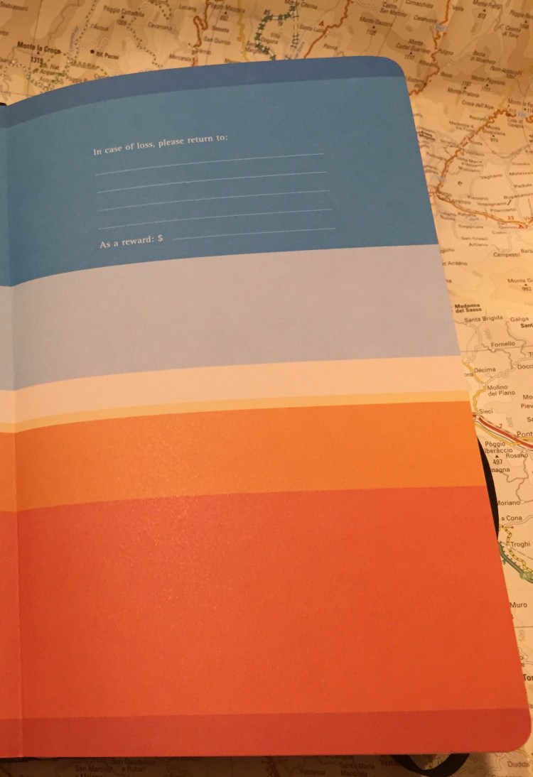
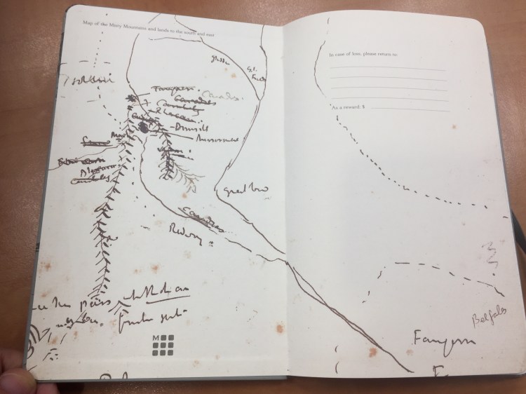
Inside the front and back cover is some of Moleskine’s finest work in terms of endpaper design. The front features a sketch of the Misty Mountains and lands to the south and the east, and also the “In case of loss“. You can see Tolkien debating which name to use for various places.
The back includes a contour map of the Misty Mountains around Mirrormere. Again, the drawing is perfectly aligned with the back pocket (it might not seem so in the photo, but trust me, it is), a small but not trivial design feature.

This is a lined notebook, with a light grey ribbon. The paper works well with pencil, ballpoint, gel ink pen, fineliners and Noodler’s Bulletproof black.
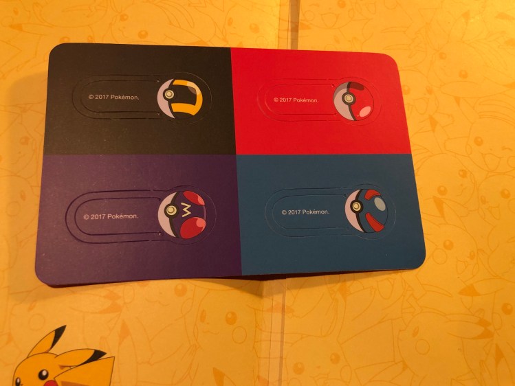
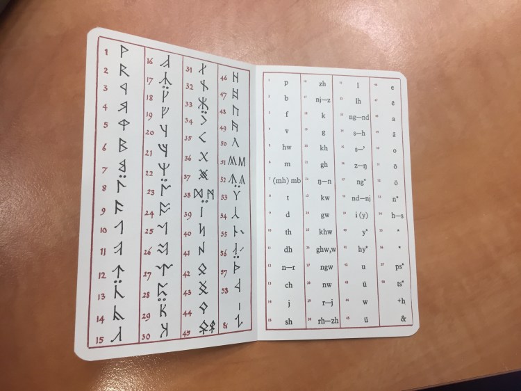
The add on to this edition is also unique: an insert with the Cirth alphabet that Tolkien invented.

Inside the insert:
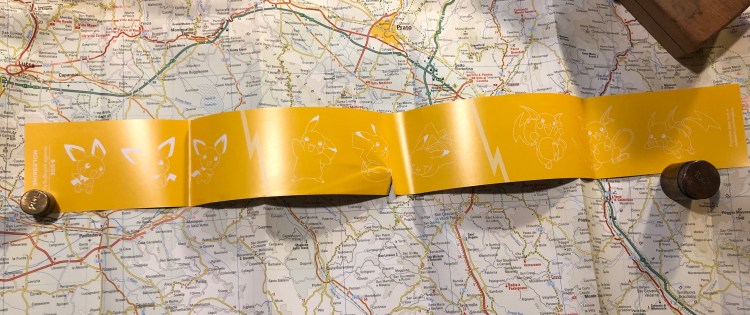
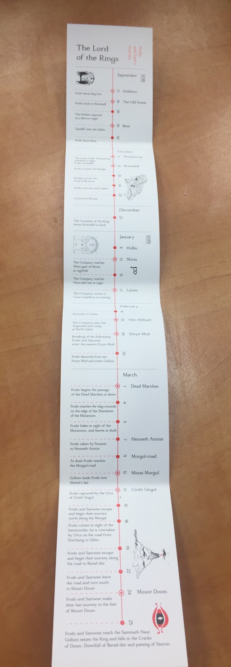
The B-side of the paper band includes a timeline for the Lord of the Rings trilogy, focusing on Frodo and Sam’s journey.
If you love the Lord of the Rings this edition is a no brainer — I highly recommend it. Even for non-fans this is a very well designed, grey/red/black and white edition that proves that you can create beautiful things even with a limited palette.