With One Week 100 People I’ve been using my fountain pens much more to sketch with, and I fell in love with them again as sketching tools. There’s something about the expressiveness of the line that they bring in that reminds me of pencil more than of fineliner pens when it comes to sketching – a combination of their varying line width and the varying ink shade.
I’ve also purchased more fountain pens than I planned, buying two Franklin Christoph pens from the pen models that they’re retiring: A model 46 in Polar Ice with an extra fine nib and a pocket 66 Italian Ice with a flex extra fine nib. These two join the Leonardo Momento Zero Grande 2.0 Galattica that I purchased from Pen Chalet last month, and the Leonardo Momento Zero Nuvola rose gold that finally arrived this month after I purchased it from Fontoplumo and it was stolen during transit. Fontoplumo were wonderful, and replaced the pen immediately, so I intend to purchase from them again.
I haven’t purchased so many new fountain pens since before the pandemic, but the Leonardo Nuvola was a gift to myself to celebrate two years from chemo, and the Galattica was a gift to myself for surviving a hellish month with my father in hospital. The Franklin Christophs were unexpected purchases made only because they were retiring these models and I was curious about these materials (I already have an Antique Glass model 66 and I love it).
Writing samplesThe pens
So far the biggest success in terms of nib has been the flex extra fine Franklin Christoph Pocket 66 Italian Ice. The nib has only a slight springiness to it, and I wouldn’t call it a flexible nib in the true sense of the word, but it works well for both sketching and writing. Diamine Earl Grey is one of my favourite inks (a bluish grey with tons of character that is legible even with very fine nibbed pens), so I didn’t hesitate filling an eyedropper pen with it. As eyedroppers have such a tremendous ink capacity, you always need to take into account just how much you love the ink you use in them.
The Leonardo Momento Zero Nuvola was a surprise in terms of the resin on the pen body (I was already familiar with LMZs fantastic fine flex nibs, and great pen and converter design). I was expecting a light blue pen with white “cloud” blotches and black outlines. In reality the black outlines are in a semi transparent brown resin, the white is more off-white/cream, and there’s real depth to the design. A very unusual resin that is both classic and unexpectedly unique.
Caran d’Ache discontinued their ultra-expensive and ultra-sought-after ink series “Colours of the Earth” in 2013 and I managed to get a bottle of the entire series besides Carbon right after they announced they wouldn’t be making them (I had bottles of Amazon, Safron and Sunset before they were discontinued because those were the ones that interested me the most). These inks are well over 10 years old and still fantastic, though the Amazon (the green ink) has darkened a bit and so lost some of its depth. The Caran d’Ache bottles are both gorgeous to look at and terribly designed.
Diamine Coral is the most optimistic of inks, a brightly bright coral ink that glows on the page and works best in generous nibs. I felt like a pick-me-up so I filled the Woodshed pen with it.
I made some interesting eexperiments with notebooks and tried a few new pencils, but this post is getting a little out of hand and so I’ll write about those in a separate post.
Did you use any interesting stationery last month?
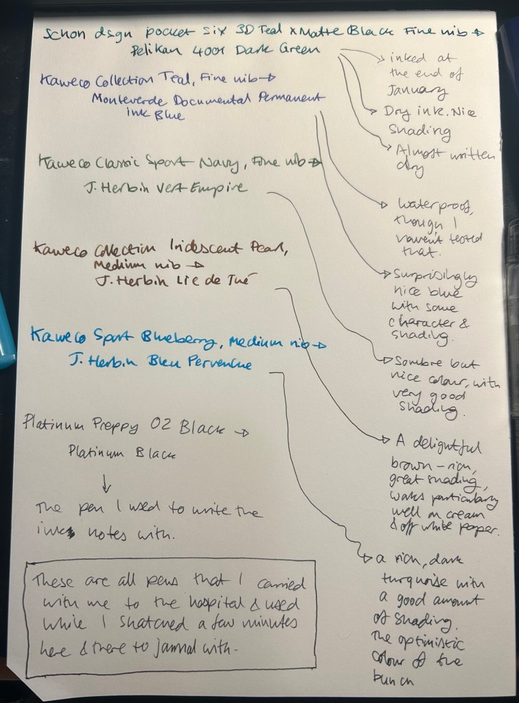
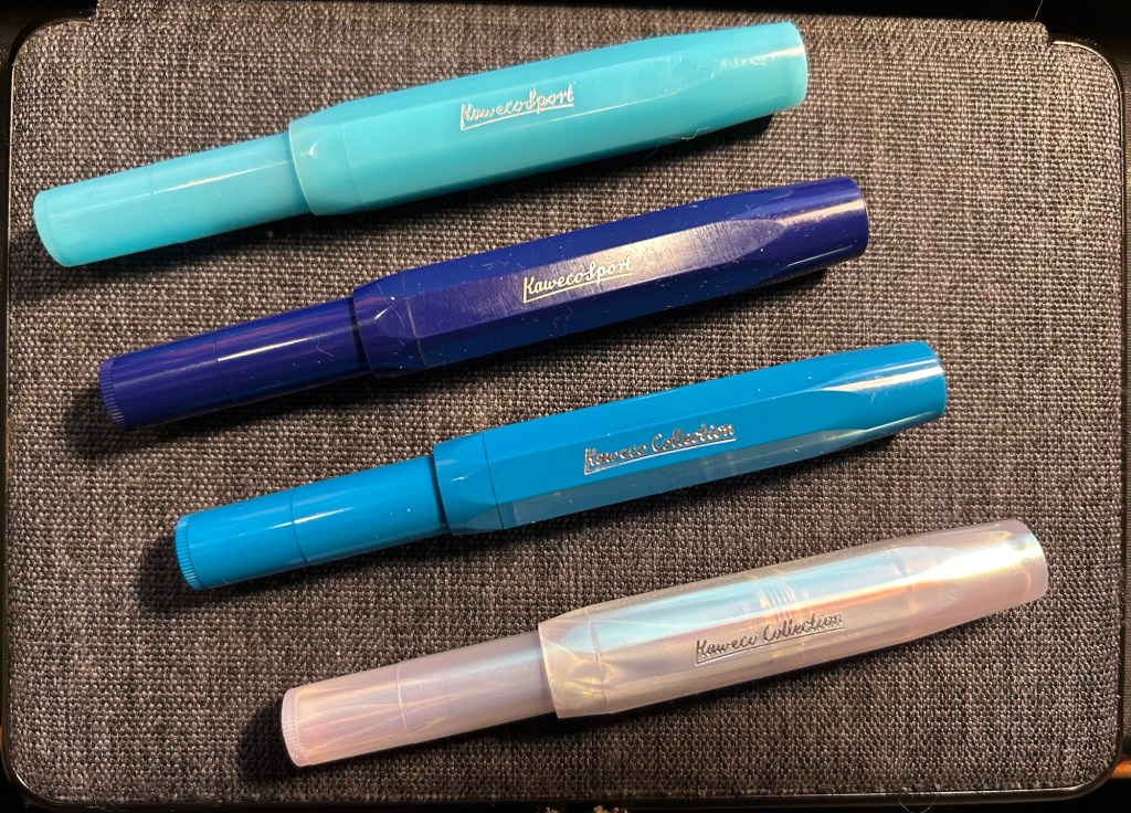
I started the month ready to spend the first half of it in hospital, with my dad. So the fountain pens I chose were all expendable pocketable pens that I was willing to have stolen (apart from the Schon Design Pocket 6 which was a leftover from January and never left my desk). So that meant I inked 4 Kaweco Sport fountain pens using various ink cartridges that I had on hand.
The portable lineup:
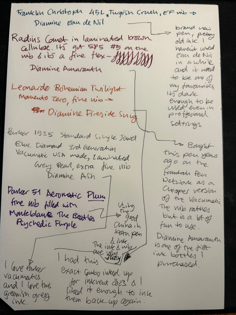
Once my dad got out of hospital and back home, I decided to celebrate by “shopping” from my collection. I inked up a Parker 51 Plum (use the good china!), a Parker Vacumatic, a Franklin Christoph 45L Turqish (spelled like that on their site) Crush that I had purchased but hadn’t inked before, and a vintage Radius Comet (because I heard that the brand was being revived).
The Franklin Christoph EF nib isn’t the best companion to the Eau de Nil as the ink tends to dry in the nib, causing hard start issues. The Radius is a flexible nib of the vintage kind, which means it’s really flexible and not just springy. It also rattles, which makes me not carry it around with me — it stays at home at my desk. The Leonardo is a beautiful pen with a beautiful ink that I refilled immediately — the only Inkvent 2023 ink I did that with. The two vintage Parkers are phenomenal, as usual. The extra fine nib on the vacumatic somehow really well with Diamine Ash, though I was worried at first that the combination would be too light to be readable. The Parker 51 Aeromatic is a treat to use. It’s the rare Plum colour, and it’s got a fantastic nib (as all 51’s have) which pairs very nicely with the Monteblanc The Beatles Psychedelic Purple.
In terms of paper I’ve been using Kokuyo A4 KB paper which I cut to half size (so A5) to manage my daily to do list. The paper is relatively cheap and very fountain pen friendly. I’m also able to use both sides of the page despite there being some show through.
Kokuyo A4 KB paper cut in half to A5 size. This is why standards are great.
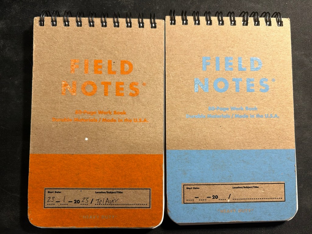
I’ve got a Field Notes Heavy duty on my desk at home and at work, and I just bought a new stock of them. These are where I jot down quick notes, phone call details, doodles during boring meetings. When they’re filled up they get tossed out as nothing in them is permanent — everything important in them moves to somewhere else as I work my way through them.
Field Notes Heavy Duty pocket spiral bound reporter notebooks
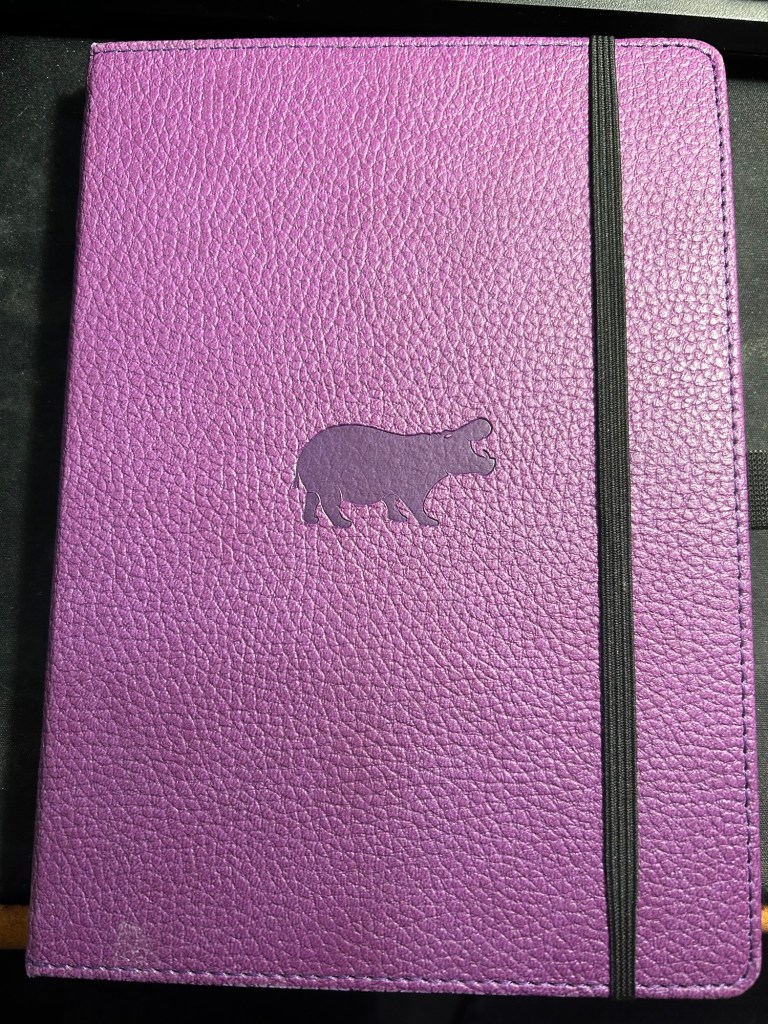
I have finally found a use for my Dingbats notebooks (beyond giving them away as gifts, as I have in the past): this lined purple hippo one is my blog notebook. I discovered that I have a much easier, much quicker time writing blog posts if I first draft them on paper, and this is where I do it in. I’ll likely write a dedicated post to this notebook soon.
Dingbats Puple Hippo A5 lined notebook
Apart from them I still use the notebooks I used last month.
Pencils
I’ve been using the Drehgriffel Nr. 2 as my daily driver. I use pencils extensively to plan, as my plans tend to change, and there’s something about this solid little mechanical pencil that makes me want to use it.
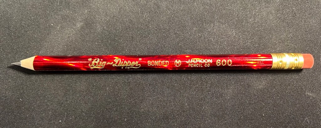
Apart from that I brought two pencils into the rotation, to try to use. One is from my last purchase from the late and great C.W. Pencils Enterprise, and it’s the “Big Dipper” J.R. Moon Pencil Co 600. It’s an oversized pencil, the kind of pencil that kids who are learning to write are expected to use. I’ve been having pretty significant neuropathy in my hands lately and I thought that this would be nice and easy to use, as after all it’s designed for kids just learning to develop their fine motor skills. So far it’s been a disappointment – the eraser and ferrule make it very top heavy, and I’ve been having a hard time manipulating it. I can’t imagine kids using this pencil and having an easy time with it. I like the over the top red foil with gold writing look though, so I haven’t given up on it yet.
Big Dipper J.R. Moon 600
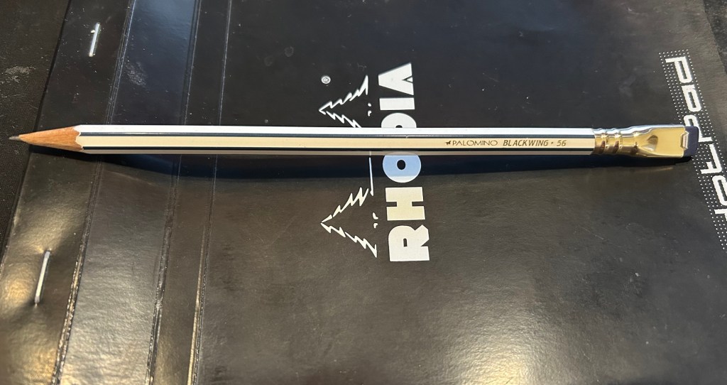
The second pencil is a Blackwing Volumes 56, the baseball themed one. The core is soft and dark, and I’ve been using it for quick and loose sketches. I’m trying to ease into one week 100 people by training myself to work faster than I normally would.
Blackwing Volumes 56
What did you use in February? Any planner changes? Pencil revelations? Pen preferences?
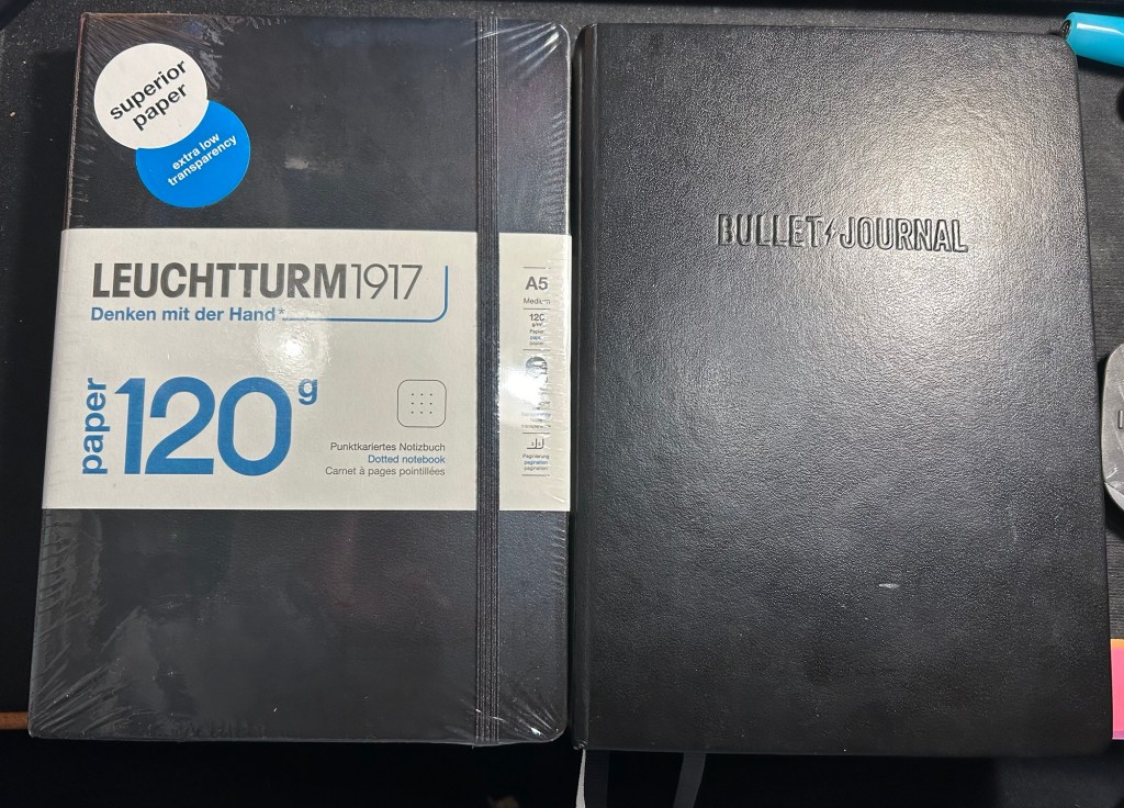
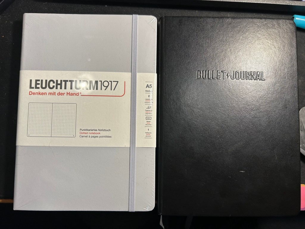
A few months ago I started using the Leuchtturm1917 Bullet Journal – at first as it was intended, but very quickly it turned into a general weekly and quarterly planner for me. As I neared the halfway mark of the notebook I decided to purchase a replacement, but instead of buying another Bullet Journal I purchased a 120gsm dot grid Leuchtturm A5 notebook. The paper was the same in both notebooks, and as I didn’t use any of the Bullet Journal features and the 120gsm notebooks are slightly cheaper, I thought that it would be a good replacement.
While I was still waiting for my 120gsm notebook to arrive, I happened to find a light grey standard (or 80gsm) dot grid A5 Leuchtturm notebook at a local store at a decent price. I purchased it and decided to compare the three notebooks.
The Bullet Journal is the most expensive of the three, but also comes with the most “stuff”. There’s a booklet that explains how to bullet journal, stickers for bullet journaling, a specially formatted front endpaper, a key for bullet journaling, three ribbon bookmarks instead of two, and several pages with dedicated bullet journal appropriate titles (intentions, index, future log). It has the fewest colour options (just three) and features Bullet Journal branding on the front cover and the spine.
The original- Bullet Journal
The Leuchtturm 120g notebook has a few more colour options, and is basically a stripped down Bullet Journal edition. In terms of thickness the two notebooks are the same (i.e. very thick notebooks, about twice the thickness of a Moleskine), but the 120g notebook has just two ribbon bookmarks (instead of three), no special endpapers, stickers (beyond the regular ones that come with each Leuchtturm notebook), titled pages, key or booklet. It’s cheaper than the Bullet Journal and has the same paper that the Bullet Journal has.
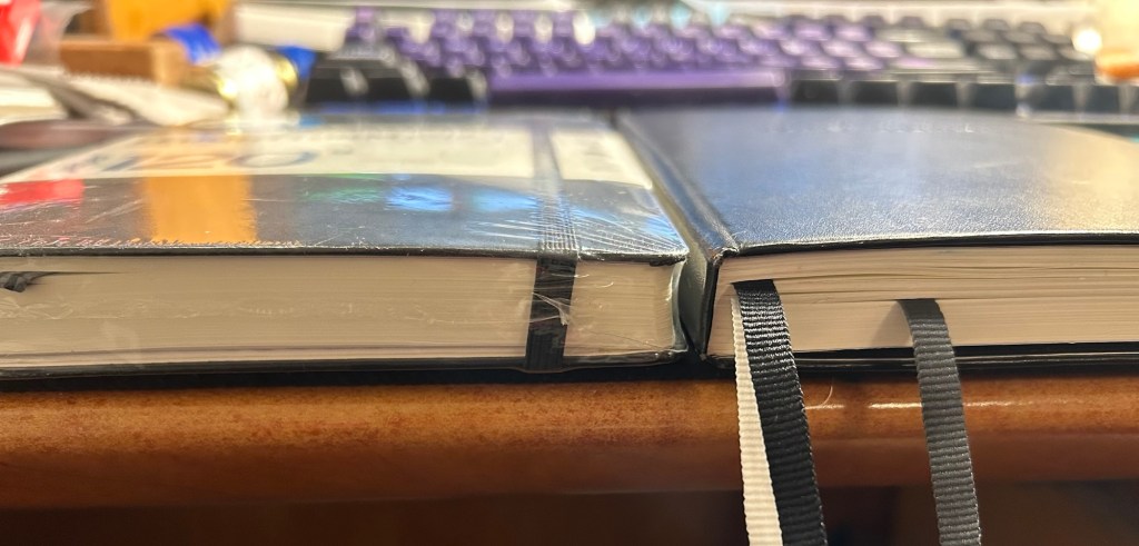
120gsm on the left, Bullet Journal on the right
Same thickness and form factor:
120gsm on the left, Bullet Journal on the right
The regular Leuchttuem dot grid (which I’ll refer to as the standard from now on) is 20% thinner than the other two, features 80gsm paper and not 120gsm and like the 120g has two ribbon bookmarks, label stickers for the notebook, and a pocket on the back. It’s also a bit lighter than the two other notebooks.
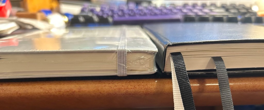
Standard on the left, Bullet Journal on the right
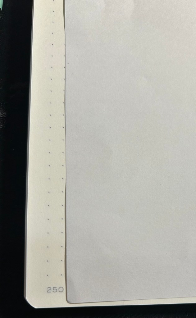
Where the standard notebook wins in a knockout is page count. The standard has 251 pages, the 120gsm has 203 pages and the Bullet Journal has 205 pages, but several of those pages feature dedicated Bullet Journal titles (Index, Future Log, etc).
Standard on the left, Bullet Journal on the right
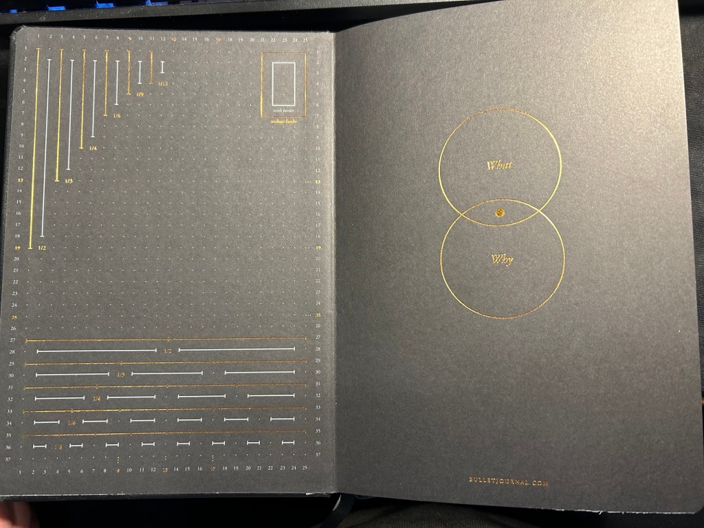
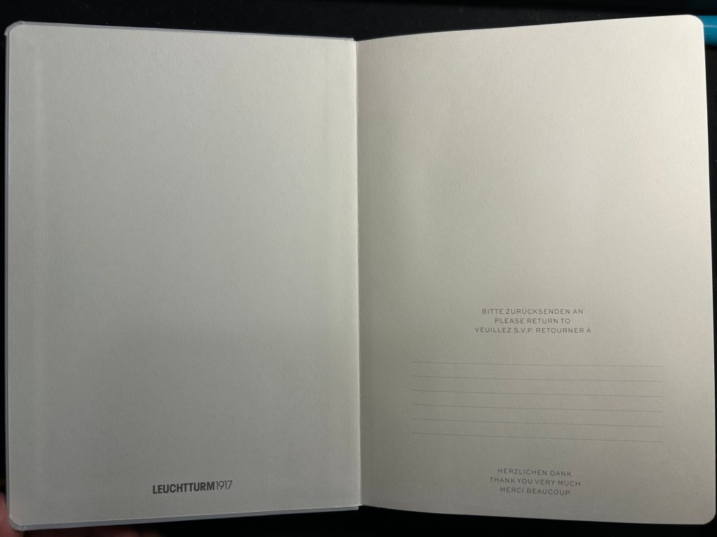
All three notebooks open flat, feature an off white paper, and the last 20 pages are perforated so you can tear them out. The standard and 120gsm contain two lined table of content pages, which the Bullet Journal does not. The Bullet Journal is also the only one to contain special divisions on the paper, which are notated on the front endpaper:
Bullet Journal front endpaper
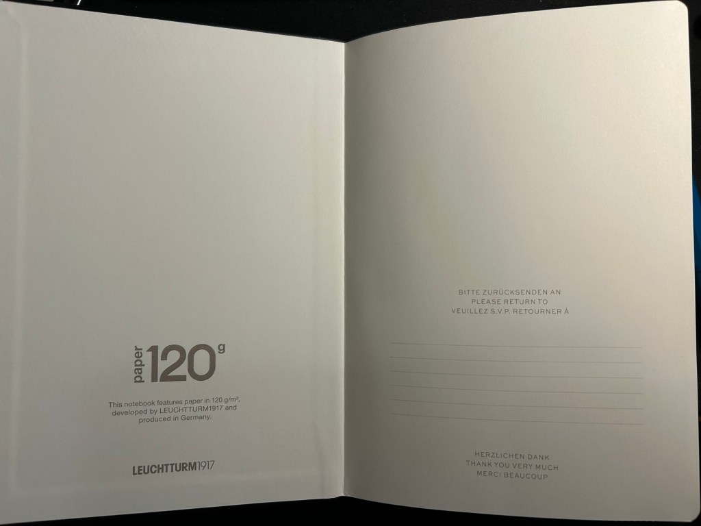
The front endpaper on the standard and the 120gsm look very similar, but the 120gsm has a bit of additional branding:
Standard front endpaper120gsm front endpaper
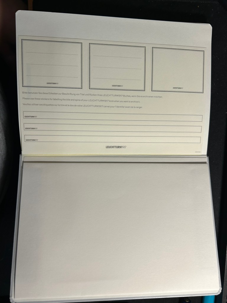
The stickers on the standard and 120gsm are the same, and are meant to be used on the cover and spine, to label the notebook:
Stickers in the Standard and 120gsm
The pockets on all three notebooks look and function pretty much the same.
Back endpapers and pocket in the Standard and 120gsm
The table of contents pages on the standard and 120gsm is useful if you use your notebook for project management or meeting notes, for instance, and want to be able to quickly reference a certain page. The pages are already numbered, so it’s just a matter of building the reference pages in a way that makes sense to you. This doesn’t exist in the Bullet Journal because Leuchtturm is assuming that you’ll be using the official Bullet Journal way of referencing and finding pages.
What Leuchtturm confusingly calls Bookmarks – two index pages in the Standard and 120gsm
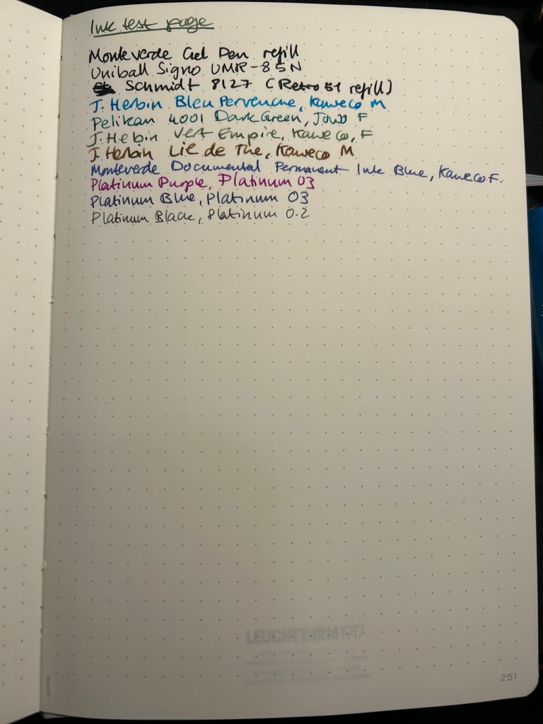
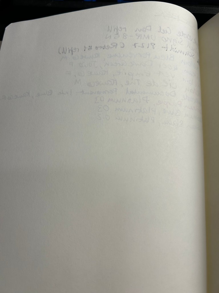
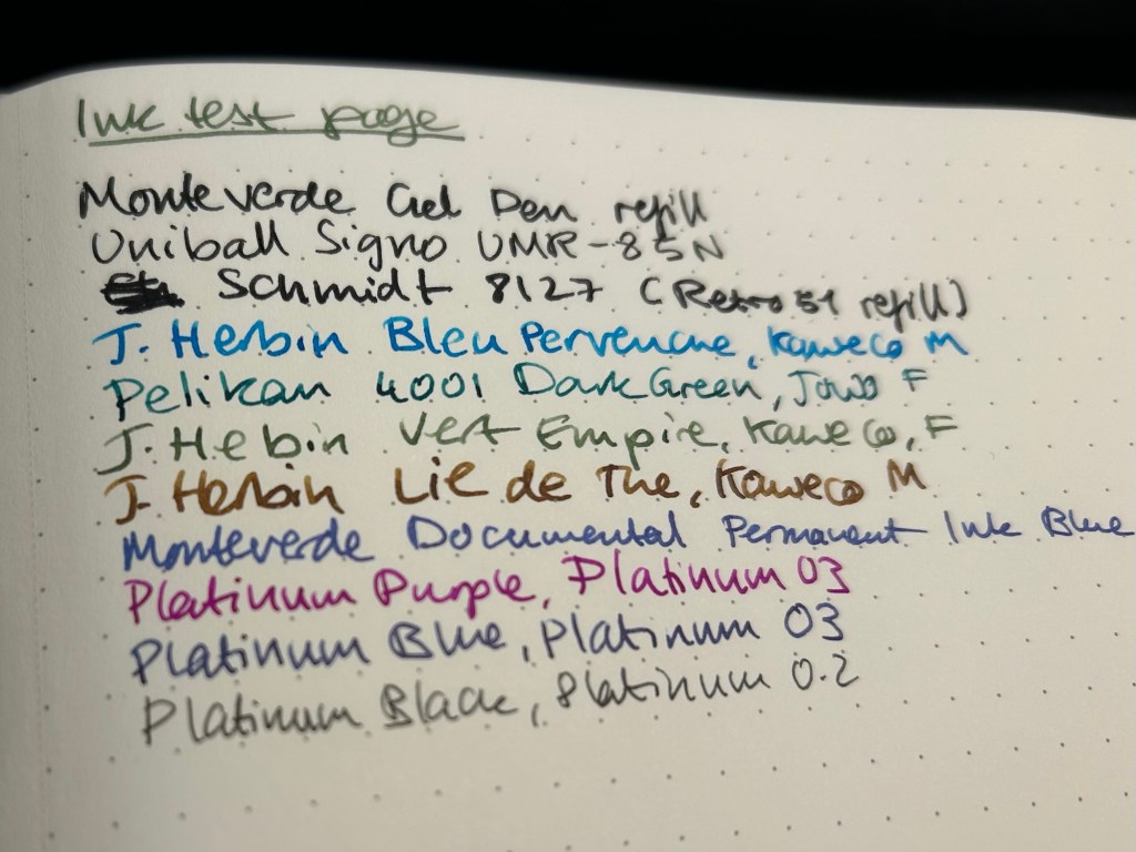
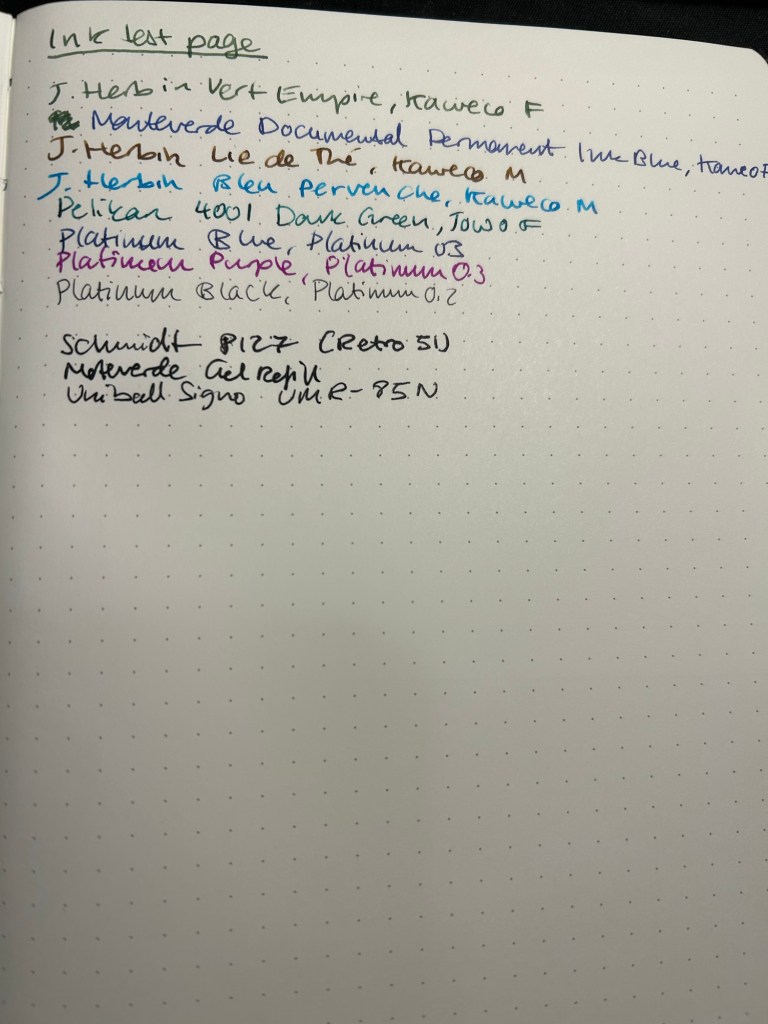
Now for the paper. The dot grid is the same on all three, but the paper in the standard is by far the inferior of the three. The page is practically transparent (you can see the Leuchtturm1917 logo on the back pocket on the bottom of the page) and you will have show through with all kinds of inks, pens and nib sizes, and bleed through with most pens and inks (including wider gel ink pens!):
Ink test page for the Standard
This is a notebook that you either need to use with a very specific kind of pen, or be willing to write on only one side of the page (therefore giving up on the price and page number advantage of the notebook):
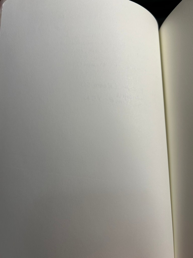
Show through and bleed through on the Standard. Even the gel inks faired poorly.
Here’s a close up of the way the ink behaved. This is fountain pen friendly paper in terms of it not spreading or feathering, but the bleed through and show through will limit you to fine and extra fine nibs and less saturated inks:
No feathering, some spread with the Retro 51 refill
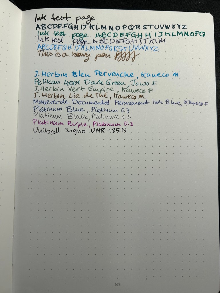
The 120gsm paper on both the Bullet Journal and the 120gsm notebook fair much better:
Ink test page on the 120gsm
You can definitely use both sides of the page with this notebook, and feel free to toss every kind of nib width and ink at it — I haven’t found one that it can’t handle.
Back of the 120gsm (Bullet Journal was the same)
I’ve been using the Bullet Journal for a while now and I have had no problems using even broad and flexible nibs on it, with wet inks. Inks take time to dry on it, but they don’t bleed through.
Ink test page with example of wet and wide nibs on the Bullet Journal
The paper in all three journals is off white. That may bother you. Here’s the page with a sample of a white page next to it:
Paper colour sample – Leuchtturm vs white paper
At the bottom and the left side of the page you can see the special Bullet Journal divisions, meant to help you create various BuJo formats of things. They’re very unobtrusive, so you can easily ignore them if you don’t need them:
Bullet Journal markings on the bottom and on the left margin
So, basically:
Standard — cheapest one, thinnest and lightest with the most pages. Works only if you use fine gel ink pens or fine and extra-fine nibs with unsaturated or light coloured inks. If you write with a heavy hand, or prefer to use ballpoints this paper will likely note work for you, as you’ll carve your way through several pages without really intending to. If you’re willing and able to work around its limitations, it’s worth getting. It’s also more widely available and comes with a much larger range of cover colours than the other two.
120gsm – when in doubt, get this notebook. It’s got the best paper for the least amount of money of the three. If two ribbon bookmarks aren’t enough for you, it’s likely that you’ll need more than three anyway — get post it tabs. If you don’t have to have the Bullet Journal addons and formatting, save a few bucks and get this notebook. You’ll also have a few more cover colour options.
Bullet Journal — get this if you want to use the Bullet Journal method or you want to try it. If you end up deciding not to use the method, you’re still left with a great notebook, and you can buy the 120gsm next time.
I hope this helps clarify things a bit. Personally I’m currently using the Bullet Journal as a regular notebook (my quarterly planning, weekly planner and long term lists are in it) after failing to find value in the Bullet Journal system, and the standard notebook for work projects. The 120gsm will replace the Bullet Journal once I’ve filled it.
After finishing my previous journal I just started a new journal, which is both an exciting and daunting prospect whenever it happens. There is so much potential in a new journal – it makes me want to crack it open and fill as many pages as possible in the first sitting. Yet opening that first blank page also makes me freeze in fear of “ruining” a perfectly good notebook with my scrawls.
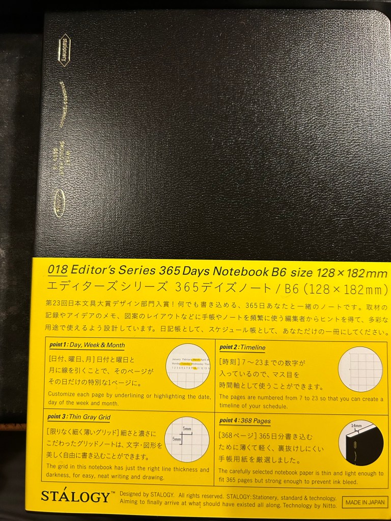
Stalogy 365 Days B6
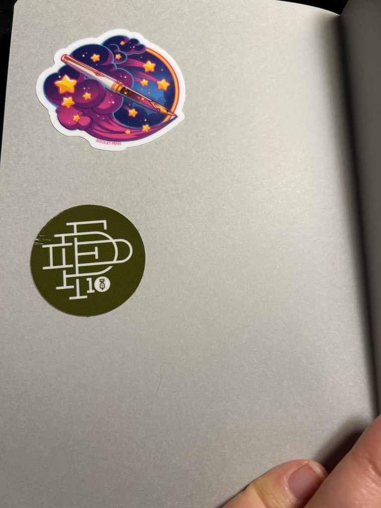
There are many tips on how to overcome that fear, ranging from deliberately destroying the first few pages to using various formulas to inspire you to fill those first pages. What I currently do is just open a new Stalogy 365 Days notebook, turn it upside down (so the header, which I don’t like, is at the bottom) and slap 2-3 stickers on the back endpages. This time I chose a 10th anniversary fountain pen day sticker and a Goulet Pens dream pen sticker to start off, but I usually add a few more stickers as I use the journal.
Stickers on the back
I then turned to the first page and started my first journal entry with the following sentence:
“New journal! My third Stalogy 365.”
After that came my usual daily gratitude list, and so I had most of the first page filled up in no time and had no problem moving on after that.
For those still in search for “new journal” inspiration, here are some pointers:
Personalize your new journal in some way. It’s about to hold your innermost thoughts, so you might as well make it your own.
Switch formats mercilessly if you find an old journaling format isn’t working for you – page size, ruling, type, etc.
Have a starting formula for your journal. If you find it difficult to start journaling each day, then pick a formula that you can use each day – like a daily gratitude list, a quote, notes about the weather, your plans for the day.
The first few entries are the hardest, but they’re also only 2-3 days out of the entire life of a journal. It’s worth remembering that and plowing through those days.
When in doubt pick a quote from a book or article you’re reading and start a discussion with the author.
If you’re really at a loss for starting ideas, use the first page, not the last one, as an ink testing page.
Do you have any new journal rituals or tips? Do you enjoy starting a new journal or find it daunting?
As I’m writing this I’m two or three pages away from finishing another journal. It’s not the first journal that I’ve finished, but somehow it’s always a tiny, little momentous occasion. After all from the moment we crack open a new notebook and dare to write on its pristine pages we envision this outcome: a notebook chock full of words, sketches and mementos.
Slightly frayed and ink stained but this Stalogy 365Days B6 notebook has served me well for about 6 months
For me the end of a journal offers a change to review and reflect on its contents. The last few pages aren’t used for normal journaling, but rather are reserved for me to write notes in as I leaf through the completed journal’s pages. What key moments does it hold? What revelations? How can I look back with kindness at moments of weakness or failure, and how can I learn and grow from them? This is not always a pleasant or easy experience, but I have always found it worthwhile.
Sample page with a sketch.
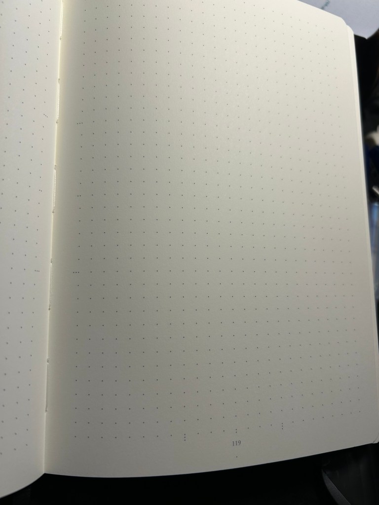
This is also a time when I consider whether I need to switch a journal format or not. I’ve been using the Stalogy Editor’s Series 365Days B6 notebook for the past two journals and I’ve been happy with it, so that’s what I’ll continue using for now.
What about you? Do you have any “end of journal” or “end of notebook” habits and rituals?
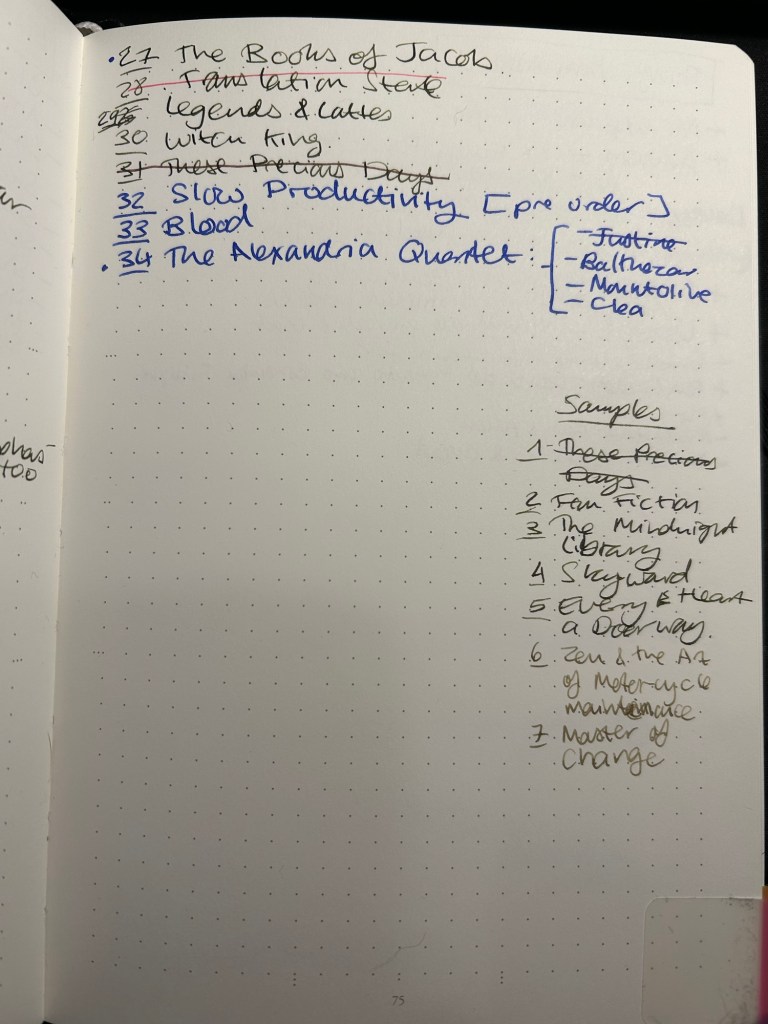
One of the things that I set up in my Leuchtturm1917 Bullet Journal is a list of the unread books on my Kindle. It’s supremely easy to buy books on a Kindle, as the whole system is set up a way to make book purchasing as fast and frictionless as possible.
This is a problem for me.
I love books, I adore reading, and I have pretty large group of friends that love reading too. This means that I’m inundated with great recommendations that run the gamut from light hearted fantasy and sci-fi to contemporary and classic literary fiction, with a whole host of fiction and non-fiction books in the middle (I don’t read horror and I don’t read romances and I rarely read poetry but that’s about the only limits I have in terms of my reading tastes). I get several such book recommendations a month, and with my initial impulse to rush out and buy them, and with the ease of purchasing books on a Kindle, things could get out of hand very quickly. This was one of the reasons why for years I was so resistant to buying a Kindle.
You see, it’s very easy to lose track of just how many unread books you have on your device. Even if you sort by unread books, you just don’t get a real feel for how many of them are actually waiting to be read. There’s no bookshelf groaning with the weight of unread books, and I was feeling the lack of that.
Enter my list of unread books on my Kindle:
It’s a simple numbered list of books that I haven’t read and are on my device. As I read a book, I cross it out. As I purchase more books I add them to the end of the list. As I’ve gotten into the habit of downloading samples, I’ve started to write them down too so they don’t get out of hand. It’s super simple, as bare-bones as it can be, and as practical as possible. The point is just to give my brain an idea of the scale of unread books on my device, and it works.
It works.
I’ve stopped compulsively buying books in the fear of “running out of something to read” or “forgetting what I was recommended”. Recommendations go into my GoodReads “Want to Read” list. And my brain can now see that there’s just no chance that I’ll run out of things to read any time soon. If I buy something I have to go over the list and convince myself that what I’m buying deserves precedence over the lovely books waiting patiently in line, some of them for years. I also photograph this list and keep it on my phone for reference, to prevent me from accidentally buying the same book in physical format (unless I purposefully intend to, which is rare).
What about the physical books stacked on shelves, some of them two books deep? I would love to have such a list for them as well, but that task is too daunting for me now. I remember where my books are visually, and moving them all just to catalogue them not only seems like an awful lot of backbreaking work, it will destroy my “memory catalogue of books”. So it seems that my physical books will remain uncatalogued for years to come.
Do you keep a list of all the books you own but haven’t read yet? Do you just keep a list of the books you intend to read next? Do you track your physical books in some way?
January was a big month in terms of writing pens dry. For the first time ever I managed to write all of the Inkvent pens dry by the end of the month. That’s 12 fountain pens written dry, which is the most I’ve ever written dry in a month. The secret is not filling them more than 50% full, and making sure to journal and note-take consistently.
In terms of paper products I’ve journaled in my Stalogy 365 B5 journal and will be switching to a new journal next month (also a Stalogy 365 B5 because I like the paper and the format). I do have a little quirk with these notebooks – I use them upside down because I don’t like the header with the dates on it, so I flip the notebook around so that it’s at the bottom of the page. That way it doesn’t bother me as much.
Stalogy 365
I’ve also been using a Rhodia A5 dot pad to time block my day, and Kokuyo A4 KB which I cut in half (to get two A5 pieces of paper) and write my daily todo list on. At work I use a Maruman Mnemosyne horizontal A5 notebook (either squared or blank) to brainstorm on, track my tasks, take meeting notes, etc. My weekly plans and long term 12 week year goals are in a Leuchtturm1917 Bullet Journal that stays at home, on my desk. The rest (Stalogy B5 journal, two pieces of daily planning paper, and the Mnemosyne) travel with me when I go to the office.
I have a monthly calendar with some monthly reading, running, gym, swimming and blogging targets on it and I draw that on a Well Appointed Desk “Rebel Plans” notepad.
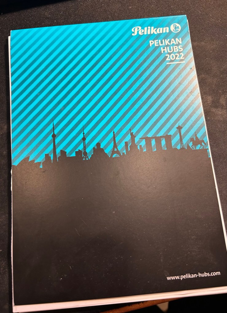
Earlier this month I used the wonderful Pelikan Hubs paper to do my daily planning, and it was amazing (cardstock thick and fountain pen friendly). I was running out of it quickly though, which is why I moved to the Kokuyo.
Pelikan Hubs paper pad
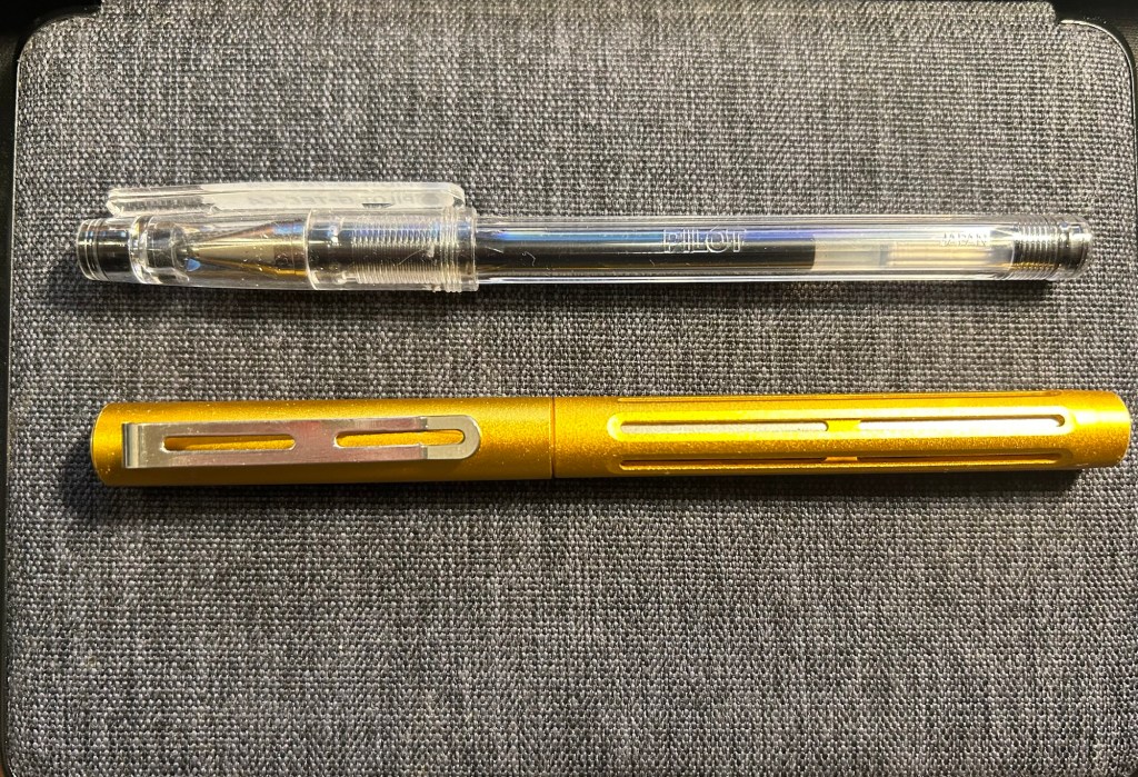
In terms of standard pens I’ve used the Pilot Hi-Tech-C in 0.4, my Spoke Design Spoke Pen in orange crush, and a Pilot Juice Up 04 in orange and light blue. As I will be spending a lot of time at hospitals next month, I will likely be using more standard pens then.
Pilot Hi Tec C and Spoke Design Pen
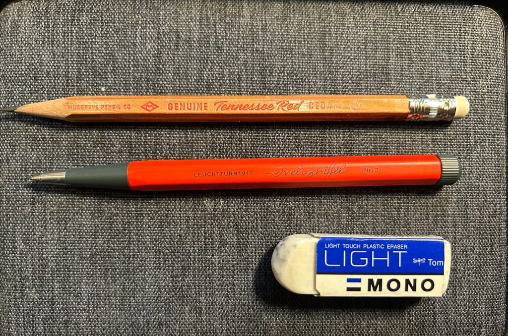
Pencils in use were the Tennessee Red, which is gorgeous and a treat to use, and Leuchtturm1917 Drehgriffel Nr.2 mechanical pencil in red and grey. I have better mechanical pencils that this one, and yet I keep returning to it. Something about the Drehgriffel design is simply appealing to me. You can read my review of it here.
Next month will likely see more use of standard pens and pocket or cheap fountain pens. I will be in the hospital a lot, so that means that my setup will change to reflect that.
Here are the fountain pens I filled for February:
Schon Design Pocket 6 pens.Kaweco Sports.
The new and challenging setting will mean that I’ll likely go back to my trusty Moleskine hardcover and Ti Arto for the duration of my dad’s stay in hospital.
What stationery products have you been using in January?
Moleskine came out with a “Bullet Notebook” obviously geared for Bullet Journalling (BuJo) relatively recently. The BuJo started out on a squared large Moleksine notebook (surprise, surprise), and only later Ryder Carroll moved to Leuchtturm as his notebook supplier of choice. What surprised me was that Moleskine actually cared enough about BuJo to come out with a new offering, when they aren’t known for rushing out with new notebook formats very often.
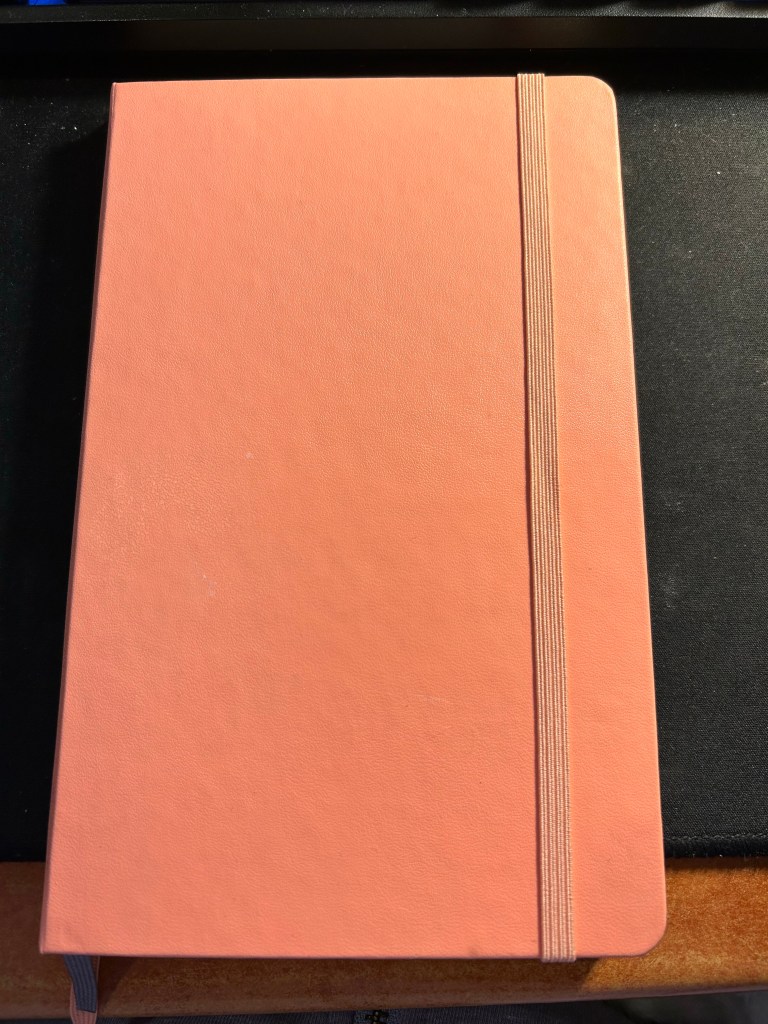
The coral pink cover.
The bullet notebook is part of Moleskine’s is part of their Art lineup, which usually has better paper than their usual lineup, as it’s used for sketching or watercolours. The choice is a bit peculiar, but it speaks to where Moleskine appears to think that BuJo fits: not in their business lineup, but within the artists’ and creatives’ one.
It comes in three cover options: black, coral pink, and aquamarine. That is also a peculiar choice for them, as normally products in the Art lineup come in any colour you want so long as it’s black. The bullet notebook comes with 120 gsm ivory coloured paper and is supposedly fountain pen friendly. Note the supposedly in that sentence, we’ll get to that later on. It is noticeably thicker and heavier than their standard large hardcover notebooks, and it comes with two bookmarks in different colours – in the case of the coral pink one is pink and one is grey. Fetching.
Now we come to where this notebook really becomes interesting, the interior. The first page of “Personal Data” is taken directly out of Moleskine’s planners. There’s a bit of fluff at the end that I don’t think comes standard with their planners, but I still recommend not filling this page, ever. Especially not the passport details, driver’s license and any other thing that can be used to ID you should you lose or misplace this notebook.
Personal data. I’ve used this notebook for over two months, and this page remains purposefully pristine.
The next spread is the very cool Moleskine world map, the same one that you can find in many of their planners and other travel related products.
I love maps, and I love this map.
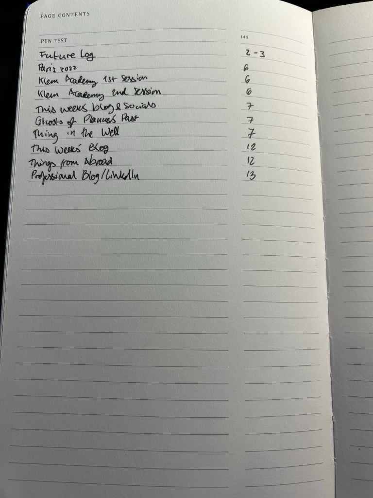
The next set of pages is where the bullet notebook starts to get interesting. It’s an index, with the first entry already printed inside: Pen Test on page 149. This is classic BuJo, and Moleskine delivers. There are five index pages, which should be enough for practically anyone’s needs.
The index
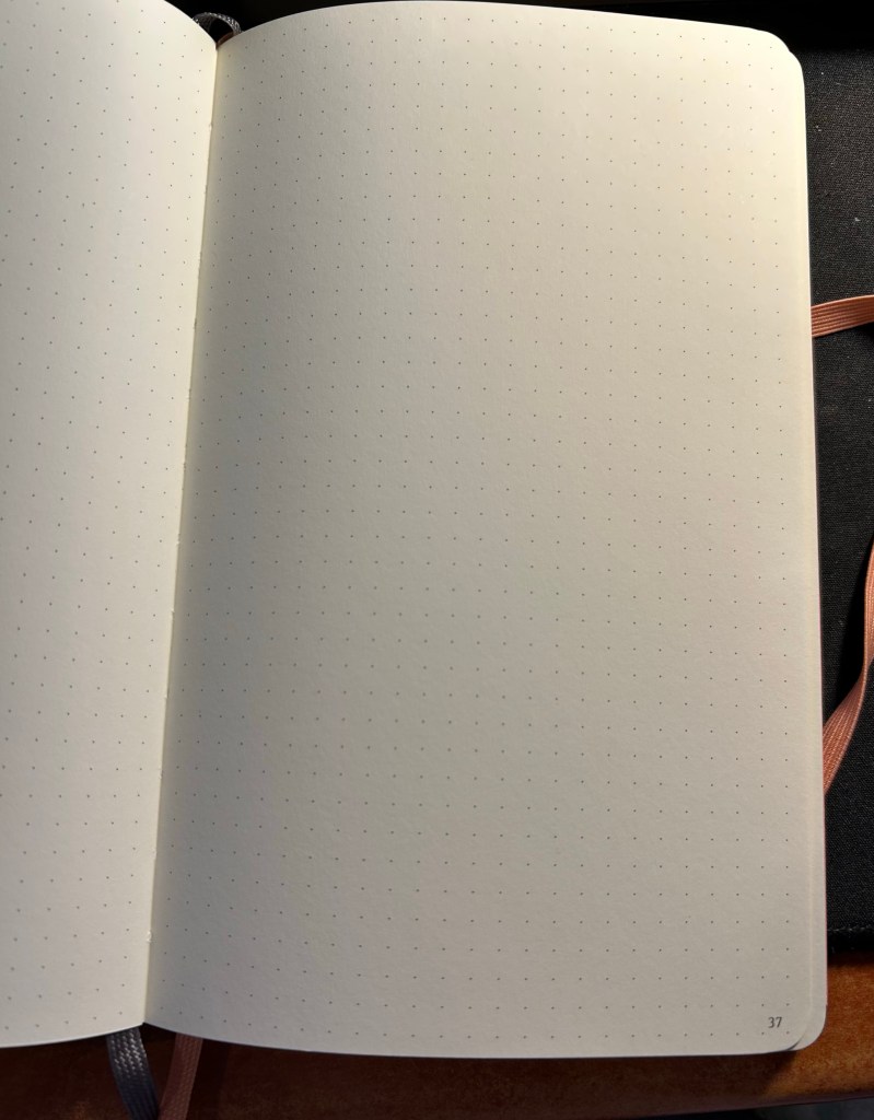
Inside there are 148 pages of ivory coloured 120 gsm dot grid paper. That’s less than there is in a regular Moleskine, but the paper is significantly thicker, and already the notebook is thicker and heavier than their standard notebook. They put the maximum number of sheets they could without making the notebook too bulky. The pages lay flat, and Moleksine’s binding and covers are built for endurance. The pages are numbered, which is also something that Moleskine doesn’t normally do, but fits well with the Bullet Journalling Method.
The paper inside.
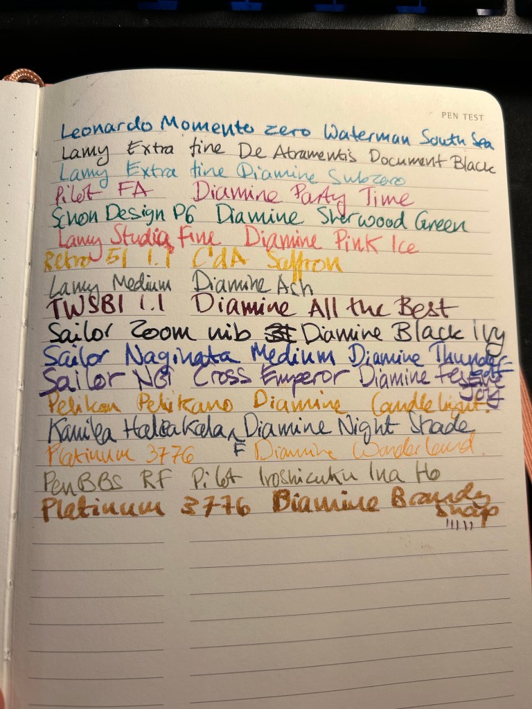
There is space in the back for pen tests, so I immediately used it to test a slew of fountain pens. Moleskine claims that the bullet notebook is fountain pen friendly. It is not. There’s spread, there’s bleed-through, show through and sometimes spidering. This isn’t a fountain pen friendly paper on any count.
Pen test page.
The back pocket has something new and interesting going on. Moleskine stuck folded piece of paper on the back pocket and on the outside it looks like regular dot grid paper:
Back pocket and closed fold-out.
But when you fold it out there’s a key page inside. Very elegant and clever.
My key page.
I like that Moleskine are experimenting with new formats. I don’t like that they advertise this paper as fountain pen friendly when it clearly isn’t. The bullet notebook comes with a sheet of stickers that I didn’t bother photographing because it just looks like a sheet of solid pink, but it’s actually made of small stickers in various geometric shapes.
If you are looking to get into BuJo but enjoy working with mixed media or fountain pens, then look elsewhere. In terms of cost the Moleskine Bullet Notebook is about the same price as the official Leuchtturm one, and you get a better deal buying that if only for the official booklet. If you are looking for a more minimalist setup that what the official Bullet Journal offers and you aren’t planning on using fountain pens, than this is a decent offering, especially as it comes with more cheerful cover options. It is un-opinionated enough to be useful even to those who have never heard of BuJo in their lives. Do I see myself buying another one of these in the future? No. I am struggling to finish using the one that I have now (because I’m not a fan of dot grid). But I am glad that Moleskine is willing to give new notebook formats and paper types a try. If this notebook had this exact paper but in plain white or squared white, I would have bought a stack of them.
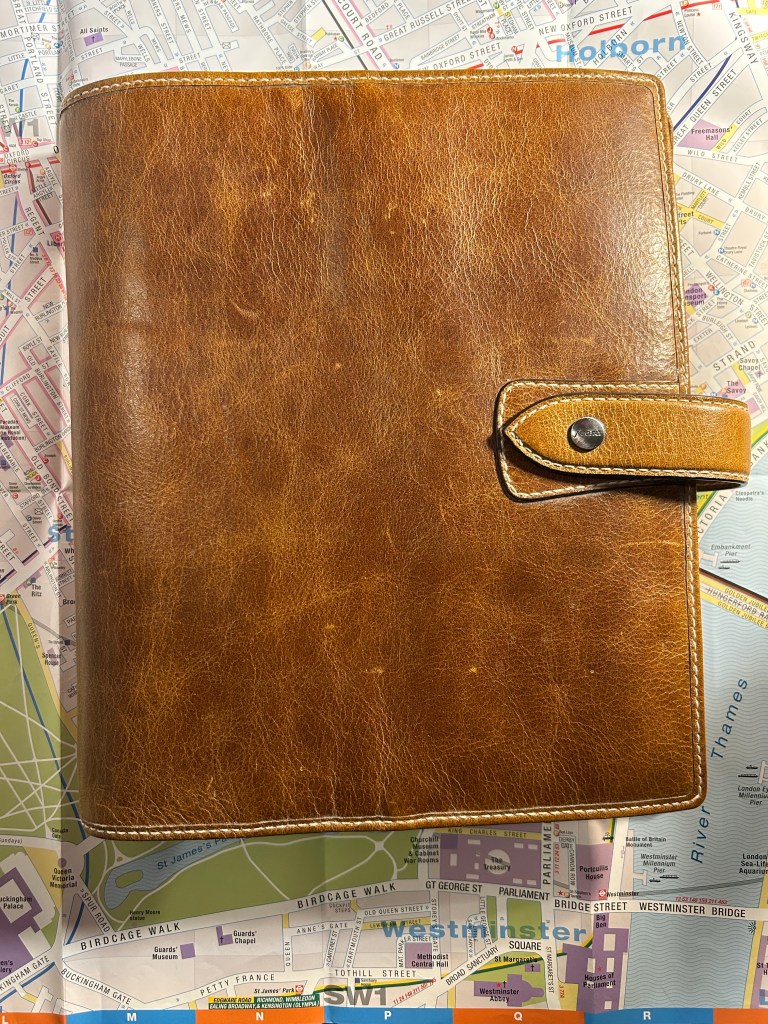
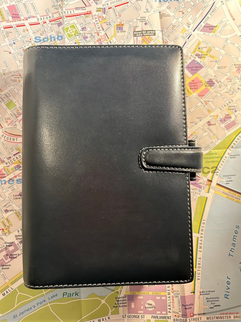
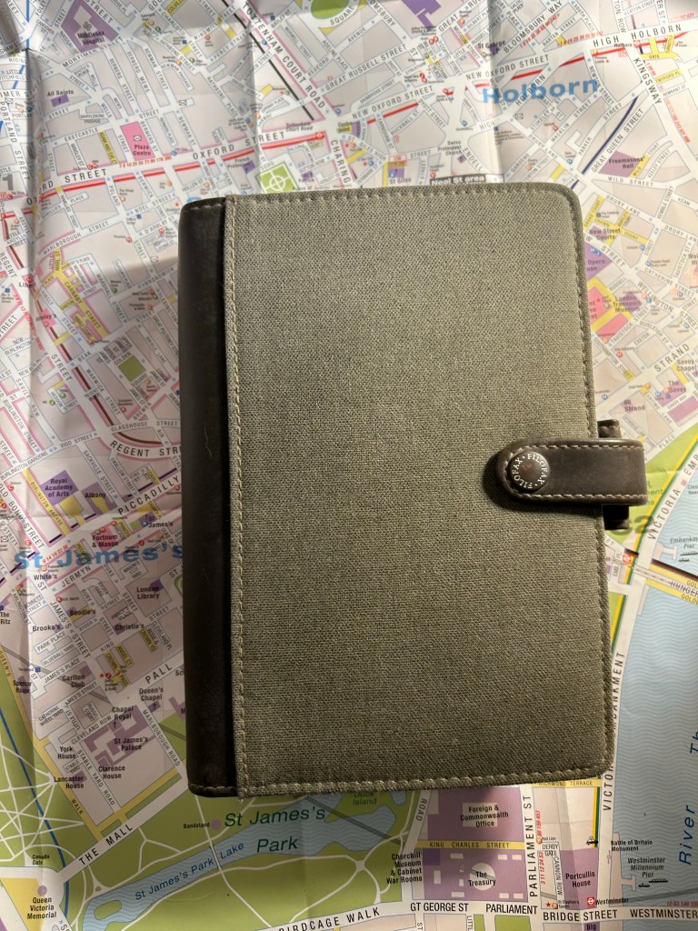
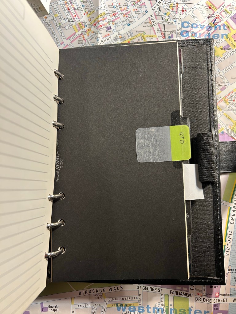
In the early 2010s Filofax was all the rage (much like Plotter is now), and I was swept with the trend. I started by purchasing the Personal Urban, then quickly expanded to Pocket, Personal and A5 Filofaxes of various kinds (Urban, Malden, Classic, Cuban, Graphic, Bond, Finchley and more).
A5 Malden, one of my more well used Filofaxes
What drew me (and others) to them is the infinite customizability and the fact that these were gorgeous, well-made objects made by a brand with a history and good track record. Online communities that shared photos of spreads and setups started to grow around the brand, and unlike Moleskine and Moleskinerie, the company left them to their own devices. Some of them exist to this day (like the delightful Philofaxy). The parallels with today’s boju and Plotter communities are pretty clear.
I invested in this Filofax, creating hand made labels for the tabs, setting it up just right.
The promise of bujo (bullet journalling) and the Plotter are also the promise of the Filofax: build a planner/notebook hybrid system that matches your exact needs like a glove. Filofaxes are a joy to hold in your hand: they are beautiful, tactile objects that feel good and are exquisitely well made.
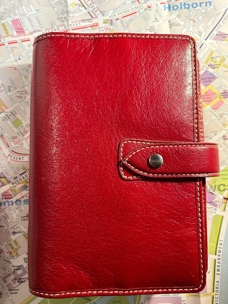
Look how pretty this red Personal Malden is. You can almost feel the buttery leather through the screen.
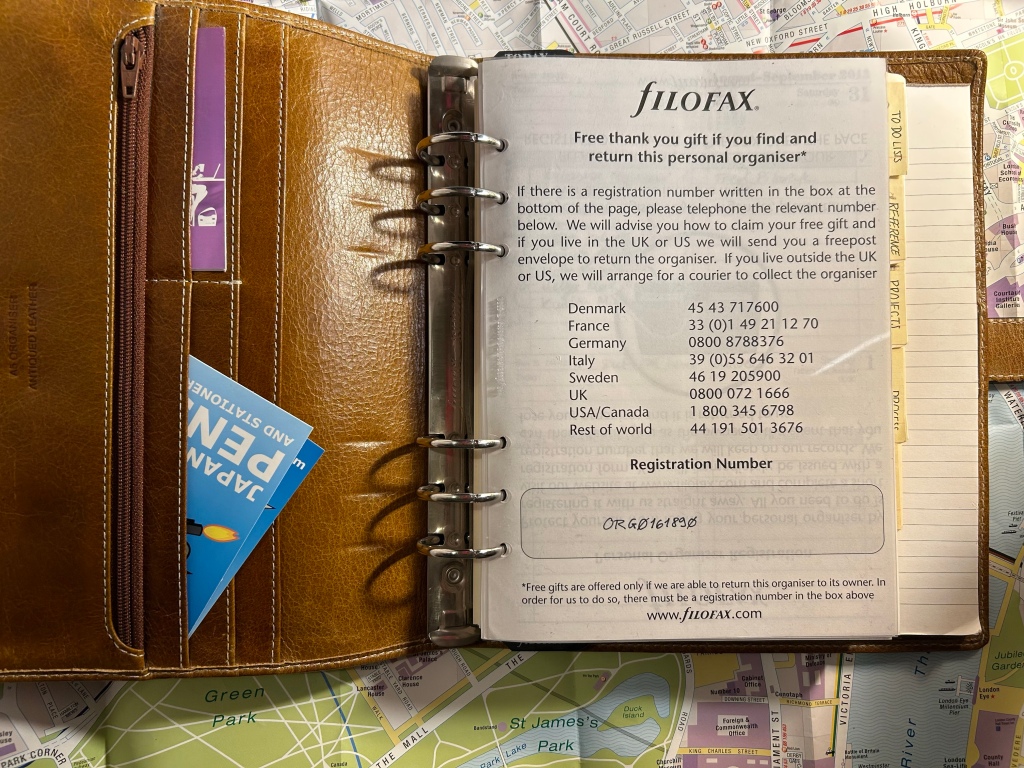
They weren’t cheap, but if you waited patiently or were willing to buy second hand you could get some really great deals, and they lasted forever. The refills, much like Plotter ones, were the real expense. Yes, you could buy a specialized hole punch for them and create your own refills, but most people just bought them from Filofax themselves or from Filofax compatible sellers. Which refills you bought depended mostly on the purpose of the Filofax in question, and I had ones that had no planner inserts at all, only lined or blank refills and tabs.
Personal Cuban, which has a rich leather cover that I was so afraid to muss it never left the house.
The olive Personal Urban Filofax below was my first Filofax and my workhorse. I used it heavily from 2011-2013, and it was a heady nostalgia ride to dust it off and open it up again. It is very well made – fabric, pleather and ring mechanism are in perfect condition even after intense use and then years of storage. It is also a relic of a person that I lost when I went through cancer treatments, and I confess that reading over some pages made me want to cry. The things I worried about…
Personal Urban Filofax, my first and most used one.
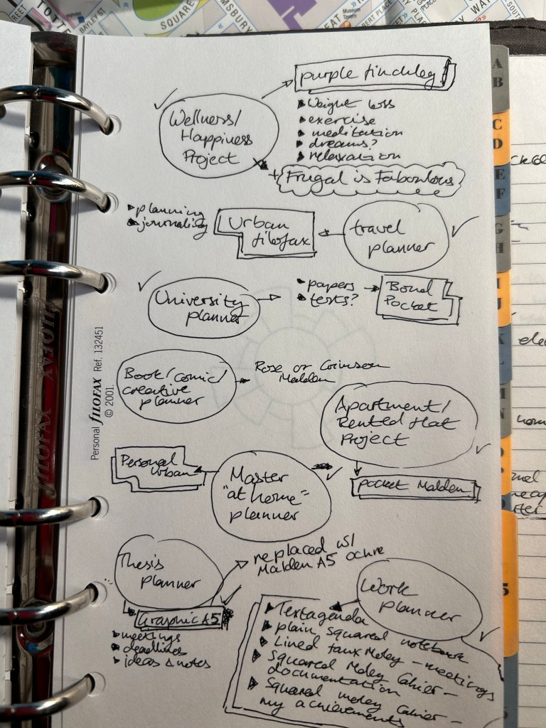
Do you want to see how much I was into Filofaxes? I even had a page in my Filofax where I planned my Filofax usage:
So much cringe, but I choose to be kind to my old, naive self.
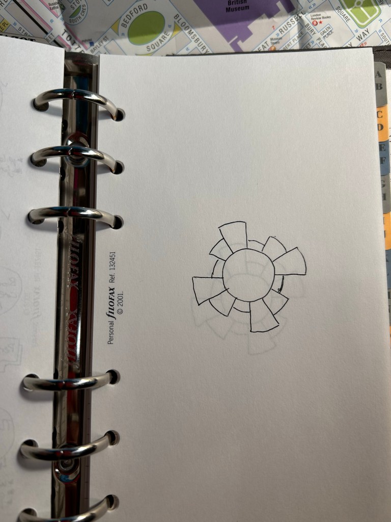
Some of the Filofax inserts were fountain pen friendly, but I didn’t use fountain pens with my Filofaxes at all. I used Pilot Hi-Tech-C Coleto multipens with them, and I spent a good amount of money on their refills (which would either get air bubbles and stop writing, break, or just simply run out much too quickly). I even combined my love for Filofax with my love for the Chronodex system for a while:
Pages in my Filofax that I planned to use for Chronodex entries.
So why did I stop using my Filofaxes completely? The system was well made, full of promise, and could double as a notebook and triple as a wallet, so what went wrong?
It was a combination of things that made me put all my Filofaxes into boxes for storage:
The stores in London closed down (first the Neal street one, then the one off Regent street), and it became harder to find Filofax refills in stationery shops in London (they never were available locally).
The refills weren’t cheap, and with the price of shipping added and the price of using the pens that worked best with them, it just became prohibitively expensive to use the system, particularly if you had more than one Filofax running.
The rings get in the way of writing. It’s a thing with all these systems, and whoever tells you that the rings don’t get in the way isn’t being candid. And no, you won’t be taking the refills out to write on them and then filing them back in, it’s just too inconvenient.
Filofaxes are bulky and heavy, particularly when full (and they collapse when they aren’t filled). It’s a hassle to carry them around, even if you are using them as a wallet (they a aren’t great at being wallets).
As with other planning systems – finding refills that have the week start on Sunday (because that’s when it starts here) was nearly impossible.
Hints of posts to come.
So why get into ring based systems like Filofax and Plotter? If you want one physical planner system that will function in more than one way at the same time, will allow you to customize it fully to your needs, and can be carried over from one year to the next, then these systems may be worth a try for you. I used my Filofaxes heavily during a very busy time in my life because I was able to set them up for all my needs, and particularly GTD (I’ll post about that system later on in this series).If you can work around the rings and can afford the system and the refills, the Filofax is a very well made object that may be able to help you fulfill your goals. It helped me apartment hunt, work on my degree, kickstart my running, and be a better manager at a busy and difficult time at work. I will forever have a soft spot for my Filofaxes, which is why I’ve never attempted to sell them.
Do I regret my Filofax obsession? No. Do I regret that I stopped using my Filofax planners? Also no. They were exactly what I needed at the time until they weren’t, and I believe that in the end a planning system needs to work for you, and not you for it. Something to remember whenever you are considering making a change in this area.
This post has been languishing in my drafts since mid September 2022. The photos were taken using my old iPhone 11, and the lighting came out very yellow and vintage-y. I was considering photographing everything again, but then I decided that this somehow works with this Moleskine’s theme.
It’s been a while since I’ve reviewed a Moleskine, but I’ve decided to get back to regular Moleskine reviews since I’ve got so many of them, and I still think that they are masters of design, and make the best quality covers and bindings than anything else in the notebook market. And 90% of Moleskine’s limited editions are their covers.
Back in the heady days of 2015, Moleskine came out with one of their best collaborative limited editions: The Moleskine Blue Note notebooks.
Front Cover
Blue Note are a jazz icon, a record label established in 1939 and instrumental in the development of modern jazz and in album cover graphic design. This collaboration could not be more tailor made for a brand that emphasized graphic design as much as Moleksine do. The front cover looks like a Blue Note album cover, because it is a Blue Note album cover: midnight blue by Kenny Burrell. It’s a classic Blue Note album with a classic Blue Note design, and it’s no wonder that this is one of the albums that was chosen for this collaboration. The other albums in this series (Art Blakey’s “A Night in Tunisia”, Freddie Hubbard’s “Hub Tones”, Dexter Gordon’s “Go!” and Thelonius Monk’s “Genius of Modern Music Volume 2”) are equally iconic in both sound and album design, although “Midnight Blue” is the most muted of the bunch. As usual in Moleskine limited editions, there were two large notebooks and two pocket notebook designs in this series. I can’t help wishing for more of these, because I think that it’s such a perfect fit between the brands, and because Blue Note album covers are so fantastically well designed.
The inside cover design is the same for all the notebooks in this edition (again, this is something that Moleskine does for all its limited editions), and they feature photos of many of the legendary artists that recorded Blue Note albums (how many do you recognize?). There’s also a note about the album and the famous Blue Note logo on the bottom right side of the page, and Moleskine’s on the left. I’ll note here that Moleskine gave Blue Note’s logo far more prominence on the cover than what it gives its own logo (which is simply debossed on the back).
On the back endpapers there’s a history of the Blue Note label, the famous back pocket, and again Moleksine’s phenomenal printing and assembling capabilities that make the pocket printing completely aligned with the endpaper printing. Pattern matching is hard, and it always surprises me that they get theirs perfect every time.
The sleeves on this edition are excellent. Moleskine in Jazz indeed:
There are four stickers that come with each of the notebooks in this edition, one for each one of the albums in it, and they are perfect. The look exactly like a Blue Note disc, and the details on them are magnificent. Someone really enjoyed their job here, and it tells.
Almost all of Moleskine’s limited editions feature lined paper, but the Blue Note edition was a welcome change: this notebook has blank paper! I’ve been using it, in combination with another notebook, for journalling, and it’s great! As is the case with Moleskine paper, it’s largely for gel ink, ballpoint, pencil and fineliner use, although some combinations of fine nibbed fountain pens and inks work on this paper, and blank paper tends to be the most fountain pen friendly of the bunch.
Doodle that I made in this notebook in September, when I was still struggling to get rid of steroid side effects.
If I could have any say in the matter, I would have loved to see more Moleskine and Blue Note collaborations, and I would have loved to see more blank paper limited edition notebooks. Most Moleskine users still prefer lined paper, which is why almost all of their limited editions have lined paper. But as Moleskine limited editions lately seem to skew to either book themed (Petit Price, Wizard of Oz, Lord of the Rings, Alice in Wonderland), pop-culture themed (Star Wars, various Manga and video game editions, Coke-Cola, Smiley) or designer based, I doubt that we’ll get to see more of these kinds of collaborations.