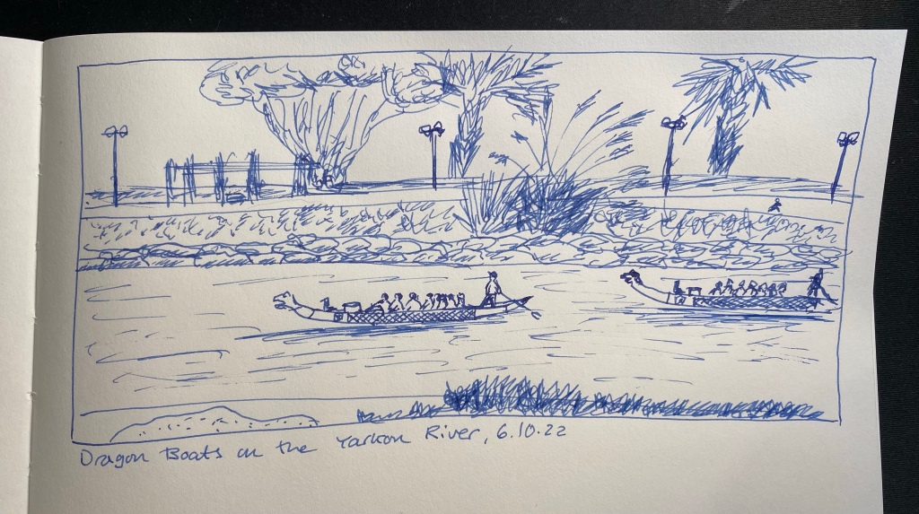
I run practically the same route every day, and yet it never gets boring, especially since the sea, the river and the park are constantly changing. Today it was dragon boats that were out in force on the river. I’ll probably do a watercolour sketch of the scene later on. In any case, this page will be sketched with a Platinum Plaisir filled with the cartridge it came with. It was supposed to highlight the fact that you can sketch with even the cheapest of fountain pens, but I have to say that I don’t recommend the Plaisir. The nib doesn’t flip well, the ink cartridge it comes with is proprietary and the ink inside is in a depressingly dull blue, and there are better pens to be had for a little more or a lot less.
It’s time for a wash, and this time it’s just water over Colorverse Golden Record ink. The sketch was done with a Diplomat Aero fine nibbed pen, which you can see at the bottom of this post, and on A4 Midori MD Cotton paper, which is not built for washes. It buckles almost immediately.
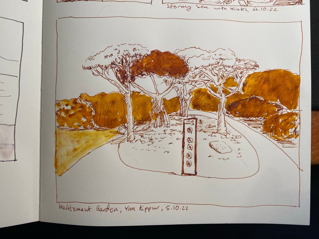
One of my favourite places in Tel Aviv, Independence Garden (Gan HaAztmaut).
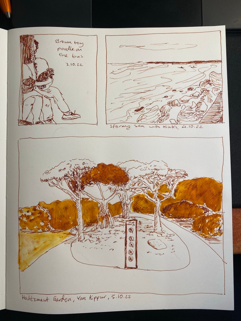
Here’s the complete page:
I like the comics like effect of it.
And here’s the pen that I used to sketch it all, the wonderful and highly recommended Diplomat Aero (in this case in orange, but it comes in a myriad of colours). The Colorverse Golden Record ink was part of a set, and I don’t recommend it.
I’m going for a page of sketches with this pen and ink combo, so here’s another small one, of two kayakers braving the stormy sea. Diplomat Aero fine nibbed fountain pen with Colorverse Golden Record on an A5 Midori MD Cotton notebook.
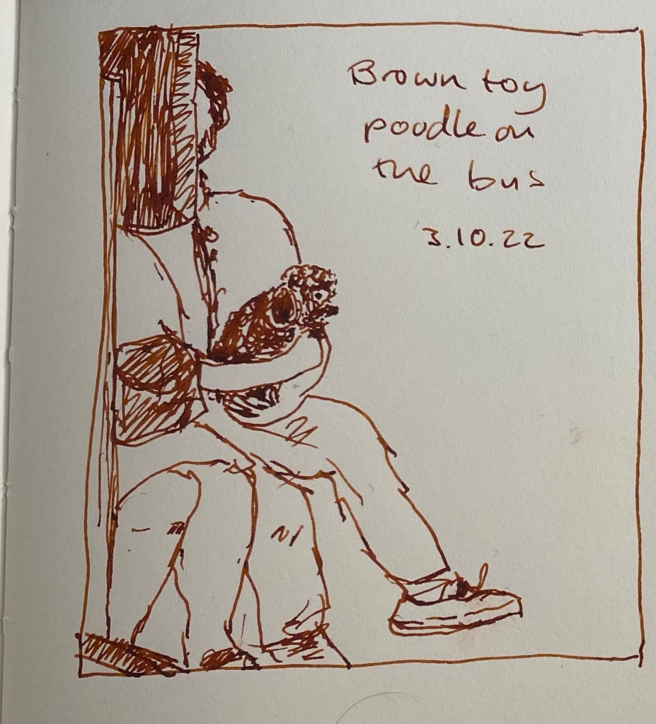
I had a busy day, so it was a very quick sketch this time, of a brown toy poodle sitting on her owner’s lap on the bus. She was quite the attraction, and reminded me of my old dog in the pure joy she took from everything around her.
Drawn on an A5 Midori MD Cotton notebook with a Diplomat Aero fine nibbed pen filled with Colorverse Golden Record. This ink has a tendency to dry out in pens, and it becomes darker in the pen after a day or two.
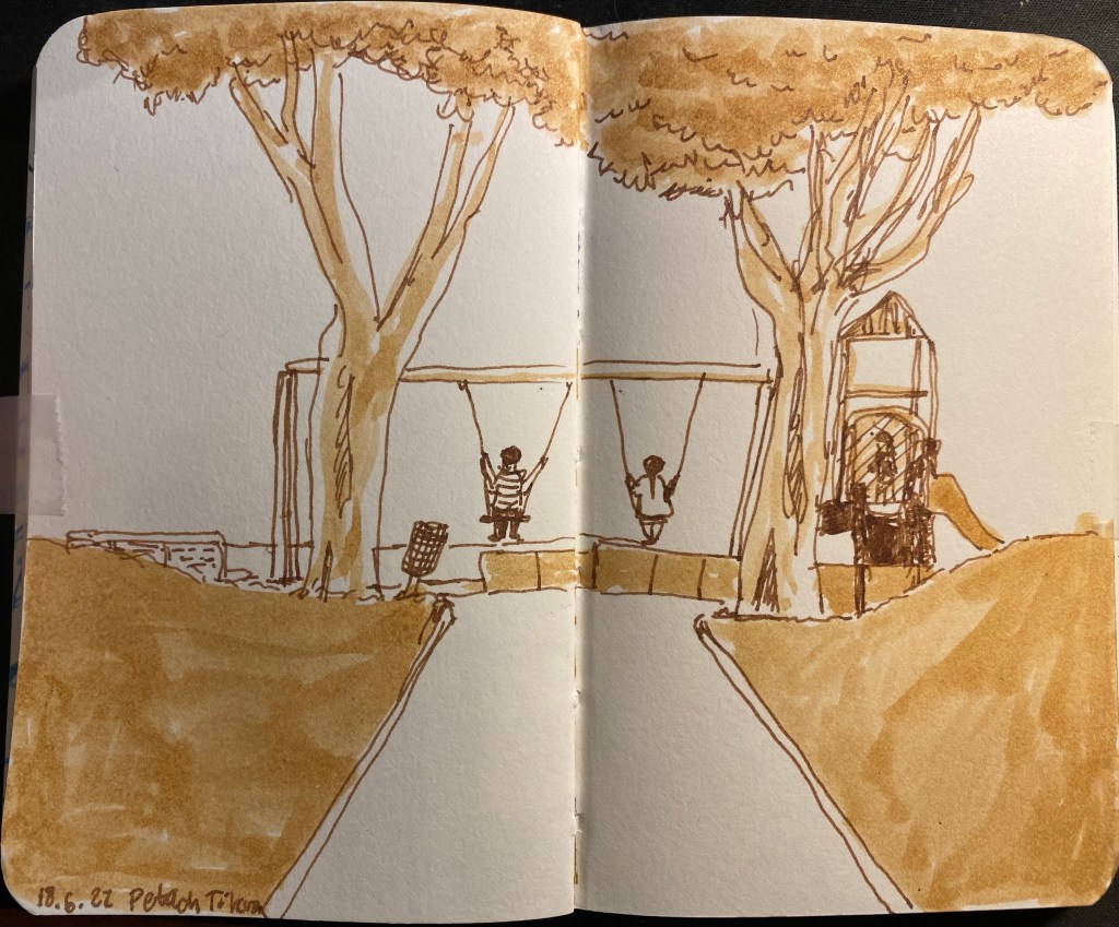
Today’s sketch was also done with a fine nibbed Karas Kustoms Velys Ignem Vertex and Kyo No Oto Sakuranezumi ink on a Midori MD Cotton A4 notebook. It’s a very quick sketch, done in less than 10 minutes, and I later on made the mistake of applying a wash on the sand, and pretty much ruined that part of the sketch.
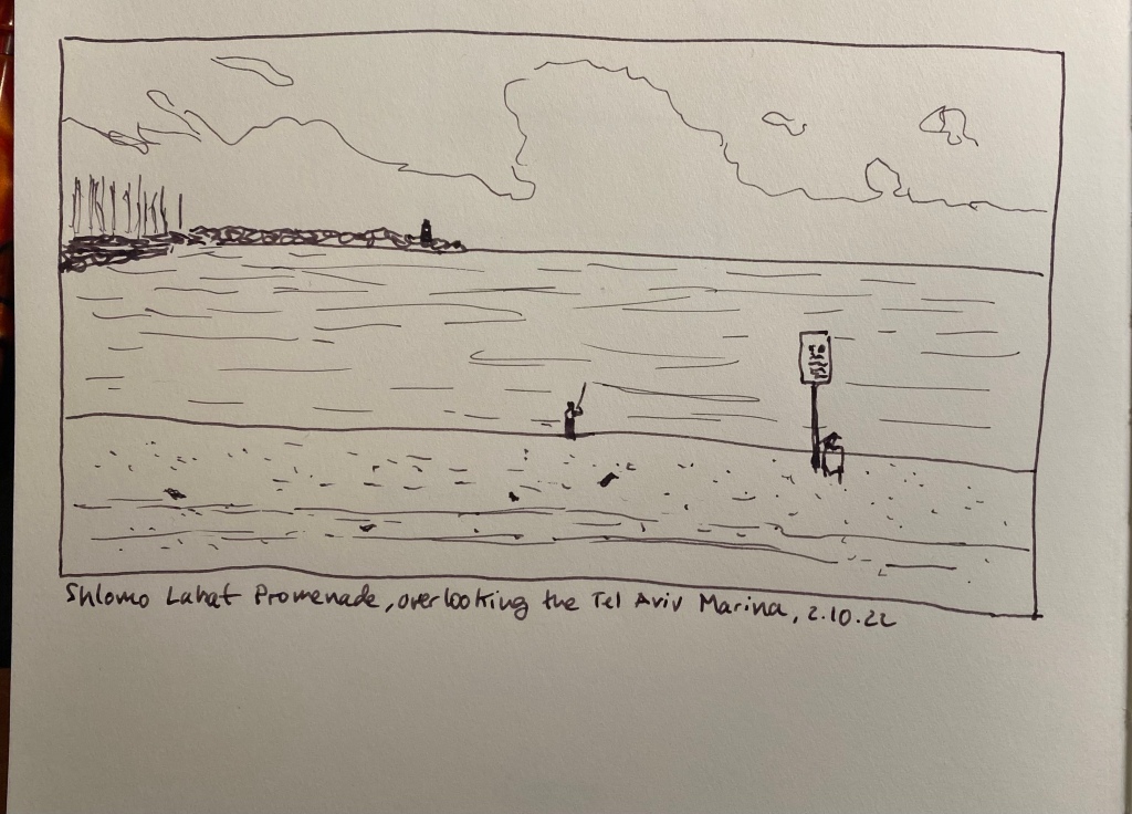
View of the sea from next to the Tel Aviv Marina
Here are the two sketches together on a complete page (before I destroyed the bottom one).
It’s Inktober again, and after a few days of hemming and hawing I decided to join it this year. Once again I’m not following the very Halloween themed prompts, but instead just sketching with fountain pens (for the most part) and ink. I’m sketching directly on paper (no pencil underdrawing), and I’m using an A4 Midori Cotton notebook for these sketches.
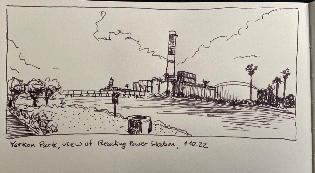
Yarkon Park, view of Reading power station.
This is a 10 minute sketch, done with a Karas Kustoms Vertex Velys Ignem fountain pen with a fine nib, filled with Kyo No Oto Sakuranezumi ink.
Vertex Velys Ignem.
This is my first Karas Kustoms fountain pen, and I really enjoy using it (I’ll be posting a full review once I’ve had more time with it). I used the nib on both sides (flipping it over for extra fine dots and lines), and it is smooth and well performing.
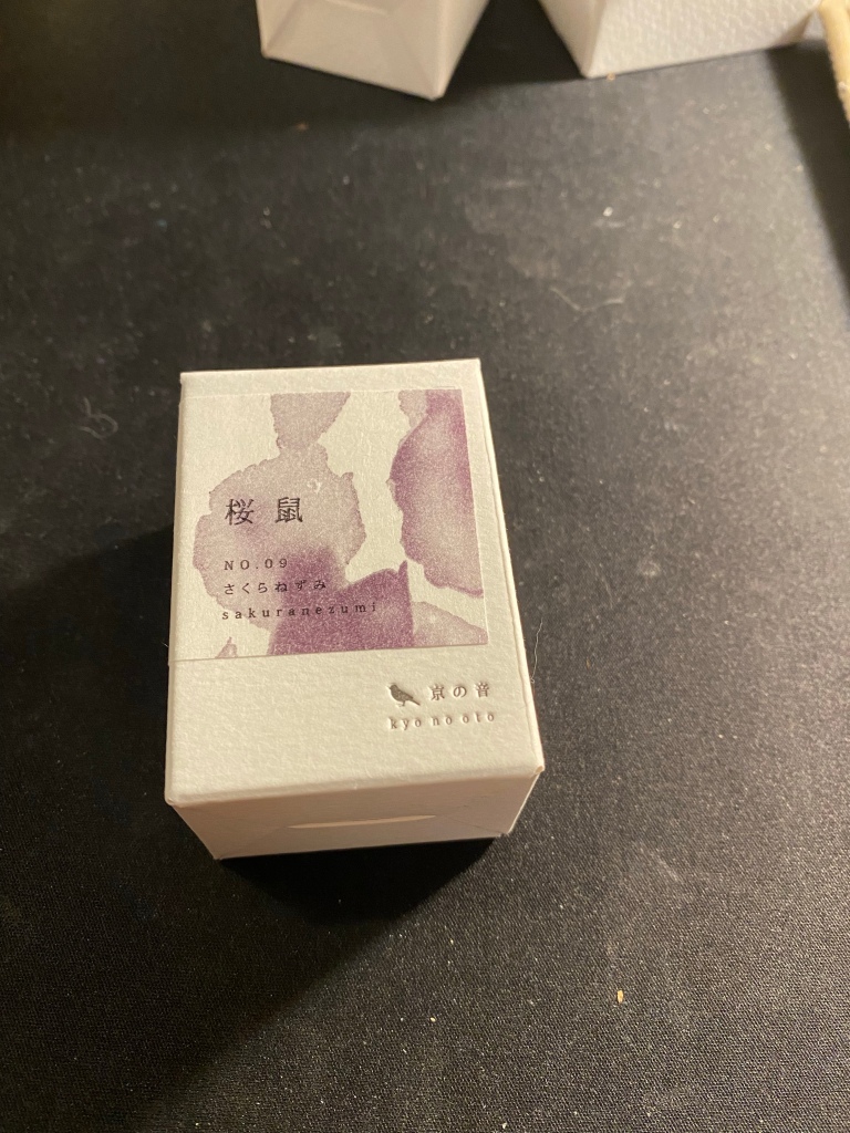
Kyo No Oto Sakuranezumi box.
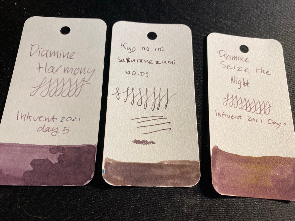
For some reason I got the ink brand name mixed up in my head and I’ve been calling it kyo no iro. Embarrassing. In any case, I bought this ink on an ink shopping spree in Choosing Keeping in London during my latest trip there. It’s a dusky purple/mauve colour that reminded me of Diamine Harmony (and costs significantly more).
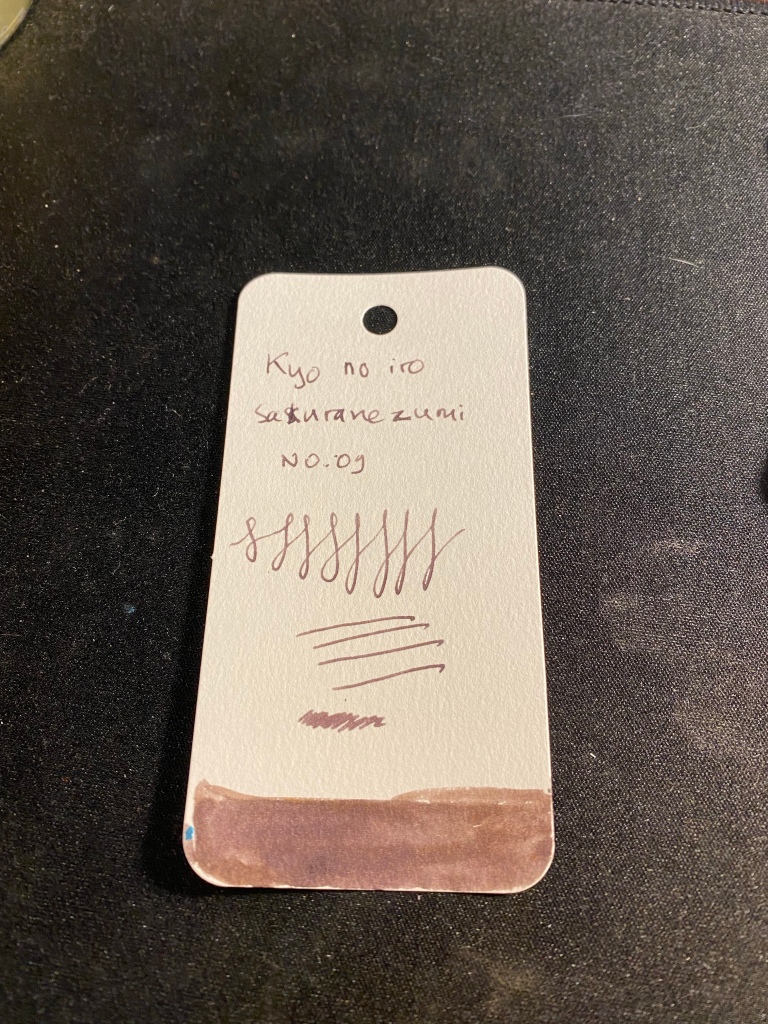
Ink sample on Col-o-ring tab.
Sakuranezumi is a purple with yellowish undertones that is darker than Diamine Harmony or Diamine Seize the Night, and shades significantly less than the other two. In a fine pen it is dark enough to be acceptable in office use, and I enjoy its dusky mystique. If you do wet the ink, the yellow undertones really become prominent, so take that into account if you plan to use it for ink washes, etc.
If you are looking for a mauve ink and you want something subdued and dark, Sakuranezumi would work for you. I personally find Diamine’s offerings to be more interesting, plus they are easier to obtain and significantly cheaper. Harmony shades more, and if you are looking for yellow undertones, then Seize the Night has the sheen for you.
Inspired by Gabi Campanario I’ve taken some waterbrushes and filled them with diluted shellac based ink from Sennelier. At first I only had Burnt Sienna ink that I bought years ago from Cornelissen and Son (one of my favourite art supply shops in London), but I purchased a bottle of Prussian Blue and Cobalt Blue to add to it. The bottles have pipettes which make using them to fill a waterbrush convenient, unless the brush has a valve on the body, in which case you’ll need to dip it inside the bottle, and you’ll have issues filling it fully.
Here are some sketches done with the Burnt Sienna. The first one was done with a fountain pen and a single waterbrush filled with pretty diluted Burnt Sienna and was drawn on a Stillman and Birn Pocket Alpha. This was when I discovered that the ink dried lighter than I thought, and that layering it on this paper isn’t really an option. I didn’t get enough of a gradient, and it didn’t take long for the paper to start to disintegrate from the ink. Note also that the ink dries fast, and getting perfect washes with a waterbrush is practically impossible, even in such a small format. But I liked the result enough to experiment with it some more.
First try with ink in a waterbrush.
I then filled another waterbrush with a much less diluted Burn Sienna and water solution. Here’s the same Stillman and Birn Pocket notebook but a sketch with a little more gradient because I used two different ink/water ratios. I like the result better, especially on the trunk.
Second try, more contrast.
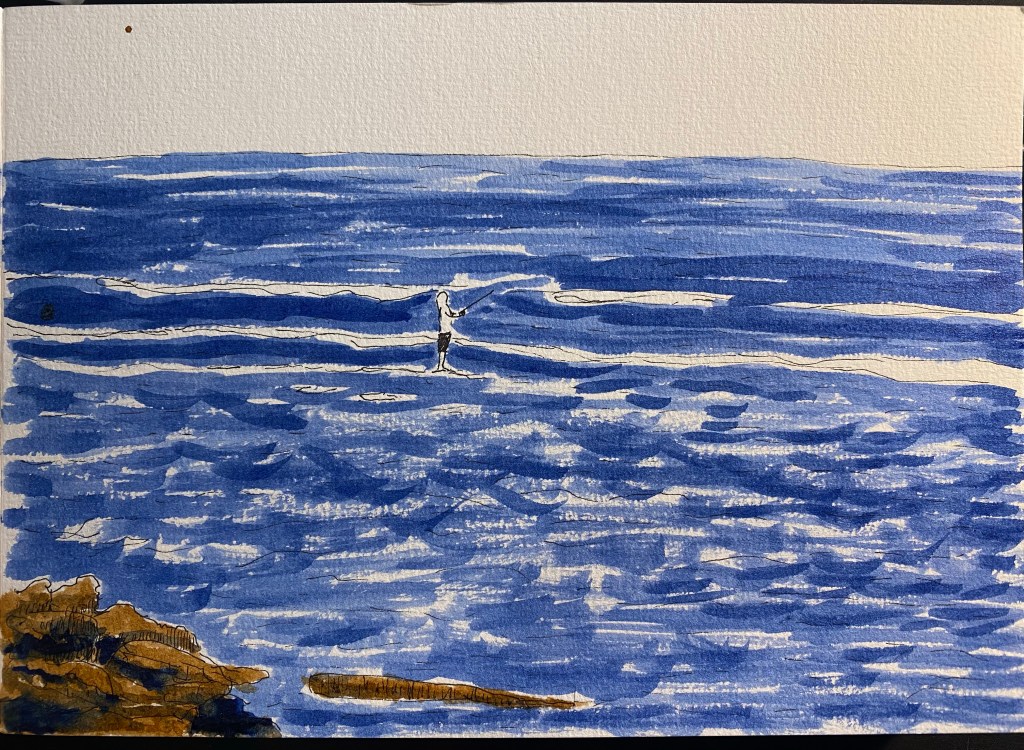
Then I got the Sennelier Prussian Blue that I ordered, and I filled two brushes with it, one diluted with water at about a 50/50 ratio, and another practically undiluted. I had enough of the Alpha paper, so I switched to 300 gsm cold press watercolour paper from Clairefontaine. Here’s the sketch, done with a Staedtler 0.1 pigment liner (I didn’t want the lines to distract from the wash):
Sketch done with Staedtler pigment liner of a fisherman in the sea.
And here is the result with the ink washes applied:
Result with ink wash.
I used the dark blue for the shadows on the rocks, and this time I could actually work with the ink (due to the quality of the paper) and blend between the Burnt Sienna and the Prussian Blue.
I loved this result enough to give these ink washes more tries. I will say that there have been some issues with them so far:
Many of my waterbrushes (most of my Pentel ones) didn’t allow the ink to flow to the brush bristles.
Some of my brushes leaked, and so I won’t be carrying them around in my bag without a ziploc bag to protect my bag contents from them.
The Cobalt Blue ink that I bought contains copper. It came with a warning label, and I’m not going to use it before I make sure I have a leak proof brush for it.
The behaviour of the ink is entirely dependent on the quality of the paper, more than any medium I’ve used before (including watercolour).
Waterbrush bristles deteriorate pretty quickly, and make fine detail work and brush control more difficult.
All that being said, I enjoyed using them enough in my sketches to continue using them for a while, and I recommend giving shellac (calligraphy) ink in a waterbrush a spin.
PS – these inks are NOT FOUNTAIN PEN FRIENDLY! If you put them in your fountain pen they will ruin it.
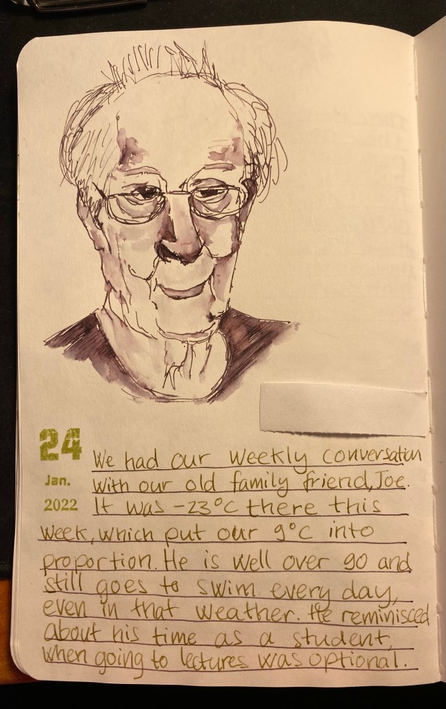
We had our weekly zoom call with our old family friend, Joe. I did my best to sketch him while we talked. It was slow, hard work and came out only so-so, mainly because my neuropathy is really bad lately (which is also why there’s been a dearth of posts). Still, I’m glad that I tried.
Sketch of our old friend, Joe.
Drawn with a Lamy LX Palladium, fine nib, filled with Diamine Harmony (an Inkvent 2021 ink).
Writing done with a PenBBS 535 Year of the Ox, RF nib, filled with Pilot Iroshizuku Ina-Ho.
The sketchbook is a Stillman and Birn Alpha 5.5’’ x 8.5’’.
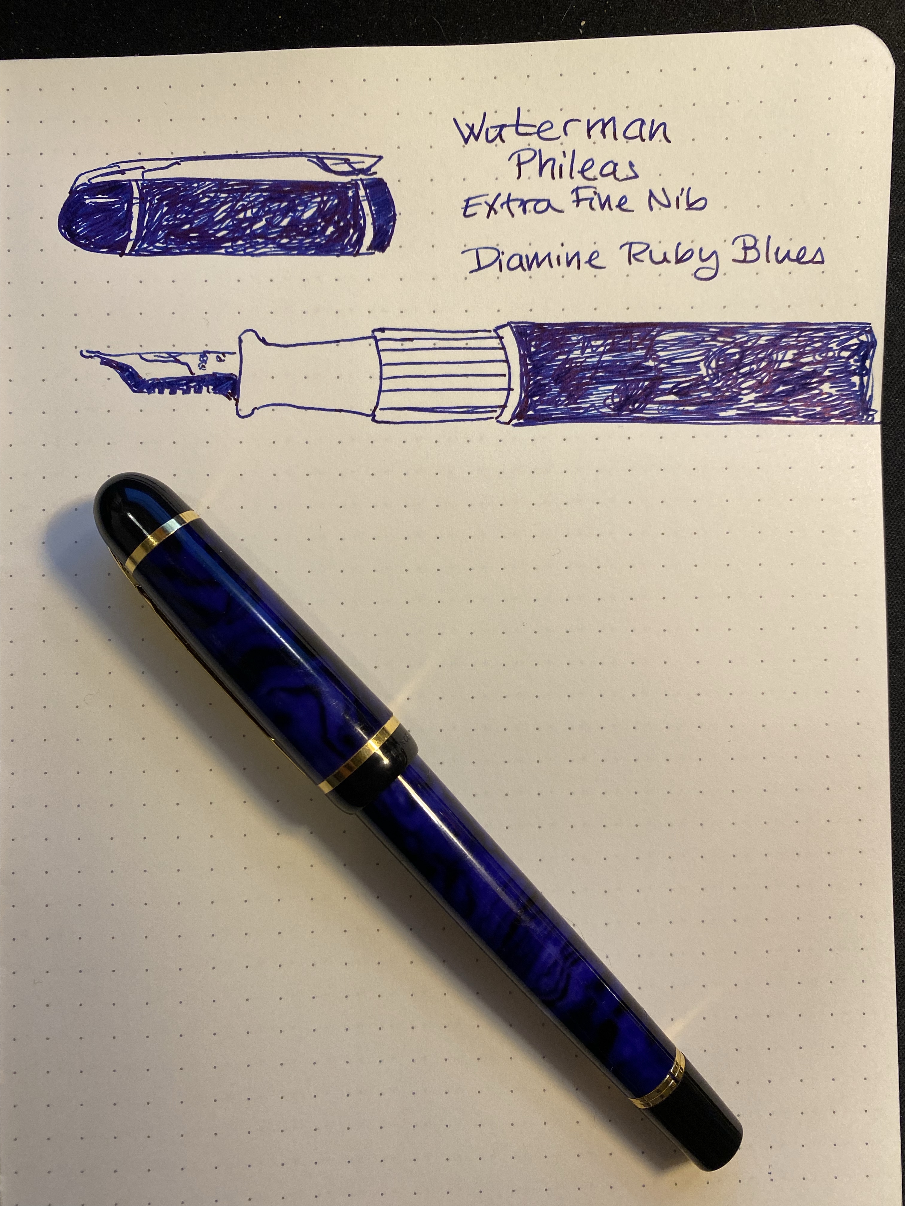
Today’s fountain pen is also my first fountain pen, the wonderful Waterman Phileas. It’s filled with Diamine Ruby Blues from the Diamine Inkvent 2021 calendar.
My hands have been an utter nightmare this week and I’m only now starting to feel a slight improvement in my neuropathy. This is the most that I’ve been able to draw and type all week.
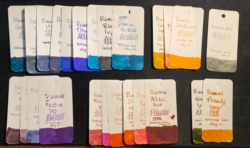
What a fun and wild ride was Diamine’s 2021 Inkvent calendar. It was tough posting a review of an ink every day for the past 25 days, in particular since my hands weren’t my best friends during many of those days (and even now) because of chemo induced neuropathy. When comparing the 2019 Inkvent calendar to the 2021 version, I personally like the 2021 version much more. There are more inks that I could see myself regularly using, the inks were more interesting, and there was a better spread of colours. Here’s a look at the Col-o-Ring swatches of all 25 inks in the Inkvent 2021 calendar, grouped more or less by hue:
A lot of blue for a red calendar.
Blue and blue green dominate this calendar, although there’s a good selection of pinks and purples. There are fewer brown inks this year, which I don’t think will disappoint many people, particularly since the two brown inks that have been included (Winter Spice and Brandy Snap) are interesting and unique.
I expect Diamine to issue full bottles of these samples, like they did with their Diamine Blue edition. These are the inks that I’ll likely be buying once that edition comes out:
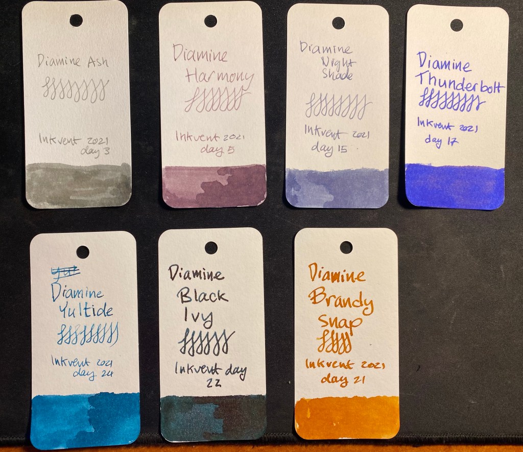
Diamine Ash, Harmony, Night Shade, Thunderbolt, Yuletide, Black Ivy, Brandy Snap
I like shading inks more than shimmering or sheening ones, and all these inks have interesting shading properties or a unique shade that I happen to like and not have in my ink collection. Will I be buying 7 new bottles of ink? Maybe, but probably not. I have over 25 fountain pens filled with ink now (the most that I’ve ever had), so my plan is to write them dry and see after a few weeks of use which ones stick and which ones don’t.
An added bonus to the decision to ink up a pen for each sample is that I’ve inked many pens that I haven’t used in months or years. It’s been a lot of fun playing with the Sailor Cross Emperor nib again, or remembering why I liked this pen or the other. If you’re looking for a way to cheer yourself up, allow me to recommend pulling out a few pens that you haven’t used in a while and jotting something down with them or just doodling. I’m pretty sure it will make you smile.